
Now that the colors are worked out, it is time to dive in and see what theme attributes exist that you can override. Be warned, theme spelunking is tough. There is little to no documentation about which attributes exist, which ones you can override yourself, and even what the attributes do. You are going off the map here. It is a good thing you have this book to be your guide.
Your first goal is to change the background color of BeatBox by altering the theme. While you could navigate to res/layout/fragment_beat_box.xml and manually set the android:background attribute on your RecyclerView – and then repeat the process in every other fragment and activity layout file that might exist – this would be wasteful. Wasteful of your time, obviously, but also wasteful of app effort.
The theme is always setting a background color. By setting another color on top of that, you are doing extra work. You are also writing code that is hard to maintain by duplicating the background attribute throughout the app.
Instead, you want to override the background color attribute on your theme. To discover the name of this attribute, take a look at how this attribute is set by your parent theme: Theme.AppCompat.
You might be thinking, “How will I know which attribute to override if I don’t know its name?” You will not. You will read the names of the attributes until one makes you think, “That one sounds right.” Then you will override that attribute, run the app, and hope that you chose wisely.
What you want to do is search through the ancestors of your theme. To do this, you will keep on navigating up to one parent after another until you find a suitable attribute.
Open your styles.xml file and Command-click (Ctrl-click) on Theme.AppCompat. Let’s see how deep the rabbit hole goes.
(If you are unable to navigate through your theme attributes directly in Android Studio, or you want to do this outside of Android Studio, you can find Android’s theme sources in the directory your-SDK-directory/platforms/android-28/data/res/values directory.)
At the time of this writing, you are brought to a very large file with a focus on this line:
<style name="Theme.AppCompat" parent="Base.Theme.AppCompat" />
Theme.AppCompat inherits attributes from Base.Theme.AppCompat. Interestingly, Theme.AppCompat does not override any attributes itself. It just points to its parent.
Command-click (Ctrl-click) on Base.Theme.AppCompat. Android Studio will tell you that this theme is resource qualified. There are a few different versions of this theme depending on the version of Android that you are on.
Choose the values/values.xml version (Figure 21.6), and you will be brought to Base.Theme.AppCompat’s definition.
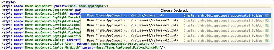
Choosing the unqualified version may seem strange here since your app’s minimum supported API version is 21. You chose the unqualified version because the background theme attribute has been around much longer than API 21, meaning it must exist in the original Base.Theme.AppCompat version.
    <style name="Base.Theme.AppCompat" parent="Base.V7.Theme.AppCompat">
    </style>
Base.Theme.AppCompat is another theme that exists only for its name and does not override any attributes. Continue along to its parent theme: Base.V7.Theme.AppCompat.
    <style name="Base.V7.Theme.AppCompat" parent="Platform.AppCompat">
        <item name="viewInflaterClass">
                androidx.appcompat.app.AppCompatViewInflater</item>
        <item name="windowNoTitle">false</item>
        <item name="windowActionBar">true</item>
        <item name="windowActionBarOverlay">false</item>
        ...
    </style>
You are getting closer. Scan through the list of attributes in Base.V7.Theme.AppCompat.
You will not see an attribute that seems to change the background color. Navigate to Platform.AppCompat. You will see that this is resource qualified. Again, choose the values/values.xml version.
    <style name="Platform.AppCompat" parent="android:Theme.Holo">
        <item name="android:windowNoTitle">true</item>
        <item name="android:windowActionBar">false</item>

        <item name="android:buttonBarStyle">?attr/buttonBarStyle</item>
        <item name="android:buttonBarButtonStyle">?attr/buttonBarButtonStyle</item>
        <item name="android:borderlessButtonStyle">?attr/borderlessButtonStyle</item>
        ...
    </style>
Here you see that the parent of the Platform.AppCompat theme is android:Theme.Holo.
Notice that the parent theme is not referenced just as Theme.
Instead it has the android namespace in front of it.
You can think of the AppCompat library as something that lives within your own app. When you build your project, you include the AppCompat library, and it brings along a bunch of XML and Kotlin (and Java) files. Those files are just like the files that you wrote yourself. If you want to refer to something in the AppCompat library, you do it directly. You would just write Theme.AppCompat, because those files exist in your app.
Themes that exist in the Android OS, like Theme, have to be declared with the namespace that points to their location. The AppCompat library uses android:Theme because the theme exists in the Android OS.
You have finally arrived. Here you see many attributes that you can override in your theme. You can of course navigate to Platform.AppCompat’s parent, Theme.Holo, but this is not necessary. You will find the attribute you need in this theme.
Just above the text color attributes, windowBackground is declared. It seems likely that this attribute is the background for the theme.
    <style name="Platform.AppCompat" parent="android:Theme.Holo">
        ...

        <!-- Window colors -->
        ...
        <item name="android:windowBackground">@color/background_material_dark</item>
This is the attribute that you want to override in BeatBox. Navigate back to your styles.xml file and override the windowBackground attribute.
Listing 21.8 Setting the window background (res/values/styles.xml)
<style name="AppTheme" parent="Theme.AppCompat">
    <!-- Customize your theme here. -->
    <item name="colorPrimary">@color/red</item>
    <item name="colorPrimaryDark">@color/dark_red</item>
    <item name="colorAccent">@color/gray</item>

    <item name="android:windowBackground">@color/soothing_blue</item>
</style>
Notice that you must use the android namespace when overriding this attribute,
because windowBackground is declared in the Android OS.
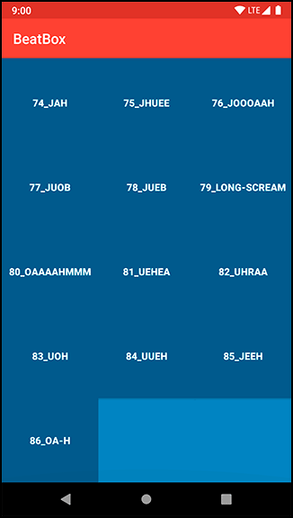
Run BeatBox, scroll down to the bottom of your recycler view, and verify that the background (where it is not covered with a button) is a soothing blue, as in Figure 21.7.
The steps that you just went through to find the windowBackground attribute are the same steps that every Android developer takes when modifying an app’s theme. You will not find much documentation on these attributes. Most people go straight to the source to see what is available.
To recap, you navigated through the following themes:
-
Theme.AppCompat
-
Base.Theme.AppCompat
-
Base.V7.Theme.AppCompat
-
Platform.AppCompat
You navigated through the theme hierarchy until you arrived at AppCompat’s root theme. As you become more familiar with your theme options, you may opt to skip ahead to the appropriate theme in the future. But it is nice to follow the hierarchy so you can see your theme’s roots.
Be aware that this theme hierarchy may change over time. But the task of walking the hierarchy will not. You follow your theme hierarchy until you find the attribute that you want to override.