6. Presentation Design: Principles and Techniques
When I was an employee with Sumitomo Electic Industries, Inc., in the mid-1990s, I learned that Japanese businesspeople often use the term “case by case” (keisu bai keisu) when discussing details of future events or strategy. This frustrated me because I was accustomed to concrete plans, absolutes, and quick decision making. I learned, however, that context, circumstance, and a kind of “particularism” were very important to the Japanese with whom I worked.
Today, I might use Japanese expressions such as jyoukyou ni yotte (judgment depends on circumstance) or toki to baai ni yotte (depends on time and circumstance) when discussing the techniques and designs to use for a particular presentation, for example. I used to think that “it depends” was a weak statement, a cop-out of sorts. Now I see that it is wise. Without a good knowledge of the place and circumstance, and the content and context of a presentation, it is difficult to say this is appropriate and that is inappropriate, let alone to judge what is good or bad design. There are no cookie-cutter approaches to design. Graphic design is as much art as science.
Nonetheless, there are some general guidelines that most appropriate and strong slide designs share. A few basic and fundamental concepts and design principles, if properly understood, can indeed help the average person create presentation visuals that are far more effective. One could fill several volumes with design principles and techniques: You can read more on the topic in my book Presentation Zen Design (New Riders). In this chapter, I’ll exercise restraint and elaborate on only a few principles plus showcase practical examples and a few techniques. First, let’s look at what is meant by design.
A Note About Slide Sizes
Before we talk about principles and techniques for designing slides, it’s important that you understand a bit about the size of your slides. When people refer to size, what they really mean is the shape or aspect ratio of your slides. Most presentation applications allow you to make slide decks in either of two aspect ratios—4:3 or 16:9. The rather boxy 4:3 (four-by-three) shape is commonly referred to as “standard.” Before flat-screen televisions were the norm, the old TVs had a 4:3 aspect ratio. Today, just like with our televisions, the more common aspect ratio for slides is 16:9 (sixteen-by-nine), most often called “widescreen.” When you’re deciding which to use, it’s important to know the aspect ratio of the screen you’ll be presenting on. If you know your slides will be shown on flatscreen monitor—increasingly more common in schools and companies these days—then make sure you design your slides in widescreen mode. If you know for a fact that your screen is the older 4:3 style, then it is acceptable to design your slides for that venue, but keep in mind that if you show those slides in future at a venue with 16:9 screens, there will be unsightly empty screen chunks on each side of your carefully designed slide. It’s not the end of the world; your slides will still work, but it will look unprofessional or at least dated. On the other hand, if you project 16:9 slides on a 4:3 screen, there will be empty chunks at the bottom and top, but usually you can adjust the screen in the classroom or board room to remove at least the bottom bit of empty space.

This is the shape people mean when they say “four-by-three” (4:3) aspect ratio. Example slide resolutions are 1024x768 or 800x600.

This screen shape is most often called “widescreen” or “sixteen-by-nine” (16:9). A common resolution is 1920x1080.

Here the slide with a 4:3 aspect ratio fills the screen, which has the same aspect ratio.
However, if you project these slides on a widescreen with its 16:9 aspect ratio, the image does not fill the screen, leaving noticeable gaps on the sides.
This widescreen slide is projected on a screen with a 16:9 aspect ratio, thereby filling the screen. There are many advantages, such as the ability to fill the screen with any widescreen video clips you show, including those shot on your smartphone.

The same widescreen slides can be projected on an older (4:3) screen, but in order to fit the slide image will be smaller.
General Design Principles
A common misunderstanding about design is that it is something that comes at the end—like the frosting and the “Happy Birthday!” on a cake. But this is not what I mean by design. For me, design does not wait until the end. Rather, it comes at the beginning, right from the start. Design is necessary to organize information in a way that makes things clearer; it can make things easier for the viewer or the user. Design is also a medium for persuasion. It is not decoration.
Design is about people creating solutions that help or improve the lives of other people—often in profound ways, and often in ways that are quite small and unnoticed. When we design, we need to be concerned with how other people interpret our design solutions and messages. Design is not art, although there is art in it. Artists can, more or less, follow their creative impulses and create whatever it is they want to express. But designers work in a business environment. At all times, designers need to be aware of the end user and how best to solve (or prevent) a problem from the user’s point of view. Art is good or bad in and of itself. Good art may move people; it may change their lives in some way. If so, wonderful. But good design must necessarily have an impact on people’s lives, no matter how seemingly small. Good design changes things.
Design is much more than aesthetics, yet things that are well-designed, including graphics, often have high aesthetic quality. Well-designed things look good. In the world of design, there is more than one solution to a single problem. You need to explore, but ultimately you need to look for the most appropriate solution for the problem, given the context of your information. Design is about making conscious decisions about inclusion and exclusion.
In the case of presentation visuals, graphics must be free of errors and they must be accurate. But our visuals—like it or not—also touch our audiences at an emotional level. People make instant judgments about whether something is attractive, trustworthy, professional, too slick, and so on. This is a visceral reaction—and it matters.
In the following sections, I’ll take you through a few interconnected design principles that are fundamental to good slide design. The first two—signal-to-noise ratio and picture superiority effect—are broad concepts with practical applications to slide design. The third—empty space—helps us look at slides in a different way and appreciate the power of what is not included to make visual messages stronger. The final four principles are grouped together as they are fundamental design principles and especially important to know for people new to design. These basic principles are: contrast, repetition, alignment, and proximity. Designer and author Robin Williams first grouped and applied these four basic principles to the art of document design in her best-selling book The Non-Designer’s Design Book (Peachpit Press). I’ll show you how to apply the principles to improving slide design. First, let’s take a look at the signal-to-noise ratio and what it means for slide design.

A great presentation does not necessarily require the projection of slides, but in most cases, visuals will amplify your message. Understanding the fundamentals of graphic design, and visual communication in general, will help you create compelling visuals once you open the computer and begin creating the visual aspect of your talk.
Signal-to-Noise Ratio
The signal-to-noise ratio (SNR) is a principle borrowed from more technical fields such as radio communications and electronic communication in general. The principle itself, however, applies to design and communication problems in virtually any field. For our purposes, the SNR is the ratio of relevant to irrelevant elements and information in a slide or other display. The goal is to have the highest signal-to-noise ratio possible in your slides. People have a hard time coping with too much information. There is simply a limit to a person’s ability to process new information efficiently and effectively. Aiming for a higher SNR attempts to make things easier for people. Understanding can be hard enough without bombarding audience members with excessive and nonessential visuals that are supposed to be playing a supportive role.
Ensuring the highest possible signal-to-noise ratio means designing and communicating clearly with as little degradation to the message as possible. You can degrade the visual message in many ways, including selecting inappropriate charts, using ambiguous labels and icons, and unnecessarily emphasizing items such as lines, shapes, symbols, and logos that do not play a key role in support of the message. In other words, if the item can be removed without compromising the visual message, then strongly consider minimizing or removing it. For example, lines in grids or tables can often be quite thin or light—or even removed. Footers, logos, and the like can usually be removed with positive results (assuming your company allows you to do this).
In Visual Explanations: Images and Quantities, Evidence and Narrative (Graphics Press), Edward Tufte refers to an important principle, called “the smallest effective difference,” that is in harmony with SNR. “Make all visual distinctions as subtle as possible,” says Tufte, “but still clear and effective.” If the message can be designed with fewer elements, then there is no point in using more.
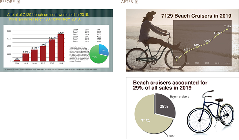
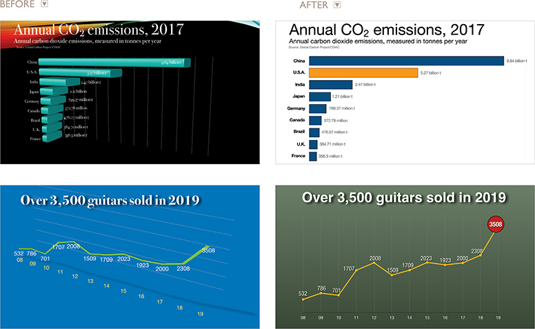
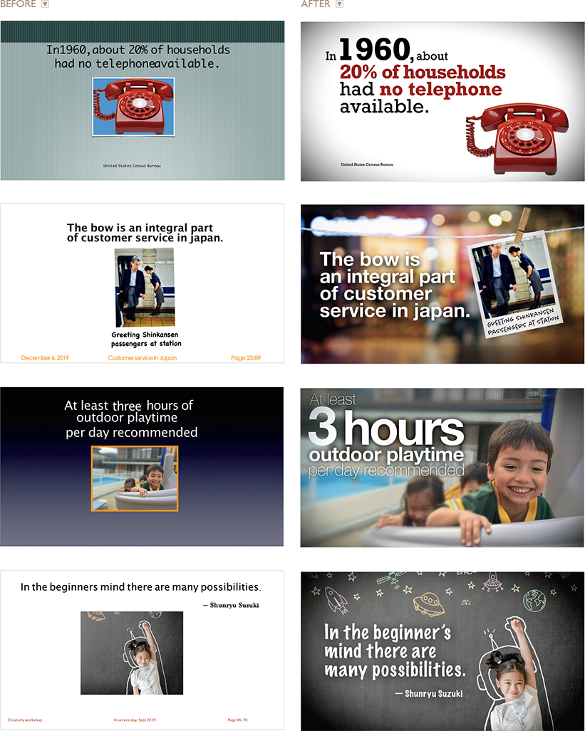
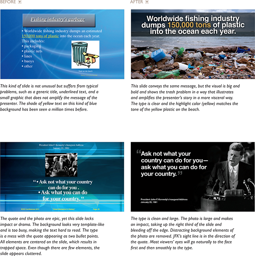
In the next three pages, you can see before/after examples of slide makeovers. Compare the original slides on the left to those with an improved signal-to-noise ratio on the right. To achieve a cleaner design with an improved SNR, I removed nonessential elements and minimized others. Note that in the third and fourth examples (opposite page) I converted the pie charts to bar charts, which make the numerical differences much easier to see. In other examples I change a bar chart to a line chart, which makes trends over time easier to see. In all cases, the general principle was to remove the nonessential and make things cleaner for the viewer.


In the original slide above with the 3D pie chart, it’s cumbersome to use the legend to figure out which color matches which country. I prefer to use a bar chart (right), which is easy to understand at a glance. Because it has only six slices, you could use a 2D pie chart as well, but one without the need of a legend and with clearly legible values, making the chart easier to understand quickly.
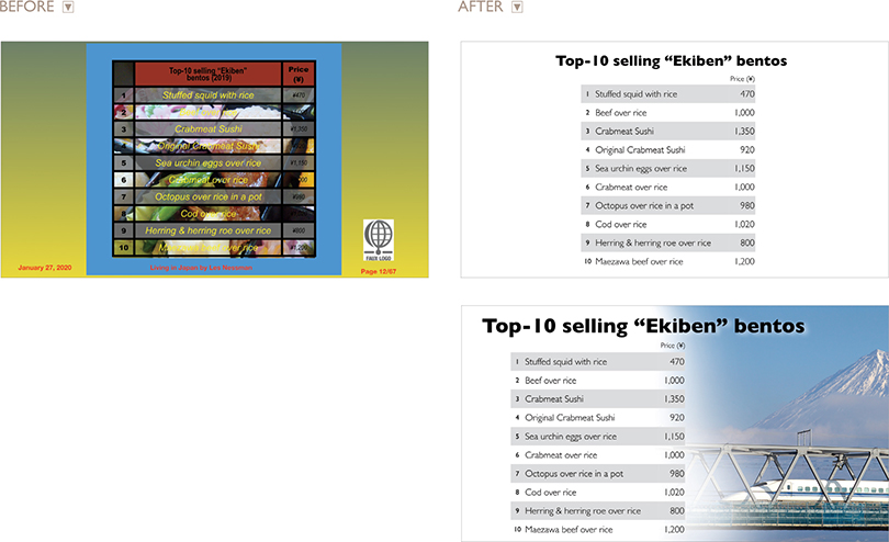
Usually we reserve tables for written documents, but if the table is large enough without too much data, it can be a useful visual. In the original above, the slide has a lot of unnecessary, decorative visual noise, which makes the table hard to read, and it looks cluttered. The first redesign on the right makes the data far easier to read by removing lines and colors and the background image. In the second redesign, the Bullet Train was added to reinforce the context of the subject (bentos sold at train stations) in a way that adds visual interest but does not interfere with the legibility of the table.
Is the Nonessential Always “Noise”?
It is generally true that unnecessary elements decrease a design’s efficiency and increase the possibility of unintended consequences. But does this mean that we must remove everything that is not absolutely essential to a design? Some say a minimalist approach is the most efficient. But efficiency itself is not necessarily an absolute good and not always the ideal approach.
When it comes to the display of quantitative information using charts, tables, graphs, etc., I strongly favor designs that include the highest SNR possible without adornment. I use a lot of photographs in my presentations, so when I do show a chart or a graph, I usually do not place other elements on the slide. There is nothing wrong with placing a bar chart, for example, over a background image (as long as there is proper contrast or salience), but I think the data itself (with a high SNR) can be a very powerful, memorable graphic on its own.
With other visuals, however, you may want to consider including or retaining elements that serve to support the message at a more emotional level. This may seem like a contradiction to the idea that “less is more.” However, emotional elements often do matter—sometimes, they matter a lot. Clarity should be your guiding principle. As with all things, balance is important and the use of emotional elements depends on your particular circumstance, audience, and objectives. In the end, SNR is one principle among many to consider when creating visual messages.
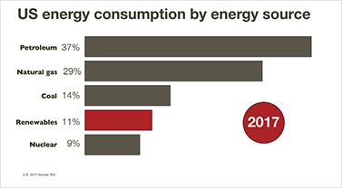
This simple bar chart without an image is easy to understand in an instant. The year and the “Renewables” bar are emphasized.
Consider the same simple data with an image added. The image complements the underlining theme—saving the planet—without getting in the way of the chart. To emphasize the “Renewables” bar, I used a color that matches the light green of the image.
The above style of data slide is not unusual still today, but it is rather noisy. The makeover example (right) displays the information over two slides accompanied by relevant visuals—the actual product and a customer enjoying the product—which add an emotional element to the displays.

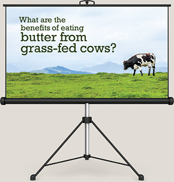
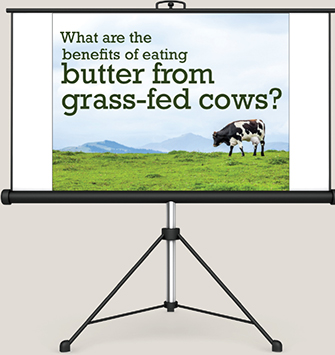
This kind of wordy slide (above) is not unusual, but all that text it is not really helpful for the audience. The pie charts showing the percentage of seniors expected in the labor force in future are difficult to see. So, I removed much of the text and spread the key points over two slides (right). The relevant images contribute a thematic and emotional element, and the figures stand out better as well.
2D or Not 2D? (That Is the Question)
Many design tools in Keynote and PowerPoint are quite useful, but the 3D tool is one I could very well do without. Creating a 3D chart from 2D data does not simplify it. Contrary to what many people hope, creating a 3D chart from 2D data doesn’t add emotion, and it certainly doesn’t simplify the data. When it comes to charts and graphs, you should aim for simple, clean, and 2D (for 2D data). In The Zen of Creativity (Ballantine Books), author John Daido Loori says that the Zen aesthetic “reflects a simplicity that allows our attention to be drawn to that which is essential, stripping away the extra.”
What is essential and what is extra is up to you, but stripping away the extra ink that 3D charts introduce seems like a good place to start. A 3D representation of 2D data increases what Edward Tufte calls the “ratio of ink-to-data.” Although having a choice is nice, 2D charts and graphs are almost always a better solution. Three-dimensional charts appear less accurate and can be difficult to comprehend. In addition, the viewing angle of 3D charts often makes it hard to see where the data points sit on an axis. If you do use 3D charts, avoid extreme perspectives.
The slides on the left are examples of 3D effects that compromise the display of simple data, making the data harder to see. The slides on the right are suggested improvements.
Who Says Your Logo Should Be on Every Slide?
Branding is one of the most overused and misunderstood terms in use today. Many people confuse the myriad elements of brand identity with brand or branding. The meaning of brand and branding goes far deeper than simply making your logo as recognizable as possible. If you are presenting for an organization, try removing its logo from all but the first and last slide. If you want people to learn something and remember you, then make a good, honest presentation. The logo won’t help close a sale or make a point, but it will create clutter and make the presentation visuals look like a commercial. We don’t begin every new sentence in a conversation by restating our names, so why would you bombard people with your company logo on every slide? When I first began working at Apple, the official slide decks we used for customer presentations featured the Apple logo prominently only on the first and last slide, no logos on the other slides.
Slide real estate is limited as it is, so don’t clutter it with logos, trademarks, footers, and so on. Could you create a deck similar to the sample below where your logo is displayed only on the first and last slide?
A Few Points About Bullet Points
The traditional way of doing presentations with slides full of bulleted lists has been going on for so long that it has become part of corporate culture. It is simply “the way things are done.” In Japan, for example, young employees entering a company are taught that when they create presentations with slideware they should put a minimum amount of text in each slide. This sounds like good advice, right? But, a “minimum” means something like six or seven lines of abbreviated text and figures along with several complete sentences. The idea of having one or two words—or (gasp!) no words—would be a sign of someone who did not do their homework. A series of text-filled slides with plenty of charts or tables shows that you are a “serious employee.” Never mind that the audience can’t see the detail in the slides well (or that the executive board does not understand your charts). If it looks complicated, it must be good—but it’s not.
I have a shelf full of presentation books in English and Japanese. All of them say “use a minimum of text.” Most of them define minimum as being anywhere from five to eight lines of bullet points. Presenters often learn the “1-7-7 Rule,” which proves that conventional wisdom is out of sync. Here’s the rub: Nobody can do a good presentation with slide after slide of bullet points. Nobody. Bullet points work well when used sparingly in documents to help readers scan content or summarize key points. But bullet points are usually not effective in a live talk.

How Many Bullet Points Per Slide?
A good general guideline is to use bullet points rarely and only after careful consideration of other options for displaying the information in a way that best supports your message. Do not let the default bulleted lists of the software template dictate your decision. Sometimes bullet points may be the best choice. For example, if you are summarizing key specifications of a new product or reviewing the steps in a process, a clear bulleted or numbered list may be appropriate (depending, as always, on your content, objectives, and audience). People will tire quickly, however, if you show slides of bulleted lists, one after another, so use them with caution. I am not suggesting that you completely abandon the use of bullet points in multimedia presentations, but the usage should be a rare exception.

This is our “before” slide. Imagine we are going to review the key points of the book A Whole New Mind by Dan Pink. Many people may create something like this wordy slide above.

In this “After” example, I added stylistic elements from the theme of ideas and communication and cut most of the type.

Here I redesigned the same content with more impactful, evocative photography.
The same content but this time with the feel of a scrapbook or photo album, which matched the theme of the presentation on the topic of creativity in education.
Picture Superiority Effect
According to the picture superiority effect, pictures are remembered better than words—especially when people are casually exposed to the information and the exposure is for a very limited time. When information recall is measured just after exposure to a series of pictures or a series of words, the recall for pictures and words is about equal. The picture superiority effect, however, applies when the time after exposure is more than 30 seconds, according to research cited in Universal Principles of Design (Rockport Publishers). “Use the picture superiority effect to improve the recognition and recall of key information. Use pictures and words together, and ensure that they reinforce the same information for optimal effect,” say authors Lidwell, Holden, and Butler. The effect is strongest when the pictures represent common, concrete things.
You can see the picture superiority effect used widely in marketing communications, such as posters, billboards, brochures, annual reports, and so on. Keep this effect in mind, too, when designing slides with images and text that support a narrative. Visual imagery is a powerful mnemonic tool that helps learning and increases retention compared to, say, witnessing someone read words off a screen.
Going Visual
Images are a powerful and natural way for humans to communicate. The key word here is natural. We are hardwired for understanding images and using them to communicate. Something inside of us—even from a very young age—seems to yearn to draw, paint, photograph, or otherwise show the ideas in our heads.
In 2005, Alexis Gerard and Bob Goldstein published Going Visual: Using Images to Enhance Productivity, Decision-Making and Profits (Wiley). Gerard and Goldstein urge us to use visuals to tell a story or prove a point. However, the authors do not suggest using imaging technology because it is “cool” or “modern.” Going visual is about using images to improve communication and business. For example, you could write about or talk about how a recent fire impacted production—but wouldn’t it be far more powerful to send pictures with a smaller amount of text (or spoken words) to describe the situation? What would be more memorable? Which would have more impact?

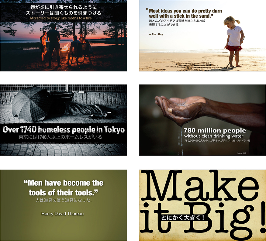
Bullet points can be useful as a summary or for highlighting key points in a document, but for a live presentation, a visual approach is more engaging for the audience. In this case, all of the points in the “before” slide were covered by the presenter, but the slides were redesigned to complement and amplify the narration. Other slides included, for example, a chart showing concretely how big the market is and how fast it’s growing. Whenever you have a slide filled with loads of text, ask yourself if you could amplify your message better with visuals.
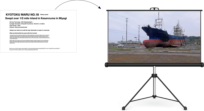
On March 11, 2011, a devastating tsunami hit the northern region of Japan. In Kesennuma, Miyagi prefecture, a large fishing vessel called the “Kyotoku Maru No. 18” was carried over one half mile inland during the tsunami. The vessel remained there for two years serving as a visual representation of just how powerful the tsunami was. After much debate, the vessel was finally scrapped in 2013. Although a text-filled slide like the one above may help the presenter remember what to say, it’s not engaging for the audience nor does it help tell the story of this natural disaster or illustrate the power of the tsunami. The image of the Kyoto Maru No.18 on the screen is actually a still from a video I shot one year after the tsunami. This is a rather obvious example of where a visual of the actual thing being talked about is far better than a lot of type on a screen.

Using images is an efficient way to compare and contrast changes, such as the effects of drought in this simulated example. Presentations on topics such as the environment and climate change often make good use of images to show great change over time. Al Gore used many then-and-now visual comparisons in his presentations and in the movie An Inconvenient Truth to show physical changes over time.
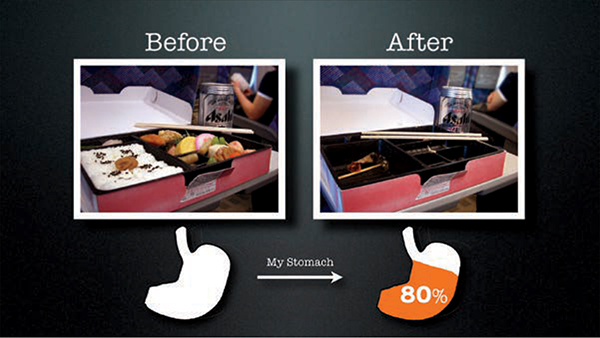
This tongue-in-cheek example shows the actual bento mentioned in Chapter 1 as the genesis for this book. Before-and-after and then-and-now visual comparisons are easy to create and easy to remember.
Ask yourself this: What information are you representing with the written word on a slide that you could replace with a photograph (or other appropriate image or graphic)? You still need text for labeling and other things. But if you are using text on a slide for describing something, you probably could use an image more effectively.
Images are powerful, efficient, and direct. Images can also be used very effectively as mnemonic devices to make messages more memorable. If people cannot listen and read at the same time, why do most presentation slides contain far more words than images? One reason, historically, is that businesspeople have been limited by technology. Visual communication and technology go hand in hand. Today, however, most people do have the basic tools available—for example, digital cameras and editing software—for easy-to-place, high-quality images in presentations.
No more excuses. It just takes a different way of looking at presentations. It takes the realization that modern presentations with slides and other multimedia have more in common with cinema (images and narration) and comics (images and text) than they do with written documents. Today’s presentations increasingly share more in common with a documentary film than an overhead transparency.
On the following pages you will see a few slides that demonstrate different visual treatments in support of a single message. The context is a presentation on gender and labor issues in Japan. The purpose of the slides was to support visually the claim that “70% of part-time workers in Japan are women.” This statistic is from the Japanese Ministry of Labor. The presenter wanted the audience members to remember the 70% figure as it was discussed again in the presentation. So in the end, we designed a subtle, simple, memorable slide that fit into an appealing and attractive theme.
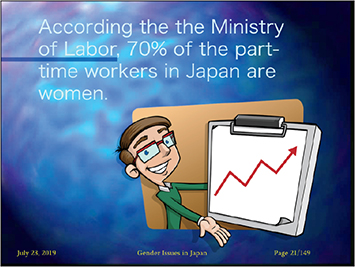
The original slide showcases various problems: the clip art does not reinforce the simple statistic, nor does it fit the theme of women in the Japanese labor market; the background is a tired, overused PowerPoint template; and the text is difficult to read.
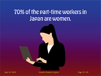
Although the text on this slide is easy to read and the clip art is a bit more appropriate to the subject, it still does not give the slide a strong visual impact or a professional look and feel.
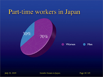
This slide displays the same information in a typical pie chart. The chart’s 3D effects, however, do not improve the impact or readability of the information.
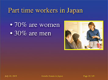
In this case, the two bullet points are easy to read in an instant. The photo of an actual female part-time worker in Japan is a step in the right direction, but it could still be much better.

The four slides above are different treatments of the same message communicated in the slides on the previous page. Any of these slides would nicely complement the presenter’s narration. The word “Japan” is removed from the slide as it is obvious in the context of the live talk. The slides above are much more cinematic and aesthetically pleasing compared to the clunky slides that we started with.

The final slide design used in the presentation is shown on the left. The remaining slides in the deck were then redesigned using Japanese stock images to give the entire presentation a consistent visual theme that supported the presenter’s words.
Make It Big, Fill the Screen
Presenters often use images that are too small, making it hard for audiences to see the content, thereby reducing the impact of the photo. Our slides for live talks are more like road signs or billboards in the sense that they (1) must get the attention of the viewer, (2) the content must be highly visual and easy to understand as quickly as possible, and (3) the visual information in the slide should help make our messages memorable. Therefore, I suggest you consider designing cinematic slides containing large, easy-to-see elements, including large type. One way to achieve cinematic slides is to have your images fill the screen. A full-screen image gives the illusion that the slide is bigger than it is. Like a movie screen, your presentation screen too is like a window into another space. If you keep the elements small and stay always within the frame, your window will seem smaller and less compelling.
Another effective technique is to use visual elements that bleed off the screen out of frame. Our brains will naturally fill in gaps, or complete shapes that are partially out of frame. For example, if you had an image of Earth that was only partially on screen with most of the image bleeding off the screen, your viewer subconsciously fills in the missing bits of the image. This makes the image more compelling and it draws the viewer in.

This image of the Earth bleeds off the edge but your brain completes the image thereby making the slide feel larger as if it is a window in to another place. Slide images on this page from iStockphoto.com.

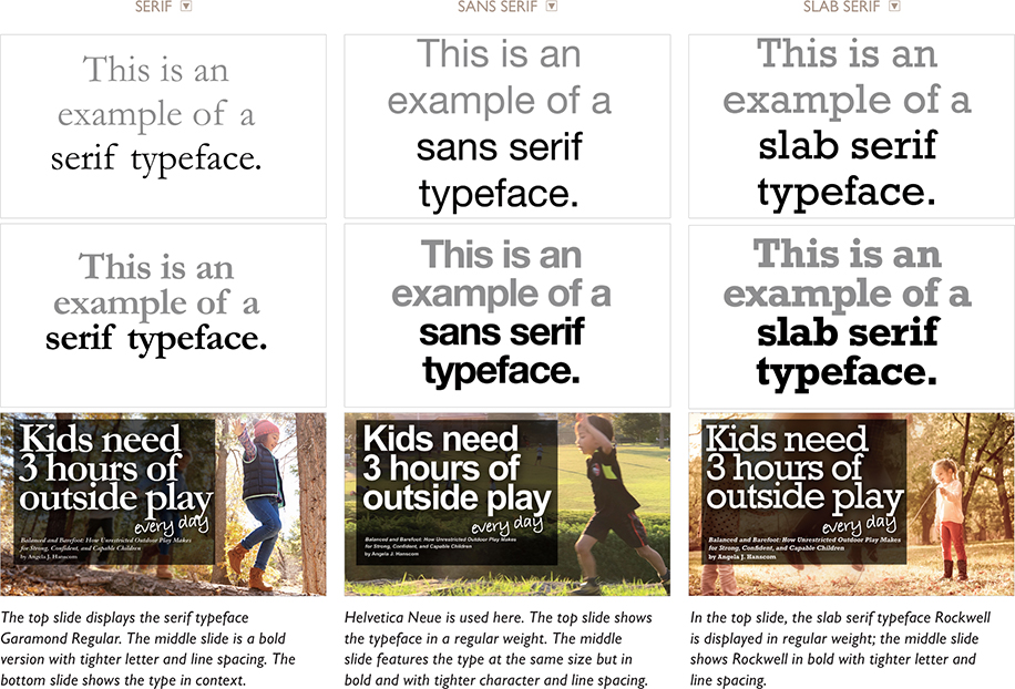
Type: Serif, Sans Serif, and Slab Serif
One of the fundamental ways of differentiating typefaces is the presence or absence of serifs in the letters and other characters. Serifs are the small lines or strokes on the ends of the main strokes that make up letters and symbols. Sans means “without,” so a sans serif typeface is one without those small strokes. Sans serif is often the preferred typeface style for billboards and a great deal of the signage we see around us. Similarly, sans serif typefaces are best for projected slides, although this is a big generalization. For instance, a slab serif typeface, such as Rockwell which has heavy block-like serifs, can make for an excellent typeface for slides, and at larger sizes, even Garamond and similar serif typefaces can be legible. The main point to remember is that you should create type that is large enough to easily understand/grasp/decipher in an instant.
When you increase the size of the type in your slide, the space between letters can seem too great, but you can use your slide software to decrease the character spacing, to make the type a bit tighter. The space between lines of type can seem too great as well at large sizes, but again, this is easily corrected in the formatting features of your software. Below are a few examples of serif, sans serif, and slab serif typefaces.


None of the slides on this page—or in this entire book—are meant to necessarily stand alone as they would in a document. In the case of the slide above, the bowl of rice gets your attention first as it is the largest and most visual thing on the screen, but you quickly understand the key message represented in type.

In this case, the image is presented as a framed photograph that is placed over the right third of the slide. The type comfortably fills the left two thirds while keeping plenty of empty space. The colors for the typography and background for the entire presentation were taken directly from the contents of the photograph of the salmon meal. This serves to give the deck a subtle, harmonious feel.

This is a simple, clean layout—just black Helvetica type on a white background. The image reinforces the message and is an example of an analog tool. To get the image of my notebook, I placed it on top of a large piece of white paper near a window to get a good light source.
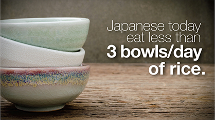
Because the bowls continue out of frame, the screen feels larger than it is and the imagery brings the viewer in to the design. The bowls reinforce the key message, and the composition of the photo leaves plenty of empty space for large-sized, easy-to-see type.

The color theme continues on this slide and the entire slide deck from which these two samples were taken. Here salmon is presented in a different way, as sushi. Note how the chopsticks go out of frame. This is not noticed consciously by the audience, but allowing images to extend out of frame makes the design more dynamic and compelling.

Your eye may notice the columns first, but then go quickly to the type. The type is simple and large and there is plenty of empty space to let the type breathe. The color of the quotation marks was pulled from the image of the columns to anchor the type to the image.
Quote This
Although long bullet points are not very effective visually, displaying quotations in slides can be a very powerful technique. Depending on the presentation, I often use quite a few quotes from various fields to support my points. The tricks are not to use them too much and to make sure they are short and legible.
When I first saw Tom Peters give a live presentation a few years ago while I was working in Silicon Valley, I was happy to see that he used a good selection of quotes from various experts, authors, and industry leaders. Using quotes in his presentation visuals is a big deal for Tom. In fact, it is listed as No. 18 in his “Presentation Excellence 56” article on his website: tompeters.com/2005/05/presentation-excellence-2/.
To explain why he uses so many quotes, Tom says:
“My conclusions are much more credible when I back them up with Great Sources. I say pretty radical stuff. I say ‘Get radical!’ That’s one thing. But then I show a quote from Jack Welch, who, after all, ran a $150 billion company (I didn’t): ‘You can’t behave in a calm, rational manner; you’ve got to be out there on the lunatic fringe.’ Suddenly my radicalism is ‘certified’ by a ‘real operator.’ Also, I find that people like to get beyond the spoken word, and see a SIMPLE reminder of what I’m saying.”
Quotes can indeed add credibility to your story. Weave a simple quote into your narrative to support your point, or as a springboard from which you can launch your next topic. Remember, quotes should be short, in most cases, because it can become quite tedious to have a presenter read a paragraph from a screen.
Text Within Images
I almost always use quotes that are straight out of material I have read or from personal interviews. My books, for example, are filled with sticky notes and pages full of my comments and highlighter marks. I sketch a star and write a note to myself next to great passages for future reference. It’s kind of messy, but it works for me when I put presentations together.
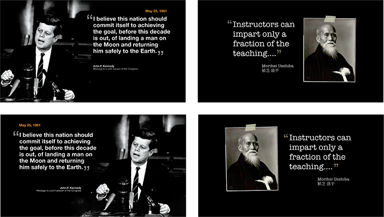
When I use a quote, I sometimes add a graphic element that targets people’s emotions, creates more visual interest, and enhances the effect of the slide. But rather than using a small photo or other element, consider placing the text within a larger photo. To do this, you will want to use an image at least as large as your slide dimensions for your background. Look for an image that supports the point you are making with the quotation. The image should have plenty of empty space so the text fits comfortably with good contrast.

This page shows two slides that display a quotation in a typical manner. On the opposite page, you’ll see the same quote displayed within the image rather than simply next to a smaller version of the image. Notice the difference in the visual impact of both the quote and image.


A white background is placed behind the text as if it were a piece of paper. This helps the text pop out from the background, making it easier to read and giving it a more analog texture.
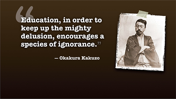
Here, a photo of the person being quoted helps enliven the text. Note that Kakuzo-san is gazing toward the quote.

This quote is presented over two slides. The text on the second slide is rather long, but the key phrase is highlighted in red. You do not want to use too many visuals with long quotes like this. However, if you introduce them only occasionally, and you do not rush through the quote, longer quotes can be useful for providing context. Note that the type is large enough to be seen from the back of the room. Most people may not read the text onscreen—they may just listen to you. Nonetheless, type that is too small to read is maddening to audience members.
Creating Bilingual Visuals
Combining languages on a slide can be effective—as long as the text is in different sizes. One language needs to be visually subordinate to the other. When I present in Japanese, the Japanese text is larger than the English text (but in a way that creates a harmonious fit). If my talk is in English, the English text is larger. When text from both languages is the same size, it creates visual discord as the type elements compete with each other for attention. The technique of placing text from one language in a clearly dominant position is commonly used in signage for public transportation and in advertising. On general principle, we need to keep text to a minimum in visuals; when creating bilingual slides, we have to be extra careful with limiting the text. Samples from my own presentations appear on the opposite page.
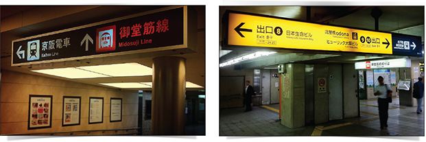
The technique of placing text from one language in a clearly dominant position is commonly used in signage for public transportation and in advertising.
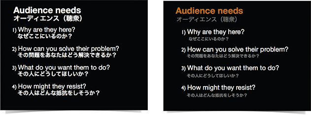
In the first example (left), all the text is very close to the same size and color. In the second example, the Japanese text is subordinate. Which is easier to scan in an instant?
Emptiness, which is conceptually liable to be mistaken for sheer nothingness, is in fact the reservoir of infinite possibilities.
—Daisetz T. Suzuki
Empty Space
Empty space, also called negative space or white space, is a concept that is supremely simple, yet the most difficult for people to apply. Whether designing a document or slide, the urge to fill empty areas with more elements is just too great. One of the biggest mistakes typical businesspeople make with presentation slides (and documents) is going out of their way to seemingly use every centimeter of space, filling it with text, boxes, clip art, charts, footers, and the ubiquitous company logo.
Empty space implies elegance and clarity. This is true with graphic design, but you can see the importance of space (both visual and physical) in the context of, say, interior design as well. High-end brand shops are always designed to create as much open space as possible. Empty space can convey a feeling of high quality, sophistication, and importance.
Empty space has a purpose. But those new to design may see only the positive elements, such as text or a graphic, without ever “seeing” the empty space and using that space to make the design more compelling. It is the empty space that gives a design air and lets the positive elements breathe.
If it was true that empty space in a design is “wasted space,” then it would make sense to remove such waste. However, empty space in a design is not “nothing.” It is, indeed, a powerful “something” that gives the few elements on your slide their power.
In the Zen arts, you will find an appreciation for empty space. A painting, for example, may be mostly “empty” except for two to three elements, but the placement of the elements within that space forms a powerful message. You can apply the same approach to a room. Many Japanese homes have a washitsu, a traditional room with tatami mats, that is simple and mostly empty. The empty space allows for the appreciation of a single item, such as a single flower or a single wall hanging. The emptiness is a powerful design element itself. In this case, the more we add, the more diluted and less effective the design of a graphic, slide, document, or living space, becomes.
Using Empty Space
The blue slide at top right is very typical, with several bullet points and an image related to the topic. Rather than making good use of empty space, the blue slide has trapped space in areas around the image. Instead of using one busy slide, I broke the flow of the content into six slides for the introduction of the Hara hachi bu concept. Because it is not necessary to put all the words spoken by the presenter on the slides, much of the onscreen text was removed. The slides have a clean white background with plenty of active empty space that helps guide viewers’ eyes. When a new slide is revealed, the eyes are naturally drawn to the image first (it’s larger, colorful) and then quickly go to the text element.

The Power of Faces to Get Attention and Guide Viewers’ Eyes

Photo courtesy of NASA.
We are amazingly good at seeing faces. We are so good at spotting faces that we even see them where they do not exist. In fact, said Carl Sagan, “As an inadvertent side effect, the pattern-recognition machinery in our brains is so efficient in extracting a face from a clutter of other detail that we sometimes see faces where there are none.” This explains why people see an image of Mother Teresa in a cheese sandwich or a face on Mars. Faces—and things approximating images of faces—get our attention. Graphic designers and marketers know this very well, which is why you so often see faces in various forms of marketing communication.
We are naturally drawn to look in the direction that other people are looking. I noticed that even my baby daughter looks where I look; this tendency starts at an early age.
Using images of faces—even nonhuman faces—can be effective for getting viewers’ attention. This is especially true in such mediums as posters, magazines, and billboards, but this concept can be applied to multimedia and large screen displays as well. Because faces are so effective at getting attention, they must be used with discretion. One important consideration is the issue of eye gaze and leading the eye of the viewer. For example, the two images below are from a study by James Breeze at usableworld.com.au, which used eye-tracking software to determine if the direction the baby looked onscreen influenced the eye gaze of the readers. Not surprisingly, the text on the right got more attention from the eyes when the baby’s eye gaze was in that direction.
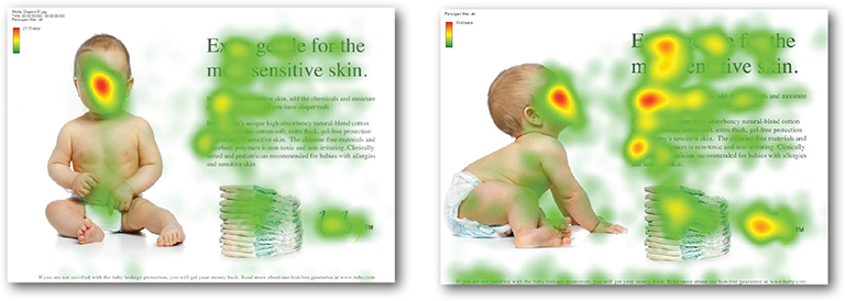
An eye-tracking study by James Breeze shows the influence of eye gaze in guiding the viewer’s eye on the page. Eye gaze in presentation visuals may have similar influences on the viewers’ attention.
Whether you use images of people or animals in your visuals is up to you; each context and topic is different. Either way, however, be mindful of the power that images of faces have for getting attention and try to use eye gaze to help guide the viewer’s eye.

If you use images of people, make sure they do not unintentionally guide viewers away from what you want them to see. If a text element or chart is the highest priority, it is important to not have images of people looking in the opposite direction from those elements. How do the images in the slides shown here guide your eyes toward or away from the other elements? Although either slide in each pair may be acceptable, notice how the slides on the bottom row lead your eye to the text or chart.

The upper-left side of a slide is often where our eyes are naturally attracted. But a figure such as a person (or animal) may get our attention first. In the examples above, if viewers do notice the subjects in the full-screen images first, their gazes will naturally go to the type as the subjects are looking or walking in the direction of the type in the frame.
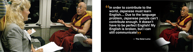
The slide on the left features an image of Judit Kawaguchi, a writer and TV reporter based in Japan, interviewing the Dalai Lama on the Bullet Train in Japan. The quote displayed in the second slide is from that actual interview on the train. The first slide shows the context, then the second slide fades in (dissolve transition), which results in Judit fading out and being replaced by the text. With this effect, the right third of the slide (the Dalai Lama) never appears to change.
Balance
Balance is important in a design, and one way to achieve good balance and clarity is through the intelligent use of empty space. A well-balanced design has a clear, single, unified message. A well-designed slide has a clear starting point and guides the viewer through the design. The viewer should never have to “think” about where to look. A visual must never confuse anyone. The most important, less important, and least important parts of the design need to be clearly expressed with an obvious hierarchy and a good balance of display elements.
Balanced does not mean rigidly symmetrical, however. Through your careful placement of positive elements, empty space can be dynamic and active, balancing your composition in unexpected ways. The conscious use of empty space can even bring motion to your design. In this way, the empty space is not passive but active. If you want to bring a more dynamic feel and interest to your slide design, consider using an asymmetrical design. Asymmetrical designs activate empty space and make designs more interesting; they are more informal and dynamic, with a variety of sizes and shapes.
Symmetrical designs feature a strong emphasis along a central vertical axis. Symmetrical balance is vertically centered and equivalent on both sides. Symmetrical designs are more static than asymmetrical designs and evoke feelings of formality or stability. There is nothing wrong with centered, symmetrical designs, although empty space in such designs is generally passive and pushed to the side.
Design is about seeing and manipulating shapes, but if we do not see the empty space in a slide as a shape, then it will be ignored and any use of empty space will be accidental. Consequently, the results will not be as powerful. Good presentations incorporate a series of presentation visuals that have a mix of slides that are symmetrical and asymmetrical.
Sumi-e is the traditional art of Japanese brush painting and it provides a good lesson for achieving balance in a design. Notan is a Japanese concept that refers to the use of light and dark aspects of a design to achieve a balanced and harmonious visual. Whether you use many colors or just shades of gray in your design work, the creation of light and dark elements, and the use of empty space, is fundamental to achieving asymmetrical balance.

Sumi-e painting by Kathleen Scott, Kansai Gaidai University, Osaka, Japan.
Grids and the Rule of Thirds
For centuries, artists and designers have introduced a proportion called the “golden mean” or “golden ratio” found in nature into their works. This ratio is 1:1.618, and a rectangle whose sides are in this proportion is called a “golden rectangle.” There is a belief that we are naturally drawn to images that have proportions approaching the golden rectangle, just as we are often drawn to things in the natural environment with golden-mean proportions. However, designing visuals according to golden-mean proportions is impractical in most cases. But, the rule of thirds, which is derived from the golden mean, is a basic design technique that can help you add balance (symmetrical or asymmetrical), beauty, and a higher aesthetic quality to your visuals.
The rule of thirds is a basic technique that photographers learn for framing their shots. Subjects placed exactly in the middle of a composition can often make for an uninteresting photo. A viewfinder can be divided by lines—real or just imagined—so that you have four intersecting lines or crossing points and nine boxes that resemble a tic-tac-toe board. These four crossing points (also called “power points,” if you can believe it) are areas you might place your main subject for a more interesting photo than a boring, subject-in-the-exact-middle shot.
Remember, there is no liberty in absolute freedom when it comes to design. You need to limit your choices so that you do not waste time adjusting every single design element to a new position. I recommend that you create some sort of clean, simple grid to build your visuals upon. Although you may not be aware of it, virtually every Web page and every page in a book or magazine is built atop a grid. Grids can save you time and ensure that your design elements fit more harmoniously on the display. Using grids to divide your slide canvas into thirds, for example, is an easy way at least to approach golden-mean proportions. In addition, you can use the grids to align elements and give the overall design balance, a clear flow and point of focus, and a natural overall cohesiveness and aesthetic quality that is not accidental but is by design.
The following three pages feature several slides from various presentations that achieved an asymmetrical yet balanced layout. First, let’s look at some before/after slides that illustrate the difference between a symmetrical layout and a more asymmetrical but balanced, dynamic, cinematic layout.


The image on the left is not a slide—it’s a picture of Hokusai Katsushika’s (1760–1849) “Red Fuji” from the ukiyo-e series called Thirty-six Views of Mount Fuji. I placed a nine-panel grid over the print to show how the rule of thirds can be seen in the composition. Remember, however, that the rule of thirds is not a rule at all, it’s only a guideline. But it is a very useful guideline when you are aiming to achieve a balanced yet asymmetrical look.
Below are a few examples of presentation visuals designed by using a nine-panel grid or by just keeping the rule of thirds in mind while placing and cropping the photos and arranging elements on the slide.
Create your own visual style. Let it be unique for yourself and yet identifiable for others.
—Orson Welles
Fundamentals: Contrast, Repetition, Alignment, Proximity
These four principles—contrast, repetition, alignment, and proximity—are not all there is to know about graphic design. But, understanding these simple, related concepts and applying them to slide design can make for far more satisfying and effective designs.
Contrast
Contrast simply means difference. And for whatever reason, we are all wired to notice differences—perhaps our brains think they are still back in the savannah scanning for wild predators. We are not conscious of it, but we are scanning and looking for similarities and differences all the time. Contrast is what we notice, and it’s what gives a design its energy. So you should make elements that are not the same clearly different, not just slightly different.
Contrast is one of the most powerful design concepts because, really, any design element can be contrasted with another. You can achieve contrast in many ways—for example, through the manipulation of space (near and far, empty and filled), through color choices (dark and light, cool and warm), by typeface selection (serif and sans serif, bold and narrow), by the positioning of elements (top and bottom, isolated and grouped), and so on.
Making use of contrast can help you create a design in which one item is clearly dominant. This helps the viewer “get” the point of your design quickly. Every good design has a strong focal point and equally strong contrast among elements, with one element being clearly dominant. If all items in a design are of equal or similar weight with weak contrast and nothing clearly dominant, it is difficult for the viewer to know where to look. Designs with strong contrast attract interest and help the viewer make sense of the visual. Weak contrast is not only boring, but it can be confusing.
Every single element of a design—such as line, shape, color, texture, size, space, and type—can be manipulated to create contrast. The next page compares slides that make good use of contrast to slides with weaker contrast.

In the screen above, we see six images of the same subject, but our eyes can not help but notice the image of the figure second from the left. The subject is different in terms of kind and color of clothing, his attitude, and his…posture. On the righthand page, you can see before/after examples of slides that went from weak contrast to better contrast.

Repetition
The principle of repetition simply means the reuse of the same or similar elements throughout a design. Repetition of certain design elements in a slide or among a deck of slides will bring a clear sense of unity, consistency, and cohesiveness. Where contrast is about showing differences, repetition is about subtly using elements to make sure a design is viewed as part of a larger whole. If you use a stock template from your software application, then repetition is already built into your slides. For example, a consistent background, as well as consistent use of typography and colors adds unity across a deck of slides.

Above are two sample templates from shutterstock.com which illustrate how repeated visual elements are used across a slide deck to achieve a unified look and feel. Note the consistent use of colors, shapes, type, photography, and charts across the deck. Online resources that offer a good, high-quality array of presentation templates include Canva (www.canva.com) and Creative Market (www.creativemarket.com).
Alignment
The whole point of the alignment principle is that nothing in your slide design should look like random placement. Every element is connected visually via an invisible line. Where repetition is more concerned with elements across a deck of slides, alignment is about obtaining unity among elements of a single slide. Even elements that are quite far apart on a slide should have a visual connection, something that is easier to achieve with the use of grids. When you place elements on a slide, try to align them with an existing element.
Many people fail to apply the alignment principle, which often results in elements being almost—but not quite—aligned. This may not seem like a big deal, but these kinds of slides look less sophisticated and less professional overall. The audience may not be conscious of it, but slides that contain elements in alignment look cleaner. And, assuming other principles are applied harmoniously as well, slides with aligned elements should be easier to understand quickly.
Proximity
The principle of proximity is about moving things closer or farther apart to achieve a more organized look. The principle says that related items should be grouped together so they will be viewed as a group, rather than as several unrelated elements. Viewers will assume that items that are not near each other are not closely related. They will naturally tend to group similar items that are close to each other into a single unit.
Audience members should never have to struggle trying to figure out which caption goes with which graphic or whether a line of text is a subtitle or a line of unrelated text. Do not make audiences think. That is, do not make them “think” about the wrong stuff, like trying to decipher your slide’s organization and design priority. A slide is not a page in a book or magazine, so you are not going to have more than a few elements or groups of elements. In her best-selling book The Non-Designer’s Design Book (Peachpit Press), Robin Williams says that we must be conscious of where our eyes go first when we step back and look at our designs. When you look at your slide, notice where your eye is drawn first, second, and so on. What path does your eye take?
This title slide lacks a design priority. Due to the poor use of contrast, alignment, and proximity, the slide seems to contain five different elements.

This slide uses symmetrical balance and better proximity, with related items now clearly together. Greater contrast is achieved by adjusting the type size and color to give the design a clear priority.

These two slides show how aligning all elements flush right creates a strong invisible line that ties all the elements together in a way that is more interesting than the more common symmetrical title. The type and color are also adjusted to create greater contrast and interest. The red dot in the title ties in with the red logo at the bottom.


The slides on the left were redesigned to be simpler, and more visual in order to amplify the message of the presenter.
The more strikingly visual your presentation is, the more people will remember it. And more importantly, they will remember you.
—Paul Arden
In Sum
Design matters. But, design is not about decoration or ornamentation. Design is about making communication as easy and clear for the viewer as possible.
Keep the principle of signal-to-noise ratio in mind to remove all nonessential elements. Remove visual clutter. Avoid 3D effects.
People remember visuals better than bullet points. Always ask yourself how you can use a strong visual element—including quantitative displays—to enhance your narrative.
Empty space is not nothing; it is a powerful something. Learn to see and manipulate empty space to give your slide designs greater organization, clarity, and interest.
Use high-quality photos that make an impact and are easily seen and understood. Consider using full-bleed images and layer type elements on top in the simplest, most balanced arrangement possible.
Use the principle of contrast to create strong dynamic differences among elements that are different. If an element is different, make it very different.
Use the principle of repetition to give your slides unity and organization by making sure certain elements recur throughout your slides.
Use the principle of alignment to visually connect elements on a slide. Invisible gridlines are very useful for achieving good alignment. Using a grid gives your slides a clean, well-organized look.
Use the principle of proximity to ensure that related items are grouped together. People tend to interpret items together or near to each other as belonging to the same group.