
7 Typographic Design
Lesson overview
In this lesson, you’ll learn how to do the following:
Use guides to position text in a composition.
Make a clipping mask from type.
Merge type with other layers.
Preview fonts.
Format text.
Distribute text along a path.
Control type and positioning using advanced features.

This lesson will take less than an hour to complete. To get the lesson files used in this chapter, download them from the web page for this book at www.adobepress.com/PhotoshopCIB2020. For more information, see “Accessing the lesson files and Web Edition” in the Getting Started section at the beginning of this book.
As you work on this lesson, you’ll preserve the start files. If you need to restore the start files, download them from your Account page.

PROJECT: MAGAZINE COVER LAYOUT
Photography © Andrew Faulkner
Photoshop provides powerful, flexible text tools so you can add type to your images with great control and creativity.
About type
Type in Photoshop consists of vector-based shapes that describe the letters, numbers, and symbols of a typeface. Many typefaces are available in more than one format, the most common formats being TrueType and OpenType (see “OpenType in Photoshop” later in this lesson). Type 1 or PostScript fonts are older font formats that are still in use.
When you add type to a document in Photoshop, the characters are composed of pixels and have the same resolution as the image file—zooming in on characters shows jagged edges. However, Photoshop preserves the vector-based type outlines and uses them when you scale or resize type, save a PDF or EPS file, or print the image to a PostScript printer. As a result, you can produce type with crisp, resolution-independent edges, apply effects and styles to type, and transform its shape and size.
Getting started
In this lesson, you’ll work on the layout for the cover of a technology magazine. You’ll start with the artwork you created in Lesson 6: The cover has a model, her shadow, and the orange background. You’ll add and stylize type for the cover, including warping the text.
![]() Note
Note
Though this lesson starts where Lesson 6 left off, use the 07Start.psd file. We’ve included a path and a sticky note in the start file that won’t be in the 06Working.psd file you saved.
You’ll start the lesson by viewing an image of the final composition.
Start Photoshop, and then immediately hold down Ctrl+Alt+Shift (Windows) or Command+Option+Shift (Mac) to restore the default preferences. (See “Restoring Default Preferences” on page 5.)
When prompted, click Yes to delete the Adobe Photoshop Settings file.
![]() Note
Note
If Bridge is not installed, you’ll be prompted to download and install it. See page 3 for more information.
Choose File > Browse In Bridge to open Adobe Bridge.
In the Favorites panel on the left side of Bridge, click the Lessons folder, and then double-click the Lesson07 folder in the Content panel.
Select the 07End.psd file. Increase the thumbnail size to see the image clearly by dragging the thumbnail slider to the right.
![]() Note
Note
If Photoshop displays a dialog box telling you about the difference between saving to Cloud Documents and Your Computer, click Your Computer. You can also select Don’t Show Again, but that setting will deselect after you reset Photoshop preferences.
You’ll apply the type treatment in Photoshop to finish the magazine cover. All of the type controls you need are available in Photoshop, so you don’t have to switch to another application to complete the project.
Double-click the 07Start.psd file to open it in Photoshop.
Choose File > Save As, rename the file 07Working.psd, and click Save.
Click OK in the Photoshop Format Options dialog box.
Choose Graphic and Web from the Workspace Switcher in the options bar.
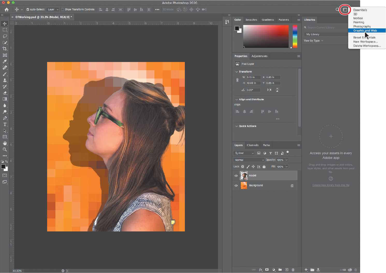
The Graphic and Web workspace displays the Character and Paragraph panels that you’ll use in this lesson, along with the Glyphs and Layers panels.
Creating a clipping mask from type
A clipping mask is an object or a group of objects whose shape masks other artwork so that only areas within the clipping mask are visible. In effect, you are clipping the artwork to conform to the shape of the object (or mask). In Photoshop, you can create a clipping mask from shapes or letters. In this exercise, you’ll use letters as a clipping mask to allow an image in another layer to show through.
Adding guides to position type
The 07Working.psd file includes a background layer, which will be the foundation for your typography. You’ll start by zooming in on the work area and using ruler guides to help position the type.
Choose View > Fit On Screen to see the whole cover clearly.
Choose View > Rulers to display rulers along the left and top borders of the image window.
If the rulers aren’t displaying in inches, right-click (Windows) or Control-click (macOS) the rulers, and choose Inches.
![]() Tip
Tip
If you find it difficult to position the vertical ruler guide exactly at 4.25", holding down Shift will snap the guide to the 4.25" ruler tick mark.
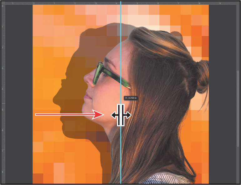
Drag a vertical guide from the left ruler to the center of the cover (4.25").
Adding point type
Now you’re ready to add type to the composition. You can create horizontal or vertical type anywhere in an image. You can enter point type (a single letter, word, or line) or paragraph type. You will do both in this lesson. First, you’ll create point type.
In the Layers panel, select the Background layer.
Select the Horizontal Type tool (
 ), and, in the options bar, do the following:
Choose a serif typeface, such as Minion Pro Regular, from the Font Family pop-up menu.
Type 144 pt for the Size, and press Enter or Return.
Click the Center Text button.
In the Character panel, change the Tracking value to 100.

The Tracking value specifies the overall space between letters, which affects the density in a line of text.
Position the pointer over the center guide you added to set an insertion point, roughly where the guide crosses the edge of the model’s forehead, click, and then type DIGITAL in all capital letters. Then click the Commit Any Current Edits button (
 ) in the options bar.
![]() Note
Note
After you type, you must commit your editing in the layer by clicking the Commit Any Current Edits button, switching to another tool or layer, or clicking away from the text layer. You cannot commit to current edits by pressing Enter or Return; doing so merely creates a new line of type.
The word “DIGITAL” is added to the cover, and it appears in the Layers panel as a new type layer named DIGITAL. You can edit and manage the type layer as you would any other layer. You can add or change the text, change the orientation of the type, apply anti-aliasing, apply layer styles and transformations, and create masks. You can move, restack, and copy a type layer, or edit its layer options, just as you would for any other layer.
The text is big enough, but not modern enough, for this magazine’s style. You’ll apply a different font.
Double-click the “DIGITAL” text.
![]() Tip
Tip
When a type layer is selected in the Layers panel, the Properties panel displays type settings—another place you can change type options such as the font.
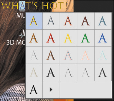
Open the Font Family pop-up menu in the options bar. Move the cursor over the fonts, either with the mouse or using arrow keys.
When the cursor is over a font name, Photoshop temporarily applies that font to the selected text so you can preview the font in context.
Select Myriad Pro Semibold, and then click the Commit Any Current Edits button (
) in the options bar.
That’s much more appropriate.
Select the Move tool, and drag the “DIGITAL” text to move it to the top of the cover, if it’s not there already.
Choose File > Save to save your work so far.
Making a clipping mask and applying a shadow
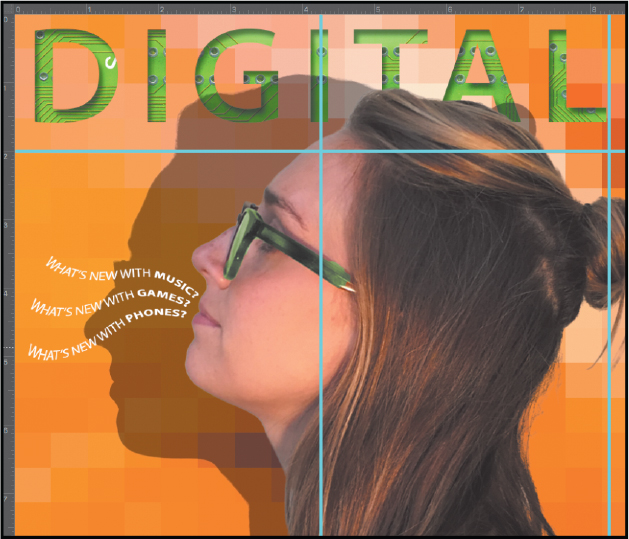
You added the letters in black, the default text color. However, you want the letters to appear to be filled with an image of a circuit board, so you’ll use the letters to make a clipping mask that will allow another image layer to show through.
Choose File > Open, and open the circuit_board.tif file, which is in the Lesson07 folder.
Choose Window > Arrange > 2-Up Vertical. The circuit_board.tif and 07Working.psd files appear onscreen together. Click the circuit_board.tif file to ensure that it’s the active window.
With the Move tool selected, hold down the Shift key as you drag the Background layer from the Layers panel in the circuit_board.tif file onto the center of the 07Working.psd file.
Pressing Shift as you drag centers the circuit_board.tif image in the composition.

A new layer—Layer 1—appears in the Layers panel for the 07Working.psd file. This new layer contains the image of the circuit board, which will show through the type. But before you make the clipping mask, you’ll resize the circuit board image, as it’s currently too large for the composition.
Close the circuit_board.tif file without saving any changes to it.
In the 07Working.psd file, select Layer 1, and then choose Edit > Transform > Scale.
Hold down Alt (Windows) or Option (Mac) as you drag a corner handle on the bounding box for the circuit board, and resize it to approximately the same width as the area of text.
Pressing Alt or Option keeps it centered.
![]() Note
Note
If you click away from a layer and its bounding box doesn’t deselect, move the pointer away from the bounding box until the rotation pointer becomes an arrow, and then click in the document window.
Reposition the circuit board so that the image covers the text, and commit the transformation by clicking away from the circuit board layer.

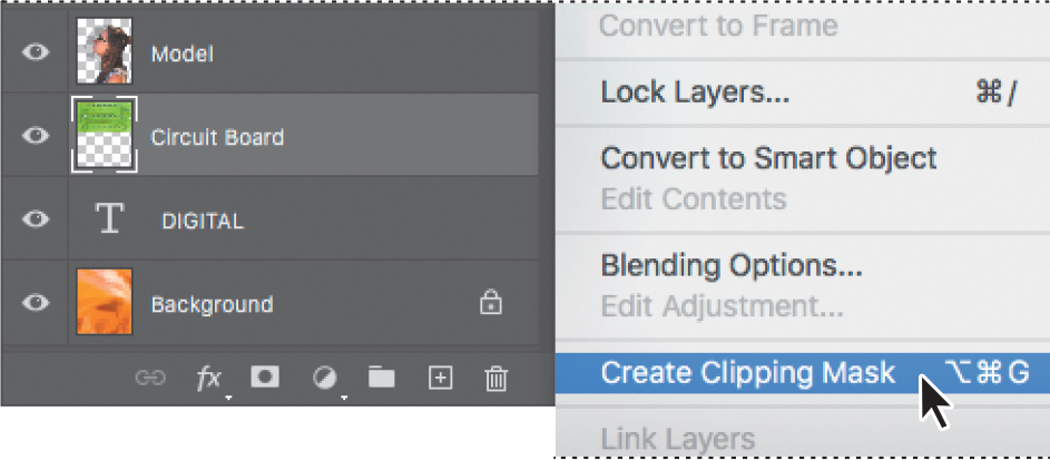
Double-click the Layer 1 name, and change it to Circuit Board. Then press Enter or Return, or click away from the name in the Layers panel, to apply the change.

![]() Tip
Tip
You can also create a clipping mask by holding down the Alt (Windows) or Option (Mac) key and clicking between the Circuit Board and DIGITAL type layers. Or, choose Layer > Create Clipping Mask when the Circuit Board layer is selected.
Select the Circuit Board layer, if it isn’t already selected, and choose Create Clipping Mask from the Layers panel menu (
 ).
).
The circuit board now shows through the DIGITAL letters. A small arrow in the Circuit Board layer and the underlined type layer name indicate the clipping mask is applied. Next, you’ll add an inner shadow to give the letters depth.
Select the DIGITAL layer to make it active. Then, click the Add A Layer Style button (
 ) at the bottom of the Layers panel, and choose Inner Shadow from the pop-up menu.
In the Layer Style dialog box, make sure the Blend Mode is set to Multiply, Opacity is set to 48%, Distance to 18, Choke to 0, and Size to 16. If the Preview option is enabled, you can see how changing the options affects the layer. Then click OK.
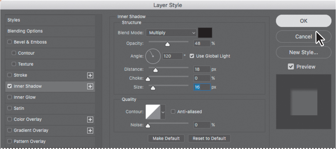
The Inner Shadow option adds a sense of dimension to the magazine title text.
Choose File > Save to save your work so far.

Creating type on a path
In Photoshop, you can create type that follows along a path that you create with a pen or shape tool. The direction the type flows depends on the order in which anchor points were added to the path. When you use the Horizontal Type tool to add text to a path, the letters are perpendicular to the baseline of the path. If you change the location or shape of the path, the type moves with it.
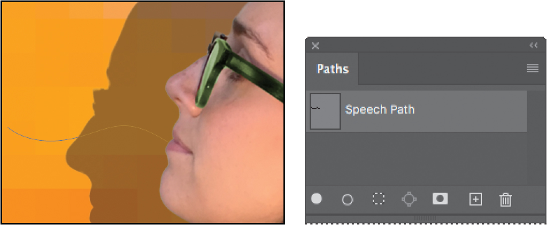
You’ll create type on a path to make it look as if questions are coming from the model’s mouth. We’ve already created the path for you; we stored it in the Paths panel.
In the Layers panel, select the Model layer.
Choose Window > Paths to show the Paths panel.
In the Paths panel, select Speech Path to make it active and visible.
The path appears to be coming out of the model’s mouth.
Select the Horizontal Type tool.
In the options bar, click the Right Align Text button.
Julieanne Kost is an official Adobe Photoshop evangelist.

Tool tips from the Photoshop evangelist
Type tool tricks
Shift-click in the image window with the Horizontal Type tool to create a new type layer—in case you’re close to another block of type and Photoshop tries to select text on the existing type layer.
Double-click the thumbnail icon of any type layer in the Layers panel to select all of the type on that layer.
With any text selected, right-click (Windows) or Control-click (Mac) on the text to access the context menu. Choose Check Spelling to run a spell check.
In the Character panel, select the following settings:
Font Family: Myriad Pro Regular
Font Style: Regular
Font Size (
 ): 14 pt
Tracking (
 ): −10
Color: White
All Caps (
 )
)
Move the Type tool over the path. When a small slanted line appears across the I-bar, click the end of the path closest to the model’s mouth, and type What’s new with games?

As you type on the path, the text expands from the right because Right Align Text was selected in step 5.
Select the word “GAMES?” and change its font style to Bold. Click the Commit Any Current Edits button (
) in the options bar.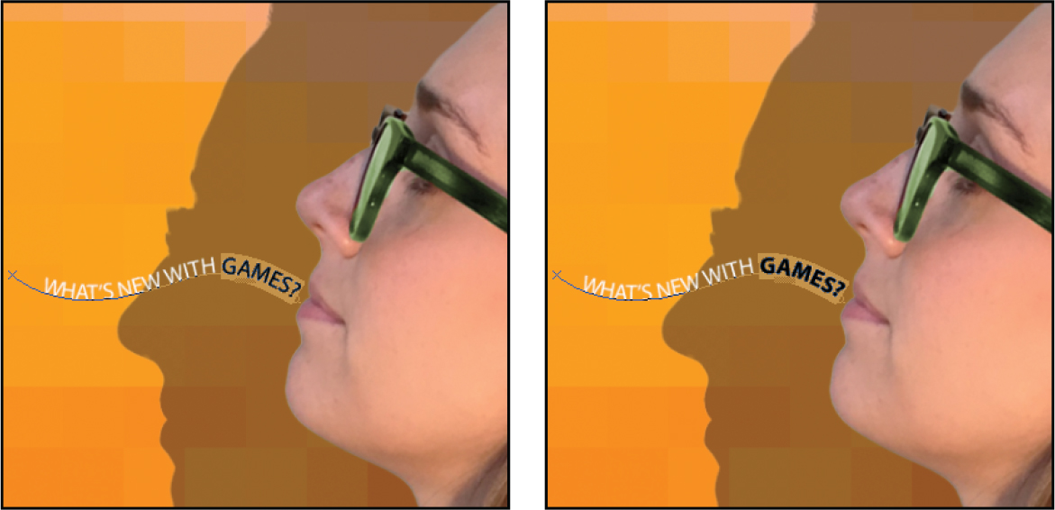
![]() Note
Note
When you position a type tool over a character that has alternate glyphs available, a grid may appear, containing alternates you can click to select from (see the sidebar on page 187). If the alternate glyphs get in your way, disable Enable Type Layer Glyph Alternates in the Type panel of the Preferences dialog box.
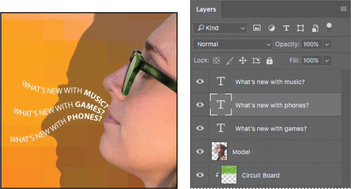
Click the Layers tab to bring it forward. In the Layers panel, select the What’s new with games? layer, and then choose Duplicate Layer from the Layers panel menu. Name the new layer What’s new with music?, and click OK.
You can’t see the duplicate text layer yet, because it’s exactly on top of the original text layer.
With the Type tool, select “GAMES,” and replace it with music. Click the Commit Any Current Edits button in the options bar.
Now that the two type layers have different text, it’s easier to see that they’re exactly on top of each other. You’ll move one away from the other.
![]() Note
Note
If you can’t remember how to rotate using a transform bounding box, position the pointer just outside the transform bounding box until the pointer changes to a rotate icon (an arc with two arrows), and drag.
Choose Edit > Free Transform Path. Rotate the path approximately 15 degrees, and then shift the path up above the first path and a little to the right, as in the image below. Click the Commit Transform button in the options bar.

Repeat steps 9–11, replacing the word “GAMES” with phones. Rotate the left side of the path approximately −15 degrees, and move it below the original path.
Choose File > Save to save your work so far.
Warping point type
The text on a curvy path is more interesting than straight lines would be, but you’ll warp the text to make it more playful. Warping lets you distort type to conform to a variety of shapes, such as an arc or a wave. The warp style you select is an attribute of the type layer—you can change a layer’s warp style at any time to change the overall shape of the warp. Warping options give you precise control over the orientation and perspective of the warp effect.
If necessary, zoom or scroll to move the visible area of the image window so that the sentences to the left of the model are in the center of the screen.
![]() Note
Note
If you don’t see the Warp Text command on the context menu, right-click/Control-click the layer or layer name, not the layer thumbnail.
Right-click (Windows) or Control-click (Mac) the What’s new with games? layer in the Layers panel, and choose Warp Text from the context menu.
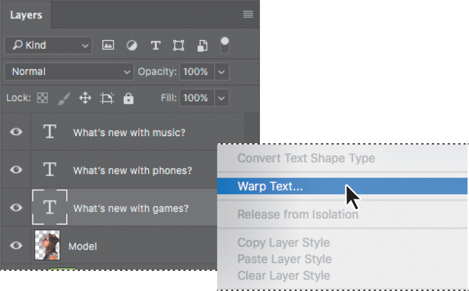
In the Warp Text dialog box, choose Wave from the Style menu, and select the Horizontal option. Specify the following values: Bend, +33%; Horizontal Distortion, −23%; and Vertical Distortion, +5%. Then click OK.
The Bend slider specifies how much warp is applied. Horizontal Distortion and Vertical Distortion determine the perspective of the warp.
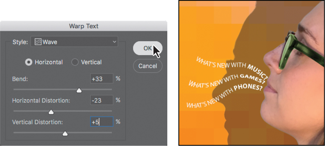
The words “What’s new with games?” appear to float like a wave on the cover.
Repeat steps 2 and 3 to warp the other two text layers you typed on a path.
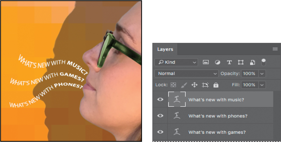
Save your work.
Designing paragraphs of type
All of the text you’ve written on this cover so far has been a few discrete words or lines—point type. However, many designs call for full paragraphs of text. You can design complete paragraphs of type in Photoshop; you can even apply paragraph styles. You don’t have to switch to a dedicated page layout program for sophisticated paragraph type controls.
Using guides for positioning
You will add paragraphs to the cover in Photoshop. First, you’ll add some guides to the work area to help you position the paragraphs.
If necessary, zoom or scroll so that you can see the entire top half of the document.
Drag a guide from the left vertical ruler, placing it approximately 1/4" from the right side of the cover.
Drag a guide down from the top horizontal ruler, placing it approximately 2" from the top of the cover.
Adding paragraph type from a sticky note
You’re ready to add the text. In a real-world design environment, the text might be provided to you in a word-processing document or the body of an email message, which you could copy and paste into Photoshop. Or you might have to type it in. Another easy way to add a bit of text is for the copywriter to attach it to the image file in a sticky note, as we’ve done for you here.
Select the Move tool, and then double-click the yellow sticky note in the lower right corner of the image window to open it in the Notes panel. Expand the Notes panel, if necessary, to see all the text.
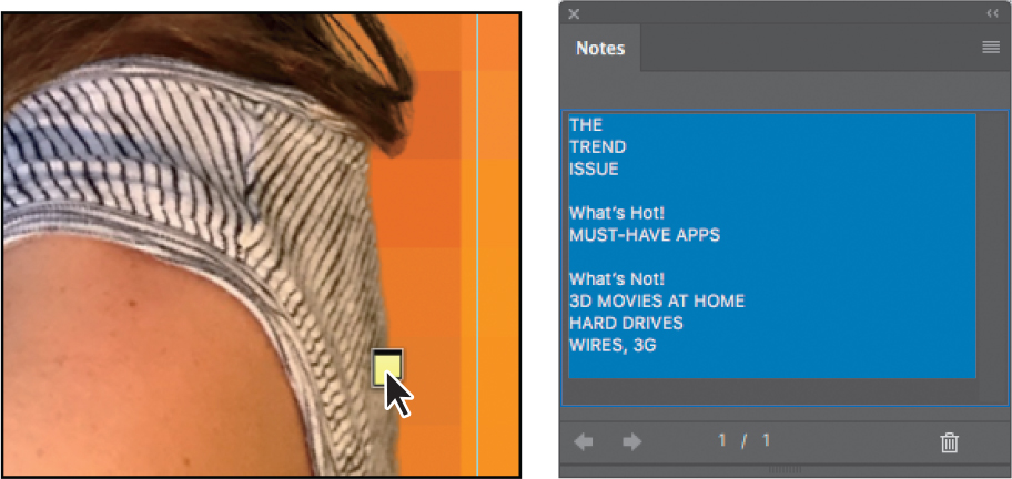
In the Notes panel, select all the text. Press Ctrl+C (Windows) or Command+C (Mac) to copy the text to the clipboard. Close the Notes panel.
Select the Model layer. Then, select the Horizontal Type tool (
).
![]() Tip
Tip
In step 4, the reason you press Shift is to make sure you create a new type layer. If you don’t press Shift, the Horizontal Type tool might instead select text in the nearby text layer containing the DIGITAL headline.
Press Shift as you click where the guidelines intersect at about 1/4" from the right edge and 2" from the top of the cover. Continue to hold the Shift key as you start to drag a text box down and to the left. Then release the Shift key, and continue dragging until the box is about 4 inches wide by 8 inches high, the top and right edges aligned with the guides you just added.
![]() Note
Note
If the text isn’t visible, make sure the new type layer is above the Model layer in the Layers panel.
Press Ctrl+V (Windows) or Command+V (Mac) to paste the text. The new text layer is at the top of the Layers panel, so the text appears in front of the model.
![]() Tip
Tip
If you paste text and it includes unwanted formatting, you can instead choose the Edit > Paste Without Formatting command in Photoshop to remove all formatting from the pasted text.
Select the first three lines (“The Trend Issue”), and then apply the following settings in the Character panel:
Font Family: Myriad Pro (or another sans serif font)
Font Style: Regular
Font Size (
): 70 ptLeading (
 ): 55 pt
Tracking (
): 50Color: White
![]() Note
Note
Leading (pronounced “ledding”) determines the vertical space between lines.
With the text still selected, click the Right Align Text button in the options bar or Paragraph panel.
Select just the word “Trend,” and change the Font Style to Bold.
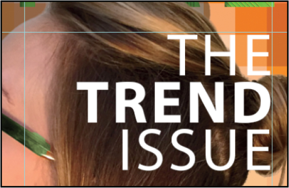
You’ve formatted the title. Now you’ll format the rest of the text.
Select the rest of the text you pasted. In the Character panel, select the following:
Font Family: Myriad Pro
Font Style: Regular
Font Size: 22 pt
Leading: 28 pt
Tracking: 0
Deselect All Caps (
)
The text looks good, but it’s all the same. You’ll make the headlines stand out more.

Select the “What’s Hot!” text, and then change the following in the Character panel, and then press Enter or Return:
Font Style: Bold
Font Size: 28 pt
Repeat step 10 for the “What’s Not!” subhead.
Select the word “TREND.” Then, in the Character panel, change the text color to green.
Finally, click the Commit Any Current Edits button in the options bar.
Save your changes.
OpenType in Photoshop
OpenType is a cross-platform font file format developed jointly by Adobe and Microsoft. The format uses a single font file for both Mac and Windows, so you can move files from one platform to another without font substitution or reflowed text. OpenType offers widely expanded character sets and layout features, such as swashes and discretionary ligatures, that aren’t available in traditional PostScript and TrueType fonts. This, in turn, provides richer linguistic support and advanced typography control. Here are some highlights of OpenType.
The OpenType menu The Character panel menu includes an OpenType submenu that displays all available features for a selected OpenType font, including ligatures, alternates, and fractions. Dimmed features are unavailable for that typeface; check marks appear next to features that have been applied.
Discretionary ligatures To add a discretionary ligature to two OpenType letters, such as to “th” in the Bickham Script Standard typeface, select them in the file, and choose OpenType > Discretionary Ligatures from the Character panel menu.
Swashes Adding swashes or alternate characters works the same way as discretionary ligatures: Select the letter, such as a capital “T” in Bickham Script, and choose OpenType > Swash to change the ordinary capital into a dramatically ornate (swash) “T.”
True fractions To create true fractions, type the fraction’s characters—for example, 1/2. Then, select the characters, and from the Character panel menu, choose OpenType > Fractions. Photoshop applies the true fraction (½).
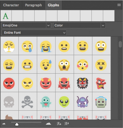
Color fonts While you can apply a color to a font in Photoshop, a format called OpenType-SVG allows multiple colors and gradients to be part of the font design itself. For example, a color font may provide the letter A in solid blue as well as solid red and in a blue-to-green gradient.
Emoji fonts Another example of OpenType-SVG fonts are emoji fonts, made possible because OpenType-SVG allows vector graphics to be used as font characters. The Photoshop font family menu indicates color and emoji fonts with an OpenType SVG icon ( ![]() ).
).
Variable fonts When you want a certain font weight but Regular is too thin and Bold is too thick, you can use a Variable Font that lets you customize attributes such as weight, width, and slant in the Properties panel. The Photoshop font family menu indicates variable fonts with an OpenType VAR icon ( ![]() ).
).
Note that some OpenType fonts have more options than others.
![]() Tip
Tip
Want to know if a character has OpenType alternates? Just select it. If a thick underline appears under a selected character, moving the pointer over that character reveals the alternate glyphs available for that character in the font applied to it. You can select from those glyphs just as you can in the Glyphs panel, or you can click a triangle to open the Glyphs panel.
Adding a rounded rectangle
You’re almost done with the text for the magazine cover. All that remains is to add the volume number in the upper right corner. First, you’ll create a rectangle with rounded corners to serve as a background for the volume number.
Select the Rounded Rectangle tool (
 ) in the Tools panel.
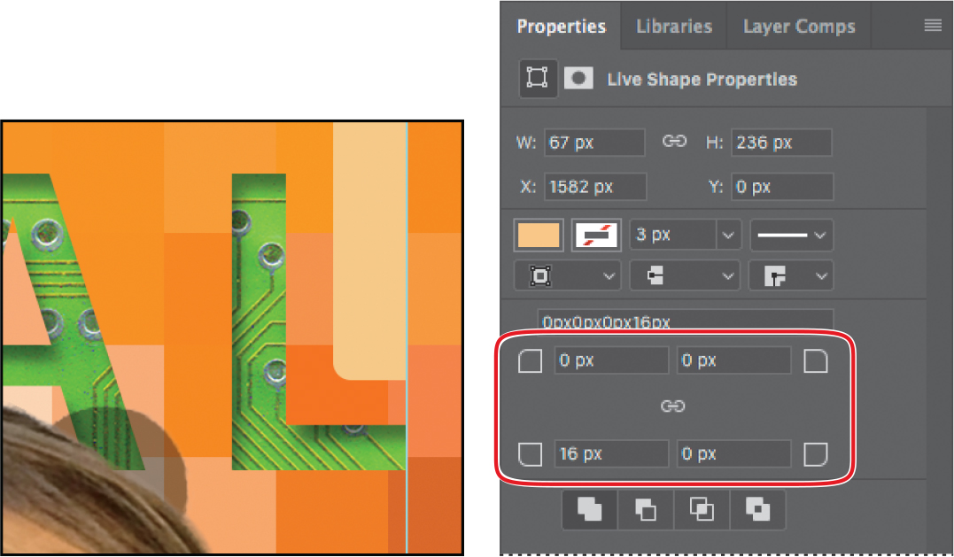
Draw a rectangle in the space above the letter “L” in the upper right corner of the cover, placing its right edge along the guide.
In the Properties panel, type 67 px for the width.
Click the fill color swatch in the Properties panel, and select the Pastel Yellow Orange swatch in the third row. Make sure the stroke is set to No Color.
By default, all the corners in the rectangle have the same radius, but you can adjust the radius for each corner separately. You can even return to edit the corners later if you want to. You’ll change the rectangle so that only the lower left corner is rounded, changing the others to right angles.
![]() Note
Note
The Properties panel has two link icons for a selected rectangle. The link icon near the top maintains the proportions of the object, and the link icon near the bottom changes all corner radius values when you edit any one of them.
At the bottom of the Properties panel, type 0 px in any of the corner radius values and press Enter or Return.
Because the Link Together Corner Radius Values icon (![]() ) is selected (darker than the panel background), the corner radius is set to 0 on all four corners.
) is selected (darker than the panel background), the corner radius is set to 0 on all four corners.
Click to deselect the Link Together Corner Radius Values icon, change the bottom left corner to 16 px, and press Enter or Return.
With the Move tool, drag the rectangle to the top of the image so it hangs down like a ribbon and its right edge is next to the ruler guide.
Select Show Transform Controls in the options bar. Drag the bottom of the rectangle down so that it’s close to the letter “L.” (If you’re not sure how long to make it, refer to the 07End.psd file.) Then click the Commit Transform button (
).
Adding vertical text
You’re ready to add the volume number on top of the ribbon.
Choose Select > Deselect Layers. Then select the Vertical Type tool (
 ), which is hidden under the Horizontal Type tool.
Press the Shift key, and click near the bottom of the rectangle you just created.
Pressing the Shift key as you click ensures that you create a new text box instead of selecting the title.
Type VOL 9.
The letters are too large to view. You’ll need to change their size to see them.
Choose Select > All, and then, in the Character panel, select the following:
Font Family: a sans-serif typeface, such as Myriad Pro
Font Style: a light or narrow style, such as Condensed
Font size: 15 pt
Tracking: 10
Color: Black
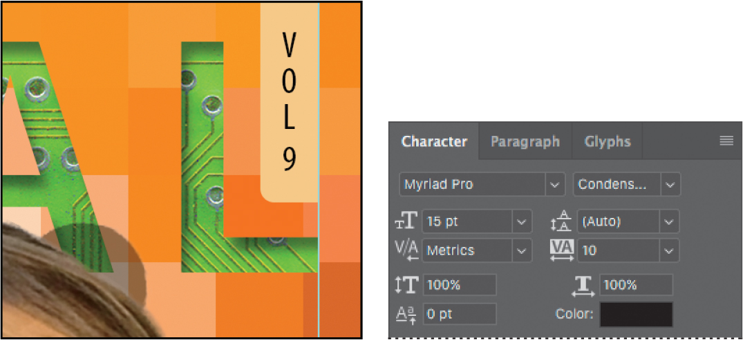
Click the Commit Any Current Edits button (
) in the options bar. Your vertical text now appears as the layer named VOL 9. Use the Move tool ( ) to center it in the ribbon, if necessary.
![]() Tip
Tip
Want a design to have a familiar look, but not with the exact font that look is known for? Try Font Similarity. Choose a font in the Font Family menu in either the Type tool options bar or the Character panel. You’ll see options at the top of the font list; click the Show Similar Fonts button.

The font list will now show the 20 most similar fonts available either on your system or from Adobe Fonts.
Now, you’ll clean up a bit.

Click the note to select it. Then right-click (Windows) or Control-click (Mac), and choose Delete Note from the context menu; click Yes to confirm that you want to delete the note.
Hide the guides: Choose the Hand tool (
 ), and then press Ctrl+; (Windows) or Command+; (Mac). Then zoom out to get a nice look at your work.
Choose File > Save to save your work.
Congratulations! You’ve added and stylized all of the type on the Digital magazine cover. Now that the magazine cover is ready to go, you’ll flatten it and prepare it for printing.
Choose File > Save As, rename the file 07Working_flattened, and click Save. Click OK if you see the Photoshop Format Options dialog box.
![]() Tip
Tip
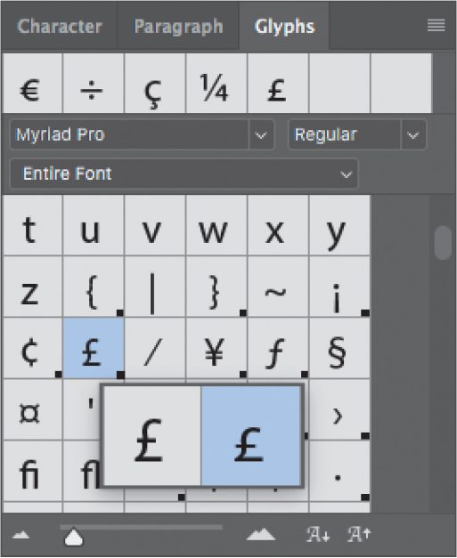
Use the Glyphs panel (Window > Glyphs) to access the full range of alternate characters in OpenType fonts. When editing text, double-click a character in the Glyphs panel to add it to the text.
The Glyphs panel
The Glyphs panel lists all characters available for a font, including specialized characters and alternate versions such as swashes. Above the font name and style menus is a row of recently used glyphs. It’s blank if you haven’t used any glyphs yet. A menu under the font name lets you display a writing system such as Arabic, or a category of characters such as punctuation or currency symbols. A black dot in the bottom right corner of a character’s box indicates that alternates are available for that character; click and hold the mouse on the character to view its alternate glyphs or to choose one to enter into a text layer.
Keeping a layered version lets you return to the 07Working.psd file in the future to edit it.
Choose Layer > Flatten Image.
![]() Tip
Tip
When preparing a Photoshop file for high-resolution output, if it contains vector shapes and text layers, consult with your output service provider about the best format to use and whether the file should be flattened.
Choose File > Save, and then close the document window.

Extra credit
Using Match Fonts to keep your projects consistent
We want to identify a font that was used in an earlier issue, for text that says “Premiere Issue” (see the file MatchFont.psd in the Lesson07 folder). We’d like to use that font for other text inside the magazine. But the only available file is flattened, so the original type layer is lost. Because no type layer is available, it’s impossible to select the text to find out which font was used. Fortunately, you don’t have to guess which font is in the image because, in Photoshop, you can let the Match Font feature figure it out for you. Thanks to the magic of intelligent imaging analysis, using just a picture of a Latin font, Photoshop can use machine learning to detect which font it is. Match Font then shows you a list of similar fonts. Match Font is also useful for identifying fonts in photos, such as in the text on a sign in a street scene.

Open MatchFont.psd in the Lesson07 folder.
Select the area containing the mystery font. Keep the selection close to the text.
Choose Type > Match Font. Photoshop displays a list of fonts similar to the font in the image, including active fonts on your system and Adobe Fonts.
To list only the fonts on your computer, deselect Show Fonts Available To Activate From Adobe Fonts.
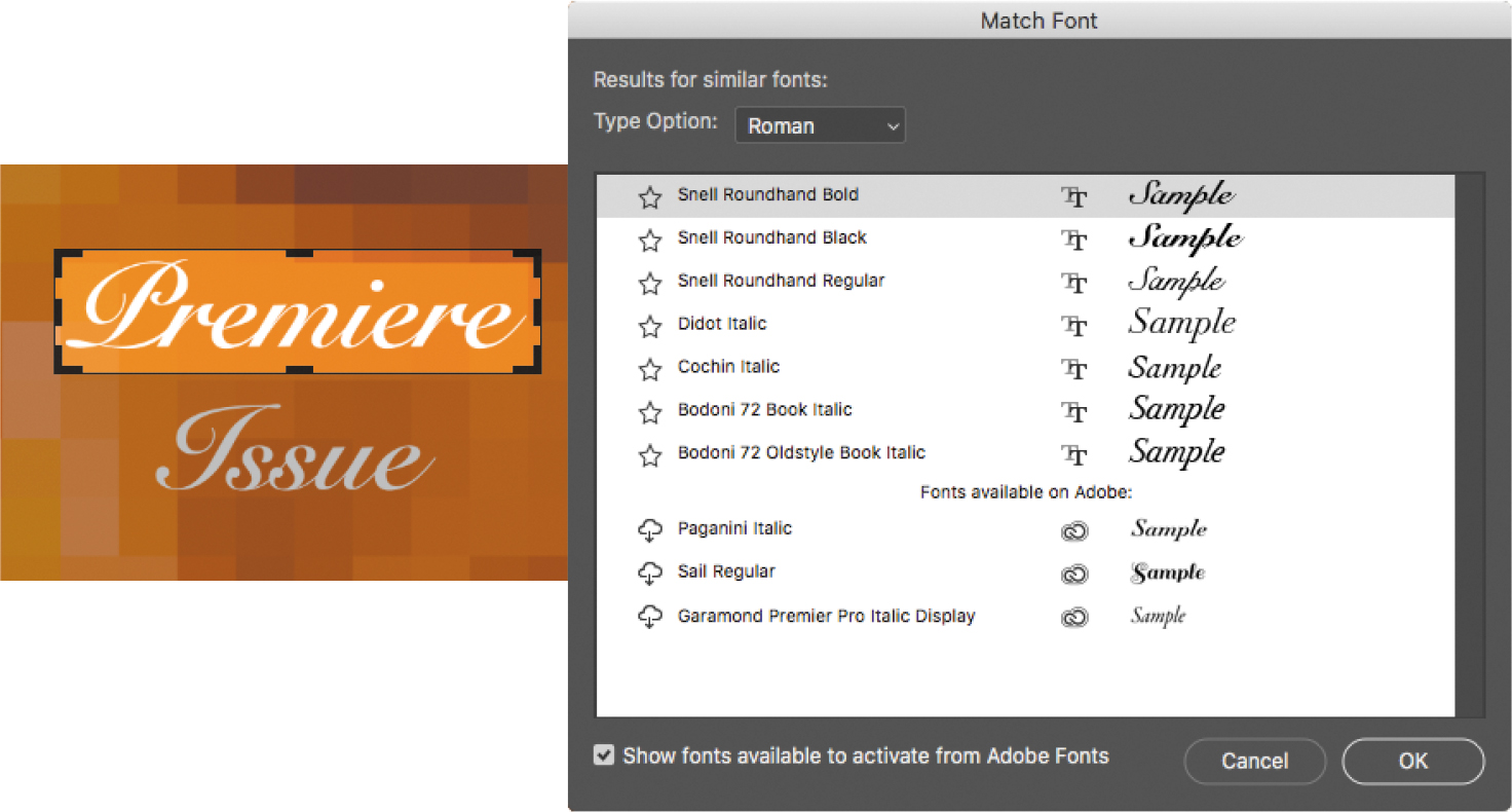
Select a script font that most closely resembles the font in the image from the list of fonts that Match Font determined to be similar. Your Match Font results may look different than ours.
Click OK. Photoshop selects the font you clicked, so you can now create new text with it.
Review questions
1 How does Photoshop treat type?
2 How is a text layer the same as or different from other layers in Photoshop?
3 What is a clipping mask, and how do you make one from type?
Review answers
1 Type in Photoshop consists of vector-based shapes that describe the letters, numbers, and symbols of a typeface. When you add type to an image in Photoshop, the characters appear on a text layer at the same resolution as the image file. As long as the type layer exists, Photoshop preserves the type outlines so that the text remains sharp when you scale or resize type, save a PDF or EPS file, or print the image to a high-resolution printer.
2 Type that is added to an image appears in the Layers panel as a text layer that can be edited and managed in the same way as any other kind of layer. You can add to and edit the text, change the orientation of the type, and apply anti-aliasing as well as move, restack, copy, and change the options for layers.
3 A clipping mask is an object or group whose shape masks other artwork so that only areas that lie within the shape are visible. To use a text layer as a clipping mask, make sure the layer you want to reveal is directly above the text layer, select the layer you want to show through the letters, and apply the Create Clipping Mask command from the Layers panel menu (or from the Layer menu, or from the layer’s context menu).