
Chapter 11. Prioritizing Desirability
“If you have a choice of two things and can’t decide, take both.”
—Gregory Corso
As I write this I am sitting in a hotel room. The room has a bed, a bathroom, and a desk, and is reasonably clean. Each of these features is a basic attribute I expect of every hotel room. If any of these were absent, I would not stay at the hotel. This hotel also has a bed that is more comfortable than most, includes free wireless Internet access, is larger than most hotel rooms, and has a fitness center. I really appreciate these additional features, but they are not mandatory for me to stay at a hotel. However, the more features like this the hotel offers, the more I’m willing to pay for a room here. Finally, this hotel delighted me in two ways: Each treadmill in the fitness center has a television built into it, and a free bottle of water was left in my room each day.
I could group the features of this hotel room into the following categories:
• Must-haves: a bed, a bathroom, a desk, clean
• The more, the better: comfort of the bed, size of the room, variety and quantity of equipment in the fitness center
• Exciting: built-in televisions on the treadmills, free bottle of water in my room each day
Kano Model of Customer Satisfaction
Separating product features into the previous three categories can provide a great deal of information about how to prioritize work for a new product release. The process of doing so was originated by Noriaki Kano, whose approach gives us a way to separate features into three categories:
• Threshold, or must-have, features
• Linear features
• Exciters and delighters
Threshold features are those that must be present in the product for it to be successful. They are often referred to as must-have features. These are the bed, bathroom, desk, and cleanliness of my hotel room. Improving the performance or amount of a threshold feature will have little impact on customer satisfaction. For example, as long as the hotel bathroom meets my basic needs I don’t care what the countertops are made from.
A linear feature is one for which “the more, the better” holds true. The bigger the hotel room is, the better. These are called linear features because customer satisfaction is correlated linearly with the quantity of the feature. The better one of these features performs (or the more of it there is), the more satisfied the customers will be. Because of this, product price is often related to linear attributes. If the hotel has dumbbells and two nice treadmills, I’ll be happier than if it just has one rusty old stair climber. I’ll be even happier if it also has elliptical trainers and spinning bikes. And important for the hotel, I’ll be more likely to return and to pay a premium for its rooms.
Finally, exciters and delighters are those features that provide great satisfaction, often adding a price premium to a product. However, the lack of an exciter or delighter will not decrease customer satisfaction below neutral. The built-in television on the hotel’s treadmill was an exciter for me. I would not have been dissatisfied if the hotel didn’t offer these because I didn’t know anyone had them. In fact, exciters and delighters are often called unknown needs because customers or users do not know they need these features until they see them.
The relationship among these three different feature types is shown in Figure 11.1. The arrow through the bottom right of this diagram shows that once some amount of a must-have feature has been implemented, customer satisfaction cannot be increased by adding more of that feature. Also, no matter how much of a must-have feature is added, customer satisfaction never rises above the midpoint.
Figure 11.1. The Kano model of customer satisfaction.

On the other hand, the line in the top left shows that customer satisfaction rises dramatically based on even a partial implementation of an exciter or delighter. Finally, the line through the middle shows the direct relationship between the inclusion of linear features and customer satisfaction.
Because must-have features are required for a product to play in its market segment, emphasis should be placed on prioritizing the development of all threshold features. A product’s must-have features do not need to be developed in the first iterations of a release. However, because users consider these features to be mandatory, they need to be available before the product is released. Keep in mind, though, that partial implementation of must-have features may be adequate, because gains in customer satisfaction drop off quickly after a base level of support for threshold features has been established. For example, I am writing this book with Adobe FrameMaker, which pays lip service to an undo feature by allowing one level of undo. For me personally, they moved pretty far up the customer satisfaction axis with a one-level undo feature, yet I would have preferred much more.
Secondary emphasis should be placed on completing as many linear features as possible. Because each of these features leads directly to greater customer satisfaction, the more of these features that can be included, the better (excluding, of course, such situations as a product that is already bloated with too many features). Finally and with time permitting, at least a few delighters should be prioritized such that they are included in the release plan.
Keep in mind that features tend to migrate down the Kano diagram over time. A short time ago, wireless Internet access in a hotel room was a delighter. Now it’s a linear feature well on its way to becoming a threshold feature.
Assessing Themes on the Kano Model
The easiest way to make use of a Kano model on an agile project is to think about each theme and make an educated guess about the type of each. A much better way, however, is to speak with customers or users to determine the type of each theme. This is surprisingly easy because it can be done with a written questionnaire and you may need to survey as few as twenty to thirty users to accurately prioritize requirements (Griffin and Hauser 1993).
Kano proposed determining the category of a feature by asking two questions: one question regarding how the user would feel if the feature were present in the product and one question about how the user would feel if it were absent. The first of these questions is known as the functional form, because it refers to the case when a function is present. The second question is known as the dysfunctional form, because it refers to when the function is not present. Each question is answered on the same five-point scale.
1. I like it that way.
2. I expect it to be that way.
3. I am neutral.
4. I can live with it that way.
5. I dislike it that way.
As an example, let’s return to the SwimStats website. Suppose we are contemplating three new features:
• The ability to see a graph of a swimmer’s times in an event over the past season.
• The ability for swimmers to post autobiographical profiles.
• The ability for any registered site member to upload photos.
To determine which type of feature these are, we survey prospective users, asking them:
• If you can graph a swimmer’s times in an event over the past season, how do you feel?
• If you cannot graph a swimmer’s times in an event over the past season, how do you feel?
• If swimmers can post autobiographical profiles, how do you feel?
• If swimmers cannot post autobiographical profiles, how do you feel?
• If you can upload photos, how do you feel?
• If you cannot upload photos, how do you feel?
The first pair of these questions and hypothetical answers from one user are shown in Figure 11.2.
Figure 11.2. The functional and dysfunctional forms of a question.
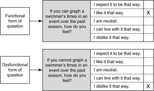
From looking at Figure 11.2, it’s apparent that it is possible for a user to give inconsistent responses. A user could, for example, say that she likes graphing a swimmer’s event times and that she also likes not having the same feature. There are twenty-five possible combinations of answers to the functional and dysfunctional forms of a question. We need a way of looking at both answers simultaneously and assessing a user’s opinion.
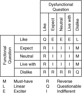
Categorizing Responses
The method for doing this is shown in Figure 11.3. By cross-referencing the answer to the functional question with the answer to the dysfunctional question, a prospective user’s responses can be reduced to a single meaning. So if a user says she expects to be able to graph event times and that she would dislike it if it did not (which are the answers given in Figure 11.2), we cross-reference those answers and get that she considers the feature to be mandatory. In her mind, graphing event times is a must-have feature.
Figure 11.3. Categorizing a feature from answers to a pair of questions.
If we repeat this process over twenty to thirty users, their answers can be aggregated and their distributions determined as is shown in Table 11.1. From examining this table, we can tell that graphing event times is a one-dimensional (linear) feature and that uploading photos is a must-have feature.
Table 11.1. Distribution of Results from Surveying Users

Occasionally you’ll encounter a feature, such as posting autobiographical profiles in Table 11.1, that has high values for two responses. This indicates that different types of customers and users have different expectations. In these cases, you should consider analyzing responses based on some factor that differentiates your customer or user subpopulation. You may, for example, separate answers from users at small companies from users at large companies. Or you may choose to separate answers based on job role within a company or by industry segment.
Relative Weighting: Another Approach
Karl Wiegers (1999) has recommended an approach that is similar to Kano’s in that it considers both the positive benefit of the presence of a feature and the negative impact of its absence. Rather than use questionnaires, this approach relies on expert judgment. Collaboratively, but led by the product owner, the team assesses each feature being considered for the next release. Each feature is assessed in terms of the benefits it will bring if implemented, as well as the penalty that will be incurred if it is not implemented. As with estimates of story points and ideal time, the estimates of benefits and penalties are relative. A scale of 1 to 9 is used. Table 11.2, which again uses the SwimStats features, shows how this works.
Table 11.2. The Relative Weighting Approach to Prioritization
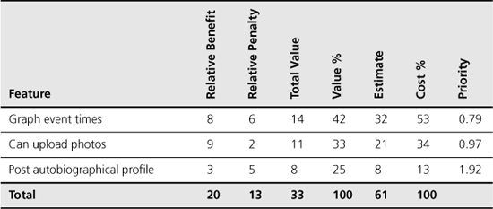
The benefit of including graphs of a swimmer’s event times over a season is estimated at 8. This feature is slightly less valuable than uploading photos but is much more valuable than the ability for swimmers to post autobiographical profiles. As for the relative penalties if these features are absent, there is very little penalty if users cannot upload photos. (In Kano’s terms, uploading photos is probably an exciter—users would like it but would not reject the product if it were absent.) There is more of a penalty if event times cannot be graphed or autobiographies posted.
For each feature, the relative benefit and penalty are summed and entered in the Total Value column. If you wish, you could weight the benefits and penalties. For example, to weight the relative benefit as twice as important as the relative penalty, multiply the Relative Benefit by 2 before adding it to Relative Penalty to get the Total Value.
The sum of the Total Value column (in this case, 33) represents the total value of delivering all features. To calculate the relative contribution of each feature, divide its total value by the sum of the Total Value column. For example, graphing event times has a value of 14. The total value of all features is 33. Dividing 14 by 33 results in 0.42, or 42%. This means that graphing event times represents 42% of the total value of all listed features.
The next column, Estimate, holds the story-point or ideal-days estimate. Exactly as with Total Value, the Estimate column is summed (61, in this case) and the percentage of each estimate is calculated in the Cost % column. In this example, graphing event times is estimated at 32 story points or ideal days. The three combined are 61 story points or ideal days. So graphing event times represents 53% of the total cost of these three stories (32/61 = 0.53).
The final column, Priority, is calculated by dividing the Value % by the Cost %. Higher numbers represent higher priorities because they will create more value for the effort invested in them. You can see this in Table 11.2 by looking at the feature to post autobiographical profiles. This feature generates a little more than half the value of graphing event times (a Total Value of 8 compared with 14), but it does so at one-fourth the cost (an estimate of 8 compared with 32). Because of its high value-to-cost ratio, posting autobiographical profiles is the highest-priority feature in this analysis.
The Importance of Including Relative Penalty
You may be tempted to drop the Relative Penalty column. Don’t. As with the Kano approach, it can be very useful to look at features from the perspective of how users will be affected by the presence of the feature as well as by the absence of the feature.
One of my clients in the financial services industry provides a good example of the importance of considering the relative penalty. The product owner for their team was able to prioritize most features quite easily. However, one feature she had to prioritize would bring no value to the company other than keeping the company in compliance with certain new government regulations. She joked that the only downside to not implementing the feature was that the CEO might spend some time in prison. And she (because she wasn’t the CEO) was OK with that risk if it meant getting other features into the product instead.
This is a clear example of a feature with a relative benefit of 1 but a relative penalty of 9.
Summary
Let’s step back for a moment and remember why we’re doing this. In the previous chapter, we learned that there are four factors to consider when prioritizing features.
1. The amount and significance of learning and new knowledge created by developing the features.
2. The amount of risk removed by developing the features.
3. The financial value of having the features.
4. The cost of developing (and perhaps supporting) the new features.
The previous chapter, “Prioritizing Themes,” described the importance of factoring learning and risk reduction into the overall prioritization of a feature. This chapter presented two approaches to prioritizing the desirability of features: Kano analysis and relative weighting.
In Kano analysis, features are segregated into must-have features, linear features, and exciters. This is done by asking potential users two questions about each feature: how they would feel if the feature were present and how they would feel if it were not present.
Relative weighting provides an approach to assessing the benefits of implementing a feature, the penalties of not implementing it, and the cost into a single value representing the priority of a feature.
Discussion Questions
1. What are the relative merits of Kano analysis and relative weighting in your current organization?
2. What exciters are going into your current project?
3. Does your current project have the right mix of exciters, linear features, and must-have features?