
Chapter 3. Lessons About Design
If the domain of requirements is about defining problems and the characteristics that solutions must have, design is about crafting the structure of those solutions. Some people say that requirements are about what and design is about how. It’s not that clear-cut.
As Figure 3.1 illustrates, the boundary between requirements and design is not a crisp black line but rather a fuzzy gray area (Wiegers, 2006a). It’s valuable to take some tentative steps into design thinking during requirements exploration, as by creating prototypes. Contemplating how the problem knowledge might lead to a solution helps people refine the product’s requirements. Users who interact with a prototype find that it clarifies their thinking and triggers new ideas because a prototype is more tangible than an abstract list of requirements.
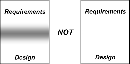
Figure 3.1 The boundary between requirements and design is a fuzzy gray area, not a crisp black line.
The essence of software design is relating requirements to pieces of code, but transitioning from even excellent requirements into specific bits of a design is neither easy nor obvious (Davis, 1995). Whenever someone asks me how people design software, I’m reminded of an old cartoon by Sidney Harris that shows two scientists standing in front of a blackboard covered with equations. One scientist points to a place on the board that says “Then a miracle occurs” and suggests that that section needs to be a bit more specific.
Some aspects of software design do appear almost miraculous, somehow crystallizing from the ether based on the designer’s experience and intuition. Some activities, such as database design, are systematic and analytical. Others are more organic, with a design emerging incrementally as designers explore the transition from problem to solution. User experience design involves artistically creative approaches, based on a solid understanding of human factors. Designers often rely on common patterns that recur in software design to reduce the amount of invention required (Gamma et al., 1995). Ken Pugh (2005) provides some insights into the designer’s thought process in his book Prefactoring.
Different Aspects of Design
Software design involves four major aspects: architectural, detailed (or low-level), database, and user experience design (Figure 3.2). All of these design aspects are subject to numerous constraints that restrict the options available to the designer. Constraints might be due to requirements for compatibility with other products, applicable standards, technology limitations, business policies, regulations, cost, and other issues. Physical products that contain embedded software are subject to other constraints, including dimensions, weight, and materials. Constraints increase the design challenge by telling designers what they cannot do, just as requirements dictate what the design must do.

Figure 3.2 Software systems involve architectural, detailed, database, and user experience design.
Architectural design refers to the structure of the system and its components, or architectural elements (Rozanski and Woods, 2005). These elements consist of code modules for software-only systems, which could be aggregated into multiple interconnected subsystems for a large product. Physical products with embedded software will include mechanical and electrical hardware components. Designing an architecture involves partitioning the system into components, defining each component’s responsibilities, and allocating specific requirements to the appropriate components. Specifying the interfaces between components is another aspect of architectural design. (See Lesson #22, “Many system problems take place at interfaces.”)
Detailed design focuses on the logical structure of individual program components—code modules, classes and their methods, scripts, and so forth—and the interfaces between modules. Algorithm development is a significant aspect of detailed design.
Database design is necessary when an application creates, modifies, or accesses a database. Database design includes identifying data entities or classes and the relationships among them, as well as itemizing each entity’s data elements and their data types, properties, and logical connections. Constructing procedures to create, read, update, and delete stored data (sometimes collectively called CRUD) also is part of database design. Designing reporting functionality and report layouts straddle database and user experience (UX) design. After all, the only reason you put data into a computer is so that people can get it out again and view it in some useful format.
Any application that has human users involves user experience design, which is a huge discipline of its own. User interface (UI) design—also called human-computer interaction or HCI—is a subset of UX design. UI design involves both architectural and detailed aspects. A user interface’s architecture depicts dialog elements—places where the user and system can interact—and the navigation pathways between them that describe user task flows. Detailed UI design addresses the specifics of the users’ interaction with a product, including screen layouts, cosmetics, input controls, and the properties of individual text blocks, graphics, input fields, and output displays. Both architectural and detailed UI designs drive the user’s perception of ease of learning and ease of use.
Do You Have a Good Design?
Design involves devising the optimum solution that will fulfill a plethora of requirements over the product’s life. The design must enable implementing the correct functionality and achieve the expected characteristics for numerous quality attributes. (See Lesson #20, “You can’t optimize all desirable quality attributes.”) Further, the design must efficiently accommodate enhancement and modification both during the development process and following release.
Over the years, software engineering pioneers such as Edsger Dijkstra, David Parnas, Barbara Liskov, Larry Constantine, and Glenford Myers have elaborated principles that guide designers toward better results, which others have compiled into useful resources (Davis, 1995; Gamma et al., 1995; Pugh, 2005). Conforming to principles like the following leads to designs that are less complex, less failure-prone, and easier to understand, modify, extend, and reuse than they might be otherwise.
• Separation of concerns. The design should be divided into modules that are independent of each other and have well-defined, non-overlapping responsibilities.
• Information hiding. Each module should conceal the internal details of its data and algorithms from the rest of the system. Other modules should access the module’s data and services only through the defined module interface. This way, each module’s implementation can be modified when necessary without affecting other modules that invoke it.
• Low coupling. Coupling refers to how intertwined two software components are. Nicely modular designs exhibit low coupling between components, so that changing one module should require minimal changes in others (TutorialsPoint, 2021).
• High cohesion. Cohesion refers to the extent to which a module’s functions logically belong together, such that each module ideally performs a single, well-defined task (Mancuso, 2016).
• Abstraction. Abstraction allows developers to write code that doesn’t depend on specific implementation details, such as the platform’s operating system or the user interface. Abstraction facilitates portability and reuse.
• Defined and respected interfaces. A well-defined module interface makes it easy for developers of other code modules to access that module’s services. It also facilitates replacing a module when necessary because the interface it presents to the rest of the system remains unchanged. The same principle applies to external interfaces the system presents to the outside world.
Design discussions sometimes treat design as a straightforward extension of requirements or bundle it in with implementation as “development,” but it’s better to regard design as a distinct exercise. Someone will design the software on every project, whether or not they treat design as a discrete activity and whether or not they record the designs in some form.
I worked on a project where coding directly from the requirements would have yielded a far more complex program than we devised by exploring design options first. It wasn’t apparent from the requirements, but three of the system’s eight computational modules used the same algorithm, three more shared a common algorithm, and the last two used a third algorithm. Eventually, we would have noticed that we were writing the same code multiple times, but we were happy to spot the repetition before implementation.
Instead of leaping straight from requirements to code, it’s well worth the time to evaluate alternative design approaches and choose the most appropriate one. This chapter describes six valuable lessons I’ve learned from my software design experiences.
First Steps: Design
I suggest you spend a few minutes on the following activities before reading the design-related lessons in this chapter. As you read the lessons, contemplate to what extent each of them applies to your organization or project team.
1. List design practices that your organization is especially good at. Is information about those practices documented to remind team members about them and make it easy to apply them?
2. Identify any problems—points of pain—that you can attribute to shortcomings in how project teams deal with architecture, detailed, database, user experience, or other design activities.
3. State the impacts that each problem has on your ability to complete projects successfully. How do the problems impede achieving business success for both the development organization and its customers? Design shortcomings can lead to brittle code that’s not easily modified or improved, subpar performance, duplicated code, inconsistencies within a product or across related products, and usability problems.
4. For each problem from Step #2, identify the root causes that trigger the problem or make it worse. Problems, impacts, and root causes can blur together, so try to tease them apart and see their connections. You might find multiple root causes that contribute to the same problem, as well as several problems that arise from a single root cause.
5. As you read this chapter, list any practices that would be useful to your team.
Lesson #17. Design demands iteration.
In his classic book The Mythical Man-Month, Frederick P. Brooks, Jr. (1995) advised, “Plan to throw one away; you will, anyhow.” Brooks was referring to the idea that, on large projects, it’s advisable to create a pilot or preproduction system to figure out how best to build the complete system. That’s an expensive prospect, particularly if the system includes hardware components. However, a pilot system is valuable if you have technical feasibility questions or if a suitable design strategy isn’t clear initially. A pilot system also reveals the unknown unknowns, factors you hadn’t yet realized were significant.
While you’re unlikely to build and then discard a preliminary version of most products, you do need to iterate on potential designs before the team gets very far into construction. Creating the simplest possible design sounds attractive, and it does accelerate solution delivery. Rapid delivery might meet a customer’s short-term perception of value, but it may not be the best long-term strategy as the product grows over time.
There’s always more than one design solution for a software problem and seldom a single best solution (Glass, 2003). The first design approach you conceive won’t be the best option. Norman Kerth—a highly experienced designer of software, furniture, and other items—explained it to me nicely:
You haven’t done your design job if you haven’t thought of at least three solutions, discarded all of them because they weren’t good enough, and then combined the best parts of all of them into a superior fourth solution. Sometimes, after considering three options, you realize that you don’t really understand the problem. After reflection, you might discover a simple solution when you generalize the problem.
Software design isn’t a linear, orderly, systematic, or predictable process. Top designers often focus first on the hard parts where a solution might not be obvious or perhaps even feasible (Glass, 2003). Several methods facilitate iteration as a designer moves from an initial concept to an effective solution. One method is to create and refine graphical models—diagrams—of the proposed designs. This technique is addressed in Lesson #18, “It’s cheaper to iterate at higher levels of abstraction.” Prototyping is another technique for iterating on both technical and UI designs.
The Power of Prototypes
A prototype is a partial, preliminary, or possible solution. You build a piece of the system as an experiment, testing the hypothesis that you understand how to design it well. If the experiment fails, you redesign it and try again. A prototype is valuable for assessing and reducing risk, particularly if you’re employing a novel architectural or design pattern that you want to validate before committing to it.
Before you construct a prototype, determine whether you intend to throw it away and then develop the real thing or to grow the preliminary solution into the product. A key point is that if you intend a prototype to grow into the product, you must build it with production-level quality from the beginning. That takes more effort than building something temporary that you’ll discard after it’s served its purpose. The more work you put into a prototype, the more reluctant you become to change it significantly or discard it, which impedes the iteration mindset. Your prototyping approach should encourage cyclical refinement and even starting over if necessary.
Agile teams sometimes create stories called spikes to research technical approaches, resolve uncertainty, and reduce risk before committing to a specific solution (Leffingwell, 2011). Unlike other user stories, a spike’s prime deliverable is not working code but rather knowledge. Spikes could involve technical prototypes, UX prototypes, or both, depending on the information sought. A spike should have a clear goal, just like a scientific experiment. The developer has a hypothesis to test. The spike should be designed to provide evidence for or against the hypothesis, test and prove the validity of some approach, or allow the team to make an informed technical decision quickly.
Proofs-of-Concept
Proof-of-concept prototypes, also called vertical prototypes, are valuable for validating a proposed architecture. I once worked on a project that envisioned an unconventional client-server approach. The architecture made sense in our computing environment, but we wanted to make sure we weren’t painting ourselves into a technical corner. We built a proof-of-concept prototype with a vertical slice of functionality from the UI through the communication layers and the computational engine. It worked, so we felt confident this design was workable.
Experimenting on a proof-of-concept prototype is a way to iterate at a relatively low cost, although you do need to build some executable software. Such prototypes are valuable for assessing the design’s technical aspects: architecture, algorithms, database structure, system interfaces, and communications. You can evaluate architectures against their needed properties—such as performance, security, safety, and reliability—and then refine them progressively.
Mockups
User interface designs always require iteration. Even if you’re following established UI conventions, you should perform at least informal usability testing to choose appropriate controls and layouts to meet your ease-of-learning, ease-of-use, and accessibility goals. For instance, A/B testing is an approach in which you present users with two UI alternatives for a given operation so they can choose which one makes the most sense to them. The people who conduct an A/B test can observe user behaviors with the different approaches to determine which option is more intuitive or leads to more successful outcomes. It’s simpler, faster, and cheaper to conduct such experiments while you’re still exploring the design than to react to post-delivery customer complaints.
As with requirements, UX designs benefit from the progressive refinement of detail through prototyping. You can create mockups, also called horizontal prototypes because they consist of just a thin layer of user interface design with no functional substance below it. Mockups range from simple screen sketches to executable interfaces that look real but don’t do real work (Coleman and Goodwin, 2017). Even simple paper prototypes are valuable and are quick to create and modify. You can use a word processing document or even index cards to lay out the data elements in boxes representing potential screens, see how the elements relate to each other, and note which elements are user input and which are displayed results. Watch out for these traps with user interface prototyping:
• Spending too much time perfecting the UI’s cosmetics (“How about a darker red for this text?”) before you’ve mastered the screen flow and functional layouts. Get the broad strokes right first.
• Customers or managers thinking the software must be nearly done because the UI looks good, even if there’s nothing behind it but simulated functions. A cruder, less polished prototype shows that it isn’t yet finished.
• Coaching prototype evaluators as they attempt to perform a task that isn’t obvious to them. You can’t judge usability if you’re helping the users learn and use the prototype.
If you don’t invest in repeatedly exploring both user experience and technical designs before committing to them, you risk delivering products that customers don’t like. Thoughtlessly designed products annoy customers, waste their time, erode their goodwill toward your product and company, and generate bad reviews (Wiegers, 2021). A few more iteration cycles will get you much closer to useful and enjoyable designs.
Lesson #18. It’s cheaper to iterate at higher levels of abstraction.
One way to revise a design is to build the entire product several times, improving it with each cycle. That’s not practical. Another way is to implement just small portions of the solution, including the hard parts or the parts you don’t understand yet, to determine what design approaches will work best. That’s the idea behind prototyping, as we saw in the previous lesson.
Yet a third strategy is to build an operational portion of the system so that users can work with it and provide feedback that improves the subsequent extensions. This incremental approach is the thrust of agile software development. It’s a good way to solicit user input on something tangible so you can adjust it to meet customer needs better. You might discover that your initial design was satisfactory for that first chunk of the product, but it won’t support the product’s growth through continued development. Or, you could find that the team didn’t make well thought-out design decisions in the rush to deliver working software, so they must revisit those decisions later. (See Lesson #50, “Today’s ‘gotta get it out right away’ development project is tomorrow’s maintenance nightmare.”) Shortcomings in system architecture and database designs often are costly and time-consuming to rectify. Therefore, building a hasty implementation in the first few iterations without carefully exploring the technical underpinnings can come back to bite the team painfully.
The common factor for all three of these design strategies is building working software to evaluate your design ideas. Incrementally improving designs in this fashion is relatively slow and expensive. You could find yourself reworking what you’ve built several times to reach a suitable design. An alternative approach is to iterate at a higher abstraction level than executable software. As Figure 3.3 illustrates, it’s more expensive to iterate on artifacts at low abstraction levels than high. That’s because you have to invest more work in creating the artifacts you’re assessing and revising. Design modeling provides a cost-effective iteration alternative.
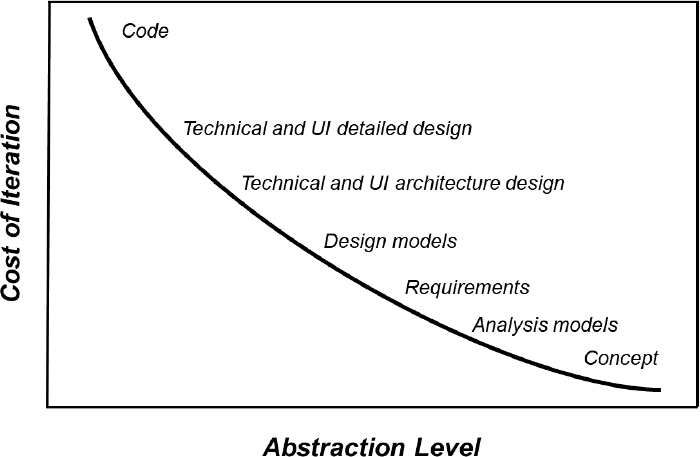
Figure 3.3 The cost of iteration is lower at higher levels of abstraction.
Stepping Back from the Details
For both requirements and designs, there’s great value in drawing pictures that represent various aspects of the system and then iterating on those pictures. It’s far faster to modify a diagram than to rewrite code. Working software is tangible; analysis and design models are abstract in that they represent something other than themselves. Diagrams that depict information at a high level of abstraction let people step back from the trees and study the forest as a whole from particular angles.
Whether you’re using simple hand-drawn sketches or high-resolution diagrams drawn in a software modeling tool, you’re modifying the design at a conceptual, not physical, level. The models won’t show all the nitty-gritty bits of reality in an actual product, but they help you visualize how the pieces fit together. Because of the value it can bring, I regard modeling as an essential skill for any business analyst (BA) or software designer (Wiegers, 2019a).
A consulting client protested when I suggested that his team would benefit from diagramming specific aspects of their project. “Our system’s too complex to model,” he claimed. But wait—by definition, a model is simpler than the thing it’s modeling. If you can’t handle the model’s complexity, how can you expect to handle the problem’s complexity? The diagrams can become intricate and confusing for intricate and confusing systems. That very challenge is a strong argument for using techniques to understand and manage the conceptual complexity.
Rapid Visual Iteration
As we saw earlier, user interfaces have two levels of design, architectural and detailed. When you view a UI screen, you see a piece of the detailed design, with its text layout, visual design theme, images, links, input fields, options, and controls. If you need more precision, you can specify the detailed design of a screen or web page using a technique such as a display-action-response (DAR) model (Beatty and Chen, 2012). However, iterating on the detailed UI design requires that you modify the individual display elements. Those revisions can become tedious unless you’re using an efficient screen builder tool.
The UI’s architectural design reveals itself through the navigation options each screen presents. You can refine an architectural design rapidly by drawing a dialog map (Wiegers and Beatty, 2013). A dialog map represents a user interface architecture in the form of a state-transition or statechart diagram. Each display that the system presents to the user constitutes a distinct state the system can be in.
Figure 3.4 illustrates a simplified portion of the dialog map for my consulting company’s website. Each rectangle represents a dialog element where the user and system can interact: a web page, workspace, menu, dialog box, message box, even a line prompt. The arrows indicate defined navigation paths from one dialog element to another. You can label the arrows to indicate the conditions and/or actions that trigger the navigation. Representing a UI at this level of abstraction prevents people from being distracted by the details of each dialog element’s appearance. They can focus on the big picture of how a user would interact with the system to accomplish a task by flowing through a series of dialog elements.

Figure 3.4 A dialog map shows navigation options between dialog elements, such as web pages.
I once led a discussion with several users to get our heads around how a particular task sequence could best function in the new system we were specifying. I had a whiteboard marker in one hand and an eraser in the other. I quickly sketched out a possible navigation flow on the whiteboard using the boxes and arrows of a dialog map. We knew—and cared—nothing about what the screens might look like, only their names and a general notion of their purpose. As the group critiqued my drawing and suggested changes, I would erase a piece and draw something different. In this way, we could rapidly adjust until we reached a shared concept of the optimal navigation flow. Along the way, we also found some errors and omissions in our original thoughts. Iterative modeling like this is a powerful thinking aid, a way to refine initial design concepts.
A model like a dialog map is static. You can walk through a series of boxes on the diagram to imagine how the user would perform a task. The next iteration level to refine a UI design is a dynamic simulation. You mock up a set of screens in a suitable tool—possibly as simple as Microsoft PowerPoint—to create a storyboard of the UI that looks more real. That lets you simulate the user experience more precisely by navigating from one such screenshot to another in a task flow. This process moves the iteration from a high-level model down one level of abstraction to a simple UI mockup. A selective combination of quick design modeling, simulation, and prototyping will take less effort than implementing the entire user interface and then modifying it until your users are happy.
Iteration Made Easy
When I began modeling software systems, I quickly discovered two truths. First, I needed to make multiple cycles because my first attempt would not yield an ideal design. Second, I needed tools that made it easy to revise my diagrams. If I had to completely redraw a picture every time I think of a change, I wouldn’t make more than one revision.
Software modeling tools became popular in the 1980s and 1990s. They make it easy to modify diagrams, such as dragging the arrows attached to an object along with it when I reposition or resize the object. The tools know the symbology and syntax for several standard analysis and design notations. They can validate diagrams and point out possible errors. General-purpose diagramming packages like Microsoft Visio now incorporate some of the standard symbology sets for software models. However, the general tools lack the validation capabilities that are valuable in dedicated modeling tools, along with the ability to integrate multiple diagrams and their associated data definitions for a whole system.
Modeling makes it easy to explore multiple approaches quickly and conceive a better design than you could create with just a single attempt. Keep in mind that you need not generate perfect models. Nor must you model the entire system, just the parts that are especially complex or uncertain. Diagramming tools facilitate iteration, but it’s easy for users to get caught up in an infinite revision cycle, mousing around endlessly in an attempt to perfect the models. Such analysis paralysis takes iteration to an extreme that’s no longer productive.
Visual models are communication aids, ways to represent and exchange knowledge. If we’re going to communicate, we need to speak the same language. Therefore, I strongly recommend using established notations when modeling requirements or designs. A proposed system architecture can be modeled as a straightforward block diagram, but lower-level designs demand more specialized symbology. The most popular notation for object-oriented design is the Unified Modeling Language or UML (Page-Jones, 1999). If you want to explore, revise, document, and share your design ideas, adopt a standard like the UML instead of inventing your personal notations that others might not understand. Modeling doesn’t fully replace prototyping, but any method that facilitates rapidly reviewing and revising designs at a high level of abstraction will help you build better products.
Lesson #19. Make products easy to use correctly and hard to use incorrectly.
I recently tried out some online life-expectancy calculators to estimate my statistical expiration date. Many such calculators are simplistic, asking for just a few bits of data and then making a fuzzy guess. I was pleased to find a comprehensive calculator that requested no fewer than thirty-five pieces of information about my personal characteristics, family background, medical history, and lifestyle. The website provided drop-down lists so I could select values for the many data items it requested. However, the website did have one small user interface design problem, as Figure 3.5 illustrates.
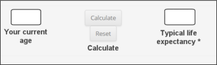
Figure 3.5 It’s too easy to accidentally click on the Reset button in this web form instead of the Calculate button.
After entering all this data, I went to click on the Calculate button to see how much longer I might be around. However, I accidentally hit the Reset button instead. As Figure 3.5 shows, those two buttons are styled identically, are not easy to read because of a medium-gray-on-light-gray color scheme, and actually touch each other, something you rarely see in UI designs. Not only that, but the prompt to trigger the calculation appears below the Reset button, not adjacent to the Calculate button, so I instinctively clicked on the button next to that prompt. When I accidentally clicked on Reset, all thirty-five of my data entries disappeared immediately. I had to start the process over since I still wondered what my future might hold.
This website makes it too easy for the user to make a mistake. Such design problems are annoying. Maybe I’m the only user who ever accidentally clicked on the Reset button, in which case it’s my problem, not the website’s. Even informal usability testing might have revealed the button layout risk, though. Three simple changes could improve this design:
1. Move the Calculate and Reset buttons farther apart, so the user is less likely to hit the wrong one by accident.
2. Style the Calculate and Reset buttons differently, such as making the riskier one—Reset—smaller and red, and making the desired one—Calculate—larger and green.
3. Protect users against error by asking them to confirm destructive actions like discarding all their data. You know, just in case they hit the wrong button by mistake.
A well-designed user interface makes the product both easy to use correctly and hard to use incorrectly. Prompts and menu options are clearly written using terminology the expected users will understand. The designer provides backout options to let the user return to a previous screen or restart a task, preferably without having to re-enter information they already provided. Data inputs appear in a logical sequence. The appropriate values to enter into each field are evident because of how the fields are structured, using drop-down lists, or with adjacent guidance text.
These properties are characteristic of an effective UI design. They make it easy for users to accomplish what they need to do when using a website or application. As well as designing for efficient usability, designers must also consider what could go wrong and how to prevent or respond to any missteps. Designers can choose to deal with potential errors in four ways (Wiegers, 2021):
1. Make it impossible for the user to make a mistake.
2. Make it difficult for the user to make a mistake.
3. Make it easy to recover from an error.
4. Just let it happen. (Please don’t.)
Make It Impossible for the User to Make a Mistake
Preventing errors is the preferred strategy. If the user must enter a particular piece of data, a blank input field invites arbitrary entries that the program must validate. Providing a drop-down list (or other control) with the allowable choices constrains the input to legal values. Don’t provide invalid selection options. I’ve seen credit-card expiration date drop-down lists that included years earlier than the current one, which makes no logical sense. Similarly, I’ve seen controls that let the user enter nonexistent dates like February 30. Accepting invalid input data will result in an error when the web page submits the information for processing.
Make It Difficult for the User to Make a Mistake
If you can’t make user errors impossible, at least make them challenging. In the life-expectancy calculator example above, I proposed three ways to make it less likely that a user will click the wrong button by mistake. Another good practice is to label the options in dialog boxes to avoid ambiguity regarding the system’s response to each choice. Don’t make the user enter the same information twice, which doubles their opportunities to make a mistake and takes twice the time. For instance, if an e-commerce page needs both the user’s shipping and billing addresses, let the user indicate they’re the same by ticking a checkbox.
Make It Easy to Recover from an Error
Despite your best efforts, errors will sometimes still occur, either on the user’s part or behind the scenes when the system does its work. Design to make it easy for the user to recover from such situations. Easy recoverability is a characteristic of a robust software system. Robustness is a quality attribute that describes how well a product handles unexpected inputs, events, and operating conditions. A multilevel undo/redo function and clear, meaningful feedback messages that help the user correct any errors are particularly helpful. Cryptic numeric error codes about HTML errors, database access problems, or network failures can help with technical diagnosis, but they don’t do an average user any good.
Just Let It Happen
The least desirable design option is to let the error occur and force the user to deal with the consequences. Suppose the user asks to initiate some use case that has certain preconditions that must be satisfied for the system to perform the task properly. The software should test those preconditions and help the user satisfy them if necessary, rather than just charging ahead and hoping for the best. The design should detect potential show-stopping conditions as early as possible to avoid wasting the user’s time. Users like systems that they understand, that prevent or correct user errors, and that communicate with them clearly and helpfully.
By the way, the life expectancy calculator that I tried suggested that I’ll probably be around for a few more years. That was good news, even if using it did put a double-sized dent in my life expectancy, thanks to the less-than-ideal UI design.
Lesson #20. You can’t optimize all desirable quality attributes.
The next software app I use had better not have any bugs in it, no 404 “page not found” errors or help screens that don’t match the form with which I’m working. It shouldn’t use much memory or slow down my computer, and it ought to free up all the memory it used when it’s done. The app should be completely secure: no one can steal my data or impersonate me. It should respond instantaneously to my every command and be completely reliable. I don’t want to see any “internal server error” or “application is not responding” messages. The user interface should never let me make a mistake. I should be able to use the app on any device I want, with instantaneous downloads and no timeouts. It should let me import and export any data I need from other sources. Oh, yes, I almost forgot—this app should be free, too.
Doesn’t that sound like a fabulous app? It sure does! Are my expectations reasonable? Of course not!
It’s impossible to get the best of all possible worlds for every aspect of a software system’s capabilities and characteristics. There are inevitable trade-offs among various aspects of quality—increasing one often causes an unavoidable decrease in another. Consequently, an essential part of requirements analysis is understanding which characteristics are the most important so that designers can address them appropriately.
Dimensions of Quality
Software project teams must consider a broad set of quality attributes as they explore requirements. Quality attributes are also called quality factors and quality of service requirements. The terms Design for Excellence and DfX refer to quality attributes as well, where X is a property of interest that designers strive to optimize (Wikipedia, 2020). When people talk about nonfunctional requirements, they’re usually referring to quality attributes.
Nonfunctional requirements aren’t directly implemented in software or hardware. Instead, they serve as the origin for derived functionality, architectural decisions, or design and implementation approaches. Some nonfunctional requirements impose constraints that limit the choices available to the designer or developer. For instance, an interoperability requirement could constrain a product design to use certain standard interfaces.
I’ve seen lists of more than fifty software quality attributes, organized in various hierarchies and groupings. Few projects will need to worry about that many. Table 3.1 lists some quality attributes that every software team should consider as they learn what quality means for their product (Wiegers and Beatty, 2013). Physical products that contain embedded software have some additional quality attributes, such as those listed in Table 3.2 (Koopman, 2010; Sas and Avgeriou, 2020).
Table 3.1 Some important quality attributes for software systems

Table 3.2 Some additional quality attributes for physical products containing embedded software

One property that doesn’t appear in either of these tables is cost. As with product functionality, designers must balance the value of achieving some desired quality goal against the cost of achieving it. For instance, everyone would like the software they use to be available for use all the time, but achieving that can be expensive.
One of my consulting clients had a manufacturing control computer system with an availability requirement of 24 hours a day, 365 days a year (366 in leap years), with zero downtime acceptable. They met that requirement by having redundant computer systems. They could install software updates on the offline system, test the software, cut over to put that system online, and then update the second system. Having two independent computer systems was expensive, but it was cheaper than not manufacturing their product when the control system was down.
Specifying Quality Attributes
Designers need to know which quality attributes are most important, which aspects of those often multidimensional attributes are paramount, and the target goals. It’s not enough to say simply, “The system shall be reliable” or “The system shall be user-friendly.” The BA needs to ask questions during requirements elicitation to understand just what stakeholders mean by reliable or user-friendly. How could we tell if the system was reliable or user-friendly enough? What are some examples of not being reliable or user-friendly?
The more precisely the BA can state the stakeholders’ quality expectations, the easier it is for designers to make good choices and assess whether they’ve reached the goal. Roxanne Miller (2009) provides many examples of clearly written quality attribute requirements in numerous categories. When possible, state quality goals in measurable and verifiable ways to guide design decisions. Consider using Planguage, a keyword language that permits precise, quantitative specification for such vague attributes as availability and performance (Simmons, 2001; Gilb, 2005). Specifying requirements this carefully takes some time, but that’s time well spent compared to restructuring a product after it fails to meet customer expectations.
Designing for Quality
Designers can optimize their solution approach for just about any quality parameter, depending on what they’ve been told—or think—is most important. Without guidance, one designer might optimize for performance, another usability, and a third portability across delivery platforms. The project’s requirements explorations need to identify which attributes are more important than others to guide the designers in the most important direction for business success. That is, you need to prioritize nonfunctional requirements just as you do functionality.
Prioritization is essential because of the trade-offs between certain pairs of quality attributes. Increasing one quality attribute often requires that the designer compromise in some other areas (Wiegers and Beatty, 2013). Here are some examples of quality attribute conflicts that demand trade-off decisions:
• Multifactor authentication is more secure than a simple login password, but it reduces usability because of the additional steps involved.
• A product or component that’s designed to be reusable will be less efficient than if the code for that functionality were optimized for a single application. Provided the performance penalty is acceptable, it still could be sensible to create a reusable component.
• Optimizing a system for performance could reduce its portability if the developers exploited specific operating system or language properties to squeeze out every bit of performance.
• Optimizing certain aspects of a complex quality attribute could degrade others. For instance, within the broad usability domain, designing for ease of learning by new or occasional users might make the system less efficient for use by an expert.
On the other hand, some pairs of quality attributes exhibit synergies. Designing a system for high reliability will enhance several other attributes:
• Availability (If the system doesn’t crash, people can use it.)
• Integrity (The risk of data loss or corruption from a system failure is reduced down.)
• Robustness (The product is less likely to fail because of an unexpected user action or environmental condition.)
• Safety (If a product’s safety mechanisms work reliably, nobody gets hurt.)
The quality attribute interactions demonstrate why the project team must understand early on what quality means to the key stakeholders and align everyone’s work toward those objectives. Stakeholders who don’t work with BAs to shape this understanding are at the mercy of designers who will make their best guess. If you don’t explore nonfunctional requirements during elicitation and specify them precisely, you’re just lucky if designers build in the properties that customers value.
Architecture and Quality Attributes
The development team needs to understand which attributes require close attention early on so they can make appropriate architectural design choices. A system’s architecture affects multiple attributes, including availability, efficiency, interoperability, performance, portability, reliability, safety, scalability, and security. Because compromises are often needed, if architects don’t know which attributes are most important, they might make design choices that don’t lead to the desired outcomes.
It’s costly to go back late in development or after release and re-engineer the system’s architecture to remedy quality shortcomings. Building systems incrementally without early knowledge of the most significant quality goals can lead to problems that might be hard to rectify, particularly if both hardware and software are involved. As is so common with software projects, spending a little more time up front to better understand the quality goals can lead to less expensive and more durable solutions.
Lesson #21. An ounce of design is worth a pound of recoding.
When I wrote my first book twenty-five years ago, I didn’t know what I was doing. I began with a comically skimpy outline; my initial book architecture was severely flawed. With guidance from an exceptionally patient editor, I restructured it into something far more readable. That restructuring took a full month of cutting and pasting, dragging and dropping, patching and smoothing. It added no value to the content but much to the delivery.
That painful rework experience delivered a powerful message. Since I began investing a lot more effort into designing a book at both the architectural and detailed levels, I’ve never had to do more than minor sequencing tweaks. I could then concentrate on content, not structure. As we saw in Lesson #18, “It’s cheaper to iterate at higher levels of abstraction,” moving items around in a book outline is far easier than reorganizing and rewriting sentences.
The same lesson applies to software design. Time invested in thoughtfully considering the design is more than repaid by time not spent fixing problems later—up to a point. You can certainly waste time trying to perfect a design in the face of uncertainties, so scale your design efforts to the nature of the problem. Even after doing your best to craft a design, you might discover shortcomings later on and have to tune it up. Nonetheless, time spent considering how to structure various aspects of your program helps you avoid excessive redesign and recoding.
Technical Debt and Refactoring
Designs executed in haste can generate technical debt, shortcomings that someone must resolve in the future to maintain the product’s proper functioning and expandability. (See Lesson #50, “Today’s ‘gotta get it out right away’ development project is tomorrow’s maintenance nightmare,” for more about technical debt.) A modest amount of technical debt could be an acceptable trade-off if skimping on design and hacking the code together accelerates achieving a pressing business objective. However, the flaws remain. The longer the team waits to address them, the more extensive, costly, and disruptive the rework will be. As with any loan, technical debt should be viewed as temporary and steadily paid off.
Rework to reduce technical debt often takes the form of refactoring. Refactoring is the process of restructuring existing code to improve its design without changing its functioning. You might decide to restructure some code to simplify it, make it more maintainable or extensible, improve its efficiency, remove duplicated and unneeded portions, or make other improvements. Substantial design changes can require significant recoding effort, when the team would prefer to be creating new useful functionality. I get uncomfortable when I see the prefix re- used this many times. We are doing something over again that we’ve already done once.
Design rework consumes effort without adding much immediate value to the customer, but it’s necessary to maintain a stable foundation for continued product growth. Good design minimizes creating technical debt, whereas refactoring chips away at accumulated technical debt. A judicious balance of the two will yield the best results. Superficial initial designs can lead to excessive rework; overly prescriptive designs can consume excessive time and may still miss the mark. Two quotations from design experts reveal the dichotomy:
By continuously improving the design of code, we make it easier and easier to work with. This is in sharp contrast to what typically happens: little refactoring and a great deal of attention paid to expediently adding new features (Kerievsky, 2004).
It is practically impossible to think of everything or know everything in the beginning of a project... However, you can use your experience and the experiences of others to guide you in a certain direction. You can make decisions today that might minimize changes tomorrow (Pugh, 2005).
As Ken Pugh indicates in the second quote above, a design goal is to make sensible decisions now to prevent unnecessary changes in the future. Use your judgment and input from your business stakeholders to guide design choices based on how likely it is that certain portions of the product will have to change.
Architectural Shortcomings
Making small design adjustments as you go along isn’t too painful. It steadily and incrementally improves the product. Major architectural restructuring to improve product robustness or the user experience is more disruptive.
As an illustration of how a deficient architectural design affects the user experience, consider the many different ways to delete an item from my smartphone. The user actions, prompts, and icons vary depending on what I’m deleting: text message, mail message, saved map location, photo, note, calendar event, alarm, contact, missed phone call, or an entire app. Some deletion actions require confirmation; others do not. The process sometimes varies if you’re deleting a single instance of the object or multiple instances. It gets confusing for the user.
Designers could have avoided many of these inconsistencies had they worked from common UI standards and an overarching design architecture. Design thinking at that level might have enabled some code reuse as well. Reuse is an excellent way to improve quality, boost developer productivity, and reduce the user’s learning curve. It would take an excessive amount of work to achieve commonality in those delete operations at this late stage of product maturity. And that’s just for one operation that recurs in some form in nearly every software system.
Software developers always create a design, either on the fly or through careful consideration. Accruing technical debt because the team doesn’t have time to perform design and implementation properly merely pushes the problem into the future, where it continues to grow in impact. Investing in design—what Ken Pugh (2005) terms prefactoring—can save considerable restructuring and recoding down the road when you’d rather work on something else.
Lesson #22. Many system problems take place at interfaces.
The simplest software system consists of a single code module and an interface to the user. An interface describes how two architectural elements intersect, either internally between two components of a multicomponent system or between the system and its external environment. Some interfaces must follow established standards and protocols, such as for communications and hardware connections. Other interfaces are specific to a particular application.
Any sizable software system has many modules and numerous internal interfaces between system components, as one component invokes another to provide some service. A system could also present external interfaces to human users, other software systems, hardware devices, networks, and possibly the computer’s operating system, as illustrated in Figure 3.6. Products that contain both hardware and software components introduce additional interface complexities.
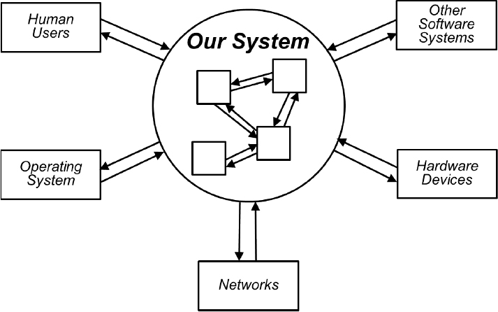
Figure 3.6 Software systems have internal interfaces between components and external interfaces to other entities.
Internal and external interfaces are common sources of problems. For instance, reusable code libraries with poorly or incorrectly documented interface descriptions can increase coding time as developers struggle to integrate the components into their system. The conscientious designer will ensure that all pieces of a complex system fit together correctly across their mutual interfaces. New components that developers integrate into an existing system must conform to established interface conventions.
Technical Interface Issues
An interface defines a contract or agreement regarding how two architectural elements—one a requestor and the other a provider—connect to exchange data and services. Each of these elements has a clearly defined boundary and a set of responsibilities or services it provides. Defining an interface involves more than just stating how to invoke an operation across it. A complete interface description contains numerous elements (Pugh, 2005; Rozanski and Woods, 2005):
• The syntax (type and format) and semantics (meaning) of service requests and responses that cross the interface, including both data and control inputs and outputs.
• Constraints that restrict the data types or values that may be passed across the interface.
• The mechanism or protocols by which the interface functions, such as messaging or a remote procedure call.
• Preconditions that state conditions that must be true at the beginning of an interaction across the interface.
• Postconditions that state conditions that will be true following the interaction for both success and exception scenarios.
Problems can arise if the responsibilities for the requestor and provider components that share an interface aren’t clear. Functionality could be duplicated across the components, or functionality could be missing because the people working on the two components each thought the other would handle it. Architectural components should always respect their established interfaces. For instance, a code module should never attempt to access code or services in another module except through their mutual interface.
Each implementation of an interface should conform to what its contract specifies (Pugh, 2006). Further, the implementation should do no harm, such as consuming excessive memory or holding locks on data objects unnecessarily. The design also must handle interface errors. If an interface implementation can’t perform its responsibilities for some reason, it should provide an appropriate notification to assist in recovery efforts.
I recently began reading an eBook that I borrowed from the library in my iPad’s web browser. I repeatedly tried to download the file for offline access, using the button provided for that function. The download would begin, but then I’d see the uninformative error message in Figure 3.7. Apparently, there was some reproducible failure with the interface between my iPad and the server that hosted the eBook, which the software duly reported to me. But I have no clue from this message where the problem lay or what to do about it. I never could download that eBook or others I tried to access in the same way.
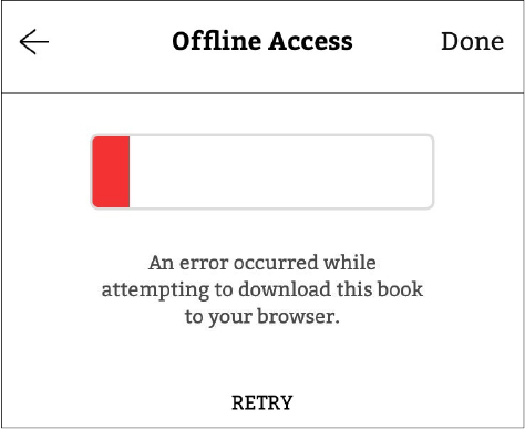
Figure 3.7 This message didn’t help me correct an interface error between my iPad and the eBook server.
Designers should thoroughly plan and study the system’s internal and external interfaces to prevent such user irritations. Complex systems that have many interconnected components are challenging to modify. Changing one of the interface definitions can launch a cascade of changes in the other connected components. Unless the system is architected with clearly defined component interfaces, technical debt can accrue as the team adds new capabilities that require interface changes. Problems can also arise if new functionality doesn’t respect the existing interfaces.
When designing an interface, it’s common to start with everything the designer thinks a user—whether a human or a system—might need. This approach can result in bloated interfaces loaded with functionality that the interface’s users won’t ever employ. It’s preferable to pursue a requestor-driven design by asking, “What functions will the users of my interface actually need?” Writing tests before implementation helps designers think through how the interface will be used so they can incorporate the required interface capabilities without including unnecessary elements. Understanding the tasks that users will want to perform with the software also contributes to building a streamlined UI.
Try to anticipate likely changes that developers will make in the system over time and consider how they might affect the interfaces. This anticipation is particularly important when growing an application in iterative and incremental development life cycles. The priority of planned incremental enhancements will inform developers about those portions of the system that are more likely to change and those that should remain more stable. Designing the architecture well from the outset facilitates sustained product growth and frequent releases (Scaled Agile, 2021b).
Input Data Validation
Each component involved in an interaction should validate the inputs it receives across the interface before processing them. Many security exploits occur because bad actors inject malicious code across an interface that doesn’t reject it as an invalid input. My website’s error log occasionally shows messages suggesting that a user attempted to access the site with invalid inputs. Fortunately, my website hosting provider looks for such dangerous inputs and blocks them. Microsoft (2017) recommends some practices for validating user input to thwart these types of malware attacks. Conforming to secure coding standards and using tools to scan for interface risks and other security threats also reduces system security vulnerabilities (SEI, 2020).
Figure 3.8 provides a heuristic to guide your assessment of interface behavior. Following a proper design-by-contract interface strategy will ensure that your components lie in the two quadrants within the heavy dashed line.

Figure 3.8 Looking at valid and invalid inputs and outputs lets you assess proper interface behavior (courtesy of Gary K. Evans, personal communication).
A well-designed system will properly handle exceptions that take place at both internal and external interfaces. I recently tried to print a document from my Windows PC to a printer on my home WiFi network. The printer was powered on and connected to the network, but my PC insisted the printer was offline. I had to restart my PC, which then correctly discovered the printer as being online and sent the print job. Some unhandled interface problem between the PC and the printer apparently had broken the connection between them, with no way for me to repair it other than the drastic action of a computer reboot.
User Interface Issues
Users aren’t concerned with a system’s internal architecture but with its user interface. User interface shortcomings lead to products that users regard as being thoughtlessly designed. Inconsistent UI behavior confuses and frustrates users, as we saw with the diverse smartphone deletion operations described in the previous lesson. Poorly designed user interfaces lead to products that aren’t easy or obvious to use, waste the user’s time, make it too easy to make a mistake, and don’t work well in realistic usage scenarios (Wiegers, 2021).
Defining UI standards helps provide a consistent user experience both throughout an application and across multiple related applications. When I managed a small software group, we adopted UI guidelines for the applications we developed for internal company use. This philosophy helped all of our applications look and behave similarly. Our users could recognize from the UI that an app they used came out of our group, but they couldn’t tell which team member designed the UI because of its style.
Well-designed user interfaces should require little support documentation in the form of help screens, user guides, and tip sheets (Davis, 1995). They make it easier for users to get up to speed on a new application, and users will make fewer errors when they use it. There’s a vast body of literature on software UI (or, more generally, UX) design; a valuable resource is the classic book About Face by Alan Cooper et al. (2014). Any designer will benefit from usability expert Jakob Nielsen’s usability heuristics for UI design (Nielsen, 2020). Keeping the design focused on usage, rather than on product features, can help avoid many UX problems. (See Lesson #4, “A usage-centric approach to requirements will meet customer needs better than a feature-centric strategy.”)
Interface Wars
Interface problems sometimes come to light as the team integrates code modules into the product. Integration testing failures when multiple modules are combined can trigger finger-pointing as developers attempt to determine where the problem lies. This conflict isn’t healthy. If the architecture is appropriately structured, interfaces are well defined, developers respect the interfaces, and modules pass their unit tests, then integration should progress smoothly—and without rancor.
Next Steps: Design
1. Identify which of the lessons described in this chapter are relevant to your experiences with different aspects of software design.
2. Can you think of any other design-related lessons from your own experience that might be worth sharing with your colleagues?
3. Identify any practices described in this chapter that might be solutions to the design-related problems you identified in the First Steps at the beginning of the chapter. How could each practice improve the way your project teams design their products?
4. How could you tell if each practice from Step #3 was yielding the desired results? What would those results be worth to you?
5. Identify any barriers that might make it difficult to apply the practices from Step #3. How could you break down those barriers or enlist allies to help you implement the practices?
6. Put into place guidance documents, checklists, or other aids to help future project teams apply your local design best practices effectively.