digital printing
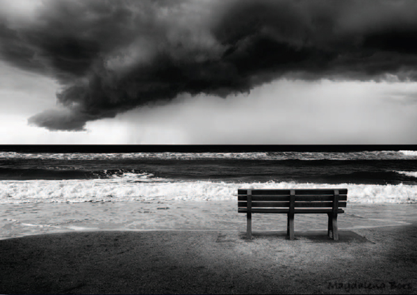
Magdalena Bors
essential skills
~ Control the color accuracy between monitor preview and print.
~ Understand the procedures involved with producing a digital print.
~ Print a color-managed digital image using a desktop inkjet printer.
~ Compensate for visual differences between the monitor preview and print.
Introduction
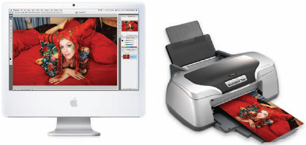
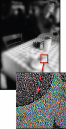
Creating high-quality prints using desktop inkjet printers can be a mystifying, infuriating and costly experience. You can really only hope to get close to the quality of traditional photographic prints if you follow a color-managed workflow and print on digital ‘Photo Paper’ using a ‘6-ink’ (minimum) rather than a ‘4-ink’ inkjet printer. Using high quality photo papers ensures that the images you print will appear sharp and with richly saturated colors. Matching the colors of the print to those that appear on your monitor is, however, a mystifying experience for many. A little understanding of the issues involved will help you find a personal path to perfect prints.
The Epson Stylus Photo R800 is capable of printing a rich color gamut due to additional primary red and blue inks. A tiny droplet size makes the need for light cyan and light magenta inks superfluous
If you choose to print using a budget priced 4-ink inkjet printer, the lower quality is most noticeable in the highlights of the image. The addition of light cyan and light magenta inks or a high-quality printer that is capable of printing a very small dot ensures smooth photographic quality highlights (the ink dots are hard to see without a magnifying glass). Epson 6 and 8-ink printers retail under the ‘Epson Stylus Photo’ name, whilst Canon’s 6 and 8-ink models are often referred to as ‘bubble-jet’ printers.
Color conversions
Color on a computer’s monitor is created by mixing red, green and blue light (RGB) whilst the reflected light from cyan, magenta, yellow and black inks (CMYK) creates color on the printed page. A perfect match is therefore very difficult to achieve, as the range or ‘gamut’ of colors capable of being reproduced by each of the two display mediums is similar, but different. The colors present in a digital image file have to be translated or converted to fit the gamut or ‘color space’ of each output device or printer. Once you have achieved an accurate translation, however (a good looking print that resembles what you have pictured on your monitor), just changing the brand of printing paper can upset the apple cart if the translation process is not adjusted accordingly.
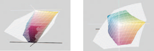
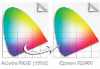
The range or ‘gamut’ of colors that each output device is capable of displaying can vary enormously. In the illustrations a CMYK printing space (shown in color) is contained by the much larger RGB monitor space (shown in white)
Profiles
The accuracy of color translation is made possible by the use of ‘ICC profiles’ such as ‘sRGB’ and ‘Adobe RGB’. Profiles are tagged onto image files by digital cameras, scanners and image-editing programs as a way of recording not only the color numbers (the numerical values taken from the levels in each of the channels) but how the colors actually appear in terms of their relative hue, saturation and brightness. In a ‘color-managed’ workflow it is a ‘color management engine’ (such as Adobe’s ‘ACE’ built into Photoshop) that will massage the numbers of the colors captured so that the actual appearance of the color is the same on your calibrated and profiled monitor. Your monitor has a distinctly different set of color characteristics to the capture device, and so the color management engine uses your monitor’s profile to perform the task of color matching. Color accuracy is only possible, however, if you have calibrated and profiled your monitor.
Color profiles help to ensure that what you see is what you get
The completion of this color management process is where the colors we see on our monitor are then translated accurately into the colors that we can see reproduced by our chosen output device. With this final step there are however choices, as the computer’s operating system, the Adobe software and the printer are all capable of managing this final step – and these choices typically lead to the confusion that often surrounds the printing procedure. Get the mix of choices wrong and the final result can look like the proverbial dog’s dinner. Find the right route through the maze of options and color consistency is yours.
Monitor calibration and working color space
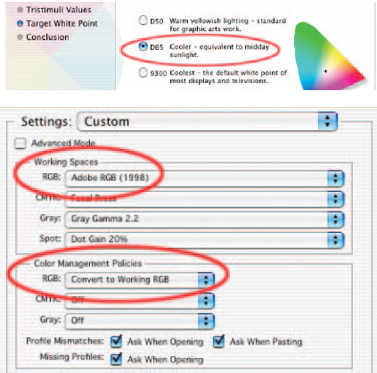
To ensure the level of visual consistency outlined earlier we must first check that our monitor’s contrast, brightness and color are fairly standard, i.e. not on a 60s trip to the world of weird. Each monitor requires its own custom profile (not the canned one considerately installed by the factory). Standardizing the monitor’s display is called ‘monitor calibration’. When the monitor is calibrated we can save a profile for the monitor. In this way the precise colors captured by the camera can be interpreted by Photoshop and tweaked using the monitor profile so that the image can be displayed accurately on your unique screen (a case of ‘what-you-see-is-really-what-you-get’). Reset the ‘Target White Point’ (sometimes referred to as ‘Adjusted White Point’) of the monitor to D65 or 6500, which is equivalent to daylight (the same light you will use to view your prints), using ‘Adobe Gamma’ (from the ‘Control Panel/s’ in Windows) or ‘Display Calibrator’ (from the ‘Utilities’ folder in Mac OSX).
Note > See ‘The Digital Darkroom’ for extended information on this important subject.
Select an appropriate color setting for the software
To create an on-screen preview of the image that will be eventually output by your printer, it is important to select a ‘working space’ for Photoshop that is sympathetic to the range of colors that can be achieved by your inkjet printer using good quality ‘photo paper’. The most suitable working space currently available is called ‘Adobe RGB (1998)’. To implement this working space choose ‘Color Settings’ in Photoshop and set the workspace to ‘Adobe RGB (1998)’ from the RGB pull-down menu. In the ‘Color Management Policies’ section, select ‘Convert to Working RGB’ from the ‘RGB’ pull-down menu and check the ‘Ask When Opening’ boxes.
Pre-flight check list
In an attempt to make the first time not too memorable, for all the wrong reasons, check that your ink cartridges are not about to run out of ink and that you have a plentiful supply of good quality paper (same surface and same make). It is also worth starting to print when there are several hours of daylight left, as window light (without direct sun) is the best light to judge the color accuracy of the prints. If you are restricted to printing in the evening it may be worthwhile checking out ‘daylight’ globes that offer a more ‘neutral’ light source than tungsten globes or fluorescent tubes. It is also important to position the computer’s monitor so that it is not reflecting any light source in the room (including the direct illumination from windows and skylights). If your monitor is reflecting a brightly colored wall or window then consider shifting your furniture.
Note > Refilling your ink cartridges and using cheap paper is not recommended for absolute quality and consistency.
Keeping a record
The settings of the translation process (all the buttons and options that will be outlined next), the choice of paper, the choice of ink and the lighting conditions used to view the print will all have enormous implications for the color that you see on the printed page. The objective when you have achieved a color match is to maintain consistency over the process and materials so that it can be repeated with each successive print. It is therefore important to keep a track of the settings and materials used.
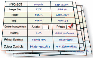
There is only one thing more infuriating than not being able to achieve accuracy, and that is achieving it once and not being sure of how you did it. Some words of advice – WRITE IT DOWN!
Note > A template for the print record sheet is available on the supporting DVD.
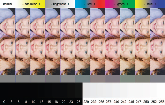
Use the test file to help you target the perfect color balance quickly and efficiently
Preparing a test print
Start the printing process by selecting ‘Print’ from the ‘File’ menu. As discussed previously there are several methods of printing. There is no one road. In order to discover a workflow that suits your own setup it is recommended that you use a test file that has a broad range of colors of varying saturations. Use a test file that incorporates a range of saturated colors, neutral grays and skin tones. If this file prints perfectly you can be confident that subsequent prints using the same media and settings will follow true to form. The test print file in the illustration above is available on the supporting DVD. It will help you target your optimum shadow and highlight points and stop you from chasing what initially appears to be a color cast and in the end turns out to be a blocked ink jet.
Note > There is an old saying, ‘quality in – quality out’. Each image you print must be checked that it has been optimized for printing. The file’s histogram should be optimized and any obvious color cast removed. See ‘Capture and Enhance’.
Printer manages color
The first path uses the Photoshop default settings in the ‘Print’ dialog box. This path allows the printer to manage the colors. Although Adobe has the industry standard color management engine it is only as effective as the profiles it is handed for the conversion job. The printer profiles shipped with the printer are again canned and may, or may not, bear any resemblance to the color characteristics of the actual printer you are using.
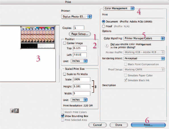
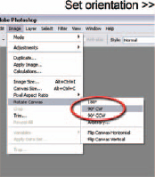
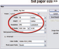
1. Click on ‘Page Setup’ to select the paper size and orientation (horizontal or vertical). If you only need to change orientation click on the icon below the preview window.
2. Deselect the ‘Center Image’ check box.
3. Drag the image preview to a corner of the page to save printing paper.
4. Choose ‘Color Management’ from the options menu.
5. Select the ‘Printer Manages Colors’ option in the Color Management section (use the ‘Photoshop Manages Colors’ option if you have a custom profile for your printer).
6. Select Print.
Note > The default settings in the Adobe Print dialog box use a setting called ‘Printer Manages Colors’, which you can only see if you click on the ‘More Options’ button. This setting instructs the Adobe software to hand over the image to the printer without making any changes to the color numbers. When you click on the Print button in the Print dialog box you will be transported to the printer driver dialog box.
Printer driver
Look for the following options in your printer dialog box:
1. Select the paper you are using from the ‘Media Type’ menu.
2. Select the ‘Advanced’ option (usually found in the ‘Custom’ menu on a PC).
3. Select the maximum dpi from the ‘Print Quality’ menu or any option that indicates the ‘Best Photo’ quality option has been selected.
4. Select ‘Color Controls’ from the ‘Color Management’ menu (you should see the Magenta, Cyan and Yellow color sliders).
5. Select ‘Print’.
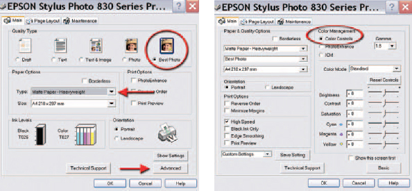
The options for ‘Printer Color Management’ in an Epson printer driver for a PC
The printer is now handling the color management. Once the test file has been printed you can make an assessment of what changes need to be made before printing a modified or ‘tweaked’ version. Be sure to let the test print dry for at least 10 to 15 minutes before making an assessment of the color and tonal values as these may change quite dramatically. Subtle changes can continue to occur for several hours during the drying process. See ‘Analyzing the test print’ when assessing whether any changes need to be made to the first test print. To speed up and simplify the procedure for subsequent prints a ‘custom setting’ or ‘preset’ can be resaved in the printer driver once you have achieved accuracy by fine-tuning the color sliders. Name the custom setting incorporating the paper surface, e.g. Matte HW-PCM (printer color management).
Note > The precise wording of the options in the printer drivers may vary between different manufacturers and models of printer.

Photoshop manages color
The secret to success when using Adobe’s color management is to select ‘No Color Adjustment’ from the ‘Color Management’ or ICC controls in the printer driver software (if using a Canon printer go to ‘Color > Color Control > None’).
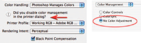
Select ‘No Color Adjustment’ in the printer driver when using Adobe to color-manage your printing
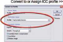
From the Color Management section of the print dialog box choose the ‘Photoshop Manages Colors’ option and choose the printer profile. Choose ‘Relative Colorimetric’ or ‘Perceptual’ as the rendering intent and check the ‘Black Point Compensation’ check box. When you select print and the printer driver opens it is now essential to cancel the printer’s color management.
Note > You may have to hunt (sometimes in vain) for the ‘No Color Adjustment’ option in your own printer driver as this is not the most common printing method used by nonprofessionals. The bargain basement inkjet printers are designed to take the reins of the color management procedure as not all image-editing software is capable of handling the color management, Adobe being the exception to the rule.
Warning > The worst colors imaginable are produced by instructing Adobe to manage the color translation, and then NOT disabling the color management in the printer driver software. If in doubt follow the printer color management approach.
Photoshop color management workflow
Select the ‘Media Type’ and quality settings as in the previous path and then click ‘Print’. The Adobe color management workflow is as follows:
1. Select ‘Color Management’ in the Print dialog box.
2. Select the profile for the printer and media type (if available) from the ‘Print Space’ menu.
3. The ‘Source Space’ indicates the current profile of the image you are about to print.
4. Choose ‘Perceptual’ or ‘Relative Colorimetric’ as the ‘Intent’.
5. Choose the media type and highest dpi or ‘Best Photo’ print quality.
6. In the Color Management section choose ‘No Color Management’.
7. Select ‘Print’.
Soft proofing
Although the image that appears on your monitor has been standardized (after the calibration process and the implementation of the Adobe RGB working space), the printed image from this standardized view would appear different if printed through a variety of different inkjet printers onto different paper surfaces or ‘media types’. In Photoshop it is possible to further alter the visual appearance of the image on your monitor so that it more closely resembles how it will actually appear when printed by your specific make and model of inkjet printer on a particular paper surface. This process is called ‘soft proofing’.
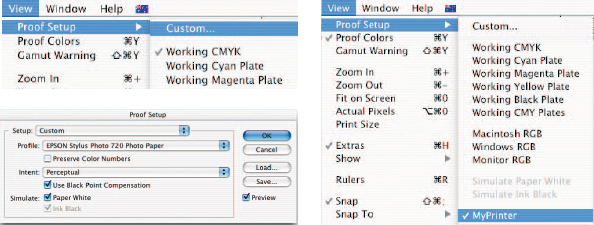
To set up the soft proof view go to View > Proof Setup > Custom. From the Profile menu select the profile of your printer and paper or ‘media type’. Choose ‘Perceptual’ from the ‘Intent’ menu and check the ‘Use Black Point Compensation’ and ‘Paper White’ boxes. Save these settings so they can be accessed quickly the next time you need to soft proof to the same printer and media type.
When you view your image with the soft proof preview the color and tonality will be modified to more closely resemble the output characteristics of your printer and choice of media.
The image should now be edited with the soft proof preview on, to achieve the desired tonality and color that you would like to see in print. It is recommended that you edit in ‘Full Screen Mode’ to remove distracting colors on your desktop and use adjustment layers to modify and fine-tune the image on screen.
Analyzing the test print
View the print using soft window light (not direct sunlight) when the print is dry, and try to ascertain any differences between the print and the screen image in terms of hue (color), saturation and brightness. Any differences may be attributed to inaccuracies in your initial monitor calibration and/or the profile that was shipped with your printer (Photoshop color management only).
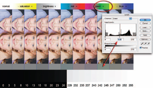
1. Check that the color swatches at the top of the image are saturated and printing without tracking marks or banding (there should be a gradual transition of color). If there is a problem with missing colors, tracking lines or saturation, clean the printer heads using the printer guidelines.
2. View the skin tones to assess the appropriate level of saturation. The lower and higher saturation swatches have a –20 and +20 adjustment applied using Photoshop’s Hue/Saturation adjustment.
3. View the gray tones directly beneath the images of the children to determine if there is a color cast present in the image. The five tones on the extreme left are desaturated in the image file. If these print as gray then no color correction is required. If, however, one of the gray tones to the right (which have color adjustments applied) appears to be gray then a color cast is present.
4. Find the tone that appears to be desaturated (the color cast corresponds with the color swatches at the top of the test file). Apply this color correction to the next print. For example, if the plus green strip appears to print with no color cast then a 1.1 gamma adjustment in the green channel is required (when using the Photoshop color management) for the next test print. A minus value will need to be entered in the Magenta slider in the ‘Color Controls’ when using ‘Printer Color Management’.
Note > Each of the color strips in the test image has the same gamma adjustment applied using the RGB channels. The correction necessary can be made using the Levels dialog box by sliding the Gamma slider to 0.9 or 1.1 in the corresponding color channel when using Photoshop color management.
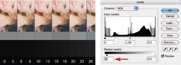
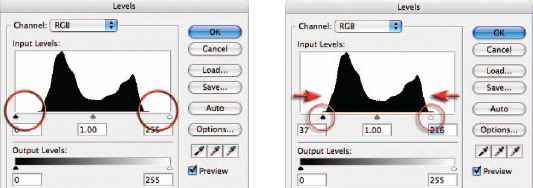
Maximizing shadow and highlight detail
Examine the base of the test strip to establish the optimum highlight and shadow levels that can be printed with the medium you have chosen to use. If the shadow tones between level 10 and level 20 are printing as black then you should establish a Levels adjustment layer to resolve the problem in your Adobe software. The bottom left-hand slider should be moved to the right to reduce the level of black ink being printed. This should allow dark shadow detail to be visible in the second print. A less common problem is highlight values around 245 not registering on the media. However, if this is a problem, the highlight slider can be moved to the left to encourage the printer to apply more ink.
Note > It is important to apply these output level adjustments to an adjustment layer only as these specific adjustments apply to only the output device you are currently testing.
Printing overview
Materials
Start by using the printer manufacturer’s recommended ink and paper.
Use premium grade ‘Photo Paper’ for maximum quality.
Monitor
Position your monitor so that it is clear of reflections.
Select a target white point or color temperature of 6500.
Set contrast, brightness and ‘Gamma’ using ‘Adobe Gamma’ or ‘Monitor Calibrator’.
Adobe
Set the Color Settings of the Adobe software.
Select ‘Same As Source’ (Path One) or the profile of the ‘Destination Space’ (Path Two).
Printer
Use a 6-ink inkjet printer for maximum quality.
Select the ‘Media Type’ in the printer software dialog box.
Select highest dpi or ‘Best Photo’ quality setting.
Proofing
Allow print to dry and use daylight to assess color accuracy of print.
Creating a ‘ringaround’
It is advisable to limit the variables once color consistency has been achieved. When changing an ink cartridge it is recommended that you run a test from the same image used to initiate the color consistency and then modify any settings if required.
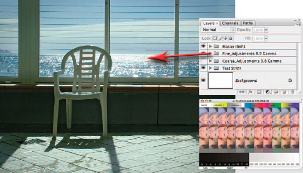
It is possible to use the adjustment layers used to create the ‘ringaround’ in the test print to monitor variations in color and saturation in additional images. This involves opening the test print PSD file on the supporting DVD and dragging the layer group (the folder above the background layer in the Layers palette) into your image window. Use the Free Transform command from the Edit menu to resize the adjustment layers to fit your own image. If one of the adjustments hits the target, switch off all of the other adjustment layers in the group and remove the layer mask of the correct adjustment layer (drag it to the trash can in the Layers palette or click the layer mask thumbnail whilst holding down the Shift key) and then proceed to print.
In conclusion
Although daunting at first, obtaining a color-managed workflow is reasonably quick and easy to use once the settings have been saved in the printer driver dialog box. It is probably worth mentioning that you should print out another test strip each time you change paper or inks just to ensure the print accuracy has not been upset by the change. It is also worth printing out a test strip if the printer has been idle for a number of weeks to ensure all the inks are printing as they should. This is not the entire color story but one of the two paths outlined in this tutorial should get you out of the maze that you may have found yourself in.
Printing using a professional laboratory
Professional photographic laboratory services are now expanding into the production of large and very large prints using the latest inkjet and piezo technology. Many are also capable of printing your digital files directly onto color photographic paper. In fact, outputting to color print paper via machines like the Durst Lambda and Fuji Frontier has quickly become the ‘norm’ for a lot of professional photographers. Adjustment of image files that print well on desktop inkjets so that they cater for the idiosyncrasies of these RA4 and large inkjet machines is an additional output skill that is really worth learning.
With improved quality, speed and competition in the area, the big players like Epson, Kodak, Durst, Fuji and Hewlett Packard are manufacturing units that are capable of producing images that are not only visually stunning, but also very, very big. Pictures up to 54 inches wide can be made on some of the latest machines, with larger images possible by splicing two or more panels together. A photographer can now walk into a bureau with a CD containing a favorite image and walk out the same day with a spliced polyester poster printed with fade-resistant, all-weather inks the size of a billboard. In addition to these dedicated bureau services, some professionals, whose day-to-day business revolves around the production of large prints, are actually investing in their own wide format piezojet or inkjet machines. The increased quality of pigment-based dye systems together with the choice of different media, or substrates as they are referred to in the business, provides them with more imaging and texture choices than are available via the RA4 route.

Before you start
Getting the setup right is even more critical with large format printing than when you are outputting to a desktop machine. A small mistake here can cause serious problems to both your 48 × 36 inch masterpiece as well as your wallet, so before you even turn on your computer, talk to a few professionals. Most output bureaus are happy to help prospective customers with advice and usually supply a series of guidelines that will help you set up your images to suit their printers. These instructions may be contained in a pack available with a calibration swatch over the counter, or might be downloadable from the company’s website.
Some of the directions will be general and might seem a little obvious, others can be very specific and might require you to change the CMYK settings of your image-editing program so that your final files will match the ink and media response of the printer. Some companies will check that your image meets their requirements before printing, others will dump the unopened file directly to the printer’s RIP assuming that all is well. So make sure that you are aware of the way the bureau works before making your first print.
General guidelines
The following guidelines have been compiled from the suggestions of several output bureaus. They constitute a good overview but cannot be seen as a substitute for talking to your own lab directly.
1. Ensure that the image is orientated correctly. Some printers are set up to work with a portrait or vertical image by default; trying to print a landscape picture on these devices will result in areas of white space above and below the picture and the edges being cropped.
2. Make sure the image is the same proportion as the paper stock. This is best achieved by making an image with the canvas the exact size required and then pasting your picture into this space.
3. Don’t use crop marks. Most printers will automatically mark where the print is to be cropped. Some bureaus will charge to remove your marks before printing.
4. Convert text to line or raster before submission. Some imaging and layout programs need the font files to be supplied together with the image at the time of printing. If the font is missing then the printer will automatically substitute a default typeface, which in most cases will not be a close match for the original. To avoid failing to supply a font needed, convert the type to line or raster before sending the image to the bureau.
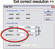
5. Use the resolution suggested by the lab. Most output devices work best with an optimal resolution; large format inkjet printers are no different. The lab technician will be able to give you details of the best resolution to supply your images in. Using a higher or lower setting than this will alter the size that your file prints so stick to what is recommended.
6. Keep file sizes under the RIP maximum. The bigger the file the longer it takes to print. Most bureaus base their costings on a maximum file size. You will need to pay extra if your image is bigger than this value.
7. Use the color management system recommended by the lab. In setting up you should ensure that you use the same color settings as the bureau. This may mean that you need to manually input set values for CMYK or use an ICC profile downloaded from the company’s website.
Printing monochromes
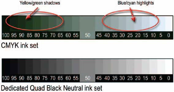
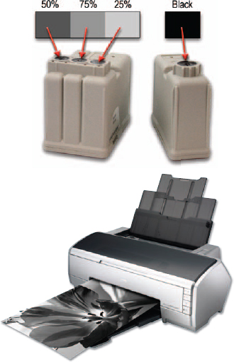
To the eyes of experienced darkroom workers the difficulties of printing black and white photographs with a color printer are immediately apparent. Most photo quality inkjets use the five colored inks, as well as black, to produce monochromes. With dot sizes now being so small it is only under the closest scrutiny that the multi-colored matrix that lies beneath our black and white prints is revealed. Balancing the different colors so that the final appearance is neutral is a very tricky task. Too many dots of one color and a gray will appear blue, too few and it will contain a yellow hue.
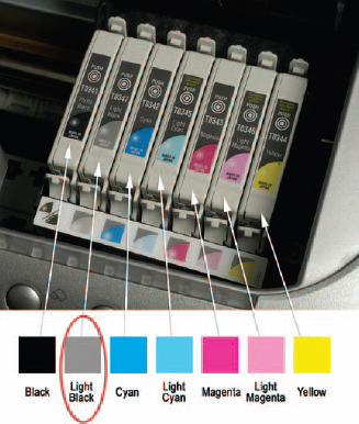
With just this type of situation in mind several of the bigger third party ink manufacturers have produced dedicated monochrome cartridges and ink sets for all popular desktop and wide format inkjet printers. The system is simple – pure black and white can be achieved by removing all color from the print process. The manufacturers produce replacement cartridges containing three levels of gray instead of the usual cyan, yellow and magenta or five levels instead of cyan, light cyan, magenta, light magenta and yellow for five-color cartridges. All inks are derived from the same pigment base and so prints made with these cartridges contain no strange color casts.
Printing with dedicated monochrome ink sets is the closest thing to making finely crafted fiber-based prints that the digital world has to offer. Not only are your images cast free, but they also display an amazing range of grays. With pictures that have been carefully adjusted to spread image tones and retain shadow and highlight details, the Quad Black system produces unparalleled quality prints on a wide range of gloss, satin, matte and fine art stock.
After the success of the initial Quad Black system, Lyson produced two more monochrome ink sets – Warm Tone, affectionately known as ‘sepia’, and Cool Tone, sometimes called ‘selenium’. Though the nicknames are familiar don’t be confused, there are no toning processes involved here. The whole procedure is still digital and the images are produced with ink on paper. Quad tone sets are available for a selected range of photo quality printers from Canon and Epson. This includes those models that have chip-based cartridges designed to restrict the user to installing the manufacturer’s own inks.
Multi-black printers
More recently all the major manufacturers have been hard at work creating machines that contain multi-black as well as color ink sets. Like Lyson’s Quad Black system these new printers contain several gray inks (of varying strengths) plus black, but unlike the Lyson system they also include the standard color inks as well (CMYK).
With as many as eight inks in the one printing head these models produce terrific black and white and color prints. For the first time, dedicated monochrome image makers have a machine that is up to the demanding task of producing the neutral grayscale masterpieces they love so much and at the same time they can still output a good color photo as well.
Chris Mollison