retouching projects
Mark Galer
essential skills
~ Develop skills using layers, adjustment layers, channels and layer masks.
~ Retouch and enhance images using the following techniques and tools:
– Lens Correction Filter and Warp
– Adjustment layers and layer masks
– Target tones
– Healing Brush, Clone Stamp Tool and Stamp Tool
– Shadow/Highlight adjustment
– High Pass, Unsharp Mask and Smart Sharpen.
Correcting perspective – Project 1
Many photographers prematurely jump to the conclusion that Photoshop is solely a tool for distorting reality or fabricating an alternative reality (the expression ‘it’s been photoshopped’ still has negative connotations for some photographers). Although this may be the case in some instances Photoshop can, however, be used as a tool to correct the distortions introduced by the camera and lens and return an image back to how we remember the original subject or location, rather than how the camera interpreted it.
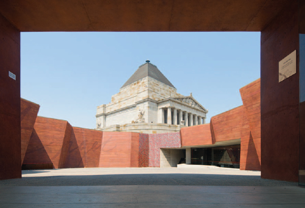
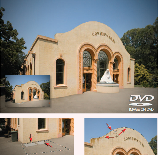
The Shrine of Remembrance, Melbourne – Nikon D200, Nikkor 12–24mm 1:4 G ED @ 12mm
Wide-angle lenses are an essential tool for the commercial photographer but they can introduce an unnatural and unnerving sense of perspective. In the natural landscape this exaggerated perspective may go unnoticed but when the photographer is in the urban environment and the photographer has to tilt the camera up in order to frame the shot the verticals will lean inwards – sometimes to an alarming extent. Architectural photographers may go into this environment equipped with specialized equipment such as shift lenses and large format cameras (some even take their own ladders). This specialized equipment allows the photographer to frame the view they need without tilting the camera from the horizontal axis. There is, however, a post-production answer that allows the photographer to create a more natural sense of perspective. This first project focuses its attention on correcting rather than distorting images and will look at perspective correction and chromatic aberration (the misalignment of colors commonly found in the corners of an image).
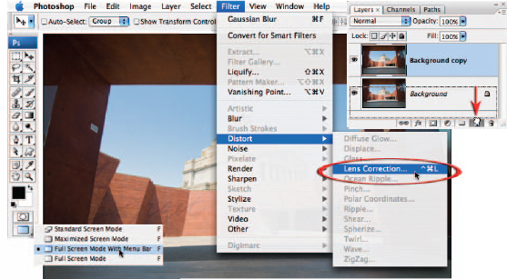
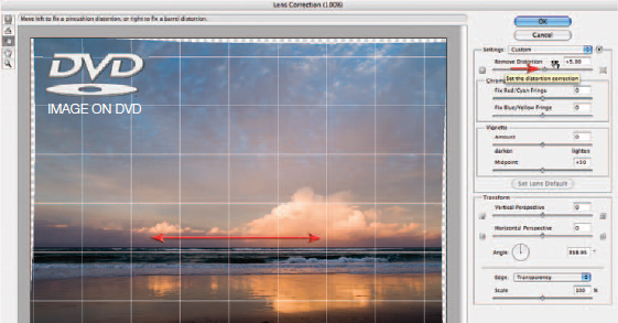
1. Start the process by selecting an appropriate screen mode by holding down the mouse clicker on the Change Screen Mode icon at the bottom of the Tools palette until the menu of screen modes appears. Choosing the ‘Full Screen Mode With Menu Bar’ option will allow you to reposition the image anywhere on your screen by holding down the Spacebar and dragging the image. This will be useful as we access the edges and corners of the image. Drag the Background layer in the Layers palette to the New Layer icon at the base of the palette to duplicate it (alternatively you can use the keyboard shortcut Ctrl + J (PC) or Command + J (Mac)). Select Filter > Distort > Lens Correction to open the Lens Correction dialog box.

2. At the base of the Lens Correction dialog box make sure the Show Grid option is checked. Move your mouse cursor over the word ‘Size’ to the right of this checkbox. You should notice two arrows appear from the hand icon that indicates you can change the value in the field to the right (this tool for changing values in any numerical field is called a scrubby slider). If you now click and drag to the right the size of the grid will increase. Set the value to around 40.
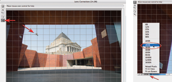
3. To check for Chromatic Aberration (color fringing as a result of misalignment of color channels) we will need to zoom in to 100% or 200% and view the edge detail in the corners of the image. Click on the Zoom Tool in the upper left-hand corner of the dialog box or use the keyboard shortcut Ctrl + Spacebar (PC) or Command + Spacebar (Mac) to access the Zoom Tool and then click and drag to target a zoom area in the upper left-hand corner of the image (where the dominant vertical line meets the dominant horizontal line). Click on the tab to the right of the magnification size (underneath the image in the Lens Correction dialog box) and select 200% from the menu of sizes. This will ensure that we get an accurate view of any chromatic aberration present in this image.
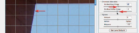
4. The chromatic aberration, if present, can be seen as a fringe running alongside the edges of lines within the corners of the image. The amount of aberration visible depends on the camera and lens used to capture the image and also, to a large extent, on the size of the reproduction of the image. By slowly moving the Red/Cyan Fringe and Blue/Yellow Fringe sliders it should be possible to greatly reduce the width of the color fringing, if not eliminate it altogether.
Note > As well as chromatic aberration some lenses will produce noticeable darkening in the corners (especially at wide apertures). These overly dark corners can be removed using the Vignette slider. The Set Lens Default option is able to record these settings and apply them to subsequent images taken with the same lens. This feature is most useful where the chromatic aberration and vignetting does not vary as a result of zooming to a different focal length or by using a different aperture.

5. Now that the chromatic aberration is under control we can move on to the Transform section of the dialog box. The controls found in this section are not recorded as part of the Lens Default Setting, as the corrections required are variable for each image depending on the angle of the camera to the subject matter. In this image the Vertical Perspective slider is moved to the left (between –45 and –50) so that the verticals align with the grid lines that overlay this image.
Note > There is a limit to the amount of correction that can be undertaken before some shapes within the subject become misshapen. Where the converging verticals are very pronounced it is sometimes only possible to reduce the distortion rather than remove the converging verticals altogether. It is worth remembering that verticals converge even when using standard focal length lenses.
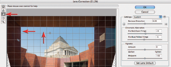
6. For an accurate assessment of the degree of correction you should click the Move Grid Tool and click and drag the grid so that it aligns with edges within the image that are meant to be vertical and horizontal.
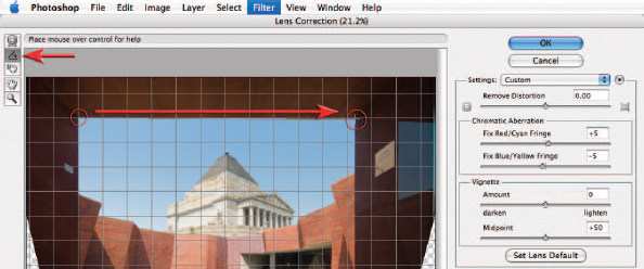
7. Use the Straighten Tool if the image appears slightly crooked when compared to the grid lines. Click on the tool in the upper left-hand corner of the dialog box and then click and drag along either a vertical or horizontal line. Let go of the mouse clicker when you get to the other end of the straight line to automatically straighten the image.
Pincushion distortion and barrel distortion
If the vertical or horizontal lines with the image appear to be curved rather than straight this is an indication that either ‘barrel distortion’ or ‘pincushion distortion’ is present within the image as a result of the lens that has been used. The slider to correct this distortion appears at the top of the control panel but is sometimes best implemented after the image has first been straightened and the vertical perspective corrected. The image used in the illustration above is a typical example where the horizon line curves excessively. After first straightening the image a small amount of barrel distortion is corrected. Pincushion distortion can be found in some images where a long telephoto lens has been used to capture the image. The image used in this illustration can also be found on the supporting DVD.
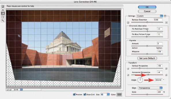
8. As a result of being slightly off-center when photographed it will be impossible to align both the horizontals and verticals that frame the sky without one further adjustment. Moving the Horizontal Perspective slider slightly to the right will ensure this entrance aligns to the grid lines. You may need to revisit some of the sliders a second time to perfect the alignment.
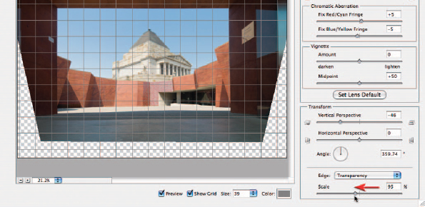
9. Scale the image down slightly using the slider in the bottom right-hand corner of the dialog box if quality rather than pixel quantity is the priority. The large correction required in this project will lead to a softening of image detail unless the scale is reduced to approximately 95%. As this is a 10-megapixel image there should be enough pixels (even at the reduced scale) to meet the final image requirements. Select OK to apply the changes and pass the corrected image back to the main Photoshop workspace.
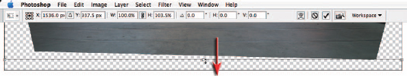
10. After the Lens Correction filter has been applied it is still possible to fine-tune the correction in Photoshop’s main workspace. Choose ‘Rulers’ from the View menu and then use the keyboard shortcut Ctrl + T (PC) or Command + T (Mac) to access the Free Transform command. Some images appear squashed after perspective correction so dragging the center handle of the transform bounding box either up or down can restore a more natural appearance to the image. This adjustment is optional in this project. The main reason for accessing the transform command is to correct some lines that were not possible using the Lens Correction filter.
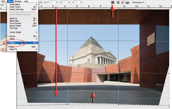
Click on the top rule and drag a guide to the lower portion of the image and align it with either end of the horizontal line on the concrete slab. You will notice how these lines in the lower portion of the image appear curved, even though the horizontal line in the top portion of the image appears comparatively straight. This is not something that the barrel distortion slider in the lens correction filter could compensate for (the uneven distortion is due to the fact that the horizontal lines near the base of the image are closer to the camera lens than the horizontal lines in the upper portion of the image, and have therefore been subject to a greater degree of barrel distortion). Click on the Warp icon in the Options bar and then move your mouse cursor over one of the curved lines in the central lower portion of the image. Click and drag gently upwards until the curved lines align with the guide you dragged into the image.

11. Switch off the visibility of the background layer so that you can see the part of the image that is now surplus to requirements. Select the Crop Tool and drag a cropping marquee around the picture area to be retained. Enter the crop dimensions and resolution in the Options bar if you are already aware of the final image requirements. Hit the Enter/Return key to apply the crop.
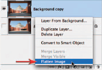
Move your cursor over the background layer and then right-click (PC) or Command-click (Mac) on the layer to open the context-sensitive menu. This menu will give you the option to flatten the image if you are now happy with the corrections. Select OK if you are presented with a warning dialog box asking you whether you want to discard the hidden layers.
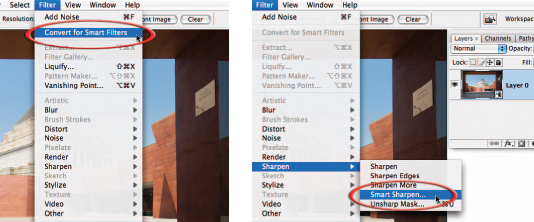
12. To complete the project we need to sharpen this image as it has not been sharpened in camera or in ACR (Adobe Camera RAW). This sharpening is considered to be part of a normal corrective process that must be performed either in camera or in post-production to all images. The Smart Sharpen filter and the Unsharp Mask filter offer greater control than sharpening in either the camera or in ACR. With CS3 we are now able to apply filters non-destructively by first converting the layer for Smart Filters (Filter > Convert for Smart Filters). After converting the layer for Smart Filters (the layer is now known as a Smart Object) choose Filter > Sharpen > Smart Sharpen. We can use any filter on a Smart Object, not just the ones that have smart in their name.
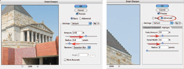
13. Images appear sharper when the contrast is raised at the edges within the image. In the Smart Sharpen dialog box we can control the amount of contrast by raising the Amount slider. Choose a generous amount of between 100% and 150%. The width either side of the edge where contrast is raised is controlled by the Radius slider. Choose a setting between 0.8 and 1.5 pixels. You should see a good overall improvement in sharpness using these settings. There is one unpleasant artifact that you may notice as a result of this sharpening process. If you click in the main image window where the roof of the war memorial meets the sky you may notice a halo appears at the edge. This halo can be reduced by clicking on the Advanced radio button and then clicking on the Highlight tab. Increase the Fade Amount and Tonal Width sliders to 50% to reduce the halo significantly. Click OK to apply these settings.
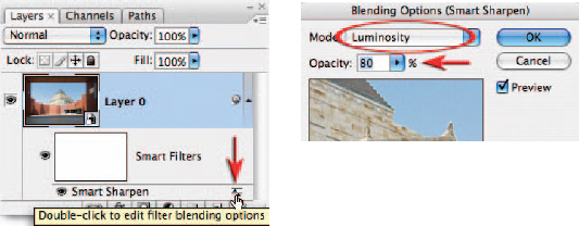
14. Double-click on the name of the filter in the Layers palette to reopen the Smart Sharpen dialog box. You will then be able to modify the settings if required. Double-click on the Blending Options icon to the right of filter name to open the Blending Options dialog box. Change the mode to Luminosity in order to reduce the risk of any additional color fringing as a result of the sharpening process (saturation is a by-product of contrast) and lower the opacity of the filter to 80%. This will in turn reduce the effect of the filter but give you the flexibility to optimize the amount of sharpening for different paper surfaces. Matt paper may require an increase in the filter opacity whilst outputting to gloss paper may require the opacity to be lowered further.
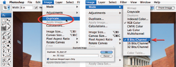
15. The corrections may be complete but it is usual to process a second image from this master file for print or screen display. The master image should be saved as a Photoshop file (PSD) and archived to an external drive or disk. The file should then be duplicated (Image > Duplicate). Select OK when the Duplicate Image dialog box appears. It is OK to select the ‘Duplicate Merged Layers Only’ box if your image has more than one layer. If this duplicate image is to be saved as a JPEG the bit depth of the image file must be dropped from 16 Bits/Channel to 8 Bits/Channel as the JPEG file format does not support higher bit depths.
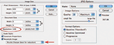
16. If the image is destined for web viewing the pixel dimensions will be too large. Go to Image > Image Size and click the Resample Image checkbox. Make sure the Constrain Proportions box is also checked (this will ensure the format or ‘shape’ of the image is preserved). Choose ‘Bicubic Sharper’ as the Interpolation method from the menu at the base of the dialog box. Type in the pixel dimensions that meet the output criteria (if known) or lower the resolution to 100 pixels/inch. Select OK to change the image size of this duplicate image.
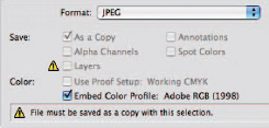
From the File menu choose Save or Save As. Rename the file in the Save dialog box and choose the TIFF file format for publishing/printing or the JPEG file format for web and screen viewing. Make sure the image is saved without layers and the profile is embedded.
Adjustment layers – Project 2
Image adjustments can be applied directly to the image from the Image menu or as nondestructive adjustment layers from the Layers palette. The advantage of using adjustment layers is that they can be re-edited an infinite number of times without causing any degradation to the image data and the adjustments can be applied to localized areas rather than globally by masking their effects using the adjustment layer mask that is attached to every adjustment layer. This project takes a look at the major adjustment layers used most frequently by photographers.
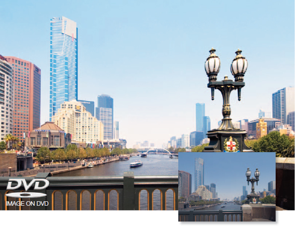
The Yarra river from the Princes bridge, Melbourne
Many of these adjustments can also be applied non-destructively in Adobe Camera RAW but the adjustments carried out in this dialog box are always global in nature (there is no opportunity to restrict the adjustments to localized areas of the image). Many of the adjustments made to optimize or enhance an image are relatively subjective (no two people would use exactly the same settings in each of the adjustments – in fact, the same person may create different versions from the same image file depending on their mood or creative objectives on any particular day). The famous photographer Ansel Adams often compared photography with music. He likened the original film negative to the sheet of music and the print created from the negative in the darkroom to the musical performance from the sheet music. The digital file has now replaced the film negative and Photoshop is now the digital darkroom. The essential skills to master are to be able to previsualize the final outcome and be able to exercise control over Photoshop’s tools to be able to realize this outcome.
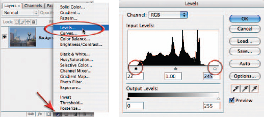
1. Open the R2 support image from the DVD and then open the Layers palette. Click once on the ‘Create new fill or adjustment layer’ icon at the base of the Layers palette and then click on the Levels option from the menu that appears. The Levels adjustment feature will allow us to optimize the dynamic range of the image to ensure the image uses the full tonal range between black and white. The graph that appears in the Levels dialog box is called a histogram and is an indication of how many pixels there are at each level of brightness in this image. Level 0 on the left is absolute black and level 255 on the right is absolute white. The three sliders directly underneath the histogram (from left to right) are called the Shadow slider, the Gamma slider and the Highlight slider. The image you have opened has not been optimized in Adobe Camera RAW so we will need to drag both the Shadow slider and the Highlight slider in towards the center of the histogram in order to expand the contrast.
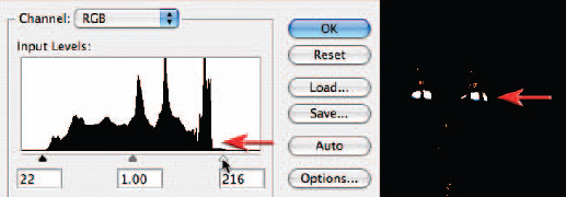
These sliders need to be moved a precise distance to give the best possible result. The aim is to expand the contrast without losing any detail in either the shadows or the highlights. A loss of detail is called ‘clipping’ and should be avoided if possible. Hold down the Alt key (PC) or Option key (Mac) and drag the Highlight slider slowly to the left. The image window will momentarily appear black (this is called a Threshold view). As you drag the slider underneath the start of the histogram you will notice more and more white areas appearing in the image (this is an indication of when clipping is occurring). Still holding down the Alt/Option key move the slider back to the right until there are no large patches of white remaining (the street lights should not have any large areas of clipping). Some minor clipping is inevitable when the light source is reflected off any shiny surfaces in the image (these are called specular highlights).
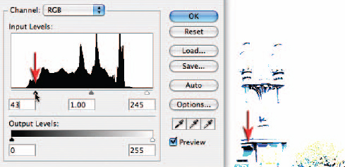
Repeat the process in the previous step using the Shadow slider. When holding down the Alt/Option key move the slider until only thin lines appear in the image window. Any large areas of clipping should be avoided unless there is an absence of a surface in the image, e.g. the entrance to a cave or an open door to an unlit room. The Gamma slider underneath the center of the histogram can be moved to the left or the right to lighten or darken the image. We will, however, perform this adjustment using an alternative adjustment feature. Select OK in the top-right corner of the dialog box to apply the changes. The Levels dialog box will close.
Note > If the major clipping is evident before the sliders are moved this is an indication that the original image was either underexposed or overexposed in the camera. This is not something that can be corrected in Photoshop unless another image with a different exposure was also captured (see HDR).
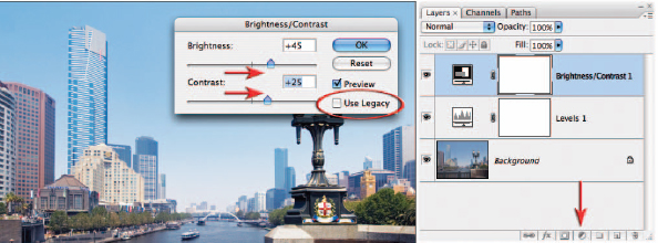
2. From the same location that you selected the Levels adjustment layer now select Brightness/Contrast. This adjustment feature was seldom used by professional photographers in previous versions of Photoshop due to its destructive nature (without great care shadow and/or highlight detail quickly became clipped). In the dialog box make sure the legacy box is NOT checked to avoid the old destructive behavior of this adjustment feature. Raise both the Brightness and Contrast sliders until the required tonality is achieved. Unlike the Levels adjustment this is a fairly subjective adjustment so there are no specific settings that should be used.
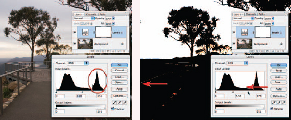
Localized levels
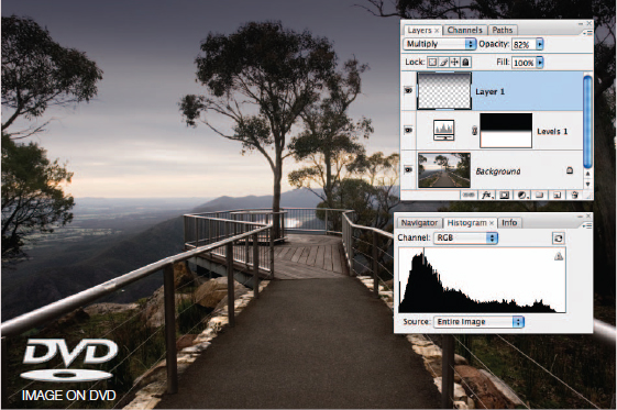
Sometimes when the levels are optimized for the entire image a portion of the image still appears flat. A close examination of the image used in this illustration (also on the DVD) will reveal that the range of levels on the right of the histogram belong only to the sky. None of the highlights in the foreground have been rendered higher than level 200, even after the Highlight slider has been adjusted. Greater contrast can be achieved if the user ignores the sky when setting the Highlight levels slider and then masks the sky later by painting into the layer mask to restore the tonality to this area of the image (preventing the highlights in the sky from becoming clipped by the adjustment). In this example a black/white gradient has been applied to the upper portion of the layer mask and then a new layer, in Multiply mode, with an added gradient has been used to darken the sky further.
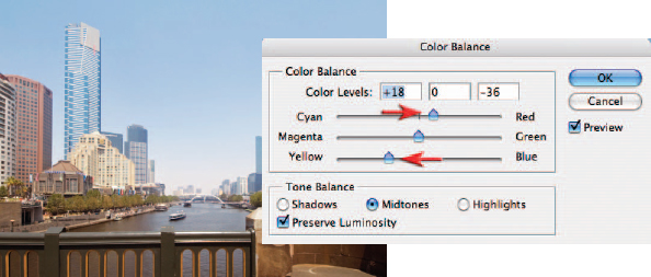
3. From the Layers palette select a Color Balance adjustment layer. The Color Balance dialog box allows color adjustments based around the primary and secondary colors. Theoretically it should be possible to achieve any color correction using just two of the three sliders. The image currently has a blue/cyan color cast so the top Cyan/Red slider needs to be moved to the right and the bottom Yellow/Blue slider needs to be moved to the left.
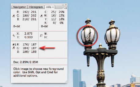
Quick and accurate color corrections can be difficult to achieve for newcomers to digital image editing without some guidance from the Info palette (palettes can be expanded from the dock or opened from the Window menu even when a dialog box is open). The user should attempt to identify a tone in the image that should appear gray (where the levels in the Red, Green and Blue channels are mixed in equal proportions). Move the mouse cursor into the image window and position the eyedropper over the shaded white areas of the street lamps. Observe the RGB readings in the Info palette. This should guide you as to which sliders to move, and in which direction, e.g. if the Red reading is lower than the other two readings move the slider in the Color balance dialog box towards Red to increase its value. Hold down the Shift key and the Alt/Option key and click to set a color sampler target. Move the sliders until all three numbers are equal. Select OK when you are happy with the Color Balance.
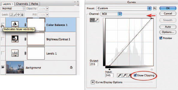
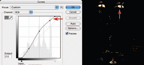
4. Perhaps the most powerful of all of the other adjustment features is Curves. With CS3 it has acquired even more control and flexibility. To demonstrate this control we will switch off the visibility of all three of the adjustment layers we have just created in the Layers palette. Open a Curves adjustment layer from the Layers palette. The diagonal line appears above a histogram. There is an adjustment point in the bottom left-hand corner and another in the top right-hand corner of the histogram window (equivalent to the Shadow and Highlight sliders in the Levels dialog box). The power of Curves comes in the ability to add additional points by clicking anywhere along the line to control specific areas of the histogram (we are not limited to just three sliders as with levels). Check the Show Clipping checkbox and then proceed to move the black point along the floor of the histogram window and the white points along the ceiling of the histogram window to positions where clipping just begins to occur. Switch off the Show Clipping checkbox when this step is complete. This sets the dynamic range of the image in the same way that we performed the task using the Levels dialog box in Step 1.
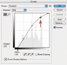
5. Click on the diagonal line about three-quarters of the way towards the top and drag the adjustment point higher in the window to brighten the highlights of the image. Now click halfway along the line and modify the midtone values with the image. Click one-quarter of the way along the line and drag the adjustment point to modify the shadow tones within the image. As the line gets steeper in the middle of the histogram the contrast of the image will increase. This performs the same task as the Brightness/Contrast adjustment but with a greater degree of control.

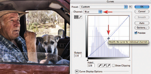
6. We can color correct the image in Curves in two different ways. We can use the individual channels in the Curves dialog box to balance the numbers. Select the Blue channel from the Channel menu in the Curves dialog box and then click to place an adjustment point halfway along the curve. Drag the adjustment point down to reduce the blue, observing the channel information in the Info palette. Repeat the process using the Red channel but this time raise the curve to increase the red values. The second alternative offers a more automated approach.
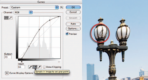
The quick alternative for color correction is to click on the center eyedropper below the histogram window. If you leave the cursor over this icon momentarily you will see the advice ‘Sample in image to set gray point’. Move your mouse cursor out into the image window and locate the Color Sample target you created in Step 3. Click on this target to color balance your image. Select OK in the Curves dialog box to apply theses changes to your image.
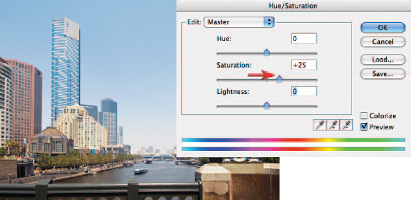
7. We have adjusted the hue and brightness of the pixels in this image but we have not yet had any control over the saturation values. An overall increase in saturation has occurred since we started editing this image due to the fact that we have increased the contrast (saturation increases as contrast increases). We need to open a Hue/Saturation adjustment layer in order to have precise control over this element of the corrective process. In the Hue/Saturation dialog box move the Saturation slider until the colors appear vibrant but realistic (a subjective decision). As the saturation increases the image appears to be sunnier.
8. Some of the colors in the foreground and on the right side of the image have higher saturation values so they should be reduced to balance the image. This requires a localized adjustment by masking some of the effects of this adjustment layer. Select the Brush Tool from the Tools palette. Choose a large soft-edged brush and lower the opacity of the brush to 50% in the Options bar. Paint over any colors in the main image window that appear too saturated. Note how the layer mask in the Layers palette indicates which parts of the image are being shielded from the Hue/Saturation adjustment layer.
Selective color
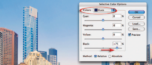
Selecting a specific color in the Hue/Saturation dialog box is useful for controlling the saturation over a limited range of colors. Moving the mouse cursor into the image window and clicking on a specific color will fine-tune the color range that is adjusted. The Lightness slider has limited use in this dialog box as it introduces gray into the mix and always desaturates the targeted colors. If you need to darken a color slightly try using a Selective Color adjustment layer and raise the Black slider after first choosing the target color.
Scott Hirko (www.iStockphoto.com)
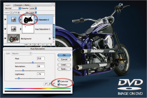
Colorize
The Hue/Saturation can quickly change all colors of one hue to another. If you want to change all of the colors to the same color, or add color to a gray tone, you must select the Colorize option in the Hue/Saturation dialog box. In the example above the studio backdrop and the color of the bike have been changed to suit the design objective.
Tina Lorien (www.iStockphoto.com)
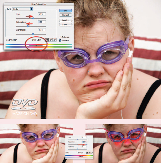
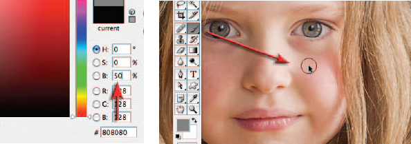
Adjusting narrow ranges of color
The Hue/Saturation adjustment feature can perform some truly remarkable adjustments. It is capable of targeting a very narrow range of color values and then adjusting them to match other colors within the image. In the example above the sunburn is targeted and then matched with the surrounding skin colors. To achieve this level of control the user must first select the broad color range that the color belongs to from the Edit menu inside the Hue/Saturation dialog box, e.g. reds, yellows, greens, cyans, etc. By clicking and dragging the sliders that sit between the two color ramps (at the base of the dialog box) closer together, or by using the ‘Add to Sample’ or ‘Subtract from Sample’ eyedroppers, the precise colors can be targeted. Moving the Saturation slider temporarily to –100 or +100 can help determine when the target colors have been isolated from their neighboring colors of a similar hue. When this has been achieved the Saturation slider is returned to 0 before moving the Hue slider to achieve the required match. Some fine-tuning using the Saturation and Lightness sliders will usually be required before the match is perfect.
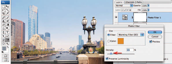
9. The color corrections that were carried out in Steps 3 and 6 render neutral colors completely neutral. It is sometimes a requirement that colors are not neutral at all but rendered cool or warm depending on the mood that is required, e.g. the cool tones of winter or the warm tones of summer. With this in mind Photoshop gives us another way of adjusting the color of our images. The adjustment feature called Photo Filter has less control than Curves, or even Color Balance, but it has similarities with the way some photographers have traditionally used filters to adjust color at the time of capture. A warming or cooling filter can be selected (the numbers refer to glass filter equivalents that were attached directly to the camera lens) and the strength of the effect is controlled by the Density slider. To give this image a late afternoon feel (the image was actually captured just before noon) select an 85 Warming filter and set the density to 15%.

10. In order to optimize the image for print it is useful to assign two more color sample targets to the image so that we can optimize the image for the print. Double-click the Curves adjustment layer icon to re-open the Curves dialog box (make sure it is the icon you click and not somewhere else on the adjustment layer). Check the Show Clipping checkbox again. Drag the black adjustment point along the floor of the Curves window until you see the first patches of shadow tone appear. Move the cursor into the image window and hold down the Shift and Option/Alt key, and click to add one more Color Sample target to the file.
11. Click and drag the White adjustment point to the left until you see the first patches of highlight tone appear in the image window that are not specular highlights (specular highlights do not have an texture or detail). Shift + Option/Alt-click to assign a third Color Sample target to this highlight tone. Now that you have located and sampled the darkest shadow tones and the brightest highlights with detail in the image you can click Cancel in the Curves dialog box (you do NOT want to save the adjustments you have just made). If you click OK you will clip the shadow and highlight detail as a result of the changes you have just made.
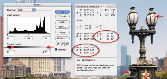
12. In the Layers palette click on the top adjustment layer to make it active and then select a new Levels adjustment layer (this final layer must appear on top of the layers stack). Move the black Output Levels slider underneath the gray ramp to the right whilst observing your #2 target in the Info palette. Move the slider until the second set of values read approximately 15 and then move the white output slider until the values read approximately 245 (adjust these values to suit your own print output requirements). You will need to average these three values as the shadow and highlight tones are not neutral tones. This procedure lowers the contrast of the image to ensure the highlights and shadow tones print with full detail. The visibility of this final adjustment layer can be switched off when the image is being viewed on screen and should also be renamed as a print target layer to prevent possible confusion later (double-click on the layer name).

Shadow/Highlight – Project 3
The Shadow/Highlight adjustment feature is one of the most useful and powerful of all the adjustment features, but it has never been available as an adjustment layer. The adjustment can now be applied as a Smart Filter however (even though the adjustment does not live in the Filter menu). The strength of this adjustment feature lies in its ability to quickly, and gently, nudge tones that are too dark or too light to print or aggressively raise shadow brightness or lower highlight brightness while adding localized contrast to these tonal regions. The Curves adjustment feature is unable to compete with the Shadow/Highlight’s ability to inject localized contrast into the modified tonal areas. For shadow recovery it is a little like a post-production version of fill-flash.
This project uses an image where the shadow tones have been greatly underexposed in camera (in order to preserve the highlight tones outside of the car window). Although the final quality of these rescued shadow tones will never be as good as if the exposure had been raised in camera, the project does illustrate the usefulness of this adjustment feature, especially where the photographer is unwilling or unable to add additional lighting to the image at the time of capture. When opening up shadow tones to this extent the photographer needs to be aware of possible problems with noise and/or tonal banding (steps of tone rather than smooth transitions). This project will also explore the use of localized color corrections and localized tonal corrections using a ‘Dodge and Burn’ layer (instead of using the Dodge and Burn tools from the Tools palette directly to an image layer). The project will utilize adjustment layers and Smart Filters (avoiding working on the pixels themselves) to achieve the goal of editing non-destructivley.

1. To prepare the image for the Shadow/Highlight adjustment we need to convert the background layer for Smart Filters (Filter > Convert for Smart Filters) and then select Shadow/Highlight from Image > Adjustments > Shadow/Highlight. When the Shadow/Highlight dialog box opens check the ‘Show More Options’ box to expand the dialog box. Enter 0 in the Black Clip and White Clip fields at the base of the dialog box so that the white and black points are left untouched. The default values are useful if you have not previously set the levels of your image.
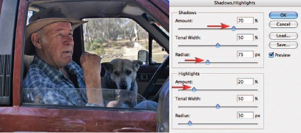
2. Raise the Amount slider in the Shadows section of the dialog box to around 70% to lighten the shadows. Leave the Tonal Width slider at 50% so that any tones darker than level 128 will come under the influence of the Amount slider above. The Radius slider controls the localized contrast in these shadows. If this slider is moved to the left or right you should notice how the contrast or lighting in these shadows appears to change. The precise value for this slider is very subjective and is determined only by the appearance of the shadow tones. In this project the Radius slider is raised to create the best appearance in the skin tones on the man’s face. In the Highlights section of the dialog box the Amount slider is raised to lower the brightness of the tones outside the window. Beware of halos surround the dark tones when using this adjustment.
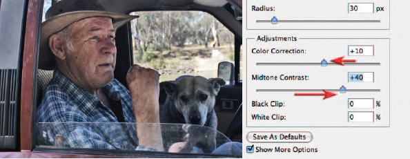
3. Additional contrast can be introduced into the shadow tones by raising the Midtone Contrast slider in the Adjustments section of the dialog box. The Amount slider in the Shadows section of the dialog box should then be raised to +90% to compensate for the tones being rendered darker. As the contrast increases in these midtones the Color Correction slider should be reduced to +10 in order to protect the midtones from excessive saturation. Select OK to apply these Shadow/Highlight changes.
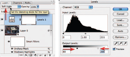
4. Blending modes can also be used to increase contrast. Create a new Levels adjustment layer and select OK without making any changes. Set the mode of this adjustment layer to Soft Light using the menu in the Layers palette. The resulting contrast is a result of the blend mode and not any changes you have made in the adjustment layer dialog box. Open the Levels dialog box by double-clicking the Levels icon on the adjustment layer. To restrict the increase in contrast to just the midtones drag both of the output sliders towards the center of the gray ramp. In this project I have used the output values of 80 and 200 but the precise values have to be fine-tuned for each image you apply this technique to. Select OK to apply the changes. Change the blend mode of this adjustment layer to Overlay to increase the contrast even further.
Note > Holding down the Option/Alt key as you select a new adjustment layer will open the New Layer dialog box. This dialog box will allow you to set the blend mode of the adjustment layer before it opens.
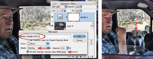
5. Blend modes can be utilized to modify the tonality of the image in other ways. The Dodge and Burn Tools in the Tools palette cannot be used on a layer that has been converted for Smart Filters. Instead of using these tools we can create a Dodge and Burn layer. Hold down the Option/Alt key and click on the New Layer icon. In the New Layer dialog box choose Overlay as the mode and check the ‘Fill with Overlay-neutral color (50% gray)’ checkbox. Continue the practice of naming the layers, e.g. ‘Dodge & Burn’ instead of the default ‘Layer 1’. Select OK to create the new layer. 50% gray in Overlay mode has no effect on the underlying pixels (pixels on this layer are effectively invisible when 50% gray). It is only when you lighten or darken pixels on this layer that you will be able to see any difference to the underlying pixels. Select the Brush Tool from the Tools palette and White as the foreground color. Choose a soft-edged brush with an Opacity of 20% from the Options bar. Paint any dark areas that need to be made lighter. Paint over the dog several times until the lightness is balanced with the rest of the image.
6. Although the dog is now lighter in tones the color will need correcting in this region. Create a new Curves adjustment layer. Select the Blue channel in the Curves dialog box and pull the curve down slightly to increase the yellow in the image. Concentrate your attentions only on the dog as the rest of the image will be masked later. Now go to the Red channel and raise the curve slightly until you have achieved some warmer colors in the coat of the dog. Select OK to apply these changes.
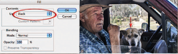
7. From the Edit menu choose Fill and from the Contents section in the Fill dialog box choose Black and then select OK. The keyboard shortcut for filling with the background color (the default color when a mask is selected) is Command + Delete (Mac) or Ctrl + Backspace (PC). The color adjustment has now been totally masked by the fill color. Choose the Brush Tool from the Tools palette and choose White as the foreground color. Select a soft-edged brush and set the opacity to 50%. Painting over the dog will erase some the fill color and slowly reveal the color correction that is required to achieve the correct color balance.
Note > If streaks appear where the brush strokes overlap you can either paint in a continuous action with a higher opacity or many times with a very low opacity.
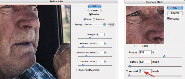
8. To complete the project you should zoom in to 100% and assess the noise and sharpness levels of the image. The initial underexposure and the subsequent extensive tonal rescue will leave an image where the overall quality has been compromised when compared to an image where the exposure had been optimized for the shadows at the expense of the highlights. Some noise reduction may be required to the image before sharpening takes place (these can be applied as Smart Filters to the base layer – the layer that was converted for Smart Filters) so that the non-image artifacts are not exaggerated excessively. My preference for sharpening would be for the Unsharp Mask rather than Smart Sharpen in this instance. Raising the Threshold slider in the Unsharp Mask dialog box will restrict the sharpening to just the major tonal differences, thus reducing the grainy effect when compared to sharpening carried out by the Smart Sharpen filter.
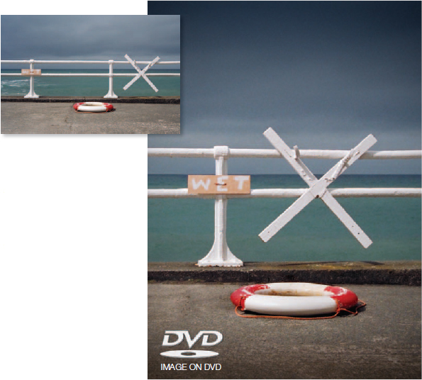
The horizontal format image is transformed into a vertical format image with the careful relocation of the life-ring and the sign declaring that the water (or is it the paint) is indeed ‘wet’. By using a few gradients and the Lens Correction filter, the drama of the image is then increased
Clone and stamp – Project 4
It has become a common retouching task in image editing to move, remove or replace details within an image to fine-tune the composition or clean the image area so everything is in its right place and there is no superfluous detail to detract from the composition or distract the viewer’s attention. In Photoshop CS3 a new palette called Clone Source has appeared. This enables a more controlled approach to copying pixels and painting them into a new location or into a new image. There is also a Stamp Tool in the Vanishing Point dialog box that offers additional features not found in the main workspace of Photoshop. Many photographers never seem to find an appropriate image that requires them to ‘edit in perspective’ in Vanishing Point and have therefore overlooked the performance features of the Stamp Tool in this editing space.
Vanishing Point may be a highly specialized editing space but the Stamp Tool that resides here can be used for a broader range of retouching activities that have no clearly defined perspective at all. This project is divided into two parts – the first part deals with the features of the Clone Stamp Tool and the Stamp Tool found in Vanishing Point, while Part 2 looks at image enhancement using gradients and the creation of a vignette in the Lens Correction filter.
Part 1 – Clone and stamp
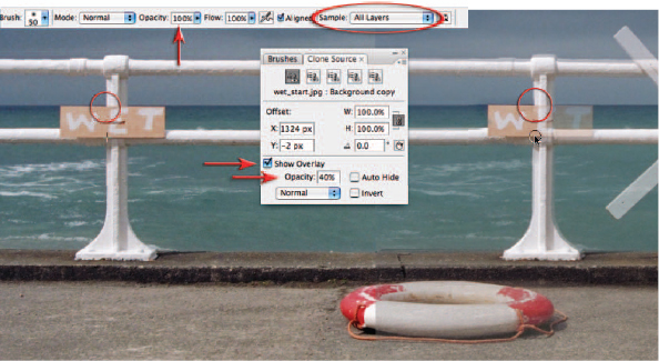
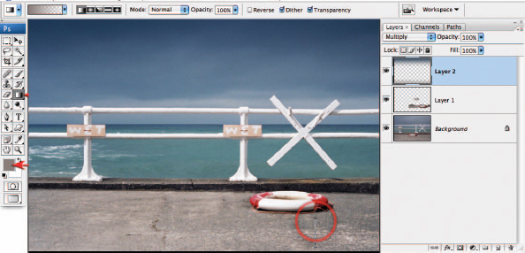
1. Open the supporting image and click on the New Layer icon in the Layers palette to create an empty new layer. Click on the Clone Stamp Tool in the Tools palette. Choose a small soft-edged brush from the Options bar and set the Clone Stamp Tool Opacity to 100%. Choose All Layers from the ‘Sample’ options. Open the Clone Source palette (Window > Clone Source) and check the Show Overlay checkbox and set the overlay Opacity to 40%. Hold down the Option/Alt key and click on the top of the Wet sign where it meets the horizon line. Move the mouse cursor over to the right side of the image and align the two ghosted upright poles (setting the mode to Difference in the Clone Source palette or checking the Invert option may help in the alignment process). When alignment has occurred click and drag to clone the new Wet sign into position. Uncheck the Show Overlay option in the Clone Source palette and assess the results. Although it is now easier to achieve precise alignment between the cloned pixel and the background layer the lack of a healing option makes it difficult to achieve a seamless result (the ocean and sky are slightly different tones).
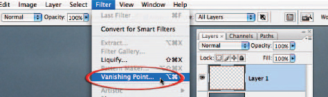
2. Discard Layer 1 in the Layers palette by dragging it to the trash can icon at the base of the Layers palette. Create another new empty layer by clicking on the New Layer icon. All of the modifications will be stamped into this layer, leaving the background layer unaffected. Go to the Filter menu and choose ‘Vanishing Point’. Be prepared for a short wait while Photoshop opens the image into the Vanishing Point dialog box.

3. When the dialog box opens, Vanishing Point tries to be really helpful by giving you advice as to what to do next – sound advice that we will now ignore (unless of course you would like to ‘tear off your perpendicular planes from the stretch nodes of existing planes’). What I would like you to do instead is to simply double-click the second icon from the top in the left-hand corner of the dialog box (the Create Plane Tool). This completely ignores Adobe’s invitation to locate any planes of perspective (parallel lines that converge as they recede into the distance – a particularly rare animal in natural landscape and portrait photography) and instead just drops a nice blue grid over your entire image. This blue grid serves absolutely no purpose in this project – but is of course an essential step before Adobe will allow us to utilize the Stamp Tool.
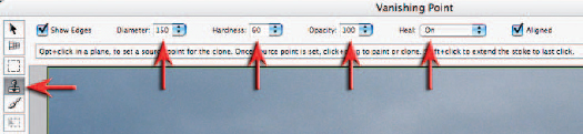
4. Now select the Stamp Tool in the Vanishing Point dialog box. Set the Opacity of the tool to 100% and switch the Heal option to ‘On’ or ‘Luminosity’. Reduce the Hardness of the brush to around 60 and then increase the diameter of the brush to around 150.
Note > If the complex process of creating the ‘planes of perspective’ on your first visit to Vanishing Point seemed more trouble than it is was worth then you probably missed the significant difference between the seemingly identical Stamp Tool in Vanishing Point and the our old friend that resides in the Tools palette of the main editing space. On closer inspection they are not the same animal at all, for when you choose a brush size and hardness for the Stamp Tool in Vanishing Point and then choose a source point for the pixels you wish to clone (copy and paint to another area in the image) the brush displays the pixels that you will paint with rather than an overlay. The essential ingredient that enables us to achieve success when using the Stamp Tool is the fact that it adopts the behavior of the healing brush. The luminosity or healing options in the Options bar within the dialog box enable the cloned pixels to achieve a seamless blend with the surrounding pixels. This is achieved when the tool draws in the hue and luminosity values of the surrounding pixels (or just the luminosity values as is the case with the Luminosity option) into the feathered edge of the brush you are using. The softer the brush the broader the area of healing that occurs, but this may also increase the risk of drawing in adjacent values of an inappropriate value. Care must be taken to adapt the brush size and hardness to the area you are cloning into.
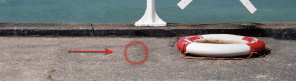
5. Alt/Option-click on the horizon line where it meets the upright pole, just above the sign ‘wet’, to select a source point for the pixels you wish to clone. Now move over to the vertical pole on the right side of the image and click on the similar intersection point where the horizon line meets the pole. Hold down the mouse clicker as you paint, stamp or clone just enough pixels to reveal the sign and its shadow into its new location.
Note > Choosing a precise intersection of horizontal and vertical lines as your initial source point is critical when attempting to clone pixels into another area of the image that shares these strong geometric lines.
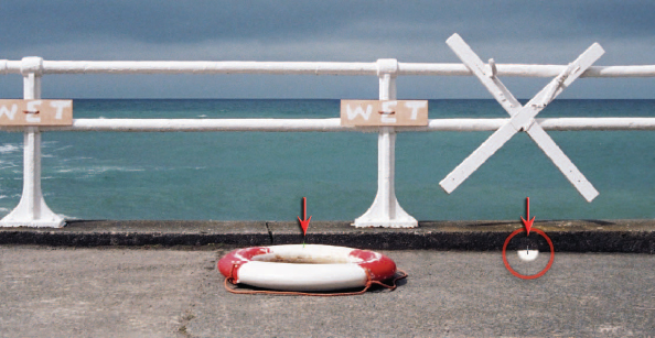
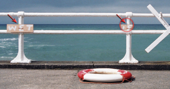
6. Turn your attention to cloning the life-ring when the sign has been relocated. To prevent the horizontal edge above the life-ring being cloned out of alignment it will be necessary to reduce the size of the brush and increase its hardness to 80%.
7. Increase the size of the brush and decrease the hardness once again before selecting a new source point from the foreground concrete to the left of the life-ring. Proceed to remove the original life-ring from the image. If the left side of the original life ring starts to reappear when attempting to remove the life-ring try selecting a source point further over to the left side of the image. When the original life-ring has been successfully removed click OK to apply the changes made by the Stamp Tool. You will notice that all of your changes now appear in the new layer you created before using Vanishing Point and can be removed if you are not entirely happy by simply switching off the layer visibility. With the changes isolated to their own layer you also have the option to erase or mask just a few of the changes that are not entirely convincing.

Part 2 – Gradients and vignettes
8. Select the Gradient Tool from the Tools palette and choose the Foreground Transparent and Linear gradient options from the Options bar. Hold down the Alt key and sample an area of the blue cloud cover to select this as your foreground color. Before creating your gradient add a new layer by clicking on the New Layer icon in the Layers palette and set the blend mode of this layer to Multiply. Now proceed to drag a gradient from the top of the image to a position just above the top railing. Holding down the Shift key as you drag the gradient will ensure the gradient is constrained to a perfect vertical.
9. Sample a new color from the concrete in the foreground and add a second gradient into this layer.
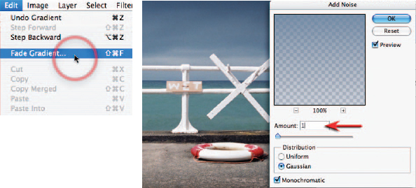
10. If you would like to reduce the effect of this second gradient without altering the effect of the first gradient you can proceed directly to the Edit menu and choose ‘Fade Gradient’. To prevent any banding (visible steps of tone) appearing in the area of the gradient it is advisable to add a small amount of noise to this gradient layer. Go to the Filter menu and choose Add Noise from the Noise submenu: 1 or 2% noise using the Gaussian and Monochromatic options selected will usually prevent any banding issues on screen or in print.
Note > The Fade option is available for any filter or painting tool that you may have used but it is only available if it is the first step you take after the filter or painting action has been applied. Even the act of deselecting a selection will render the Fade option unavailable.
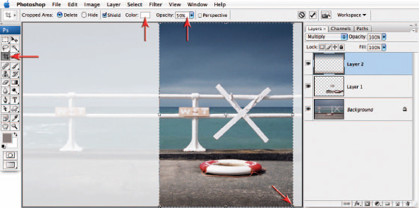
11. Duplicate your master PSD file (Image > Duplicate) and then crop your image to its new vertical format. When cropping I prefer to switch my shield color in the Options bar to white and reduce the opacity to 50% (you can take this action only after you have first dragged out a crop marquee). I find this gives me a better idea of the new composition when cropping rather than using the default option of Black at 75% opacity.
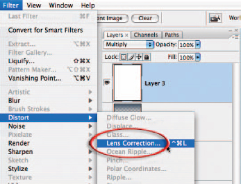
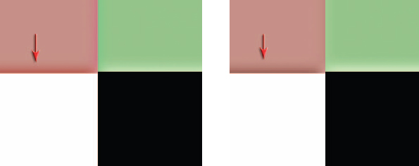
12. Create a new layer, fill it with white (Edit > Fill) and set the blend mode of the layer to Multiply. Now choose ‘Lens Correction’ from the Distort submenu. The vignette option in Lens Correction is designed to eliminate vignetting that may occur with some wide-angle lenses while shooting at wide apertures, but it is equally adept at adding vignettes for creative purposes.
Note > White is a neutral color in Multiply mode so the effects of this layer will be invisible until we darken the corners.
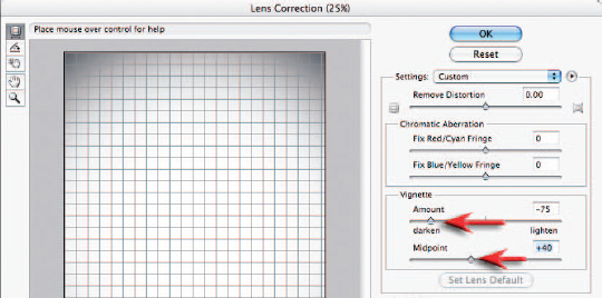
13. Reduce the Amount and Midpoint sliders in the Lens Correction dialog box to create the vignette you are looking for. Click OK when you are done. An advantage to using the Lens Correction filter to add a vignette as opposed to other techniques is that this process can be included as part of an automated ‘action’ that can be applied on a range of different resolution files, i.e. it requires no radius value for either a feather or mask.
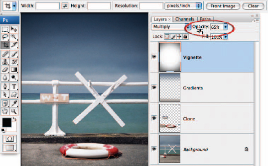
14. Reduce the opacity of the vignette layer until you strike the appropriate amount of drama in the image and then you are pretty much done. You will probably want to complete the project by merging all of the visible elements of the project to a new layer (hold down the Ctrl + Alt + Shift keys and then type the letter E) and then applying the Unsharp Mask or Smart Sharpen filter.
Note > Converting the background layer to a smart object and applying the sharpening as a smart filter will not sharpen the sign and life-ring which have been placed on another layer.
Clone or Heal
When cleaning an image of superfluous detail the question often arises as to which is the best tool for the job. When working in broad areas of texture to remove small blemishes the Spot Healing Brush Tool is hard to beat for speed and ease of use. As the areas requiring removal get larger, switching to the Healing Brush and nominating a texture avoids the errors that occur when using the Spot Healing Brush for this task. The limitations of the Healing Brush (and Spot Healing Brush) become apparent when working up against tones or colors that are markedly different to the area being cleaned. The Healing process draws luminance and color values from the surrounding area and when these colors are very different they contaminate the area to be healed. Problems can often be avoided in these instances by either using a harder brush or making a selection that excludes the neighboring tones that are different. When working up against a sharp edge even these actions may not be enough to avoid contamination – this is the time to switch to the Clone Stamp Tool. A selection will help to contain the repair while the Clone Source palette or Stamp Tool in Vanishing Point will help to align edges so that the repair is seamless.
Advanced sharpening techniques – Project 5
Most, if not all, digital images require sharpening – even if shot on a state-of-the-art digital mega-resolution SLR with pin-sharp focusing. Most cameras or scanners can sharpen as the image is captured but the highest quality sharpening is to be found in the image-editing software. Sharpening in the image-editing software will allow you to select the precise amount of sharpening and the areas of the image that require sharpening most. When you are sharpening for the screen, it is very much a case of ‘what you see is what you get’. For images destined for print, however, the monitor preview is just that – a preview. The actual amount of sharpening required for optimum image quality is usually a little more than looks comfortable on screen – especially when using a TFT monitor (flat panel).
The basic concept of sharpening is to send the Unsharp Mask filter or Smart Sharpen filter on a ‘seek and manipulate’ mission. These filters are programmed to make the pixels on the lighter side of any edge they find lighter still, and the pixels on the darker side of the edge darker. Think of it as a localized contrast control. Too much and people in your images start to look radioactive (they glow), not enough and the viewers of your images start reaching for the reading glasses they might not own. The best sharpening techniques to use with sharpening filters are those that prioritize the important areas for sharpening and leave the smoother areas of the image well alone, e.g. sharpening the eyes of a portrait but avoiding the skin texture. These advanced techniques are essential when sharpening images that have been scanned from film or have excessive noise, neither of which will benefit from a simple application of the Unsharp Mask filter. So let the project begin.
Note > If you have any sharpening options in your capture device it is important to switch them off or set them to minimum or low (if using camera RAW set the sharpening amount to 0). The sharpening features found in most capture devices are often very crude when compared to the following technique. It is also not advisable to sharpen images that have been saved as JPEG files using high compression/low quality settings. The sharpening process that follows should also come at the end of the editing process, i.e. adjust the color and tonality of the image before starting this advanced sharpening technique. Reduce the levels of sharpening later if it proves too much.
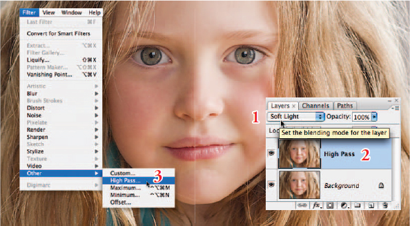
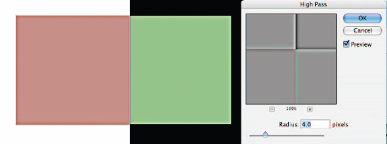
Technique one – High Pass
1. Duplicate the background layer and set the blend mode to Soft Light from the blend modes menu in the Layers palette. Change the name of this layer to High Pass. Go to Filter > Other > High Pass.
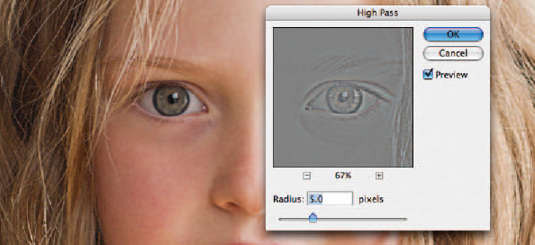
2. Choose a 5.0 pixels Radius for this project. A pixel radius between 1.0 and 5.0 would be considered normal if you were not going to proceed beyond Step 4 in this project.
Note > Use lower Radius values when printing to Gloss paper and higher values if printing to Matte paper. To adjust the level of sharpening later you can either lower the opacity of the High Pass layer (to decrease the amount of sharpening) or set the blend mode of the ‘High Pass’ layer to ‘Overlay’ or ‘Hard Light’ (to increase the level of sharpening).
3. Click on the foreground color swatch in the Tools palette to open the Color Picker. Enter 0 in the Hue and Saturation fields and 50% in the Brightness field to choose a midtone gray. Select OK. Paint the High Pass layer to remove any sharpening that is not required, e.g. skin tones, skies, etc. This technique is especially useful for limiting the visual appearance of noise or film grain. Turn off the background layer momentarily to observe any areas you may have missed.
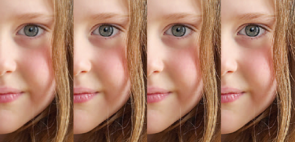
Detail from a portrait captured on a Nikon D1x. The RAW image was processed with 15% sharpening. First test has no subsequent sharpening. Second test uses a High Pass layer (3 pixel radius) in Soft Light mode. Third test has had the blend mode of the High Pass layer changed to Overlay mode. Fourth test has sharpening via a localized Unsharp Mask (100%) in Luminosity mode. The Opacity slider could be used to fine-tune the preferred sharpening routine
4. Remember at this point the settings you have selected are being viewed on a monitor as a preview of the actual print. To complete the process it is important to print the image and then decide whether the image could stand additional sharpening or whether the amount used was excessive. If the settings are excessive you can choose to lower the opacity of the ‘High Pass’ layer.
Saturation and sharpening
Most techniques to increase the contrast of an image will also have a knock-on effect of increasing color saturation. As the High Pass and Unsharp Mask filters both increase local contrast there is an additional technique if this increased color saturation becomes problematic. You may not notice this in general image editing, but if you become aware of color fringing after applying the High Pass technique you should consider the following technique to limit its effects.
Technique two – Unsharp Mask/Smart Sharpen
The second technique is a continuation of the first technique and is intended to address the issues of increased saturation leading to the effect of color fringing. If a merged layer is used as the sharpening layer (as in Project 3) and this layer is then changed to Luminosity blend mode the effects of saturation are removed from the contrast equation. This second technique looks at how the benefits of localized sharpening and Luminosity sharpening can be combined.
5. Change the blend mode of the High Pass layer back to Normal mode. Then apply a Threshold adjustment to the High Pass layer. Go to Image > Adjustments > Threshold.
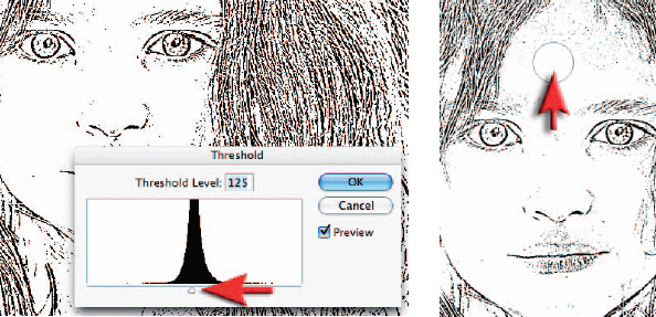
6. Drag the slider just below the histogram to isolate the edges that require sharpening. The aim of moving these sliders is to render all of those areas you do not want to sharpen white. Select ‘OK’ when you are done. Paint out, with a white brush, any black pixel areas that you do not want sharpened, e.g. in the portrait used in this example any pixels remaining in the skin away from the eyes, mouth and nose were painted over using the Paintbrush Tool with white selected as the foreground color.
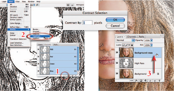
7. Go to the Channels palette and either Ctrl-click (PC) or Command-click (Mac) the RGB thumbnail or click on the ‘Load channel as selection’ icon from the base of the Channels palette to load the edge detail as a selection. Go to Select > Modify > Contract. Enter 1 pixel in the Contract dialog box and select OK. Return to the Layers palette and drag the background layer to the New Layer icon to make a background copy layer. Drag this background copy layer to the top of the layers stack.
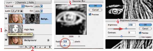
8. Switch off the visibility of the High Pass layer. Hold down the Alt or Option key and click on the ‘Add layer mask’ icon in the Layers palette. Click on the layer mask thumbnail to make sure this is the active part of the layer and then go to Filter > Blur > Gaussian Blur. Apply a 5-pixel radius blur to the mask and then go to Image > Adjustments > Brightness/Contrast and apply +50 Brightness adjustment to the layer mask. The mask is now softer and brighter.
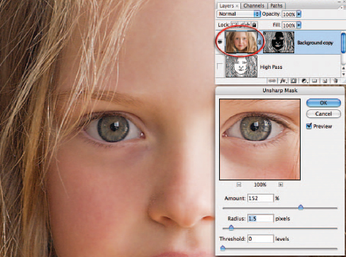
9. Now click on the image thumbnail on the top layer (background copy). Ensure the image is zoomed in to 100% for a small image or 50% for a larger print resolution image (200–300 ppi). Go to ‘Filter > Sharpen > Smart Sharpen or Unsharp Mask’. Adjust the ‘Amount’ slider to between 80 and 150%. This controls how much darker or lighter the pixels at the edges are rendered. Choose an amount slightly more than looks comfortable on screen if the image is destined for print rather than screen.
Note > See Capture and Enhance for basic settings of the Unsharp Mask filter. The exact Threshold and Radius settings are not so critical for this advanced technique.
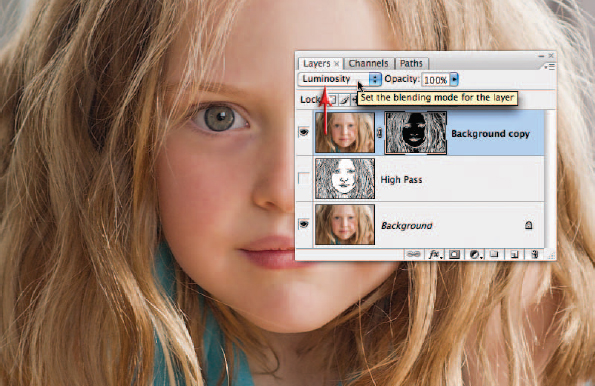
10. Change the blend mode of the sharpening layer (the uppermost layer) to Luminosity mode. Luminosity mode will restrict the contrast changes to brightness only, and will remove any changes in saturation that have occurred due to the use of the Unsharp Mask. The changes are often very subtle but this technique is recommended for all images and is a fast alternative to a technique that advocates changing the mode of the image to Lab and then sharpening the L channel only (L for Luminosity).
Darkened edge exhibits increased saturation prior to changing the blend mode to Luminosity
The illustration above is a magnified view of the effects of changing the blend to Luminosity. These two cutting-edge techniques are capable of producing razor sharp images that will really put the finishing touches to a folio quality image.
Mark Galer
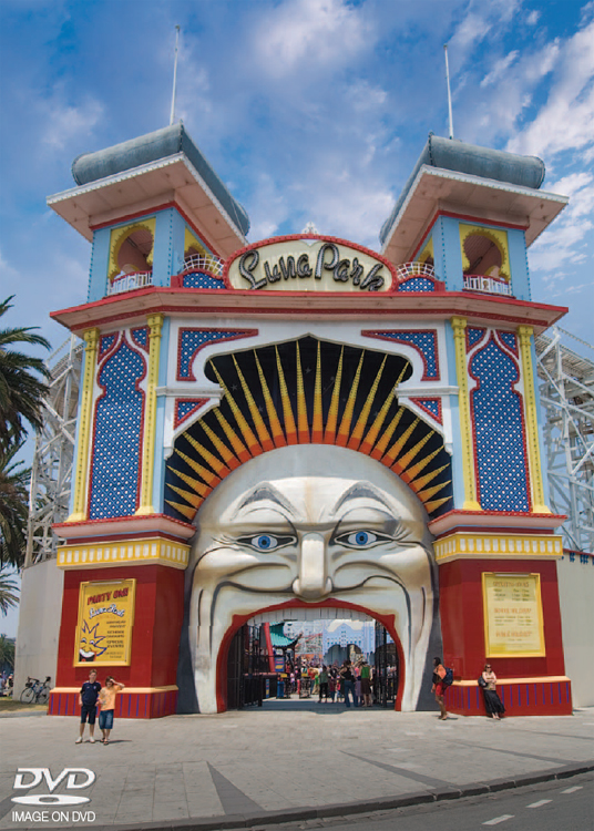
The Lens Correction filter can only correct converging verticals to a certain extent before excessive distortion enters the image. This amusement park was captured at nearly point blank range with a 12mm extreme wide-angle lens on a Nikon D200 and then optimized using the techniques outlined in this chapter

Mark Galer
Combined techniques from Projects 1 and 5 of the Advanced Retouching chapter. Localized contrast and sharpening techniques are introduced from Projects 3 and 5 of the Retouching Projects chapter