advanced retouching
Mark Galer
essential skills
~ Create a monochrome or black and white image from an RGB master.
~ Create a toned image using a ‘Gradient Map’.
~ Create an image with reduced depth of field.
~ Use Smart Objects to balance the lighting within a scene.
~ Create smooth tone to subdue superfluous detail.
~ Create a mirror reflection, add morning mist and change the time of day.
Black and white – Project 1
When color film arrived over half a century ago the pundits who presumed that black and white film would die a quick death were surprisingly mistaken. Color is all very nice but sometimes the rich tonal qualities that we can see in the work of the photographic artists are something certainly to be savored. Can you imagine an Ansel Adams masterpiece in color? If you can – read no further.
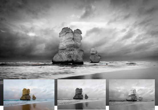
The final image in this project (main image) together with the original color, desaturated version and the result of processing the image using the Black and White adjustment feature
Creating fabulous black and white photographs from your color images is a little more complicated than hitting the ‘Convert to Grayscale mode’ or ‘Desaturate’ buttons in your image-editing software (or worse still, your camera). Ask any professional photographer who has been raised on the medium and you will discover that crafting tonally rich images requires both a carefully chosen color filter during the capture stage and some dodging and burning in the darkroom. Color filters for black and white? Now there is an interesting concept! Well as strange as it may seem, screwing on a color filter for capturing images on black and white film has traditionally been an essential ingredient to the recipe for success. The most popular color filter in the black and white photographer’s kit bag, that is used for the most dramatic effect, is the ‘red filter’. The effect of the red filter is to lighten all things that are red and darken all things that are not red in the original scene. The result is a print with considerable tonal differences compared to an image shot without a filter. Is this a big deal? Well yes it is – blue skies are darkened and skin blemishes are lightened. That’s a winning combination for most landscape and portrait photographers wanting to create black and white masterpieces.
Note > The more conservative photographers of old (those not big on drama) would typically invest in a yellow or orange filter rather than the ‘full-on’ effects that the red filter offers.

The Black and White adjustment offers a quick and controlled method for controlling tonality – just click in the main image window and drag left or right to darken or lighten the tonal value of this color range
Now just before you run out to purchase your red filter and ‘Grayscale image sensor’ you should be reminded that neither is required by the digital shooter with access to Photoshop. Shooting digitally in RGB (red, green, blue) means that you have already shot the same image using the three different filters. If you were to selectively favor the goodies in the red channel, above those to be found in the green or blue channels, you would, in effect, be creating a Grayscale image that would appear as if it had been shot using the red filter from the ‘good old days’. You can see the different tonal information by using the ‘Channels palette’ to view the individual channels (turn off the visibility of all but one channel). Then you can selectively control the information using the fabulous new Black and White adjustment layer feature (also available from the main Image > Adjustments menu). This new adjustment feature is probably the easiest and most versatile way to convert images to black and white. No more juggling sliders in Channel Mixer to prevent clipping and no clever techniques (such as Russel Brown’s dual Hue/Saturation layers technique) to implement this process. The adjustment feature is a breeze to use and very versatile. You can use the color sliders if you like or simply click on a color within the image window and drag to the right to make the color lighter, or to the left to make it darker. How easy is that! In fact, this technique is so easy to use it hardly warrants a project to master the technique. The adjustment feature does, however, have its limitations. Try creating the effect seen in the main image on the previous page using the Black and White adjustment feature from the Layers palette and you will quickly appreciate that the Black and White adjustment feature has its limitations. Dragging the sliders to their extreme values in the Black and White adjustment feature can introduce image artifacts and halos around adjusted colors and the image adjustment feature has no contrast adjustment within the dialog box. Total control over tonality still requires some additional and essential skills using the information from the individual channels in conjunction with the contrast blend modes such as Overlay and Soft Light. The skill of controlled black and white conversions also underpins most of the color toning projects that follow.
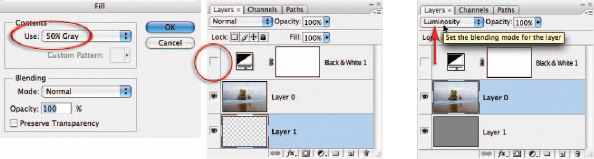
1. Keep the Black and White adjustment layer (described on the previous page) in place but switch off its visibility by clicking on the eye icon to the left of the layer in the Layers palette. Double-click on the background layer to open the New Layer dialog box and select ‘OK’ to convert this layer to an unlocked and editable Layer 0. Hold down the Ctrl key (PC) or Command key (Mac) and then click on the New Layer icon to create a new empty layer below Layer 0. From the Edit menu choose Fill and then select 50% Gray from the contents menu of the Fill dialog box before selecting OK. Change the blend mode of Layer 0 to Luminosity.
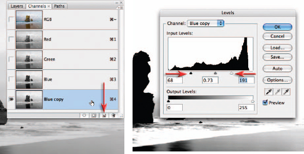
2. Turn off the visibility of Layer 1 (the 50% gray layer). Open the Channels palette and click on the Blue channel. Note how this channel offers the best contrast between the sky and the rocks (blue sky will be lighter in the Blue channel and opposite colors, such as the yellow rocks, will be darker in the Blue channel). We can use this channel to create a quick and effective mask for this project. This mask will allow us to work on the sky and the foreground separately to achieve optimum tonality and contrast in both areas. This technique is called channel masking and is a commonly used advanced technique for professional retouchers to save time. Drag the Blue channel to the New Channel icon to copy it. From the Image > Adjustments submenu choose ‘Levels’. Drag the shadow slider in the Levels dialog box to the right until the dark rocks are mostly black. Drag the highlight slider to the left until the sky is mostly white (you should be left with a few gray clouds just above the horizon line). Click OK to apply the adjustment. Although not perfect, this mask can be optimized in the next step.

3. Painting in Photoshop is not everybody’s flavor of the month. There is, however, a clever Brush technique when masking that makes it a far less painful procedure. Switch the blend mode of the Brush Tool to ‘Overlay’ in the Options bar and set the foreground and background colors to their default setting in the Tools palette. When you now paint in the layer mask all the gray tones are progressively rendered lighter or darker tones depending whether you are painting with white or black. The magic lies in the fact that black has no effect on the lightest tones and white has no effect on the darkest tones in Overlay mode. Painting with black in the white areas will have no effect. Switching between black and white (press X on the keyboard) and repeating the work in some areas results in a vastly improved mask with very little effort. Switch the mode of the brush back to Normal for final clean-up work in the sky away from the edges of the rocks. There is no need to work on the water or beach at this stage.
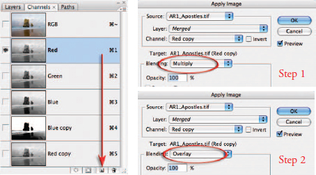
4. Duplicate the Red channel by dragging it to the New Channel icon. This channel offers the best tonal information in the sky but at the moment it lacks contrast. We could use the image adjustments to increase the contrast or we could use the blending options by going to Image > Apply Image. Check that the Red copy channel is selected in the Source section and then choose Multiply from the Blending options in the target section. Select OK and then proceed to select Apply Image a second time. This time choose Overlay as the blending option. This will darken (Multiply) and increase the contrast (Overlay) of the Red channel.
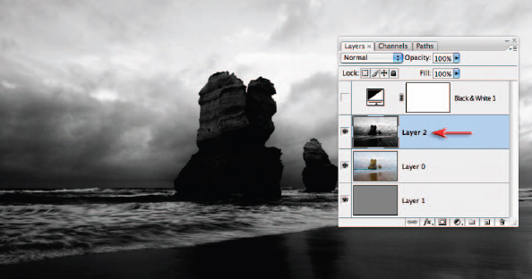
5. To copy the Red copy channel to the clipboard, choose All from the Select menu (Ctrl/Command + A) and then Copy from the Edit menu (Ctrl/Command + C). Open the Layers palette, select Layer 0 and create a new layer by choosing Paste from the Edit menu (Ctrl/Command + V).
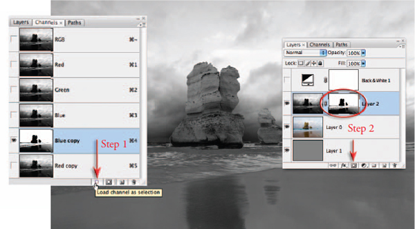
6. Drag the Blue channel to the Load channel as selection icon at the base of the Channels palette. Return to the Layers palette and turn on the visibility of Layer 1 (the 50% gray layer). Click on Layer 2 (the information from your Red copy channel) to make sure it is the active layer. Hold down the Alt/Option key and click on the ‘Add layer mask’ icon at the base of the Layers palette. The mask will require further work to ensure the modified sky is seamless and the immediate foreground (waves and sand) does not appear a little strange.
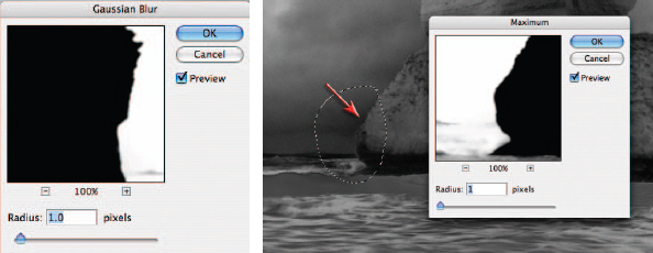
7. Click on the layer mask thumbnail on Layer 2 to make it active and then go to Filter > Blur > Gaussian Blur and apply a 1-pixel blur to soften the edge of the mask a little. Select OK and then zoom in and take a close look around the edges of the rocks. If you notice a halo around any section select that portion using the Lasso Tool. Go to Filter > Other > Maximum. A 1-pixel radius should be sufficient in most cases to remove the halo. Lasso additional areas if required and use the keyboard shortcut to apply the last used filter (Command/Ctrl + F).
Note > If the Maximum filter increases the halo effect when using alternate images, use the Minimum filter instead.
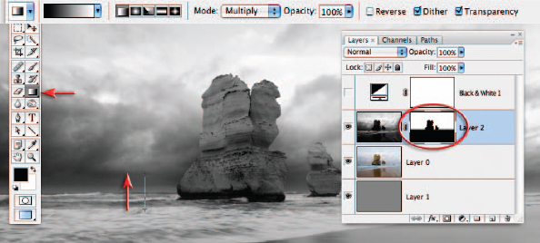
8. As we only require the tonality of the sky on this layer we will need to mask the water and beach using the Gradient Tool from the Tools palette. Choose the Black, White gradient and the Linear options and set the Opacity to 100% in the Options bar. Set the Mode to Multiply to add information rather than replace information in the layer mask. Drag a short gradient from just below the horizon line to just above the horizon line to mask the foreground.
Note > An alternative to the Black, White gradient in Multiply mode is to set the Foreground color to Black and then use the Foreground to Transparent gradient in Normal mode.
9. This step will add contrast to the waves and beach. Choose Select > All, then Edit > Copy Merged and then Edit > Paste. These three commands can be combined into a single command which is commonly referred to as Stamp Visible by professional retouchers. This command has an unlisted shortcut which is to hit the letter E while holding down the Ctrl + Alt + Shift keys (PC) or Command + Option + Shift keys (Mac). This will create a copy of what you see on the screen and paste it as a new layer. Switch the blend mode of this layer to Overlay and then add a layer mask. Add a short Black to White gradient to this mask from just above the horizon line to just below the horizon line.
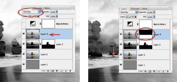
10. This step will darken the sky at the top of the image. Click on the New Layer icon at the base of the Layers palette and set the mode to Overlay. Choose Black as the Foreground color and select a Foreground to Transparent gradient. Drag a gradient from the top of the image to a position halfway to the horizon line. Adjust the opacity of the layer if you would like to reduce the effect.
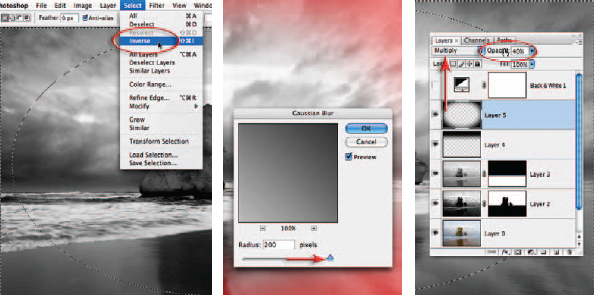
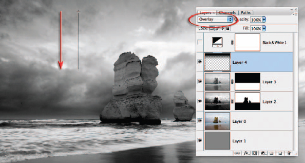
11. This step will create a subtle vignette that is designed to darken the corners of the image and increase the drama even further. Add another new layer and set the mode to Multiply. Select the Elliptical Marquee Tool from the Tools palette (behind the Rectangular Marquee Tool). Drag a selection from the top-left corner to the bottom-right corner of the image. Choose Inverse from the Select menu. Press the Q key to turn this selection into a ‘Quick Mask’. Go to Filter > Blur > Gaussian Blur and apply a 200-pixel blur to this mask. Press Q on the keyboard to return to the selection. Be sure the foreground color is set to black and fill the selection with black using the keyboard shortcut Alt + Backspace (PC) or Option + Delete (Mac). Lower the opacity of the layer to around 40%. Finally, don’t forget to choose Select > Deselect before going on to the next step.
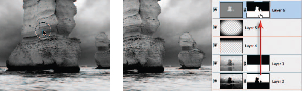
12. Create a ‘dodge and burn’ layer (create a new layer and fill with 50% gray and then set the mode to Overlay). Select the Brush Tool from the Tools palette and then choose a soft-edged brush, Opacity 20% and Normal mode from the Options bar. Set the foreground color to white to dodge or black to burn, then paint over the rocks to lighten and increase their localized contrast. Paint several times until you are happy with the effect. It does not matter if the brushwork spills into the background sky. Hold down the Alt/Option key and drag the layer mask from Layer 2 to Layer 5. Holding down the Alt/Option key will copy the mask. Invert this mask using the Invert shortcut Ctrl + I (PC) or Command + I (Mac).
Reintroducing color
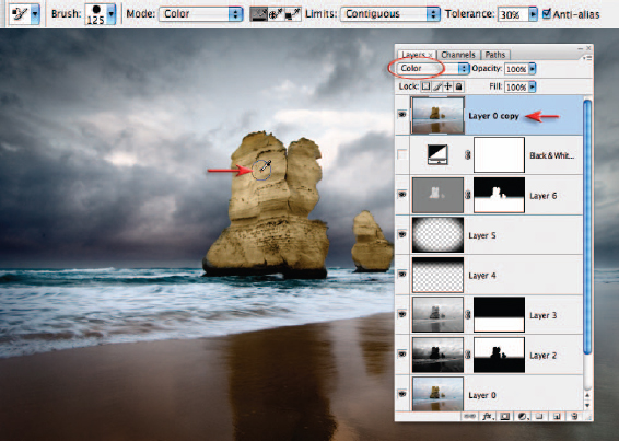
The original color can be reintroduced in a way that preserves the tonal values we have just created. Duplicate Layer 0 using the keyboard shortcut Ctrl + J (PC) or Command + J (Mac). Drag this layer to the top of the layers stack and change the mode to Color. Adjust the opacity until an appropriate balance between tonality and color is achieved. The colors on the main rock can be evened out by selecting the Color Replacement Tool from the Tools palette. Using the default settings of this tool hold down the Option/Alt key and sample a saturated color near the top of the rock. Increase the size of the Tool and paint over the rest of the rock to modify the color values. The edge of the brush can overlap the edges of the rock but care must be taken not to move the cross-hair in the center of the cursor over any areas of sky as this will change the color of the sky to yellow. Stamp or merge the visible elements of all layers (including or excluding the color layer) before applying the Smart Sharpen or Unsharp Mask filter. To compare the difference that has been achieved by incorporating blend modes and masking techniques into the mix, turn off the visibility of all of the other layers except Layer 0, set the Mode to Normal and switch the Black and White adjustment layer back on.
Note > The ability to modify color and tonality separately and then reunite them later in the editing process can be a powerful technique for creating information-rich images where luminance values have the priority over color values.
Gradient maps – Project 2
Burning, toning, split-grade printing and printing through your mother’s silk stockings are just some of the wonderful, weird and positively wacky techniques used by the traditional masters of the darkroom waiting to be exposed (or ripped off) in this tantalizing digital tutorial designed to pump up the mood and ambience of the flat and downright dull.
Seeing red and feeling blue
It probably comes as no small surprise that ‘color’ injects images with mood and emotional impact. Photographers, however, frequently work on images that are devoid of color because of the tonal control they are able to achieve in traditional processing and printing techniques. Toning the resulting ‘black and white’ images keeps the emphasis on the play of light and shade but lets the introduced colors influence the final mood. With the increased sophistication and control that digital image-editing software affords us, we can now explore the ‘twilight zone’ between color and black and white as never before. The original image has the potential to be more dramatic and carry greater emotional impact through the controlled use of tone and color.
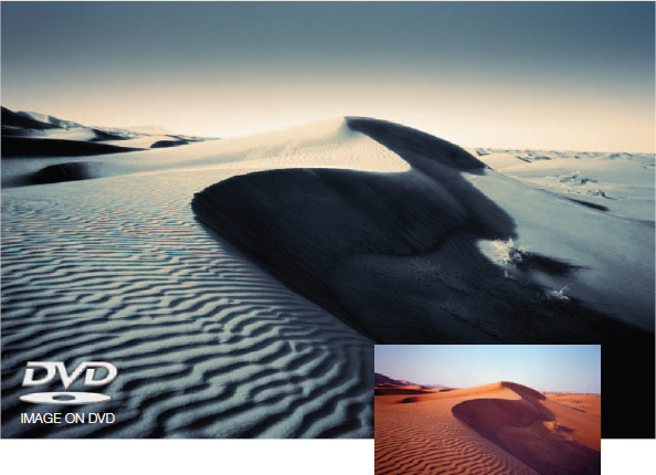
The tonality of the tutorial image destined for the toning table will be given a split personality. The shadows will be gently blurred to add depth and character while the highlights will be lifted and left with full detail for emphasis and focus. Selected colors will then be mapped to the new tonality to establish the final mood.
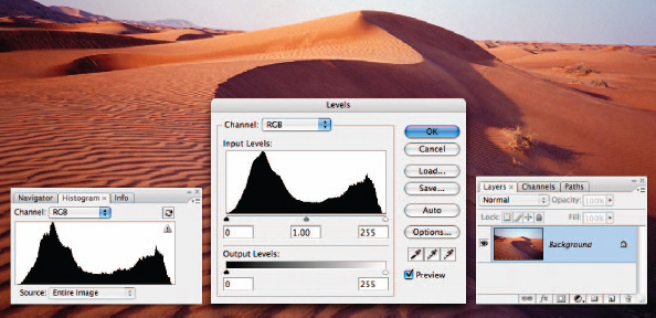
1. Open the project image from the support DVD. Although the Levels have already been optimized for this file the tonality will be adjusted extensively during the following steps. Although none of the steps will cause any of the tones to become clipped in the master image file, some of the shadow tones may need extensive recovery so that they will print with detail. It is recommended that you leave the Histogram palette open for the duration of the project to monitor these tones as you work.
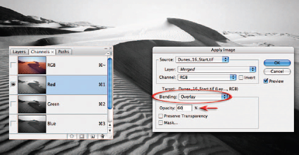
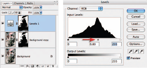
2. This step will create a black and white layer with good contrast above the background layer. Open the project image and select the Red channel in the Channels palette. Go to Select > All and then Edit > Copy. Select the RGB channel and then open the Layers palette and choose ‘Paste’ from the Edit menu. The information from the Red channel will now appear in its own layer above the background layer. Choose ‘Apply Image’ from the Image menu and choose ‘Overlay’ from the blending options in the Apply Image dialog box. Lower the Opacity to 60% and select ‘OK’.
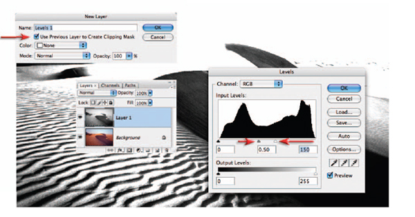
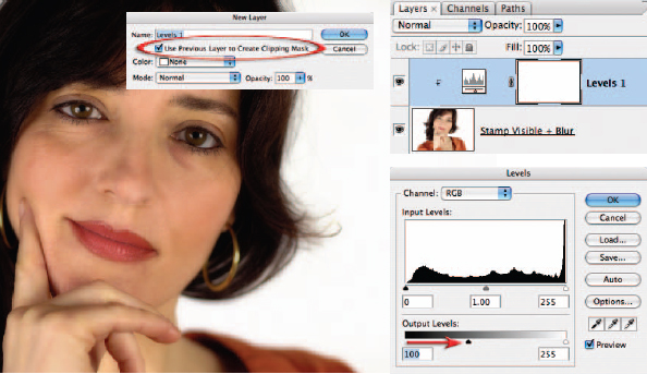
3. Use an ‘adjustment layer’ to adjust the tonality of this layer. Hold down the Alt/Option key on the keyboard and click on the ‘Create new fill or adjustment layer’ icon and select Levels. In the ‘New Layer’ dialog box check the ‘Use Previous Layer to Create Clipping Mask’ option. Click ‘OK’ to open the ‘Levels’ dialog box. Drag the highlight slider to the left until the highlights disappear. Move the ‘Gamma’ slider (the one in the middle) until you achieve good contrast in the shadows of the image. Select ‘OK’ to apply the levels adjustment.
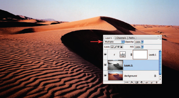
4. In the Layers palette select the black and white layer (not the adjustment layer) and switch the ‘mode’ of the layer to ‘Multiply’ to blend these modified shadow tones back into the color image. The image will appear excessively dark but will be corrected in Step 6.
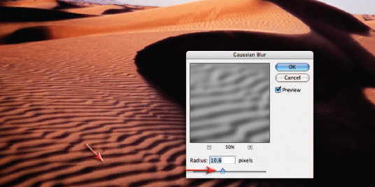
5. With the black and white layer still selected, go to ‘Filter > Blur > Gaussian Blur’ and increase the ‘Radius’ to spread and soften the shadow tones. With the Preview on you will be able to see the effect as you raise the amount of blur. Go to ‘View > Zoom In’ to take a closer look at the effect you are creating. There is no single amount of blur that will suit all images so experiment with alternate values when using images where the size and shape of the shadows are different.
Note > This effect emulates the silk-stocking technique when it is applied to only the high contrast part of the split-grade printing technique made famous by Max Ferguson and digitally remastered in his book Digital Darkroom Masterclass (Focal Press).
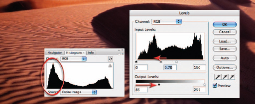
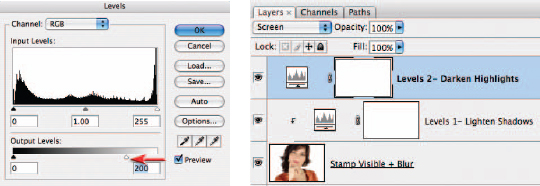
6. Open the Histogram palette and observe how the shadow tones have become compressed towards Level 0 but are not clipped. We need to open up these shadow tones to ensure they print with detail. Reopen the Levels adjustment that you created earlier (note how the histogram only reflects the tones present in the layer it is clipped with and not the overall image). Drag the shadows Output slider to the right (see the illustration to ensure you have the correct slider) to lighten the shadows and the Gamma slider to the left slightly to lighten the midtones if required. Observe the changes to the histogram in the Histogram palette. Use the Info palette if you need to gather feedback about specific shadow values.
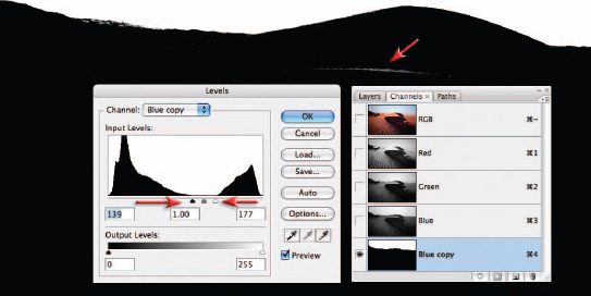
7. Bright areas of tone within the image can be distracting if they are not part of the main subject matter. It is common practice when working in a black and white darkroom to ‘burn’ the sky darker so that it does not detract the viewer’s attention from the main focal point of the image. In the project image the overly bright sky detracts from the beautiful sweep of the dominant sand dune. To darken the sky create a selection using the channel masking technique outlined in the Selections chapter (duplicating the blue channel and increasing the contrast using a Levels adjustment). Fine-tune the mask by switching on the visibility of the alpha channel and the RGB master channel (remember you can change your mask color to a green to contrast better with the dunes). Use a hard-edged brush with the foreground color set to black and paint any areas missed by the channel masking process. Apply a 1.5-pixel Gaussian Blur to the finished mask.
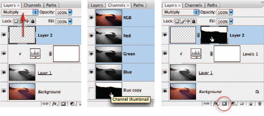
8. Create a new layer for the gradient by clicking on the New Layer icon in the Layers palette and switch the blend mode to Multiply. Load the channel mask you created in the previous step as a selection by holding down the Ctrl key (PC) or Command key (Mac) and clicking on the Blue Copy thumbnail (this selection will help shield the foreground from the gradient). With the selection active click on the ‘Add layer mask’ icon in the Layers palette and then click on the empty layer thumbnail to make this the active component of the layer.
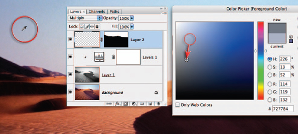
9. Select the Gradient Tool from the Tools palette. Hold down the Alt/Option key to turn the mouse cursor into the eyedropper icon and click on a deep blue from the sky within the image. Click on the foreground color swatch in the Tools palette to open the Color Picker. Make the color that you selected darker by moving the sample circle in the Color Picker lower or by lowering the brightness value. Select OK.
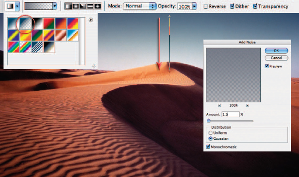
10. In the Options bar select the ‘Foreground to Transparent’ and ‘Linear Gradient’ options. Drag a gradient from the top of the image to just below the horizon line to darken the sky. Holding down the Shift key as you drag constrains the gradient, keeping it absolutely vertical. Go to Filter > Noise > Add Noise. Check the Monochromatic option and adjust the Amount slider to a value between 1 and 2%. Adding noise will help to reduce any banding (stepping of tone) that may occur as a result of using the Gradient Tool.
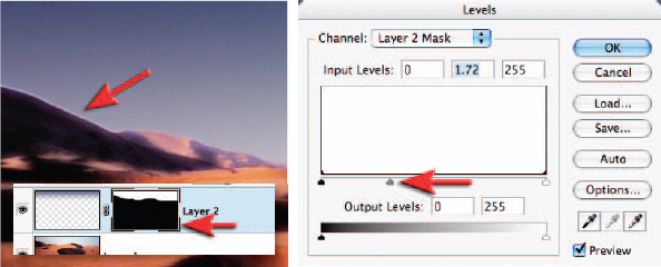
11. Zoom in and take a look at the edge where the sky meets the sand dunes. If you notice a small halo this can be corrected by making adjustments to the layer mask. Click on the layer mask thumbnail and from the Image > Adjustments menu choose ‘Levels’. Moving the Gamma slider will realign the edge precisely with the edge of the sand dunes. Moving the shadow and highlight sliders in the Levels dialog box will render the edge of the mask less soft.
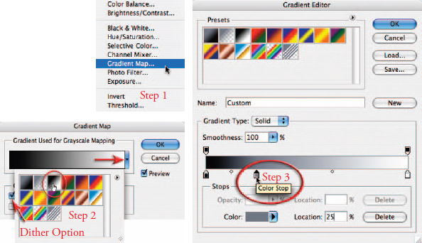
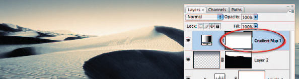
12. To introduce alternative colors into the image we can use a Gradient Map adjustment layer. In the dialog box, choose the ‘Black, White’ gradient from the gradient presets (this will remap the colors to a full tonal range black and white image), check the Dither option in the Gradient Map dialog box (to help to reduce banding) and then click on the gradient strip to open the ‘Gradient Editor’ dialog box. Click underneath the gradient ramp to add a color stop. Move the stop to a location of 25%. Click on the mini color swatch at the bottom of this dialog box to change the color of this stop. The Select Stop Color dialog box (color picker) will open.
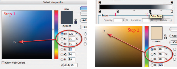
13. Choose a cool color with a brightness value of 35% to give character to the shadow tones. Choosing desaturated colors (less than 25%) will help to keep the effects subtle so the tonal qualities of the image are not suppressed by overly vibrant colors. If color rather than tone is to take center stage then saturation levels of the color stops can be increased beyond 25%. Select OK to return to the Gradient Editor dialog box. Create another stop by clicking underneath the gradient ramp in the Gradient Editor dialog box and move it to a location that reads approximately 70%. This time try choosing a bright warm color with a brightness value of 90% to contrast with the blue chosen previously.
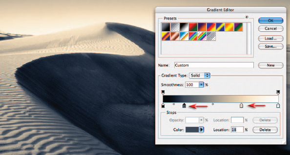
14. Fine-tune the tonality and color distribution in the image by moving each slider to the left or right to either darken or lighten this range of tones. In this project image the highlight and shadow tones are lightened by moving both stops slightly to the left. Note how the colors you have chosen are remapped to the tones as they change in brightness, i.e. as the shadow tones are made lighter they also become warmer.
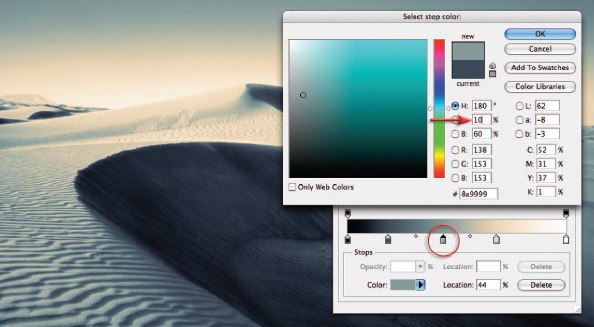
15. Add a third midtone color stop if required halfway between the shadow and highlight stops. In this project image I have chosen a cool Cyan color of only 10% saturation. Drag this color stop and observe how the highlight or shadow tones can be pushed back or drawn into the adjacent tones, e.g. moving the midtone color stop to the left will let the highlight color flow through to some of the ridges in the sand ripples.
Note > Be careful not to drag any of the sliders too close together as this will cause banding in the image. Once you have created the perfect gradient you can give it a name and save it by clicking on the ‘New’ button. This gradient will now appear in the gradient presets for quick access. Click OK in the Gradient Editor and Gradient Map dialog boxes to commit the gradient.
16. Lower the opacity of the Gradient Map adjustment layer or use the layer mask to remove some of the effects of the Gradient Map adjustment layer. Instead of changing the layer opacity, in this project image a ‘Black, White’ linear gradient has been added to the layer mask to bring back some of the tone and color of the underlying layers in this region. This will restore the smoother gradient that was disturbed by moving the color stops in the Gradient Map adjustment layer.
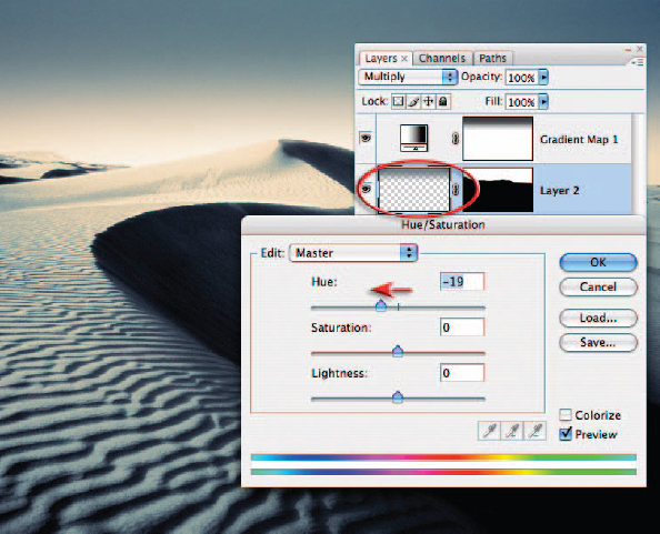
17. To adjust the hue of the sky on Layer 2 apply a Hue/Saturation adjustment (Image > Adjustments > Hue/Saturation). Move the Hue slider to the left in order to align the hue with shadow color added in the Gradient Map adjustment layer. Select OK when color consistency has been achieved.
Now all you need to do is lock yourself in the bathroom for half a day, dip your hands in some really toxic chemicals and you will have the full sensory experience of the good old days of traditional darkroom toning.
Note > If the original color of a gradient is black the Colorize checkbox in the Hue/Saturation dialog box must first be checked.
Gradient presets
A range of gradient presets including the one used in this toning activity can be downloaded from the supporting DVD and loaded into the ‘presets’ by double-clicking the gradients preset file or clicking on the Load button in either the Gradient Editor or the Preset Manager.
Creative depth of field – Project 3
The Gaussian Blur filter or Lens Blur filter can be used creatively to blur distracting backgrounds. Most digital cameras achieve greater depth of field (more in focus) at the same aperture when compared to their 35mm film cousins due to their comparatively small sensor size. This is great in some instances but introduces unwelcome detail and distractions when the attention needs to be firmly fixed on the subject – and not the woman in the background picking her nose!
When capturing a decisive moment with a camera the most appropriate aperture or shutter speed for the best visual outcome often gets overlooked. Photoshop can, however, come to the rescue and drop a distracting background into smooth out-of-focus colors. A careful selection to isolate the subject from the background and the application of a blur filter usually does the trick. Problems with this technique arise when the resulting image, all too often, looks manipulated rather than realistic. The Gaussian Blur filter will usually require some additional work if the post-production technique is not to become too obvious. A more realistic shallow depth of field effect is created by using the ‘Lens Blur filter’.
1. Duplicate the background layer by dragging it to the New Layer icon in the Layers palette. Make a selection of the foreground subject or open the Channels palette and hold down the Ctrl key (PC) or Command key (Mac) and click on the saved Alpha channel (the TIFF file on the supporting DVD has an Alpha channel of the main subject to allow you to fast-track this project). This selection will isolate the foreground subject from the blurring technique that will follow. Switch to Quick Mask mode (Q) and apply a Gaussian Blur filter (Filter > Blur > Gaussian Blur) to the mask to replicate the edge quality of the main subject. Exit Quick Mask mode (Q).
Note > If you intend to make your own selection and are using a mixture of selection tools, adjust the feather setting in the Options bar to 0. Perfect the selection using a hard-edged brush in ‘Quick Mask mode’ (the Refine Edge dialog box does not allow localized painting which may be required when working on the spokes of the wheel).
2. Alt/Option-click on the ‘Add layer mask’ icon in the Layers palette to convert the selection into a layer mask. The mask will require further work to create an area of sharp focus in the background for positioning or anchoring the subject realistically in its environment. The subject will need to be planted firmly on an area of ground that is not blurred to prevent the subject from floating above the background. A simple gradient will allow us to anchor the subject and allow the background to fade gradually from focus to out of focus. Set the Foreground Color to black and then select the Gradient Tool from the Tools palette. Choose the ‘Foreground to Transparent’, ‘Reflected Gradient’ and ‘Opacity: 100%’ options in the Options bar. Drag the Gradient Tool (while holding down the Shift key) from a point where the rear wheel of the wheelchair touches the road to the axle of the same wheel.
3. Click on the image thumbnail in the Layers palette to make sure this is the active part of the layer rather than the layer mask. From the ‘Blur’ submenu in the ‘Filter’ menu, select the Lens Blur filter. From the ‘Depth Map’ section of this dialog box choose ‘Layer Mask’.
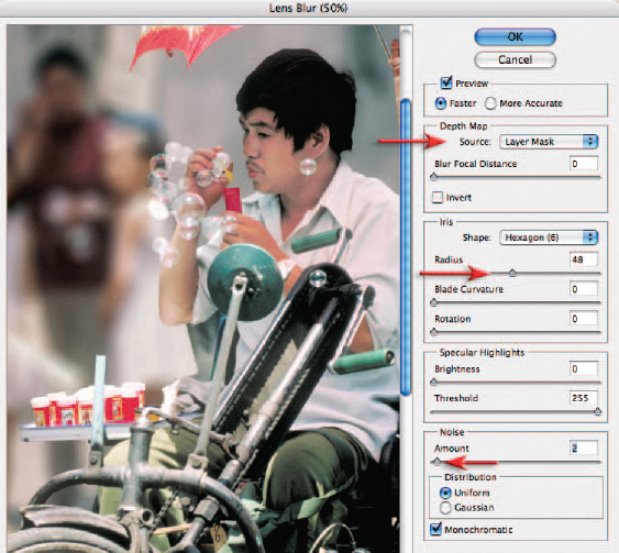
4. Choose the depth of field required by moving the Radius slider. The Blade Curvature, Rotation, Brightness and Threshold sliders fine-tune the effect. Zoom in to 100% before applying a small amount of noise (1 or 2 is usually sufficient) to replicate the noise of the rest of the image. Select OK to apply the lens blur and return to the main workspace.
Lens Blur or Gaussian Blur?
Gaussian Blur was always the first port of call prior to Photoshop CS for creating simulated shallow depth of field. The Gaussian Blur filter has a tendency to ‘bleed’ strong tonal differences and saturated colors into the background fog, making the background in the image look more like a watercolor painting rather than a photographic image. The Lens Blur filter was new to Photoshop CS and was then enabled for 16 Bits/Channel files in CS2 and introduces none of the bleed that is associated with the Gaussian Blur technique. The filter is extremely sophisticated, allowing you to choose different styles of aperture and control the specular highlights to create a more realistic camera effect.
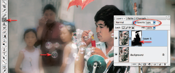
5. To retrieve areas of focus that were blurred accidentally (the appearance of the bubbles would benefit from sharper reflections) select black as the foreground color and a soft-edged Paintbrush with an opacity of 50%. Select the mask layer and paint any areas of the subject that appear too blurry to increase the detail present. Several passes of the brush set at 50% opacity will gradually increase the detail and leave a subtle edge. Hold down the Alt or Option key and the Shift key and click on the layer mask thumbnail to view the layer mask and image together if this helps the process.
6. Hold down the Ctrl key (PC) or Command key (Mac) and click on the layer mask thumbnail to load the mask as a selection. Use the selection to create a localized ‘Levels’ adjustment layer to lower the overall brightness of the background to further draw attention to the foreground subject matter.
Future developments – shifting focus
If digital cameras are eventually able to record distance information at the time of capture this could be used in the creation of an automatic depth map for the Lens Blur filter. Choosing the most appropriate depth of field could be relegated to post-production image editing in a similar way to how the white balance is set in camera RAW.
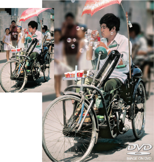
Smart Objects – Project 4
Striking the right balance between ambient light and introduced light can be the difference between sweet success and dismal failure. This project (together with the Shadow/Highlight project in Retouching Projects) demonstrates the art of balancing the lighting in post-production rather than at the time of capture.
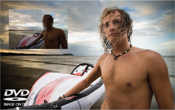
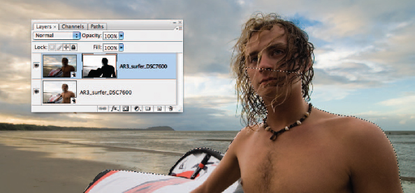
The original exposure is a compromise between background and foreground – neither delivers the goods but plentiful information is available in both to allow further work to be carried out
Instead of using the excellent Shadow/Highlight adjustment feature we now have the option with this project file of using the extended dynamic range of the Raw file format. Different exposures can be extracted from a single Raw file and combined in Photoshop’s main workspace. This project will introduce the technique of using several Smart Objects, each being generated from the same Raw file. The initial camera Raw settings used to create each Smart Object can be subsequently modified if required. This ability to double-click on a Smart Object (generated from a Raw file), open the ACR dialog box and adjust the settings is similar to reopening an adjustment layer or smart filter to modify its settings. Even if the project file is in 8 Bits/Channel mode, any changes or modifications to the Smart Object, via the ACR dialog box, are occurring at a higher bit depth so optimum quality is preserved.
New horizons
Modifying exposure is just the tip of the iceberg when it comes to the creative possibilities of using Raw files as Smart Objects, e.g. the photographer could change from a small color space to a large color space and simply access the additional colors from the ACR dialog box.
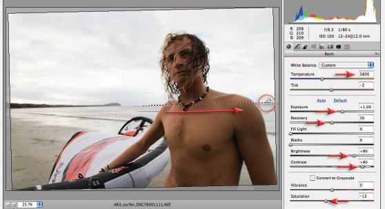
1. Open the Raw project file in the Adobe Camera Raw dialog box (ACR). Set the Color Temperature to 5800 and the Exposure slider to +1.00 to optimize the tonality for the young man. Raise the Recovery slider to +50 to prevent any clipping in the sky and lighter strands of hair. The Brightness and Contrast sliders can also be raised to +80 to further enhance skin tones. Lower the Saturation slider to –15. Click on the Straighten Tool in the ACR dialog box (upper left-hand corner) and click and drag along the horizon line.
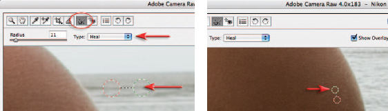
2. Click on the Retouch Tool (top left-hand corner of the ACR dialog box). Select ‘Heal’ from the ‘Type’ options. Zoom the image to 100% magnification and move to the area of the image just to the left of the man’s shoulder (on the right side of the image). Remove the distracting dark item from the sea (just below the horizon line) by clicking on the center of the item and dragging until the selection area just covers the blemish. Let go of the mouse button for the healing action to work. Drag the second green circle (the source) to a new area for a better match (along the ridge of the wave). A small white dot (known as a ‘hot pixel’) appears on the man’s arm close to the first retouching procedure (zoom to 200% if necessary). A third and final blemish can be removed from the sky on the left side of the image (a distant kite). Hold down the Shift key and select Open Object in the ACR dialog box to open this file into Photoshop’s main workspace.
Note > See the Adobe Camera Raw chapter for more information about the Retouch Tool. Open Object can be set to the default option for Raw files in the Workflow Options of ACR.
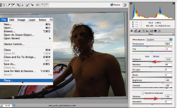
3. From the File menu choose the Place command. Browse to the same Raw file and select Place. The ACR dialog box will open with the previous settings that were applied during Step 1. We will modify these settings to optimize the file for the sky by lowering the Exposure slider to –0.50. Increase the Vibrance slider to +50 and select OK. The file will open as a second Smart Object complete with a Transform bounding box. Select Commit Transform in the Options bar or hit the Return/Enter key.
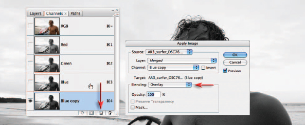
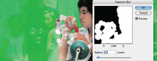
4. In the Channels palette click and drag the Blue channel (the one with the best contrast between the sky and the foreground) to the ‘Create a new channel’ icon to duplicate it. From the Image menu choose Apply Image. Set the Blending mode to Overlay in the Apply Image dialog box and select OK to increase the contrast of the blue copy channel.
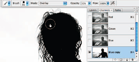
5. This step aims to create an effective mask for the sky. Select the Brush Tool from the Tools palette and set the foreground color to White. Set the Mode in the Options bar to Overlay and set the Opacity to 30%. Paint the dark areas of the figure until you have created a silhouette. Paint up to, but NOT over, the thin strands of hair. Switch the foreground color to Black in the Tools palette and paint around the head until you have created a good mask for the sky. The Overlay mode will help in the process of creating an effective mask as you cannot paint white over areas that are already black, and black over areas that are already white, using this blend mode. The foreground will be masked in the following step.
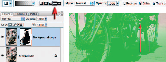
6. Load the Blue copy channel as selection (Ctrl/Command-click the channel thumbnail). Click on the RGB master channel to return to the normal RGB before returning to the Layers palette. Hold down the Alt/Option key and click on the ‘Add layer mask’ icon in the Layers palette to mask the sky. Make a selection of the figure and sail using either the Pen Tool or the Lasso Tool (ensure no feather is applied at this stage).
Note > A selection and path are available in the supporting TIFF file for this section of the image if you wish to fast-track the project.

7. This step aims to render the water and the beach in the mask completely white. Hold down the Option/Alt key together with the Shift key and click on the layer mask thumbnail to view the layer mask contents. Fill the active selection of the figure and sail with black (Edit > Fill > Black). Invert the selection (Select > Inverse) and then select white as the foreground color. Set the blend mode to Normal and the Opacity to 100% and then proceed to paint all of the beach outside of the selection white. Be careful to avoid the hair in this procedure. From the Select menu choose Deselect. Click on the layer thumbnail to revert to the normal RGB view.
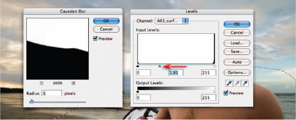
8. This step will optimize the edge quality of the mask. Click on the layer mask thumbnail to make it the active component of the layer. Select the Lasso Tool and make a selection of all of the mask except the hair. Go to Filter > Blur > Gaussian Blur and apply a 1 or 2-pixel blur to soften the hard edge of this mask. Go to Image > Adjustments > Levels and move the center Gamma slider in the Levels dialog box to the left to remove the majority of the lighter halos around the edge of the mask. Make another selection of the hair and apply Gaussian Blur and Levels adjustment only if required. Maker smaller selections of any problem areas and move the mask edge using the levels technique to fine-tune the transition between the two layers.
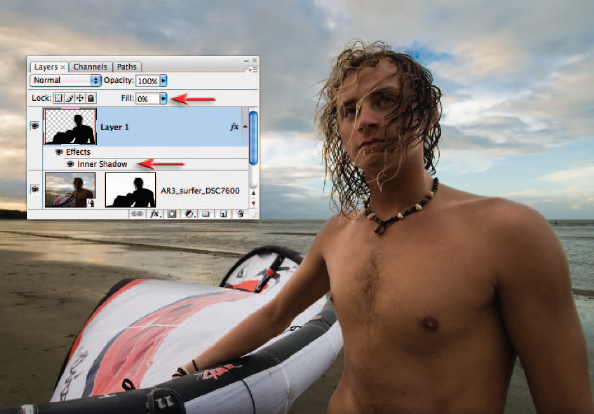
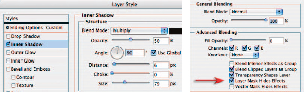
9. The lighter edge down the young man’s left arm (right side of image) may appear too light even when the alignment of the mask is perfect (the arm is back lit against the lighter sky). Hold down the Ctrl key (PC) or Command key (Mac) and click on the layer mask thumbnail to load the mask as a selection. From the Select menu choose ‘Inverse’ and then click on the ‘Create a new layer’ icon in the Layers palette to create an empty new layer. From the Edit menu choose ‘Fill’ and select Black as the fill color before selecting OK. Go to Select > Deselect. Lower the Fill for this layer to 0% in the Layers palette (the black pixels will now be transparent but still allow us to add a visible layer style). Click on the fx icon (Layer style) at the base of the Layers palette and choose ‘Inner Shadow’. In the Layer Style dialog box adjust the opacity, distance and size to darken the light edge on the arm (ignore any excessive darkening in other areas). Click on the Blending Options tab in the upper left corner of this dialog box and then check the ‘Layer Mask Hides Effects’ option before clicking OK to apply this layer style.
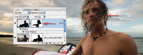
10. Add a layer mask to the layer and then paint with black at 100% Opacity to conceal any areas that do not require darkening.
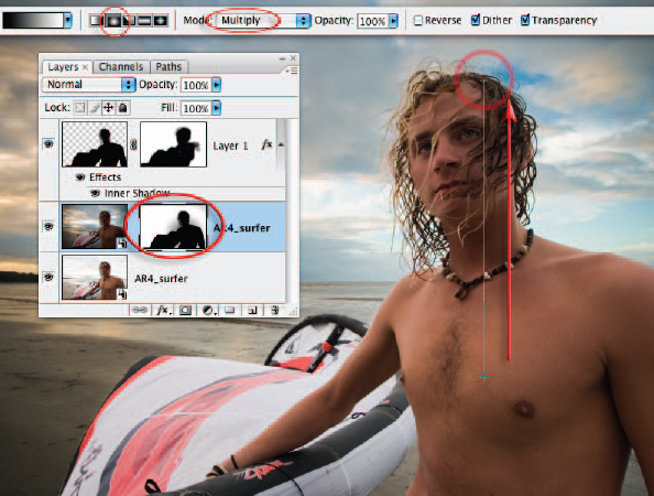
11. The edge around the body can be difficult to perfect if the tonal difference between the two exposures is too great. Create a gradient in the layer mask to reduce the tonal differences between the lightened body and darkened background. Select Black as the foreground color and then select the Gradient Tool. Select the Foreground to Transparent gradient, Radial gradient and 100% Opacity from the Options bar. Click just below the man’s elbow in the center of the image and drag to a position just above the horizon line.
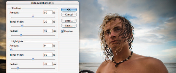
12. Click on the base layer in the layer stack. As this layer is a Smart Object you can apply a Shadow/Highlight adjustment and filters directly to this layer without having to convert it for smart filters first. Go to Image > Adjustments > Shadow/Highlight and lighten the shadows by 50%, using a Tonal Width of 25% and a 45-pixel Radius. Click OK to apply the tonal changes and then go to Filter > Sharpen > Unsharp Mask. Sharpen using a generous Amount of sharpening (100+) using a low Radius (0.8 to 1.0). Raise the Threshold to 7 so that the noise does not get sharpened along with the edge detail.
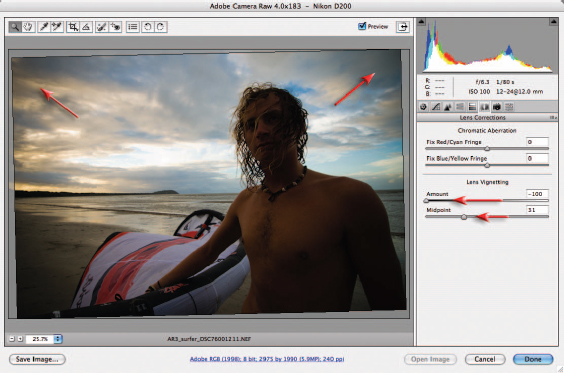
13. Double-click the second darker Smart Object to reopen the ACR dialog box. Click on the Lens Correction tab and move the Amount slider in the Lens Vignetting section to –100. Move the Midpoint slider to –30 to draw the darkening towards the center of the image. Click Done to apply the changes and update the file in the main workspace.
The smooth tone technique – Project 5
A fellow photographer was showing me some images the other day that he had captured with a camera that uses a plastic lens. The images had a certain attraction. Although the images had some pretty shocking vignetting and heavy distortion he was drawn to the beautiful liquid smooth tones that the plastic lens was offering up. Most women who look at photographs of themselves would agree that crunchy detail is just not a good look. A digital camera can be a very cruel tool that can capture way too much information. Most people would prefer their skin to appear smooth, but not featureless, and will thank the photographer when they can reveal a skin texture that does not shout its detail to the viewer.
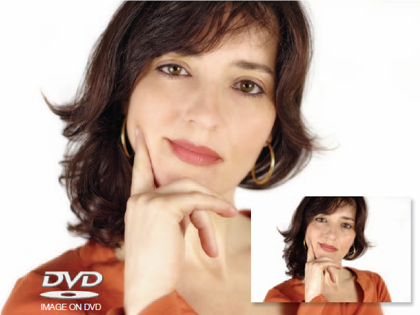
Carmen Martinez Banus (www.iStockphoto.com)
Remove unflattering detail using this smooth tone technique
I have over the years observed many photographers zoom in to 400% and laboriously start healing individual flaws in an attempt to make amends for an overly sharp lens and overly harsh lighting in order to flatter their sitter. This smooth tone technique avoids laboriously removing superfluous details one at a time. I use this technique so often in my own editing that I have now created an action for it (supplied on the DVD). I play this action on whole folders of images and am slightly disturbed how often I like all of the images it is applied to. I even apply it to landscapes. This technique does not just blur the entire image, which is the bit I like best. It is the areas of continuous tone that take the brunt of the smoothing, leaving edges with good contrast, crisp and sharp.
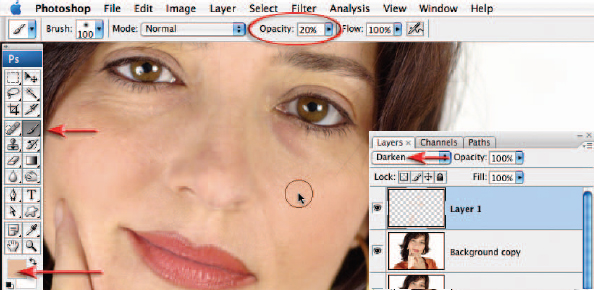
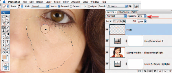
1. Duplicate the background layer by dragging it to the ‘Create a new layer’ icon in the Layers palette. The slightly oily skin has created some highlights on the cheeks, brow and hand that are not very flattering. Click on the ‘Create a new layer’ icon in the Layers palette and set the mode to ‘Darken’. Select the Brush Tool from the Tools palette and choose a large soft-edged brush in the Options bar. Set the Opacity of the brush to 20%. Take a color sample by holding the Alt/Option key and clicking on an area of skin just outside the highlight and then paint over the areas to suppress these highlights. A couple of passes with the brush may be required.
Note > In order to take a color sample that is representative of the color area ensure the sample size of the Eyedropper Tool is set to 5 × 5 in the Options bar.
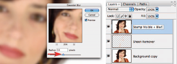
2. Stamp the Visible layers to a new layer. Go to the Select menu and choose ‘All’ and then choose ‘Copy Merged’ and ‘Paste’ from the Edit menu. The unlisted keyboard shortcut, known only to ‘those-in-the-know’, is to hold down the Ctrl + Alt + Shift keys (Command + Options + Shift keys for Mac users) while hitting the E key. Go to Filter > Blur > Gaussian Blur. Choose a very generous blur that sees all of the fine detail removed but that retains the general shape of the features and face. The precise amount will vary depending on the resolution of the image and how much of the frame the face occupies. This 6-megapixel image uses a 15-pixel radius blur.
3. In the Layers palette change the mode of this blur layer to Multiply. Your image will, for the moment, appear very dark and saturated. Hold down the Alt/Option key and then click on the ‘Create new adjustment layer’ icon in the Layers palette. Choose ‘Levels’ from the dropdown menu. When the New Layer dialog box opens click on the ‘Use Previous Layer to Create Clipping Mask’ checkbox and then select OK. When the Levels dialog box opens move the shadow output slider to the right until the Output Levels read around 100 and then select OK. This will partly restore the shadow values to something approaching, but not quite, normal.
4. Hold down the Alt/Option key and select ‘Levels’ from the ‘Create new adjustment layer’ menu in the Layers palette. Set the mode to Screen in the New Layer dialog box and select OK. This will restore the midtones but push the highlights uncomfortably high. To rescue these highlight tones we will use a similar technique that we used to rescue the shadow tones in the previous step. In the Levels dialog box move the highlight output slider to the left until the Output Levels read around 200 and then select OK. This should fully restore the highlight tones to their normal value. You should now be getting an idea of the smooth tones we are achieving even if the tonal values and saturation values are not yet perfect.
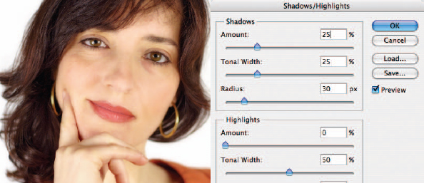
5. Stamp Visible again and use the Shadow/Highlight adjustment feature to fully restore the shadow values (go to ‘Image > Adjustments > Shadow/Highlight’). Lower the tonal width to around 25% and raise the Amount slider just enough to restore the overly dark shadow values. Experiment with increasing the Color Correction slider in the Shadow/Highlight dialog box to make these adjusted shadow tones more colorful.
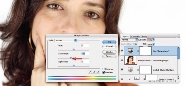
6. Create a Hue/Saturation adjustment layer and lower the saturation levels – lowering the saturation by –15 to –25 will put things back to normal – well normal minus the superfluous detail in the skin. If you were creating an action for this technique you would now sharpen the image. Sharpening the image will reveal that edge detail with contrast has not been sacrificed. Only Step 1 and Step 7 of this project cannot be actioned (they require you to selectively paint or heal).
Note > If making an action you should prepare variations for low-resolution and high-resolution images. I have created one action for 3- to 6-megapixel images and another for 8- to 12-megapixel images. The only setting that needs to be varied is the radius of the Gaussian Blur filter used in Step 2, i.e. a higher radius for higher resolution images.
7. Click on the ‘Create a new layer’ icon in the Layers palette. Make a selection of the healing area that excludes the area of difference. Use a 2-pixel feather in the Options bar when using the Lasso Tool. Select the Healing Brush Tool (not the Spot Healing Brush Tool) from the Tools palette and select the Sample All Layers option in the Options bar. When working up against areas of different tone or hue you will need to sample an area of smooth skin tone from the cheek and then, using a hard-edged brush, paint your way to wrinkle-free skin. After painting over the lines and dark areas underneath the eyes the woman will appear to have undergone a rather dramatic Hollywood-style face-lift, so we need to give this woman back her dignity and a hint of her years by lowering the Opacity of the healing layer to around 50%.
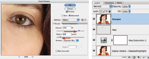
8. Create another Stamp Visible layer to act as a sharpening layer. Set the mode of this layer to Luminosity to eliminate the effects of increased saturation when the contrast at the edges is increased and then apply either the Unsharp Mask or the Smart Sharpen filter (Filter > Sharpen > Smart Sharpen/Unsharp Mask). Whichever technique you choose keep the Radius low and if you notice any artifacts rearing their ugly heads then switch from the Smart Sharpen filter to the Unsharp Mask and raise the Threshold slider to 4 or more. Take a look at the hair above the eyebrows to see how crisp and sharp this detail has now become. Take a long look at 100% View (Actual Pixels) of the skin. You will see the skin pores are visible – this is no plastic fantastic technique but a flattering makeover to reveal smoother tones.
Photograph by Jennifer Stephens
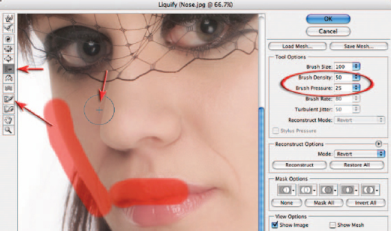
Pixel surgery
The Liquify filter can reshape facial features, if this does not present an ethical dilemma for the retoucher or model. The various tools in the Liquify filter dialog box can be used to modify the shape or size of the sitter’s features. The Pucker Tool and Bloat Tool can be used to contract or expand various features, e.g. grow eyes or lips and shrink noses. Perhaps the most useful of the Liquify tools, however, is the Shift Pixels Tool. This tool can be used to move pixels to the left when stroking down and to the right when stroking up. This tool is ideal for trimming off unsightly fat or reshaping features. In the illustration the brush pressure is dropped to 25%. The side of the face and the top of the lips have been frozen using the Freeze Mask Tool so that the side of the face and lips are not moved along with the nose. If things start to get ugly just remember the keyboard shortcut Ctrl/Cmnd + Z (undo)!
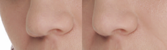
Note > It is important to exercise great restraint when using the Liquify filter, as the face can quickly become a cartoon caricature of itself when taken too far. The filter also softens detail that becomes obvious when overdone.
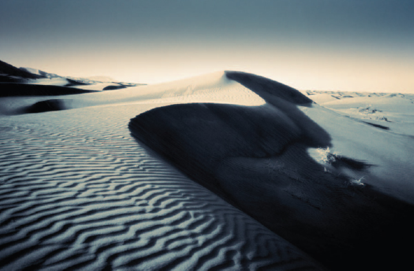
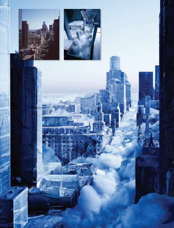
Time of day – Project 6
The commercial studio photographer is able to control the quality and direction of light to create the precise mood in order to meet the requirements of the brief. On location the photographer is at the mercy of the weather and the limitations of time (budget). Photoshop is able to lend some assistance to manipulate the mood so that the final image aligns more closely with the requirements of the client and still meets the specified budget. This project is a companion for the ‘Replace a sky’ project in the Montage chapter.
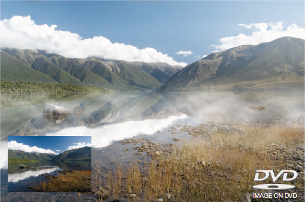
Original image of Lake Rotoiti in New Zealand’s South Island (courtesy of John Hay)
OK, so the alarm clock failed to go off and by the time you arrive at the foreshore of the lake you can’t help feeling that, although mightily majestic, these mountains and their reflections may just have been a little moodier 2 hours ago. We can perhaps only imagine what it might have looked like as the shafts of light penetrated the morning mist over the still waters with their mirror-like reflections of the distant mountains, but this project aims to provide you with a few tips and techniques for winding back the clock so that we can recapture the mood, mist and tranquillity of the dawn shot.
This project uses the Transform and Warp commands to perfect a reflection (simulated reflections are rarely as simple as just flipping a copy layer). A combination of adjustment layers and the Shadow/Highlight adjustment feature is used to change the color and contrast so that the light is closer to the soft light of dawn. The introduction of morning mist and shafts of warm light complete the picture of tranquility.
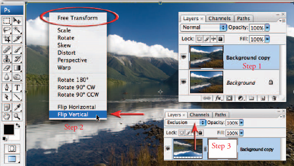
1. To create the mirror-like reflections in the water duplicate the background layer by dragging it to the ‘Create a new layer’ icon in the Layers palette and then flip it by going to Edit > Free Transform (Ctrl/Command + T). Access the context-sensitive menu (right-click or Command-click) and then select the Flip Vertical command. Change the mode of the layer to Exclusion and click and drag inside the Transform bounding box so that the distant foreshore and its reflection on the left side of the image line up.
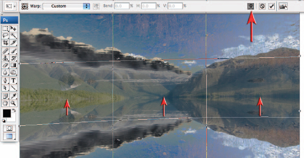
2. With the Free Transform bounding box still active click on the Warp mode in the Options bar. Move your mouse cursor just below the distant lake edge and drag the reflection up on the left, center and right-hand sides until the two shorelines are perfectly aligned. Select Commit Transformation to apply the transformations and warp to the layer.
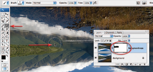
3. Change the blend mode of the top layer back to Normal. Add a layer mask to this layer and then select the Brush Tool in the Tools palette. Choose a large soft brush at 100% Opacity and select black as the foreground color. Paint just above the water’s edge to mask everything above the water’s edge to reveal the mountains and sky.
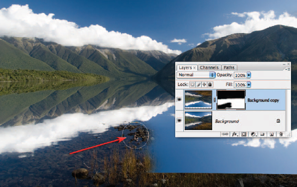
4. Paint with black to reveal the foreshore, submerged pebbles and that white-tipped rock in the middle of the lake using the Brush Tool (change the mode temporarily back to Exclusion to locate and mask the rock). Reduce the size of the brush and lower the Opacity in the Options bar to around 50% as you paint between the immediate foreshore and the reflected clouds in the water.

5. Stamp the visible elements of all of the layers into a single layer so that we can apply an image adjustment to both layers simultaneously. The shortcut to achieve this is to hold down the Ctrl + Alt + Shift keys (PC) or Command + Option + Shift keys (Mac) while you type the letter E. Go to Image > Adjustments and choose ‘Shadow/Highlight’. Lighten the Shadows by 30% and darken the Highlights by 34%. Reduce the Radius to restrict the changes to the deep shadows and brightest highlights. This will soften the effects of the strong sunlight in the original image. Choose ‘OK’ to apply these changes.
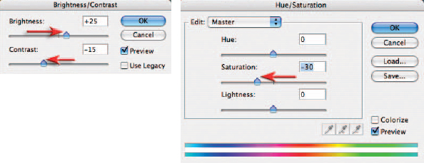
6. As the sun begins to rise, it starts to burn away the morning mist and the contrast and saturation of the colors start to increase. To return the colors to the pastel shades found nearer dawn we can use two adjustment layers. Add a Brightness/Contrast adjustment layer to increase the brightness and lower the contrast. Add a Hue/Saturation adjustment layer to lower the saturation by –30 (this can be adjusted to personal taste as saturation is a bit like sugar in tea – within moderation, varying levels are acceptable).
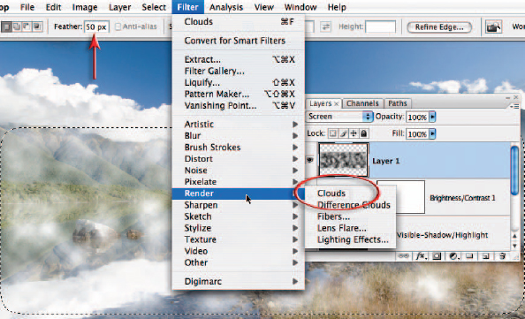
7. Click on the ‘Create a new layer’ icon in the Layers palette to create an empty new layer. Select the Marquee Tool in the Tools palette and enter a feather radius of 50 pixels in the Options bar. Select the bottom 2/3 of the picture. Make sure the foreground and background colors in the Tools palette are set to their default settings of Black and White (type D on the keyboard) and then from the Filter menu go to Render > Clouds. Set the mode of this layer to Screen to render the black component of this layer invisible.
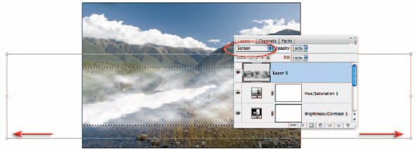
8. Go to Edit > Free Transform. Change the screen mode to either Maximized screen mode or Full Screen Mode and zoom out several times so that you can drag the side handles of the Free Transform bounding box. Stretch this layer so that it is double the width of the background layer. This will ensure the clouds look more like mist than clouds. Reduce the height of the mist if required and click and drag inside the bounding box to move the mist into the best position. Commit the transformation by hitting the Enter key (Return key on a Mac). Lower the opacity of the layer until you achieve the correct degree of subtlety.
9. This step aims to recreate the soft light of a dawn sky. Create an empty new layer by clicking on the ‘Create a new layer’ icon in the Layers palette and set the mode to Soft Light. Select the Gradient Tool and choose the ‘Linear’ and ‘Foreground to Transparent’ options in the Options bar. Hold down the Alt/Option key and sample a light blue just above the clouds. Click on the Foreground Color Swatch to open the Color Picker. Set the Brightness to 100% and the Saturation to 10% and then select OK. Drag a gradient from the middle of the sky to a position just below the top of the mountains.
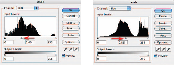
10. The next two steps create the illusion of low sunlight filtering into the image from the right-hand side. Create a Levels Adjustment layer and move the Gamma slider in the master RGB channel to the left to lighten the image. Select the Blue channel in the Levels dialog box and move the central slider to the right to introduce a warm yellow cast. You may also need to select the Green channel and move the slider to the right to increase the amount of Magenta to prevent the warm glow taking on a green cast. Fill the adjustment layer mask with Black (Edit > Fill Layer and then choose ‘Black’ as the contents color).
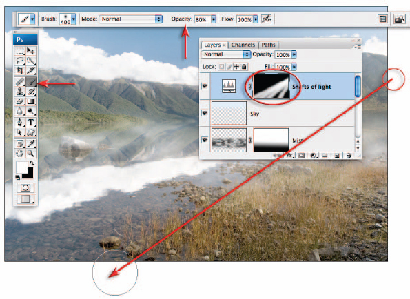
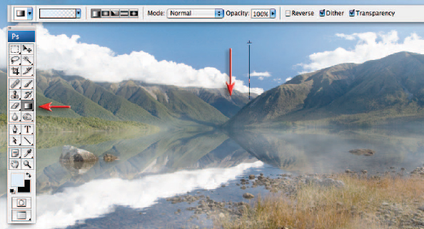
11. Select the Brush Tool and choose a large soft-edged brush from the Options bar. Select white as the foreground color and set the brush opacity to 80%. Click once just outside of the image window on the right-hand side and then move the mouse cursor to the lower left-hand side of the image window. Hold down the Shift key and click a second time to create a straight line of warm light in the image. Repeat this process several times to create numerous shafts of light.
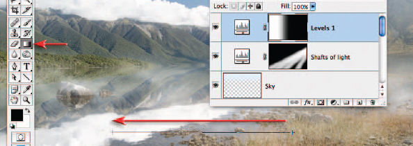
12. Create one final Levels adjustment layer and this time move the Gamma slider to the right to darken the image. Select ‘OK’ and then use a ‘Linear’ ‘Black, White’ gradient to mask the right side of the image and restrict the darkening to the left side of the image only.
13. The final step is to sharpen the image. Stamp the visible elements of all the layers into a single new layer (see Step 6) and set the mode to Luminosity. Use either the Unsharp Mask or the Smart Sharpen. Be generous with the amount (150% or more) and very conservative with the Radius (1 pixel or less). Holding down the Alt/Option key and clicking on the visibility icon of the background layer will show you just how far you have come. Now your image has undergone a character transformation you are truly a master of time, light and weather.
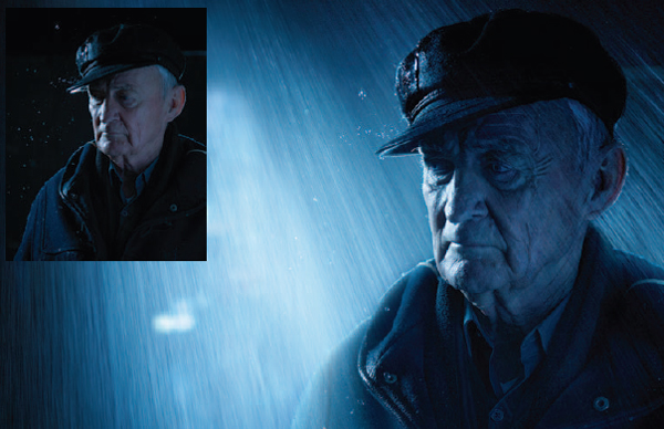
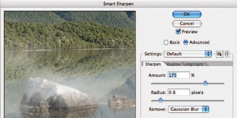
Chris Mollison
Adding weather
Extra rain is added to enhance the mood of the original scene. The Screen blend mode is the perfect technique for adding bright highlights that have first been captured against a black background. Subtle toning completes the rain-soaked scene.
Chris Mollison
Paulina Hryniewiecka