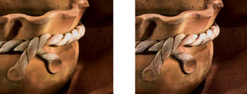
FIG 5.1 Rust Panel painted with the Square Chalk brush using a paper from the Crack paper library
When painting traditionally, the choice of paper is critical to the success of the painting and when using Painter the choice of the right texture is just as important. The huge range of paper textures is one of the reasons that Painter is so attractive to photographers.
In this chapter we will explore the library of paper textures that come as the default set, altering the size of the texture and also the contrast and brightness, all of which will change the appearance of the finished picture.
In addition to the default paper library there are many more papers available to load into the Painter program. You can also make your own paper and this is explained later in the chapter.
Paper textures can be applied after the picture is finished based on both the paper texture and also the image itself, and in many cases this is the best way to get an overall texture such as a canvas effect.
What are paper textures?
When printing on a canvas surface in the traditional manner the surface texture can be clearly seen. Painter replicates this by printing a pattern on the paper which resembles this texture. The result is obviously not the same, but it can be very effective when viewed at the right distance.
The choice of papers is very wide and the first place to check is the Papers palette where the default range of papers is stored.
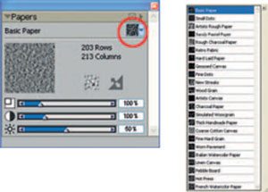
FIG 5.2 Papers palette with drop down menu listing the default papers in Painter 11. To access this menu, click the paper thumbnail highlighted

Not all brushes show the paper texture clearly.
The best ones to do so are the hard media, that is Chalk, Charcoal, Conte, etc.
The examples in this chapter are designed to work on the photograph provided. When you use your own picture you will need to adjust the brush size, opacity and grain settings as these are all dependent upon the size and density of the photograph being cloned. The key control for using paper textures is the Grain slider. Basically, the lower the setting, the more the grain is visible. The slider is often on the Properties bar, but if it is not there it can be found in the General palette or Brush Creator.
1. Open ‘ Sand patterns ’ from Chapter 5 folder on the DVD.
2. Select the>Chalk Square Chalk brush, size 35, Opacity 35%, Grain 9%.
3. In the General palette change the Method to Cloning and the Subcategory to Grainy Hard Cover Cloning. This will make a brush which shows the paper texture clearly.
4. Make a Quick Clone.
5. Try out several of the paper textures on this picture; you will soon appreciate the difference between them.

FIG 5.3 This shows an alternative way to view the papers in the palette. Click the paper icon to show the drop down menu, then click the tiny arrow (highlighted) in that menu and select Thumbnails
Paper scale
The Paper Scale slider (top slider shown in Figure 5.2) slider controls the size of the texture on the paper. This is particularly useful when different file sizes are used. Generally speaking the larger the file size, the larger the paper scale needs to be to show a significant effect. The size to suit the particular picture is of course an artistic decision. Figure 5.4 shows the Paper Scale slider at 25%, 50%, 100%, 200%, 300% and 400%.
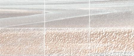
FIG 5.4 The Paper Scale slider
Paper contrast
Changing the Paper Contrast slider (middle slider shown in Figure 5.2) increases or decreases the contrast: the higher the setting, the more pronounced the texture appears. Figure 5.5 shows the Paper Contrast slider at 0%, 25%, 50%, 100%, 200% and 400%.
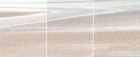
FIG 5.5 The Paper Contrast slider
Paper brightness
The Paper Brightness slider controls the brightness of the paper texture. The brightness is effectively the depth of the paper grain; the shallower the grain the less texture is visible. In common with the other two controls, as the brightness level is raised the texture becomes more pronounced. At very low levels the texture is hardly visible while at 100% the picture is only just discernible and the texture itself dominates the picture. Figure 5.6 shows the Paper Brightness slider at 0%, 15%, 25%, 50%, 75% and 100%.
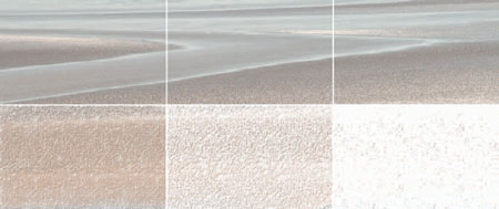
FIG 5.6 The Paper Brightness slider
Using extra paper libraries
Painter 11 contains many extra paper texture libraries which are not automatically loaded with the program.
You will need to copy the folder containing these files and place them within the Painter program on your computer; they can be found in the Extras folder on the Painter 11 CD. These papers are not included on the DVD which accompanies this book. Once you have done this, follow the instructions below.
1. On the far right of the Papers palette, click the small right facing triangle to reveal the drop down palette menu.
2. Click on Open Library and a warning message will appear asking whether you want to Append or Load the new library, click on Load. The Choose Papers dialog box will appear as in Figure 5.7; go to the Corel Painter program files and open the Paper Textures folder.
3. Highlight the library you want to load and click Open. The selected library will appear in the Papers palette, replacing the existing default library.
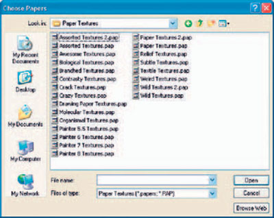
FIG 5.7 Loading additional paper libraries
4. To return to the original paper library, click on Load Library again and in the Choose Papers dialog box go up one level out of the Paper Textures folder and you will see a solitary file named Painter.pap amongst the folders. Select this file and click on Open to reinstate the default paper set.
Painter does not offer an easy way to view all these papers as each paper library has to be loaded into the program before it can be viewed. On the DVD there are examples of all these paper libraries that you can view or print out for reference. The thumbnails should prove very useful to help you decide which paper to choose and therefore which library you will need to load.
Creating your own paper texture
In addition to the many paper textures supplied with Painter, paper textures can also be created from a pattern or a photograph of your own.
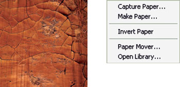
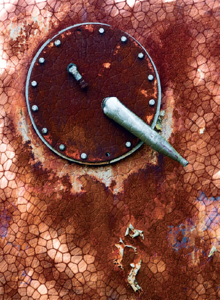
FIG 5.8 Photograph used for paper texture and the Capture Paper dialog box
1. Open ‘ Cracked paint ’ from Chapter 5 folder on the DVD.
2. Select All.
3. Select Capture Paper in the Papers palette menu, type in a name for the paper in the dialog box that appears, and click OK. Close the file.
4. Your new paper texture will appear at the bottom of the Papers palette; click the name to make it ready for use.
5. Open ‘ Sand patterns ’ from Chapter 5 folder on the DVD.
6. File>Quick Clone.
7. Select the Square Chalk 35 brush from the Brush Selector. In the General palette change the Method to Cloning and the Subcategory to Grainy Hard Cover Cloning.
8. On the Properties bar set brush size 60.0, Opacity 100%, and Grain 7%.
9. Clone the picture and you will see the overlaid pattern.
10. Make a new Quick Clone from the original picture and change the Scale setting in the Papers palette to 25%.
11. Clone in the picture again and you will notice that there is a tiling effect where the pattern is repeated. You need to be aware that when you make your own patterns this will appear when the texture is used at small sizes and it can be very intrusive. These tiling effects can be reduced significantly if the original photograph from which you make the pattern has a very even texture.
In this example the whole picture was used to create the pattern but you can use just part of a photograph; in that case make a rectangular or square selection before capturing the paper.
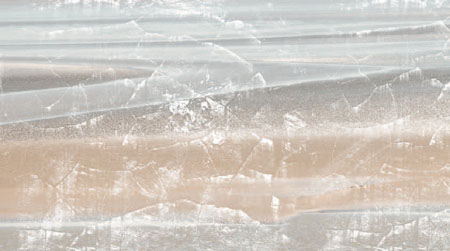
FIG 5.9 The new paper texture applied to the Sand patterns photograph
Using paper textures for creating pictures
Having made your own texture for use with cloning, it is worth considering other ways in which this technique may be used. In the example which follows the paper texture is created from a clearly recognizable shape and the texture is stamped into a document using colored inks. The first stage is to make a black and white single tone picture which is done by using the Woodcut effect. There is more about the Woodcut effect in Chapter 13.
1. Open ‘ Gladioli ’ from Chapter 5 folder on the DVD.
2. Effects>Surface Control>Woodcut.
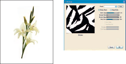
FIG 5.10 The original photograph and the Woodcut dialog box showing the settings used for this example
3. Tick the Output Black option and remove the tick from Output Color.
4. Move the sliders to Black Edge 64.94, Erosion Time 0, Erosion Edge 1.0, and Heaviness 50%. Figure 5.10 shows the settings used.
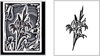
FIG 5.11 The result of the Woodcut effect being applied and after the unwanted outer area has been erased
5. When the filter has been applied the flower has a lot of black marks around the edges. Nothing is visible in the original, but this is actually the result of some not so good masking on the original! The Woodcut effect has picked up these small variations from pure white and applied the filter to them.
6. Use the Eraser from the Toolbox at 100% Opacity to remove all the black marks which do not belong to the flower.
7. Select>All.
8. Select Capture Paper in the Papers palette menu, type in a name for the paper in the dialog box that appears, and click OK. Close the woodcut picture.
9. Your new paper texture will appear at the bottom of the Papers palette; click the name to make it ready for use.
10. Make a new document: File>New, width 2783 and height 3374 pixels at resolution 300 pixels per inch.
11. Select the Conte>Square Conte 22 brush, size 149, Opacity 12%, Grain 1%.
12. Make sure that the Gladioli Paper is active and in the Papers palette, then click the Invert Paper button (this is the icon with two arrows). Choose a color in the Colors palette. Keep the colors fairly dark – I started with R127, G9, and B141 – but it is not critical. Paint until the whole flower is visible.
13. Now paint over again with other colors; use dabbing brush strokes so that the colors blend, rather than running in lines.
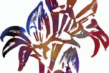
FIG 5.12 After applying the color
14. Texture can be added to this image to give it more depth.
15. Effects>Apply Surface Texture. Amount 200%, picture 100%, and shine
16. Apply the texture a second time.
The picture could be left as it is, or in the case of the version in Figure 5.13 the canvas was filled with black prior to painting and lighter colors were painted onto the canvas. Textures were also applied to this picture.
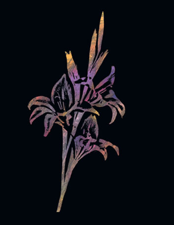
FIG 5.13 Using the paper pattern on a black background
Using paper textures for stamping
Another way to use texture shapes is to apply them like rubber stamps. This is a technique often used by card makers, but making them in Painter means not having to buy lots of individual stamps!
1. Open ‘ Thistle ’ from the Chapter 5 folder on the DVD.
2. Make a Woodcut in the same way as earlier in this chapter: Black Edge 16, Erosion Time 20, Erosion Edge 1.0 and Heaviness 50%. Erase all the black areas not required.
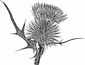
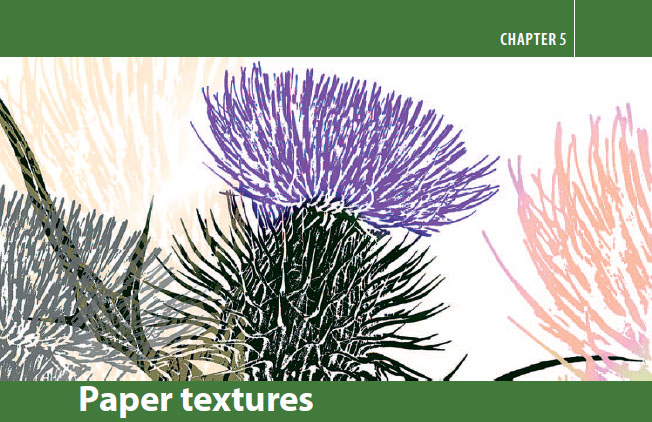
FIG 5.14 Thistle picture as a woodcut
3. Select the whole picture and capture the pattern as a paper texture. Name it Thistle 1.
4. Select just the thistle head and capture the pattern. Name it Thistle 2.
5. Make a new document 3795 × 2740 300 dpi. This is quite a large document but the last stage normally involves cropping so the final picture will be smaller.
6. Select the Blunt Chalk brush, size 127, Opacity 6%, Grain 12%.
7. Make a new layer.
8. Select the Thistle 1 paper texture.
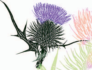
FIG 5.15 Painting with the paper texture using different colors
9. Select a color and paint in the design. Use dark colors and have the paper size at 100%. Use the eraser in the Toolbox to remove any unwanted areas.
10. Make a new layer.
11. Increase the paper size to 250% and select a different, lighter color and paint again. This will be larger and fainter than the previous layer; move the layer below the first layer and reduce the layer opacity.
12. Make a new layer.
13. Change to the other paper pattern, increase the size and paint again. Continue painting more layers at different opacities and colors.
The reason for painting on new layers each time is that they can be copied, moved, transformed in size and their opacities changed to get the design just right. If the thistle is not in the right place use the Transform tool from the Toolbox to move it to where it looks better. Using a large size canvas gives you the space to move the layers around.
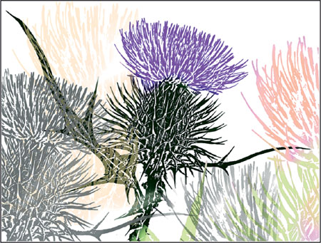
FIG 5.16 Thistle – created by using the Thistle Captured Paper and painting with different colors
Applying surface textures
Having seen how paper textures can be applied as part of the brush strokes when painting, we now move on to applying the same textures but this time over the top of the painting and usually at the end. The textures that you can apply are not confined to paper patterns and the examples show how to apply textures based on both the clone picture and the original source image.
The choice of whether or not to apply texture to a finished picture can be a difficult one so I would recommend that you save a copy of the file and apply the texture to a duplicate version. An alternative method is to make a copy of the canvas and apply the texture to that layer; this allows you to reduce the opacity thereby lessening the effect. Experience will help you decide on the settings but it is always difficult to tell on screen so a test print is often required.
The controls for applying textures are all contained in the Apply Surface Textures dialog box, see Figure 5.17.
First decide on the source of the texture and select this in the Using box. The default is Paper and this will be explored first.
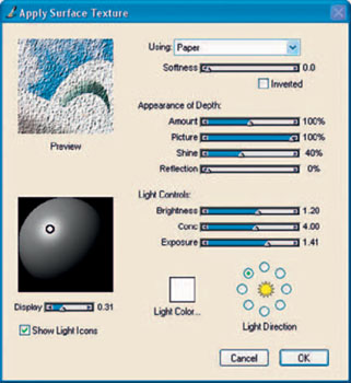
FIG 5.17 Apply Surface Texture dialog box
Using: Paper
1. Open ‘ Railing ’ from the Chapter 5 folder on the DVD.
2. Select the Italian Watercolor Paper in the Papers palette.
3. Open the Effects>Surface Control>Apply Surface Texture dialog box.
4. Ensure that Paper is selected in the Using box.
5. Use the default settings as shown in Figure 5.17 and click OK; this will apply the texture to this picture.
6. One important point to remember is that texture is file size dependent. This is a small file and the texture is very prominent, indeed it is far too strong for the picture, however had the file been a lot larger then the effect would be quite subtle. Undo the texture before trying the next steps.
7. Open the dialog box and while it is open go to the Papers palette and change the paper. The ability to change papers with the dialog box open is very useful; the preview will update immediately so you can assess the likely result.
The most important slider by far is the Amount slider; this controls the strength of the applied texture. The default is 100% and I generally find this too strong; try 50% as a starter for most photographs. It is often difficult to assess the amount needed as the preview window is small, so it is usually better to make the amount fairly strong and then to go to Edit>Fade to reduce the strength. This option to fade an action is really useful to remember as it applies not only to this effect but to many actions throughout Painter, including individual brush strokes.
Another way of making textures crisper in a print is by applying sharpening to the picture. In Painter this can be done in the Effects menu. (Effects>Focus>Sharpen).
There are several other sliders in the Apply Surface Texture dialog box, but in most cases they can be left on default. The Inverted option changes the texture from positive to negative; the effect is fairly subtle in most cases.
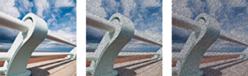
FIG 5.18 The Amount slider at 25%, 100% and 200% (from left to right)
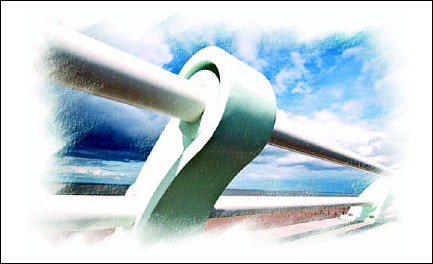
FIG 5.19 This is a clone of the original photograph, using the Soft Cloner from the Cloners brush category
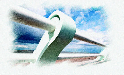
FIG 5.20 Using: Paper. A texture based on the paper has been applied to the clone. In this case the Italian Watercolor Paper has been used. The Paper option applies the texture across the entire picture regardless as to whether it has been painted. This is the big difference between adding the texture at the end as opposed to applying it as you paint.
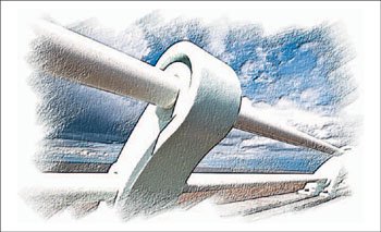
FIG 5.21 Using: Image Luminance. This option bases the texture on the luminance or brightness of the image itself. In effect, this means that you are putting an embossing effect directly upon the picture. The effect is used to add depth and texture to a picture. This is a very effective way to add more emphasis to brush strokes.
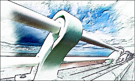
FIG 5.22 Using: Original Luminance. This option uses the original picture as the source of the texture and applies it to the clone copy. You must have the clone source active on the desktop and linked to the clone before the texture can be applied. The original and clone need not be the same picture as the texture can be taken from any open image.
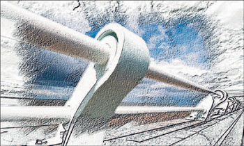
FIG 5.23 Using: 3D Brush Strokes. This is the last of the four options in the Using dialog box and compares the original picture with the clone, and puts the texture on the difference between the two. This is a little difficult to imagine but it does give a very 3D effect to the brush strokes, particularly when a rough brush and textured paper have been used.
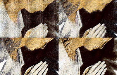
FIG 5.24 The four examples shown here clockwise from top left are: Using: Paper, 3D Brush Strokes, Original Luminance and Image Luminance. Note the differences in the hair and face of the statue.
Applying paper textures to a layer
This technique applies the textures created in Apply Surface Textures onto a separate layer rather than putting them directly on the image. The advantage in doing this is that the image remains unchanged and the texture is adjustable at any time as it is not part of the picture.
There are several ways of achieving this: a duplicate copy of the canvas can be made, and the texture applied to this. Reducing the layer opacity will lessen the effect. Any type of texture can be applied and adjusted in this way.
The alternative process shown next will involve making a new layer and applying the texture to that layer.
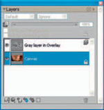
FIG 5.25 The Layers palette with surface texture on a separate layer
1. Open ‘ Pot ’ from Chapter 5 on the DVD.
2. Click the new layer icon to make a new layer.
3. In the Colors palette select 50% gray (move the RGB sliders until they read 128 for each color).
4. Edit>Fill and choose Current Color.
5. Change the Layer Composite Method to Hard Light and the gray layer will disappear.
6. Change the clone source (File Clone Source Pot).
7. Effects>Surface Control>Apply Surface Texture. Select Original Luminance in the Using menu and make the Amount 100%. Click OK.
Now that the texture is on a separate layer it can be adjusted. Reduce the layer opacity to lessen the effect. Change the Layer Composite Method to Overlay and Soft Light and see how the texture looks different each time – for more extreme changes try Multiply and Screen. Figure 5.25 shows the Layers palette with the gray layer in Hard Light Composite Method. The examples below show the result before and after applying the texture.
This technique can use the Paper, Original Luminance and 3D Brush Strokes textures but not Image Luminance, as it is being applied to a layer empty of imagery.