
8. More User Interface
THE real stars of LCDUI are List and Form. Both classes provide practical interactive displays that are well-suited to small screens. List is just what it sounds like, a simple presentation of text and image items that adapts well to any screen size. Forms can hold a variety of items, everything from text input fields and images to date and time editors. The constraints of a small display mean that complex forms are awkward, but simple forms are very useful.
8.1. Lists
A List shows as many items as it can fit on the display. An item has a text label and can also have an associated image.
Lists come in three varieties, which are represented by constants in the List class:
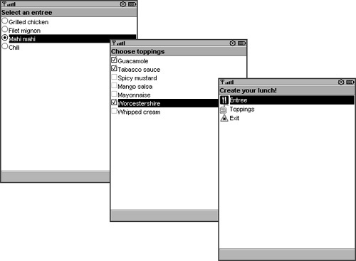
EXCLUSIVElists allow only one selection. The items in anEXCLUSIVElist are commonly shown as radio buttons.MULTIPLElists allow more than one item to be selected. A common representation is checkboxes.An
IMPLICITlist is a special case ofEXCLUSIVE. It looks just like a menu, but the event handling is different.
The three types of lists appear in the Sun Java Wireless Toolkit emulator as shown in Figure 8.1.
Figure 8.1. List types: EXCLUSIVE, MULTIPLE, and IMPLICIT
To create a list, supply a title and a list type to the constructor. You can also supply a string array and an Image array representing the items, if you have them available.
To add items to the end of a list, pass the label and the image to append(). If you don’t have an image, pass null, but the label must not be null.
Other methods to manage items are straightforward. The list items are numbered, beginning with 0. To add an item at a specific position, use insert(). You can remove items with delete() and deleteAll(). To retrieve the label or image for an item, pass the item index to getString() and getImage() respectively.
To ensure that your lists look as nice as possible, you should try to use images with appropriate sizes. At runtime, you can ask Display for the best size of list item images, as shown here:
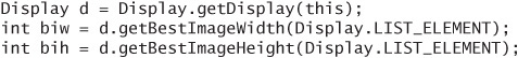
This size is likely to vary among devices. One way to create a portable application is to find out the best image sizes for all or most of the devices you wish to support. Package images in these sizes with your MIDlet suite and select the most appropriate images at runtime.
8.2. List Selections
The method for finding the current selection in a list varies depending on the type of list. EXLUSIVE and IMPLICIT lists work the same with respect to selection because only one item can be selected at a time. You can retrieve the zero-based index of the currently selected item by calling getSelectedIndex(). If the list has just been initialized, it is possible that there is no selection at all, in which case getSelectedIndex() will return 1. Make sure your application is prepared for this possibility.
MULTIPLE lists work differently. To find out which items are selected and which are not, pass a boolean array to getSelectedFlags(). The array should have size() elements. Selected items will have a corresponding true value in the array.
To change the selection from the application, use setSelectedIndex() or setSelectedFlags(), depending on the list type.
8.3. Handling List Events
Except for the IMPLICIT type, lists work like any other screen. This is great news because it means you already know what to do. You can add commands and set a command listener. Your users will browse through a list, make one or more selections, and then choose one of the commands you have added, probably OK or Cancel or Back.
IMPLICIT lists work a little differently, but they still work within the Command and CommandListener structure. When you make a selection, an event is fired immediately to the registered CommandListener. The Command that is fired is a special one, List.SELECT_COMMAND. You can test for it in commandAction() in your listener.
You do not get any notifications as the user browses lists and checks or unchecks items. MIDP’s List is not that specific. If you want more fine-grained control, you need to create your own user interfaces, as described in Chapter 9, “Creating Custom Screens,” and Chapter 10, “Custom Items.”
8.4. Three Lists in One Example
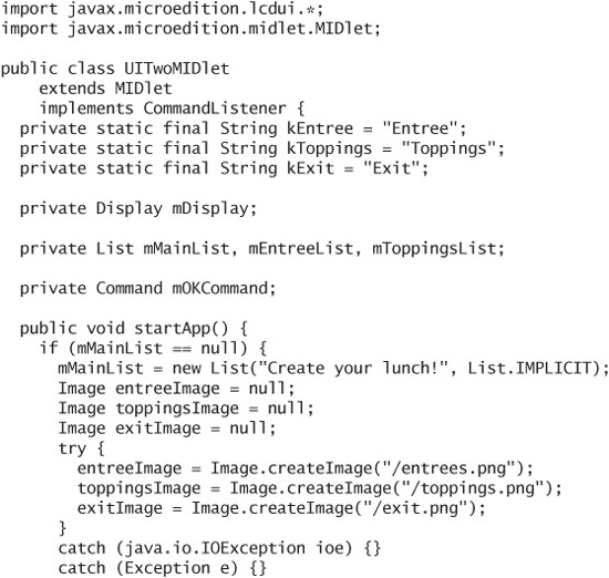
To give you some idea what’s possible with List, take a look at the following example, which simulates a lunch menu. You can choose exactly one entree (an EXCLUSIVE list) and as many toppings as you wish (a MULTIPLE list). A main menu (an IMPLICIT list) controls the whole thing. There are some images for the main menu as well, so you can see how that looks.
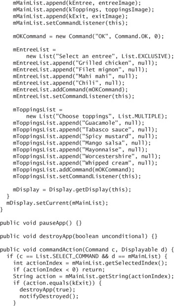
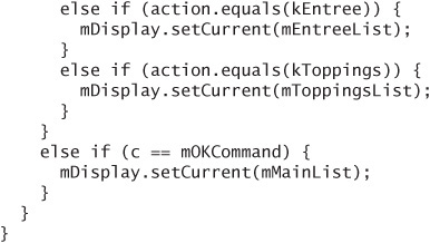
Take special note of the event handling in commandAction(). To catch events from the IMPLICIT list, test for List.SELECT_COMMAND. Depending on the value of the selection, the application shows the entree list, the toppings list, or exits.
If the OK command is invoked on either the entree list or the toppings list, the main menu is shown again.
8.5. Advanced List Control
Two methods provide advanced control over the appearance of a List. The first, setFont(), allows applications to request a particular font for a specific item in the List. You’ll learn all about fonts in Chapter 9.
The second method is setFitPolicy(). You can specify TEXT_WRAP_ON, TEXT_ WRAP_OFF, or TEXT_WRAP_DEFAULT. The fit policy is used for items whose labels are too long to fit on a single line.
According to the specification, TEXT_WRAP_ON means that long list items are shown on multiple lines. TEXT_WRAP_OFF means that long lines will be truncated so each list item is one text line. TEXT_WRAP_DEFAULT means the default value for the platform. Sun’s emulator and my Nokia 6030 are polite enough to show ellipsis (…) at the end of list items that won’t fit on a single line, but my Motorola RAZR V3 simply chops off the line at the end of the last word that will fit.
8.6. Using Forms
Forms are like Swiss army knives: they are versatile and useful, but if you make them too big, they get heavy and pull your pants down.
Forms are similar in some respects to windows or dialog boxes in desktop programming. You can add items (think widgets or components) to create a customized user interface. LCDUI is full of useful items, all descendants of the Item class:
StringItemshows a text string with an optional label.TextFieldis editable text with a label.ImageItemshows an image with an optional label.ChoiceGroupis kind of like a miniatureList. TheEXCLUSIVEandMULTIPLEflavors are the same as before, while a new type,POPUP, is a variation onEXCLUSIVE. Most devices will show aPOPUP ChoiceGroupas a combo box.Gaugeis used to indicate progress or allow input. It is something like a slider in the desktop world, although of course appearances vary among devices.Spaceris an invisible item that you can use to control the layout of other items on the form.DateField, which you met briefly in Chapter 6, represents a point in time.If you can’t find an item that suits your needs, you can create your own by subclassing
CustomItem. Read all about it in Chapter 10.
Before you even have to worry about items, though, Form offers some shortcuts to make it easy to add text and image items. Just pass a string or an image to append(), like this:
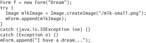
On the Sun Java Wireless Toolkit emulator, with an Exit command, the result looks like Figure 8.2.
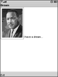
Users navigate through forms one item at a time. In the screenshot in Figure 8.2, the image is the active item, indicated by the frame drawn around it. Usually, navigation from one item to the next is accomplished using the arrow keys, although of course the exact mechanism is left to the device.
When all the items in a form won’t fit on the screen, the device allows scrolling up and down as users navigate through the items.
8.7. Working with Items
Most items are easy to create, so I won’t spend a lot of time on them here. StringItem and ImageItem are best illustrated by example.
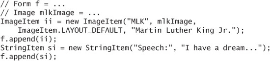
The ImageItem constructor takes a label, an image, a layout directive, which is described in the next section, and alternate text, which is shown if the image cannot be displayed for any reason.
StringItem and ImageItem also support an appearance mode, which means you can request the device to display the string or image as a hyperlink or a button. See the Item documentation for more information.
Most of the behavior of TextBox comes from TextField, so you are already familiar with input constraints and input modes. Specify a label, the text, a maximum size, and constraints to create a TextField.
You can retrieve the current value of a TextField with getString().
ChoiceGroup looks a lot like List because both classes implement the Choice interface. Here is one example using the POPUP type. The null parameters are for images.
A DateField is an item that represents a point in time. DateField can show a day, a time of day, or both. Create one by specifying a title and the type of display you want. The types are DATE, TIME, and DATE_TIME.
A point in time is represented by a long wrapped in a Date. You can set or retrieve this value using setDate() and getDate().
8.8. Gauges
Gauges are trickier than you might think.
Gauges that allow user input are interactive. They are a lot like sliders in the desktop world. Your application usually sets a maximum value and the current value. After that, the user can modify the setting. The Gauge constructor accepts a title, a flag that is true for interactive gauges, a maximum value, and a current value. Here is an interactive gauge that has a maximum value of 5 and a current value of 3:
Noninteractive gauges are generally useful for showing progress in something that takes a long time, like a network connection or a long computation. You can specify a maximum value and update the current value from your application, or you can use one of two special flavors of noninteractive gauges.
Continuous noninteractive gauges show some kind of animation that indicates the application is working on something. This is nice because you don’t need to create a new thread in your application and your users get to see something blinking or moving that makes them feel like something is actually happening. Create a continuous gauge by passing INDEFINITE for the maximum value and CONTINUOUS_RUNNING for the current value:
Incremental noninteractive gauges work almost the same way, but your application has to poke them every once in a while to get them to move. Create one this way:
To make the incremental noninteractive gauge move, set its value to INCREMENTAL_ UPDATING.
Finally, you can also set noninteractive indefinite gauges to appear idle by setting the value to either CONTINUOUS_IDLE or INCREMENTAL_IDLE.
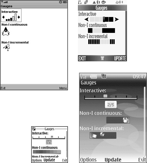
The appearance of gauges depends on the device, as usual. The Sun Java Wireless Toolkit emulator uses simple animations for nonincremental indefinite gauges. Other devices use animations that resemble desktop progress bars. See Figure 8.3.
Figure 8.3. Clockwise from top left: gauges on Sun’s toolkit, Motorola RAZR V3, Nokia Series 40 3rd edition, and Nokia Series 40
8.9. Controlling Item Layout
Forms will normally lay out items the way you read text. For devices that display English text, the layout runs left to right in rows from top to bottom. Devices that display other languages, like Arabic or Hebrew, can lay out items from right to left and top to bottom. You can exert some control over the layout using layout directives.
Although I describe the techniques briefly in this section, I don’t spend a lot of time tweaking form layouts, for the following reasons:
Even if you get a form layout perfect on one device, it’s going to be significantly different on a different-sized screen.
Devices are likely to interpret your form layout directives in subtly different ways, which could produce unexpected results on different devices.
If you have a form with a lot of content that needs organizing, you should probably rethink your application design rather than try to make the form look better. Remember, you should use a mobile phone to present a small amount of information and receive a small amount of input. If you’re trying to cram some desktop application into a MIDlet, it’s time to return to square one.
You can set the layout directive on each item. As the device lays out the items in a form, it keeps track of the current layout directive. If an item doesn’t change anything, it gets the layout directive of the previous item.
A layout directive is some combination of the constants in the Item class. The first one to use is LAYOUT_2, which indicates that you are using the layout rules from MIDP 2.0 (not MIDP 1.0).
To indicate the default layout policy for the form, use LAYOUT_DEFAULT.
Rows of items in a form share a horizontal layout, one of LAYOUT_LEFT, LAYOUT_CENTER, or LAYOUT_RIGHT. If items have a different horizontal layout, they will be placed on separate lines.
Within a line, items can have a vertical layout, either LAYOUT_TOP, LAYOUT_VCENTER, or LAYOUT_BOTTOM. The total height of the line is dictated by the tallest item. Shorter items will be placed according to the vertical layout.
You can request that items be expanded to fill the available space horizontally with LAYOUT_EXPAND or vertically with LAYOUT_VEXPAND. Likewise, to request that items be made as small as possible, use LAYOUT_SHRINK and LAYOUT_VSHRINK.
Finally, you can control line breaking with LAYOUT_NEWLINE_BEFORE and LAYOUT_NEWLINE_AFTER.
For an exhaustive discussion of form layout, consult the documentation for the Form class.
One additional trick for controlling form layout is the Spacer class, also a descendant of Item. It is invisible but has a minimum size so that you can put a certain amount of space between items in the form. Create a Spacer by specifying the minimum width and height.
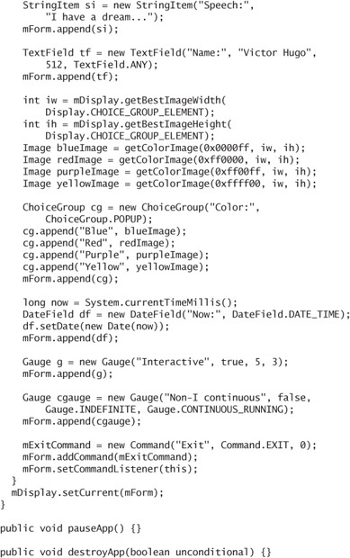
8.10. Please Drink Form Responsibly
Don’t be corrupted by the power of forms. Good user design is simple and intuitive. Add more than three or four items to a form and use it on a 128 x 128 screen, and you’ll realize you’ve created something that’s neither simple nor intuitive.
Simplify ruthlessly and question everything. Are the knobs and buttons you’re putting on your form necessary? What do your users care about? Can you offer options and configuration using a desktop browser interface instead of a mobile interface? Will item layout trickery make your form more usable? Are you using commands effectively? Can your grandma use this thing? Your son? Your buddy Bo?
The following example is not simple or intuitive, but it will give you a good idea of how to create items and add them to a form.
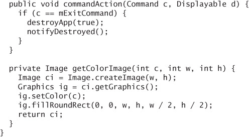
I’ve used some magic in getColorImage() to create color swatches for the ChoiceGroup, but otherwise everything should be straightforward. You’ll learn all about images and colors in the next chapter.
8.11. Item Change Events and Item Commands
Items fire off change events when their contents are changed. For example, a ChoiceGroup will fire an event when the currently selected item changes. You can receive these notifications by passing a listener to setItemStateListener() on the containing Form.
ItemStateListener is an interface with one method:
You know which item is changed, but you don’t know how it changed or which Form it belongs to. One possible use for ItemStateListener is form validation. Every time you get an itemStateChanged() call, examine the data on the Form. If it is valid, you can add an OK command to the form.
The last important wrinkle with respect to forms is item commands. Item commands are just like regular screen commands except they are specific to an item in a form. You add them directly to an Item with addCommand(). The device should only show the item command when that item is active.
The event handling for item commands is separate from the command handling for screens. Create an ItemCommandListener and pass it to the item’s setItemCommandListener() method to receive notifications. ItemCommandListener has a single method, commandAction(), which receives a reference to the Command that was invoked and the Item owning the Command.
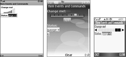
Here is an example that shows an interactive gauge. As you change the value of the gauge, an ItemStateListener retrieves the current value and shows it in a StringItem. The StringItem has its command, which clears the text.
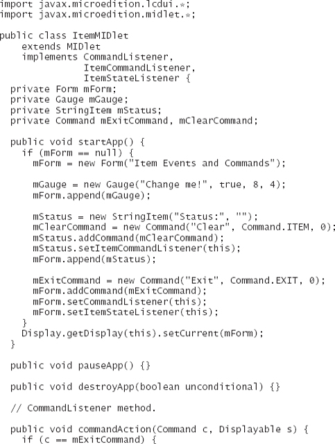
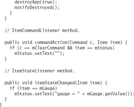
Figure 8.4 shows it on Sun’s emulator, the Nokia Series 40 3rd edition emulator, and a Motorola RAZR V3. Notice again how commands don’t necessarily show up in the same places on different devices.
Figure 8.4. Item events and commands
8.12. Summary
This chapter describes List and Form, two useful screens. Lists can allow multiple selections, a single selection, or can act like a menu. Each list item can have an associated image. Forms are collections of items. Items can display or allow editing of strings, images, lists, points in time, and gauges. The layout of items on a form can be controlled with layout directives. Your application can be notified when item values change. Furthermore, items can have their own Commands, which are shown only when the item is active. You now know everything there is to know about prepackaged screen classes. The next three chapters describe how you can do your own drawing.