
10. Custom Items
A middle ground lies between the easy path of canned LCDUI screens and the raw bravado of using Canvas. Custom items are your own items that can be placed into standard forms.
A custom item is very similar to a canvas, but it has some additional equipment to allow it to be part of a form. Create a custom item by subclassing javax.microedition.lcdui.CustomItem.
10.1. Custom Item Sizing
The size of a custom item is determined by the form. In your own implementation, you must specify a minimum and a preferred size for your custom item. The minimum is the smallest size your item can possibly be. The preferred size is the size at which your item will look its best and operate most smoothly.
The minimum and preferred sizes refer to the content area of the custom item, which is the part you are responsible for drawing. The entire area of a custom item includes a label and possibly a border, both of which are drawn by the device.
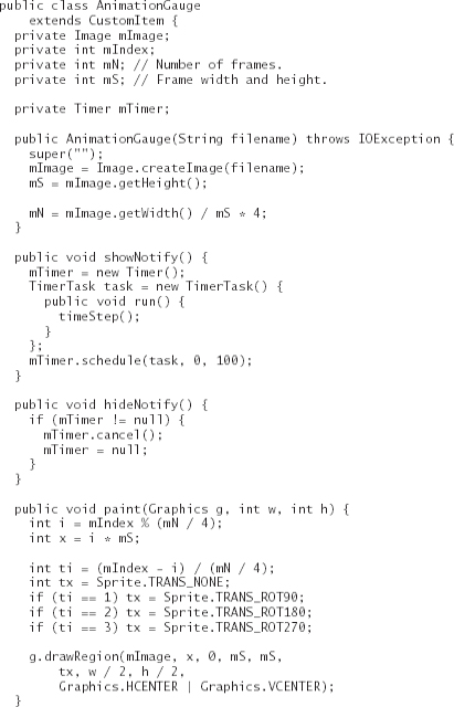
To communicate the minimum content size to the containing form, your CustomItem subclass must define two methods:
The methods for preferred size are passed a trial value from the form as it performs its layout. The form asks, “If I make you this height, what width would you like?” or “If I make you this width, what height would you like?”
A CustomItem’s size can change as additional items are added to its containing form. As with Canvas, CustomItem includes a sizeChanged() method that is called when the item gets bigger or smaller.
10.2. Painting
As with Canvas, you must define a paint() method for your custom item. In addition to a Graphics object, CustomItem’s paint() method is passed the width and height of the content area.
Like Canvas, CustomItem has a repaint() method you can use to request that the item be rendered again.
10.3. A Pretty Wait Indicator
You know enough now to write a simple custom item. Subclass CustomItem, implement the four size methods, implement paint(), and you’re done. The following example displays a rotating indicator, useful for letting users know you’re doing something that might take a while. You could more easily use a continuous noninteractive Gauge for this purpose, but writing your own custom item gives you more control over the appearance of the item on different devices.
This example, AnimationGauge, is created by supplying an image that contains one-quarter of the frames of a rotating animation. AnimationGauge transforms whatever frames you supply to rotate the animation through a full circle.
AnimationGauge creates a timer thread to drive the animation. The timeStep() method advances the animation by one frame.
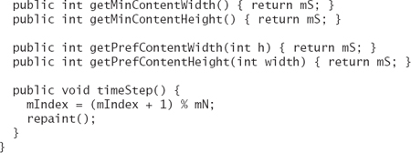
As with Canvas, the perfect place to start and stop animations is in the showNotify() and hideNotify() methods. The paint() method simply chooses the appropriate frame and its transformation and draws one frame of the original image.
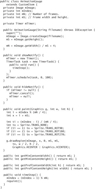
The minimum and preferred sizes of the AnimationGauge are calculated on the basis of the height of the image, which is the same as the height of one frame, and frames are square.
A suitable image is shown in Figure 10.1.
Figure 10.1. Image frames for animation
The image is 96 × 32 pixels. It contains three 32 × 32 frames of an animation. The three frames can be rotated in increments of 90 degrees to form a complete set.
The code to create the AnimationGauge is simple:
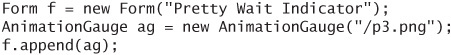
Figure 10.2 shows the AnimationGauge as part of a form on Sun’s emulator, the Nokia 6270 emulator, and the Motorola V3. The form also contains an image (the lizard) and another custom item, which you’ll see in the next section.
Figure 10.2. The AnimationGauge and FontChoice custom items
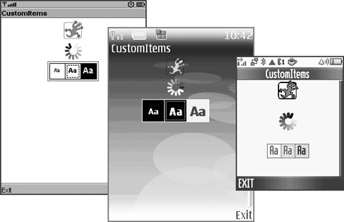
The image I used here has a transparent background, so you can see how the Nokia 6270’s spiffy background shows through. You can see that Motorola V3 does not support alpha blending. The image looks chunkier because the partially transparent pixels around the edges of the lines are rendered fully opaque. Likewise, the lizard, which contains some partial transparency, looks chunkier on the Motorola.
The book’s Web site also contains the source code for a Java SE utility, Progressor, that generates the images I used for AnimationGauge.
10.4. Handling Events in Custom Items
Event handling in custom items is just like event handling in canvases. The same callback methods are defined in CustomItem: keyPressed(), keyReleased(), pointerDragged(), and so forth.
Game actions are supported through the getGameAction() method, but don’t forget that the game action constants are defined in Canvas, not CustomItem.
Your custom item receives events based on the capabilities of the device as well as the implementation of Form. Some key events might be swallowed by the form to be used in navigation. You can find out what kind of events your custom item might expect to receive by calling getInteractionModes(). This method returns some combination of KEY_PRESS, KEY_RELEASE, KEY_REPEAT, POINTER_DRAG, POINTER_PRESS, and POINTER_RELEASE. Any set flag indicates that the corresponding callback event handler can be called by the device.
10.5. Internal Traversal
Complex custom items will probably support internal traversal, which means that individual parts of the item can have the input focus.
In the normal course of events, one item in a form has input focus. Key events apply to the currently selected item. You can move the input focus from one item to another (usually with the arrow keys), which is called traversal. In some special cases, traversal can move into and out of an item. A good example of this is the ChoiceGroup item. You can traverse into a ChoiceGroup and move among the elements it contains.
A device might or might not support internal traversal. You can find out by checking the TRAVERSE_HORIZONTAL and TRAVERSE_VERTICAL bits in the return value of getInteractionModes(). If you do want to implement internal traversal in your custom item, you’ll have to override the traverse() method. It’s exceptionally complicated. Check out the CustomItem documentation for the full story. I’ll describe it briefly here.

The return value indicates whether traversal continues inside your item (true) or whether traversal leaves your item (false). The default implementation returns false every time, which means no internal traversal occurs.
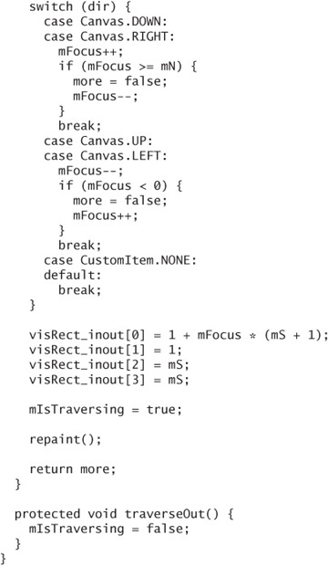
To implement internal traversal, override traverse() and return true at appropriate times. The dir argument tells you how the user is attempting to traverse: typically, it is Canvas.UP, Canvas.DOWN, Canvas.LEFT, or Canvas.RIGHT.
The viewportWidth and viewportHeight arguments describe the viewable area of the containing form.
visRect_inout describes the currently visible rectangle of the item. Upon returning, you should modify it to contain the currently selected portion of the item. This enables the device to scroll the form to show that part of the item if it happens to be partially or fully off the screen.
traverse() is tricky. One of the trickiest things about traverse() is that it is called in two subtly different ways. It is first called when the user traverses from another item into your item. It is also called when the user traverses inside your item.
The device calls another method, traverseOut(), when traversal leaves your item. Typically, this happens when you return false from traverse().
The following code skeleton shows how you can use a member variable, mIsTraversing, to keep track of internal traversal. Set it to true in traverse() and unset it in traverseOut(). You can also examine this variable in paint() to create a visual representation of focus.
The next section has a complete example that shows one way to work with traverse() and traverseOut().
10.6. An Interactive Example
The following example is a custom item that allows the user to select a font size. Supply it with a font face and style, and it will display the small, medium, and large versions of the font. When the item has input focus, any key press will change the current size.

You’ve already seen this custom item in the previous screen shots. The FontChoice example illustrates some of the slings and arrows of outrageous MIDP implementations. Motorola’s V3, for example, appears to provide exactly the same font regardless of what size you request. Another oddity is that the select (or fire) key on Sun’s emulator and the Motorola V3 will change the currently selected font size, but the same key on the Nokia 6270 and 6136 emulators (and my 6030 device) does not get passed to keyPressed().
10.7. Summary
If you want to create a specialized application user interface, CustomItems offer some advanced control without the heavy responsibility of creating canvases. In some respects, custom items behave just like canvases. Custom items have a minimum size and a preferred size, which your subclass must return from corresponding methods. Implement paint() to display the custom item, and implement event callbacks to respond to key presses and pointer events. More complex custom items might have internal traversal. You can implement internal traversal by overriding traverse() and, perhaps, traverseOut(). This chapter includes two examples to get you started on your own custom items.