Well-formedness and validity check basic syntactic constraints. The next step is to make sure the semantics are appropriate. Each element should be used for its intended purpose: ul for unordered lists, ol for numbered lists, table for tabular data, blockquote for quotations, h1–h6 for headings, and so forth. Using the proper semantics for each element renders pages more intelligible to screen readers, and makes sure they can be displayed properly on different platforms. As you’ll see, proper semantics have a number of other beneficial characteristics as well.
Many good semantic elements, such as ul, blockquote, and table, have been abused to achieve particular layout effects. The goal of this abuse is to produce a very particular appearance for a page. However, that appearance rarely extends across browsers, almost never across platforms, and often not anywhere beyond the designer’s own computer. Proper HTML can account for this, but you have to stop thinking about what the page looks like and start thinking about what it means.
Of course, we do want our pages to have pleasing appearances. We want them to stand out from the competition. It is possible to achieve this by placing all the presentation information in a separate CSS stylesheet. The CSS describes what the page looks like. However, browsers are free to use a different or modified stylesheet if they choose. Indeed, you are free to send different stylesheets to different browsers, tailored to each one’s unique capabilities.
In modern browsers, CSS enables much greater control over the appearance of a page. It’s not merely that the fanciest sites can be duplicated in CSS. They can only be designed in CSS. Creating a modern page requires moving away from tabular layout and font tags to XHTML cleanly separated from CSS.
Remove all table layouts and replace them with div elements that linearize the content. Then use a CSS stylesheet to position the divs in the form you want.
<html xmlns="http://www.w3.org/1999/xhtml"> <head> <title>3 Column Page</title> </head> <body> <table> <tr> <td valign="top" id="Left"> Left column content </td> <td valign="top" id="Center"> Center column content </td> <td valign="top" id="Right"> Right column content </td> </tr> </table> </body> </html><blockquote cite= 'http://www.gutenberg.org/dirs/etext00/dvlft10.txt'> <p> It was, then, with <em>considerable</em> surprise that I received a telegram from Holmes last Tuesday—he has <html xmlns="http://www.w3.org/1999/xhtml"> <head> <title>3 Column Page</title> <link rel="stylesheet" href="threecolumns.css" type="text/css" /> </head> <body> <div id="Left"> Left column content </div> <div id="Center"> Center column content </div> <div id="Right"> Right column content </div> </body> </html>
CSS layouts are more powerful and more accessible than table layouts. They work better across a broader variety of devices, such as PDAs and audio browsers. They are more understandable to machines and thus enable better processing of content, including somewhat enhanced search engine optimization. Finally, they make it easier to edit and update pages both because the pages are simpler and because the style and content are separated so that designers don’t step on authors’ toes and vice versa.
CSS-based pages are smaller and simpler than table-based pages. This makes them easier to edit and easier to author. It also makes them faster to download. All those <td> and <tr> tags add up. A kilobyte here, a kilobyte there, and pretty soon you’re talking about real bandwidth. High-volume sites such as Slashdot can save gigabytes per day and thousands of dollars in bandwidth costs per year by moving to CSS. Although the CSS files themselves take some bandwidth, they can be cached and reused. They do not need to be downloaded with every page.
CSS layouts do tend to fix sizes more than table layouts do. For example, with tables it is possible to define a three-column layout in which each column is as big as it needs to be, with any extra space distributed among the columns. You can specify widths for the columns, but you don’t have to. With CSS, you usually need to specify widths for at least one of the columns.
Older browsers may not work as well with the CSS versions of a page as they do with the table layouts. However, they will still see the complete content of the page, and given the minuscule market share of browsers that don’t support CSS, that’s good enough.
Although the overall site may download faster and perform better with external CSS stylesheets, that is likely not true for the first such page visited. The first time a browser loads the external CSS stylesheet two HTTP connections will be needed. Over a fast connection, this is negligible, but it can cause temporary problems for dial-up clients and slow servers. I still tend to think that the speedups on second and subsequent pages more than outweigh this, though.
Laying out pages with CSS absolutely has a steeper learning curve than laying out pages with tables. This is very much a technique for full-time professionals. Amateurs should either use professionally designed templates or stick to simple, linear pages with browser default layouts.
Even for professionals, CSS layouts are much harder to implement and debug, especially across browsers, than table-based layouts. You have to invest more time and effort upfront. The saving grace is that not too many layouts are needed. Probably less than a dozen basic layouts account for 99% of all web pages, and almost all of these are simple variations of one to three columns with optional headers and footers in varying widths and heights. Consequently, you can copy preexisting CSS layouts and make slight modifications, rather than reinventing each layout from scratch every time.
No one layout works for every site and no one recipe fits all needs. However, certain common layouts appear frequently enough to be worthy of special notice. Mastering the techniques involved in these layouts will enable you to customize them for many other cases. In particular, three layouts are among the most common on the Web today:
Two columns, with a fixed-width sidebar on the left and a liquid content column on the right
Two columns, with a fixed-width sidebar on the right and a liquid content column on the left
Three columns, with fixed-width sidebars on the right and left and content in the middle
Layouts with fixed-width content columns are also common. However, fixed-width content is almost always a bad idea. Users have different screen sizes, browser widths, font choices, and more. Some users maximize their browser windows and some don’t. (Windows users are much more likely to maximize their browser windows than Mac users are, even on identically sized monitors.) One size does not fit all.
These layouts may or may not have headers and footers. Usually, the header and footer belong to the main content column. However, they can also precede or follow all three columns, in which case they usually extend across the full width of the browser window. A header that precedes all three columns is a little more common than a footer that follows all three. The problem with a footer that is below all three is that it may show up far underneath the main column if the main content is short.
Usually the column heights are determined naturally by the amount of content they contain. Occasionally, the columns may be set at a fixed height to guarantee equal widths. However, this is problematic for content-heavy sites because the content of the individual columns is by no means guaranteed to match up. It works a little better for short pages consisting of no more than one screen of text.
Arranging the HTML itself is the easiest part. Divide each separate section into its own div element. Give the div element a unique id attribute by which it can be addressed. These divs can be nested if necessary. Ideally, the main content div should appear before any sidebars, headers, or footers. This way, screen readers that access the page linearly will start with the most important content on the page. So will search engine robots that often assign a higher priority to content that appears earlier in the page.
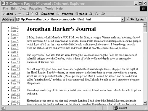
Listing 5.1 demonstrates a typical two-column HTML page. There are two divs: Pages and Content. The main content contains the first page from Bram Stoker’s Dracula. The left-hand column contains links to other pages in this book. I’ve abridged the text somewhat for printing in this book, but this should give you an idea of the structure we’ll be dealing with. In the following sections, we’ll style this page.
Example 5.1. A Two-Column HTML Page
<!DOCTYPE html PUBLIC "-//W3C//DTD XHTML 1.0 Strict//EN"
        "http://www.w3.org/TR/xhtml1/DTD/xhtml1-strict.dtd">
<html xmlns="http://www.w3.org/1999/xhtml">
<head>
  <title>Dracula, Page 1</title>
</head>
<body>

<div id="Content">
<h1>Jonathan Harker's Journal</h1>
<p>
3 May. Bistritz.--Left Munich at 8:35 P.M., on 1st May,
arriving at Vienna early next morning; should have arrived
at 6:46, but train was an hour late.  Buda-Pesth seems a
wonderful place, from the glimpse which I got of it from the
train and the little I could walk through the streets.  I feared
to go very far from the station, as we had arrived late and would
start as near the correct time as possible.
</p>

<p>
The impression I had was that we were leaving the West and
entering the East; the most western of splendid bridges over
the Danube, which is here of noble width and depth, took us
among the traditions of Turkish rule.
</p>

<p>...</p>

</div>

<div id="Pages">

<ul>
<li><a href='page1.html'>Page 1</a></li>
<li><a href='page2.html'>Page 2</a></li>
<li><a href='page3.html'>Page 3</a></li>
<li>...</li>
<li><a href='page291.html'>Page 291</a></li>
<li><a href='page292.html'>Page 292</a></li>
<li><a href='page293.html'>Page 293</a></li>
</ul>

</div>
</body>
</html>
It’s worth noting that even if there’s no CSS or further styling, this page works. The user can read all the content and then find the navigation. It’s not ideal, but it’s adequate. This is an important consideration that’s especially crucial for cell phone browsers, screen readers, robots, and other renderers that are never going to show a two-dimensional layout no matter how it’s implemented, with tables or CSS.
Once you’ve done a few of these layouts, you’ll usually just copy and paste some standard layouts. However, for learning it’s helpful to build up the stylesheet in stages. The first step is to assign different background colors to the individual divs so that you can see where the boxes are going.
Coloring the divs
It’s often helpful to add borders and different background colors to the individual column divs when designing a new layout, just so that you can see where things are going. For example, I used these styles when working on this section:
div#Content {
  background: red;
  border: solid;
}

div#Pages {
  background: green;
  border: solid;
}
Then I took them out when I was satisfied with the results.
Chris Pederick’s Web Developer extension for Firefox is also an invaluable tool, especially it’s Outline Block-level Elements and Outline Positioned Elements commands. It’s usually easiest to make a layout work in Firefox first, and then to figure out what hacks you need to add to make it look decent in Internet Explorer. Most of the time layouts that work in Firefox work without further changes in Safari and Opera.
To create a columnar layout, we have to float at least one of the columns to the right or left. Because we’d like the content to come first, we need to float both. Therefore, both will need a specified width. (Floats simply don’t work if the widths aren’t specified. I can’t justify this fact, but it is the way it is.) There are three possibilities for the width:
Fixed width for both columns
Fixed width for the left column; percentage width for the content column
Percentage widths for both columns
Option 1 is the most common choice, but I rather prefer option 3, though option 2 is sometimes a nice compromise. The problem with fixing the width is that it’s almost guaranteed to be too small for some users and too large for others. If it’s too large, a reader has to scroll horizontally to view the content, and horizontal scrolling makes text very hard to read. If it’s too small, too little text will fit on each line, making for frequent eye movement and hard-to-read text. Columns that are too small are better than columns that are too large, but there’s simply no way to design one fixed-width layout that suits everyone. It simply cannot be done. At the very least, the main content column should resize to fit the window width.
The stylesheet to accomplish this is simple and appears in Listing 5.2. It places the sidebar on the left and the content on the right. Figure 5.1 shows the rendered document.
This should be enough, but we actually need to add one more rule to work around Internet Explorer 6 bugs:
* html {
    left: 18%;
}
Of course, this is a very bare-bones stylesheet. You’ll likely want to adjust the fonts, borders, margins, padding, and more. That’s straightforward once you have the layout in place.
Moving the sidebar to the right is easy. Simply swap float: left and float: right in the two rules as demonstrated in Listing 5.3. Figure 5.2 shows the outcome. If you’ve used an external stylesheet, you don’t need to change one bit of the HTML file to change from a left to a right sidebar. That’s the power of CSS and separation of presentation from content.
In this case, because the sidebar follows the content in the text, rather than merely on the screen, you actually don’t need the extra rule for IE.
Three-column layouts are trickier. In fact, they’re so tricky that it took many smart people quite a few years of experimentation to develop the technique I show here. In fact, so many people searched for this while believing that it didn’t actually exist that this technique goes under the name “The Holy Grail.” The goal is simple: two fixed-width columns on the left and right and a liquid center for the content in the middle. (That something so frequently needed was so hard to invent doesn’t speak well of CSS as a language, but it is the language we have to work with.)
Listing 5.4 demonstrates a typical three-column HTML layout. Now there are three divs: Pages, Content, and Books. The main content contains the first page from Dracula. The left-hand column contains links to other pages in this book. The right-hand column contains links to other books. Once again, the content comes first.
Example 5.4. A Three-Column HTML Page
<!DOCTYPE html PUBLIC "-//W3C//DTD XHTML 1.0 Strict//EN"
        "http://www.w3.org/TR/xhtml1/DTD/xhtml1-strict.dtd">
<html xmlns="http://www.w3.org/1999/xhtml">
<head>
  <title>Dracula, Page 1</title>
</head>
<body>

<div id="Content">
<h1>Jonathan Harker's Journal</h1>
<p>
3 May. Bistritz.--Left Munich at 8:35 P.M., on 1st May,
arriving at Vienna early next morning; should have arrived at
6:46, but train was an hour late.  Buda-Pesth seems a wonderful
place, from the glimpse which I got of it from the train and
the little I could walk through the streets.  I feared to go
very far from the station, as we had arrived late and would
start as near the correct time as possible.
</p>

<p>
The impression I had was that we were leaving the West and
entering the East; the most western of splendid bridges over
the Danube, which is here of noble width and depth, took us
among the traditions of Turkish rule.
</p>

<p>...</p>

</div>

<div id="Pages">

<ul>
<li><a href='page1.html'>Page 1</a></li>
<li><a href='page2.html'>Page 2</a></li>
<li><a href='page3.html'>Page 3</a></li>
<li>...</li>
<li><a href='page291.html'>Page 291</a></li>
<li><a href='page292.html'>Page 292</a></li>
<li><a href='page293.html'>Page 293</a></li>
</ul>


</div>

<div id="Books">

<ul>
<li><a href="/book97/">Flatland: a romance of many
                                  dimensions</a></li>
<li><a href="/book604/">Gulliver of Mars</a></li>
<li><a href="/book1607/">A journey in other worlds<br />
A romance of the future</a></li>
<li><a href="/book7052/">Dr. Heidenhoff's Process</a></li>
...
<li><a href="/book12163/">The Sleeper Awakes<br /></li>
<li><a href="/book8968/">The World Set Free</a></li>
<li><a href="/book20553/">Out Around Rigel</a></li>
</ul>
</div>

</body>
</html>
Let’s suppose we want the left column to be 10 ems wide and the right column to be 20 ems wide. We set up three columns, one for each div. Each div is positioned relative and floated to the left. The left and right columns have fixed widths and the center column is set to 100% width. Then margins are used to keep the columns from laying on top of each other. To be specific:
Left column:
Position is relative.
Float is left.
Width is a fixed value you choose.
The right position is equal to the width of the column plus the left padding plus the right padding plus the left padding of the center column plus the right padding of the center column.
The left margin is -100%.
Right column:
Position is relative.
Float is left.
Width is a fixed value you choose.
The right position is equal to the width of the column plus the left padding plus the right padding.
The right margin is -100%.
Center column:
Position is relative.
Float is left.
Width is 100%.
Body:
Margin is 0.
Left padding is equal to the full width of the left column, including left and right padding.
Right padding is equal to the full width of the right column, including left and right padding.
Minimum width is equal to the full width of the left column plus the full width of the center column, including the left and right padding of both.
The template in Listing 5.5 should make this clearer. The rules in the Fixed Values section should be copied directly into your stylesheet without change, aside from the IDs of the columns. Then you can set the values in the Chosen Values section to your liking. I’ve used em measurements here, but pixels, inches, and other length units work as well. Finally, you calculate the values in the Calculated Values section based on the specified formulas and the numbers you entered in the second section.
This would be somewhat easier if CSS supported variables and simple calculations. However, it doesn’t, so you have to determine the right sizes by hand using these formulas. Then insert the relevant literal values in your stylesheet.
Example 5.5. Three-Column Stylesheet with Fixed-Width Left and Right Columns, Liquid Center Column
/* Fixed Values */
body {
    margin: 0;
}

#Content {
    width: 100%;
    position: relative;
    float: left;
}

#Pages {
    margin-left: -100%;
    position: relative;
    float: left;
}

#Books {
    margin-right: -100%;
    position: relative;
    float: left;
}
/* Chosen Values */
#Content {
    padding-right: 2em;
    padding-left:  2em;
}
/*
LC = Left column
RC = Right column
CC = Center column
*/
#Pages {
    width: 9em;          /* LC width */
    padding-right: 1em;  /* LC right padding */
    padding-left: 1em;   /* LC left padding */
}

#Books {
    width: 15em;         /* RC width */
    padding-right: 1em;  /* RC right padding */
    padding-left:  1em;  /* RC left padding */
}

/* Calculated Values */
body {
    padding-left: 11em;  /* LC width + LC right padding
                          + LC left padding */
    padding-right: 22em; /* RC width + RC right padding
                          + RC left padding + CC left padding
                          + CC right padding */
    min-width: 15em;     /* LC width + LC right padding
                          + LC left padding + CC left padding
                          + CC right padding */
}

#Pages {
    right: 15em;      /* LC width + LC right padding
                         + LC left padding
                       + CC left padding + CC right padding */
}
IE 6 has some problems with this technique. To work around them, we add this rule:
html #left {
 left: 17em; /* RC width + RC right padding + RC left padding*/
}
What’s especially annoying about this technique is that it’s very easy to get the widths a little off. They are calculated based on each other, but they are defined as static constants in the CSS file. However, once you get this right, it does work, and it works reasonably well across modern browsers.
Convert framesets to single pages.
<frameset cols="20%,80%"> <frame frameborder="1" src="navframe.html" name="navframe" scrolling="auto" /> <frame frameborder="1" src="contentframe.html" name="contentframe" scrolling="auto" /> <noframes> <body> <p> Go away! We don't want your kind here. </p> </body> </noframes> </frameset>
Frames were a bad idea that hasn’t improved in the ten years since they were invented. They are a usability disaster. They make it extremely hard to bookmark or return to a particular page. They make it hard to save a page or print it. They break the connection between the URL displayed in the title bar and the content on the page. They take control away from the user, because frame sizes are set by the page author. Users cannot resize individual frames to fit their needs. Scroll bars take up valuable screen real estate.
Frames confuse search engines and reduce your Google rank. Furthermore, when users do find a relevant framed page with a search engine, they’re likely to come into the framed page directly, rather than the frameset, thus completely bypassing your carefully designed frame layout.
Browsers have partially compensated for some of these flaws with tools such as the This Frame context menu in Firefox. However, this is still a limited solution. Furthermore, when users take advantage of such functionality, they may well break a site that depends on having all frames in a set visible at once. Critical navigation or other content can be missed when a reader sees only part of a frameset.
The techniques outlined here will not work quite as well in older browsers that are rarely used anymore. However, the content will still be accessible to them. It just won’t be as pretty. In modern browsers, by contrast, it should be both more attractive and more usable.
The individual nonframe pages may require more bandwidth than the frame equivalents. That’s because the frame content will need to be served to the client on each page.
Frames were a hack in the very early days of the Web before browsers supported CSS or servers supported sophisticated include schemes. Today a combination of both of these is preferred to achieve a much nicer frame effect with greater usability.
There are actually two reasons that sites use frames:
To include static content on all pages, without separately editing each page
To present a multicolumn appearance
Although these are legitimate goals, in 2008 neither of them requires the use of frames. You already saw in the preceding section that it’s not hard to create multicolumn layouts with CSS.
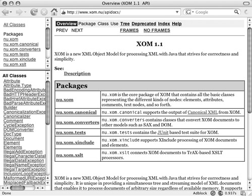
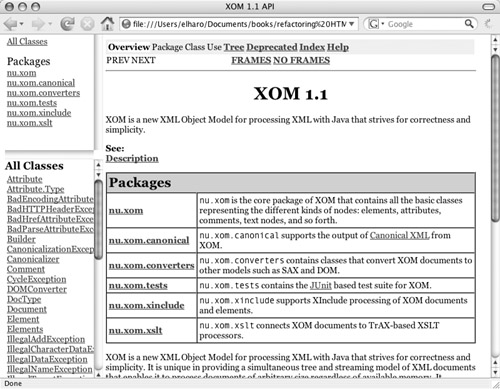
It is very common for web sites to have navigation bars or other content that remains the same or almost the same from page to page. For example, in Java API documentation there are two frames on the left-hand side that contain a list of all packages and all classes in the current package. The main content frame is on the right. This is shown in Figure 5.3.
This actually works fairly well, and it is one of the better uses of frames. Let’s see how we might replace it with CSS. The key is to set up three divs, one for each frame. The content of each div is taken from the body of each framed document. These divs are then positioned using the same CSS properties described in the preceding section. However, this time we’ll add one more piece. We’ll make them individually scrollable using the overflow property.
Listing 5.6 shows the original document.
Example 5.6. The Framed Page
<!DOCTYPE html PUBLIC "-//W3C//DTD XHTML 1.0 Frameset//EN"
"http://www.w3.org/TR/2000/REC-xhtml1-20000126/DTD/xhtml1-
frameset.dtd">
<html xml:lang="en-US" xmlns="http://www.w3.org/1999/xhtml">
 <head>
  <title>XOM 1.1 API</title></head>
  <frameset cols="20%,80%">
    <frameset rows="30%,70%">
      <frame frameborder="1" src="overview-frame.html"
      name="packageListFrame" title="All Packages"
      scrolling="auto" />
      <frame frameborder="1" src="allclasses-frame.html"
name="packageFrame" title="All classes and interfaces
  (except non-static nested types)" scrolling="auto" />
   </frameset>
   <frame frameborder="1" src="overview-summary.html"
          name="classFrame" scrolling="auto"
          title="Package, class and interface descriptions"  />
    <noframes><body><h2>
Frame Alert</h2>
<p>
This document is designed to be viewed using the frames feature.
If you see this message, you are using a non-frame-capable web
client.
<br clear="none"></br>
Link to<a shape="rect" href="overview-summary.html">Non-frame
version.</a>
</p></body></noframes>
</frameset>
</html>
The first thing you can do is take out the noframes element. We won’t need this anymore. The nonframe version should work with any browser. This gives us the simpler Listing 5.7, though this is just an intermediate step we won’t actually publish.
Example 5.7. Removing noframes
<!DOCTYPE html PUBLIC "-//W3C//DTD XHTML 1.0 Frameset//EN"
"http://www.w3.org/TR/2000/REC-xhtml1-20000126/DTD/xhtml1-
frameset.dtd">
<html xml:lang="en-US" xmlns="http://www.w3.org/1999/xhtml">
 <head>
  <title>XOM 1.1 API</title></head>
  <frameset cols="20%,80%">
    <frameset rows="30%,70%">
      <frame frameborder="1" src="overview-frame.html"
       name="packageListFrame" title="All Packages"
       scrolling="auto" />
      <frame frameborder="1" src="allclasses-frame.html"
       name="packageFrame" title="All classes and interfaces
      (except non-static nested types)" scrolling="auto" />
   </frameset>
   <frame frameborder="1" src=" overview-summary.html"
    name="classFrame"
    title="Package, class and interface descriptions"
   scrolling="auto" />
  </frameset>
</html>
Next, change each frameset and frame into a div, as shown in Listing 5.8. The name attributes will need to be changed into id attributes. Also, add a body element. Finally, change the DOCTYPE to the XHTML strict DOCTYPE.
Example 5.8. Replacing Frames with divs
<!DOCTYPE html PUBLIC "-//W3C//DTD XHTML 1.0 Strict//EN"
        "http://www.w3.org/TR/xhtml1/DTD/xhtml1-strict.dtd">
<html xml:lang="en-US" xmlns="http://www.w3.org/1999/xhtml">
<head>
<title>XOM 1.1 API</title></head>
<body>

<div cols="20%,80%">
  <div rows="30%,70%">
    <div frameborder="1" src="overview-frame.html"
     id="packageListFrame" title="All Packages"
     scrolling="auto">
  <div frameborder="1" src="allclasses-frame.html"
       id="packageFrame" scrolling="auto" title=
 "All classes and interfaces (except non-static nested types)"
     />
</div>
  <div frameborder="1" src="overview-summary.html"
       id="classFrame" scrolling="auto"
  title="Package, class and interface descriptions" />
</div>
</body>
</html>
Now change the cols and rows attributes into CSS width and height values. This is tricky because frames put these values on the container (the outer div), whereas CSS puts them on the contained item (the inner div). For example, the 20% col from the top div becomes a 20% width on its first child div, and the 80% col from the top div becomes an 80% width on its second child div, as shown in Listing 5.9.
Example 5.9. Replacing cols and rows with CSS Width and Height
<!DOCTYPE html PUBLIC "-//W3C//DTD XHTML 1.0 Strict//EN"
        "http://www.w3.org/TR/xhtml1/DTD/xhtml1-strict.dtd">
<html xml:lang="en-US" xmlns="http://www.w3.org/1999/xhtml">
<head>
<title>XOM 1.1 API</title></head>
<body>

<div>
  <div style="width: 20%;">
    <div style="height: 30%;" frameborder="1"
      src="overview-frame.html" scrolling="auto"
      id="packageListFrame" title="All Packages"  />
    <div style="height: 70%" frameborder="1"
      src="allclasses-frame.html" id="packageFrame"
      title="All classes and interfaces
    (except non-static nested types)" scrolling="auto" />
  </div>
  <div style="width: 80%" src="overview-summary.html"
       id="classFrame" title="Package, class and interface
             descriptions" scrolling="auto" />
</div>
</body>
</html>
We also need to change the frameborder attributes into CSS border properties. We replace the scrolling attribute with the CSS overflow property. Listing 5.10 shows this step.
Example 5.10. Replace Scrolling with CSS Overflow
<!DOCTYPE html PUBLIC "-//W3C//DTD XHTML 1.0 Strict//EN"
        "http://www.w3.org/TR/xhtml1/DTD/xhtml1-strict.dtd">
<html xml:lang="en-US" xmlns="http://www.w3.org/1999/xhtml">
<head>
<title>XOM 1.1 API</title></head>
<body>

<div>
  <div style="width: 20%;">
    <div style="height: 30%; border: solid; overflow: scroll;"
         src="overview-frame.html" id="packageListFrame"
         title="All Packages" />
    <div style="height: 70%; border: solid; overflow: scroll;"
      src="allclasses-frame.html" id="packageFrame"
      title="All classes and interfaces
    (except non-static nested types)" />
  </div>
  <div style="width: 80%; border: solid; overflow: scroll"
       src="overview-summary.html" id="classFrame"
       title="Package, class and interface descriptions" />
</div>
</body>
</html>
The next step is to copy the text from the body elements in the framed documents into the new source document. This text can, of course, be rather long, so in Listing 5.11, I’ve just filled in some dummy text. This is now a valid XHTML strict document.
Example 5.11. The Finished Frame-Free Document
<!DOCTYPE html PUBLIC "-//W3C//DTD XHTML 1.0 Strict//EN"
        "http://www.w3.org/TR/xhtml1/DTD/xhtml1-strict.dtd">
<html xml:lang="en-US" xmlns="http://www.w3.org/1999/xhtml">
<head>
<title>XOM 1.1 API</title></head>
<body>

<div id="outer">
  <div id="leftFrame" style="width: 20%;">
    <div style="height: 30%"
      id="packageListFrame" title="All Packages" >
      Package list goes here
    </div>
    <div style="height: 70%"
      id="packageFrame" title="All classes and interfaces
    (except non-static nested types)" >
      Class list goes here
    </div>
  </div>
  <div style="width: 80%;"
       id="classFrame" title="Package, class and interface
             descriptions"  >
   Summary details go here
  </div>
</div>
</body>
</html>
Of course, if we stopped here we’d have a technically valid but rather ugly and hard-to-use document. The final step is to reproduce the original layout with CSS instead of frames. The techniques are much the same as used in earlier sections for eliminating table layouts. The details will vary depending on the frame-based layouts you’re replacing. Simple sidebar and navigation layouts can be handled using the stylesheets presented earlier. For the Javadoc layout demonstrated here, Listing 5.12 shows a CSS stylesheet that does the job. Figure 5.4 shows the finished document.
Example 5.12. A CSS Stylesheet for Javadoc Layout
#outer { position: relative; }

#leftFrame {
  position: fixed;
  height: 100%;
  width: 20%;
  top: 0;
}

#classFrame {
  position: absolute;
  left: 21%;
  width: 77%;
}

#packageListFrame{
  position: static;
  height: 200px;
  overflow: scroll; }

#packageFrame {
  position: static;
  height: 70%;
  overflow: scroll;
}
The problem with this technique is that it violates the DRY (Don’t Repeat Yourself) principle. Although it’s fine for one page, the same content is repeated on page after page after page, often with simple, small variations. Repetitive content is usually a code smell, and one that you should pay attention to. Frames do avoid needless repetition in a way that static, frameless HTML does not. That would almost be enough to convince me they’re not so bad if only they weren’t such a problem for users. I advocate clean, maintainable code, but not at the expense of the user interface. If forced to choose between ugly code and an ugly user interface, I’ll pick the ugly code every time. Frame code is cleaner, but frame interfaces are not.
More static sites that are not generated by code, databases, or CMSs should consider using some form of server-side include technology to manage repetitive content. This is transparent to the user but a big help to the author. For example, the Apache 2.0 web server provides the mod_include module. You can include repetitive static content in many pages simply by using comments such as <!--#include virtual="/header.html" -->, as shown in Listing 5.13. However, maybe we don’t have to make that choice. Although the raw HTML shown in the last few examples is repetitive, that is not necessarily the code we edit. The example developed here—Javadoc—is automatically generated from Java source code. The HTML is more akin to compiled assembly code than source code. The real source is the Java code from which the Javadoc is extracted and the HTML is generated.
By modifying the doclet that generates the HTML, we could switch all the Javadoc to frameless XHTML without changing a line of the actual source. Wikis, blogs, content management systems (CMSs), and more can all easily duplicate the authoring convenience of frames without the user-facing problems they cause.
Example 5.13. Apache Server-Side Includes
<html xmlns="http://www.w3.org/1999/xhtml">
<head>
<title>On Iterators and Indexes</title>
</head>
<body>

 <!--#include virtual="/header.html" -->
<div id="Content">
<h1>On Iterators and Indexes</h1>
<p>
Here's a neat little trick Wolfgang Hoscheck <a href="http://
lists.ibiblio.org/pipermail/xom-interest/2004-November/
001501.html">showed me</a>... </p>
</div>
 <!--#include virtual="/footer.html" -->
 <!--#include virtual="/sidebar.html" -->

</body>
</html>
Customarily, files that contain server-side includes end with .shtml to tell the server to parse them and resolve the includes before sending them to clients. Although mod_include is compiled into Apache by default, it may not be enabled for all directories. You need to add these three configuration directives for each directory that uses server-side includes, either in the main Apache config file or in an .htaccess file:
AddType text/html .shtml
AddOutputFilter INCLUDES .shtml
Options +Includes
PHP has similar functionality accessed via the include function, as demonstrated in Listing 5.14.
Example 5.14. PHP Includes
<html xmlns="http://www.w3.org/1999/xhtml">
<head>
<title>On Iterators and Indexes</title>
</head>
<body>

<?php
   include("header.html");
?>
<div id="Content">
<h1>On Iterators and Indexes</h1>
<p>
Here's a neat little trick Wolfgang Hoscheck <a href="http://
lists.ibiblio.org/pipermail/xom-interest/2004-November/
001501.html">showed me</a>... </p>
</div>
<?php
   include("footer.html");
   include("sidebar.html");
?>

</html>
I wouldn’t recommend switching to PHP just for server-side includes, but if you’re already using PHP, as so many sites are, this is very convenient.
These are just a couple of common examples. All but the most basic web servers support some form of server-side include functionality.
Performance may be marginally slower with server-side includes of various stripes than with static files, but not usually significantly slower. CPU and local disk speed are rarely the limiting factors on even the highest-volume web sites today.
When reading the raw HTML from start to finish, the main content of the page should be the very first thing encountered. Sidebars, headers, footers, navigation, and such should follow.
<div id="left">Left sidebar</div> <div id="content">Page content</div> <div id="right">Right sidebar</div>
Search engines often treat content earlier in the page as more important than content later in the page. You usually want the unique content on the page, not the navigation, advertisements, logos, and other froufrou.
Putting content first is extremely important for accessibility. Screen readers see the page as a linear sequence that starts at the beginning and continues to the end. Pages laid out as two-dimensional columns are big problems for blind readers. For these readers, especially, it’s really important to put the crucial content upfront rather than making them wade through several dozen irrelevant links first.
Insisting on having the content first does make designing CSS stylesheets with positioning more difficult. You’ll likely need to modify any such stylesheets to account for the new content order.
To the extent that static content such as headers, footers, navigation, ads, and sidebars are repeated from page to page, there’s usually some constant string you can search for, such as id="sidebar". If your pages are structured very consistently, you may even be able to automate moving the secondary content after the main content. More often, though, you’ll need to find these issues manually unless all the pages are generated out of a CMS or database of some kind. If that’s the case, you just need to update the template.
The biggest problem is likely to be reorganizing the CSS stylesheet to support the new content order. CSS is not as independent of content order as one would like it to be. However, the techniques given in the first section in this chapter for converting from a table-based layout apply here as well. There is one common problem I did not address in that section: putting the header after the main content. This is tricky, though it can be done. If you don’t want to update the stylesheets just yet, you should at least install skip links, as discussed in the next chapter.
However, if you do want to go whole-hog, the trick is to absolutely position the header at the top of the page and then give the content and sidebars enough of a top margin to slide out of its way. This is not a perfect solution. It does tend to let the main content bleed over the header at very large font sizes, but it’s adequate for most sites.
Imagine we’ve added new divs for headers and footers, as shown in Listing 5.15. The footer is actually inside the content, so it will show up at the bottom. The header appears at the very end, after all the other content. Nonetheless, we want it to appear at the top of the page.
Example 5.15. A Three-Column HTML Page with Header and Footer
<!DOCTYPE html PUBLIC "-//W3C//DTD XHTML 1.0 Strict//EN"
        "http://www.w3.org/TR/xhtml1/DTD/xhtml1-strict.dtd">
<html xmlns="http://www.w3.org/1999/xhtml">
<head>
  <title>Dracula, Page 1</title>
</head>
<body>

<div id="Content">
<h1>Jonathan Harker's Journal</h1>
<p>
3 May. Bistritz.--Left Munich at 8:35 P.M., on 1st May,
arriving at Vienna early next morning; should have arrived
at 6:46, but train was an hour late.  Buda-Pesth seems a
wonderful place, from the glimpse which I got of it from the
train and the little I could walk through the streets. I feared
to go very far from the station, as we had arrived late and
would start as near the correct time as possible.
</p>
<p>...</p>

<div id="Footer">
  <p>The text is in the public domain and courtesy of
     <a href="http://www.gutenberg.org/">Project Gutenberg</a>.
  </p>
</div>

</div>

<div id="Pages">
<ul>
<li><a href='page1.html'>Page 1</a></li>
<li><a href='page2.html'>Page 2</a></li>
<li>...</li>
<li><a href='page292.html'>Page 292</a></li>
<li><a href='page293.html'>Page 293</a></li>
</ul>
</div>

<div id="Books">
<ul>
<li><a href="/book97/">Flatland: a romance
                                 of many dimensions</a></li>
...
<li><a href="/book20553/">Out Around Rigel</a></li>
</ul>
</div>

<div id="Authors">
Edward Bellamy | Marion Zimmer Bradley | Edgar Rice Burroughs
| John W.  Campbell | Lester Del Rey | Cory  Doctorow
| Arthur Conan Doyle | H. Beam Piper | Robert Sheckley
| E. E. Smith | Jules Verne | H. G.  Wells
</div>

</body>
</html>
Although the Authors header is at the end of the document, we can still move it to the visual top of the page by absolutely positioning it with this rule:
#Header {
  position: absolute;
  top: 1ex;
  margin:10px 10px 2ex 10px;
  padding-right: 17em;
  font-size: small;
}
Note that we had to set its right margin to keep it from overlapping the right sidebar containing the titles. We also need to push the main content down the page by setting Content’s top margin like so:
#Content {
  top: 24ex;
}
You’ll have to experiment to find the right size for the top of the main content. It will depend on how much text you put in the header, as well as how big the header font is. If you leave some extra whitespace, you can usually find a value that works for a wide range of user font sizes and browser widths. If the font gets really huge, there may be some overlap. However, I’ve been using layouts such as this for several years now, and so far no one has written me to complain that at 64 points or larger, the header starts to overlap the rest of the page.
The footer is actually quite easy to handle. Because that comes after the main content in both the logical and presentational flow of the document, it doesn’t require nearly as much trickery as the header does. In fact, all you really have to do is place the footer div inside the main content div, rather than outside. That moves it to the bottom, and no extra CSS positioning is needed.
Make sure any lists are marked up as ul elements, or, occasionally, as dl or ol elements.
<div id="Authors"> Edward Bellamy | Marion Zimmer Bradley | Edgar Rice Burroughs | John W. Campbell | Lester Del Rey | Cory Doctorow | Arthur Conan Doyle | H. Beam Piper | Robert Sheckley | E. E. Smith | Jules Verne | H. G. Wells </div>
Identifying lists as lists improves accessibility. In particular, it enables the use of screen reader tools for skipping over and navigating through lists.
Most browsers assign very specific appearances to lists and list items, typically indented and bulleted, and you may not want this appearance. You can fix this easily with CSS in modern browsers. However, some older browsers do not support all the necessary properties and will display these pages in less-than-ideal fashion.
There’s no simple way to find all the unidentified lists in a site. You’ll just have to read the pages and look for lists. They can be marked up in dozens of different ways: as paragraphs, divs, tables, inline text separated by commas or other symbols, and more.
Once you’ve found a list, marking up the individual items is easy. Just use a ul, ol, or dl instead of the current wrapper element. Use the ordered list ol if the items are numbered. Use dl if the list takes the form name-description, name-description, name-description. Use ul for all other lists.
Although lists are extremely common in content, list elements are not. The reason is that browsers usually indent and bullet or number each separate item, as well as placing line breaks in between items; and this is not always desired. However, this is easy to fix with CSS. For example, to remove the bullets add this rule to the page’s CSS stylesheet:
ul {
  list-style-type: none;
}
Or, instead of removing the bullet, you can add a custom bullet loaded from an image file with the list-style-image property like so:
ul li {
 list-style-image: url(images/star.gif)
}
To get rid of the indentation, add this rule:
ul {
  margin-left: 0px;
  padding-left: 0px;
}
Alternatively, you can set a different margin by increasing the value of these properties. If you like, you can also play with the text-indent property, which indents just the first line. Negative values create hanging indents.
To place the list items on a single line use this rule:
ul, li {
  display: inline;
  margin: 0px;
  padding: 0px;
}
To place a character such as a comma between list items add this rule:
ul li:after {
  content: ", ";
}
This actually puts a comma after each list item, including the last. To avoid that, assign a special class to the last item in the list, like so:
<li class="last">H.G. Wells</li>
Then add one extra rule just for this last item that overrides the earlier rule:
ul li.last:after {
  content: "";
}
Of course, you can use class or ID selectors to apply these rules to some lists and not others if you like.
Change any blockquotes or ul elements used purely to indent their contents into divs, and assign CSS rules to the div that use the margin-left and margin-right properties to indent.
<blockquote> The quick brown fox jumped over the lazy dog. </blockquote>
blockquote should be reserved for quotations. ul should be reserved for lists.
CSS offers much greater control over exactly how far any given chunk of text is indented. You also have the option to set a right margin separately from the left margin, to indent the first line differently than the rest, to specify a hanging indent, or anything else you can imagine. CSS is simply a more powerful and precise means of indenting text than blockquote and ul ever were.
Minimal. Even if a browser cannot load the CSS stylesheet, the consequent lack of indentation has a very small effect on the overall appearance of the page.
Finding text improperly marked up with blockquote is tricky. On some sites, there are no real blockquotes, so a quick search for <blockquote will locate all the occurrences. However, if a site is using real blockquotes anywhere, you’ll need to inspect each example.
To find places where ul (or, less commonly, ol) has been used to indent, first try validation. Even the transitional XHTML DTD requires all ul and ol elements to contain at least one li child element. Lists that don’t contain any list items should pop right up with an error message such as this:
test.html:9: element ul: validity error : Element ul content
does not follow the DTD, expecting (li)+, got ()
</ul>
     ^
You can also use regular expressions to locate any item-less ul elements. Because these almost always extend across multiple lines, this is a little tricky, but it is doable:
<ul>([^<]|<[^l]|<l[^i])*?</ul>
Once you find one, change it into a div. Then set the margin-left and margin-right properties on the div. Forty pixels is a common value that many browsers use for blockquote indentation, so this rule would reproduce that:
<div style="margin-left: 40px; margin-right: 40px; ">
Of course, you could take this opportunity to choose a different size if you like, and you probably should place the style rule in an external stylesheet to allow for easier updates later.
If you like, you can also play with the text-indent property, which indents just the first line. Negative values create hanging indents. However, this is very different from the both-sides indentation that you get with a blockquote or a list.
Delete all spacer GIFs. Use CSS margin, padding, position, and indent properties as necessary to reproduce their effects.
<td> <img src="images/spacer.gif" hspace="10" vspace="1"> </td> <p>foo</p> <img src="images/spacer.gif" hspace="1" vspace="10"> <p>bar</p> <img src="images/spacer.gif" hspace="1" vspace="10">
Spacer GIFs were a really ugly hack from the days even before tables, much less CSS. They may have made sense in 1995 (barely), but they’re in no way necessary today. It’s shocking that these are still showing up on web sites, even new ones.
Spacer-GIF-based layouts are fragile and unreliable. They tend to break in modern browsers. They do not scale well with increased or decreased font sizes.
Spacer GIFs without alt attributes cause massive problems for screen readers.
Furthermore, many browsers and browser plug-ins today refuse to load single-pixel GIFs because they are commonly abused for user tracking.
To find spacer GIFs, just search your web site for the word spacer (case-insensitive). Any hits on that string are a red flag. Of course, there’s nothing magical about the name spacer, though it is by far the most common. Other names I’ve seen pop up more than once include transparent.gif, 1.gif, and 1×1.gif. If you discover any spacer GIFs using a different name, search for those too to see what other files they may be infecting. You may even find a few spacer “GIFs” that are actually JPEGs or PNGs, and of course, you should replace these as well.
Spacer GIFs can and should be replaced by CSS rules. Exactly which properties you replace them with will depend on the use to which the spacer GIF was put, but usually it’s one or more of margin, padding, or position that’s involved.
For example, this is an old attempt to indent a paragraph 20 pixels by prefixing it with a transparent spacer GIF:
<p>
 <img src="spacer.gif" width="20" height="1" />
I was not able to light on any map or work giving the exact
locality of the Castle Dracula, as there are no maps of this
country as yet to compare with our own Ordnance Survey Maps;
but I found that Bistritz, the post town named by Count Dracula,
is a fairly well-known place. I shall enter here some of my notes,
as they may refresh my memory when I talk over my travels
with Mina.
</p>
You can easily replace this with a text-indent CSS property with the value 20px:
<p style="text-indent: 20px">
I was not able to light on any map or work giving the
exact locality...
</p>
Better still, use a text relative unit of measure, such as ems, so that the indent will grow and shrink as necessary to match the browser’s default font size:
<p style="text-indent: 4em">
I was not able to light on any map or work giving the
exact locality...
</p>
As always, this rule can and probably should be placed in an external stylesheet.
Assign each element a unique id by which it can be addressed.
<h2>Resources</h2> <ul> <li><a href="/faq.html">Frequently Asked Questions</a></li> <li><a href="/tutorial.html">Tutorial</a></li> <li><a href="/contact.html">Contact Us</a></li> </ul> <p>Are you <strong>really</strong> sure?</p>
ID attributes allow you to precisely target individual elements for styling with CSS, addressing with JavaScript, transforming with XSLT, and more. They make it much easier for programs to operate on the document.
ID attributes also make it easier for you and other people to link to and cite your content. Instead of referencing the entire page, they can now reference the individual paragraph, heading, table, or other content.
Adding ID attributes to every element can bloat file sizes by a noticeable amount. If bandwidth is a major concern, consider adding ID attributes to only some of the elements. In particular, it’s usually enough to put an id on every p, table, blockquote, ul, ol, dl, and div.
The ID attribute is named id, and it must contain a single XML name. For example, consider this paragraph:
<p>Game over. Sony has
<a href=
 "http://www.sgknox.com/2007/01/11/no-porn-on-blu-ray/">
   forfeited</a>
and Blu-Ray has lost.</p>
You simply add an id attribute to each start-tag, like so:
<p id='p1'>Game over. Sony has
<a id='a1' href=
 "http://www.sgknox.com/2007/01/11/no-porn-on-blu-ray/">
  forfeited</a>
and Blu-Ray has lost.</p>
There are a few rules for the values of id attributes, but they’re not especially onerous.
The value must begin with a letter.
The value must contain only letters and digits.
Each value must be unique within the document where it appears.
The ID values do not have to have any particular system or meaning, though they can if that’s convenient for you. Usually, however, they’re pretty much arbitrary strings.
Assuming the documents are already well-formed, it’s easy enough to automate this process. Listing 5.16 demonstrates a simple XSLT stylesheet that adds IDs to all elements in a document that don’t already have them.
Example 5.16. An XSLT Stylesheet That Adds IDs to All Elements
<xsl:stylesheet xmlns:xsl='http://www.w3.org/1999/XSL/Transform'
  version='1.0'>

  <!-- match elements with IDs -->
  <xsl:template match='*[@id]' priority='1.5'>
    <xsl:copy>
      <xsl:apply-templates select="@*|node()"/>
    </xsl:copy>
  </xsl:template>

  <!-- match elements without IDs -->
  <xsl:template match='*' priority='1'>
    <xsl:copy>
      <xsl:attribute name='id'>
        <xsl:value-of select='generate-id()'/>
      </xsl:attribute>
      <xsl:apply-templates select="@*|node()"/>
    </xsl:copy>
  </xsl:template>

  <!-- match non-elements -->
  <xsl:template match='@*|node()' priority='0.5'>
    <xsl:copy>
      <xsl:apply-templates select="node()"/>
    </xsl:copy>
  </xsl:template>

</xsl:stylesheet>
Listing 5.17 modifies this slightly to add id attributes to only p, table, and div elements. You can easily adjust the list of elements you add ids to by changing the element names in the match pattern in the second template rule.
Example 5.17. An XSLT Stylesheet That Adds IDs to Particular Elements
<?xml version='1.0'?>
<xsl:stylesheet version='1.0'
  xmlns:xsl='http://www.w3.org/1999/XSL/Transform'
  xmlns:html='http://www.w3.org/1999/xhtml'>

  <!-- match elements that already have IDs -->
  <xsl:template match='html:*[@id]' priority='1.5'>
    <xsl:copy>
      <xsl:apply-templates select="@*|node()"/>
    </xsl:copy>
  </xsl:template>

  <!-- match elements we will add IDs to -->
  <xsl:template match='html:p | html:table | html:div'
                priority='1.25'>
    <xsl:copy>
      <xsl:attribute name='id'>
        <xsl:value-of select='generate-id()'/>
      </xsl:attribute>
      <xsl:apply-templates select="@*|node()"/>
    </xsl:copy>
  </xsl:template>

  <!-- match elements we're not going to add IDs to -->
  <xsl:template match='*' priority='1'>
    <xsl:copy>
      <xsl:apply-templates select="@*|node()"/>
    </xsl:copy>
  </xsl:template>

  <!-- match non-elements -->
  <xsl:template match='@*|node()' priority='0.5'>
    <xsl:copy>
      <xsl:apply-templates select="node()"/>
    </xsl:copy>
  </xsl:template>

</xsl:stylesheet>
Add width and height attributes to all img elements that don’t have them.
<img src="winter.jpg" alt="Frozen river" />
width and height attributes enable a browser to format a page much more quickly and display it to the user sooner. This is especially critical on slow dial-up connections, which about 20% of web surfers still use.
If you change the size of the images, you’ll also need to change the HTML. Otherwise, the pictures may be strangely compressed or expanded. If you’re frequently changing images—for instance, while designing a page—you may wish to leave the insertion of widths and heights to the final prepublication stage.
The XHTML DTD does not require width and height attributes on img elements, so simple validation will not find the problem. However, a regular expression can find missing width attributes. The trick is to match all possible attributes except width and height, like so:
<imgs+((alt|border|class|align|id|src|usemap|hspace|vspace)
s*=s*("[^"]+"|'[^']+')s*)*>
Only img tags that do not contain width and height attributes will match. (Here we’re relying on the absence of weird, unexpected attributes. In essence, validity is a weak prerequisite for this search.)
If you think you might have remembered to add a height but not a width or vice versa, check these regular expressions:
<imgs+((width|alt|border|class|align|id|src|usemap
|hspace|vspace)s*=s*("[^"]+"|'[^']+')s*)*>

<imgs+((height|alt|border|class|align|id|src|usemap
|hspace|vspace)s*=s*("[^"]+"|'[^']+')s*)*>
That should sniff out all the missing sizes.
If you find only a few such elements, you might as well open the files, load the relevant images into a program that will tell you their size, and fix them manually. Firefox helpfully shows the image width and height when you open an image directly (as opposed to the HTML page in which the image is embedded).
However, if there are many such problems, you’ll want to automate the process with a program that parses the documents and fills in the missing sizes. Randal Schwartz has published a Perl script called addsize that does this, which you can find at www.stonehenge.com/merlyn/WebTechniques/col36.html. It’s a little old, but it’s still functional. Marc Merlins has another at http://marc.merlins.org/linux/scripts/addsize that is based on ImageMagik. And Eric S. Raymond has written one called imgsizer in Python (www.catb.org/~esr/imgsizer/). None of them is perfect, but imgsizer is probably the most up-to-date and reliable. It should run on most UNIX/Linux variants fairly easily.
To update one file in place, just type:
$ imgsizer -n filename.html
To change all HTML files in a directory, use the -d option:
$ imgsizer -n -d /var/www/html
This program does not back up the files before changing them, and it can create malformed files in some cases. Be sure to make a backup before running it or any similar utility. Indeed, it’s probably a good idea to run the tool on only a copy of your files and to verify the modified copy before proceeding.