We aren’t going to follow the advice of this quote. In this chapter we pull back the curtain on Dojo widgets and reveal their secret inner life. It is a life of purpose and utility achieved with simplicity and yet, like a duck furiously paddling just beneath the water line, there is lots going on under the surface. We explore the internal workings of Dojo widgets and acquire a foundation of knowledge for using them effectively.
Describing exactly what a widget is (and isn’t) turned out to be harder to do than I thought it would be at first. As I did a little research I came across a wonderful definition in, of all places, some Red Hat Linux documentation. The definition describes a widget as “a standardized onscreen representation of a control that may be manipulated by the user. Scroll bars, buttons, and text boxes are all examples of widgets.”[1] What a great description.
Let’s tease out each of the elements of the definition and see what it means for us.
A widget is an onscreen control—. Widgets are visual elements on the page that provide a way for the user to manipulate some data or functionality of the application. One of the simplest widgets is an HTML check box. It appears on the page, and by checking it, the user is setting some data values that will eventually be sent to the server. And though a widget must be on the page, it doesn’t necessarily have to be visible. It may sometimes be temporarily hidden.
A widget is standardized—. The widget should work the same way everywhere and should have some intuitive or obvious behavior. Also the widget should follow generally accepted patterns of usage and behavior. Within the Ajax world, this criteria is not always met. Some widgets are used in such a limited role or are so new that standardized behavior hasn’t been defined yet.
A widget can be manipulated by the user—. The purpose of a widget is to allow the user to set some data or control the functionality of the system in some way. So just because there is a visual element on the page doesn’t mean that it is a widget.
A widget contains data—. Although this isn’t in the definition, it is also a crucial fact in understanding widgets. A widget contains some state that can be manipulated. For instance, an image isn’t a widget even though it is an element on the page. However, a slide show of images is a widget because not only can the user manipulate it, but it also contains state information (the current image in focus, for example).
Are the existing standard HTML controls such as check boxes and radio buttons also widgets? I would argue that they certainly are. However, the small number of widgets provided by HTML don’t give us enough variety. A really good widget matches itself to the functionality the user expects for a given feature of an application. An excellent example of this is the “crop” widget in Photoshop. The icon shows a picture of an actual physical cropping tool used in film-based photography. The icon also allows the user to set the crop area in a fashion similar to the real tool. However, there is no “cropping” widget in HTML. Nor are there widgets to match much of the functionality we’d like to provide in current browser-based applications. There are too many missing widgets in HTML. Dojo provides some of these “missing widgets” that HTML should have given us.
We just discussed a general definition for widgets, but we can further ask exactly what Dojo widgets are. First a short definition: A Dojo widget is a collection of DOM elements and JavaScript objects that work together to provide a single control for manipulating the application. They are combinations of DOM elements on the web page that act together to provide a visual component that provides the widget characteristics that we’ve already discussed. The great thing is that you don’t have to write code for them. Dojo has provided everything you need to add your widget to a web page and start using it. Although you probably understand what a widget is now and probably already knew before we defined it, we discuss one of Dojo’s most popular and most complicated widgets here, the Rich Text Editor. Here’s a picture—which is not only worth a thousand words but will let you edit a thousand words as well!
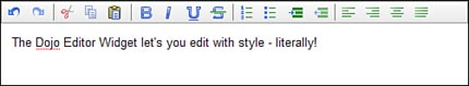
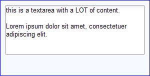
This editor is really an HTML <textarea> widget on steroids. It allows you to create multi-line text and apply various styles to it. It’s like having a word processor built right into your web page.
So Dojo widgets are simple to use, are they? We just “add” them to a page? Exactly how do we do that? Following is an example of HTML markup that places a Dojo widget on a web page.
<input
    type="text"
    dojoType="dijit.form.TextBox"
/>
See, it was simple! The only “magic” (if you can even call it that given how simple it is) is to include the dojoType attribute and name the desired widget. There is one other small step, and that is to include the code for the widget by putting a dojo.require("dijit.form.TextBox") statement somewhere in the JavaScript. And of course, this example doesn’t take full advantage of customizing the widget. It is also possible to set properties of the widget by using additional attributes in the <input> tag.
Note
Notice how the code is referring to “dijit”? This is the module, known as Dijit, that contains the code and other artifacts for creating Dojo widgets.
There is also a technique for creating Dojo widgets using JavaScript that is quite simple also. We just create an object using the desired constructor and then add it to the DOM for the page. Following is an example of how to add a Dojo TextBox to a web page (this example assumes there is a DOM element named placeHolder to which we can attach the widget).
new dijit.form.TextBox({}, dojo.byId("placeHolder"));The first parameter is an object containing properties of the widget to be created. Although we’re not setting any in the example, there certainly are many possible properties that can be used to customize the widget. Also the second parameter is a DOM element to which we can attach the new widget. Without a reference to an existing DOM node, the new widget would be created but wouldn’t be part of the page. This is a common mistake to make when you’re first learning to work with widgets.
Now that we’ve described Dojo widgets in a top-down fashion, if you’re like me, let’s dive into and explore the technical details. We’ll drill down to the atomic level and see what elementary substances make up a widget.
Every Dojo widget consists of three elements, as follows.
The structure defined in HTML tags
The look defined in CSS styles
The behavior defined with events and event handlers in a JavaScript object
Let’s walk through each of these elements in more detail using an actual widget from Dojo as an example to clarify these areas further.
A Dojo widget is a collection of DOM elements created from the HTML tags that describes its structure. The HTML for each widget is contained is a separate file and saved in a special directory. The following example will describe one HTML file and identify its location. The example will explain the general technique that all widgets use to define their structure in HTML.
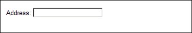
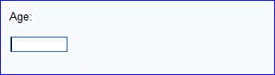
Let’s start with one of the simplest widgets, a text box. This widget replaces the standard HTML text field. Following is an example of a simple text field that would allow the user to type in an address.
Address: <input type="text" name="address" />
This field in this example is preceded by a label that describes the field on the web page. Figure 6.2 shows how this field would display on a page (in the absence of additional styling).
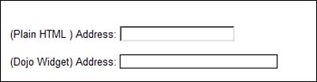
We’re going to replace this standard HTML widget with the Dojo equivalent, using the declarative method. This means we’ll use HTML markup within the body of the page to define the widget. The alternative is to use the programmatic method that uses JavaScript. The following HTML markup would build the Dojo widget.
    <br><br>(Plain HTML ) Address:
    <input type="text" name="address" />

    <br><br>(Dojo Widget) Address:
    <input type="text" name="address" dojoType="dijit.form.TextBox"/>
I also added some additional HTML to include the regular widget, the Dojo widget, and just a bit of formatting. Figure 6.3 shows how the original HTML text box and the Dojo text box would appear.
Remember, for the example to work, we’ve got to make sure we’ve included Dojo, started the parser, and included the widget code. We’ll repeat the code for this here, but for more detail, see the tutorial in Part I, “A Dojo Tutorial.”
        <script type="text/javascript"
            src="../dojo-release-1.0.2/dojo/dojo.js"
            djConfig="parseOnLoad: true"></script>

        <script type="text/javascript">
            dojo.require("dijit.form.TextBox");
        </script>
There are some obvious differences between the plain HTML widget and the Dojo widget. For instance, the background color for the Dojo widget is yellow. Why do these differences exist? To answer that question we need to examine the actual DOM elements that have been created. We’ll use the Firebug plug-in for Firefox to see the DOM elements represented as HTML.
      <br/><br/>(Plain HTML ) Address:
        <input type="text" name="address"/>

        <br/><br/>(Dojo Widget) Address:

        <input
            id="dijit_form_TextBox_2"
            class="dijitTextBox"
            type="text"
            autocomplete="off"
            dojoattachevent="onmouseenter:_onMouse,
                onmouseleave:_onMouse,
                onfocus:_onMouse,
                onblur:_onMouse,
                onkeyup,onkeypress:_onKeyPress"
            name="address"
            dojoattachpoint="textbox,focusNode"
            tabindex="0"
            widgetid="dijit_form_TextBox_2"
            value=""
            aaa:valuenow=""
            aaa:disabled="false"
            style=""/>
Firebug looks at the DOM after it is modified by the JavaScript on the web page and converts the DOM back to the equivalent HTML. You might expect that the HTML displayed from Firebug should be the same as the HTML we created in the original source for the page. And in the case of the HTML for the plain text widget, it is. However, the Dojo parser looks for Dojo widgets defined in HTML and replaces them with additional DOM elements and attributes. That is why the HTML we see from Firebug for the Dojo widget seems so much different from the HTML we typed into the source page.
Why are the differences there? The obvious answer is that Dojo put them there. But how? Dojo does it by replacing the entered HTML with alternate HTML, which it calls a template. The template contains most of the replacement HTML with a few hooks where Dojo can add some additional information.
Let’s review the HTML template for this widget. First we have to find it. The HTML markup containing the structure of a widget (its template) can be found by looking for its “template” directory in the path corresponding to its package name. Our widget is in the package “dijit.form,” so we should look for the template subdirectory at “dijit/form/template” as shown in Figure 6.4. The figure shows only the relevant directories and files, and your directory structure may be slightly different depending on the version of Dojo you are using.
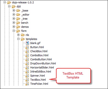
Below is the code in the “TextBox.html” file. It’s been reformatted by adding some line breaks to make it more readable. Otherwise, the code shown is exactly as what is in the file.
         <input
             class="dojoTextBox"
             dojoAttachPoint='textbox,focusNode'
             name="${name}"
             dojoAttachEvent='
                 onmouseenter:_onMouse,
                 onmouseleave:_onMouse,
                 onfocus:_onMouse,
                 onblur:_onMouse,
                 onkeyup,onkeypress:_onKeyPress'
             autocomplete="off"
             type="${type}"
         />
Now we can see why the HTML from Firebug looks different than what we entered in the source file. It has simply been replaced by the preceding template file. However, there are a few differences—a few places where Dojo has changed the value in the template. The first difference is in the following line from the template file.
name="${name}"Compare this to the same line from Firebug:
name="address"
How did “${name}” from the template get replaced with “address” in the final HTML? This was done by the Dojo parser, which looks for values in the template and replaces them with attributes from the actual HTML. The “$” character is a special symbol used to name a variable in the template file that will be replaced with an attribute value from the HTML markup with the same name. In other words, the name attribute from the HTML markup in the source was used. Remember, the name attribute was in the original HTML as shown as follows in bold.
    <br><br>(Plain HTML ) Address:
    <input type="text" name="address" />

    <br><br>(Dojo Widget) Address:
    <input type="text" name="address" dojoType="dijit.form.TextBox"/>
This value replacement is a general purpose process that can be used to substitute any attribute value into the template. It is a way of passing data from the HTML markup to the template. The same mechanism is used to pass type="text" into the template as well for the assignment of the type="${type}" line.
The id and widgetid attributes in the template are created automatically by Dojo. They can be assigned by setting the value of these attributes in the markup. In this case, Dojo made up some values based on a simple naming scheme.
There are also some new attributes that don’t seem to come from the template. These are autocomplete, tabindex, and value. They have also been added automatically by Dojo for this widget type. Different widget types also have some unique properties added. We explore these in later chapters when we examine individual widgets.
We now have a much better idea how Dojo is updating the DOM for this widget. However, there are still some open issues. For example, why does the text area for the Dojo widget appear longer and with a slightly different border? We need to examine how Dojo applies styles to widgets.
You may have noticed that the Dojo TextBox widget does not look the same as the standard HTML text box. This is because Dojo has applied some special styling to the widget. One of the three primary elements of every Dojo widget is the set of styles associated with it. How does the style get applied? We can answer that by examining one of the attributes in the DOM element for the widget we’ve been discussing. The following code comes from the HTML defined in the template file for the TextBox Dojo widget.
class="dojoTextBox"
The class attribute is used to associate various styles to the DOM element. The specific styles are unique to each widget. The TextBox widget uses only a single style, but many Dojo widgets use multiple styles. The various Dojo widget styles are defined in CSS files, which can be found in the Dojo directory structure.
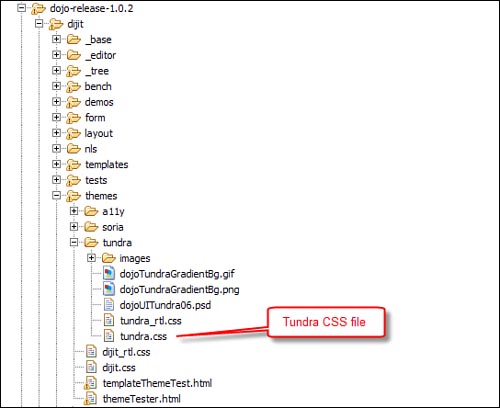
Inside the subdirectory “dijit/themes” we can find the file “dijit.css.” This file contains the styles for most of the Dojo widgets. Additionally, Dojo also provides a number of alternative themes that can be used to apply additional styling beyond the default.
Figure 6.5 shows a screen shot of the directory structure used to hold the various style sheets including images used by the styles.
We’ll look inside the “dijit.css” file and see if we can find the style information related to this widget. With just a bit of searching, we can find the following style definitions.
         .dijitTextBox,
         .dijitComboBox,
         .dijitSpinner {
                 border: solid black 1px;
                 width: 15em;
         }
This code assigns a solid black border to any DOM element whose class is either dijitTextBox, dijitComboBox, or dijitSpinner. It also assigns these elements a default width of 15em. The “em” is a unit of measure roughly equivalent to a character at the current font size.[2]
You can customize the style of a Dojo widget by adding properties to the appropriate style. For instance, if we wanted the background color of all TextBox widgets to be yellow, we could simply add the background property to the dijitTextBox style.
          <style>
          .dijitTextBox {
                  background: yellow;
          }
          </style>
Of course, you’ll probably want to include this in a separate CSS file so that you can use it from all your pages. This would allow you to create your own style on top of the Dojo default style. Dojo has done some of this work for us already. They’ve provided an additional style called Tundra that you can use as a base or as a model for your own themes.
We’re heading toward a complete understanding of Dojo widgets. Are we there yet? Not quite. There is one more element we need to review to complete our understanding of Dojo widgets. Now we’ll look at the JavaScript code associated with each widget we create.
A widget is a control that possesses behavior. But where does all that behavior reside? The functionality of a widget is provided by a JavaScript object associated with the widget that contains properties and methods not contained in the DOM element.
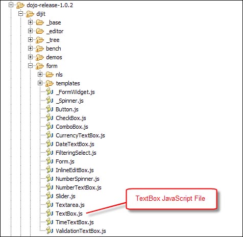
The JavaScript object is created from a constructor function defined for each widget. In the example we’ve been following for dijit.form.TextBox, we can find that constructor function in a file within the “dijit/form” subdirectory. Notice how the widget package name corresponds to a subdirectory in the Dojo directory structure. Figure 6.6 is a screenshot of the directory structure for TextBox showing only the files relevant for our example.
When we open up the “TextBox.js” file we will find the following code near the top of the file.
          dojo.declare(
                  "dijit.form.TextBox",
                  dijit.form._FormWidget,
The dojo.declare function will be described in more detail in Chapter 12, “Objects and Classes,” when we discuss Object Orientation, but here’s a brief description of it now. The dojo.declare function creates a constructor function that can be used to build new objects. The first parameter is the name of that constructor function. The next parameter defines the super class for the object being created. The new object will inherit all the properties and methods from the super class. Additional code (not shown) describes properties and methods in the object created by the constructor. To create a new object after dojo.declare has been defined, you just use the standard JavaScript technique for object creation using the new keyword.
newWidget = new dijit.form.TextBox();
The variable newWidget will now reference a JavaScript object. This object is not the DOM element itself, but a separate object associated with the Dojo widget. Like the wave/particle duality of light, Dojo widgets also have a dual nature existing as both a DOM element and a JavaScript object. As we’ve already discussed, there are two ways to create a Dojo widget—declaratively by including HTML markup or programmatically by using the new keyword as the preceding example shows. When we’re creating the widget using HTML markup, the Dojo parser automatically creates the widget object for us. So in both cases, the widget object is built from the constructor, but when using HTML markup, we don’t have to write the code ourselves.
What kinds of properties and methods are included in the constructor code? It all depends on the specific functionality of the widget. Each widget constructor is different, but there are some common characteristics. They all contain the following types of properties and methods:
Attributes—. An attribute is a property of the object that is used to specify some behavior or characteristic of the widget. It can be set by passing a parameter when calling the constructor function or by setting an attribute value in the HTML markup when declaratively creating the widget. In general, it is set only when the object is created. However, some widgets allow these properties to be modified by using special methods following the setter/getter naming convention. For example, an attribute called
valuecould be set by calling a method namedsetValueand passing the new value of the property. This technique is familiar to Java programmers who use JavaBeans. You should use these methods when they exist and avoid setting properties directly in the widget objects.Behavioral Methods—. These are the functions that define the specific behavior of the widget. These are different for each widget depending on what the widget does.
Extension Points—. These are really just methods, but they have a special role. They are meant to be overridden by developers to change the default behavior of the widget. This is a very powerful feature of Dojo widgets. You don’t have to just take what you get. Dojo widgets are built with the expectation that you can modify and extend them. These methods are not called directly but instead are called by other methods at a certain point in the lifecycle of the object—for example, when a widget object is created or deleted. The default implementation of the methods (the code inside them) usually does nothing. They just provide the developer with a place to add functionality to the object.
We talk about the specific properties and methods for Dojo widgets when we review each widget in subsequent chapters. But there are some specific examples of these components that all widgets share, which we can discuss now.
There are many different kinds of Dojo widgets available to us. And although each type of widget is unique, they share many common features. To understand how a widget acquires these shared features, we need to understand a little about an object-oriented programming concept called inheritance. This is the idea that we can build new objects by inheriting the capabilities of existing objects. All Dojo widgets have some similarities. One of the most important ways they are similar is that they all descend from a few classes from which they inherit a number of special properties and methods. In object-oriented programming languages, these special ancestor objects are knows as abstract objects because they can’t be built into usable objects themselves. They are not standalone widgets but act as placeholders for inheritable properties and methods.
Let’s review Figure 6.7, which allows us to visualize the various widget classes and their relationships.
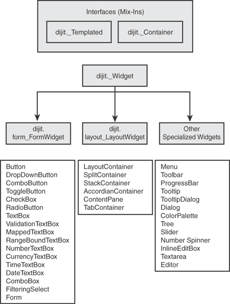
The diagram shows the overall relationship between the major widget classes. The diagram only shows a highly selective and abbreviated description of the class hierarchy for widgets. We’ll drill down more into these in later chapters. But I think it would be helpful now to at least get a brief description of some of the classes shown in the diagram.
dijit._Widget—. This is the root class for the hierarchy. Every widget is a subclass of this class.dijit._Templated. —This class provides methods for subclasses that can be built from templates of HTML code. Java programmers are accustomed to single inheritance, but Dojo provides a type of multiple inheritance by allowing an object to inherit from more than one class. Another way to think of this class is as an interface.dijit._Container—. This class provides methods for objects that can contain other widgets as children. This class can also be thought of as an interface.dijit.form._FormWidget—. This is the root class for widgets that will appear on a form.dijit.layout._Layout—. This is the root class for widgets that provide some kind of a layout mechanism that can contain other widgets.Specialized Widgets—. This isn’t an actual Dijit class, but I’m using it as a placeholder for all the Dojo widgets that are not part of the Form or Layout package.
Figure 6.7 contains many other widget classes besides those just described. We discuss these in detail in Chapters 7, 8, and 9, but we should describe some of them now. We’ll start with the most important class, dijit._Widget.
The abstract class dijit._Widget is the root class from which all widget objects descend. Notice a few characteristics of the class name that give us hints about its purpose. One is the use of the underscore character in the name. This tells us that this is a class to be used internally by Dojo—we won’t create instances of this class ourselves as Dojo users. The other hint is that there is no subpackage name, which tells us that this class applies to all widgets. So this class is the “mother” of all widgets. It has properties and methods that are shared by every Dojo widget object that we will create. Table 6.1 shows some of the important ones.
Table 6.1. Key Properties of dijit._Widget Object
Property | Description |
|---|---|
| This is a unique identifier for the widget that can be assigned by Dojo or by the developer. |
| HTML class attribute. |
| HTML style attribute. |
| HTML title attribute. |
| Reference to the DOM element in the page associated with this widget prior to processing by the Dojo parser. |
| This is the root-level DOM element representing this widget. This is the node that is added to the DOM. This node may exist without actually yet being associated with the DOM. |
Table 6.2 shows some of the methods in dijit._Widget.
Table 6.2. Key Methods of dijit._Widget Object
Description | |
|---|---|
| This function creates the widget. |
| This is a stub function that you can override to modify take actions after the widget has been placed in the DOM. There is no requirement to call this function. |
| This is a life-cycle function that can be called after the all the widget’s children have been created but not yet displayed. This is a stub function containing no code. There is no requirement to call this function. |
| This is a life-cycle function that can be used to override properties in the widget. It is a stub function containing no code. There is no requirement to call this function. |
| This function actually creates a DOM element for the widget. This function can also be overridden by code in the |
| Destroy this widget and its descendants. |
| This function returns all the children of this widget. |
| This function is used to associate an event handler with a function within the widget. |
| This function is used to remove an event handler from the widget. It is the reverse of |
It isn’t enough just to know what methods are available in dijit._Widget. We also need to know when they are called and how. In other words, what are the lifecycle methods for each and every widget? Fortunately for us, it is pretty easy to create a good idea of the important methods by looking at the create method for Widget. This is the method that is called when a widget is created, either by the parser as it works through the HTML or by the constructor function of the widget we are building programmatically.
Following is the main code from the create method. The code has been reformatted and some additional comments added to further explain the comments you have read in these sections.
//mixin our passed parameters
if(this.srcNodeRef && (typeof this.srcNodeRef.id == "string")){
    this.id = this.srcNodeRef.id;
}
if(params){
    dojo.mixin(this,params);
}

this.postMixInProperties();

if(!this.id){
    this.id=dijit.getUniqueId(this.declaredClass.replace(/./g,"_"));
}

dijit.registry.add(this);

this.buildRendering();

// Copy attributes listed in attributeMap into
// the [newly created] DOM for the widget.
. . .

if(this.domNode){
        this.domNode.setAttribute("widgetId", this.id);
}

this.postCreate();

// If srcNodeRef has been processed and removed
// from the DOM (e.g. TemplatedWidget) then delete it to allow GC.
if(this.srcNodeRef && !this.srcNodeRef.parentNode){
        delete this.srcNodeRef;
}
Let’s walk through each section and describe the key processing steps.
Table 6.3. Key Methods Called as Processing Steps During Widget Creation
| A stub function that you can override to modify variables that may have been naively assigned by the |
| Method which performs UI initialization including attachment of additional DOM nodes to the root DOM element for the widget. |
| A stub function that you can override to modify take actions after the widget has been placed in the UI. |
At this point it would be useful to see some of the widgets. This will give you a good idea of the breadth of the Dojo widget set. The widgets are divided into general categories that correspond to the way the widgets are packaged. Most of these widgets have numerous properties that can be set to enable additional functionality. We only show the simplest version of each widget just to give you an idea of what they do. We drill down into each widget in subsequent chapters and see their full power.
Many of these examples are modified versions of test pages available in the Dojo distribution directory at “dijit/tests.”
These widgets appear in the form package. Their basic purpose is to display some data and provide the user with a way of modifying that data that is appropriate for the data type.
Table 6.4. Examples of Form Widgets
Description | Example |
|---|---|
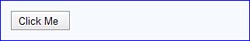
Button This replaces the standard HTML button. It looks nicer and has a slightly better effect on rollover. | |
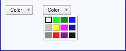
DropDownButton When this button widget is clicked, it will display whatever widget is defined as its child. In the example, the leftmost widget is the widget before it is clicked. The rightmost example shows the same widget after it has been clicked. It displays its child widget, which in this case is a ColorPalette but could be any valid widget (menus are very typical). | |
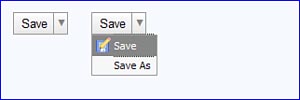
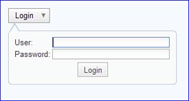
ComboButton This widget combines a regular Button widget with a DropDownButton widget, hence the name ComboButton. The leftmost example shows the widget before the down arrow is selected. The rightmost example shows the widget after the down arrow icon has been checked. The user can click either on the down arrow icon or on the button itself. | |
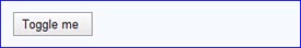
ToggleButton | |
This button looks the same as a regular Button but behaves differently. When the button is clicked, the button CSS as well as the icon CSS can change. | |
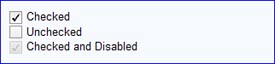
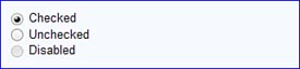
CheckBox | |
This replaces the standard HTML checkbox. It looks nicer and has a better check icon. | |
RadioButton | |
This replaces the standard HTML checkbox. The advantages are a nicer look and a better checked icon. | |
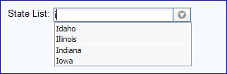
FilteringSelect This widget is an enhanced version of the HTML | |
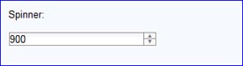
NumberSpinner This is really just a text box for entering numbers but with a special feature: Up and down arrow keys can be used to increase or decrease the value instead of the person having to type it directly. | |
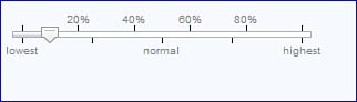
Slider This widget is also a replacement for a simple numeric text value, but instead of entering the number directly you drag an icon (the slider) across a bar of values. The value for the widget is determined by the position of the slider on the bar. | |
Textarea This widget is a replacement for the standard HTML | |
TextBox This widget is a replacement for the | |
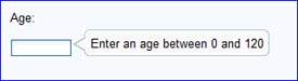
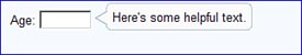
ValidationTextBox This widget extends TextBox and adds various kinds of validations including those for dates, times, and numbers. Messages and prompts are automatically displayed. | |
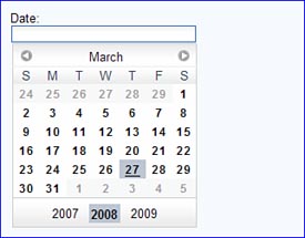
DateTextBox This widget extends TextBox by providing the user with a calendar metaphor for selecting a date. The widget looks like a TextBox on the page, but when the field is in focus, a pop-up calendar appears. This is a complex widget possessing a number of controls that allow the user to sequence through days, weeks, or years. And, of course, the look is easily customized by the developer. |
These widgets appear in the layout package.
Table 6.5. Examples of Layout Widgets
Description | Example |
|---|---|
LayoutContainer This widget provides a technique for dividing the page into separate areas for placing content. The areas can be aligned to the “top,” “bottom,” “right,” or “left.” Think of this widget as a replacement for using a table to provide layout. | |
SplitContainer This widget allows the user to define different areas, either vertically or horizontally, that can contain content. Between the areas is a border dragged to change the relative sizes of the panes. Any content within a pane can be automatically reformatted. The callout is not part of the widget. | |
StackContainer This is a container that has multiple children but only displays a single child at a time. It usually depends on some external control (like the prior page and next page buttons in this example) to allow the user to trigger the display of a different child. Otherwise, it looks like a typical ContentPane. | |
AccordianContainer | |
This widget acts as a container for its children. Only one child at a time is displayed (as with the StackContainer). However, the controls are built into this widget and display as pane titles with an arrow icon that can be used to collapse the displayed content and expand the hidden content. | |
ContentPane This widget that acts as a container for other widgets and includes the capability for dynamically loading content using Ajax. | |
TabContainer This widget acts as a container for its children and only displays a single child at a time. However, just like the AccordianContainer, its controls are built in and appear as tabs. By selecting a particular tab, the content associated with that tab is displayed. |
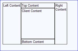
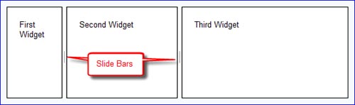
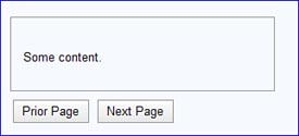
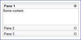
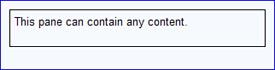
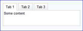
Table 6.6. Examples of Other Specialized Dojo Widgets
Description | Example |
|---|---|
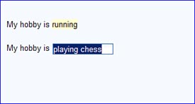
InlineEditBox This widget displays text that will be highlighted when the user places the mouse over it. Clicking the highlighted text causes it to be replaced with a different widget that can be used for editing. In this example, the user clicks the word “running” in the first line, which is then replaced with a TextBox that the user can enter a new value in. | |
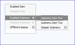
Menu This widget displays a popup menu that can be nested as deeply as the developer wants. Menu items can be separated with a line icon or disabled. | |
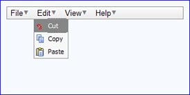
Toolbar | |
A toolbar presents a series of options or icons that can display additional content (including submenus) or trigger some process to occur. | |
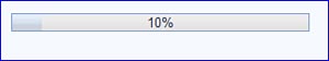
ProgressBar This widget is used to represent the completion state of a process. In this example, the current state of the widget is shown as a number (i.e., 10%), and the bar is partially filled in at the left. | |
Tooltip This widget displays a popup. | |
TooltipDialog Pops up a dialog that appears like a Tooltip. It may contain any content including a form. The page behind the widget is still active. | |
Dialog | |
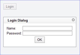
This widget provides a pop-up dialog containing content that may include a form (as shown in the example). When the dialog appears, the original page is disabled. This is sometimes known as a modal dialog. The page does not become active until the dialog is dismissed. | |
ColorPalette | |
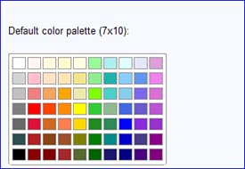
This widget displays color swatches that can be selected by the user. The widget will automatically convert the selected color into its RGB value for use inside the page. | |
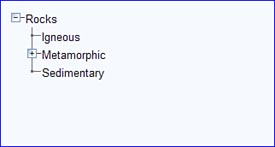
Tree This widget displays data in a hierarchical tree with nodes that can be expanded or collapsed. You can specify an icon for each node. One of the major features of the tree widget is the ability to build itself from data on the server by making Ajax requests when either the tree is first built or when nodes are expanded. |
The visual guide provides a quick introduction to many of the widgets available to you in Dojo. However, there are some we didn’t cover, which we review in subsequent chapters. Also remember that Dojo is constantly being improved, and new widgets are becoming available all the time.
Dojo widgets are highly customizable. You can change the way they look by changing their style properties. You can control their behavior by setting properties and by providing overrides to the various life-cycle methods. However, sometimes you may just want to build your own widget. The various base classes such as dijit._Widget, dijit.form._FormWidget, and dijit.layout._LayoutWidget are perfect starting points for creating new widget classes of your own.
Now that we’ve seen how Dojo widgets work in general (and we’ve seen some examples of specific widgets), we can begin a detailed study of the various widgets available in Dojo. The next chapter explores each of the Form widgets in detail.
[1] Red Hat Linux 6.2: The Official Red Hat Linux Getting Started Guide: http://www.redhat.com/docs/manuals/linux/RHL-6.2-Manual/getting-started-guide/ch-glossary.html.
[2] For a more detailed explanation of “em,” you can read the Wikipedia explanation at http://en.wikipedia.org/wiki/Em_%28typography%29.