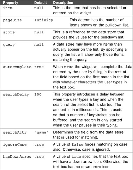
As with creation, there was a point when the World Wide Web itself was also without form, <form> tags that is. But we certainly have them now, and they are the primary technique for gathering data from the user. Standard HTML provides a number of useful form widgets such as text boxes, radio buttons, check boxes, and select lists. However, these widgets are limited and a bit primitive especially considering that users today are clamoring for Rich Internet Applications with user interfaces rivaling those of some desktop applications. Dojo provides replacements for these standard widgets along with many new widgets that can be used in forms to collect information from the user of our pages. This chapter drills down into the details of the Dojo form widgets.
To begin our discussion of form widgets, let’s go back to first principles for a moment. Why do we need forms at all? We need them so that we can capture data from the user and send it to the server for processing. But we don’t really send forms to the server; we send the individual data elements. Remember what a query string looks like in a URL? Here’s an example of something you might see in the address bar of the browser:
submit.jsp?name=Joe&id=123&type=new
In this example we have three data fields being sent from the browser (name, id, and type) along with their values (“Joe,” 123, “new”). But where is the form? The form is the aggregation of the data but doesn’t appear as a distinct component in the URL. However, within the HTML for the page, it certainly has a distinct identity and its own tag: <form>. We need it so we can specify characteristics of the entire form such as the action (server resource to be requested) and the method type (“GET” or “POST”). So we need a form widget, and Dojo provides one for us that allows us to treat the form as a Dojo object and gives us a few additional methods that make it easier to use.
However, the real meat in this chapter is in the form element widgets. These are the components that capture the actual data and associate it with a logical name to be used on the server. To make this more concrete, let’s look at just one of the name/value pairs from the prior URL example.
id=123
From this we can tell that there is a field (or variable) called “id,” which was given a value of “123” by the user. This doesn’t tell us anything about how the user entered the value. Did they do it by typing it in, selecting it from a pull-down list, or maybe even just checking a radio button that was associated with the value. The server doesn’t know, and it doesn’t care—and it shouldn’t. The server just cares about the data value. But for the user, the “how” is very important. They need a widget that makes it easy and intuitive for them to enter the right value. And that is why we need a number of form widgets—to present different metaphors to the user for entering and validating data. So for us, a form widget is simply a visual component of the page that captures a single data value but does it in a way that corresponds to the user’s understanding of the data. For example, the technique for selecting a data value for a date should be different than that of selecting an RGB value for color. Each should have its own unique visual metaphor, and Dojo provides snazzy widgets for both!
Now let’s explore the technical details of the Dojo form widgets.
Form widgets are used to capture entered values from the user so that the data can be submitted to the server. The simplest examples of these widgets are the replacements for the standard HTML form elements such as text fields, multi-line text fields, radio buttons, check boxes, and select lists. Each acts as an individual data element on a form. Dojo provides us with souped-up versions of these HTML elements along with some new widgets that have no HTML counterparts.
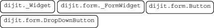
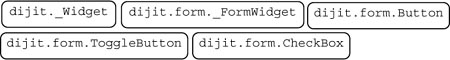
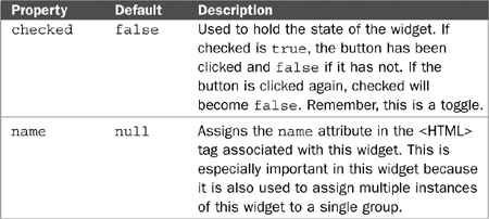
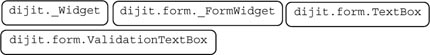
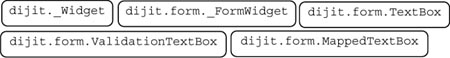
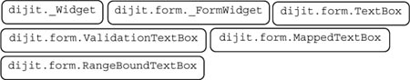
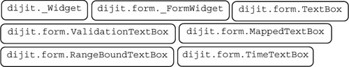
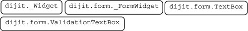
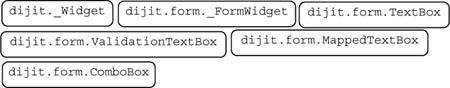
Although there are many different Dojo form widgets, they have many common features. The Dojo widgets are built using an object-oriented approach, which implies that a new widget should be able to inherit properties from more general widgets. The most general widget of all is dijit.form._FormWidget, which can be described as “the mother of all form widgets.” In other words, any Dojo widget we create in the form package inherits properties and methods from this class. Remember, inheritance is additive. A form widget will possesses all the properties and methods in its own class plus any from the dijit.form._FormWidget class. And also remember that in Chapter 6 we studied the base class for all widgets: dijit._Widget. The form widget dijit.form._FormWidget is a subclass of dijit._Widget, so any individual form widgets would also inherit all dijit._Widget methods and properties.
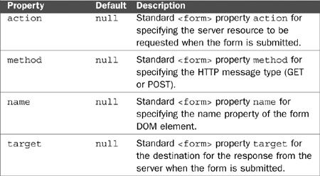
Let’s review the properties and methods that all widgets have in common by studying the members of the dijit.form._FormWidget class. We’ll review the key properties and methods. To see a full list of every property and method, you should review the source code for the widget.
You may notice that many of the properties have a null value in FormWidget. This is because they are common properties of all form widgets, but each specific widget must assign its own value for the property. The reason that they don’t need values in FormWidget is that we will never build a FormWidget object directly. We’ll build one of its subclasses. That makes FormWidget an abstract class.
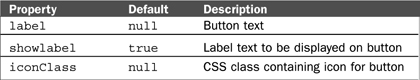
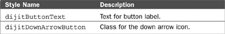
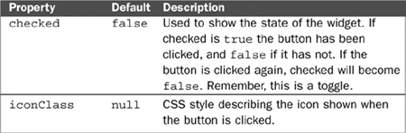
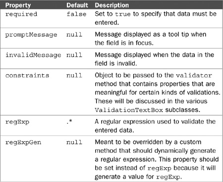
Table 7.1. dijit.form._FormWidget Properties
Property | Default | Description |
|---|---|---|
|
| CSS class for this widget used to associate styles. |
|
| Used to assign the |
|
| Used to assign the |
|
| Used to assign the |
|
| Used to assign the |
|
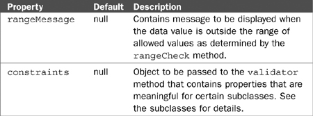
| Determines whether the user can interact with this widget. A value of |
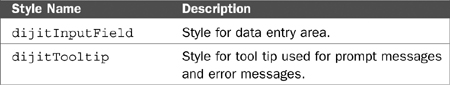
We seem to be missing some important properties. For instance, where is the style property that defines styles for a DOM element? Remember, dijit.form._FormWidget inherits from dijit._Widget, and it is dijit._Widget that contains the definition for the style property.
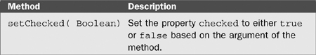
Here are the key methods for dijit.form._FormWidget. Again, these aren’t all the methods, just the ones I felt were important. There are more in the source code.
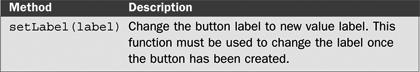
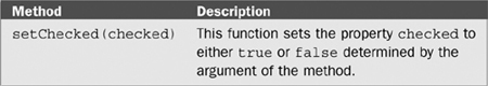
Table 7.2. dijit.form._FormWidget Methods
Description | |
|---|---|
| Turns the widget on or off based on the argument this.domNode.disabled =
this.disabled = disabled; |
Notice that both the DOM element and the Dojo widget have a | |
| Returns |
| Places the widget in focus. This places the cursor on the widget. |
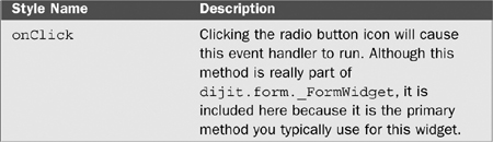
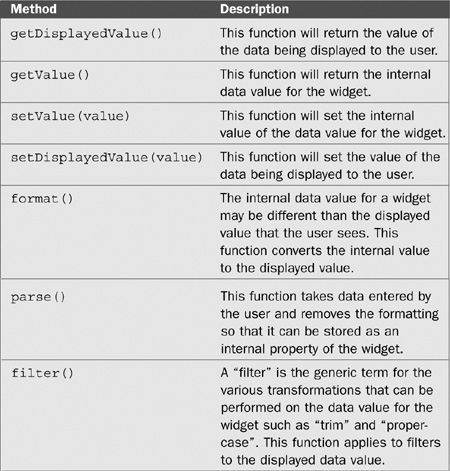
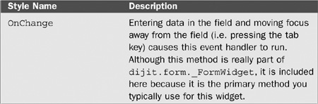
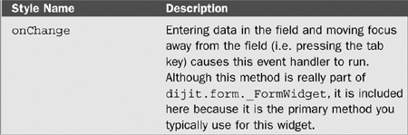
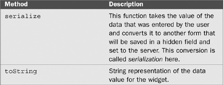
| This is the method that you would override to add your own behavior to the widget when the user enters some new data. If you look at the code for this method, you’ll notice that it doesn’t do anything. It is a stub method that can be replaced by your own code—although you don’t have to. |
| Programmatically change the value of the widget to |
| Returns the current value of the widget. |
| Resets the value of the widget to the last value passed to the |
This section provides a detailed write-up, usually two pages long, describing each of the form widgets in a standard format. But first, the following are some suggestions on how to use these write-ups, and a description of each of the categories in the write-ups.
Table 7.3. Legend for Dojo Widget Documentation
Widget Name | This is the full name of the widget including the package name. For example, |
Super Classes | Widgets inherit properties and methods from their super classes. This shows the class hierarchy for the widget. There are some missing pieces here. Some of the classes that act as interfaces aren’t shown, |
File Location | This contains the location of the file containing the JavaScript source code for the widget. You don’t need to look at the source code, but here’s some advice: Don’t be afraid to look at the source code. It is very well written and very instructive. A wise developer once said that a programmer who doesn’t read the source code is really no better than one who can’t read the source code. Let’s not be that developer. |
This section also contains the JavaScript code necessary to include this widget in your page. Declaring the widget in the HTML is not enough. | |
Usage | This describes when you might use the widget and describes the behavior of the widget. |
Display Examples | This shows you some examples of what the widget would look like on your page. |
HTML Markup Examples | This shows the HTML that you would need to include in your page to create the widget. Remember, you can create the widget either in HTML or JavaScript. The HTML markup method is also known as the declarative method. |
JavaScript Constructor Examples | This shows the JavaScript code you would need to create your widget. This is the programmatic method of creating the widget. When you create a widget this way, it is not automatically included in the DOM; you need to explicitly attach it; otherwise, it won’t be usable. |
Key Properties | These are some of the important properties of the widget. I usually only show properties unique to the class and not the ones that are inherited from super classes. However, sometimes the really important properties are the inherited ones so they are listed. |
Key Methods | These are some of the important methods of the widget. |
Key Styles | Need explanation from Jim. |
Key Events | These are some of the important events of the widget. |
Notes | This contains additional items of interest about the widget. |
One final note before we begin the form widget write-ups. The write-ups do not attempt to document every aspect of each widget. They provide a summary of each widget. These write-ups balance completeness versus succinctness. When you really need all the details you should go to the Dojo site to review documentation, the API, and the forums. You should also dive into the source code.
Also there are a few form widgets that are more complicated and specialized. I’ve chosen to put those in Chapter 8, “Dojo Layout Widgets.” These include the Slider, Number Spinner, InlineEditBox, Textarea, and Editor.
Table 7.4. Explanation of Dojo Form Widgets
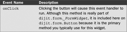
Widget Name | dijit.form.Button |
Super Classes | |
File Location | dijit/form/Button.js Use |
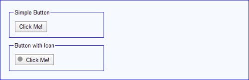
Usage | This class will create a button icon that triggers some behavior when clicked. This button replaces the standard HTML |
Display Examples | |
HTML Markup Examples | Create a simple button. <button dojoType="dijit.form.Button" label="Click Me" /> Create a simple button with an icon: <button dojoType="dijit.form.Button"
label="Click Me" iconClass="circleIcon" />Example CSS for icon .circleIcon {
background-image: url(circleIcon.gif);
background-repeat: no-repeat;
width: 16px;
height: 16px;}Create a simple button with the label defined by placing text in the tag body: <button dojoType="dijit.form.Button" onclick="handler">
Click here!
</button>Note: This example also shows how to create behavior by assigning a function named |
JavaScript Constructor Examples | Constructor for creating a new new dijit.form.Button({label: "Click me"}, dojo.byId("form1"); |
This code automatically adds the widget to an existing widget in the DOM whose id is “form1”. If you don’t specify a node for attaching the widget, it will not appear on the page. | |
Key Properties | |
Key Methods | |
Key Styles | |
Key Events | |
Notes | You can also attach an dojo.connect( dojo.byId("btn1"), "onclick", handler); |
dijit.form.DropDownButton | |
Super Classes | |
File Location | dijit/form/Button.js Use |
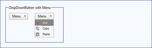
Usage | This class creates a button icon that displays its child element when clicked. The child element can be any widget type. This widget is named as it is because it makes the creation of drop-down menus very simple. By default, the displayed content appears just below the button. |
Display Examples |
The examples here show what the widget looks like before it is clicked and then after. The rightmost image shows how the widget appears after it is clicked. |
HTML Markup Examples | Create a <div dojoType="dijit.form.DropDownButton"> <span>Menu</span> <div dojoType="dijit.Menu"> <div dojoType="dijit.MenuItem" iconClass="dijitEditorIcon dijitEditorIconCut">Cut</div> <div dojoType="dijit.MenuItem" iconClass="dijitEditorIcon dijitEditorIconCopy">Copy</div> <div dojoType="dijit.MenuItem" iconClass="dijitEditorIcon dijitEditorIconPaste">Paste</div> </div> </div> In this example, the child widget is a |
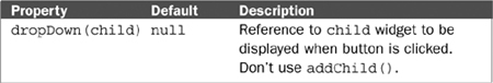
JavaScript Constructor Examples | Constructor for creating a new btn1 = new dijit.form.DropDownButton({label: "Menu"};This code creates the widget, but it must be attached as a child of some DOM element to be visible on the page. For this widget to be useful you must also attach a child widget that will be displayed when the button is activated. Let’s say that you’ve already created a btn1.dropDown = menu; This is necessary because a bit of processing needs to be done to make the widget hidden, so just adding the new widget as a child of the button using |
Key Properties | |
Key Methods | There are no additional public methods for this widget, just those that have been inherited from its super classes. |
Key Styles | There are no additional public key styles for this widget, just those that have been inherited from its super classes. |
Key Events | There are no additional public events for this widget, just those that have been inherited from its super classes. |
Notes | The power of this widget comes from its ability to display any other widget on activation, but its most typical use is to display menus. |
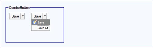
dijit.form.ComboButton | |
Super Classes | |
File Location | dijit/form/Button.js Use |
Usage | This class creates a button combining the features of a |
Display Examples |
The rightmost widget shows what would display if the user clicks the down arrow icon on the widget. |
HTML Markup Examples | Create a <div dojoType="dijit.form.ComboButton">
<span>Save</span>
<div dojoType="dijit.Menu" id="saveMenu1">
<div dojoType="dijit.MenuItem"
iconClass="dijitEditorIcon dijitEditorIconSave">Save</div>
<div dojoType="dijit.MenuItem">Save As</div>
</div>
</div>Remember to include |
JavaScript Constructor Examples | Constructor for creating a new new dijit.form.ComboButton({label: "Save"},
dojo.byId("form1");This code automatically adds the widget to an existing widget in the DOM whose id is “form1”. If you don’t specify a node for attaching the widget, it will not appear on the page. |
Key Properties | There are no additional public properties for this widget, just those that have been inherited from its super classes. |
Key Methods | There are no additional public methods for this widget, just those that have been inherited from its super classes. |
Key Styles | |
Key Events | There are no additional public events for this widget, just those that have been inherited from its super classes. |
Notes | None |
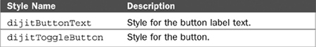
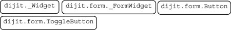
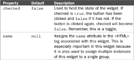
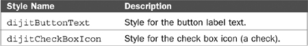
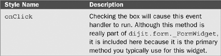
dijit.form.ToggleButton | |
Super Classes | |
File Location | dijit/form/Button.js Use |
Usage | This class creates a button that can be in two states (checked or not). Use this widget to provide users with a means of flipping some internal state. It looks like a regular |
Display Examples | |
HTML Markup Examples | Create a simple <button dojoType="dijit.form.ToggleButton"
iconClass="dijitCheckBoxIcon">
Toggle
</button> |
JavaScript Constructor Examples | Constructor for creating a new ToggleButton with a label of “Click me”: new dijit.form.ToggleButton({label: "Toggle"},
dojo.byId("form1");This code automatically adds the widget to an existing widget in the DOM whose id is “form1”. If you don’t specify a node for attaching the widget, it will not appear on the page. |
Key Properties | |
Key Methods | |
Key Styles | |
Key Events | |
Notes | ToggleButton is a base class for checkboxes and radio buttons. |

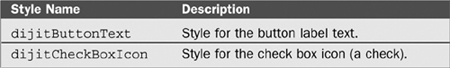
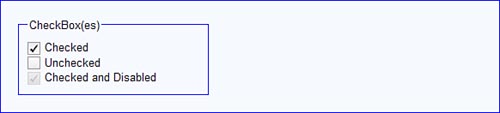
dijit.form.CheckBox | |
Super Classes | |
File Location | dijit/form/CheckBox.js Use |
Usage | This class creates a widget that can be in two states (checked or not). These widgets can be combined into a group. This is a replacement for the HTML |
Display Examples | |
HTML Markup Examples | Create a simple <input dojoType="dijit.form.CheckBox" checked="checked" name="c1"> Checked</input><br> <input dojoType="dijit.form.CheckBox" name="c1"> Unchecked</input><br> <input dojoType="dijit.form.CheckBox" checked="checked" disabled="disabled" name="c1"> Checked and Disabled </input> |
JavaScript Constructor Examples | Constructor for creating a new new dijit.form.CheckBox({name: "c1", checked: true});This constructor only created the |
Key Properties | |
Key Methods | |
Key Styles | |
Key Events | |
Notes | Use an |

dijit.form.RadioButton | |
Super Classes | |
File Location | dijit/form/CheckBox.js Use |
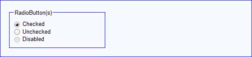
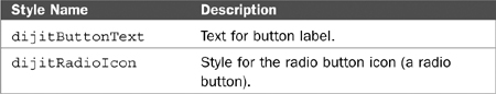
Usage | This class creates a widget that can be in two states (checked or not). These widgets can be combined into a group. This is a replacement for the HTML |
Display Examples | |
HTML Markup Examples | Create a simple set of <input type="radio" name="rb" dojoType="dijit.form.RadioButton"
checked="checked" name="rb1">
Checked
</input><br>
<input type="radio" name="rb" dojoType="dijit.form.RadioButton">
Unchecked
</input><br>
<input type="radio" name="rb" dojoType="dijit.form.RadioButton"
disabled="disabled" >
Disabled
</input> |
JavaScript Constructor Examples | Constructor for creating a new RadioButton: new dijit.form.Radiobutton({name: "c1", checked: true});This constructor only created a single |
Key Properties | |
Key Methods | |
Key Styles | |
Key Events | |
Notes | None |
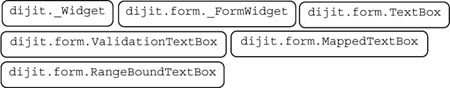
dijit.form.TextBox | |
Super Classes | |
File Location | dijit/form/TextBox.js Use |
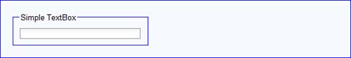
Usage | Creates a generic textbox field. This widget can be used as a replacement for the |
Display Examples |
A label would usually be associated with this field but is not part of the widget itself. |
HTML Markup Examples | Create a simple TextBox <input type="text" name="f1" dojoType="dijit.form.TextBox"/> |
JavaScript Constructor Examples | Constructor for creating a new new dijit.form.TextBox({}, dojo.byId("form1");This code automatically adds the widget to an existing widget in the DOM whose id is “form1”. If you don’t specify a node for attaching the widget, it will not appear on the page. |
Key Properties | |
Key Methods | |
Key Styles | |
Key Events | |
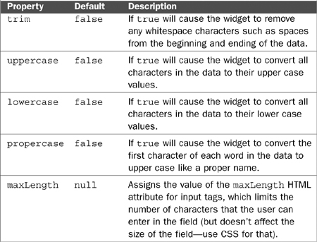
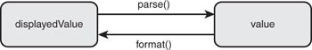
Notes | Even though this class is used as a root class for other more useful validating textbox types, it can still be used by itself and often is when validation is not required. The This widget allows the user to enter a single field. However, you can think of the data for the entry as being stored in two properties. The first property, The default behavior for these methods is to perform no transformation so that the internal |
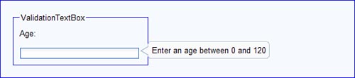
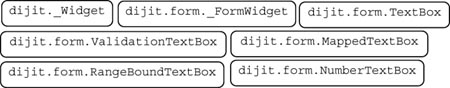
dijit.form.ValidationTextBox | |
Super Classes | |
File Location | dijit/form/ValidationTextBox.js Use |
Usage | This widget can be used as a replacement for the |
Display Examples |
This widget requires that a value be entered. The prompt message appears when the widget is in focus and no value has been entered. |
HTML Markup Examples | Create a simple <input id="q01" type="text" name="age"
dojoType="dijit.form.ValidationTextBox"
promptMessage="Enter an age between 0 and 120"
required="true" /> |
JavaScript Constructor Examples | Constructor for creating a new new dijit.form.ValidationTextBox(
{ promptMessage: "Enter an age between 0 and 120",
required: "true"},
dojo.byId("form1");This code automatically adds the widget to an existing widget in the DOM whose id is “form1”. If you don’t specify a node for attaching the widget, it will not appear on the page. |
Key Properties | |
Key Methods | |
Key Styles | |
Key Events | |
Notes | The regular expression validation is extremely powerful. Regular expressions can be created for a huge variety of validations, although they can be somewhat difficult to work with at first. Regular expression syntax is beyond the scope of the book, but many good references exist. |

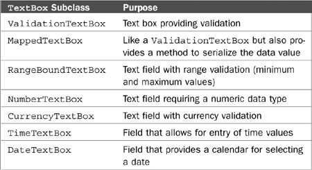
dijit.form.MappedTextBox | |
Super Classes | |
File Location | dijit/form/ValidationTextBox.js Use |
Usage | This widget is the same as Although it is possible to create widgets from this class it usually isn’t done. Instead, this is used as a base class for other validation widgets. You could think of this as an abstract class used to implement inheritance in the class hierarchy. |
Display Examples | Not applicable. |
HTML Markup Examples | Not applicable. |
JavaScript Constructor Examples | Not applicable. |
Key Properties | None |
Key Methods | |
Key Styles | None |
Key Events | Not applicable. |
Notes | This widget is used as a base class for other validation wizards and would probably not be used directly. You might wonder what the purpose of the |
dijit.form.RangeBoundTextBox | |
Super Classes | |
File Location | dijit/form/ValidationTextBox.js Use |
Usage | This widget is a subclass of |
Display Examples | Not applicable. |
HTML Markup Examples | Not applicable. |
JavaScript Constructor Examples | Not applicable. |
Key Properties | |
Key Methods | |
Key Styles | None |
Key Events | None |
Notes | None |
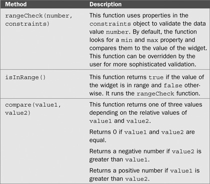
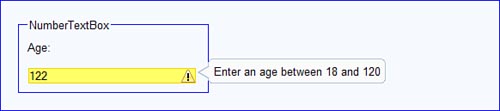
dijit.form.NumberTextBox | |
Super Classes | |
File Location | dijit/form/NumberTextBox.js Use |
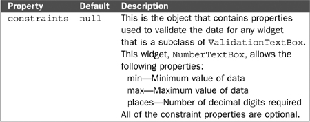
Usage | This class creates a widget that subclasses |
Display Examples |
This figure shows the |
HTML Markup Examples | Following is the HTML for creating a simple <inputtype="text" name="age"
dojoType="dijit.form.NumberTextBox"
promptMessage="Enter an age"
rangeMessage="Enter an age between 18 and 120"
constraints="{min:18,max:120}"
required="true" />Notice that the |
JavaScript Constructor Examples | Create a var obj = {
name: "temperature",
value: 98.6,
constraints: {min:90,max:110,places:1},
promptMessage: "Enter a value between 90 and 110",
required: "true" ,
invalidMessage: "Invalid temperature."
};
var f1 = new dijit.form.NumberTextBox(obj, "form1");Notice that the |
Key Properties | |
Key Methods | None |
Key Styles | None |
Key Events | None |
Notes | None |
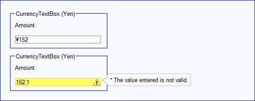
dijit.form.CurrencyTextBox | |
Super Classes | |
File Location | dijit/form/CurrencyTextBox.js Use |
Usage | This class creates a widget that subclasses |
Display Examples |
This example displays an amount in Japanese, which is always formatted as a whole number without decimal digits. The bottom example shows what happens when you try to enter decimal digits in a field expecting an amount in yen. The symbol for yen is not entered by the user but is supplied automatically after the data is entered and focus leaves the field. |
HTML Markup Examples | The following HTML would create a widget for entering an amount in Japanese yen. <input id="field1" type="text" name="total" dojoType="dijit.form.CurrencyTextBox" required="true" currency="JPY"/> The following HTML would create a widget for entering an amount in U.S. dollars. The user would not be required to enter the decimal digits. <input id="field1" type="text" name="total"
dojoType="dijit.form.CurrencyTextBox"
required="true"
currency="USD"
constraints="{fractional:false}"/> |
JavaScript Constructor Examples | Create a var obj = {
name: "cost",
promptMessage="Enter the item cost."
constraints="{fractional: true}"
currency="USD"
};
var f1 = new dijit.form.CurrencyTextBox(obj);This widget must still be added to the DOM so it displays on the page. |
Key Properties | |
Key Methods | None |
Key Styles | None |
Key Events | None |
Notes | None |
[1] For a detailed explanation of currency codes, visit the following page on Wikipedia: http://en.wikipedia.org/wiki/ISO_4217 | |
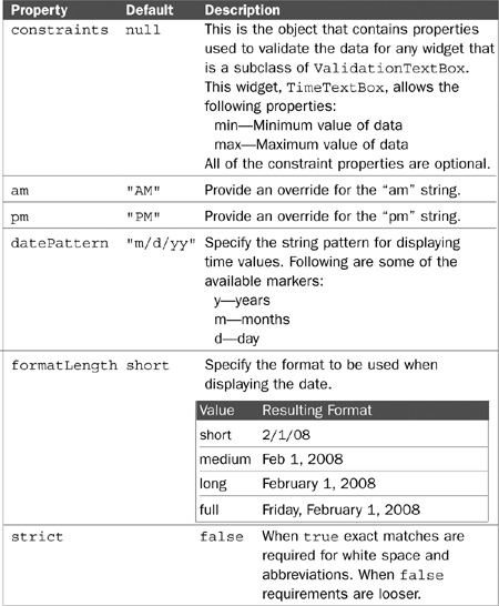
dijit.form.TimeTextBox | |
Super Classes | |
File Location | dijit/form/TimeTextBox.js Use |
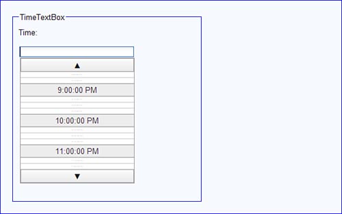
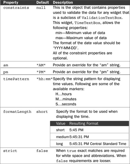
Usage | This class creates a widget that allows the user to enter data representing time. It also performs validation on the data to ensure that it is a time value and that it is in an appropriate format. The widget can be configured so that various time formats can be selected. Another very useful feature of this widget is its ability to display a scrollable list of times from which the user can select a value. So there is no need to actually type the time. This feature is provided by a special pop-up widget created from the There are many formatting options for displaying time and date data. Dojo uses the Unicode locale conventions, which are explained in more detail at the Unicode Consortium web site. The URL for additional information on date and time conventions is as follows: |
Display Examples |
This example shows the widget after the user has clicked in the data entry area. A popup appears displaying the The |
HTML Markup Examples | Here is the HTML markup for creating a widget to display a time using the “medium” value for <input id="time1" type="text" name="time1"
dojoType="dijit.form.TimeTextBox"
constraints="{formatLength:'medium'}"
/> |
JavaScript Constructor Examples | Create a var obj = {
name: "time",
promptMessage="Enter the time.",
constraints="{formatLength: 'medium'}"
};
var f1 = new dijit.form.TimeTextBox(obj);This widget must still be added to the DOM so it displays on the page. |
Key Properties | |
Key Methods | None |
Key Styles | None |
Key Events | None |
Notes | None |
dijit.form.DateTextBox | |
Super Classes | |
File Location | dijit/form/DateTextBox.js Use |
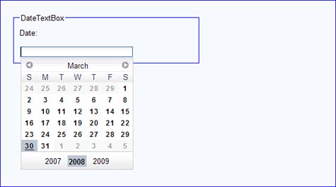
Usage | This class creates a widget that allows the user to enter data representing a date. It also performs validation on the data to ensure that it is a properly formatted date value. The widget can be configured so that various date formats can be specified. Another very useful feature of this widget is its ability to display a calendar from which the user can select a value. This feature is provided by a special pop-up widget created from the There are many formatting options for displaying time and date data. Dojo uses the Unicode locale conventions, which are explained in more detail at the Unicode Consortium web site. The URL for additional information on date and time conventions is as follows: |
Display Examples |
This example shows the widget after the user has clicked in the data entry area. A popup appears displaying the |
HTML Markup Examples | Here is the HTML markup for creating a widget for entering date values: <input id="date1" type="text" name="date1"
dojoType="dijit.form.DateTextBox"
/> |
JavaScript Constructor Examples | Create a var obj = {
name: "date",
promptMessage="Enter the date."
};
var f1 = new dijit.form.DateTextBox(obj);This widget must still be added to the DOM so it displays on the page. |
Key Properties | |
Key Methods | None |
Key Styles | None |
Key Events | None |
Notes | None |
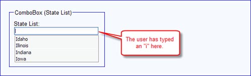
dijit.form.ComboBox | |
Super Classes | |
File Location | dijit/form/ComboBox.js Use |
Usage | This class creates a widget that is a combination of a text box and a select list, hence the name The list of values can be supplied statically as HTML markup or by specifying a function that will retrieve data from the server using Ajax. The widget also has an auto-complete feature. When auto-complete is enabled for the widget, the user can just type the first few characters of the field, and the widget displays the first matching value from the select list. |
Display Examples |
By typing an i in the text box the user is forcing the widget to filter out any option not beginning with an “i.” Also given that auto-complete is enabled, the first value in the select list that matches “i” is automatically entered into the text area. |
HTML Markup Examples | The following HTML markup would create a <select
dojoType="dijit.form.ComboBox"
name="state"
autoComplete="true">
<option value="blank"></option>
<option value="AL">Alabama</option>
<option value="AK">Alaska</option>
</select>Most of the state values have been left out for brevity. |
JavaScript Constructor Examples | The following JavaScript code would create a var st = new dojo.data.ItemFileReadStore({url: 'states.json'});
cb = new dijit.form.ComboBox({
name: "state",
autoComplete: true,
store: st,
}, dojo.byId("stateList"));This version of the constructor also automatically adds the widget to the DOM as a child of the DOM element with an id of “stateList”. |
Key Properties | |
Key Methods | None |
Key Styles | None |
Key Events | None |
Notes | None |
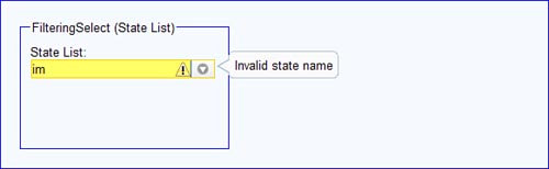
dijit.form.FilteringSelect | |
Super Classes | |
File Location | dijit/form/FilteringSelect.js Use |
Usage | This class creates a widget that acts as a replacement for the HTML |
Display Examples |
By typing an i in the text box, the user is forcing the widget to filter out any option not beginning with an “i.” This example shows what happens when the user types data that can’t be matched against anything in the select list. |
HTML Markup Examples | The following HTML markup would create a <select
dojoType="dijit.form.FilteringSelect"
name="state"
invalidMessage="Invalid state name"
autoComplete="true">
<option value="blank"></option>
<option value="AL">Alabama</option>
<option value="AK">Alaska</option>
</select>Most of the state values have been left out for brevity. |
JavaScript Constructor Examples | The following JavaScript code would create a var st = new dojo.data.ItemFileReadStore({url: 'states.json'});
cb = new dijit.form.FilteringSelect({
name: "state",
autoComplete: true,
store: st,
}, dojo.byId("stateList"));This version of the constructor also automatically adds the widget to the DOM as a child of the DOM element with an id of “stateList”. |
Key Properties | Same as for |
Key Methods | Same as for |
Key Styles | Same as for |
Key Events | Same as for |
Notes | When the user types invalid text, the last correct entry is saved so that only valid data is ever sent to the server. |

dijit.form.Form | |
Super Classes | |
File Location | dijit/form/Form.js Use |
Usage | This widget corresponds to the HTML |
Display Examples | There is not an HTML template associated with this widget, so there is specific visual display. |
HTML Markup Examples | <form action="submit.jsp" dojoType="dijit.form.Form"
id="form1" method="POST">
Name: <input type="text" name="name" />
</form> |
JavaScript Constructor Examples | Create a new new dijit.form.Form(
{method: "POST", id: "form1", action: "submit.jsp" });Additionally, you would need to add every child element (form widgets) that you want in your form to this widget. Given the amount of code you would need to write to create all the form elements, it is likely that you would create this widget with HTML markup rather than with JavaScript. |
Key Properties | |
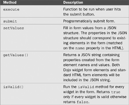
Key Methods | |
Key Styles | No corresponding HTML template exists for this widget so there are no Dojo styles. |
Key Events | The primary event for this widget is the submission of the form either through user input by clicking the Submit button or programmatically by running the |
Notes | This widget is very useful when you wish to submit the form using Ajax rather than having the browser submit it automatically. |
Now that we’ve studied the various form widgets, we can move on to the next major category of widgets: layout widgets. We use the same approach to analyze them.