One of the first decisions you will have to make about your site is its layout. How many columns will your site have? Does it have a header and a footer? Consider sketching out a layout on a piece of paper, or even creating a mockup in a graphics program. In this chapter, you’ll see how you can use <div> XHTML tags and CSS rules to define the different areas on the page. In the figure on this page, we’ve shown the divs, labelled with the CSS class name for each.
When you begin working on your site, we suggest that you start by creating the most important part of the site: its content. Write (or collect from coworkers) the site’s copy, and gather the images. Make sure that the images are in the correct format for the Web, either JPEG, PNG, or GIF. If you don’t have the site’s text yet, you can always add in sample text (“The quick brown fox...”).

Before we jump into creating the layout, you need to know a few more things about XHTML. Much of XHTML can be separated into two types of tags: block tags and inline tags. For instance, all the heading tags are block elements; that is, if you put something in an <h1> there will automatically be a line break after the </h1>. Other common block tags are <p> and <blockquote>.
Inline tags are usually used to style text within a line and don’t cause a line break. Common inline tags include <i>, <em>, <strong>, and <b>.
Two tags, <div> (a block tag) and <span> (an inline tag), are specifically meant to be containers, to help add structure to your page.
It’s considered good practice to use as few div and span tags as possible. If your markup is meaningful—that is, your paragraphs are inside <p> tags, your headings are inside <h#> tags, and so on—you don’t need as many of them. For instance, you never need a div around paragraphs or headings, because those are already block elements.
A series of divs on your page, with rules that specify their position, make up your page’s layout. In this example, we’ve shown a page from Alpaca Repo in Dreamweaver, with its option to show all the divs in different colors turned on to make the divs easier to see.
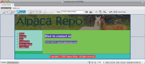
Every block element is a rectangular block (like a box), and that box is made up of parts that you can use CSS to address and manipulate. By default, the borders of the boxes are not visible, and the background is transparent, so you don’t actually see the boxes, but trust us, they’re there.
When working with CSS and layout, you’re creating boxes (sometimes by adding a div) and positioning them on your pages. Each box contains several properties: its margin (the distance between the box and other elements), border (the line that defines the outside of the box), padding (the distance of a box’s content from its border), and content (the text or images—or other boxes—that are inside the box).
Using CSS, you can set rules for each of these elements. For example, you can set different rules for the top, right, bottom, and left sides of an element.
The margin, border, and padding properties allow you to set values for each of the four sides individually or jointly. In other words it’s perfectly okay to write a rule in different ways (we’re styling a class named #theDiv just as an example):
#theDiv { margin: 10px; }

#theDiv { margin-top: 10px; margin-right: 10px;
          margin-bottom: 10px; margin-left: 10px; }

#theDiv { margin: 10px 10px 10px 10px; }

#theDiv { margin: 10px 10px; }
Each of these rules does the same thing: applies a 10 pixel margin around #theDiv. When a property such as margin is given a single value (the first rule above), it’s applied to all four sides. In the second rule, each side is individually specified. When it’s given four values, as in the third rule, they are applied to the top, right, bottom, and left, respectively (think about a clock face, and go around in a clockwise manner starting at 12 and going to 3, 6, and 9 to remember this). When a property is given two values, as in the last rule, the first value is applied to the top and bottom, and the second value goes to the left and right. If a value for a property is zero, there is no need to give it a unit of measurement, as zero is zero whether it’s in pixels or points.
You apply the padding property in the same way as you apply margin.
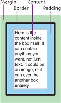
The border property has three associated properties: width, style, and color. Say that you want a thin black line above and below your text. You can set the border around your text (that is, you would create a rule for the tag that contains your text) to 1px solid black just for the top and bottom. If you don’t set the other sides, they’ll be set to 0 by default.
.lines {
   border-top: 1px solid black;
   border-bottom: 1px solid black;
}
The border-width can be set in any unit (ems, pixels, or percent). The border-style can be set to none, hidden, solid, dotted, dashed, double, groove, ridge, inset, or outset. Some of these look terrible, so use them with care. You can set border-color using color names or other methods (see the extra bits for more detail).
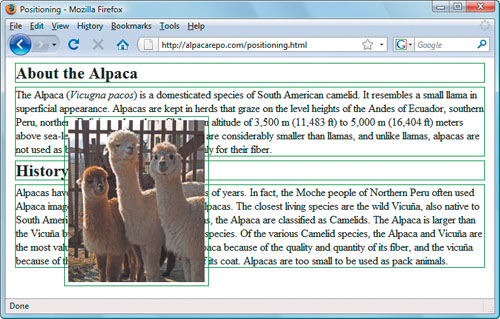
After you have created your boxes, you want to place them on your page. In order to do that you need to understand the different ways CSS can position block elements. In the examples in this section, we’ve turned on a thin green border around the divs on the page, so that you can tell where they are.
Static positioning means that the box ends up where it would normally end up, all on its own. Each element is laid out one after the other. The margin settings for each box determine the amount of space between them. Static positioning is the default.
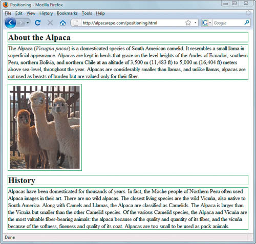
Relative positioning is just like static except that you can set its left and top positions. The positioning is relative to the original position of the element, not relative to any other element on the page. In this example, we’ve pushed the alpaca picture 80 pixels down and to the right. You can see how it impinges on the other divs but still takes up all the vertical space that it did originally.
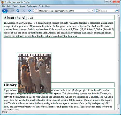
Absolute positioning places an element in reference to its container. If you have an absolutely positioned box placed 100 pixels from the top of the page, and another absolutely positioned box inside that box that is also set to be 100 pixels down, the interior box will be 200 pixels down from the top of the page, not 100—because its frame of reference is to the box that it is inside. In this example, absolute positioning takes the picture out of the flow, because it is now 80 pixels down and to the right of the top-left corner of the page.
Fixed positioning, on the other hand, is based on the page itself. If you set a box to be fixed at 100 pixels down, it will always be there, even if you scroll the page. When you scroll, that box will move down with you so that it’s always 100 pixels down from the top of the visible page.
When you want a box to stick to one side or the other of its container (imagine positioning a photo inside a column), you need to float the box. The values for float are left, right, none, and inherit.
Left: a box that is floated to the left causes everything else on the page (well, everything that isn’t explicitly told to be somewhere else) to wrap around it to the right.
Right: just like left, a box floated to the right causes everything else to wrap around it on the left. Here, we’ve floated the alpaca picture to the right, so the text flows around the picture.
None: this is the default, but it’s sometimes useful to be able to explicitly tell a box, no, don’t float.
Inherit: if you do want a box to inherit the float value of its container, just say so explicitly by setting float to inherit.
In the Alpaca Repo site, we’ve defined two classes, .floatRight and .floatLeft. We can apply these classes to move elements to the right or left as needed.
.floatRight {
   float: right;
   margin-left: .8em;
}

.floatLeft {
   float: left;
   margin-right: .8em;
}CSS sizes come in two flavors: relative and absolute. Relative sizes are those that are defined in terms of their relationship to some element on the page, while absolute sizes are, well, absolute; they are fixed to a particular size.
Overall, the W3C (the organization that sets Web standards) strongly recommends that you use relative sizes on your pages instead of absolute, unless you are absolutely certain of the dimensions of the display device (and that’s darned rare for a Web page).
Note that points and pixels are not the same thing at all! While Macs started out with 1pt=1px, things have changed since the days of the 9″ black-and-white screen. And on PCs, points and pixels have never been equivalent.??????
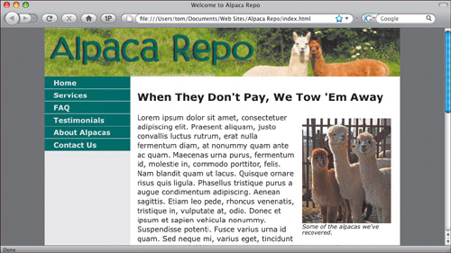
Enough with the theory; now it’s time to start building the page. The Alpaca Repo site uses a pretty standard layout: header, sidebar that contains the navigation bar, a main content area, and a footer.
The unit we are primarily using on the site is ems, because we want the site to automatically and properly resize if the user bumps up (or reduces) the text size in their browser.
We’ve decided that the site will begin with six pages, which will be reflected in the navigation bar: index.html, services.html, faq.html, testimonials.html, about.html, and contact.html.
In your text editor, create an XHTML page, with the usual elements: <head>, <title>, and <body>. Fill in the title. We’ll need five divs, which we will give ids to: an overall container that goes inside the <body> tag; a header; a sidebar; the mainContent; and the footer.
The initial XHTML looks like this:
<!DOCTYPE html PUBLIC "-//W3C//DTD XHTML 1.0 Transitional//EN"
"http://www.w3.org/TR/xhtml1/DTD/xhtml1-transitional.dtd">
<html xmlns="http://www.w3.org/1999/xhtml">
<head>
   <meta http-equiv="Content-Type" content="text/html;
         charset=UTF-8" />
   <title>Welcome to Alpaca Repo</title>
   <link rel="stylesheet" href="styles.css" type="text/css" />
</head>
<body>
   <div id="container">
      <div id="header">
      </div>   <!-- end #header -->
      <div id="sidebar">
      </div>  <!-- end #sidebar -->
      <div id="mainContent">
      </div> <!-- end #mainContent -->
      <div id="footer">
      </div> <!-- end #footer -->
   </div> <!-- end #container -->
</body>
</html>
Notice that the <link> tag in the <head> points to the external stylesheet that we’ll create in the next section, called styles.css. Now we’ll add some content inside the divs. First, let’s add the entries in the navigation bar. Inside the sidebar div, add an unordered list with links to the pages that we’ll create. The result looks like this:
<div id="sidebar">
   <ul>
      <li><a href="EB9780321573025_1.html">Home</a></li>
      <li><a href="services.html">Services</a></li>
      <li><a href="faq.html">FAQ</a></li>
      <li><a href="testimonials.html">Testimonials</a></li>
      <li><a href="about.html">About Alpacas</a></li>
      <li><a href="contact.html">Contact Us</a></li>
   </ul>
</div> <!-- end #sidebar -->
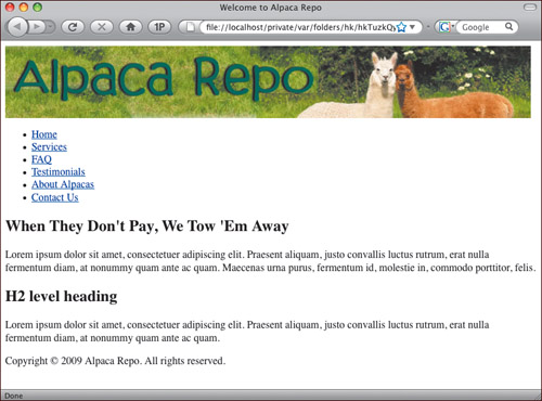
In the header div, add the image that is inside the header, like so (of course, your path and image name may be different):
<div id="header">
   <img src="images/header.jpg" width="800" height="110"
alt="header" />
</div> <!-- end #header -->
Now add some text inside the footer div:
<div id="footer"> <p>Copyright © 2009 Alpaca Repo. All rights reserved.</p> </div> <!-- end #footer -->
Finally, add some text in the mainContent div. We included a couple of headings and some filler text:
<div id="mainContent">
   <h2>When They Don't Pay, We Tow 'Em Away</h2>
   <p>Lorem ipsum dolor sit amet, consectetuer adipiscing elit.
Praesent aliquam,  justo convallis luctus rutrum, erat nulla
fermentum diam, at nonummy quam  ante ac quam. Maecenas urna
purus, fermentum id, molestie in, commodo  porttitor, felis.</p>
   <h2>H2 level heading </h2>
   <p>Lorem ipsum dolor sit amet, consectetuer adipiscing elit.
Praesent aliquam,  justo convallis luctus rutrum, erat nulla
fermentum diam, at nonummy quam  ante ac quam.</p>
</div> <!-- end #mainContent -->
The end result is this XHTML:
<!DOCTYPE html PUBLIC "-//W3C//DTD XHTML 1.0 Transitional//EN" "http://www.w3.org/TR/xhtml1/DTD/xhtml1-transitional.dtd"> <html xmlns="http://www.w3.org/1999/xhtml"> <head> <meta http-equiv="Content-Type" content="text/html; charset=UTF-8" /> <title>Welcome to Alpaca Repo</title> <link rel="stylesheet" href="styles.css" type="text/css" /> </head> <body> <div id="container"> <div id="header"> <img src="images/header.jpg" width="800" height="110" alt="header" /> </div> <!-- end #header --> <div id="sidebar"> <ul> <li><a href="EB9780321573025_1.html">Home</a></li> <li><a href="services.html">Services</a></li> <li><a href="faq.html">FAQ</a></li> <li><a href="testimonials.html">Testimonials</a></li> <li><a href="about.html">About Alpacas</a></li> <li><a href="contact.html">Contact Us</a></li> </ul> </div> <!-- end #sidebar --> <div id="mainContent"> <h2>When They Don't Pay, We Tow 'Em Away</h2> <p>Lorem ipsum dolor sit amet, consectetuer adipiscing elit. Praesent aliquam, justo convallis luctus rutrum, erat nulla fermentum diam, at nonummy quam ante ac quam. Maecenas urna purus, fermentum id, molestie in, commodo porttitor, felis.</p> <h2>H2 level heading </h2> <p>Lorem ipsum dolor sit amet, consectetuer adipiscing elit. Praesent aliquam, justo convallis luctus rutrum, erat nulla fermentum diam, at nonummy quam ante ac quam.</p> </div> <!-- end #mainContent --> <div id="footer"> <p>Copyright © 2009 Alpaca Repo. All rights reserved.</p> </div> <!-- end #footer --> </div> <!-- end #container --> </body> </html>
That does it for the XHTML for now.
The XHTML from the last section creates a pretty dull-looking page, with everything flowing down the page and no added style.
Time to add the CSS rules that will turn our boring XHTML page into something with a bit more snap to it. We’ll do that by creating a CSS stylesheet, and adding rules for each of the five divs.
Begin in your text editor by creating a new blank stylesheet. Save it as styles.css.
First, let’s style the container div, which surrounds the rest of the layout. Enter this text:
#container {
   width: 80%;
   background-color: #EBEBEB;
   margin: 0 auto;
   padding: 0;
   text-align: left;
}
There is only one element on the page named container, so we are setting its rule as an id by naming it #container. We’re setting the width to be 80%, so that it takes up that percentage of the page. The background-color is a light gray (for reasons we’ll get to later). For margin, when you have two values, the first, which in this case is 0, applies to the top and bottom of the box; auto applies to the right and left sides of the box and centers the container on the page. The padding has one value of 0, which applies to all four sides of the box. And finally, we set the text-align to left.
Next, we create the #header id, with this text:
#header {
   background-color: #91A43D;
   text-align: center;
   margin: 0;
   padding: 0;
}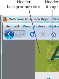
The main color in the Alpaca Repo header picture is green, so we set background-color to a nice medium green. This color will appear behind the header image if the user resizes the browser window wider than the image.
Finally, we set the header’s margin and padding to zero.
The next id we’ll create is #sidebar. We’re going to set it to float to the left, and we’ll make it about 12 characters wide (or 12 ems).
#sidebar {
   float: left;
   width: 12em;
}
Now comes the #mainContent id.
#mainContent {
   background-color: #FFFFFF;
   margin-left: 12em;
   padding: 10px 20px 0 1em;
}
The mainContent column does not float.The background-color gets set to white. The mainContent column goes to the right of the sidebar, so we give it a margin-left of 12 ems, the same width as the sidebar. For padding, we provide 10 pixels at the top (so the content doesn’t butt right up against the header), 20 pixels on the right, 0 pixels at the bottom, and 1 em at the left.
It’s fine to mix size values to a certain extent, although you should keep all your text in relative sizes. Just because you use em in one place doesn’t mean that you have to use it everywhere. Here, we’ve used pixels in places where we want to be offset a certain distance from things that are measured in pixels (such as the header graphic) and ems in places where we want to be offset a certain distance from things that are measured in ems (such as the sidebar).
The last div we’re styling is #footer. But here, we’re not styling the footer itself, but rather, all the paragraphs inside the footer. To do that, we set the selector (remember, that’s the part of the rule that defines what the rest of the rule will apply to) to be the div’s id followed by a space and the tag we want to style, as shown here:
#footer p {
   margin: 0;
   padding: 10px 0;
   background-color: #DDDDDD;
   text-align: center;
   font-size: .8em;
}
So, this rule applies to everything inside the <p> tags, so long as those <p> tags are inside the #footer div. By now, you can see that we’re setting the margin to 0, and the top and bottom padding to 10 pixels, with no right and left padding. The background-color gets set to a medium gray. We also align the text in the div to center alignment, and set its font-size to .8em, so that it is 80% of the size of the body font.
Things are looking pretty good, but there’s a potential problem that we’ll solve in the next section.
After styling and positioning the divs, the layout is beginning to look the way we want it to. The problems we alluded to in the last section are twofold. First, on the different pages that we have in the site, we don’t know whether sidebar or mainContent will contain the most content. Second, we want both divs to have a background color going all the way down the page, and instead, they stop when the content in that block element stops.
The solution is to create what are called faux columns, which will fake a layout so that it appears to have columns that are the same length. Here’s how:
#sidebar {
   float: left;
   width: 12em;
}
You might have noticed that we never gave the sidebar div a background color—that’s because if we set sidebar’s background color, it wouldn’t always show the color for the entire height of sidebar, but only for that part where there was some text content. The solution is in the container rule.
#container {
   width: 80%;
   background-color: #EBEBEB;
   margin: 0 auto;
   padding: 0;
   text-align: left;
}
Recall how we skipped explaining why the background color for container was set? Instead of putting the background color on sidebar, we put the sidebar background color on container. That way, once we force sidebar to appear to have the height we want, and so long as we don’t give it a background color of its own, the color behind it (that is, container’s background color) will just show through.
As a result of this, we have to make sure that header, footer, and mainContent also have their background colors set, which we’ve already done.
Because we floated sidebar, we need to make sure that mainContent (the area that wraps around sidebar) comes to a complete end before footer starts—otherwise, footer will also wrap around sidebar any time that mainContent is shorter than sidebar. We do that by adding a new class called .clearfloat.
.clearfloat {
   clear: both;
   height: 0;
   font-size: 1px;
}
And finally, we add this line to mainContent, just before the final <div>.
<br class="clearfloat" />
Together, these force everything following to display after any previously floated element (whether floated either to the left or right). In this case, footer will now always be after both sidebar and mainContent. The height and font-size are set to 0 and 1px (respectively) to make the <br> take up as little vertical height as possible.???????????????