
Chapter Ten. Tooltips
Tooltips are used to present content “on demand” in an interface—typically, secondary content like a simple text description for an icon button, detail for a data point on a chart, or helpful field-level instruction in a form—so that users can gain greater context without having to interrupt what they’re reading or doing. Tooltip content generally displays as a small overlay that appears when the user places their cursor over an element.
Most browsers include a standard tooltip feature by default: any content in a title attribute assigned to an HTML tag will render as a tooltip when the user hovers the cursor over an element for about a second. However, these standard browser tooltips have a fixed appearance (usually a fixed text size in a yellow box, positioned to the right of the cursor) that can’t be changed with CSS. And their content is limited to a string of text—no HTML tags, images, background images, or other formatting can be used to introduce style, structure, or hierarchy. They don’t even support line breaks! In some browsers, tooltips don’t support wrapping, so all text is displayed in a single line; if the text is long, it may bleed beyond the visible browser window.
There are a number of situations where a more robust tooltip would be useful, including:
• Sites with distinctive branded designs that include advanced CSS formatting such as rounded corners, drop shadow, borders, and backgrounds, where the tooltip should reflect that established design
• Ecommerce sites that show product images, richly formatted text, or a complex layout—like Netflix’s movie tooltips, for example, which contain a photo, a short plot description, and a table listing the director, actors, format, genre, and user rating
• Websites that cater to older or younger target audiences, or to users with impaired vision, where it would help to display tooltips with larger text sizes and higher contrast than a native tooltip
In this chapter, we’ll explore techniques for creating custom tooltips using progressive enhancement techniques that allow for a wide range of customized appearance and behavior, and incorporate the semantic markup structure required for accessibility. Specifically, we’ll discuss how to style and show a simple tooltip based on a title attribute’s value, and then a more complex tooltip with hierarchical structure based on content within the page or pulled in from an external page via Ajax.
X-ray perspective
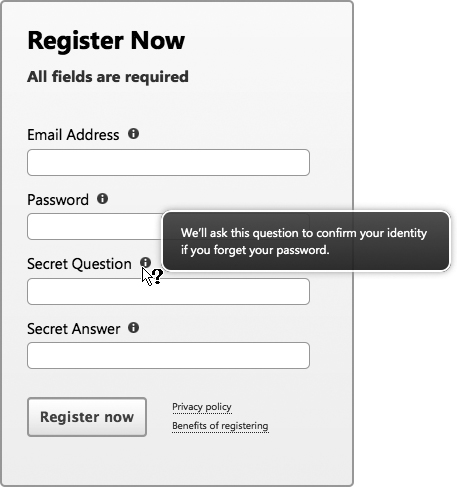
For our target tooltip design, we’ll consider a case where tooltips are very common: a registration form.
To keep the form’s appearance simple and uncluttered, we’ll use tooltips to selectively provide all the information a registrant needs for an error-free registration when they hover the cursor over labels and links. Here’s our target design (at right):
Figure 10-1 Form field tooltips in the enhanced experience
Two different types of content in this form lend themselves to tooltips:
• Brief field-level instructions, like formatting guidelines, or information about how the data is used for each text input
• Privacy Policy and Benefits of Registering content, which the user may choose to review before moving on to the next step (see links at the bottom of the form)
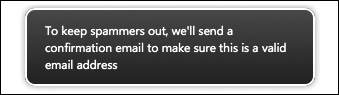
In the enhanced experience, instruction for each text input will be placed in tooltips that appear when the user hovers the cursor over the field’s label. The design also includes a small “i” icon to the right of each label as a visual indicator that additional information is available; the tooltip will also appear if the user hovers the cursor over that icon. The tooltips will also be read aloud to screen-reader users when they focus on an associated field. The instructions are text-only and don’t require any special functionality or behavior; in short, they’ll behave just like a standard tooltip that appears when a title attribute is specified. So in our foundation markup, we’ll simply add a title attribute to each label element, and then write a short script for the enhanced experience that will parse the contents of each title attribute and present it in a custom-styled tooltip—with nicer typography and design.
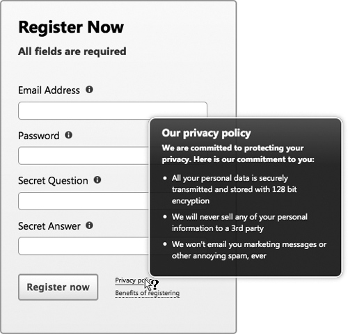
The Privacy Policy and Benefits of Registering links at the bottom of the form will reveal, respectively, a short privacy policy statement and a longer block of content to explain the benefits of registering. We’ll display both of these content blocks as tooltips because they are supplemental information that is not required for filling out or submitting the form.
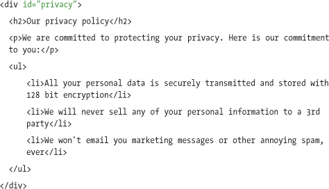
The privacy policy content is an introductory paragraph followed by a simple bulleted list:
Figure 10-2 Privacy policy tooltip in the enhanced experience
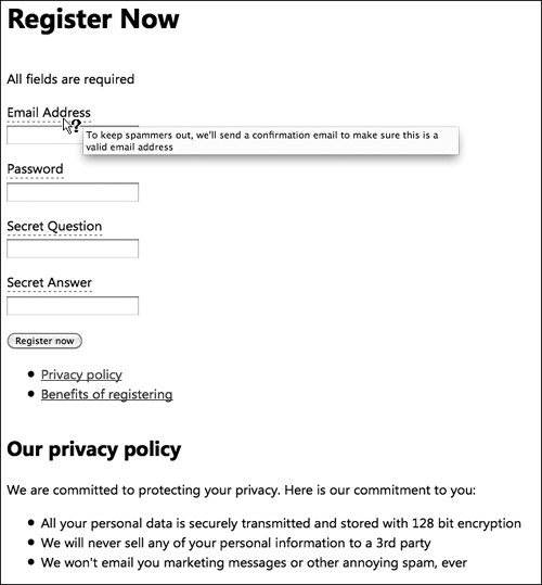
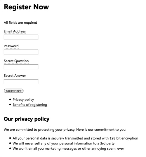
Since this privacy information is both brief and important to communicate to the majority of the audience at the time of registration, in the basic experience we’ll keep it in the page in the foundation markup, right below the form:
Figure 10-3 Basic experience with privacy policy content displayed below the form
The Privacy Policy link in the basic experience will be an anchor link that scrolls users down to the policy content when clicked; to do that, we’ll set the link’s href attribute to match the privacy content block’s ID preceded by a pound sign (href="#privacy"). In the enhanced experience, we’ll use a script to find the anchor link’s href attribute and its associated content, and then display that content as a tooltip when a user hovers the cursor over the link.
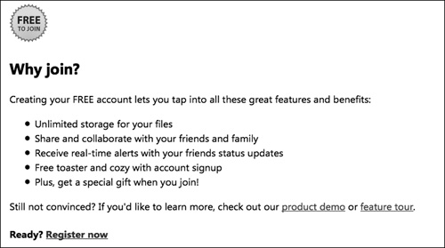
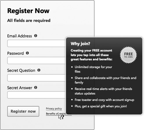
Last but not least, the Benefits of Registering content consists of a fairly long set of features and benefits along with a graphic image (“Free to Join”):
Figure 10-4 Features and benefits tooltip in the enhanced experience

While it’s helpful and may be interesting to many people, it’s not as essential to complete the form as, say, the privacy information. For that reason, in the basic experience we will place the benefits content in a separate page (benefits.html) that the user can access by clicking the Benefits of Registering link. And because we don’t want to dead-end our users, we make sure that the separate benefits page links back to the registration form.
Figure 10-5 Features and benefits content in a separate page
In the enhanced experience, a script will find the link’s href value (benefits.html) and build an Ajax request to pull that page’s content into the registration form and display it as a tooltip.
Happily, we can use a great deal of the same markup, styles, and scripts for all three tooltip types. We’ll first look at the simple title-based tooltip, follow that with a summary of the modifications to make in order to create a tooltip from an anchor link, and then discuss how to create a tooltip from content in an external source.
Creating a tooltip from title content
We’ll start with the simplest of our tooltips—the field-level instructional text that appears next to each label in the form.
Foundation markup and style
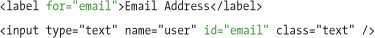
Each field in the registration form consists of a label and input pair, with the label’s for attribute pointing to the input’s id to properly associate them. The input also has a class of text, which we can use to apply style rules:
We’ll add a title attribute to each label with instructions that explain how to fill out the field correctly, or provide feedback about how the data will be used:
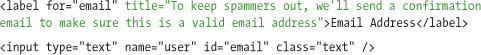
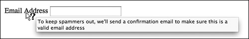
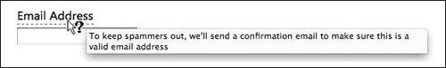
In most browsers, the title attribute will display as a simple tooltip when the mouse is placed over the label:
Figure 10-6 Native browser tooltip displayed below label on cursor hover
There are a number of safe styles we can add to our foundation markup in the basic experience. To make the form easier to read (and a bit more attractive), we’ll set the global font style:
body { font-family: "Segoe UI", Arial, sans-serif; }
Next, we’ll provide a couple of visual cues to indicate that the label has a tooltip. We’ll set the cursor style property to help, which makes it look like a question mark (?) when the user hovers the cursor over the label; and we’ll add a dotted underline to the label text, which is a fairly common web convention to indicate the presence of a tooltip:
label { cursor: help; border-bottom: 1px dashed #777; }
To make the form easier to scan, we can stack the label over the input by setting it to display: block, and add a little top margin:
input.text { display: block; margin: .5em 0 0; }
Figure 10-7 Foundation markup with safe styles applied
Enhanced markup and style
For our enhanced experience, we’ll create styles for both the form and the tooltip content, which we can leverage for all three tooltip types.
To show that a tooltip is available in the form, we’ll add a small “i” icon background image to the right of the label (instead of the simple underline we use in the basic experience). We’ll remove the bottom border style property from each label, specify a background image for the icon, and add right padding to ensure that the text (e.g., “Email Address”) doesn’t obscure the icon:
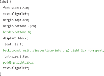
The form fields now look like our target design:
Figure 10-8 Enhanced styles applied to the email form field
For the custom tooltip content in the enhanced experience, we’ll need to generate a new snippet of HTML and style it to look like our target tooltip design. The markup will be a simple div with a class of tooltip:
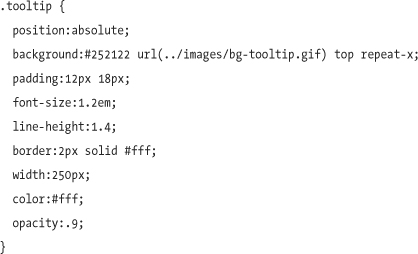
The tooltip div is styled with a background image, border and padding, and opacity set to 90% to create a semi-transparent effect (this property won’t be recognized in current versions of Internet Explorer, but will cause no harm). We’ll position the tooltip absolutely on the page, so that later we can dynamically set the top and left coordinates with the script:
To give this tooltip even more visual polish (without requiring multiple background images), we’ll add some vendor-specific and standards-based CSS3 properties: border-radius for rounded corners, and box-shadow for a drop shadow behind the tooltip. These properties will display in newer versions of Firefox, Safari, and Opera; in other browsers, the tooltip will display all other style rules, but with squared corners and no shadow:
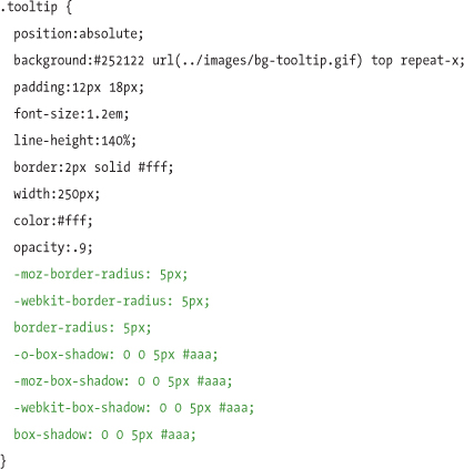
Figure 10-9 Enhanced tooltip markup with styles applied
To show and hide the tooltip, we’ll also add a class called tooltip-hidden that will set the tooltip’s display property to none, and conditionally toggle it on and off by the script:
.tooltip-hidden { display: none; }
Enhanced tooltip script
Now that the foundation and enhanced markup and styles are complete, we’ll address the enhancement script that creates and displays the tooltips. As with the styles, much of the behavior—including the container definitions and the mouse events to position them properly—can be written once and reused for all three tooltip types.
First, we’ll create a few variables that we’ll use to generate the enhanced tooltip: the label element that’s associated with the email text input, the value of the label’s title, and a unique ID for the tooltip div to associate the label with the custom tooltip for screen-reader users:
var label = $('label[for=email]'), var tooltipContent =
label.attr('title'), var tooltipID = "email-tooltip";
Now we can generate the tooltip markup: a new div element with an id of email-tooltip and content drawn from the label’s title (stored in the variable tooltipContent). We’ll assign the tooltip and tooltip-hidden classes so that we can style the div with CSS, and make sure it is hidden by default. We will also add an ARIA role of tooltip to describe its purpose to screen-reader users, and an aria-hidden attribute to let screen readers know that it’s currently hidden:
var tooltip = $('<div class="tooltip tooltip-hidden" role="tooltip"
id="'+ tooltipID +'" aria-hidden="true">'+ tooltipContent +'</div>'),
Then, we’ll append the tooltip to the end of the page body:
tooltip.appendTo('body'),
In order to enable screen readers to recognize the tooltips, we’ll add the ARIA role of application to the body element:
$('body').attr('role','application'),
Now that we’ve generated the tooltip markup, we should remove the title attribute from the label to prevent the now-duplicative native tooltip from appearing. To make a new custom tooltip that’s related to the label accessible to screen readers, we’ll associate it by assigning an ARIA attribute, aria-describedby, set to the same value as the tooltip’s id:
label.removeAttr('title').attr('aria-describedby', tooltipID);
Next, we’ll make the tooltip show on mouseover and hide on mouseout. We’ll bind a mouseover event to the label that shows the tooltip on hover by removing the tooltip-hidden class, setting its aria-hidden attribute to false, and positioning the tooltip’s coordinates relative to the cursor’s location in the page. We can also retrieve information about the mouseover event by passing a variable argument (e) to the mouseover event’s callback function—for example, finding the x and y coordinates of the mouse, as we do with the argument shown below as e.pageY and e.pageX:
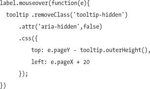
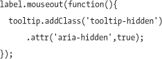
We’ll bind a mouseout event so that when a user moves the cursor off the label, the tooltip-hidden class is reapplied, and the aria-hidden attribute is set back to true:
There’s a final step that’s necessary to make the tooltip fully accessible to screen-reader users: we need to make sure the text input associated with the label has the aria-describedby attribute. With this attribute applied, screen-reader users gain access to the additional descriptive information. Depending on the screen reader, the tooltip may be read aloud whenever a screen-reader user focuses on the input, or the user may hear the tooltip spoken after pressing a key combination.
$('#' + $(this).attr('for')).attr('aria-describedby', tooltipID);
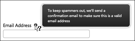
Now we have a fully functional enhanced custom tooltip based on the native title attribute:
Figure 10-10 Tooltip in the enhanced experience
This title-based approach is perfect for simple text-based tooltips, but won’t work for content with richer text formatting. The next two methods we discuss will demonstrate how to create enhanced tooltips with structured content, either from a different section of the page or from an external resource.
Creating a tooltip from an anchor link
We often use local anchor links to provide quick navigation from one area of a page to another; to do this, we just set the anchor element’s href value to the pound sign plus the id of the destination element on the page. When the href is set up this way, clicking the anchor directs focus to the referred element, and the browser immediately scrolls to that focused element (as page height allows). We can use JavaScript and the link’s href value to find the relevant content on the page and use it to populate a tooltip in the enhanced experience.
To start, we write the Privacy Policy content into the foundation page markup below the registration form and assign an id with the value privacy:
The related link will act as a standard local anchor in the basic experience, scrolling the user to that section of the page. To do this, we’ll set the Privacy Policy link’s href to reference the privacy content:
In the basic experience, this link will scroll the browser window down to the privacy policy content block:
Figure 10-11 Privacy policy content placed below the form in the basic experience
Once the content is in the page and the anchor and its related content block are associated, we can modify the JavaScript from the previous title-based tooltip example, and use the link’s href value to find the relevant content on the page and populate a tooltip. We just need to amend the script to change the way we insert content into the tooltip.
To start, we’ll create a new, empty tooltip div, using the tooltipID variable:
var tooltip = $('<div class="tooltip" role="tooltip"
id="'+ tooltipID +'"></div>'),
Since the href of the any local anchor—the pound sign (#) plus the value of the id attribute—is the same syntax as the selector jQuery needs to find the tooltip content on the page (in this case, #privacy), the script can simply reference the entire href value to find the tooltip content:$(this).attr('href').
All that’s left to do is append the privacy content into the empty tooltip:
tooltip.append( $(this).attr('href') );
Note
When content is appended this way—with either the jQuery append method, as shown, or the standard JavaScript appendChild method—it’s actually moved from its original location in the markup to the tooltip container, so no markup “cleanup” is necessary.
To complete the process, we leverage the existing styles and script logic to display the new custom tooltip when the user hovers the cursor over the Privacy Policy link:
Figure 10-12 Privacy policy tooltip in the enhanced experience

Creating a tooltip from an external source
We’ve shown how to grab tooltip content from a title attribute and leverage the href value of a local anchor link. Now we’ll review how to get content from a separate linked page.
At the bottom of the registration form is a link to the Benefits of Registering page, benefits.html:
<a href="benefits.html">Benefits of registering</a>
In the enhanced experience, we’ll use Ajax to request this page’s content from the server to populate the tooltip. Ideally, the web server would be smart enough to decide whether to send the full HTML page or, if the request is made using Ajax, send only the lightweight snippet of markup needed to populate the tooltip. If we have a smart server that is configured to handle requests differently if they’re coming from Ajax, we can utilize jQuery’s load method to request the benefits page with Ajax and the server will know to return only a subset of the page’s content. The load method provides an extremely simple interface for loading external content with Ajax and needs only a single argument for the URL to load.
Our enhancement script can grab the URL from the link’s href and append it to our tooltip div:
tooltip.load( $(this).attr('href'));
There may be cases where the smart server approach may not be an option, either because you don’t have full access to the server or the expertise to write the scripting logic. For these situations, you can use Ajax to retrieve the entire Benefits page referenced in the href—including the full document head and body—and write JavaScript logic to parse out the relevant portion of the document and insert it into the tooltip div. The load method provides a slick way to grab the markup we want by simply specifying the selector (#content) of the tooltip content we want inside the full page, and jQuery will insert the relevant snippet into our tooltip:
tooltip.load( $(this).attr('href') +' #content');
While this JavaScript-only approach works, there’s significant bandwidth and processor overhead involved in requesting the entire page, when all we really want is a small portion of it. If possible, the smart server approach will always be the first choice for speed and efficiency in Ajax situations like this.
Figure 10-13 Features and benefits tooltip in the enhanced experience
Using the tooltip script
We’ve created a jQuery plugin, jQuery.tooltip.js, that automates the process of creating tooltips and works with a range of content sources (title, anchor, or external page). The script and example code is available for download at www.filamentgroup.com/dwpe.
To use the tooltip script, simply find one or many elements in the page using a jQuery selector and call the tooltip method on them. For example, to assign tooltip behavior to all links inside a paragraph in a container with an ID of #content, use the following reference:
$('#content p a').tooltip();
From this single method, the script will automatically generate a tooltip and populate it with the appropriate content.
The script is smart enough to look for the three possible content sources we’ve described in this chapter—title attribute, local href anchor, and Ajax external resource—and will then populate the tooltip according to the following logic:
1 It first looks to see if a custom HTML5 data-hrefpreview attribute is present on the element and, if so, pulls the external content source referenced in that attribute into the tooltip with Ajax. The data-hrefpreview attribute is custom to this plugin, and doesn’t have any semantic value beyond the context of this script.
2 If the data-hrefpreview attribute isn’t found, the script will then look for a local href reference (href="#privacy") and populate the tooltip with the contents of the ID referenced in the anchor link.
3 If neither of these sources is found, the script will use the title attribute to populate the tooltip.
The logic order is structured to cascade: the data-hrefpreview attribute takes precedence over the href reference, which in turn takes precedence over the title attribute. For example, if all three content sources are populated within a link, the script will populate the tooltip using the content referenced in the data-hrefpreview attribute:
The script degrades gracefully: in cases where tooltip is called on an element but none of these sources is populated with content, the script simply won’t display a tooltip for the element in question, but will not throw an error.
By applying progressive enhancement, we were able to build upon native title attributes, anchor links, and HTML 5 data attributes to turn content stored within the semantic markup of the page into richly formatted and styled tooltips. This approach gives us the design flexibility we need for effective user experiences, without sacrificing the quality of the basic user experience or negatively impacting usability.