
Chapter Sixteen. Slider
Slider controls are used to capture a single value, or data range, on a continuum. Many users find them to be immediately intuitive because they mimic the appearance and functionality of physical sliders in everyday objects like stereos, car dashboard controls, and appliances; the “track” constrains choices to the continuum of available options, and the “handle” position indicates clear feedback of the currently selected value.
Typically, sliders in web applications capture numeric values such as price and volume level, but they can be applied equally well to virtually any set of values in a continuum—like letter grades, financial bond ratings, or positive to negative sentiment. They can capture a single value or be extended with two or more slider handles to capture multiple values or a range.
Sliders are commonly used as:
• Filtering tools to set parameters like product size, weight, or capacity; minimum and maximum price range; the display size of photo thumbnails in an album; the length of abstracts to display in a RSS reader; or the zoom level in a map
• Playback controls for embedded audio or video, with the slider acting as the timeline for the media and the draggable handle auto-advancing to indicate the current playback position
There is no native HTML form control for a slider widget that currently works across browsers. Sites that employ them typically mark up a set of HTML elements (often divs) and use CSS and JavaScript to apply style and slider behavior. Accessibility-minded developers also build in essential keyboard support, and assign the ARIA attributes necessary to ensure that modern screen readers will understand how to communicate meaning and behavior to a non-sighted user.
But what happens when a user doesn’t have JavaScript enabled, or can’t render the CSS styles needed for the slider to work? Some popular sites that use sliders extensively—like the travel site Kayak, which offers sliders to filter flight times and prices—simply require script support. They offer no fallback option, and completely exclude users who don’t have JavaScript enabled from accessing this functionality.
There’s no reason to lock users out of key functionality; building with progressive enhancement, it’s possible to start with a standard HTML form element like a text input or select element in the foundation markup to offer core functionality to all users in the basic experience, and then transform it into a slider widget in the enhanced experience. In this chapter, we’ll explore how to create a slider that is universally accessible.
X-ray perspective
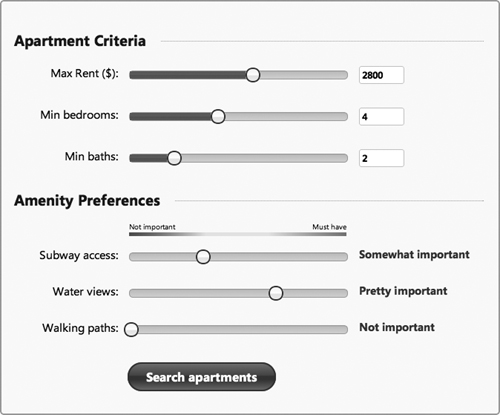
Online real-estate search sites frequently use sliders to simplify setting and adjusting target search criteria. In our sample design, we’ll consider an apartment search form that features two groups of sliders: the first set collects numeric ranges for maximum price and minimum number of bedrooms and bathrooms; the second set collects qualitative values for the relative importance of amenities within a four-level continuum from “Not important” to “Must have,” and displays feedback of the selected value to the right of the slider.
Figure 16-1 Target design for the enhanced experience
Looking at these sliders from an x-ray perspective, the text input, select, and radio button elements are all good candidates for the foundation markup. We can decide which element is optimal in the basic experience by analyzing the specific data-entry requirements for each form field, and considering how to balance the speed and flexibility of user input and the need to constrain data values to an acceptable range.
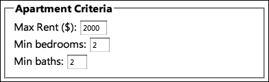
The first three sliders collect numeric values within specific minimum and maximum ranges. The maximum rent slider allows any dollar value between $0 and $5,000, while the bedroom and bathroom sliders accept a smaller range of numbers, from 0–10. If we used an HTML select element for the maximum price field, it would need to list up to 5,000 options in the markup for full flexibility, or even 50 values if we limit prices to $100 increments—these would be technically workable implementations, but probably not optimal from a user experience perspective. A text input is a far more flexible and friendly choice for the rent field’s foundation markup—it’s faster and easier to type a number into a field than to interact with a select menu either by mouse or keyboard. For consistency, we’ll use a text input for the bedroom and bathroom fields, too.
The HTML5 specification offers an input attribute, type=number, which accepts attributes that define the minimum and maximum values to aid in validating the user’s entry; these attributes let us more richly describe the rent, bedroom, and bathroom fields than the simpler type=text. And, since both the HTML 3 and 4 specifications stipulate that input elements default to type=text when no type (or an unknown type) is specified, we can safely use the HTML5 number input in our foundation markup and know that it will display as a still perfectly functional standard text input in browsers that don’t understand the number type.
Figure 16-2 Text inputs in the basic experience for rent, bedroom, and bath values
One important consideration when using a text or number input is data validation. Unlike a select, an input doesn’t provide constraints or real-time feedback to prevent users from entering invalid values like negative numbers, letters, symbols, or values outside the acceptable range. To ensure that the data entered is valid in the basic experience, each time the user submits the form to update results, the server should validate the entry, and provide an error message if it’s not an acceptable value. In the enhanced experience, that same validation logic can be handled on the front-end with JavaScript for immediate feedback for users with capable browsers.
We should also consider data granularity when the user interacts with the slider control. The values a slider can capture are limited by the width of the slider track—in this design, roughly 300 pixels. Our minimum bedroom and bath entries accept only numbers between one and ten, so the sliders pose no problem: we simply divide our ten values evenly along the 300-pixel track.
But the rent field is another story: it has 5,000 acceptable values (0–$5,000 at $1 increments), but the slider handle offers only 300 possible pixel positions across the width of the track. This translates to $17 increments if we distribute the pixels evenly. While incrementing the handle by 17 might not cause any problems for users with a mouse—aside from being a seemingly arbitrary amount—it would be slow and inconvenient for someone to use with their keyboard arrow keys. To optimize the slider for quick selection of round numbers, we’ll specify that the handle will move at $50 increments, either when a user drags the handle or uses the arrow keys to move it left or right.
By making both the slider and text input available in the interface, we can let users choose how they want to interact: moving the slider handle to specify a rent value (for quick, imprecise selections), or entering a number in a text input field (for precise entry of exact dollar amounts). Since both will actively collect data, we’ll make sure they sync with each other: the slider handle position will update the input text value, and vice versa.
Figure 16-3 In the enhanced experience, both the slider and text input can be used.
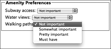
The amenity preference sliders—the second set of three on our form—collect markedly different data from the rent, bedroom, and bathroom fields. Here, users can choose one of four preset values: Not important, Somewhat important, Pretty important, or Must have. To represent these choices in the foundation markup, we could use a radio button set, as it displays all possible options for easy scanning and constrains users to making a valid selection. However, given the space required for each radio and its label, a select element offers the same constraints but in a more compact and easier-to-read format in the basic experience—when a selection is made, the selected option will combine with the label to form an easily readable phrase (for example, Subway access: Somewhat important).
Figure 16-4 Select inputs in the basic experience for amenity preferences
There’s no benefit to leaving the select visible on the page in the enhanced experience, since the slider is a complete replacement for the select’s functionality. In this case, we’ll hide the original select and display text feedback for the currently selected value to the right of the slider. Since the slider itself will communicate its value to screen-reader users, we’ll prevent duplication by using ARIA to hide the visual text feedback from those users.
Figure 16-5 In the enhanced experience, the select is hidden and replaced with text feedback.
A truly usable slider control must gracefully work with both mouse and keyboard, and requires refined logic to elegantly handle drag-and-drop functionality. Rather than create a slider from scratch, we recommend leveraging the robust slider included in the jQuery UI library (http://jqueryui.com/docs/slider) to save time and development effort; we’ll use it here.
When called on an input or select element, our enhancement script will work as a sort of middle-man, parsing the foundation markup and culling the values needed to configure the jQuery UI slider. The jQuery UI slider plugin then injects the enhanced markup to generate the slider track and handle, apply drag and snap behavior, calculate value changes based on handle movement, and support keyboard actions.
Our plugin script will supplement the capabilities of the jQuery UI slider plugin by adding ARIA support, which the current version of jQuery UI does not include as of this writing (but will very soon). And finally, it proxies to ensure that any changes in data value are communicated between the enhanced slider and the native input or select element.
Now that we have a plan for how to handle the various sliders’ functionality in the basic experience, we can dive into developing our custom sliders.
HTML5’s input type=range element: a native slider for the future
The HTML5 specification adds a new type=range attribute for the input element that is intended to collect “imprecise” numeric values (the W3C’s way to say “slider”). The latest versions of Opera and Webkit already render this input type as a slider, so browser support is slowly gaining ground for a native slider.
Figure 16-6 Native sliders in the latest Safari (top) and Opera (middle) versions rendered from the range input. In Firefox (bottom), a standard text input is displayed, because the range type isn’t supported.
Technically, you could safely specify the type=range input in your foundation markup today; input elements will default to a type of text when no type, or an unknown type, is provided. Just keep in mind that, from a design perspective, Opera and Safari render the range input slider in dramatically different ways, both in terms of functionality and appearance. It feels a bit more like an experiment than an element we can safely use. We look forward to a time in the future when we can use these sliders in a consistent way.
Creating the slider
The first step in building the apartment search tool’s sliders is to create the foundation markup that will capture their data values in the basic experience. Then, we’ll create the enhanced markup for interactive sliders for capable browsers, as well as the scripts that apply their behavior and keep the data in sync between the sliders and input elements.
Foundation markup and style
For the first three fields, we’ll use numeric input elements, and for the last three we’ll use select elements, each coded with an associated label tag and wrapped in a form for submission.
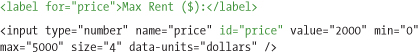
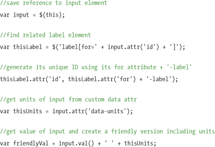
As we discussed in the x-ray section, each numeric data field—for maximum rent price, number of bedrooms, and number of bathrooms—will be coded as an input with the HTML5 type=number, and with min and max value attributes. We’ll prepopulate the input with an initial default value and specify a size attribute, which is a flexible way to tell the browser to display the input in a width that will hold a specific number of characters to match the acceptable data constraints.
<input type="number" name="price" id="price" value="2000" min="0"
max="5000" size="4" />
To add a bit of extra meaning that we can leverage to provide clearer feedback for screen readers in the enhanced experience, we’ll create a custom attribute using the HTML5 data- prefix, called data-units, to specify the unit for the input’s value (in this case, dollars). When we set the aria-valuenow (current value) attribute on each slide movement, it will read aloud a more human-friendly “1,500 dollars” instead of just the value, “1,500.” We’ll also use this feedback text to populate the slider handle’s title attribute, which will render in most browsers as a tooltip:
<input type="number" name="price" id="price" value="2000" min="0"
max="5000" size="4" data-units="dollars" />
We’ll create a label for each input and properly associate it to its input with a for attribute that matches the input’s id:
The markup for number of bedrooms and baths inputs will be structured in the same way, with the properly associated label, and appropriate min, max, size, and data-units values.
The three amenities sliders will be coded as select elements in the foundation markup, also associating the label’s for attribute and select’s id, like this:
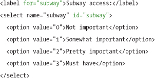
The option values in the select-based sliders are complete and readable as is and inherently constrained, so they don’t require any additional attributes.
Now that the basic markup for each of the form fields is defined, we’ll apply a single global font to the basic style sheet to make the basic experience look a bit nicer:
body, input { font-family: "Segoe UI", Arial, sans-serif; }
Enhanced markup and style
As we mentioned earlier, we’ll use the jQuery UI slider plugin to take care of generating the enhanced markup and applying all the behavior for any element in the markup designated as a slider.
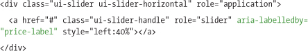
The jQuery UI slider generates an anchor link for the slider handle, wrapped in a div for the track. As the slider handle is dragged, the script dynamically sets an inline style on the anchor to set the CSS left property, reflecting the handle’s current placement as a percentage of the track’s maximum value:
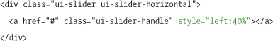
Note
For clarity, we’ve omitted a few classes from the jQuery UI slider markup that apply a jQuery UI theme.
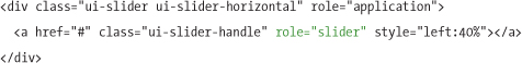
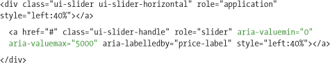
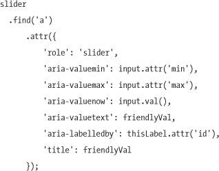
Our enhancement script will need to add a number of ARIA attributes to make the slider accessible. These attributes are the same, regardless of whether the foundation markup is a numeric input or a select.
First, an ARIA role attribute with a value of application is added to the body element to make a screen reader recognize the slider control and respect any custom keyboard shortcuts we assign:
<body role="application">
Then, the script will assign a number of ARIA attributes to the anchor link that acts as the slider handle. (Since the handle delivers all interactive functionality on the slider, and the track is primarily visual feedback, all ARIA roles are addressed to the anchor.)
The role of slider on the anchor element tells the screen reader that it’s playing the part of a slider control instead of a normal link, so it will read aloud a description of the control when the link gains focus:
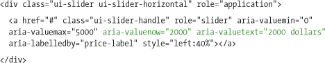
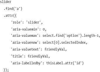
The aria-labelledby attribute allows us to associate the slider with an element on the page that describes it. The native foundation element that provides the slider’s data and proxies with it when data is manipulated—in this case, the input element—already has an associated label on the page that accurately describes the slider as well. We can use the input element’s label to serve as a label for the slider in the enhanced experience. The aria-labelledby attribute must reference another element by its id, so we’ll use JavaScript to generate a unique id for the label by using the value of its for attribute, plus a suffix of -label:
<label for="price" id="price-label">Max Rent ($):</label>
Then we’ll use the same ID to populate the aria-labelledby attribute on the slider’s anchor, thereby associating it with the label element for screen reader users:
The aria-valuemin and aria-valuemax attributes communicate the minimum and maximum values of the slider control—again, we’ll borrow values from the foundation markup and use the min and max attributes for each input, or the first and last values of each select:
Lastly, we’ll use the script to dynamically update two additional ARIA attributes whenever the slider handle moves or its associated form field’s value changes: aria-valuenow (the current number value of the slider) and aria-valuetext (the human-friendly value feedback text that’s read aloud by screen readers). This process is slightly different for our two foundation elements. For the select-based sliders, we’ll use the option text to populate the data-units attribute. To make the aria-valuetext more useful for the numeric inputs, our script will take the current input value (2,000) and add in the string from the data-units attribute in the foundation markup (“dollars”) to improve audible feedback (“2,000 dollars”):
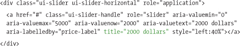
We can leverage one ARIA attribute to improve the experience of non-screen-reader users. Our enhancement script will use feedback text from the aria-valuetext attribute to populate a title attribute on the handle link, which will render as a descriptive tooltip. (This isn’t required, but is a “nice to have” feature, because the slider inputs are still visible on the page.)
The same markup structure will be used to create the sliders for the rest of the controls on the page. Now that the ARIA-enabled enhanced markup is roughed out, we’ll write the enhanced styles to make the jQuery UI slider look like our target design.
CSS for enhanced experience
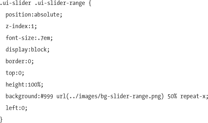
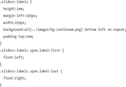
First, we’ll style the slider container, which forms a track for the slider handle in our design. It has a fixed width and height, a background image to add some gradient texture to the track, rounded corners, and a border. It’s also relatively positioned, to allow the slider handle and range elements to be absolutely positioned within it:
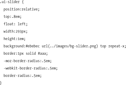
Our slider track and its label now look like this:
Figure 16-7 Styled slider track
The slider handle is absolutely positioned using negative top and margin-left properties to center it over the track. We’ll style it using width and height properties to create a square, and then give it a solid border, a background image, and CSS3 border-radius properties to round the corners to look like a circle (which aren’t supported everywhere, but degrade safely):
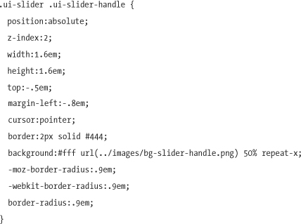
With these styles added, our slider handle looks like this:
Figure 16-8 Styled slider handle and track
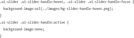
To create visual feedback on the slider handle when the user hovers with the mouse or focuses with the keyboard, we’ll apply a different background image during hover and focus states. During an active state (click or keypress), the background image is removed, leaving a flat white appearance.
For the numeric input sliders like maximum rent, we’ll take advantage of the jQuery UI slider’s range-min option, which uses a colored fill to highlight the range from the left edge of the slider track to the current handle position (like a thermometer) to visually indicate that users are selecting all rent prices or bedrooms up to the selected value, not just a single point in the continuum. When this option is enabled, the plugin adds an additional div element to the slider markup and dynamically sets an inline percentage width to match it to the handle’s position:
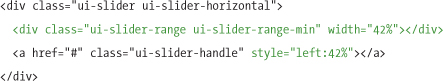
We’ll style this range div with a dark background image to give the appearance that the slider track is filled up to the handle position:
Our numeric range sliders now have a range fill that makes it much clearer that the selected value is a maximum that includes every value below it.
We’ll also style the numeric inputs to look editable, since they can be used in addition to the slider. In the source order, the slider div appears before the input; setting both to float:left will display each slider to the left of its input. We’ll set the font-weight to bold, specify the border color, and use the CSS3 border-radius property to round the corners of the input:
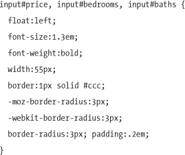
Figure 16-9 Numeric slider with a colored range fill from the left of the track to the handle, and numeric input positioned to the right
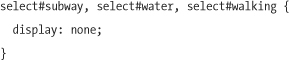
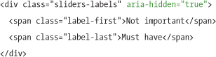
For the three amenity sliders, we’ll hide their select elements off-screen using CSS while keeping them on the page for form submission. Our enhancement script will assign the ARIA aria-hidden=true attribute to these elements to reinforce to ARIA-capable screen readers that the select elements are hidden.
To provide visual feedback for each amenity slider’s value, the script will append a feedback div with a class of slider-status after the slider and dynamically update it with the current value. We’ll apply an aria-hidden attribute with a value of true to the div to hide it from screen readers, because the feedback text is redundant with the aria-valuetext attribute information in the slider itself.
<div class="slider-status" aria-hidden="true">Pretty important</div>
We’ll style the feedback div elements alongside the sliders, similarly to how we styled the input elements with the first three sliders.
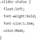
Figure 16-10 Styled amenity slider with current selection feedback
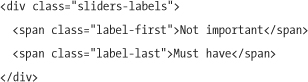
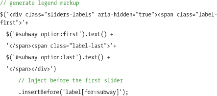
Lastly, we’ll add a legend above the amenity sliders to clarify the range of choices, from not important to must-have.
Figure 16-11 Amenity slider legend
We’ll inject the legend markup via JavaScript. Its text content will be dynamically generated by the first and last text value of the first select menu (as it has the same options as all amenity sliders), and the color continuum is added with a background image:
The legend markup is for visual feedback only, so we’ll apply an aria-hidden attribute with the value true, to convey that the div has no meaning to a screen reader.
Finally, we’ll style the legend to look like our target design:
Slider script
We’re using jQuery UI’s slider plugin for the actual slider control, so our enhancement script will act as a bridge to parse the foundation markup into a format the slider can use, manage adding and updating of ARIA attributes, and ensure that the value of the slider and input or select are kept in sync at all times. The page will need to reference both the jQuery and jQuery UI libraries.
Note
The jQuery UI library and widget-specific plugins like slider can be downloaded at http://jqueryui.com/download.
Our script will deal with the numeric input sliders and the qualitative select-based sliders differently. We’ll walk through the steps for each here.
Generating the input-based sliders
To generate sliders from our numeric input elements, the first thing our enhancement script needs to do is loop through each of the input elements on the page to collect the labels, values, and other information needed to generate the slider:
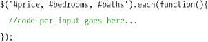
Within the each loop, the script starts by making a reference to the current input in the loop, and then applies a generated id to the label element, stores the unit name from the data-units attribute, and builds a variable that stores the human-friendly feedback text that will be used for ARIA and the slider handle’s tooltip:
To ensure keyboard control to the slider for screen-reader users, we’ll apply a role of application to the body element:
$('body').attr('role','application'),
Next, the script adds a div for the jQuery UI plugin to insert the slider markup:
var slider = $('<div></div>'),
This div is inserted into the page, just before the input. (Normally, we’d do this after creating the control, but the slider plugin requires that the markup be on the page before it can be configured.)
slider.insertBefore(input);
Then we can initialize each slider, passing options to the jQuery UI slider API in key/value pairs, separated by commas. We’ll set the min and max options with the values of the min and max attributes from each input. The initial value of the slider is set with the value option, which we’ll grab from the input’s value and parse into a number. The range option allows for a visual highlight either on a range between two slider handles, or from a handle to the end of the slider; we’ll set the range to min, which tells the plugin to create a range element that stretches from the start of the slider to the handle. Lastly, the step option sets an increment by which the slider handle will move; we’ll use a special conditional statement called the ternary operator to set the step option to 50 if the current input has an id of price, and 1 for all others:
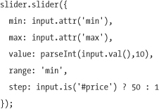
With this information, the jQuery UI plugin creates the fully functional slider control, and inserts it into the div before the text input.
Now that the slider is functional, we’ll make it more meaningful and usable for screen-reader users by adding ARIA attributes:
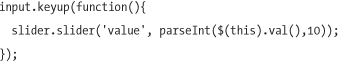
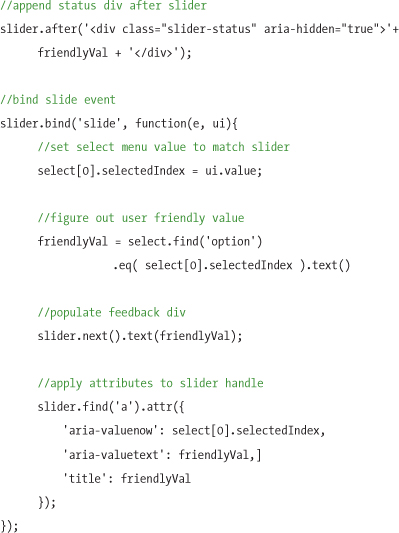
Each slider should also sync with the original input element every time it updates. We’ll take advantage of the slider plugin’s custom slide event to update the input with the current slider value whenever it updates:
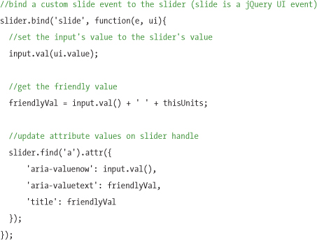
We also want the input to talk back to the slider control and update the slider handle position when users type a value into the input field. To do that, we’ll use the plugin’s slider method again. The first argument we’ll provide is the slider option we’d like to update (value), and the second option is the input’s current value:
We now have a slider built from a standard input, and the means to keep both synchronized. When the form is submitted, each input’s value will be sent with the form data the same way in both the basic and enhanced experiences.
Generating the select-based sliders
The basic steps to initialize the select-based slider widget by parsing the foundation HTML are quite similar to the input, but the methods and syntax are a bit different for a select.
The first step is to loop through each select that will have a slider:
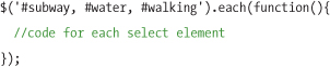
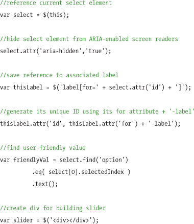
Inside the each loop, the script will create a variable reference to the current select element, apply aria-hidden=true on that select, apply a generated id to the label element, capture the text for the currently selected option, and then create a div that will hold the slider:
The slider div is inserted just before the select element:
slider.insertBefore(select);
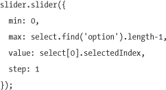
The script then calls the jQuery UI slider method on the div and passes in the configuration options for the minimum, maximum, and current values to create a slider. The min and max options refer to the first and last index numbers of the options in the select (which start at 0). The current value is found by checking the selected option in the original select element. We’ll set the step option to 1, as it’s critical that every option from the select will be available in the slider.
We’ll add the same ARIA attributes to the slider as we did with the input–based sliders to make it accessible to screen readers:
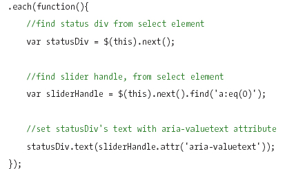
Next we’ll insert a div with the current value to act as visual feedback, since the select is hidden. We’ll also bind the plugin’s slide event to watch for changes in the slider handle’s position, and do two things when the slider value changes: update the selected value of the original select, and update the text in the feedback div with the user-friendly value. We’ll also apply the aria-hidden attribute, to prevent duplication for screen-reader users who will get the value from the select’s aria attribute.
Lastly, the script will insert the static markup needed to build the color-coded range legend’s image and labels:
Using the slider script
The slider demo and code that accompanies this book (available at www.filamentgroup.com/dwpe/) includes the script, jQuery.peSlider.js, which packages the progressive enhancement slider features outlined in this chapter into a reusable plugin. The peSlider script is a “wrapper” for the jQuery UI slider plugin; it requires both jQuery and jQuery UI as dependencies.
To use this script in your page, download and reference the files listed in the slider demo page, and then call the peSlider method on a numeric input, select element, or any combination of the two. This plugin makes it possible to create all the sliders in our demo page with a single jQuery statement, such as the following:
$('#price, #bedrooms, #baths, #subway, #water, #walking').peSlider();
Calling the peSlider method will create a jQuery UI slider with all the data and proxy logic to sync the native element to the slider, an automatically calculated default increment, and all ARIA attributes for accessibility.
There are three custom options we described in the examples above that are not included by default in either the jQuery UI slider plugin or the peSlider plugin: the range option that adds a highlight color fill to the slider track to show the selected area; the modified step option for setting a custom increment; and the div that displays text feedback about the current selected value to the right of the select-based sliders. To support these specific examples, you’ll need to either pass configuration options to the peSlider method, or generate some markup manually using jQuery. The examples that follow will walk through how each of these examples could be achieved using peSlider.
The first three input-based sliders use the range feedback element, which highlights the track from the slider’s start to the handle. Our peSlider plugin wraps the native jQuery UI slider, so we can pass any native jQuery UI slider options, like the option to create range feedback, as key/value pairs. For example, we’ll specify the range min option:
$('#price, #bedrooms, #baths').peSlider({range: 'min'});
You can pass any jQueryUI slider options in this way; keep in mind that the min, max, and value options are automatically populated from the input or select markup by our plugin and don’t need to be passed in as arguments.
The peSlider plugin will also figure out a sensible default increment based on dividing the slider’s maximum value by its width, and automatically set the slider’s step option to that increment. This default can easily be overridden in favor of a custom increment by setting a specific step value:
$('#price').peSlider({step 50});
In our x-ray example, the select-based sliders update a read-only block of feedback text to the right of the slider. The peSlider plugin doesn’t automate the process of generating and updating a feedback div, because this is a specific design element that may not be needed in every situation. However, this feature can be accomplished by using jQuery to key off the slide event of the slider to check the new value and update a feedback div.
The following code inserts a feedback div after each select-based slider and uses the slider’s slide event to update the feedback div whenever the slider changes values. For the text in the feedback div, we’ll simply grab the slider handle’s aria-valuetext value, since it’s already formatted as a user-friendly version of the slider’s value:
The peSlider plugin is very simple by design because the jQuery UI slider provides a wealth of features that can be easily accessed to extend it.
Note
To learn more about the wide variety of features available in the jQuery UI slider, including vertical orientation, additional callback events, and visual theming using ThemeRoller.com, read the documentation at http://jqueryui.com/demos/slider.
* * *
This chapter illustrates how we can build very interactive elements like a slider with progressive enhancement techniques in a way that will work on any device. Using scripting to parse data from foundation markup and generate enhanced JavaScript widgets is, we think, a very powerful way to take advantage of Web 2.0 features while still providing a semantic HTML equivalent that will work on any device.
We also demonstrate how to wrap an existing full-featured plugin to add progressive enhancement capabilities and ARIA accessibility support; we feel this is a good way to get a plugin with the features you want without having to reinvent the wheel and rewrite a plugin from scratch, and build in essential accessibility considerations.