
Chapter Two. Progressive Enhancement in Action: The X-ray Perspective
Our primary goal when building a website is to ensure that everyone gets the best possible experience within the capabilities and constraints of their browser. We believe progressive enhancement makes it possible to achieve this goal by delivering all the benefits that advanced coding affords to those with modern browsers, while still serving the needs of users on older browsers, screen readers, and web-enabled mobile phones—all with a unified code base.
Over the course of many client projects, we’ve devised a custom progressive enhancement-based methodology which has two important keystones: a capabilities test to conclusively determine each browser’s specific capabilities, and a design and development planning process we call “the x-ray perspective.”
The x-ray perspective is based on the principle that even within the most complex modern web designs—including dynamic, Ajax-driven applications with desktop-like behaviors—essential content and functionality can and should be expressed with simple, semantic HTML to provide a usable, accessible experience for all visitors. Taking an x-ray perspective means looking “through” the complex widgets and visual styles of a design, identifying the core content and functional pieces that make up the page, and finding a simple HTML equivalent for each that will work universally. It also means identifying the complex styles and behaviors of each component, and creating a strategy for conditionally applying these enhancements when the browser is capable, and in a way that maintains accessibility.
The x-ray process is a powerful tool for thinking strategically about how to layer on page enhancements in the best possible way; it can make the difference between a fully accessible experience and a series of frustrating dead-ends. It’s simply a matter of “unlearning” some common bad coding habits, and getting into the habit of thinking strategically about first building the most complete basic experience possible on the page, and then layering the cool stuff on top of it.
In this chapter, we’ll summarize the mechanics of our x-ray method, and then review four real-world design cases that include a range of advanced interface elements and interactions. The case studies will show how we evaluate a complex design with the x-ray perspective, review the development and coding decisions we make when building foundation and enhanced markup, CSS, and scripts, and also discuss some of the additional enhancements we add to ensure broad accessibility. Finally, we’ll finish up with a summary checklist of criteria to consider when testing code to verify that all the effort put into progressive enhancement will actually deliver a satisfying experience to all users.
An overview of the x-ray perspective
The x-ray perspective is a methodology we’ve developed to evaluate a complex site design, break it down into its most basic modular parts, and build it back up in such a way that a single coded page will work for modern browsers with full functional capabilities as well as all other browsers and devices that may understand only basic HTML and nothing else.
The x-ray process starts with a target design that shows how the final page should look and behave on a modern browser, with all the advanced bells and whistles. With that target design in hand, we follow a planning and development process comprised of three key parts:
1 Define overall content hierarchy and priority, and map components to a basic HTML equivalent.
2 Build “foundation” markup that provides all essential content and functionality with minimal “safe” styles and no JavaScript.
3 Write advanced markup, CSS, and JavaScript to layer visual and functional enhancements in browsers that can support them.
Constructing the basic and the enhanced experiences in code is often an iterative process; as we write a first draft of the foundation markup and begin working through where to add enhancements, we often find cases where slight tweaks to the foundation markup will be necessary to make those enhancements possible.
Defining content hierarchy and mapping components to HTML
The first step is an exercise in prioritization that simultaneously looks top-down to identify the overall content grouping and hierarchy, and bottom-up to define basic HTML equivalents for all content and functionality.
With content grouping and hierarchy, there are a few questions to consider:
• What are the most important pieces of content on the page, and what do users need to read/focus on to understand the intended purpose or message? Is there a literal or implied order of that content?
• Looking across the full site design, are there common content, functionality, or behavior patterns that can and should be reused in the template system?
• Are there any tasks that must be completed? If so, what are the steps in the process, and the tools the user will need? Are steps required or optional? Are the content and/or the choices for any step contingent on a prior user decision?
These higher-order questions tease out opportunities to establish interface rules and norms, and become a foundation for the centralized style and functional behavior rules for the coding process.
Concurrent with the high-level analysis, we look with a critical eye at the detailed page content and functionality, and how it would work in the basic vs. enhanced experience:
• Does the design call for content that’s inserted dynamically via Ajax? (In the foundation markup, this content must either be served with the page or be contained in a separate, linked HTML page.)
• Are there parts of the interface that constitute a workflow where choices in one step determine options in another, or require detailed connections back to a server to validate a selection? We need to make sure any contingencies are properly segregated in the basic experience to help users be most efficient, and to minimize errors or complications.
• Are there parts of the interface that may be prohibitively bandwidth-intensive or difficult to use in the basic experience, constructed only with standard HTML? If so, we can either provide simpler components in the foundation markup, or encourage basic users to accomplish a goal through an alternate, offline method.
Finally, we do a detailed analysis of each individual component on the page to identify its purpose and determine the basic HTML elements that would best support it. At the same time, we consider how we could apply CSS and JavaScript enhancements to this markup, and assess whether enhancements introduce any specific accessibility concerns.
In our own work, we often find ourselves in interesting debates as we figure out how to express a very complex user interface with the limited vocabulary of HTML. Some basic HTML decisions are quite straightforward—simple page headers and body content, for instance, clearly lend themselves to being formatted as headings and paragraph elements. But others—particularly more complex interactive components that don’t clearly map to standard HTML elements—occasionally require more careful thought.
Consider, for example, a custom slider control that filters for flight times and prices:
Figure 2-1 Sliders used as filters on a travel search website.
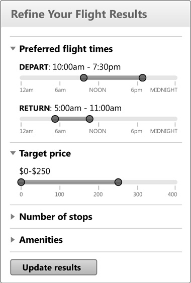
What’s the proper HTML equivalent for a slider that sets a start and end timeframe? Or a low and high dollar amount? Are they the same?
This is where the x-ray perspective kicks in. Instead of looking at the appearance or user-interaction of an element in the final design, we focus on what information the element is supposed to convey or what data needs to be collected from the user. What’s really going on inside Kayak’s sliders, beneath the surface?
Consider that each timeframe slider is designed to collect two values—a start time and an end time—within a 24-hour period. A few standard HTML elements for collecting user input could very effectively capture those values, including a text input or a select element, but which element provides the best user experience? The time chooser also has a fixed set of options on a continuum, so a pair of select elements—say, with standard time increments at 15-minute intervals—would be a good choice for the foundation markup, because it provides clear user constraints analogous to markers on the slider’s scale (it allows only valid times to be selected). For an enhanced experience, we’d leverage the select elements’ markup—their options, values, and any other relevant attributes—to create a full-featured slider widget with CSS and JavaScript that “communicates” its values back to the original select elements so they’re submitted with the form. (We’ll discuss detailed recommendations for implementing accessible sliders with progressive enhancement in Chapter 16.)
Considering higher-level content hierarchy, priorities, and groupings, and then mapping detailed content and component functionality to basic HTML equivalents yields an initial roadmap for building the simple markup and minimal styles in a basic experience, followed by the more complex markup, styles, and scripts that will be delivered as enhancements.
Building foundation markup and minimal, safe styles
When the overall hierarchy of the page and the purpose of each component is planned out, it’s much easier to efficiently write semantic HTML code that will serve as the basis for both the basic and enhanced experiences. We refer to this HTML as the “foundation” markup because it literally forms the foundation on which we’ll build CSS and JavaScript enhancements to bring the finished design to life.
When coding the foundation markup, we tackle the major layout sections first—including all main container elements like the masthead, footer, and column configurations—to solidify the basic page structure before we move on to more detailed components. Then we fill out the content and functionality for all the individual elements on the page with a particular focus on using semantic HTML to create a basic experience that is easy to use. (In Chapter 3, we review how to write semantic markup that supports both the basic and enhanced experiences.)
There are some situations where HTML elements are needed to make the basic experience functional but won’t be necessary in the enhanced experience, or alternately, cases where markup is only relevant and usable in the enhanced experience. For example, a select used as a filter on a results page requires a button to submit a form in the basic experience; that button isn’t necessary in the enhanced code, where JavaScript can automatically submit on “blur” (when the user has completed their selection, and focused elsewhere on the page). Conversely, a Print button requires JavaScript to function; it should be excluded from the foundation markup so it doesn’t confuse users in the basic experience, and added with JavaScript when the page is enhanced.
Tip
When writing the foundation markup and noting where enhancements should be made, keep track with HTML comments written directly to the markup, for example:
<!-- This radio button set will be enhanced into a slider -->
or
<!-- Print button goes here -->
This annotation keeps important enhancement-related information clearly in place during development, and also provides useful signposts when returning to a design to update it, or for communicating among larger collaborative design teams.
When writing foundation markup, we periodically preview the page in a wide range of browsers and screen readers to check that the content hierarchy is intact and that the page reads well, makes sense, and is functional on its own. Well-structured markup that is written with proper semantics is inherently accessible—links and form controls are all keyboard accessible; alt text on images adds meaning for screen readers and search engines; well-organized source order makes the page easy to read.
This is also a good time to validate the markup, which can be extremely helpful in unearthing markup errors and avoiding bugs down the road.
Tip
A validation tool we frequently use is provided by the W3C: http://validator.w3.org.
Once the foundation markup is in good shape, there are a small number of “safe” style rules that can be applied to improve the visual appearance and usability of the basic experience. Safe styles are very simple CSS rules that render reliably on a wide range of browsers and degrade gracefully if they aren’t supported.
Safe styles are applied to the foundation markup through an external style sheet and can include a font family and a very minimal set of background colors, borders, padding, and margins—just enough to convey basic branding and create comfortable spacing between content objects, to underscore the hierarchy and make the page easier to read or scan.
Some CSS properties can render in unexpected ways across older and mobile devices, so it’s crucially important to avoid using them in the safe style sheet for the basic experience. These include floats; reversing text on darker background colors or images; and setting fixed width or height dimensions, overflow properties, or negative margin or position values. (We’ll discuss how to write safe styles in greater detail in Chapter 4.)
When foundation markup and safe styles are completed, the page should be fully functional and usable to everyone. Next, we’ll plan the enhanced experience.
Applying markup, style, and script enhancements
When coding enhanced components, like a custom slider control, we often need to tweak the foundation markup so it will better enable the enhanced experience. For example, we will often add IDs and classes to HTML elements in the foundation markup to establish the “hooks” needed to apply styling and behavior enhancements. If extra markup is needed to apply multiple background images or other visual effects in the enhanced experience, span and div tags may also be selectively added. Since these attributes and tags are invisible to a user in the basic experience, they are harmless to add to the foundation markup and will make the enhancement process much easier to style and make interactive with JavaScript. Still, we recommend using extra markup selectively and in moderation—additional tags add weight to the page, and too much additional complexity and page weight could negatively impact the basic experience (read: increase download time).
Once the markup is complete, enhanced styles will do most of the heavy lifting to move content into floated or positioned columns, layer in background images, and apply styles necessary to make interactive widgets function properly. As such, they may not work for all browsers the same way, and may need to be divided among multiple style sheets that are applied conditionally when the capabilities test passes.
This is also the time to add any JavaScript functions that transform the foundation markup, manipulate styles and add behavior to transform the page into the enhanced experience, and to remove markup that is useful only in the basic version of the site.
It’s also critical to ensure that any content that will be added or updated by Ajax in the enhanced experience be delivered to the page in an accessible way for users in the basic experience. For example, a data grid, search results page, or product description should be populated with data in the foundation markup, not structured as an empty div that is populated by Ajax after the page loads. Any filtering, paging, or navigation to update page data should be built with standard HTML forms and links to make sure the navigation works without scripting enabled. This seemingly simple rule is frequently overlooked—presumably in the name of speed or responsiveness—but as we saw in the examples in this book’s introduction, neglecting to serve necessary content with the page can result in unacceptably poor experiences for users on devices without complete JavaScript or CSS capabilities.
* * *
Designing and developing web pages with the x-ray perspective requires a little more planning time up front, but it pays off in huge dividends in the form of cleaner separation of markup, presentation, and behavior, and most importantly, it makes the goal of progressive enhancement attainable.
Next, we’ll look at four real-world design scenarios—a news website, a retail checkout form, a dynamic budget-planning tool, and a photo-manager application—featuring advanced interface designs that present rendering or accessibility challenges. Each case study will illustrate how to deconstruct a design into foundation markup and style and script enhancements, with emphasis on how to maintain accessibility in both the basic and enhanced experiences.
Case 1: Planning structure and organization in a news website
News sites have transformed in recent years to incorporate a broad range of enhanced styles and JavaScript-enabled features like animated slideshows, compact filtering and sorting controls, dynamic charts, maps, and other rich data-display tools. While these enhanced features dramatically improve the experience, they require a more complex code structure and present potential challenges to accessibility, which make this site an ideal case for building with progressive enhancement.
Let’s take a look at the target news site design:
Figure 2-2 News website target design with interactive features
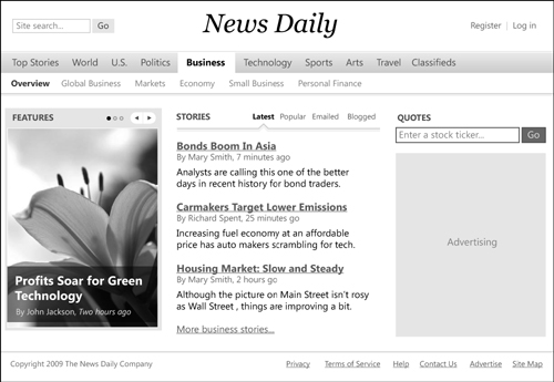
The target design incorporates a number of interactive components, including a prominent rotating feature block, a list of story links with several filtering options, and a custom stock-quote search tool.
Evaluating content organization and naming
First, we’ll evaluate the final design to understand how content is grouped, and to identify any components with advanced features that will need to be mapped to simple standard HTML.
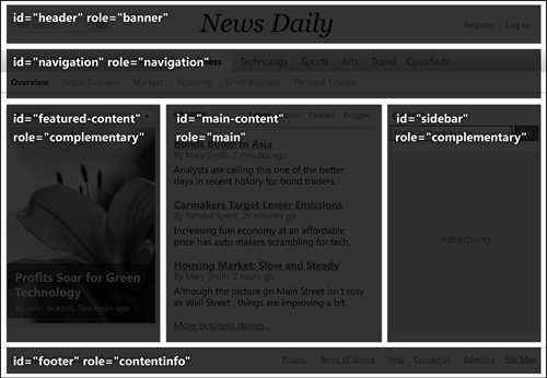
The first step is to organize and name the high-level regions of the page. This layout is pretty straightforward: starting at the top, there is a masthead with the search box and logo, followed by a two-level global navigation bar, a large content section in the main part of the page with three columns of content, and a footer with copyright and support links. We’ll assign a descriptive ID to each region that is brief and clearly describes its purpose and priority on the page, rather than its position or style (which may evolve if the site is expanded or redesigned).
To organize these regions, we’ll name the top bar’s ID “masthead,” the global navigation “navigation,” and the footer bar “footer.” Naming IDs for the three columns within the main page is a bit trickier. The fairly neutral ID scheme of “featured-content” for the feature slideshow column, “main-content” for the wider center column, and “sidebar” for the right-hand column with search and advertising is a workable naming convention that sufficiently describes the priority and relationships among the columns.
We should also assign WAI-ARIA landmark roles to each content region. ARIA is a specification created by the W3C for assigning additional semantic meaning to markup for screen readers, like the role or dynamic state of specific components. Landmark roles can be assigned to static content blocks to identify their primary purpose, and also provide a quick way for screen reader users to navigate around the page, as many newer screen readers enable this functionality. Landmarks are assigned with the role attribute and an accepted value, like navigation or main; the complete list of accepted roles and their descriptions are listed in the latest WAI-ARIA specification at www.w3.org/WAI/PF/aria/roles#landmark_roles.
Figure 2-3 The news website’s primary layout blocks are assigned logically named IDs and given landmark roles.
Leveraging native HTML hierarchy features for content organization
In the basic experience, advanced CSS and JavaScript aren’t available to create multi-column layouts, or use slideshows or tabs to streamline the content presentation. Instead, the basic experience must rely completely on source order and semantic markup structure to express the content organization and priority. One of the most important tools for visually organizing content on the page is the heading element, which has built-in hierarchy in its structure, and provides additional semantic meaning for search engines and people using screen readers. We’ll leverage the native capabilities of headings to provide the majority of the structure here.
When coding the foundation markup, it’s important to analyze all the page content and sketch out a heading structure that is parallel, comprehensive, and consistent. Here is how we’ll set up the heading structure for the news page to provide a clear overview of the document organization:
• The masthead, including the name of the publication, “News Daily,” is marked up with an h1 element, because it’s the most prominent and important heading on the page.
• The main section of content is divided into three columns for Features, Stories, and a sidebar with a stock quote search tool and advertising. The top heading for each column is marked up with an h2 element.
• Content objects within each column, like slideshow titles, linked article titles, and market data tabs, are marked up with h3 elements.
Headings used in this way help both visual and screen-reader users discern the content hierarchy. By default, browsers render heading elements in graduated font sizes, from very large (h1) to small (h6); in the basic experience, we rely on the browser’s default sizes to style headings so that they appear larger than normal text.
Headings introduce hierarchy and order on the news page, and build in an added benefit for users of screen readers who rely on markup structure alone to navigate; most modern screen readers now provide a control to browse the content by page headings (as well as paragraphs and lists).
Structuring navigation
Top navigation in the enhanced experience is a compact horizontal bar; a background color shift indicates on-state feedback for the selected primary navigation option, and groups it with secondary navigation options:
Figure 2-4 News site top navigation in the target design
In the basic experience, this navigation is best represented as an unordered list, because it will support the hierarchical relationship between the selected primary navigation option and its list of sub-navigation options. Each list item contains a link that will refresh the page in both the basic and enhanced experiences when clicked. The unordered list of navigation links renders in the basic version of the page as a long, nested list of links:
Figure 2-5 Top navigation unordered list seen in the basic experience, with the “Skip to content” link above.
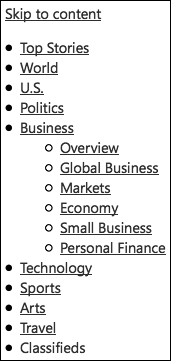
When it’s placed at the top of the source order (just below the masthead), users navigating the page with keyboard commands on mobile devices and screen readers may have to scroll or read through this long list of options before reaching the more important, featured content, so it’s good practice to provide an optional link that lets users skip any navigation elements that are repeated on every page. Simply include an anchor link that reads “Skip to content,” and point its href value to the main content area’s id, in this case, content:
<a href="#content">Skip to content</a>
We’re choosing to show only the sub-navigation for the selected option in our design, but keep in mind that the submenus associated with all ten top-level news categories could number 50–80 items or more. For complex or deeply nested navigation systems with hundreds of options, we sometimes place navigation markup below the page content in the source order so that users don’t encounter—and have to skip—the complete navigation every time they load a new page. This allows the main content to display closer to the top of the screen, and makes it easier for users with mobile phones or screen readers to access it quickly.
Tip
When employing this alternate approach, it helps to provide keyboard users a “Jump to navigation” link at the top for quick access to the navigation block at the bottom.
Accommodating layered and animated content
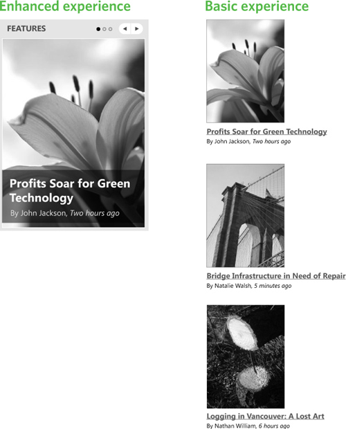
The first column of content in the main page content area contains a featured slideshow with animated transitions and Pause/Play controls. The slideshow is slick, but at a fundamental level it’s really just a compact way to display links to multiple feature stories, each with an image, a story title that links to a detail page, and a caption. Looking at this widget from an x-ray perspective, this slideshow could simply be built from a series of content blocks, written to the page as part of the foundation markup so they’re accessible without JavaScript, and then enhanced into a slideshow for capable browsers.
In the basic experience, all slideshow content can be formatted like a static filmstrip, with the photos and their captions all displayed at once. This way, all the content is visible and accessible, and we can easily transform the set of content blocks into the enhanced slideshow experience.
The slideshow controls—the Pause/Play, Previous, and Next controls for navigating through the slides—are necessary only in the script- and CSS-enhanced experience; they can be omitted entirely from the foundation markup and created and inserted by JavaScript when the capabilities test passes.
Figure 2-6 The animated slideshow in the enhanced experience is based on a fully accessible series of content blocks in basic experience.
In some situations, serving all feature stories may be too bandwidth-intensive for the foundation markup. If this is the case, it’s equally valid to include a single feature story in the foundation markup to reduce page weight, and then load the remaining stories’ markup into the page with Ajax for users in the enhanced experience.
Supporting dynamic filtering and sorting
Next to the Features block, the page displays a Stories list that users can filter by the latest, most popular, most emailed, or most blogged:
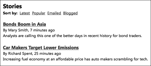
Figure 2-7 In the enhanced experience, the filter links dynamically load new stories with Ajax.
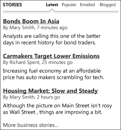
From an x-ray perspective, we see that this feature will be accessible to all users in the basic experience if the page loads an initial set of stories based on a default filter option (“Latest”), and the filter controls are coded as standard links that reload the page with an alternate set of stories:
Figure 2-8 Filtered story views are accessed with simple links in the basic experience.
In the foundation markup, each filter link’s href attribute will contain parameters to reload the page with a filtered story list. In the enhanced version, we can use JavaScript to intercept the click on a link, parse the link’s href value, and repopulate the list of stories dynamically with Ajax, instead of requiring a page refresh.
This feature could also be implemented as a small form with radio buttons, or a select control with sort options, and a Go button to submit the form. The choice of how the basic markup is built for a particular interaction like this depends on the server configuration, and what feels most usable and appropriate for the design.
Case 2: Workflows, validation, and data submission in a checkout form
Consider an online scenario that commonly employs enhanced dynamic features: an ecommerce checkout form.
Many contemporary checkout pages use JavaScript-, Ajax-, and advanced CSS-controlled features to deliver highly efficient and engaging transactions that minimize opportunities for error and result in far higher user confidence. For example, checkout pages commonly include features such as form elements that progressively reveal required fields based on user input: in-place data validation and highlights and error feedback on form elements; tooltips with helper text and instructions next to or even within form fields; and highly efficient data-entry widgets like sliders and calendars. These features visually organize a form, place focus and information where users need it most, and make it more attractive and easier to use.
The downside is that these features function poorly or not at all without JavaScript and CSS, possibly leaving some percentage of users on older browsers, slower systems, and mobile phones out in the cold. Since most companies that sell on the web spend a great deal of time and effort convincing shoppers to purchase on their site, it really isn’t acceptable to lose even a single customer on the final checkout page because the developer decided to take a shortcut.
So let’s take a look at a checkout page design with some advanced features to see how we could devise a plan that provides all required content and functionality in the foundation markup, and pave the way for the addition of enhanced features for capable modern browsers.
Breaking down the checkout form design
Our target design is a compact checkout workflow that groups several distinct steps into a single page:
Figure 2-9 Target design for an advanced checkout transaction page
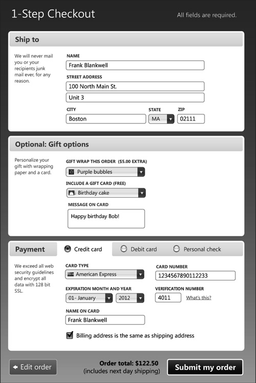
The first step in building an accessible checkout form is to take a high-level pass through the target design to identify any features or components that don’t map exactly to standard HTML. A host of advanced features immediately jump out:
• Richly designed form sections with multi-column layout
• Custom-styled dropdowns with branded visual styles and, in the case of the gift options and credit card chooser, a thumbnail image to deliver feedback
• A radio button-driven set of payment options that function as tabs, each displaying a unique set of form controls for collecting that type of payment
• A custom-styled Submit button
We need to understand how the features and interactivity should work in the basic experience, since we won’t be able to rely on JavaScript for constraints, validation, feedback, or interactivity.
With data-entry-intensive form interfaces in particular, we should focus our x-ray view specifically on identifying and isolating any cases in the enhanced interface that employ sophisticated error-condition feedback, dynamically populate data from one area to another, or reveal options contingent on user decisions. These features need to be handled through server interactions in the basic experience, so it’s critical to identify any key workflow points with functionality that requires server input or validation, and structure the experience to properly support the user in a logical and error-free way.
Starting at the top of the form, we have a shipping address block that is pretty straightforward; it contains a combination of text inputs and dropdowns and requires no JavaScript for interactivity in the enhanced experience. While the Gift Options block’s design calls for custom features, like icons displayed with each option, the data input mechanism has similarly straightforward functionality, just like a standard select element, and doesn’t require extensive validation or introduce any complex business rules.
When we apply the x-ray perspective to the payment section, we arrive at an important decision point: The enhanced version is organized into a radio button-driven tab strip that reveals specific form controls unique to each payment method, based on user interaction; the server retrieves the appropriate set of form controls dynamically, based on the chosen radio-button option. But in the basic experience, we don’t have the luxury of dynamically activating and disabling multiple form fields.
We could present a very long form in a single page, with the three payment methods listed out under their respective radio buttons, but this format is not very usable. It places unreasonable burden on the shopper to understand the technical constraints, fill out only the fields related to their selected payment method, and skip the form elements related to the other payment types. This can lead to errors, confusion, frustration, and ultimately, of course, abandoned checkouts.
A better option is to break the form into multiple screens, splitting the process into logical steps to provide server-side validation and properly branch the experience based on user input. This separation of steps affords an added benefit: it allows for content captured in earlier steps to be directed into successive steps—shipping address information entered into the first block can populate the payment section in the third, for example.
With this plan in mind, the next step in our x-ray process is to look at each part of the enhanced target design to identify the contingencies in detail, and map our enhanced components to basic HTML equivalents.
The first two sections—Ship To and Gift Options—include no dependencies, and they logically fit together, so we’ll combine these two sections into the first step in our basic experience:
Figure 2-10 The first two sections of the enhanced form (left) are grouped into the first step of a multi-screen checkout wizard for the basic experience (right).
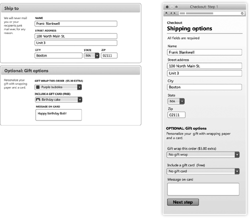
The enhanced design for the Gift Options section calls for custom select menus for the gift-wrap and gift-card fields, in order to provide thumbnail images for each option. By starting with a standard select element in the foundation markup, we can provide a perfectly functional version in the basic experience that lacks only thumbnails, and then enhance it to a custom select when the browser is capable. (We’ll discuss how to create custom selects in detail in Chapter 17).
The gift-card message is applicable only if the shopper chooses to include a card, so this field will be hidden in the enhanced experience until a gift card is chosen. However, the card message field should be included in the foundation markup so it’s accessible in the basic experience; these shoppers will simply skip the card message field if they choose not to include a card. While it’s not ideal to show an unnecessary form field, it’s only a single, clearly labeled field, so its presence isn’t likely to cause confusion or place too much burden on the user.
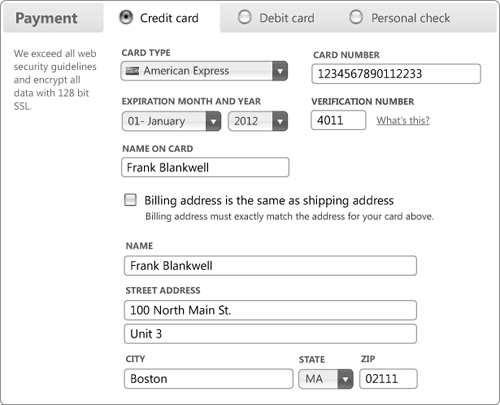
Now let’s address the Payment section. In the enhanced experience, the interface presents the payment-type option in a single, compact row of radio buttons, and pre-fills the default page with the form fields and content for the most common option, Credit Card:
Figure 2-11 The Payment section of the enhanced experience defaults to the most popular option—in this case, the Credit Card form.
In the basic experience, we could include the payment options at the bottom of the first step, below the shipping address and gift options, since there are technically no contingencies that must be met before this step. But from a user perspective, payment options may seem out of place here—a logical disconnection—and that could be confusing. Also, we want shoppers to be able to jump back to specific steps from the final confirmation page to edit their choices, which will be easier to implement if we maintain a crisp divide between the shipping and payment steps (this requirement won’t be necessary in the enhanced experience, as all content is visible on the single-page form).
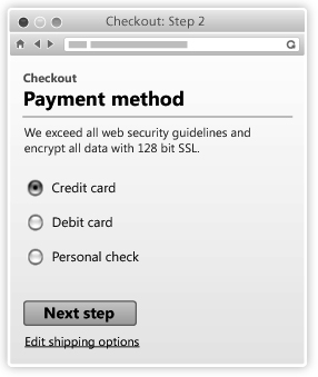
So the second step in the basic checkout experience will be a fairly simple page with three radio buttons for the various payment options; when submitted, the form will send a request to the server and retrieve the correct payment fields based on the user’s choice:
Figure 2-12 In the basic experience, a simple payment chooser retrieves the correct form fields.
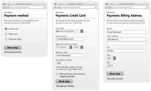
The next screen will be conditionally written by the server to display one of three different payment forms depending on whether credit card, debit card, or personal check was selected.
For credit card and debit card payments, a billing address block is used to validate the card information. Since the shipping address has already been sent to the server, we can provide a checkbox to let shoppers skip the billing address entry if it’s the same as the shipping address. In the enhanced experience, checking this field will hide the billing address fields with JavaScript. In the basic experience, the billing address form presented on the subsequent screen can be skipped completely if the checkbox is checked:
Figure 2-13 Payment workflow in the basic experience. Users who check the “same billing address” checkbox on the Credit Card screen (middle) will skip the Billing Address screen (right).
The basic checkout experience includes a final review page that provides feedback on all the data entered throughout the workflow, with an Edit button next to each section that navigates the user back to that step. Since the basic checkout experience involves a series of forms across multiple pages, users’ data entries and selections should be presented for review before the form is submitted, to give them the opportunity to catch and edit errors:
Figure 2-14 Order review and confirmation page in the basic experience
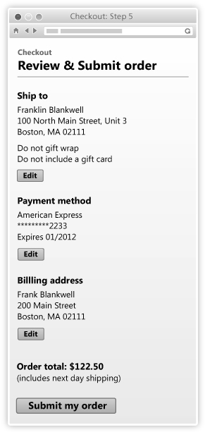
This page is unique to the basic experience—in the enhanced experience, the whole checkout takes place on a single page, so the ability to review and edit the information is always available.
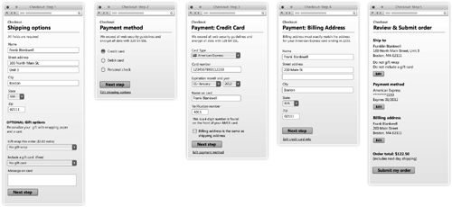
To recap: the basic checkout experience consists of five discrete steps that branch the user workflow based on business rules, and provide validation along the way:
1 Shipping address and gift options
2 Payment method (credit card, debit card, check)
3 Payment details (with custom form fields based on the user choice in step 2)
4 Payment billing address (for credit and debit options only)
5 Review order
Figure 2-15 The five sequential steps of the basic checkout experience
Marking up the form to ensure accessibility
To build our checkout form in the most accessible way, it’s essential that we make good choices about HTML markup structure, taking special care to consider underlying semantics. Are the form elements organized and coded to be as descriptive and usable as possible? For instance, every form element should have a properly associated label, and provide the best possible user experience in terms of ease of use and proper constraints to avoid errors.
In the foundation markup, each checkout page must start with a form tag with an action attribute directed to the server resource—for example, a PHP file—that will process the form. For each step in the checkout sequence, form controls are logically grouped within a fieldset element, and labels are stacked above each input with only minimal styles applied—no float or width/height properties should be set on form elements. At the bottom of each page, a Next Step button is provided to submit the form and move the user to the next step in the process, and a Back link navigates the shopper back to the previous page.
Our enhanced checkout form design includes several custom-styled select menus with embedded thumbnail images: gift-wrap options, gift-card options, and a custom credit-card chooser. It’s essential to use a basic HTML select in the foundation markup to ensure that any user can make all relevant functional choices, and then enhance that select with custom styles once a browser has passed the capabilities test.
Figure 2-16 The basic experience uses a standard HTML select (left), which is transformed into a custom-styled select with thumbnail images in the enhanced experience (right).
Note
For a detailed explanation of how to style custom selects, see Chapter 17.
The custom-styled Submit My Order button is another case where proper markup choice is crucial. The latest HTML specification (4.01) provides two elements: an input with the type attribute set to submit, or a button element. Both natively submit form data, but the button element was omitted from a subset of XHTML called XHTML-MP (mobile profile), and as a result is not supported in browsers that render according to the XHTML-MP specification. The input element, on the other hand, is supported by every browser that implemented HTML 2 or later and will work on the widest range of browsers, including obscure or older mobile devices. We want to make sure that any transaction process works reliably everywhere and for everyone, so we recommend using the input here.
Figure 2-17 A universally compatible submit input is used in the foundation markup (left), and custom-styled in the enhanced experience (right).
With some custom styles applied to make the submit input look and behave like a button, users get a satisfying, predictable, and reliable experience everywhere. (We describe the recommended process for developing custom-styled buttons in Chapter 14.)
Applying constraints and validation
Ensuring that shoppers enter valid information during the checkout is essential to completing the transaction. As designers, we have three techniques to ensure that valid data is entered: provide instruction and helper text to demonstrate proper formatting, impose constraints to prevent invalid entry, and provide validation logic in the form of user feedback (tell the user on-screen that they entered invalid input and need to correct it).
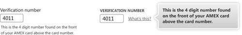
Providing instruction and example data is the friendliest of our validation options; hints about proper formatting from the start can go a long way toward reducing invalid data. We recommend either displaying helpful content directly on the page or providing in-context assistance in tooltips next to specific fields, to keep the overall experience clean and help the user focus on the question at hand.
Figure 2-18 Instructions can help reduce data errors. They should be placed on the page in the basic experience (left), and can be selectively shown in the enhanced (right).
We can also constrain user entry to valid data values by providing controls and enhanced widgets that accept only valid entries (like checkbox, radio button, select, auto-complete text input, slider, or calendar date picker), and showing only the necessary form elements for the task at hand using progressive disclosure.
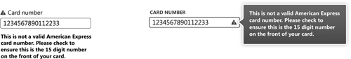
When the design calls for a free-text entry control such as a text input, for example, for a credit card number, we can provide text instruction in the basic experience and configure server-side validation to check the value to makes sure it’s the right type (e.g., numeric), within the acceptable value range (e.g., 15 digits), and, if needed, add more sophisticated algorithms to recognize number patterns that map to specific card types.
Figure 2-19 Credit card number validation requires form submission in the basic experience (left). The input can be validated in real time with JavaScript in the enhanced experience, and the error message displayed as a tooltip (right).
The basic experience requires server interaction to provide validation feedback and hide/show form fields based on relevant context. When a user clicks the Submit My Order button, the server can validate form data to check for required fields that are not filled out or fields that don’t have valid data values, and return the user to the relevant page with clear messaging about what needs to be corrected. The server can also coordinate which form fields should be seen next, like which payment form to show based on the user’s payment choice.
In the enhanced experience, much of this user-constraint and validation behavior can happen in real time by using Ajax, and feedback is provided as the user types or completes their selection. This technique allows us to reuse the same server-side validation rules in both the basic and enhanced experiences.
Assembling the basic and enhanced experiences
The single-page enhanced experience is broken down into so many steps for the basic experience that it may seem like the foundation markup for both experiences is too different to use the same code. However, we can serve up the first step of the basic experience to everyone, run the capabilities test, and use the power of JavaScript (specifically, Ajax) and CSS to assemble the foundation markup from our five basic steps into the single enhanced page. Or, to speed up page load, the server could check for the cookie set by the capabilities test to see if the browser has already passed, and then assemble the entire page for users of the enhanced experience.
It’s also possible to leverage the same back-end logic created to serve the proper forms and implement validation rules for both the basic and enhanced experiences. In this case, the server logic would be configured to simply retrieve requested data; the enhanced experience would employ Ajax to make the request, while the basic experience would use a standard page request.
Case 3: Interactive data visualization in a budget calculator
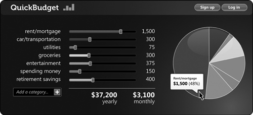
Our next case study is perhaps our most visually rich example: a dynamic budget calculator tool for planning a financial budget. It works with an interactive set of sliders, calculates data on the fly, and delivers real-time feedback in the form of an interactive pie chart with hover tooltips and monthly and yearly totals.
Figure 2-20 Target enhanced design for the budget calculator
At first glance, this tool may not immediately seem like a good candidate for progressive enhancement. But with an x-ray perspective, this tool’s core functionality is very straightforward and lends itself to a universal design approach: the advanced slider elements simply allow users to enter a numeric value for several categories, and the summary table and pie chart display the calculated sum of those values and show their relative weight by category and sum total.
Choosing basic markup for the budget line components
The budget calculator uses a slider widget to set and adjust the numeric value of each budget line item. There’s a range of “best” foundation markup options for an enhanced slider widget, with the right element depending on the number and length of options available. For example:
• In cases with 2–5 simple choices (Rate: Great, Good, Fair, Poor, Not Applicable) or up to 10 numeric levels, a radio button set is a great choice, because it displays all options for easy scanning and has built-in constraints to avoid user input errors.
• For larger or more custom continuum situations where the slider is populated with 5–20+ fixed options (like financial ratings levels, for example: AAA, AA+, AA, AA–, A+, A, A–, BBB+, BBB, etc.) a select is optimal, because it provides good constraints, and larger lists of options can be visually divided into groups using the optgroup element. On the downside, select menu options are not easy to scan because they’re hidden from view by default (contained in a dropdown menu) and may require scrolling.
• Where users can enter a wide range of numeric values (Maximum price: $0–1,000), a text input would be appropriate—with the caveat that there is no native way to constrain input to numeric values, so this approach would require server-side validation.
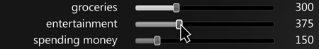
For each budget slider, we’ll use a simple text input, because we want to allow users to enter any numeric dollar value, including decimal points for added precision.
The budget calculator foundation markup starts with a form tag that has an action attribute directed to a resource for processing the form. Each budget category line item is presented in a div that includes a label, an associated text input for entering a budget dollar value, and a span to display the calculated percentage for the category. Our markup for each category looks like this:
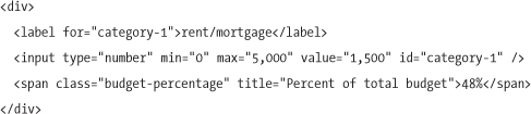
The input has an attribute of number, and additional min and max attributes to set its acceptable high and low range; its actual number value and calculated percentage would both be blank to start, and then populated with the necessary values with each page refresh.
Note
The input number type is a new attribute in the HTML5 specification, but can be used safely now as it defaults to an attribute type of text in browsers that don’t support it. We will talk more about input attributes in Chapter 3, “Writing meaningful markup.”
At the bottom of the list of categories, the form needs a Calculate Budget button in the basic experience to submit the form data and calculate totals and category percentages on the server.
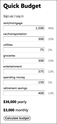
Figure 2-21 The basic calculator offers simple text inputs, calculated percentages and totals, and a button to update changes server-side.
We’ll have to accommodate one error case: text inputs for entering the budget amount don’t natively provide good constraints to prevent people from entering letters or special characters. For this reason, the inputs will need to be validated by the server each time the form is submitted.
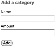
We can also support the ability to add new budget categories in the basic experience by providing a set of “blank” text inputs. Just like the Submit button to recalculate the budget, the Add button will submit the whole form and reload the page with the new category and calculated values.
Figure 2-22 A small form adds a new category to the basic experience and reloads the page.
With these two simple forms for collecting budget information and adding a new category, we’re supporting all the essential functionality to provide a satisfying and informative basic experience.
Creating accessible sliders from the foundation markup
While simple form fields in the basic experience do the job, for users with capable browsers, the tactile nature of slider controls in the enhanced experience encourages more exploration—and is a lot of fun.
Figure 2-23 Interactive, color-coded sliders update the dollar-number feedback and pie chart visualization as they are dragged.
There are a few key principles about how the basic and enhanced experience can work together in the context of progressive enhancement and the x-ray perspective.
First, whenever we build an enhanced widget that collects user input or data entry, we build it using a “proxy” pattern. For example, at page load, the enhancement script that creates the slider looks for any pre-existing value in the corresponding foundation input, and uses that value to set the initial position of the slider handle. Whenever the slider is moved, the script resets the input value to match, and the script continuously keeps the two in sync. In many cases, we’ll keep both the slider and the editable input on the page at the same time and let the user choose which one to use. The benefit of this approach is that the server can process the data the same way in both basic and enhanced experiences, because it interacts only with the input.
Second, since there aren’t any HTML elements that natively map to the semantics of a slider, we’ll use non-semantic markup for this enhanced widget—which means we need to factor in accessibility features to mirror the native behaviors that users expect. In this case, we’ll code it with a series of divs for the slider container, track, and gripper handle. But users on assistive devices won’t know that this pile of divs is an interactive widget unless we add accessibility features to “translate” it. Specifically, we’ll add an ARIA role attribute with the value of slider to identify this as a slider widget, and attributes to set the minimum, maximum, and current value for the slider so newer versions of screen readers can interpret this widget. For users on older screen readers that don’t support ARIA features, the ability to interact with the original inputs is an essential accessibility feature.
Lastly, since sliders rely on a drag behavior to move the handle, it’s also important to consider that many newer mobile devices like the iPhone, Palm Pre, and Google Android use drag events for general scrolling around the screen. To ensure that sliders are still usable on those devices, the slider script must allow users to click on a handle to give it focus, and then click elsewhere on the track to set the new value. Similar behaviors also support keyboard access—the Tab key focuses on a slider handle, and arrow keys move the slider to a specific value.
Building the pie chart
Seeing the pie chart update on the fly as the budget sliders move is a prominent feature of the enhanced experience, and really adds to the interaction. But relying on a plugin like Adobe Flash or a server-side tool to generate a static pie chart image doesn’t embrace the inclusive progressive-enhancement principles we’re striving for. Luckily, we can embrace a more universal—and future-forward—approach by using the HTML5 canvas tag to generate charts natively in HTML across a broad range of modern browsers. (Even Internet Explorer will render the chart without plugins, with a Google script called ExplorerCanvas, http://excanvas.sourceforge.net.)
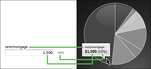
Figure 2-24 Pie chart tooltips in the enhanced experience are populated with the same values as the basic experience: category label, value, and percentage.
The pie chart’s values are pulled from the same JavaScript code that generates the percentage feedback next to each input, and passed into a script that generates the canvas chart. (We’ll cover accessible charting with canvas in detail in Chapter 12.)
The pie chart’s tooltips display the label, budget dollar amount, and percentage when the user places their mouse over a portion of the pie. These data are just a different presentation of the label, input, and percentage values in the “enhanced” table (and the foundation markup).
Note
We’ll talk about creating accessible custom tooltips in detail in Chapter 10.
From an accessibility standpoint, a pie chart image, regardless of how it’s rendered, doesn’t provide useful information for a non-sighted user. Therefore, in the enhanced experience we’ll add a bit of context for screen-reader users, so they understand that the canvas tag and any associated markup for the chart are strictly presentational. We’ll put the canvas in a containing div and add a role of img to communicate that the canvas is performing the role of an image, and also provide instructional message text in an aria-label attribute that explains the chart’s purpose and its data values. For users on older screen readers that don’t have ARIA support, we’ll provide a second message in a span tag (which we’ll hide from sighted users and ARIA-aware screen readers) that explains that the chart markup is purely presentational, along with a “skip” link so they can easily move past that markup.
In the basic experience, the percentage feedback expresses the same information as the pie chart in text form, so you may not need to include the pie chart at all. However, if a chart is desired, it’s possible to generate a static image of the pie chart with each recalculation of the budget and add it to the page as an image tag.
We now have a fully usable and accessible budget-planner tool that will work on any device—and some interesting x-ray techniques in the toolbox to reuse in other contexts.
Case 4: Supporting full-featured application capabilities in the browser—the Photo Manager
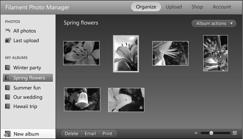
Our final example, a photo-manager interface, is a product of the more recent Web 2.0 era, with complex application functionality previously found only on the desktop, replicated within a web browser:
Figure 2-25 Web-based photo-manager application
Today, many sites and online tools include complex Ajax-powered application features similar to the ones in this example, including scalable and resizable panes for navigation and content display, simple single-object drag-and-drop gestures, complex multiple selection abilities enabled by mouse-drag selections or Control/Shift-clicking, and Ajax-powered edit-in-place actions.
There is so much interactivity expressed in this design that it’s almost difficult to see how all the capabilities might be supported in a basic experience! In fact, a big part of the x-ray exercise for such complex interfaces is to take a critical eye to functionality and decide how it will be handled: there may be a simple equivalent for select features; more complex interactions or gestures may be structured as multi-step or staged workflows; or, in some cases, we may determine that certain types of advanced functionality are so complex that their basic HTML equivalent may not be warranted for all users and devices.
As with our other target designs, we’ll start by looking at the photo manager at a high level to understand the content and functionality groupings, look for any complex data-submission contingencies, determine which content and components are essential to the function of the site for all users, and map back to basic HTML equivalents to support them.
Marking up global navigation elements
We’ll start with the overall page layout, for which the x-ray analysis is easy enough: the top bar with the product name and primary navigation sections (Organize, Upload, Shop, Account) can be coded as a standard set of links. Each link will reload the entire application window in both the basic and enhanced experiences, because the corresponding sections of the application will have different functionality. We’ll use a heading element (h1) in the foundation markup for the product name (“Filament Photo Manager”), and style it to make it look more refined in the enhanced experience:
Figure 2-26 The heading and global navigation as seen in the basic experience

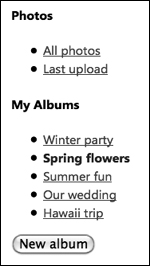
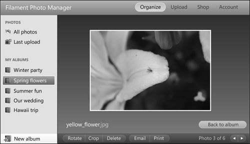
For section-specific secondary navigation, the left-hand navigation pane should also be coded as a set of standard links in the foundation markup, with headings to identify and group the two types of content (photos and albums):
Figure 2-27 The left navigation pane is coded as a series of headings and list of links.
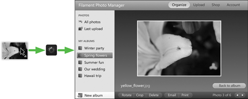
In the enhanced experience, when the user clicks a link in the left navigation pane we’d like a seamless, application-like interaction to populate the right pane with the corresponding photos. We’ll use JavaScript to intercept the link’s href value to formulate an Ajax request that grabs photos from the selected album and populates the right-hand pane.
Figure 2-28 In the enhanced experience, clicking on an album name in the left pane loads the grid of album photos in the right pane via Ajax.
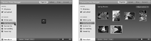
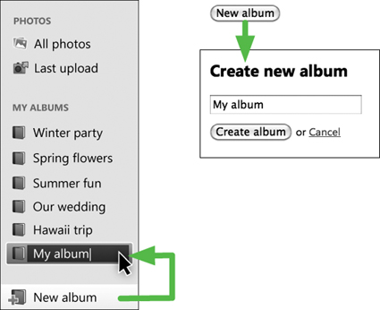
At the bottom of the left navigation pane there’s also a New Album button. In the enhanced experience, clicking this button dynamically creates a new album link in the left navigation list with a default name, ready to be edited; in the basic experience, it navigates the user to a separate page with a simple form to name the album:
Figure 2-29 The enhanced New Album button creates an editable node in the left navigation pane; in the basic experience, the button navigates to a separate form page to name the album.
Supporting complex album and multi-photo interactions
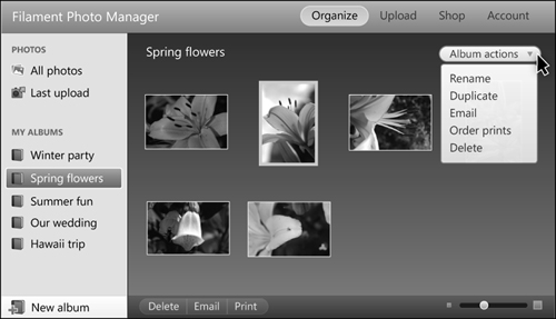
In the enhanced experience, each album is displayed in a clean, simple interface with the album name at the top and secondary actions tucked into a menu in the upper right corner. The bottom toolbar has a set of action buttons for selected photos, and a slider to change the thumbnail photo size:
Figure 2-30 The enhanced experience album detail offers Album Actions at the top of the screen, and an actions toolbar (Delete, Email, Print) for selected photos at the bottom.
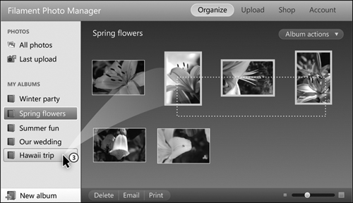
One feature that makes the enhanced photo manager really feel like a desktop application is the ability to select multiple photos in the album grid view by dragging a lasso around a group of photos, or holding down the Control or Shift key and clicking on a set of photos. When a selection is made, the interface allows users to click on the actions toolbar at the bottom to edit, delete, email, or print the selected photos, or drag and drop them over an album name in the left-hand pane to add them to an album.
Figure 2-31 Multiple photos can be selected and added to an album by dragging and dropping, just like a desktop application.
These rich interactions may not seem to be compatible with a progressive enhancement approach at first glance, but it’s actually easy to provide the same functionality by using standard HTML form elements.
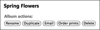
The basic experience of the album view looks quite a bit less styled, but provides all the same functionality. The album page starts with a heading followed by a series of album action buttons that route the user to separate pages to complete or confirm the actions:
Figure 2-32 In the basic experience, the album detail shows the album name and Album Actions headings first in the source order after the navigation.
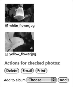
When considering the complex mouse-drag and Control-click interactions from an x-ray perspective, they simply allow users to select multiple photos—and we can easily replicate this in the basic experience with native form elements. In the foundation markup, each photo can be coded with a label containing the image name, and a checkbox for selecting the photo. The album markup is wrapped in a form tag with several submit buttons to perform delete, email, and print actions, as well as a select menu grouped with an Add button to assign the selected photos to an album.
Figure 2-33 In the basic experience, checkboxes make it easy to select multiple photos and perform actions on the set with a series of buttons.
This form-style interaction is perfectly usable in the basic experience, and may even be preferable for users who are less comfortable with using drag-and-drop gestures, not to mention screen-reader users or mobile-phone users with multi-touch interfaces who can’t perform drag gestures at all. (We always like to provide a fallback link with our capabilities test to let users access the basic experience from the enhanced experience—this is a classic example where even users with capable browsers may want to simplify the experience, and providing a link lets them choose which version best suits their needs.)
In the enhanced experience of the album view, the user double-clicks on a thumbnail image to replace the album thumbnails view with a full-size photo detail:
Figure 2-34 In the enhanced experience, double-clicking on a photo thumbnail image loads a full-size photo into the right pane via Ajax.
This fluid transition between the album grid and photo detail view is possible only with JavaScript. To allow users in the basic experience access to the photo detail and relevant editing tools, we’ll place a link on each thumbnail photo, which will open a separate HTML photo-detail page. As with the albums above, we’d use Ajax to pull this exact foundation HTML markup for the photo-detail content into the pane in the enhanced version and style it appropriately, so there is no difference in the markup between these two experiences.
Figure 2-35 Photo-detail view in the enhanced experience
The photo-detail page in the enhanced experience has the photo name, a Back To Album button, and along the bottom, an actions toolbar that makes it easy to rotate, crop, delete, email, and print the photo. We’ll create standard form submit buttons in the foundation markup that allow users to perform these actions on the photo; these same buttons are simply styled and positioned differently in the enhanced experience. Implementing keyboard shortcuts (such as mapping the Delete key to deleting the photo) and mouse gestures (such as supporting drag-and-drop to add the photo to an album in the left navigation list) will add interactive richness that mirrors behavior found in a native desktop application.
Figure 2-36 In the basic experience, clicking a linked photo navigates the user to a separate photo-detail page with optimized tools and navigation.

In the basic experience, we’ll add a few unique features beneath the photo to enhance usability. First, we’ll provide clear feedback about albums in which the photo is stored, with a Remove button next to each. The same “add to album” functionality from the album grid is presented here, to make it easy to add this photo to additional albums. Each of these actions would submit a form and reload the page to provide accurate feedback.
At the very bottom of the screen, navigation links enable browsing to next and previous photos in the album, and navigating back to the album grid view. When breaking up the basic experience into multiple pages (as we have here), it’s always a good idea to provide additional navigation options to improve the overall flow for users.
Creating custom forms and overlays
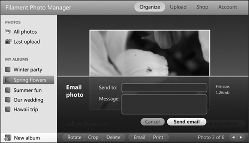
In addition to the navigation among albums and between the album grid and detail views, there are a number of situations where the addition of small overlays and dialog boxes would make an enhanced experience feel truly responsive and application-like. For example, clicking the Email button in the actions toolbar could slide a semi-transparent overlay over the photo that prompts the user to specify recipients and a message before sending via Ajax.
Figure 2-37 In the enhanced experience, the Email Photo form opens in an overlay that is appended to the page via Ajax.
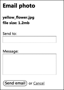
To make this work in the basic experience, the Email button would navigate users to a separate page containing the email form. (This same form foundation markup can be used in both the basic and enhanced experiences; in the latter, it’s pulled in via Ajax and styled to look like the overlay design.) After the email is successfully sent, the page should refresh with a confirmation message and have a button or link to return to the photo detail page.
Figure 2-38 In the basic experience, the Email Photo form is a separate HTML page.
This plan for supporting the navigation and functional actions in the core screen types and functional actions follows a common set of patterns: providing discrete screens for workflow in the basic experience, and repurposing the foundation markup with overlays and in-place features in the enhanced experience.
Building in Back-button support
One last crucial point we feel is worth considering carefully when building complex websites or web-based applications, especially those that use Ajax: how the browser’s Back button will work.
While web users are becoming more comfortable with complex application-like interactions within the browser, they still expect some native browser conventions to behave consistently, including the idea of using the browser’s Back button to navigate to the previous page. When an application uses Ajax, by default the Back button doesn’t recognize the interim Ajax-enabled steps, and instead navigates users back to the last real “page” it loaded (frequently, this can be the login page!), which may seriously confuse and frustrate users. Even in sites or applications coded without Ajax, there may be cases where the user can toggle large panes of content that are on the page that they would consider a new “page,” and to which they would expect to “return” when they click the Back button.
In the case of our photo application, we anticipate that people would probably expect the Back button to move them back through their previous navigation views (Album 1 > Photo detail A > Photo detail B > Album 5), but not undo any of the actions they’ve performed (add to album, email, and so on) in between. In simple terms, by adding a unique URL hash—a string preceded with a # in the URL—and using JavaScript to check every time users navigate to a unique album or photo view, the Back button will work as expected, and all the normal browser actions, like bookmarking and emailing a link, will also work as expected.
Each website is different, so the specifics of how to make the Back button behave in a predictable and useful way will depend on the particular system model, but it plays an important role in making an application work well, and as such requires attention. We discuss specific techniques for tracking state this way when we discuss building a tabs widget in Chapter 9.
Checklist for implementing the x-ray in action
Once we’ve mapped the functionality to standard HTML, created foundation markup, layered on enhancements, and iteratively tested and refined a couple of times, the final step to the x-ray approach is to run through a checklist of questions to test progress:
• Is the basic experience fully functional and usable with HTML only?
• Does the foundation markup encode all the information, including layout and structure, that the enhanced experience needs?
• For both basic and enhanced experiences, does the page read and work in a sensible order, and promote the most important content and function?
• Are the pages navigable and form elements usable (selections can be made and submitted) using only keyboard commands?
• Do the pages make sense when navigated with a screen reader? Can the user navigate the header structure alone?
• Is there a clear way for all users—including those on mobile devices or using screen readers—to switch between the basic and enhanced experiences (for example, with a “View low/high bandwidth version” link) as a matter of preference, or if for some unforeseen reason the enhanced version fails?
While these questions may not reveal every exception case for accessibility and rendering support for every browser experience, they highlight many of the key factors that will help achieve the goal of universal access.
* * *
We’ve only scratched the surface of all the elements one could encounter in the broad range of sites and web-based applications that could possibly be designed. But we hope this overview gives a good sense of how many enhanced interactions can be translated into simple HTML for the basic experience, and more importantly, serve as inspiration when thinking about how to tackle complex applications with progressive enhancement.
Progressive enhancement in general, and our x-ray approach and capabilities test in particular, work effectively only when your coding approach strictly applies best-practice coding approaches for HTML markup, CSS, and JavaScript. In the next three chapters, we’ll review the key points and features we believe are essential to understand in order to properly implement progressive enhancement design.
Once we’ve laid that foundation, we’ll then walk through the specifics of how our capabilities testing framework works, and how you can refine and even extend it to work in even more creative ways for your own unique needs.
And then we’ll get into some detailed widget components to demonstrate the real in-the-trenches techniques you can employ to make progressive enhancement work in today’s browsers, and tomorrow’s.