
These principles act in a gestalt, where the whole is more than the sum of its parts. That is, using all these principles together is more important and creates a greater effect than using only one principle.
Keep in mind that:
Contrast doesn’t mean everything is big—it means there is a contrast between elements, and its point is to provide clarity.
Repetition does not mean it all looks the same—it means you have created a consistent look that ties your slides together.
Alignment does not mean everything is aligned along one line—it means every item on the slide is visually connected to some other item, and elements across slides provide a consistent line for visual organization (which translates to an intellectual organization).
Proximity doesn’t mean that everything is close together—it means items that are closer together create groups of information, which in turn provide clarity.
See pages 152–153 for checklists about where to start and what to think about as you pull together your presentation. The following pages show an amazing slide deck from Paul Isakson that incorporates all these principles and provides an exciting and provocative experience.
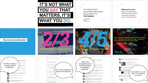
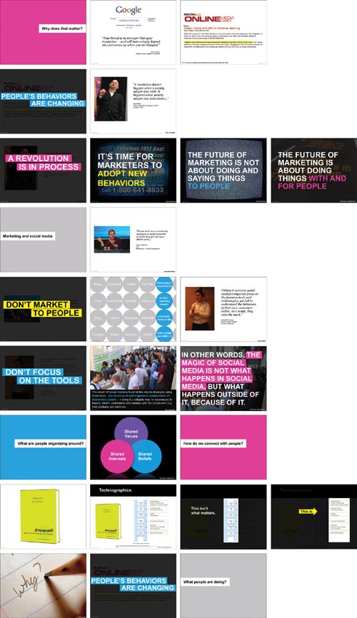
This portion of a presentation by Paul Isakson (PaulIsakson.com, posted on his site and used with permission) is a great example of how the conceptual and visual principles outlined in this book do not limit your design, but can liberate your ideas and allow your cohesive thoughts to appear in exciting ways.
Shown on these four pages is the first third of a presentation. Paul firmly believes that one set doesn’t fit all—he customizes every presentation to make it relevant for the specific audience and purpose he will be speaking to.
As an exercise in seeing, put into words what Paul has done with these slides.
Clarity: What makes the text succinct and clear?
Relevance: What makes the images relevant? The text purposeful?
Animation: Are there places where animation or special transitions might be used effectively?
Plot: Note how he begins and ends his story. Does he involve humanity in the telling of it? Is it organized?
Contrast: Point out contrasts in type, color, size, arrangement, etc.
Repetition: Make a list of the elements that are repeated. Include color, alignments, imagery, fonts, size of fonts, etc.
Alignment: Although there’s a lot going on, you’ll find very clear alignments throughout the deck. Draw lines to connect them.
Proximity: Note where information is clustered into groups.
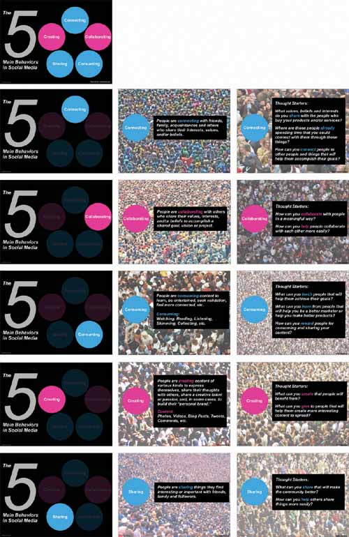
In this segment, you can clearly see the elements that are contrasted, repeated, aligned, and grouped into proximity. Although this format is different from the others in this portion of the full deck, you can see the repetition of colors, fonts, and imagery that unifies these slides with the running theme.
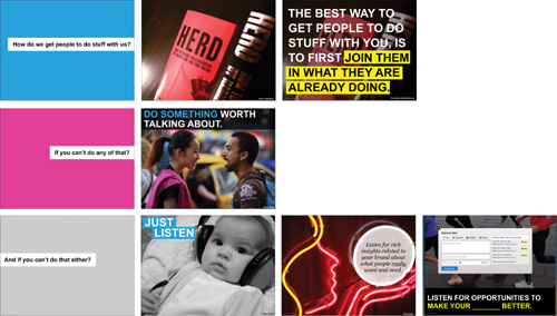
How do these slides tie in with the rest of the deck? Be specific—name names.
Can you see how beautifully he’s used the principle of repetition (unity with variety) to tie so many disparate elements together throughout 67 slides?

Note how he brings us full circle—he winds down the piece, lets us know it’s ending, ties it together, and says goodbye.
Although this portion of the entire presentation is posted online as a stand-alone product, I’m sure you can imagine how Paul’s animated and insightful talk would enhance its message, how the slides actually become an augmentation to his wisdom and expertise when given in person.