6. Color & Tonal Correction

In this chapter, you’ll use various Photoshop features to remove noise, correct for under- and overexposure, enhance or correct contrast, simulate a neutral density filter, add glowing highlights, and neutralize a color cast.
If you shoot digital photos, as a first step we recommend performing as many color and tonal corrections in Camera Raw as possible (see Chapter 3). Camera Raw offers an impressive range of controls, its tab and slider interface is easy to use, and its corrections are nondestructive. Then, for digital photos that have been processed through Camera Raw but need further refinement, as well as for scanned images, Photoshop has plenty of excellent color and tonal correction features to choose from. The challenge is to learn which command or tool can best solve a specific problem you’re faced with, and to use it effectively.
We’ll introduce you to color samplers and the Info panel first so you can monitor how the colors in your image change as you perform corrections. Then you’ll learn how to correct exposure problems by using the Shadows/Highlights command, which, like Camera Raw, preserves all the tonal levels in an image. We’ll also show you how to remove noise by using a filter, use the Curves command to increase contrast and neutralize a color cast, use the Masks panel to accentuate shadows and highlights, and apply brush strokes to a neutral gray layer to enhance contrast.
The tasks in this chapter are presented in a logical progression, from broad corrections to subtle tweaks. If you’re going to work with the photos we’ve supplied, plunge in. If you prefer to work with your own photos, study them and try to diagnose their weaknesses. You can pick and choose among the many methods we offer, depending on the nature of the problems you need to correct.
Note! Remember to calibrate your monitor on a regular basis, and especially before using this chapter.
• Related topics in other chapters include combining dual exposures on pages 70–72 and retouching portraits in Chapter 7.
Note: Settings listed in the captions in this chapter were chosen for photos that are approximately 3000 × 2000 pixels.
Using color samplers
Instead of relying on the single color readout that a click of the Eyedropper tool provides, you can get multiple readouts by placing up to four color samplers in your image with the Color Sampler tool. As you perform color and tonal corrections, pre- and postadjustment color breakdowns from the sampler locations display as instant readouts on the Info panel. The color samplers will save with your file and can be displayed or hidden as needed.
To place color samplers in a document:
1. Choose the Color Sampler tool ![]() (I or Shift-I).
(I or Shift-I).
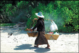
2. Click in up to four locations in the document window. A color sampler appears in each spot, and the color readout for each sampler appears on the Info panel.A If you want to include a broad spectrum of tonal values, place one sampler each in a highlight area, a midtone area, and a shadow area, and perhaps place the fourth one on a specific color that you want to monitor closely.
• To add color samplers while an adjustment dialog (such as Shadows/Highlights) is open, Shift-click in the document window.
• If you flip or rotate the whole canvas, your samplers will shift positions for the new orientation.
To move a color sampler
Do either of the following:
Choose the Color Sampler tool ![]() (I or Shift-I), then drag a color sampler.
(I or Shift-I), then drag a color sampler.
Choose the Eyedropper tool ![]() (I or Shift-I), then Ctrl-drag/Cmd-drag a color sampler.
(I or Shift-I), then Ctrl-drag/Cmd-drag a color sampler.
When you remove a color sampler from a document, its readout, logically, disappears from the Info panel.
To remove a color sampler
Do either of the following:
Choose the Color Sampler tool, then Alt-click/Option-click a sampler (the pointer becomes a scissors icon).B
Choose the Eyedropper tool, then Alt-Shift-click/Option-Shift-click a sampler.
A Click in the document window with the Color Sampler tool to create up to four samplers.

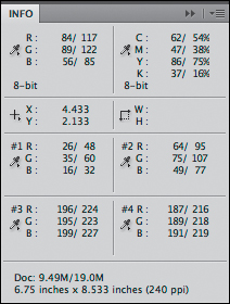
The Info panel displays color breakdowns of the pixel(s) currently under the pointer and at the location of up to four color samplers. You can use the panel to get instant feedback, such as while changing the settings for an adjustment layer.
To view color readouts on the Info panel:
1 Display the Info panel.![]()
2. To change the color mode for any readout on the panel, click the dropper icon and choose from the menu.A (Actual Color displays data in the current document color mode.)
3. While settings are being changed for an adjustment layer, the panel displays preadjustment data to the left of the slashes, followed by the postadjustment data, as in “45/34%.” B
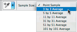
When used with the default Sample Size setting of Point Sample, the Eyedropper and Color Sampler tools sample data only from the single pixel directly below the pointer. For color correction work, we recommend sampling from a slightly larger area. Choose the Color Sampler tool, ![]() then from the Sample Size menu on the Options bar,C either choose 3 by 3 Average (the setting we use) to sample an average color from an area three pixels square or, if you’re working on a very high resolution image, choose one of the other Average options.
then from the Sample Size menu on the Options bar,C either choose 3 by 3 Average (the setting we use) to sample an average color from an area three pixels square or, if you’re working on a very high resolution image, choose one of the other Average options.
• The Sample Size chosen for the Color Sampler tool also applies to the Eyedropper tool, and vice versa.
• When correcting an image on dual computer displays, choose the same sample size in both displays (different sample sizes would yield different sampler data).
• If you hide a layer that a sampler is reading information from, the Info panel will read data from the next visible layer.
A To change the color mode for a readout, click its dropper icon and choose from the menu.

B When an adjustment dialog is open, the Info panel displays pre- and postadjustment values for the pixels under the pointer and for any color samplers (#1–#4) that you’ve placed in your document.
C From the Sample Size menu on the Options bar, choose a sampling area for the Color Sampler tool.
Using the Shadows/Highlights command
One good use for the Shadows/Highlights command is to illuminate shadow areas that result from strong side or back lighting. The Shadows and Highlights sliders are similar to two sliders in Camera Raw: The Shadows sliders recover shadow detail, as the Fill Light slider in Camera Raw does, and the Highlights sliders recover highlight detail, as the Recovery slider in Camera Raw does. Best of all, the Shadows/Highlights command produces minimal data loss while preserving the full range of tonal values in the image.
To use the Shadows/Highlights command:
1. Click the Background, press Ctrl-J/Cmd-J to duplicate it, and keep the duplicate layer selected.A
2. Optional: Right-click/Control-click the duplicate layer and choose Convert to Smart Object. If you do this, the Shadows/Highlights command will be applied in the next step as a Smart Filter, which you can change the settings for at any time. Editing a Smart Filter will take more processing time, though, so be patient.
3. Choose Image > Adjustments > Shadows/Highlights. The Shadows/Highlights dialog opens, and it adjusts the image automatically, using the default settings.
4. Check Show More Options.B
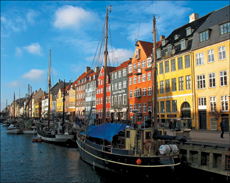
A Because of the low position of the sun at the time this image was shot, the shadow and midtone areas are underexposed.

B In the Shadows/Highlights dialog, check Show More Options.

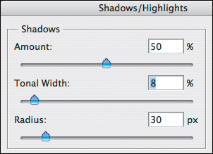
5. For the Shadows, you can increase the Amount slightly to lighten and recover details in the shadow areas. To keep the light from looking artificial, keep this value below 60%.
• You can use the scrubby sliders in this dialog.
6. To control which tonal levels will be adjusted, do the following:
Choose a Tonal Width value for the Shadows to control which part of the tonal range the command affects.A–D To limit the adjustment to just the darkest shadows, keep this value between 5 and 10%; or to allow the adjustment to affect the midtones, keep the value between 40 and 60%.
A This low Tonal Width setting is limiting the Shadows adjustment to the dark shadows.
B The shadows and dark midtones are still too dark, despite the fact that the Shadows slider is near the middle of its range.
C This time, we reduced the Amount for the Shadows and increased the Tonal Width.

D The higher Tonal Width settings shown at left successfully corrected the exposure in both the shadows and the midtones.

Change the Radius value to expand or reduce the number of neighboring pixels that are affected by the adjustment.A
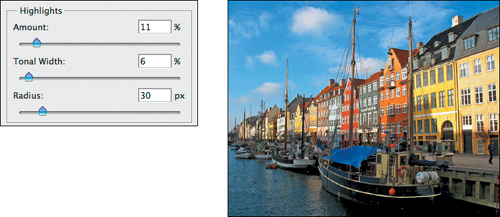
7. For the Highlights, increase the Amount to darken the highlights and recover some detail (at 0%, the slider has no effect). Also adjust the Tonal Width and Radius to control whether just the highlights, or both the highlights and midtone levels, are adjusted.B
A In the Shadows area of the Shadows/Highlights dialog, a Radius setting of 40 spread the Shadows correction into just the right number of surrounding pixels. (A low Radius setting would have flattened the lighting, whereas a high Radius value—over 100 px, for our file—would have created too much contrast by allowing too many pixels to be compared.)

B In the Highlights area, we reduced the Tonal Width to restrict the adjustment to just the highlights (not the midtones) and raised the Amount to darken and recover details in the highlights. This also had a positive effect of subduing the yellow in the buildings in the foreground.
8. If an increased Amount for the Shadows caused oversaturation, correct it by reducing the Color Correction value in the Adjustments area (or to boost the saturation, raise the Color Correction value).A
You can also use the Midtone Contrast control to intensify or reduce the contrast in the mid-tones (this slider has the same effect as the gray Input Levels slider for a Levels adjustment layer).
9. Uncheck then recheck Preview to view the image without and with the adjustment, change any of the settings, then click OK.B–C
• If you created a Smart Filter layer and you want to change the filter settings, double-click the Shadows/Highlights listing. To change the visibility or opacity of the adjustment, use the controls for the Smart Object layer, which will take less processing time than using the visibility or opacity control for the individual Smart Filter.
A For our final Shadows/Highlights adjustment, we set the Color Correction value to +24 to boost the color saturation, but left the Midtone Contrast value at 0.

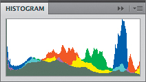
B There are no gaps or spikes in the histogram for the final image, which confirms that the Shadows/Highlights command preserved the full tonal spectrum.
C The Shadows/Highlights command improved the detail in the shadow areas in this image.

Reducing noise
Digital noise (graininess or speckling) may result from using a high ISO setting in a camera or may be the unintended result of corrections made to recover details in underexposed shadow areas. The Reduce Noise filter removes both luminance noise (a grainy texture) and color noise (randomly colored dots). The filter also includes an option that removes artifacts (caused by the JPEG compression methods) from JPEG photos.
To reduce noise in shadow areas:
1. Zoom to 200%. With the Hand tool ![]() (H), move the image around in the window and inspect the shadow areas for stray red, green, or blue speckles or graininess.A
(H), move the image around in the window and inspect the shadow areas for stray red, green, or blue speckles or graininess.A
2. Choose Filter > Noise > Reduce Noise.
3. In the Reduce Noise dialog,B check Preview.
• If you click in the document window, that area will appear in the preview window.
4. As you choose settings, try to strike a balance between removing noise, which will soften the image slightly, and keeping the edges adequately sharp. Click Basic and examine the result in the preview as you do the following (you can use the scrubby sliders):
Choose a Strength value (try 6–8).
Choose a low value (around 5–10%) for Preserve Details to reduce luminance noise and to avoid introducing more noise.
Choose a Reduce Color Noise value (try 60–70%).
Keep the Sharpen Details value low (10%) to avoid introducing artifacts.
5. Click Advanced, then click the Per Channel tab (A, next page).
6. From the Channel menu, choose Blue (the most noise is usually in this channel), then choose a Strength value of around 4–6 and a Preserve Details value of 50–60%. Next choose the Red channel and a Strength value of 1–2.
• For a portrait, try these Strength settings for the channels: Red 4, Green 2, and Blue 2. For a photo shot outdoors at twilight, try a Strength setting for the Blue channel of 6–8.
A In this closeup of a photograph shot at twilight, you can see some noise (tiny red, green, and blue dots).

B In the Reduce Noise filter dialog, we clicked Basic, then chose these initial settings.

7. Optional: To save the current settings, click the Save a Copy of the Current Settings button, ![]() type a name, then click OK. You can choose a saved settings preset from the Settings menu for any file.
type a name, then click OK. You can choose a saved settings preset from the Settings menu for any file.
8. To compare the image without and with the adjustment, click and hold on the preview and then release. Change the settings if needed, then click OK.B
9. We recommend that you resharpen the image via the Smart Sharpen filter to restore some lost definition (use a low Amount setting).
• To reduce the visibility of artifacts created by compression in a JPEG file, check Remove JPEG Artifact in the Basic options panel of the Reduce Noise dialog.
Applying Curves adjustments
To adjust the tonal values, contrast, and white balance in a digital photo, we recommend using the nondestructive Basic and Tone Curve controls in Camera Raw first, whenever possible. If you then need to apply tonal and color corrections in Photoshop, use the adjustment control that the pros reach for: Curves. Curves is useful in many scenarios, such as:
• When you need to correct a file that for some reason can’t be processed through Camera Raw.
• When you want to correct an imbalance in a specific tonal or color range of an image with more precision than the Camera Raw sliders allow.
• When you want to limit the adjustment to just the color or luminosity values of an image (you would do this by choosing a layer blending mode for the Curves adjustment layer).
We’ll show you how to use a Curves adjustment layer to correct the color in a still life, a landscape, and a portrait. In each case, you’ll use the controls in this order: make tonal adjustments to enhance the contrast via the Curves sliders first; neutralize a color cast by using the gray eyedropper next; then finally tweak the color correction by subtly reshaping the curves for one or more of the individual color channels.
A Next, we clicked Advanced and chose settings for the Blue channel (and then the Red channel).

B The Reduce Noise filter successfully smoothed out the grainy texture.

In these instructions, you’ll apply basic tonal corrections to the shadow, highlight, and midtone areas of an image by using a Curves adjustment layer.
To increase contrast by using a Curves adjustment layer: ![]()
1. Open an RGB image.A
2. On the Adjustments panel, ![]() click the Curves button.
click the Curves button. ![]() Choose the Curves Display Options from the panel menu, check all four of the Show options, then click OK.
Choose the Curves Display Options from the panel menu, check all four of the Show options, then click OK.
Adjust the shadows and highlights
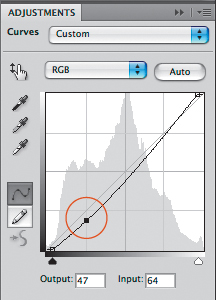
3. Examine the static histogram behind the curve, then do either of the following:
To increase the contrast in a dull image, drag the black and white Input sliders inward to align with the edges of the histogram.B
To adjust the highlight and shadow clipping in high-contrast Threshold mode, Alt-drag/Option-drag the black slider until a few areas of black appear,C then Alt-drag/Option-drag the white slider until a few areas of white appear.
Adjust the midtones
4. Do either of the following:
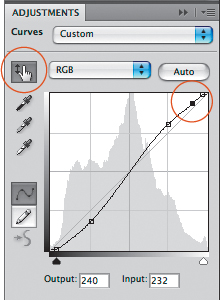
To lighten the midtones, drag the middle of the curve upward; or to darken the midtones, drag the middle of the curve downward. A new point appears each time you move part of the curve.
To boost the contrast, drag the part of the curve that represents the dark midtones downward slightly, and drag the part that represents the light midtones upward (A–C, next page).
Adjust a specific area of the image
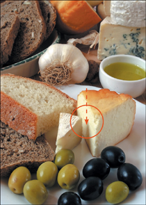
5. Click the On-Image Adjustment tool ![]() on the panel, then move the pointer over an area of the image that needs adjusting. Drag upward to lighten that area, or downward to darken it. A point corresponding to that tonal area will appear on the curve (D–E, next page).
on the panel, then move the pointer over an area of the image that needs adjusting. Drag upward to lighten that area, or downward to darken it. A point corresponding to that tonal area will appear on the curve (D–E, next page).
• Increasing contrast via a Curves adjustment may also have the unintended effect of boosting the color saturation. To limit the adjustment to just tonal values (not colors), set the blending mode of the adjustment layer to Luminosity.
A This image could use a boost in tonal contrast.
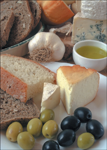
B For the Curves adjustment, we moved the black and white Input sliders slightly inward...

A We dragged the part of the curve that represents the dark midtones downward.
B The shadows and dark midtones are even darker now, especially in the foreground.

C We dragged the part of the curve that represents the light midtones upward; this raised the middle of the curve.
• To heighten the contrast in an image, replicate the S shape that you see on the curve at left.

D With the On-Image Adjustment tool, we dragged downward on a light area of the image. A point appeared and the corresponding tonal region of the curve was lowered.
E Lightening the midtones and highlights improved the contrast; dragging downward on a light area of the image (as shown above) restored the needed details.
Neutralizing a color cast
Suppose, after adjusting the tonal balance in an image, you notice it still has a slight color cast. To remove it, the first step is to locate a 50% midtone gray area in the image that’s neutral (has equal R-G-B values) or almost neutral. If you can easily pinpoint such a gray, skip this task and go directly to the instructions on the next page; if you can’t, follow the instructions on this page first.
To pinpoint a neutral gray in an image:
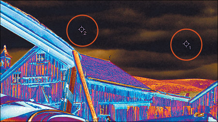
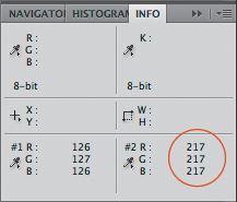
1. Open an RGB image A and display the Info panel.![]() Choose Actual Color for the first readout on the panel (click the dropper icon to access the menu) and Grayscale for the second readout.
Choose Actual Color for the first readout on the panel (click the dropper icon to access the menu) and Grayscale for the second readout.
2. Choose the Color Sampler tool ![]() (I or Shift-I).
(I or Shift-I).
3. On the Layers panel, click the Background, then press Ctrl-J/Cmd-J to duplicate it.
4. Press Ctrl-I/Cmd-I to invert the colors in the duplicate layer.
5. To help you locate a neutral gray, choose Difference as the layer blending mode. Any colors in the duplicate layer that match colors in the Background will display as black. In other words, any inverted grays that are close to 50% neutral will still match the same grays in the background and will display as black.B
6. Move the pointer over black areas, noting the K readout on the Info panel. When you locate an area where the K value is at or near 99% (a neutral gray), click there to place a color sampler.C
7. Just as an added option, if you’re able to spot another black area in the image that’s close to 99%, click to create a second color sampler.
8. Hide the duplicate layer, then follow the steps on the next page.
A This image has a yellowish color cast.

B We inverted the duplicate layer and changed its blending mode to Difference.
C With the Color Sampler tool, we placed samplers on two areas that read as 98% K on the Info panel.
In this exercise, a gray area in an image is neutralized by using a Curves adjustment layer.
To neutralize a gray and remove a color cast with one click: ![]()
1. Open either an image that has an identifiable neutral gray or the image that you used for the instructions on the preceding page.
2. Show the Info panel.![]()
3. On the Adjustments panel, ![]() click the Curves
click the Curves ![]() button.
button.
4. Click the gray (middle) eyedropper, ![]() then do either of the following:
then do either of the following:
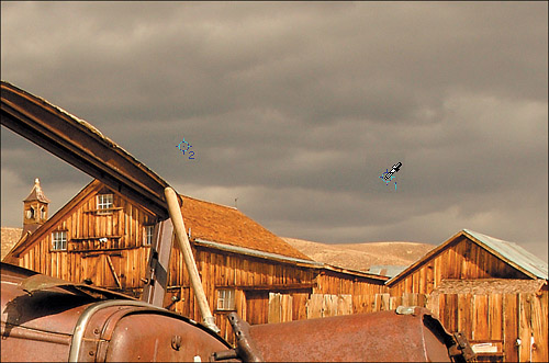
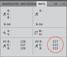
Click the identifiable neutral gray area, then view the RGB readouts on the Info panel.
Click the #1 sampler point in the image, then the #2 sampler point, viewing the readout for each on the Info panel to decide which one is removing the color cast more effectively.A–B
Verify that the readouts to the right of the slashes are close in value to one another, indicating the presence of a neutral gray.C–D If you think the color needs still more tweaking, see the following two pages.
A With the gray eyedropper chosen for Curves, we clicked a sampler point in the document.
B Clicking with the gray eyedropper caused the curve for each color to be modified automatically and produced a neutral gray.

C Converting gray areas to a neutral gray successfully removed the yellow cast from the image. How simple was that?

D On the Info panel, the RGB values from our Curves adjustment (to the right of the slashes) are nearly equal, which confirms that the color samplers are now reading neutral grays.

Fine-Tuning a Color Correction Using Individual Channels in Curves 
If you were able to neutralize the midtone grays in your image by following the instructions on the preceding page, but the colors still don’t look quite as well balanced as they should, try using a Curves adjustment layer again, except this time modify the curve for one or more of the individual color channels (A–C this page and A–D, next page).
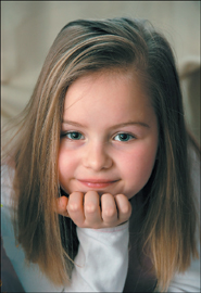
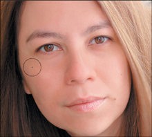
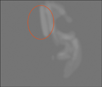
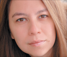
A This image has a greenish cast. We used the technique described on page 146 to locate a neutral gray, then clicked to place a sampler point on the girl’s sleeve (shown in the circle above).

B Clicking with the gray Curves eyedropper neutralized the midtones but left the girl’s face with a reddish cast.

C On the Adjustments panel for Curves, we displayed the Red curve (Alt-3/Option-3), then dragged downward with the On-Image Adjustment tool on the girl’s forehead to reduce reds in the highlights.

A Now the face is less red. So far, so good. To balance the Green and Blue channels, we pressed I (to reselect the eyedropper), then clicked to place another sampler point on a bright white area of the sleeve.

B While noting the sampler point #2 data on the Info panel (see C on this page), we displayed the Green curve (Alt-4/Option-4), then moved the white slider slightly inward, then did the same for the Blue curve (Alt-5/Option-5), making sure the G and B readouts closely matched the R readout.

C This is the Info panel readout from sampler point #2 before we adjusted the Green and Blue curves...
...and this is the readout after we adjusted the Green and Blue curves.
D In the final image, the face looks less red and the shirt sleeve is a brighter white.
Simulating a neutral density filter
When shooting a landscape scene, sometimes the proper exposure setting for a sky can leave the foreground area underexposed, or vice versa. To resolve this conflict on site, photographers reduce light on the upper part of the lens by using a graduated neutral density filter. We’ll show you how to simulate the effect of such a filter for a landscape photo using Photoshop.
To simulate a graduated neutral density filter: ![]()
1. Open a landscape photo that contains a properly exposed ground and an overexposed sky.A
2. On the Adjustments panel, ![]() click the Curves button.
click the Curves button.![]()
3. If the sky lacks strong highlights, align the white Input slider with the edge of the histogram to brighten the highlights.
4. Click the On-Image Adjustment tool ![]() on the panel, then drag a short distance downward in the image to darken the sky and make it more saturated.B–C Don’t worry that the foreground is too dark; you’ll correct that next.
on the panel, then drag a short distance downward in the image to darken the sky and make it more saturated.B–C Don’t worry that the foreground is too dark; you’ll correct that next.
5. Keep the adjustment layer selected, and choose the Gradient tool ![]() (G or Shift-G). On the Options bar, click the Black, White preset on the Gradient preset picker, click the Linear style button (A, next page), choose Mode: Normal, choose Opacity 100%, and uncheck Reverse.
(G or Shift-G). On the Options bar, click the Black, White preset on the Gradient preset picker, click the Linear style button (A, next page), choose Mode: Normal, choose Opacity 100%, and uncheck Reverse.
6. Starting from where the sky meets the ground, drag a short distance upward. You want the gradient in the layer mask to block the Curves effect from the lower part of the image (B–C, next page).
7. To control where the black part of the gradient mask ends, choose the Move tool ![]() (V), and check Show Transform Controls on the Options bar. On the transform box for the gradient, drag the top center handle upward or downward until you’re satisfied with where the Curves effect ends, then double-click inside the box to accept the edit (D, next page).
(V), and check Show Transform Controls on the Options bar. On the transform box for the gradient, drag the top center handle upward or downward until you’re satisfied with where the Curves effect ends, then double-click inside the box to accept the edit (D, next page).
A The sky in this photo is too light relative to the foreground.

B We created a Curves adjustment layer, moved the white Input slider inward, clicked the On-Image Adjustment tool on the panel, then dragged a short distance downward in the image to darken the sky.
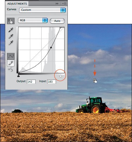
C The Curves adjustment darkened the whole image.

8. If any shapes from the foreground extend into the sky, choose the Brush tool, ![]() a Soft Round tip, and an Opacity of 75%. With Black as the Foreground color, carefully draw strokes over those shapes. They will be added to the mask, as you’ll see in the updated layer mask thumbnail.E–F
a Soft Round tip, and an Opacity of 75%. With Black as the Foreground color, carefully draw strokes over those shapes. They will be added to the mask, as you’ll see in the updated layer mask thumbnail.E–F
• To learn about the Graduated Filter tool in Camera Raw, see pages 68–69.
A On the Options bar for the Gradient tool, we chose the Black, White preset on the Gradient preset picker and clicked the Linear style button.

B We dragged the Gradient tool upward a short distance, starting from where the sky meets the ground.

C The gradient appeared in the layer mask for the Curves adjustment layer.

D We dragged the top handle of the transform box for the gradient downward to change where the black part of the gradient mask ends.

E Finally, we painted with the Brush tool to mask out shapes from the foreground (the tractor and tree) that extend into the sky area.
F In the final image, the sky looks as rich and saturated as the rest of the photo. Mission accomplished.

Creating dramatic lights and darks
Using the Masks panel, you can quickly add shadows and highlights to a photo without having to touch a brush or choose adjustment settings (take a break from using Curves!).
To create dramatic lights and darks by using the Masks panel: ![]()
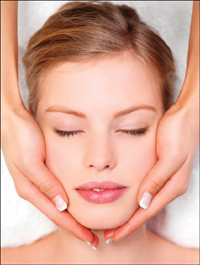
1. Open an RGB photo that is evenly lit yet contains noticeable highlights.A
2. From the New Fill/Adjustment Layer menu, ![]() choose Solid Color. In the HSB area of the Color Picker dialog, enter 0 in the H and S fields and 10 in the B field, then click OK. Change the blending mode of the fill layer to Multiply.
choose Solid Color. In the HSB area of the Color Picker dialog, enter 0 in the H and S fields and 10 in the B field, then click OK. Change the blending mode of the fill layer to Multiply.
3. Duplicate the Background (Ctrl-J/Cmd-J), then drag the duplicate layer above the Fill Color layer.B
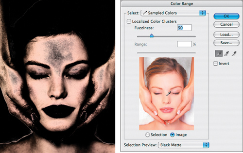
4. On the Masks panel, click the Add Pixel Mask ![]() button, then click Color Range.
button, then click Color Range.
5. In the Color Range dialog, uncheck Localized Color Clusters. Choose Black Matte from the Selection Preview menu. Click the Image button below the preview, then click a highlight area in the preview. Adjust the Fuzziness value to limit the selection to only the lightest highlight areas of the photo (A, next page), then click OK.
6. On the Masks panel, raise the Feather value to between 70 and 90 px to soften the transition between the light and dark areas. Lower the Density value slightly to lighten the dark areas in the mask and thereby reveal more of the original color areas of the photo (B, next page).
7. To lighten the overall exposure in the photo, duplicate the layer that contains the mask, then lower the Opacity of the new layer until the exposure and highlights look just right (C, next page).
A We want to create dramatic lights and darks in this evenly lit portrait.
B This is the Layers panel after we created a Solid Color fill layer and restacked the duplicate of the Background.

A After opening the Color Range dialog, we clicked the model’s forehead in the preview, then chose the settings shown at left to limit the selection to just the lightest highlights.
B We increased the Feather value to soften the transitions between the lights and darks, then lowered the Density value (see the values at right).

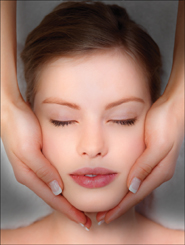
C Our last edits were to duplicate the mask layer and lower the Opacity of the new layer to 80%. The stronger lights and darks make the shapes look more sculptural and focus attention on the key elements of the portrait.
Creating glowing highlights
Another use we’ve found for the Masks panel is to create soft and diffused—yet still bright—lighting, with glowing highlights.
To create soft, glowing highlights by using the Masks panel: ![]()
1. Open an RGB photo that contains good contrast and some bright highlights, such as a product shot.A
2. Duplicate the Background (Ctrl-J/Cmd-J). Click the Background, then press Shift-Backspace/Shift-Delete to open the Fill dialog. Choose Use: White, Normal mode, and 100% Opacity, then click OK.
3. Select the duplicate image layer. On the Masks panel, click the Add Pixel Mask button, ![]() then click Color Range.
then click Color Range.
4. In the Color Range dialog, click the Image button (below the preview) and choose Black Matte from the Selection Preview menu.
5. Do either of the following:
Choose Highlights from the Select menu (A, next page).
Uncheck Localized Color Clusters, then click a highlight area in the preview. Using the Fuzziness slider, expand or contract the selection of highlight areas.
6. Click OK.
7. On the Masks panel, click Invert to reverse the black and white areas of the mask (B, next page). Raise the Feather value to between 70 and 90 px to soften the transitions between light and dark areas. Lower the Density value slightly to lighten the dark areas in the mask and thereby reveal more of the original colors in the photo. That’s a lot of effect for very little effort! (C, next page)
8. Optional: To adjust the intensity of the highlights, click Mask Edge on the Masks panel. In the dialog, click Default, raise or lower the Contract/Expand value to lessen or intensify the effect, then click OK.
A Our goal is to bathe this photo in a soft, diffused glow by intensifying the highlights, without losing the beautiful colors in the midtones.

A We added a layer mask, then clicked Color Range on the Masks panel. In the dialog, we chose Highlights from the Select menu. The selection previewed in the document window.

B On the Masks panel, we clicked Invert to reverse the black and white areas in the mask. For the time being, the highlights in the photo are too harsh and transition too abruptly to the midtones.

C Finally, we adjusted the Feather value, and then the Density value. As a result, the highlights are softer and transition smoothly to the midtones.

Dodging and burning
For a subtle contrast enhancement, you can lighten or darken areas of an image by drawing strokes with the Brush tool on a removable, editable neutral gray layer. Remember: Dodge to lighten, burn to darken.
To dodge or burn using a neutral color layer:
1. Open an RGB image.A
2. Click the Background, then Alt-click/Option-click the New Layer button.![]()
3. In the New Layer dialog, choose Mode: Overlay, check Fill with Overlay-Neutral Color (50% gray)(catchy name, huh?), then click OK.
4. Press Ctrl-J/Cmd-J to duplicate the neutral gray layer.B
5. Choose the Brush tool ![]() (B or Shift-B), a large Soft Round tip, Normal mode, a very low tool Opacity of 6–10%, and a Flow setting of 50%. Press D to reset the Foreground and Background colors.
(B or Shift-B), a large Soft Round tip, Normal mode, a very low tool Opacity of 6–10%, and a Flow setting of 50%. Press D to reset the Foreground and Background colors.
6. Click the lower neutral gray layer, then paint with black to burn (darken) some of the moderately dark shadow areas. The change is subtle.C–D
A To create more contrast in this portrait, we’ll dodge and burn areas with a brush on two neutral gray layers.

B We created a neutral gray layer, then duplicated it.

C To darken the left side of the face, we clicked the lower of the two neutral gray layers, then painted strokes with black.
D These are the brush strokes that we applied to the lower neutral gray layer.

7. Click the upper neutral gray layer. Press X to swap the Foreground and Background colors, then paint with white to subtly dodge (lighten) some of the highlight areas.A–B
8. Optional: To remove any of your dodge or burn strokes, hide the Background, then Alt-click/Option-click an unretouched area to sample the neutral gray. Redisplay the Background, choose an Opacity of 100% for the Brush tool, then paint over any areas to restore them.C–D
9. Optional: To lessen the overall dodge or burn effect, click one of the neutral gray layers, then either lower the layer Opacity (A–B, next page) or choose Soft Light as the layer blending mode.
A To lighten the right side of the face, we clicked the upper neutral gray layer, then painted with white.

B These are the light paint strokes that we applied to the upper neutral gray layer. Oops! We lightened too much of the forehead. That won’t be hard to fix.
C We hid the Background, then Alt/Option-clicked an area that didn’t contain any brush strokes to sample the original neutral gray.

D We redisplayed the Background, chose an Opacity of 100% for the Brush tool, then painted to remove some of the unwanted dodge strokes. Then we pressed D to reset the colors to black and white, lowered the brush Opacity to 8%, and continued to dodge and burn more areas by hand.

A The original image was a bit humdrum.
B To soften the results of our dodge and burn strokes, we lowered the Opacity of both neutral gray layers to 80%. Overall, our edits enhanced the contrast in the face and added subtle contouring.
