
Understanding Outlook forms
Creating a custom form
Working with fields, controls, and pages
Understanding control and page properties
Testing and publishing a form
Almost everything you do in Outlook is based on a form. When you create or read an email message, you use a message form. When you read an appointment, you use an appointment form. The same goes for contacts, journal entries, and tasks. Outlook provides you with all these predefined forms, but you do not have to limit yourself to these—you can create your own custom forms and publish them for others to use. This chapter takes you through the basics of creating and using forms in Outlook. The next chapter goes beyond the basics to cover more advanced form topics.
An Outlook form provides a way to collect and distribute information. In addition to all the standard things you can do with forms in Outlook, such as creating email messages, you can use custom forms for tasks such as posting information to public folders, gathering requests from meeting attendees, and the like. The term form application is sometimes used for a collection of one or more Outlook forms designed to serve a particular purpose.
Custom forms in Outlook are based on existing form templates. All Outlook installations include the basic set of templates that correspond to the forms that Outlook itself uses. These are
Appointment
Contact
Journal Entry
Message
Task
There are some other form templates that may require some explanation:
Note that three of these forms are marked as hidden. This is because during normal Outlook operation you never see these forms—they are used behind the scenes. They are still available for use as a template, however.
When you decide which template to base your custom form on, think about the purpose of the application. If the functionality requires sending information between recipients, the Message form is likely your best bet. If the functionality requires posting information to public or private folders, a Contact, Appointment, Task, or Post template would be suitable depending on the nature of the information.
In practice, two of Outlook's forms are used most often as templates: Message and Post. This chapter focuses on using these form templates, but the principles are the same for the other templates.
Creating a custom form involves two fundamental steps:
Design the form to work with the information required by your application.
Publish the form to make it available.
These topics are covered in the remainder of this chapter and in the next chapter.
You create custom forms in the Forms Designer, a powerful tool that lets you customize a form to precisely meet your needs. This section explains the procedures you use in the Forms Designer, then later in the chapter I present some step-by-step examples of creating custom forms.
In Outlook, a field represents a single piece of information, such as the subject of an email message or the phone number of a contact. Forms use fields, too—in fact, all the information a form contains is represented by fields. Each form template starts with a set of default fields. When you design the form, you can add additional fields from Outlook's list of predefined fields, and you can also create you own custom fields.
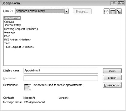
To open the Forms Designer and create a new custom form, select Forms from the Tools menu and then select Design a Form. The Design Form dialog box, shown in Figure 26.1, lets you select the form that your custom form will be based on (as explained earlier in this chapter). By default, this dialog box displays the form templates in the Standard Forms Library. This section uses the Message template for illustration purposes, but the procedures and principles are the same for other form templates.
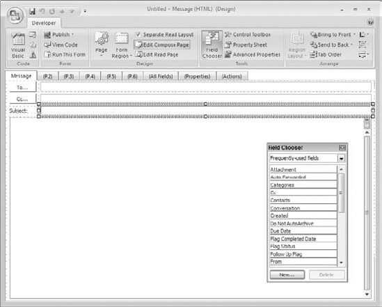
After selecting the desired template and clicking OK, the template opens in the Forms Designer as shown in Figure 26.2.
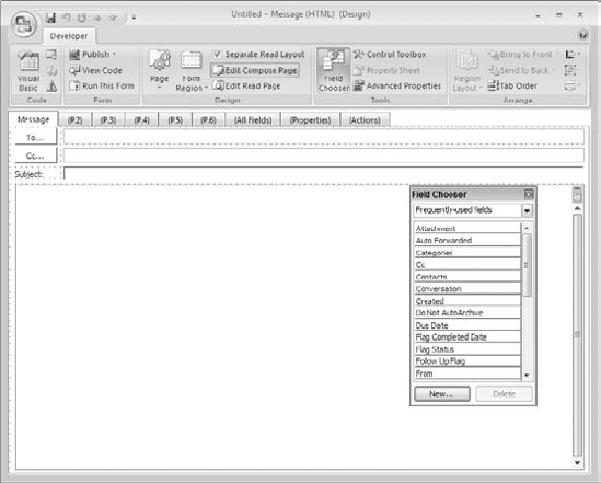
When you first look at the form in the Forms Designer, it may look like the form it is based on—in this case, the Message form. You see the To and CC and Subject fields and a large field to enter the message body. But a moment's observation will reveal that it is very different:
The ribbon, named the Developer ribbon, displays an assortment of tools you use in designing your form. It is not the usual ribbon that you see displayed on the Message form.
The Field Chooser lists the various fields available for the form.
The form itself has nine tabs, some of which have meaningless names such as P.2 and P.3.
The background of the form—although perhaps not clearly visible in the figure—displays a grid of dots.
These factors show you that the form is in design mode, ready to be modified as needed.
If you want to modify a form that you designed previously:
Open the Design Form dialog box (shown earlier in Figure 26.1).
Open the Look In list at the top of the dialog box and select the folder where you originally published the form.
Select the form from the list.
Click Open.
You can now use the techniques explained in this chapter to modify the form and publish it.
A form is made up of one or more tabs, called pages in Outlook. If you refer back to the Message form template in Figure 26.2, you can see that it has nine pages. Some pages are defined as part of the template—for example, the Message, All Fields, Properties, and Actions tabs in this example. Others—P.2, P.3, and so on—are blank to start with so that you can design them exactly as you see fit. You do not have to use all the available pages. A custom form has at least one visible page, of course, and as many more as the application requires. In the Forms Designer, pages whose name is displayed in parentheses are be displayed when the form is used.
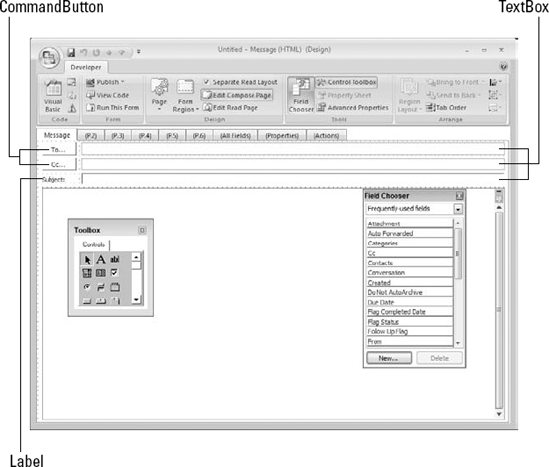
Each tab can be thought of as a page on which you place elements or controls. The Forms Designer has a set of controls to perform specific tasks. Look at Figure 26.3, which shows part of the Message template with the controls called out. There are three types of controls on this form:
Textbox: For user entry and editing of text.
Label: For displaying text that the user cannot edit.
CommandButton: For carrying out an action when the user clicks it.
A form usually has actions associated with it as well. Actions are defined in VBScript, a lightweight version of the VBA programming language that can be included with a form. VBScript is usually associated with a CommandButton control because that is the control designed for the user to click to perform some action.
In a nutshell, designing a custom form consists of arranging controls on the pages of the form. The controls are selected and arranged to accommodate the information the form is designed to work with. A form also has actions defined in VBScript.
Every form template has a certain number of built-in pages. You cannot add pages to or delete pages from a form, but you can control which ones are shown when the form is used. Pages whose names are in parentheses are not displayed. To specify that a page should be displayed when the form is run, or to change a page name, click the page's tab, click the Page button on the ribbon, and select either Display This Page or Rename This Page from the menu.
When a form is run, the pages you specified to be displayed will be listed in the Show section of the ribbon. For example, in Figure 26.4 you can see the Show section for a form that has three pages named Message, Names, and Deadlines. The user clicks the name of the page she wants to view.

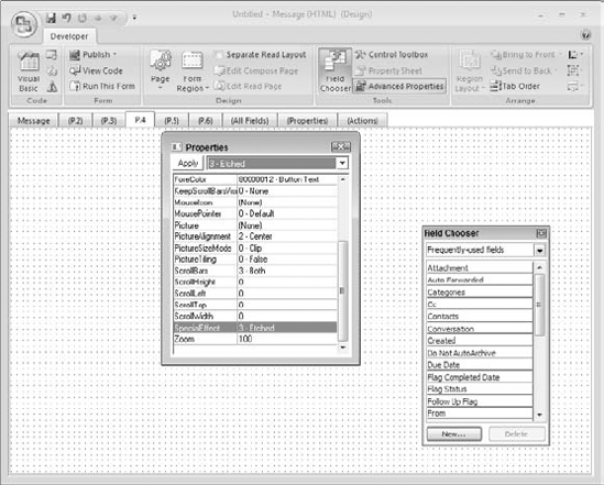
Each page of a form has a set of properties. To display the Properties dialog box for a page (shown in Figure 26.5), select the page by clicking its tab (make sure that no control on the page is selected). Then, click the Advanced Properties button in the Tools section of the ribbon.
To set a property, click its name in the list and select the desired value from the list at the top of the dialog box. For some properties, a small button with ... on it is displayed at the top right of the dialog box—click this button to open a dialog box where you set the property.
Click the Apply button to apply new property settings to the page without closing the dialog box. To close the Properties dialog box, click the Advanced Properties button again or click the close button (the red X at the top right of the dialog box).
As has already been mentioned, a form uses fields to hold its data. A form template contains its own default set of fields; you can add more fields to a form and delete some of the default ones until the new custom form contains just the fields you need.
Every field on a form is represented by a control. The type of control is appropriate for the data the field contains. By adding a field to a form you are automatically adding the corresponding control. This is the easiest and recommended way to add controls to a form, although it is not appropriate in all situations.
You add fields to a form using the Field Chooser. This is usually displayed by default when you create a new form, but if necessary click the Field Chooser button in the Tools section of the ribbon to display it. The Field Chooser is shown in Figure 26.6.
At the top of the Field Chooser is a pull-down list where you select the category of fields to be displayed in the Chooser. The default is Frequently Used Fields. To add a field to the form, drag it from the Field Chooser and drop it at the desired location on the page (although you can change the position later).
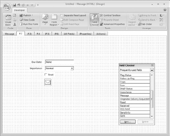
To illustrate, look at Figure 26.7. To create this example, four fields were dragged from the Field Chooser to the form. From top to bottom they are
Due Date: The Forms Designer has created a TextBox control to hold the date as well as an adjacent Label control to identify the field.
Importance: This field can take three values: Low, Normal, and High. The Forms Designer has created a ComboBox control from which the user can select one of these values. Again, an adjacent Label serves to identify the field.
Read: This field is a yes/no, true/false value, and the appropriate control is a CheckBox, which includes its own identifying label.
Icon: The last control/field represents the icon associated with the form data—in this case a message (envelope) icon because the form is based on the Message template. The Image control, designed specifically for displaying digital images, is used here.
After you have added one or more fields to a page, you can work with them as described in the following sections—changing their size and position on the page, modifying their properties, and so on.
Controls are the foundation of form design. The Forms Designer provides you with a toolbox of 14 controls you can place on a form. Each control has a set of properties that determine its appearance and, in some cases, its behavior. A control that holds information is linked, or bound, to the corresponding form field. The techniques described in this chapter can be used to add new controls to a page or to modify or delete controls that are part of the template.
The usual way to add most controls to a page is by adding fields, as was described in the previous section. When you add a field, the Forms Designer automatically adds a control of the appropriate type to the page, saving you time and effort.
There are times, however, when you will want to add controls manually. For example, some forms use controls not linked to a field so you will have to use the manual method. You can also add a control manually and then later link it to a field.
You use the Toolbox to manually add controls to a page. The Toolbox, shown in Figure 26.8, is displayed or hidden by clicking the Control Toolbox button in the Tools section of the ribbon.
The arrow icon at the top left of the Toolbox is not a control—you select it when you want to manipulate controls already placed on a page. The other icons in the Toolbox represent the controls. In order across and then down, they represent:
Label: Displays text that the user cannot edit. Usually used to identify other page elements.
TextBox: Used for user entry/editing of text.
ComboBox: Combines an editable text field with a list of items from which the user can select.
ListBox: Displays a list of items from which the user can select.
CheckBox: Represents an on/off option.
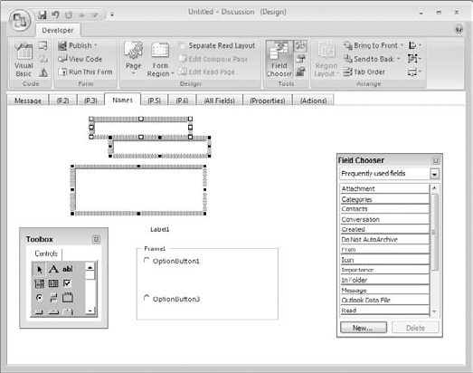
OptionButton: Represents one in a set of two or more options. Within a set, one and only one option can be selected at a time.
ToggleButton: Represents an on/off option.
Frame: Used to group controls, for example to define a set of two or more OptionButtons.
CommandButton: Used to carry out an action (defined in VBScript).
TabStrip: Used to display two or more tabs or pages.
MultiPage: Similar to a TabStrip but easier to use.
ScrollBar: Displays a vertical or horizontal scroll bar that the user can use to scroll with the mouse.
SpinButton: Displays a pair of up/down arrows that the user can click to increment or decrement a numerical value.
Image: Displays a digital image.
To add a control to a page manually, click the desired icon in the Toolbox and then drag on the page to place the control. Don't worry about the precise size or placement of the control—you can always change them later.
After placing one or more controls on a page, you can select an individual control by clicking it. A selected control displays a hatched border and small squares, called handles, on its corners and sides. In Figure 26.9, the upper TextBox is selected and the lower one is not.
When a control is selected, you can perform the following actions with it:
To move it, point at the border—the mouse cursor will change to a 4-headed arrow—and drag to the new location.
To resize it, point at one of the handles—the mouse cursor will change to a two-headed arrow—and drag to the desired size.
To delete it, press Del.
By default, all controls align to the grid of dots displayed on the page background. This alignment affects both the control position and size—in other words, the top-left corner is always at a grid boundary, and the height and width are always multiples of the grid size. This default behavior simplifies the task of creating neat-looking forms with controls that are aligned. You can modify this behavior if desired by clicking the Align button in the Arrange section of the ribbon and then selecting these commands from the menu:
Snap to Grid: Turn this option off if you want to be able to position and size controls freely, without reference to the grid.
Show Grid: Toggles the grid display on or off. Snap to Grid will still operate even when the grid is not displayed.
Set Grid Size: Opens a dialog box where you can set the size of the grid (the default is 8). Changing the grid size does not affect controls already on the form.
The Forms Designer provides commands to automatically adjust the size and/or position of two or more controls to be the same. To use these commands you must first select two or more controls to adjust:
Click the first control to select it. This is the reference control whose size and/or position is applied to the other controls.
Hold down the Shift key while clicking the other control(s).
When you select two or more controls in this manner, you'll see that all selected controls display handles and a border, but the reference control has white handles while all other selected controls have black handles. This is shown in Figure 26.10.
Once you have selected the controls, you size them by clicking the Size button on the ribbon, clicking the Make Same Size command, and then selecting Width, Height, or Both from the next menu.
To align the selected controls, click the Align button on the ribbon, then from the menu:
Select Left, Middle, or Right to align the controls horizontally by their left edges, centers, or right edges.
Select Top, Center, or Bottom to align the controls vertically by their top edges, centers, or bottom edges.
The Size and Align menus have a few additional commands that simplify the task of arranging controls on a page. On the Size menu:
Size to Fit: Changes the size of the selected control(s) to fit between other controls on the page.
Size to Grid: Changes the size of the control to match the closest grid points.
On the Align menu:
Distribute Horizontally: Displays a submenu with commands for arranging selected controls horizontally.
Distribute Vertically: Displays a submenu with commands for arranging selected controls vertically.
Center in Form: Positions the selected control(s) either vertically or horizontally at the center of the form.
Arrange: Displays a submenu with commands for arranging selected controls.
The Z-order of controls is relevant when one control overlaps another. You can think of it like overlapping sheets of paper on your desk—there's one on top, one on the bottom, and the ones in between in a certain order. With controls, this is the Z-order. For example, Figure 26.11 shows a label control that overlaps a TextBox control. You can see that the Label control hides the portion of the TextBox that is behind it—this means that the Label is at the front of the Z-order.
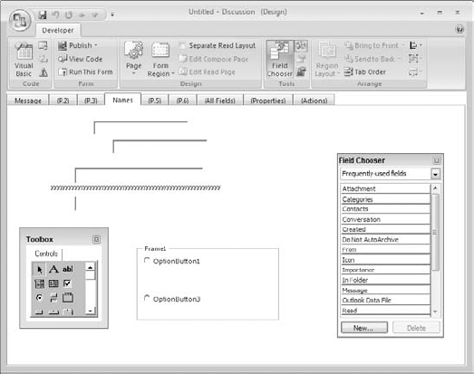
Figure 26.11. When controls overlap, the Z-order determines which one—the Label control in this figure—is on top.
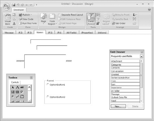
By selecting a control and clicking either the Bring to Front or the Send to Back button on the ribbon, you can change the position of the selected control in the Z-order. Figure 26.12 shows the same controls as in Figure 26.11 after either sending the Label control to the back or bringing the TextBox control to the front.
When a form is being used, only one control is active—that is, has the focus—at a given time. The active control is indicated visually in some way. For example, when a TextBox is active it will display a blinking cursor.
The user can move the focus by clicking with the mouse or by pressing Tab or Shift+Tab to move the focus forward or backward in the tab order. Also, when the form is first opened, the control that is first in the tab order gets the focus.
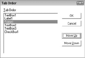
By default, controls are added to the tab order in the same sequence they are placed on the page (each page has its own tab order). To change the tab order, click the Tab Order button on the ribbon to open the Tab Order dialog box, shown in Figure 26.13. To change the order, click a control name and use the Move Up and Move Down buttons to change its position in the list.
The tab order on a form should reflect the logical structure of the form and how a user would normally move from control to control.
As mentioned earlier, every control has a set of properties. Some properties are common to all or most controls, whereas others are relevant to only one or two controls. This section starts by describing the most important common properties and then discusses some individual controls in detail.
Control properties are accessible to the person designing the form. Some of them can also be changed in VBScript code while the form is running.
Each control's properties are divided, simply for convenience, into two groups. The more commonly used properties are grouped together on the control's property sheet, whereas the less frequently needed advanced properties have their own dialog box.
To view a control's property sheet, select the control and click the Property Sheet button in the Tools section of the ribbon. You can also right-click the control and select Properties from the context menu. Advanced properties are also accessed from the context menu by selecting the Advanced Properties command.
Some of the common control properties are found on the property sheet. The property sheet is essentially the same for most controls. It is shown, for a TextBox control, in Figure 26.14.
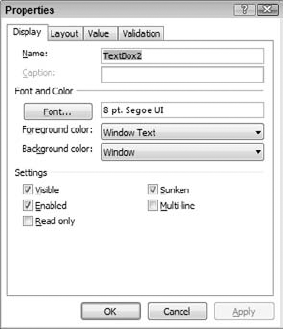
The Display tab, shown in the figure, contains these properties. Note that some of these properties will not be available for some controls:
Name: The control name, which must be unique on its page. You may want to change this from the default name to something more descriptive such as
FirstNameorZIPCode, particularly if you will be manipulating the control in VBA code.Caption: The text of the control's caption, where applicable.
Font: The font used for the control.
Foreground Color: The color of the control's text.
Background Color: The color of the control's background.
Visible: If selected, the control will be visible when the form runs.
Enabled: If selected, the control will be enabled (can be accessed by the user) when the form runs.
Read Only: If selected, the data in the control cannot be changed by the user.
Sunken: If selected, the control displays with a 3-D sunken appearance.
Multi-line: If selected, the control can display multiple lines of text. Applicable to TextBox controls only.
The Foreground Color and Background Color properties let you choose from a set of predefined Windows operating system colors. For more choices you must use the BackColor and ForeColor properties in the Advanced Properties dialog box.
The Layout tab of the property sheet is shown in Figure 26.15. The Top, Left, Height, and Width properties specify the size and position of the control. You can change these here, but usually size and position of controls is modified in the designer.
The Resize with Form option determines whether the control always keeps its set size (option off) or grows and shrinks with the form.
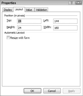
The Validation tab is used to define data validation rules for a control/field and is covered in the next chapter.
A control's advanced properties are listed alphabetically in the Properties dialog box as shown in Figure 26.16. The property names are in the left column and the values are in the right column. The properties listed here duplicate some of the properties found in the property sheet, and you can change them in either place. Other properties listed here can only be accessed via the Advanced Properties command.
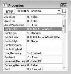
Some of the advanced properties that you are most likely to need to change are described here. To change a property, click its name in the list and then select a value at the top of the dialog box:
BackColor, ForeColor: Same as Background Color and Foreground Color in the property sheet, but provide a greater selection of colors to choose from.
BackStyle: Sets the control background to Opaque or Transparent.
BorderStyle: Sets the style of the control's border to Single or None.
Locked: If True, the control is read-only.
MousePointer: Specifies the shape of the mouse pointer when it is over the control.
TabStop: If True (the default), the control is part of the tab order. Set to False if you do not want the user to be able to tab to the control.
The Value tab of the property sheet is related to the field that the control corresponds to. This tab is shown in Figure 26.17. If the control is already associated with a field, the property values will be filled in (as in the figure). Otherwise they will be blank.
Warning
To associate a control with a field, or to change its association to a different field, click the Choose Field button and follow the prompts to select a field. Be careful doing this because not all control types are appropriate for certain field data types—although the Forms Designer will let you make inappropriate associations, the resulting form is likely to be less useful.
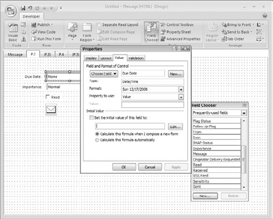
Figure 26.17. The Value tab of a control's property sheet specifies the field the control represents.
The other properties are
Type: Displays the data type of the field. This is a read-only property—you cannot change it because the data type is a characteristic of the field.
Format: Depending on the data type, you can select the format it should be displayed in.
Property to Use: Specifies the control property linked to the field. This is almost always the
Valueproperty and generally should not be changed unless you have a good reason to.
While you are designing a form, you can test, or run, the form to see how it works. To do so, click the Run This Form button on the ribbon. The form opens and you can use it just as if you were using it "for real." You can test your tab orders, make sure controls display as desired, check default data values, and so on. If it's a form that can be sent, you can send it (which closes the form as well). If it's a form to be posted, you can post it. Otherwise, after testing close the form and return to the Forms Designer by clicking the X at the top right of the form.
You must publish a form to make it available for use. You have three options:
Publish the form to the Personal Forms Library, where it will be available for use as a template.
Publish the form to a personal folder, where it will be available for your use only.
Publish the form to a public folder (Microsoft Exchange only), where it will be available for use by anyone who has permission to access that folder.
The true power of Outlook forms can only be realized when you are using them with an Exchange Server account. This topic, including publishing forms to public folders, is covered in Chapter 28. For now I will explain the fundamentals of publishing a form.
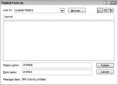
After you have completed form design, click the Publish button on the ribbon. The Forms Designer displays a menu with two choices: Publish Form and Publish Form As.
If your form was created based on one of Outlook's default templates, these commands are equivalent—either command opens the Publish Form As dialog box (see Figure 26.18). Then:
Open the Look In list and select the folder where you want to publish the form. If the folder you want is not on this list, click the Browse button to locate it.
Enter a descriptive name for the form in the Display Name box. This is the name Outlook uses for the form.
By default, the Form Name box—which is the name that the form's file will be given—is the same as the display name. There is rarely a reason to change this but you can if needed.
Click Publish.
Outlook forms provide a powerful tool for creating custom solutions, or applications, that require the collection and/or distribution of data. You can create a custom form based on any of Outlook's built-in forms, adding controls and fields to perfectly suit your application's needs. This chapter covered the fundamentals of designing and publishing custom forms. In the next chapter, you learn some more advanced aspects of Outlook forms.