
When you get into a new car, one of the first things you do is to rearrange the seat and mirrors. You do this to make yourself comfortable. The same principle can apply to software packages: Arranging or customizing an interface makes it more comfortable to work with.
Early versions of Max allowed only minimal changes to the interface, but later versions enable significant customization. The Max interface can be customized to show only the icons and tools that you want to see. Max also has a rather bulky set of preferences that you can use to set almost every aspect of the program. This chapter covers various ways to make the Max interface more comfortable for you.
The Customize menu provides commands for customizing and setting up the Max interface. The first menu item is the Customize User Interface menu command. This command opens the Customize User Interface dialog box. This dialog box includes five panels: Keyboard, Toolbars, Quads, Menus, and Colors. You can also access this dialog box by right-clicking any toolbar away from the buttons and selecting Customize from the pop-up menu.
If used properly, keyboard shortcuts can increase your efficiency dramatically. Figure 4.1 shows the Keyboard panel of the Customize User Interface dialog box. In this panel, you can assign shortcuts to any command and define sets of shortcuts. You can assign keyboard shortcuts for any of the interfaces listed in the Group drop-down list. When an interface is selected from the Group drop-down list, all its commands are listed below, along with their current keyboard shortcuts. You can disable the keyboard shortcuts for any of these interfaces using the Active option located next to the drop-down list.
Note
To access the defined keyboard shortcuts for the various interfaces, the Keyboard Shortcut Override Toggle button on the main toolbar must be enabled. If this button is disabled, then only the keyboard shortcuts for the Main UI are active.
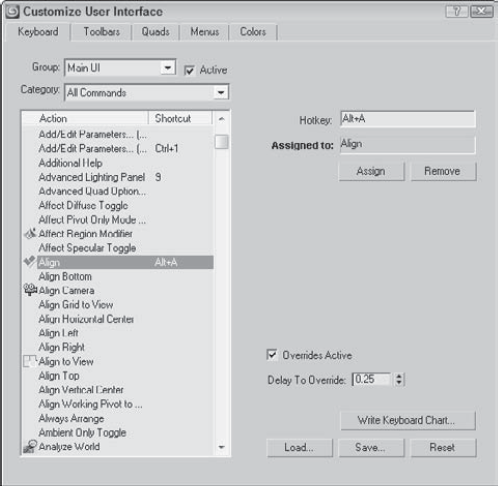
Groups that have a large number of commands are split into categories. You can use the Category drop-down list to filter only select types of commands. This helps you to quickly locate a specific type of command such as controllers, modifiers, or Space Warps. Entering a keyboard shortcut into the Hotkey field shows in the Assigned to field whether that key is currently assigned to a command. You can Assign the hotkey to the selected command or Remove the hotkey from its current assignment.
If the Overrides Active option is enabled, then the Editable Poly commands that are marked in bold text can be activated by pressing and holding a keyboard shortcut. When you release the keyboard shortcut, the original mode is restored. For example, if you are working in Extrude mode, you can press and hold the Shift+Ctrl+B keyboard shortcut to access the Bevel command. When you release the keyboard shortcut, the Extrude mode is active again. The amount of time that passes before the press-and-hold keyboard shortcut becomes active is set by the Delay to Override value.
You can use the Write Keyboard Chart button to output all the keyboard commands to a text file. Using this feature, you can print and post a chart of keyboard shortcuts next to your computer monitor. You can also Load, Save, and Reset selected keyboard shortcut sets. Keyboard shortcut sets are saved as .kbd files in the UI directory where Max is installed.
Note
You can find a reference of the available default keyboard shortcuts in Bonus Chapter 2, "3ds Max 2009 Keyboard Shortcuts."
You can use the Customize User Interface dialog box's Toolbar panel to create custom toolbars. Figure 4.2 shows this panel.
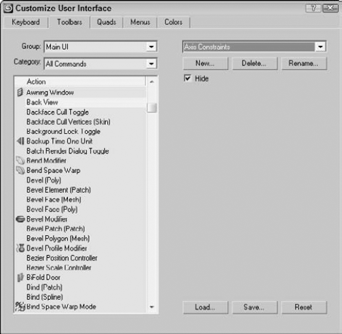
Figure 4.2. The Toolbars panel in the Customize User Interface dialog box enables you to create new toolbars.
The Toolbars panel of the Customize User Interface dialog box includes the same Group and Category drop-down lists and command list as the Keyboard panel. Clicking the New button opens a simple dialog box where you can name the new toolbar. The Delete button lets you delete toolbars. You can delete only toolbars that you've created. The Rename button lets you rename the current toolbar. The Hide option makes the selected toolbar hidden.
Use the Load and Save buttons to load and save your newly created interface, including the new toolbar, to a custom interface file. Saved toolbars have the .cui extension.
After you create a new toolbar, you can drag the commands in the Action list to either a new blank toolbar created with the New button or to an existing toolbar. By holding down the Alt key, you can drag a button from another toolbar and move it to your new toolbar. Holding down the Ctrl key and dragging a button retains a copy of the button on the first toolbar.
If you drag a command that has an icon associated with it, the icon appears on the new toolbar. If the command doesn't have an icon, then the text for the command appears on the new toolbar.
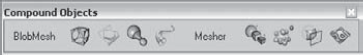
If you've been using Max for a while, you probably have several favorite commands that you use extensively. You can create a custom toolbar of all your favorite commands. To learn how to do this, you'll create a custom toolbar for the compound objects.
To create a custom toolbar for creating compound objects, follow these steps:
Open the Customize User Interface dialog box by choosing Customize

Open the Toolbars panel, and click the New button. In the New Toolbar dialog box that appears, name the toolbar Compound Objects. After you click OK, a new blank toolbar appears.
Select the Main UI group and the Objects Compounds category from the drop-down lists on the left. Then drag each command in the Action list to the new blank toolbar.
Click the Save button to save the changes to the customized interface file. You can load the resulting toolbar from the Chap 04 directory on the DVD. It is named Compound Objects toolbar.cui.
Note
Don't be alarmed if the toolbar icons show up gray. Gray icons are simply disabled. When the tool is enabled, they are shown in color.
Figure 4.3 shows the new toolbar. With the new toolbar created, you can float, dock, or edit this toolbar just like the other toolbars. Notice that some of the tools have icons and others have text names.
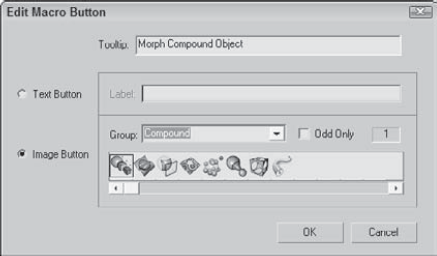
You can right-click any of the buttons on any of the existing toolbars, except for the main toolbar, to access a pop-up menu. This pop-up menu enables you to change the button's appearance, delete the button, edit the button's macro script, or open the Customize User Interface dialog box.
Note
To learn more about editing macro scripts, see Chapter 49, "Automating with MAXScript."
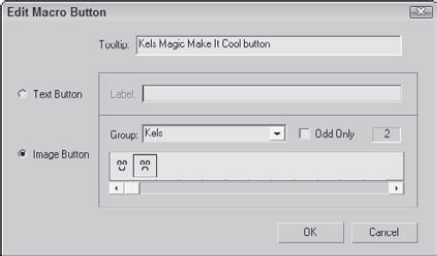
Selecting the Edit Button Appearance command from the right-click pop-up menu opens the Edit Macro Button dialog box, shown in Figure 4.4. This dialog box enables you to quickly change the button's icon, tooltip, or text label. Each icon group shows both the standard icon and the grayed-out disabled version of the icon. Default buttons can also be changed. The Odd Only check box shows only the standard icons.
The Max interface uses two different sizes of icons. Large icons are 24 × 24 pixels, and small icons are 16 × 15 pixels. Large icons can be 24-bit color, and small ones must be only 16-bit. Multiple icons can be placed side by side in a single file. The easiest way to create some custom toolbars is to copy an existing set of icons into an image-editing program, make the modifications, and save them under a different name. You can find all the icons saved as BMPs and used by Max in the 3dsmaxUIIcons directory.
To create a new group of icons, follow these steps:
Select a group of current icons to edit from the UI directory, and open them in Photoshop. I selected the Patches group, which includes all the files that start with the word Patches. This group includes only two icons. To edit icons used for both large and small icon settings and both active and inactive states, open the following four files: Patches_16a.bmp, Patches_16i.bmp, Patches_24a.bmp, and Patches_24i.bmp.
In each file, the icons are all included side by side in the same file, so the first two files are 32 × 15 and the second two are 48 × 24. Edit the files, being sure to keep each icon within its required dimensions.
When you finish editing or creating the icons, save each file with the name of the icon group in front of the underscore character. My files were saved as Kels_16a.bmp, Kels_16i.bmp, Kels_24a.bmp, and Kels_24i.bmp, so they show up in Kels group in the Edit Macro Button dialog box. Copy these four edited files from the Chap 04 directory on the DVD to the 3dsmaxUIIcons directory.
After the files are saved, you need to restart Max. The icon group is then available within the Customize User Interface dialog box when assigned to a command.
Figure 4.5 shows the Edit Macro Button dialog box with my custom icon group named Kels open.
The third panel in the Customize User Interface dialog box allows you to customize the quadmenus. You can open quadmenus by right-clicking on the active viewport or in certain interfaces. Figure 4.6 shows this panel.
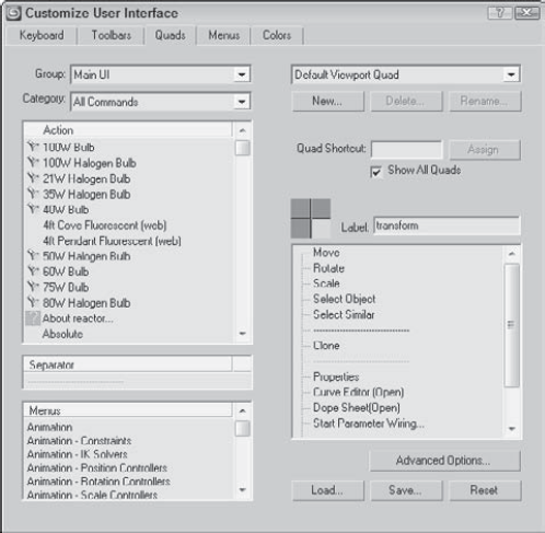
Figure 4.6. The Quads panel of the Customize User Interface dialog box lets you modify pop-up quadmenus.
To the left of the panel are the Group and Category drop-down lists and a list of actions that are the same as those that appear in the Keyboard and Toolbars panels, but the Quads panel also includes a Separator and a list of Menu commands. Quadmenus can include separators to divide the commands into different sections and menus that appear at the top of the standard interface.
The drop-down list at the top right of the Quads panel includes many different quadmenu sets. These quadmenus appear in different locations, such as within the ActiveShade window. Not only can you customize the default viewport quadmenus, but you also can create your own named custom quadmenus with the New button or you can rename an existing quadmenu. The Quad Shortcut field lets you assign a keyboard shortcut to a custom quadmenu.
Tip
Several quadmenus have keyboard shortcuts applied to them. Right-clicking with the Shift key held down opens the Snap quadmenu. Other shortcuts include Alt+right-click for the Animation quadmenu, Ctrl+right-click for the Modeling quadmenu, Shift+Alt+right-click for the reactor quadmenu, and Ctrl+Alt+right-click for the Lighting/Rendering quadmenu.
If the Show All Quads option is disabled, it causes only a single quadmenu to be shown at a time when unchecked. Although only one quadmenu is shown at a time, the corner of each menu is shown, and you can switch between the different menus by moving the mouse over the corner of the menu. This is useful if you want to limit the size of the quadmenu.
The four quadrants of the current quadmenu are shown as four boxes. The currently selected quadmenu is highlighted yellow, and its label and commands are shown in the adjacent fields. Click the gray boxes to select one of the different quadmenus.
To add a command to the selected quadmenu, drag an action, separator, or menu from the panes on the left to the quadmenu commands pane on the right. You can reorder the commands in the quadmenu commands pane by dragging the commands and dropping them in their new location. To delete a command, just select it and press the Delete key or select Delete Menu Item from the right-click pop-up menu.
If you right-click on the commands in the right pane, a pop-up menu appears with options to delete or rename the command. Another command allows you to flatten a submenu, which displays all submenu commands on the top level with the other commands.
Custom quadmenus can be loaded and saved as menu files (with the .mnu extension).
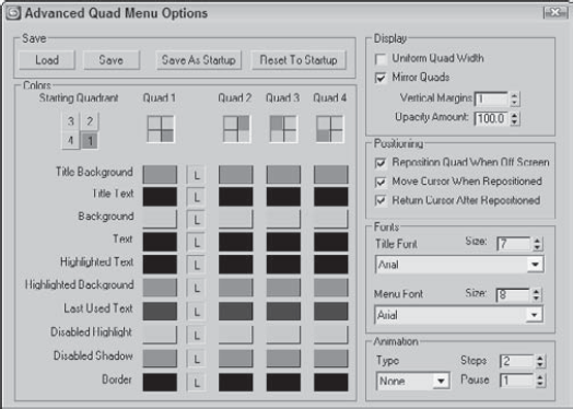
The Quads panel also includes an Advanced Options button. Clicking this button opens the Advanced Quad Menu Options dialog box, shown in Figure 4.7. Using this dialog box, you can set options such as the colors used in the quadmenus.
Changes to the Advanced Quad Menu Options dialog box affect all quadmenus. You can load and save these settings to files (with the .qop extension). The Starting Quadrant determines which quadrant is first to appear when the quadmenu is accessed. You can select to change the colors for each quadmenu independent of the others. The column with the L locks the colors so they are consistent for all quadmenus if enabled.
The remainder of the Advanced Quad Menu Options dialog box includes settings for controlling how the quadmenus are displayed and positioned, as well as the fonts that are used.
The Animation section lets you define the animation style that is used when the quadmenus appear. The animation types include None, Stretch, and Fade. The Stretch style slowly stretches the quadmenus until they are full size over the designated number of steps, and the Fade style slowly makes the quadmenus appear.
The Menus panel of the Customize User Interface dialog box allows you to customize the menus used at the top of the Max window. Figure 4.8 shows this panel.
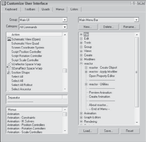
This panel includes the same Group and Category drop-down lists and the Action, Separator, and Menus panes found in the Quads panel. You can drag and drop these commands to the menu pane on the right. Menus can be saved as files (with the .mnu extension). In the menu pane on the right, you can delete menu items with the Delete key or by right-clicking and selecting Delete Item from the pop-up menu.
Adding a new menu is easy to do with the Customize User Interface dialog box. For this example, you tack another menu to the end of the Tools menu.
To add another menu item to the Tools menu, follow these steps:
Choose Customize
Click the Menus tab to open the Menus panel.
In the top-left drop-down list, select Main UI from the Group drop-down list and Tools from the Category drop-down list.
Expand the Tools menu in the right pane by clicking on the plus sign to its left.
Locate the Cross Hair Cursor Toggle menu item in the Action list, drag it to the right, and drop it right after the Channel Info Editor menu item.
As you drag, a blue line indicates where the menu will be located.
Click the Save button to save the menu as a file. You can find the customized menu from this example in the Chap 04 directory on the DVD.
After you save the new menu file, you need to restart Max before you can see the changes. You can reset the default UI by choosing Customize
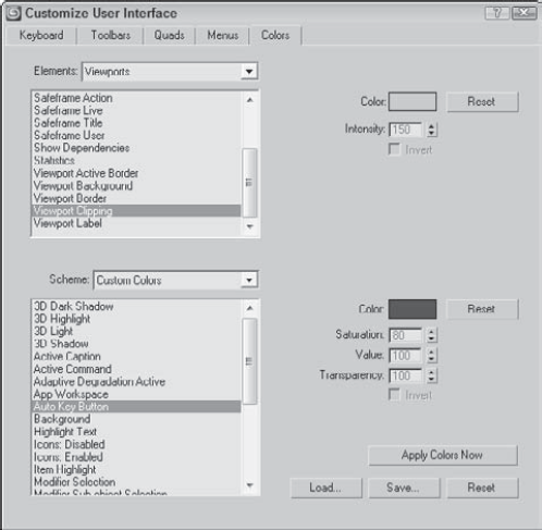
Within Max, the colors often indicate the mode in which you're working. For example, red marks animation mode. Using the Colors panel of the Customize User Interface dialog box, you can set custom colors for all Max interface elements. This panel, shown in Figure 4.9, includes two panes. The upper pane displays the available items for the interface selected in the Elements drop-down list. Selecting an item in the list displays its color in the color swatch to the right.
The lower pane displays a list of the custom colors that can be changed to affect the appearance of the interface. For example, Highlight Text isn't an element; it's an interface appearance. The Scheme drop-down list can alter the color scheme between custom colors and the Windows Default Colors.
You can save custom color settings as files with the .clr extension. You can use the Apply Colors Now button to immediately update the interface colors.
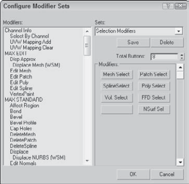
In the Modify panel, the Configure Modifier Sets button is the right-most button directly under the Modifier Stack. This button opens a pop-up menu that lists all the modifier categories. The top pop-up menu command is Configure Modifier Sets, which opens a dialog box, shown in Figure 4.10, when selected. Using this dialog box, you can control which modifiers are grouped with which sets.
To add a modifier to a set, select the set from the Sets drop-down list and drag the modifier from the list of Modifiers on the left to the button set on the right. To create a new set, simply type a new name into the Sets field. After a set has changed, you need to save it with the Save button.
You can find the same Configure Button Sets button on the Utilities panel. Clicking this button opens a similar dialog box where you can drag from a list of Utilities to a list of buttons on the right. These buttons are then displayed in the Utilities panel.
If you've changed your interface, you'll be happy to know that the Customize menu includes a way for you to save and then reload your custom setup. This feature is especially helpful for users who share a copy of Max.
Tip
Any custom .ui file can be loaded as the default interface from the command line by adding a −c and the .ui filename after the 3dsmax.exe file (for example, 3dsmax.exe −c my_interface.ui).
Custom interface schemes are saved with the .ui extension using the Customize
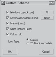
Figure 4.11. The Custom Scheme dialog box appears when you're saving a custom interface and lets you select which items to include.
You can load saved user interface schemes with Customize
DefaultUI: Default interface that opens when Max is first installed.
Ame-dark: Displays the standard interface with black windows, backgrounds, and viewports. All the icons and menus are light gray, and many of the icons are different, as shown in Figure 4.12.
Ame-light: Same as the Ame-dark layout, except the icons and menus are black and the backgrounds are all light gray. Many icons are different here, too.
ModularToolbarsUI: An interface that breaks the main toolbar into many smaller toolbars that are easier to move and arrange.
You also can use both the Load Custom UI and Save Custom UI menu commands to save and load any of the custom user interface files types, including these:
Interface Scheme files (.ui)
UI files (.cui)
Menu files (.mnu)
Color files (.clr)
Keyboard Shortcut files (.kbd)
Quadmenu Options files (.qop)
Note
If you want to return the default UI setup, you can use the Customize
Note
You can set Max to automatically save your interface changes when exiting. Select the Save UI Configuration on Exit option in the General tab of the Preference Settings dialog box.
After you're comfortable with your interface changes, locking the interface to prevent accidental changes is a good idea. To lock the current interface, choose Customize
When you're first playing around with Max's customization features, really messing things up can be easy. If you get in a bind, you can reload the default startup interface (MaxStart.ui) with the Customize
Note
If your MaxStart.ui file gets messed up, you can reinstate the original default interface setup by deleting the MaxStart.ui file before starting Max. However, do not overwrite the default UI file, because this file is needed to reinstate the default UI.
The Customize
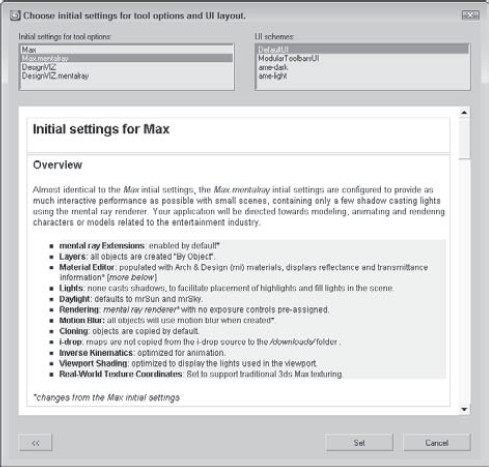
Figure 4.13. This window explains the benefits of the different initial settings and scheme choices.
The initial settings for the tool options list include Max, Max.mentalray, DesignVIZ, and DesignVIZ.mentalray. These different selections cause the default settings for the various controls to change. For example, the default renderer for Max is the Scanline renderer, but for the Max.mentalray option, mental ray is the default renderer.
The schemes list includes the same custom interfaces listed earlier, along with any custom interfaces that have been saved.
After selecting the initial settings and scheme to use, click the Set button to commit the selections to the interface. The button with arrows on it in the lower left displays the initial information page again.
Note
If any of the settings within the CurrentDefaults.ini file or if the other files are missing from the new settings folder, then the settings and files within the default Max directory are used.
When strolling through a park, chances are good that you'll see several different paths. One might take you to the lake and another to the playground. Knowing where the various paths lead can help you as you navigate around the park. Paths in Max lead, or point, to various resources, either locally or across the network.
All paths can be configured using two distinct Configure Paths dialog boxes found in the Customize menu: Configure User Paths and Configure System Paths. The Configure User Paths dialog box is used to specify where to look for scene resource files such as scenes, animations, and textures. The Configure System Paths dialog box is used to specify where the system looks to load files that Max uses such as fonts, scripts, and plug-ins.
The Configure User Paths dialog box, shown in Figure 4.14, holds the path definitions to all the various resource folders. The dialog box includes three panels: File I/O, External Files, and XRefs.
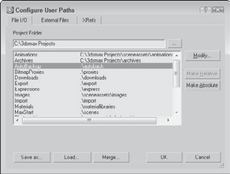
The main panel in the Configure User Paths dialog box is the File I/O panel. The Project Folder is listed at the top of the dialog box and can be changed in this dialog box or with the File
Tip
Personally, I like to keep all my content in a separate directory from where the application is installed. That way, new installs or upgrades don't risk overwriting my files. To do this, simply change the Project Folder to a location separate from the 3ds Max installation directory.
Under the External Files and XRefs panels, you can add and delete paths that specify where Max looks to find specific files. All paths specified in both these panels are searched in the order they are listed when you're looking for resources such as plug-ins, but file dialog boxes open only to the first path. Use the Move Up and Move Down buttons to realign path entries.
Warning
Using the Customize
At the bottom of the Configure User Paths dialog box are buttons for saving, loading, and merging the defined configuration paths into a separate file. These files are saved using the .mxp format. This file can be found in the root of the Project Folder.
Tip
Setting up a Project Folder on the network gives every team member access to all the project files and synchronizes all the paths for a project.
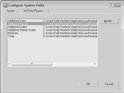
Max default paths are listed in the Configure System Paths dialog box, shown in Figure 4.15. When Max is installed, all the paths are set to point to the default subdirectories where Max was installed. To modify a path, select the path and click the Modify button. A file dialog box lets you locate the new directory.
The Configure System Paths dialog box also includes the 3rd Party Plug-Ins panel where you can add directories for Max to search when looking for plug-ins.
One of the first tasks you need to complete before you can begin modeling is to set the system units. The system units have a direct impact on modeling and define the units that are represented by the coordinate values. Units directly relate to parameters entered with the keyboard. For example, with the units set to meters, a sphere created with the radius parameter of 2 would be 4 meters across.
Max supports several different measurement systems, including Metric and U.S. Standard units. You can also define a Custom units system. (I suggest parsecs if you're working on a space scene.) Working with a units system enables you to work with precision and accuracy using realistic values.
Tip
Most game engines work with meters, so if you're building assets for a game, set the units to meters.
To specify a units system, choose Customize
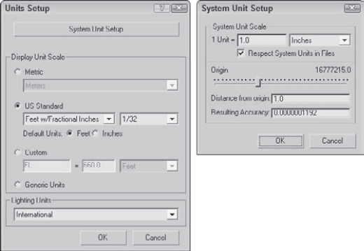
Figure 4.16. The Units Setup dialog box lets you choose which units system to use. Options include Metric, U.S. Standard, Custom, and Generic.
To define a Custom units system, modify the fields under the Custom option, including a units label and its equivalence to known units. The final option is to use the default Generic units. Generic units relate distances to each other, but the numbers themselves are irrelevant. You can also set lighting units to use American or International standards. Lighting units are used to define Photometric lights.
At the top of the Units Setup dialog box is the System Unit Setup button. This button opens the System Unit Scale dialog box, also shown in Figure 4.15. This dialog box enables you to define the measurement system used by Max. Options include Inches, Feet, Miles, Millimeters, Centimeters, Meters, and Kilometers.
For example, when using Max to create models that are to be used in the Unreal game editor, you can use the Custom option to define a unit called the Unreal Foot unit that sets 1 Uft equal to 16 units, which matches the units in the Unreal editor just fine.
A multiplier field allows you to alter the value of each unit. The Respect System Units in Files toggle presents a dialog box whenever a file with a different system units setting is encountered. If this option is disabled, all new objects are automatically converted to the current units system.
The Origin control helps you determine the accuracy of an object as it is moved away from the scene origin. If you know how far objects will be located from the origin, then entering that value tells you the Resulting Accuracy. You can use this feature to determine the accuracy of your parameters. Objects farther from the origin have a lower accuracy.
Warning
Be cautious when working with objects that are positioned a long way from the scene origin. The farther an object is from the origin, the lower its accuracy and the less precisely you can move it. If you are having trouble precisely positioning an object (in particular, an object that has been imported from an external file), check the object's distance from the origin. Moving it closer to the origin should help resolve the problem.
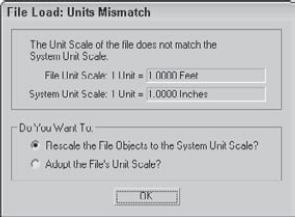
Imagine designing a new ski resort layout. For such a project, you'd want to probably use kilometers as the file units. If your next project is to design a custom body design on a racecar, then you'll want to use meters as the new units. If you need to reopen the ski resort project while your units are set to meters, then you'll get a File Load: Units Mismatch dialog box, shown in Figure 4.17.
This dialog box reminds you that the units specified in the file that you are opening don't match the current units setting. This also can happen when trying to merge in an object with a different units setting. The dialog box lists the units used in both the file and the system and offers two options. The Rescale the File Objects to the System Unit Scale option changes the units in the file to match the current system units setting. The second option changes the system units to match the file unit settings.
Tip
If you rescale the file object to match the system file units setting, then the objects will either appear tiny or huge in the current scene. Use the Zoom Extents All button to see the rescaled objects in the viewport.
If you discover halfway through your scene that you're working with the wrong units, you can use the Rescale World Units utility to scale up the entire scene or just selected objects. To access this utility, click the Utilities panel and then the More button. In the utilities list, select the Rescale World Units utility and click OK.
The Rescale World Units dialog box has a Scale Factor value, which is the value by which the scene or objects are increased or decreased. If your world was created using millimeter units and you need to work in meters, then increasing by a Scale Factor of 1000 will set the world right.
The Preference Settings dialog box lets you configure Max so it works in a way that is most comfortable for you. You open it by choosing Customize
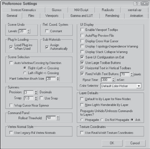
The first panel in the Preference Settings dialog box is for General settings, as shown in Figure 4.18. The General panel includes many global settings that affect the entire interface.
Tip
The quickest way I've found to open the Preference Settings dialog box is to right-click the Spinner Snap Toggle button.
The Scene Undo spinner sets the number of commands that can be kept in a buffer for undoing. A smaller number frees up memory, but does not let you backtrack through your work. The default Undo Levels is 20.
The Reference Coordinate System setting makes all transform tools use the same coordinate system and transform center when the Constant option is enabled. If disabled, each transform uses the coordinate system last selected.
The Load Plug-Ins When Used option keeps plug-ins out of memory until they are accessed. This saves valuable memory and still makes the plug-ins accessible.
The Automatic Sub-Material Assignment option, when checked, enables materials to be dragged and dropped directly onto a subobject selection. This applies the Multi/Sub-Object material to the object with the dropped material corresponding with the subobject selection's Material ID.
The Auto Window/Crossing by Direction option lets you select scene objects using the windowing method (the entire object must be within the selected windowed area to be selected) and the crossing method (which selects objects if their borders are crossed with the mouse) at the same time, depending on the direction that the mouse is dragged. If you select the first option, then the Crossing method is used when the mouse is dragged from right to left and the Window method is used when the mouse is dragged from left to right.
Tip
I like to keep the Auto Window/Crossing by Direction option disabled. I use the Crossing selection method and find that I don't always start my selection from the same side.
The Paint Selection Brush Size value sets the default size of the Paint Selection Brush. In the default interface, this size is set to 20. If you find yourself changing the brush size every time you use this tool, then you can alter its default size with this setting.
Spinners are interface controls that enable you to enter values or interactively increase or decrease the value by clicking the arrows on the right. The Preference Settings dialog box includes settings for changing the number of decimals displayed in spinners and the increment or decrement value for clicking an arrow. The Use Spinner Snap option enables the snap mode.
Tip
Right-click on a spinner to automatically set its value to 0 or its lowest threshold.
You can also change the values in the spinner by clicking the spinner and dragging up to increase the value or down to decrease it. The Wrap Cursor Near Spinner option keeps the cursor close to the spinner when you change values by dragging with the mouse, so you can drag the mouse continuously without worrying about hitting the top or bottom of the screen.
The Rollout Threshold value sets how many pixels can be scrolled before the rollup shifts to another column. This is used only if you've made the Command Panel wider or floating.
The Use Legacy R4 Vertex Normals option computes vertex normals based on the Max version 4 instead of the newer method. The newer method is more accurate but may affect smoothing groups. Enable this setting only if you plan on using any models created using Max R4 or earlier.
The options in the UI Display section control additional aspects of the interface. The Enable Viewport Tooltips option can toggle tooltips on or off. Tooltips are helpful when you're first learning the Max interface, but they quickly become annoying and you'll want to turn them off.
The AutoPlay Preview File setting automatically plays Preview Files in the default media player when they are finished rendering. If this option is disabled, you need to play the previews with the Animation
For some actions, such as non-uniform scaling, Max displays a warning dialog box asking whether you are sure of the action. To disable these warnings, uncheck this option (or you could check the Disable this Warning box in the dialog box). Actions with warnings include topology-dependence and collapsing the Modifier Stack.
The Save UI Configuration on Exit switch automatically saves any interface configuration changes when you exit Max. You can deselect the Use Large Toolbar Buttons option, enabling the use of smaller toolbar buttons and icons, which reclaims valuable screen real estate.
The Horizontal Text in Vertical Toolbars option fixes the problem of text buttons that take up too much space, especially when printed horizontally on a vertical toolbar. You can also specify a width for text buttons. Any text larger than this value is clipped off at the edges of the button.
The Flyout Time spinner adjusts the time the system waits before displaying flyout buttons. The Color Selection drop-down list lets you choose which color selector interface Max uses.
If you select an object and open its Properties dialog box, the Display Properties, Rendering Control, and Motion Blur sections each have a button that can toggle between ByLayer and ByObject. If ByObject is selected, then the options are enabled and you can set them for the object in the Properties dialog box, but if the ByLayer option is selected, then the settings are determined by the setting defined for all objects in the layer in the Layer Manager.
The settings in the Preference Settings dialog box set the ByLayer option as the default for new objects and new lights. You also have an option to propagate all unhide and unfreeze commands to the layer. You can select Propagate, Do Not Propagate, or Ask.
The Use Real-World Texture Coordinates setting causes the Real-World Scale or the Real-World Map Size option in the Coordinates rollout to be enabled. This setting is off by default, but it can be enabled to be the default by using this setting.
Note
Real-World Texture Coordinates is a mapping method explained in more detail in Chapter 17, "Adding Material Details with Maps."
The Files panel holds the controls for backing up, archiving, and logging Max files. You can set files to be backed up, saved incrementally, or compressed when saved.
Note
The Files panel is covered in Chapter 3, "Working with Files, Importing, and Exporting."
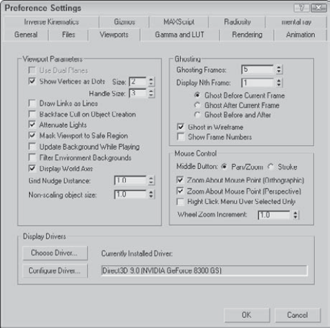
The viewports are your window into the scene. The Viewports panel, shown in Figure 4.19, contains many options for controlling these viewports.
Note
Although the viewports are the major topic in Chapter 2, "Controlling and Configuring the Viewports," the viewport preference settings are covered here.
The Use Dual Planes option enables a method designed to speed up viewport redraws. Objects close to the scene are included in a front plane, and objects farther back are included in a back plane. When this option is enabled, only the objects on the front plane are redrawn.
In subobject mode, the default is to display vertices as small plus signs. The Show Vertices as Dots option displays vertices as either Small or Large dots. The Draw Links as Lines option shows all displayed links as lines that connect the two linked objects.
Warning
I've found that keeping the Draw Links as Lines option turned on can make it confusing to see objects clearly, so I tend to keep it turned off.
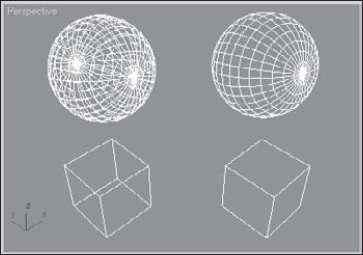
When the Backface Cull on Object Creation option is enabled, the backside of an object in wireframe mode is not displayed. If disabled, you can see the wireframe lines that make up the backside of the object. The Backface Cull option setting is determined when the object is created, so some objects in your scene may be backface culled and others may not be. Figure 4.20 includes a sphere and a cube on the left that are backface culled and a sphere and cube on the right that are not.
Note
The Object Properties dialog box also contains a Backface Cull option.
The Attenuate Lights option causes objects farther back in a viewport to appear darker. Attenuation is the property that causes lights to diminish over distance.
In the Viewport Configuration dialog box, you can set Safe Regions, which are borders that the renderer includes. The Mask Viewport to Safe Region option causes the objects beyond the Safe Region border to be invisible.
The Update Background While Playing option causes viewport background bitmaps to be updated while an animation sequence plays. Viewport backgrounds can be filtered if the Filter Environment Background option is enabled, but this slows the update time. If this option is disabled, the background image appears aliased and pixelated.
Note
The Low-Res Environment Background option didn't improve viewport performance that much, so the option has been removed.
The Display World Axis option displays the axes in the lower-left corner of each viewport. The Grid Nudge Distance is the distance that an object moves when Grid Nudge (+ and – on the numeric keypad) keys are used. Objects without scale, such as lights and cameras, appear in the scene according to the Non-Scaling Object Size value. Making this value large makes lights and camera objects very obvious.
Ghosting is similar to the use of "onion skins" in traditional animation, causing an object's prior position and next position to be displayed. When producing animation, knowing where you're going and where you've come from is helpful.
Max offers several ghosting options. You can set whether a ghost appears before the current frame, after the current frame, or both before and after the current frame. You can set the total number of ghosting frames and how often they should appear. You can also set an option to show the frame numbers.
Note
For a more detailed discussion of ghosting, see Chapter 20, "Understanding Animation and Keyframe Basics."
If you're using a mouse that includes a middle button (this includes a mouse with a scrolling wheel), then you can define how the middle button is used. The two options are Pan/Zoom and Stroke.
The Pan/Zoom option pans the active viewport if the middle button is held down, zooms in and out by steps if you move the scrolling wheel, rotates the view if you hold down the Alt key while dragging, and zooms smoothly if you drag the middle mouse button with the Ctrl and Alt keys held down. You can also zoom in quickly using the scroll wheel with the Ctrl button held down, or more slowly with the Alt key held down. You can select options to zoom about the mouse point in the Orthographic and Perspective viewports. If disabled, you'll zoom about the center of the viewport. The Right Click Menu Over Selected Only option causes the quadmenus to appear only if you right-click on top of the selected object. This is a bad idea if you use the quadmenus frequently.
Tip
I've found that using the middle mouse button along with the Alt key for rotating is the simplest and easiest way to navigate the viewport, so although Strokes is a clever idea, I always set the middle mouse button to Pan/Zoom.
The Stroke option lets you execute commands by dragging a predefined stroke in a viewport. With the Stroke option selected, close the Preference Settings dialog box and drag with the middle mouse button held down in one of the viewports. A simple dialog box identifies the stroke and executes the command associated with it. If no command is associated, then a simple dialog box appears that lets you Continue (do nothing) or Define the stroke.
Another way to work with strokes is to enable the Strokes Utility. This is done by selecting the Utility panel, clicking the More button, and selecting Strokes from the pop-up list of utilities. This utility makes a Draw Strokes button active. When the button is enabled, it turns yellow and you can draw strokes with the left mouse button and access defined strokes with the middle mouse button.
If you select to define the stroke, the Define Stroke dialog box, shown in Figure 4.21, is opened. You can also open this dialog box directly by holding down the Ctrl key while dragging a stroke with the middle mouse button. In the upper-left corner of this dialog box is a grid. Strokes are identified by the lines they cross on this grid as they are drawn. For example, an "HK" stroke would be a vertical line dragged from the top of the viewport straight down to the bottom.
With a stroke identified, you can select a command in the upper-right pane. This is the command that executes when you drag the stroke with the middle mouse button in the viewport. For each command, you can set the options found below the stroke grid. These options define what the command is executed on.
All defined strokes are saved in a set, and you can review the current set of defined strokes with the Review button. Clicking this button opens the Review Strokes dialog box where all defined strokes and their commands are displayed, as shown in Figure 4.22.
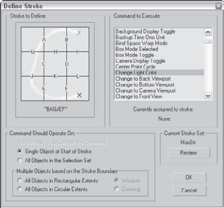
Figure 4.21. The Define Stroke dialog box lets you define specific command strokes that are executed by drawing the stroke with the middle mouse button.
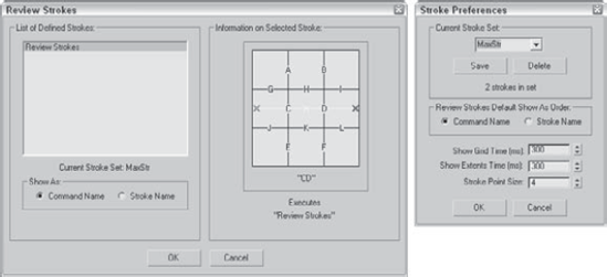
Figure 4.22. The Review Strokes and Stroke Preferences dialog boxes list all defined strokes and their respective commands.
One of the commands available in the list of commands is Stroke Preferences. Using this command opens the Stroke Preferences dialog box, also shown in Figure 4.22, where you can save and delete different stroke sets, specify to list commands or strokes in the Review Strokes dialog box, set how long the stroke grid and extents appear, and set the Stroke Point Size.
If you look closely at the right end of the title bar, you notice that the Display driver is displayed and set to Direct X. When Max is installed, it loads the latest Direct X drivers and sets the display to use those drivers, but you can change the display driver to OpenGL or to Software if your video card doesn't support the needed drivers.
The Display Drivers section in the Viewports panel of the Preference Settings dialog box lists the currently installed driver. Clicking the Configure Driver button opens a dialog box of settings for the current driver. Clicking the Choose Driver button opens the Direct3D Driver Setup dialog box, shown in Figure 4.23. This dialog box lets you change the Direct3D version, but unless you have a reason to change it, keep it set to DirectX 10.0 or you'll disable some features. The Software (RefRast) and Debug Use Flags options are enabled only if you have a debug version of Direct3D installed on your system.
If you click the Revert from Direct3D button, the Graphics Driver Setup dialog box, also shown in Figure 4.23, opens. This dialog box lets you change the display driver. The options include Software, OpenGL, Direct3D (which is recommended because the Max installation includes the latest drivers), and Custom. If you change the display driver, you need to restart Max.
Warning
The Graphics Driver Setup dialog box displays the options only for the drivers that it finds on your system, but just because an option exists doesn't mean it works correctly. If a driver hangs your system, you can restart it from a command line with the –h flag after 3dsmax.exe to force Max to present the Graphics Driver Setup dialog box again or use the Start
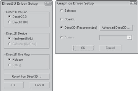
Figure 4.23. You use the Direct3D Driver Setup and the Graphics Driver Setup dialog boxes to select a different display driver.
The Configure Driver option opens a dialog box of configurations for the driver that is currently installed. The various configuration dialog boxes include options such as specifying the Texture Size, which is the size of the bitmap used to texture map an object. Larger maps have better image quality but can slow down your display.
All the display driver configuration settings present tradeoffs between image quality and speed of display. By tweaking the configuration settings, you can optimize these settings to suit your needs. In general, the more memory available on your video card, the better the results.
Note
You can learn more about the various display drivers in Bonus Chapter 1, "Installing and Configuring 3ds Max 2009."
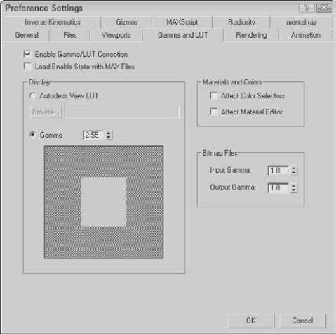
The Gamma and LUT panel, shown in Figure 4.24, controls the gamma correction for the display and for bitmap files. It also includes a Browse button for loading an Autodesk Look-up Table (LUT) file. A Look-up Table is a file that holds all the color calibration settings that can be shared across different types of software and hardware within a studio to maintain consistency.
Have you ever noticed in an electronics store that television-screen displays vary in color? Colors on monitor screens may be fairly consistent for related models, but may vary across brands. Gamma settings are a means by which colors can be consistently represented regardless of the monitor that is being used.
Gamma value regulates the contrast of an image. It is a numerical offset required by an individual monitor in order to be consistent with a standard. To enable gamma correction for Max, open the Gamma panel in the Preference Settings dialog box and click the Enable Gamma Correction option. To determine the gamma value, use the spinner or adjust the Gamma value until the gray square blends in unnoticeably with the background.
LUT files can be loaded from other software to ensure consistency across several calibrated monitors in a studio.
Note
3ds Max cannot create LUT files, but it can use existing LUT files created in other software packages, such as Combustion.
Although gamma settings have a direct impact on the viewports, they do not affect the colors found in the Color Selector or in the Material Editor. Using the Affect Color Selectors and Affect Material Editor options, you can propagate the gamma settings to these other interfaces also.
Many bitmap formats, such as TGA, contain their own gamma settings. The Input Gamma setting for Bitmap files sets the gamma for bitmaps that don't have a gamma setting. The Output Gamma setting is the value set for bitmaps being output from Max.
Note
Match the Input Gamma value to the Display Gamma value so that bitmaps loaded for textures are displayed correctly.
The remaining preference panels, including Rendering, Animation, Inverse Kinematics, Gizmos, MAXScript, Radiosity, and mental ray, are covered in the related chapters.
Note
The details of the Rendering Preferences panel are covered in Chapter 22, "Learning to Render a Scene." The Animation Preferences panel is covered in Chapter 20, "Understanding Animation and Keyframe Basics." To learn more about Applied IK and Interactive IK, see Chapter 41, "Working with Inverse Kinematics." See Chapter 7, "Transforming Objects, Pivoting, Aligning, and Snapping" for more detail on Gizmo preferences. Check out Chapter 49, "Automating with MAXScript" for more on MAXScript commands and preferences. Swing over to Chapter 44, "Working with Advanced Lighting, Light Tracing, and Radiosity," for greater detail on Radiosity preferences. Look to Chapter 46, "Raytracing and mental ray," for more detail on the mental ray renderer.
You can customize the Max interface in many ways. Most of these customization options are included under the Customize menu. In this chapter, you learned how to use this menu and its commands to customize many aspects of the interface. Customizing makes the Max interface more efficient and comfortable for you.
Specifically, this chapter covered the following topics:
Using the Customize User Interface dialog box to customize keyboard shortcuts, toolbars, quadmenus, menus, and colors
Customizing buttons on the Modify and Utility panels
Saving and loading custom interfaces
Configuring paths
Setting system units
Setting preferences
Part II, "Working with Objects," is next. The first chapter covers the primitive objects and gets some objects into a scene for you to work with.