In This Chapter
Drawing line charts with single and multiple lines
Generating scatterplots
Creating bar charts from your data
This chapter provides examples of various graphical data displays and shows you how to build the graphs you're probably most familiar with; Chapter 11 shows examples of graph types that may be less familiar to you. Both chapters present each example as a step-by-step procedure, kept as simple as possible.
Although every variation of every possible chart won't fit into a pair of chapters, you can certainly use the procedures they present to produce some nifty-looking graphs. And once you get the basic idea of producing graphs, you should have no problem branching out and making fancy graphs of your own.
You could work through the examples in these two chapters to get an overview of building the kinds of graphs you can get from SPSS — not a bad idea for a beginner — or simply choose the look you want your data to have and follow the steps given here to construct the chart that does the job. Either way, when you get a handle on the basics, you can step through the process again and again, using your data, trying variations until you get charts that appear the way you want them to.
A line chart works well as a visual summary of categorical values. Line charts are also useful for displaying timelines because they demonstrate up and down trends so well. Line graphs are popular because they're easy to read. If they're not the most common type of statistical chart, they're a contender for the title.
Tip
The display of data is similar in a line chart and a bar chart. If you decide to display data as a line graph, you should probably try the same data as a bar chart to see which you prefer.
The following steps generate a simple line chart displaying a single timeline:
Choose File
Open Data and open the
Employee data.savfile, which is in the SPSS installation directory.Choose Graphs
Chart Builder.The Chart Builder dialog box appears.
In the Choose From list, select Line.
Drag the first diagram (the one with the Simple Line tooltip) to the panel at the top.
An Element Properties dialog box appears. You can simply close it because this example uses the default settings.
In the Variables list, drag Current Salary to the Y-Axis rectangle in the panel at the top.
Again in the Variables list, drag Date of Birth to the X-Axis rectangle in the panel.
Click the OK button.
The chart in Figure 10-1 appears.
You can have more than one line appear on a chart by adding more than one variable name to an axis. But the variables must contain a similar range of values before they can be represented by the same axis. For example, if one variable ranges from 0 to 1,000 pounds and another variable ranges from 1 to 2 pounds, the values of the second variable will show up as a straight line, regardless of how much it actually fluctuates.
The following steps generate a multiline graph:
Choose File
OpenData and open theCars.savfile.The file is in the SPSS installation directory.
Choose Graphs
Chart Builder.In the Choose From list, select Line to specify the general type of graph to be constructed.
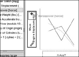
To specify that this graph should contain multiple lines, select the second diagram (the one with the Multiple Line tooltip) and drag it to the panel at the top.
The Element Properties dialog box pops up, but you can close it because the default values work fine.
In the Variables list, select Number of Cylinders and drag it to the rectangle named X-Axis in the diagram.
In the Variables list, select Engine Displacement and drag it to the Y-Axis rectangle in the panel at the top.
The word Mean is added to the annotation because the values displayed on this axis will be the mean values of the engine displacement.
In the Variables list, select Horsepower and drag it to the Y-axis also.
Warning
Be careful how you drop Horsepower. To add Horsepower as a new variable, you want to drop it on the little box containing the plus sign, as shown in Figure 10-2. If you drop the new name on top of the one that's already there, the original variable could be replaced.
When the Create Summary Group window appears, telling you that SPSS is combining the two variables along the Y-axis, click the OK button.
Click the OK button.
The chart shown in Figure 10-3 appears.
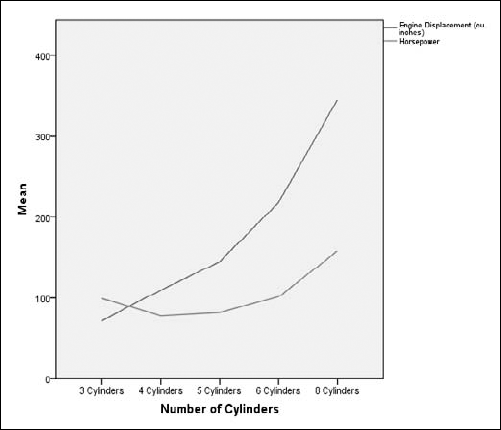
The variables you choose as members of the Y-axis must have a similar range of values to make sense. For example, if you were to choose age and annual income as two variables to be charted together, the result wouldn't be all that interesting; the salary values would be in the thousands and the ages, regardless of their variation, would all appear in a single line.
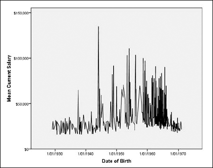
A scatterplot is simply an X-Y plot where you don't care about interpolating the values — that is, the points are not joined with lines. Instead, a disconnected dot appears for each data point. The overall pattern of these scattered dots often exposes a pattern or trend.
The following steps show you how to construct a simple scatterplot:
Choose File
OpenData and open theEmployee data.savfile.The file is in the SPSS installation directory.
Choose Graphs
Chart Builder.Select the simplest scatterplot diagram (the one with the Simple Scatter tooltip), and drag it to the panel at the top.
In the Variables list, select Beginning Salary and drag it to the rectangle labeled X-Axis in the diagram.
In the Variables list, select Current Salary and drag it to the rectangle labeled Y-Axis in the diagram.
Click the OK button.
The chart in Figure 10-4 appears.
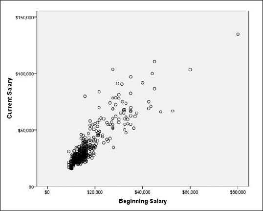
Each dot on the scatterplot in Figure 10-4 represents both the starting salary and the current salary of one employee. The most obvious fact you can derive from this is that the current salary depends largely on the starting salary. In the pattern of the dots, it's easy to see a normal line from the lower left to the upper right. Any dot on that imaginary line represents the salary of an employee who received a normal raise. The dots above the line are the employees who got above-average raises, and those below the line are those with below-average raises. This plot has the shortcoming that the length of service is not considered.
You can display the values of more than one variable along the same axis. The following example constructs a scatterplot showing the beginning salary and the current salary according to the number of months of experience the person had before taking the job:
Choose File
OpenData and open theEmployee data.savfile, which is in the SPSS installation directory.Choose Graphs
Chart Builder.In the Choose From list, select Scatter/Dot.
Select the second scatterplot diagram (the one with the Grouped Scatter tooltip) and drag it to the panel at the top.
In the Variables list, do the following:
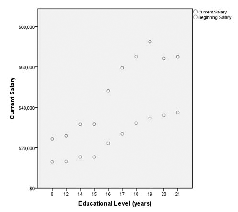
Select Educational Level and drag it to the X-Axis rectangle.
Select Beginning Salary and drag it to the Y-Axis rectangle.
Select Current Salary and drag it to the same location as you dropped the Beginning Salary.
Warning
Be careful to drop it on the square with the plus sign. The plus sign appears as you drag a droppable item over the rectangle.
Click the OK button.
The chart shown in Figure 10-5 appears, with two different colored dots and a legend at the upper right.
Three-dimensional scatterplots can be dramatic in appearance, but clarity is not their strongest point. Because the scatterplot is drawn on a two-dimensional surface, you might find it difficult to envision where each point is supposed to appear in space. On the other hand, if your data distributes appropriately on the display, the resulting chart may demonstrate the concept you're trying to get across.
The following example uses the same data as in the preceding example but displays it in a different way, as a three-dimensional plot:
Choose File
OpenData and open theEmployee data.savfile.The file is in the SPSS installation directory.
Choose Graphs
Chart Builder.Select the third scatterplot diagram (the one with the Simple 3-D Scatter tooltip) and drag it to the panel at the top.
In the Variables list, do the following:
Click the OK button.
The graph shown in Figure 10-6 appears.
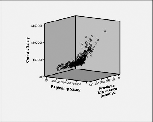
Three-dimensional scatterplots can have more than a single value along an axis. However, as in the previous example, clarity is not the strongest point of the result. Depending on the data, you might find it difficult to envision where each point is supposed to appear in space — or the chart may demonstrate the concept you're trying to get across. All you can do is generate the graph and then evaluate whether or not you want to use the result.
The following example uses the same data basic information that was displayed in the preceding example:
Choose File
OpenData and open theEmployee data.savfile.The file is in the SPSS installation directory.
Choose Graphs
Chart Builder.In the Choose From list, select Scatter/Dot.
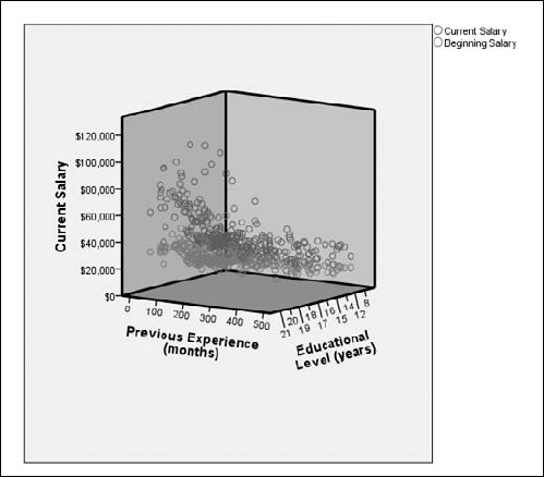
Select the fourth scatterplot diagram (the one with the Grouped 3-D Scatter tooltip) and drag it to the panel at the top.
In the Variables list, do the following:
Select Educational Level and drag it to the Z-Axis rectangle.
Select Current Salary and drag it to the Y-Axis rectangle.
Select Beginning Salary and drag it to the plus sign in the Y-Axis rectangle.
Drag INDEX from the X-Axis rectangle to the Set Color rectangle at the upper right.
The INDEX variable is automatically inserted by the graph-building process. It is not used in the example.
Select Previous Experience from the Variable list and drag it to the X-Axis rectangle.
Click the OK button.
The graph shown in Figure 10-7 appears.
A Summary Point plot has the same layout as a bar chart, except the bars are not drawn. Instead, a point is placed at the position of the top of the bar. This means that it is possible to place more than a single value at the position that would otherwise be filled by a single bar. The points for different data items vary in appearance, and are identified by a legend. You must be careful, however, to choose variables that make sense when combined and displayed this way.
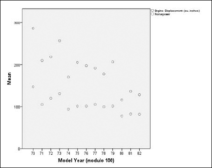
The following example shows the relationship between the means of cubic-inch engine displacement and the mean of automobile horsepower over several years:
Choose File
OpenData and open theCars.savfile.The file is in the SPSS installation directory.
Choose Graphs
Chart Builder.In the Choose From list, select Scatter/Dot.
Select the fifth scatterplot diagram (the one with the Summary Point plot tooltip) and drag it to the panel at the top.
In the Variables list, do the following:
Select Model Year and drag it to the X-Axis rectangle.
Select Horsepower and drag it to the Y-Axis rectangle.
Select Engine Displacement and drag it to the plus sign in the Y-Axis rectangle.
Click the OK button.
The graph shown in Figure 10-8 appears.
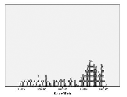
No plot is simpler to produce than the dot plot. It has only one dimension. Although SPSS groups it among the scatterplots, there's nothing scattered about it. It actually presents data more like a bar chart — and it reminds me of that old joke about stacking BBs.
It's easy to create a dot plot. You select the dot plot as the type of graph you want and then select one variable. SPSS does the rest. The following steps guide you through the process of creating a simple dot plot:
Choose File
OpenData and open theEmployee data.savfile.The file is in the SPSS installation directory.
Choose Graphs
Chart Builder.In the Choose From list, select Scatter/Dot.
Select the sixth graph image (the one with the Simple Dot Plot tooltip) and drag it to the panel at the top.
In the Variables list, select Date of Birth and drag it to the X-Axis rectangle.
Click the OK button.
The chart shown in Figure 10-9 appears.
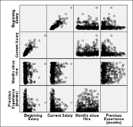
A scatterplot matrix is a group of scatterplots combined into a single graphic image. You choose a number of scale variables and include them as a member of your matrix, and SPSS creates a scatterplot for each possible pair of variables. You can make the matrix as large as you like — its size is controlled by the number of variables you include.
The following steps walk you through the creation of a matrix:
Choose File
OpenData and open theEmployee Data.savfile.The file is in the SPSS installation directory.
Choose Graphs
Chart Builder.Select the seventh graph image (the one with the Scatterplot Matrix tooltip) and drag it to the panel at the top.
In the Variables list, drag Beginning Salary to the Scattermatrix rectangle in the panel at the top.
The selected name replaces the label in the rectangle.
Drag the variable names Current Salary, Months Since Hire, and Previous Experience (Months) to the rectangle inside the panel at the top of the window.
The labels may or may not change with each variable you add, depending on their length and amount of space available. All your labels appear in the list at the bottom of the Element Properties dialog box.
Click the OK button.
The chart in Figure 10-10 appears. As you can see, each variable is plotted against each of the others.
The matrix of scatterplots in Figure 10-10 has each variable plotted against each of the others. Notice that the scatterplots along the diagonal from the upper left to the lower right are blank — that's because it's useless to plot a variable against itself. Also, notice the symmetry: Each plot in the lower-left half has a rotated and mirrored image in the upper-right half.
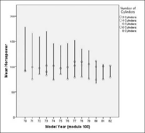
A drop-line chart presents a special kind of summary with points and vertical lines. The points are grouped horizontally; at each categorical value, a line is drawn vertically through them. This arrangement can be visually helpful for comparing the values that appear within each category.
The following steps take you through the basic actions necessary for producing a drop-line graph:
Choose File
OpenData and open theCars.savfile.The file is in the SPSS installation directory.
Choose Graphs
Chart Builder.Select the last graph image (the one with the Drop-line tooltip) and drag it to the panel at the top.
In the Variables list, do the following:
Select Number of Cylinders and drag it to the rectangle in the upper-right corner with the Set Color label.
Select Model Year and drag it to the X-Axis rectangle.
Select Horsepower and drag it to the rectangle on the left labeled Mean.
Note that X-Axis and Set Color both contain categorical variable names, and the Mean on the left contains a scale variable. This is the only combination of variable types that will work.
Click the OK button.
The graph in Figure 10-11 appears.
A bar graph is a comparison of relative magnitudes. Simple bar graphs and simple line graphs are the most common ways of charting statistics. It would make an interesting statistical study to determine which is more common. The results could be displayed as either a bar graph or a line graph, whichever is more popular.
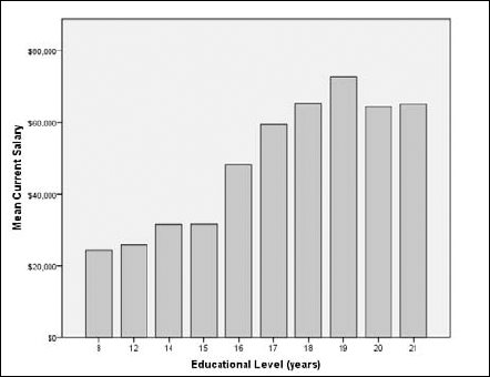
A fundamental bar graph is simple enough that the decisions you need to make when preparing one are almost intuitive. The following steps can be used to generate a simple bar graph:
Select File
OpenData and open theEmployee data.savfile.The file is in the SPSS installation directory.
Choose Graphs
Chart Builder.In the Choose From list, select Bar.
Select the first graph image (the one with the Simple Bar tooltip) and drag it to the panel at the top of the window.
In the Variables list, select Education Level and drag it to the X-Axis rectangle.
In the Variables list, select Current Salary and drag it to the Count rectangle.
The label changes from Y-Axis to Mean to indicate the type of variable that will now be applied to that axis.
Click the OK button.
The bar graph in Figure 10-12 appears.
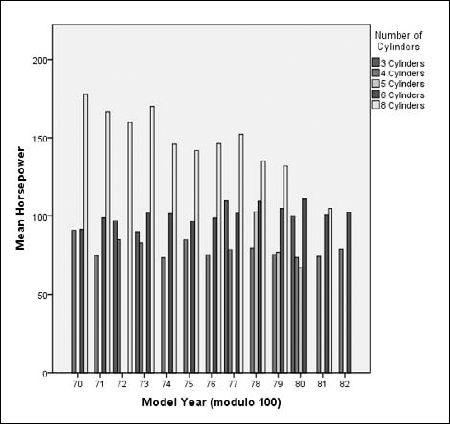
A clustered bar chart can show the relationships among a cluster of items by displaying more than one value and presenting a summary of categorical values. Clustering combines several bar charts into one. The following steps take you through the process of constructing a clustered bar chart:
Choose File
OpenData and open theCars.savfile.The file is in the SPSS installation directory.
Choose Graphs
Chart Builder.In the Choose From list, select Bar.
Select the second graph image (the one with the Clustered Bar tooltip) and drag it to the panel at the top of the window.
In the Variables list, do the following:
Select Model Year and drag it to the X-Axis rectangle.
Select Horsepower and drag it to the Count rectangle.
The rectangle was originally labeled Y-Axis. The label changed to help you understand the type of variable that needs to be placed there.
Select Number of Cylinders and drag it to the rectangle in the upper-right corner, the one now labeled Cluster on X.
Click the OK button.
The graph in Figure 10-13 appears.
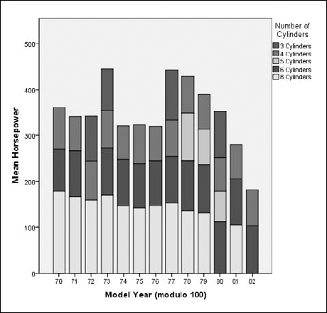
A stacked bar chart is similar to the clustered bar chart in that it displays multiple values of a variable for each value of a categorical variable. But it does it by stacking them instead of placing them side by side. The following chart displays the same data as the preceding example, but emphasizes different aspects of the data.
Following these steps will create a stacked bar chart:
Choose File
OpenData and open theCars.savfile.The file is in the SPSS installation directory.
Choose Graphs
Chart Builder.In the Choose From list, select Bar.
Select the third graph image (the one with the Stacked Bar tooltip) and drag it to the panel at the top of the window.
In the Variables list, do the following:
Select Model Year and drag it to the X-Axis rectangle.
Select Horsepower and drag it to the Count rectangle.
The rectangle was originally labeled Y-Axis. The label changed to help you understand the type of variable that needs to be placed there.
Select Number of Cylinders and drag it to the rectangle in the upper-right corner, the one now labeled Stack.
Click the OK button.
The graph in Figure 10-14 appears.
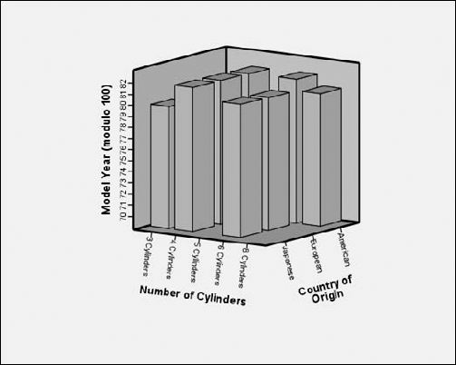
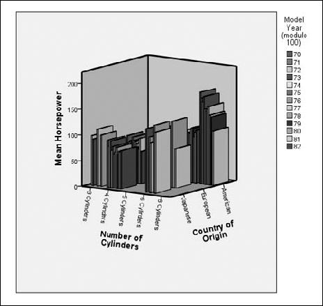
A simple three-dimensional bar chart is the same as a two-dimensional bar chart, except a third variable is added to specify the values along the new dimension. As with most three-dimensional displays, it has the advantage of displaying three relative values at once, and it has the disadvantage of making it difficult to determine which is the greater of two values if the two values are close. You'll just have to try it with your data and decide whether it demonstrates what you've got or just contributes to the general confusion.
The following steps construct a three-dimensional bar chart:
Choose File
OpenData and open theCars.savfile.The file is in the SPSS installation directory.
Choose Graphs
Chart Builder.In the Choose From list, select Bar.
Select the fourth graph image (the one with the Simple 3-D Bar tooltip) and drag it to the panel at the top of the window.
In the Variable list, do the following:
Select Model Year and drag it to the Y-Axis rectangle.
Select Number of Cylinders and drag it to the X-Axis rectangle.
Select Country of Origin and drag it to the Z-Axis rectangle.
Click the OK button.
The graph in Figure 10-15 appears.
A clustered three-dimensional bar chart can show the relationships among a cluster of items by displaying more than one value and presenting a summary of categorical values. Clustering combines several bar charts into one. A great deal of information is displayed in a single chart, and it can be confusing in appearance. You will need to test it with your data and determine whether it demonstrates what you are trying to show.
The following steps take you through the process of constructing a clustered bar chart:
Choose File
OpenData and open theCars.savfile.The file is in the SPSS installation directory.
Choose Graphs
Chart Builder.In the Choose From list, select Bar.
Select the fifth graph image (the one with the Clustered 3-D Bar tooltip) and drag it to the panel at the top of the window.
In the Variables list, do the following:
Select Number of Cylinders and drag it to the X-Axis rectangle.
Select Horsepower and drag it to the Count rectangle.
The rectangle was originally labeled Y-Axis. The label changed to help you understand the type of variable that needs to be placed there.
Select Country of Origin and drag it to the Z-Axis rectangle.
Select Model Year and drag it to the rectangle in the upper-right corner, the one now labeled Cluster on X.
Click the OK button.
The graph in Figure 10-16 appears.
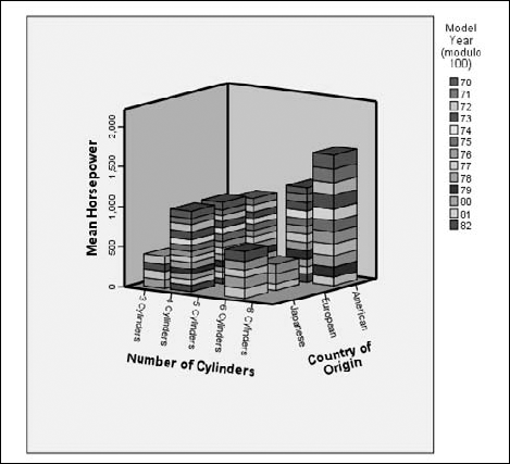
A stacked three-dimensional bar chart is very similar to the clustered bar chart. The two can be used to show the same data, but in slightly different ways. A stacked chart can show the relationships among data items by stacking more than one value and presenting a vertical summary of categorical values. Stacking combines several bar charts into one. Because that single chart displays a great deal of information, however, it can be confusing in appearance. The layout may even hide some of the data inadvertently. You'll have to test it with your data to see whether it shows what you want to see.
The following steps take you through the process of constructing a stacked three-dimensional bar chart:
Choose File
OpenData and open theCars.savfile.The file is in the SPSS installation directory.
Choose Graphs
Chart Builder.In the Choose From list, select Bar.
Select the sixth graph image (the one with the Stacked 3-D Bar tooltip) and drag it to the panel at the top of the window.
In the Variables list, do the following:
Select Number of Cylinders and drag it to the X-Axis rectangle.
Select Horsepower and drag it to the Count rectangle.
The rectangle was originally labeled Y-Axis. The label changed to help you understand the type of variable that should be placed there.
Select Country of Origin and drag it to the Z-Axis rectangle.
Select Model Year and drag it to the rectangle in the upper-right corner, the one labeled Stack Set Color.
Click the OK button.
The graph in Figure 10-17 appears.
Some errors come from flat-out mistakes — but those aren't the errors I talk about here. Statistical sampling can help you arrive at a conclusion, but that conclusion has a margin of error. This margin can be calculated and quantified according to the size of the sample and the distribution of the data. For example, suppose you want to know how typical the result is when you calculate the mean of all values for a particular variable — for any one case, the mean could be as big as the largest value or as small as the smallest. The maximum and minimum are the extremes of the possible error. You can choose values and mark the points that contain, say, 90 percent of all values. Marking these points on graphs creates error bars.
You can add error bars to the display of most types of graphs. For example, you could add error bars to the simple bar graph presented earlier in this chapter (refer to Figure 10-12) by making selections in the Element Properties dialog box. If you've worked through any of the examples, you'll know Element Properties as that pesky window that pops up every time you construct a chart.
For an example of adding error bars to a bar chart, follow the same procedure described previously in the "Simple bar graphs" section — but just before the final step (clicking the OK button to produce the chart), do the following:
If the Element Properties window is not displayed, click the Element Properties button to put that window on-screen.
In the Element Properties window, make sure that a check mark appears in the Display Error Bars option.
Click the Apply button.
Close the Element Properties window by selecting the Close button.
Click the OK button.
The chart shown in Figure 10-18 appears.
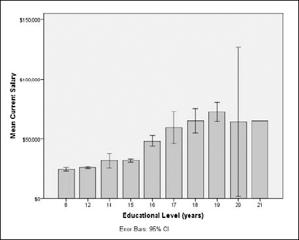
Another way to display the same data is to display the range of errors without displaying the full range of all values. To do so, follow these steps:
Choose File
OpenData and open theEmployee data.savfile.The file is in the SPSS installation directory.
Choose Graphs
Chart Builder.In the Choose From list, select Bar.
Select the seventh graph image (the one with the Simple Error Bar tooltip) and drag it to the panel at the top of the window.
In the Element Properties window, make sure that the Display Error Bars option is checked, the Confidence Intervals option is selected, and the Level is set to 95%.
Note
Any time you change a setting or a value in the Element Properties dialog box, you must click the Apply button to have the change reflected in your chart.
In the Variables list, select Education Level and drag it to the X-Axis rectangle.
In the Variables list, select Current Salary and drag it to the Mean rectangle.
The label changes from Y-Axis to Mean to indicate the type of data that will be displayed on that axis.
Click the OK button.
The bar graph in Figure 10-19 appears.
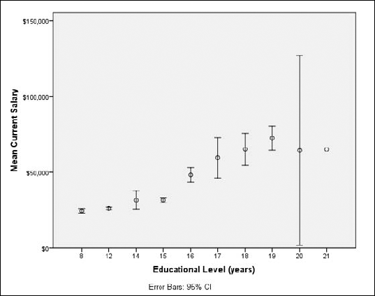
Figure 10.19. An error bar graph, showing the mean values as dots and the upper and lower bounds of the error.
This example displays the result of one way of making error calculations: The magnitude of the error is based on 95 percent of all values being within the upper and lower error bounds. If you prefer, you can base the error on the bell curve and mark the upper and lower errors at some multiple of the standard error or standard deviation.
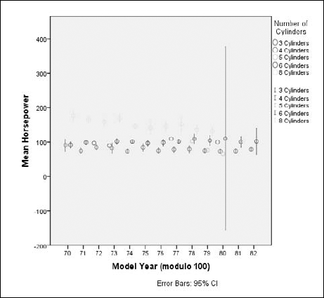
A clustered error bar chart can show the relationships among a cluster of error ranges by presenting a summary of categorical values. Clustering combines several error bar charts into one. The following steps take you through the process of constructing a clustered error bar chart:
Choose File
OpenData and open theCars.savfile.The file is in the SPSS installation directory.
Choose Graphs
Chart Builder.In the Choose From list, select Bar.
Select the eighth graph image (the one with the Clustered Error Bar tooltip) and drag it to the panel at the top of the window.
In the Variables list, do the following:
Select Model Year and drag it to the X-Axis rectangle.
Select Horsepower and drag it to the Mean rectangle.
The rectangle was originally labeled Y-Axis. The label changed to help you understand the type of variable that should be placed there.
Select Number of Cylinders and drag it to the rectangle in the upper-right corner, the one now labeled Cluster on X.
Click the OK button.
The graph in Figure 10-20 appears.