
In This Chapter
Generating reports by summarizing data
Displaying summary data in rows and columns
Manipulating the display of pivot tables
To execute an analysis, you run your numbers through one or more procedures to produce numbers that present a conclusion. The SPSS Viewer displays the output from an analysis in the form of a pivot table — so called because you can change them after they're produced, and one dramatic change is to pivot the rows so they become columns and the columns so they become rows.
A report generated in SPSS is created as the result of running an analysis. The analysis can be as simple as specifying how subtotals and totals are to be calculated, or as complex as applying a multipart series of equations.
Note
Computer-generated reports depend on the concept of a break variable. If a report will contain subtotals, or some other type of logical internal break, you must define the conditions under which the break will be made. A break usually occurs when a variable changes value. For example, if you're generating a list of employee sick days and want to insert subtotals for male and female, you could use the Gender variable as the break variable: A subtotal could be printed at the end of the 'f' values representing female, and again at the end of the 'm' values representing male.
When you request that SPSS create a table from your data, you also get another table — the processing summary. It appears in SPSS Viewer immediately before the table you requested. Its purpose is to provide you with information about the actions taken by SPSS to create your table. You don't have to request a processing summary to get one.
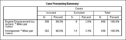
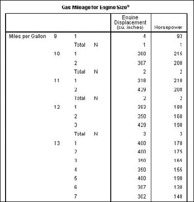
Figure 12-1 is a simple example of a processing summary. In this example, the values from the Engine Displacement and Horsepower variables in the Cars.sav file were included in the table, which was organized to display information by Miles per Gallon. In a SPSS table, the letter N is used as a header to indicate a simple count, or number, of items. The counts tell you how many variables were included. In this example, if all the selected cases had been included in the report, there would have been 406 for each variable. A small number of cases (8 for one variable, 14 for the other) were excluded, so the report included data from 398 cases for one variable and 392 for the other. A case is excluded if the data is missing for a variable. You can see from the table that the percentage of excluded cases is quite small.
You can construct a case summary to organize and summarize the values from one or more variables. Follow these steps:
Choose File
Open Data and open the
Cars.savfile.The file is in the SPSS installation directory.
Choose Analyze
ReportsCase Summaries.In the list on the left, do the following:
Select Engine Displacement and move it to the Variables panel by clicking the arrow button.
Select Horsepower and move it to the Variables panel.
Select Miles per Gallon and move it to the Grouping Variable(s) panel.
The dialog box should now look like the one in Figure 12-2, with Engine Displacement and Horsepower to be summarized, and the summaries to be grouped by Miles per Gallon. The default, in the lower-left corner of the window, is to limit the summary to the first 100 cases and exclude cases with invalid (missing) values.
The dialog box in Figure 12-3 appears. Here, you can select the statistics you would like to include in the report. The ones available are on the left and the ones selected are on the right.
Make certain the only statistic selected is Number of Cases, and then click Continue.
Click the Options button.
The dialog box in Figure 12-4 appears. The Title is the text that appears at the top of the table, and the Caption is text that appears at the bottom. In the text you enter for the Title or Caption, you can include
Replace the default title and click Continue.
In this example, replace the default title (Case Summaries) with Gas Mileage for Engine Size.
Click OK.
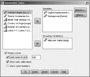
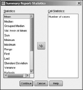
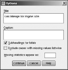
Figure 12-5 is the top portion of the table produced in this example (the entire table is too large to show conveniently). The table includes mileage data only from the first 100 cases: 2 cars report 10 miles per gallon, 2 report 11 miles per gallon, and 3 report 12 miles per gallon. Each car has its engine displacement and horsepower reported. The small letter a appended to the title indicates the presence of a footnote, which states that this report includes only the first 100 cases.
You can produce a report that lists the values of a variable in a column down the left with the values for other variables associated with it in a row to its right. In addition, you can elect to have multiple rows for each break variable by simply selecting the type of statistic.
A row summary table is simple to create but very flexible; it offers lots of options. You'll find a lot of dialog boxes, but the decisions you have to make are easy. After you've run through the process a couple of times to see how it all works, you'll be able to romp through the sequence and produce output without guidance.
The following steps produce a table while giving you a tour of most of the options:
Choose File
OpenData and open theCars.savfile.The file is in the SPSS installation directory.
Choose Analyze
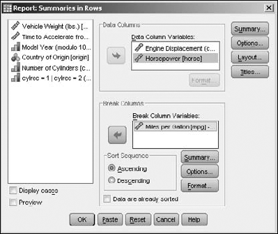
ReportsReport Summaries in Rows.In the list on the left, do the following:
Select Engine Displacement and move it to the Data Column Variables panel by clicking the arrow button.
Select Horsepower and move it to the Data Column Variables panel.
Select Miles per Gallon and move it to the Break Column Variables panel.
The variable names in your dialog box should now look like the ones in Figure 12-6.
In the Break Columns area, click the Summary button.
This button is enabled only if the Miles per Gallon variable is selected. The dialog box in Figure 12-7 appears.
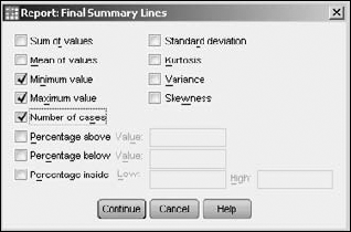
Select the Mean of Values, Minimum Value, Maximum Value, and Number of Cases check boxes, and then click Continue.
The report will include a row for each of these types of statistics. When you click the Continue button, the dialog box closes — and the dialog box shown in Figure 12-6 appears again.
In the upper-right corner of the dialog box, click the Summary button.
The dialog box in Figure 12-8 appears.
Select the Minimum Value, Maximum Value, and Number of Cases check boxes, and then click Continue
These values appear as part of the summary at the bottom of the resulting table. (When you click the Continue button, the dialog box closes and the dialog box shown in Figure 12-6 appears again.)
In the upper-right corner of the dialog box, click the Options button.
The dialog box in Figure 12-9 appears.
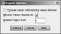
In the Missing Values Appear As text box, type @ (an at sign), and then click Continue.
The usual default in this text box is a period. You'll need to replace it with the @ sign. Missing values will be displayed as the character you enter. Alternatively, you could decide to exclude missing values entirely. (When you click the Continue button, the dialog box closes and the dialog box shown in Figure 12-6 appears again.)
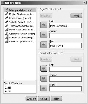
In the upper-right corner of the dialog box, click the Titles button.
The dialog box in Figure 12-10 appears.
At the top (in the text box labeled Left), type the text Miles per Gallon. Select the Next button above it, and then enter by Engine Size in the same text box.
This specifies that the heading will be two lines in length, and the text on the left will be Miles per Gallon by Engine Size. The text on the right of the first line will default to the page number.
Click Continue and then click OK.
The output is shown in Figure 12-11. The titles are the text entered in the Titles dialog box (refer to Figure 12-10). The missing value for Miles per Gallon, displayed as
@(as specified in Step 9), occurred in eight cases.

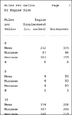
In the output, the break variable is Miles per Gallon and appears in the first column. Also in the first column are the names of the types of statistics, and to the right of each one is a row of values for that statistic for each variable chosen — that's why this table is known as summary in rows.
The dialog boxes in this example contain some buttons we didn't use; all of them have to do with formatting details and are self-evident. You can ignore them because the defaults are reasonable, but if you want to make changes to the display, you can do so by clicking the Layout button or either Format button (refer to Figure 12-6). The Format buttons provide options for displaying the currently selected variable.
What the Titles dialog box does, however, may need a bit of explanation (refer to Figure 12-10). The dialog box has two sets of three text boxes. The top set determines the text of each page's title, and the lower set determines the text of each page's footer. You can define as many lines of text for each as you want. The text boxes allow you to define the left, middle, and right of one line. As soon as you enter text for a line, the Next button becomes available and you can click it to move to the text of the next line. The Previous button allows you to back up and make changes.
You produce a report in columns by following almost the same procedure used to produce a report in rows. The options are similar, but the form of the report is quite different. You can produce a summary in column format with the following steps:
Choose File
OpenData and open theHome sales [by neighborhood].savfile.The file is in the SPSS installation directory.
Choose Analyze
ReportsReport Summaries in Columns.In the list on the left, do the following:
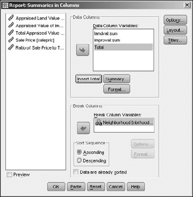
Choose Appraised Land Value and move it to the Data Columns panel by clicking the arrow button.
It appears with its name and statistic type as
landval:sum.Select Appraised Value of Improvements and move it to the Data Columns panel.
Its name and statistic type appear as
improval:sum.Select Neighborhood and move it to the Break Columns panel.
Click the Insert Total button.
The word Total (defining a new column) will be added to the bottom of the list in the Data Columns list. Your dialog box should now look like the one in Figure 12-12.
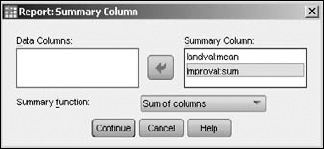
Select
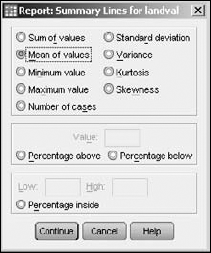
landval:sumfrom the Data Columns Variables list and then click Summary.The dialog box in Figure 12-13 appears.
Select Mean of Values and then click Continue.
The first variable in the Data Columns panel is now listed as
landval:meanto show that the variable is the same as before, but the statistic is now mean instead of sum.Select Total in the Data Columns Variables panel and then click Summary.
Select
landval:meanin the Data Columns panel and click the arrow button to move it to the Summary Column panel (see Figure 12-14). Do the same forimproval:mean.Here you're choosing the variables to be summed to produce the total. You could calculate the total in ways other than a simple sum by selecting another option from the pull-down list, but the default Sum of Columns is right for this example.
Click Continue and then click OK.
The table is output and displayed by SPSS Viewer, as shown in Figure 12-15.
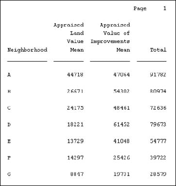
For each neighborhood listed in the first column, the report shows the mean land appraisal value, the mean appraisal value of the improvements, and the total of the two means — the total mean appraisal value.
Other options are available for defining the appearance of this report, but the defaults are reasonable and probably should be used unless you have something specific in mind. You can use the Titles button to specify the text of the headers and footers just as you would for summaries in the rows report.
A regular table is in two dimensions: height and width. A cubed table is a table in three dimensions: height, width, and depth. It's like a deck of cards with a regular two-dimensional table printed on each card. You can flip from one card to another to see any of the tables. Thus it adds the third dimension, depth, and the table becomes cubed.
An OLAP (Online Analytical Processing) cube is the output from a process that uses one or more scale variables along with one or more categorical values to divide the report information into layers for the depth. The following steps guide you through the process of producing a three-dimensional table:
Choose File
OpenData and open theEmployee data.savfile.The file is in the SPSS installation directory.
Choose Analyze
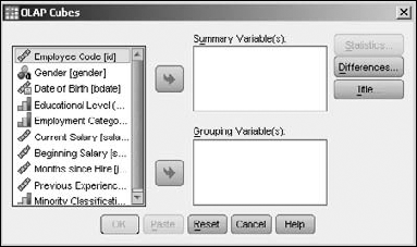
ReportsOLAP Cubes.The OLAP Cubes dialog box appears, as shown in Figure 12-16.
In the list on the left, do the following:
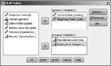
Select Current Salary and move it to the Summary Variable(s) panel by clicking the arrow button.
Select Beginning Salary and move it to the Summary Variable(s) panel.
Select Educational Level and move it to the Grouping Variable(s) panel.
Select Employment Category and move it to the Grouping Variable(s) panel.
The results should look like Figure 12-17. These selections will produce a table with several layers: The beginning salary and the current salary will each be shown in separate tables based on educational level and job category. The Statistics button is now available in the dialog box because the variables chosen will make up a valid table.
Click the Statistics button.
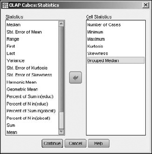
The OLAP Cubes Statistics dialog box appears, as shown in Figure 12-18. In this dialog box, you decide what calculations you want SPSS to perform.
Change the list of selected Cell Statistics to include only Number of Cases, Minimum, Maximum, Kurtosis, Skewness, and Grouped Median.
These statistics will be calculated to fill in the table. To select a statistic, highlight its name in the list on the left and click the arrow button to move it to the right. To deselect a statistic, select its name in the list on the right and click the arrow button to move it to the left.
Note
The order in which the variable names appear in the list determines the order of the values in the table. You determine that order by moving the names into the list in the order in which you want the values to appear. To change the order, you can take the names out and then move them back in the order you want.
Click the Continue button, then the OK button.
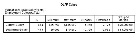
The table in Figure 12-19 appears. This is only the total layer of the multilayered table.
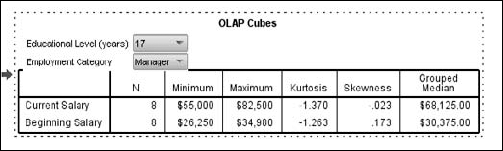
Double-clicking the OLAP Cubes table selects it and causes the appearance of pull-down lists, as shown in Figure 12-20. One pull-down list appears for each grouping variable. By making selections from the lists, you change the view by changing the table that appears on top.
The tables that appear as output in SPSS Viewer are called pivot tables because you can change their appearance in several ways — not the least of which is to pivot the table by swapping the rows with the columns.
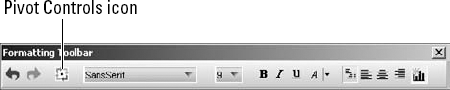
To modify a table in SPSS Viewer, the table must first be selected, then activated. You select a table by clicking on its name in the list on the left, or by clicking directly on the table. Selection is signified by the presence of a small, red arrow. To then activate the table, it is necessary to double-click on it. An activated table is designated by being surrounded by a dashed line. Then, clicking the right mouse button on the table (you may actually have to do this a couple of times) brings up a menu with Toolbar as its last selection. Selecting this activates the toolbar shown in Figure 12-21.
The controls in this toolbar can be used to change the appearance and layout of the table. The changes are immediate. If you use the controls to specify changes to the font (font size, text position, or whatever) the changes show up immediately in the Viewer.
The most dramatic change is a pivot. To perform a table pivot, click the Pivot Controls symbol (it is third from the left on the Formatting toolbar). The dialog box shown in Figure 12-22 appears.
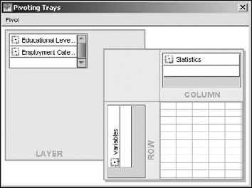
As you change the position of variable names in the dialog box, the display of the table in SPSS Viewer changes. You change the positions by dragging the variable names from one place to another.
The box at the upper left initially holds the variable names. The box at the lower right represents the table. You can drag the variable names from the list to the table and drop them on either the rows or the columns. If you don't like the result, you can drag the names back to the list, or to another position in the table. When you drag a variable name, SPSS tells you whether it can be dropped; if it is dropped, the layout of the table shows an immediate change.