
3.1. The Anatomy of JMP
This section gives you some basic background on how JMP works. We talk about the structure of data tables, modeling types, obtaining reports, visual displays and dynamic linking of displays, and window management.
3.1.1. Opening JMP
When you first open JMP, two windows will appear. The one in the foreground is the Tip of the Day window, which provides helpful tips and features about JMP (Exhibit 3.1 shows Tip 2). We recommend that you use these tips until you become familiar with JMP. Unchecking Show tips at startup at the bottom left of the window will disable the display of the Tip of the Day window.
Figure 3.1. Tip of the Day and JMP Starter Windows

Behind the Tip of the Day window, you will find the JMP Starter window. This window shows an alternative way to access commands that can also be found in the main menu and toolbars. The commands are organized in groupings that may seem more intuitive to some users. You may prefer using the JMP Starter to using the menus. However, to standardize our presentation, we will illustrate features using the main menu bar. At this point, please close both of these windows.
To set a preference not to see the JMP Starter window on start-up, select File > Preferences, uncheck Initial JMP Starter Window under General, and click OK to save your preferences.
3.1.2. Data Tables
Data structures in JMP are called data tables. Exhibit 3.2 shows a portion of a data table that is used in the case study in Chapter 7 and which can be found in the data folder for Chapter 7. This data table, PharmaSales.jmp, contains monthly records on the performance of pharmaceutical sales representatives. The observations are keyed to 11,983 physicians of interest. Each month, information is recorded concerning the sales representative assigned to each physician and the sales activity associated with each physician. The data table covers an eight-month period. (A thorough description of the data is given in Chapter 7.)
Figure 3.2. Partial View of PharmaSales.jmp Data Table

A data table consists of a data grid and data table panels. The data grid consists of row numbers and data columns. Each row number corresponds to an observation, and the columns correspond to the variables. For observation 17, for example, the Region Name is Greater London, Visits has a value of 0, and Prescriptions has a value of 5. Note that for row 17 the entry in Visits with Samples is a dot. This is an indicator that the value for Visits with Samples is missing for row 17. Since Visits with Samples is a numeric variable, a dot is used to indicate that the value is missing. For a character variable, a blank is used to represent a missing value.
There are three panels, shown to the left of the data grid. The table panel is at the top left. In our example, it is labeled PharmaSales. Below this panel, we see the columns panel and the rows panel.
The table panel shows a listing of scripts. These are pieces of JMP code that produce analyses. A script can be run by clicking on the red triangle to the left of the script name and choosing Run Script from the drop-down menu. As you will see, you will often want to save scripts to the data table in order to reproduce analyses. This is very easy to do.
The last script in the list of scripts is an On Open script. When a script is given the name On Open, it is run whenever the data table is opened. In the data tables associated with the case studies that follow, you will often see On Open scripts. We use these to reinitialize the data table, to prevent you from inadvertently saving changes. If you wish to save work that you have added to a data table that contains an On Open script, we suggest that you delete that script (click on the red triangle next to it and choose Delete) and then save the table under a different name.
The columns panel, located below the table panel, lists the names of the columns, or variables, that are represented in the data grid. In Exhibit 3.2, we have 16 columns. The columns list contains a grouping of variables, called ID Columns, which groups four variables. Clicking on the blue disclosure icon next to ID Columns reveals the four columns that are grouped.
In the columns panel, note the small icons to the left of the column names. These represent the modeling type of the data in each column. JMP indicates the modeling type for each variable as shown in Exhibit 3.3.
Figure 3.3. Icons Representing Modeling Types

Specification of these modeling types tells JMP which analyses are appropriate for these variables. For example, JMP will construct a histogram for a variable with a continuous modeling type, but it will construct a bar graph and frequency table for a variable with a nominal modeling type. Note that our PharmaSales.jmp data table contains variables representing all three modeling types.
The rows panel appears beneath the columns panel. Here we learn that the data table consists of 95,864 observations. The numbers of rows that are Selected, Excluded, Hidden, and Labelled are also given in this panel. These four properties, called row states, reflect attributes that are assigned to certain rows, and that define how JMP utilizes those rows. For example, Selected rows are highlighted in the data table and plots, and can easily be turned into subsets. (In Exhibit 3.2, four rows (17–20) are selected.) Excluded rows are not included in calculations. Hidden rows are not shown in plots. Labelled rows are assigned labels that can be viewed in most plots.
3.1.3. Visual Displays and Text Reports
Commands can be chosen using the menu bar, the icons on the toolbar, or, as mentioned earlier, the JMP Starter window. We will use the menu bar in our discussion. Exhibit 3.4 shows the menu bar and default toolbars in JMP 8. Note that the name of the current data table is shown as part of the window's title. Also shown are the File_Edit, Tools, and Data_Table_List toolbars. This last toolbar shows a drop-down list of all open data tables; the selected data table is the current data table. Toolbars can be customized by selecting Edit > Customize > Menus and Toolbars.
Figure 3.4. Menu Bar and Default Toolbar in JMP 8

Reports can be obtained using the Analyze and Graph menus. JMP reports obtained from options under the Analyze menu provide visual displays (graphs) along with numerical results (text reports). Options under the Graph menu primarily provide visual displays, some of which are supported by analytical information.
The Analyze and Graph menus are shown in Exhibits 3.5 and 3.6. These high-level menus lead to submenus containing a wide array of visual and analytical tools, some of which are displayed in Exhibits 3.5 and 3.6. Other tools appear later in this chapter and in the case studies.
Figure 3.5. Analyze Menu

Figure 3.6. Graph Menu

We say that the menu choices under Analyze and Graph launch platforms. A platform is launched using a dialog that allows you to make choices about variable roles, plots, and analyses. A platform generates a report consisting of a set of related plots and tables with which you can interact so that the relevant features of the chosen variables reveal themselves clearly. We will illustrate this idea with the JMP Distribution platform.
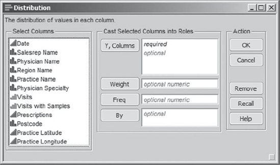
Whenever you are given a data table, you should always start by understanding what is in each variable. This can be done by using the Distribution platform. At this point, please open the data table PharmaSales.jmp. Clicking on Analyze > Distribution, with this data table active, opens the dialog window shown in Exhibit 3.7.
Figure 3.7. Distribution Dialog for PharmaSales.jmp
Suppose that we want to see distribution reports for Region Name, Visits, and Prescriptions. To obtain these, first select all three variable names in the Select Columns list by holding down the control key while selecting them. Enter them in the box called Y, Columns; you can do this either by dragging and dropping the column names from the Select Columns box to the Y, Columns box, or by clicking Y, Columns. You can also simply double-click each variable name individually. In Exhibit 3.8, these variables have been selected and given the Y, Columns role.
Figure 3.8. Distribution Dialog with Three Variables Chosen as Ys
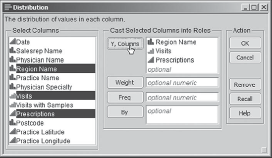
Note that the modeling types of the three variables are shown in the Y, Columns box. Clicking OK gives the output shown in Exhibit 3.9. The graphs are given in a vertical layout to facilitate dynamic visualization of numerous plots at one time. This is the JMP default. However, under File > Preferences > Platforms > Distribution, you can set a preference for a stacked horizontal view by checking the Stack option. You can also make this choice directly in the report by choosing the appropriate option from the drop-down list of options obtained by clicking the red triangle next to Distributions, as we will illustrate later.
Figure 3.9. Distribution Reports for Region Name, Visits, and Prescriptions

The report provides a visual display, as well as supporting analytic information, for the chosen variables. Note that the different modeling types result in different output. For Region Name, a nominal variable representing unordered categories, JMP provides a bar graph as well as frequency counts and proportions (using the default alphanumeric ordering). Visits, an ordinal variable, is displayed using an ordered bar graph, accompanied by a frequency tabulation of the ordered values. Finally, the graph for Prescriptions, which has a continuous modeling type, is a histogram accompanied by a box plot. The analytic output consists of sample statistics, such as quantiles, sample mean, standard deviation, and so on.
Looking at the report for Region Name, we see that some regions have relatively few observations. Northern England is the region associated with roughly 42.5 percent of the rows. For Visits, we see that the most frequent value is one, and that at most five visits occur in any given month. Finally, we see that Prescriptions, the number of prescriptions written by a physician in a given month, has a highly right-skewed distribution, which is to be expected.
Additional analysis and graphical options are available in the menus obtained by clicking on the red triangle icons. If we click on the red triangle next to Distributions in the report shown in Exhibit 3.9, a list of options appears from which we can choose Stack (see Exhibit 3.10). This gives us the report in a stacked horizontal layout as shown in Exhibit 3.11. (Although the red triangle icons will not appear red in this text, we will continue to refer to them in this fashion, as it helps identify them when you are working directly in JMP.)
Figure 3.10. Distribution Whole Platform Options
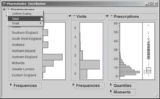
Figure 3.11. Stacked Layout for Three Distribution Reports

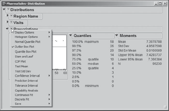
Further options, specific to the modeling type of each variable being studied, are given in the menu obtained by clicking the red triangle next to the variable name. Exhibit 3.12 shows the options that are revealed by clicking on the red triangle next to Prescriptions. These options are specific to a variable with a continuous modeling type.
Figure 3.12. Variable-Specific Distribution Platform Options
The red triangles support the unfolding style of analysis required for EDA. They put context sensitive options right where you need them, allowing you to look at your data in a graphical format before deciding which analysis might best be used to describe, further investigate, or model this data.
You will also see blue and gray diamonds, called disclosure icons, in the report. These serve to conceal or reveal certain portions of the output in order to make viewing more manageable. In Exhibit 3.12, to better focus on Prescriptions, the disclosure icons for Region Name and Visits are closed to conceal their report contents. Note that the orientation of the disclosure icon changes, depending on whether it is revealing or concealing contents.
When you launch a platform, the initial state of the report can be controlled with the Platforms option under File > Preferences. Here, you can specify which plots and tables you want to see, and control the form of these plots and tables. For the analyses in this book, we use the default settings unless we explicitly mention otherwise. (If you have already set platform preferences, you may need to make appropriate changes to your preferences to exactly reproduce the reports shown above and in the remainder of the book.)
3.1.4. Dynamic Linking to Data Table
JMP dynamically links all plots that are based on the same data table. This is arguably its most valuable capability for EDA. To see what this means, consider the PharmaSales.jmp data table (Exhibit 3.2). Using Analyze > Distribution, we select Salesrep Name and Region Name as Y, Columns, and click OK. In the resulting report, click the red triangle icon next to Distribution to select Stack. Also, close the disclosure icon for Frequencies next to Salesrep Name. This gives the plots shown in Exhibit 3.13.
Figure 3.13. Distribution Reports for Region Name and Salesrep Name
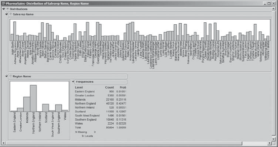
Now, in the report for Region Name, we click in the bar representing Scotland. This selects the bar corresponding to Scotland, as shown in Exhibit 3.14. Simultaneously, areas in the Salesrep Name bar graph corresponding to rows with the Region Name of Scotland are also highlighted. In other words, we have identified the sales representatives who work in Scotland. Moreover, in the Salesrep Name graph, no bars are partially highlighted, indicating that all of the activity for each of the sales representatives identified is in Scotland. The proportion of a bar that is highlighted corresponds to the proportion of rows where the selected variable value (in this case, Scotland) is represented.
Figure 3.14. Bar for Region Name Scotland Selected

Now, what has happened behind the scenes is that the rows in the data table corresponding to observations having Scotland as the value for Region Name have been selected in the data grid. Exhibit 3.15 shows part of the data table. Note that the Scotland rows are highlighted. Also, note that the rows panel indicates that 11,568 rows have been selected.
Figure 3.15. Partial View of Data Table Showing Selection of Rows with Region Name Scotland

Since these rows are selected in the data table, points and areas on plots corresponding to these rows will be highlighted, as appropriate. This is why the bars of the graph for Salesrep Name that correspond to representatives working in Scotland are highlighted. The sales representatives whose bars are highlighted have worked in Scotland, and because no bar is partially highlighted, we can also conclude that they have not worked in any other region.
Suppose that we are interested in identifying the region where a specific sales representative works. Let us look at the second sales representative in the Salesrep Name graph, Adrienne Stoyanov, who has a large number of rows. We can simply click on the bar corresponding to Adrienne in the Salesrep Name bar graph to highlight it, as shown in Exhibit 3.16.
Figure 3.16. Distribution of Salerep Name with Adrienne Stoyanov Selected

This has the effect of selecting the 2,440 records corresponding to Adrienne in the data table (check the rows panel). We see that the bar corresponding to Northern England in the Region Name plot is partially highlighted. This indicates that Adrienne works in Northern England, but that she is only a small part of the Northern England sales force.
To view a data table consisting only of Adrienne's 2,440 rows, simply double-click on her bar in the Salesrep Name bar graph. A table (Exhibit 3.17) appears that contains only these 2,440 rows—note that all of these rows are selected, since the rows correspond to the selected bar of the histogram. This table is also assigned a descriptive name. If you have previously selected columns in the main data table, only those columns will appear in the new data table. Otherwise all columns will display in the new table, as shown in Exhibit 3.17. (We will explain how to deselect rows and columns next.)
Figure 3.17. Data Table Consisting of 2,440 Rows with Salesrep Name Adrienne Stoyanov

To deselect the rows in this data table, left-click in the blank space in the lower triangular region located in the upper left of the data grid (Exhibit 3.18). Clicking in the upper right triangular region will deselect columns. Pressing the escape key while the data table is the active window will remove all row and column selections.
Figure 3.18. Deselecting Rows or Columns

Note that JMP also tries to link between data tables when it is useful. For example, when using the Tables > Summary menu option (described later), reports generated from summary data can be linked to reports based on the underlying data.
By way of review, in this section we have illustrated the ability of JMP to dynamically link data among visual displays and to the underlying data table. We have done this in a very basic setting, but this capability carries over to many other exciting visual tools. The flexibility to identify and work with observations based on visual identification is central to the software's ability to support Visual Six Sigma. The six case studies that follow this chapter will elaborate on this theme.
3.1.5. Window Management
In exploring your data, you will often find yourself with many data tables and reports simultaneously open. Of course, these can be closed individually. However, it is sometimes useful to close all windows, to close only data tables, or to close only report windows. JMP allows you to do this from the Window menu. Exhibit 3.19 shows our current JMP display. We have four open windows—two data tables and two reports. These are listed in the bottom panel of the Window drop-down. (We have arranged these windows by selecting Window > Arrange > Cascade.)
Figure 3.19. Window Menu Showing List of Open Windows
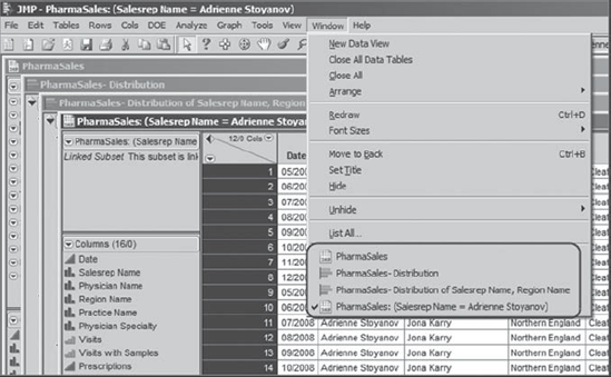
Note that PharmaSales: (Salesrep Name = Adrienne Stoyanov) has a checkmark next to it and, in the display, the title bar for that data table is highlighted. This indicates that this data table is the current data table. When running analyses on data, it is important to make sure that the appropriate data table is the current one—when a launch dialog is executed, commands are run on the current data table.
At this point, we could select Window > Close All or Close All Data Tables. Had a report been the active window, we would have been given the choice to Close All Reports. However, we want to continue our work with PharmaSales.jmp. So, for now, let us close the other three windows individually by clicking on the close button (X) in the top right corner of each window.