
An essential part of any Web application is the ability to respond to events triggered by the user or by a condition that occurs on the client: the clicking of a button, the pressing of a key, the scrolling of a window. Whereas the user interacts with an HTML element, the entire document, or the browser window, JavaScript serves as the watchful eye behind the scenes that monitors all this activity taking place and fires off events as they occur.
With its touch interface, iPhone is all about direct interactivity with the user. As a result, it is not surprising that any iPhone Web app you create can handle the variety of gestures — finger taps, flicks, swipes, and pinches — that a user naturally performs as they interact with your app on their mobile device.
There are three primary types of touch-related events to consider when developing an iPhone Web app. These include the following:
Mouse emulation events: Events in which a one- or two-finger action simulates a mouse.
Touch events: Events that dispatch when one or more fingers touch the screen. You can trap touch events and work with multiple finger touches that occur at different points on the screen at the same time.
Gesture events: Combinations of touch events that also support scaling and rotation information.
The mouse emulation events are the ones that you'll be working with for most purposes inside your Web app. As such, I'll spend most of my time exploring them. However, I also talk about the touch and gesture events later in the chapter.
When working with touch interactions and events for iPhone, keep in mind that several of the gestures that a user performs are designed to emulate mouse events. At the same time, I need to make one thing clear: the finger is not the same as a mouse. As a result, the traditional event model that Web developers are so used to working with on desktop computers does not always apply as they may expect in this new context. The new ground rules are described in the following sections.
By default, many of the events are handled for you automatically by iPhone and Safari. As a result, you don't need to write code to handle the basic touch interactions of the user. Flick-scrolling, zoom pinching and unpinching, and one-finger panning (or scrolling) are user inputs that come free. You can, however, trap for many of these events with touch or gesture events.
The way in which Safari events are handled depends on two key variables:
Number of fingers: Different events fire depending on whether a one-finger or two-finger gesture is performed. Tables 7-1 and 7-2 list the common iPhone one- and two-finger gestures and their ability to trap these events.
Event target: Events are handled differently depending on the HTML element being selected. In particular, the event flow varies depending on whether the target element is clickable or scrollable. A clickable target is one that supports standard mouse events (for example,
mousemove, mousedown,mouseup,click), whereas a scrollable target is one equipped to deal with overflow, scrollbars, and so on. (However, as I'll discuss later in this chapter, you can make any element clickable by registering an event handler for it.)
Table 7-1. One-Finger Gestures
Gesture | Event(s) Fired | Description |
|---|---|---|
Panning |
| No events triggered until user stops panning motion. |
Touch and hold | None | Some native iPhone apps support this gesture. For example, touch and hold on an image displays a Save dialog box. |
Double-tap | None | |
Tap | Clickable element: | If |
Table 7-2. Two-Finger Gestures
Gesture | Event(s) Fired | Description |
|---|---|---|
Pinch/unpinch zoom | None | Gesture used to zoom and unzoom on a Web page or image. |
Two-finger panning | Scrollable element: | If nonscrollable element, event is treated as a page-level scroll (which fires an |
The general rule of thumb for iPhone event handling is that no events trigger until the user's finger leaves the touch screen. As a result, the normal flow of mouse events is radically altered over the traditional browser event model, because mouse events now depend on the actual selection (or clicking) of an element, not simply when a finger passes over it. Said differently, the focus or selection of an element is what matters, not the movement of the mouse.
Take the example of a page that consists of two links: Link A and Link B. Suppose a user glides his finger from Link A, passes over the top of Link B, and then clicks on it. Here's how the events will be handled:
The
mouseover, mousemove,andmousedownevent handlers of Link B are fired only after amouseupevent occurs (but beforemouseupis triggered). As a result, from a practical standpoint, these preliminary mouse events are rendered useless.Because you can't perform a
mousedownandmouseupwithout aclick, they all refer to the same event.The
mouseoutevent of Link A is fired only after the user clicks on Link B, not when the finger moves off of Link A. The CSS pseudo-style:hoveris applied to Link B only when the user selects it and is removed from Link A only when Link B is actually selected, not before.
Therefore, for most purposes, you should design your app to respond to click events rather than other mouse events.
If the element you are working with is not considered "clickable" by Safari, all mouse-related events for it are ignored. However, this can be problematic in certain situations, such as if you are using span or div elements in a cascading menu and want to change the menu display based on the context of the user.
To override Safari's default behavior, you need to force the element to be considered "clickable" by Safari. To do so, you assign an empty click handler to the element (click="void(0)"). For example:
<span mousemove="displayMenu(event)" click="void(0)">Run Lola Run</span>
Once you add the empty click handler, the other mouse-related events begin to fire.
Besides the anomaly of the timing of the mousedown event, the rest of the supported mouse and key events fire in Safari in the same sequence as a standard Web browser. Table 7-3 shows the event sequences that occur when both a block-level element and a form element are clicked. The form element column also displays the order of key events if the user types in the on-screen keyboard.
You cannot trap for all events inside Safari. For example, you cannot trap for events associated with a user switching between pages in Safari. The focus and blur events of the window object are not triggered when the focus moves off or on a page. Additionally, when another page becomes the active page, JavaScript events (including polling events created with setInterval()) are not fired. However, the unload event of the window object is triggered when the user loads a new page in the current window.
Table 7-4 lists the events that are fully supported and unsupported.
Table 7-4. Event Compatibility
Supported Events | Unsupported Events |
|---|---|
|
|
|
|
|
|
|
|
|
|
|
|
|
|
|
|
|
|
|
|
|
|
|
|
|
|
|
|
|
|
| |
| |
| |
| |
[a] Different behavior than in a desktop browser. (See the "Mouse Events: Think 'Click,' Not 'Move'" section earlier in this chapter.) | |
Using mouse-emulation events, you can program the two-finger scroll. Whereas a one-finger scroll is used to move an entire page around, the two-finger scroll can be used to scroll inside any scrollable region of a page, such as a text area. Because Safari on iPhone supports the overriding of the window.mousewheel event, you can use the two-finger scroll for your own purposes.
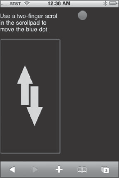
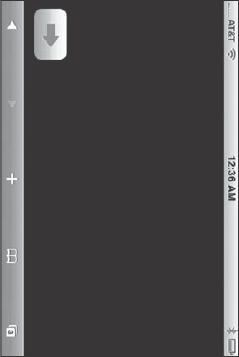
Suppose, for example, that you want to control the vertical position of a ball image based on the two-finger scroll input of the user inside a scrollable region. When the user scrolls up, you want the ball to move up. When the user scrolls down, you want the ball to move down. Figure 7-1 shows the UI layout for this example.
Start with the page layout and styles:
<!DOCTYPE html PUBLIC "-//W3C//DTD XHTML 1.0 Strict//EN"
         "http://www.w3.org/TR/xhtml1/DTD/xhtml1-strict.dtd">
<html xmlns="http://www.w3.org/1999/xhtml">
<head>
<title>ScrollPad</title>
<meta name="viewport" content="width=320; initial-scale=1.0; maximum-scale=1.0;
user-scalable=0;">
<style type="text/css" media="screen">
     body {
          margin: 0;
          padding: 0;
          width: 320px;
       height: 416px;
          font-family: Helvetica;
          -webkit-user-select: none;
          cursor: default;
          -webkit-text-size-adjust: none;
    background: #000000;
    color: #FFFFFF;
     }
     #leftPane {
          position: absolute;
          width: 160px;
          height: 100%;
     }
     #rightPane {
          position: absolute;
          width: 140px;
          left: 161px;
          height:100%;
     }
  #scrollPad {
          width: 148px;
          top: 3px;
          height: 300px;
          border-style: none;
          background-image: url( 'fs.png' );
     }
     #blueDot {
               position: absolute;
               left: 50px;
               top: 10px;
     }
</style>
</head>
<body>
     <div id="leftPane">
          <p>Use a two-finger scroll in the scrollpad to move the blue dot.</p>
          <form>
     <textarea id="scrollPad" readonly="readonly" disabled="true"></textarea>
          </form>
     </div>
<div id="rightPane">
<img id="blueDot" src="compose_atom_selected.png"/>
</div>
</body>
</html>The scrollPad textarea element is used as the hot scrollable region. It is enclosed inside a div on the left half of the page and sized large enough so that a two-finger scroll is easy for people to perform inside its borders. To ensure that the textarea is easy to identify on the screen, an arrow PNG is added as the background image and a solid border is defined. The disabled="true" attribute value must be added to prevent keyboard input in the control. On the other side of the page, the blueDot img is enclosed inside a div on the right.
The interactivity comes by capturing window.mousewheel, which is the event that Safari triggers when a user performs a two-finger scroll. You do that through an addEventListener() call that you add to a <script> tag in the document head.
<script type="application/x-javascript">
    addEventListener('load', function() {window.mousewheel = twoFingerScroll; });
</script>
As shown in the preceding example, a function called twoFingerScroll() is assigned to be the event handler for window.mousewheel.
Next, here's the code for twoFingerScroll():
function twoFingerScroll(wEvent)
{
     var delta = wEvent.wheelDelta / 120;
scrollBall(delta);
return true;
}You can place this function and all of the other code in the same <script> block in the document head.
The wheelDelta property returns negative 120 when the scroll movement is upward and positive 120 when the movement is downward. This value is divided by 120 and assigned to the delta variable, which is then passed onto the scrollBall() function.
The scrollBall() function manipulates the vertical position of the ball:
var currentTop = 1;
var INC = 8
function scrollBall(delta) {
     currentTop = document.getElementById('blueDot').offsetTop;
     if (delta < 0)
               currentTop = currentTop − INC;
     else if (delta > 0)
          currentTop = currentTop + INC;
     if (currentTop > 390)
          currentTop = 390;
     else if (currentTop < 1 )
          currentTop = 1;
  document.getElementById('blueDot').style.top = currentTop + 'px';
  setTimeout(function() {
               window.scrollTo(0, 1);
      }, 100);
}
The currentTop variable stores the current top position of the blueDot img. The delta variable is then evaluated. If the number is less than 0, currentTop decreases by the value of INC. If it's greater than 0, it increases by the same amount. Although INC can be any value, 8 seems to be the most natural for touch interaction in this example. To ensure the blueDot does not scroll off the top or bottom of the viewport, the currentTop value is evaluated and adjusted as needed. The blueDot style.top property is updated to the new value. Finally, to ensure that inadvertent touch inputs do not cause the URL bar to display, window.scrollTo() is called.
This technique enables you to effectively utilize the two-finger scroll in your own applications. However, using this touch input has two caveats:
The biggest downfall to implementing the two-finger scroll in your application is that it is a tricky touch input for a user to pull off consistently. If one of the fingers lifts up off the glass surface, Safari is unforgiving. It immediately thinks the user is performing a one-finger scroll and begins to scroll the entire page.
It's impossible to effectively program a flicking action in association with a two-finger scroll to accelerate the rate of movement of the element you are manipulating. Instead, there is always a 1:1 correspondence between the firing of a
mousescrollevent and the position of the element.
If you need to trap for scrolling actions that go beyond the basic two-finger scrolls, use touch or gesture events instead.
Finally, I should mention that this demo works only in portrait mode and is not enabled for landscape.
In addition to the mouse-emulation events, Safari on iPhone captures an additional touch-related sequence of events for each finger that touches the screen surface. A touch event begins when a finger touches the screen surface, continues when the finger moves, and ends when the finger leaves it. The four touch events are shown in Table 7-5.
Table 7-5. Touch Events
Event | Description |
|---|---|
| Fires when a finger touches the screen surface |
| Fires when the same finger moves across the surface |
| Fires when a finger leaves the surface of the screen |
| Fires when the OS cancels the touch |
Each of these touch events has properties that enable you to get information about the touch:
event.touchesreturns an array of all the touches on a page. For example, if the surface had four fingers, thetouchesproperty would return fourTouchobjects.event.targetTouchesreturns just the touches that were started from the same element on a page.event.changedTouchesreturns all the touches involved in the event.
The information contained in each of these properties varies depending on what multitouch event is performed. Table 7-6 shows several scenarios.
Table 7-6. Touch Scenarios
Touch Scenario | Touches | Target Touches | Changed Touches |
|---|---|---|---|
One finger touches surface | 1 item | 1 item | 1 item |
Two fingers on the same target at the same time | 2 items | 2 items | 2 items |
Two fingers touching different targets at different times | 2 items | 1 item | 1 item |
Moving one finger across the surface | 1 item | ||
Moving two fingers across the surface | 2 items | ||
Lift up a finger from the surface | (Removed from list) | (Removed from list) | 1 item |
The items inside these arrays are Touch objects, which provide the information related to the touch event shown in Table 7-7.
Table 7-7. Touch Object Properties
Property | Description |
|---|---|
x coordinate of the object relative to the full viewport (not including scroll offset) | |
y coordinate relative to the full viewport (not including scroll offset) | |
| Unique integer of the touch event |
x coordinate relative to the page | |
y coordinate relative to the page | |
x coordinate relative to the screen | |
y coordinate relative to the screen | |
| Originating element (node) that dispatched the touch event |
Unlike mouse-emulated events, you can trap for multiple touches to occur on-screen at the same time and then have your app respond to them.
For example, if you want to do a test to determine how these events are fired, you can add event handlers and then take different actions when these events occur. Here's the JavaScript code:
function init()
{
    document.addEventListener("touchstart", touchEventHandler, false);
    document.addEventListener("touchmove", touchEventHandler, false);
    document.addEventListener("touchcancel", touchEventHandler, false);
    document.addEventListener("touchend", touchEventHandler, false);
}


function touchEventHandler(event)
{
    // Gather basic touch info
    var numTouch = event.touches.length;
    var numTargetTouches = event.targetTouches.length;
    var numChangedTouches = event.changedTouches.length;

    // Get first touch object
    if (numTouch > 0)
    {
var touchObj = event.touches[0];
var x = touchObj.screenX;
var y = touchObj.screenY;
}
if (event.type == "touchstart")
{
// do something to begin
}
else if (event.type == "touchmove")
{
// do something on move
}
else if (event.type == "touchend")
{
// do something to end
}
else
{
// do something when cancelled
}
}During a multitouch sequence, touch events are dispatched through touchstart, touchmove, touchend, and touchcancel. However, Safari also dispatches gesture events when multiple fingers are touching the surface of the screen. The three gesture events are shown in Table 7-8.
The two key properties associated with gesture events are as follows:
scalereturns the multiplier of the pinch or push since the gesture started. (1.0is the baseline value.)rotationreturns the rotation value since the gesture began.
Users of your application are free to rotate their iPhone or iPod touch in their hands at anytime. Therefore, one of the most important events that you need to account for in your application is properly responding to these events no matter where they are in your application. In this section, I'll show you how to detect an orientation change, how to style for both portrait and landscape modes, how to tweak the UI based on the current context, and how to work with older versions of Safari on iPhone.
One of the unique events that an iPhone Web application developer needs to be able to trap for is the change between vertical and horizontal orientation. Safari (iPhone OS 1.1.1 and later) provides support for the orientationchange event handler of the window object. This event is triggered each time the user rotates the device. The following code shows how to configure the orientationchange event:
<!DOCTYPE html PUBLIC "-//W3C//DTD XHTML 1.0 Strict//EN"
         "http://www.w3.org/TR/xhtml1/DTD/xhtml1-strict.dtd">
<html xmlns="http://www.w3.org/1999/xhtml">
<head>
<title>Orientation Change Example</title>
<meta name="viewport" content="width=320; initial-scale=1.0; maximum-scale=1.0;
user-scalable=0;">
<script language="javascript" type="text/javascript">
    function orientationChangeHandler()
    {
      var str = "Orientation: ";
      switch(window.orientation)
      {
          case 0:
              str += "Portrait";
          break;

          case −90:
              str += "Landscape (right, screen turned clockwise)";
          break;

          case 90:
              str += "Landscape (left, screen turned counterclockwise)";
          break;

          case 180:
            str += "Portrait (upside-down portrait)";
          break;
      }
      document.getElementById("mode").innerHTML = str;
     }
</script>
</head>
<body onload="orientationChangeHandler();" onorientationchange="orientationChangeHandler();">
<h4 id="mode">Ras sed nibh.</h4> <p> Donec semper lorem ac dolor ornare interdum. Praesent condimentum. Suspendisse lacinia interdum augue. Nunc venenatis ipsum sed ligula. Aenean vitae lacus. Sed sit amet neque. Vestibulum ante ipsum primis in faucibus orci luctus et ultrices posuere cubilia Curae; Duis laoreet lorem quis nulla. Curabitur enim erat, gravida ac, posuere sed, nonummy in, tortor. Donec id orci id lectus convallis egestas. Duis ut dui. Aliquam dignissim dictum metus. </p> </body> </html>
An orientationchange attribute is added to the body element and assigned the JavaScript function orientationChangeHandler(). The orientationChangehandler() function evaluates the window.orientation property to determine the current state: 0 (Portrait), −90 (Landscape, clockwise), 90 (Landscape counterclockwise), or 180 (Portrait, upside down). The current state string is then output to the document.
However, note that the orientationchange event is not triggered when the document loads. Therefore, to evaluate the document orientation, assign the orientationChangeHandler() function to the load event.
The most common procedure that iPhone developers will want to use an orientationChange handler for is to specify a style sheet based on the current viewport orientation. To do so, you can expand upon the previous orientationChangeHandler() function by updating the orient attribute of the body element based on the current orientation and then updating the active CSS styles off that attribute value.
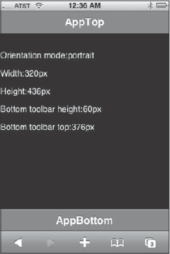
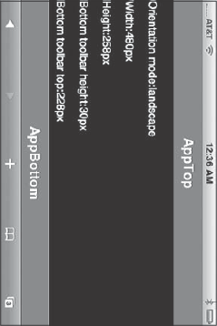
To add this functionality, you begin with a basic XHTML document. The following code, based on a liquid layout template by Joe Hewitt (the original developer of iUI), uses a series of div elements to imitate a basic iPhone interface, consisting of a top toolbar, a content area, and a bottom toolbar. The content inside the center div is going to be used for testing purposes only. Here's the code:
<!DOCTYPE html PUBLIC "-//W3C//DTD XHTML 1.0 Strict//EN"
         "http://www.w3.org/TR/xhtml1/DTD/xhtml1-strict.dtd">
<html xmlns="http://www.w3.org/1999/xhtml">
<head>
<title>Change Stylesheet based on Orientation</title>
<meta name="viewport" content="width=320; initial-scale=1.0; maximum-scale=1.0;
user-scalable=0;">
</head>
<body>
     <div id="canvasMain" class="container">
          <div class="toolbar anchorTop">
               <div class="main">
                    <div class="header">AppTop</div>
               </div>
          </div>
          <div class="left">
<p>Orientation mode:<span id="iMode"></span></p>
<p>Width:<span id="iWidth"></span></p>
<p>Height:<span id="iHeight"></span></p>
<p>Bottom toolbar height:<span id="iToolbarHeight"></span></p>
<p>Bottom toolbar top:<span id="iToolbarTop"></span></p>
</div>
<div id="bottomToolbar" class="toolbar anchorBottom">
<div class="main">
<div class="header">
AppBottom
</div>
</div>
</div>
</div></body>
</html>Next, add CSS rules to the document head. However, notice that the selector for the final four rules (highlighted below) depends on the state of the orient attribute of body:
<style type="text/css" media="screen">
     body {
          margin: 0;
          padding: 0;
          width: 320px;
          height: 416px;
          font-family: Helvetica;
          -webkit-user-select: none;
          cursor: default;
          -webkit-text-size-adjust: none;
    background: #000000;
    color: #FFFFFF;
     }
     .container {
               position: absolute;
               width: 100%;
     }
     .toolbar {
               position: absolute;
               width: 100%;
               height: 60px;
               font-size: 28pt;
     }
     .anchorTop {
               top: 0;
     }
     .anchorBottom {
               bottom: 0;
     }
     .center {
               position: absolute;
               top: 60px;
               bottom: 60px;
}
.main {
overflow: hidden;
position: relative;
}
.header {
position: relative;
height: 44px;
-webkit-box-sizing: border-box;
box-sizing: border-box;
background-color: rgb(111, 135, 168);
border-top: 1px solid rgb(179, 186, 201);
border-bottom: 1px solid rgb(73, 95, 144);
color: white;
font-size: 20px;
text-shadow: rgba(0, 0, 0, 0.6) 0 −1px 0;
font-weight: bold;
text-align: center;
line-height: 42px;
}
/* Styles adjusted based on orientation */
body[orient='portrait'].container {
height: 436px;
}
body[orient='landscape'].container {
height: 258px;
}
body[orient='landscape'].toolbar {
height: 30px;
font-size: 16pt;
}
body[orient='landscape'].center {
top: 50px;
bottom: 30px;
}
</style>Based on the body element's orient value, the container CSS class changes its height, the top and bottom toolbars adjust their height and font-size, and the main content area (the center class) is repositioned to fit with the sizing changes around it.
With the XHTML and CSS styles in place, you are ready to add the orientationchange handler to the body element:
<body onorientationchange="orientationChangeHandler()" onload="orientationChangeHandler()">
Next, you can add JavaScript code inside the document head:
<script language="javascript" type="text/javascript">
function orientationChangeHandler()
    {
        if (window.orientation == 0 || window.orientation == 180)
            document.body.setAttribute('orient', 'portrait')
        else
            document.body.setAttribute('orient', 'landscape'),
        document.getElementById('iMode').innerHTML =
           document.body.getAttribute('orient'),
        // currentWidth is a global variable defined in the document head
        document.getElementById('iWidth').innerHTML = currentWidth + 'px';
        document.getElementById('iHeight').innerHTML =
            document.getElementById('canvasMain').offsetHeight + 'px';
        document.getElementById('iToolbarHeight').innerHTML =
            document.getElementById('bottomToolbar').offsetHeight +'px';
        document.getElementById('iToolbarTop').innerHTML =
            document.getElementById('bottomToolbar').offsetTop +'px';
    }
</script>
The orientationChangeHandler() function is called when the window loads or changes orientation. It updates the body element's orient attribute to either portrait or landscape.
This example also outputs some of the changing div size and position values into a series of span elements for information purposes.
Figures 7-2 and 7-3 show the document loaded in both portrait and landscape modes, respectively.
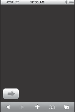
Once you understand the basic interaction between an orientationChangeHandler() function and orientation-dependent styles, you can begin to dynamically position elements of the UI based on whether the current viewport is in portrait or landscape mode. Suppose, for example, you want to align an arrow image to the bottom-left side of a page. Here's the img declaration:
<img id="pushBtn" src="bottombarknobgray.png"/>
To align the graphic in portrait mode, you can specify the CSS rule as follows:
#pushbtn
{
    position: absolute;
    left: 10px;
    top: 360px;
}
However, if you leave the positioning as is, the button goes off-screen when the user tilts the viewport to landscape mode. Therefore, a second landscape-specific rule is needed for the button image, with an adjusted top value:
body[orient="landscape"] #pushBtn
{
    left: 10px;
    top: 212px;
}
The orientationChangeHandler() function is as follows:
function orientationChangeHandler()
{
    if (window.orientation == 0 || window.orientation == 180)
        document.body.setAttribute('orient', 'portrait')
    else
        document.body.setAttribute('orient', 'landscape'),
}
As Figures 7-4 and 7-5 show, the button image aligns to the bottom left of the page document in both portrait and landscape modes, respectively.
As with an ordinary Web page, you can validate keyboard input by trapping the keydown event. To illustrate, suppose you have an input field in which you want to prevent the user from entering a numeric value. To trap for this, begin by adding a keydown handler to the input element:
<input onkeydown="return validate(event)" />
In the document header, add a script element with the following code inside:
function validate(e) {
          var keynum = e.which;
          var keychar = String.fromCharCode(keynum);
          var chk = /d/;
          return !chk.test(keychar)
     }
As a standard JavaScript validation routine, this function tests the current character code value to determine whether it is a number. If a non-number is found, true is returned to the input field. Otherwise, false is sent back and the character is disallowed.
Given iPhone's touch interface, event handling is a key part of any iPhone application, whether it is native or Web-based. This chapter focused on event handling in iPhone Web apps. I began by exploring the three major types of touch events. The first type of event occurs when a single- or double-finger action emulates a mouse. The second type is a touch event, which begins when a finger touches the screen surface, continues when the finger moves, and ends when the finger leaves it. The third type is a gesture event, which combines a set of touch events into a "gesture". The chapter than concentrated on an event that is unique to a mobile device such as iPhone and iPod touch: the change in orientation when a user rotates the device in their hands.