
Traditional Web applications rely on a series of pages to display changing information. An e-commerce application, for example, would likely include one or more product pages, a shopping cart display page, one or more checkout pages, and an order summary page. Each of these would be individual, distinct documents.
In contrast, a Flex application is, once published, a single SWF document. The entire application is contained within this single document.
Individual pages are represented by view states. As a designer in Catalyst, you can define these view states, determine which assets appear on them, and set up interactions that allow users to move from one state to the next.
Note
To ease the transition to the Flex framework for designers, Catalyst refers to states as either view states or pages. For the purposes of working in Catalyst and for the purposes of this text either term is interchangeable. The Flex framework, however, only uses the term view states.
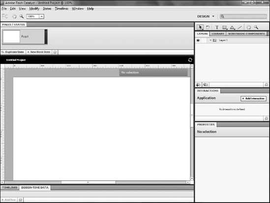
Every new Catalyst project contains a single state which by default is named Page 1. Projects can, however, contain as many states as are needed. States are managed in the Pages/States panel at the top of the screen (see Figure 10.1).
You can create new states either from scratch or as a duplicate of an existing state. Most often, states contain assets and components from other existing states; therefore, you generally create them as duplicates of other states.
You can create duplicate states by following these steps:
Click the Duplicate State button at the bottom of the Pages/States panel. Alternately, you can right-click (

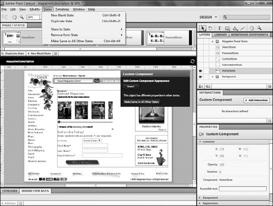
Selecting the Duplicate State option.
You can create blank states by following these steps:
Once created, you should immediately rename the state (see Figure 10.2). State names can only be letters, numbers, and underscores. They must begin with either a letter or an underscore. State names are also case-sensitive, so you need to be consistent with your use of upper- and lowercase letters in the name. Most important, state names should be descriptive of the state's purpose.
Tip
If you attempt to type illegal characters for the state name, the name box turns red. When you press Enter to finish the name any name with illegal characters is ignored and the previous name restored.
Components can contain multiple states. You create states within a component by double-clicking it on the artboard to edit it and then using the Pages/States panel. Anything that can be done on the artboard with states can also be done within components.
View states will contain differing components and assets. Components that exist on one state can be removed, hidden, or moved, and new components can be added to the state.
Any group of assets or artwork that you want to work with between states should be converted into a custom or generic component. While you can add, remove, move, or show and hide individual groups of artwork, it's far easier and more efficient to work with components.
Note
See Chapter 9 for details on converting assets to custom or generic components.
Components that are visible in one state but not visible in another can either be removed or hidden. To remove a component, simply select it on the art board and press Delete. You can also select Modify
Once removed from a state, the component remains as part of the project and can be displayed on other components.
Rather than deleting components, you can choose to simply hide the component's layer on a state (see Figure 10.3). To do this, ensure that you have the correct state selected and click the Show/Hide Layer button on the Layers panel.
Figure 10.3. A layer hidden on a component
Warning
When working with components between view states, be careful to check that you have the current state selected in the Pages/States panel before you begin any modifications.
Warning
Layers are shared by all states. If you want to remove a component from a state, be sure to delete the component from the artboard and not the layer on which you want to place the component in another state.
You can move components to new locations on the artboard between states (see Figure 10.4). This approach allows you to present the same basic information between states while changing the layout, perhaps to draw attention to one component while de-emphasizing another.
You can move components around on the artboard with the Selection tool or Direct Select tool. You may want to use the grid or add guides to help align components between states.
Note
See Chapter 4 for details on adding guides or using the grids.
You can also place components to the left, right, above, or below the artboard. Placing components off the artboard allows you to animate them, moving the component onto the art board when the state changes.
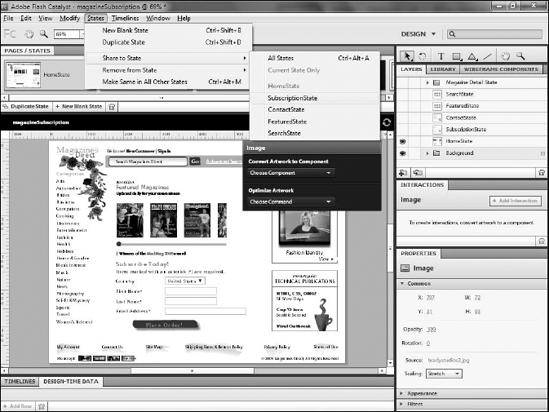
If you make a change such as resizing to a piece of art work in one state, you may want to apply that same change to all of the other states. Click States
Often you will have assets in one state that you need to copy to another state. While any asset that exists in a state automatically copies to new states, assets added to a state after new states have been created will not automatically appear in the new state.
Catalyst provides a utility for sharing assets to states in the States menu (see Figure 10.6). You have the option to share selected assets to all states within the current component, share it to the currently selected state, or share it to a particular state.
You can also remove assets from states using the Remove from State command, also located in the States menu.
You need to add interactions to your application in order to allow your users to change states. As is true throughout Catalyst, these interactions can be added to your application without the need to do any manual coding.
To add an interaction, follow these steps:
Select the component that you want to use to trigger the interaction. Most often, this will be a button, although almost any component can be used.
Note
If the component you want to use to trigger the interaction is nested within another component, you must double-click the parent component to go into its editing mode and select the trigger component.
Click Add Interaction on the Interactions panel (see Figure 10.7).
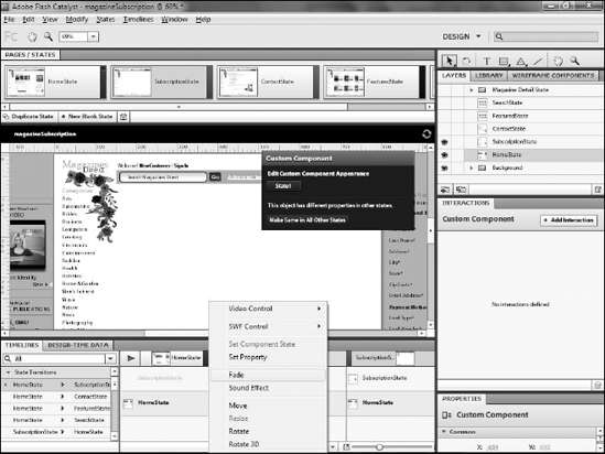
Select the action you want to use.
Each interaction is comprised of three parts:
An event (see Table 10.1)
An action (see Table 10.2)
A target for the action
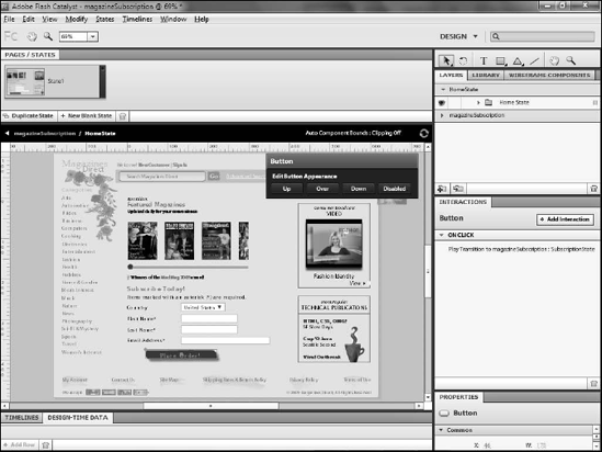
Table 10.1. Events
Description | |
|---|---|
On Application Start | Interactions with onApplicationStart will happen automatically when the application is launched. This action is only available if no component is selected. |
On Click | Occurs when the user clicks the mouse on the target component. |
On Mouse Down | Occurs when the user is pressing the mouse button but has not yet released it. |
On Mouse Up | Triggers when the user releases the mouse. Most often this is used in conjunction with On Mouse Down to create drag effects, where On Mouse Down initiates the drag and On Mouse Up releases it. |
On Roll Out | Triggers when the user moves the mouse away from the target without having clicked. |
On Roll Over | Occurs when the user moves the mouse over the component without clicking. |
Note
See Chapter 14 for details on adding video to your projects.
The target of the action depends on the action you select. For example, Play Transition to State allows you to select a state; Play Action Sequence activates the Timeline to allow you to set up a sequence; Go to URL prompts you to type the path to the Web page to which you will navigate. You specify the video when you use any of the three video actions.
Note
When providing the path to a Web page for the Go to URL action, you can use either an absolute URL, such as http://www.robhuddleston.com or a URL relative to the location where the project's SWF file will eventually reside on the Web server, such as products/product1.html.
Note
See Chapter 11 for details on creating action sequences.
You can test interactions and state changes by previewing the project in a Web browser. You can either choose File
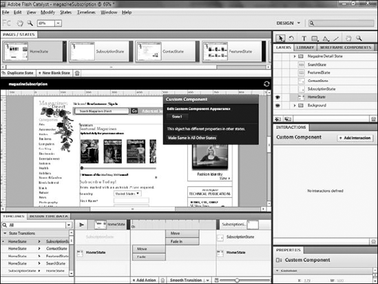
When a project moves from one state to another, you can animate the change through a transition. Transitions are created on the Timeline (see Figure 10.8).
The left side of the Timeline displays any actions that currently exist in the project, organized into three categories:
Once you add an interaction to move from one state to another, that state change will be added to the Timeline.
Note
You do not need to be in the component that contains the asset being used to trigger the state change, nor do you need to be in either of the states to adjust the transition settings.
When you select a state transition from the left, the main section of the Timeline updates to display the states involved in the change. A default Fade Out transition is added for the layers that are hidden from the first state and a default Fade In for those that appear for the second. If you moved components between states, default Move actions are added for each.
You can increase the amount of time each action in the transaction will take by dragging its right edge. The timescale across the top of the Timeline shows how long, in seconds, each action will take. You can also move actions by dragging them left or right; so in a transition with multiple actions (see Figure 10.9), you can control the order in which they occur.
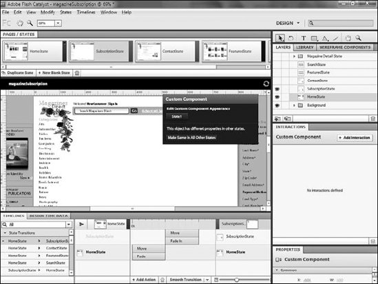
Figure 10.9. Multiple actions in a single transition. In this example, a crossfade effect has been created by lengthening the time for each fade and overlapping them.
You can add other actions to the transition with the Actions menu (see Figure 10.10) at the bottom of the Timeline panel by following these steps:
Click the menu.
Select an action
Adjust its timing just as you would the default actions.
You can remove actions from the transition by selecting them and clicking the trashcan icon at the bottom of the panel.
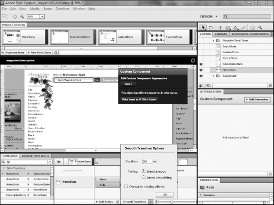
The Smooth Transition menu, located at the bottom of the Timelines panel as shown in Figure 10.11, allows you to more precisely control how the various actions in a transition play.
To use this feature, follow these steps:
Click the small arrow to the right of Smooth Transition.
Select your desired settings.
Click Smooth Transition.
Once complete, you can test your transition by previewing the project in a Web browser. You can either choose File
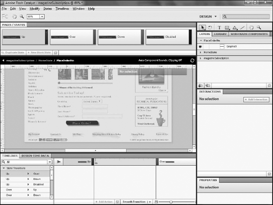
Buttons are a special type of component that automatically contain four states (see Figure 10.12):
Up. Represents the appearance of the button when the user is not interacting with it.
Over. Triggered when the user moves her mouse over the button.
Down. Triggers when the user presses their mouse button to click the button.
Disabled. Represents the appearance of the button when it has been programmatically disabled.
You can modify the appearance of the button in each of these states just as you would with any other component. While you generally only modify the general appearance of the button, such as the color, it is possible to show and hide layers, resize assets, or even replace assets altogether.
You do not need to add interactions in order for the button to trigger its state changes. The triggers for the state changes are built into the core of the button component, so they will occur automatically.
In this chapter, you were introduced to the concepts needed to create states in your application.
You learned:
What states are and how they work in a project
How to create new states
How to change components in states
How to trigger state changes with interactions and apply transitions to those changes