
IN THIS CHAPTER
The remaining chapters in this book assist you in pulling together the primary lessons learned through the earlier chapters by providing step-by-step tutorials that guide you through the process of creating an application using Flash Catalyst.
This tutorial is by no means designed to cover every aspect of any of the programs listed, nor detail the steps required for every workflow in Catalyst. Instead, it follows the primary workflow for which Catalyst is designed: taking an Illustrator design comp through Catalyst to Flash Builder.
Good design does not happen by accident. Instead, you should always undertake a process of careful planning to determine the requirements of the application and expectations of the client before attempting to begin the design work.
In the hypothetical scenario detailed here, you have been tasked with creating an online presence for a magazine subscription service. The client has stated his needs as follows:
Present a modern, Web 2.0 look and feel for the application.
Provide an intuitive user interface focused on driving the user to purchase subscriptions.
Allow the company to organize magazines by category, price, and other criteria as needed.
Provide search functionality for users to look up magazines.
Include an area for featured titles that the company can populate as needed.
Incorporate the company's existing color schemes, logo, and other branding to ensure that the Web site feels like an extension of existing marketing materials.
In discussions with the client, you have decided that a Flex-driven application can meet its needs. The inherent animation capabilities will satisfy requirement No. 1, while the relative ease with which server-side data can be used in an application makes Flex an obvious solution given requirements 3, 4, and 5. Given requirements 2 and 6, it seems easiest to design the application using Illustrator and use Catalyst to convert the design into a front end for the Flex application.
You have located a developer well versed in the Flex framework and ColdFusion to handle the details of creating the back-end services needed for the data aspects of the application. Thus, you feel ready to begin the design process in Illustrator.
You begin the process of designing the application by creating a file in Illustrator. To do this, begin with a new, blank file in the program and begin drawing the visual assets of the project.
Note
All of the screenshots used and steps outlined in this tutorial use Illustrator CS5. However, none of the features of the program being used was introduced specifically in CS5, so older versions will work.
The first steps in the design process involve opening Illustrator and creating a new file.
Note
The book's accompanying Web site (www.wiley.com/go/flashcatalystbible)includes all of the files needed to complete the design comp. Download the Chapter19.zip file and extract it to a location on your hard drive.
Open Illustrator. In Windows, you are likely to find Illustrator in Start

Note
All of the screenshots through these tutorials were taken on a Windows-based machine, but the interfaces of Illustrator, Catalyst, and Flash Builder are the same on both platforms, so Macintosh users should have no problems following along.
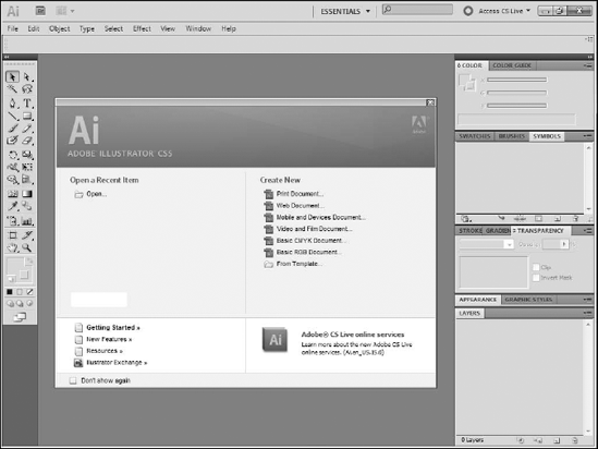
From the Illustrator Start screen, click Flash Catalyst Document under the Create New category (see Figure 19.1).
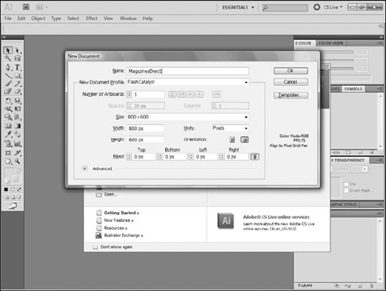
From the New Document dialog box, type a name, width, and height for your project (see Figure 19.2). Keep in mind that in this first version Catalyst can only create applications with fixed dimensions. While it is impossible to accurately predict the size of your user's browser window, most average computer users today set their monitors to 1024 × 768.
While this number is rapidly changing and becoming much less predictable thanks to the proliferation of wide-screen monitors, 1024 × 768 still provides as good a starting point as any.
Account for the additional space lost by the browser's toolbars, scroll bar, and status bar. If you want your application to fit nicely on most screens without needing to scroll down, designing for around 800 × 600 makes sense.
Click OK. The document is created and Illustrator opens a blank artboard.
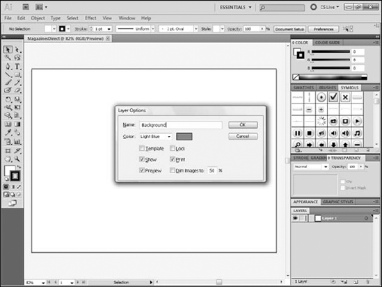
On the Layers panel, double-click Layer 1 to open the Layer Options dialog box.
Use the dialog box to rename Layer 1 to Background (see Figure 19.3). It is easier to rename layers and maintain organization within the application if you rename layers in Illustrator rather than waiting to rename them in Catalyst.
If necessary, choose View
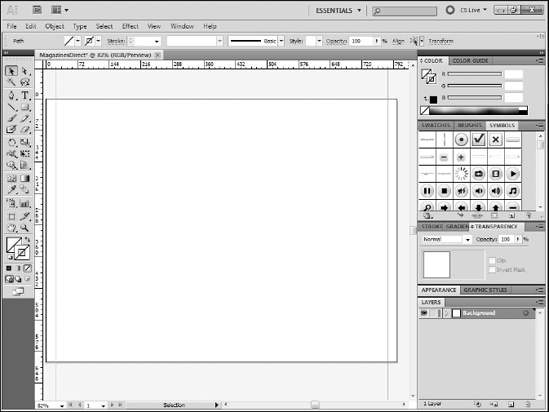
Press and hold your mouse down on the vertical ruler on the left side of the screen and drag to create a guide that will define the application's left margin. Margins are not required in your project as assets can go all the way to the edge of the application window; many projects, however, will be more visually appealing with margins.
Repeat Step 9 to create a guide defining the right margin (see Figure 19.4).
If desired, press and hold your mouse over the ruler along the top of the screen and drag down to create guides defining the application's top and bottom margins.
Save the file by choosing File
Type a name for the file and click Save. The design file is now created and saved on your computer.
Tip
Just as with any other task on your computer, you should get in the habit of frequently saving your work in Illustrator.
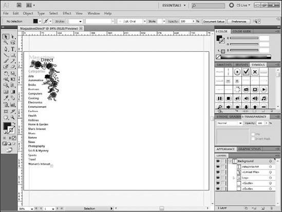
The logo in this case is simple: merely two lines of text using the client's desired font, color, and size. While many clients would likely provide a logo in some electronic form, possibly even as an Illustrator file, in this case re-creating the logo in the project is easy enough.
Click the Type tool.
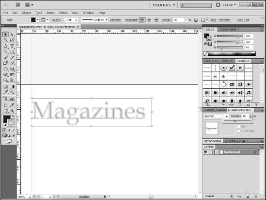
From the Control panel, select a type face, font size, and color for the main logo type. In this example, the first line of the logo, Magazines, is in 23-point Book Antiqua, with a 1-point stroke color of #CBC92B and a black fill.
Type Magazines.
Click the Appearance panel.
Set the opacity to 40 percent (see Figure 19.5).
Ctrl+click (

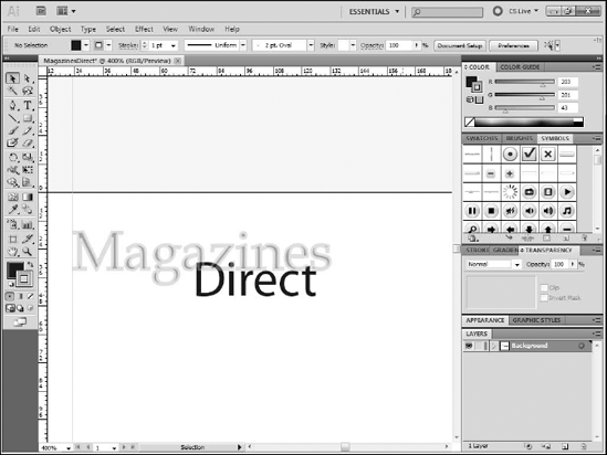
From the Control panel, set the font to 21-point Myriad Pro.
Use the Appearance panel to set no stroke and a black fill.
Type Direct.
Click the Selection tool.
Move Direct so that it partially overlaps the lower portion of Magazines (see Figure 19.6). You have finished designing the logo.
Throughout this tutorial, the importance of maintaining layer organization in the Illustrator file will be stressed repeatedly.
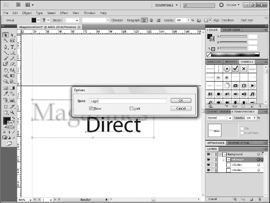
On the artboard, click the Magazines text.
Shift+click the Direct text.
Choose Object
Rename the group Logo by double-clicking it in the Layers panel and typing the new name (see Figure 19.7). The logos layers are now organized.
Another advantage to grouping the layers, beyond organization, is that grouped layers can be repositioned together.
Click the Target icon for the Logo layer group in the Layers panel. It is the small circle to the right of the layer name. Clicking the target icon selects the layer or group's content.
With the Selection tool, drag the logo to the top-left intersection of the left-most and upper-most guides. This positions the logo in the top left corner of the application.
The design requirements for the project specified that the client wanted an easy way to maintain the list of categories and change it as needed. The final project needs this list to be generated from a database table of possible categories.
In the design comp stage, you just need to add placeholder text that will eventually be replaced by live data.
Click the Type tool. Use the Control panel to set the font to 15-point Myriad Pro Bold, with a fill color of #CBC92B, the same color used in the logo, and no stroke.
Click the word Character on the Control panel to open the Character panel. You can also choose Window
Set the leading to 19 points. Leading defines the space between lines.
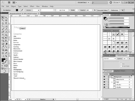
In the document, type Categories.
Press Enter.
Use the Control panel to change the font to 12-point Myriad Pro Regular, with a black fill and no stroke.
Check the Character panel to be sure that the leading remains at 19 points.
Type Arts.
Press Enter.
Type Automotive.
Repeat Step 6 to add between 15 and 20 categories. Keep in mind that these are merely placeholders for the live data that will eventually be used to populate the list, so the actual values are not important.
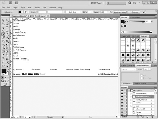
Rename the layers involved appropriately (see Figure 19.8). The category list is created and its layers renamed and organized appropriately.
A clip art image of flowers is going to be used to set off the category list from the logo and the rest of the page.
Choose File
Navigate to the folder that contains the image of the flowers.
Click Place.
Click near the logo and top of the category list. The flower image is placed on the artboard.
Use the Selection tool to position the flowers.
Rename the layers involved appropriately (see Figure 19.9). Finishing the floral element completes the left sidebar area of the comp.
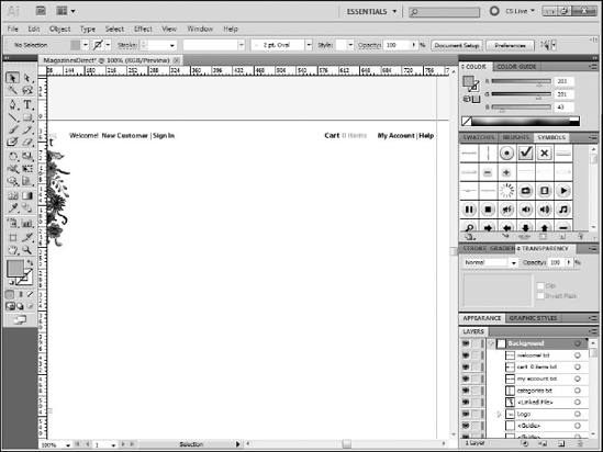
The top of the screen contains a line of basic navigation, whereby the user can see a welcome message.
The message will be personalized if a user is logged in; links next to the message take users to forms where they can sign up with the company or log in if they are already signed up. To the right, aligned with the message, are links to the shopping cart, the user's account, and the home page.
Click the Type tool.
Use the Control panel to set the font to Black 12-point Myriad Pro Regular.
Type Welcome.
Set the font style to Bold and the color to #282A73.
Type New Customer | Sign In.
Ctrl+click (
Toward the right edge of the screen, click on the artboard and then type Cart 0 Items.
Click and drag to select 0 Items.
Change the color to #CBC92B.
Ctrl+click (
Change the color back to black.
Click and type My Account | Help.
Align the three blocks of text as desired.
Rename the layers involved appropriately (see Figure 19.10). The top navigation is complete.
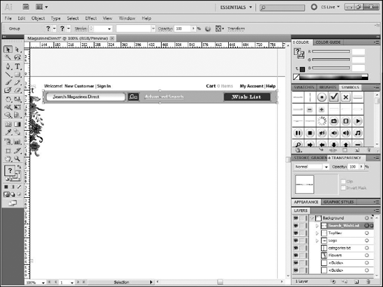
The design requirements call for a search function. In further discussions with your client, he also expressed a desire to have a wish list function similar to the one found on sites like Amazon.com.
To that end, you have decided to combine both into a single area of the screen, offset in a rectangular shape.
Click the Rounded Rectangle tool. You may need to press and hold your mouse on the Rectangle tool to see the Rounded Rectangle tool.
Click once on the artboard. Most of the time, you click and drag to create shapes, but when you make a shape with precise dimensions, it may be easier to click once on the artboard and use the dialog box to set the size of the shape.
Type a width of 627 pixels and a height of 33 pixels.
Set the Corner Radius to 2.
Use the Appearance panel to change the fill color to #8A854E and the opacity to 64 percent.
Click on the artboard again.
Set the width to 212 pixels and the height to 22 pixels, with a corner radius of 5.
Use the Selection tool to position this new rectangle within the one created in Step 2.
Use the Appearance panel to set the fill to white and add a 1-pixel black stroke.
Use the Type tool to type Search Magazines Direct in 12-point black Myriad Pro in the smaller rounded rectangle.
Use the Rectangle tool to create a 30-×-22-pixel rectangle with a fill of #282A73.
Type Go in this newest rectangle in white 14-point Myriad Pro Regular.
Type Advanced Search in white 14-point Myriad Pro Regular.
Create a rectangle 125 pixels wide × 22 pixels tall with a fill of #282A73, the same fill used in Step 9.
Arrange the Search and Wish List bar so that the elements all fit within the large brown rectangle.
Rename and organize the layers as needed (see Figure 19.11). The search and wish list bar are now done.
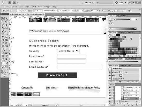
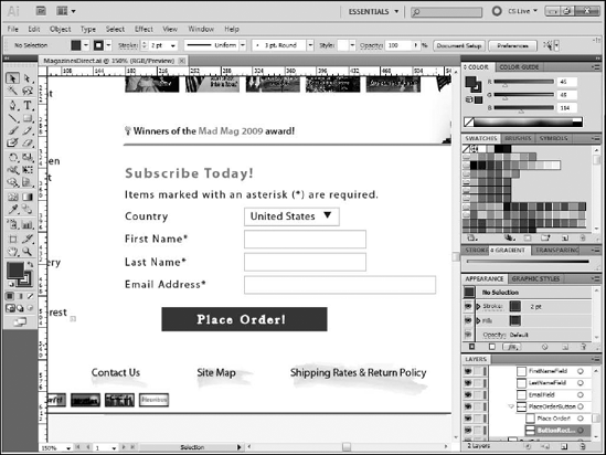
The page will provide a set of site-wide links along the bottom of the screen, along with copyright information and an indication of what credit cards are accepted.
Using the Type tool, type each of the necessary blocks of text to represent the bottom navigation bar.
Choose File
Position the elements as desired, using the guides if you want.
Rename and organize the layers involved appropriately (see Figure 19.12). You have now added the credit card images to the bottom navigation.
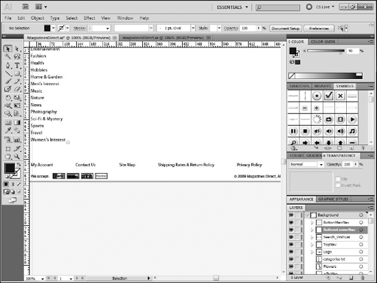
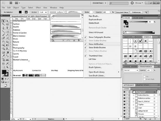
Each link in the bottom navigation contains a stylistic brush stroke as a background. Illustrator contains a set of specialized brushes that make creating effects like this simple.
Click the Brush tool.
Click the Brush Definition drop-down list on the Control bar (see Figure 19.13).
Click the drop-down menu button in its top right corner (see Figure 19.14).
If no check box appears next to the Show Art Brushes option, select it.
Scroll through the list of brushes in the drop-down list and select Watercolor Stroke 3.
Click the Stroke color box on the toolbox to open the Swatches panel.
Select the color you want to use for the stroke. In this example, you will use the grape green color.
Note
The color swatches for this file are available as part of the download for this chapter. To access them, click the Swatches Panel menu and select Open Swatch Library
Press and hold the Shift key.
Click and drag to draw a straight line the same length as the text (see Figure 19.15).
Repeat Steps 8 and 9 to add a brush stroke for each navigation element.
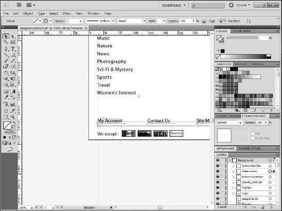
Select all of the brush strokes and choose Object
Drag the group below the group containing the links (see Figure 19.16). The bottom navigation bar, with its links and credit card images, is complete.
Now that the common areas of the application are complete, you can move to creating the content area for each state of the application.
First, you will create the Home state, or the content users see when they first launch the application. This state is comprised of three main sections:
A list of the magazines currently being featured
A form to collect basic information for the user to subscribe to a magazine
A sidebar
The featured magazine section is fairly straightforward, as it only contains some text and placed images.
You begin the featured section by creating the three text blocks that make up its heading.
Rename this layer Home.
Select the Type tool.
Use the Control panel to set the font to Myriad Pro, the style to Italic, the size at 11pt, and the color to black.
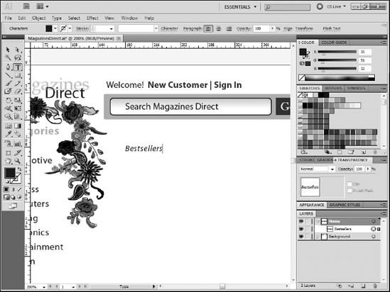
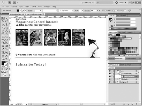
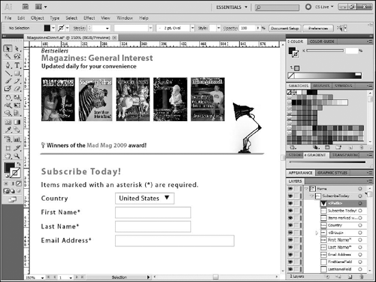
Type Bestsellers (see Figure 19.17).
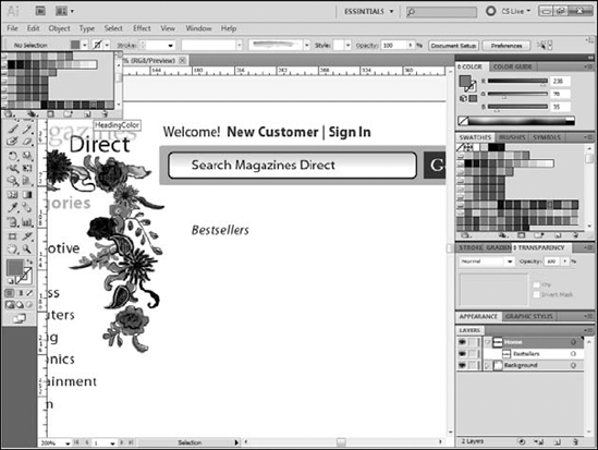
Ctrl+click (
Use the Control panel to change the font style to bold, the size to 16pt, and the color to the HeadingColor swatch (see Figure 19.18).
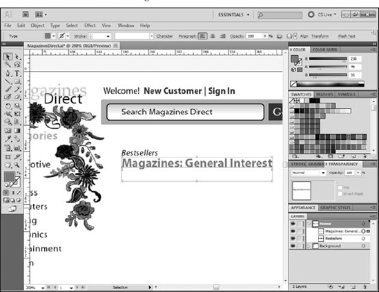
Click just below the text you typed in Step 3 and type Magazines: General Interest (see Figure 19.19).
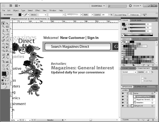
Ctrl+click (
Set the font style to Semibold, the size to 11pt, and the color to black.
Type Updated daily for your convenience.
On the toolbox, click the Selection tool.
Reposition the text to create the featured section heading (see Figure 19.20). The featured section heading is complete.
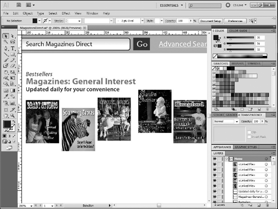
You can now place the five magazine images that will serve as placeholders for the featured magazines.
Choose File
Navigate to the folder into which you downloaded and unzipped the cover images.
Click on one of the covers. The exact order in which you place the covers is unimportant.
Click Place.
From the toolbox, click the Selection tool.
Below the heading, position the cover that will be the farthest to the left so that it aligns with the left edge of the heading text.
Position the cover that will be farthest to the right so that it is far enough over to allow room for the other covers. Do not worry about getting the other three covers distributed evenly or about getting any of the covers lined up exactly (see Figure 19.21).
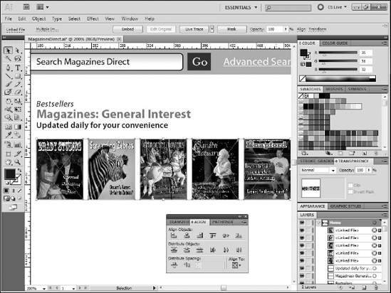
Choose Window
With the Selection tool, click one of the covers.
While holding the Shift key, click on each of the other covers until all five are selected.
On the Align panel, click Align Vertical Center and then click Horizontal Distribute Center (see Figure 19.22).
With all five covers still selected, move them as a group up or down as desired to place them where you want them. You have added the magazine covers to the design.
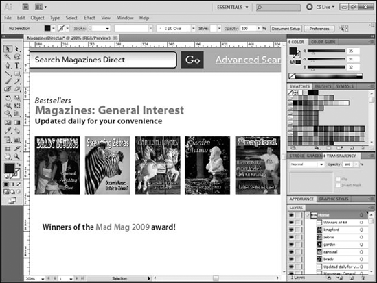
You will finish off the featured magazine section by adding the remaining text and images and adding the separator line.
From the toolbox, click the Type tool.
Use the Control box to set the font style to Semibold, the size to 11pt, and the color to black.
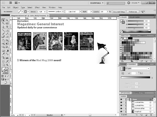
Type Winners of the Mad Mag 2009 award!
Click and drag to select the words Mad Mag 2009.
From the Control bar, change the color to the Heading Color swatch (see Figure 19.23).
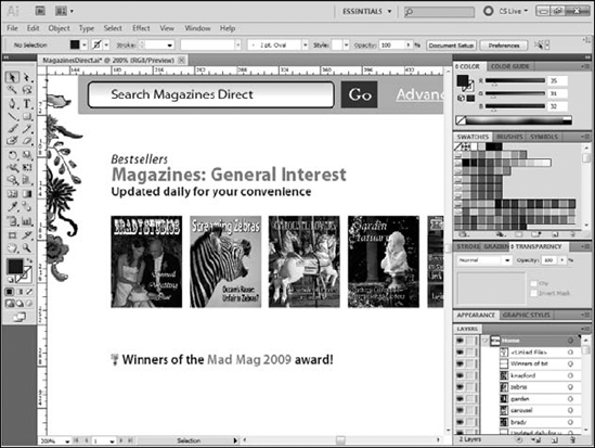
Click the Selection tool.
Choose File
Select the
bulb_001.gifimage.Position the image just to the left of the text (see Figure 19.24).
Choose File
Select
lamp_001.gifand click Place.Position the lamp image to the right of the magazine covers (see Figure 19.25).
Click the Brush tool.
Set the stroke color to #999966.
Press and hold the Shift key.
Click and drag to draw a line under the text and lamp.
Click the Selection tool in the toolbox.
Click the line.
Use the Control bar to adjust the thickness of the line as desired.
Move the line so that it just touches the bottom of the lamp graphic (see Figure 19.26). The visual elements of the featured section is now complete.
The final step to complete the featured magazines section is organizing its layers.
Rename the layer as Best Sellers.
Drag the layers for the elements of the section into this layer (see Figure 19.27). With its layers organized, you are now done with this section of the design.
Below the featured magazines is a simple form that users can fill out to begin the process of subscribing to a magazine. Begin by creating a sublayer to hold the new elements.
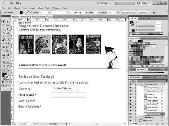
Double-click the new layer and name it SubscribeToday (see Figure 19.28). This creates the layer for this section of the design.
Now, you add the text elements for the form.
Click the Type tool.
Use the Control panel to set the font to 16pt Bold Myriad Pro.
Set the color to Heading Color.
Type Subscribe Today! (see Figure 19.29).
Ctrl+click (
Use the Control panel to change the font style to Regular, the size to 12pt, and the color to black.
Type Items marked with an asterisk (*) are required (see Figure 19.30).
Ctrl+click (
Type Country.
Ctrl+click (
Type United States.
Type First Name*.
Ctrl+click (
Type Last Name*.
Ctrl+click (
Click the Selection tool.
Position the text as needed (see Figure 19.31).
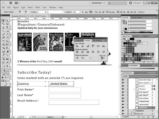
Set the stroke color to a light gray and the fill color to None.
Click and drag to create a rectangle over the words United States. Make the rectangle about a quarter of an inch wider than the text.
Click and drag to create a rectangle to the right of the First Name label.
Double-click each of the new layers and rename them appropriately (see Figure 19.32).
Click the Selection tool.
Press and hold the Alt (Option) key.
Click and drag the rectangle you created in Step 22 to create a copy immediately below it.
Rename the new layer (see Figure 19.33).
Repeat Steps 25, 26 and 27 to create a second duplicate.
Click and drag the control handle on the right edge of this second field to make it wider (see Figure 19.34).
If the Align panel is not open, choose Window
Shift+click the United States text and the rectangle around it.
Choose Object
Shift+click the group and the Country text.
Click Vertical Align Center on the Align panel (see Figure 19.35).
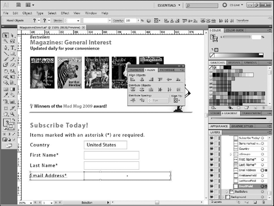
Shift+click the First Name text and the rectangle to its right.
Click Vertical Align Center on the Align panel.
Repeat Steps 33 and 34 for the remaining text and fields (see Figure 19.36).
Click the Polygon tool.
Set the stroke to None and the fill to Black.
Click and drag to begin drawing a polygon.
While still holding your mouse button, press the Down-arrow key repeatedly until you have a triangle.
Rotate the shape as you finish drawing so that its top line is horizontal.
Make the triangle small enough to fit in the rectangle next to the United States text block.
Click the Selection tool, and move the triangle into the rectangle and to the right of United States (see Figure 19.37).
On the Layers panel, drag the triangle into the group containing the United States text and the rectangle.
Rename the triangle's layer and the group (see Figure 19.38).
Use the Rectangle tool to create a 185-×-25-pixel rectangle with a fill of #282A73.
Type Place Order in this newest rectangle in white 14-point Myriad Pro Regular (see Figure 19.39).
Choose Object
Rename the button elements as needed (see Figure 19.40). The subscription section of the design is complete.


The sidebars are final element of the main content. The top sidebar will contain an image of the video player and some descriptive text.
Click the New Sublayer button on the Layers panel.
Rename the sublayer Sidebar.
From the toolbox, select the Rectangle tool.
Set the fill to None and the stroke to Warm Gray.
Click and drag to create a rectangle approximately 177 pixels wide and 210 pixels tall on the right edge of the artboard.
Line the top of the rectangle up with the Magazines: General Interest heading.
Rename the layer SidebarTopRectangle (see Figure 19.41).
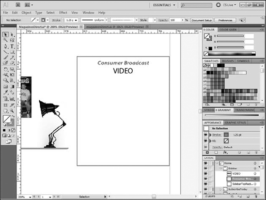
Click the Type tool.
Set the font to Italic, black, 11pt, Myriad Pro. Type Consumer Broadcast.
Ctrl+click (
Set the font to 14pt Regular Myriad Pro and type VIDEO.
Use the Selection tool or Align Panel to position the text (see Figure 19.42).
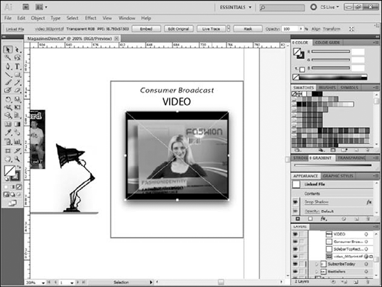
Choose File
Select
videoplaceholder.jpgand click Place.Position the image below the text (see Figure 19.43).
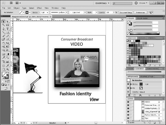
Click the Type tool.
Set the font to 14pt Regular Myriad Pro.
Set the color to the Sidebar Text swatch.
Type Fashion Identity.
Change the font to the Italic style. Leave the other settings as is.
Type View.
Click the Selection tool and position the text below the image (see Figure 19.44). You are now done with the first sidebar.
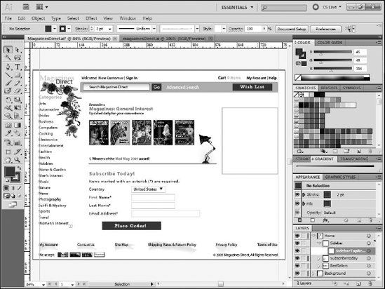
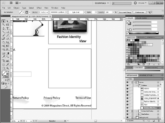
The second sidebar is made up of a rectangle, text blocks, and a placed image.
Set the fill to None and the stroke to Warm Gray.
Click and drag to create a rectangle approximately 177 pixels wide and 164 pixels tall on the right edge of the artboard.
Position the rectangle below the first and rename the layer as
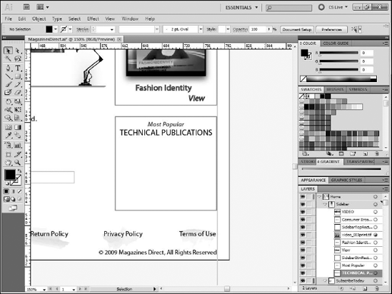
SidebarBtmRectangle(see Figure 19.45).Click the Type tool.
Set the font to Italic, black, 11pt Myriad Pro.
Type Most Popular.
Ctrl+click (
Set the font to 14pt Regular Myriad Pro and type TECHNICAL PUBLICATIONS.
Use the Selection tool or Align Panel to position the text (see Figure 19.46).
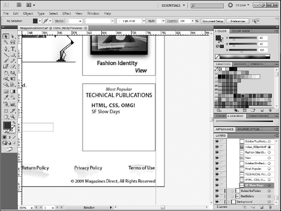
Click the Type tool.
Set the font to 14pt Regular Myriad Pro.
Set the color to the SidebarText swatch.
Type HTML, CSS, OMG!
Ctrl+click (
Change the font size to 12pt and the color to black.
Type SF Slow Days.
Position both text blocks in the sidebar (see Figure 19.47).
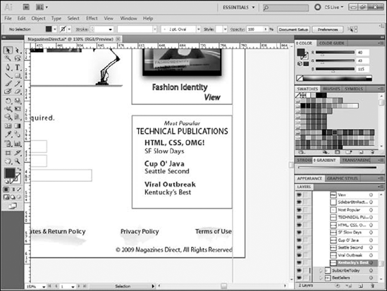
Ctrl+click (
Reset the font size to 14pt and the color to SidebarText.
Type Cup O' Java.
Ctrl+click (
Type Viral Outbreak.
Ctrl+click (
Set the font size to 12pt and the color to black.
Type Seattle Second.
Ctrl+click (
Type Kentucky's Best.
Position the text in the sidebar (see Figure 19.48).
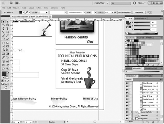
Choose File
Select
cupofcoffee.gifand click Place.Position the image in the bottom-right corner of the sidebar (see Figure 19.49). Both sidebars are now done.
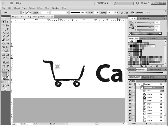
Although it is part of the heading, the shopping cart icon is one of the more difficult items to create, as it is very small yet intricate and contains many individual pieces. However, now that you are more comfortable with Illustrator from completing the other exercises, it will be easier to understand the steps required.
Click the New Sublayer button.
Rename the new layer ShoppingCart.
Position the new sublayer just below the TopNav sublayer (see Figure 19.50).
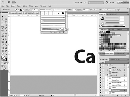
Use the Zoom tool to zoom in very tight on the area just to the left of the word Cart (see Figure 19.51).
Click the Brush tool.
Use the Control bar to set the stroke color to black and weight to 1pt.
Set the brush definition to Pencil – Thin (see Figure 19.52).
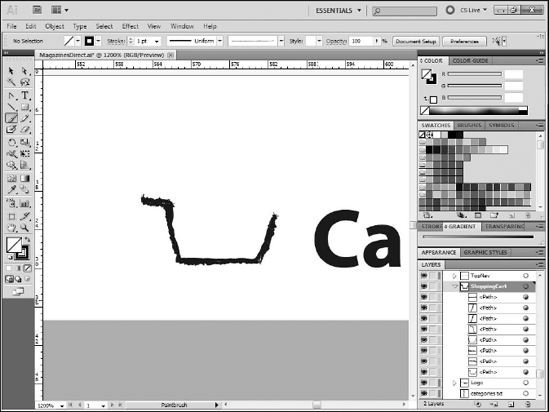
Draw the basic outline of the cart (see Figure 19.53). You can draw it either in a series of strokes or as a single stroke. If you do not like the results, choose Edit
Using the same brush properties, draw the wheels of the cart (see Figure 19.53).
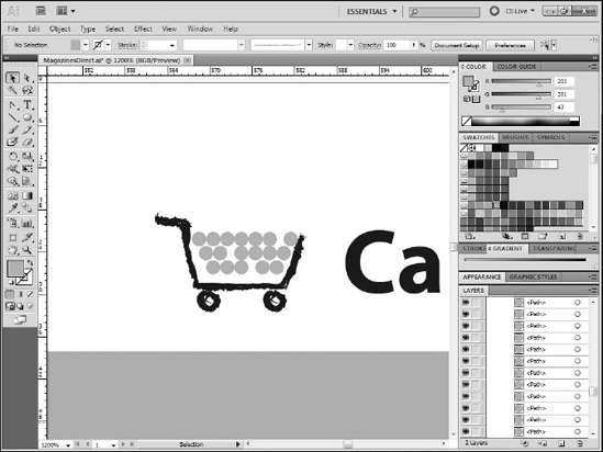
Set the fill color to #CBC92B and the stroke color to None.
Click the Ellipse tool.
Click on the artboard.
Set both the width and height at 2 px.
Position the ellipse in the shopping cart (Figure 19.54).
Select the ellipse.
Choose Edit
Choose Edit
Move the new ellipse to a new position in the shopping cart.
Repeat Steps 18 and 19 to add more ellipses until the cart appears to be filled (see Figure 19.55). This completes the shopping cart.
Tip
You may need to disable the Smart Guides by choosing View
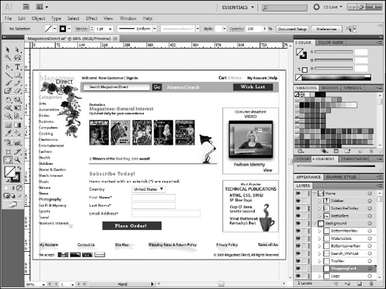
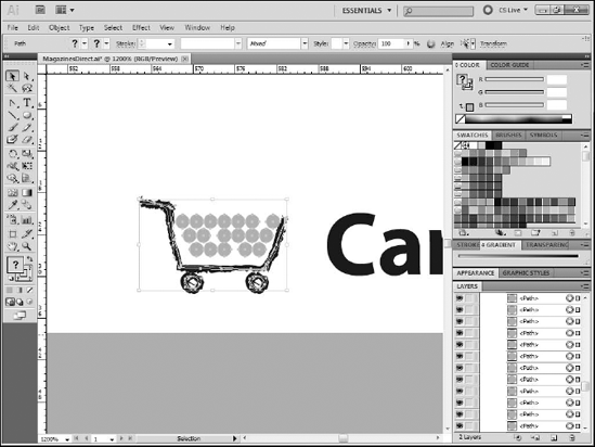
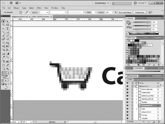
With the design complete, you can analyze the project and determine what parts of it can be optimized. Your main goal is to reduce the number of vector paths in the project, as importing a project into Catalyst that contains a large number of paths may cause Catalyst to suffer from performance problems.
The best method for optimizing vectors is to rasterize them, which converts the vector paths into a single raster image. Not every graphic in your project should be rasterized, however, as the process flattens all of the layers, reducing or potentially eliminating your ability to make additional changes to it in Illustrator. Also, because Catalyst is a vector tool you won't be able to make changes to the rasterized image in it, either.
The shopping cart icon you just completed contains a large number of vector paths. If you were to import the project as is, each of these paths would be converted into an object in Catalyst, which would likely slow the program down. As there is no need for the cart to change as the project runs, it is a good candidate for rasterizing.
If necessary, zoom in on the shopping cart icon.
With the Selection tool, click and drag to draw a selection box around the cart. Make sure that the selection box completely encapsulates the cart, but does not touch any other object on the page (see Figure 19.56).
Choose Object
Set the color model to RGB, the resolution to 72 ppi, and the background to Transparent (see Figure 19.57).
Click OK.
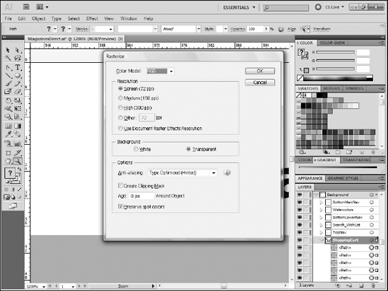
The image will be rasterized. If you are zoomed in very tight on the cart, it may appear to have lost all definition (see Figure 19.58). However, remember that your users will not be able to zoom in on your project when it is running, and once you zoom back out to 100 percent, the cart will be so small that you will not be able to make out the details anyway.
All of the images that were imported or placed on the page are already rasters, so you don't need to do anything to optimize them unless they were high-resolution print graphics. In that case, you would want to rasterize them to reduce their resolution to 72 ppi.
One remaining vector path that you might want to rasterize is the line that separates the Bestseller and Subscribe Now sections, since they do not need to remain editable in Catalyst. Catalyst contains tools to add interactivity to non-rasterized design elements.
The blue rectangles that make up the Place Order, Go and Wish List buttons should not be rasterized as you will want them to be editable in Catalyst so that you can change their color when the user mouses over them.
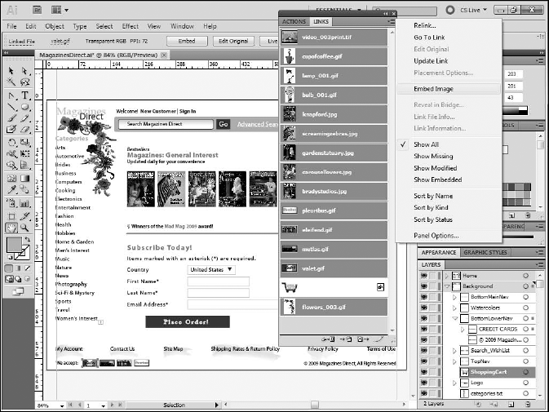
While the imported artwork does not need rasterization, it's likely that it's all linked as this is the default setting in Illustrator. When you complete your work in Catalyst and hand the project off to the Flex developer, these linked graphics might not be available to the developer. Therefore, embed the graphics instead.
You can embed the graphic when you first import it by deselecting the Link check box in the Place dialog box. However, if you don't do this, you can embed the images as you finish the project.
Choose Window
Click the top graphic in the list.
Press and hold Ctrl (
Click the Links panel's menu button in the top-right corner of the panel.
Select Embed Image (see Figure 19.59). If this option is grayed out, you have selected rasterized images, so you need to go back to the panel and deselect them.
If a dialog box appears allowing you to set TIFF import options, select Flatten Layers to a Single Image and click OK.
Your project is now ready to be imported into Catalyst.
In this chapter, you created the Illustrator file that will be used as the design comp for the Catalyst project. You learned how to:
Identify the design requirements for the project
Create a new Flash Catalyst file in Illustrator
Create the logo
Organize Illustrator's layers
Import images
Add and format text
Use Illustrator's drawing tools
Optimize the project to prepare it for import into Catalyst