CHAPTER 5
Trend Is Your Friend?
Everybody loves a trend. Almost every trading book repeats the dictum “the trend is your friend” ad nauseum. Furthermore, most traders are much more comfortable trading with the trend, rather than against it. In FX, where strong trends tend to develop often as major economic themes seize the market for sometimes months at a time, trend trading is the preferred strategy of choice.
What is a trend? The basic, most common definition is higher lows for an uptrend or lower highs for a downtrend, both of which form stutter-step patterns in the price action. Note that trend is defined by the price action of the lows in a uptrend and highs in a downtrend, something that may appear at first to be counterintuitive but actually makes sense upon further reflection. Although most traders would define an uptrend as a series of higher highs, in fact prices can sometimes pause instead of rising. What makes an uptrend an uptrend is the failure of prices to go down; bulls overpower the bears and step up to buy every decline, which they perceive as an opportunity to acquire tradable assets at discount prices. The ever-higher slope of higher lows is what forms the uptrend on the charts. The process and the price dynamics work the exact same way except in reverse in downtrends.
Of course, this is an idealized definition of trend because prices rarely create such perfect patterns. Even in the strongest uptrends and the most vicious downtrends, prices will temporarily break below higher lows or above lower highs. In real life, price action tends to correct, retrace, and generally follow a two steps forward, one step backward scenario that can shake traders out of their positions at the slightest indication of change of trend. To combat this problem, technical traders have designed an array of tools to help them first determine if trend exists and then create strategies to stay in the trend for as long as possible.
TREND LINES
Perhaps nothing is more controversial in technical analysis than trend lines. Ridiculed by some as useless subjective squiggles on a chart and hailed by others as indispensable tools, they are the simplest method for trend determination in technical analysis. The rules for drawing trend lines vary, and therein lies the first problem. The premise behind the trend line is that in a uptrend the trader should draw a single straight line connecting the lowest swing low to the highest swing low and do the reverse in the downtrend. The idea is that price will then respect these boundaries. One very serious problem with trend lines is to know exactly where to draw them. Do you use the closing price or the highs and lows of the period? Do you adjust the slope for isolated spikes, or do you ignore them? Do you change the trend line based on the scale of your chart?
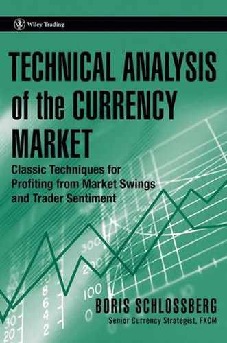
Note how in Figure 5.1 trend lines can have divergent slopes leading to very different conclusions as to the status of price action.
Proponents of trend lines argue that their true value is in capturing the natural rhythms of buying and selling. A more sophisticated use of the trend line is to design trend line channels that connect the lows of price action on one side and the highs on the other (see Figure 5.2). The classic technical analysis strategy is then to purchase the instrument at or near the support trend line and then sell it at or near the resistance.
The net effect is then to buy cheap and sell dear and be able to do so several times over as price progresses through time. This can be a very profitable strategy as long as price remains in the trend channel, but what happens when it breaks through? First and foremost, careful speculators should define clearly what constitutes a break of the trend line. Does a piercing of the line signify a break or must the price close through a trend line to be considered valid? How far must price extend beyond the trend line before it can be considered a legitimate break? More importantly, is a trendline break for only one price period enough?
There are of course no absolute answers, but certain rules can be applied with relative assurance. Generally a simple intraperiod piercing of a trend line when prices extend beyond it in a rush of buying fury in the case of a downtrend break, but then quickly retreat to close within the parameters of the line, is the weakest signal and for all intents and purposes is considered “noise” by most technicians. Understand that many professional traders and dealers are well aware of these price channels, and they love nothing more than to run prices to those levels to pick off many stops clustered in that region. Because FX is the most leveraged market in the world, it is also one where most participants trade with hard stops. The failure to do so at such high leverage would quickly annihilate most trading accounts. Nevertheless, the flip side of this fact is that stop running is perhaps more prevalent in FX than in any other market. For this reason, intraperiod piercings of trend lines cannot really be considered valid breaks. A close above the trend line may carry more meaning, as it indicates that in the case of down trend line the buyers have found enough strength to overwhelm the sellers, who have typically been beating them up for days. Yet what meaning does the trend line break really hold? Does it predict change of trend? No, not at all. Certainly, sometimes a trend line break can mean that price action is ready to race the other way, but anyone who has traded for any period of time will attest that “V” bottoms and “Λ” tops are quite rare indeed. The best clue that can be gathered from trend line breaks is that the trend may be ending. What most frequently follows the end of a trend is not a strong countertrend but rather consolidation, which will tend to frustrate both bulls and bears alike as price action will generate many false breakouts and breakdowns while remaining essentially in the same place.
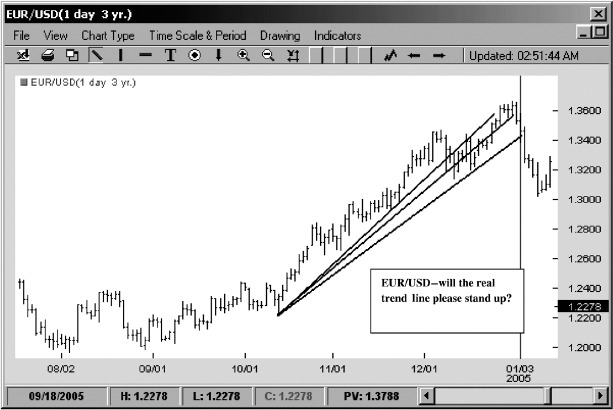
FIGURE 5.1 Different Possible Trend Lines in EUR/USD
Source: FXtrek IntelliChart™. Copyright 2001–2005 FXtrek.com, Inc.
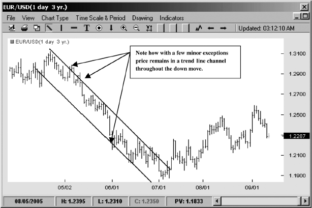
FIGURE 5.2 Trend Line Channel in EUR/USD
Source: FXtrek IntelliChart™. Copyright 2001–2005 FXtrek.com, Inc.
So what would provide the strongest evidence for a trend line break? First, price would have to close beyond, not just pierce, a particular trend line. In the case of a downtrend the close would have to be above the line. In the case of an uptrend the close would have to be below the line. Why such emphasis on the close? Because the basic premise of technical analysis is that the past matters, and the more recent, the more important its value. Technical analysis is the study of past price behavior to ascertain future direction. If prices are actually able to close above or below the key trend line, the assumption is that the consensus of the market may have materially changed. Like tectonic plates underneath the earth's surface, speculator sentiment may be shifting away from the present direction. Secondarily, if price over the next few periods is then able to stay above the trend line in case of a downtrend break, and vice versa for an uptrend break, then technicians would have stronger support for their thesis that the trend was changing. Finally, if prices return to the trend line but then bounce off, that would provide a final clue that a turn may have occurred (see Figure 5.3).
The fundamental principle of technical analysis is that once resistance is broken it becomes support, and once support is broken it becomes resistance. The common saying is that old support becomes new resistance and old resistance becomes new support. Why? The assumption behind this premise is that once traders have broken through a key level they will defend it vigorously. For example, in the case of an upside break the trading dynamic behind the move suggests that the bulls have decided that these particular prices represent true value for the currency pair as they overwhelm the bears and sweep away their stops. Now as price moves upward the bulls are validated in their thesis. However, the bears, though weakened, may decide to regroup at higher levels and try to push the price back down. As price declines back to the levels of the breakout the bulls may once again perceive value and decide to add to their positions. Furthermore, other players who have missed the original run-up will join the bidding as they now have an opportunity to position themselves for another run-up.
FIGURE 5.3 Trend Line Break in EUR/USD
Source: FXtrek IntelliChart™. Copyright 2001–2005 FXtrek.com, Inc.
Does this work all the time? Of course not. New information can completely reconfigure the market's perception of value. That's why most successful technical traders also follow news. In surveys of various bank traders around the world, fundamental news is considered to be as critical to professional trading as technical analysis. Currencies, after all, are national assets, and they can be greatly affected by geopolitical events. To trade price action alone in a vacuum is to set yourself up for brutal shocks when news overwhelms technical patterns. However, in the absence of news prices do tend to respect the technical boundaries set by trend lines. The reason is actually quite logical. When there is no news, the market is weighing the currently available information; therefore, prices that seemed like a bargain a few days ago may remain so today since no new information has hit the market.
William Gallacher in his famous antitechnical treatise Winner Take All (McGraw-Hill, 1993) noted that “trend lines cannot withstand serious critical scrutiny. It is born of geometric desire to suppose that bull and bear markets should proceed at a constant speed. It is ludicrous to try to confirm the constant speed of markets by trend lines.” There is a lot of truth to that statement, as traders should be cautious not to attach too much significance to trend lines. As noted earlier, markets rarely move in elegant straight lines. However, during trends, price behaviors tend to assume a certain rhythm. In an uptrend, selling is constantly met with more buying and prices push ever higher as time moves forward. In a downtrend just the reverse occurs as every attempt to mark up prices is met with waves upon waves of selling as bids give way. Because the markets are a quintessential human activity, the dynamic is messy and often chaotic. Unlike machines that can spit out widgets with remarkable precision and complete detachment, human beings will overreact, panic, or become optimistic beyond all bounds. All of this behavior will be reflected in price action, which will faithfully record the madness of the crowd. For this reason alone I believe that trend lines should be best used as guidelines rather than some kind of inviolable vectors. Too often traders want the type of mathematical certainty with respect to trend lines that allows NASA scientists to point spacecraft on courses of thousands of miles away from earth and land them within inches of their destinations. That kind of attitude towards technical trading is only self-defeating. When it comes to trend lines, they should be called guidelines and used loosely to pinpoint the possible direction of price action. Ironically enough, trend lines may be of most value for traders who do not take them too seriously.
MOVING AVERAGES
A second method of identifying trend is the study of moving averages. Moving averages, unlike trend lines, provide far more definitive measures of support and resistance because they can be calculated mathematically with great precision. The most common form of moving average is the simple moving average (SMA), which is calculated by taking the sum of the closing price values of the tradable asset and dividing it by a specific number of periods. For a 10-period simple moving average the trader would add each individual price close and divide the total by 10. As each new period is added, the oldest period is dropped off and the average is recalculated. Simple moving averages are very much a lagging indicator, but they are very important to technical analysis nevertheless because they represent the consensus price of the market. By taking the average over a given period of time, traders can obtain an approximate idea of where the market believes the value lies. The most basic analysis states that if prices trade above a certain average they are in an uptrend and if they trade below they are in downtrend.
Aside from the simple moving average calculation, technicians have designed a variety of flavors of moving averages over the years. The next most common moving average is the exponential moving average (EMA), which differs from the simple moving average by weighting the most recent price data samples more heavily than the data from periods further back.
This process tends to make the EMA more responsive to recent price action and therefore eliminates some of the lag of the SMA. The idea behind the EMA is one common to much of technical analysis work—namely that the most recent price action is more valuable than prior price action. This idea sometimes works well, but it can also distort the overall tone of price action by underweighting events further past that may have an important effect on future market movement.
The exponential moving average is calculated as follows. Assuming the same 10-period time sample we used for our simple moving average, the exponential moving average would have each period multiplied by an exponent first before all the values are summed and divided by 10. One common formula is to have the EMA calculated by multiplying the most recent value by 10, the next most recent by 9, the one further back by 8, and so on, all divided by 10. You can clearly see that while the advantage of such a series is that it may respond faster to most recent price data, it does so at the expense of diminishing the value of the past data. While this type of calculation may provide the trader with faster response, it may also send out far more false signals.
I am of two minds about EMAs. On the one hand I can clearly see the value of weighting most recent price action to offer a trader faster clues to potential turns in price. On the other hand I feel that the function of stand-alone moving averages is to provide as accurate an approximation of price action as possible. By minimizing some parts of the sample while overemphasizing others, the price sample may become skewed and for this reason I prefer to use simple moving averages to get a true feel for direction. Ultimately the argument is really academic over the shorter time frames such as 20 days. Note how in Figure 5.4 20-day SMA and 20-day EMA in the EUR/USD really do not deviate much from each other. On longer time frames the situation is quite different. Looking at the 200 SMA and 200 EMA in Figure 5.5, the divergence can be profound as the larger 200-period data sample with typically far greater variability in price will generate a far different reading in an SMA than in an EMA.
There are numerous technical systems centered on moving averages designed to help the technician to ascertain trend. The most basic and common way to utilize moving averages is to simply see if the current price is above or below a given moving average. Typically in an uptrend all price action is contained by the 20-period SMA. Why is this so? There is no exact answer and my observation simply comes from watching thousands upon thousands of chart patterns, but one logical explanation is that especially on a daily basis the number 20 represents a full month of trading and therefore serves as a good sample of market sentiment. Moving averages are notorious, though, for providing false signals when price action oscillates, so many traders create filters by designing moving average crossover systems. Typically these involve the use of a short-term moving average crossing a longer-term moving average to trigger a trade. If the short-term average crosses the long-term average from the bottom, a buy signal is indicated. If it falls through the longer-term average from the top, this may signal further price weakness. The thinking behind these systems is that when the short-term average price has dipped below the long-term average price, the market is discounting the tradable asset as sellers mark down the price below long-term value. The converse is true when the short-term moving average moves above the long-term average. There are literally thousands of permutations of this setup, with traders utilizing every conceivable combination of averages to optimize their probability of success. Unfortunately, this methodology is just as vulnerable to choppy price action as the simple “price through the moving average” approach. Furthermore, the actual moving average crossover point often occurs at the worst possible price entry to the trader. The reason is optical deception that shows up on the charts versus the dynamic of what is happening in real time.
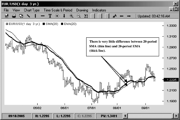
FIGURE 5.4 20 SMA versus 20 EMA
Source: FXtrek IntelliChart™. Copyright 2001–2005 FXtrek.com, Inc.
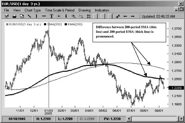
FIGURE 5.5 200 SMA versus 200 EMA
Source: FXtrek IntelliChart™. Copyright 2001–2005 FXtrek.com, Inc.
Rookie traders will often see a moving average crossover and perceive that the point of entry is at the intersection of the two moving averages. Seeing then how price action often follows in the direction of the cross they assume that this setup works well. In real life the actual moving average crossover occurs only after the price candle (i.e., the day's trading) has completed its period. If, say, in the case of a downtrend the price candle is particularly steep, the real-life entry for the trader is at the bottom of the candle rather than at the point of the cross. On the upside the exact same dynamic occurs in reverse. The end result is that the moving average crossover will often force the trader to sell the bottoms or buy the tops. This is the prototypical mistake of trend chasing rather than trend trading that frustrates so many traders using technical analysis techniques. Typically, after a severe move to the downside or a strong breakout to the upside, prices will pause and often retrace as short-term traders cover for profits while others fish for tops or bottoms. The net effect on the inexperienced trader who trades the moving average crossover blindly is to usually be in a losing trade from the moment of entry. While the trade ultimately may be correct, the disconcerting effect of instant losses will often force a panic stop out of the position with vows that all moving average crossover systems are useless (see Figure 5.6). Yet, as with all technical analysis concepts, it's the practitioner, not the tools, that determines success.
One interesting setup that uses moving averages is the triple moving average crossover. I like to use the 3-, 20-, and 65-period SMAs for my setup, but the specific value of moving averages is immaterial. In fact, focusing on specific periodicity of moving averages is a useless task. There is very little difference between a 20-period and a 21-period or even 25-period moving average. Their variability is minuscule, and traders who spend their time trying to fine-tune just the right periodic average are engaging in nothing but retrofitting of data. The value of the 3 SMA filter is not in the particular time selection of averages, but in the fact that they are measuring the short-term, the intermediate-term, and the long-term directions of price. The idea behind this setup is that when the short-term average is above the intermediate-term average and the intermediate-term average is above the long-term average, prices are in an uptrend. When the positioning is reversed, with the intermediate-term below the long-term average and the short-term below the intermediate-term average, prices are in downtrend.
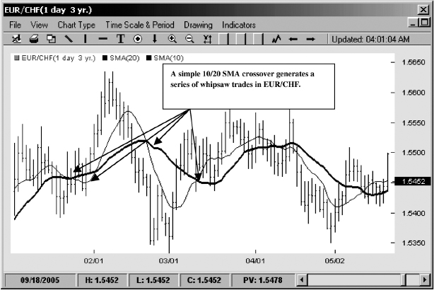
FIGURE 5.6 Whipsaw Trades with Moving Average Crossovers
Source: FXtrek IntelliChart™. Copyright 2001–2005 FXtrek.com, Inc.
For the most part the value of the SMA setup is simply as an analysis tool. It can quickly and very effectively tell the trader if prices are in a trend, but it cannot tell the trader if that trend will continue. More importantly, the setup's primary value may be more as a negative filter rather than as a positive trigger. For example, a trend-oriented trader may choose to stand aside if there is any conflict among the three moving averages. If the intermediate-term average is above the long-term average but the short-term average has dipped below the intermediate-term average, the trend is unclear and the trend trader should look for a turn back up in price action before determining that the uptrend remains in place. This simple pause can save traders from untold mistakes by paring down trade selection to only the most consistent price patterns. Many traders often enter trades based on an outdated understanding of price action and then stubbornly hang on to losing positions, unwilling to accept the reality that price action has changed. For trend traders, the 3 SMA setup offers a simple yet logical analytic tool to test their assumptions. Unlike trend lines, which can be configured differently based on each trader's selection of price points, moving averages are completely objective in their readings (see Figure 5.7).
Although the 3 SMA filter is simply a trend detection tool and by itself cannot be used as an accurate trade trigger, there is one exception to the rule that is worth exploring. When price action compresses, the three moving averages will often begin to converge as the lack of volatility will make the average short-term, intermediate-term, and long-term price nearly identical. If at this point the three moving averages begin to fan out in proper alignment either up or down, as shown in Figure 5.8, then a trend trader should consider taking the price direction. The key reason that makes this particular variation of the setup so attractive is that the trade carries little risk. Since all of the moving averages are extremely close to one another, it would not take a large adverse move in price to trigger a moving average crossover from the short-term average to the intermediate-term average and therefore indicate to the trader that the setup has failed. In actuality what this type of setup is showing is a classic volatility breakout. In times of market quiet when bulls and bears are in general agreement on price, volatility will contract, but as one camp assumes dominance price will begin to move in that direction. The 3 SMA filter is an easy visual representation of this dynamic, which when it occurs can lead to very powerful profits if the trend sustains itself for a long time.
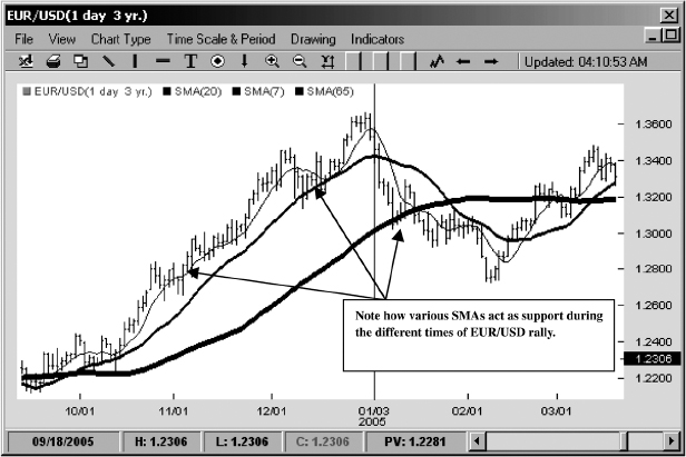
FIGURE 5.7 Support at Moving Averages in EUR/USD
Source: FXtrek IntelliChart™. Copyright 2001–2005 FXtrek.com, Inc.
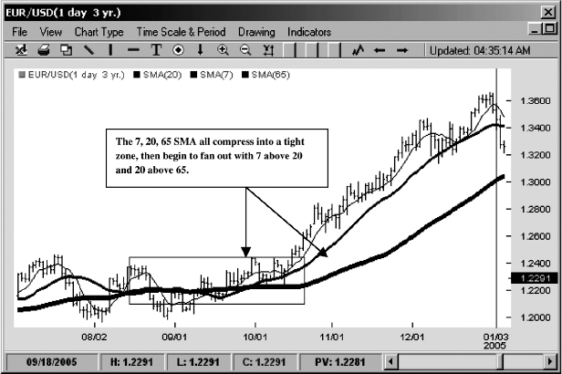
FIGURE 5.8 The Three Moving Average Filter
Source: FXtrek IntelliChart™. Copyright 2001–2005 FXtrek.com, Inc.
AVERAGE DIRECTIONAL INDEX/DIRECTIONAL MOVEMENT INDEX
One very common technical trend detection indicator that I find absolutely worthless is the Average Directional Index (ADX)/Directional Movement Index (DMI). Invented by J. Welles Wilder, who was a tremendous innovator in the field of technical analysis, and some of whose indicators we will examine in detail later on, the ADX is comprised of three basic components: +DI, which indicates an up average of the tradable; −DI, which indicates the down average of the same instrument; and the ADX itself, which smooths the difference between the up prices and the down prices and then generates an oscillator reading between 0 and 100 that tells the trader whether the instrument is in a strong trend. The general rules are that readings above 20 indicate the presence of trend and readings below 20 suggest that markets are directionless. Like all of Wilder's work, the logic behind his analysis is sound. The idea is that as prices begin to find direction the difference between +DI and −DI will expand, providing the trader with valuable clues to price action. Unfortunately, in real life trading the ADX is a day late and dollar short affair. The indicator is woefully slow at producing any meaningful signals. Furthermore, since the ADX itself is directionally agnostic—simply telling the trader that a trend exists but unable to tell the direction of that trend—the trader can often be spectacularly faked out by relying on ADX readings alone. For example, prices may originally rise, causing ADX readings to increase, but then slowly change course and eventually begin a severe decline, while all the while ADX readings may be rising.
The ADX, of course, is simply communicating that price is in a trend—but not that it was in an uptrend, then has quickly changed direction, and is now declining. A trend still exists, and may even be increasing—but now it's a downtrend instead of an uptrend! It is easy to see how looking at ADX the trader can easily become confused by its signals. Instead of being trend followers, traders using ADX become the ultimate trading sucker—they become trend chasers.
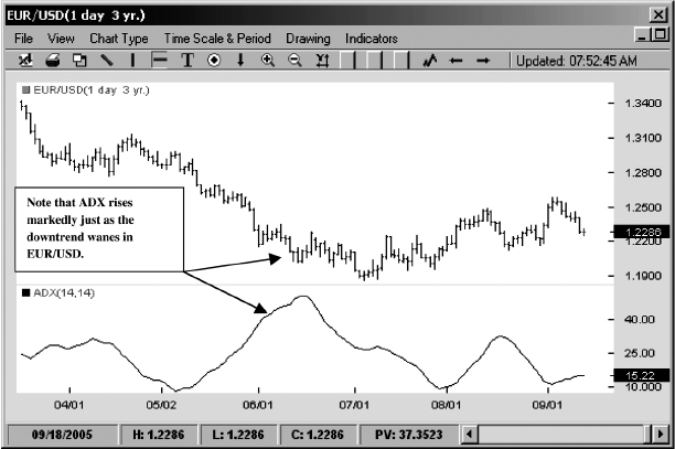
FIGURE 5.9 ADX versus Price Pattern
Source: FXtrek IntelliChart™. Copyright 2001–2005 FXtrek.com, Inc.
Although some traders actively use ADX for their trend trading work, and some even swear by its effectiveness, I find its usefulness limited at best. It is considered a classic trend indicator by technicians, which is why I have taken the time to discuss it, but I cannot leave without taking one final potshot at this tool. Note that when the price makes a sharp V move—that is, when prices suddenly reverse from declining to rising or vice versa—the ADX will often send completely contradictory messages to the trader. As the turn in price action is processed in its calculations, the ADX will indicate that the trend is actually weakening when in fact it's just beginning to find direction. Furthermore, just as prices may have reached a temporary peak or bottom, the ADX reading will rise, suggesting that a trend is now in place (see Figure 5.9)!
BOLLINGER BAND “BANDS”
Is there a more accurate way to glean trend? Yes, I believe there is. Surprisingly enough, one indicator that is often used for range-bound markets can be an extremely helpful tool for trend discovery. I discuss the Bollinger bands (BBs) in more detail in Chapter 10, but for now note that we will use them in a unique way to detect trends in the currency market.
Before we begin, let's first examine the underlying notion of trend. What is trend really? I will postulate that trend is actually a deviance in price. It is common wisdom in all markets that trends are generally rare. Typically, in all markets, including the currency market, prices stay in a range somewhere between 70 and 80 percent of the time. Therefore, when prices decide to trend they in fact deviate from the norm. What is one of the best tools to measure deviation in technical analysis? Bollinger bands, of course. The Bollinger band formula contains the standard deviation (SD) calculation within it. Bollinger bands measure the standard deviation of price away from its 20-period moving average. Here is where the use of Bollinger bands becomes quite interesting. If you superimpose a second set of Bollinger bands with a standard deviation setting of 1 onto the price chart that already has a set of BBs with a default setting of 2 standard deviations, you will instantly see that as prices begin to trend the majority of price action is captured within the 1 SD–2 SD Bollinger bands.
These Bollinger band “bands” divide the price action into three separate areas (see Figure 5.10). If prices are between the upper 1 standard deviation Bollinger band and the upper 2 standard deviation Bollinger band, they are in the buy zone. If a specific currency is trading between the lower 1 standard deviation Bollinger band and the lower 2 standard deviation band, then its price is in the sell zone. Price candles that exist in the area between the second Bollinger band “bands” are in effect in no-man's-land as markets struggle to find direction.
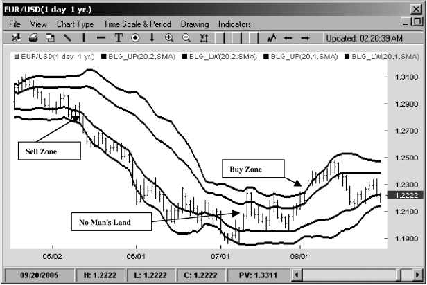
FIGURE 5.10 Bollinger Band “Bands”
Source: FXtrek IntelliChart™. Copyright 2001–2005 FXtrek.com, Inc.
In essence, Bollinger band “bands” act as dynamic trend channels in a superior version of hand-drawn trend line channels covered earlier in this chapter. Because Bollinger bands are generated off the 20-period simple moving average, their readings can be mathematically calculated with a much better degree of accuracy than simple trend lines. Furthermore, the standard deviation formula naturally adapts to the volatility of price action, widening or narrowing the Bollinger channels accordingly.
For traders seeking a quick confirmation of trend, the Bollinger band “bands” approach offers an easy visual tool. One can use a variety of rules to trade with them, but I prefer the following simple rules. The example I will use refers to detecting and trading the uptrend (for the downtrend the rules are the same but simply reversed). To trade trend the trader needs to answer three basic questions:
- Trend, detection. When is a trend in place?
- Trade entry. How is a position initiated?
- Trade exit. What constitutes trend exhaustion?
With the Bollinger band “bands” approach, the trend detection rule is quite straightforward. I consider the uptrend to have commenced once the price closes—not simply penetrates, but closes—in the buy zone. The idea behind this rule is that buyers must have enough conviction behind their actions to sustain a rally into the upper Bollinger channel. If prices merely pierce the channel but cannot hold their value, then we do not have enough evidence of a clear up move in place.
The second component of the trade is perhaps the most tricky. Instead of simply entering the trade at market we will look for an opportunity to buy on any small dip into the no-man's-land zone. If the penetration of the buy zone is so powerful that prices reach the upper 2 standard deviation Bollinger band, then we will wait for prices to retrace to the middle of the bands or to the 1 standard deviation band. Why such hesitation? Shouldn't we just jump in the moment the trend becomes clear? No. Not if you want trade FX like a professional.
When it comes to trend trading in FX, the difference between professionals and amateurs is that while the pros are trend followers, the amateurs are trend chasers. The distinction may seem like nothing more than semantics, but in fact it's often what separates those who earn money through trading from those who lose it. But perhaps before I explain this point in more detail I should disclose the final component of the setup—the exit.
Where would the trader abandon his position? At what point on the chart will he be proven most likely wrong? If prices retreat all the way back to the lower 1 standard deviation Bollinger band, then the trader should stop out. The probability that trend is over is very high. Note the difference in approach. In order for us to consider the trend valid, prices must not only touch but close through the upper 1 standard deviation Bollinger band. As for our exit, a mere tag of the lower 1 standard deviation band will take us out of the trade. Why be so slow to enter and so quick to exit? Because, as I noted before, trend is not the common state of price, so price must really prove to the trader that it is making a directional move. Once price can't hold trend, there is absolutely no reason for the trend trader to stay around. His risks far outweigh potential rewards, because he now faces three possible scenarios—consolidation, trend reversal, or trend continuation. Two out of the three outcomes are unfavorable to his position and the last choice, which is advantageous, is usually the least likely under such circumstances.
Using the lower 1 standard deviation band provides ample room for the trend trader not to be falsely shaken out of the trade while the price meanders through the no-man's-land zone before it decides whether it wants to continue its initial impulse higher.
Understanding the exit—the third rule of the trade—may now be helpful to appreciating the second rule of buying only when the price retraces. It all has to do with risk and reward. Remember that in real life prices frequently fake out the trader. Just because price enters into the trend channel is no guarantee that it will remain there. If markets were highly predictable most traders would make money rather than lose it. The key to positioning in a trend-based setup is to minimize the amount of losses for the countless times you will inevitably be wrong, rather than to maximize the gains for the few times that you will be right. In trading, as I will never tire of stating, trends are the exception, not the rule, and in order to avoid being wiped out, traders need to try to always enter the market under the most advantageous of circumstances no matter what the market environment holds. Novice traders tend to succumb to the lure of the crowd and not restrain themselves from buying at the top or selling at the bottom. Note in Figure 5.11 how a trader who buys the high of the candle exposes himself to fully 300 points of losses in the GBP/USD trade as the uptrend fails and price retreats all the way to the lower Bollinger band. The more patient trader, however, who would wait for a retracement down to the upper 1 standard deviation Bollinger band, would suffer only a 150-point loss. Both trades are losers but one is less of a loss than the other.
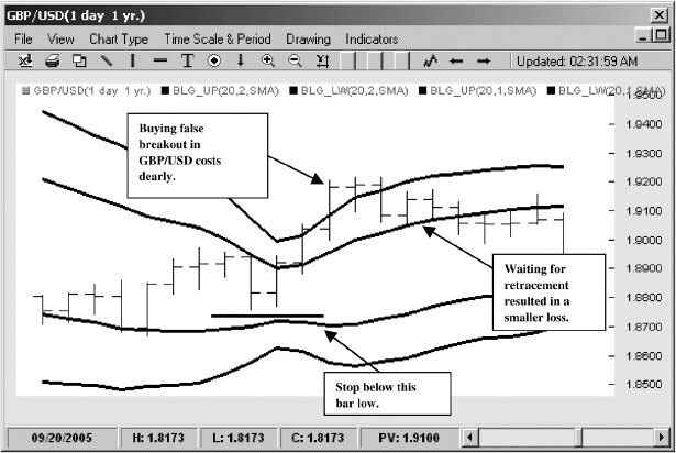
FIGURE 5.11 Buying on Retracement in GBP/USD
Source: FXtrek IntelliChart™. Copyright 2001–2005 FXtrek.com, Inc.
Football fans know that the win does not necessarily go to the best athletic team but to the one that practices the best field management. Joe Theismann, the former quarterback for the Washington Redskins, once stated that he became a much better quarterback once he understood that he did not have to convert every third down play into the first down. If the opportunity just did not present itself to make first down, it was better to try for just a couple of extra yards, so the punter would have more room and could bury the opposition deeper in their own territory. Trading trend with Bollinger bands follows the same philosophy: When in the game the focus should always be on minimizing risk first, maximizing profit second.
In the example with the GBP/USD pair shown in Figure 5.12 the setup shows how well Bollinger bands can be used to trade trend with minimal risk. First the price enters into the sell zone, signaling the potential for a downward move. Second, it retraces back to the 1 standard deviation line, offering the trader a low-risk entry into the trade. If the trader is wrong he or she could stop out at the 20-period moving average, suffering only a minor loss. However, in this case the trader is correct and the profits turn out to be massive as the pair collapses for nearly 1,000 points of uninterrupted decline.
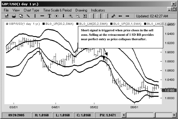
FIGURE 5.12 Trading Downtrend in GBP/USD
Source: FXtrek IntelliChart™. Copyright 2001–2005 FXtrek.com, Inc.
CONCLUSION
Contrary to popular opinion, identifying a trend is not nearly as difficult as it may seem. Whether we use trend lines, moving averages, Bollinger band “bands,” or even, for some traders, the ADX, the technician's arsenal is full of tools capable of accurate trend analysis. Yet while detecting a trend is easy, trading it is not. By definition, all of the technical analysis indicators use past price data and are therefore highly vulnerable to whipsaws and fakeouts. No technical analysis tool can predict future price action. Indicators can only suggest it. Generally, the more specific the technical setup and the more the trader has thought through the variety of failures likely to befall it, the more robust the trade. In this chapter I have offered two setups (the compressed 3 SMA crossover and Bollinger band “bands”) that not only utilize the basic tools of technical analysis but combine them in circumspect, logical ways to trade most traders’ favorite price action—trend. In the next chapter we look at the far more common price behavior—range—and see how technical tools can help us to trade it successfully.