
Like a good piece of Swiss Army Software, Excel provides tools that go beyond the basics. Using features like PivotTables, Scenarios, and Goal Seeking, Excel lets you sharpen your powers of visualization as you look at your data in new and interesting ways.
A PivotTable is a special spreadsheet entity that helps summarize data into an easy-to-read table. You can exchange the table’s rows and columns (thus the name PivotTable) to achieve different views on your data. PivotTables let you quickly plug different sets of numbers into a table; Excel does the heavy lifting of arranging the data for you.
PivotTables are useful when you want to see how different-but-related totals compare, such as how a retail store’s sales per department, category of product, and salesperson relate. They let you build complicated tables on the fly by dragging various categories of data into a premade template. PivotTables are also useful when you have a large amount of data to wade through, partially because Excel takes care of subtotals and totals for you.
Here’s how to create a PivotTable from data in an Excel sheet.
Suppose, for example, that you’re the Executive Director for a community non-profit, trying to decide which fundraisers bring in the most donors for the time and money spent. You have a spreadsheet showing four years’ worth of data on five different fundraisers (such as each event’s revenue, number of new donors, and hours of staff and volunteer time). But you can’t yet see the trends that identify which fundraisers bring in the most new donors for the least time investment while achieving the highest revenues. A PivotTable, you realize, would make the answer crystal clear.
Select a cell in the data range from which you want to create a PivotTable. Choose Data → PivotTable Report, which brings up the PivotTable Wizard. This will walk you through the process of creating a PivotTable in three steps.
In the first step, select the data from which you want to create a PivotTable. Your choices include an Excel list, multiple consolidation ranges (which use ranges from one or more worksheets), and another PivotTable. If you’ve installed the necessary ODBC-related software (see the box on Working with Databases), you can also use data from an external data source.
In this example, you want to create a PivotTable from existing data in an Excel sheet. Choose “Microsoft Excel list or database”; click Next to continue.
This PivotTable Wizard asks for the cell range that you want to use in your PivotTable. Excel—bless its digital heart—takes its best guess, based on the active cell when the wizard was invoked. If that range is not correct, type the range you want in the Range field or use the cell-selection triangle (see Selecting Cells (and Cell Ranges)) to select the range yourself. Click Next to continue.
Finally, Excel asks where you want to place your new PivotTable. You can put it either in a new worksheet or in an existing worksheet at a specific location. Because this table is relatively small, place it in the same worksheet as the source data.
This last screen gives you two additional customization buttons:
The Layout button opens the Layout window, where you can exercise some control over how the PivotTable is laid out.
The Options button opens the Options window, where you can choose to include grand totals, to preserve cell formatting, and how you want data sources handled.
To finish your PivotTable, click Finish.
At this point, Excel has dropped a blank PivotTable into the specified location, but its poor cells are empty. To help you insert data, Excel opens the PivotTable toolbar, which you can use to add elements to your blank slate.
The bottom of the PivotTable toolbar shows a few names that coincide with the column names in your original data (Figure 14-14); these are called field names. To complete your PivotTable, you drop these field names onto the row axis (the column on the left), the column axis (the row across the top), or the data field (the big empty space in the center). A different table will form, depending on which data fields you drop on which axes.
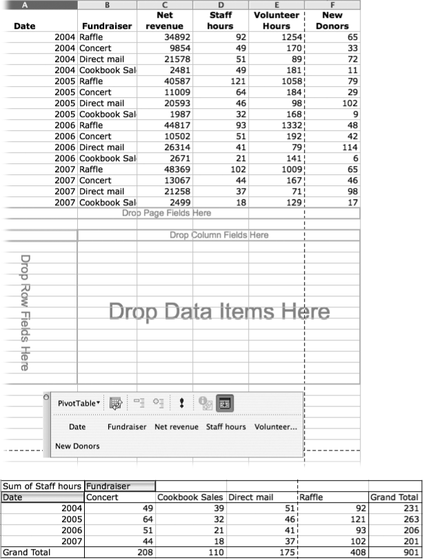
Figure 14-14. Top: To finish your PivotTable, fill in the blank table with field items from the PivotTable toolbar. Drag these items onto the column to the left, the row across the top, or the data field in the middle to complete your PivotTable. Bottom: This table results from dragging field names from the PivotTable toolbar onto the waiting PivotTable, in this example showing the total hours of staff time spent for each year and for each event.
You, the weary executive director, now want to build a table relating how much revenue each fundraiser brought in to the staff time it ate up. Drag the Date field name onto the Row Field area, the Fundraiser field name onto the Column Field area, and the Staff Hours field name onto the data area.
As depicted in Figure 14-14, Excel builds a table that displays how many staff hours each fundraiser required, and adds the totals for each fundraiser (at the bottom) and for each year (at the right).
Now that you’ve created your simple PivotTable, you can quickly rearrange it to glean the juicy results from it by dragging field names to different areas in the PivotTable, or you can add a new dimension by dragging yet another field name (in the case of the executive director, the number of new donors) onto the table. If you add a new field to the data area, Excel divides each row into two, showing how the data for each date interrelate. The more field names you drag into the data area, the more complex your table becomes, but the more chance you’ll have to spot any trends (Figure 14-15). Field names can also be added to the row and column axes for an entirely different kind of table.
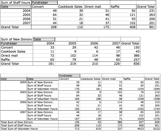
Figure 14-15. These three PivotTables were created using the same data source—the only difference is that the fields from the PivotTable toolbar were dragged to different areas on the blank PivotTable. In the case of the complicated PivotTable (bottom), three different fields were dragged to the data field, creating three totals at the bottom of each column and grand totals at the right. Exercise this option with caution, since dragging multiple fields to the same axis can quickly render a PivotTable unreadable. If your table turns to hash, press ⌘-Z repeatedly to undo your steps.
Though PivotTables start out totaling rows and columns you needn’t stop there. Control-click (or right-click) any of the totals and choose Field Settings. In the PivotTable field dialog box you can choose other functions for your summaries, such as Average, Max, Min, and so on. Click the Options button if you’d like your summaries expressed as percentages or differences.
PivotTables aren’t the only way to analyze your Excel data. In fact, if you’re the type who loves to answer those “what if” questions posed by board members or your spouse, then Excel has some great tools for you: data tables, goal seek, andscenarios.
Data tables let you plug several different values into a formula to see how they change its results. They’re especially useful, for example, when you want to understand how a few different interest rates might affect the size of a payment over the life of a five-year loan.
Data tables come in two flavors: one-variable tables (where you can change one factor to see how data is affected) and two-variable tables (where you can change two factors). The only hard part about using a data table is setting it up. You’ll need to insert the formula, the data to substitute into the formula, and an input cell that will serve as a placeholder for data being substituted into the formula.
To create a one-variable table, arrange the data in your cells so that the items you want plugged into your calculation (the interest rate, for example) are in a continuous row or column; then proceed as shown in Figure 14-16. If you choose a row, type the formula you want used in your table in the cell that’s one column to the left of that range of values, and one row below it. If you choose a column, type the formula in the row above the range of values, and one row to the right of it. Think of the values (the interest rates) as row or column heads, and the formula’s location (the payment amount) as the heading of an actual row or column in your soon-to-be-formed table. You’ll also need to decide on the location of your input cell; it should be outside this table.
For example, to see the effects of different rates of interest on a proposed loan, set up a table similar to the one at the top of Figure 14-16, where column B contains one possible interest rate, the loan term, and the loan amount. Column C contains a list of other possible loan rates, while D3 contains the formula to calculate payments based on the values in column B: =PMT(B4/12,B5,-B6).
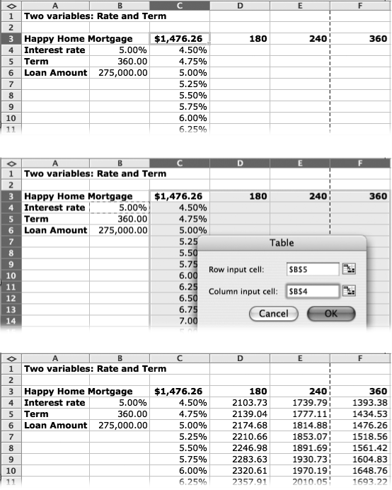
If one “what if” is good, two has got to be better—and Excel is happy to oblige by creating a two-variable data table. Using the same example, you can compute payments based on different rates and a different number of monthly payments in much the same way as a single-variable data table.
To create a two-variable table, enter a formula in your worksheet that refers to the two sets of values plugged into the formula. Now proceed as shown in Figure 14-17.
If you still don’t see the information you really need after Excel creates one of these tables, you can simply replace values in the table—for example the loan amount, terms, or interest rates—and Excel updates the results in the table.
When you know the answer that you want a formula to produce but you don’t know the values to plug into the formula to get that answer, then it’s time for Excel’s goal seek feature.
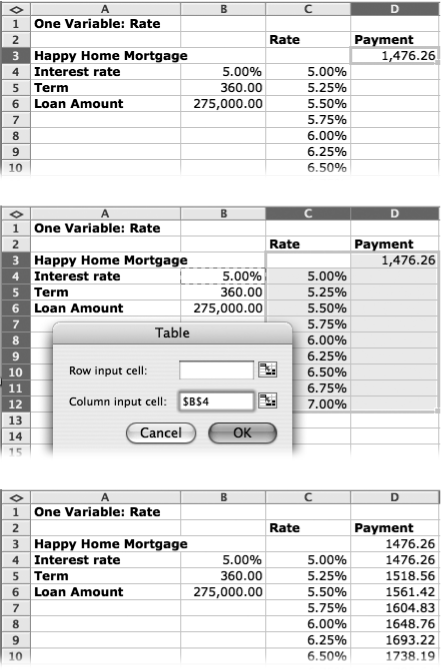
Figure 14-16. Top: To create a single-variable What-If data table, start by entering one set of data and a formula to calculate your result. Column B contains the values needed to calculate loan payments. Cell D3 contains the PMT formula to calculate monthly payments. Enter your set of substitute values in a column starting one column to the left and one row below the cell containing the formula. (Or one column to the right and one row above for a row-oriented data table.) Middle: Select the group of cells containing your substitute values and the formula and choose Data → Table to summon the Table dialog box. Since this is a column-oriented table, click the Column input cell field and then click cell B4—the cell containing the value in the formula to be replaced by the substitute values. Bottom: When you click OK, Excel builds the table, calculating the payment for each interest rate.
Note
If you’ve been using Solver—Goal Seek’s more capable big brother—in previous versions of office, you’ll be disappointed to see that Microsoft removed it from Excel 2008, apparently due to the change to the .XML file format.
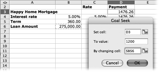
To use it, choose Tools → Goal Seek. In the resulting dialog box (Figure 14-18), fill in the following three fields:
Set cell. Specifies which cell to start from—the cell containing the formula you’re using to seek your goal. For example, Figure 14-18 shows a mortgage calculation. The Set cell (the upper-right cell), which shows the amount of the monthly payment, is D3. The purpose of this exercise is to find the amount you can mortgage if the most you can pay each month is $1,200.
To value. Specifies the value that you want to see in that cell. In the example of Figure 14-18, the To value is $1,200—that’s what you and your spouse agree you can pay each month.
Figure 14-17. Top: In a two-variable data table, one set of data serves as one axis, and the second set serves as the second axis (top). The formula sits in the upper-left corner (C3), and it refers to two input cells outside of the table (B4 and B5). Enter one set of values in a column starting just below the formula, and the second set of values in a row starting just to the right of the formula. Select the range of cells containing the formula and all of the input values that you just entered, and choose Data → Table. Middle: Enter the addresses for the row input cell (B5 for the term) and the column input cell (B4 for the rate) and click OK. Bottom: Excel creates a beautiful table of payments based on how two variables interact showing you payments for a variety of interest rates for a 15-, 20-, or 30-year term.
By changing cell. Tells Excel which cell it can tinker with to make that happen. The key cell in Figure 14-18 is B6, the loan amount, since you want to know how much you can spend on a house with a $1,200 mortgage payment.
Click OK to turn Excel loose on the problem. It reports its progress in a Goal Seek Status dialog box, which lets you step Excel through the process of working toward your goal. There are a couple of caveats: You can select only single cells, not ranges, and the cell you’re tweaking has to contain a value, not a formula.
Scenarios are like little snapshots, each containing a different set of “what if” data plugged into your formulas. Because Excel can memorize each set and recall it instantly, scenarios help you understand how your worksheet model is likely to turn out given different situations. (You still have to enter the data and formulas into your spreadsheet before you play with scenarios, though.) In a way, scenarios are like saving several different copies of the same spreadsheet, each with variations in the data. Being able to quickly switch between scenarios lets you run through different situations without retyping any numbers.
To create a scenario, choose Tools → Scenarios to bring up the Scenarios Manager, where you can add, delete, edit, and merge different scenarios, as shown in Figure 14-19.
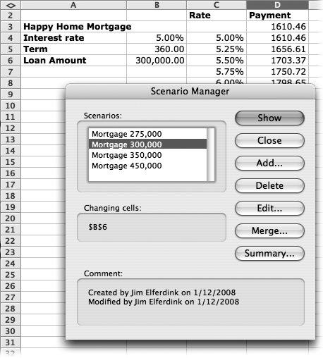
Figure 14-19. In the Scenario Manager dialog box, you can switch between saved scenarios, add new ones, edit existing ones, merge scenarios from other worksheets into the Scenarios list, and even summarize your scenarios to a standard summary or PivotTable. The Scenarios list displays all of the scenarios that you’ve created and saved, and by selecting a scenario and clicking Show, Excel plugs the scenario values into the worksheet and shows the results.
The listbox on the left side displays all of the scenarios that you’ve saved. By selecting a scenario and then clicking a button on the right, you can display your scenarios in your spreadsheet, or even make a summary. Here’s what each does:
Show. The Show button lets you switch between scenarios; just select the scenario you want to view, and then click Show. Excel changes the spreadsheet to reflect the selected scenario.
Close. As you expect, this button simply closes the Scenario Manager.
Add. Click this button to design a new scenario, courtesy of the Add Scenario dialog box (Figure 14-20). It lets you name your scenario and specify the cells you want to change (either enter the cell references or select them with the mouse). Excel inserts a comment regarding when the scenario was created. You can edit this comment to say anything you like, making it a terrific place to note exactly what the scenario affects in the spreadsheet.
Figure 14-20. Top: Clicking Add in the Scenario Manager calls up the Add Scenario dialog box, shown here. (It changes to say Edit Scenario when you fill in the “Changing cells” field.) In this box, you name your scenario and tell Excel which cells to change when showing it. Bottom: Once you click OK, you see the Scenario Values dialog box, where you enter the new values for the cells that you specified in the previous window.
After clicking OK, you’re taken to the Scenario Values dialog box, where you enter new values for the cells you specified in the previous window. Once you’re done entering your new values, click OK. The new scenario appears in the Scenario Manager.
Delete. This button deletes the currently selected scenario.
Edit. The Edit button opens the Edit Scenario dialog box, which looks just like the Add Scenario box. Use this box to edit a previously saved scenario.
Merge. This command merges scenarios from other worksheets into the Scenario list for the current worksheet. To merge scenarios, open all of the workbooks that contain scenarios that you want to merge, and then switch to the worksheet where you want the merged scenarios to appear. This is your destination worksheet for the merge.
Open the Scenario Manager (Tools → Scenarios) and click Merge, select the workbook that has the scenarios to merge, and then select the sheet containing the actual scenarios.
Summary. When you click the Summary button, the Scenario Summary dialog box appears. It has two radio buttons: one for a standard summary (which creates a table) and one for a PivotTable summary (a PivotTable of your changes really lets you tweak the numbers). Figure 14-21 shows a standard summary, complete with buttons for expanding and contracting the information.
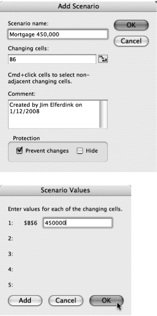
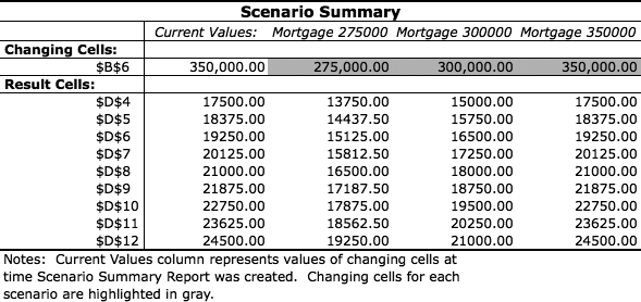
Figure 14-21. A summary report shows all of the scenarios in your worksheet. Click the + and - buttons in the margins to expand and contract rows. Once Excel creates a summary, you can edit it, to dress it up or just make it more readable. For example, you could copy and paste the interest rates from the worksheet into the Result Cells column which now shows cell references.
Granted, PivotTables and databases are some of the most powerful elements found in the Data menu, but they’re not the only ones. A few other commands in the Data menu let you perform additional tricks with your data.
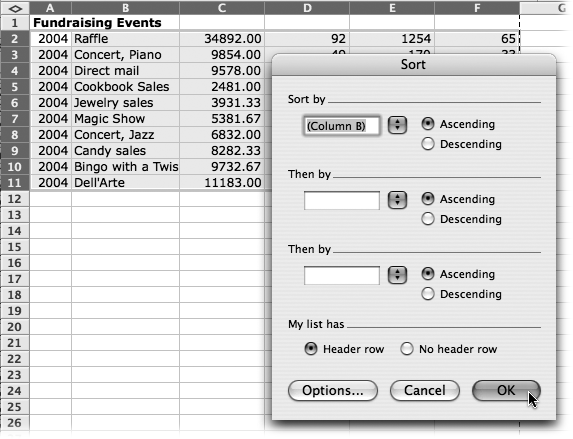
Sort. This powerful menu command lets you sort selected data alphabetically or numerically with much greater control than when using the Toolbar’s Sort buttons. You can perform several levels of sorting, just as you can when sorting database items—for example, sort by year, then by month within each year. As shown in Figure 14-22, the beauty of the Sort command is that it sorts entire rows, not just the one column you specified for sorting.
Tip
Clicking “Header row” avoids sorting the top-row column labels into the data—a common problem with other spreadsheet software. Excel leaves the top row where it is, as shown in Figure 14-22.
Figure 14-22. A table sorted alphabetically by event. Highlight the table (including the header row of across the top), and then choose Data → Sort. In the Sort dialog box, specify (using the Sort by pop-up menu) that you want to sort the rows according to the text in column B. turn on the radio button for “Header row” to exclude that row from the sorting. When you click OK, Excel sorts the rows into the proper order.
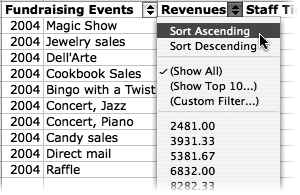
Filter. When you choose AutoFilter from this submenu, you get pop-up menus at the top of each column in your selection (Figure 14-23). You can use them to hide or show certain rows or columns, exactly like the filters found in list objects (see Use the total row). AutoFilter pop-up menus can be applied to only one selection at a time in a worksheet. Also on the Filter submenu, Show All displays items that you hid using the AutoFilter pop-up menus, and Advanced Filter lets you build your own filter. (Consult the online help if you want to build an advanced filter.)
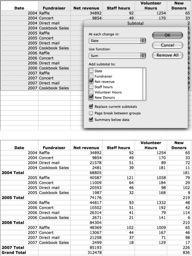
Subtotals. This command automatically puts subtotal formulas in a column (or columns). The columns need to have headings that label them (Figure 14-24 shows an example).
Figure 14-24. Top: Select a set of data that could stand some subtotals. When you choose Data → Subtotals, the Subtotal dialog box appears. In this box, you can choose the column that determines where subtotals go (in this case, at each change in the date), which function is used, and in which columns the subtotal appears. Bottom: When you click OK, the subtotals appear in your data, grouped appropriately according to the column you selected in the Subtotal dialog box. (Excel uses its outlining notation, as described on Outlining, making it easy to collapse the result to show subtotals only.)
To use this feature, select the relevant columns, including their headings, and then choose Data → Subtotals. In the Subtotal dialog box that pops up, you can tell Excel which function to use (your choices include Sum, Count, StdDev, and Average, among others) and whether to include hidden rows or columns in the subtotal. If you’ve selected more than one column, you can add the selected function to whichever column or columns you choose.
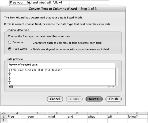
Text to Columns. Suppose you’ve pasted a phrase into a single cell, and now you’d like to split each word into a separate column. Or maybe a cell contains several cells worth of text, each separated by a nonstandard delimiter (such as a semicolon) that you’d like to split in a similar fashion. “Text to Columns” is the solution, as shown in Figure 14-25.
Figure 14-25. Top: To split delimited text into several columns, select the cell and choose Data → Text to Columns to summon the threestep Convert Text to Columns Wizard. Excel asks what kind of split you’d like to perform, what punctuation serves as the delimiter, and what the data and cell formatting looks like. Bottom: Click Finish, and Excel splits the data into columns.
Consolidate. The Consolidate command joins data from several different worksheets or workbooks into the same area, turning it into a kind of summary. In older versions of Excel, this command was important; in Excel 2008, Microsoft recommends that you not use it and instead simply type the references and operators that you wish to use directly in the consolidation area of a worksheet. For example, if you track revenues for each region on four different worksheets, you can consolidate that data onto a fifth worksheet. (If you insist on going old-school, learn more by reading the “Consolidate data” entry in Excel’s online help.)
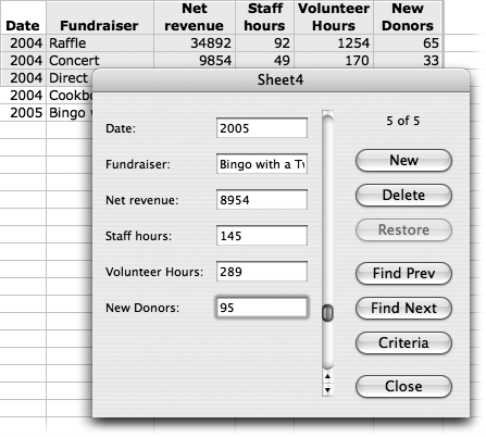
A spreadsheet is certainly a compact and tidy way to view information. But for the novice, it’s not exactly self-explanatory. If you plan to turn some data-entry tasks over to an assistant who’s not completely at home with the row-and-column scheme, you might consider setting up a data form for him—a little dialog box that displays a single spreadsheet row as individual blanks that have to be filled in (see Figure 14-26). Data forms also give you a great way to search for data or delete it one row (that is, one record) at a time.
To set up a data form, start with a series of columns with column headers at the top—a list does nicely. These headers serve as categories for the data form. Then, with the cursor in the list, choose Data → Form, which brings up the data form window for that particular list (Figure 14-26).
When the form appears, the text boxes show the first row of data in the list. You can scroll through the rows (or records) using the scroll bar. On the right, buttons let you perform the following functions: add a new record (or row) of data at the bottom, delete the currently selected row, click Criteria to enter search criteria in the text boxes next to the field names, and then search for that information using Find Prev and Find Next. Finally, the Close button closes the window.
Excel worksheets can grow very quickly. Fortunately, Excel has some convenient tools to help you look at just the data you want.
Excel can memorize everything about a workbook’s window: its size and position, any splits or frozen panes, which sheets are active and which cells are selected, and even your printer settings—in a custom view. Custom views are snapshots of your view options at the time that the view is saved. Using custom views, you can quickly switch from your certain-columns-hidden view to your everything-exposed view, or from your split-window view to your full-window view.
To create a custom view, choose View → Custom Views, which brings up the Custom Views dialog box. To make Excel memorize your current window arrangement, click Add (and type a name for the current setup); switch between custom views by clicking a view’s name in the list and then clicking Show.
In Excel, outlines help to summarize many rows of data, hiding or showing levels of detail in lists so that only the summaries are visible (see Figure 14-27). Because they let you switch between overview and detail views in a single step, outlines are useful for worksheets that teem with subtotals and details. (If you’re unfamiliar with the concept of outlining software for word processing, consult Outline View, which describes the very similar feature in Microsoft Word.)
You can create an outline in one of two ways: automatically or manually. The automatic method works only if you’ve formatted your worksheet in a way Excel’s outliner can understand:
Summary columns have to be to the right or left of the data they summarize. In Figure 14-28 at top, the D column is a summary column, located to the right of the data it summarizes.
Summary rows have to be immediately above or below the cells that they summarize. For example, in Figure 14-28 at bottom, each subtotal is directly below the cells that it adds together.
If your spreadsheet meets these conditions, creating an outline is as easy as selecting Data → Group and Outline → Auto Outline.
If your data isn’t so neatly organized, you’ll have to create an outline manually. Select the rows or columns of data that you want to group together into one level of the outline; choose Data → Group and Outline → Group. A bracket line appears outside the row numbers or column letters, connecting that group. Keep selecting rows or columns and grouping them until you’ve manually created your outline.
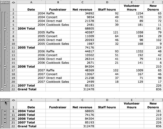
Figure 14-27. Top: An outlined spreadsheet fully expanded. Bottom: The same spreadsheet partially collapsed. Clicking a + or - button opens or closes detail areas, while clicking the number buttons in the upper-left corner displays just the first, second, or third levels of detail for the entire outline. This example shows three levels, but Excel allows up to eight levels of detail in outlines.
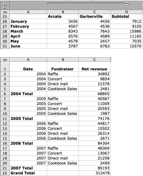
Figure 14-28. Top: Because the column of subtotals (column D) is to the right of the data to which it refers, this spreadsheet can be automatically outlined Bottom: Each subtotal is beneath the cells it summarizes, making this spreadsheet, too, a fine candidate for automatic outlining.
Outlines can have eight levels of detail, making it easy to go from general to specific very quickly. Thick brackets connect the summary row or column to the set of cells that it summarizes; a + or - button appears at the end of the line by the summary row or column.
To expand or collapse a single “branch” of the outline, click a + or - button; if you see several nested brackets, click the outer + or - buttons to collapse greater chunks of the outline. Also, the tiny, numbered buttons at the upper left hide and show outline levels and correspond to Level 1, Level 2, and so on, much like the Show Heading buttons on the Outlining toolbar in Word (see Collapsing and expanding an outline).
Sometimes, when you’re presenting the contents of a workbook to someone else—or when you’re up battling a bout of insomnia by going through your old Excel workbooks—you come across something in a spreadsheet that needs updating, research, explanation, or some other kind of follow-up. Excel’s flag for follow-up feature lets you attach a reminder to a file, which you can program to appear (as a reminder box on your screen) at a specified time. See Office Reminders for more on Office Reminders.

Figure 14-29. To flag a file for follow up, choose Tools → “Flag for Follow Up”, which produces the “Flag for Follow Up” dialog box (inset). In this box, you can set a time and date to be reminded that you need to attend to your worksheet. (Press Tab if you have trouble moving the insertion point around in the dialog box.) Click OK and save the document. Excel creates a task in Entourage; the reminder pops up at the specified time—as long as your computer is on. Otherwise, you’ll see the reminder the next time you turn on your Mac.
Here’s another way to get your own attention (or somebody else’s): Add a comment to a cell—a great way to annotate a spreadsheet. A note might say, for example, “This figure is amazing!—Congratulations!,” or “I had no idea that old cookbook was still selling so well!” See Figure 14-30 for details.
To edit a comment that already exists, select the cell and then choose Insert → Edit Comment. To delete a comment, select the cell with the comment and choose Edit → Clear → Comments. You can also reveal all comments on a worksheet at once by choosing View → Comments.
Tip
Like the Stickies program on every Mac, Excel comment boxes lack scroll bars. If you have a lot to say, keep typing past the bottom boundary of the box; Excel expands the note automatically. You can press the up and down arrow keys to walk your insertion point through the text, in the absence of scroll bars. (Alternatively, drag one of the blue handles to make the box bigger.)
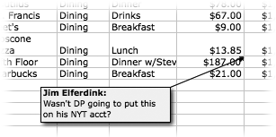
Figure 14-30. To add a note to a cell, click the cell and then choose Insert → Comment. A nice yellow “sticky note” opens with your user name on the top (as it appears in the Excel → Preferences → General tab). Type your comment in the window. When you click elsewhere, the note disappears, leaving only a small triangle in the upper-right corner of the cell. To make the comment reappear, let the cursor hover over the triangle. (If you prefer to see comments all the time, change that setting in Excel → Preferences → View.)