
One of the things about Flash that makes it a bit hard to define to new users is that it wears many hats. Although it is known for its ability to compile and load assets created in other applications, it is not just an authoring tool. That is, one of Flash’s strengths is that it can be used to create assets all on its own. In fact, one of the distinctions between Flash and Flex (another Flash Platform technology) has always been that Flex authoring tools (like Flex Builder) don’t have Flash’s graphics drawing environment and don’t allow you to draw custom assets while authoring.
Believe it or not, some designers use Flash as a primary illustration tool in specific cases, creating art in Flash and saving it to several image formats and even to video files. Part of Flash’s advantage as an illustration tool is its unique drawing modes—editing configurations that allow object-based drawing, similar to Adobe Illustrator, and that contain drawing tools that treat vectors with the casual familiarity of pixels.
Flash’s primary graphic building blocks, vectors, are points joined by lines used to describe shapes. You may have worked with vector assets if you’ve used EPS (Encapsulated PostScript) or PDF (Portable Document Format) files. The following pages give you an overview of how to approach drawing with Flash’s tool set.
At the end of the chapter, you’ll use a lot of what you’ve learned to work on the ongoing portfolio project. In the meantime, you may get the most from this material by experimenting often. As you read the descriptions in this chapter, keep Flash open and tinker as you go. You will occasionally find descriptive references about drawing, or even outright suggestions to try tasks as you read along. Unless specified otherwise, however, it is not necessary to save your work. You will not begin working on the cumulative project until the end of the chapter.
Flash has two distinct drawing modes: Merge Drawing mode and Object Drawing mode. Merge Drawing mode is the original drawing mode and allows shapes in the same layer to overwrite and join with each other. Introduced in Flash 8, Object Drawing mode prevents interaction between shapes. You can toggle between the two modes by clicking the Object Drawing button on or off. This button is in the context-sensitive tool options at the bottom of the Tools panel whenever a drawing tool is active (Figure 2-1). Examples of tools with access to this option include Pen, Line, all basic shapes (Rectangle, Oval, and so on), Pencil, and Brush.
In Merge Drawing mode, overlapping fills or strokes of like color will be joined and differing colors can be used to destroy vector segments. When used properly, merge drawing is a powerful Flash feature. If you’re careless, however, it can ruin your artwork.
Note
Unlike most object-based drawing applications, such as Adobe Illustrator, Flash treats fills (the inside of a square, for instance) and strokes (the lines surrounding a square) as easily separable, discrete objects. It’s very easy, for example, to select a stroke and drag it to a new location, ending up with a strokeless fill and a fill-less stroke. It’s also possible to use strokes to subdivide fills, to paint fills but not strokes, and to convert strokes to fills, among other things. It may take some getting used to, but, as you’ll learn in this chapter, this unique treatment of strokes and fills can be a valuable illustration tool.
To understand Merge Drawing mode, it helps to understand how strokes and fills behave in Flash. You will learn more about this throughout the chapter, but for now you can see the difference between the two drawing modes with a few simple shapes. If you want to try things along with the text, start by selecting the Rectangle tool and turning Object Drawing mode off.
When you draw shapes in Merge Drawing mode, they are what you might call “unprotected” because there is nothing to prevent them from interacting with other shapes in the same layer. If you draw a rectangle on the stage using the Rectangle tool and then switch to the Selection tool, you will see that you can select each segment of the shape’s stroke and fill with a separate single click. You’ll learn more about selection techniques later, but for now just notice that the shape is vulnerable to your selecting and even editing specific areas without manipulating the underlining vector path directly.
If you use the Line tool to draw a line all the way through the middle of the shape, the shapes interact and the line divides the rectangle in two. At first, this is not immediately apparent. As you would expect, you can drag the Selection tool over all the artwork to select both the rectangle and the line, as shown at the top of Figure 2-2.
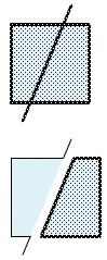
Figure 2-2. Selecting a square and line created with Merge Drawing mode (top) and selecting and moving a portion of the merged shapes (bottom).
When you click on either side of the shape fill, however, only that segment of the fill is selected. Furthermore, when you double-click the fill, the fill and the surrounding strokes, including the new dividing line, are selected. You can even drag with the mouse or use the arrow keys on your keyboard to move the selected area away from the original shape, as shown in the bottom of Figure 2-2.
If you consider the combined shape before pulling it apart, the strokes and fill are divided at every intersection. The fill can be isolated into two parts, and, perhaps less obviously, the stroke can be isolated into nine parts. The four sides of the rectangle result in six parts (because two sides are divided by the line passing through them), but the dividing line is also subject to interaction from another shape. Accordingly, it is divided into three parts: above, inside, and below the rectangle.
Within the same Timeline layer, strokes and fills of like color can join to form a union, and strokes and fills of different colors can intersect and eliminate the underlying artwork—but only when you deselect. You can always change your mind before a shape change takes place, as long as you don’t deselect.
For example, if you overlap a circle and a rectangle shape of the same color, both without strokes, the two shapes would become one after deselecting. If you moved the topmost shape away from the bottom shape before deselecting, no change would occur.
Alternately, if you centered a small circle on top of a larger circle of a different color (both circles without strokes) and deselected, you could delete the inner circle and end up with a donut. Again, if you aborted the process prior to deselecting, no change would occur.
The same is true of strokes. Strokes of the same color in the same layer can merge into connected strokes if they are deselected. Strokes of different color, or strokes intersecting fills, can divide the underlying shape.
When Object Drawing mode is enabled, you are protecting shapes from interacting. This behavior is similar to drawing two discrete objects in Adobe Illustrator. Without intervention from you, those two objects won’t typically join or intersect each other.
When you draw a shape with Object Drawing mode on, Flash encapsulates the shape in a wrapper of sorts—hermetically sealed for your protection. You can still edit the shape, but the object wrapper prevents shapes from interacting the way they would if Merge Drawing mode were enabled.
Remember the Merge Drawing mode example of the line dividing a rectangle? This time, turn Object Drawing mode on, create a circle with the Oval tool and use the Pencil tool to draw a line over it. Because the object wrapper protects the two shapes from interacting, clicking on one half of the circle will select the entire circle, rather than a portion of it. Moving the selected shape to the right (as in the Merge Drawing mode example), both shapes remain intact and the line’s position is unchanged. This contrasting behavior can be seen in Figure 2-3.
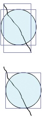
Figure 2-3. Selecting a circle and line created with Object Drawing mode (top) and selecting and moving only the circle (bottom); shapes remain discrete and can be moved independently
Note
Both the Rectangle and Oval tools have companion tools called Rectangle Primitive and Oval Primitive, respectively, which have special powers. The former can control the radius of each of its four corners independently (allowing you to create tab-shaped buttons with rounded corners, for example), and the latter can control its starting and ending angle, as well as inner radius (allowing you to create pie pieces, arcs, and donut shapes). Check the companion website for examples.
The Drawing Mode toggle button in the Tools panel doesn’t change existing assets from Merge Drawing mode to Object Drawing mode, or the other way around. Changing the setting affects newly drawn assets only. Using the Modify menu’s Group and Break Apart options, however, you can achieve an effect similar to changing an asset’s drawing mode.
When you have an unprotected shape that was created using Merge Drawing mode, you can select and group the asset (Modify→Group) to protect it. Although it makes more sense to think of grouping as collecting more than one object into a single unit, you can also group a single shape to prevent it from interacting with other shapes.
When you have a Drawing Object (a shape created while Object Drawing mode was enabled), you can convert it to an unprotected shape by breaking it apart (Modify→Break Apart). This is handy when you want to join or cookie-cut two shapes that were previously created as Drawing Objects.
You will see this process appear more than once throughout this book, since you can use it to degrade a complex object into a less complex object. For example, you can break a text field into individual editable letters, and then break those letters again into vector shapes.
Note
If you break a Drawing Object into a shape, you can’t later return it to a Drawing Object (short of using Edit→Undo). However, you can group the shape to protect it from further edits.
Alternatively, you can edit the contents of a group or Drawing Object without breaking it apart. To do this, double-click the object. The application will enter an editing mode without radically changing the interface. This allows you to edit groups and Drawing Objects in the context of any surrounding art. While in editing mode, double-clicking any unoccupied area of the Stage or Pasteboard will return you to the Stage.
The Edit Bar just above the Stage shows a “breadcrumb trail” of buttons leading up to your current location in a chain of possible nested objects you are editing. For example, if you edit a Drawing Object placed on the Stage, the Edit Bar shows a button called Scene 1 (the default name for the main Timeline), followed by the text Drawing Object to mark your current location. Clicking the Scene 1 button will exit editing mode, and you can again access the Stage.
If you group two Drawing Objects together and want to edit one, you must first double-click the group to edit its contents and then double-click the Drawing Object to edit the shape therein. The Edit Bar ultimately includes buttons that say Scene 1 and Group, followed by the text Drawing Object—again showing where you are. In this case, you can click the Edit Bar’s Group button to back out one level in editing mode, or the Scene 1 button to again access the Stage.
Some users who are new to Flash go through a short period of adjustment when it comes to the drawing tools. In Flash, the traditional object-based model is not the primary drawing technique. Unlike Adobe Illustrator and others, Flash allows you to work with vectors in a very fluid, natural way. Instead of manipulating curves with vertices and control handles (common to object-based graphics), you can just grab hold of a line and drag it (Figure 2-4).

Figure 2-4 shows just such a manipulation in progress. To accomplish this, start by placing your cursor over the shape you wish to manipulate. To help identify which object you might be clicking with the Selection tool, a small icon, often called a cursor badge, appears in the lower-right corner of the cursor. A curve appears when you roll over a line segment, and a corner appears when you roll over a corner point. In Figure 2-4, you can see a curve to the lower right of the cursor, reaffirming that the cursor is over a line, not a corner. If you click and immediately drag the mouse, you can manipulate the selected stroke or fill. By contrast, if you click and let go, you select the stroke or fill, and subsequent drags will move the selected element to a new location.
Further in the “natural drawing” vein, you can create vectors with a paintbrush or remove them with an eraser. Each time you paint with a brush, it may feel like you’re painting with pixels, but the resulting shape will be comprised of vectors.
Grabbing and dragging lines may eventually become your preferred method of finessing a curve. However, it is also possible to manipulate curves with the same precision afforded in other object-based drawing applications. Flash offers the same Pen and Subselection tools as Adobe Illustrator and allows you to create, add, subtract, and transform vertices.
To create the s-shaped Bézier curve shown in Figure 2-5, for example, you use the Pen tool. Starting at the upper-right corner of the S, you can drag a bit upward along a path tangential to the desired curve. Moving to the second point at the top of the S, you can drag to the left, again forming a tangent to the curve. To finish the curve, follow around the S, dragging tangentially for the four remaining vertices. Figure 2-5 shows two of these vertices selected (the solid points at the top-left and bottom of the curve) using the Subselection tool. The control handles jutting out of any point at tangents to the curve can be dragged to reshape the curve.

As with drawing, selecting objects in Flash can be approached from both the “natural” and “precise” viewpoints. You’ll learn specific selection subtleties, as they apply to strokes and fills, in a moment. However, it’s worth mentioning in the context of drawing styles that you can select individual vertices if required or simply drag the Lasso tool over a shape, as shown in Figure 2-6. Despite the fact that you are dragging your Lasso tool over a vector shape, you can select a subset of that shape with the ease of surrounding pixels in a bitmap.
As previously discussed, Flash treats the fill and stroke of a single shape as discrete elements almost unto themselves. Bear this in mind when you select them with the Selection tool, and you’ll be less likely to end up with unexpected results.
You will quickly realize that some attention is required when selecting shapes if you don’t intend to leave fragments of your object behind. This is because you can select objects in Flash with a great deal of granularity. For example, it is not only possible, but even simple, to select a shape’s fill and stroke separately. It is even possible to select a fragment of a stroke very easily, even accidentally.
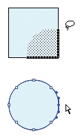
Figure 2-7 shows the visual feedback Flash provides upon various selection actions. Figure 2-7 is the result of a single click in the interior of the shape. Look carefully, and you’ll see that only the fill is selected. If you were to try to move this shape, you would leave behind, and possibly overwrite, its stroke.
Figure 2-7 shows the result of a single click on the shape’s stroke—the right side in this case. A single click on a stroke selects only the clicked-upon fragment between two corner or intersection points. Only for ellipses or circles will the entire stroke be selected, because these contain no corners.

Figure 2-7. Selecting fill only (a), stroke segment only (b), complete stroke only (c), and fill and stroke (d)
Figure 2-7 shows the result of double-clicking the stroke. A double-click selects all contiguous parts of the stroke. In the example, all four sides of the square are selected, despite the intervening corner points.
Finally, Figure 2-7 shows the result of double-clicking the fill of the shape. This has the effect of selecting not only the entire contiguous fill, but also the entire surrounding stroke. If you want to be sure to grab all parts of the shape, use this method. Alternately, you can drag over the object with the Selection or Lasso tools to achieve the same result.
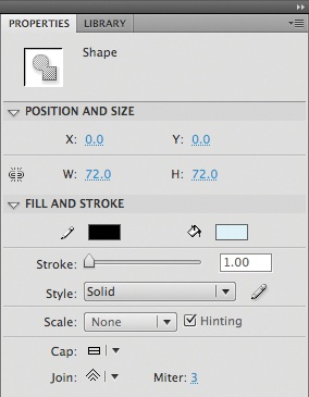
The Properties panel (Window→Properties) is among the most often used Flash panels. It is context-sensitive and provides access to most properties that are editable within the Flash interface. Fill and stroke properties (Figure 2-8) can be found in the Fill and Stroke section of the panel when a shape is selected and are itemized in the following list:
- Stroke
Stroke is the weight or thickness of the stroke in pixels.
- Style
The menu for the Style option offers seven preset line styles: Hairline, Solid, Dashed, Dotted, Ragged, Stippled, and Hatched. Clicking the pencil to the right of the menu opens an editing panel that allows you to configure advanced properties of these line styles, such as the space between dashes or dots.
- Scale
When a movie clip is scaled, strokes scale accordingly by default. This can distort the appearance of artwork because the stroke can thin or thicken as a result of stroke scaling. A new stroke feature, Scale, lets you dictate how strokes are scaled when an object is resized. This setting affects the thinning and thickening of the stroke only when the object as a whole is enlarged or reduced. You can specify None (no change to the stroke thickness), Horizontal or Vertical (adjusting strokes only when the object is scaled in the specified direction), or Normal (the default behavior, in which strokes are always scaled anytime the object as a whole is scaled).
For example, say you wanted to create a custom vertical scroll bar. If the overall asset is scaled in both directions, you may want the strokes in the scroll bar to scale because the entire asset is being reduced or enlarged. However, you may not want the scroll bar strokes to thicken if the scroll bar is only scaled vertically. This would allow you to elongate a scrolling text field without thickening the scroll bar strokes. To accomplish this, you would set the Scale property to Horizontal so the stroke is only scaled when enlarging the asset horizontally or both horizontally and vertically.
Note
The book’s companion website, http://www.LearningFlashCS4.com, has examples of line scaling in action.
- Hinting
When enabled, Hinting attempts to nudge stroke positions to whole pixels, as opposed to subpixel positioning (decimal values for x and y properties). This prevents lines from thinning or thickening due to antialiasing side effects.
- Cap
Cap affects the shape of line end caps. This property can be set to Round (default), Square, or None. Round and Square both add a cap to the end of the line, while None adds nothing, matching the exact length of the line. The three corner types are shown in Figure 2-9.
- Join
Join affects the corners of line joints. This property can be set to Miter, Round, or Bevel. Examples of these joins are shown in Figure 2-9.
- Miter
The Miter property affects the sharpness of corner joins when the Join property is set to Miter.

Although the Properties panel is typically the go-to way of assigning most properties in the Flash interface, three tools are available to make this assignment process quick and easy for strokes and fills. The Eyedropper tool in Flash is unique among similar tools in other applications. It not only retrieves color values, but also retrieves all stroke or fill properties and automatically switches to a tool useful for assigning these properties to another stroke or fill.
After using the Eyedropper, Flash automatically switches to either the Paint Bucket or Ink Well tool, depending on whether you clicked on a fill or stroke, respectively. Both tools work in a similar fashion, applying properties to the object on which you click, but the Paint Bucket affects only fills, and the Ink Well affects only strokes.
When hovering over an object, the Eyedropper shows a cursor badge icon in the lower-right corner of the cursor. When over a line, a small line appears; when over a fill, a small paintbrush appears. Although the Eyedropper prepares only properties relevant to the element on which you clicked (prepping stroke color only when clicking on a stroke, for example), it is possible to query color from a stroke and apply it to a fill, and vice versa. If you hold down the Shift key when using the Eyedropper, Flash will populate both stroke and fill colors for your subsequent use of the Paint Bucket or Ink Well tools. For instance, this allows you to pull a color from a stroke and then apply it to a fill without an interim trip to the color tools.
There are several ways to create and apply colors in Flash. You can use existing color libraries, create your own custom colors (either before they are needed or on-the-fly), save color libraries for later use, and even retrieve color families from other users online.
Perhaps the quickest way to access or create a color is by using the pop-up color palette. This palette is available in the Tools, Properties, and Color panels, and anywhere a color chip is available. Figure 2-10 shows the palette accessed from the Fill color chip in the Tools panel.
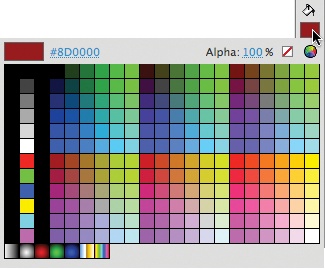
Using the panel is quite simple. You can select from any precreated solid colors (found in the middle of the palette) or gradients (found at the bottom of the palette). You’ll learn how to add swatches in the next section.
You can also create custom colors on the fly using the tools along the top of the palette. The first item is a preview of the color you’re selecting. The second item serves two functions. It is a preview of the hexadecimal value of the color you’re selecting and allows you to change the value on the fly.
Note
Hexadecimal numbers are used to specify color values in HTML and as additional color systems in applications. They consist of three character pairs that represent the red, green, and blue values of a color. Each character can be 0–9 or A–F, 0 being the lowest, and F being the highest. Together, each pair represents a number from 0 to 255. So, #FF0000 is all red, no green, and no blue. Further, #FFFFFF is the maximum of all colors, or white, and #000000 is no color, or black.
The next item in the row is the alpha value, or percent of transparency in any color. A maximum value of 100 is opaque, while a minimum value of 0 is transparent. The red line button indicates no value, allowing you to remove color from an object. Finally, the color wheel opens the operating system color picker as an alternate color-selection tool.
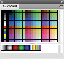
The Swatches panel is the repository of color swatches that appear in the pop-up palette. You can leave the Swatches panel open and select from it if you prefer not to use the pop-up palette, and anytime you create a custom color (solid or gradient), you can add it to the swatches in this panel. With the color active, the cursor will change to a Paint Bucket when rolling over an empty area of the appropriate section (solids or gradients) of this panel. Clicking will add the color to the end of that area of the palette. Thereafter, the color will become available to any interface element that uses the pop-up palette. Using the panel-specific menu (the button for which can be seen in the upper-right corner of the panel in Figure 2-11), you can also load color swatches from, or save to, an external source.
The Color panel is where you are most likely to create or edit custom colors. As in the Tools panel, here you can choose to edit stroke or fill colors, but the feature set of the Color panel is more complete. In addition to offering input for hexadecimal color values and percentage alpha values, you can also edit standard 0–255 range RGB color values—both by pop-up slider and text input. You can also use a built-in color picker and lighten or darken any color. While editing, the color appears in a large horizontal stripe at the very bottom of the panel for easy preview. In Figure 2-12, for example, the panel is configured to edit a linear gradient.
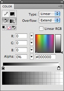
To create a gradient in the Color panel, change the color’s Type setting from Solid to Linear or Radial. Doing so adds three new interface elements to the panel.
The primary new interface element is the gradient definition bar that appears between the color picker and large preview stripe at the bottom of the panel. Figure 2-12 shows a gradient featuring two colors (evidenced by the color chips immediately beneath the bar), but this bar allows you to manipulate up to 15 colors in any gradient. To add a color, click the definition bar, and an editing chip will appear.
Selecting any chip allows you to edit that color portion of the gradient using the color picker and numeric input fields in the panel. Double-clicking a chip displays the pop-up palette for quick selection of preexisting colors. Any changes are reflected in the preview stripe at the bottom of the panel.
Figure 2-12 shows the editing of the rightmost color (note the darker triangle at the top of the chip pointing to the color being edited). Because this color has a low alpha value (0, in this case) you can see a grid through the color. This is a helpful indicator to show you how much transparency is applied to the color.
The next interface element the gradient color type adds to the panel is the Overflow menu near the panel’s upper-right corner. This menu has three options: Extend, Reflect, and Repeat. Extend continues the first and last colors of the gradient infinitely. Reflect continues to flip the gradient end to end, creating a smooth transition as though seen in a mirror. A gradient from black to white, for example, would read black, white, white, black, and so on. Repeat cycles the gradient without reflecting it each time, creating a hard edge. The same example gradient would read black, white, black, white, and so on. These options come into play when the scale of your gradient is smaller than the fill it occupies. You’ll learn more about scaling your gradient with the Gradient Transform tool later on.
The final gradient-specific addition to the panel is the Linear RGB option. This creates linear or radial gradients that are compatible with the SVG (Scalable Vector Graphics) standard.
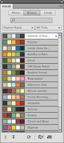
Shown in Figure 2-13, the Kuler panel can be found in the Windows→Extensions submenu and offers access to an online repository of user-defined color families. This panel requires an Internet connection and connects to Adobe’s Kuler service. You can browse, search, and submit families of up to five colors for use in your work. Unlike the Color panel, this extension allows you to use several color theories when creating families in which colors affect one another in a variety of ways. When you’ve found a family you like, you can automatically add it to your Swatches panel. For more information, visit the Kuler site, http://kuler.adobe.com/.
Once you’ve had some time to play with the Flash Tools panel, you’ll see that many tools have context-sensitive options that appear at the bottom of the panel. Most are self-explanatory, but some are unique to Flash’s natural drawing techniques.
When working with a brush, you can choose a paint mode that will affect what is colored by that brush. You can access these modes by the first context-sensitive option, shown in Figure 2-14.
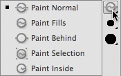
The modes are fairly self-explanatory and apply primarily to unprotected shapes (created in Merge Drawing mode or broken apart). Some work with Drawing Objects and some have a few subtleties worth mentioning. Paint Normal offers no special effect and allows you to return to this setting after using another option. Paint Fills paints only fills, leaving strokes untouched. Paint Behind affects only areas around the shape, leaving fill and strokes intact. Paint Selection affects only selected fills and strokes. Paint Inside paints only within a shape, as long as you originate your painting within the same shape.
Erase modes (available as an option of the Eraser tool) control how the eraser affects shape strokes and fills, and are similar to Paint modes. Erase Normal, Erase Fills, and Erase Inside behave the same way as their painting counterparts. Erase Lines affects only strokes, and Erase Selected Fills erases only selected fills, but not selected strokes (differing slightly from Paint Selection). A related context-sensitive tool is also available—the Faucet tool automatically erases any contiguous stroke or fill.
Although there are many meanings for the word transform, when referring to the Flash user interface, transforming typically means scaling, rotating, skewing, or moving (sometimes referred to as translating) an object. There are three essential ways to transform an asset.
The Free Transform tool applies a series of handles and a transformation point on any selected object. Depending on which handle you grab with your mouse, you can alter the appearance of the object in different ways. To help you with this process, the cursor changes to a shape that is specific to each available task.
Figure 2-15 shows all the possible cursors when using the Free Transform tool. Moving clockwise from the lower left, the cursors represent move, skew vertically, skew horizontally, rotate, scale horizontally, scale vertically and horizontally, and scale vertically. Finally, the cursor in the center of the shape is for moving the point around which transformations occur.
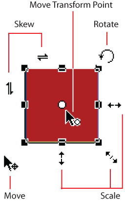
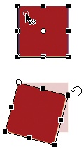
Figure 2-16 shows the effect of moving the transformation point. The top graphic shows the process of moving the transformation point from the default center of the object to the upper-left corner. The bottom graphic shows that, when rotating, the object is rotated around the new transformation point rather than the center of the object as before.
The Transform panel (Figure 2-17) offers options to scale horizontally and vertically (independently or proportionally), rotate, and skew an object. If the object is an instance of a symbol, such as a movie clip, you can also rotate on any 3D axis and move the 3D center point of the instance along any 3D axis, both of which you’ll learn more about in Chapter 8.
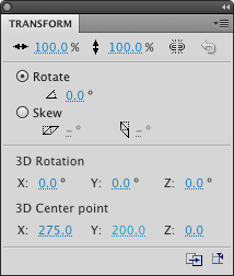
There are three compelling reasons to use the Transform panel. First, numeric entry for property values allows for greater precision. Reasons two and three are the unsung heroes in the lower-right corner of the panel. The first of these two buttons duplicates your most recently completed selection and transformation, akin to step and repeat in other applications. For example, you could create a series of copies of a movie clip that are progressively larger in size. The second button removes all transformations and returns the instance to its original state.
The final transform tool, called the Gradient Transform tool, is used to edit gradients. It can be found in the same transform tool menu as the Free Transform tool. To more easily understand how this tool works, create a rectangle shape with a radial gradient fill. Figure 2-18 shows a rectangle with a red stroke and red-to-white radial gradient so that you can easily differentiate it from the black interface elements of the Gradient Transform tool.
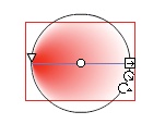
With the Gradient Transform tool active, click the radial gradient fill you created. A circle with a line across its diameter and a handful of icons will appear, as shown in Figure 2-18.
If you can’t see the tool’s interface, it probably means that the scale of the gradient is too big to fit in your view. Look for this symptom when you see what looks like a solid color instead of your expected gradient (if you zoom in closely to a gradient, it will look like a single color). Use the Zoom tool (or Zoom menu in the Edit Bar) to zoom out until you see the Gradient Transform tool interface and scale the gradient down. In this case, use the middle of the three icons on the circumference of the circle. This scales the gradient proportionally.
Once you have the interface in view, look at the three grouped icons at the lower right. The first icon, an arrow inside a square, scales the gradient in only one direction, always along the diameter line. Try this first so your radial gradient is no longer a perfect circle.
You can use the diameter scaling option in conjunction with the bottom of the three icons (a rotation arrow), which rotates the gradient. Using these two tools, you can scale a gradient along any angle. As mentioned previously, you can scale the gradient proportionally by using the middle of the three icons, an arrow inside a circle.
Finally, the center of the interface contains two icons. Dragging the circle icon drags the location of the gradient within the fill. Dragging the triangle above the circle skews the gradient in either direction along the diameter line. Figure 2-18 shows the arrow all the way to the left of the fill, skewing the gradient to the left. This can create an illusion of movement. As with scaling, rotating the gradient first allows you to skew the gradient in any direction.
You’ll learn a lot about text in Chapter 11, particularly when it comes to ActionScript control and user input. However, it’s a good idea to get used to working with text early, and a good way to start is to think about text as a graphics object. That may sound a bit odd, but you don’t have to give up the ability to edit the text during authoring.
To put this into perspective, think about the common problem of custom typefaces (also called fonts). Text that uses a custom font usually looks fine on the machine that created it because the font is installed on that machine. However, when that text is viewed on machines without the required font, or even on the author’s machine if the font is disabled, text using the missing font will not appear.
Flash provides a couple of ways around this, some of which you’ll learn in Chapter 11. The simplest solution applies when the text is static, or does not have to change at runtime. In this case, Flash provides a text type, appropriately called Static Text, which is editable at the time of authoring but treated as a graphic at runtime.
To create a Static text field, choose the Text tool, click on the Stage, and type something. If you don’t type something to start with, the text field will disappear (because Static text fields are somewhat akin to graphics, this is the equivalent of clicking on the Stage with the Rectangle tool, but not drawing anything). With the text field still active, make sure Static Text is selected in the menu at the top of the Properties panel, as shown in Figure 2-19.
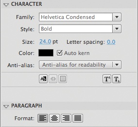
The Properties panel contains several properties that you can adjust for Static Text fields. You’ll focus on a select group of these properties for now, and learn the remainder in Chapter 11. In the Character properties group, you can change these properties:
- Family
The Family property specifies the font you want to use. Because you are working with static text, any font that will display in Flash is appropriate.
- Style
The Style menu includes all font styles (bold, italic, and so on) available for the typeface you chose.
- Size
Size is the type size, in points.
- Letter spacing
The Letter Spacing setting controls the space between all the letters of the text field. This feature is sometimes called tracking in other applications. This is in contrast to kerning, which is the space between two letters.
- Color
Color is the color of the text, and provides access to the pop-up color palette.
- Selectable
The final row of settings in the Character section of the Properties panel is a series of small buttons. The leftmost button controls whether the text is selectable at runtime. This is handy in some cases, such as for copy and paste support. However, if this is not a feature you want to include, it can be annoying because text-selection highlighting and/or the standard I-beam text cursor may appear and distract your users from design or animation. Typically, you should disable this setting.
For paragraphs you can alter:
- Format
The Format property controls the alignment of the text within the field, and can be left, center, right, or full justified.
Note
You can use the Properties panel to apply individual settings to subselections of a text field. For example, different words or paragraphs within the same text field can have different settings.
New to Flash CS4 Professional is the Spray Brush, previously available to Adobe Illustrator users. Found in the Brush submenu of the Tools panel, the Spray Brush automatically adds shapes or symbols to the Stage as long as the mouse button is pressed. It’s like an advanced can of spray paint, spraying graphics instead of plain color. The results of each spray are conveniently collected in a group for easy management.
Figure 2-20 shows a detail of the Properties panel and an example configuration of the Spray Brush. The first setting of the brush dictates whether the brush will use a default shape (a small square) of your color choice, or a symbol from the Library. More on that in a moment.
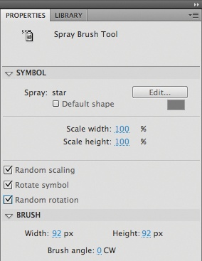
The next section controls the horizontal and vertical scale of the shape or symbol to spray. The final three settings of the panel’s Symbol section control the orientation and randomness applied to the symbol instance as you spray them. Random scaling, as the name implies, scales each symbol instance randomly. Rotate symbol rotates the symbol as it leaves the virtual spray nozzle, orienting the instance based on the movement of the mouse. Rotate randomly rotates each instance randomly, regardless of mouse movement.
Finally, you can use the Brush section of the Properties panel to change the width, height, and angle of the Spray Brush.
Now consider the idea that you can spray a symbol of your choosing instead of the default small square. You learned a bit about symbols in Chapter 1 and you will learn much more about them in the next chapter. Take a quick moment now, however, to review how to create a movie clip symbol. For this exercise, you’ll use a star.
In the Primitives menu of the Tools panel, where the tried-and-true Rectangle and Oval tools reside, you’ll also see the PolyStar tool. This tool can create multisided shapes (polygons) and multipointed shapes (stars, starbursts, and so on). To specify the shape you want to use, deselect any active selection by switching to the Selection tool and clicking on any unoccupied location of the Stage or Pasteboard. With nothing selected, choose the PolyStar tool. A Tool Settings section with an Options button appears in the Properties panel.
Clicking this button brings up a straightforward dialog, shown in Figure 2-21. Using this dialog, you can switch between polygon and star, and dictate the number of sides or size of the star points accordingly.
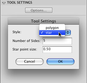
After you’ve configured the PolyStar tool, drag your mouse on the stage to draw a small star, approximately 20 pixels × 20 pixels. Remember, this is going to be sprayed many times from a virtual spray can, so it needs to be small enough to look good in numbers, but big enough to see.
Next, switch to the Selection tool and drag over the entire star to select everything. As you did in Chapter 1, use the Modify→Convert to Symbol menu command. When the resulting dialog appears, choose Movie Clip for the Type property, a center registration point, and name the symbol Star.
Now that you have a symbol in your Library, you can use it instead of the Spray Brush’s default shape. Do so by clicking the Edit button at the top of the Symbol section of the Properties panel while the Spray Brush Tool is active. Figure 2-22 shows the result of spraying with the setting shown in Figure 2-21.


In Chapter 1 you created a template that you will use throughout the asset creation phases, described in this and later chapters. In the following step-by-step instructions, you will focus on creating the assets for the home page, as well as the user interface widget used to control sound playback. If you haven’t already, download the source files from the companion website discussed in the Preface.
As discussed briefly in Chapter 1, it is sometimes useful—especially within teams of multiple Flash designers and developers—to create assets in a dedicated FLA first and then later move them to the final project file. This provides a convenient way for many people to contribute simultaneously to a large job without having more than one person share a single file. In addition, this approach will reinforce skills you’ll learn in future chapters, such as working with multiple libraries and asset positioning.
Figure 2-23 shows the finished version of the file you’re creating. Keep in mind that the interface visible in this figure, including the controls, logo, frame, and paper background, are all part of the guide layer you created in Chapter 1. The guide image has been muted here to remind you that you’ll be focusing on the content within the frame.
Note
Throughout this project, numerical values are provided for entry into the Properties panel. In all cases, feel free to adjust these values to suit your preferences or better match a provided image. Many small factors can contribute to discrepancies in these numbers. For example, your choice of typeface may alter the size of text fields. The exact numbers are not always important. If adjustments don’t disrupt your progress, focus on what looks good and works well for you.
Knowing that the final project dimensions are 750×500 (as described in Chapter 1), it’s helpful to work from your template file. This not only allows you to preview your work in an appropriate setting, but it also contains a correctly positioned movie clip within which you can add your content. You will soon see that this will make it much easier to transfer your work from one file to another.
Create a new file (File→New) using the Content template you created in Chapter 1.
You will be creating the content for the Home page and adding this content later to an ongoing project file. To keep your assets organized, rename the container movie clip by opening the Library and double-clicking the name field of the content movie clip in the vertical list to edit its name. Rename it
HomePage.Moving your attention to the Stage, double-click the placeholder content symbol to open the movie clip for editing (you will delete the placeholder artwork in the next section, after you have added some content). By looking at the breadcrumb trail in the Edit Bar, you should see that you’re inside the newly renamed HomePage movie clip (for more information on the breadcrumb trail, see Chapter 1). If you see that the movie clip is still named content, consider trying step 2 again. The name of the symbol will not affect anything in this FLA, but if you neglect to give each symbol a unique name, it will be harder to manage your assets when you combine them into a larger master file.
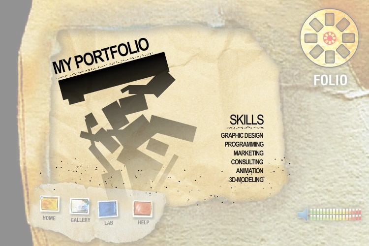
Most prominent on the home page is a title announcing the purpose of the project: an artist’s portfolio. As such, it needs a bold treatment to draw the viewer’s eye. A title will give way to falling shapes leading the user’s focus directly to the project navigation.
Use the Timeline New layer button or the Modify Timeline New Layer menu to add a new layer called
titleto the Timeline of the HomePage movie clip, and place all art created in this section into this layer.Use the Text tool and Properties panel to create a Static text field on the Stage and type
MY PORTFOLIOin the field. The field should be approximately 210 pixels wide × 100 pixels tall. However, this is only relevant because the size of the field may slightly affect numeric input values specified in these instructions. If your text field is larger or smaller, either adjust the field size or adjust the numbers as you enter them to whatever looks best.Note
When adjusting the size of a text field, do not use the Free Transform tool unless you want to distort the text. Use the handles visible when the Selection or Text tools are active. These handles will adjust the size of the field but not the text therein.
For more information about creating text fields or configuring their properties, see the section Creating Static Text, earlier in this chapter.
Select the text field with the Selection tool. Using the Properties panel while the text field is selected, set the Character properties of the field. For the Family setting, specify a strong font worthy of a title. The sample files use Arial Narrow, not as a design choice, but because it is common on both Mac and Windows platforms. Feel free to choose another font. Use a bold Style, and a Size of 36 points. Feel free to change these settings based on your font choice. Use black for the Color and turn off the Selectable option by deselecting the button at the bottom left of the Character properties (if it is enabled). Optionally, set tighter Letter spacing (adjacent to the Size property) if your chosen font warrants this adjustment.
Set the Paragraph properties of the field, choosing Align left for Format.
With the text field selected, use the Transform panel to rotate the field to −15 degrees by clicking on the blue number under the Rotate option and entering
−15. Alternately, the Free Transform tool should snap to −15 degrees if you rotate the field by hand while the tool’s Snap to Objects option is on (in the context-sensitive area at the bottom of the Tools panel).With the text field selected, use the Properties panel to position the field at approximately point 100, 65. Don’t worry too much about the width and height of the field, as these properties will vary depending on your chosen typeface. Just make sure that the entire phrase “My Portfolio” is visible.
Use the Line tool to draw a line anywhere on the stage. Select the line with the Selection tool, then use the Properties panel to set the width and height of the line to
200and1, respectively. Set a Stroke color ofblack, Stroke of4points, and Style ofStippled.Use the Transform panel (or Free Transform tool with Snap to Objects turned on) to rotate the line to
−15degrees. With the line selected, use the Properties panel to position the line at approximately point115,110. Adjust the position based on the font you chose so that the line appears under the title text.Now that you have the title and underline in place, remove the placeholder artwork by deleting the layer with the placeholder content. Lock the title layer by clicking the dot across from the layer name and under the lock icon to prevent unwanted editing in future sections.
Save your file and check your work against the sample file, home_page_01.fla. If desired, feel free to start with this file when moving on to the next section.
Note
Notice that after rotating the line, its width and height are approximately 190 pixels and 50 pixels, respectively. These settings have changed from the original values of approximately 200 and 1, respectively, due to the rotation.
Before moving on to the primary graphical element of the page, you need to repeat the text exercise to add a small list of skills professed by the portfolio owner. Because the process is nearly identical to what you’ve just accomplished, this segment stresses only variances in the tasks outlined previously. From a practical standpoint this is more concise, but, more importantly, it’s also good practice because not every step is described.
Add a new layer called
skillsto the HomePage movie clip Timeline, and place all art created in this section into this layer.Repeat the title creation process, but populate the field with the word
Skills. Use a font style that is not bold (Plain,Regular,Roman,Book, or equivalent), a type size of24, and set Paragraph Format toAlign right. The field should be approximately 75 pixels wide × 36 pixels tall, or make adjustments to the size of the field or any relevant property values specified herein. Remember, the result of your efforts should please you, not adhere rigidly to these values.Do not apply any rotation, and position the text at approximately point
460,225.Create a second underline at approximately point
460,260that is75pixels wide with no rotation.Create another Static text field, and populate it with a handful of one- to two-word skills. Use a
boldstyle of the same font you used previously, at a size of14at approximately point445,265. Set the Paragraph Format toAlign rightagain.Holding down the Shift key, click on all three elements added in this section—the title, underline, and list—and open the Align panel (Windows→Align). With the To stage option
off, click on the Align right edge button (the last of the second group of buttons in the panel). All three elements should now be right-aligned and tidy.Now that you have the remaining text in place, lock the skills layer to prevent unwanted editing in future sections.
Save your file and check your work against the sample file, home_page_02.fla. Again, if you prefer, start with this file when moving on to the next section.
With the page’s text elements behind you, it’s time to move on to the graphic centerpiece.
If you’re not still working inside the HomePage movie clip, double-click the title text you created in the previous segment to open the file for editing.
Add a new layer called
cascadeto the Timeline. You will place all art created in this section into this layer.Select the Rectangle tool from the Tools panel and select Object Drawing mode from the context-sensitive options at the bottom of the panel.
Use the Properties panel to set a Fill color of
black. To choose no color for Stroke, select the red diagonal line (the universal “no” symbol) found near the upper-right corner of the pop-up color palette, accessed from the Tools, Properties, or Color panels.Draw a rectangle approximately the length of the title you created previously (the source file rectangle is approximately 220 pixels wide), and approximately
40pixels in height.With the rectangle selected, use the Transform panel (or Free Transform tool with snapping enabled) to rotate the rectangle to
−15degrees.Position the rectangle under the line beneath the title, at approximately point
120,100.Repeat steps 4 and 5, but vary the size and rotation of the rectangle each time to create several rectangles that appear to cascade down from the title. Create enough rectangles so they eventually exceed the lower bounds of the framed area shown in the guide layer on the main Timeline. Most importantly, overlap some portion of every rectangle so they appear to form a contiguous shape (at least one portion of every rectangle touches some other rectangle so there are no isolated shapes in the mix). Although you have not yet applied the gradient, refer back to Figure 2-23 for an example of what you’re trying to achieve.
Check to make sure you are happy with your cascade, and that at least some portion of every rectangle overlaps some other rectangle, connected in one contiguous piece. After the next step, you won’t be able to edit this layout.
Select all the shapes in the layer. You can either confirm that the only other layer (title) is locked and select all (Edit→Select All), or click on the cascade layer name in the Timeline to select all of the layer’s contents. With all the rectangles selected, break them apart (Modify→Break Apart) so they convert from Drawing Objects to shapes that can merge together. To be sure you did this correctly, click anywhere on the Stage or Pasteboard to deselect the shapes, and then click anywhere in the jumble of rectangles again. All of the shapes should select as one. If not, you can either connect or delete any lone rectangles.
Note
If breaks in the cascade still occur (not all rectangles appear part of one merged shape), you may have neglected to remove the stroke from your Rectangle tool before creating the shapes. If this is the case, select the entire layer, and select the Modify→Shapes→Convert Lines to Fills menu command. This is a handy way of changing any line to a fill if that will make it easier for you to edit.
Lock the cascade layer to prevent unwanted edits, then save your file. Check your work against the sample file, home_page_03.fla or, if desired, start the next with this file.
To reduce the weight of the cascade but still draw the viewer’s eye all the way to the navigation panel, change the fill from solid black to a linear gradient ending in an alpha value of 0. This fade out to transparency will soften the transition to the bottom of the screen.
Return to your HomePage movie clip and unlock the cascade layer. Select the shape cascade using the Selection tool and open the Color panel (Windows→Color). You should be able to select any color, and all the shapes should change to that color. If this is not the case, review all the steps in the previous section carefully. Know, however, that erring in this segment will not affect any other segment, as these results are purely cosmetic.
In the Color panel, select the Fill color chip (which looks like a paint bucket) if it is not already selected. To create the linear gradient you need, select
Linearfrom the Type menu.Select
Extendfrom the Overflow menu to make sure that your gradient continues seamlessly if enough display area is available. For example, the gradient you’ve created in this exercise will continue with 100% black above and 100% transparent below.Create a gradient with two colors at the extreme ends of the gradient-editing bar. Make the left color
blackwith an alpha value of100and the right colorblackwith an alpha value of0. Refer back to the Creating gradients section of this chapter for more information.If your shape cascade is not already fading, select the Paint Bucket tool from the Tools panel and click in the shape. Don’t worry about the placement or size of the fade yet. It may default to the correct black-to-transparent appearance but orient horizontally, or it may look like a different gradient or even a solid if the scale of the gradient is not correct. If the shape is selected, deselect it by clicking in any unoccupied area of the Stage or Pasteboard. This will give you a better look at the gradient. The best indication that the gradient has been applied is to look in the Fill color chip in the Tools panel while the shape is selected. The chip should resemble the gradient you created, even if the shape does not.
Once you’re sure that the gradient has been applied, use the Gradient Transform tool to set its appearance. As discussed previously, this tool is found in the Transform tool menu below the Subselection tool. With the tool selected, click on the shape. Scale the gradient to fit the shape (refer back to the Gradient Transform Tool section of this chapter for more information). Using the same Gradient Transform tool, rotate the gradient to orient it vertically, with black at the top.
When you are happy with your gradient, relock the cascade layer and save your file. Check your work against the sample file, home_page_04.fla. If the files don’t match to your satisfaction, look over your work or start with the provided file when moving on to the next section.
Tying the stippled underlines in with the overall distressed look of the portfolio, it’s time for grime. Use the Spray Brush tool to quickly and easily add black shapes of random size along the bottom of the screen:
Create a new layer at the top of the Timeline and name it
spray.Select the Spray Brush tool (found in the Brush menu in the Tools panel) and configure its settings. Maintain the default settings of
blackcolor, Scale of100, Brush Width and Height of96, and Brush angle of0. Enable the Random scaling option to randomly adjust shape size during spray.In the spray layer, spray the brush along the bottom edge of the content area so that grime is deposited both inside and outside the frame area. This will make the grime appear more natural within the frame. After trying these settings, you may want to adjust the brush size, through trial and error, to affect the density of the grime.
Once you are happy with your filth, lock the spray layer to prevent unwanted future changes.
Save your file and check your work against the sample file, home_page_05.fla.
In the next chapter, you’ll practice with the Deco tool and get an early taste of ActionScript (just for fun). The example will provide an entrée into the use of Flash symbols, the topic of the next chapter.
You’ll also practice editing vectors using both the Selection and Subselection tools, and you’ll create your first mask—a layer that will only make parts of specific underlying content visible to the user.