
Chapter 6. Dimensions
Introduction
Dimensions are a core part of adding advanced behaviors to a website. Once you know how to manipulate the dimensions of elements and their position on the page, you will have a new level of control over your user interface, providing desktop-like behaviors and interactions in your application.
6.1. Finding the Dimensions of the Window and Document
Solution
jQuery’s width and height methods provide easy access to the basic dimensions of
the window or document:
jQuery(document).ready(function() {
    alert('Window height: ' + jQuery(window).height()); // returns the height of
the viewport
    alert('Window width: ' + jQuery(window).width()); // returns the width of the
viewport

    alert('Document height: ' + jQuery(document).height()); // returns the height
of the document
    alert('Document width: ' + jQuery(document).width()); // returns the width of
the document
});
Discussion
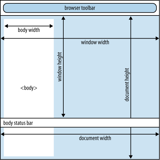
It’s important to understand that the width and height of the
document can (and likely will) be different from the width and height
of the window. The dimensions of the window refer to the size of the
viewport—that portion of the browser that is available for displaying
a document. The dimensions of the document refer to the size of the
document itself. In most cases, the document height will be taller
than the window’s height. The document’s width will always be at least
the window’s width but may be greater than the window’s width. In
Figure 6-1, jQuery('body').width() < jQuery(document).width(), and jQuery(document).width() == jQuery(window).width(). If the body were
wider than the window, the document width would increase
accordingly.
The width and height methods can also accept arguments if
you want to set the dimensions
of an element. The argument can be provided as an integer—in which
case it will be interpreted as a pixel measurement—or as a string, in
which case it is interpreted as a CSS-like measurement (i.e., $('#foo').width('300px')).
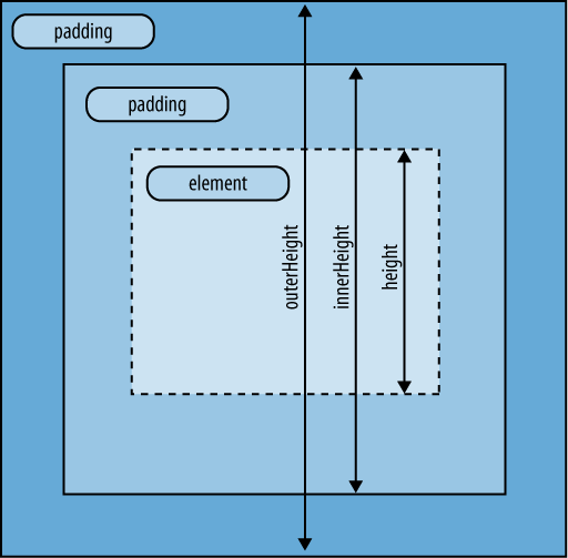
6.2. Finding the Dimensions of an Element
Solution
The width and height methods can be applied to any
element, and they are useful for determining the computed width or
height of an element. However, they fall short if you need to
determine the actual real estate that an element is occupying on the
screen. In addition to width and
height, jQuery provides the
following methods for determining more specific dimensions of an
element:
For a visual reference, see Figure 6-2.
Given the following HTML:
<div id="results"></div>
<div id="myDiv">Some text.</div>
and the following CSS:
#myDiv {
    width:100px;
    height:30px;
    padding:10px;
    border:1px;
}
you could expect the following:
jQuery(document).ready(function() {
    var $myDiv = jQuery('#myDiv'),
    var $results = jQuery('#results'),

    jQuery('<p>Computed width: ' + $myDiv.width() + '</p>')
        .appendTo($results); // 100
    jQuery('<p>Computed height: ' + $myDiv.height() + '</p>')
        .appendTo($results); // 30
    jQuery('<p>Inner width: ' + $myDiv.innerWidth() + '</p>')
        .appendTo($results); // 120
    jQuery('<p>Inner height: ' + $myDiv.innerHeight() + '</p>')
        .appendTo($results); // 50
    jQuery('<p>Outer width: ' + $myDiv.outerWidth() + '</p>')
        .appendTo($results); // 122
    jQuery('<p>Outer height: ' + $myDiv.outerHeight() + '</p>')
        .appendTo($results); // 52

    jQuery('<p>Document outer height: ' + jQuery(document).outerHeight() + '</p>')
        .appendTo($results); // NaN
    jQuery('<p>Document inner height: ' + jQuery(document).innerHeight() + '</p>')
        .appendTo($results); // NaN
    jQuery('<p>Window outer height: ' + jQuery(window).outerHeight() + '</p>')
        .appendTo($results); // NaN
    jQuery('<p>Window inner height: ' + jQuery(window).innerHeight() + '</p>')
        .appendTo($results); // NaN
});
Discussion
The innerWidth/innerHeight and outerWidth/outerHeight methods are useful tools for
determining the actual dimension that you’re after—the basic width and
height methods are of limited use when you are trying to measure the
actual real estate that an element with border and padding occupies on
the screen.
Note that using innerWidth,
innerHeight, outerWidth, or outerHeight methods on jQuery(document) or
jQuery(window) objects will return
NaN.
6.3. Finding the Offset of an Element
Solution
jQuery offers three methods that are useful in determining an element’s position:
offsetReturns an object containing the position of the top-left corner of the element relative to the document’s top-left corner
positionReturns an object containing the position of the top-left corner of the element relative to the top-left corner of the first positioned parent of the element (the
offsetParent)offsetParentReturns a jQuery object containing the
offsetParentof the element
The offset method is useful
for determining the location of an element on the page—for example, if
you want to scroll the window to an element. The position method is useful for repositioning
elements and for finding the position of an element in a scrolling
container. Both tasks will be discussed in subsequent sections; this
section seeks to serve as an overview to the positioning
methods.
Given the following HTML where the <body> element has 0-pixel margin and
10-pixel padding:
<body id="the_offset_parent">
    <h1>Finding the Offset of an Element</h1>
    <div id="foo">
        <div id="bar">Some text inside #bar, which is inside #foo</div>
    </div>

    <div id="results"></div>
</body>
you can use the following code to determine the position,
offset, and offset parent of the two DIVs:
jQuery(document).ready(function() {
    var $foo = jQuery('#foo'),
    var $bar = jQuery('#bar'),

    var $results = jQuery('#results'),
    var fooPosition = $foo.position();
    var barPosition = $bar.position();
    var fooOffset = $foo.offset();
    var barOffset = $bar.offset();

    var $fooOffsetParent = $foo.offsetParent();
    var $barOffsetParent = $bar.offsetParent();

    $results
        .append('<p>#foo position.top: ' + fooPosition.top + '</p>') // 10
        .append('<p>#foo position.left: ' + fooPosition.left + '</p>') // 10
        .append('<p>#bar position.top: ' + barPosition.top + '</p>') // 10
        .append('<p>#bar position.left: ' + barPosition.left + '</p>') // 10

        .append('<p>#foo offset.top: ' + fooOffset.top + '</p>') // 10
        .append('<p>#foo offset.left: ' + fooOffset.left + '</p>') // 10
        .append('<p>#bar offset.top: ' + barOffset.top + '</p>') // 10
        .append('<p>#bar offset.left: ' + barOffset.left + '</p>') // 10

        .append('<p>ID of #foo offsetParent: '
            + $fooOffsetParent.attr('id')) // the_offset_parent
        .append('<p>ID of #bar offsetParent: '
            + $barOffsetParent.attr('id')); // the_offset_parent
});
In this case, both elements have the same position, and both
have the same offsetParent (the document’s <body> element).
However, if #foo is
positioned using CSS:
<body id="the_offset_parent">
    <div id="foo" style="position:absolute; top:10px; left:10px;">
        <div id="bar">Some text inside #bar, which is inside the
absolutely-positioned #foo</div>
    </div>

    <div id="results" style="position:absolute; top:60px; left:10px;"></div>
</body>
then the results change. The #foo DIV
hasn’t actually moved and its offsetParent hasn’t changed, so its position
and offset stay the same; the #bar
DIV hasn’t moved either, but since
its offsetParent has changed, its
position has changed—remember, an element’s position is relative to
its offset parent.
jQuery(document).ready(function() {
    var $foo = jQuery('#foo'),
    var $bar = jQuery('#bar'),

    var $results = jQuery('#results'),
    var fooPosition = $foo.position();
    var barPosition = $bar.position();
    var fooOffset = $foo.offset();
    var barOffset = $bar.offset();

    var $fooOffsetParent = $foo.offsetParent();
    var $barOffsetParent = $bar.offsetParent();

    $results
        .append('<p>#foo position.top: ' + fooPosition.top + '</p>') // 10
        .append('<p>#foo position.left: ' + fooPosition.left + '</p>') // 10
        .append('<p>#bar position.top: ' + barPosition.top + '</p>') // 0
        .append('<p>#bar position.left: ' + barPosition.left + '</p>') // 0

        .append('<p>#foo offset.top: ' + fooOffset.top + '</p>') // 10
        .append('<p>#foo offset.left: ' + fooOffset.left + '</p>') // 10
        .append('<p>#bar offset.top: ' + barOffset.top + '</p>') // 10
        .append('<p>#bar offset.left: ' + barOffset.left + '</p>') // 10

        .append('<p>ID of #foo offsetParent: '
            + $fooOffsetParent.attr('id')) // the_offset_parent
        .append('<p>ID of #bar offsetParent: '
            + $barOffsetParent.attr('id')); // foo
});
Discussion
The important thing to remember is this: the offset method will always give you an
element’s position relative to the document. The return value of the
position method
may be the element’s position relative to the
document, depending on whether the element has an offsetParent. If the element has an offsetParent—that is, a parent element that
has positioning applied to it—then the position method will provide
information about the position of the element relative to the offsetParent, not to
the document.
6.4. Scrolling an Element into View
Solution: Scrolling the Whole Window
If you need to scroll the whole window, you’ll use the offset method to determine the location
of the destination element relative to the document and then
use the scrollTop method to scroll the document to bring the element into
view.
For example, let’s say you want to scroll to the #foo element when the user clicks the
#bar element:
jQuery('#bar').click(function() {
    var fooOffset = jQuery('#foo').offset(),
        destination = fooOffset.top;
    jQuery(document).scrollTop(destination);
});
Solution: Scrolling Inside an Element
If your destination element is inside a scrolling container,
you’ll use the position method to
determine the location of the destination element relative to the
container, add it to the current scroll position of the container, and
then use the scrollTop method to
scroll the container to bring the element into view. Note that the
scrolling container must be positioned—using position: relative, position: absolute, or position: fixed—in order for this to
work.
For example, consider the following markup, styled so that
#foo is not large enough to show
both paragraphs at once.
<head>
    <style>
    #foo {
    width:300px;
    padding:10px;
    height:20px;
    border:1px solid black;
    overflow:auto;
    position:relative;
    }
    </style>
</head>
<body>
    <input type="button" id="bar" value="Click to scroll to last paragraph" />
    <input type="button" id="bam" value="Click to scroll to last paragraph with
animation" />
    <div id="foo">
    <p>This is the first paragraph. Lorem ipsum dolor sit amet, consectetur
adipisicing elit, sed do eiusmod tempor incididunt ut labore et dolore magna
aliqua. Ut enim ad minim veniam, quis nostrud exercitation ullamco laboris nisi
ut aliquip ex ea commodo consequat. Duis aute irure dolor in reprehenderit in
voluptate velit esse cillum dolore eu fugiat nulla pariatur. Excepteur sint
occaecat cupidatat non proident, sunt in culpa qui officia deserunt mollit anim
id est laborum.</p>
    <p>This is the second paragraph. Lorem ipsum dolor sit amet, consectetur
adipisicing elit, sed do eiusmod tempor incididunt ut labore et dolore magna
aliqua. Ut enim ad minim veniam, quis nostrud exercitation ullamco laboris nisi
ut aliquip ex ea commodo consequat. Duis aute irure dolor in reprehenderit in
voluptate velit esse cillum dolore eu fugiat nulla pariatur. Excepteur sint
occaecat cupidatat non proident, sunt in culpa qui officia deserunt mollit anim
id est laborum.</p>
    <!-- several more paragraphs -->
    </div>
</body>
Scrolling #foo to show the
last paragraph is simple:
var $foo = jQuery('#foo'),
$('#bar').click(function() {
    var lastParagraphPosition = jQuery('#foo p:last').position();
    var scrollPosition = $foo.scrollTop() + lastParagraphPosition.top;
    $foo.scrollTop(scrollPosition);
});
In both of these examples, the scrolling happens
instantaneously—efficient, but not necessarily attractive. The animate
method will animate an element’s scrollTop property, so animating the
transition is trivial. Here’s how we would do it for the scrolling
container:
var $foo = jQuery('#foo'),
$('#bam').click(function() {
    var lastParagraphPosition = jQuery('#foo p:last').position();
    var scrollPosition = $foo.scrollTop() + lastParagraphPosition.top;
    jQuery('#foo').animate({scrollTop: scrollPosition}, 300);
});6.5. Determining Whether an Element Is Within the Viewport
Problem
You want to determine whether an element is visible within the viewport; further, you want to determine the percentage of the element that is visible and scroll to it if it is less than 50 percent visible.
Solution
This makes use of several of the methods discussed in earlier sections of this chapter.
There are several steps to this process:
Determine the size of the viewport.
Determine the scroll position of the document.
Figure out the minimum and maximum values for the top and left positions of the element if the element is visible.
Test the position of the element against those values.
jQuery(document).ready(function() {
    var viewportWidth = jQuery(window).width(),
        viewportHeight = jQuery(window).height(),

        documentScrollTop = jQuery(document).scrollTop(),
        documentScrollLeft = jQuery(document).scrollLeft(),

        minTop = documentScrollTop,
        maxTop = documentScrollTop + viewportHeight,
        minLeft = documentScrollLeft,
        maxLeft = documentScrollLeft + viewportWidth,

        $myElement = jQuery('#myElement'),
        elementOffset = $myElement.offset();
    if (
        (elementOffset.top > minTop && elementOffset.top < maxTop) &&
        (elementOffset.left > minLeft &&elementOffset.left < maxLeft)
    ) {
        alert('element is visible'),
    } else {
        alert('element is not visible'),
    }
});
With this solution, we know whether the top of the element is visible in the viewport; a better solution would test whether the entire element was contained in the viewport:
jQuery(document).ready(function() {
    var viewportWidth = jQuery(window).width(),
        viewportHeight = jQuery(window).height(),
        documentScrollTop = jQuery(document).scrollTop(),
        documentScrollLeft = jQuery(document).scrollLeft(),

        $myElement = jQuery('#myElement'),

        elementOffset = $myElement.offset(),
        elementHeight = $myElement.height(),
        elementWidth = $myElement.width(),

        minTop = documentScrollTop,
        maxTop = documentScrollTop + viewportHeight,
        minLeft = documentScrollLeft,
        maxLeft = documentScrollLeft + viewportWidth;

    if (
        (elementOffset.top > minTop && elementOffset.top + elementHeight < maxTop) &&
        (elementOffset.left > minLeft && elementOffset.left + elementWidth < maxLeft)
    ) {
        alert('entire element is visible'),
    } else {
        alert('entire element is not visible'),
    }
});
Alternatively, we could look at how much of the element is visible—if it is less than a certain amount, then we can scroll to the element:
jQuery(document).ready(function() {

var viewportWidth = jQuery(window).width(),
    viewportHeight = jQuery(window).height(),

    documentScrollTop = jQuery(document).scrollTop(),
    documentScrollLeft = jQuery(document).scrollLeft(),

    $myElement = jQuery('#myElement'),

    verticalVisible, horizontalVisible,

    elementOffset = $myElement.offset(),
    elementHeight = $myElement.height(),
    elementWidth = $myElement.width(),

    minTop = documentScrollTop,
    maxTop = documentScrollTop + viewportHeight,
    minLeft = documentScrollLeft,
    maxLeft = documentScrollLeft + viewportWidth;

function scrollToPosition(position) {
    jQuery('html,body').animate({
        scrollTop : position.top,
        scrollLeft : position.left
    }, 300);
}

if (
    ((elementOffset.top > minTop && elementOffset.top < maxTop) ||
    (elementOffset.top + elementHeight > minTop && elementOffset.top +
elementHeight < maxTop))
&&
    ((elementOffset.left > minLeft && elementOffset.left < maxLeft) ||
    (elementOffset.left + elementWidth > minLeft && elementOffset.left +
elementWidth < maxLeft))
) {
    alert('some portion of the element is visible'),

    if (elementOffset.top >= minTop && elementOffset.top + elementHeight
<= maxTop) {
        verticalVisible = elementHeight;
    } else if (elementOffset.top < minTop) {
        verticalVisible = elementHeight - (minTop - elementOffset.top);
    } else {
        verticalVisible = maxTop - elementOffset.top;
    }

    if (elementOffset.left >= minLeft && elementOffset.left + elementWidth
<= maxLeft) {
        horizontalVisible = elementWidth;
    } else if (elementOffset.left < minLeft) {
        horizontalVisible = elementWidth - (minLeft - elementOffset.left);
    } else {
        horizontalVisible = maxLeft - elementOffset.left;
    }

    var percentVerticalVisible = (verticalVisible / elementHeight) * 100;
    var percentHorizontalVisible = (horizontalVisible / elementWidth) * 100;

    if (percentVerticalVisible < 50 || percentHorizontalVisible < 50) {
        alert('less than 50% of element visible; scrolling'),
        scrollToPosition(elementOffset);
    } else {
        alert('enough of the element is visible that there is no need to scroll'),
    }

} else {
    // element is not visible; scroll to it
    alert('element is not visible; scrolling'),
    scrollToPosition(elementOffset);
}

});
Note
The scrollTo
plugin by Ariel Flesler provides excellent shorthand
access to many of these methods by allowing you to simply write
$.scrollTo('#myElement'); it takes
care of determining the position of the destination element.
6.6. Centering an Element Within the Viewport
Solution
Get the viewport’s dimensions; determine the width, height, and offset of the element; and use a little math to center the element in the viewport:
jQuery(document).ready(function() {
    jQuery('#bar').click(function() {
        var viewportWidth = jQuery(window).width(),
            viewportHeight = jQuery(window).height(),

            $foo = jQuery('#foo'),
            elWidth = $foo.width(),
            elHeight = $foo.height(),
            elOffset = $foo.offset();

        jQuery(window)
            .scrollTop(elOffset.top + (elHeight/2) - (viewportHeight/2))
            .scrollLeft(elOffset.left + (elWidth/2) - (viewportWidth/2));
    });
});
In the final lines, we add the top offset of the element to half the element’s height in order to determine the vertical center of the element. Then we subtract half the viewport’s height to determine the position to which we want the window to scroll. Finally, we do an analogous calculation to center the viewport horizontally.
6.7. Absolutely Positioning an Element at Its Current Position
Solution
To accomplish this, we simply get the position of the element and then use it to set the element’s CSS properties accordingly:
var $myElement = jQuery('#foo p').eq(0),
            elPosition = $myElement.position();

        $myElement.css({
            position : 'absolute',
            top : elPosition.top,
            left : elPosition.left
        });
We can also easily reposition an element relative to its current position:
var $myElement = jQuery('#foo p').eq(1),
            elPosition = $myElement.position();

        $myElement.css({
            position : 'absolute',
            top : elPosition.top + 20,
            left : elPosition.left + 20
        });
6.8. Positioning an Element Relative to Another Element
Solution
Get the width, height, and offset of the existing element, and use the values to position the new element accordingly.
Given the following HTML:
<style>
#foo {
    width: 300px;
    height: 100px;
    border: 1px solid red;
    padding: 5px;
}
#tooltip {
    border: 1px solid black;
    padding: 5px;
    background-color: #fff;
</style>

<div id="foo">An existing element</div>
the following code would add an element as a sibling to the existing element but positioned “inside” the element, 10 pixels from the top and 10 pixels from the left of the existing element’s top-left corner, and with a width 20 pixels less than that of the existing element:
jQuery(document).ready(function() {
    var $foo = jQuery('#foo'),
        fooPosition = $foo.position(),
        $tooltip = $('<div id="tooltip">A new element</div>').insertAfter($foo);

    $tooltip.css({
        position : 'absolute',
        top : fooPosition.top + 10,
        left : fooPosition.left + 10,
        width : $foo.width() - 20
    });
});
If you wanted to add the new element somewhere else in the page—that is, if you didn’t want it to be a sibling of the existing element—you could adjust your code to look at the offset of the original element rather than the position:
jQuery(document).ready(function() {
    var $foo = jQuery('#foo'),
        fooOffset = $foo.offset(),
        $tooltip = $('<div id="tooltip">A new element</div>').appendTo('body'),

    $tooltip.css({
        position : 'absolute',
        top : fooOffset.top + 10,
        left : fooOffset.left + ($foo.width() / 2),
        width : $foo.width() - 20
    });
});
6.9. Switching Stylesheets Based on Browser Width
Solutions
There are a few solutions to this problem. One changes the
class attribute of the body
element, another changes the href
attribute of the stylesheet you want to change, and the third includes
all size-related stylesheets on the page but enables only one of them
at a time.
In each case, we’ll create a function that checks the width of
the browser and bind that function to the document’s ready event and to the window’s resize event. The checkWidth function will then call the
setSize function, which we’ll
define based on the approach we’re taking:
var checkWidth = function() {
    var browserWidth = $(window).width();
    if (browserWidth < 960) {
        setSize('small'),
    } else {
        setSize('large'),
    }
};

jQuery(document).ready(function() {
    checkWidth();
    $(window).resize(checkWidth);
});
The definition of the setSize
function depends on how you want to switch styles.
Solution 1: Changing the Class on the Body Element
var setSize = function(size) {
    var $body = jQuery('body'),
      jQuery('body').removeClass('large small').addClass(size);
};
Solution 2: Changing the href Attribute of the Stylesheet That’s Responsible for Size-Related Styling
Let’s assume you have the following size-related stylesheet in your document:
<link rel="stylesheet" type="text/css" id="css_size" href="size-small.css" />
In this case, you would define the setSize function as follows:
var setSize = function(size) {
    var $css = jQuery('#css_size'),
    $css.attr('href', 'size-' + size + '.css'),
};
Note that in this case, the new CSS file is requested from the server, which is likely to cause a brief delay in the style change occurring. For this reason, this is perhaps the least-preferable method.
Solution 3: Include All Size-Related Stylesheets in the Page, but Enable Only One at a Time
<link rel="stylesheet" type="text/css" class="css_size small" href="size-small.css" />
<link rel="alternate stylesheet" type="text/css" class="css_size large"
    href="size-large.css" disabled=true/>
In this case, you would define the setSize function as follows:
var setSize = function(size) {

    jQuery('link.css_size').each(function() {
        var $this = $(this);
        if ($this.hasClass(size)) {
            $this
                .removeAttr('disabled')
                .attr('rel', 'stylesheet'),
        } else {
            $this
                .attr('disabled', true)
                .attr('rel', 'alternate stylesheet'),
        }
    });
};
In this approach, all stylesheets are loaded at page load, and nothing new is fetched when switching from one stylesheet to another. This eliminates the delay caused by solution 2 but it also results in potentially unnecessary HTTP requests if your user is unlikely to need the alternate stylesheets.
Discussion
There is no definitive answer to which of the three style-switching methods is the best. When choosing a method, you’ll want to consider how likely your users are to need a different stylesheet, how big your size-related stylesheets are, and how you prefer to manage your size-related styles. In many cases, the method from the first solution will be both sufficient and preferable.