In this chapter, you will:
Explore what’s new for working with text in Word 2010 and Word for Mac 2011
Understand key essentials for working with typography tools in Word
Learn how to create the look of professional typesetting in your documents
Get tips for working with the new generation of WordArt
Examine how to use font and paragraph formatting as layout tools
You’re an experienced user of Microsoft Word. You know it’s not a typewriter. But do you find yourself fighting with documents just to get your text or layout looking right? If so, you’re probably just trying too hard.
In Chapter 6, we looked at why Word behaves the way it does—such as when text seems to take on formatting other than what you intended. (If you still think that’s true, give Chapter 6 a look before continuing here.) But if you spend time fussing and fighting to lay out pages or make content fit, you might be overlooking the easiest alternatives. So before you mess with floating objects or even tinker with tables, explore how you can use the character and paragraph formatting that you apply to text to easily manage many aspects of document layout.
Sound good? Great. But that’s the last part of this chapter. Before we get there, Word 2010 and Word for Mac 2011 have two new text features that can be as much fun for font fanatics as for those who think a serif is a landless peasant from the Middle Ages. So, let’s get started by checking out new support for OpenType typography features and new text effects.
Note
See Also After you’ve reviewed this chapter, learn more about working with font and paragraph formatting in Chapter 8.
Word 2010 and Word 2011 both introduce support for several OpenType typography features as well as formatting effects that you can apply directly to document text, such as the examples shown in Figure 7-1.
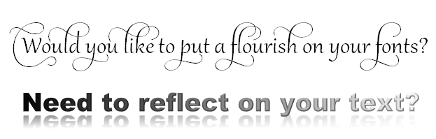
Figure 7-1. Stylistic sets (top) are one of the newly supported OpenType typography features. The gradient fill, bevel, and reflection applied to text (bottom) are among the new text effects features.
Word now supports OpenType typography features including ligatures, stylistic sets, number forms and spacing, and contextual alternates when they’re present in a font. What does that mean? In a nutshell, you can format text to look like it was professionally typeset. And you can get pretty creative with it, as you see in the top image of Figure 7-1.
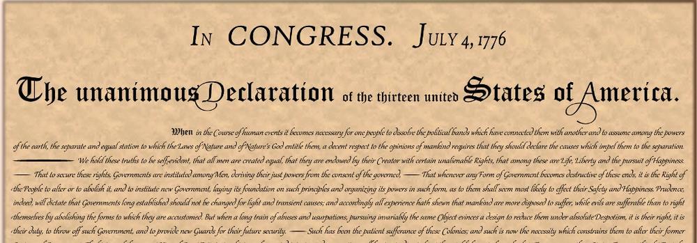
How can you really use features like this? Why not start a revolution? Check out the loose reproduction of the Declaration of Independence shown in Figure 7-2. Microsoft recently engaged me to create this document using Word 2010, and it was one of the most fun document projects I’ve done. And it wouldn’t have been possible without support for OpenType typography features.
Figure 7-2. A portion of a reproduction of the Declaration of Independence created in Word 2010, using new OpenType typography support.
But you don’t have to be reproducing historical documents to take advantage of these tools. Features like ligatures and stylistic sets can add a beautiful, elegant touch to more traditional documents when used for the right reasons and at the right time.
Note
See Also Learn about each of the supported OpenType typography tools and how to use them in the next section of this chapter, Introducing the OpenType Typography Tools. To download and check out this document for yourself, visit the Office.com page “Word 2010 for all your Revolutionary ideas” available at http://office.microsoft.com/en-us/word/word-2010-documents-for-all-your-revolutionary-ideas-FX102226936.aspx?CTT=1 (Note that some fonts in this reproduction are not available in Office for Mac.)
Wondering about the right reasons and right time to use features like OpenType typography support? See the sidebar The Good and Evil of Text Formatting: Don’t Let the Document Wear You at the end of this section.
In previous versions of Word, the feature known as WordArt was, well, pretty sad—fussy, often frustrating, and rarely useful for professional documents. In its place, we now have the text effects that you might already know from Microsoft PowerPoint and Excel in Office 2007 and Office 2008 for Mac.
The biggest benefit of the new text effects in Word is that you can apply them directly to document text (no more embedded objects). In addition, you can include them in character and paragraph styles. Text effects are also much more flexible than the old WordArt and offer more professional effect options. They’re part of the Office Art graphics engine (along with shapes, SmartArt, and Excel charts) and give you formatting effects similar to those you know for other Office Art objects.
Note
See Also Learn about the available text effects and how to use them in the section Introducing Text Effects: The New Generation of WordArt, later in this chapter. And learn more about formatting for other Office Art content (such as shapes and diagrams) in Chapter 14.
Note
The terms text effects and WordArt (and text styles, in Office for Mac 2011) are used fairly interchangeably throughout the programs. You most often see the term WordArt where the feature either inserts or formats a text box containing text that uses effects; you see text effects or text styles referenced where you can apply the formatting to your selected text. They are largely the same features, but where the effects are applied (that is, to document text or to text in a text box) does change your options a bit. You’ll learn more about this later in this chapter.
There are undoubtedly some of you reading this book who saw support for features like ligatures and stylistic sets, jumped up from your seats, and exclaimed “finally!” But the other 95 percent of you might be wondering just what the heck a ligature or stylistic set is and whether you should care.
In this section, you’ll learn about each of the available typography features in Word 2010 and Word 2011, and how to use them.
The features you’ll see in this section aren’t actually features in Word. They’re features that are included in some fonts by the font designer. What’s new about this in Word is that when a font contains these features, Word now gives you the ability to utilize them in your documents.
However, a font has to include a given feature for the related Word tools to have any effect. For example, if you turn on ligatures for your text and nothing happens, that doesn’t mean the Word feature isn’t working. It most likely means that the font you’re using doesn’t include ligatures.
For each typography feature addressed in the upcoming section, Exploring the OpenType Typography Features Available in Word, you’ll see an example of a built-in font available in Office 2010 or Office 2011, which you can use to try the feature for yourself.
Access any of the features discussed here on the Advanced tab of the Font dialog box, shown in Figure 7-3.
Notice that these features are referred to as OpenType Features in Word 2010 and Advanced Typography in Word 2011, but the options are largely the same.
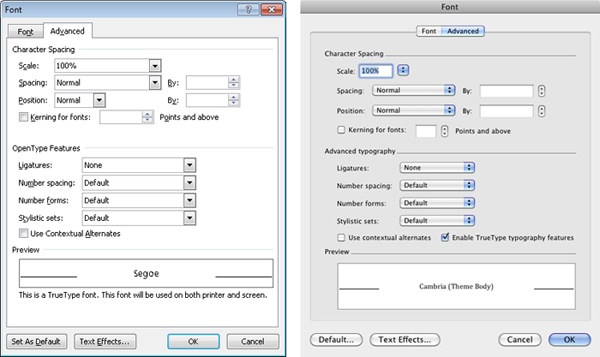
Figure 7-3. The Advanced tab of the Font dialog box, shown in Word 2010 (left) and Word 2011 (right).
To access this dialog box in Word 2010, on the Home tab, in the Font group, click the dialog launch icon. You can also use the keyboard shortcut Ctrl+D, unless a graphic object is selected (in which case, the shortcut duplicates the object).
In Word 2011, on the Format menu, click Font (or press Command+D if your selection is not a graphic object). Additionally, on the Home tab in Publishing Layout view, you see the Typography group by default. And you can configure the Ribbon in the Word Preferences dialog box to show this group in Print Layout view as well.
Unfortunately, there is nothing in the interface that indicates whether a feature is available in a given font. So this section endeavors to provide you with some guidance to cut down on trial and error. One or more of the supported typography features are present in the following list of built-in fonts available in both Office 2010 and Office 2011:
Note
See Also To learn more about the Clear Type fonts, and see visual examples and a list of which OpenType features are included in each, visit http://microsoft.com/typography/cleartypefonts.mspx.
Note
In addition to the C fonts and Gabriola, the built-in Segoe fonts available in Office 2010 contain some supported OpenType features. These fonts include Segoe Print, Segoe Script, and Segoe UI. Note that these fonts are not available in Office 2011.
Considering all the fonts that you see in the Font list in Word, that doesn’t seem like very many to choose from. But keep in mind that the C fonts and Gabriola are all cross-platform fonts that are available in any edition of Office 2010 or Office 2011. So, in addition to being flexible fonts with some creative features, they’re also good choices for sharing documents.
Note
You can, of course, purchase custom fonts that support many of these features, and there are a vast number of them to choose from. In fact, you might find cross-platform versions of fonts that are built in on only one platform (such as the previously referenced Mac OS font Zapfino, which is available in a Windows-compatible OpenType format from Linotype, at linotype.com). However, with Zapfino or any custom font, be sure that it supports the features you need before you purchase it. Also consider how you need to share the document. If you will be sharing it electronically, it’s might be a good idea to stick with built-in fonts that are widely available to electronic recipients.
Note
See Also For more about font availability in Microsoft Office versions, see Chapter 3.
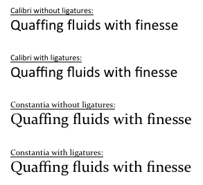
Ligatures are combined character pairs, such as the ff, fl, and fi pairs shown in Figure 7-4. In addition to Calibri and Constantia, shown in the figure, the built-in fonts Candara, Consolas, Corbel, Gabriola, and Segoe Script all contain some ligatures.
In the Font dialog box (or the Typography group in Word 2011), you see options for Standard, Contextual, and Historical And Discretionary ligatures.
Standard ligatures are those commonly thought to be appropriate for a given language.
Contextual ligatures are nonstandard ligatures added by the font designer for any use of the specific font.
Historical ligatures are those that were standard at one time but are no longer commonly used.
Discretionary ligatures are added by the font designer for a specific use with the particular font.
Stylistic sets replaced the default glyphs (characters) with stylistic alternatives that can either subtly or dramatically vary the appearance of text. Of the built-in fonts available in Microsoft Office, only Gabriola has significant stylistic sets, as shown in Figure 7-5. This font contains seven stylistic sets.
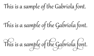
Figure 7-5. The Gabriola font shown with default glyphs (top), stylistic set five (center), and stylistic set seven (bottom).
Caution
The most dramatic Gabriola stylistic sets (six and seven) use extreme ascenders and descenders, as you can see at the bottom of Figure 7-5 in stylistic set seven. Both Word 2010 and Word 2011 fail to adjust line height automatically for these fantastic flourishes. So when you use these stylistic sets, be sure to increase line spacing, or your result will likely be less than fabulous.
Number spacing options in the Font dialog box (or the Typography group in Word 2011) include Proportional and Tabular. Number Forms options include Lining and Old Style.
Proportional number spacing allots a different width based on the numeric character (for example, the space allotted for 0 is wider than for 1).
Tabular number spacing allots the same width to all characters.
Lining number forms provide numbers that are all identical in height and that all sit on the text baseline.
Old Style number forms provide numbers that differ in height by character, with characters extending either above or below the text baseline.
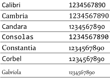
The differences in the preceding options are demonstrated in Figure 7-6. The built-in fonts that support these features in both Word 2010 and Word 2011 are listed in Table 7-1.
Table 7-1. Number spacing and number forms support in Word 2010 and Word 2011
Tabular spacing | Proportional spacing | Lining forms | Old Style forms | |
|---|---|---|---|---|
Calibri | Default | No visual effect | Default | Supported |
Cambria | Default | Supported | Default | Supported |
Candara | Supported | Default | Supported[a] | Default |
Consolas | Default | No visual effect | Default | Supported |
Constantia | Supported | Default | Supported | Default |
Corbel | Supported | Default | Supported | Default |
Gabriola | No visual effect | Default | Supported | Default |
[a] Lining number forms in the Candara font do not appear to be identical in height. Some characters may appear to slightly exceed the text baseline. | ||||
As you’ve seen, ligatures, stylistic sets, and number forms and spacing can have a substantial impact on the appearance of your text. Word 2010 and Word 2011 support two additional OpenType typography features that are less obvious but may be extremely useful in some circumstances.
Contextual alternates will alter individual characters based on surrounding characters where useful to improve the visual flow of text. These changes are typically extremely subtle. The Cambria font uses some contextual alternates. Segoe Script (available in Office 2010) does as well.
You might already be familiar with font kerning, a feature that balances character spacing in proportional fonts. Though it’s been available in Word for several years, the feature has been enhanced in Word 2010 and Word 2011. Now, when kerning specifications are defined in the OpenType feature tables within a font file, Word uses the definitions provided by the font designer for more precise, often better results.
As mentioned earlier, the text effects that are new to Word 2010 and Word 2011 may not be new to you as experienced Microsoft Office users. If you have used Office 2007 or Office 2008 for Mac, you might already know these features from PowerPoint and Excel.
Essentially, the new text effects (also called WordArt or, in Word 2011, text styles, depending upon how you access them) give you the ability to apply effects such as gradient fills, reflections, bevels, and internal or external shadows directly to the text in your document. No more embedded objects, no more stilted and inflexible effects. You can now apply text effects just like you apply attributes such as bold and underline. You can also include text effects in character and paragraph styles.
Note
Because the Office Art formatting available to text effects in Word is covered elsewhere in this book, this section focuses on specific tips for working with text effects in Word.
Note
See Also To learn about Office Art formatting capabilities, see Chapter 14.
On the Home tab, in the Font group, click Text Effects to expose a gallery of preset options—as well as galleries of presets for outline, shadow, reflection, and glow—as shown in Figure 7-7.
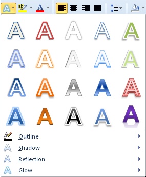
Figure 7-7. The Text Effects gallery is available on the Home tab, in the Font group in Word 2010 and in Print Layout view for Word 2011.
The galleries shown in Figure 7-7 can certainly help you get started, but they’re actually a pretty limited representation of the overall available options. At the bottom of the Shadow, Reflection, and Glow galleries, you see an Options command. Click this command to open the Text Effect dialog box shown in Figure 7-8, where you can customize these effects. The Format Text Effects dialog box also includes formatting options not shown in the gallery at all, such as 3-D Format and options for outlines (including gradient lines and more extensive outline style options than what’s shown in the gallery).
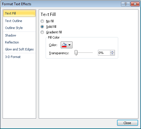
To access the Format Text Effects dialog box directly, at the bottom of the Font dialog box, click Text Effects. This dialog box provides very similar options to those available for formatting Office Art objects such as shapes. Note, however, that the soft edges option listed in this dialog box is unavailable for text effects.
Although the terms text effects and WordArt are used fairly interchangeably, there is a logic to where you see them. In Word 2010 or Word 2011, when you apply effects directly to text in the document, the feature is called text effects. Where you can insert or format text within a floating text box, the feature is referred to as WordArt.
The text effects available to document text and those available to text within objects (that is, WordArt) are almost entirely the same. The only differences are that WordArt enables Transform (warping the shape of the text string within the object) and 3-D Rotation because the containing object makes these options possible.
For example, Figure 7-9 shows you text formatted with a bevel and gradient fill, and using a Transform option, as shown in the menu beside the text. It is the object (the text box), not the text, that allows for this text to take the shape that it does. In fact, you adjust the shape of the transform by adjusting the size and proportions of the text box.
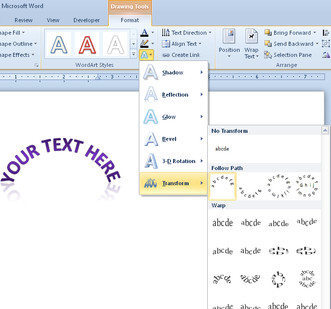
Caution
Transform is often not the friendliest feature. When you apply a transform, it might not seem as though your text actually took on your transform setting. You might need to drag the transform adjustment handle (a pink diamond) that appears on the text box and change the height or width of the text box substantially to create the transform shape you wanted. For example, to create the transform shown in Figure 7-9, I applied the transform you see selected in the gallery. I then used the adjustment handle to increase the curve and reduced the width and greatly increased the height of the text box to achieve the desired shape.
If you occasionally need a transform for a particular use in a particular document, this warning isn’t the end of the world. But it’s particularly important to keep in mind if you’re creating content for others to use (and in fact, it’s probably best to avoid Transform in those cases). As you’ll see when you give it a try, it takes some fussing to adjust for text changes and can be quite a bit of work and difficult to accomplish for the average (or even the experienced) user.
Similarly, Figure 7-10 uses 3-D Rotation on text inside a text box. Again, it is the text box that enables the rotation, not the text itself.

To further clarify the difference between text effects and WordArt formatting, notice that 3-D Rotation and Transform both appear on the Drawing Tools Format tab, in the WordArt Styles group, on the Text Effects menu. And if you click the dialog launcher in that group, they appear in the Format Text Effects dialog box. (In Word 2011, on the Format tab, in the Text Styles group, these options appear on the Effects menu.)
However, in both Word 2010 and Word 2011, you do not see these options in the Font group on the Home tab. You also do not see these options when you access the Format Text Effects dialog box from within the Font dialog box. That’s because they don’t apply unless the text is inside a text box (and thus can access the Drawing Tools Format (Format) tab). To summarize:
Text effects include text fill, line style and formatting (including gradient line options), shadow, reflection, glow, and 3-D format. These effects can be applied to text in the run of a document or to text inside a text box. They can be included in paragraph and character styles as well.
Note
When you create or modify a style through the New Style or Modify Style dialog boxes, on the Format menu in the dialog box you see the Text Effects option, where you can apply the same text effects that you can apply to text within the run of the document. This option actually appears on the Format menu in the dialog box for any type of style you can create through that dialog box. When you use this option in a list style, it applies the effects to the bullet or number for the selected level, not the paragraph text. And, as discussed in Chapter 8, not all formatting that you can include in a table style really belongs there.
Note
See Also For more about working with styles, see Chapter 8.
When you apply text effects as WordArt (that is, within a text box), you have the same effects available, as well as Transform and 3-D Rotation settings that can be applied to the text box itself.
Note
When you save and share your documents in the cloud and open those documents in Word Web App view mode, you can see text effects as well as applied typography features (for supported fonts). Like much custom formatting, these features are not visible on your text when you open the document in Word Web App edit mode (at the time of this writing), but the features are retained in the document. As with any formatting or content that is not visible when editing documents in Word Web App, just switch to view mode (on the View tab, click Reading View) or open the document in Word 2010 or Word 2011 on your computer to see your complete, formatted document.
Note
See Also For typography features, keep in mind that custom fonts may not be supported when you view your document in the cloud. To learn about Office Web Apps and what you can expect when you use them for sharing documents, see Chapter 2.
This section is about tricks of the trade—ways in which you can use the simplest of features to make your document work.
For years, I worked in the document production centers of investment banks, churning out pitch books—complex documents containing dozens of financial tables, graphics, and very complex layouts. Your documents certainly don’t need to be that complex for you to run into circumstances where you need a workaround to make something fit. But one of my favorite examples on the subject occurred one day while I was at work at one such investment bank.
A very stressed banker came to my desk 15 minutes before a courier was to pick up his final pitch book. He said he just needed one quick edit to one page. It was a landscape page containing a 17-column financial table. To make everything fit, the table font was just 7 points, the page margins were at 0.3 inches other than the binding edge, and the cell margins were at 0.02″ left and right. To the best of my recollection (this was several years ago), his exact words were something to the effect of “I just need you to add one more column to the table before it goes out the door. But could you please make the font bigger?! I can’t read it at all!”
I suppressed a laugh because the poor guy was stressed enough already. And, as it turns out, what seemed initially like an impossible task needed nothing more than a small adjustment in character spacing throughout the table—smaller than the typical reader would be likely to notice. (Admittedly, I only increased the font size by a half point, but unlike the Earth, the page is flat and things that exceed it will indeed fall off.)
It might not be that uncommon to need to fit an additional table column without reducing font size. But let’s look at a few even simpler examples:
You have a small graphic (such as an icon) that needs to sit inline within a paragraph without significantly increasing line height.
You have a heading that is wrapping to two lines, and you have to make it fit one line without changing the wording or the document formatting.
You need the text after a page break to retain its space before formatting.
Like the table column example, the first two of the preceding examples use character spacing options (position in the first example, and condensed spacing in the second) to accomplish the task. The third example uses the Line And Page Break paragraph formatting feature Page Break Before in place of a manual page break. But let’s not leave it at that. Use the tips that follow to help you simplify any applicable layout issues that you might encounter in your documents.
Note
When you use any of the features discussed in this section just once in a document to tweak formatting or layout for a specific instance, apply the formatting directly. One of the most common misconceptions about styles in Word is that using direct formatting is wrong. Styles, like any feature, exist to simplify your work. If you create a custom style every time you need a single, unique instance of formatting, then you’re complicating your document with styles rather than simplifying it. The document police will not come after you for using direct formatting where it’s a simpler, cleaner solution than using a style. (If they do, send them to me and I’ll set them straight.) Using the simplest solution means thinking for yourself and doing what will be the simplest—over the life of the document—for anyone who uses that document.
Of course, as with any formatting—styled or direct—take care to use the tools discussed in this section to adjust layout only where it simplifies your work. For example, if you find that you’re frequently tweaking character spacing or line spacing for just individual paragraphs within the same document, an overall formatting change might simplify things for you more than many intermittent tweaks. After all, if the content you tweak changes, the adjusted formatting might no longer fit. Remember the tale of the lazy operator and put nothing in the document that doesn’t need to be there.
Note
See Also To read the tale of the lazy operator and learn how following her example can help simplify the time you spend in Microsoft Office, see Chapter 1. For more about best practices when working with styles, see Chapter 8.
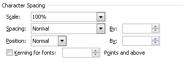
Character Spacing options—available in the Font dialog box, on the Advanced tab—include both position and spacing (among other features).
You can raise or lower the position of as little as a single character by as little as a half point. This feature raises or lowers text relative to the text baseline. This is similar to superscript or subscript formatting, but character size is not altered and you can specifically control the preferred distance from the baseline.
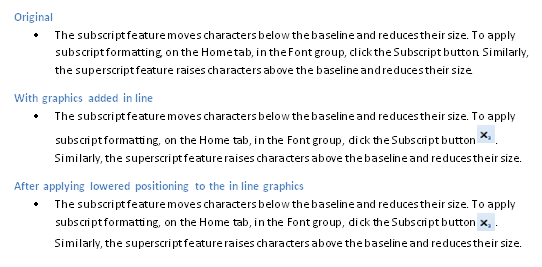
For example, if you’re writing some technical documentation and want to include icons inline, as shown in Figure 7-11, you can lower the position of the graphic itself. Graphics formatted using the In Line With Text layout can be formatted using character and paragraph formatting. In Figure 7-11, the icon image in the third bullet point is lowered by 4 points to equalize line spacing for the paragraph.
Word 2010 users can just select the graphic itself and then open the Font dialog box to the Advanced tab to apply the position change. Word 2011 users should select the surrounding spaces as well as the graphic to access the font dialog box. In Word 2011, the Font dialog box will be unavailable if nothing but a graphic is selected.
You can condense paragraph spacing by very slight amounts to often make a significant difference. For example, if all headings in your report need to be a single line, and one heading wraps to a second line, an adjustment as small as one- or two-tenths of a point might make all the difference you need and be indistinguishable to readers.
You can type values or use the spin boxes, as you see in Figure 7-12, to condense or expand spacing as needed by as little as a tenth of a point.
You probably already know that setting spacing before or after the paragraph—rather than using multiple returns to create space between paragraphs—greatly simplifies your work with text. (If that’s news to you, you might want to review Chapter 6 for tips on other key formatting basics for managing Word documents.)
But, as with character spacing, you can often adjust paragraph spacing just slightly to accomplish an important change in layout when needed. For example, say that the last page of your document contains a full-page table. It’s not unusual for an extra page to be added at the end of the document because of the paragraph mark that must follow the table. Remember that you can easily make small adjustments such as changing the font size of that paragraph mark, or reducing paragraph spacing on the paragraph mark, to keep it from flowing on to the next page.
This example is also a good one for discussing ways in which to keep formatting simple. Say that you need that reduced paragraph mark at the bottom of several pages in the document. If so, ask yourself why. If it’s always for the paragraph that follows the table, do you actually need one? There must be a paragraph mark following a table, but it doesn’t have to be empty. So, for example, if a new page starts after each table, you might be able to include Page Break Before formatting in the heading style that follows each table rather than creating space for a paragraph mark into which you can place a page break. The next section, Using Line and Page Break Options to Manage Layout, discusses line and page break options.
Before moving on, however, we need to consider an important point about working with line spacing.
The type of line spacing you choose can have an enormous effect on the usability of your document, and is particularly important when you’re creating content for others to use. As shown in Figure 7-13, three different types of line spacing are available.
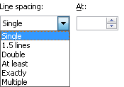
Since you obviously see six options in Figure 7-13, you might be wondering if numbers just aren’t my strong suit. Actually, the first three options (single, 1.5, and double) are all types of multiple line spacing.
The At Least line spacing setting is measured in points. This is a good setting to use when you want to specify the line spacing in points, but don’t want to constrict spacing in cases such as when someone needs to insert a graphic inline with text or increase the font size for a paragraph.
The downside to At Least line spacing is that it allows your document users to adjust layout more easily as needed for their own customizations. However, reducing font size is likely to cause formatting complications for users because line spacing set this way won’t reduce to accommodate the font. So, your decision on whether to use this option depends on who the document is for and how it will be used.
The Exactly setting is also measured in points. This is the most common setting used when someone specifies line spacing other than single or double, particularly in cases such as creating a template from a specification provided by a graphic designer. In my experience, designers often measure in points and will provide a point size for text and another for line spacing.
If you deliberately want users of your document or template to run into formatting trouble if they do things such as insert an inline graphic in a paragraph or change font size, then set line spacing exactly. Otherwise, use either the aforementioned At Least setting, or the Multiple setting described next.
As already mentioned, single, 1.5, and double are all types of multiple line spacing. For example, if you select Multiple line spacing and set the value to 1, the result is identical to selecting Single line spacing.
Multiple line spacing measures in number of lines to values as precise as one-hundredth of a line. I prefer to stick with multiple line spacing wherever possible because I can be as precise as needed (to match a setting that is comparable to a specification from a designer, for example) but still give users the flexibility they need to customize content without causing formatting and layout issues.
In the Paragraph dialog box, the Line And Page Breaks tab too often goes unnoticed. But if you don’t like having to add and remove page breaks throughout your document every time you change content, you’ll definitely want to give it a look.
The two most important settings for page layout of those shown in Figure 7-14 are Page Break Before and Keep With Next. It’s more common to use these features in styles because they’re most often needed consistently throughout the document. But, as with any formatting tool, when it’s the simplest solution for the formatting you need, use it in whatever way will be the least amount of work for you and other users of the document, and for Word.
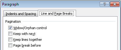
Figure 7-14. Pagination options appear at the top of the Line And Page Breaks tab in the Paragraph dialog box.
The most common reason for using Keep With Next is to avoid orphaning a heading at the bottom of a page. For this reason, this option (along with the Keep Lines Together setting) is included by default in the built-in heading styles (Heading 1 through Heading 9).
The Page Break Before command can save you an enormous amount of time spent fussing with manual page breaks, such as when your top-level heading always needs to start on a new page. But it can also be handy in a single instance where you always need to ensure that a particular piece of content starts on a new page.
For example, you might add this formatting to a specific paragraph containing an image that you want to make sure always appears at the top of a page regardless of how content flow changes in the document. Similarly, you can apply this formatting in the first cell of the first row of a table to ensure that the table starts on its own page.
When using this setting, however, you should be aware that, unlike when you use a manual page break character, spacing before the paragraph is respected in paragraphs that use the Page Break Before setting. This is as important to keep in mind for instances when you want to retain that space as for those when you need to remove the space for consistent top-of-page formatting.
Note
When viewing formatting marks in your document, you’ll notice that paragraphs that include Keep With Next, Keep Lines Together, or Page Break Before formatting display a (non-printing) small, black square in the margin to the left of the paragraph.
Note
See Also Tables, the great document organizer, can help you go much further than character and paragraph formatting when you need to simplify a complex page layout. And you can often use paragraph formatting within tables to make that layout work even better. You’ll learn all about using tables for layout in Chapter 9.