In this chapter, you will:
Learn to use content controls for more powerful, flexible forms and placeholder content
Explore options for using content controls to make documents more dynamic
Discover how to use building blocks (document elements) to construct documents more easily
Learn to create and manage building blocks for customized, reusable content and more flexible templates
Capitalize on the power of fields for simple solutions to more dynamic documents
This is the fun stuff. Fields have long been one of my favorite Microsoft Word features for making documents more dynamic. Then, back in Word 2007, they became just one (and not even the coolest) of several features that you can use to make your documents do more and to make them easier to use.
That said, it’s important to be upfront about the fact that the following two features do much more for users of Word 2010 than for users of Word for Mac 2011. But the information in this chapter still applies to you both. (Mac users, check out the Mac-specific sidebar after Chapter Assumptions to learn about what’s available to you for both of the following features.)
Content controls elevate form controls to a completely new level and have benefits for many types of documents beyond just forms. They’re flexible, they’re easy to use, they’re more powerful than you might imagine, and—perhaps best of all—they don’t make your documents ugly. (Incidentally, if you got the feeling from the preceding statement that this book isn’t the place to learn about the stilted, ugly, unfriendly legacy form controls, you’re right.)
Building blocks (called document elements in Word for Mac 2011) are the evolution of AutoText and then some. They give you the ability to insert (and, in Word 2010, to save) formatted pieces of rich document content that you can easily access through galleries on the Ribbon. Many types of building blocks also provide added benefits, such as the ability to replace the design of a piece of document content (a cover page or a header, for example) without losing your content (yes, there’s a catch, but you’ll learn all about it here).
Much of this functionality is now bundled into the metafeature named Quick Parts (in Word 2010), whose name gives you some idea of its purpose. But this isn’t cookie-cutter content. Word 2010 gives you more power than you’ve ever had before to use these kinds of features to create custom content. Personally, I don’t remember the last time I created a template without using content controls, building blocks, or fields. And now that I have all of them, I never want to be without them again (unless, of course, the wily Word team comes up with something even cooler down the road).
Note
See Also For the list of six features that you can use to create any document, which includes Quick Parts, see Chapter 6.
A content control is, essentially, a container in which you can store and act on different types of document content. Some of these controls are simply placeholders for text or other content, some give you the ability to select from choices of content that you specify, and some provide additional types of functionality to help you do more with the content they contain.
Note
To use most types of content controls in Word 2010, you must be working in Print Layout view. When working in Draft view, you can edit text in plain text and rich text controls, and can change the state of a check box control. But you cannot edit the content of other control types in that view. Table 12-1, shown shortly, provides a list and descriptions of the eight available content control types.
Content control behavior in Word 2010 Draft view is very much the same as the behavior of content controls when edited in Word 2011, whether you are working in Print Layout view or Draft view. However, the check box control is not editable in Word 2011.
Also note that content controls are Office Open XML functionality, so they are not available to documents saved in the legacy file formats. Content in controls is converted to static text (or to images, depending on the type of content) when saved in a legacy document.
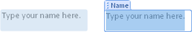
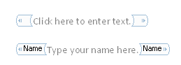
You can recognize a content control in a couple of ways. When you hover your mouse pointer on a content control in Word 2010 Print Layout view, it appears shaded (blue in most color schemes), as shown in Figure 12-1 on the left. This is also the way the control appears in Draft view (or, in Word 2011, in Draft or Print Layout view) when you click in it.
When you click in or otherwise activate a control in Word 2010 Print Layout view, you either see a tag at the top that contains a title (such as the Name control that you see in Figure 12-1 on the right), or a similar tag on the left of the control that contains no text. The tag that appears at the top may have additional icons that provide other functionality for the content within the control.
Figure 12-1. A content control as it appears when your mouse pointer hovers on it (left) and when selected (right) in Word 2010 Print Layout view.
Most controls contain placeholder text or other placeholder content until user content is added. If a control contains placeholder content, that content is selected automatically when you click in the control. If a user has already edited the control, you see the border of the control when you click in it (in Word 2010 Print Layout view), but text won’t automatically be selected. In Draft view, or in Word 2011, content controls are not visible when they contain user-edited content.
There are eight types of content controls, as shown in Table 12-1.
Table 12-1. Content control types
When you use content controls that already exist in a document, such as in the built-in Word templates or building blocks (document elements), you might notice that some disappear when you type in them, and others can’t be deleted at all.
You can set some controls to be removed when their content is edited. All controls can be set to disallow deletion or even to disallow editing. Note also that several types of content controls can be used with document protection, discussed later, for documents in which you want to completely manage document layout and allow users to edit only within designated controls. Controls also provide a grouping feature that enables a quick and simple form of document protection for ease of editing.
You can apply styles and formatting to content inside controls just as you can in the body of the document. However, you can also format controls to automatically use a particular style or formatting when you add content.
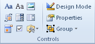
To create a new content control, on the Developer tab, in the Controls group shown in Figure 12-2, just click the type of control you want to add it to the document at your insertion point.
The control will be added at your insertion point and will take on default settings for that control. These default settings, all of which you can customize for the individual controls you create, are as follows:
Content controls take on the same formatting as the paragraph into which they’re inserted.
Every type of control you can create contains placeholder content. For picture controls, this placeholder is a graphic that you can click to open the Insert Picture dialog box. For all other control types, it is text, such as “Click here to enter text” for rich text and plain text controls. This text is formatted with a character style named Placeholder Text that applies gray font color by default. Placeholder text formatting is separate from the formatting for content you add to controls, so you can easily tell the difference between placeholder text and user-edited text.
Controls are not deleted when their placeholder content is edited.
Users can edit and delete controls.
Building block gallery controls default to showing the Quick Parts gallery.
Date Picker controls default to displaying selected dates using the Windows System Short Date setting.
Combo box controls have no functionality beyond that of plain text controls until you add a list of options to them.
Drop-down list controls have no functionality until you add a list of options to them.
Once you’ve added a control to your document, you can name the control, customize applicable options from the preceding list, and format both the placeholder content and the user-edited content within the control.
To edit the settings for a control, click in that control and then, on the Developer tab, in the Controls group, click Properties to open the Content Control Properties dialog box.
The options available in this dialog box change depending on the type of control you’re editing, as detailed in the list that follows.
Note
If you click Properties and a Properties pane opens that displays “ThisDocument Document” at the top, your insertion point is either not inside a content control, or not inside a control for which you can edit properties (such as the control surrounding a built-in table of contents building block entry). Just click the X at the top of that pane to close it, make sure your insertion point is inside the control for which you want to edit properties, and then click Properties again. Note that this error will occur only if Design Mode is active.
Note
See Also Learn about Design Mode in the upcoming section Working in Design Mode.
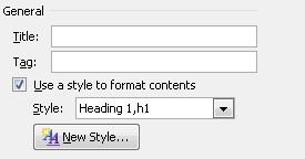
General options, shown in Figure 12-3, are the same for all controls except picture controls, which don’t offer the Style option. For instructions on how to apply font and paragraph formatting to user-edited content in picture controls, see the section Formatting Placeholder and User-Edited Control Content, later in this chapter.
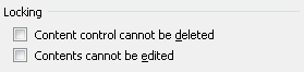
Locking options, shown in Figure 12-4, are the same for all controls. Note that, if you set a control to disallow editing, it can’t be formatted or edited outside of Design Mode.
Note
When setting controls to not be edited or deleted, remember that any document user can edit those settings. To keep users from removing or altering controls where you need to control layout or content, use the document protection options discussed in the section Understanding Document Protection Options for Content Controls, later in this chapter.
With the exception of picture controls, each control also has control-specific properties available in the Content Control Properties dialog box. For example, in plain text or rich text controls, you can set the control to be temporary (that is, set the control to be deleted when the user edits its content) and you can set the option to allow line breaks in plain text controls.
In the control-specific properties within this dialog box, you’ll find the option to select a gallery and related category for a building block gallery control, add list items for a drop-down list or combo box control, set date format for a date picker control, and set the checked and unchecked symbols for a check box control.
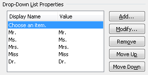
For example, in the sample Drop-Down List Properties shown in Figure 12-5, notice that you can add, modify, remove, or reorder list entries.
The only time you must enter Design Mode is to edit the placeholder content in your control. To enter Design Mode, on the Developer tab, in the Controls Group, click Design Mode.
When you turn on Design Mode, the tags inside content controls become visible, as you see in Figure 12-6. The tags are the shapes that wrap around the content and sit inside the control.
These are XML tags, used to identify the particular control when you want to act on it programmatically. XML tags are paired, as you see in Figure 12-6, wrapping around the content to which they refer.
When you insert a control from the Developer tab, it is not named by default (notice the blank tag at the top of Figure 12-6). You can add a title and a tag name when you edit the content control properties. When you add a tag name, it appears in Design Mode, as you see in the second control in Figure 12-6.
Note that, by default, tags on content controls have the same name as the title of the control. But you can customize this when editing content control properties, as discussed later in this section.
Note
XML tags are also visible for many types of building blocks when Design Mode is enabled. This can be very handy for identifying the start and end points of various content types when you need to do advanced editing. XML tags surrounding a building block entry use the type of building block entry as the name of the tag (such as Cover Pages) to make it easy to recognize. You should keep this in mind particularly when working in Design Mode, because not all XML tags you see indicate the presence of content controls.
Note
See Also Learn more about building blocks in the section Understanding Building Blocks: The Evolution of Documents, later in this chapter.
Any text (or, for rich text controls, rich content) that you add to a control while in Design Mode automatically becomes placeholder content.
When you need to edit the formatting of placeholder text inside a control, the easiest option is to edit the Placeholder Text character style. When you do that, new controls you create take on the formatting of your edited style. Of course, when your rich text controls need to contain more complex formatting in placeholder text, such as different styles on different paragraphs, you can use any styles or formatting that you need and apply them directly to the placeholder content.
Note
If you delete all existing placeholder text before adding your own, you’re likely to lose the Placeholder Text character style. If this happens, just reapply it while in Design Mode. Or, for ease of editing, you can delete all but one character before adding your own placeholder text, and then delete the last character of default text.
If you don’t want placeholder text to be formatted differently from user-edited text, you can also just clear the character style while editing the control in Design Mode. Do this exactly as you would to clear font formatting on any text. Select the placeholder text and then press Ctrl+Spacebar.
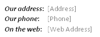
Use the Style command in the Content Control Properties dialog box to specify font and paragraph formatting for user-edited content in the control. If no formatting is specified in the control, user-edited content takes on the formatting at the insertion point. However, if you want specific formatting for the user-edited text in the control, it’s a good idea to specify it. This is particularly useful with formatting such as run-in headings, which can often occur in forms and similar content for which content controls are commonly used. For example, Figure 12-7 shows contact information for a template. The headings for the contact information use a character style and the body content (which will be the user-edited content) uses the active paragraph style. To ensure that users get the body style when they edit content, and don’t inadvertently carry over the character style, set the Style in the control properties.
Keep in mind, however, that when you make changes to the formatting in a control after the control contains user-edited content, your changes won’t be reflected automatically on existing content. If a user adds new content at the beginning of the control, it will take on your new formatting. However, from within existing content, formatting will follow Word formatting rules. That is, new content takes on the formatting at the insertion point.
For best results when changing the formatting of controls that already contain some user-edited content, apply the style or formatting you need directly to the existing content and update the formatting in the control properties. That way, you update the formatting on existing content and you ensure that future editing will result in the formatting you want.
For picture controls, you can format the picture placeholder to take on the formatting you need for the user-added picture. When you select the picture placeholder within the picture control, you get the Picture Tools Format contextual tab. So, you can format placeholder attributes—such as applying a picture style—and that formatting will be retained when the placeholder is replaced with a picture. Note that, because picture sizing is proportional by default, if the user-added picture has different proportions from the placeholder, the smaller of the dimensions set in the placeholder is kept and the user-added picture is resized proportionally.
Note
Picture formatting options that appear in the Adjust group on the Picture Tools Format tab, such as Recolor or the new artistic effects, are not retained in a user-added picture if applied to the placeholder. Incidentally, they are also not retained on a new image if the Change Picture command is used, regardless of whether the original image is inside a picture content control.
Caution
As noted a couple of times in this section, content controls and text wrap don’t play nicely together. However, that statement requires some clarification. Although it’s not ideal to place content controls inside text boxes, it is done (and I’ve had to do it on occasion myself), and it’s not likely to cause any major disasters on its own.
The most important thing to remember in terms of floating objects and content controls is to never apply text wrap to any content within a control. For example, if you apply a text wrapping setting that causes the picture placeholder in a picture control to float (that is, any wrap setting other than In Line With Text, which turns off text wrap), you’re likely to get a document corruption error message when you next open the document. If this happens, however, it’s typically a safe and consistent fix to just choose the option to recover the document, turn off text wrap in any content controls, and then resave the document.
You can nest controls in the user-edited content of a control, but not in placeholder content.
You’re likely to find this useful only when you want to contain a large part of a formatted document inside a control. In that case, add the placeholder content for the host control as regular user-edited content (that is, not as placeholder content at all). Remember that placeholder content can’t be edited outside of Design Mode, so when users click in a control that has placeholder content, they either replace all of it or none of it. In a case where you want to include a large part of document content as placeholder text, it’s likely that you’ll want the user to be able to retain some of it, so it should be saved as user-edited text in any case.
If you need to nest controls inside a host control, start with a rich text control and add the text content you need outside of Design Mode so that the user can edit it. Then, while still outside of Design Mode, insert each nested control you need. You can later edit any of the controls in Design Mode as needed.
When you click into placeholder text in a control while Design Mode is active, you’ll notice that you can’t nest new controls within it. You can use a workaround by inserting them separately and then pasting them into your placeholder text, but Word will let you know it doesn’t want you to do that, because you’ll be unable to exit Design Mode. As in similar cases of Design Mode remaining on, you can save, close, and reopen the document to turn it off. But, for best results, heed Word’s warning here. You can encounter usability problems if you try to add nested controls as placeholder text within a control. Remember that placeholder text is not designed to be edited by the user.
There are essentially two ways to protect the document structure when you want users to edit content only in content controls. If you don’t need to password-protect the restrictions (that is, if you aren’t concerned about users turning off protection), the easiest approach—and the one that was designed for this task—is to group controls. If you do need to be able to password-protect the restrictions so that users can’t gain access to editing the document structure or content outside of controls, using the Restrict Editing options (commonly known as document protection).
When you select a portion of the document containing content controls and then use the Group command on the Developer tab, users are able to edit content only in that portion of the document that is within content controls. This command is incredibly easy to use, and the only downside to it (if it is a downside) is that you can’t password-protect the setting.
To group controls:
Select the portion of the document you want to include in the protection.
Be sure to select complete paragraphs because incomplete paragraphs may not be correctly included in the group.
On the Developer tab, in the Controls group, click Group and then click Group again.
Notice that there are both Group and Ungroup commands available here to make it as easy to group or ungroup controls as it is for shapes or other graphics.
The Group command makes any content that is not inside a control inaccessible to editors. So, you can even select a portion of your document that contains no content controls and apply this setting to quickly provide a level of protection against editing. Of course, keep in mind that grouping or ungrouping content in the document is just as easy for any other user who is familiar with the feature.
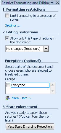
If you need a further level of protection—that is, the ability to set a password on your restrictions—check out the Restrict Editing options. This is the feature most commonly known as document protection. The same document protection options are available from both the Review tab and the Developer tab in Word 2010, under the Restrict Editing command. This command is also available on the Info tab in Backstage view, under Protect Document. When you click this command, you see the Restrict Formatting And Editing pane shown in Figure 12-8.
Note
If you see a command named Restrict Permission By People or Restrict Permissions, that is a different type of document protection. It’s called Information Rights Management (IRM) and is only available in volume license editions of Office 2010 and Office for Mac 2011. IRM is for restricting access by specific users, so it’s not related to the type of protection you might use when you need to restrict editing for use with content controls.
Access the options for protecting documents so that users can edit only content inside controls under Editing Restrictions in the Restrict Formatting and Editing Pane. Four options are available under that heading:
The Tracked Changes restriction forces Tracked Changes to remain on, but allows any type of editing. This option can be enabled only for the entire document.
The Comments restriction allows no content editing, but it does allow users to add or edit comments. This option has an Exceptions setting that allows you to select portions of the document to keep freely editable, and to assign editing rights for those exceptions to everyone or just to specified users.
The Filling In Forms option is one of the options to consider for use with content controls. This option can be enabled for the entire document or by section. (Note that you will see the option to select sections only when multiple sections exist in the document.)
When you enable forms protection, users can access or edit content only inside controls. More specifically, users can add or edit text only within controls because formatting and the ability to insert or paste objects is prohibited. The exception to this rule is picture controls, to which users can add a picture while forms protection is active. However, once a picture is added in a Picture control, it can’t be replaced while this protection is active.
Caution
Do not enable Filling In Forms protection mode when using building block gallery controls. These controls are not available to users when the document is protected for forms. In these cases, or when you want users to be able to format and edit any type of content inside controls, consider protecting part of the document in No Changes (Read Only) protection mode instead.
The No Changes (Read Only) option does not allow any editing of the document. However, as with the Comments option, you can select portions of the document to make them freely available to all users or only those you specify.
When you need to enable users to access building block gallery controls, or to format and work with objects inside content controls, the No Changes (Read Only) option might be your best bet. To allow editing of content controls while in No Changes (Read Only) mode, select controls one at a time and then, under Exceptions, click Everyone or select specific users to permit access to. If you use this option, however, keep the following in mind:
If you select an entire control as an exception to the protection setting, users can still enable Design Mode and can still delete or edit the control (unless the options to restrict editing or deletion are enabled in the Content Control Properties dialog box).
When you select a control as an exception in this protection mode, placeholder text does not behave like placeholder text. It behaves like user-edited text, which means that users can click in and edit placeholder text without being in Design Mode.
Once you’ve set the options you need, click Yes, Start Enforcing Protection. The dialog box that opens gives you the option to include a password. You’re not required to add one. However, if you don’t add a password, or if users have access to the password, any user can turn off the editing restrictions.
In versions of Word for Windows prior to 2007, you might have used fields to add information to your document, such as Title or Author. In Word 2007, with the introduction of content controls and other new dynamic content options, Document Property Quick Parts replaced and substantially improved on this functionality.
Document Property Quick Parts are plain text content controls that are bound to data saved in the document properties. So, for example, if you insert three Title controls in the document and you edit one of them, the other two update automatically. If you edit the Title property in Document Properties, all instances of the Title control that appear in your document update automatically.
Document Property Quick Parts are available on the Insert tab, in the Text Group, under the Quick Parts command. Figure 12-9 shows the list of available controls.
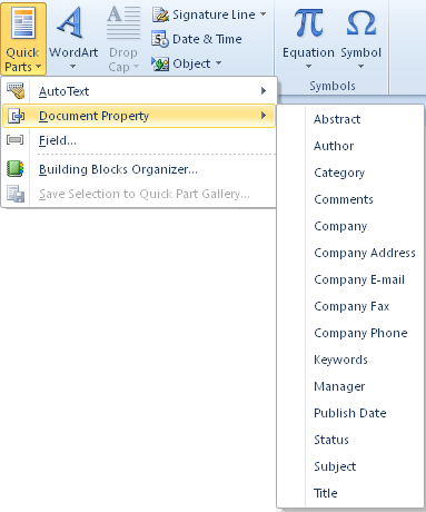
Figure 12-9. Document Property Quick Parts are content controls that are bound to data stored in the document.
You can add or edit data for several Document Property Quick Parts (such as Title) through the Document Properties pane on the Info tab in Backstage view or the Document Properties dialog box. Others, including Abstract and several company information options, are linked to custom XML data (stored under the hood of your Office Open XML document) that Word automatically generates when you insert and then add content to one of these controls.
Some types of custom XML data are available to your documents through built-in functionality such as these Document Property Quick Parts. Developers can also create their own custom XML data for many purposes, such as creating custom data binding for content controls.
Note
See Also For more on this subject, see the upcoming sidebar Binding Content Controls to Custom Data.
Regardless of what data is bound to a content control, the major benefit here is that you can edit the data at the source (whether that’s in Document Properties, in custom XML within the file format, or perhaps on a server) or in any instance of the relevant bound content control in your document, and it will update in all instances of that same bound control.
Note
The Document Property menu in the Quick Parts gallery is unavailable when you’re working in a legacy document. This is because, as noted earlier in this chapter, content controls and their data binding capabilities are Office Open XML functionality, available only to the Office Open XML (that is, Office 2007 and later) file formats.
Tip
If you need bound controls for other information beyond what is listed in the Document Property Quick Parts, consider using one of those controls and just changing the name. If you don’t need to use a given property field for another purpose (such as Abstract, Comments, or Company Fax) and you don’t need to bind hte controls to external data, there is no reason not to repurpose it for your own information.
For example, mailing label templates include multiple labels on one page. It’s a good idea to use bound controls when creating that type of template because then users can edit their contact information in one label and it will update on all labels automatically. But what do you do if you want to break the address into multiple controls (such as street, city, state, postal code) for ease of design or editing? Just use Document Property Quick Parts that you don’t need in that template for another purpose and use the Content Control Properties dialog box discussed earlier in this chapter to edit the title of the control. You can also edit the placeholder text for that control in Design Mode. Then, you can duplicate that customized, bound control for subsequent labels throughout the sheet so that they are all bound to the same property.
It’s always faster and easier to take advantage of the built-in bound controls when you can, rather than creating your own from scratch.
Building blocks (known as document elements in Word 2011) take the concept of AutoText and make it much smarter. Some types of building blocks just insert formatted content at the insertion point, but others do quite a bit more.
For example, insert an entry from the Cover Page gallery, and it will insert as the first page of your document by default, adding a first page header and footer if one isn’t already active for the first section of your document. If you later select a new cover page option for the front of your document, the existing page gets swapped automatically for the new one, but much of the content you added to the cover page remains intact and is automatically formatted to match the new design.
As mentioned earlier in this chapter, many building blocks (such as Cover Pages) include content controls—specifically, in Document Property Quick Parts—which enable your content to be retained when the design is swapped.
When a building blocks entry is saved, it’s assigned to a gallery that represents the type of content, and to a category within that gallery. Built-in building block galleries in Word 2010 include AutoText, Cover Pages, Headers, Footers, Page Numbers, Tables, Table Of Contents, Bibliography, Text Boxes, Watermarks, Equations, and Quick Parts.
Note
In Word 2010, notice that the gallery previews for building block gallery entries that include themed content, such as Cover Pages and Headers, update automatically to reflect the active document theme—just like many Quick Style galleries do.
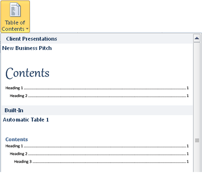
Within each gallery, there are precreated categories (such as Built-In or General) by which entry previews are organized, and you can create your own categories as well. For example, notice the custom Client Presentations category in the Table Of Contents gallery shown in Figure 12-10.
Building block entries can be saved to a master building blocks template, to Normal.dotm, or to another global template for availability to all documents—as discussed later in this chapter. You can also save unique building block entries in any Word 2010 template.
A Note About the Equation Tools
The fantastic XML-driven equation tools were introduced in Word 2007 to replace the ugly old Microsoft Equation 3.0 (Equation Editor for Mac in Word for Mac), and they are available from a building block gallery in Word 2010 and Word 2011.
These improved equation editing tools are new to Word 2011, and work exactly the same as they do in Word 2010. In fact, when you use them in Word 2011, you’ll see the surrounding content control container for an equation, just as for a table of contents or bibliography that you insert from those galleries, exactly as it appears in Word 2010 Print Layout view (rather than the way that most content controls appear in Word 2011).
Note
The same equation tools are also newly available for Windows users in PowerPoint 2010 and Excel 2010. They are not building blocks and are not stored in content controls in those programs, because building blocks and content controls are Word functionality. But equation tool behavior in a text box in PowerPoint 2010 or Excel 2010 is essentially the same as it is in Word 2010.
If you used the Equation 3.0 tools of the past, the fact that equations no longer need to be embedded objects probably makes you happy all by itself. But you can see just by looking at the Equation Tools Design contextual tab (shown in Figure 12-11) that these equation tools are also much more flexible and powerful.
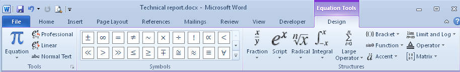
Figure 12-11. The Equation Tools Design tab, shown in Word 2010. Note that a tab with comparable tools is called Equation Tools in Word 2011.
On the Insert tab in Word 2010 (the Document Elements tab in Word 2011), you can insert a blank equation to access the Equation Tools tab or select an equation from the gallery. Notice at the bottom of the gallery that—as with all building block types in Word 2010—you can save your own custom equations as new entries as well.
To customize your equation settings for Word 2010, on the Equation Tools Design tab, in the Tools group, click the dialog launcher to open a dialog box that’s filled with so many settings, it’s likely to make mathematically inclined hearts leap for joy. Word 2011 users can find an abbreviated but still useful set of equation tool customization options in the Word Preferences dialog box.
Like content controls and building blocks, equation functionality is rooted in Office Open XML, so it’s not available in legacy documents. If you copy an equation created with these new tools and paste it into a legacy document, the equation will be converted to a picture when the document is saved.
For legacy documents, Equation 3.0 (Equation Editor for Mac in Word 2011) is available through the Object dialog box. To access the legacy functionality in Word 2010, on the Insert tab, in the Text group, click Object. In Word 2011, on the Insert menu, click Object. Also note that, if you have existing Equation 3.0 objects in documents when you upgrade them to the new file formats, you’ll still need to edit them in Equation Editor or replace them with new equations using the new tools. Legacy equation objects do not convert to the new equation format.
With many types of building block entries, such as Quick Parts, you can insert them where needed, as often as needed. However, some types of building blocks have additional properties, as mentioned earlier, that enable them to automatically swap in your document when you select a different entry from the same gallery. These building block types may in fact delete some of your content, so it’s important to understand how they work. The following list explains all building block types that swap when you select a new entry:
Cover Page, Table Of Contents, and Bibliography galleries are designed with the idea that you usually need only one of any of these in a given document. So, when you click an entry in one of these galleries to insert it, if your document already includes an entry from the same gallery, it will be replaced. However, Word does give you ways to include several entries from any one of these galleries in your document.
If you just click to insert a cover page, it’s inserted at the front of your document. If you click to insert a table of contents or bibliography, it’s inserted at your current document location. But if you right-click an entry in one of these galleries, you get the option to insert the building block at the beginning or end of the document, beginning or end of the section, or at the current document position.
When you use the default setting, inserting a new entry just by clicking will replace the first entry of that same type. However, when you use the right-click options to insert more than one of any of these content types in a document, existing entries of the same type are not replaced. Note that if you later just click to insert an entry, any existing cover page at the front of your document, or the first table of contents or bibliography in your document, will be replaced.
In the case of cover pages, content you’ve added or edited inside content controls is retained when you swap to a new design (provided that the same content controls appear in the new design), but formatting customizations are not saved. Similarly, customizations made to tables of contents and bibliographies (other than those made to related paragraph styles, such as the TOC and Bibliography styles) are not retained when you select a different gallery entry.
Note
Companion Content Though you can add several tables of contents to the document at once using building blocks, these tables will all contain identical entries by default. To learn how to include different content in each table of contents within a document, see “Reference Tables and Tools”, available in the Bonus Content folder that you’ll find online as part of the companion content for this book, at http://oreilly.com/catalog/9780735651999.
Header, Footer, Page Number, and Watermark building block entries also swap, but do so according to header and footer rules. That is, the active header, footer, or page number at your insertion point is swapped when you select an entry from one of these galleries.
For example, if your insertion point is on a page that uses a first page header, only the first page header (and any other first page headers linked to it) is changed when you select a new option from the Header gallery.
However, it’s important to note that any header or footer option you select from the Header and Footer galleries is placed in the header or footer on the active page. Odd Page and Even Page gallery entries are provided for cases where you enable Different Odd & Even Pages in your document and need that type of formatting, but they can be added to any active header or footer, and using those options does not enable the Different Odd & Even Pages setting.
Caution
Any content in the active header or footer is replaced when you select an entry from one of these galleries, whether or not it was created from a building block. As with any type of building block that swaps, the only content automatically retained is content inside bound content controls that also exist in the new header or footer. To retain other content when you select a new header or footer, first copy the content and then select the new header or footer. Because that copied content is in your clipboard, you can paste it as needed into the new header or footer.
Note
Only watermarks for which you see previews in the Watermark gallery are building block entries. Watermarks applied from the Printed Watermark dialog box always apply to the entire document and do not swap with those applied to individual headers. However, as addressed in Chapter 11, both the Printed Watermark dialog box and Watermark gallery options use legacy WordArt and are far less flexible than simply adding a shape in the header/footer layer and applying new text effects, as addressed in Chapter 10.
Building block entries assigned to the custom versions of the galleries mentioned in this list, such as cover pages, have the same behavior as entries in the relevant built-in gallery. For example, if you click to insert a cover page from the built-in Cover Page gallery and later click to insert a cover page from the Custom Cover Page gallery into the same document, the new cover page will replace the first.
Word can make these types of distinctions either because of the building block location (as with headers or footers) or because of XML tags surrounding the building block entry (as with cover pages and watermarks).
In Word 2010, to save any content as a building block entry, start by selecting the content you want to save. This content can include a combination of text, tables, fields, graphics, and content controls. With the content selected, use one of the following methods to open the Create New Building Block dialog box:
When you use the Alt+F3 keyboard shortcut method, the assigned gallery in the dialog box (shown in Figure 12-12) will default to AutoText, as noted earlier. Otherwise, the gallery will default to the gallery from which you opened the dialog box. Regardless, you can change the gallery assignment at any time when this dialog box is open.
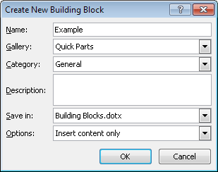
Additionally, keep the following points in mind when saving new entries:
When you type a description for your new entry, that description appears in the ScreenTip when users point to the entry preview in the gallery.
Just as with the legacy AutoText feature, building block entries can be saved to any loaded global template or to the active template. Select any available template from the Save In list in the Create New Building Block dialog box.
Note that with building blocks, you can move an entry from one template to another without resaving the entry or using the Organizer (which you may have used in previous versions to move or copy AutoText entries between templates). Building block entries aren’t, in fact, available through the Organizer. (However, in Word 2011, AutoText entries are still available there.)
Note
See Also To learn about global templates, see Chapter 22. To learn how to move building block entries between templates, see the upcoming sidebar Saving to Normal.dotm or Building Blocks.dotx.
Finally, notice that you have the option in the Create New Building Block dialog box to set each entry to be inserted on its own, in its own paragraph, or on its own page.
Every option available in the Create New Building Block dialog box is also available from the Modify Building Block dialog box, discussed in the section Managing Building Blocks, later in this chapter.
Once you click OK in the Create New Building Block dialog box, your new entry appears in the relevant gallery, if that gallery is exposed in your Word window—in other words, on the Ribbon, Quick Access Toolbar, or in a building block gallery content control within the document. (For more information about accessing custom galleries, see the upcoming sidebar Where Are My Custom Building Block Galleries?) However, the entry is not saved until you save the template to which this entry was added. If you can’t save the template before exiting your current Word session, you’ll be prompted to do so when you exit Word.
Caution
There is an exception to the rule that you’ll be prompted to save the template before exiting Word 2010. By default, Word saves changes to Normal.dotm automatically when you exit the program. You can, however, enable the option to be prompted when you’ve made changes to Normal.dotm. To do this, in the Word Options dialog box, on the Advanced tab, select Prompt Before Saving Normal Template, which appears under the Save options.
For Word 2011 users, even though you can’t save custom building block entries, this point still applies to you when saving AutoText entries or other types of content (such as recorded macros that you save in Normal.dotm). In Word 2011, find the option to be prompted to save changes to the Normal template in the Word Preferences dialog box, on the Save tab.
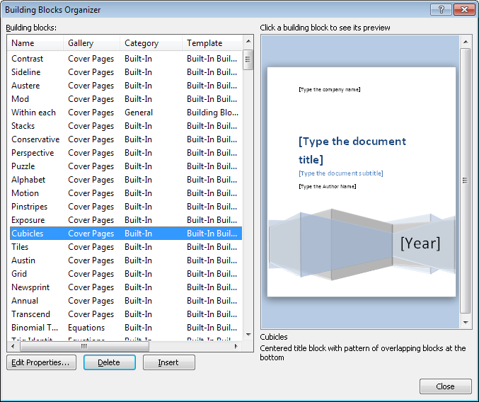
The Building Blocks Organizer is surely one of the most efficient new Word features. From this single location, you can manage all building block entries in all available templates. Note that “available templates” refers to Building Blocks.dotx, Normal.dotm, any other global templates, and any active template (that is, the active document if it is a template, or the active document’s attached template). Using the Building Blocks Organizer, you can:
Edit the properties of any building block entry, such as renaming it, changing its assigned gallery or category, or even moving it to another template just by changing the entry’s Save In property.
Delete building block entries.
Insert an entry from any available template, and any gallery (whether that gallery appears on the Ribbon), into your document.
View all available building blocks sorted by name, gallery, category, or source template.
To access the Building Blocks Organizer, on the Insert tab, click Quick Parts and then click Building Blocks Organizer. Or, right-click any entry in a building blocks gallery and then select Organize And Delete to open the Building Blocks Organizer and automatically locate the entry in the same step.
In the Building Blocks Organizer, shown in Figure 12-13, just select an entry and then select Edit Properties, Delete, or Insert, as needed. The Edit Properties option opens the Modify Building Block dialog box, which contains exactly the same options as the Create New Building Block dialog box. Notice in the Building Blocks Organizer dialog box that the description of the selected entry appears below the preview. This description is the same one discussed earlier that appears in the ScreenTip when you point to the entry in its gallery. Add or edit descriptions in the Create New or Modify Building Block dialog boxes.
Note
Notice that the Building Blocks Organizer has no relationship to the Organizer dialog box that you may know from earlier versions of Word. That Organizer dialog box is still available, however, for moving or copying styles or Microsoft Visual Basic for Applications (VBA) modules between documents and templates (or, in Word 2011, for all of its original uses, including moving AutoText entries and toolbars).
Note
See Also For help using the Organizer to manage styles, see Chapter 8.
Despite the fact that some Word for Windows field functionality was supplanted by the arrival of content controls in Word 2007 (namely, document property fields being replaced by Document Property Quick Parts), fields in general are still present throughout your Word documents, and they are still one of the most important features for advanced Word users to know.
Note
As noted earlier, Word 2011 users still have USERPROPERTY field. The DOCPROPERTY field is available in Word 2010 for similar functionality, but is only recommended for use with legacy documents that don’t support content controls.
A field is, essentially, dynamic text. It’s information stored in your document that displays a result. Fields are used for many built-in features—from tables of contents to page numbers to embedded objects—and can be used to expand the capabilities of other features, such as with the LISTNUM fields and STYLEREF fields discussed later in this chapter. Many fields can be customized to display just the information you need in exactly the format you need it. You can even nest fields inside one another as an easy alternative to some types of automation, or to simplify formatting options, such as when the information that the field displays is conditional.
To access the Field dialog box shown in Figure 12-14, in Word 2010, on the Insert tab, in the Text group, click Quick Parts, and then click Field. In Word 2011, on the Insert menu, click Field.
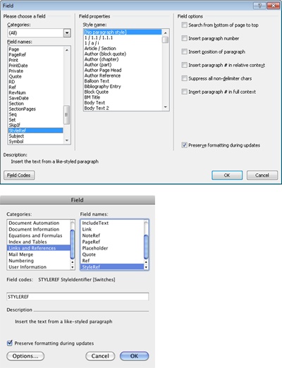
In Word 2010, you can select a field from the Field Names list and customize it through settings shown automatically when you select the field name. Or, after selecting the field name, click Field Codes at the bottom of the dialog box for an Options button that you can click to open the Field Options dialog box. In Word 2011, click the Options button to access customization options.
However, for advanced users, this dialog box is not usually the fastest or easiest way to create, or especially to edit, a field. Most fields can be created and edited directly on screen.
So, why should you really care about fields or how to create or edit field codes on screen? First, because if you understand how fields work, you can use them to easily automate many things you might not know Word can do—from something as simple as a field to display the number of pages in the active section, to a customized cross-reference field to suppress nondelimiter characters in a paragraph number (such as when you want a cross-reference to “Article II” to display as “II”).
Note
In case you’re curious, the field name for the first example in the preceding paragraph is SECTIONPAGES. The switch for suppressing nondelimiter characters (learn about switches in the next section, Understanding Field Construction) is .
A field code consists of a field name and, where applicable, information used to customize the field. This custom information can be information from the document, such as a bookmark or style name, or options you can specify that are known as switches. A switch is an option that customizes the information or the formatting of information displayed by the field.
For example, look at the codes for a few common types of fields:
The following field is a default page number field. It displays the page number in Arabic numerals.
The page number field in the image that follows is customized using a formatting switch. A switch always starts with a backslash followed by an identifying character. Some switches, including this one, also require more information. In this case, you specify the format as uppercase roman numerals by typing ROMAN in uppercase letters.
The hyperlink field shown in the following image is a default hyperlink to the Microsoft home page. It contains only the field name and the target location.
The hyperlink field in the next image is customized with two switches. The switch doesn’t require additional information; it simply indicates that the target location will be opened in a new window. The o switch requires text after it in quotation marks, as you see here, because it’s used to specify the ScreenTip text that appears when you point to the link.
If you know the name of the field you want to create, along with any specific syntax it requires, you can create that field right on screen with just a few keystrokes. To try this, start by creating a basic page number field, as follows.
Type the word PAGE and then select it.
Though field names are not case-sensitive, it’s good practice to always type them in uppercase letters to match the way they are generated by Word.
Press Ctrl+F9 (Command+F9 in Word 2011) to convert the selected text to a field and then press F9 to update the field to display the result.
Be careful about what’s selected when you convert the text to the field. If any extra characters are included, such as punctuation, you’ll get an error result.
Mac users, note that the Mac OS Exposé utility application takes over the F9 (or Fn+F9) keyboard shortcut by default. If you want to use this keyboard shortcut for updating fields, you can change or remove the Exposé shortcut in System Preferences. Or, you can preserve the Mac OS defaults and use the alternative keyboard shortcut Command+Option+Shift+U to update fields.
To toggle between viewing the selected field and its result, press Shift+F9. Or, press Alt+F9 to toggle between the code and result for all fields in the document at once.
Note
Using Alt+F9 to toggle field codes is the same as changing the Word setting to display field codes instead of their values. In Word 2010, find the setting for this behavior in the Word Options dialog box, on the Advanced tab, under Show Document Content. In Word 2011, the same behavior is enabled in the Word Preferences dialog box, on the View tab, under the Show heading, when you select Field Codes.
If you don’t know the name of the field you need, you can find it in the Field dialog box. To access this dialog box, on the Insert tab, click Quick Parts and then click Field. As you scroll through the Field Names list, see the description for the selected field directly below that list.
For fields that require more information than the field name, such as a HYPERLINK field that requires a target address or a STYLEREF field that requires a style name, simply type that information in quotation marks after the field name and then select all of that text to convert the text to a field, as outlined in the steps in the preceding section.
For example, to create the HYPERLINK field with a target of the Microsoft home page, as shown earlier, type HYPERLINK “www.microsoft.com”, select everything from the H in HYPERLINK to the end quotation mark, and then follow the steps provided earlier for converting this to a field and displaying its result.
If you want to add switches to any field, just type all of the information you want to include as it would appear in the field code once created, and then select all of that text to convert it to a field. For example, to create a table of contents generated from outline levels one and two, with hyperlinks from the table entries to their corresponding headings in the document, follow these steps.
Note
If you’re going to try this for yourself, be sure to use a document that contains at least one outline level one or two heading (such as text formatted with Heading 1 or Heading 2 style), or you’ll get an error result.
Type TOC o “1-2” h.
The o switch indicates to generate the TOC from outline levels, the levels in quotation marks indicate the top and bottom levels you want to include (if you don’t specify levels, three levels are used by default), and the h switch adds hyperlinks from each entry to its corresponding location in the document.
Select all of that text and then press Ctrl+F9 (Command+F9) followed by F9 to convert to a field and update the result.
If you don’t know the available field options or correct syntax for a particular field type, there are two easy ways to find it. First, in the Field dialog box, select the field in the Field Names list, click Field Codes, and then click Options for the Field Options dialog box (in Word 2011, just select the field and then click Options). In this dialog box, you see a list of available switches and/or formatting customizations, along with descriptions and an example of the correct syntax.
Note
See Also For an even easier source of help, in Word 2010, click the Help button on the right edge of the Ribbon, and in the help search box, type Field Codes in Word. Office.com has an article by this name that provides detailed help for almost every field code, including a complete description of syntax and available switches. For Word 2011, the same article is not available from built-in help, but you can access it on Office.com. Just go to http://office.com and search for “Field Codes in Word” for the same article. Although the article refers to Word 2010, it applies to Mac users as well. The direct link is http://office.microsoft.com/en-us/word-help/field-codes-in-word-HA102110133.aspx?CTT=1.
Note
See Also For further examples of creating custom fields, see the next two sections in this chapter, LISTNUM Fields and STYLEREF Fields. These fields are specified because of how frequently they can be helpful, how generally little-known they are, and the fact that they’re good examples of useful fields that aren’t available through a built-in feature other than the Fields dialog box.
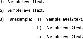
A LISTNUM field is, literally, an outline list stored inside a field code. Practically speaking, a LISTNUM field is designed for occasions when you need a paragraph number within an outline that doesn’t conform to the formatting requirements of your list style or multilevel list. For example, when you need to have multiple outline numbers appear in the same paragraph, as shown with bolded text in the following sample, do this with a LISTNUM field.
When you add a LISTNUM field in an existing outline list, it will automatically take on the formatting of the active list. For this reason, it’s a good idea to avoid adding too much customization to your LISTNUM fields unless you must, as discussed in the sidebar Why Doesn’t My Field Update Correctly? earlier in this chapter.
For example, to add the a) in the preceding image, use a LISTNUM field. To do this, simply apply the correct paragraph style for your list level for the paragraph numbered 3, and then type the text of that paragraph as you normally would. Except, instead of typing a), type LISTNUM, select it, convert it to a field, and then update its result. By default, a LISTNUM field will take on the correct number, one list level lower than the list number that precedes it. The paragraph number 3 represents the first level in the list, so the LISTNUM field automatically displays the correct number (a letter, in this case) for the second level in the list. When you then use the style for your second list level in the next paragraph, it numbers automatically to b), because the LISTNUM field became an automatic part of your outline.
LISTNUM field switches include the ability to set the specific level in the list (l) or the specific start at value to display (s). For both switches, specify a number after the switch.
Additionally, you can specify a LISTNUM Field List Name to give your LISTNUM field a particular list format. To create a name for any existing list style or multilevel list, just type a name in the LISTNUM Field List Name box that you find in the Define New Or Modify Multilevel List dialog box (Customize Outline Numbered List dialog box in Word 2011). To see this option, you must expand the dialog box.
Note
See Also To learn about working with multilevel lists and list styles, see Chapter 8.
Once you create a list name, you can specify the name in a LISTNUM field. To do this, type the name in quotation marks after the field name, and then type any switches. Note that the order isn’t important, as long as the field name comes first. If you type another switch before the list name, the field will work as well. This flexibility in field syntax is common to most fields.
For example, using the LISTNUM Field List Name you can create a LISTNUM field that automatically takes on the formatting of that list regardless of where you place the field in the active document. To create that field, type LISTNUM “SampleList”, select the text you just typed, and then convert it to a field.
Caution
Just as with using switches, be careful about overusing LISTNUM Field List Names. If you’re going to place the LISTNUM field in an existing list, it will automatically take on that list’s formatting. If you don’t specify a list name, and you change the formatting of the list in which the field appears, the field will automatically change formatting to match. If you’ve specified a list name, the formatting in your field will continue to reflect the named list, regardless of how the active list changes.
STYLEREF fields are quite simple to use, but not as well known as they deserve to be, which is why they’re mentioned here.
A STYLEREF field can be a great way to format headers in a long document when you want the topic on any given page to be reflected in the headers. By default, STYLEREF fields show the text of the first instance of the field to appear on a given page. So, without any section breaks or new headers, you can have the most recent top-level heading, for example, appear in the header on every page. Assuming that your top-level headings use the Heading 1 paragraph style, the field code for this example would be STYLEREF “Heading 1.”
This field type also has several switches, including ones that enable you to display the paragraph numbers in or out of context with your outline, or to suppress any nondelimited characters in the paragraph number. Find a complete list of available switches for the STYLEREF field, along with descriptions of each, in the Field Options dialog box mentioned earlier. To get to the Field Options dialog box for this specific field:
In Word 2010, on the Insert tab, click Quick Parts and then click Fields.
In Word 2011, on the Insert menu, click Fields.
In the Style Names list, select STYLEREF.
Click Field Codes and then click Options. (In Word 2011, just click Options.) The Field Options dialog box that opens displays options for the selected field.
Just as you can create field codes right on screen with a few keystrokes, you can edit field codes directly as well, whether you created them on screen or through a built-in feature such as Table Of Contents.
To edit a field code, toggle the field so that you can see its code (Shift+F9 to toggle the selected field, or Alt+F9 to toggle all fields in the document), and then simply edit the code as if you were creating it.
For example, when you generate an automatic table of contents in Word from one of the built-in options in the Table Of Contents gallery, or from the Indexes And Tables dialog box, it’s created from outline levels one through three and includes hyperlinks from each entry to its referenced location, as well as other options. To change the number of levels and remove the hyperlinks, just press Alt+F9 to toggle all field codes, and then edit the code as if you were creating it. That is, change the levels to what you want them to be and delete the h switch that controls the hyperlink.
Caution
When a reference table uses the h switch for hyperlinks, a separate hyperlink field code is added to each entry. For this reason, if you press Shift+F9 to display the selected TOC field code, you might get odd results. When working with reference fields, always use Alt+F9 to display field codes.
Note
Companion Content Learn more about working with reference fields in the article “Reference Tables and Tools,” which you can find in the Bonus Content folder available as part of the online companion content for this book, at http://oreilly.com/catalog/9780735651999.
When you’ve finished editing, just press F9 to update the selected field and then Alt+F9 to toggle field codes back so they display their results. This is a simple example of how editing field codes on screen can be an enormous timesaver and help you avoid recreating or reformatting content.
If you want to remove a field code and leave only its result, such as to convert an embedded object to a picture (discussed in Chapter 10), select the field code (or its result) and press Control+Shift+F9 (Command+Shift+F9 in Word 2011, or Fn+Command+Shift+F9 in Word 2011 when working on a Mac laptop). Whatever the displayed result of the field is (whether it’s text or an image), it remains and the field code is removed so that the content is no longer dynamic.
It won’t happen often, but it’s good to know that you have the option to nest one field inside another when you need it.
If you’ve ever nested functions in Microsoft Excel, nesting fields is a very similar concept. A nested field is just a field whose arguments are other fields. There are many reasons for nesting one field inside another, but the most common is when you need to display different information based on a given condition. In these cases, you would start with an IF field and then use other fields to specify arguments of that conditional statement, as demonstrated later in this section.
There’s one note of caution to consider before you proceed with the steps to create a nested field. Some Word users, even very talented and experienced Word developers, get carried away with nested fields. So, if your nested field begins to look like an essay, ask yourself if you’re overcomplicating things before you do more work than is necessary. Remember that the idea behind any field is to provide a simple approach when you need dynamic content. If your field looks like a complex computer program, a macro or another solution may be a better option.
That said, when you have a good reason for your nested field, and it is the simplest solution, you might be surprised at how truly easy it can be to create.
For example, say that you want to use a STYLEREF field in the document header, as described earlier in this chapter. Perhaps the first part of your document needs to display the top-level heading in the header, and the second part needs to show more detail—by displaying the second-level headings throughout the chapter, for instance. If you have no other reason to add a section break between those document portions, don’t do it for the STYLEREF field—just use a nested field. That is, if the heading text is the name of the first chapter, display the text of the Heading 1 style; if not, display the text of the Heading 2 style. That field code, when complete, would look like the following code.
To create this field:
Type all of the text that will be included in your field code. For this example, type IF STYLEREF “Heading 1” = “My first section” STYLEREF “Heading 1” STYLEREF “Heading 2”.
Convert the inside content to field codes where needed first, one at a time. That is, select the first instance of STYLEREF “Heading 1” in that text and convert it to a field code (Ctrl+F9 or Command+F9). Then, select the second instance of that same text and convert it. Then, select STYLEREF “Heading 2” and convert that.
Select the entire text of what will be the nested field code, from the I in IF to the close quotation mark after Heading 2, and then press Ctrl+F9 (Command+F9) to convert it to a field, followed by F9 to update the results for the entire nested field.
Note
If you’re trying this nested field example for yourself, it will work best in a document containing several Heading 1 and Heading 2 paragraphs, with one of the Heading 1 paragraphs matching the text in the field.
Note
Companion Content You can find a sample document with a completed example of this nested field, named Nested field sample.docx, in the Chapter12 sample documents folder that you’ll find online at http://oreilly.com/catalog/9780735651999.