In this chapter, you will:
Understand the benefits of using a PivotTable
Learn the essentials of creating and formatting PivotTables
Explore PivotTable field settings and options
Learn about calculated PivotTable fields and PivotCharts
Discover the power of Slicers
PivotTable and PivotChart reports have a bad reputation, but don’t believe everything you hear. Though you can get more complex if you want to, PivotTables don’t have to be any more challenging to create and use than a typical bar or column chart. However, simple as your PivotTable may be, it’s likely to be a powerful analytical tool that can do more for you than you probably expect.
This chapter is quite a bit different from most chapters to this point. That is, it covers basics—because basic PivotTables, by popular opinion at least, are an advanced skill. You can also access sample data to use for all tasks throughout this chapter, so you can follow along step by step if you’d like to try each new task for yourself.
Excel 2011 PivotTables are greatly improved over the previous version and now have very similar PivotTable capabilities to those in Excel 2010. For details, see the For Mac Users sidebar that follows.
Because this chapter doesn’t assume that you have experience with PivotTables, it won’t go into new features up front. However, experienced PivotTables users can just breeze through this chapter and see what’s new as you go along.
Note
Wondering what the difference is between a PivotTable and a PivotTable report? Not a thing. In the past, Microsoft always referred to PivotTables or PivotCharts as reports, and you still see that reference in some places in Excel 2010. More recently, it’s become acceptable to use the shortened terms PivotTable or PivotChart as well (as they are in Excel 2011). So, you’ll see the term report referenced in this chapter from time to time, but that’s just for readability.
A PivotTable report is a table that shows you values across categories—much like a column, bar, or line chart—but that also enables you to easily look at the same set of data from different angles. You might use a PivotTable as an analytical tool for reporting—such as for preparing budgets or periodic management reports. Or, you might use it as a spin doctor to help you find the best face to put on your data, such as when you’re trying to decide which data to include in a chart or what chart type to use.
You can pivot any data that can be quantified, ranging from currency or other numeric values to qualitative data that can be counted. For example, if you need to report on training courses attended in the past year by vice presidents across the company, you could create a PivotTable to look at total cost per person, cost per business area, or cost per type or instance of a course, as well as the number of hours spent in class or the type of classes attended by each person.
You can create a PivotTable from any of several data sources, from a basic Excel worksheet to external data sources such as a Microsoft Access 2010 database or a Microsoft SharePoint list. A valid data source needs to be set up like a database table—with field names and a value for each record in each field.
For this chapter, we’ll stick with using an Excel worksheet as your data source. The three sections that follow will walk you through setting up your data, creating a basic PivotTable, and beginning to use pivot fields.
Set up your data in columns, with a single row of headings. For best results, if you’re typing your data in manually, type your headings and the first couple of rows of data, and then format the range as a table. Using a table, you can take advantage of table features, such as calculated columns, that help you set up the data throughout the table with the least work possible.
Be sure to type a value in each cell on each row, unless you expressly want to include blank values in your PivotTable analysis. So, for example, if more than one row that you need in your data has the same values for some columns, repeat those values on each row where they’re required. As you’re probably noticing, what you’re setting up is the equivalent of a very simple database, where each row represents a record, and each column represents a field.
For example, take a look at Figure 21-1 and the sample data used for the PivotTable and PivotChart examples throughout this chapter.
Note
Another benefit to using a table for your source data is that if you add or remove data rows, the source data range will automatically update. However, changes to data are not automatically reflected in existing PivotTables and PivotCharts. To refresh data, in Excel 2010, on the PivotTable Tools Options tab or the PivotChart Tools Analyze tab, click Refresh. In Excel 2011, on the PivotTable tab, in the Data group, click Refresh. (You’ll also see the option to refresh your PivotTable data from the shortcut menu that appears when you right-click anywhere inside a PivotTable or the chart area of a PivotChart.)
Note that you can set the table to automatically refresh data when the workbook is opened. To do this, follow these steps:
In Excel 2010, on the PivotTable Tools Options tab, in the PivotTable group, click Options. In Excel 2011, on the PivotTable tab, in the Data group, click Options.
Click Data.
Select the option Refresh Data When Opening The File.
This setting will affect all tables in the workbook that are based on the same data.
When your data is set up in a way that the PivotTable can clearly understand, as just discussed, creating the table can be quick and easy (and maybe even fun).
To begin creating the PivotTable, click in the table that you want to use as your data source and then do the following:
In Excel 2010, on the Insert tab, click PivotTable. Or, on the Table Tools Design tab, click Summarize With PivotTable.
In Excel 2011, on the Data tab, in the Analysis group, click the arrow next to PivotTable and then click Create Manual PivotTable. Or, on the Table tab, in the Tools group, click Summarize With PivotTable.
The Create PivotTable dialog box (shown in Figure 21-2) opens.
Leave the defaults in the dialog box and just click OK.
It’s a good idea to place your PivotTable on a separate sheet from the source data (as is the default), just to make a clear distinction between the source data and the PivotTable. You might also want multiple PivotTables or PivotCharts in the same workbook, based on the same data, so keeping the data on its own sheet can help to keep your workbook more organized.
Note
Notice in the Create Pivot Table dialog box shown in Figure 21-2 that, if you wanted to use an external data source, this would be the place to select it. If you do want to use external data, you don’t need to select anything in your workbook before accessing the dialog box.
In Excel 2010, clicking Choose Connection under the external data option opens the Existing Connections dialog box, where you can select from a known connection or browse to a location or file.
In the Create PivotTable dialog box in Excel 2011, when you click Get Data, you are prompted to install Open Database Connectivity (ODBC) Drivers if you’ve not already done so. In the ODBC driver message box, click Go To Page for a brief explanation about ODBC drivers and links to two third-party providers of database connectivity drivers for Mac OS.
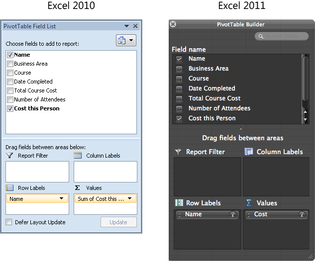
When the PivotTable is first created, it’s empty; you need to select the fields to include in the table. You’ll initially see an empty area on a worksheet for your PivotTable along with a pane for modifying it, both shown in Figure 21-3.
Note
In Excel 2010, this pane is named PivotTable Field List. In Excel 2011, the pane is named PivotTable Builder. (Both of these panes are shown in Figure 21-4.) To minimize repetition, this chapter will refer to the pane as PivotTable pane when referring to both Excel 2010 and Excel 2011.
Note
The PivotTable pane appears only when your insertion point is inside the PivotTable area on the worksheet. In Excel 2010, the pane is docked by default, and in Excel 2011 it floats next to your PivotTable. On either platform, you can drag to move or resize the pane as needed.
For Excel 2010 users, if you prefer to arrange the pane in a different layout, use the button that appears next to the heading Choose Fields To Add To Report. You can stack fields and table areas (as they are in Figure 21-3), place them side by side, or choose to show just one or the other.
Note
If you’ve used PivotTables in versions of Excel earlier than 2007 for Windows or Excel for Mac 2011, note that what you may know as the Page Field is now called Report Filter.
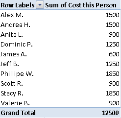
Just select a field in the top portion (field name list) of the pane to add it as a field that you want to include in your table. Think of this step as if you were creating a column chart. For example, if you want to look at cost per person using our sample data, select Name and Cost This Person. Excel adds the fields to what it believes to be the correct PivotTable area—either Row Labels or Values—as you see in Figure 21-4.
The corresponding PivotTable, with no additional formatting, looks something like Figure 21-5.
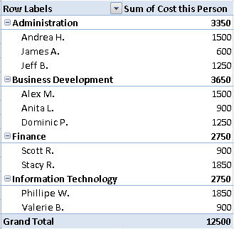
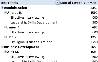
If you then want to further categorize the row field to see people grouped within their business area, select Business Area to add that field to your table. Initially, you might not get what you want; fields are prioritized in the order added, so the first row field chosen in the example that follows (Name) remains the highest-level row field, as shown in Figure 21-6.
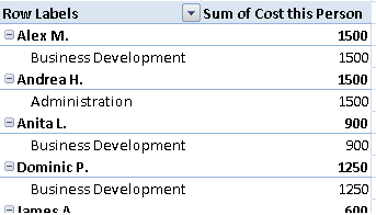
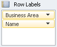
To group the people by their business area, just reorder the fields in the Row Labels area. That is, drag the Business Area field above the Name field where they appear in the Row Labels area of the PivotTable pane, as you see in Figure 21-7.
This is very much like grouping the labels in a category axis for a column or similar chart. And now, that PivotTable looks like Figure 21-8.
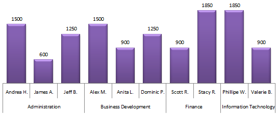
For comparison, if this were a column chart instead of a PivotTable, it would look something like Figure 21-9.
Note
See Also For details on grouping labels in the category axis of a regular chart, see the sidebar Group a Category Axis in Chapter 20.
Whenever you add fields to the PivotTable by selecting them in the field name list of the PivotTable pane, they’re added to either the Row Labels or Values area, based on whether Excel recognizes the data as numeric values. You can, however, move any field to any other area just by dragging it. You can also add fields to the various areas by dragging them from the field name list directly to one of the four field areas in the pane, instead of clicking to select the field.
Note
If you add a field to the Values area and Excel doesn’t recognize that field as numeric values, it will show those values in the PivotTable as a count of records in that field.
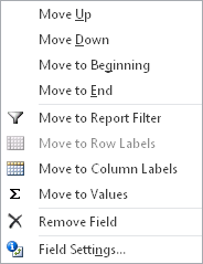
For Excel 2010 users, if dragging isn’t your cup of tea, click to add fields to the areas where they fall by default, and then click the arrow at the right of the field name where it appears in the table area portion of the pane. The options in that pop-up menu, shown in Figure 21-10, include the ability to move that field to any other area in the PivotTable, to move fields up or down in priority within a given PivotTable area, or to access field settings (discussed in the section Working with Field Settings, later in this chapter).
In Excel 2011, there isn’t an arrow to the right of the field name; instead, there’s an information icon that you can click to display the PivotTable Field dialog box, which provides settings discussed later in this chapter.
Understanding the four PivotTable field areas is the key to being able to use PivotTable reports effectively. Following are nutshell definitions of each, after which you’ll find an example from the sample data being used in this chapter.
Use the Values area for the fields that represent the data you want to analyze. Each value field is the equivalent of a data series in a column chart.
For example, in a PivotTable showing training cost per person, the cost is the Values field.
The Row Labels and Column Labels areas are the categories for which you want to view data. These areas are the equivalent of the category axis labels or series names on a column chart.
For example, when you’re analyzing cost per person, the list of people’s names would be a row field. The person’s business area or the name of the course might be either an additional row field or a column field. Subsequent row fields (or any column fields) are typically used to break out data for the categories in the primary row field, but row and column fields can be used interchangeably as needed.
The Report Filter area is for fields by which you can filter your Row Label or Column Label entries to show only row or column entries that match the filter criteria.
For example, Business Area or Course might be an effective report filter if you want to view cost per person for just certain business areas or certain courses at once.
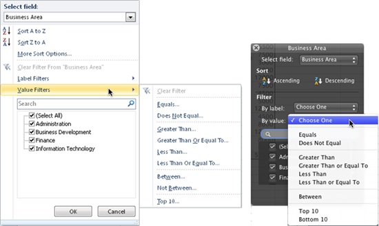
In addition to selecting the right fields and right placement for those fields in your table, you can sort fields or filter them based on either quantitative (value) or qualitative (label) data. For example, filter the Name field in the sample data by names that begin with A (a label filter) or by total-cost-per-person values greater than 5,000 (a value filter).
Filters in PivotTables work as they do in regular Excel tables. Click the drop-down arrow that appears at the right of a row label or column label heading to open the filter pane and access filter options.
If you have more than one row or column field active in the PivotTable, the pane gives you the option to select the field you want to filter, as shown in Figure 21-11.
Once you place a filter on any field, notice that the drop-down arrow for the sort and filter pane displays a funnel icon.
If you move a filtered field between the Row Labels and Column Labels areas, the filter remains intact. However, if you move a field from Row or Column Labels to Report Filter, the existing filter is cleared automatically.
To remove a filter after you’ve set it, click into the field for which you set the filter and then open the sort and filter pane for the option to clear the filter. This option will be unavailable if your insertion point is anywhere in the table other than in an instance of the filtered field.
In Figure 21-11, notice that the clear option in Excel 2010 appears above the filter options. In Excel 2011, the clear option is hidden behind the pop-up menu in this screenshot; it appears at the bottom-right of the sort and filter pane.
In Excel 2010, you can also clear filters on the PivotTable Tools Options tab, using the Clear button in the Actions group.
Tip
In Excel 2010, you can also filter a field directly from the PivotTable pane, whether or not you’ve added it to a table area. If you filter a field before adding it to a table area, you can still remove the filter once the field is part of the PivotTable.
When you hover your mouse pointer on a field name in the field name list area of the PivotTable pane, you see an arrow to the right. Click that arrow to open the sort and filter pane.
So, you now have a basic PivotTable. You can move fields around and examine your data in as many ways as you can logically combine the fields from your source data. But chances are that you may want to customize things a bit more. The sections that follow provide an overview of PivotTable capabilities along with key tips for customizing field and table settings.
You can reorganize the layout of your table, customize field names, manage subtotal options, select formulas by which to present or summarize value fields, and customize the appearance of field results.
When you right-click a field, you see the Field Settings option (in Excel 2010 for value fields, this option is Value Field Settings). Between these dialog boxes, the PivotTable tabs on the Ribbon, and the shortcut menu options available when you right-click a field in the table, you have many options for customizing a great many field settings, such as the layout options shown in Figure 21-12.
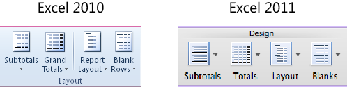
Figure 21-12. PivotTable layout options appear on the Pivot Table Tools design tab in Excel 2010 and the PivotTable tab in Excel 2011.
Following are instructions for some of the most useful field customizations:
You can change the Report Layout by choosing among Compact, Outline, and Tabular formats, or add blank rows between each group of row labels for a layout that’s easier to read.
In Excel 2010, on the PivotTable Tools Design tab, in the Layout group, click Report Layout.
In Excel 2011, on the PivotTable tab, in the Design group, click Layout. Note that these options are new for Excel 2011.
Report layout options affect all levels of row headings—meaning that you can have only one layout setting per table. Adding blank rows (notice the option shown in Figure 21-12) will affect each row field that has a lower-level field grouped beneath it.
In Excel 2010, there is a new Report Layout option named Repeat All Item Labels. If you have more than one field as a row label in your PivotTable and only the first occurrence of the row label displays, you can use the Repeat All Item Labels to repeat the row labels throughout your PivotTable. This new functionality primarily enables you to utilize PivotTable data in functions, such as VLOOKUP, INDEX, and MATCH. Note, however, that the repeated labels do not display if your PivotTable report uses the Compact layout.
Expand/collapse icons are on by default for any row or column field that has a lower-level field grouped beneath it.
In Excel 2010, these are +/- buttons. To hide these buttons, on the PivotTable Tools Options tab, in the Show/Hide Group, click +/- Buttons.
In Excel 2011, the newly added expand/collapse buttons are triangles. To hide these triangles, on the PivotTable tab, in the View group, click Triangles.
To change the position of subtotals (so that they appear at the top or bottom of the group), use the Subtotals buttons shown in Figure 21-12. In Excel 2010, this command also includes the option to hide all subtotals in the table at once.
In addition to displaying subtotals, you can expand or collapse all visible instances of the active field, or even expand or collapse individual records.
In Excel 2010, find expand and collapse options on the PivotTable Tools Options tab, in the Active Field group, to expand or collapse all visible instances of the active field.
In Excel 2011, find these options on the PivotTable tab, in the Field group.
To expand or collapse individual entries, use the buttons to the left of the entry in the table.
Entries appear for individual records when they have a lower-level field beneath them. For example, in the sample data, if you add the field Course under Names in the Row fields to break out cost per person, per course, each person’s name will have an expand/collapse button.
You can also expand or collapse the entire field from the shortcut menu available when you right-click any entry in the field. In Excel 2010, you can also right-click an entry for expand/collapse options.
You can change the name of any field in the table without affecting the name of the field in the source data. In Excel 2010, find this option on the PivotTable Tools Options tab, in the Active Field group. In Excel 2011, the same option is on the PivotTable tab, in Field group.
As mentioned earlier, when Excel recognizes a field you add to the Value area as numeric, it sums the values by default; otherwise, it counts them. However, you can change that function as needed, with quite a bit of flexibility. Just right-click the field and on the shortcut menu, click Value Field Settings (Field Settings in Excel 2011). Then in the resulting dialog box, select the function you want from the list of available options.
Note that Excel 2010 users can also right-click the field, point at Summarize Values By, and choose from six common functions.
To change the number format for all instances of a value field, right-click any instance, click Value Field Settings (Field Settings), and then click the Number Format button (Number in Excel 2011). Excel 2010 users can also right-click a value field and then click Number Format.
Note
For label and value fields alike, the options when you right-click include Format Cells. Unlike the Number Format option for value fields, Format Cells affects only selected cells, just as though you were selecting cells in a typical worksheet. Formatting you apply through the Format Cells dialog box this way is direct formatting and will not be removed when you apply a PivotTable style. Depending on your PivotTable settings, however, cell formatting may not be retained when you refresh table data. To retain cell formatting when the table is updated, in the PivotTable Options dialog box, on the Layout & Format tab (Layout tab in Excel 2011), click Preserve Cell Formatting On Update.
Insider Tip: Detail Is Just a (Double) Click Away
If you need to extract a portion of data from the current PivotTable organization, just double-click a value field entry. Excel creates a table on a new sheet containing all details from your source data for the portion of the table you requested. For example, if you double-click the value beside Business Development, Excel then creates the table shown in Figure 21-13 on a new sheet.
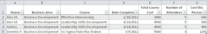
Figure 21-13. Data for the Business Development area extracted from sample PivotTable onto a new worksheet.
Note that this action works whether or not subtotals are displayed. You only need to double-click in the value cell for a field entry, whether or not it currently displays a value.
If you get an error when you try to extract data using this method (“Cannot change this part of a PivotTable”), in the PivotTable Options dialog box, on the Data tab, select the option Enable Show Details.
If you turn off subtotals for a field and nothing seems to happen, you’re just running into a common misunderstanding. You need to turn off the subtotal from the field that displays it, not from the field that contributes the values for it.
For example, say you have three row fields, as shown in the PivotTable in Figure 21-14.
If you don’t want the subtotals that appear on each row where you see a name, you have to turn off subtotals for the Name field. Even though those subtotals are combining the values from the lower Course Name field, it’s not the Course Name subtotal you’re seeing.
Every row or column field has subtotals turned on by default, but those subtotals become visible only when you give them a lower-level field by which to subtotal.
You can turn off subtotals for a single field in the options for that field. To do so, follow these steps.
In the PivotTable pane, in the Row Labels section, click the drop-down arrow to the right of the field.
In the Field Settings dialog box, under Subtotals, select the option None.
Or, right-click the field and click Subtotal “<Field Name>”. If nothing happens, be sure you selected the correct field when you turned off subtotals.
For fields in the Row Label, Column Label, or Report Filter areas, you need the Field Settings dialog box (PivotTable Field dialog box in Excel 2011) for just two tasks: customizing the function used for subtotals, and (for Excel 2010) placing page breaks between items when printing.
To view the Field Settings dialog box in Excel 2010, on the PivotTable Tools Options tab, in the Active Field group, click Field Settings.
To view the PivotTable Field dialog box in Excel 2011, on the PivotTable tab, in the Field group, click Settings. Or, in the PivotTable pane, click the information icon on the right side of a field name that appears in one of the four PivotTable field areas.
You can also right-click in a field and then click Field Settings to open this dialog box (note that this option is the same in both Excel 2010 and Excel 2011).
Note
In both Excel 2010 and Excel 2011, the content of the Field Settings dialog box changes based on the type of field (label or value), but the name of the dialog box changes only in Excel 2010. When used in a value field in Excel 2010, the dialog box is named Value Field Settings.
For additional flexibility with value field calculations, use the Show Values As (Show Data As) functions, accessible from this dialog box. For example, you can choose to display values as the difference from or percentage of a specific value from another field, as you see in Figure 21-15.
For Excel 2011 users, the PivotTable Field dialog box is the only place to access the Show Data As functions. To expand the dialog box to access these functions, click Options.
For an alternative to the dialog box, Excel 2010 users can now also access Show Values As functions when you right-click the value field, or on the PivotTable Tools Options tab, in the Calculations group.
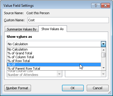
Figure 21-15. The Value Field Settings dialog box in Excel 2010 (left) and the PivotTable Field dialog box in Excel 2011 (right), displaying Show Values As (Show Data As) options.
One of the best ways to try out these calculations is to add the same value field to your PivotTable multiple times so you can see the actual value and the calculated value at the same time.
Note
Excel 2010 includes six new Show Values As calculations in addition to the ones you might already know. These include % Of Parent Row Total, % Of Parent Column Total, % Of Parent Total, % Of Running Total In, Rank Smallest To Largest, and Rank Largest To Smallest.
Note
See Also For more information about working with the new Show Values As calculations in Excel 2010, see the power tips section in the Excel 2010 product guide. You can download all Office 2010 and Office for Mac 2011 product guides from the Microsoft Download Center. Find the Office 2010 guides at http://www.microsoft.com/downloads/en/details.aspx?FamilyID=e690baf0-9b9a-4c47-88da-3a84f3e9b247, and the Office 2011 guides at http://www.microsoft.com/downloads/en/details.aspx?FamilyID=6ca3d83a-bfb2-4cb4-a3bf-86c05ace6b06. Note that the Excel 2011 product guide also contains expert tips for working with the improved PivotTable tools.
In addition to the fields in your source data, you can add a field that is a calculation based on the values in one or more of your source data fields. Calculated fields can be used only in the Values area of the table. To create a calculated field:
In Excel 2010, on the PivotTable Tools Options tab, in the Calculations group, click Fields, Items, & Sets, and then click Calculated Field.
In Excel 2011, on the PivotTable tab, in the Field group, click Formulas, and then click Calculated Fields.
In the Insert Calculated Field dialog box, shown in Figure 21-16, name your field and then create your formula, inserting fields into the formula as needed from the list provided.
When you’ve finished inserting fields, click Add to add the new field to the field list in the PivotTable pane.
The field will be added to the Values area in your table. You can remove it from the PivotTable just as you would any field.
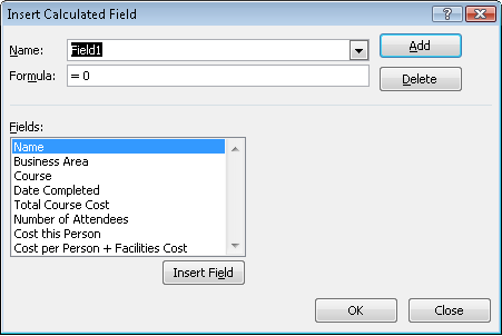
To delete a calculated field from the field list, or to modify it, use the Insert Calculated Field dialog box. When you open that dialog box, select the field you want to delete from the drop-down list labeled Name and then click Delete. Notice that Modify also becomes an option when you select an existing calculated field name from this list.
You can make numerous modifications for PivotTables right from the Ribbon, as already shown. However, when you venture into the Options dialog box for PivotTables, you get a great deal more flexibility.
To access this dialog box, right-click anywhere in the table and then click PivotTable Options. Or, do the following:
It’s a good idea to look through this dialog box the first time you create a PivotTable just to take stock of the details you can manage here. In addition to PivotTable Options settings mentioned earlier in the chapter, here are a few of my favorites:
Specify text to display for empty cells or error values. Find this option on the Layout & Format tab in Excel 2010 or the Display tab in Excel 2011.
Specify the indent width for subsequent row fields when you’re using the compact layout. This option is also on the Layout & Format tab in Excel 2010. In Excel 2011, find this option on the Layout tab.
Enable a setting to allow multiple filters per field. Find this option on the Totals & Filters tab in Excel 2010 and the Layout tab in Excel 2011.
Change the sort order of fields in the PivotTable pane. This option is available on the Display tab in Excel 2010 and the Layout tab in Excel 2011.
Formatting PivotTables is very much like formatting ranges as tables. You get a separate set of PivotTable styles, which you can create and customize almost exactly as you can table styles in Excel. The only difference is that, with PivotTable styles, you can create custom formatting for additional table elements, such as Subtotal and Grand Total rows and columns, as well as Report Filter Labels and Values.
In Excel 2010, you access PivotTable styles on the PivotTable Tools Design tab. In Excel 2011, PivotTable styles are on the PivotTable tab. Also on this tab are style options for displaying row and column headers as well as banded rows and columns, similar to table style options.
Note
See Also For more details on creating and working with these styles, see the section Formatting Ranges As Tables, in Chapter 17.
The Slicer in Excel 2010, shown in Figure 21-17, just might be the biggest improvement to PivotTables since, well, the inception of PivotTables.
Essentially, a Slicer is a filtering tool. So, because you already have filter capabilities in a PivotTable, you might be wondering what all the fuss is about. Well, a Slicer enables you to view your filter choices while viewing the filter results. It also enables you to filter multiple PivotTables in a single click. (Okay, that second part is pretty cool, right?)
Note
See Also For more on PivotChart functionality in Excel 2010, see the section Using PivotCharts, later in this chapter.
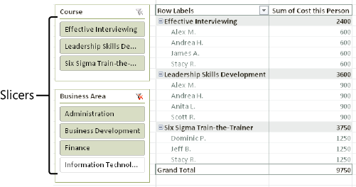
Let’s start by taking a look at the example shown in Figure 21-17:
Notice the two Slicers, Course and Business Area. Both Slicers can be used to filter the PivotTable. In these examples, data for all courses is displayed in the table, and data for all business areas other than Information Technology is also displayed.
Although the Business Area field is not displayed in this PivotTable, the Business Area Slicer can still be used to filter the table. All source data fields are available to your Slicers.
For Mac Users
As noted at the beginning of this chapter, Slicers are an Excel 2010 exclusive. However, you can open workbooks that contain Slicers and even use a Slicer in a workbook that contains them (there is a catch, but bear with me).
When you try to open an Excel 2010 workbook that contains a Slicer in Excel 2011, you’ll get a warning indicating that there is incompatible content and offering to open the workbook in read-only mode. When you accept this option, you’ll be prompted with the new Open & Repair feature, which will remove the Slicer from the workbook before opening it. (Don’t be alarmed—read on.)
Note
See Also To learn about the new Open & Repair feature in Excel 2011, see Chapter 17.
For example, the workbook shown in Figure 21-17 looks like Figure 21-18 when opened in Excel 2011.
Notice the empty area to the left of the PivotTable, where the Slicers were displayed in Figure 21-17. Even though they were removed, the PivotTable has retained its filtered state and the data itself remains the same.
So, if Slicers are removed when you open a workbook in Excel 2011, how you can use them? The answer to that question is Excel Web App. Because Excel Web App enables you to use Slicers that exist in a workbook, you can do your slicing and dicing in the cloud. (And doesn’t saving that workbook to the cloud make it easier to share with whoever sent you the Excel 2010 workbook anyway?)
Note
See Also For more information on Excel Web App and your options for saving workbooks to the cloud for easier sharing, see Chapter 2.
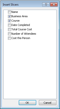
Click in the PivotTable for which you want to add a Slicer.
On the Insert tab, click Slicer. (Note that Slicers are also available on the PivotTable Tools Options tab, in the Sort & Filter group.)
The Insert Slicers dialog box displays, as shown in Figure 21-19.
Select the field or fields you want to use to filter your PivotTable. Note that a separate Slicer is created for each field you select.
Click OK.
That’s all there is to it. You’ve got your Slicers, and you’re ready to start slicing and dicing your PivotTable data.
Just click an item in a Slicer to apply a filter. But before you do, check out the following additional Slicer essentials to help you get the most from these tools.
Note
Companion Content In the PivotTables.xlsx sample file referenced earlier (available in the Chapter21 sample files folder online at http://oreilly.com/catalog/9780735651999), find the example used for the figures in this section on the worksheet named “Slicer Examples.”
Selecting items in a filter is identical to selecting cells in a worksheet. You can drag or hold the Shift key to select contiguous items, or you can hold the Ctrl key to select or clear noncontiguous items.
 To clear all filtered items, click the funnel icon (shown to the left of this paragraph) that appears in the upper-right corner of a Slicer.
To delete a Slicer, click the Slicer and press Delete. Or, right-click the Slicer and then click Remove “<Slicer Name>”.
You can move or size a Slicer similar to a shape or chart, so you can place it anywhere on the worksheet. And, because a Slicer sits in the drawing layer, you can align it to other Slicers or graphic objects.
Note that Slicers even appear in the Selection Pane, like all graphic objects.
Note
See Also To learn about the Selection Pane, see Chapter 17.
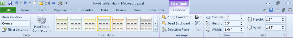
When you select a Slicer, the contextual Slicer Tools Options tab becomes available, as shown in Figure 21-20. This tab provides tools for formatting a Slicer and managing PivotTable connections.
Note
The PivotTable Connections command on the Slicer Tools Options tab refers to connecting a Slicer to multiple PivotTables. This is unrelated to Workbook Connections (such as the Connections tools on the Data tab or the Choose Connection option in the Create PivotTable dialog box) that enable you to select and manage external data sources.
Note
See Also For more information on managing PivotTable connections, see the section Connect Multiple PivotTables to a Slicer, later in this chapter.
On the Slicer Tools Options tab, notice the Slicer Styles gallery. Unlike other Excel objects, a Slicer gets its formatting only through a style. If you want to change the font, colors, or other formatting, you need to either apply a different style or create a new style. You can create and customize a Slicer style almost exactly as you can table styles in Excel. But instead of formatting table elements, such as a header row and the first column, you format Slicer elements, such as selected or unselected items with or without data.
Note
See Also For more details on creating and working with these styles, see the section Formatting Ranges As Tables in Chapter 17.
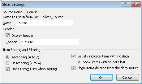
Also on the Slicer Tools Options tab, in the Slicer group, note the Slicer Settings option. This command displays the Slicer Settings dialog box, shown in Figure 21-21.
In this dialog box, you can customize the Slicer caption, adjust sorting and filtering options, and specify how to display Slicer items that have no data.
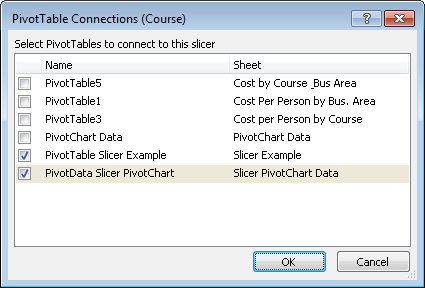
To connect the same Slicer to multiple PivotTables or PivotCharts, start in a workbook that contains multiple PivotTables (or PivotCharts)—such as the sample file named PivotTables.xlsx, referenced earlier—and then follow these steps.
Note
PivotTables don’t need to be based on the same data to be connected to the same Slicer. They do, however, need to have the same structure, such as the same field names and compatible data.
Click in the Slicer that you want to connect to multiple PivotTables.
On the Slicer Tools Options tab, in the Slicer group, click PivotTable Connections.
Select the PivotTables you wish to connect from the list provided, as shown in Figure 21-22.
This list will display all available PivotTables and PivotCharts that are compatible with the active Slicer.
A PivotChart is just a PivotTable in another form. It’s also an Excel chart just like any Excel chart, but with additional functionality.
In fact, the column chart in Figure 21-23 (also shown earlier in Figure 21-9 as a comparison to a basic PivotTable) is actually a PivotChart. It’s available for your perusal in the sample file (PivotTables.xlsx) referenced earlier.
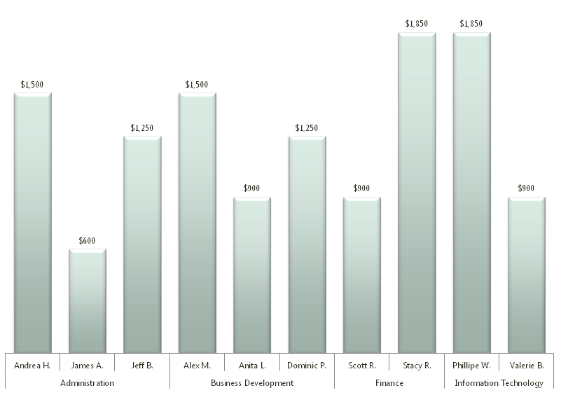
Yes, it looks exactly like a regular column chart, and you can use it as one if you choose. The only difference with using it instead as a PivotChart is that you get added functionality. What you’re not seeing in this screenshot are the buttons that enable you to filter directly on the PivotChart. (If you’re a long-time Excel user, you may recall that this capability was removed in Excel 2007. Fortunately, that removal was short-lived, and the feature is back in Excel 2010.) Take a look at the same PivotChart in Figure 21-24, this time at full screen with the field buttons displayed.
To sort or filter directly on the PivotChart, just click a field button to open a list of filter and sort options, as shown in Figure 21-24. Also notice the contextual PivotChart Tools tabs, which include the three Chart Tools tabs as well as an Analyze tab from which you can insert a Slicer, refresh your data, or show/hide field buttons.
Using a PivotChart adds a visual dimension to working with PivotTable reports and can be an excellent solution when you’ll be including your PivotTable in a report or presentation. PivotCharts can also be a nice way for you to assess different charted configurations of your data when deciding what chart type to use or which elements of your data to present.
A PivotChart is always based on a PivotTable because the chart is, essentially, just a visual representation of the table.
To create a PivotChart from an existing PivotTable, click the PivotChart option on the PivotTable Tools Options tab and select the chart type. The PivotChart is inserted on the same sheet as the source PivotTable, displaying the options currently active in the source PivotTable.
To create a PivotChart directly from source data, on the Insert tab, click to expand PivotTable options and then click PivotChart. To populate the chart, just use the PivotTable pane to insert fields as needed. Note that both the PivotChart and the PivotTable will be created at the same time.
If you’re an experienced PivotChart user, you’ll be glad to know that—along with the restored ability to filter directly on a PivotChart—there are no longer two task panes, one for the PivotTable and one for filtering the chart. You now have a single task pane for both the PivotTable and the PivotChart. (Note that the text on the PivotTable pane changes slightly depending on whether a PivotTable or PivotChart is active.)
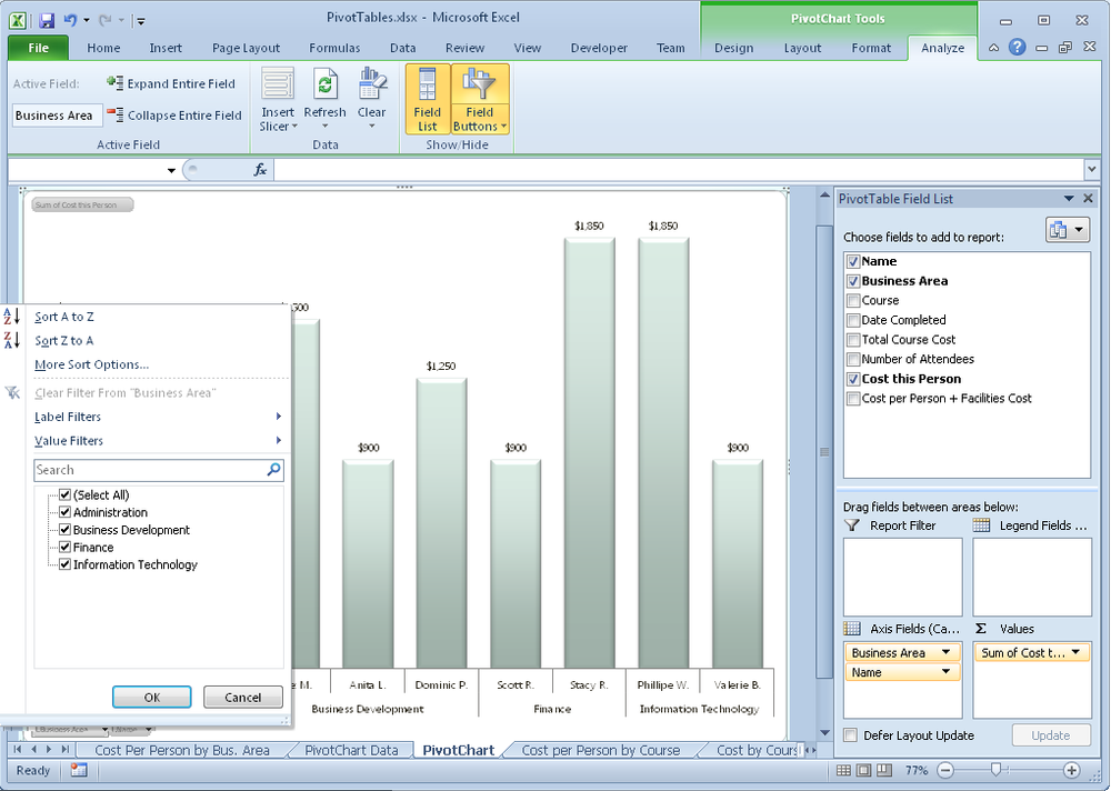
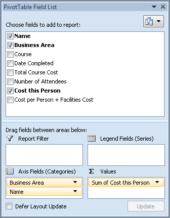
When a PivotChart is active, Row Labels in this pane are referred to as Axis Fields (Categories), and Column Labels are referred to as Legend Fields (Series), as shown in Figure 21-25. Even though the text is different, the functionality remains the same.
Note
When working with a PivotChart, you can actually click the field where it appears on the chart to use it the Expand Entire Field and Collapse Entire Field options in the Active Field group options on the PivotChart Tools Analyze tab. For example, in the chart example shown in Figure 21-25, if you click the Business Area labels where they appear on the chart x-axis, the Business Area field is selected. If you click the Name labels on the x-axis, that field is selected. If your PivotChart doesn’t have multiple row fields, clicking the Expand Entire Field button will open a Show Detail dialog box, which lets you add a row field.
Also keep in mind that you can format a PivotChart exactly as you format a regular chart.
The most important thing to remember about using a PivotChart is that it’s always linked to its PivotTable. Delete, filter, or collapse a field on the PivotChart, and the same action happens to the PivotTable on which that chart is based.
For best results when you need both a PivotTable and PivotChart, create a copy of the PivotTable before generating the PivotChart so that you can manage each independently.
For easy reference once you have the concepts down, follow these steps to create and manage the basics of PivotTable and PivotChart reports:
Create your data in columns, with a single row of headings and a value in every cell of the range. For best results, format your data range as an Excel table.
Click in the table and then, in Excel 2010, on the Insert tab, click PivotTable. In Excel 2011, on the Data tab, in the Analysis group, click the arrow next to PivotTable, and then click Create Manual PivotTable. Or, click Create Automatic PivotTable and skip to step 5.
Just click OK in the Create PivotTable dialog box to accept the defaults and create your PivotTable on a new sheet, with the selected table as your source data.
On the new sheet, click to select the fields in the PivotTable pane that you want to include in your PivotTable.
After you’ve added your fields to the PivotTable Row Labels and Values areas on the PivotTable pane, drag field names to reorder them or to move fields to the Column Labels or Report Filter areas, if needed. Use the PivotTable areas as follows:
Each field in the Values area is the equivalent of a column chart data series.
Each field in the Row Labels or Column Labels area is the equivalent of the category axis labels or series names in a column chart.
Excel uses any field placed in the Report Filter area as criteria by which to filter the row or column fields shown in your table.
To customize the way a field looks in the PivotTable, use the available settings on the PivotTable Tools contextual tabs (PivotTable tab in Excel 2011) or the shortcut menu available when you right-click. To customize subtotals or, in Excel 2010, to set page breaks between field entries for printing, use the Field Settings dialog box (PivotTable Field dialog box in Excel 2011). Find the dialog box among the available right-click options or on the PivotTable Tools Options tab (PivotTable tab).
If the PivotTable options you need are not available from the Ribbon, find a wide range of settings—from customizing the way error values are displayed to preserving cell formatting when the table is refreshed—in the PivotTable Options dialog box. This dialog box is available either when you right-click in the table or from the PivotTable Tools Options tab (PivotTable tab).
To format the PivotTable, on the PivotTable Tools Design tab (PivotTable tab), apply a PivotTable style. Similar to table styles, you can use a built-in style, create your own custom PivotTable style from scratch, or duplicate and customize a built-in style. You can also specify options and layout preferences on the PivotTable Tools Design tab (PivotTable tab), such as banded rows and columns, report layout, and subtotal display.
To create a PivotChart in Excel 2010, click PivotChart on the PivotTable Tools Options tab and then select a chart type. Keep in mind that the PivotChart is linked to its PivotTable. To avoid losing PivotTable data when you remove or rearrange fields in the chart, create a copy of the PivotTable before creating the chart. You can format the chart just as you would a regular Excel chart—including moving the chart to its own sheet.
Note
See Also For additional information on Excel charts, see Chapter 20.
To insert a Slicer for your Excel 2010 PivotTable, click in the PivotTable or PivotChart and then, on the Insert tab, click Slicer.