
Chapter at a glance
Use
Use Goal Seek to determine the optimum value needed to solve a problem, Performing what-if analyses
Track
Track changing values with the Scenario Manager, Set Up
Apply
Apply an appropriate function to selected data using the Quick Analysis tools, ???

Examine
Examine your data in new ways with PivotTables, Creating a PivotTable

IN THIS CHAPTER, YOU WILL LEARN HOW TO
Perform goal-seeking operations and manage multiple scenarios.
Use the Quick Analysis tools.
Apply conditional formatting.
Import data from outside sources.
Create, edit, and manipulate Excel tables.
Perform customized sorting procedures.
Create a PivotTable.
After the data is entered into a workbook, your most tedious work is done. In this chapter, you’ll learn to work with many of Excel’s analysis features to help reveal the truths that are hidden beneath the numbers.
Practice Files
To complete the exercises in this chapter, you need the practice files contained in the Chapter20 practice file folder. For more information, see Download the practice files in this book’s Introduction.
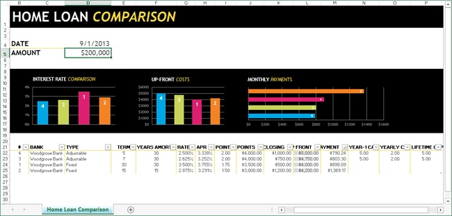
Microsoft Excel 2013, like all the Microsoft Office Home and Student 2013 applications, comes with numerous ready-made templates you can use right out of the cloud (the old aphorism right out of the box no longer seems appropriate). Many of the built-in templates are sophisticated applications all by themselves; the astute spreadsheet student would do well to study them.
Many of these templates represent hundreds of hours of work and deep understanding of features, some of which will be introduced in this book. They are aspirational and provide examples of many of the features that you’ll use, as building blocks to create your own mini-applications. Use these excellent template applications if you can, or modify them to fit your needs, but learn from them as well.
In this exercise, you’ll create a new document based on a template.
Set Up
You don’t need any practice files to complete this exercise. Start Excel, open a clean, blank workbook, and follow the steps.
Click the File tab, and then click New.
Click any of the template sample images once to view a visual preview.
Click the Create button to open a new worksheet based on the template. (Double-clicking a template sample image is the same as clicking the Create button in the preview window.)
Click the menu arrow next to the Name box in the formula bar, and then click Loans. A selected table will be displayed below the charts.
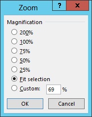
Click the View tab.
Click the Zoom button.
Click the Fit Selection option to adjust the size of the worksheet so that it fits on the screen. (Note that depending on your screen size, this zoom option may either increase or decrease the size of the worksheet.)
Click OK. The entire width of the worksheet should be visible on your screen.
Click any cell to deselect the table.
This is one of the simpler templates, but it’s useful and instructive, just like all the templates that are available in Excel 2013. Before you start building a workbook for a specific task, you should take the time to look for an existing template that may perfectly suit your needs. If you enter a keyword or two into the Search Online Templates box on the New page, a vast and ever-growing catalog of cloud-based templates will be displayed. New ones are added constantly; all are updated if bugs, typos, or other issues arise, making this a preferred source for safe and useful tools.

You do it every day. You probably have thoughts such as, “What if I get stuck in traffic with no gas in the tank?” or “What if I get a raise?” or “What if we downsize the house?” Excel can help you answer at least two of those questions, but for the next exercise, let’s use the latter question.
In this exercise, you’ll work with the workbook created in the previous chapter. It explores the costs within a range of acceptable prices when selling a home and purchasing a less expensive and less expansive home (values only, ignoring loan and equity issues).
Set Up
You need the RealEstateTransition_start.xlsx workbook located in the Chapter20 practice file folder to complete this exercise. Open the RealEstate-Transition_start.xlsx workbook, and save it as RealEstateTransition.xlsx.
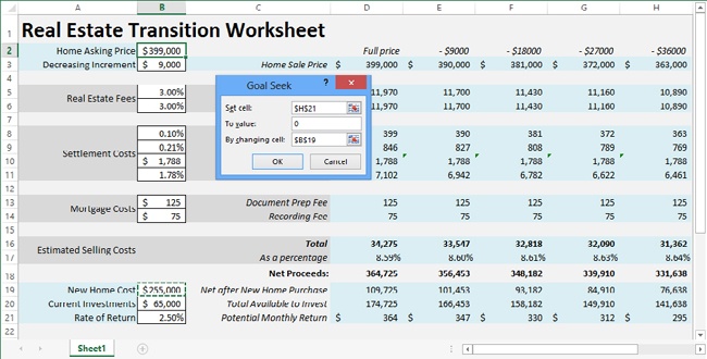
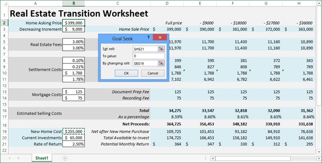
On the Data tab, in the Data Tools group, click What-If Analysis, and then click Goal Seek.
With the cursor in the Set Cell box, click cell H21.
In the To Value box, enter 0 (zero).
Click the By Changing Cell box, and then click cell B19.
Click OK in the Goal Seek dialog box, and then click OK again to dismiss the Goal Seek Status dialog box.
Now when you examine the worksheet, the Goal Seek command has increased the cost of a new home until all of the money (both net proceeds from the existing home sale and current investments) is used up at the lowest acceptable sale price in column H (thus yielding a zero potential monthly return). This tells you that you can spend up to about $396,000 on a new home, if you don’t mind spending some or all of your savings.
You could have used the good old trial-and-error method to do this, but by using the Goal Seek command, Excel allows you to reach a faster and more precise conclusion.
When you use the Goal Seek command, you can instantly view the results of one possible scenario, and then you can use the Undo command to revert to the original values on the worksheet. Usually, however, there is more than one possible scenario, and it would be helpful if you could keep track of them. Excel provides the Scenario Manager for just this purpose.
Important
If you want to access a workbook online by using Excel Web App, don’t add scenarios. The presence of a scenario will prevent you from opening the workbook with the Web App.
In this exercise, you’ll save sets of variables in scenarios, naming them so you can display them again later.
Set Up
You need the RealEstateTransition.xlsx workbook you created in the previous exercise to complete this exercise.
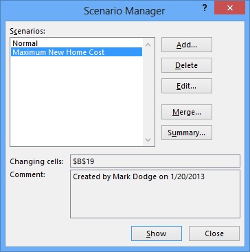
On the Data tab, click the What-If Analysis button in the Data Tools group and choose Scenario Manager.
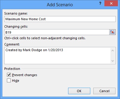
Click the Add button to display the Add Scenario dialog box.
In the Scenario name box, enter Maximum New Home Cost.
In the Changing Cells box, enter B19, if it is not already entered (the active cell appears here).
Click OK, and the Scenario Values dialog box appears, showing the current value in cell B19. Make sure it says 396,638 (and if not, change it).
Click OK, and the Scenario Manager dialog box reappears with your new scenario in the Scenarios list.
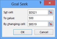
Click the What-If Analysis button and then click Goal Seek.
With the cursor in the Set Cell box, click cell D21.
In the To Value box, enter 500.
Click the By Changing Cell box, and then click cell B19.
Click OK in the Goal Seek dialog box, and then click OK to dismiss the Goal Seek Status dialog box.
Click the What-If Analysis button, and then click Scenario Manager.
In the Scenario Manager dialog box, click Add.
In the Scenario Name box, enter Maximum monthly income.
Click OK in the Add Scenario dialog box, and then click OK to dismiss the Scenario Values dialog box.
With the Scenario Manager dialog box open, you can select each scenario on the list, click the Show button, and view the results on the worksheet. Otherwise, you can double-click the name of the scenario you want, which will dismiss the dialog box.
You can also build multivariable scenarios, perform goal seeking, or just enter values you want to use in cells. You can also add a different set of scenarios for each new changing cell. Then you can test one set of scenarios with other sets of scenarios and save the most compelling combined results as yet another scenario with all the changing cells specified.
Tip
Although you can only solve for one changing cell at a time with the Goal Seek command, you can specify up to 32 changing cells in a scenario. To seek goals using more than one variable, use the Solver—a sophisticated analysis tool that is beyond the scope of this book. Excellent Solver help and examples are available in the online Help system.

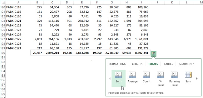
You may have noticed that every time you select more than one cell in the worksheet (as long as the cells are not empty), an icon appears near the lower-right corner of the selection. This is called the Quick Analysis button, and it offers a menu containing many of the commands and features available on the ribbon that can be applied to cell ranges. The Quick Analysis menu is like a mini-ribbon, with categories (tabs) across the top. Click a category to change the available command buttons, as illustrated in the following exercise.
In this exercise, you’ll use the Quick Analysis tools to apply formatting and add totals to a selected range.
Set Up
You need the 2015Projections_start.xlsx workbook located in the Chapter20 practice file folder to complete this exercise. Open the 2015Projections_start.xlsx workbook, and save it as 2015Projections.xlsx.
Make sure that the 2015 Projections worksheet tab is selected.
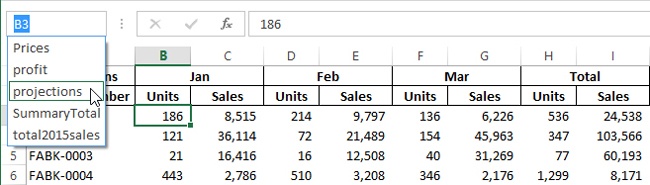
Click the small downward-pointing arrow in the Name box to the left of the formula bar, and select the name projections to select all the values in the table.
Scroll to the bottom of the selection and click the Quick Analysis button. (Point to each command icon on the menu to display an instant preview.)
Click the Totals category, and then click the first Sum button to add a row of totals below the selected table. (The second Sum button adds totals on the right instead of at the bottom.)
Click the Quick Analysis button and then click the Totals category.
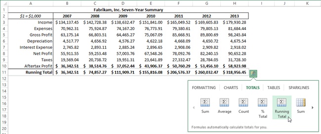
Click the Running Total button.
This time, because you selected the label in column A in the selection, Excel added the Running Total label in row 11. When you select an appropriate label, along with the data, Excel adds a new label for you.
An example of inappropriate labels would be the year numbers at the top of the table on the Seven-Year Summary tab in the 2015Projections.xlsx workbook; dates are numeric, so any formulas you apply using AutoSum or Quick Analysis will attempt to include them in calculations.
A running total simply combines the values in the selected cell(s) one by one, creating an incremental tally, from either left to right or top to bottom.
Take a few minutes to explore all the options on the Quick Analysis menus. More features will be explained later.
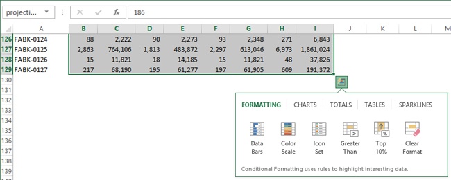
Sometimes astute analysis may consist of simply being aware when something in your worksheet reaches a limit or crosses a threshold. The conditional formatting features in Excel do that and a lot more, such as highlighting cells that contain specific text or proximate dates, and using icons or shading to give visual cues about cell contents. On the Quick Analysis menu, all of its formatting commands are actually conditional formats.
In this exercise, you’ll use Conditional Formatting to highlight the important details on a worksheet.
Set Up
You need the 2015Projections.xlsx workbook from the previous exercise to complete this exercise.
Make sure the 2015 Projections worksheet tab is active.
Click the downward-pointing arrow in the Name box, to the left of the formula bar, and select the name total2015sales to select the values in column I.
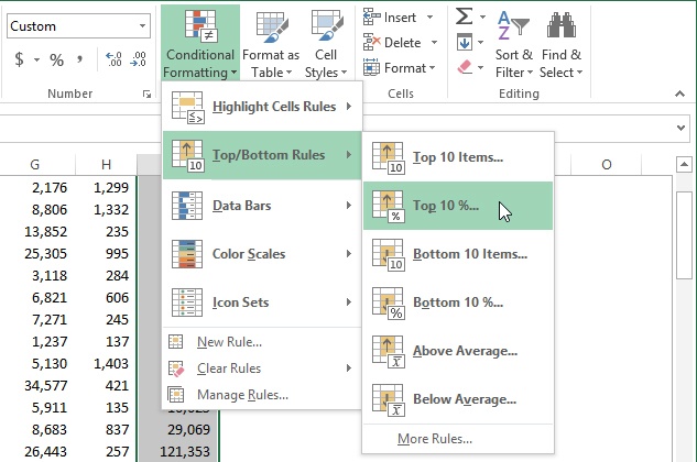
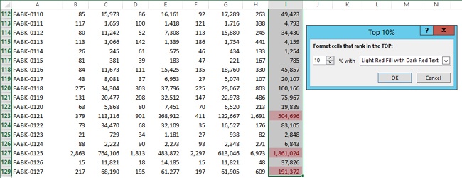
Click the Conditional Formatting button on the Home tab, click Top/Bottom Rules, and click Top 10%.
A dialog box appears that allows you to change the format and the percentage. (This does not happen when you use the equivalent command on the Quick Analysis menu. Instead, it uses the default settings.) With the dialog box open, you can choose options and view the results displayed on the worksheet before clicking OK.
In the Top 10% dialog box, enter or select the percentage that you want to change to 20%.
Click OK, and all the products projected to be in the top 20 percent of sales in 2015 are highlighted.
Click the Unit Sales worksheet tab.
Click the downward-pointing arrow in the Name box to the left of the formula bar and select the name unitsales to select all the values in the table.
Click the Conditional Formatting button, click Highlight Cells Rules, and then click Less Than.
In the Format Cells that are Less Than box, enter 0 (zero); there should be no unit sales less than zero, so a negative entry must be a typo.
Click OK, and notice that cell BY87 is highlighted.
Select cell BY87 and enter 90, and notice that the highlight disappears.
Because you have applied the less than zero formatting parameter to this table, any time another negative value appears, the errant cell will be highlighted unless you remove the formatting. You can do so by using the Conditional Formatting button, Clear Rules command, and clicking either the Clear Rules From Selected Cells command, or the Clear Rules From Entire Sheet command.
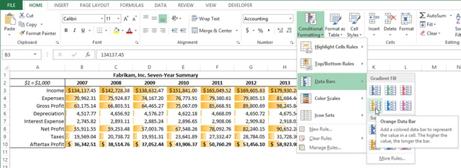
Experiment with the other commands in the Conditional Formatting menu, but use these formats carefully; they may provide too much clutter to be helpful. The Data Bars command inserts a small one-bar chart into each cell that indicates the cell’s value in relation to other selected cells. The Icon Sets offer graphic alternatives to bars, but you will probably need to widen some cells; for these; icons are actually inserted into cells, though all other conditional formats are more or less transparent. The Color Scales command tints each cell in a solid color according to its rank, and the Data Bars command puts varying sizes of bars of the same color into cells like individual columns in a horizontal column chart.
Click the Seven-Year Financial Summary tab.
Click the downward-pointing arrow in the Name box to the left of the formula bar and select the name SummaryTotal to select all the values in the table.
Click the Conditional Formatting button, click Data Bars, and position your mouse pointer to point to the Orange Data Bar command to preview the results on the worksheet. (Click the command if you want to apply the previewed formatting.)

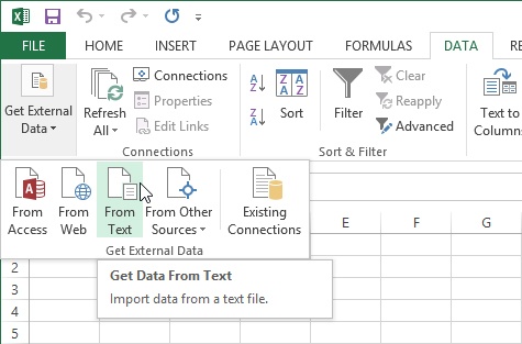
Sometimes data you work with does not reside in a workbook, but in a corporate database, a document created by another program, on the web, or elsewhere. Click the Data tab and take a look at the commands in the Get External Data group. Including the commands on the From Other Sources menu, Excel provides ten different connection options, but in this next exercise, you’ll focus on importing data from a text file. Even if your data is stored in a Microsoft Access database or another program, you can save it as a text-based document; this is called a universal sharing format.
In this exercise, you’ll import data from a text file created by another program.
Set Up
You need the FabrikamJan2013Sales.txt file located in the Chapter20 practice file folder to complete this exercise. Start by opening a new, blank workbook.
Click the Data tab on the ribbon.
In the Get External Data group, click the From Text button to display the Import Text File dialog box.
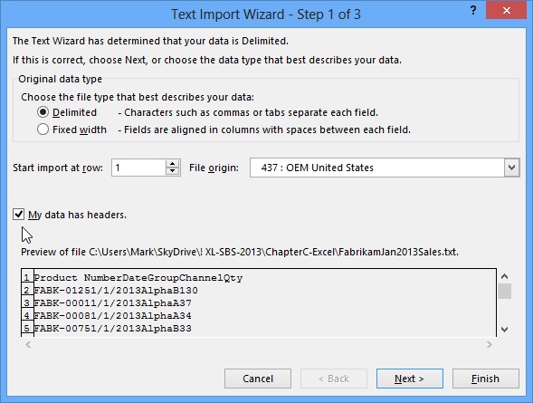
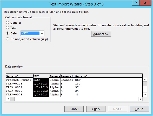
Select the FabrikamJanSales2013.txt file and click the Import button to display the Text Import Wizard.
Select the My Data Has Headers check box.
Make sure that the Delimited option is selected, and then click the Next button.
Make sure that Tab is the selected delimiter (a sample is available in the Data Preview area), and then click the Next button.
In the Data Preview area, click the Date column.
Click the Column Data Format option button labeled Date and make sure that MDY is selected.
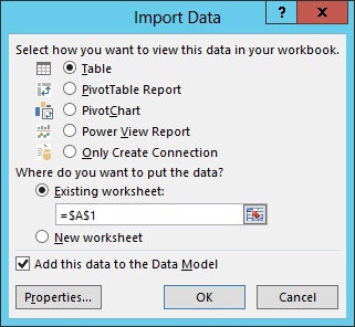
Click the Finish button to display the Import Data dialog box.
Select the Add This Data to the Data Model check box.
The options at the top of the dialog box become active.
Click OK to import the data formatted as a table, which is the default selection in the Import Data dialog box.
Click the header for column B to select the entire column.
Click the Number Format drop-down menu on the Home tab of the ribbon, and click Short Date.
Click the Save button (located on the Quick Access Toolbar); because the data was imported into a new workbook, the Save As dialog box appears.
Name the file Fabrikam-Jan-2013-Sales.xlsx and click the Save button.
Tables have evolved a lot over the years. In previous versions of Excel, tables were called lists. In the 1990s, Microsoft did a lot of usability research, and they were surprised to find that list management was the number one reason that people used Excel. In Excel 2013, tables not only offer prepackaged formats (like them or not), but they also contain sophisticated mechanisms you can use to sort, filter, and summarize data.
In this exercise, you’ll turn a cell range into a table, and use Excel’s table features to manipulate it.
Set Up
You need the Fabrikam-Jan-2013-Sales.xlsx workbook you created in the previous exercise to complete this exercise. When you open the workbook, if the Enable Content button appears, click it to allow editing; if the Trusted Document dialog box appears, then make the data source a trusted document.
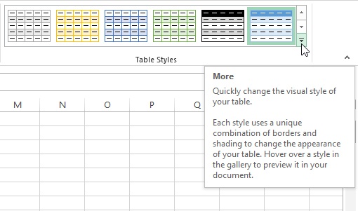
Click anywhere in the table on Sheet1, then click the Table Tools Design tool tab that appears whenever a table is selected.
Click the More button on the Table Styles drop-down palette to display the full complement of available styles.
Select Table Style Light 19 from the palette.
In the Table Style Options group, select the Banded Columns check box, and clear the Banded Rows check box.
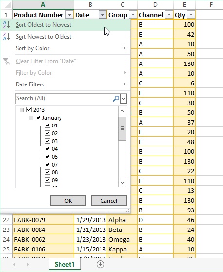
Click the Date column’s Filter Button (the arrow adjacent to the Date header) to display the Filter menu.
Click the Sort Oldest to Newest option in the Date column’s Filter menu to put the dates in ascending order.
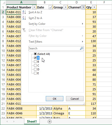
Click the Channel column’s Filter button, and then select the Select All check box, which actually clears all the check boxes, because all of the channels were already selected.
Select the A check box, and then click OK.
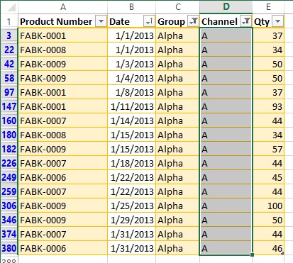
Click the Group column’s Filter button, and then select the Select All check box to deselect all the groups.
Select the Alpha check box, and then click OK.
The Excel table features make it easy to create quick reports like this one that shows all January 2013 sales of Fabrikam’s Alpha product line through marketing channel A. The filters allowed you to instantly collapse nearly 400 rows of data into just 16 (look at the row numbers on the left). The table hides any rows eliminated by your filters. When you apply a column filter, a tiny funnel icon appears in the Filter button, so it’s more evident to you which filters have been applied to the table.
Tip
You may sometimes find the filter buttons annoying, especially when you want to print a table, but it’s easy to hide them by clearing the check box adjacent to the Filter button in the Table Tools Design tool tab, in the Table Style Options group.
Because this table was created by importing data from a text file, Excel has established a connection to the text file that can be easily updated.
Click the arrow below the Refresh button on the Table Tools Design tool tab to display the Refresh menu.
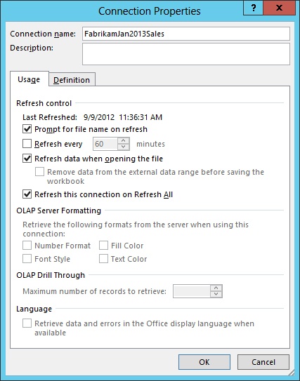
Click the Connection Properties command to display a dialog box of the same name.
Select the Refresh Data when Opening the File check box.
Click OK.
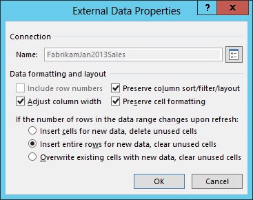
On the Table Tools Design tool tab, click the Properties button in the External Table Data group.
Note that there are two different Properties dialog boxes available for this table.
Click Insert entire rows for new data, clear unused cells.
When the data in the text file changes, Excel automatically updates the workbook each time you open it. Because this is a database-style, row-oriented file, you will be inserting entire rows of new data to eliminate errors caused by the possible insertion of individual cells.
You’ve already used the Filter buttons to sort a column and focus on a particular data set. The Filter menu offers the following additional features you should know about:
Sort. There are two Sort commands that may perform different functions, depending on the contents of the column. For example, for a column of text, the commands are Sort A To Z and Sort Z To A. If the column contains numbers, the commands are Sort Smallest To Largest, and Sort Largest To Smallest. If the column contains dates, the commands are Sort Oldest To Newest and Sort Newest To Oldest.
Clear Filter. This command removes the filter from the selected column.
Sort by Color/Filter by Color. This means exactly what it says, and is used when your data uses a hierarchical color scheme.
Date Filters. This command appears only when the column contains dates, and offers a list of options, such as Today, Next Week, and Last Month, as well as customizable options like Before and Between that display a dialog box that allows you to add date criteria.
Text Filters. This command appears only when the column contains text; it offers a list of options, such as Begins With, Ends With, Contains, and Does Not Contain.
Number Filters. This command appears only when the column contains numeric data, and offers a list of options such as Greater Than, Between, Top 10, and Below Average.
Adding data is actually easier with a range converted to an Excel table than it is with a regular cell table on a worksheet. One thing you can do in a table is use the Tab key to jump to the next cell in the table. When you press Tab to move to the last cell in a row, pressing Tab again jumps the selection to the first cell in the next row. But when you reach the last row of data in a table, the Tab key adds a row instead.
In this exercise, you’ll insert a new row and a new column into an existing table.
Set Up
You need the Fabrikam-Jan-2013-Sales.xlsx file saved in the previous exercise to complete this exercise. In the Import Text File dialog box, click the Import button to update the data connection. (This happens because the Refresh Data When Opening File option was set in the Connection Properties dialog box.)
If your table still has filters applied from the previous exercise, clear them. To do so, click the Filter button in a filtered row (the button displays a funnel image when there is an active filter), and click the Clear Filter command.
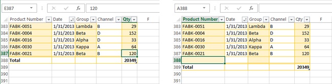
Click the Total Row button in the Table Tools Design tool tab, in the Table Style Options group. This adds a row of totals to the bottom of the table and activates the new row so that it is visible on the screen. In this case, it adds only one total, to the Qty column, because this is the only column that contains numeric data. (The active cell must be somewhere within the table for the Table Tools Design tab to appear.)
Press the Tab key.
All you need to do is press the Tab key with the last cell in the table selected. Even when there is a totals row, Excel adds the new row above the total and adds any new values to the totals in the summarized columns. Also, adding a table row this way automatically propagates the table formatting and formulas (if any) to the new row.
Press the Undo button to remove the unneeded row.
Press Ctrl+Home to jump to the first cell in the worksheet.
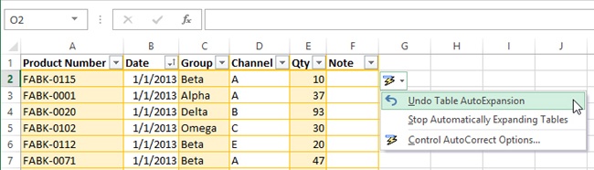
Select cell F1, located to the right of the Qty column header.
Enter Note and press Enter, and notice that Excel automatically expands the table with a new formatted column, and a Filter button is added to the new heading.
Click the AutoCorrect Options button and notice that the menu that appears offers a command to undo the previous auto-expansion, or you can keep it from happening again by clicking the Stop Automatically Expanding Tables command. In addition, you can click the Control AutoCorrect Options command to open a dialog box that lets you choose whether you want to enable or disable these and other AutoCorrect options.
Press the Esc key to dismiss the AutoCorrect options menu.
You explored one way to sort data in Filtering data with tables earlier in this chapter, but not all data will be in tables, and the sorting commands on the Filter menus only go so far. The Excel Sort and Filter commands offer a few more tricks you can use to get your data in order.
In this exercise, you’ll use Excel’s sorting tools to rearrange data on a worksheet.
Set Up
You need the JanSales2_start.xlsx workbook located in the Chapter20 practice file folder to complete this exercise. Open the JanSales2_start.xlsx workbook, and save it as JanSales2.xlsx.
In the JanSales2.xlsx workbook, select cell B2 (the first date in the Date column).
Click the Sort Z to A button in the Sort & Filter group to sort the table by date (newest first).
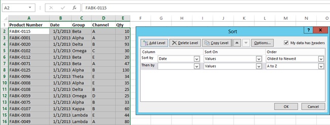
Click the Sort button in the Sort & Filter group to display the Sort dialog box.
Clear the My data has headers check box, and notice what happens to the selected cells in the table (the headers are included in the sort range, which in this case would not be a good thing).
Select the My data has headers check box again.
In the Sort by Area (called a level), make sure that Date is selected in the Column drop-down list.
Make sure that the Values option is selected in the Sort On drop-down list.
In the Order drop-down list, select Oldest to Newest.
Click the Add Level button to add a Then by level after the Sort by level. (The Sort dialog box allows you to specify up to 64 levels of sorting criteria.)
In the Then by level, click the Column drop-down list and select Channel.
Make sure that the default Sort On option is selected (Values).
In the Order drop-down list, make sure that A to Z is selected.
Click the Options button and note the possibilities here (just so you know).
Click Cancel to dismiss the Sort Options dialog box.
Click OK.
The result of this exercise gives you a list of sales made each day during January 2013, sorted by sales channel. If you click the Sort button again and change the Then by column option to Group, you get a similar result, sorted by product group.
Tip
If you get unexpected results, check the data in the cells adjacent to the apparent sorting error to check if there are any numbers formatted as text, or leading spaces in cells. If so, delete the leading spaces, or select the entire column and format it as text, because Excel will sort numbers first, followed by numbers formatted as text. If all the numbers are in the same format, Excel will sort them correctly.
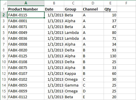
Sometimes neither numerical sequences nor the alphabet provide the criteria you would like to use to sort data. Let’s say, for example, that you want to sort your list by Product Group, but not in order of sales or names or dates, but by some other arbitrary criteria for which there are no standard ways to sort, such as strategic value.
In this exercise, you’ll create your own sorting criteria.
Set Up
You need the JanSales2.xlsx workbook created in the previous exercise to complete this exercise.
In the JanSales2.xlsx workbook, click the Data tab.
Click the Sort button in the Sort & Filter group on the Data tab, and notice that the sort criteria you used in the previous exercise is still there.
Click the Delete Level button twice to remove both criteria levels.
Click the Add Level button.
In the Column drop-down list, select Group.
In the Sort On drop-down list, make sure that Values is selected.
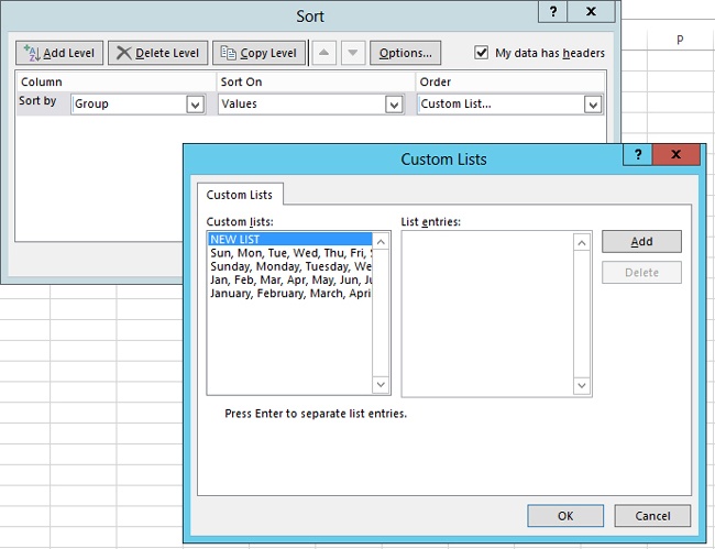
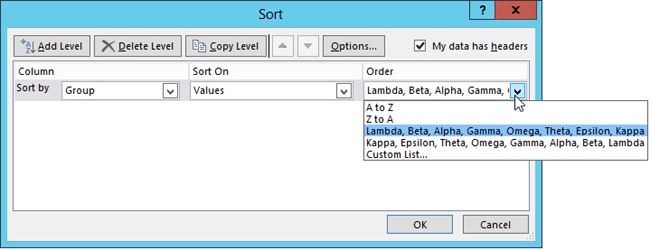
In the Order drop-down list, select Custom List.
Make sure that New List is selected in the Custom lists box, and then click the Add button. (Clicking the Add button simply activates the List Entries box; a flashing cursor will appear.)
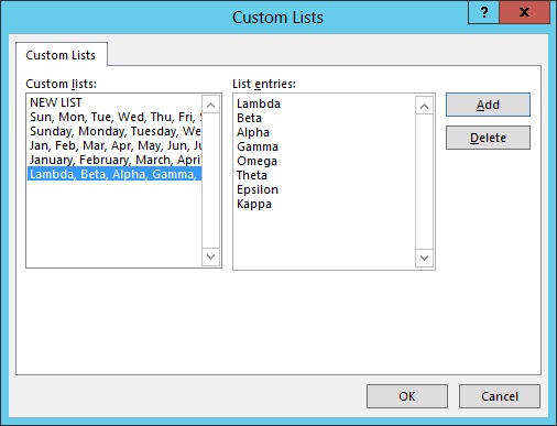
Enter Lambda and press Enter.
Enter Beta and press Enter.
Enter Alpha and press Enter.
Enter Gamma and press Enter.
Enter Omega and press Enter.
Enter Theta and press Enter.
Enter Epsilon and press Enter.
Enter Kappa, and then press the Add button to add your new list to the Custom Lists box.
Click OK to dismiss the Custom Lists dialog box.
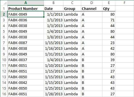
Click OK to dismiss the Sort dialog box and apply the sorting criteria to the sales table.
You can create as many custom sorting lists as you like. Your custom lists are preserved with the workbook and will be available the next time you open it. In fact, for every custom sort list that you create, Excel automatically creates a second one for you, in reverse order.
On the Data tab, click the Sort button.
Click the arrow adjacent to the Order drop-down list, and notice that there are two custom lists there now; the second one is the reverse of the one you entered.
Click the Cancel button.
PivotTables are powerful tools for summarizing and analyzing data that is stored in workbooks, or data collected from external sources. PivotTables do not contain data; they link to it. That disconnection from the source data allows you the freedom to rearrange PivotTable information without fear of corrupting the underlying values.
PivotTables work best on data with common relationships. For example, the Fabrikam sales data you worked with in the previous exercises comprises a lot of individual rows (records), but every record includes one of eight product groups, one of six sales channels, one of 31 dates, and one of 127 product numbers. So, by using a PivotTable, you can display the unit sales from each product group by sales channel, by date, or by product number. And, with a few clicks of the mouse, you can pivot your results using any other combination of these criterion.
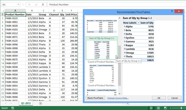
New in Excel 2013 is the Recommended PivotTables feature, which starts with the PivotTable command and jumps ahead a step, saving you some time by making educated guesses about the kind of PivotTables you can build, based on the data you select. It offers several options in visual form, showing an example of the results before you commit.
In this exercise, you’ll create a new PivotTable and manipulate it.
Set Up
You need the FabrikamQ1SalesDetail_start.xlsx workbook located in the Chapter20 practice file folder to complete this exercise. Open the FabrikamQ1Sales-Detail_start.xlsx workbook, and save it as FabrikamQ1SalesDetail.xlsx.
In the FabrikamQ1SalesDetail.xlsx workbook, click the Insert tab.
Making sure that the active cell is within the table of data, click the Recommended PivotTable button in the Tables group on the Insert tab, which automatically selects your data and displays a dialog box of the same name. (If you were to click the Blank PivotTable button at the bottom of the dialog box, it would be the equivalent of clicking the PivotTable button on the Insert tab, which bypasses the recommendations.)
Scroll down the list of recommendations, click the Sum of Qty by Group option, and click OK, which inserts a PivotTable on a new worksheet and displays the PivotTable Fields pane.
Move the mouse pointer toward the top of the PivotTable Fields pane until the pointer turns into a four-headed arrow.
Drag the PivotTable Fields pane to the left, so that it “undocks” from the side of the window and becomes a floating pane.
Drag the floating pane all the way to the left side of the screen, until it docks on the left, just for fun. (Feel free to move about the window. Note that this works only when the Excel window is maximized.)
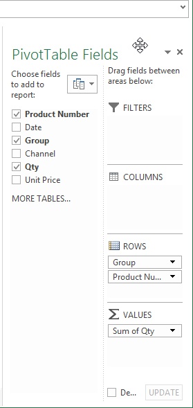
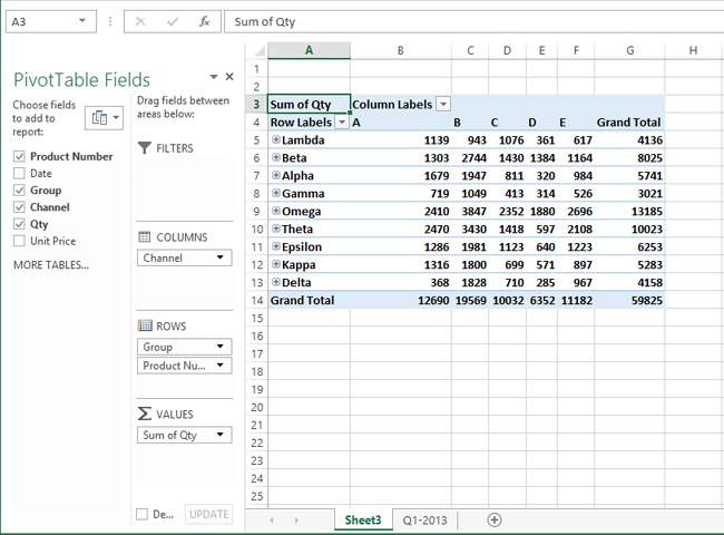
Select the Channel check box. Now Channel appears under Rows on the right side of the PivotTable Fields pane. This adds the data to the PivotTable, but it is buried in detail rows, as indicated by the tiny plus-sign icons adjacent to each Product Group name.
Under Rows, drag the Channel box up, and place it under Columns. The result is that each channel gets its own column, and the total quantities appear below it for each product group.
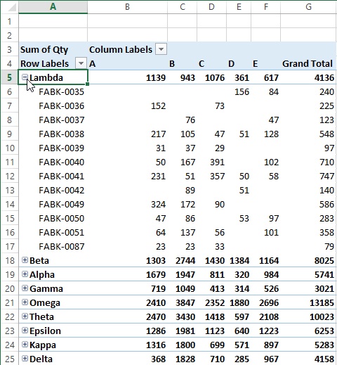
Click the plus-sign icon adjacent to the Lambda product group label to display the detail data.
This PivotTable now shows the total unit sales for each product, by product group and by sales channel. PivotTables allow you to try different arrangements of rows and columns in the easiest way imaginable. It would be prohibitively difficult to do this manually, working with the actual raw data in cells. Plus, using the PivotTable insulates the original data for inadvertent harm.
Click the Lambda plus-sign icon again to collapse the detail rows.
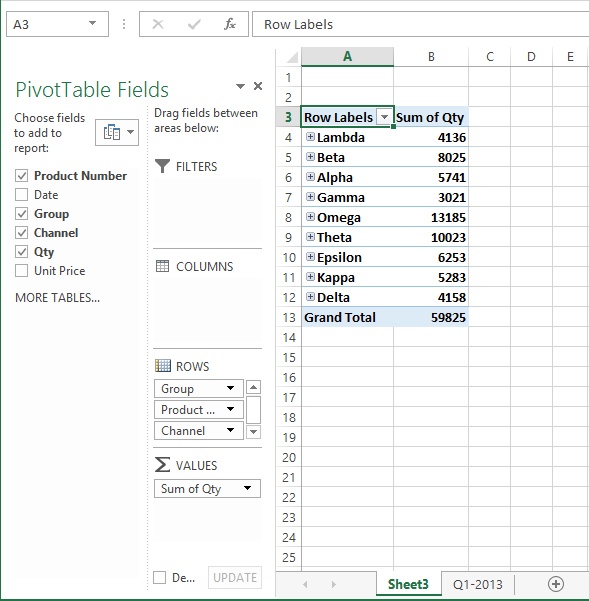
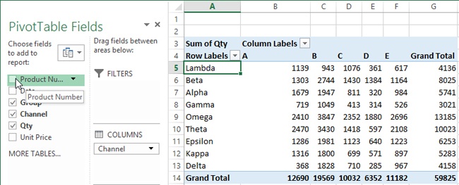
In the PivotTable Fields pane, clear the Product Number check box.
The plus-sign icons disappear, and the icons and detail rows are hidden for a cleaner presentation. The totals remain unchanged, except that they are no longer displayed with a bold font.
On the right side of the PivotTable Fields pane, drag the Channel box down and put it under Rows, then drag the Group box up and put it under Columns; the result is that the table pivots.
On the left side of the PivotTable Fields pane, select the Date check box, and the table immediately expands to include every date in the quarter.
Select cell A5.
Click the PivotTable Tools Analyze tab.
Click the Collapse Field button in the Active Field group.
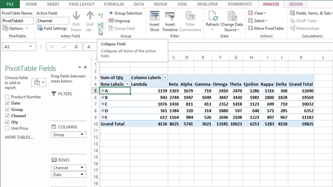
Clicking the Collapse Field button was a shortcut; you could have clicked each plus-sign icon individually. But consider this your formal introduction to the two PivotTable Tools tabs, Analyze and Design, brimming with buttons. The Design tab has controls similar to the table controls you learned about earlier in this chapter. Tools on the Analyze tab will be discussed in later chapters.
See Also
For information about creating a PivotChart, a Slicer, or a Timeline, see Chapter 23.
You can use the Goal Seek command to arrive at individual scenario values, and you can manage multiple goals and values by using the Scenario Manager.
Use the Quick Analysis menu to perform many relevant operations on a selected cell range without using the ribbon.
You can use conditional formatting to highlight important values in a worksheet when they meet or exceed predetermined thresholds.
You can easily import data from remote sources by using the Get External Data commands on the Data tab.
The Excel table format is a sophisticated mechanism you can use to sort, filter, and summarize data.
You can sort data by using up to 64 criteria, including custom sort lists that you can create yourself.
PivotTables allow you to quickly change your perspective and directly manipulate relationships among data sets by dragging.