
Chapter 8. SharePoint Web Parts
If you ask any Microsoft SharePoint developer what they built first for SharePoint, the vast majority will answer “a Web Part.” Web Parts are one of the fundamental building blocks of SharePoint and, in combination with site pages, allow users to customize SharePoint in many different and interesting ways.
In this chapter, you first review Web Part fundamentals and their relationship to ASP.NET. and then you examine the different pieces that together build the Web Part framework. The chapter covers building Web Parts by using Microsoft Visual Studio 2012 and explains how to package Web Parts for use in sites. You continue the development process by learning about some of the options you have when developing the UI and interacting with Web Parts, and you learn about how to personalize and customize your Web Part.
The last part of this chapter discusses some of the more advanced Web Part development scenarios such as Web Part connections, which allows the end-users to combine the powers of multiple Web Parts to create their own dashboards or mashups. The chapter ends by taking a look at asynchronous and parallel execution of Web Parts, which might be needed to improve the performance of your Web Parts.
Understanding Web Part fundamentals
Your Web Part journey begins by reviewing the history of Web Parts and how ASP.NET uses Web Parts. To understand how Web Parts are developed, used, and managed in ASP.NET and SharePoint, you need to learn about the required components so that your Web Parts work as expected. Even though you might be familiar with Web Parts from ASP.NET or your earlier SharePoint experience, this section should be a valuable read. If you have been working with Web Parts only in SharePoint, you might find this section particularly interesting.
Understanding Web Parts
This chapter starts by discussing what a Web Part is but doesn’t go into the details yet; there is plenty of time for that in the remainder of this chapter! Web Parts are one of the more important features of SharePoint, and without Web Parts, SharePoint might not have been as successful as it is. Web Parts are not unique to SharePoint, because every portal platform has similar concepts that are called different names, such as portlets or widgets.
Web Parts can be described as applications within the portal or page. They can be self-contained or cooperate with other Web Parts, they can display information, and they can ask for information from users. Users can add Web Parts to pages, selecting different Web Parts from a gallery and creating their own unique pages and experiences. The Web Parts themselves can have different configurations, even for different users. SharePoint uses Web Parts a lot; each list view, and each list form or document library, is displayed through a Web Part—a List Viewer Web Part.
Comparing ASP.NET and SharePoint Web Parts
Web Parts is not a SharePoint-specific concept but rather an ASP.NET concept; they first appeared in ASP.NET 2.0. But the Web Part concept was created much earlier, before SharePoint existed, by the Digital Dashboard Resource Kit. The Web Part concept was then inherited by SharePoint 2001 and eventually was ported to the Microsoft .NET Framework 1.1. ASP.NET 2.0 refined the implementation and made the Web Part concept a part of ASP.NET 2.0. When SharePoint 2007 was released based on ASP.NET 2.0, the default Web Part implementation was based on the ASP.NET 2.0 Web Part framework.
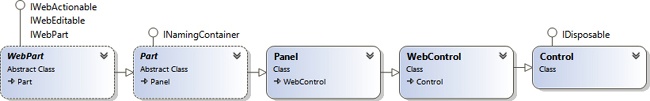
A Web Part is essentially a specific derivative of the System.Web.UI.WebControls.WebControl control, as illustrated in Figure 8-1. All custom Web Parts must derive from the abstract WebPart class, defined in the System.Web.UI.WebControls.WebParts namespace. The WebPart class also implements some specific interfaces that define the Web Part (IWebPart) and define the behavior of the Web Part (IWebEditable and IWebActionable).
Just like any control in .NET, Web Parts can have properties. There is a difference between the properties of normal web controls and the properties of Web Parts. The values of a Web Part property can be modified and persisted by users provided that the Web Part has a parent control that is a Web Part zone. The property values can be persisted on a page or per-user basis. You learn more about Web Part properties and zones later in this chapter, in the Understanding Web Part zones section.
SharePoint contained the first implementation of Web Parts in the .NET Framework, using the SharePoint-specific class WebPart, in the Microsoft.SharePoint.WebPartPages namespace. This is the same class name that is used by the ASP.NET WebPart class, which might be a bit confusing. The SharePoint class was created before ASP.NET implemented the Web Part framework, and the SharePoint implementation still exists for backward compatibility. Many of the out-of-the-box Web Parts in SharePoint use this class as the base class. It is worth noting that when ASP.NET implemented the Web Part framework and SharePoint 2007 was released, the SharePoint Web Part class was reengineered to be derived from the ASP.NET Web Part class.
A common question among SharePoint developers is which Web Part implementation to use: the SharePoint or the ASP.NET implementation. In most cases, the ASP.NET Web Part implementation is the recommended starting point. The SharePoint Web Part implementation contains a lot of internal (to SharePoint and Microsoft) functionality for caching and manipulating how the Web Parts are stored and managed. But there are a few scenarios where the SharePoint implementation can be of value for all developers. Whereas the ASP.NET Web Part implementation has not changed in ASP.NET 4.0, the SharePoint 2013 Web Part implementation has been updated with some new features, for example, features for better management of Composed Looks, which is the new theming engine in SharePoint 2013.
One important aspect to keep in mind with regard to the SharePoint Web Part implementation is that the SharePoint sandbox supports only the ASP.NET implementation of Web Parts. Even though code-based sandboxed solutions are deprecated in SharePoint 2013, there might be scenarios when you would like to create a sandboxed Web Part. If that is the case, you must use the ASP.NET Web Part implementation as the base for your Web Part.
Understanding App Parts
Web Parts are available only in farm or sandboxed solutions, not in SharePoint apps. If you need to build a Web Part–similar experience for hosted scenarios, you should look into the App Part or Client Web Part concepts, which are not discussed in this chapter. A Client Web Part can be provisioned by a SharePoint app into the host web. This is an ASP.NET Web Part called ClientWebPart that renders an iframe element with a page from the SharePoint app, and allows for a customizable set of parameters. You can read more about App Parts in Chapter 4.
Understanding Web Part zones
For Web Parts to be fully functional, they must exist in a Web Part zone. The Web Part zone is an ASP.NET control called WebPartZone. The Web Part zone defines a region in the page where Web Parts can be hosted, and the responsibility of the Web Part zone control is to lay out the Web Parts. SharePoint uses its own derivative of the ASP.NET WebPartZone control. It has the same class name WebPartZone and is defined in the Microsoft.SharePoint.WebPartPages namespace. The following code shows adding a zone to a Web Part page, as discussed in Chapter 7:
<WebPartPages:WebPartZone runat="server" ID="zone"
   Title="The Zone" LayoutOrientation="Horizontal"/>
The Web Part zone determines how the Web Parts are rendered on the page. Table 8-1 shows some of the more common configuration properties for the SharePoint Web Part zone. The ID property should be treated carefully. After a Web Part zone is used on a page and a Web Part is added to that zone, the id of the zone is used when storing the Web Part state in SharePoint. If you remove the zone or change its id without removing the Web Parts, the saved Web Part state will be orphaned in the SharePoint databases. But after you change the id back to its original value or add another zone with the same id as the previous zone, the Web Parts are once again available.
Description | |
ID | The ID of the Web Part zone. |
Title | The title of the Web Part zone. |
LayoutOrientation | Determines in which direction the Web Parts should be rendered; Horizontal or Vertical (default). |
AllowLayoutChange | Boolean value that indicates whether the users are allowed to add, remove, or close Web Parts in the zone, or change specific layout properties of the Web Parts. Default is true. |
AllowCustomization | Boolean value that indicates whether the users are allowed to modify the properties of Web Parts. |
AllowPersonalization | Boolean value that indicates whether the users are allowed to personalize the Web Parts in the zone. |
PartChromeType | Defines the chrome for the zone. Allowed values are Default, TitleAndBorder, None, TitleOnly, and BorderOnly. |
Understanding the Web Part Manager
One of the most important components of the Web Part framework is the Web Part Manager. The Web Part Manager is responsible for serializing and deserializing the Web Parts and their properties from persisted storage. ASP.NET implements the WebPartManager object, and SharePoint has its own derivative of that object called the SPWebPartManager (defined in the Microsoft.SharePoint.WebPartPages namespace). The SharePoint Web Part Manager is responsible for retrieving and storing the Web Part data in the SharePoint content databases.
A Web Part Manager object is required on all Web Part pages. As described in Chapter 7 in the context of the master page, SharePoint adds the SPWebPartManager to the default master pages. You should also add this if you’re creating your own master page. When a page is loaded, the Web Part Manager loads the Web Part from the persisted storage, including its state and the shared or personal settings of the Web Part, and populates the Web Part zones.
Understanding static Web Parts
Web Parts are essentially ASP.NET web controls and can be used as such. You don’t need to add a Web Part to a Web Part zone; a Web Part can be added to a page directly just like any ASP.NET control. When a Web Part is added to a page outside of a Web Part zone, that Web Part is referred to as a static Web Part. Static Web Parts do not have all the unique features that Web Parts located in Web Part zones have. For instance, a static Web Part cannot be customized or personalized; a zone and a Web Part Manager are required to persist the properties of the Web Part.
Storing Web Part control description files in the Web Part Gallery
At this point, you are familiar with the components required to get the Web Part framework to function and render properly. But how do users discover and add Web Parts to pages? In SharePoint, Web Parts that should be available to users to select from should be published to the Web Part Gallery. The Web Part Gallery is a specific catalog in SharePoint located in the root web of all site collections (/_catalogs/wp/). The Web Part Gallery can be found in the user interface by going to Site Settings and choosing Web Parts in the Web Designer Galleries.
This gallery contains Web Part control description files. These files are often referred to as the Web Parts themselves, but they are more like templates of the Web Parts. A Web Part control description file is an XML file containing a reference to the Web Part type and assembly, and a set of default values for the Web Part’s properties. When a Web Part is added to a zone by using a Web Part control description file, the Web Part Manager imports the XML file and instantiates a new instance of the Web Part type. The Web Part Gallery also adds metadata to the Web Part control description file, such as a description, group, and recommended settings. You examine these files more when you build a Web Part later in this chapter, in the “Building your first Web Part” section.
The Web Part Gallery contains two types of XML files: one having the .dwp extension and one having the .webpart extension. The .dwp format is the former format of the Web Part control description files and uses the version 2 (SharePoint 2003) schema for Web Parts, whereas the .webpart files use version 3 of the schema (SharePoint 2007 and newer versions). Version 3 of the schema is the newest version, and you should use it in your projects; you will use it throughout the samples in this chapter.
Developing and deploying Web Parts
Now it’s time to build some Web Parts. The Microsoft Office and SharePoint tools in Microsoft Visual Studio 2012 are excellent for building Web Parts and give you a lot of aid to properly implement them. In this section, you build a Web Part from the very beginning, deploy it to the Web Part Gallery, and then verify that it works as expected. The chapter also describes how you can provision Web Part pages prepopulated with Web Parts.
Building your first Web Part
In this sample, you focus on how to create a Web Part by using Visual Studio 2012 and how to properly deploy it to a site collection. You first need to create a new Visual Studio 2012 solution. When choosing the Visual Studio project, you have two options: create an empty project, SharePoint 2013 - Empty Project; or use the predefined Visual Web Part project, SharePoint 2013 - Visual Web Part. The Visual Web Part is discussed in the Using Visual Web Parts section later in this chapter, so in this case you start with the empty project, which provides more opportunity to discuss the different parts of a Web Part solution in more detail. As is typical when creating a SharePoint project in Visual Studio, the wizard asks which trust level you would like to use. In this sample, choose a farm solution, because code-based sandboxed solutions are deprecated, and you can do a lot more interesting things with farm solutions.
Next, you need to add a Web Part to this project. The preferred way is to use the Visual Studio SharePoint Project Item for this. Visual Studio 2012 has three Web Part item templates:
Web Part
Visual Web Part
Silverlight Web Part
The difference between the Visual Web Part and the Web Part SharePoint Project Item is that the Visual Web Part uses an .ascx user control to build the UI for the Web Part, and the nonvisual Web Part SharePoint Project Item requires you to build your control hierarchy and rendering. The Visual Web Part does not deploy an .ascx file to SharePoint, which was the initial case with Visual Studio 2010. Instead Visual Studio 2012 compiles the .ascx file and merges it with your code-behind file. The Visual Web Part is the preference if you like to have more separation between the user interface and the logic in your Web Part.
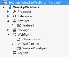
This sample uses the nonvisual Web Part SharePoint Project Item. After you add the project item to the project, Visual Studio adds a few files to the project, as shown in Figure 8-2. The new project item creates a new node in Solution Explorer with the name of the Web Part. Under that node, it will add three files:
Elements.xml. The element manifest for the Web Part containing a Module element to deploy the Web Part control description file to the Web Part Gallery
WebPart1.cs. The actual Web Part implementation
WebPart1.webpart. The Web Part control description file that will be deployed to the Web Part Gallery
If you don’t have a site-scoped Feature in your project, Visual Studio will also add a new Feature to the project. Web Parts must be deployed through a site-scoped Feature because the Web Part Gallery exists only on the site collection level in the root web.
Implementing the Web Part
Examining the Web Part class file reveals that it derives from the ASP.NET WebPart class. This is the default, and recommended, method for creating a new Web Part. The generated class file contains an override for the CreateChildControls method (which is discussed in more detail later in this chapter, in the Using CreateChildControls section). Now you need to make sure that the Web Part writes a Hello message to the current user. Example 8-1 shows how a new LiteralControl object is added to the Controls collection of the Web Part and how the current user’s name is retrieved by using the SPContext object.
namespace WingTipWebParts.WebPart1
{
[ToolboxItemAttribute(false)]
public class WebPart1: WebPart
{
protected override void CreateChildControls()
{
this.Controls.Add(
new LiteralControl(
String.Format("Hello {0}!", SPContext.Current.Web.CurrentUser.Name)));
}
}
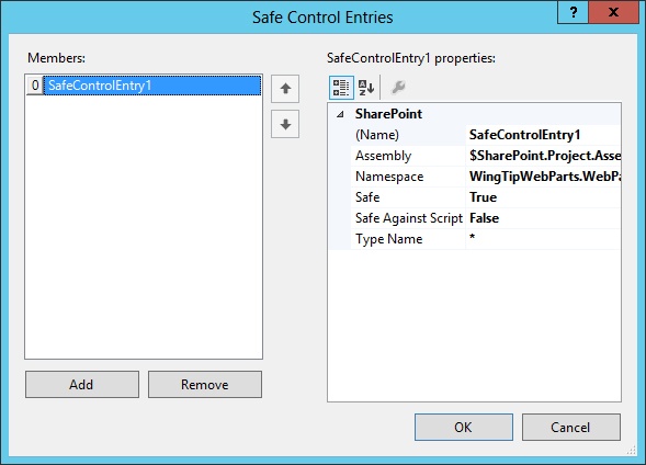
}Microsoft Visual Studio also automatically adds a safe control entry for this Web Part. You can locate it if you right-click the Web Part project item in Solution Explorer, click Properties, and select the safe control entry’s property, as shown in Figure 8-3.
Examining the Web Part control description file
The next file to examine is the Web Part control description file, or the .webpart file. This file is also automatically generated when the Web Part SharePoint Project Item is added to the project. This file will be added to the Web Part Gallery to provide users with an easy and user-friendly way to locate the Web Part when they want to edit Web Part pages. This template file allows you to specify a title and description for the Web Part, in addition to other default property values that will be used when adding the Web Part to a page.
Example 8-2 shows the .webpart file after modifying the Title and Description properties and after adding one of the Web Part default properties—Height. The Web Part control description file is divided into two sections. The first one, under the metaData element, defines which Web Part type to use and also includes the default error message that should be shown if an error occurs when the Web Part Manager imports the file. The second part, under the data element, defines all the property values that should be used for the Web Part instance when the instance is added to a page from the Web Part Gallery. Each property has a name, a type, and a value. Notice that this value is only the start value; after the Web Part is added to a page, any changes in the .webpart file will not be reflected in the Web Parts. Think of the .webpart file as a template or configuration of a Web Part instance.
<webParts>
<webPart xmlns="http://schemas.microsoft.com/WebPart/v3">
<metaData>
<type name="WingTipWebParts.WebPart1.WebPart1,
$SharePoint.Project.AssemblyFullName$" />
<importErrorMessage>$Resources:core,ImportErrorMessage;</importErrorMessage>
</metaData>
<data>
<properties>
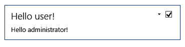
<property name="Title" type="string">Hello user!</property>
<property name="Description" type="string">
Says hello to the current user</property>
<property name="Height" type="string">200px</property>
</properties>
</data>
</webPart>
</webParts>If this was a Web Part that you didn’t want the users to add to pages, for example, you wanted it to be added to pages by using only code, you could delete this file. The Web Part would still work but would not be available for selection in the Web Part Gallery.
Understanding the element manifest
The element manifest is responsible for deploying the Web Part control description file to the Web Part Gallery. The file contains a Module element, which you already examined in Chapter 7, targeted at the Web Part Gallery. The List attribute of the Module element is set to 113, which is the ID of the Web Part Gallery list template and defined in the global Onet.xml file, and the Url attribute points to the actual Web Part Gallery URL at _catalogs/wp.
The Module element contains a File element that represents the Web Part control description file. Typically you don’t need to change anything here unless you want to change the file name of the deployed .webpart file (the Url attribute). However, under the File element is one Property element with the Name attribute set to Group. This specific element defines in which group in the Web Part Gallery the Web Part should be available. By default, the element is set to Custom, and you should always change this value to something more appropriate. For instance, use your project, company, or customer name, or use one of the default categories. Example 8-3 shows the Web Part control description file with a modified Group property.
<Elements xmlns="http://schemas.microsoft.com/sharepoint/" >
 <Module Name="WebPart1" List="113" Url="_catalogs/wp">
   <File Path="WebPart1WebPart1.webpart"
     Url="WingTipWebParts_WebPart1.webpart" Type="GhostableInLibrary">
     <Property Name="Group" Value="Wingtip" />
   </File>
 </Module>
</Elements>
Deploying and uninstalling a Web Part
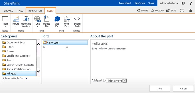
At this point, you are ready to deploy your first Web Part. You can use F5 debugging to deploy the solution and automatically activate the feature on the site you specified when the project was created. Visual Studio will start a new instance of your web browser and go to the Home page of the site. If you edit that page and choose to add a new Web Part by using the ribbon menu, you will discover that the Web Part Gallery and Web Part are deployed into the category called Wingtip, which was the group specified in the element manifest. In the Parts pane, the title, defined in the Web Part control description file, is visible, and to the far right both the title and description are visible after the Web Part is selected. Figure 8-4 shows this simple Web Part in the Web Part Gallery. Click Add to add the Web Part to the page.
When the Web Part is added to the page, the page reloads and the Web Part is rendered. The page displays the title of the Web Part and renders the contents as specified in the implementation of the custom Web Part class, as shown in Figure 8-5.
You’ve learned how to build a very simple Web Part as a farm solution, and you’ve learned about the different pieces needed to properly provision the Web Part so that it is available from the Web Part Gallery. This Web Part doesn’t use any restricted APIs or anything that is scoped outside of the site collection, so you can change the Sandboxed Solution property of the project so that the project is targeted for sandboxed deployment; you can just redeploy it and it will work.
When you’re using Visual Studio and perform F5 debugging, after you stop your debugging session, the solution by default is retracted, but not completely. If you added one of your Web Parts to a page during the debugging session, that Web Part will still be on that page and produce an error message, because SharePoint cannot find the assembly and control, which was retracted when the debugging session ended. Also, the Web Part control description file provisioned to the Web Part Gallery will still be there. SharePoint does not automatically remove items provisioned by the Module element when the solution is retracted. So users editing a page will still believe that they can use the Web Part, and when they try to add it, they will get an error message stating that “The operation could not be completed because the item was removed from the gallery.” It is good practice to mitigate this by using a Feature receiver on your Web Part Features. You do this by adding a new event receiver to the Web Part, which you learned to do in previous chapters, and then implementing the FeatureDeactivating of the Feature receiver, as illustrated in Example 8-4. Note that this event will fire only when the Feature is deactivated, not when it is uninstalled, so you should deactivate the feature before uninstalling.
public override void FeatureDeactivating(SPFeatureReceiverProperties properties)
{
 SPSite site = properties.Feature.Parent as SPSite;
 if (site != null)
 {
   SPList gallery = site.RootWeb.GetCatalog(SPListTemplateType.WebPartCatalog);
   foreach (SPListItem item in gallery.Items.Cast<SPListItem>().ToArray())
   {
     SPFile file = item.File;
     using (XmlReader reader = XmlReader.Create(file.OpenBinaryStream()))
     {
       XDocument doc = XDocument.Load(reader);
       var typeName = from element in doc.Descendants()
         where element.Name.LocalName == "type"
         select element.Attribute("name");
       if (typeName.Count() == 1)
       {
         Type type = Type.GetType(typeName.First().Value);
         if (type.Assembly.FullName == this.GetType().Assembly.FullName)
         {
           item.Delete();
         }
       }
     }
   }
 }
}
The Feature deactivation code in Example 8-4 reads the XML definition for all the Web Part control description files and takes a look at the type of the control in the file by using a Linq-to-XML query. This requires you to add using statements for System.Linq, System.Xml, and System.Xml.Linq in your code file. The code compares this control type with the type of the current assembly and, if they are the same, removes the template file. This ensures that any Web Parts from the current assembly are removed.
Deploying a Web Part page with Web Parts
In Chapter 7, you focused on how to deploy site pages and learned briefly about Web Part pages. Typically, you want to deploy Web Part pages, or wiki pages that contain a default set of Web Parts. You now examine two approaches: the first is a purely declarative approach, and the second uses an object called SPLimitedWebPartManager. Finally, you learn about the special case when you have a wiki page.
Deploying Web Parts by using a declarative approach
One approach to deploying Web Parts is to use a declarative approach. The benefit of the declarative method is that it works both with farm solutions as well as sandboxed solutions. To deploy a Web Part page with a Web Part, you start by deploying the page by using a Module element, just as you did in Chapter 7. You need to add a new .aspx page to the Module SharePoint Project Item. Example 8-5 shows the source for the Web Part page, which contains two zones, one on the left side and one on the right.
<%@Page Language="C#" MasterPageFile="~masterurl/default.master"
 Inherits="Microsoft.SharePoint.WebPartPages.WebPartPage, Microsoft.SharePoint,
 Version=15.0.0.0, Culture=neutral, PublicKeyToken=71e9bce111e9429c" %>
<%@ Register Tagprefix="WebPartPages" Namespace="Microsoft.SharePoint.WebPartPages"
 Assembly="Microsoft.SharePoint, Version=15.0.0.0, Culture=neutral,
 PublicKeyToken=71e9bce111e9429c" %>
<asp:Content ID="Content1" ContentPlaceHolderId="PlaceHolderMain" runat="server">
<div>
 <div style="float:left;width:50%">
   <WebPartPages:WebPartZone ID="left" Title="Left" runat="server">
   </WebPartPages:WebPartZone>
 </div>
 <div style="float:right;width:50%">
   <WebPartPages:WebPartZone ID="right" Title="Right" runat="server">
   </WebPartPages:WebPartZone>
 </div>
</div>
</asp:Content>
Next, you modify the element manifest for the Module SharePoint Project Item. Assume you want to deploy this page to a team site and the Site Pages library. To do this, you specify a Url attribute pointing to that library on the Module element, as illustrated in Example 8-6; you update the File element with a modified Url attribute so that the page will be provisioned in the root of that library; and you set the Type property.
The next modification to the element manifest is adding a new element as a child to the File element: the AllUsersWebPart element. This element is used to add a Web Part to a specific zone. Example 8-6 shows how the AllUsersWebPart is given a unique ID in addition to the name of a Web Part zone and the order within that zone. The contents of the element is identical to the data in the Web Parts control description file deployed to the Web Part Gallery. Note that that XML is enclosed in CDATA tags because the contents of the AllUsersWebPart must be text data.
<Elements xmlns="http://schemas.microsoft.com/sharepoint/">
 <Module Name="PageModule" Url="SitePages">
   <File Path="PageModuleWebPartPage.aspx" Url="WebPartPage.aspx"
Type="GhostableInLibrary">
     <AllUsersWebPart ID="LeftWebPart" WebPartOrder="0" WebPartZoneID="Left">
       <![CDATA[
       <webParts>
         <webPart xmlns="http://schemas.microsoft.com/WebPart/v3">
           <metaData>
             <type name="WingTipWebParts.WebPart1.WebPart1,
               $SharePoint.Project.AssemblyFullName$" />
             <importErrorMessage>$Resources:core,ImportErrorMessage;</importErrorMessage>
           </metaData>
           <data>
             <properties>
               <property name="Title" type="string">Hello user!</property>
               <property name="Height" type="string">200px</property>
             </properties>
           </data>
         </webPart>
       </webParts>
       ]]>
     </AllUsersWebPart>
   </File>
 </Module>
</Elements>
The File element can have zero or more AllUsersWebPart elements, which means that you can deploy a complete dashboard of Web Parts. Just make sure that all Web Parts have unique IDs. You can use this method to deploy your Web Parts or the out-of-the-box Web Parts.
Just as you learned about removing the Web Part control description file from the Web Part Gallery, you should consider removing the custom provisioned pages. Remember that any customizations that the user has made to the pages will be lost if you decide to remove the pages.
Deploying a Web Part by using SPLimitedWebPartManager
If you need to work with existing pages, or you want a more programmatic and dynamic approach to deploying Web Parts, you could use the SPLimitedWebPartManager object. This is a special object that gives you access to a limited set of operations on the Web Part Manager object, specifically when no HttpContext is present, such as in a Feature receiver activated through Windows PowerShell. You can use the SPLimitedWebPartManager to add, edit, and remove Web Parts in addition to connecting and disconnecting them, which is discussed in the Using Web Part connections section later in this chapter.
The SPLimitedWebPartManager object works only with Web Part pages, which have Web Part zones. You should not use it on wiki pages. Example 8-7 shows site-scoped Feature activation code that retrieves a Web Part page from the root web, the same page created in Example 8-6, and adds a new Image Web Part to the zone with the ID equal to “Right”.
public override void FeatureActivated(SPFeatureReceiverProperties properties)
{
 SPSite site = properties.Feature.Parent as SPSite;
 if (site != null)
 {
   SPFile page = site.RootWeb.GetFile("SitePages/WebPartPage.aspx");
   using (SPLimitedWebPartManager manager =
     page.GetLimitedWebPartManager(PersonalizationScope.Shared))
   {
     ImageWebPart image = new ImageWebPart();
     image.ImageLink = "_layouts/15/images/homepage.gif";
     image.ChromeType = PartChromeType.None;
     manager.AddWebPart(image, "Right", 0);
   }
 }
}
The SPLimitedWebPart manager must always be created from a SPFile object and with a personalization scope. The personalization scope can either be Shared or User. The shared scope means that you’re editing the state of the page that is shared among all users, whereas the user scope is for the current user only.
To add a Web Part to a zone by using SPLimitedWe bPartManager, you only need to create the Web Part control and initialize the properties with the values you need for your solution. Then you use the AddWebPart method to add the Web Part to a zone by using the zone ID and the order number in the zone. Using 0 (zero) as the zone index adds the Web Part as the first Web Part in that zone.
Deploying Web Parts to wiki pages
Wiki pages are a special version of Web Part pages that have a wiki zone in which you can alternate wiki content and Web Parts. To insert a Web Part into a wiki zone, adding the Web Part to a hidden Web Part zone and inserting special markup into the wiki zone that references the Web Part in the hidden zone is required. Fortunately, a helper method does all of this for you. Example 8-8 shows how to insert a Web Part into a wiki zone.
SPFile homepage = web.GetFile("SitePages/Home.aspx");
WikiEditPage.InsertWebPartIntoWikiPage(
 homepage,
 new ImageWebPart()
 {
   ImageLink = "_layouts/15/images/homepage.gif",
   ChromeType = PartChromeType.None
 },
 0);
The file retrieved in this case is the Home page of a team site. Using the static method InsertWebPartIntoWikiPage of the WikiEditPage class, you specify the page, the Web Part, and the desired insertion position for the Web Part. The position in this case is not the order of the Web Parts but rather the position in the markup of the wiki zone.
Deploying Web Parts by using client-side code
When working with Web Parts, you’re not restricted to using only Collaborative Application Markup Language (CAML) or full trust code; you also have the option of using the client-side object model (CSOM), and in SharePoint 2013, even the Representational State Transfer (REST) APIs. These options are very useful when you want to build SharePoint apps or remote applications for hosted services such as SharePoint Online.
The SPLimitedWebPartManager has its own REST endpoint, and it can be used to retrieve and edit Web Parts. To get a list of all the Web Parts, the following REST Uniform Resource Identifier (URI) could be used:
http://wingtiptoys/_api/web/getfilebyserverrelativeurl('/SitePages/WebPartPage.aspx')
/getlimitedwebpartmanager(1)/WebParts
The preceding URI retrieves the page by its server relative URL and then retrieves the limited Web Part Manager, passing in 1 as a parameter, which indicates the shared scope. Finally, the URI retrieves all the Web Parts on that page. To retrieve data about one specific Web Part, you retrieve the ID from the REST GET query and pass that into the following URI, replacing the GUID with your ID:
http://wingtiptoys/_api/web/getfilebyserverrelativeurl('/SitePages/WebPartPage.aspx')
/getlimitedwebpartmanager(1)/WebParts
/GetById('6c5ee333-cf88-4c32-a192-3152c4f10f8c')/WebPart
Controlling Web Part rendering
You just built a very simple Web Part that rendered a simple piece of text on a page. Now you learn how to control the rendering and create a good user experience. There are several approaches to this, and different methods are favored by different developers. The methods discussed here aren’t specific to SharePoint but rather reflect standard ASP.NET control development.
Overriding the RenderContents method
One of the simplest approaches for rendering the Web Part contents, which gives you full control of the generated output, is to override the RenderContents method. The RenderContents method takes a HtmlTextWriter object as an argument, and you use this object to render the exact HTML that you would like your Web Part to show. Example 8-9 shows how to override this method and write an HTML heading.
using Microsoft.SharePoint;
using System.Web.UI;
using System.Web.UI.WebControls.WebParts;

namespace WebParts.Rendering.OverrideRenderContents
{
 public class OverrideRenderContents : WebPart
 {
   protected override void RenderContents(HtmlTextWriter writer)
   {
     writer.RenderBeginTag(HtmlTextWriterTag.H1);
     writer.Write("Hello " + SPContext.Current.Web.CurrentUser.Name);
     writer.RenderEndTag();
   }
 }
}
The overwritten RenderContents method uses the HtmlTextWriter and its methods to render HTML content. You use the RenderBeginTag to render the start tag of an H1 element and then write normal text. Finally, you must end the H1 element by using the RenderEndTag method. This is a straightforward method that allows you to have full control of the generated HTML.
It is very important to note that you override only the RenderContents method and not the Render method. The Render method renders the necessary chrome that a Web Part needs to be functional, and is responsible for calling the RenderContents method. The chrome of a Web Part is, for instance, the top bar and title of the Web Part and the Web Part menu.
Using CreateChildControls
Another approach to rendering the Web Part contents is to override the CreateChildControls method. This is also the method that Visual Studio suggests when you create a Web Part project item, and this method should be the starting point for the vast majority of your Web Parts. Instead of working with the HTML elements directly through the HtmlTextWriter, you build a control tree of ASP.NET and HTML controls. The default implementation of the RenderContents method will traverse the control tree and render each control and its child controls in the order in which they are added to the control tree. The WebPart has a property called Controls that is inherited from the System.Web.UI.Control object. This property is a collection of Control objects, and this collection of objects is the control tree. In Example 8-10, you build exactly the same Web Part as you built in Example 8-9, but this time you do so by adding ASP.NET controls to the control tree.
using Microsoft.SharePoint;
using System.Web.UI.HtmlControls;
using System.Web.UI.WebControls.WebParts;

namespace WebParts.Rendering.OverrideCreateChildControls
{
 public class OverrideCreateChildControls : WebPart
 {
   protected override void CreateChildControls()
   {
     HtmlGenericControl heading = new HtmlGenericControl("h1");
     heading.InnerText = "Hello " + SPContext.Current.Web.CurrentUser.Name;
     this.Controls.Add(heading);
   }
 }
}
First, you need to create the H1 element, and you do this by using the HtmlGenericControl and passing in the element name. The inner text of the element is set by using the InnerText property. Then, you need to add this control to the Web Parts control tree by using the Add method of the Controls property. When this Web Part is rendered on a page, the default RenderContents implementation traverses the control tree and renders the added HtmlGenericControl.
Responding to events
One benefit of using the ASP.NET controls is having the abstraction layer over the actual HTML, which lets ASP.NET control the generated HTML. Another benefit of using ASP.NET controls is that you can take advantage of ASP.NET Web Forms features such as events, callbacks, and view state.
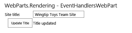
It’s time to examine a more advanced scenario in which you expect the users to enter data and want the Web Part to act upon that data. Example 8-11 shows a Web Part that has a text box in which the users can view and edit the title of the current site (SPWeb). It also has a button that updates the title of the web when clicked. You extend this sample by adding a validation control that makes sure that the user doesn’t specify an empty title, and you add a Label control that shows an indication that the web title has been updated.
using Microsoft.SharePoint;
using System;
using System.Web.UI.WebControls;
using System.Web.UI.WebControls.WebParts;

namespace WebParts.Rendering.EventHandlersWebPart
{
 public class EventHandlersWebPart : WebPart
 {
   protected Button button;
   protected TextBox textBox;
   protected Label message;
   protected RequiredFieldValidator validator;

   protected override void CreateChildControls()
   {
     textBox = new TextBox();
     textBox.Text = SPContext.Current.Web.Title;
     textBox.ID = "titleTextBox";
     this.Controls.Add(textBox);

     button = new Button();
     button.Text = "Update Title";
     button.Click += button_Click;
     this.Controls.Add(button);

     message = new Label();
     this.Controls.Add(message);

     validator = new RequiredFieldValidator();
     validator.ControlToValidate = textBox.ID;
     validator.ErrorMessage = "You must supply a title";
     this.Controls.Add(validator);
   }

   void button_Click(object sender, EventArgs e)
   {
     SPContext.Current.Web.Title = textBox.Text;
     SPContext.Current.Web.Update();
     message.Text = "Title updated";
   }
 }
}
In the Web Part, you define the four controls—the text box, button, validation control, and message—as protected members. In CreateChildControls, you instantiate every one of these controls, set properties on them, and then add them to the control tree. In the text box, you set the default value to the title of the current site, and you also need to specify an ID for that control. That ID is required by the validation control so that the validation control knows which control to validate. You give the button a title and then do something interesting: you add a custom event handler, which should be invoked whenever the button is clicked. This is an ASP.NET feature that will do a post-back to the page when the button is clicked and then invoke the event handler specified on the Click event.
The event handler for the Click event is implemented in the button_Click method, and it takes the value from the text box and sets it as the new title for the current web. It will also update the message control to notify the user that the title has been updated.
The drawback with this method is that each control is rendered one after the other, meaning that you have less control of the look and feel of the Web Part. Of course, you could add even more ASP.NET controls such as HtmlTable, HtmlTableRow, and HtmlTableCell to control the rendering. If you have a more advanced UI for your Web Part, adding controls will result in a lot of controls and a large control tree, which impacts the server-side processing in terms of CPU and memory usage. In many cases, it also results in code that is really hard to follow.
Combining CreateChildControls and RenderContents
One way to improve the rendering if you require more styling of your Web Parts is to combine the CreateChildControls and RenderContents methods. You define the controls that require interaction in CreateChildControls and control the layout in the RenderContents method. Example 8-12 shows how to alter the previous Web Part by overriding the RenderContents method, and then render out the four controls in an HTML table. This approach also separates the logic a bit from the design.
protected override void RenderContents(System.Web.UI.HtmlTextWriter writer)
{
 writer.RenderBeginTag(System.Web.UI.HtmlTextWriterTag.Table);

 writer.RenderBeginTag(System.Web.UI.HtmlTextWriterTag.Tr);
 writer.RenderBeginTag(System.Web.UI.HtmlTextWriterTag.Td);
 writer.Write("Site title: ");
 writer.RenderEndTag();

 writer.RenderBeginTag(System.Web.UI.HtmlTextWriterTag.Td);
 textBox.RenderControl(writer);
 validator.RenderControl(writer);
 writer.RenderEndTag();
 writer.RenderEndTag();

 writer.RenderBeginTag(System.Web.UI.HtmlTextWriterTag.Tr);
 writer.RenderBeginTag(System.Web.UI.HtmlTextWriterTag.Td);
 button.RenderControl(writer);
 writer.RenderEndTag();

 writer.RenderBeginTag(System.Web.UI.HtmlTextWriterTag.Td);
 message.RenderControl(writer);
 writer.RenderEndTag();
 writer.RenderEndTag();

 writer.RenderEndTag();
}
In the RenderContents method, you render an HTML table with rows and columns (Tr and Td tags, respectively). In the table cells in which you want the controls to be rendered, you use the RenderControl of those controls you added and pass in the HtmlTextWriter object. In this way, you can create a more appealing UI without adding a lot of objects to the control tree, which is shown in Figure 8-6.
Using Visual Web Parts
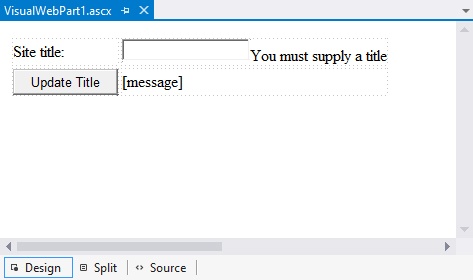
In all examples in this chapter, you must create objects or write one tag at a time to generate the UI. As soon as you have more than a handful of controls, getting an overview of what the interface actually looks like is difficult. If you’ve previously worked with ASP.NET, you are likely used to a more visual approach when building controls and pages. Fortunately, Visual Studio 2012 provides another Web Part project item called a Visual Web Part. A Visual Web Part is essentially a user control (.ascx) that you use to build the UI so that you can mix HTML content with server-side controls. It even allows you to do this in a design surface. Figure 8-7 shows you how the design surface might look when you create a Visual Web Part with the same functionality as in the Web Part in Example 8-12.
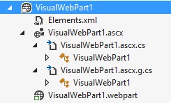
Each time you save the .ascx file in Visual Studio 2012, a partial class file is generated from the .ascx file that builds the control tree from the HTML content and the server-side controls. Figure 8-8 shows you the Visual Web Part SharePoint Project Item and the generated file that has the extension of .ascx.g.cs.
The code in the user control file (.ascx) looks like the code in Example 8-13, but the page directives that are automatically added by Visual Studio are omitted in the listing. The content is a mix of HTML tags and ASP.NET server-side controls, and this approach gives much better separation of the UI design from the business logic in the code-behind file, which you examine next.
<table>
 <tr>
   <td>
     Site title:
   </td>
   <td>
     <asp:TextBox ID="siteTitle" runat="server"/>
     <asp:RequiredFieldValidator ID="rfv" ControlToValidate="siteTitle"
       ErrorMessage="You must supply a title" runat="server"/>
   </td>
 </tr>
 <tr>
   <td>
     <asp:Button runat="server" Text="Update Title" OnClick="button_Click" />
   </td>
   <td>
     <asp:Label runat="server" ID="message"/>
   </td>
 </tr>
</table>
Using Solution Explorer in Visual Studio 2012, you can expand the Visual Web Part SharePoint Project Item and drill down to the .ascx.g.cs file and open it. In that file is the precompiled implementation of the markup you wrote in the user control. You should not modify this file; if you do, any modifications will be overwritten every time you save the user control (.ascx) file.
Each Visual Web Part has a code-behind file, which should contain the logic for the Web Part. Example 8-14 shows you how the Page_Load method is modified to set the initial values of the server-side controls. It also shows the server-side event handler for the button click event, button_Click, which looks exactly the same as in the previous implementation of this Web Part, seen in Example 8-11.
protected void Page_Load(object sender, EventArgs e)
{
 siteTitle.Text = SPContext.Current.Web.Title;
}
protected void button_Click(object sender, EventArgs e)
{
 SPContext.Current.Web.Title = siteTitle.Text;
 SPContext.Current.Web.Update();
 message.Text = "Title updated";
}
In Example 8-13 and Example 8-14, the Visual Web Part contains fewer lines of code and an easier-to-follow implementation. Visual Web Parts are a good starting point if you need to build a Web Part that has a rich UI because they allow you to work with the UI in a much easier way. Worth noticing is that even though you have good control of the actual markup rendered, all HTML markup will be precompiled into ASP.NET objects and a control tree, and you should thoroughly consider the performance implications of such a solution. Every control that ASP.NET needs to keep track of adds to the amount of CPU and RAM used, and the View State might grow larger. For a Web Part that is extensively used throughout a farm, this could cause a performance bottleneck.
Working with Web Part properties
So far this chapter has discussed the rendering of Web Parts and how you can provision Web Parts to the Web Part Gallery so that users can add and remove Web Parts from pages. But one of the core pieces in the Web Part framework is that all Web Part instances can have properties that can be modified by the users and that are persisted (in the case of SharePoint, the persistent storage is the content databases). This section covers how to make Web Part properties persistent and how to make them editable by users through the UI. It also examines more deeply how to customize the edit interface for Web Part properties, specifically by using Editor Parts.
Persisting Web Part properties
To add a property to a Web Part that can be persisted, you first need to add a property and then mark that property by using the Personalizable attribute:
[Personalizable]
public string Text { get; set; }
When SharePoint, or rather the Web Part Manager, sees this attribute on a Web Part property, it serializes and persists the value of the attribute. When rendering the page where the Web Part is placed, the Web Part Manager deserializes the value and sets the property on that Web Part. To set this value, either you could use the programmatic approach, which is to use SPLimitedWebPartManager, or you could set the default value by using the Web Part control description file, which is done by adding a new property element to the properties element:
<properties>
 <property name="Text" type="string">This is some random text</property>
</properties>
Remember that this default value is used only if the Web Part is added through the Web Part Gallery, not if it is added to a page through code. For properties that require a value, it is always good to also set the default value in the constructor of the Web Part.
By default, any property that is using the Personalization attribute can be personalized because the default personalization scope of the attribute is set to User scoped. When the personalization scope is set, User users are allowed to override the persisted value when personalizing the Web Part, and the value of the property will persisted on a per-user basis. To prohibit this behavior, you can set the personalization scope to Shared. Properties with a Shared personalization scope can be edited only in the shared view of the page:
[Personalizable(PersonalizationScope.User)] // same as [Personalizable]
public string Property { get; set; }
[Personalizable(PersonalizationScope.Shared)] //
public string SharedOnlyProperty { get; set; }
To allow the users to actually edit the properties from the web UI, you need to declare another couple of attributes on the property. The following snippet shows how a typical Web Part property could look:
[Personalizable]
[WebBrowsable]
[WebDisplayName("Text content")]
[WebDescription("Text displayed in Web Part")]
[Category("Wingtip")]
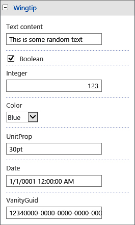
public string Text { get; set; }First, you use the Personalizable attribute to tell the Web Part Manager that the property value should be persisted, in this case by using the User personalization scope. Then you add another couple of attributes that tell SharePoint how you want to enable editing in the web interface. The WebBrowsable attribute tells SharePoint that you would like the users to be able to edit the property and to generate a default input interface for this property. In this case, the property is of the type string, so a text box will be rendered as the input field. The WebDisplayName attribute allows you to specify a user-friendly display name for the property, and WebDescription allows you to provide a description. Finally, the Category attribute allows you to specify a name for the category in which you want the property to be visible. If you omit the Category attribute, the property will end up in the Miscellaneous category.
The UI generated for editing the property is based on the type of the property. The types in Table 8-2 are natively supported by SharePoint. Figure 8-9 shows you how the edit interface looks for the standard types.
Property type | Edit interface generated |
string or char | Text box |
bool | Check box |
int, byte, sbyte, short, ushort, uint, long, ulong, double, float, or decimal | Text box that validates that the value is numeric |
DateTime | Text box that requires a valid date value or date and time value |
Unit | Text box that requires a valid unit (for example, 30px, 30pt) |
Enumerations | Drop-down list box with available enumeration values |
As long as the value of the property type can be represented by and converted to a string, you have another option, which is to use the TypeConverter attribute to specify which converter object type to use. The property value is editable through a text box and only values that can be converted by using the specified TypeConverter are allowed to be stored. This is, for instance, how a property that has the Guid type could be made editable:
[Personalizable]
[WebBrowsable]
[Category("Wingtip")]
[TypeConverter(typeof(GuidConverter))]
public Guid VanityGuid { get; set; }
The TypeConverter attribute specifies that the Guid property should be converted from and to a string representation that uses the GuidConverter type converter class from the System.ComponentModel namespace. This property is shown in Figure 8-9.
Using custom Editor Parts
Although in most cases, the default generated user interface for Web Part properties might be sufficient, in some cases you will want to have more control over how the properties are edited. For instance, you might have dependencies between properties, you might want to add validation rules, or you might need to load data from another source. Luckily, these scenarios have been considered!
You are going to create a Web Part that has a property that contains the title of a list in the current site and shows the number of items in that list. Example 8-15 shows how you could implement that property and the CreateChildControls for such a Web Part. Worth noting is that the code specifically sets the WebBrowsable attribute to false. Not having the WebBrowsable attribute present is the same thing as specifying it as false, but in this case, you do it to explicitly show in the source code that you do not want the standard generated interface for that property.
public class CustomWebPart : WebPart
{
 [Personalizable]
 [WebBrowsable(false)]
 public string ListTitle { get; set; }

 protected override void CreateChildControls()
 {
   if (!String.IsNullOrEmpty(ListTitle))
   {
     SPList list = SPContext.Current.Web.Lists.TryGetList(ListTitle);
     if (list != null)
     {
       this.Controls.Add( new LiteralControl(
         String.Format("The list '{0}' contains {1} items",
           ListTitle, list.ItemCount)));
       return;
     }
   }
   this.Controls.Add(new LiteralControl("List not found or selected"));
 }
}
To create a custom user interface to edit the Web Part properties, you need to create an Editor Part. An Editor Part is a specialized control that can retrieve from and set property values on a Web Part. To create an Editor Part, you create a normal C# class file and choose to inherit from the EditorPart class, which is a part of ASP.NET:
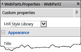
class CustomWebPartEditorPart: EditorPart { }You build the UI of the Editor Part in exactly the same way you build it by using a Web Part. The most common approach is to use the CreateChildControls method to build a control tree. For this sample, you want the user to choose one list from the current site by using a drop down list. The CreateChildControls method of the Editor Part could look like the code in Example 8-16.
protected DropDownList dropDown;
protected override void CreateChildControls()
{
 this.Title = "Custom properties";

 this.Controls.Add(new LiteralControl("List:"));

 dropDown = new DropDownList();

 SPContext.Current.Web.Lists.Cast<SPList>().
   Where(l => !l.Hidden).
   Select(l => l.Title).ToList().
   ForEach(t => dropDown.Items.Add(
     new ListItem(t, t)));

 this.Controls.Add(dropDown);
}
The DropDownList object is defined as a protected object in the class so that it is available for all methods in the class; you will need it later. The first thing you do in the CreateChildControls method is to set the title of the Editor Part by using the Title property. Although doing this is not necessary, it is a good practice. Next, you add descriptive text before you create the actual drop-down list. The drop-down list box is populated with the titles of all the lists in the current site, and then it is added to the control tree.
After building the Editor Part UI, you need to implement two abstract methods: SyncChanges and ApplyChanges. The SyncChanges method synchronizes the properties from the Web Part to the Editor Part, and ApplyChanges applies the property values to the Web Part. The implementation of both methods is in Example 8-17.
public override void SyncChanges()
{
   EnsureChildControls();
   CustomWebPart wp = this.WebPartToEdit as CustomWebPart;
   dropDown.SelectedValue = wp.ListTitle;
}
public override bool ApplyChanges()
{
   EnsureChildControls();
   CustomWebPart wp = this.WebPartToEdit as CustomWebPart;
   wp.ListTitle = dropDown.SelectedValue;
   return true;
}
Both methods start by calling the EnsureChildControls method, which is important. The EnsureChildControls method, which is defined in the System.Web.UI.Control class, makes sure that the CreateChildControls method is called before proceeding. In this case, you rely on the fact that the drop-down list box is created and has values; if the EnsureChildControls method wasn’t called, you could potentially get a null reference exception in the methods. Next, the code retrieves a reference to the Web Part that is using the Editor Part, which is done by using the WebPartToEdit property, which is then type-converted to the needed Web Part type. The SyncChanges method copies the Web Part property values into the Editor Part controls, and ApplyChanges copies the property values in the other direction, and set the values on the Web Part. The ApplyChanges method must return true when it successfully copies the values from the Editor Part to the Web Part and, if anything fails, should return false, prohibiting the Web Part from persisting the change.
You have done everything you need to do to implement a custom property editing interface by using an Editor Part. You next must connect this Editor Part to the Web Part by overriding the CreateEditorParts method in the Web Part. The CreateEditorParts method is defined in the IWebEditable interface, which the WebPart class implements. Example 8-18 shows how the CreateEditorParts method should be overridden in this case.
public override EditorPartCollection CreateEditorParts()
{
 List<EditorPart> editors = new List<EditorPart>();
 EditorPart editorPart = new CustomWebPartEditorPart();
 editorPart.ID = this.ID + "_editorPart";
 editors.Add(editorPart);
 return new EditorPartCollection(editors);
}
In this overridden method, you start by creating a List<EditorPart> object to which you will add the custom Editor Part classes. It is possible to have more than one Editor Part. Then you create a new instance of the Editor Part, and before you add the object to the list, you must set the ID of the Editor Part. Finally, you convert the list of Editor Parts to an EditorPartCollection object and return that.
The end result of this custom Editor Part looks like Figure 8-10. You’ve just learned how you can create a complete custom editor interface for your Web Part properties and implement logic, validation, and data retrieval.
Exploring advanced Web Part development
This last part of the chapter explains some of the more advanced Web Part development concepts. When used properly, these can give that little extra specialness to your Web Parts. You start by examining Web Part verbs and how to extend the default Web Part menu. You then learn about the Web Part Connections feature, which really shows the strengths in the Web Part framework and allows the user to build even more advanced Web Part pages. Finally, this chapter examines the case in which you are executing, for instance, web service requests in your Web Part, and it shows you how to do this asynchronously to improve performance. The chapter also explains how to take advantage of the .NET Framework 4.0+ parallel features to boost the performance of your Web Parts.
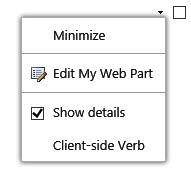
Using Web Part verbs
All Web Parts have a menu in the upper-right corner containing a set of menu options, also known as Web Part verbs, such as Minimize, Delete, Close, Export, and Edit (My) Web Part. The menu options shown depend on the Web Part, the user’s permissions, settings on the Web Part, and whether the user is in edit mode. If none of the verbs are present, no menu is shown. The default verbs are added by the Web Part zone. For a specific Web Part, you can control some of the built-in verbs. The WebPart class has a set of properties that can be used to control this, which are listed in Table 8-3. You use these properties to configure your own Web Parts either by overriding the property or by specifying the property in the Web Part control description file:
<property name="AllowClose" type="bool">False</property>
Property name | Purpose |
AllowClose | Set to false to prohibit closing of the Web Part. |
AllowConnect | Set to false to prohibit Web Part connections. |
AllowEdit | Set to false to prohibit the users from editing the Web Part. |
AllowHide | Set to false to prohibit hiding the Web Part. |
AllowMinimize | Set to false to prohibit minimizing the Web Part. |
AllowZoneChange | Not directly tied to the Web Part menu but related. Set to false to prohibit changing Web Part zone for the Web Part. |
The Web Part framework allows you to add custom verbs to a Web Part. You can do this through the IWebActionable interface, which the WebPart class implements. There are two types of verbs that you can add: client-side verbs, which execute a JavaScript function on the client, or server-side verbs, which execute code on the server. Using both client-side and server-side verbs can be a very good way to add options to your Web Part. For instance, consider how you could implement a Web Part verb that allows you to shift between a basic mode and a detailed mode of a Web Part. To persist the selected display state, you use a property on the Web Part, which is defined as follows:
[Personalizable]
public bool ShowDetails { get; set; }
To add verbs to a Web Part menu, you must override the Verbs method of the IWebActionable interface. The default Web Part implementation returns an empty WebPartVerbCollection. Example 8-19 shows how a server-side verb is being added to a Web Part. To create a new verb, the WebPartVerb class is used, and the constructor determines whether the verb is a server-side or client-side verb. There is also a constructor that allows you to define a verb that executes both client-side and server-side code.
public override WebPartVerbCollection Verbs
{
 get
 {
   List<WebPartVerb> verbs = new List<WebPartVerb>();
   WebPartVerb detailsVerb = new WebPartVerb(this.ID + "_details", toggleDetails);
   detailsVerb.Text = "Show details";
   detailsVerb.Checked = this.ShowDetails;
   verbs.Add(detailsVerb);
   return new WebPartVerbCollection(base.Verbs, verbs);
 }
}
The overridden Verbs method creates a new WebPartVerb object by using the constructor that creates a server-side verb. The first parameter to the constructor is a unique ID for this Verb, constructed from the ID of the Web Part, and the second parameter is the name of the delegate method, shown in Example 8-20, which should be invoked when the verb is selected on the Web Part menu. You must also set the Text property of the Web Part verb, which is the displayed text on the menu. In this case, you also use the Checked property of the verb; this is a property that can be used to indicate a checked state. Finally, you create a new WebPartVerbCollection object by using a List<WebPartVerb> containing the custom verbs. This implementation also uses the constructor of the WebPartVerbCollection that can take another WebPartVerbCollection object and merge it with the new verbs. This is done just in case the code inherits from another custom Web Part that has its own set of custom verbs.
private void toggleDetails(object sender, WebPartEventArgs eventArgs)
{
 this.ShowDetails = !this.ShowDetails;
 SPFile file = SPContext.Current.File;
 using (var manager = file.GetLimitedWebPartManager(PersonalizationScope.User))
 {
   DetailsWebPart wp = manager.WebParts[this.ID] as DetailsWebPart;
   wp.ShowDetails = this.ShowDetails;
   manager.SaveChanges(wp);
 }
}
The toggleDetails delegate method that is invoked when the verb is selected on the Web Part menu changes the value of the ShowDetails property. Then the delegate method retrieves the current Web Part page and uses the SPLimitedWebPartManager to update this property change, because in this case you want to persist this property change.
Implementing a client-side Web Part verb is very similar to implementing a server-side verb. The difference is that you aren’t specifying a delegate method but rather a JavaScript string to execute:
WebPartVerb clientVerb = new WebPartVerb(this.ID + "_clientVerb", "alert('Client-side Verb')");
clientVerb.Text = "Client-side Verb";
verbs.Add(clientVerb);
The constructor determines that the verb is a client-side Web Part verb because it is being passed a string as the second argument. The string passed into the constructor must be a valid JavaScript snippet that can be evaluated. If you’re adding this code snippet to the same verb collection that contains the server-side verb, the Web Part menu would look like Figure 8-11.
Using Web Part connections
One of the really interesting features of Web Parts is their ability to connect to each other. One Web Part can connect to one or more other Web Parts and then send information from the single Web Part to the others. This feature is very useful when building Web Part pages and dashboards, and by using it, the user can filter information in other Web Parts. Many of the default Web Parts in SharePoint 2013 support connections, and if you’re using the Server edition of SharePoint 2013, you also get access to a set of specific filter Web Parts that can be used to filter the contents of other Web Parts.
A Web Part connection always has one provider and one consumer Web Part. The provider Web Part sends information to the consumer Web Part. Filter Web Parts, for instance, are provider Web Parts, and they send filtering information to the consuming Web Part. A Web Part can either be a consumer, a provider, or both. The connection set between a provider and a consumer needs a contract that both the provider and consumer understand. This contract is defined as a .NET Framework interface, which is implemented by the provider Web Part and used by the consumer Web Part. A provider Web Part can support multiple contracts, which means that it can implement multiple connection interfaces. The consumer can consume multiple contracts, but it cannot consume multiple connections of the same type. The Web Part framework comes with a set of predefined contracts that can be used to connect custom Web Parts to the out-of-the-box Web Parts, such as the XSLT List View Web Part:
IWebPartField. Sends one cell or field of data
IWebPartRow. Sends one row of data
IWebPartTable. Sends a full table of data
IWebPartParameters. Sends one cell or field of data based on a parameter
The default connection interfaces are very generic and are based on callbacks in the interface. These interfaces allow the consumer to call back into a method in the provider and retrieve the required data instead of just retrieving data from the provider.
Web Part connections are a part of the ASP.NET Web Part infrastructure, even though connections existed in SharePoint prior to ASP.NET 2.0. Web Part connections prior ASP.NET, or SharePoint Web Part connections, worked in similarly to the ASP.NET connections except regarding some important aspects. The connections that were used in earlier versions of SharePoint had the concept of client-side connections, which is not available in the ASP.NET Web Part infrastructure. Connections before ASP.NET could also connect across pages, which the today’s connections cannot.
To understand the details of Web Part connections and how to build consumers and providers, you will create one provider Web Part that allows you to select one list from the lists available in the current site, and one consumer Web Part that reads the chosen list from the provider Web Part and shows details about the list. After you build these two Web Parts, you learn about how to connect them by using the UI and the SPLimitedWebPartManager, and how to connect them declaratively in a SharePoint Feature.
Building a provider Web Part
The very first task you need to perform is building the provider. This is a simple Web Part that hosts a drop-down list box, with the visible lists in the current site. Whenever a list is selected in the drop-down list box, the code gets the ID, a Guid, for the list and stores it in a local variable. Example 8-21 shows the full implementation of such a Web Part.
public class ListChooserWebPart : WebPart
 protected Guid selectedList;
 protected DropDownList dropDown;
 protected override void CreateChildControls()
 {
   this.Controls.Add(new LiteralControl("Choose list:<br/>"));
   dropDown = new DropDownList();
   SPContext.Current.Web.Lists.Cast<SPList>().
     Where(l => !l.Hidden).ToList().
     ForEach(list => dropDown.Items.Add(
       new ListItem(list.Title, list.ID.ToString())));

   if (selectedList == Guid.Empty)
   {
     selectedList = Guid.Parse(dropDown.Items[0].Value);
   }
   dropDown.SelectedValue = selectedList.ToString();
   dropDown.AutoPostBack = true;
   dropDown.SelectedIndexChanged += (s,e) => {
     selectedList = Guid.Parse(dropDown.SelectedValue);
   };
   this.Controls.Add(dropDown);
 }
}
The Web Part creates a DropDownList object and populates the drop-down list box with all the available and visible lists in the current site. The drop-down list box is also configured to automatically do a postback whenever its list is changed. It uses a lambda expression that is fired when the list is changed, and it stores the current ID of the list.
To be able to use this Web Part as a provider Web Part, you need to define a contract that the consumer can use. This contract is created by using an interface. In this case, all you need to expose to the consumer is the ID of the selected list. Example 8-22 shows the interface you need as the connection contract.
public interface IListProvider
{
 Guid ListID {get;}
}
After you have the interface defined, you must implement that interface in the provider Web Part. First, make sure the interface is listed in the class definition:
public class ListChooserWebPart : WebPart, IListProvider
Next, implement the property that the interface is exposing. You had already stored the list ID in a local variable, so you need only to return that value:
public Guid ListID
{
 get
 {
   return selectedList;
 }
}
The final task you need to perform on the provider Web Part is to create a connection provider endpoint. This must be a method that returns an object implementing the connection interface type. In most cases, this is the Web Part itself. This method must be marked with the ConnectionProvider attribute, as in the following snippet. The attribute allows you to specify a display name for the connection. You can optionally add a unique ID. In this case, also declare that this connection allows multiple consumers by using the AllowsMultipleConnections property:
[ConnectionProvider("List", AllowsMultipleConnections = true)]
public IListProvider SetListConnection()
{
 return this;
}
This code is all you need to build the connection provider Web Part. But to test it, you need to build a consumer that uses this connection contract.
Building a consumer Web Part
The consumer Web Part does not need to implement the connection interface—it just needs to have a consumer connection endpoint, very much like the provider connection endpoint. This must be a method that takes the connection interface as an argument, and it has to be marked with the ConnectionConsumer attribute. Example 8-23 shows how this could be implemented in a consumer Web Part. The consumer connection endpoint, the GetListConnection method, stores the reference in a local variable to the connection provider.
IListProvider provider;

[ConnectionConsumer("List")]
public void GetListConnection(IListProvider listProvider) {
 provider = listProvider;
}
After the consumer connection endpoint is in the consumer Web Part, you can use the connection information in the Web Part. Example 8-24 implements the CreateChildControls method for the consumer Web Part. The method does a check whether the Web Part has a connection. If it does not, it renders an error message, and if it is connected, you use the information sent to the Web Part by the provider and generate the Web Part UI. Remember to always implement a check to determine whether the Web Part is connected. When you add the Web Part to a page, the Web Part will not be connected until you connect it.
protected override void CreateChildControls()
{
 if (provider == null)
 {
   this.Controls.Add(new LiteralControl("Not connected!"));
 }
 else
 {
   try
   {
     SPList list = SPContext.Current.Web.Lists[provider.ListID];
     this.Controls.Add(new LiteralControl("You selected: " + list.Title));
   }
   catch (Exception)
   {
     this.Controls.Add(new LiteralControl("List not found..."));
   }
 }
}
Connecting Web Parts
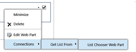
You just created one provider Web Part and one consumer Web Part that understand each other through using the connection interface. Now it is time to connect these Web Parts. It can be done in the web interface or by using SharePoint Designer 2013. In the web interface, you connect Web Parts by editing the page and choosing to edit either the consumer or the provider Web Part. If any compatible consumer or provider is found, a Connections menu option is available on the Web Part menu, as shown in Figure 8-12.
You can also create a connection in a programmatic way; for instance, by using a Feature receiver. Recall how you previously added Web Parts by using a Feature receiver. (You can refer to Example 8-7 to review how you did this.) You can use SPLimitedWebPartManager not only to add Web Parts to a page but also to connect them together by using the SPWebPartConnection object. Example 8-25 shows an excerpt from a Feature receiver and how the provider and consumer Web Parts are added to the page and then connected.
SPFile page = site.RootWeb.GetFile("SitePages/WebPartPage2.aspx");
using (SPLimitedWebPartManager manager =
 page.GetLimitedWebPartManager(PersonalizationScope.Shared))
{
 ListChooserWebPart.ListChooserWebPart provider =
   new ListChooserWebPart.ListChooserWebPart();
 provider.ID = "Provider";
 manager.AddWebPart(provider, "Left", 0);

 ListInfoWebPart.ListInfoWebPart consumer = new ListInfoWebPart.ListInfoWebPart();
 consumer.ID ="Consumer";
 manager.AddWebPart(consumer, "Right", 0);

 SPWebPartConnection connection = new SPWebPartConnection()
 {
   ProviderID = "Provider",
   ConsumerID = "Consumer",
   ID = "Connection"
 };
 manager.SPWebPartConnections.Add(connection);
 manager.SaveChanges(provider);
 manager.SaveChanges(consumer);
}
The Web Parts are created and added to the Web Part zone, and you must be sure to set their IDs. Then you create a new object of type SPWebPartConnection. That object is populated with the ID of both the provider and consumer Web Parts in addition to its own unique ID. In the case where you have multiple consumer or provider endpoints, you must also specify the name of the endpoints. Finally, you add that connection to the limited Web Part Manager and save the Web Parts.
If you prefer to do this declaratively, you use basically the same approach. Assume you deploy a Web Part page by using the Module element, and the consumer and provider Web Parts by using the AllUsersWebPart element, as child elements to a File element. Then you connect the Web Parts by using the WebPartConnection element, which also must be a child element of the File element:
<WebPartConnection
 ProviderID="Provider"
 ConsumerID="Consumer"
 ConsumerConnectionPointID=""
 ProviderConnectionPointID=""
 ID="Connection"/>
Just as you did in the Feature receiver, you need to specify the ID of the consumer and provider and give the connection and ID. You also must specify the endpoint IDs when declaratively creating connections. In this case, you leave the endpoint names empty, because you have only one endpoint on both the Web Parts.
You’ve just explored one of the more interesting features of the Web Part framework. By creating connectable Web Parts, you give your users a lot of power to build their own dashboards or mashups by using Web Part pages and Web Parts.
Using parallel and asynchronous execution in Web Parts
Once in a while, you are required to build a Web Part that performs some long-running operations, such as reading data from databases or web services. If you don’t have the possibility of moving this executing to the client side or outside of SharePoint, you need to make sure that you implement the server side thoroughly and use good code patterns and practices. The .NET Framework 4.0 and .NET Framework 4.5 introduce a lot of new features for executing code in parallel or asynchronously, and some of those features can be used in SharePoint development. The following sections describe how to take advantage of these features.
Using parallel execution
One of the options you have with .NET Framework 4.0 is to execute code in parallel. By using the Parallel class in the System.Threading.Tasks namespace, you can do work in parallel. Even though parallel execution does not reduce stress on the system—most likely the opposite—it can, if used correctly, improve perceived performance. This means that if you have the resources available, you can execute logic in parallel so that the end users receive their information faster.
When building Web Parts, there is often the need to do several lookups, web service calls, or queries to lists or the search index. These tasks were often done synchronously in the Web Parts, and the total time to load the Web Part was the sum of all the tasks. By using parallel execution, you can initiate each query or call so that each runs in parallel, and use the resources on the server more efficiently. The time it takes to perform the tasks is equal to the longest running task.
Consider this simple example. In Example 8-26 are parts of a Web Part that calculates the total number of tasks from a specific list in each site assigned to the current user in the current site collection. If there are a large number of sites, all these CAML queries typically would be executed one after another. By using the ForEach method on the Parallel class, the code can, in parallel, walk through all the sites in the site collection and do the CAML query.
long totaltasks = 0;
string queryText =
 "<Where><Eq><FieldRef Name='AssignedTo' LookupId='True' /><Value Type='UserMulti'>" +
 SPContext.Current.Web.CurrentUser.ID +
 "</Value></Eq></Where>";
Parallel.ForEach(SPContext.Current.Site.AllWebs, web =>
{
 SPList list = web.Lists.TryGetList("Shared Tasks");
 if (list != null)
 {
   SPQuery query = new SPQuery();
   query.Query = queryText;
   SPListItemCollection tasks = list.GetItems(query);
   Interlocked.Add(ref totaltasks, (long)tasks.Count);
 }
 web.Dispose();
});
A couple of things are important to notice in the code. First, you need to dispose the SPWeb objects, and for easier reading, any exception handling has been omitted. Second, you cannot simply increment the totaltasks variable; you must use the atomic Interlocked.Add method to increment the value of the variable, because each parallel execution will run on its own thread.
Warning
You have to be very careful when using the parallel features in .NET Framework 4.0 and SharePoint. All objects executing in parallel have to be thread-safe, and most of the SharePoint objects are not. For instance, you will get exceptions if you try to perform parallel execution on all the lists in one single web.
Using asynchronous execution
Many of these long-running operations consist of calls to external sources, which means that SharePoint is idling, waiting for the data to return from the external source. In this case, you can take advantage of asynchronous features in ASP.NET. Even though a lot of features in ASP.NET 4.5 create asynchronous methods and pages, not all of them can be used in SharePoint 2013 because of its configuration.
There are options for building asynchronous Web Parts, however, by using the asynchronous page tasks. Asynchronous page tasks are an ASP.NET 2.0 feature but still a valid option. To illustrate this, you’ll walk through the creation of a Web Part that reads OData (Open Data Protocol) from an external source. If one or more of these Web Parts are on a page, each request to the data source runs sequentially for each Web Part, one at a time. For instance, if the request takes one second and you have four Web Parts, the page load time will be at least four seconds. This demonstration uses the OData Northwind test service to retrieve product information. You can find this test service at http://services.odata.org/Northwind/Northwind.svc/.
First, you add three properties to the Web Part that allows you to specify how many products you want to retrieve and how to sort them. You also make these personalizable through the web UI. The UI will be a bulleted list with the product names, and you will also add a Label control that shows any error messages:
[Personalizable, WebBrowsable]
public string OrderBy { get; set; }
[Personalizable, WebBrowsable]
public int Items { get; set; }
[Personalizable, WebBrowsable]
public bool SortAscending { get; set; }

protected BulletedList products;
protected Label errorMessage;
The Web Part control description file is also updated with these properties so that you have default values on the properties. A good convention is also to set default values in the constructor of the Web Part in case a user programmatically adds this Web Part to a page and forgets to set any values on the properties:
<property name="Items" type="int">10</property>
<property name="OrderBy" type="string">UnitPrice</property>
<property name="SortAscending" type="bool">true</property>
To load the products from the Northwind test service, create a local method called LoadProducts, shown in Example 8-27. This method ensures that the UI controls are present, and then constructs a REST query by using the Web Part properties. Finally, it uses the WebClient object to download the OData XML and parse it.
void LoadProducts()
{
 EnsureChildControls();
 errorMessage.Text = String.Empty;
 products.Items.Clear();

 string restUrl = String.Format("http://services.odata.org/Northwind/Northwind.svc/"
   +"Products?$top={0}&$orderby={1}+{2}",
   Items, OrderBy, SortAscending ? "asc" : "desc");

 using (WebClient client = new WebClient())
 {
   try
   {
     client.Encoding = System.Text.Encoding.UTF8;
     string data = client.DownloadString(restUrl);

     XNamespace ns = "http://schemas.microsoft.com/ado/2007/08/dataservices";
     XElement element = XElement.Parse(data);
     var names = element.Descendants(ns + "ProductName").Select(d => d.Value);
     names.ToList().ForEach(n => products.Items.Add(new ListItem(n)));
   }
   catch (WebException we)
   {
     errorMessage.Text = we.Message;
   }
 }
}
The REST query is sent to the Northwind test service endpoint, and the code is using Linq-to-XML to retrieve the product names from the returned data. Each product name is then added to the bulleted list. If any error message is returned from the REST call, such as time-outs or invalid queries, this error will be written in the error message label.
In this case, you build the UI by overriding the CreateChildControls method, and it is in this method that you register—not start—the asynchronous call. You could also register the asynchronous call in any postback event handlers, or even as late as in the OnPreRender method. This is because of how the asynchronous execution is implemented in ASP.NET. If an ASP.NET page has a registered asynchronous task, the thread that the page is executing on will be returned to the thread pool after the OnPreRender method. This is to prohibit running all these tasks sequentially on the same thread and blocking other threads from executing. Then the ASP.NET framework picks up one new thread from the thread pool for each asynchronous task, executes the tasks, and waits for them to finish or time out. After all the asynchronous tasks are complete, a new primary thread is retrieved from the thread pool, and the page execution continues on that thread. This process means that you cannot start any external calls in the RenderContents method, and you cannot use any of the results from the asynchronous tasks until after the OnPreRender has executed.
The CreateChildControls method for the Northwind products Web Part, shown in Example 8-28, initializes the two controls and then registers the asynchronous task. Also notice how you added the SPMonitoredScope class to create a monitored scope. It is a good practice to use monitored scopes so that you can use, for instance, the Developer Dashboard to monitor performance of methods and sections in your Web Parts. When running this Web Part at a later time, you can view in the Developer Dashboard that nearly no time was spent in the CreateChildControls. You can use this as an exercise and change the implementation of this method from asynchronous to synchronous to compare the difference.
private Action asyncTask;
protected override void CreateChildControls()
{
 using (SPMonitoredScope scope = new SPMonitoredScope("Async CreateChildControls"))
 {
   products = new BulletedList();
   this.Controls.Add(products);
   errorMessage = new Label();
   errorMessage.ForeColor = System.Drawing.Color.Red;
   this.Controls.Add(errorMessage);

   asyncTask = new Action(LoadProducts);

   PageAsyncTask task1 = new PageAsyncTask(OnBegin, OnEnd, OnTimeOut, null, true);
   this.Page.RegisterAsyncTask(task1);
 }
}
After creating the controls, you declare an Action delegate for the product loader method. It is this delegate that will be executed asynchronously. Asynchronous page tasks are created by instantiating a new object of the class PageAsyncTask. The constructor of this object takes five arguments. The first one is the begin handler and is the method that will be executed to start the asynchronous execution. The second and third are two methods that are used when the execution ends and when it times out. The fourth argument can be used to send parameters to the task, and the fifth one indicates, in this case, that you can run this task in parallel with other tasks. Finally, you register the task with the page, so that it can start the asynchronous task later in the page life cycle.
The three methods OnBegin, OnEnd, and OnTimeOut, which you added to the PageAsyncTask, are implemented in Example 8-29. The OnBegin method uses the Action delegate that was previously created and calls its BeginInvoke method to start the execution. This method returns an IAsyncResult object, which is used by the framework to keep track of the status of the asynchronous operation. The OnEnd method is called when the execution completes successfully, within the time-out limits, and the OnTimeOut method will be called if the asynchronous call times out.
public IAsyncResult OnBegin(object sender, EventArgs e, AsyncCallback callback,
  object data)
{
 return asyncTask.BeginInvoke(callback, data);
}
public void OnEnd(IAsyncResult result)
{
 asyncTask.EndInvoke(result);
}
public void OnTimeOut(IAsyncResult result)
{
 errorMessage.Text = "Operation timed out...";
}
The default time-out value for asynchronous operations in ASP.NET is 45 seconds, but SharePoint lowers this time-out to 7 seconds. This is configured in the Web.config file of the SharePoint Web application in the pages element:
<pages asyncTimeout="7"/>
You should usually not edit this value, but if you know that your asynchronous operation can take longer time than 7 seconds, or you don’t want those long time-outs, you can set a temporary longer or shorter value in your Web Part. You do this by changing the settings of the AsyncTimeout property of the ASP.NET Page object:
this.Page.AsyncTimeOut = new TimeSpan(0,0,15);
Now you’re all set with your asynchronous Web Part. To see any visible benefits from the asynchronous operations, you should add two or more of these Web Parts to a page and then monitor the requests by using the Developer Dashboard.
Summary
This chapter covered one of the historically most predominant features of SharePoint—Web Parts. Web Parts have come a long way since their initial implementation and now are a part of the ASP.NET framework. This chapter discussed the Web Part framework and its important aspects, and how you can take advantage of its features. After covering the fundamentals, you created Web Parts by using Visual Studio 2012. This chapter explained all the different aspects you need to keep in mind to use Web Parts to create a deployable solution.
You explored in depth how to render the UI of Web Parts and how to make them customizable by using Web Part properties. It is the personalized properties that make Web Parts unique and so easy to work with. By taking advantage of these properties, you can create Web Parts that your users will love to use.
Finally, you examined some of the more advanced Web Parts development topics, such as extending the Web Part menu with verbs and how to make Web Parts connectable by using Web Part connections. Both of these features are very interesting if you want to make easy-to-use and reusable Web Parts for your organization or customers. The last part of the advanced topics section discussed parallel and asynchronous execution of Web Parts, which is essential to know when you’re dealing with long-running calls and operations.