

40 THE BASICS
Your basic color palette
A considered, core palette of primary
colors can make your life as a painter
easier because it will enable you to
mix a huge range of hues. You can
create many types of painting using
primary colors as your foundation,
as shown in the examples below.
(See also pp.32–39.)
Choosing a palette
HOW TO SELECT AND WORK WITH COLORS FOR YOUR NEEDS
The term “palette” can refer to the actual choice of paints—such as a palette
of blues—as well as to the physical container you use to store and mix your
watercolor paints (also called a paintbox). With more than 250 different
hues available, there is no shortage of choice in watercolor, so consider
and research what you need before you start buying.
Quinacridone
magenta
Cadmium red French
ultramarine
Phthalo blue
Indian yellow
Azo yellow
Cool
primary
colors
Warm
primary
colors
Pure primaries and secondary mixes
This abstract piece uses a bold limited palette of warm primary colors
for impact. Cadmium yellow, cadmium red, and azure blue are applied
wet-in-wet to create vibrant secondary colors.
Blue left as
pure color
Orange—a secondary
mix of yellow and red
Neutrals mixed from primaries
Here, warm yellow raw sienna, cool alizarin crimson, and warm
ultramarine blue are combined with touches of burnt sienna and
burnt umber to mix a full range of skin tones for a realistic portrait.
Dark brown mixed from
three primary colors
Core primary colors
With this set of warm and
cool primary colors you can mix
almost any hue imaginable. Other
primary colors that are similar in
hue to this selection will also be
suitable. When choosing paints,
do check for permanence or their
likelihood to fade.
US_040-041_Choosing_a_palette.indd 40 02/04/2020 3:33pm
41 Choosing a palette
Container choices
For ease of working, choose a paintbox
or palette that can both store your
squeezed paint or pans and provide
good mixing areas. Palettes vary
dramatically in price and construction,
so choose something that ts your
needs and your budget. All palettes
should have deep paint wells to t a
full pan, or the equivalent in squeezed
paint. There should also be a number
of deep mixing areas that will hold at
least
1
⁄2 oz (15 ml) of mixed paint.
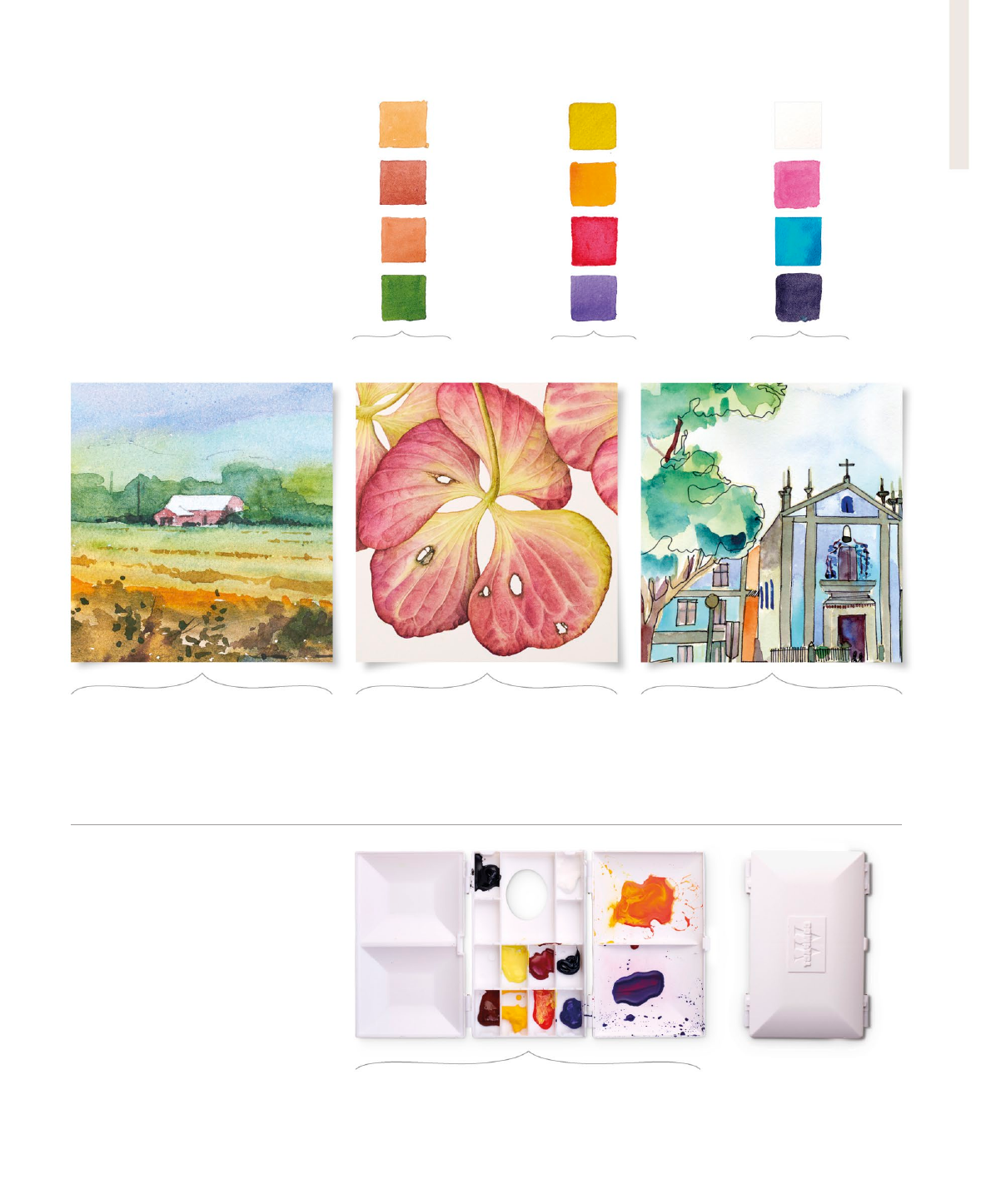
Useful colors for landscapes
As you would expect, muted, slightly dull
earth colors are a worthwhile addition
for a landscape palette. Pigments such as
ochers and siennas were originally literally
made from the earth.
Useful colors for owers
To encapsulate nature’s vivid color schemes,
still-life painters often favor the freshest
and brightest colors and will also include
secondary colors in their palette. Painters
tend to form rm favorites.
Useful colors for illustration
For illustration, black and white are useful
additions to reinforce bright spots and
shadows. Liquid watercolors, such as aqua
green, provide illustrators with concentrated
pigments for an immediate hit of color.
Closed palette
Useful additional colors
While you can mix similar versions
of popular colors such as burnt sienna,
having premixed colors in your palette
can be more convenient. Neutral tint (a
strong dark) and titanium white gouache
for highlights are both useful. You may
also favor certain types of color
depending on your preferred subjects.
Burnt sienna
Rose madder
genuine
Aqua green
(liquid
watercolor)
Yellow ocher
Cadmium
orange
Titanium white
gouache
Light red
Dioxazine
violet
Opera pink
Sap green
Green
gold
Neutral tint
A versatile palette
This palette is convenient and easy to store and transport—
ideal for plein air painting. Its generous paint-holding wells
can be lled and topped up as needed, without waste.
Earth colors
and greens
Vivid ower and
foliage colors
Black, white,
and brights
US_040-041_Choosing_a_palette.indd 41 02/04/2020 3:33pm
..................Content has been hidden....................
You can't read the all page of ebook, please click here login for view all page.