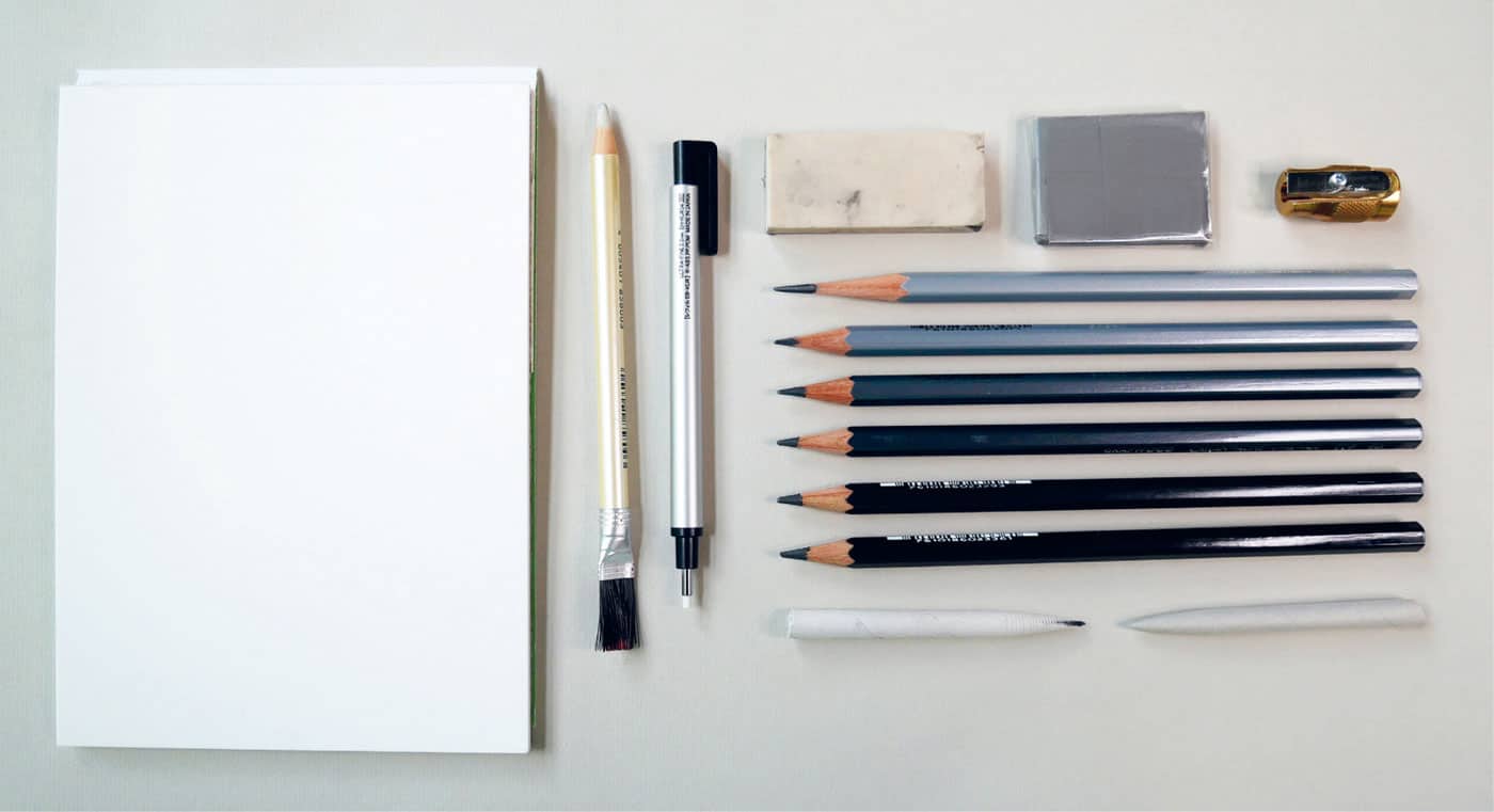
Graphite is a gray, crystalline form of carbon with a metallic sheen; its name comes from the Greek graphein (“to write”). It’s the humble material used to make the no. 2 pencils we have used since grade school, and it’s also used to make the artist-grade pencils I hope you will try. Artist-grade graphite comes in varying degrees of hardness and softness. The hardest pencils, from H to 10H, create a paler, silvery, very defined line. The softest pencils, from B to 10B, create a smudgy, deep-gray line. HB is right in the middle of hardness and softness—the perfect balance—and is used to make the venerable no. 2 pencil. For these lessons, I recommend a set of artist-grade pencils. A good variety of hardness and softness would be 2H, HB, 3B, 5B, 7B, and 9B. You’ll also need:MATERIALS
LESSONS
Our journey with graphite starts at the beginning: how to hold the pencil and put the material on the paper with a featherlight touch to give it the most beautiful appearance. Then, we explore the qualities of your individual mark and how that relates to seeing your subject and documenting what you see. We also explore the value (lightness and darkness) of your subject and the importance of capturing a three-dimensional object onto a two-dimensional piece of paper. Finally, we put all our learnings into practice in the last three graphite projects. Each lesson builds on the previous one and is meant to be further explored in your way.
Gather your materials, get those pencils sharpened, and let’s begin!
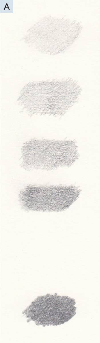
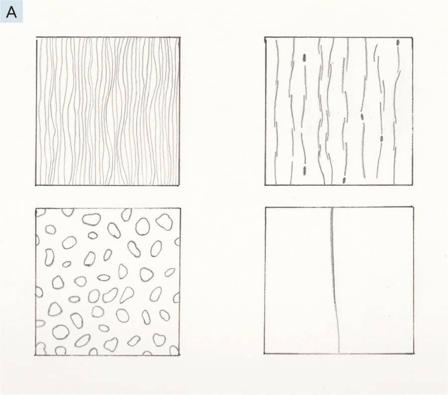
Let’s begin with the very foundation of drawing and the most important thing I can teach you—the feather touch. When we first begin to use a pencil or pen for drawing instead of writing, our natural tendency is to hold the writing implement as we do when writing our name. This can be handy when we need to be very precise, but in general, it forces us to use a firmer touch than desired. When we see a beautiful drawing, some things we might notice are the fineness of the graphite application and the texture of the paper shining through. These contribute an element of lightness, of luminosity, no matter how dark in tone the marks may be. When we use too firm a touch with a pencil, it can hide that beautiful surface texture of the paper and create shine or reflective quality, which keeps our eyes from seeing the darker values. 1 - In this first exercise, we will use an HB pencil to layer graphite in darkening values. Using the most delicate touch you can, create 4 small swatches of graphite. See A. (This isn’t easy! Give yourself time to practice this feather-touch technique.) Leave the first swatch as is. Build a second feather-touch layer on the next three. Add another layer to the last two and a final layer on the very last swatch. Do you see how, by layering with this delicate touch, you can achieve darker values but still see the light and texture of the paper shining through? The fifth swatch is an example of pressing too hard with an HB pencil. It covers all the texture and light of the paper and creates a reflective sheen. This is what we’ll work to avoid.
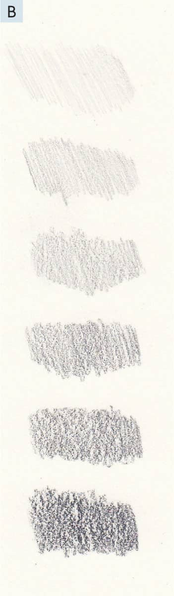
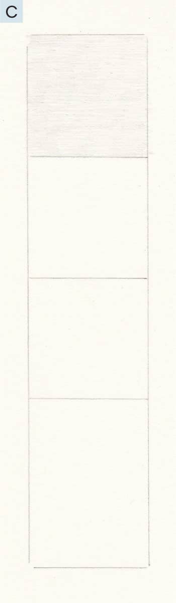
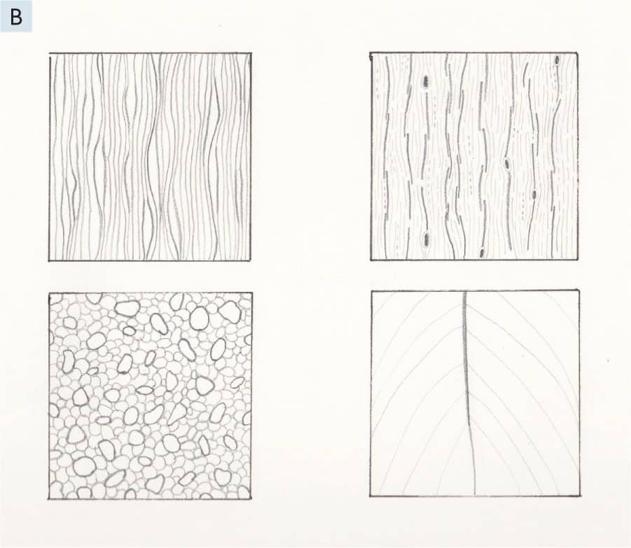
2 - Now that you know how to layer and create different values of light and dark with an HB pencil, let’s make our job easier by using the varying shades of our artist’s pencils, 2H through 9B. Using the same feather touch as before, make a small swatch with each of these pencils, in order from light to dark, making sure to let the texture and light of the paper shine through. See B. This is the reason we have varying degrees of hardest and softness in graphite artist’s pencils. It is much easier to choose a softer pencil when we need a darker value than to layer over and again using just one pencil. A delicate touch and an array of pencil hardnesses allow for a lovely drawing. 1 - For the next exercise, use a ruler to draw a rectangle, about 5 × 1½ inches (13 × 4 cm). Divide it into three 1-inch (2.5 cm) sections and leave the rest open. For the first section, use the 2H pencil in one direction, and fill the square as evenly as possible. See C.
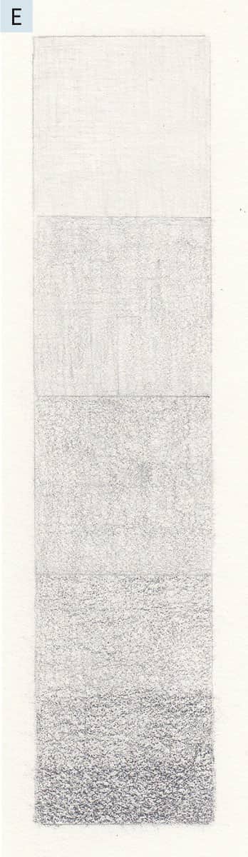
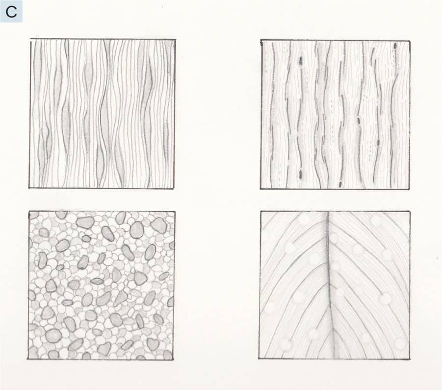
2 - Fill the next square in the same manner using the HB pencil. Fill the third square with the 3B pencil. Then, evenly fill the final space with 5B, 7B, and 9B, in that order. See D. Use the lightest touch possible.
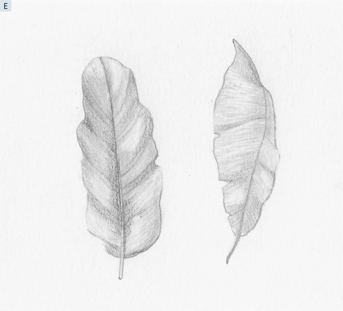
3 - Complete steps 1 and 2 again, filling in the spaces as directed but in another direction to create the most even tone possible. See E. If you’ve gone outside the lines of the rectangle, this is normal! It takes a lot of practice to control keeping the edges clean. The point of this exercise is to create a value scale using all your pencils and to practice achieving a smooth tone and texture with the light of the paper still shining through.
Repeat this exercise often over the next few weeks. Training our hands to use a delicate touch is so important. It helps us understand the varying values of our pencils and achieve an even tone using the feather-touch technique. The feather touch is truly my secret to delicate, poetic drawings. Think of dragging a very sharp needle across the surface of very ripe tomato with tight skin. If you press too hard, you will break the skin. This is the image to keep in your mind when using a pencil on a paper.
It’s time to break the “I’m not sure what to draw” ice. For now, let’s think about drawing as simply making marks on a piece of paper. In this lesson, we will create several designs using patterns of marks and then try our hand at putting them together to create a fun, expressive drawing. 1 - Using your pen and ruler, create 4 square boxes (see the examples for how to situate them), about 3 × 3 inches (7.5 × 7.5 cm), on your practice paper. Keep in mind that my examples are only examples. You do not have to copy the exact line placement—ever. See A.
2 - See B.
3 - See C.
4 - Now that you have created several beautiful patterns, it’s time to put them together into one drawing on your drawing paper. You can follow my example or use the patterns creatively to make your design. See D. Notice the tiny tick marks—like raindrops. These are one of my favorite ways to fill in spaces on expressive drawings—and are so easy to do! Use the full value range of your pencils. See how I use the broken-lines technique to create something that looks like a tree stump in the middle? Be fearless here. See how many different marks you can create from the patterns we have learned. It’s for your eyes only. This is practice, and this is fun!
5 - Use your blending stump to give your drawing some dimension and contrast. I even lightly pressed my eraser on the tick marks randomly to create some interest. See E. Your first creative drawing is complete! I’m proud of you.
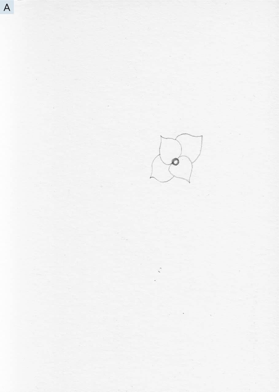
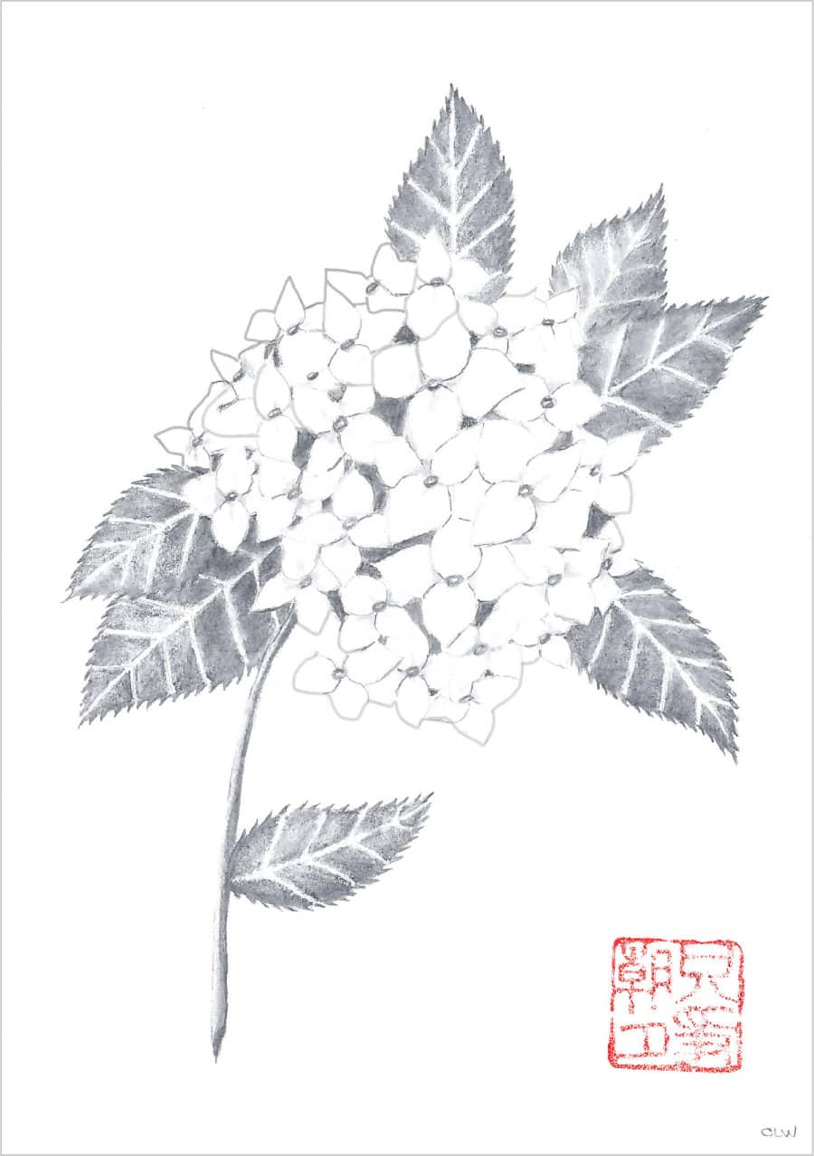
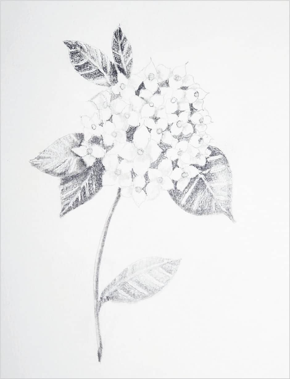
How do you feel when you see the finished image in this lesson? Does it make you worry it may be too hard for you? Or, are you excited to try something you didn’t think was possible with the skills you have right now? Well, it’s very possible! So, let’s do this. In this lesson, we will build a complex-looking flower, step by step, using patterns of repetitive marks, just like we did in Lesson 2 (here). The difference is, this time we will work to create something recognizable, such as a hydrangea flower. Put your doubts aside and let’s draw this together, step by step. 1 - Just to the upper right of the center of the paper, use an HB pencil to draw a tiny circle. Switch to a 2H pencil and draw 4 petal shapes. See A. This is the basic pattern for the flower head.
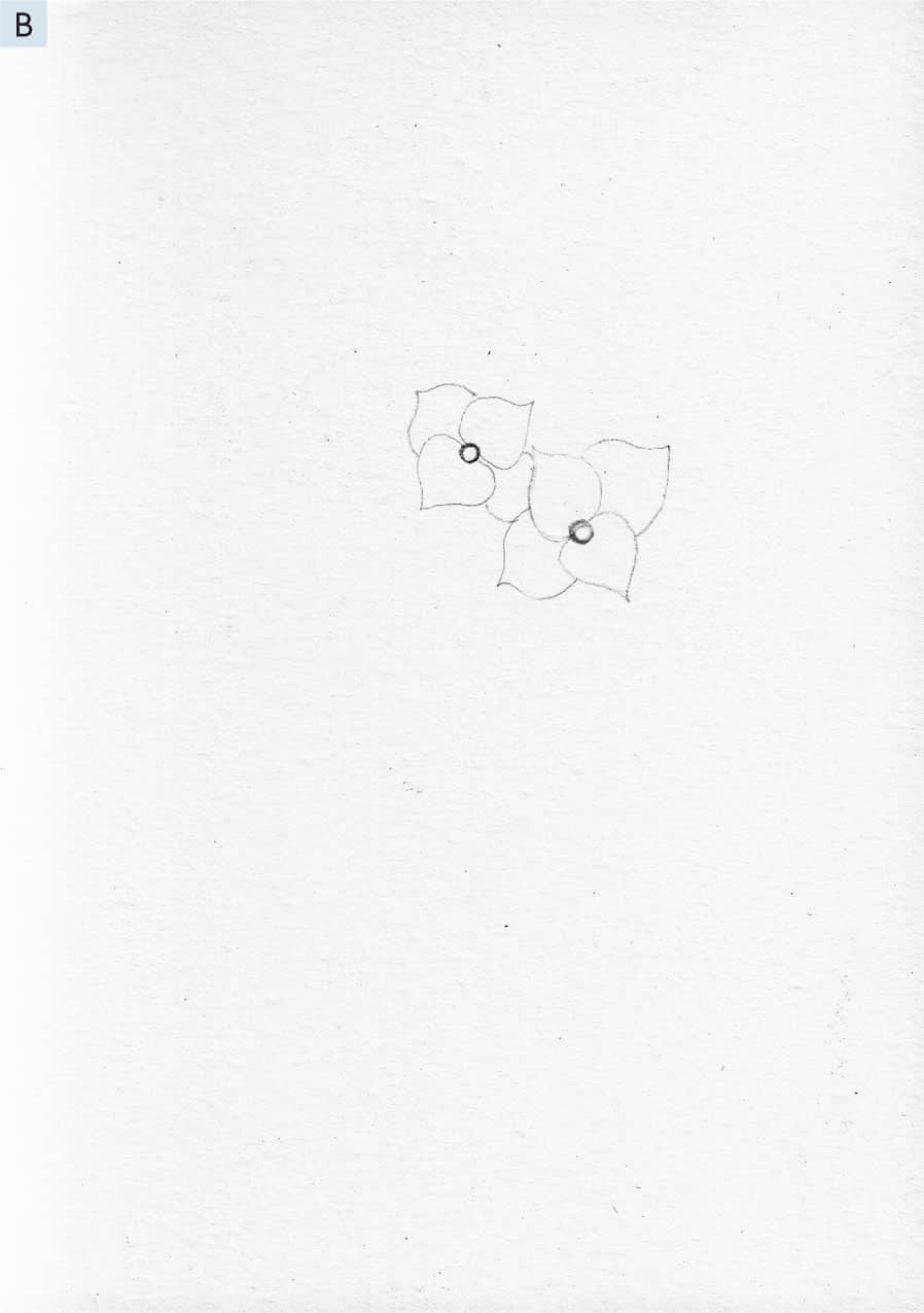
2 - Use the HB pencil to draw another tiny circle just to the upper left of the first one, as shown. Repeat the same petal pattern using the 2H pencil, but notice the way one petal goes underneath the first flower. When this happens, just draw the parts that are visible and do not go underneath. See B.
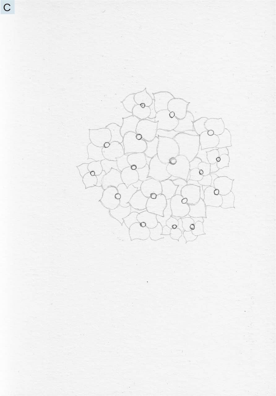
3 - Fill out the remainder of your flower by repeating step 2 until you have created a roundish shape of petals that is pleasing to you. You may use my example as your guide. Remember, all the petals do not need to be the same and can vary in size and direction (with smaller flowers toward the edges). Notice how the center circles are evenly spaced but in a random way. See C.
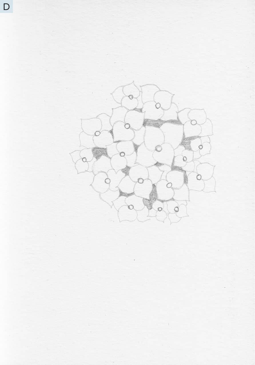
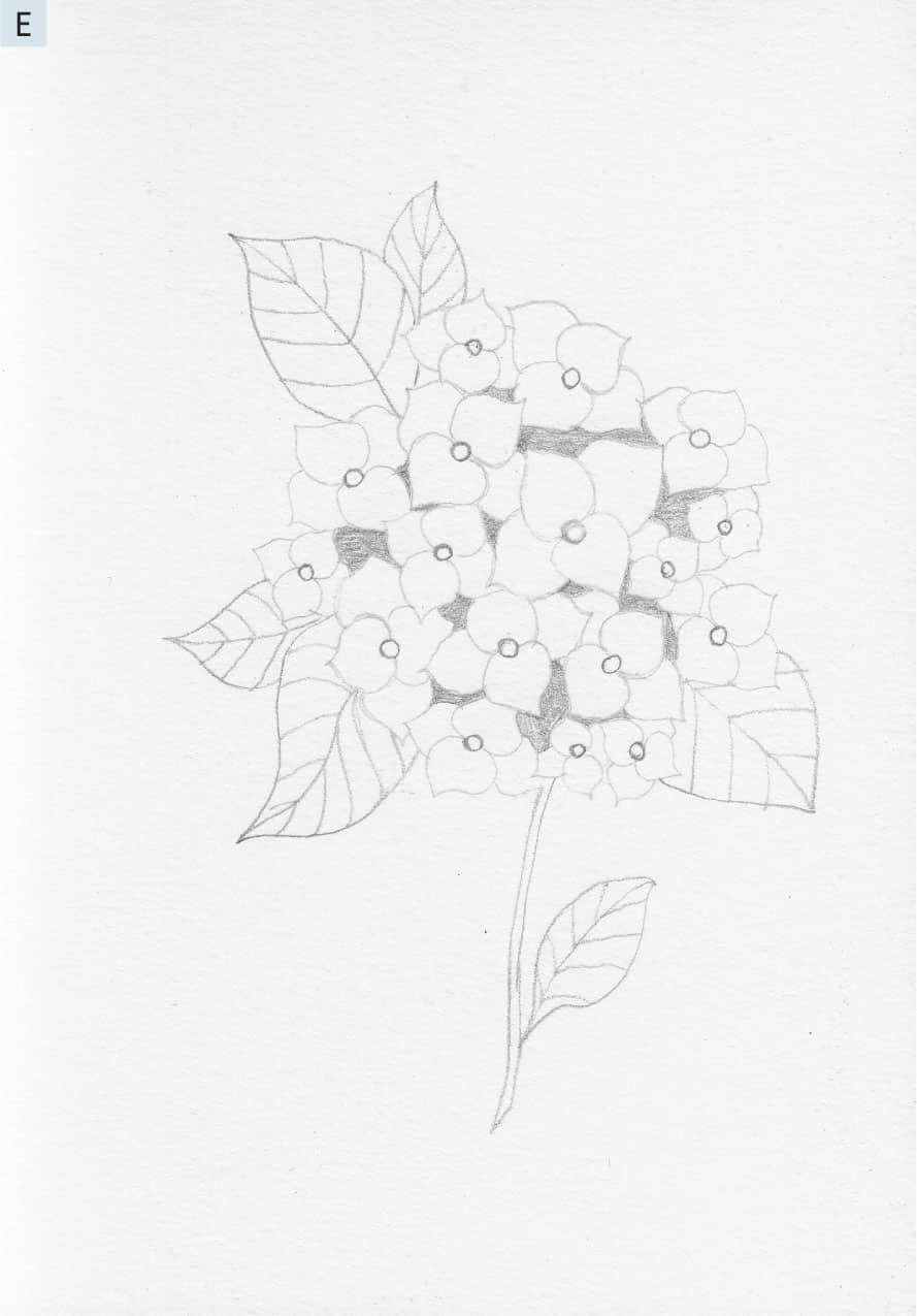
4 - Use the HB pencil to fill in the tiny spaces between the petals, as shown. Take your time with this and look carefully. See D. Remember, use your feather touch!
5 - Time to add some simple leaf shapes. This is not too different from one of the patterns we created in Lesson 1 (here). With an HB pencil, lightly draw 5 leaf shapes around the outer edge of the flower. Use the example here as a guide. Then, add a stem with another leaf coming off the stem, as shown. I draw the leaf shape first, add the center vein, and then add the secondary veins. See E.
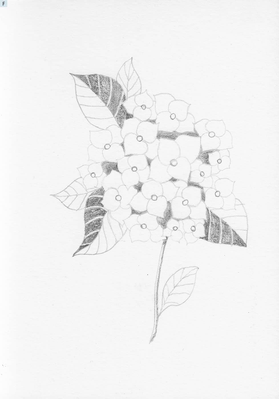
6 - With your 3B pencil, fill in the lower section of each of the tiny spaces from step 4. Begin to fill in the right side of each of the 3 larger leaf shapes, leaving a tiny sliver of white paper below each secondary vein line, as shown. I turn my paper as needed so my hand is in a comfortable position and I am not smearing previous marks where I rest my hand. Draw a line down the right side of the stem. See F.
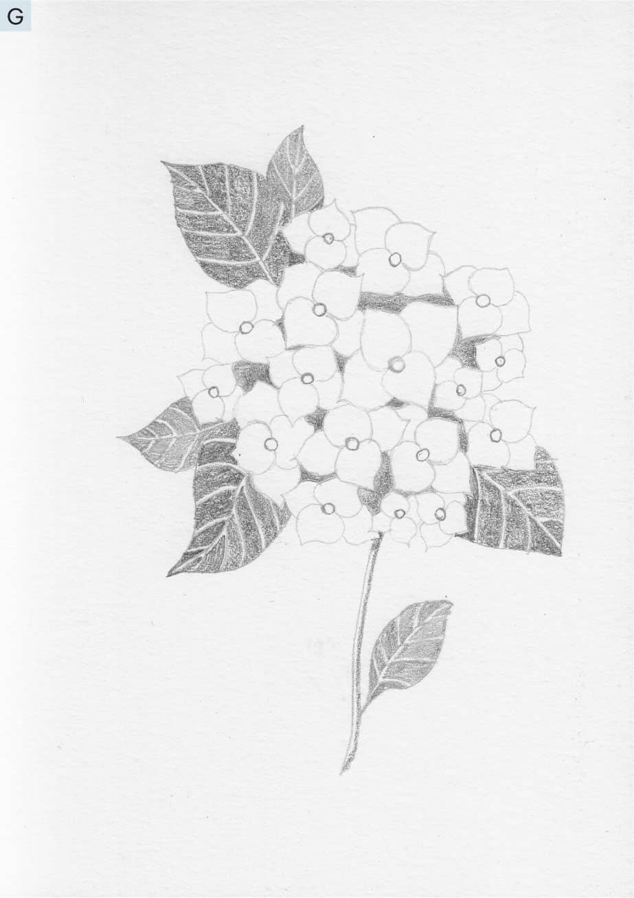
7 - Continue to fill in the left-hand side of each leaf while leaving a thin sliver of white paper at the center rib as well as below each secondary vein line. With an HB pencil, repeat steps 6 and 7 for the 3 smaller leaf shapes. See G.
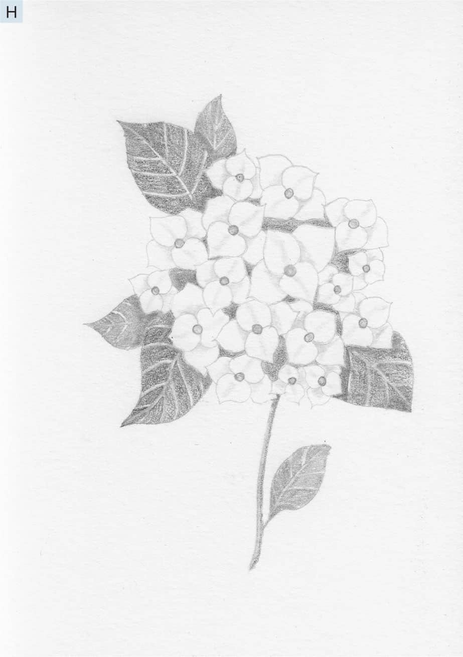
8 - Now that the drawing is complete, let’s use the blending stick to put the finishing touches on our flower. Remember, use a feather touch and do not press the point of the blending stick or flatten it. Wipe the point clean with a tissue every now and then to keep it clean of excess graphite. See H.
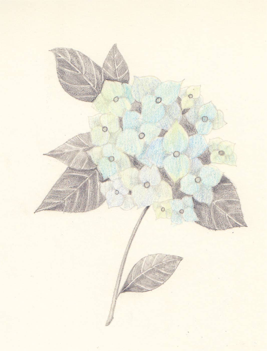
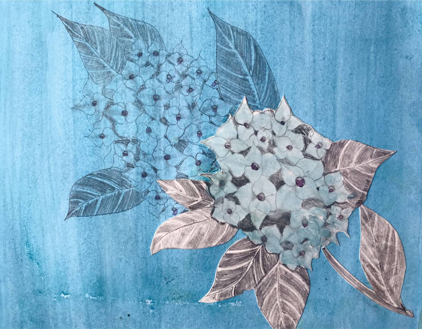
Sit back and admire your beautiful hydrangea! What if you used colored pencils to shade the petals of the flower? What if you drew the entire flower in colored pencil? What if you created an entire bouquet of hydrangeas? What other flowers could you break down into similar steps using different shapes? Mary Dowson Carol Williamson Jane Woker Lina Card
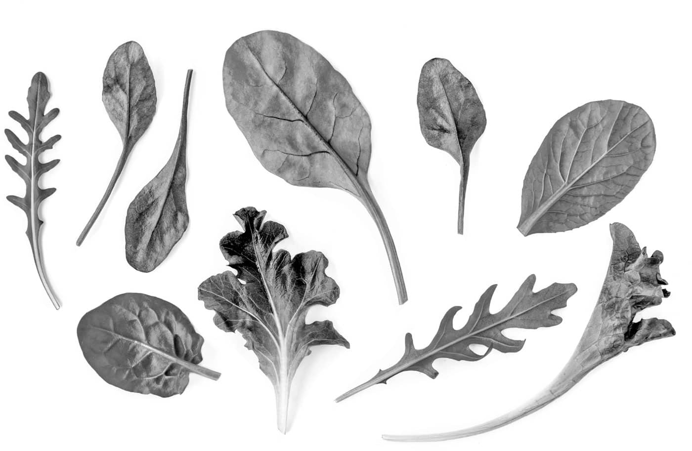
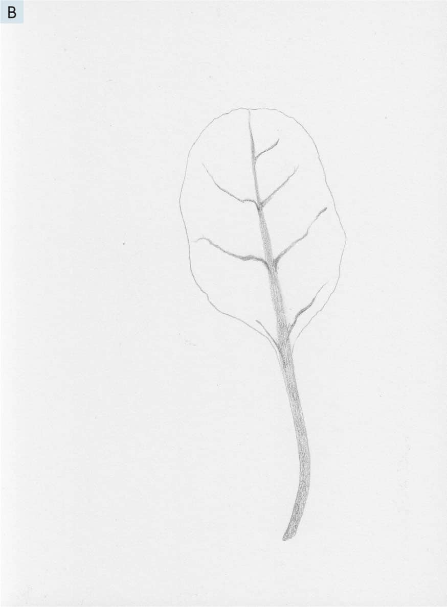
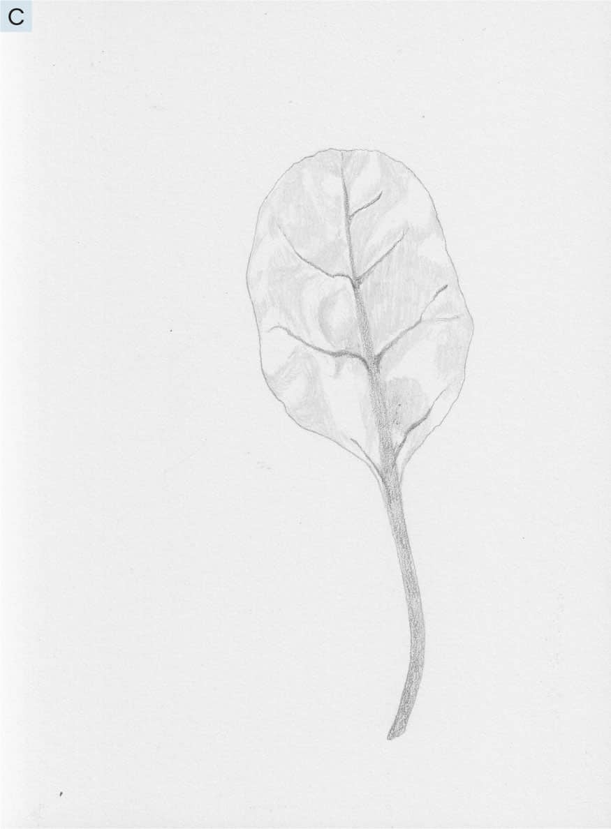
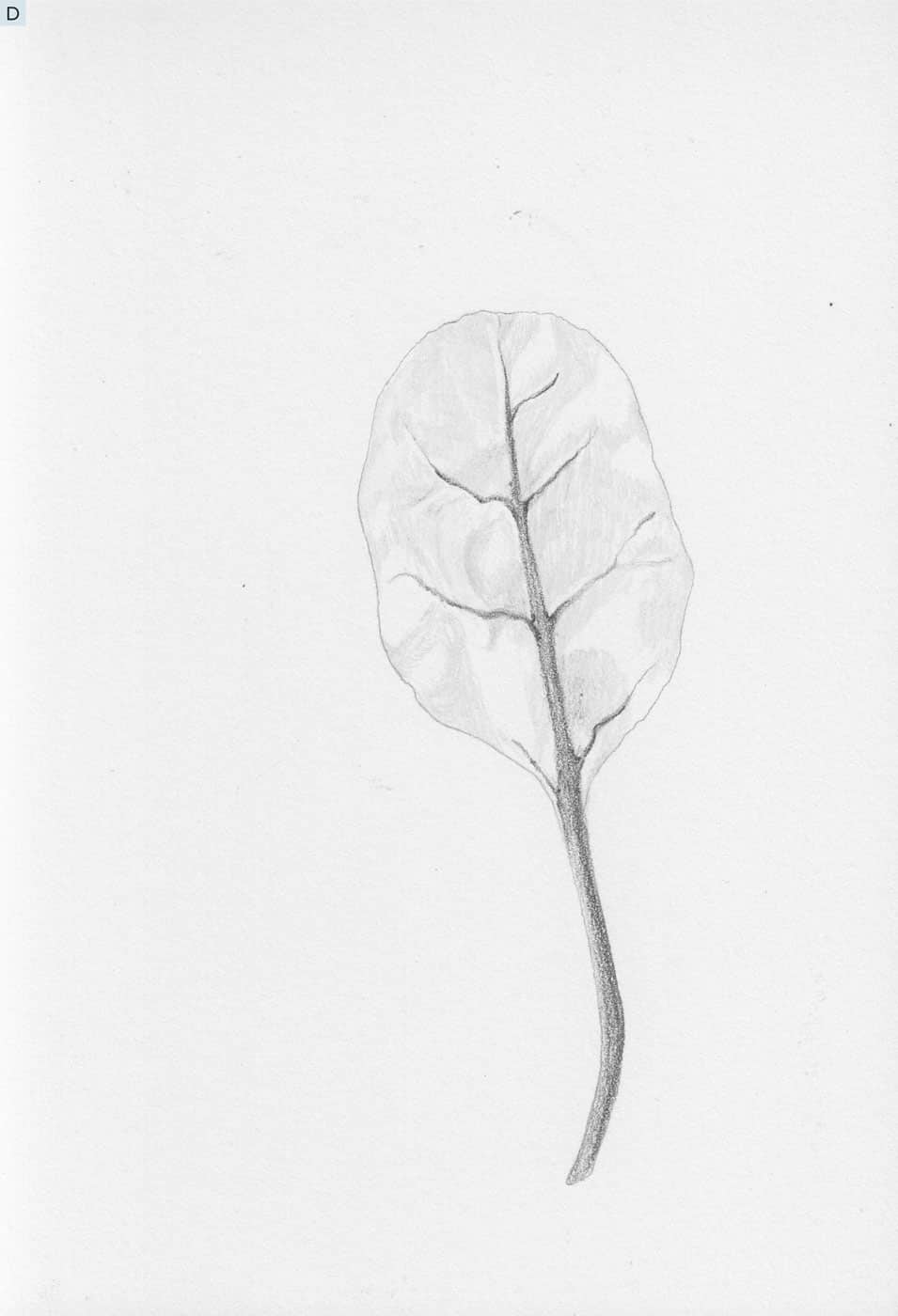
Now it’s time to get representational with our new drawing skills. All this means is that what we draw has a likeness to a real subject we are looking at as we make our marks; it is not simply from memory or imagination. Our first projects were more freeform and imaginative, or based on technical skills. Now, it’s time to look closely at a simple subject and use our pencils to make marks based on what we see. I call this Seeing and Drawing Practice, and it is the way I taught myself to draw real, tangible things from everyday life. There is no measuring, no rulers or perspective or foreshortening. Instead, we rely on the way our eyes perceive something, line, light, and shadow, and we make intuitive marks in our own way. Every time I lead a group of beginners in a seeing and drawing lesson, people are amazed at their results. “I had no idea I could do this!” is something I hear commonly. So, let’s get started on our first subject—a lettuce leaf. 1 - We will practice our seeing and drawing skills with the leaf in the center of the reference image, but I hope you continue this practice by trying all the leaves! Begin by using an HB pencil to create a simple outline of the leaf shape. Start anywhere it feels natural and slowly create a light outline of the leaf shape you see. Don’t be afraid to start and stop; use your eraser, but don’t get too hung up on perfection. We are not trying to create a photocopy, but a tender drawing of how our eyes perceive this lovely lettuce leaf. Use the sample image as a guide. Remember, do not press too hard with your pencil—keep that feather touch. See A.
2 - With the HB pencil, start at the top of the leaf and create a soft shading mark to form the center rib. Notice how it starts out very thin and gradually becomes as wide as the stem at the bottom of the leaf. Fill in the stem with gentle shading marks, smoothly moving the pencil in small strokes as evenly as possible. Then, use the same technique to create the side veins, as shown. Look at the reference image, not the sample drawing, as you create your marks. The sample is just a guide to show you which parts of the subject we are working on. See B.
3 - Switch to the 2H pencil. Paying close attention to the reference image, lightly fill in the leaf where you see the darkest areas. Let your marks move in the same direction that you notice on the subject. Study the sample image as an example, but also look directly at the subject when making your marks. Again, feather touch. It should be a lighter gray than the HB pencil marks. See C.
4 - Finally, switch to the 5B pencil. Notice the places on the stem, center rib, and veins that are darker in value. Use your 5B pencil lightly to create these small areas of darkness. Sometimes these final dark areas are very small, but their impact makes a big difference. See D. How did that feel? I recommend trying this exercise three times: first for learning, second for practicing what you learned, and a third time when you will not be so worried about the steps and can relax and really see and draw what you notice. Remember, do not get too rigid about creating an exact likeness; that is not our goal. Now, try some of the other leaves, starting with the flatter varieties and working your way to the curly lettuces.
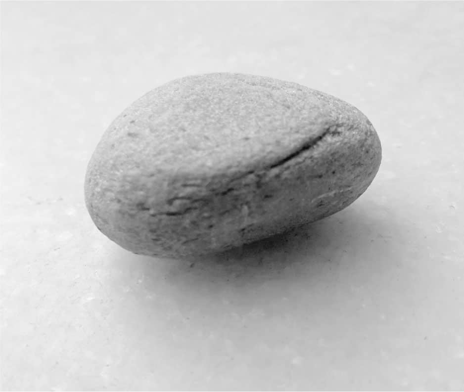
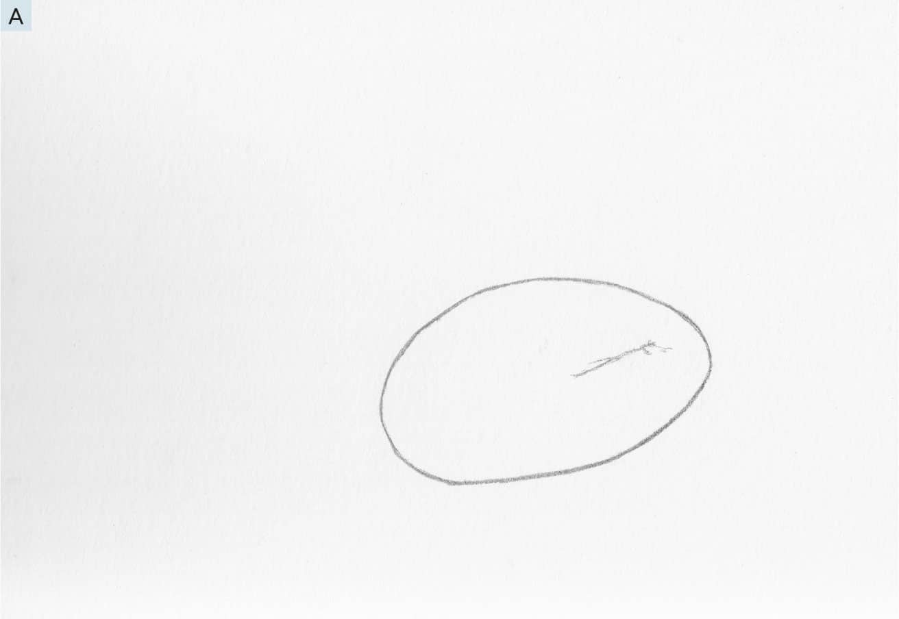
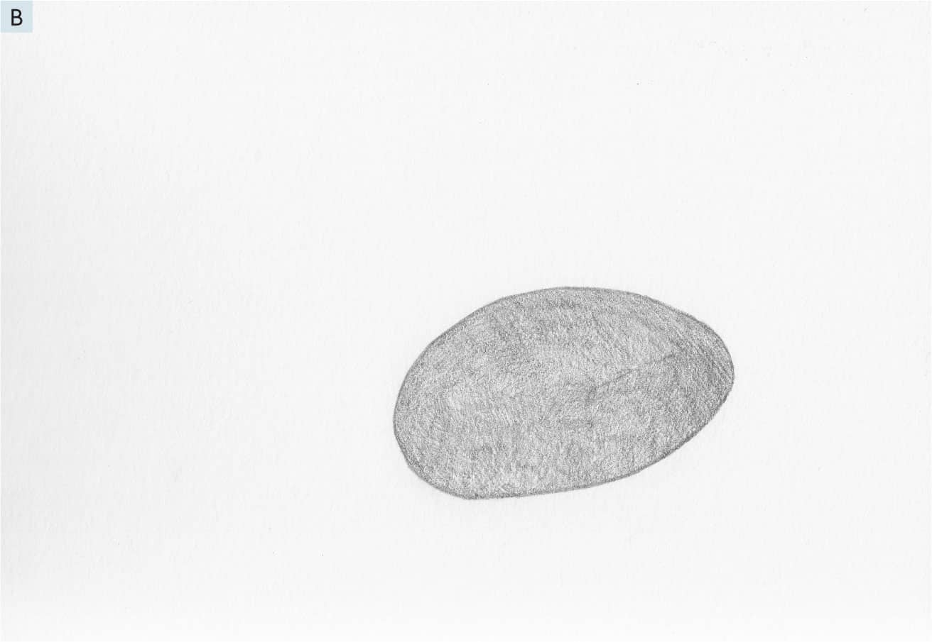
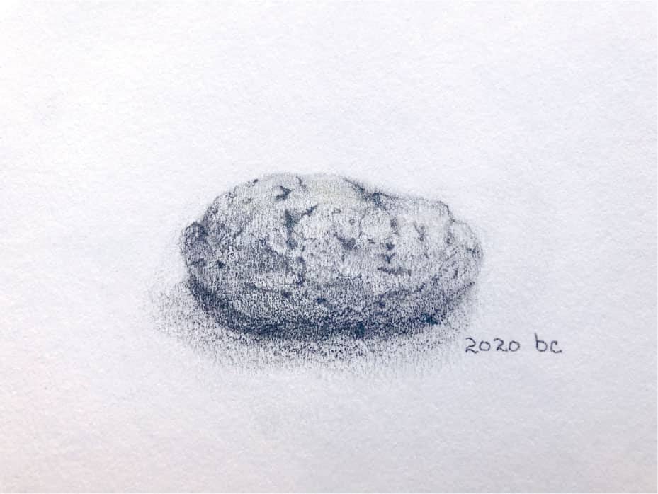
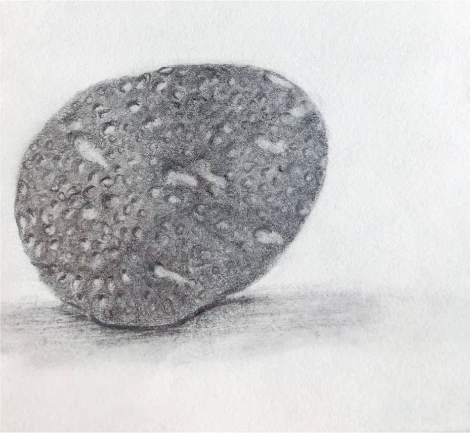
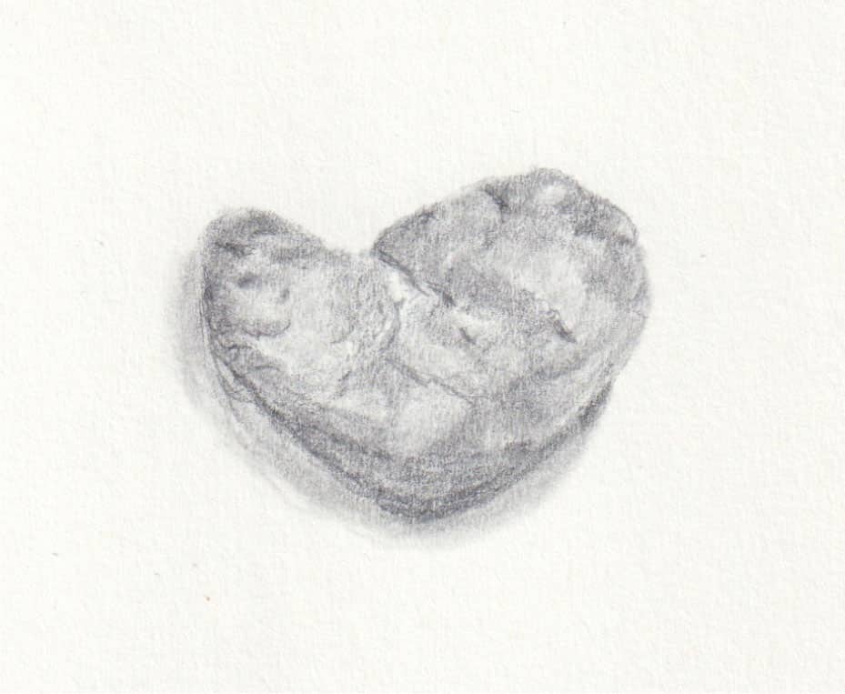
In the winter of 1856, John Ruskin, artist and famous art critic, wrote in his book, The Elements of Drawing: Now if you can draw that stone, you can draw anything; I mean, anything that is drawable. Many things (sea foam, for instance) cannot be drawn at all, only the idea of them more or less suggested; but if you can draw the stone rightly, everything within reach of art is also within yours. For all drawing depends, primarily, on your power of representing Roundness. If you can once do that, all the rest is easy and straight-forward. This idea of learning to represent roundness by drawing a stone is the subject of this lesson. In Lesson 4 (here), we drew a fairly flat subject, a lettuce leaf. Now, we will build on what we have learned by drawing a more three-dimensional object—a smooth stone. To make any subject appear three-dimensional on a flat piece of paper, we must learn to see and depict contrast and shadow, the lights and darks of our subject, and the smoothness of transitions between them, as our eyes see them. Although we will use a reference image of a stone, I hope you will continue this lesson with a real stone to further explore the technique. At the end of this lesson are stones drawn from life by other beginner artists. This lesson requires your attention and time, but the results are remarkable and will give you the confidence to try many other subjects you wish to draw—the principles are the same no matter the subject. 1 - With an HB pencil, take your time to create a line drawing of the outline of the stone on your paper. Use an eraser to make adjustments, if needed.
2 - Continuing with the HB pencil and a feather touch, make small marks to shade the inside of the stone, paying attention to the direction of form of your marks. Instead of simply making random back-and-forth marks in one direction, direction of form follows the contour of the subject. Study the sample image in comparison to the reference image for how this is achieved. And remember, we all see things differently, so yours will be different from the sample. Using this technique to fill in a shape gives us the start of the illusion of roundness.
3 - Use your kneaded eraser to lift off some of the graphite in areas where the reference stone is lighter in value—gently press and lift the flattened section of the eraser. Pay attention to anywhere the stone seems lighter to your eye. Use the sample image as a guide, but always do your work directly from the reference image or actual subject. See C.
4 - Use the 2H pencil to create marks that mimic the textural details your eyes see. Let your eyes comb the entire surface of the rock as you add these delicate markings. Pay attention to the area where the lighter section that you erased meets the darker section. Use the 2H pencil to blend these areas with small, short marks. See D.
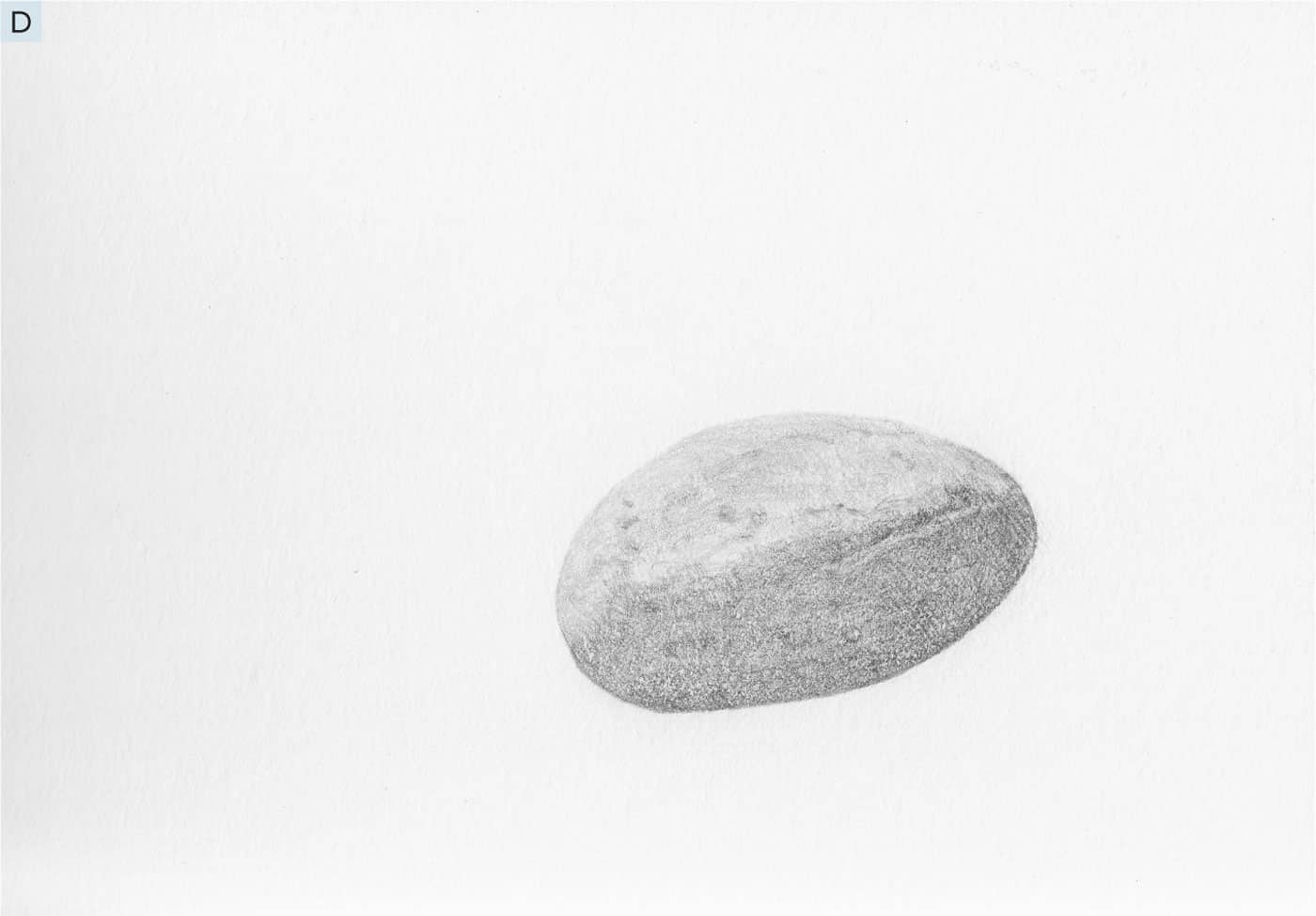
5 - Use your 3B pencil to put a fine layer of graphite over the lower half of the stone that is in shadow. Remember, use the feather touch so you do not disturb the layers and textures already there. Then, use the same pencil to create the cast shadow, noticing where the darkest areas begin and end. Use the sample as a guide. See E.
6 - Use the 7B pencil to add tiny dark contrast marks to the center of some of the textural marks on the stone, as shown. Then, create an inner layer of darkest cast shadow under the stone. See F.
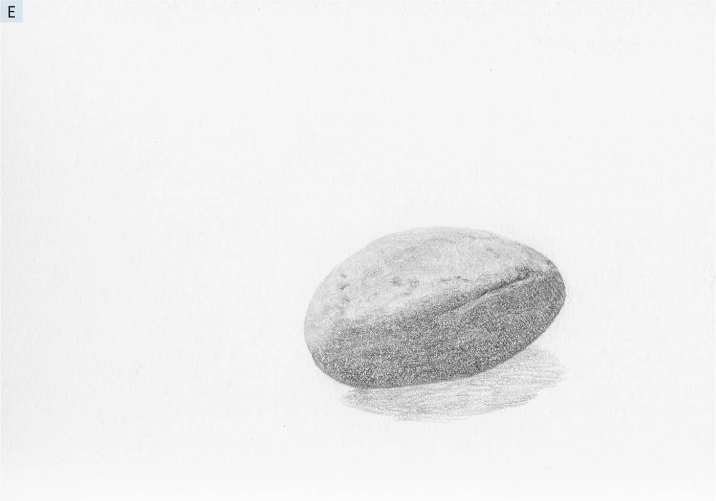
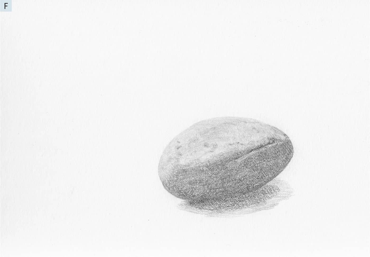
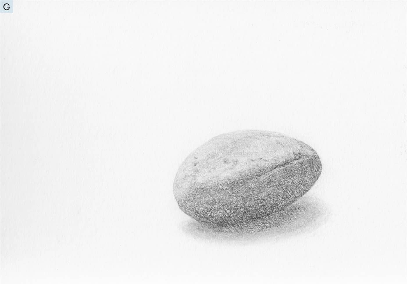
7 - Finally, use your tortillon to lightly blend and soften the cast shadow underneath the stone. Use your eraser to further soften this, if needed. See G. Beverly Eddy Liz Gamelin Nathalie Bélanger Lisa Hoffman
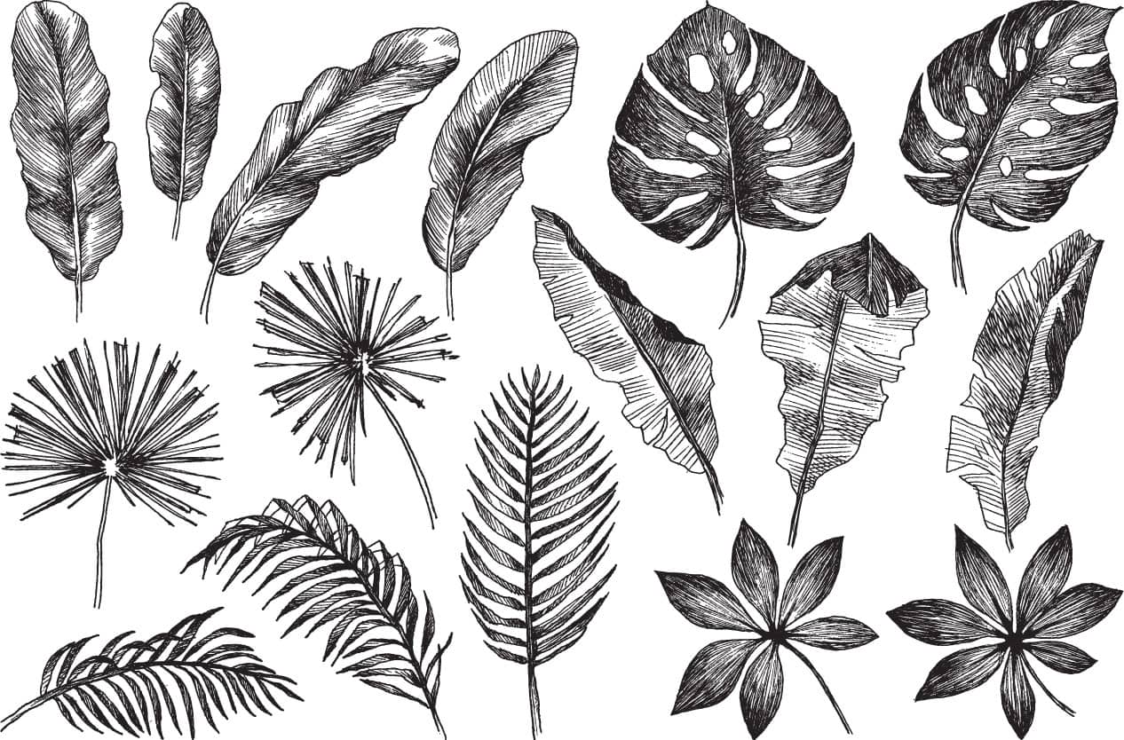
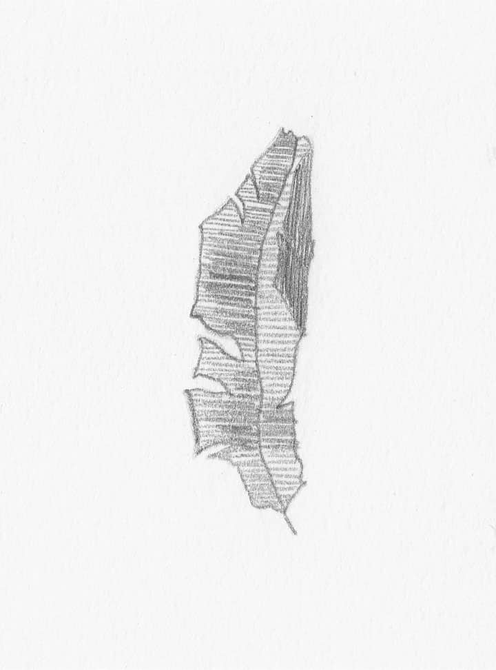
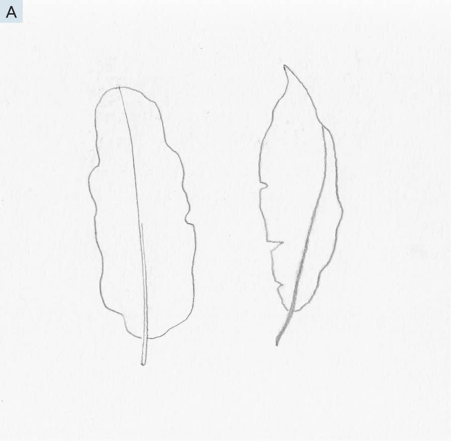
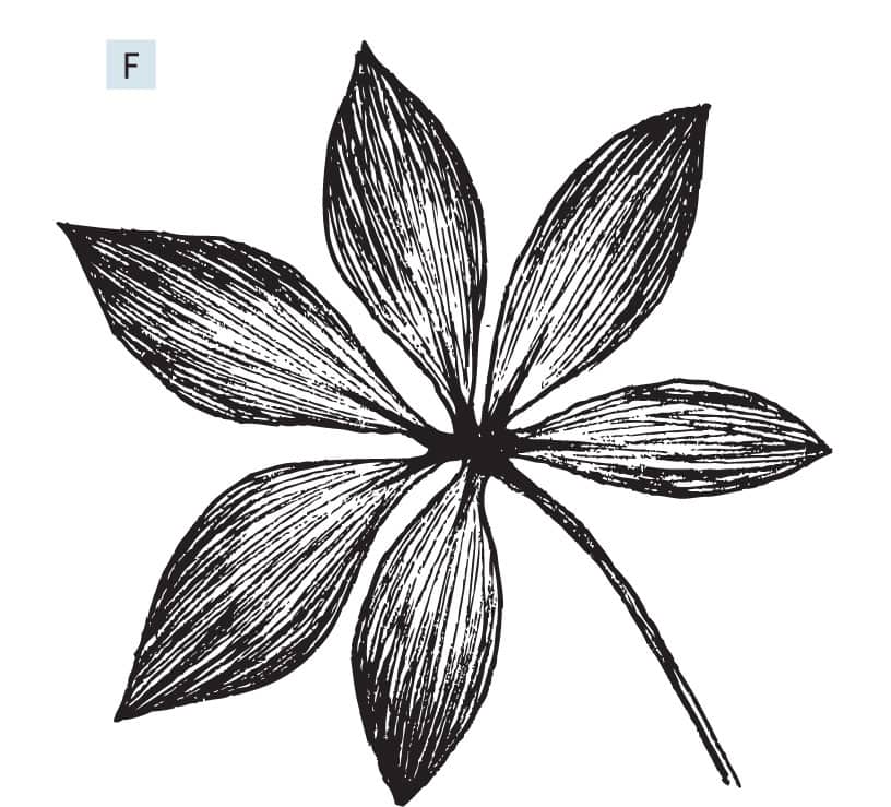
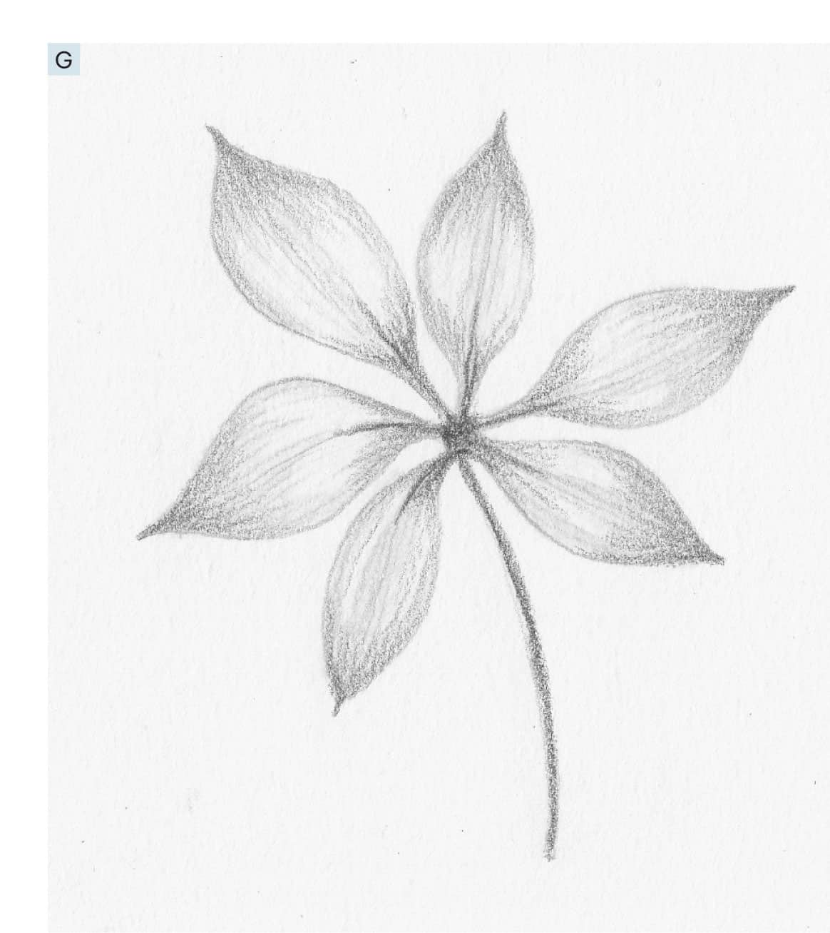
If the feather touch is the first most important tip I can share with you for making beautiful drawings, the concept of direction of form is a close second. It can be a tricky concept at first, but this lesson will surely set you on your way to using it in every drawing you create. The best example I can think of to help demonstrate this is drawings of leaves. The reference images for this lesson will provide the plant you practice from, but for now, look at the leaf on the far right, middle row. Notice how it is curled and has real dimension. Now, look at the example below and notice that although it is the same leaf shape, it looks flat, even with shading added in the same places. This is because the lines that fill in example A simply go back and forth, instead of following the curvature of the different parts of the leaf. Look again at the reference image leaf and notice how the lines follow the shape and curvature of the form. This, in a nutshell, is direction of form. Shading alone can make a difference, but it will not prove nearly as successful as making our marks and filling objects in with direction of form. Let’s try two examples of leaves, each from a different angle, to practice direction of form. 1 - With an HB pencil, create a simple outline drawing with a center vein for each of the two leaves, as shown. Do not worry if they do not match exactly. The techniques will work regardless of precision. And remember, you have an eraser, if needed! See A.
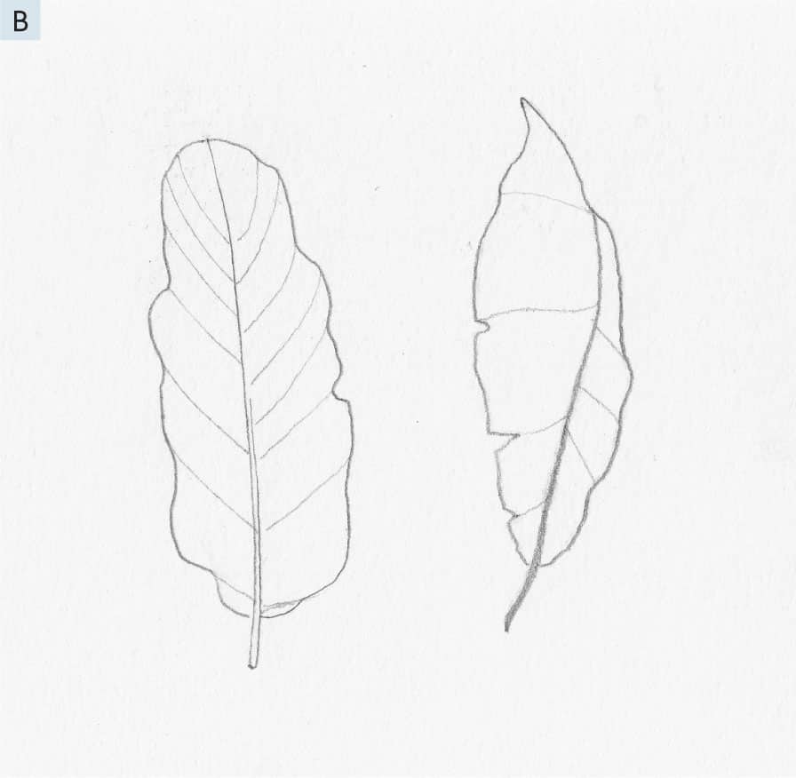
2 - Draw lines from the outer edge, diagonally, to the center rib, as shown. Even if you change the angle a bit, it will still work. All leaves are different! We are simply aiming to create a sense of dimension. See B.
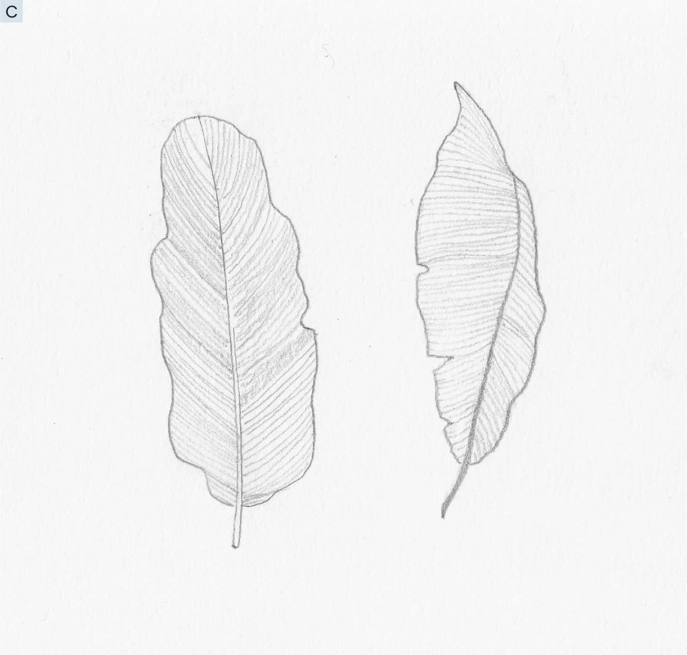
3 - Continue to fill in more lines, following the direction of form, as shown. See C.
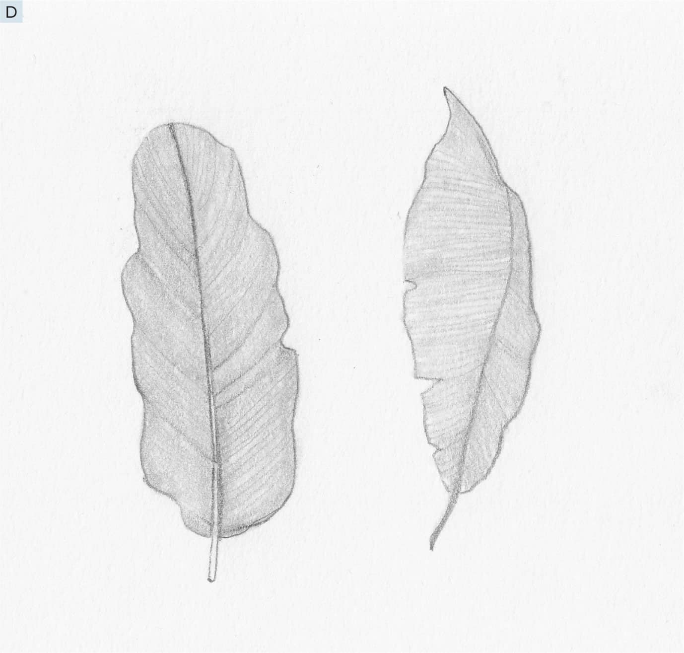
4 - Using a blending stump or tortillon, also in direction of form, lightly blend the graphite. See D.
5 - Using an eraser, lift out some areas of light. Use the reference image of leaves as an example of where light might be seen on similarly shaped leaves or follow the sample image. Then, use the 5B pencil to lightly add some darker shading where it might be darker. Follow either the reference image or the sample drawing. See E. You do not have to be exact. Having areas of contrast—light and dark—is what matters most. See how the leaves don’t look flat, but have dimension to them? That is the illusion that contrast and direction of form help create. 1 - Now, choose other leaves from the reference image as examples on which to practice these same steps. I chose one from the bottom right (see F) and followed steps 1 through 5 on the previous pages. Notice how my leaf isn’t exactly like either of the two shown in the reference but still has the same qualities and is full of dimension. See G.
2 - Finally, draw some real leaves using this technique. See H and I. Once you get the basic outline shape, pay close attention to direction of form and contrast—there is really nothing you cannot draw.
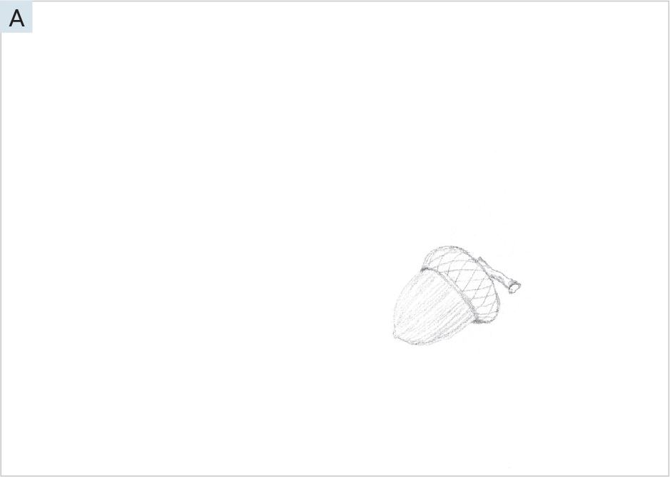
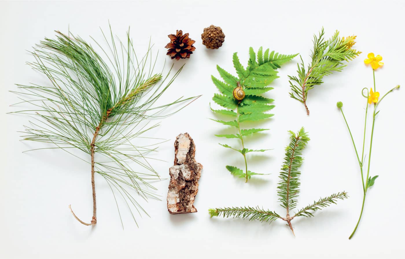
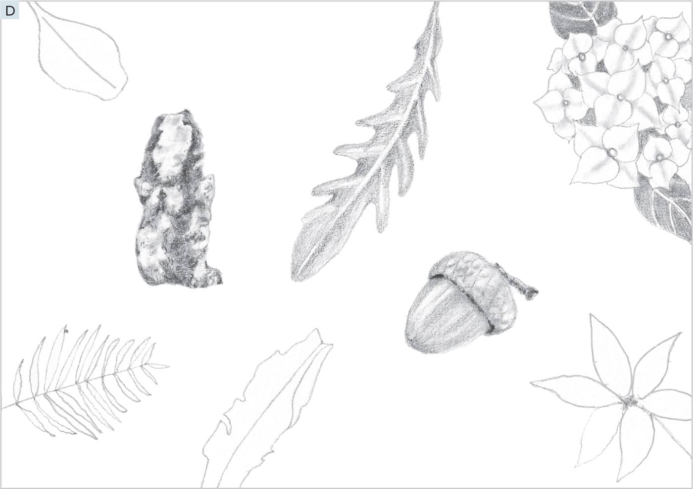
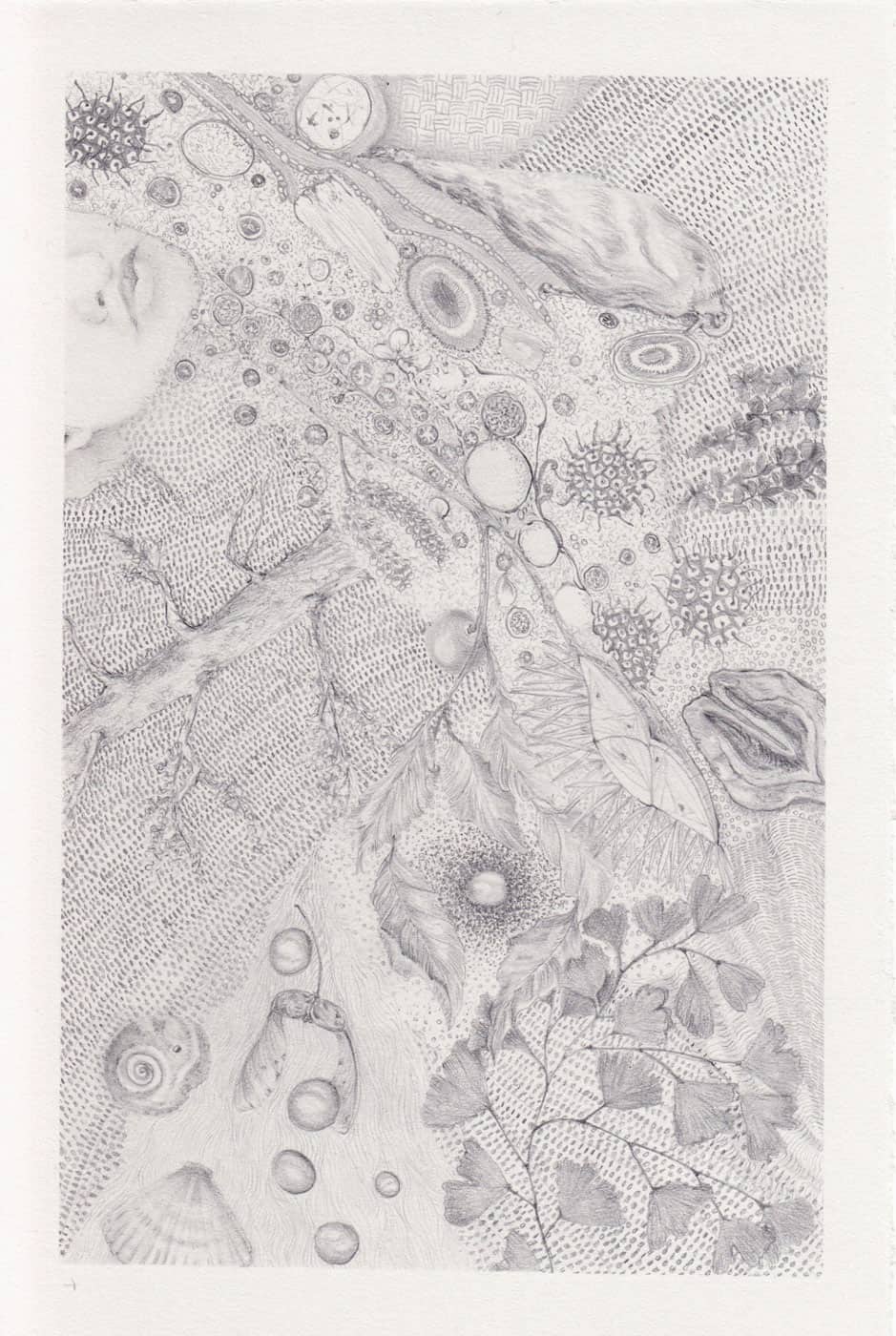
Now, it’s time to create a piece of artwork that brings together all the elements we have learned so far. I like to think of these drawings as pocket treasure collages because, often, they are created from random assortments of acorns, seeds, leaves, rocks, flowers, bits of bark, and the like that I collect in my pockets while out on walks. These drawings can also include landscapes or birds, a special cloud formation, etc., and always include random mark making to fill the spaces between the objects I’ve drawn. It’s a great mix of intuitive expressive work and representational work. At right is an example of a collage I made; see here for another. Notice how intricate they can become. The more you practice, the more elements you can add to them. The possibilities are endless! For this lesson, let’s keep it simple using images from the reference photos we have used so far, as well as the mark making we have been practicing. Follow along for some good fun! To prevent smudging the graphite, feel free to use a workable fixative between steps, if you tend to rest your hand on the paper while you draw. You can also rest another piece of paper under your hand to prevent accidental smearing as you work. 1 - Begin by drawing the outline and direction of form markings of the acorn, as shown. Place it toward the center right of your paper. See A.
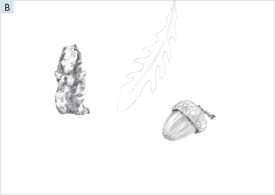
2 - Finish the acorn in the same way we created the leaves in Lesson 6 (here). Then, create a drawing of the piece of bark in the same way. You can choose other subjects in the reference image if they appeal to you more. Make an outline drawing of another leaf between the first two subjects using images from the reference photos, as shown. See B.
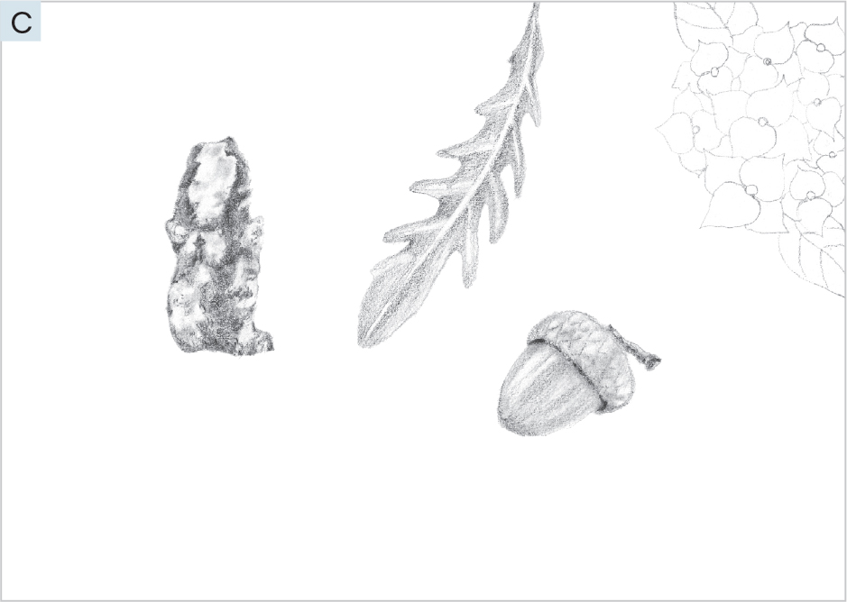
3 - Finish the leaf, and then add the line drawing for a smaller version of the hydrangea we created in Lesson 3. See C. Revisit any previous lessons for refreshers on how to create these drawings.
4 - Finish the hydrangea, and then fill out the rest of the page in a balanced way, with more line drawings of subjects from the reference images. See D. They don’t have to be exact. Use the references on this page as a guide.
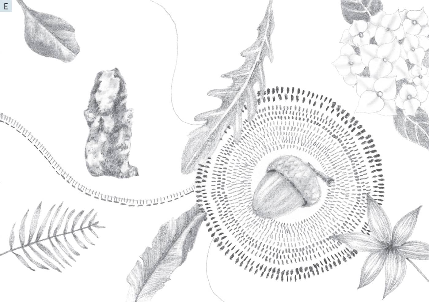
5 - Finish the drawings of the leaves you began in step 4, and then begin to create a circular pattern of the tiny tick marks we used in Lessons 2 and 4. Use different pencils to achieve different shades of gray to bring interest to the pattern. Spray your drawing with fixative (if using), if your hand is smudging the pencil marks on the paper. Finally, use an HB pencil to draw in some dividing lines lightly, as shown.
6 - Use the sample as a guide to suggest ways to fill in each section with tiny marks. You can also experiment with your mark making in these sections. Be creative and free, using different pencils to create a variety of marks and shades of gray. Notice the technique in progress, filling in the long sections with curved lines. When this is complete, use your blending stump to gently smudge along each long line, as shown in step 7.
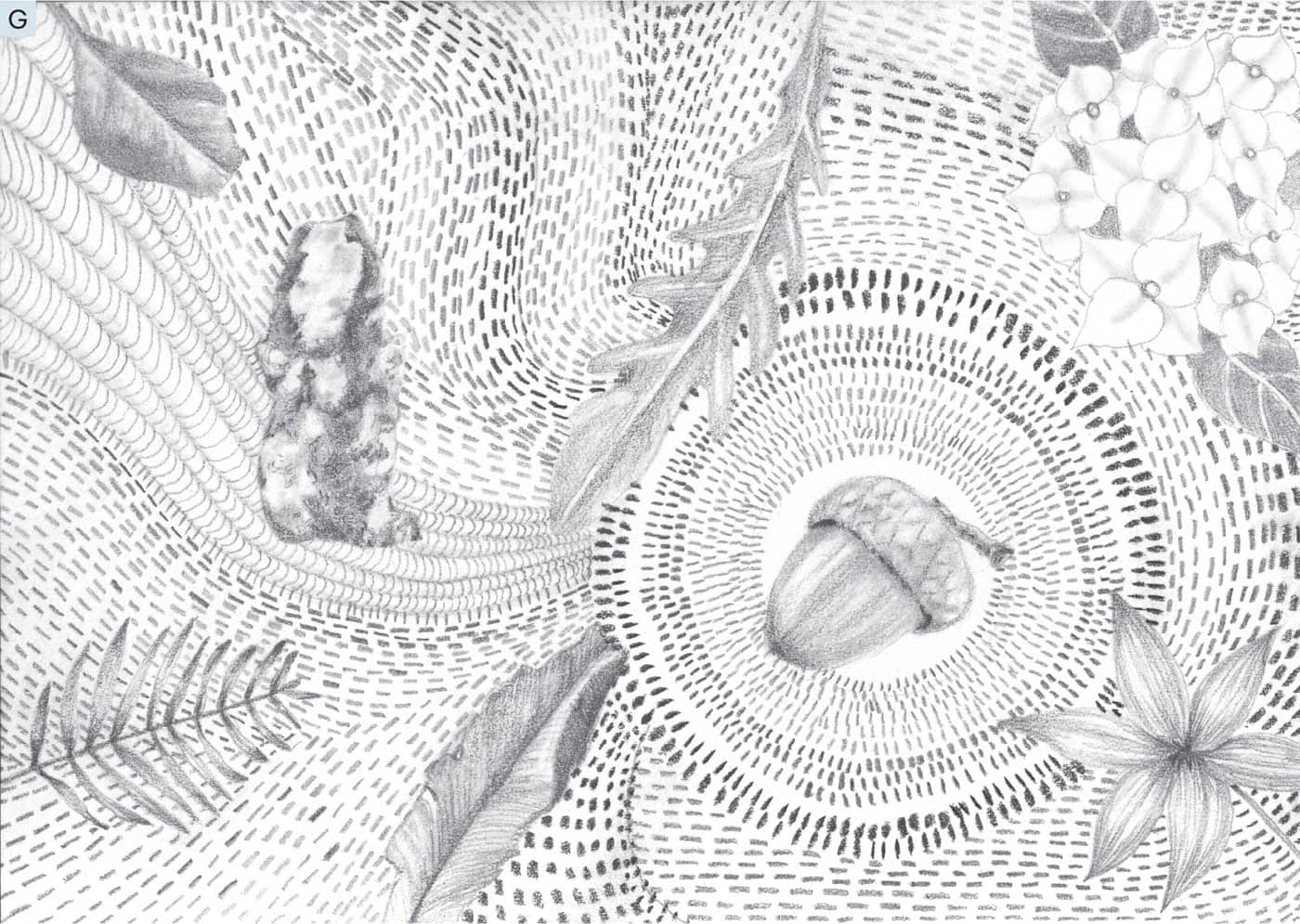
7 - The finished drawing is a feast for the eyes—many natural treasures surrounded by energetic, expressive mark making. Try this lesson using different objects you might find throughout the year. Frame a few to give as gifts, personalizing the objects for the recipient. People love these intricate-looking pieces of art.LESSON ONE
![]()
THE TOUCH OF A FEATHER
TOOLS TO GATHER
STEPS

RULED VALUE SCALE

LESSON TWO
![]()
LET’S MAKE MARKS
TOOLS TO GATHER
STEPS
LESSON THREE
![]()
HYDRANGEA IN SHADES OF GRAY
TOOLS TO GATHER
STEPS

LESSON FOUR
![]()
THE SEEING AND DRAWING PRACTICE
TOOLS TO GATHER
STEPS

LESSON FIVE
![]()
TO DRAW A STONE
TOOLS TO GATHER
STEPS


LESSON SIX
![]()
LEAVES AND DIRECTION OF FORM
TOOLS TO GATHER
STEPS
TAKE IT FURTHER

LESSON SEVEN
![]()
POCKET TREASURE COLLAGE
TOOLS TO GATHER
STEPS