· PICKING A ·
THEME FOR YOUR DECK
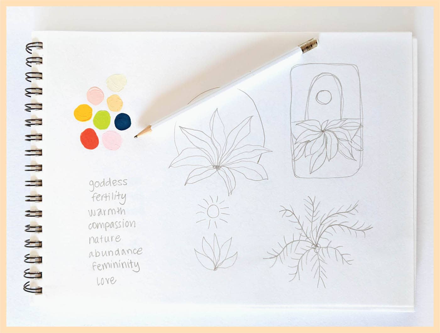
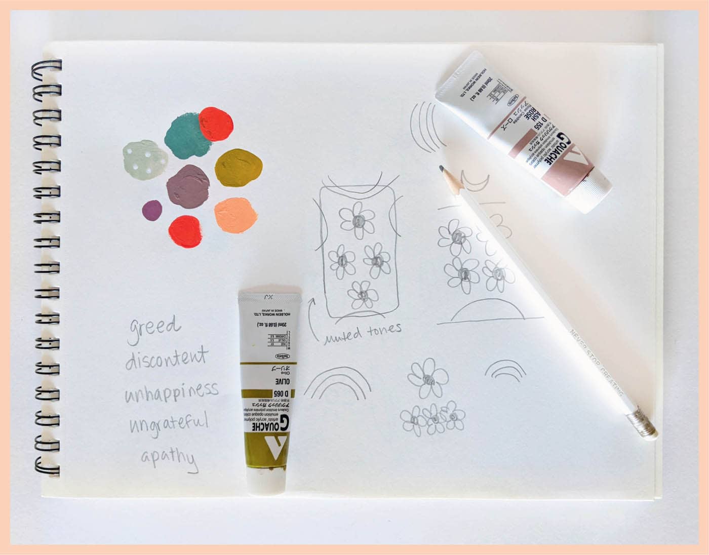
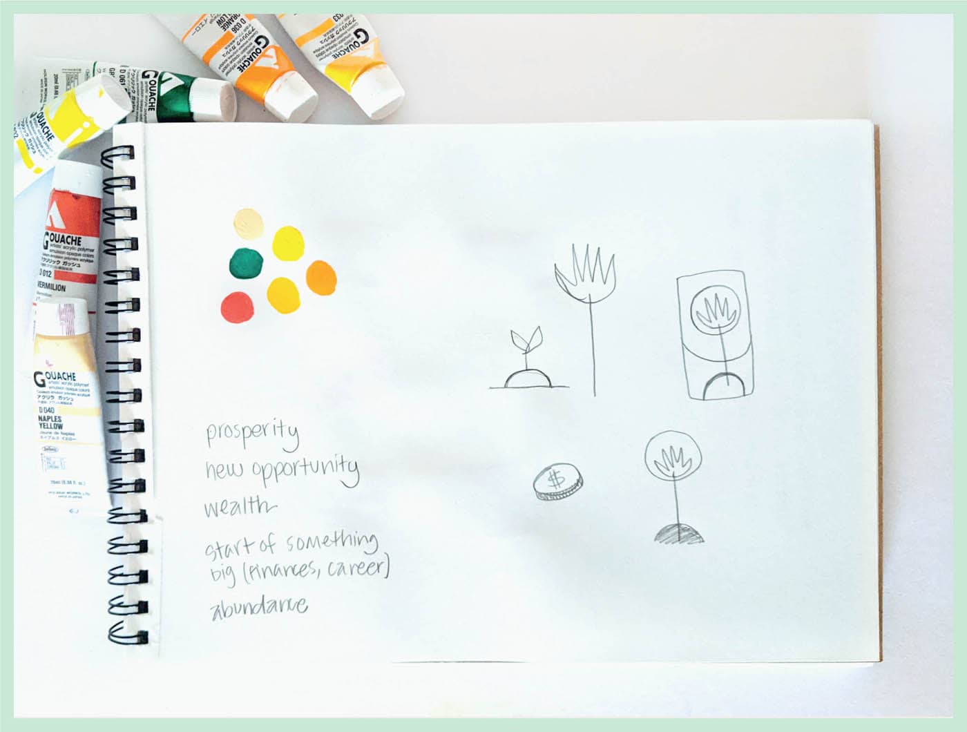
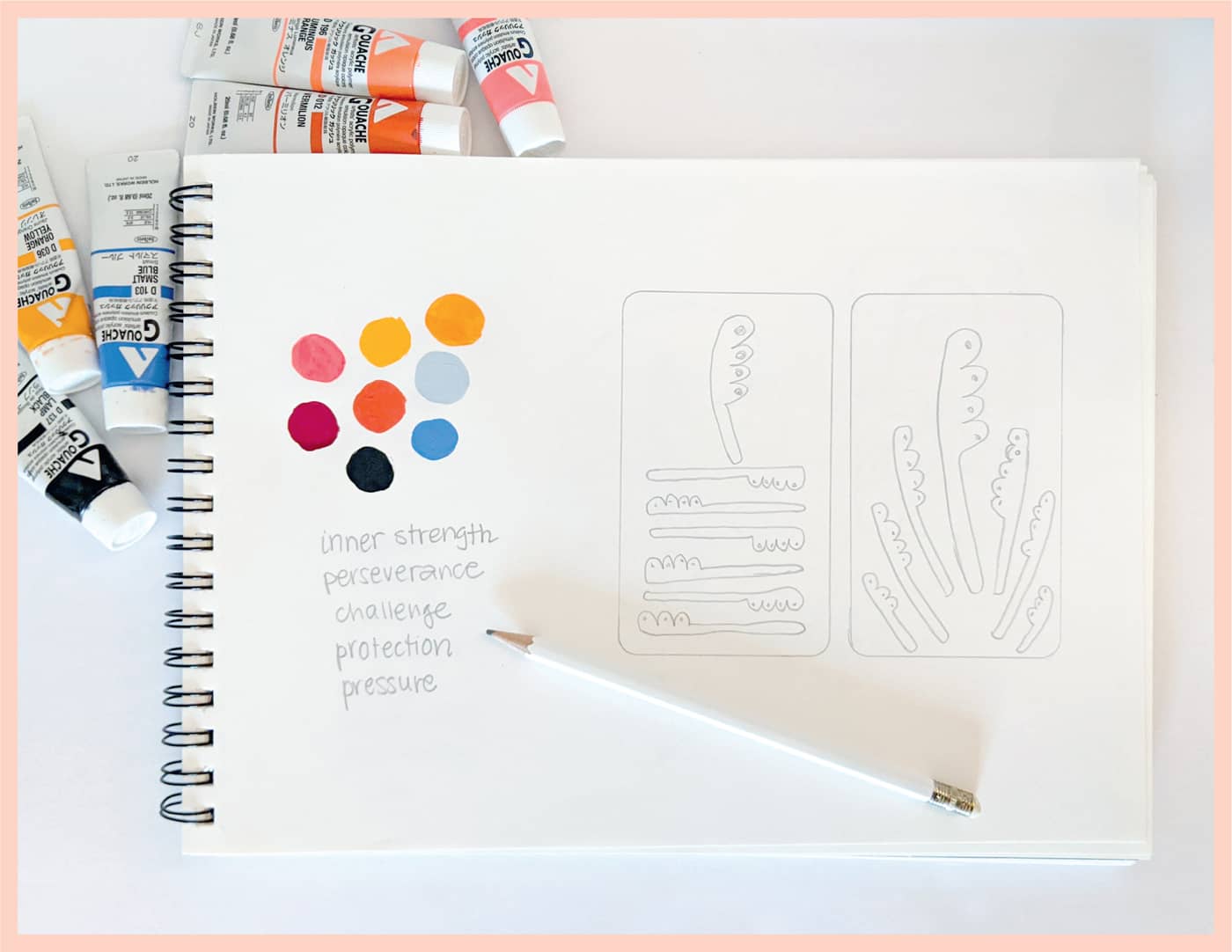
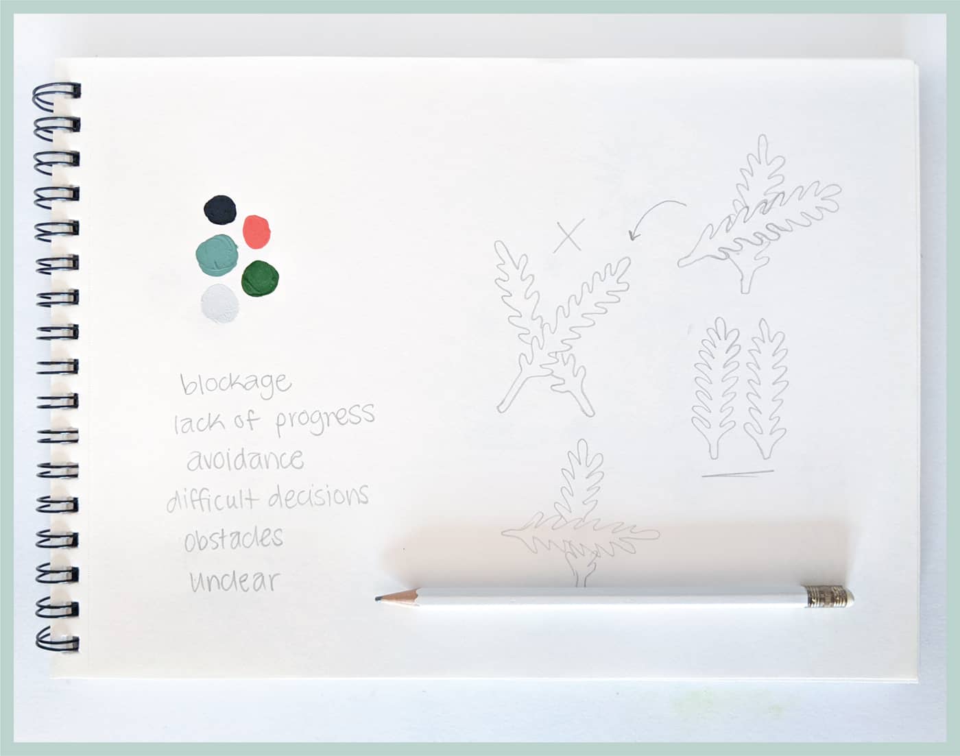
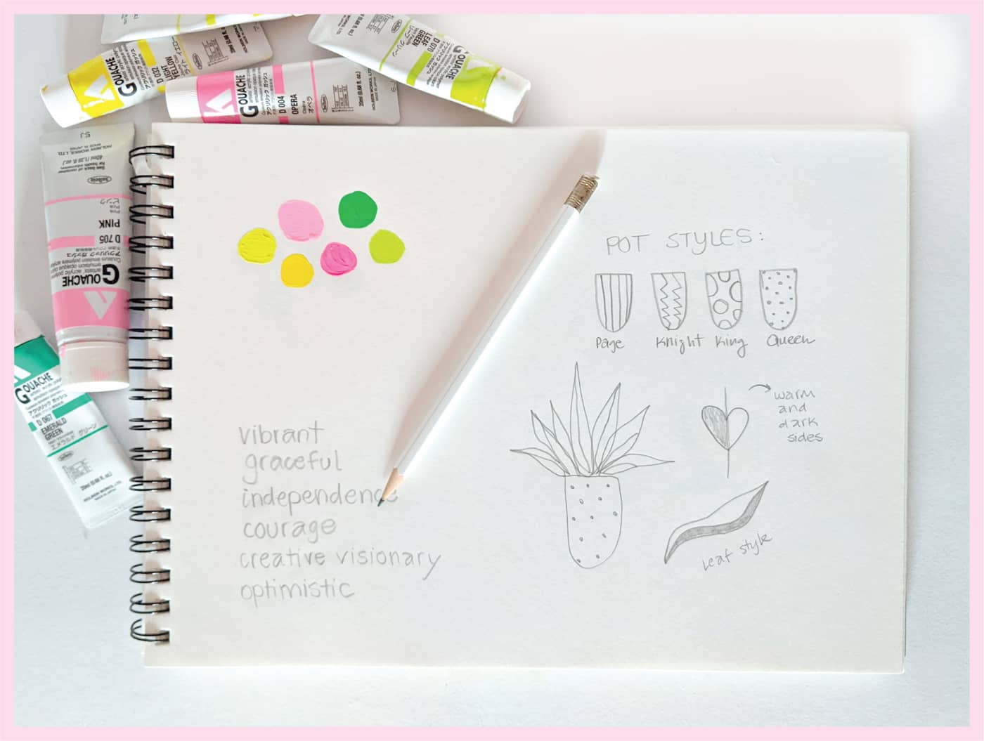
The first step in designing your own tarot deck is deciding your deck’s theme. This can be anything you want—which I know doesn’t make the decision any easier—but I’ll give you some parameters to help you choose.
You will need 78 cards for a full deck, so try to pick a theme that offers a wide enough range of subject matter. Flowers, animals, cars, candy, cocktails . . . these are all subjects that can take on a range of looks for each card. Some cards are positive while others are dark, so consider how you might depict your subject matter to reflect the card’s meaning. Choosing a theme that offers variety will help when it comes time to plan your deck and its suits.
If you would rather use traditional imagery, but drawn in your own style, you certainly can! The Rider-Waite deck, created in 1909, is one of the most popular out there and typically referenced in tarot readings. It’s easy to find the Rider-Waite imagery online, or you can purchase a deck for reference as you create your cards.
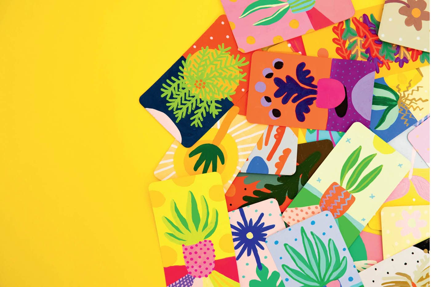
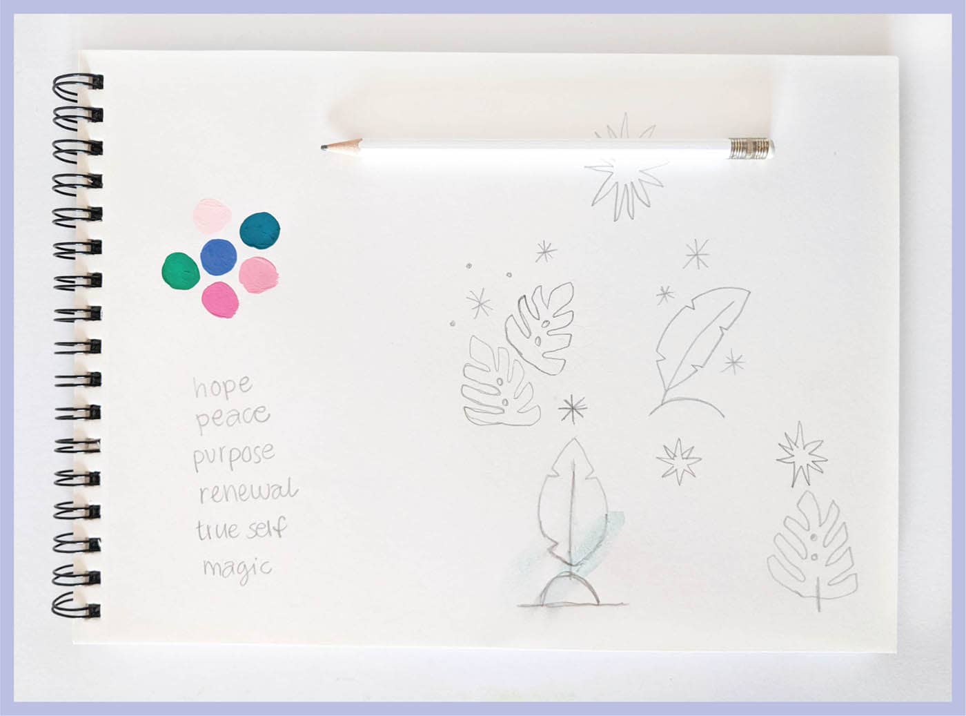
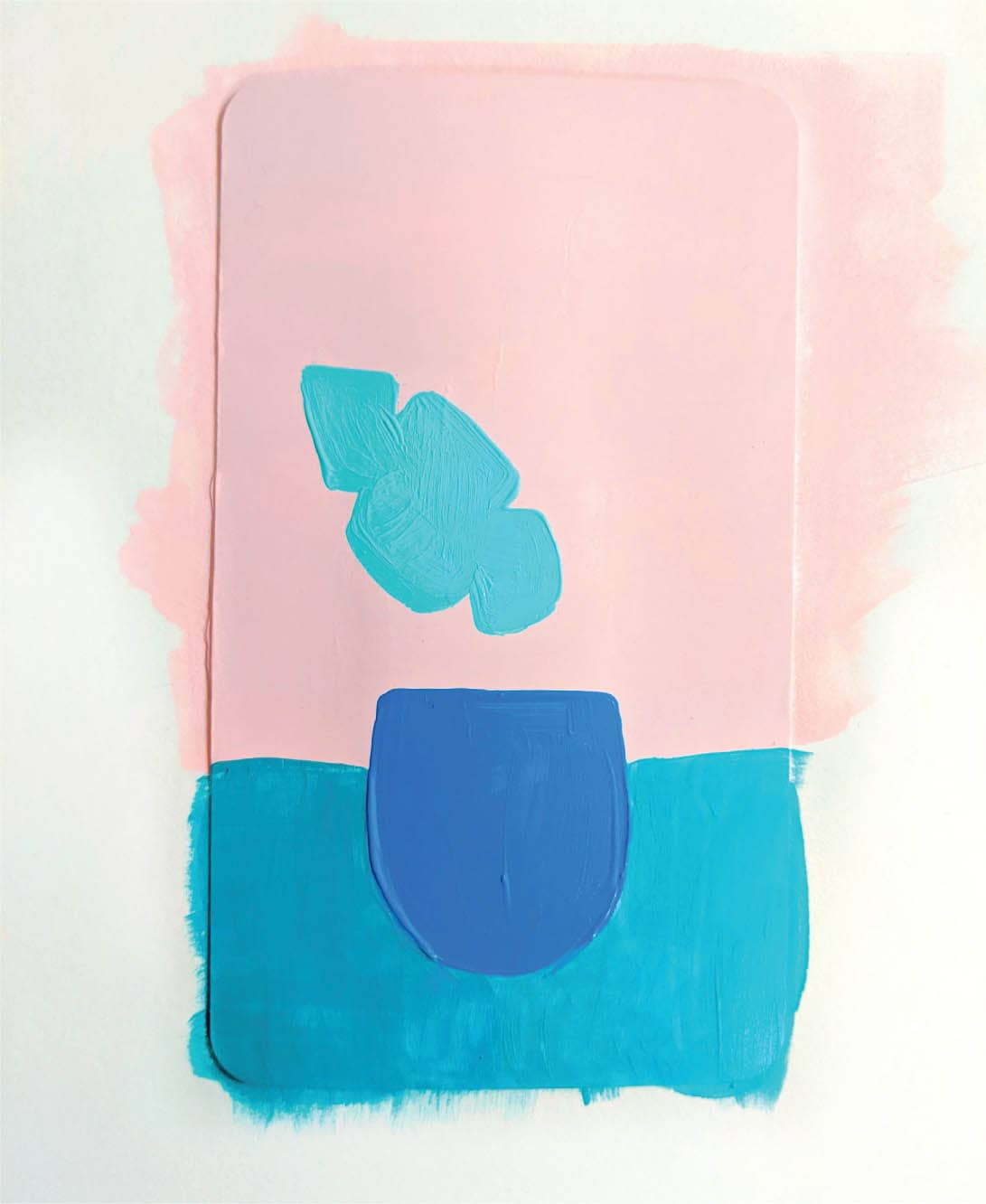
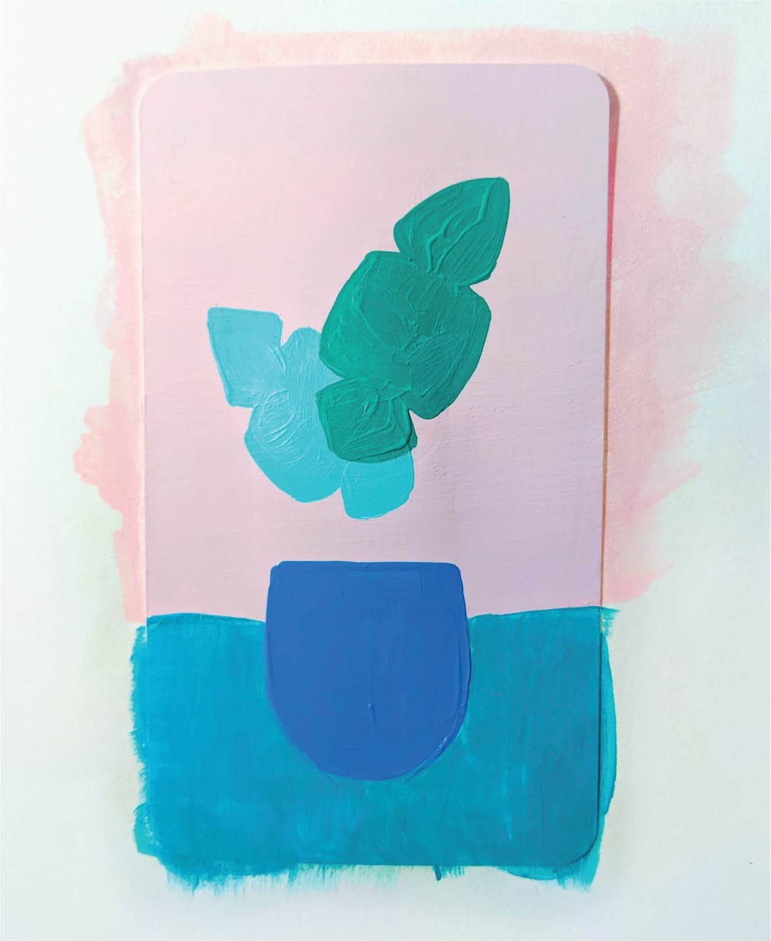
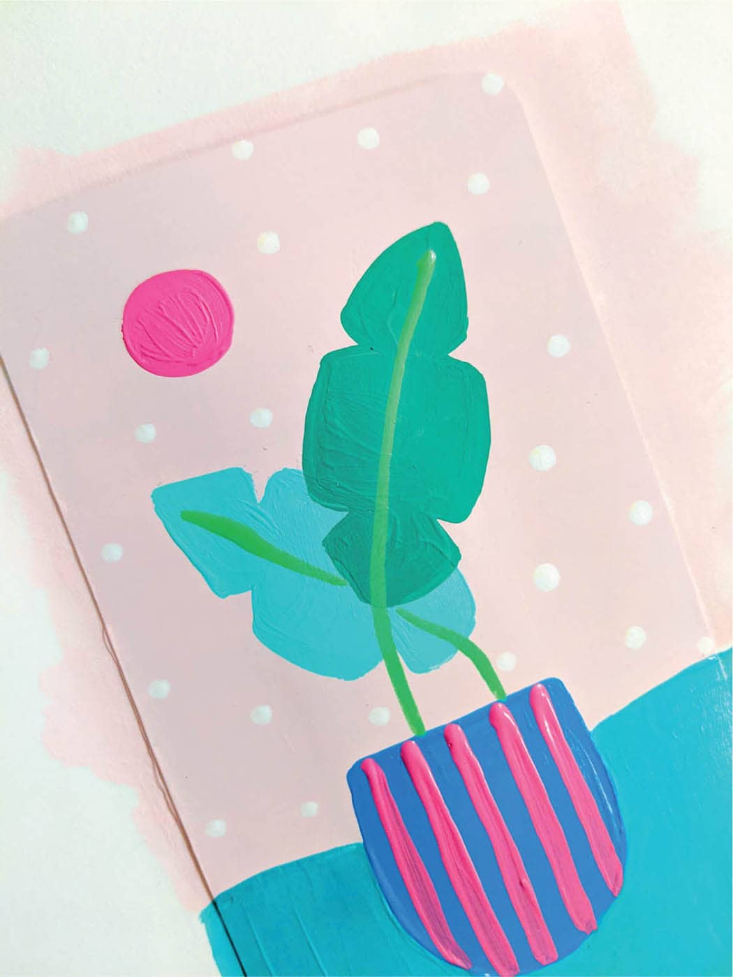
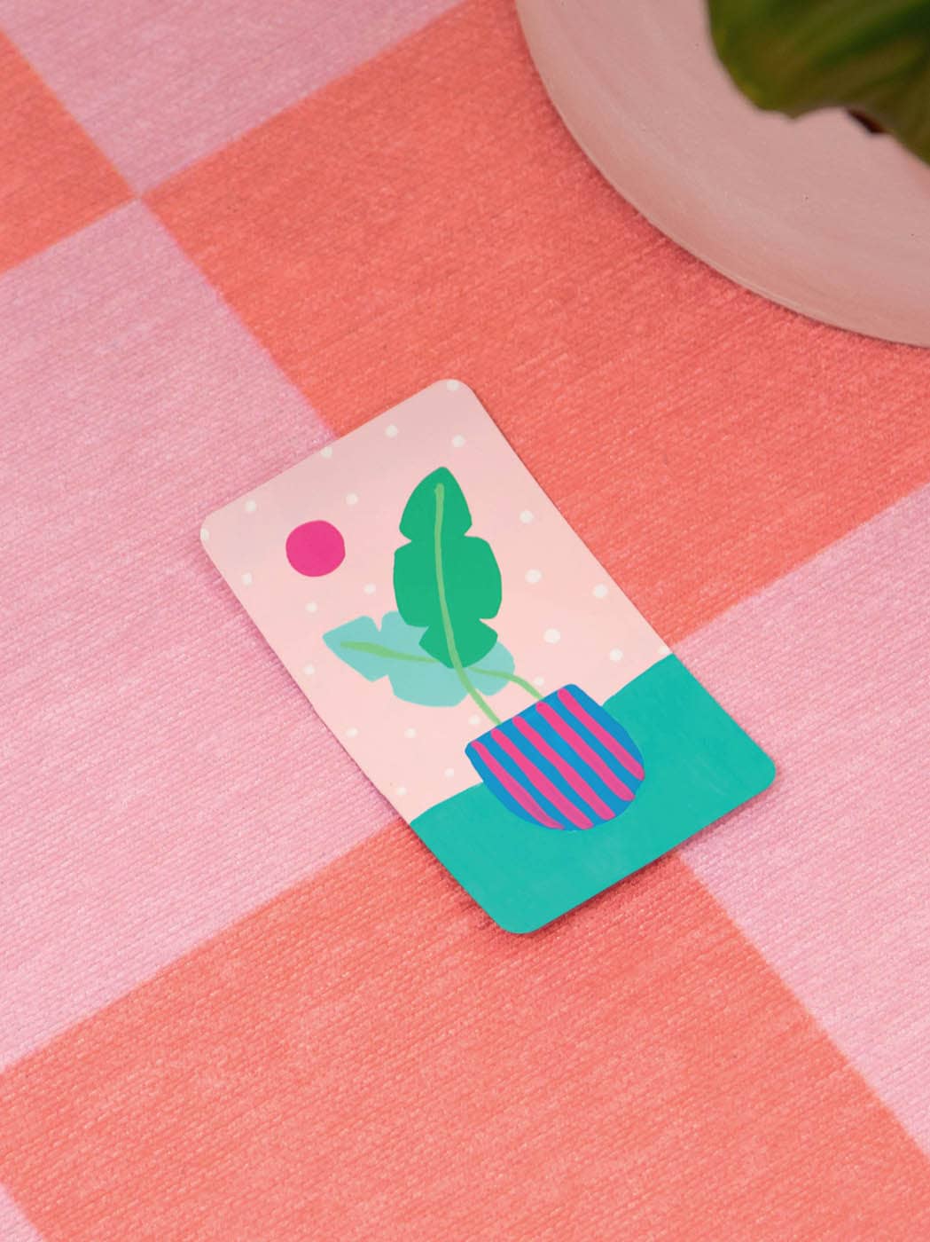
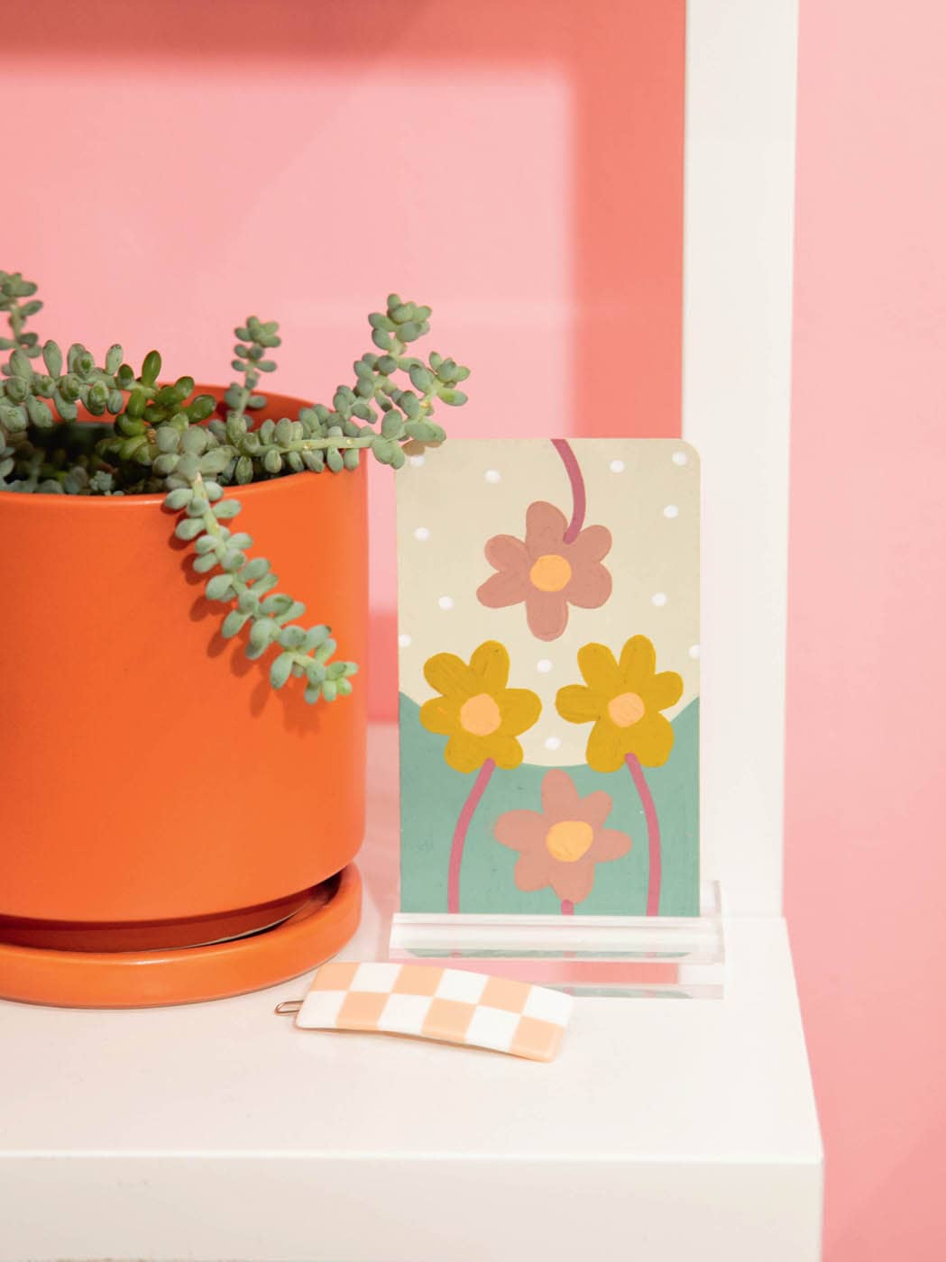
I chose to use plants for my deck because I love them and already use them in my work. I wanted to make sure my deck had a similar style to my abstract paintings. Also, there are many types of plants, making them an excellent source of inspiration for the various meanings in tarot cards. Plus, I knew I wouldn’t run out of plants to paint!
Choosing a theme is really important, so take your time. If you’re struggling to come up with an idea, take a look at your favorite books, Pinterest, or nature for inspiration. Free write or journal whatever pops into your head. Almost anything can work as a theme as long as there is enough variety for the cards. If you have a strong intuition about what your deck should be, don’t second guess it. If there’s anything I’ve learned about designing a tarot deck, it’s that your intuition—and the cards themselves—will guide you. Your intuition is a powerful tool—listen to it!
Once you’ve decided on a theme, the next step is to choose your suits, and then your court cards. Tarot decks are divided into two sections: the Major and Minor Arcana. The Minor Arcana are the suit cards. Tarot decks have four suits, and they are:
- Wands
- Cups
- Swords
- Pentacles (or Coins)
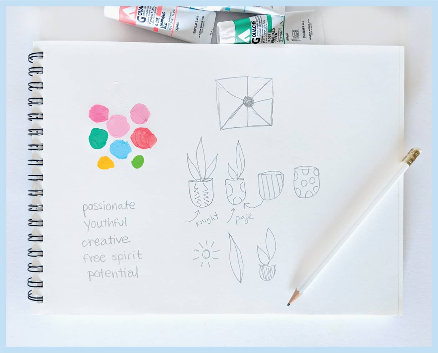
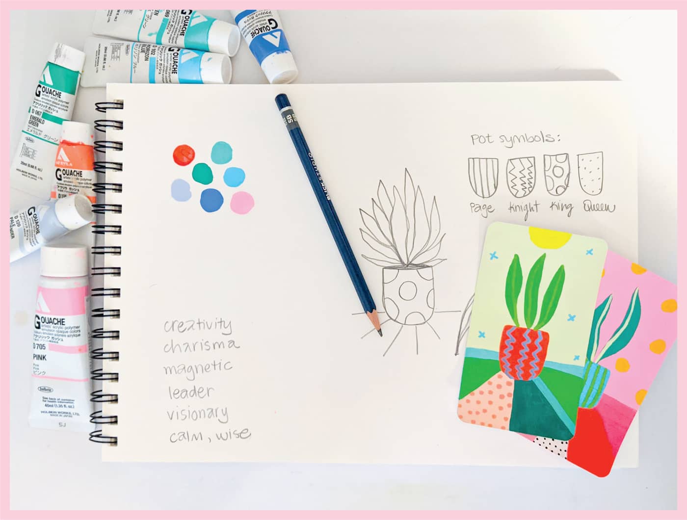
Each suit represents a different set of feelings and things. The cards range in number from ace to ten, in addition to four court cards. The court cards include the Page, Knight, Queen, and King for each suit. Think about a plan for your deck’s cards, using your chosen theme. I’ll explain my thought process using plants, which is my chosen theme.
01. Wands
I’ve decided to riff on the traditional suits by making them plant-related. For Wands, instead of a wand, I’ve used a made-up plant shape that is thin and sticklike. It’s visually similar to a wand but still a funky, fun plant shape that I’ve created to fit the vibe of my deck. The Wands suit is about creativity, so inventing my own shape for this suit seems appropriate.
02. Cups
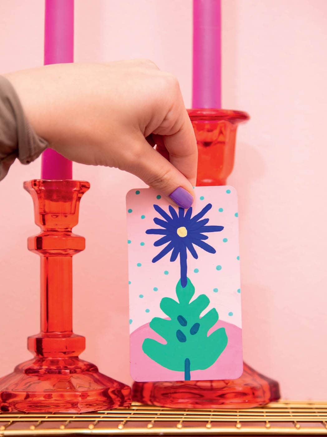
The Cups suit is about emotion. To me, a daisy represents emotion because flowers are typically given to others during times of celebration and sadness. Daisies fit within my theme of plants. Their round shape also mimics the top of a cup.
03. Swords
The Swords suit is about action. I’ve used a thin, fernlike plant with lots of fronds to convey a feeling of sharpness, like the tip of a sword.
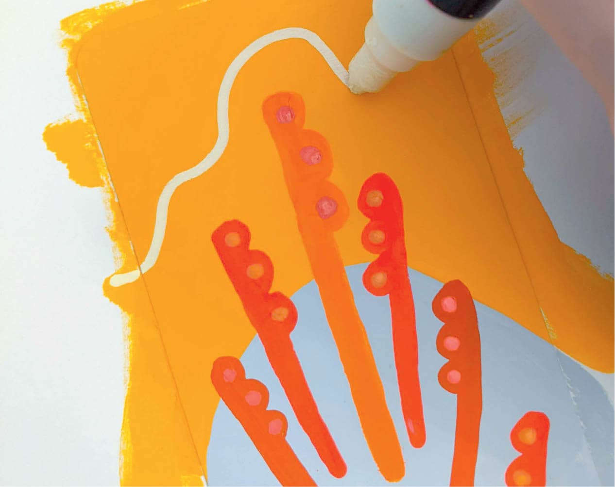
04. Pentacles
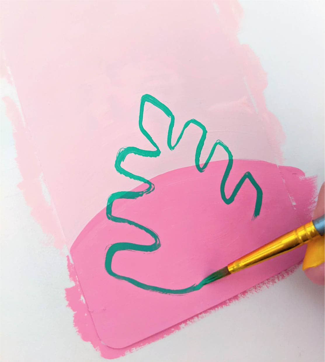
And lastly, the suit of Pentacles, which is usually about the home, wealth, or other physical possessions. I’ve created a flowerlike shape that looks like a hand for this suit. The hand shape conveys possessions, or something you can hold in your hand. This suit is also called Coins, so you can choose to depict whichever one you like best.
Major Arcana
The Minor Arcana follows your deck’s chosen theme in a precise way. Imagery is chosen in advance for the suits and court cards. The Major Arcana is different.
Rather than representing a specific suit and number, the Major Arcana cards represent individual life themes—things like strength, death, turmoil, and triumph. They are all unique and symbolize different aspects of the human condition. Because of this, they don’t need to follow a specific script.
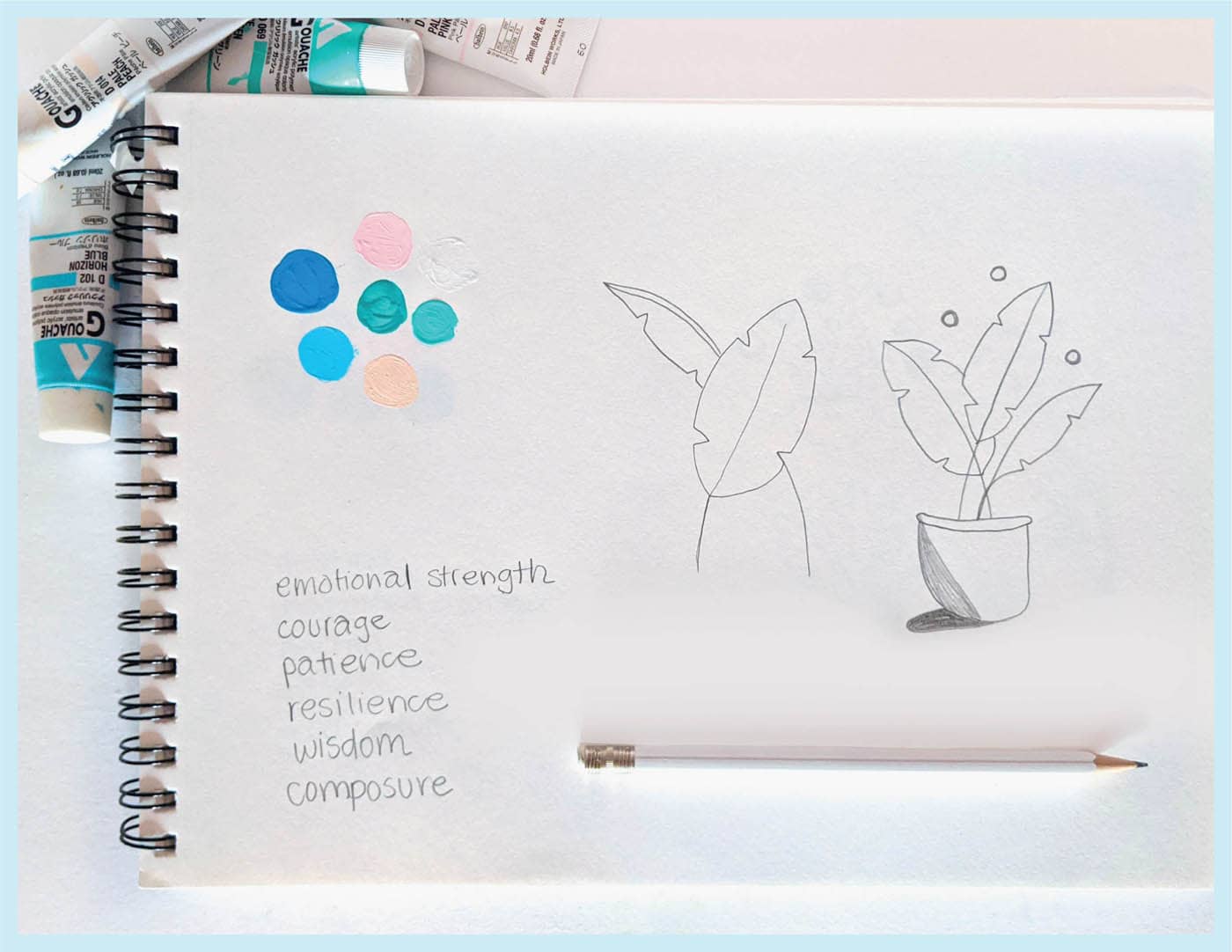
My deck is plant-themed and because of this, I want the Major Arcana cards to all be plants. But for these cards, I’ve chosen plants based on the overall theme of the card. Painting the Major Arcana is much less restrictive than the Minor Arcana.
My typical process for painting a Major Arcana card involves reading a bit about the card’s meaning and journaling about what it means to me in my own life.
Court Cards
Keep in mind that your suits can be anything—there are no rules here! To keep it simple, you can also use traditional images for wands, cups, swords, and pentacles or coins. Once you’ve decided on the images for your four suits, you are ready to move on to the court cards.
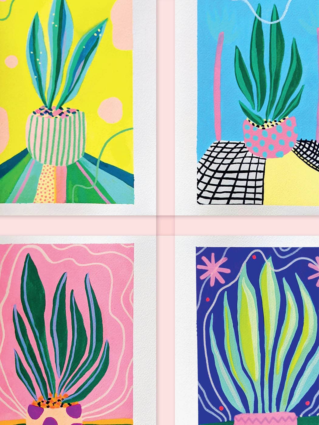
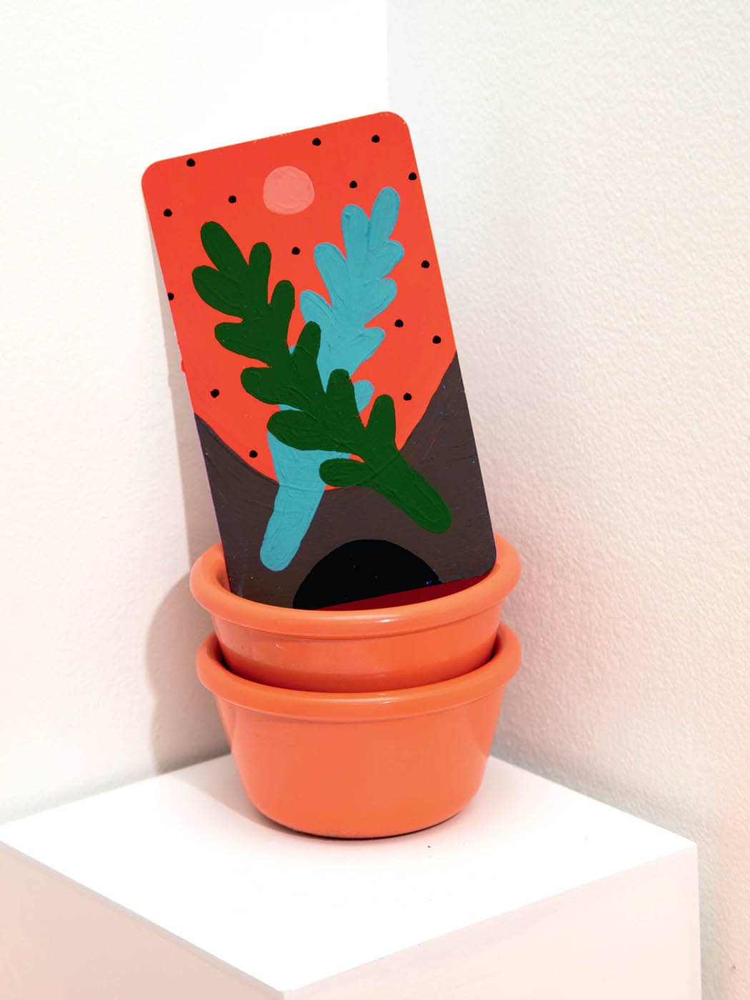
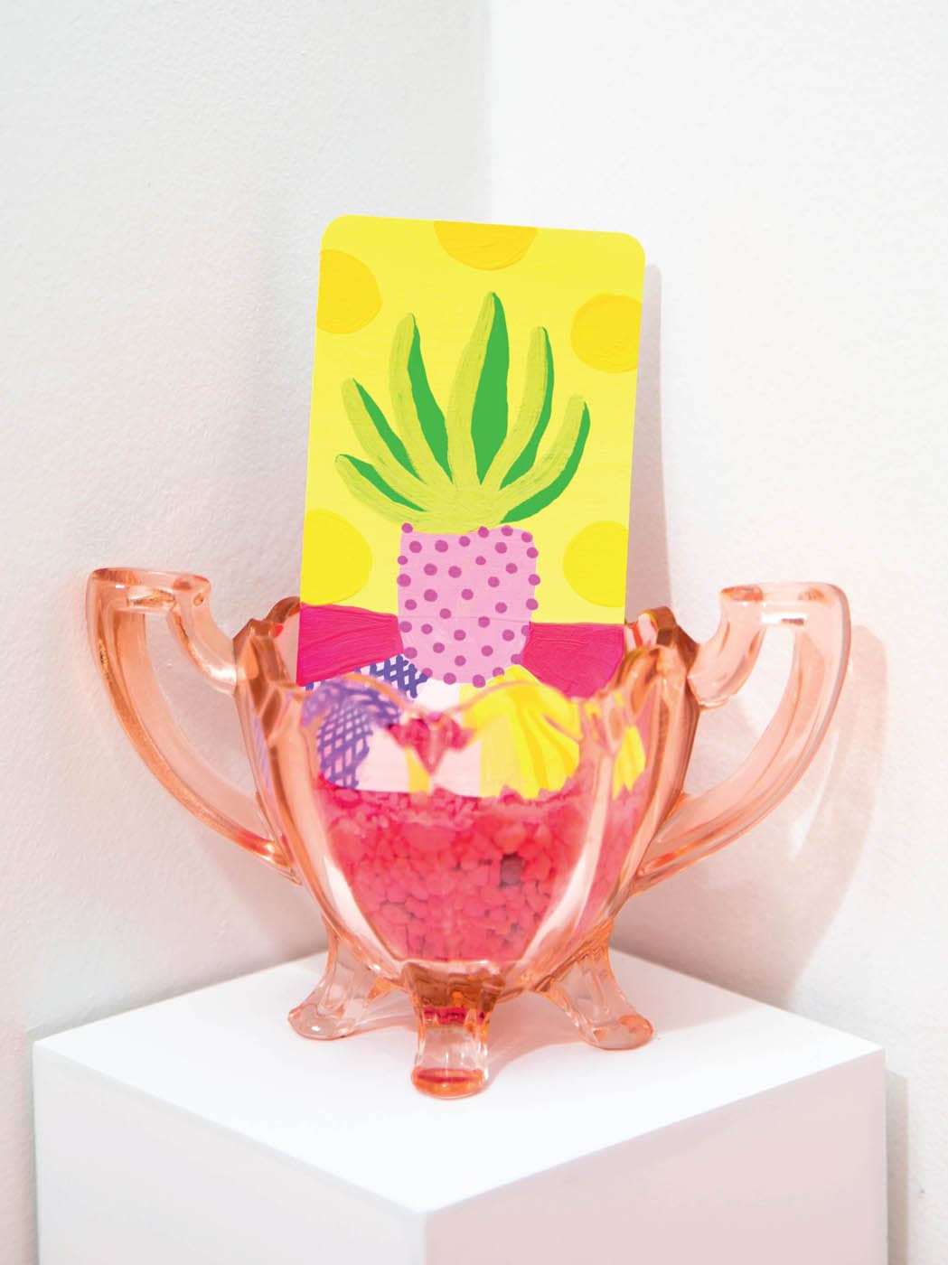
Each suit has four court cards that loosely symbolize different things. The Page is the least mature of the court cards and usually represents a younger being trying to figure themself out. They may have a few lessons to learn on their journey. The Knight is a little more mature, followed by the wise Queen and most mature King. I’ve chosen to represent the court cards with potted plants at various stages in their growth.
In the example above, the Page of Pentacles is on the upper left and is represented by a young snake plant. I use a bright-yellow color to convey immaturity and youth. The Knight of Pentacles is the second-youngest plant, shown here in the upper-right corner. It has a bit more growth and has aged more than the Page. The Queen of Pentacles (bottom left) has much more wisdom, so I’ve made this plant larger. I’ve opted for a rose-pink background to evoke a feeling of calm and wisdom. Last is the King of Pentacles (bottom right)—the largest snake plant of the Pentacles court cards.
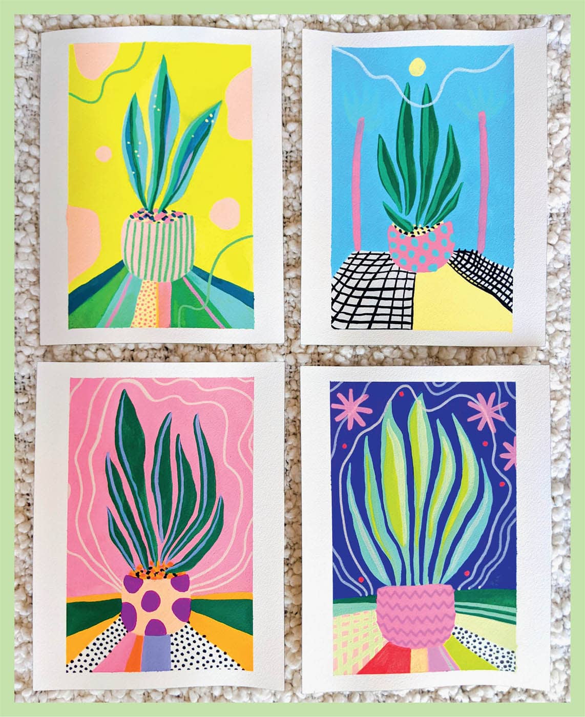
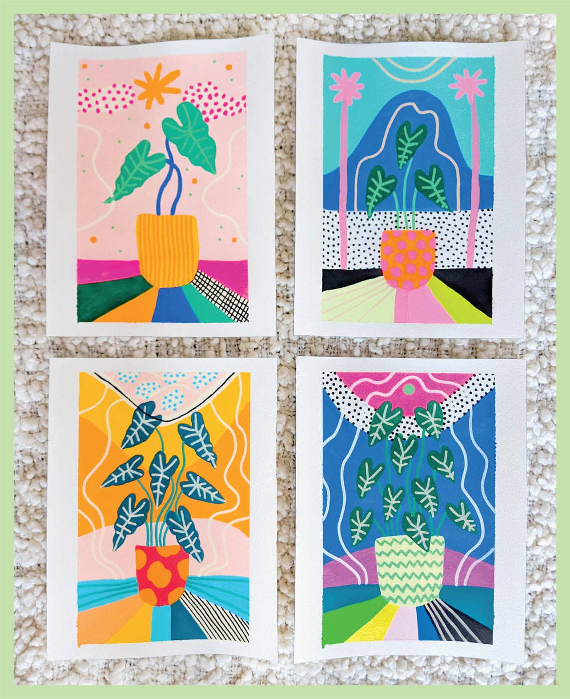
I like using plant maturity to represent these cards. I think it’s easy for people to understand quickly. I also make sure to choose a specific plant for each suit’s court cards. You don’t have to do this, but I want to add one more level of consistency and detail.
I’ve chosen the following plants for each suit’s court cards:
- Wands: Banana plant
- Cups: Monstera plant
- Swords: Alocasia plant
- Pentacles: Snake plant
These plants are all distinct from one another and loosely represent the suit to which they belong. Banana plants are long and thin (like Wands), monstera plants are warm and friendly-feeling (like the emotional Cups suit), alocasia plants have a sharp point (like Swords, which are about thoughts, conflict, and action), and snake plants are consistent and even (like Pentacles and the feeling of home). Feel free to do the same when you choose a subject for your court cards—but remember that you don’t have to do it exactly this way.
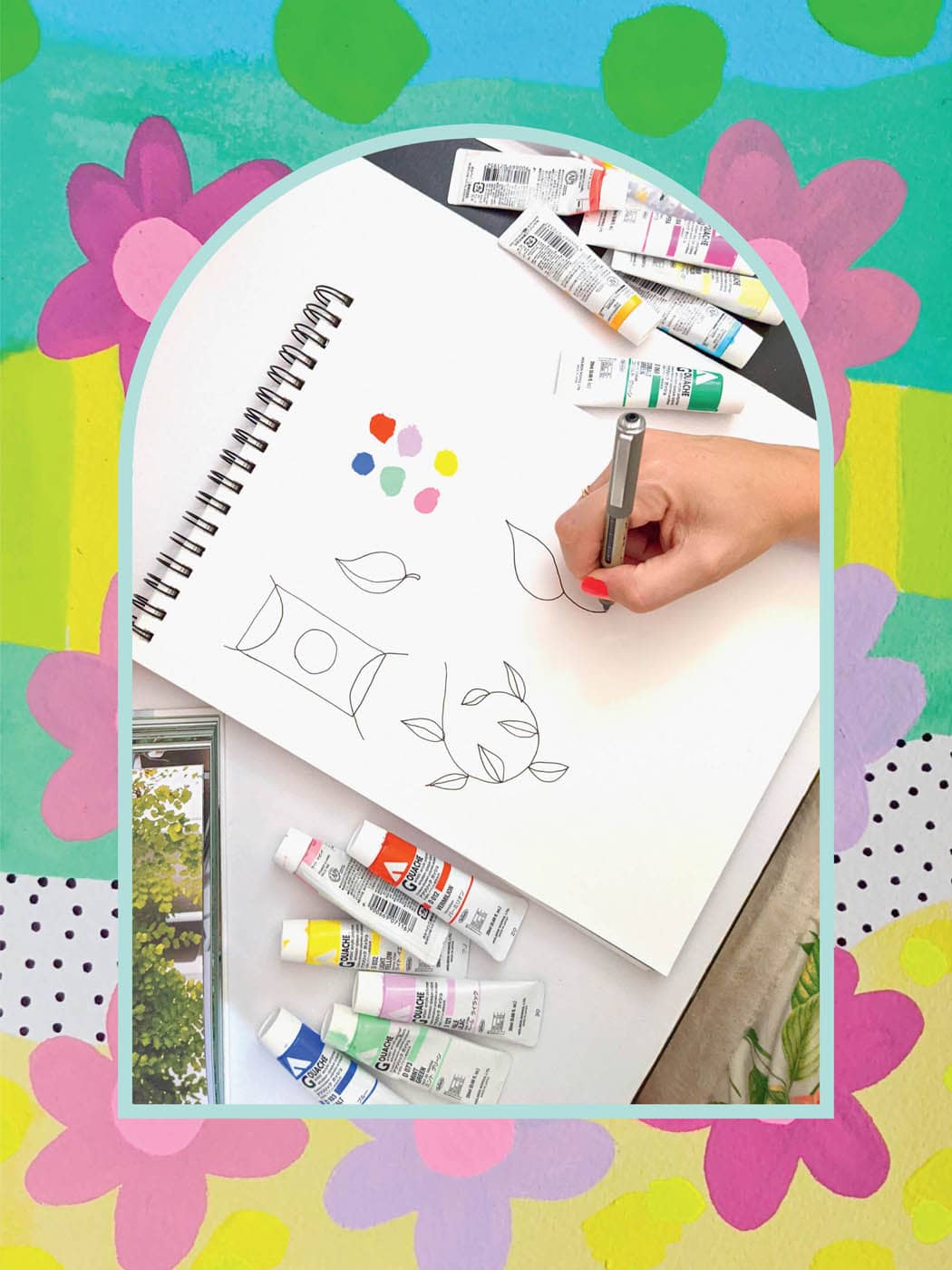
Once you’ve planned out your deck’s theme, suit, and court cards, you can begin your deck! I find that I don’t like to go right to the final product, so I usually spend some time sketching and looking through books for inspiration. My goto book for this project is called Leaf Supply: A Guide to Keeping Happy House Plants by Lauren Camilleri and Sophia Kaplan (Smith Street Books). I chose this book because it has beautiful images of all types of plants, and it was very helpful when deciding my suit and court cards.
Deciding which card to paint can also be a fun process. Feel free to choose the card that speaks to you. In my case, I want to leave it up to chance, so pick a card at random from the deck my sister gave me. The card I pull is the card I paint.
Sometimes after I pull a card, I have an idea right away and begin sketching. Other times, I reference Leaf Supply or the plants in my own home for inspiration. Sketching is a powerful tool. It allows me to visualize a card before creating the final product. It also lets me try out different color combinations before settling on the final. Take as much time as you need in the sketching phase; it’s important to feel good about the card you’re going to make.
In some rare cases, I skip sketching altogether because the image I want to paint comes to me immediately. This is OK too! Begin the final card when you feel ready—there’s no right or wrong way to approach the creative process.
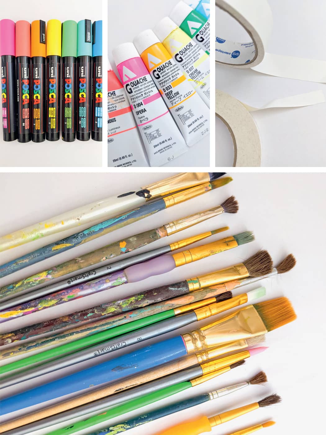
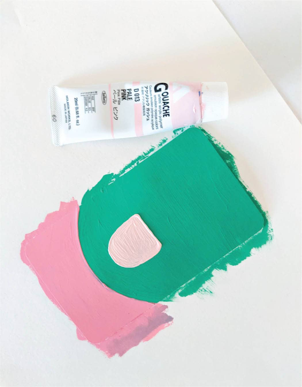
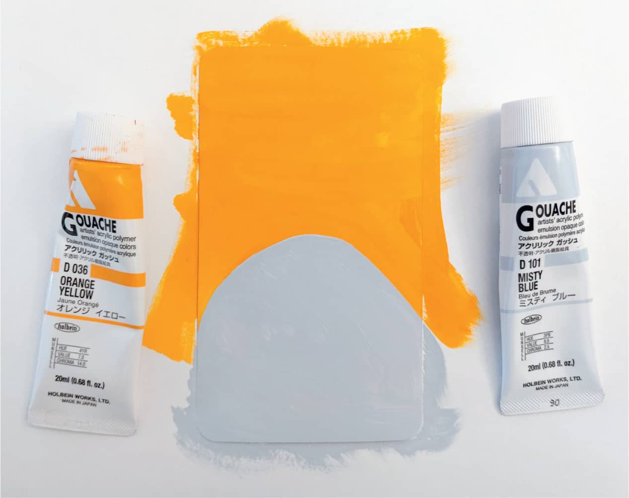
In this book, I’ve used Holbein® Acryla Gouache for my cards. I love gouache because it gives good coverage like acrylic, but it can be thinned to look like watercolor. It holds well to paper and lasts a long time. Plus, the colors are so vibrant! Since I’m a painter, I wanted my deck to also be painted, but you can draw yours if you prefer.
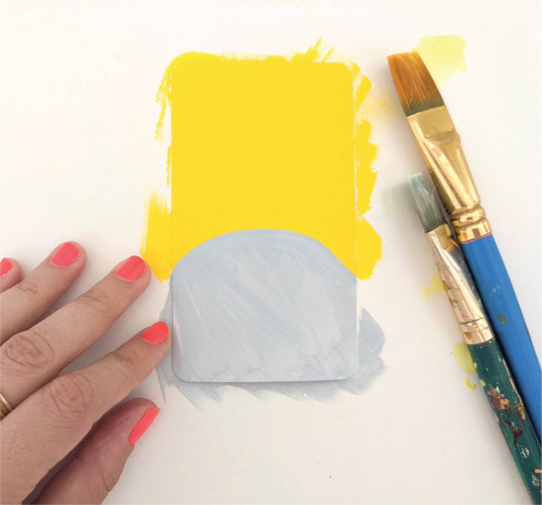
If you want to follow along with me, here are the supplies you’ll need:
- Gouache (any brand and as many colors as you like. It’s a good idea to have a nice mix of light and dark colors for this project.)
- Paintbrushes of any kind; they don’t have to be expensive or fancy
- Jar for water
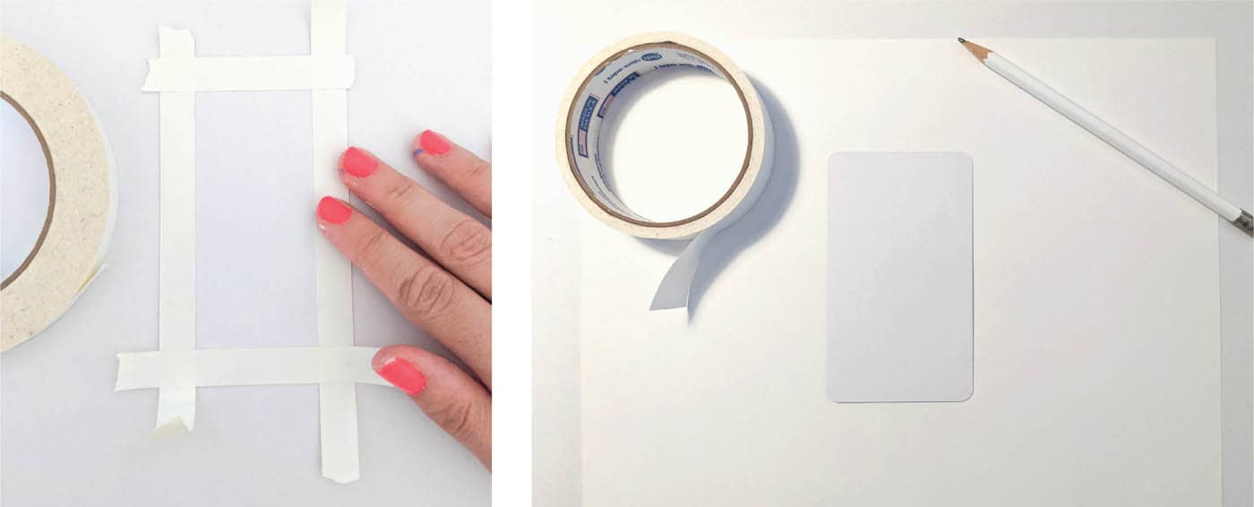
- Artist’s tape (This is important! Other tapes, like masking or painter’s tape, can damage the paper. Investing in artist’s tape is strongly recommended.)
- Card-stock tarot cards (included), or you can use watercolor paper
- Markers or paint pens (I use POSCA® paint markers and Sharpie® permanent markers)
- Optional: table fan to speed up drying times
- Optional: Scotch® clear packing tape or a laminator
- Optional: Spray varnish in matte, satin, or gloss finish
- Optional: Mask for spraying varnish
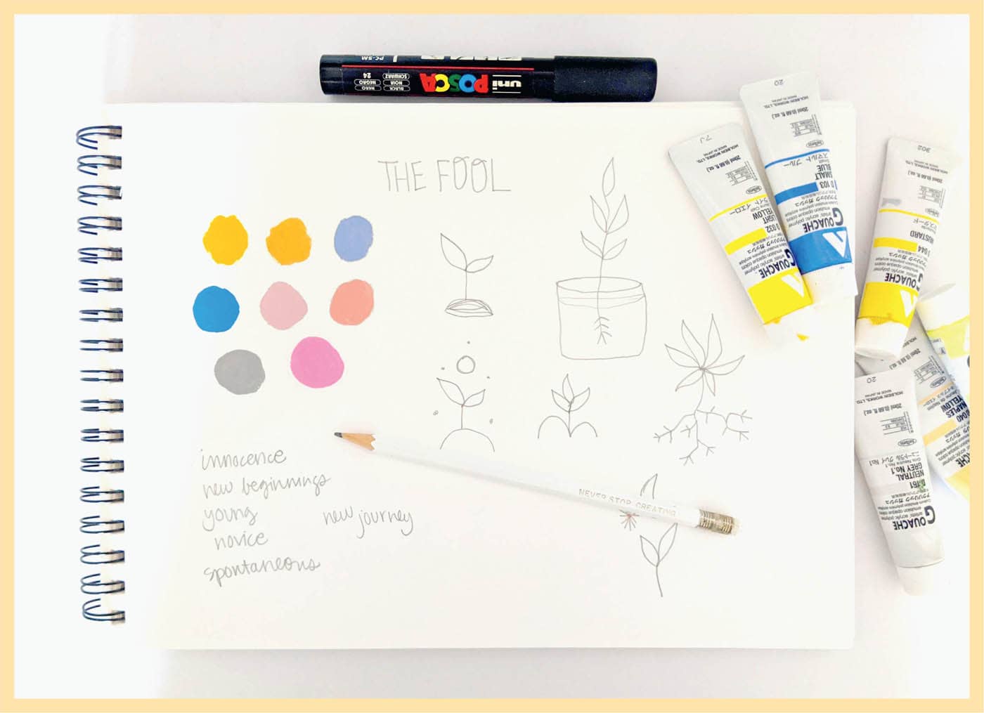
· THE FOOL ·
COLOR SCHEME

Step 1: Sketch
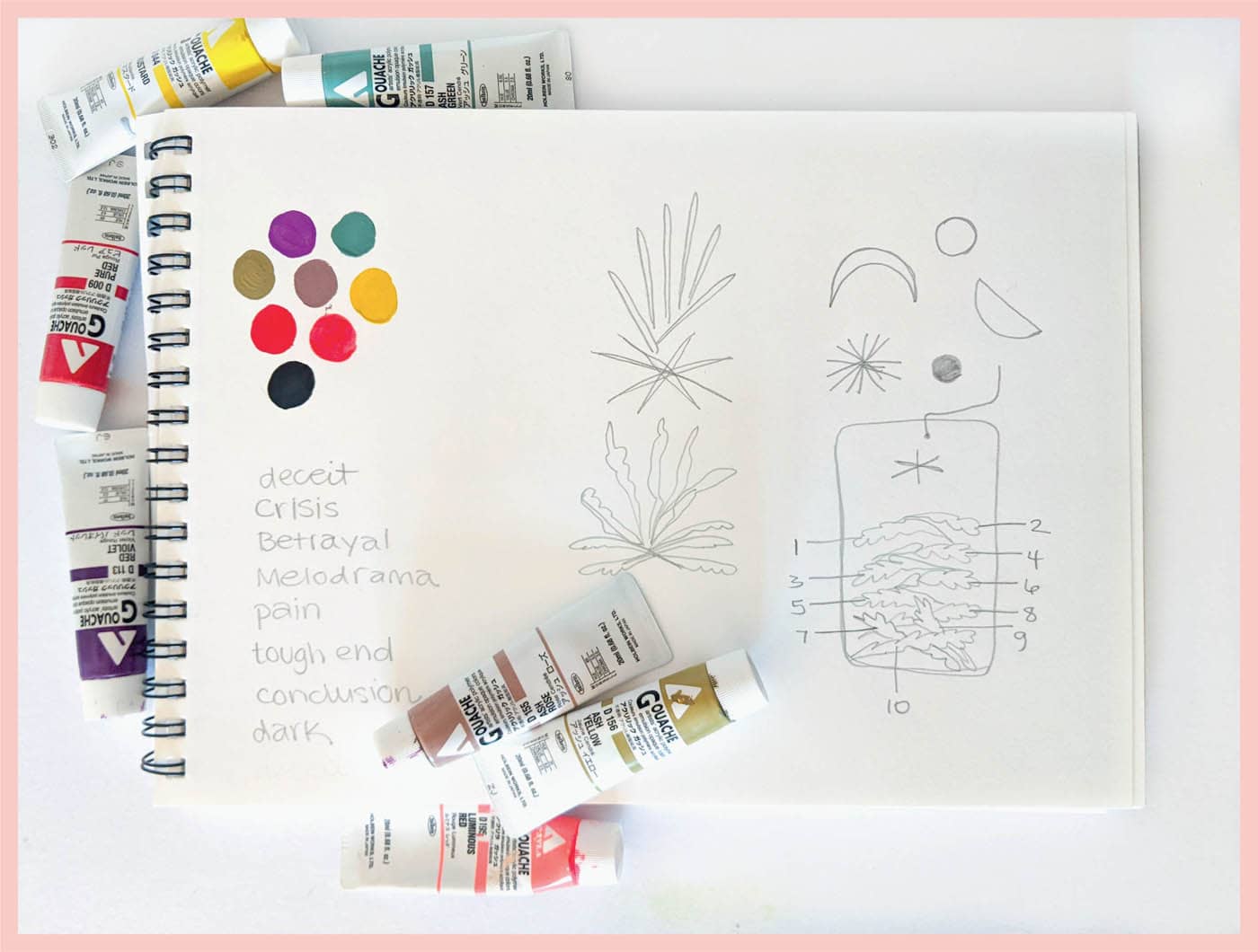
Sketching is optional, but it’s something I like to do to orient my mind and plan out what I want the final card to look like. Grab some scrap paper, pencils, and paint (or whatever you’ll use to create your card).
Read about The Fool card and think about what it means. Write down a few key words to help guide you. Since The Fool card is about youthful innocence, I want bright, playful colors and I’ve tested several colors on the far corner of my scrap paper.
Next, doodle some ideas. A cutting and a seedling are the ideas that emerge first for me, and I like the composition of the seedling direction. I decide to move forward with a seedling as my final card imagery.
Step 2: Prep
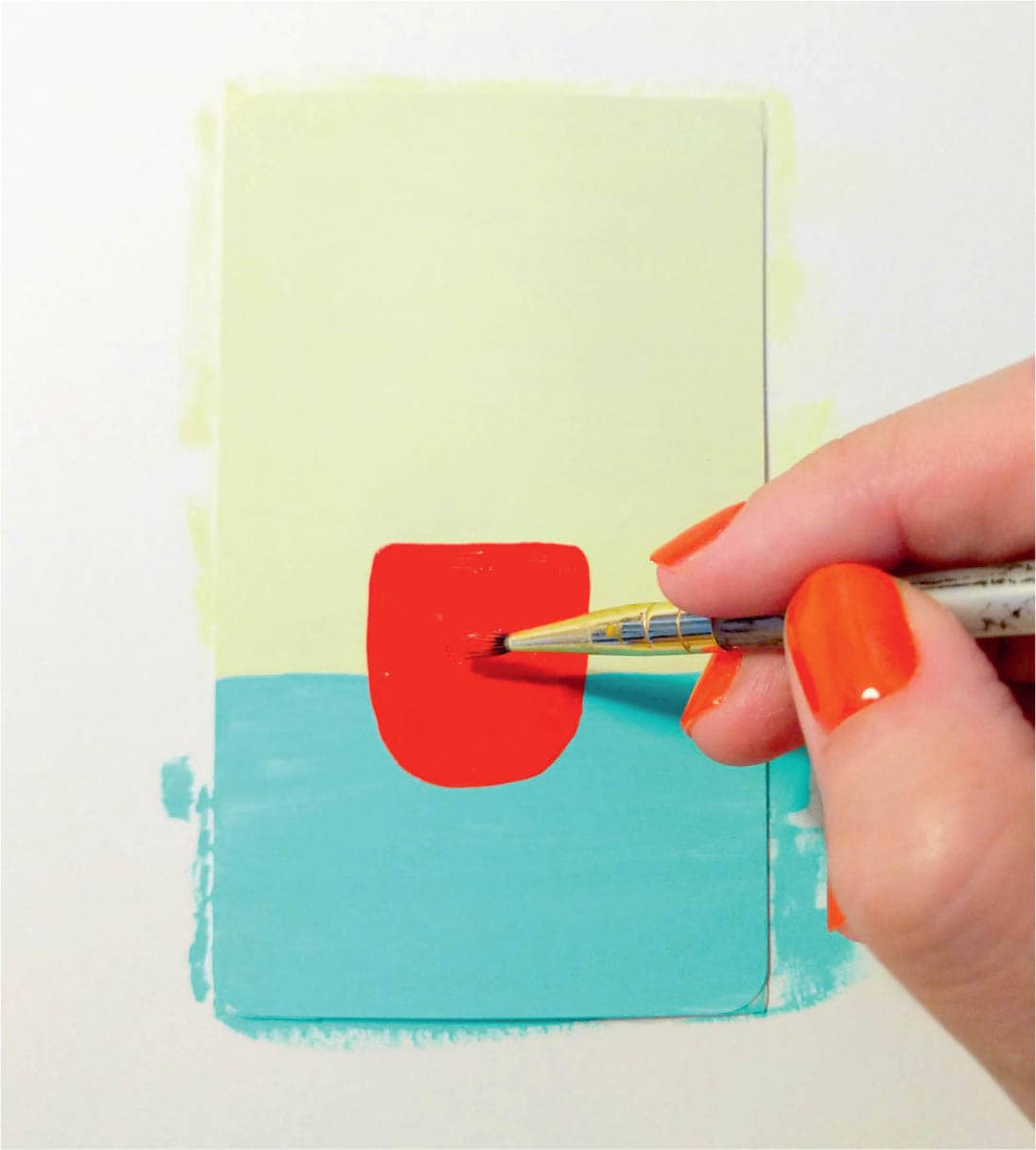
Now it’s time to prep your card for painting! Note that taping off the back of the cards is optional. If you want the back of your cards to stay neat, use artist’s tape to tape off the edges so paint doesn’t get on them. It’s important to use artist’s tape because it won’t damage the paper card. Use scissors to trim the excess and flip your card over.
If you don’t mind if the back of the cards get a little paint on them, feel free to jump to this part of the process. Use artist’s tape to tape the blank card to a sheet of scrap paper. If you taped off your card edges, flip the card over so the blank side is facing up.
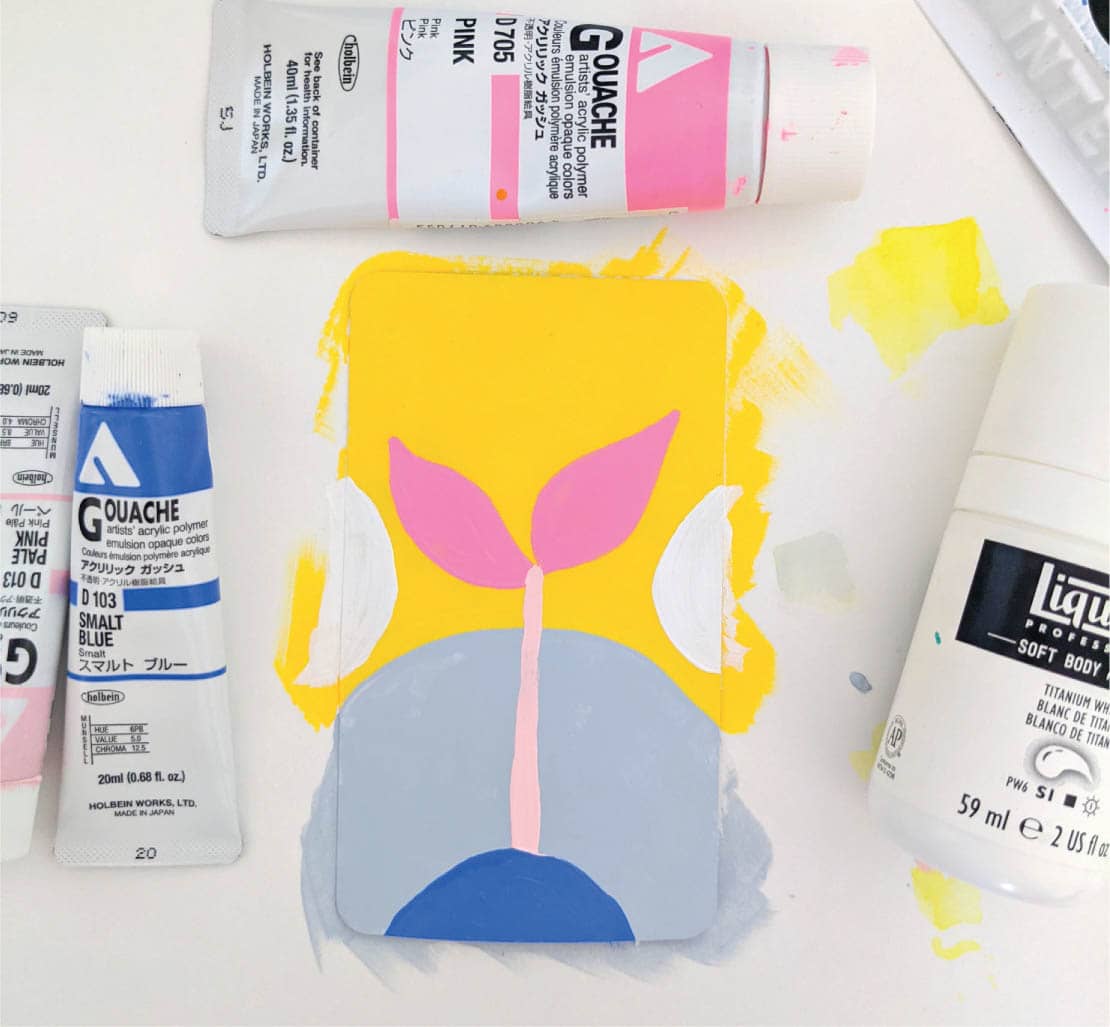
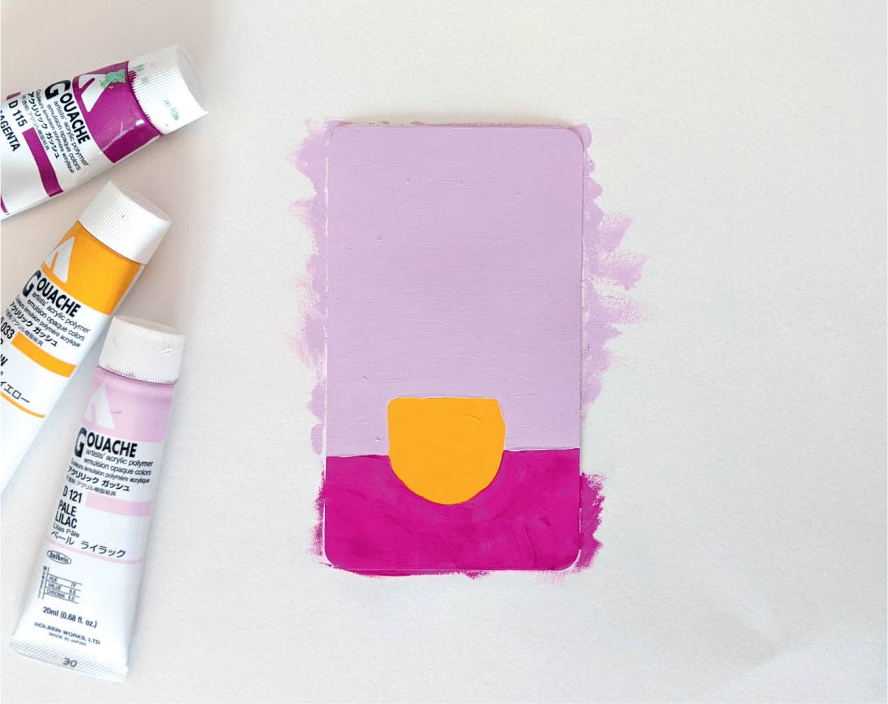
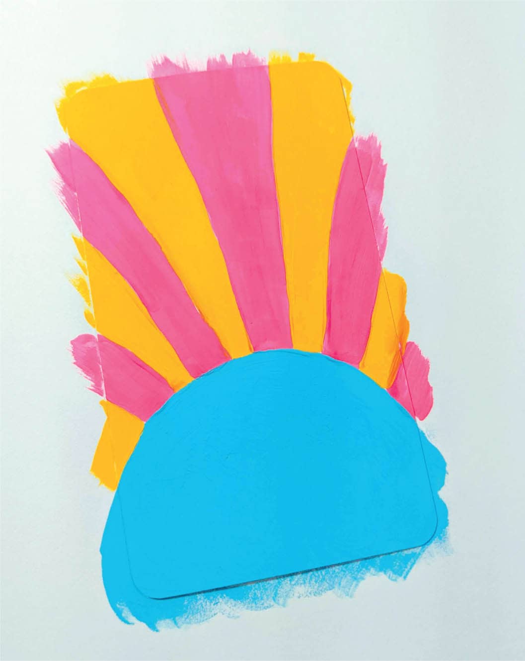
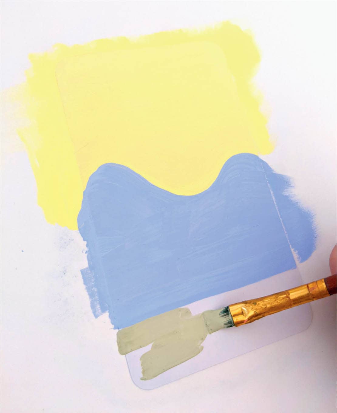
Step 3: Paint the Background
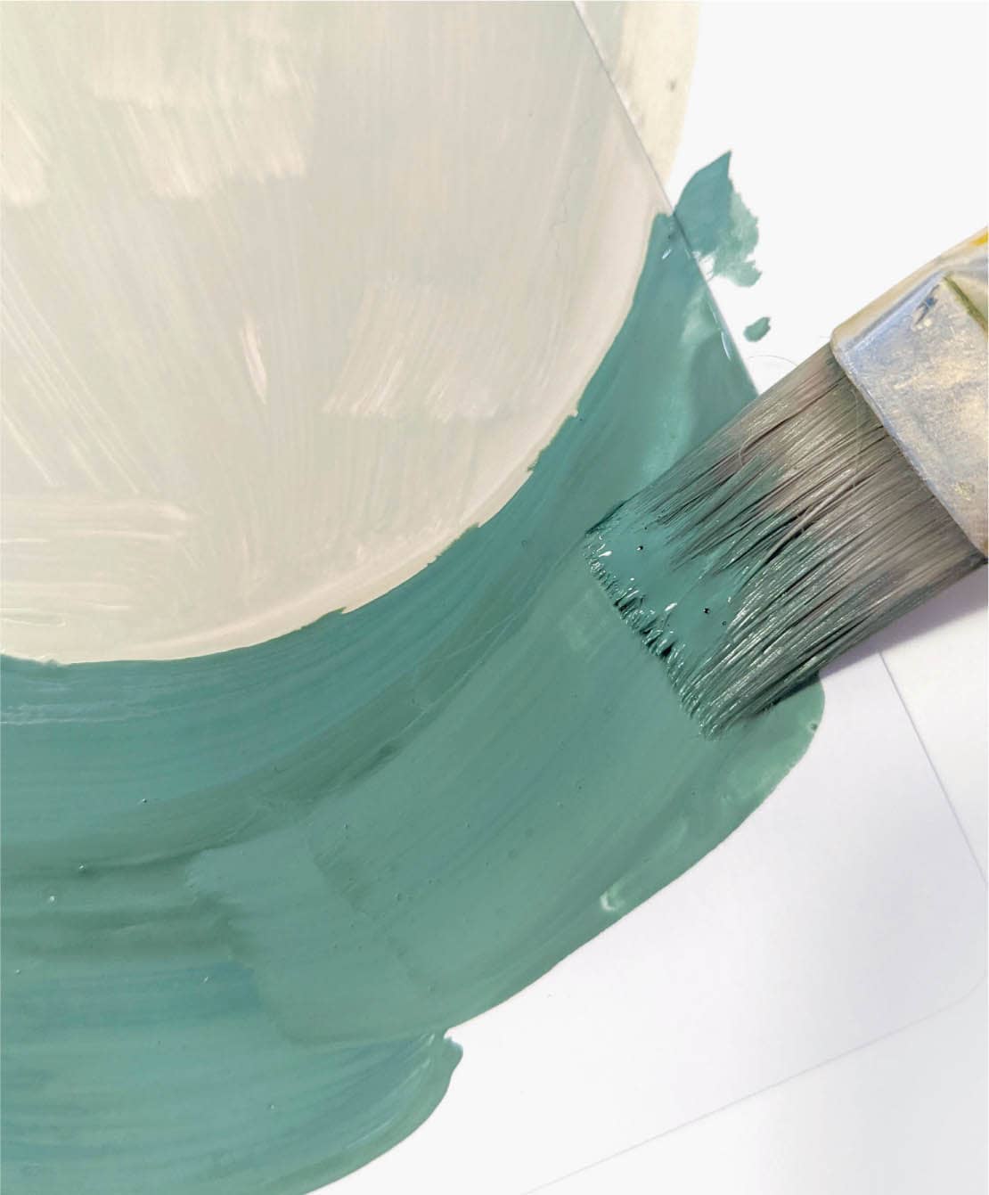
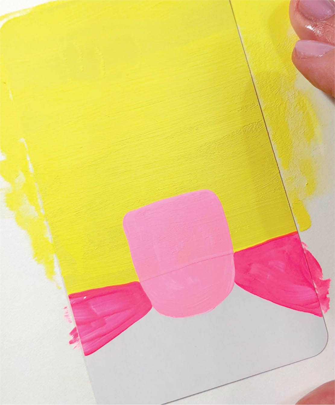
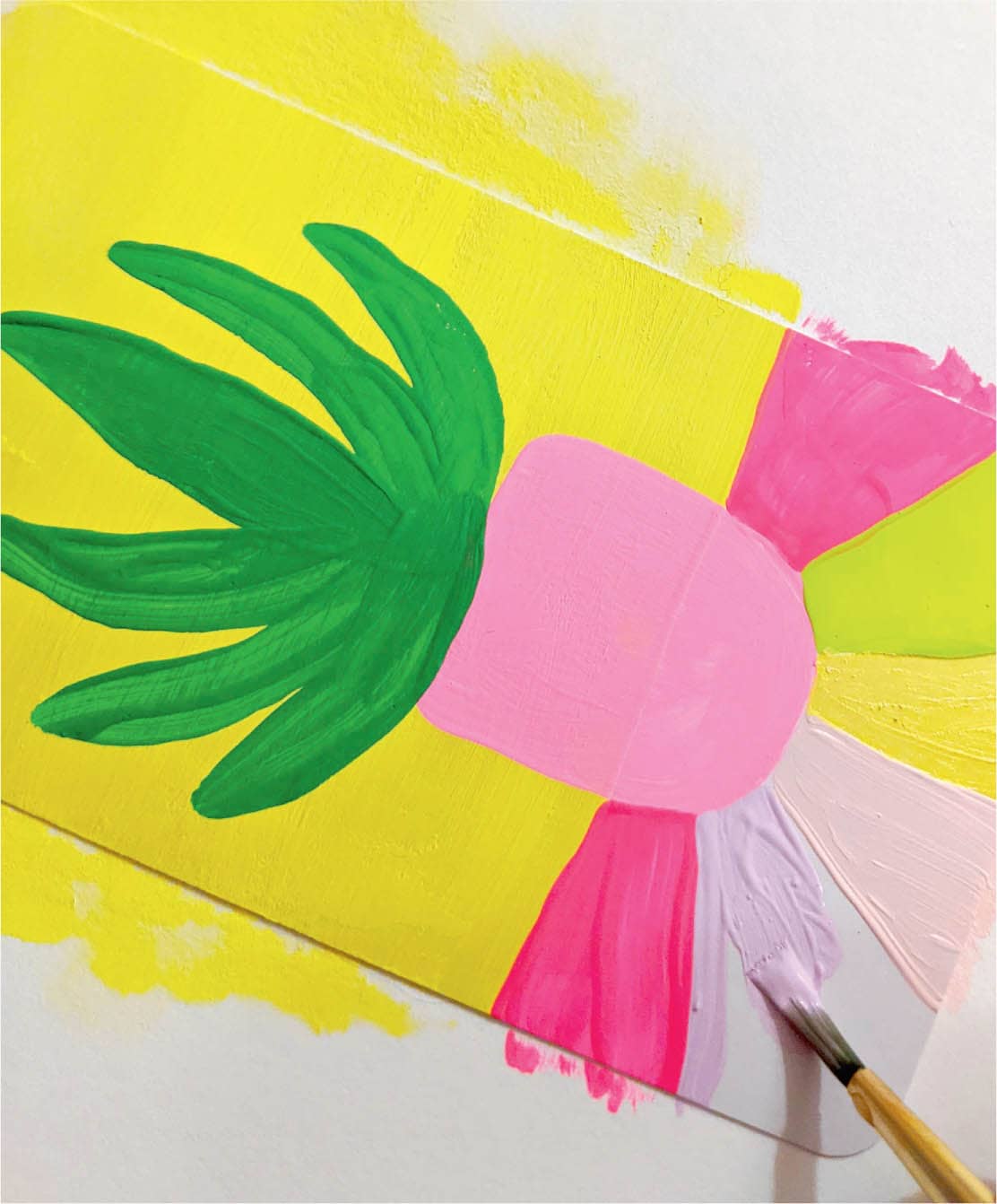
Next, you’ll paint your card’s background. Take the paint all the way to the edge of the card and use wide swaths of color. I try to keep my backgrounds simple so that my foreground imagery stands out. Let the background dry before moving on to the next step, and add a second coat of paint if you feel like the card needs it (I’ve done this).
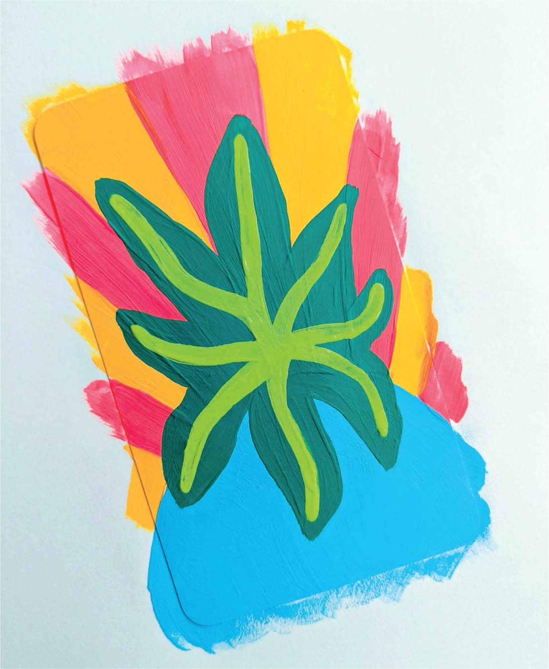
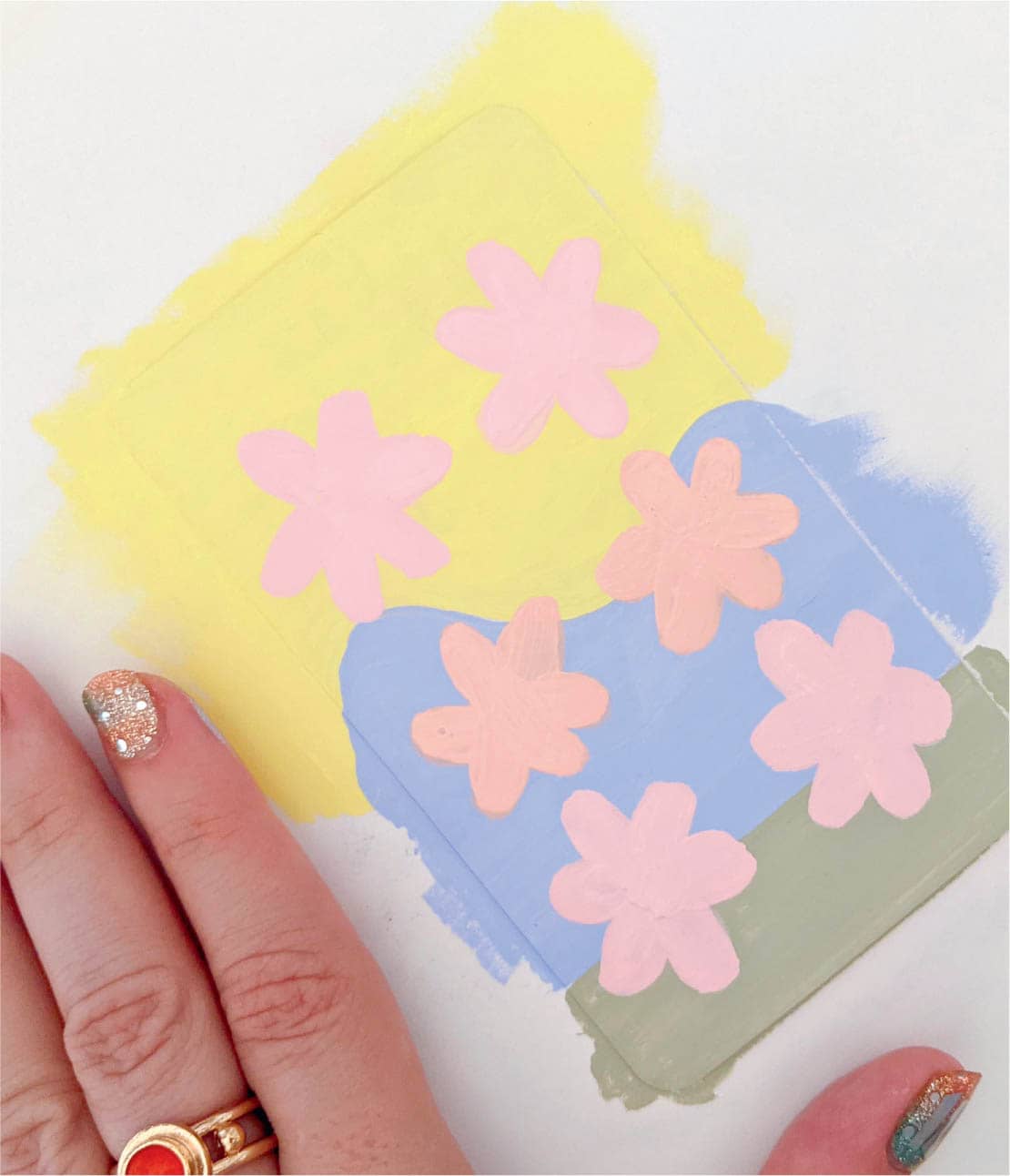
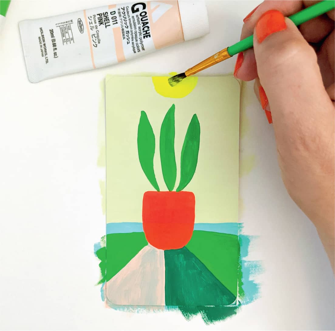
Step 4: Paint the Foreground
Here’s where sketching comes in handy. I reference my doodles for the seedling and paint two small leaves. Next, add the seedling’s stem, a dark semicircle for the stem to anchor to, and two white spots that you’ll add a pattern to at the end. Let the foreground dry before moving on to the next step.
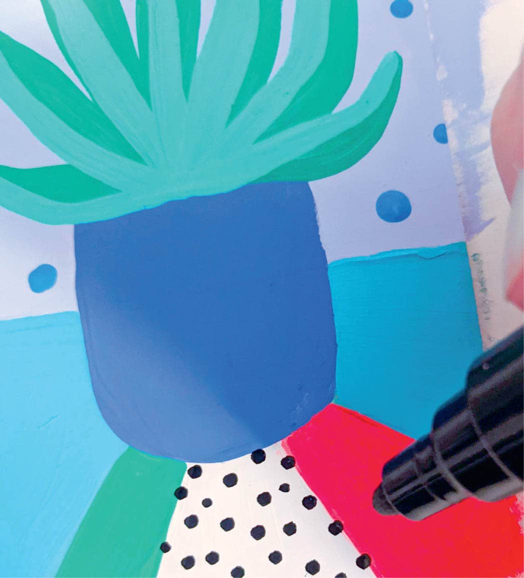
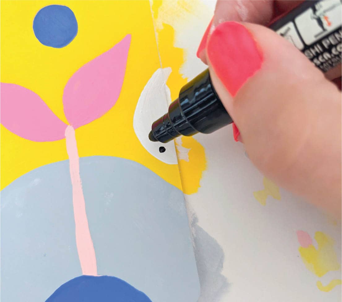
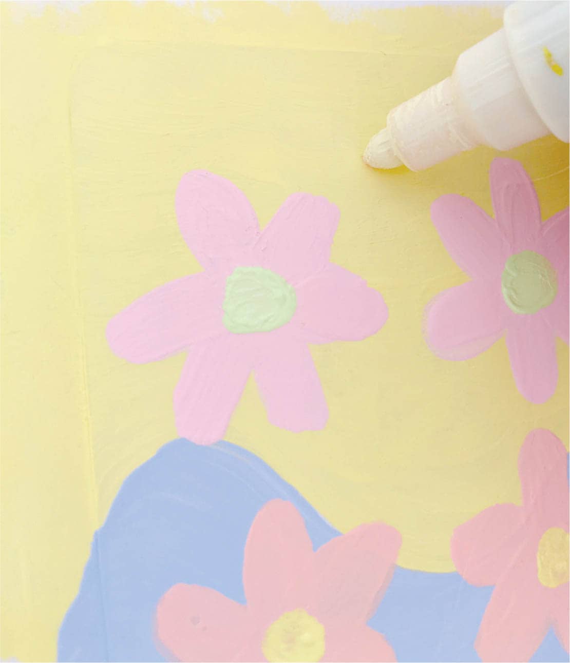
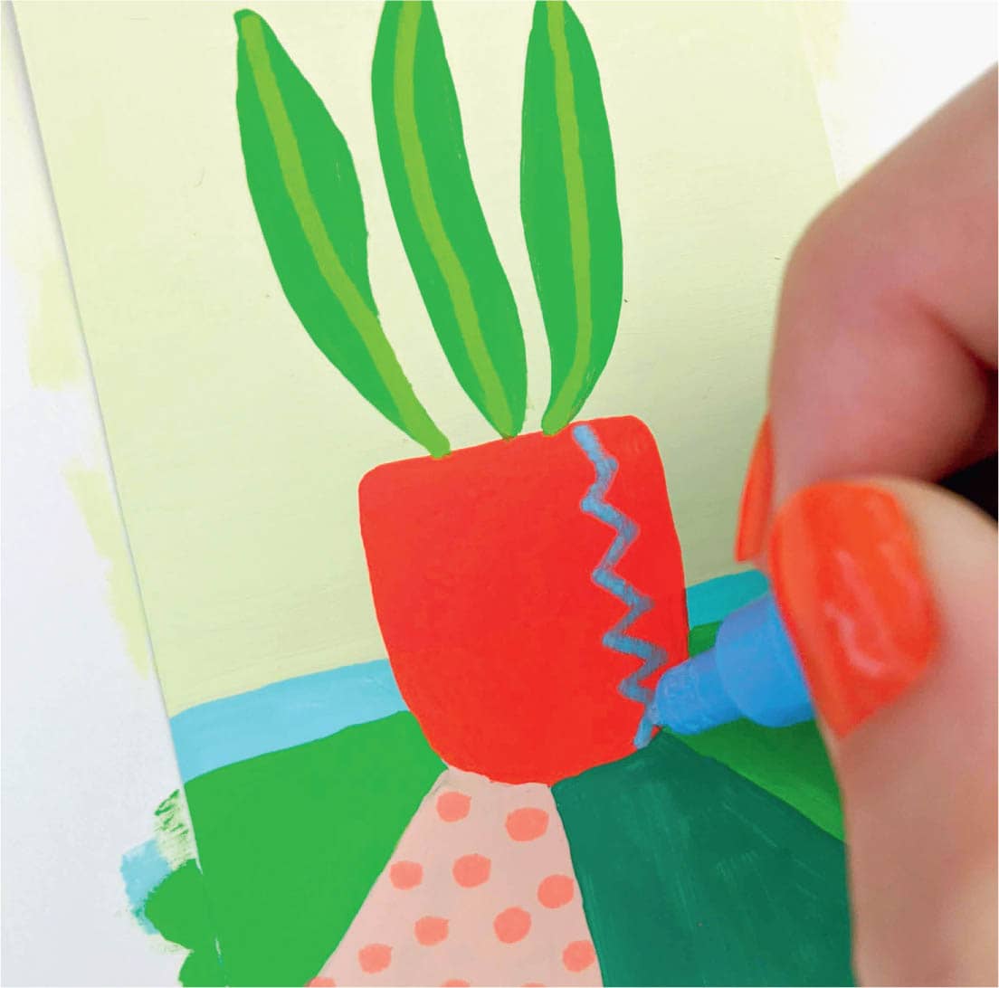
Step 5: Add Finishing Touches
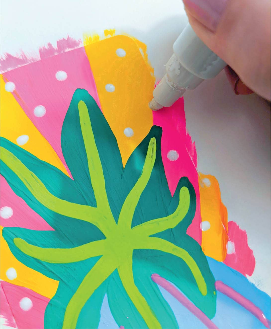
This is my favorite step! Adding small, final details really brings a tarot card to life. In this case, I use a paint marker to add black dots to the white areas painted earlier. Next, add light pink stripes to the deep-blue semicircle. Last, add a sun above the seedling and small white dots in the yellow sky. Let the paint dry completely before removing the card from the scrap paper.
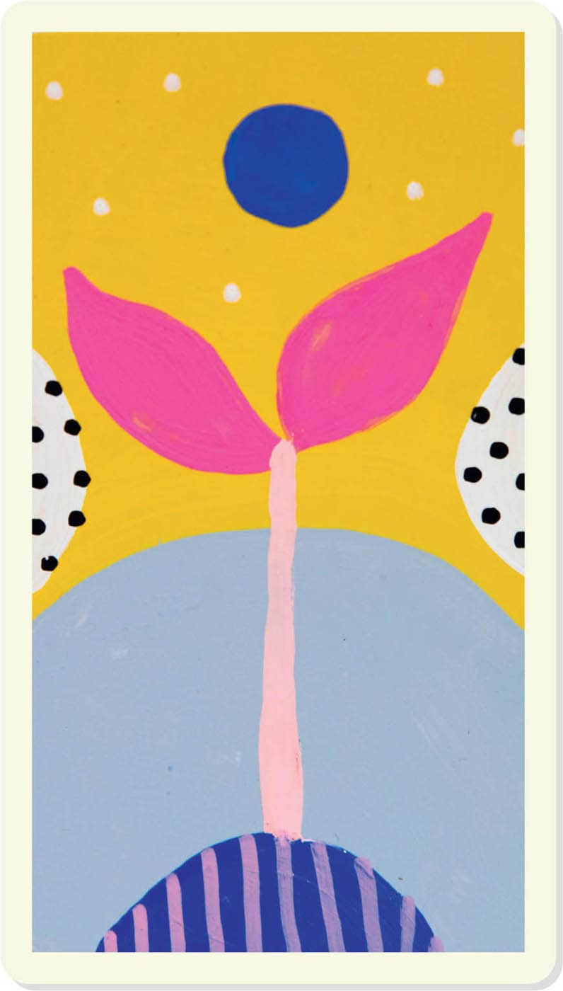
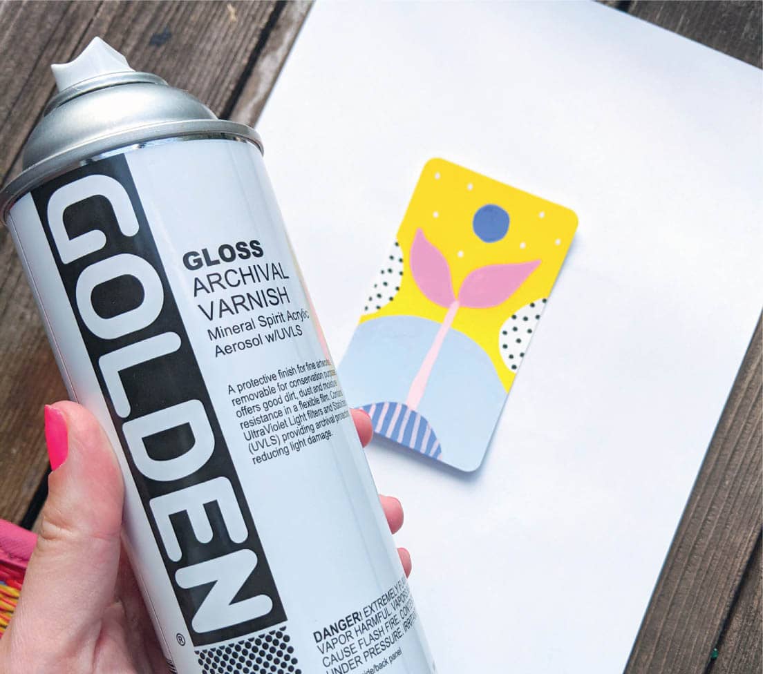
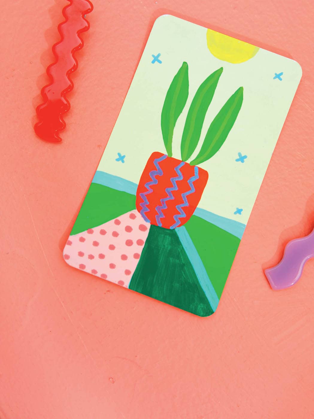
Step 6: Varnish (optional)
Spray varnish protects the paint on your cards from wear and tear, but it’s completely optional. If you don’t want to add varnish, simply remove the artist’s tape from your card and you’re finished!
If you do choose to apply varnish, make sure all the artist’s tape is removed from your card and that your card is completely dry. Wear a mask and spray in a well-ventilated area. Place your card on a piece of scrap paper before spraying. Shake the can of varnish well and spray about 8 inches from the card. Coat evenly and let dry before bringing the card inside (varnish has a very strong smell)!
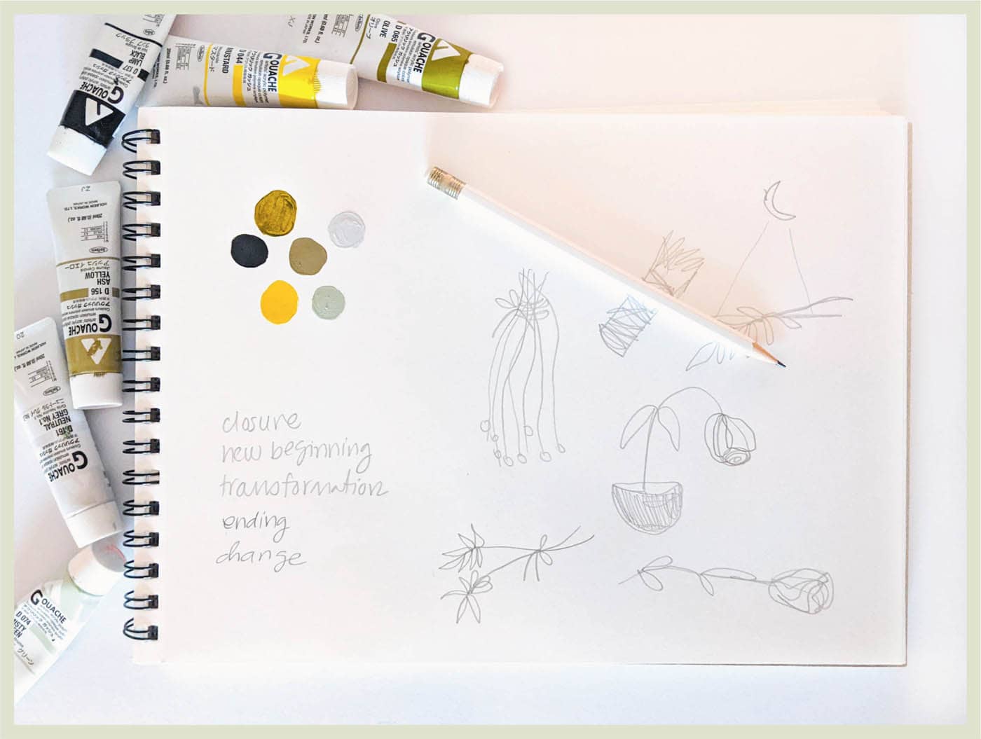
· DEATH ·
COLOR SCHEME
Step 1: Sketch & Prep
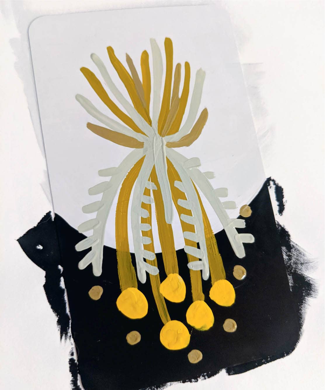
Since the Death card isn’t necessarily about the end of life, I want to avoid imagery of dead plants fallen over in pots. This is especially clear once I start sketching. Instead, I want to focus on the beauty that can come from change. I’ve decided to create an upside-down bouquet of dried flowers. While once vibrant and alive, dried flowers are still beautiful in their second life. Since the concept of death is often dark, I decide to stick with a muted color palette consisting of black, light gray, and shades of yellow and olive.
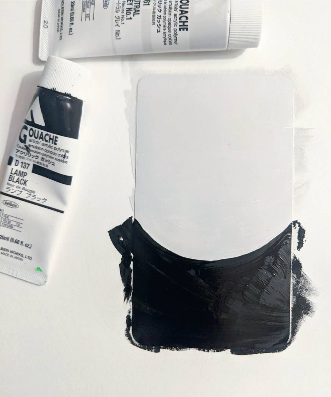
Step 2: Paint the Background
Begin by painting the top two-thirds of the card with a light, neutral gray. Add black to the bottom third for a dramatic effect. It’s important when using dark colors—like black or navy—to let the background dry completely, so you don’t get dark smears over lighter foreground colors.
Step 3: Paint the Foreground
Once the background dries, you can get to work painting the stems of the dried bouquet. I’ve used an olive green for this, and I’ve added round flowers to the ends using mustard yellow.
Next, add a few more stems using a light misty green, and finish with dots in ash yellow. I like the contrast of the yellow flowers against the leafier green stems. I think it adds interest against the dark background.
Step 4: Add the Finishing Touches
For the details step, I’ve decided to use a black paint marker to add stars to the sky. To conclude the card, I do something a bit unexpected and add a red-orange tie to the bouquet. This color was not in my original plan, but something about it feels right. By now, you know not to ignore your instinct with the tarot!
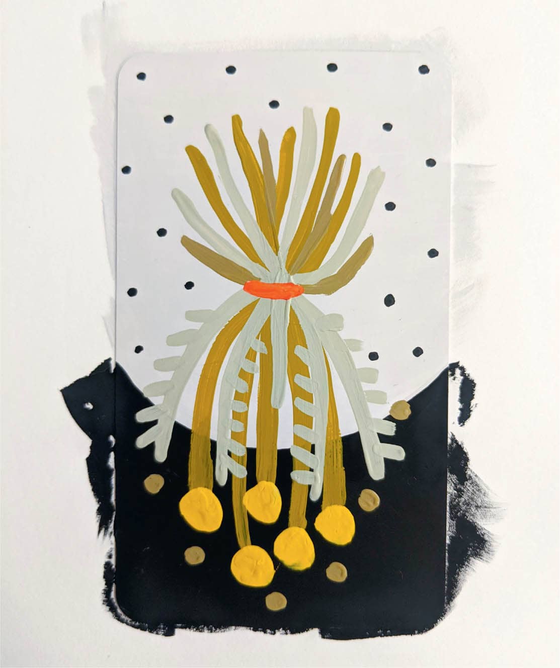
Adding the tie makes the card feel complete. I’m really pleased with how it turned out and I like that I’ve focused more on the beauty of the Death card, rather than the darkness of it.
· THE EMPRESS ·
COLOR SCHEME
Step 1: Sketch
For some reason, when I think of motherly energy and plants, a fern comes to mind. I have no idea why this is, but I’ve learned not to question my initial thoughts when it comes to painting the tarot. Those initial thoughts are really your intuition, and you should follow it for something as intuitive as tarot cards!
Ferns are large, dominant plants that still feel soft and welcoming. The Empress has been described as the mother of the tarot, so to me, this plant fits perfectly. I’ve sketched two types of ferns; I’ll decide which style to use later in the process.
Tape off your card’s back (if you are doing that) and adhere it to a piece of scratch paper for painting.
Step 2: Paint the Background
I want to project warmth with this card, so I’ve painted a yellow sun in the background. Next, add warm red and indigo color washes to either side of the sun. I’ve decided to stick with a primary color palette for this card because I like the vibrancy and I think it fits perfectly with the meaning of The Empress card.
Step 3: Paint the Foreground
Once the background dries, begin drawing the fern plant. I’ve decided to go with the thinner leaves because I feel it looks more interesting. Since the fronds are so thin, draw them on the card with a green paint marker, rather than painting them.
Step 4: Add the Finishing Touches
Since this card is already detailed due to the fern’s leaves, I keep this step minimal. Add a light pink circle to the bottom of the card to visually anchor the fern. Then add a few yellow dots to the center of the fern with a paint marker, and finish off the card with stars in the sky.

· THE LOVERS ·
COLOR SCHEME
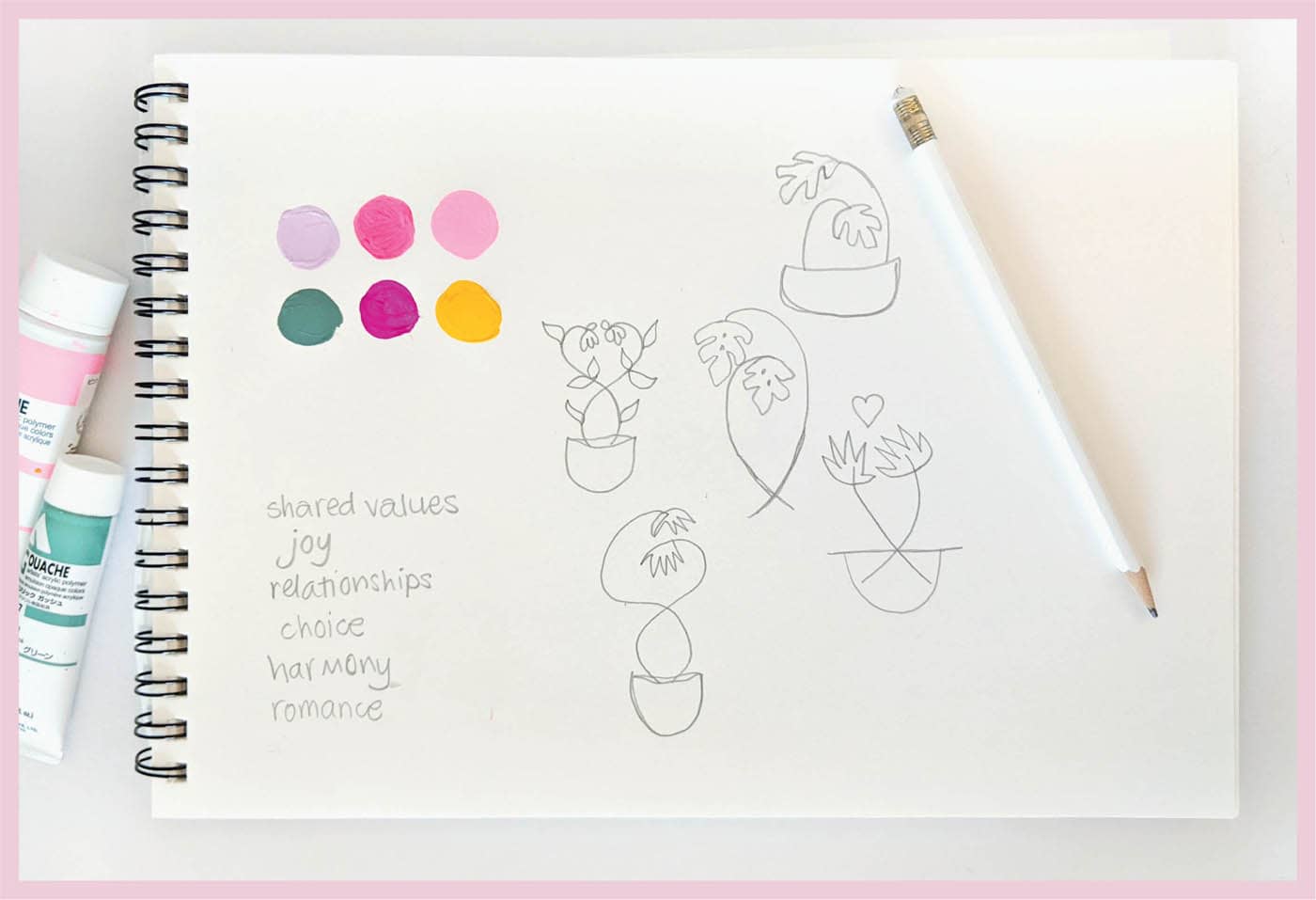
Step 1: Sketch & Prep
Since this is our fourth card together, you know by now that it’s time to sketch! Sketching is always optional, but I like to do it because it grounds my ideas and allows me to explore freely.
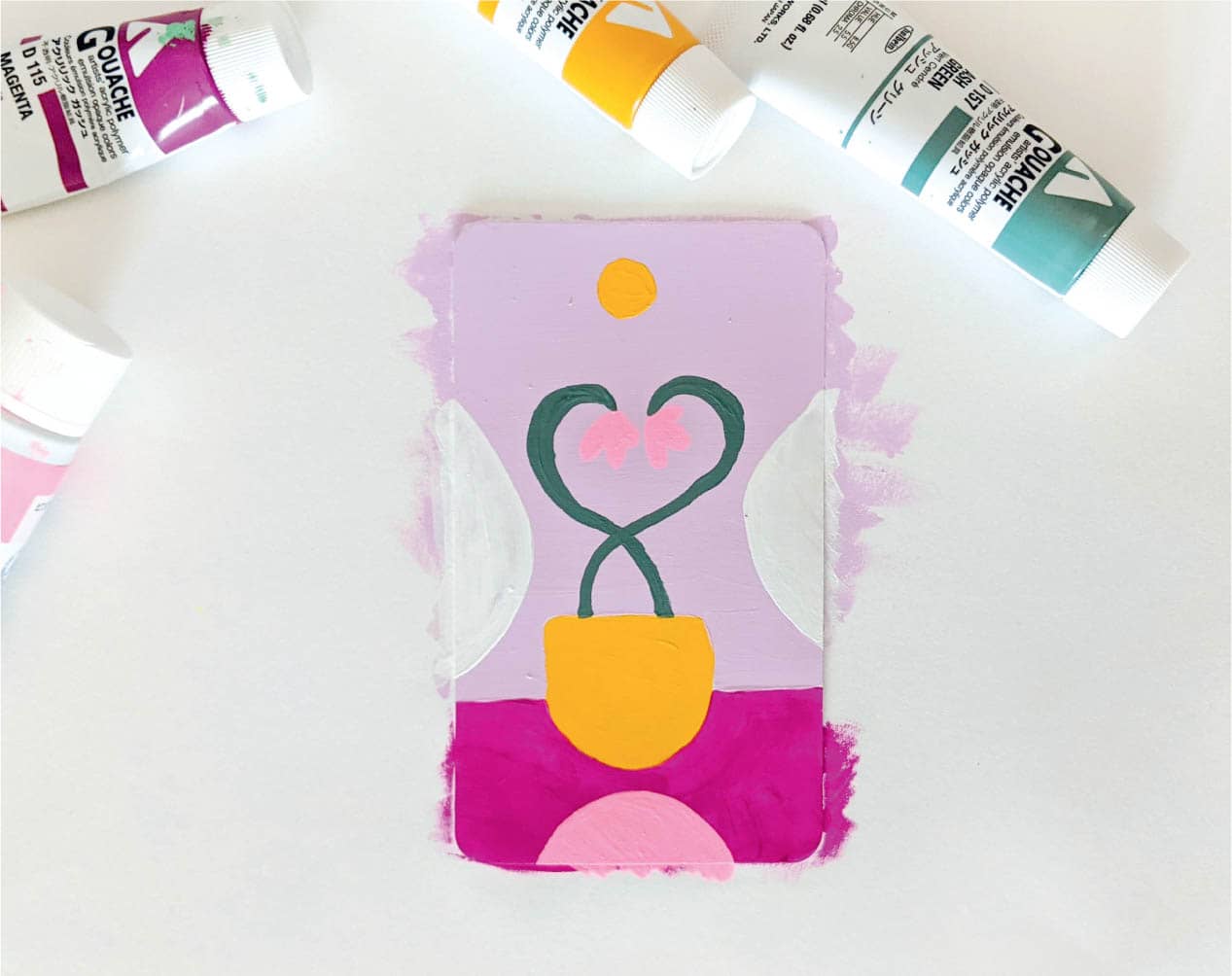
The Lovers card is about harmony, relationships, shared values, and joy. I immediately think of two plants together as a couple in the same planter. Since this is a Major Arcana card and not one of the Minor Arcana suit cards, you can choose any plant you want!
Play with a warm color palette. Purple conveys romance to me, so I’ve started with that and added complementary yellow. It’s always a safe strategy to add a color’s complement if you aren’t sure what color to choose.
Go ahead and tape off your card’s back, if you are doing that, and adhere your card to a piece of scratch paper for painting.
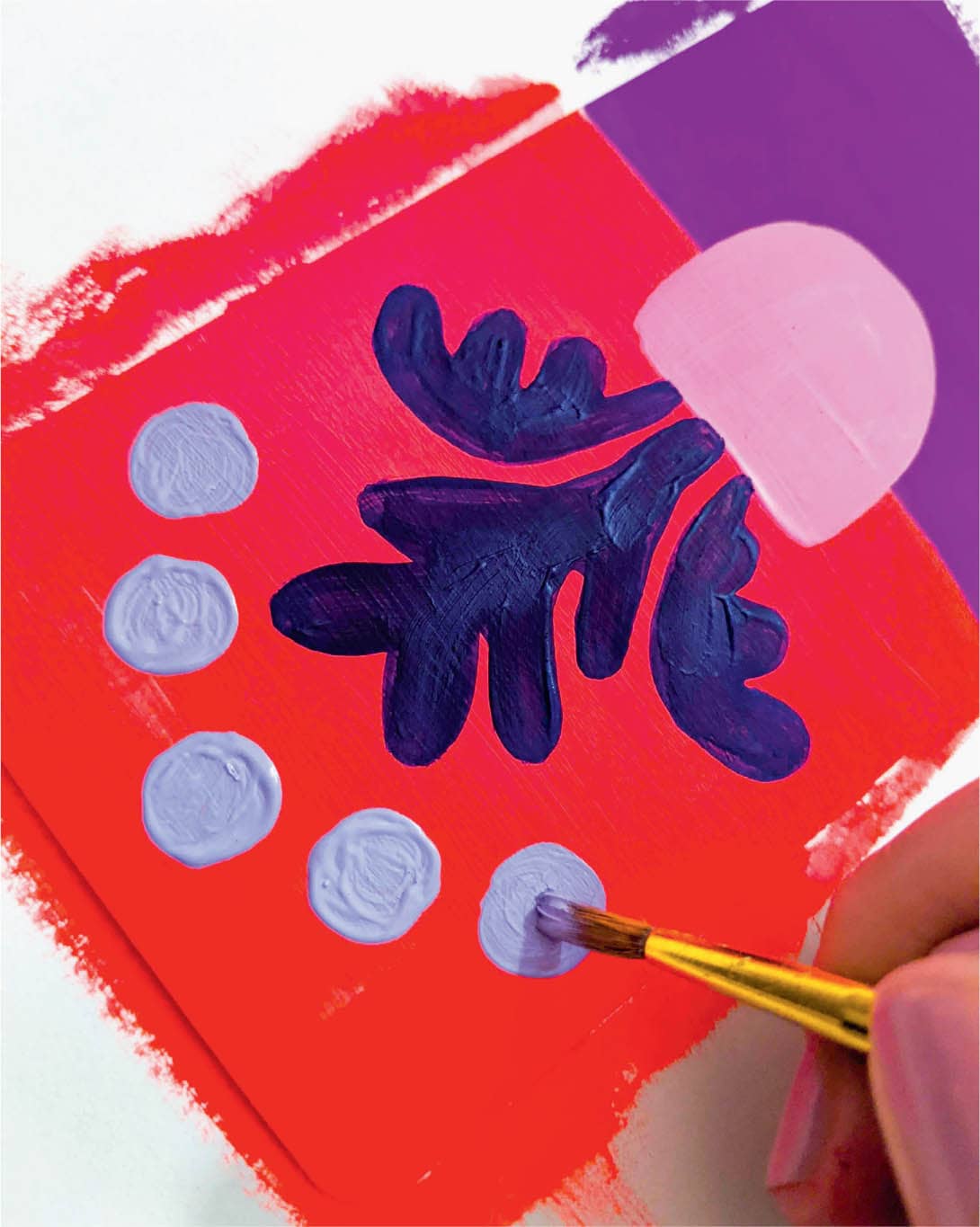
Step 2: Paint the Background
You may want to do something different with this background. Paint the yellow planter first, and add purple and lilac around it. This ensures that the yellow will still show up against the dark-colored background. Add two coats of gouache and set the card in front of a fan to dry.
Step 3: Paint the Foreground
For the foreground, convey partnership by painting intertwining stems. Paint the stems first so you know how much room you have for the flower bud. Keep the buds simple if you don’t have much room for detail. Next, add two white washes of color on the sides for visual interest. Lastly, add a sun at the top and a pink semicircle at the bottom to anchor the card. Once this dries, you can move on to the final step: details!
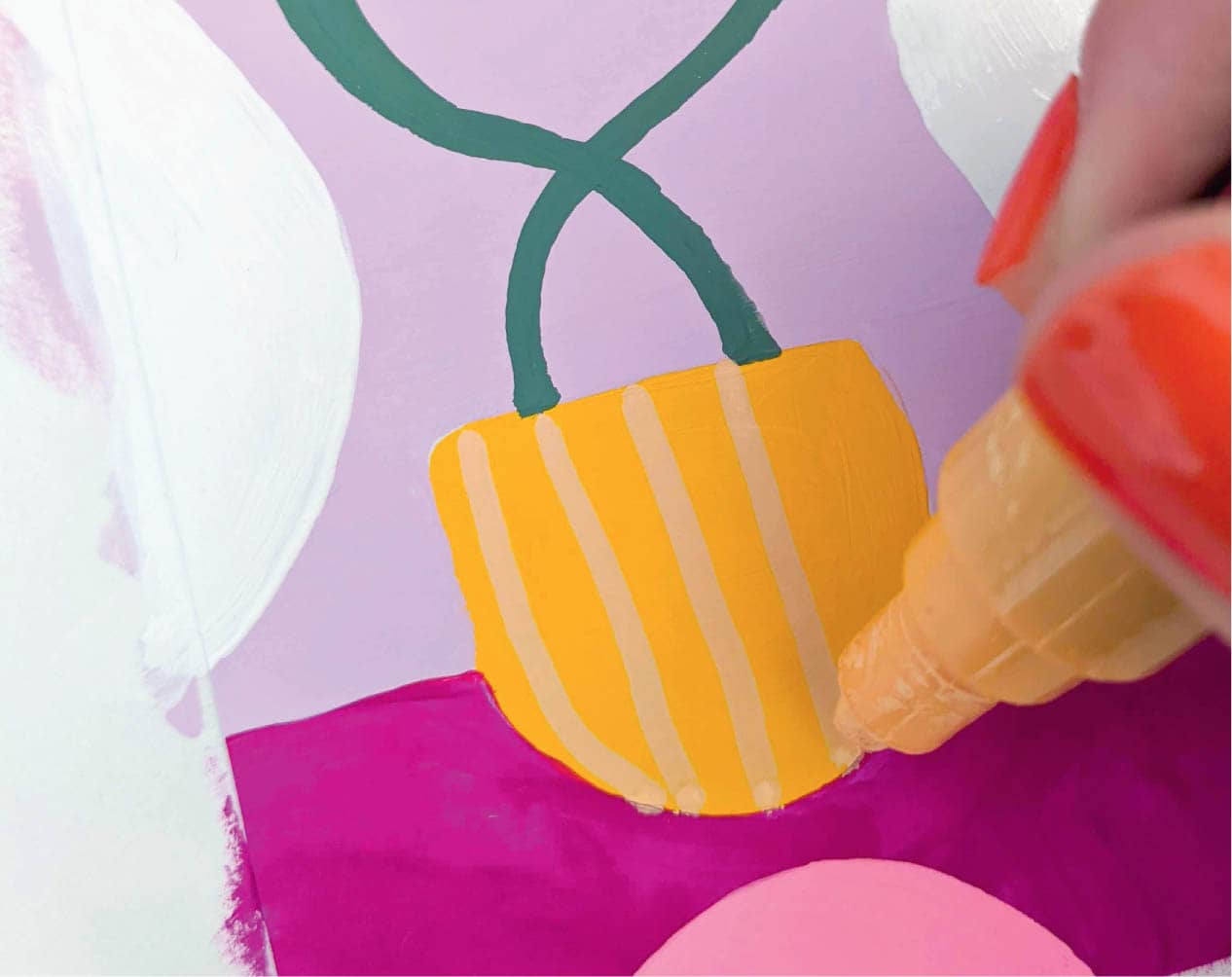
Step 4: Add the Finishing Touches
Details time! Not too much is needed to avoid taking away from the card’s focus—the intertwined plant stems. Just use a cream-colored paint marker to add some simple stripes to the planter. Voilà!
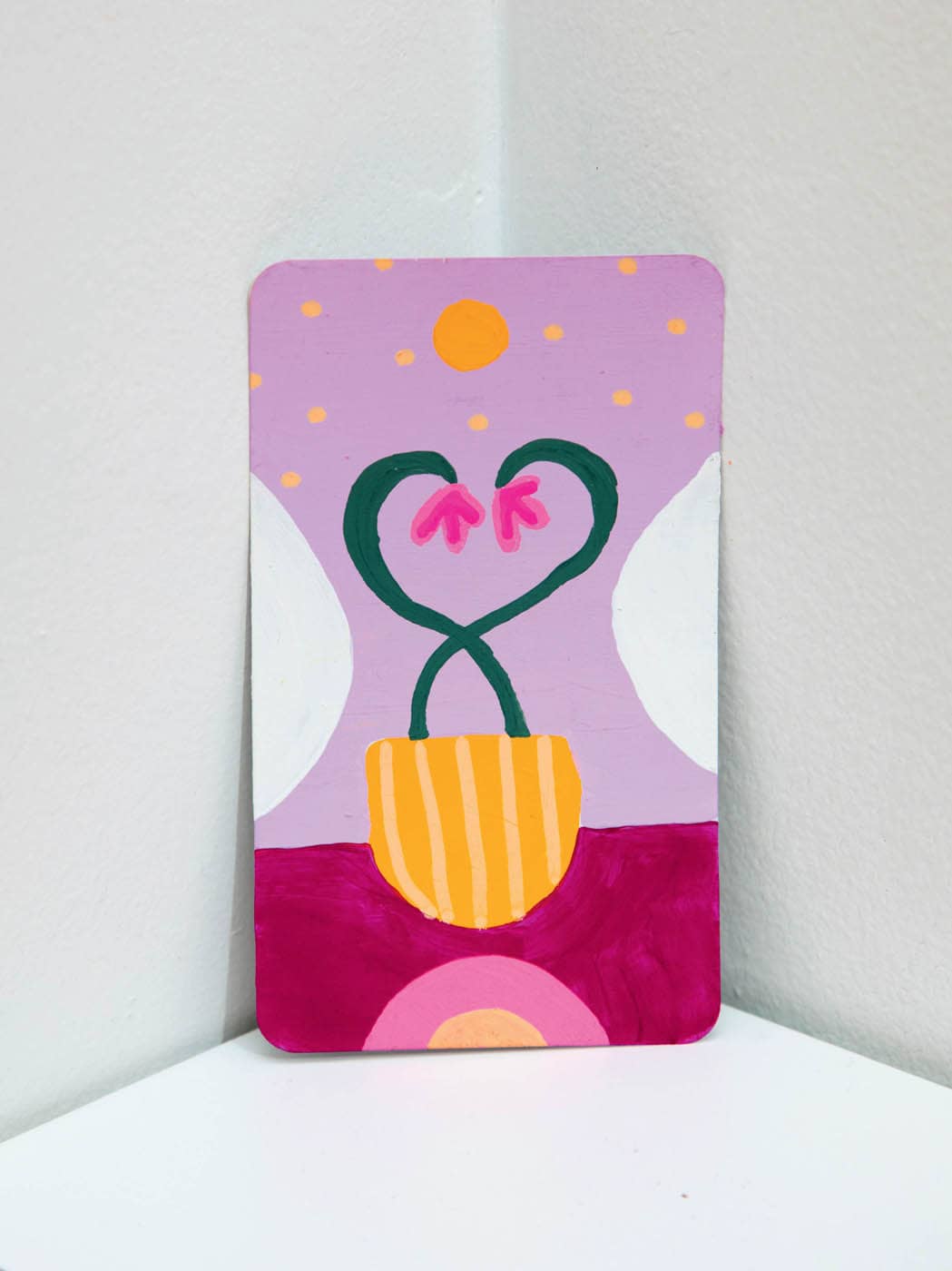
I feel good about the state of this card, so I’m going to call it finished. If you are protecting your card, wait until it’s fully dry and then proceed.
· THE STAR ·
COLOR SCHEME
Step 1: Sketch & Prep
I don’t have an immediate image for this card, so I’ve sketched cool plants that would look nice with a large star. I draw a banana leaf and a monstera, and after considering them both, I feel the softer edges of the monstera leaf will complement the sharper edges of the star. For the color palette, I’ve chosen calming ultramarine blue paired with muted pinks and rich greens.
This card’s composition is tricky because there are two dominant elements: a star and a monstera. Placing them on opposite ends of the card gives balance, as you’ll see in the following steps.
Go ahead and tape off your card’s back (if you are doing that) and adhere your card to a piece of scratch paper for painting.
Step 2: Paint the Background
Start by adding pale pink gouache to the upper two-thirds of the card and use a light magenta gouache for the bottom third. Apply a second coat for each and let it dry completely before moving on to the foreground imagery.
Step 3: Paint the Foreground
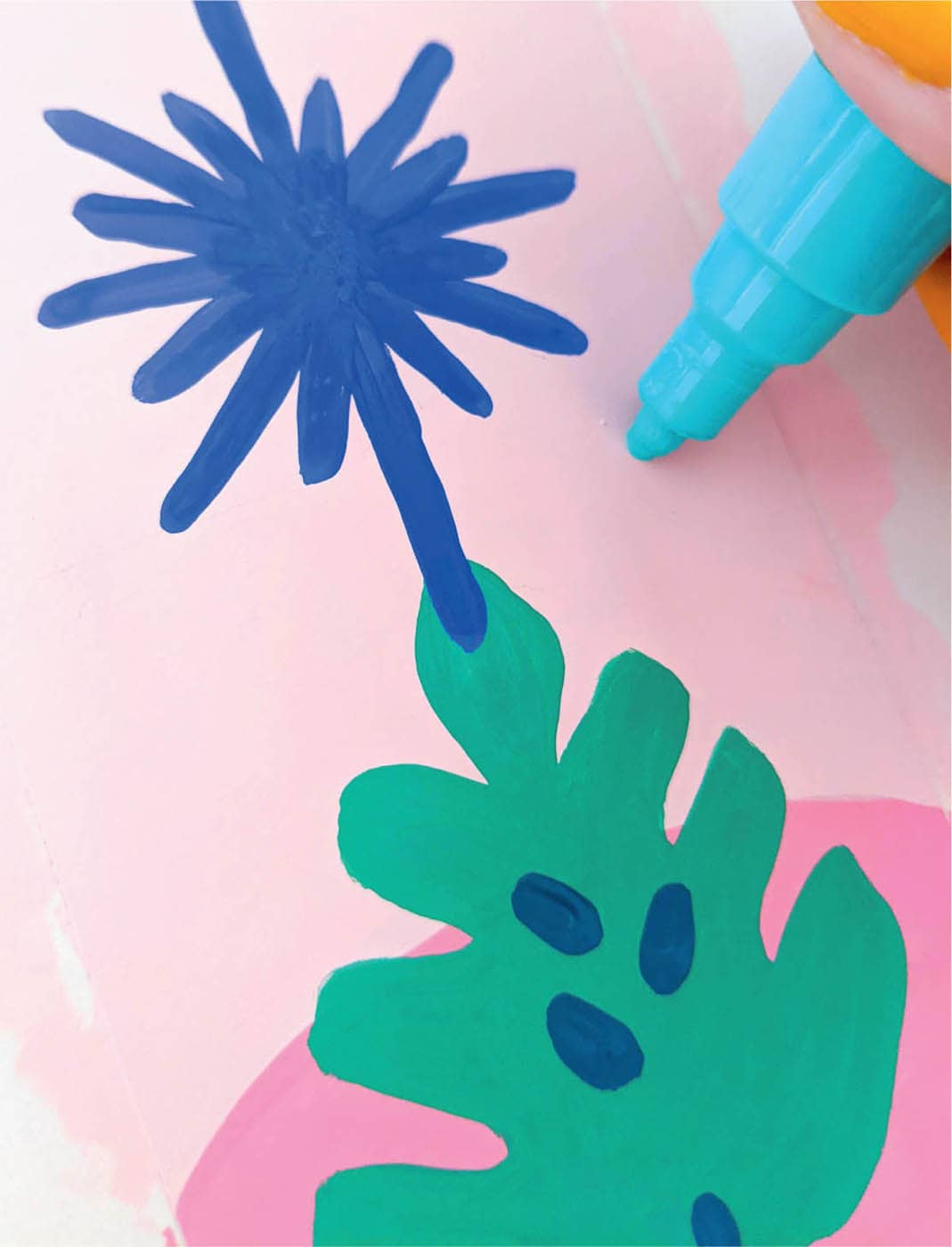
Begin the foreground with the monstera. The star is slightly more important for this card, so you can keep the monstera small and on the bottom half of the card. I’ve used an emerald-green gouache for the leaf.
Step 4: Add the Finishing Touches
Details are important on this one. First, add dark spots to the monstera leaf using peacock-blue gouache. Use this same color to add a stem to the leaf, making it extend off the page to complement the star.
Next, use a turquoise paint marker to add stars to the sky. I thought I’d be done at this point, but something still felt like it was missing. I’ve gone rogue and added a cream-yellow circle to the center of the star. This makes the star look more radiant. I know yellow wasn’t on my planned color palette, but it’s OK to deviate from the plan if your intuition tells you to! Feel free to do the same with your own cards.
· THE TOWER ·
COLOR SCHEME
Step 1: Sketch & Prep
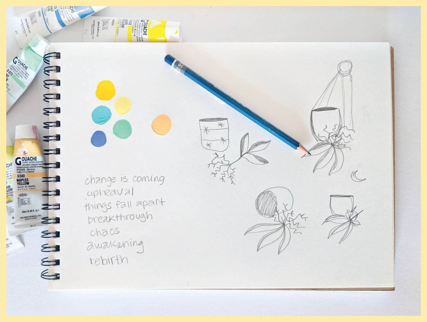
The Tower card is about upheaval and chaos. Things are going wrong in life, maybe because they weren’t done correctly from the start or because change is needed. Rebirth can be a result. Since the meaning of the card is negative with a positive twist, I decide to use chaotic imagery with a brighter color palette. I’ve sketched a few ideas with uprooted or upside-down plants. For the color palette, I’ve started with yellow hues and added in shades of blue and green.
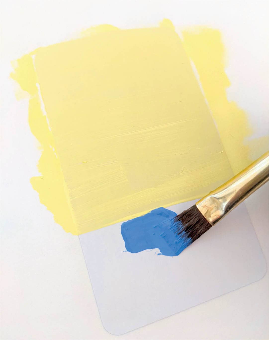
Step 2: Paint the Background
Start by painting the top half of the card a light yellow and adding a royal blue to the bottom half. You may need to do several coats, especially if the yellow comes out a little thin.
Step 3: Paint the Foreground
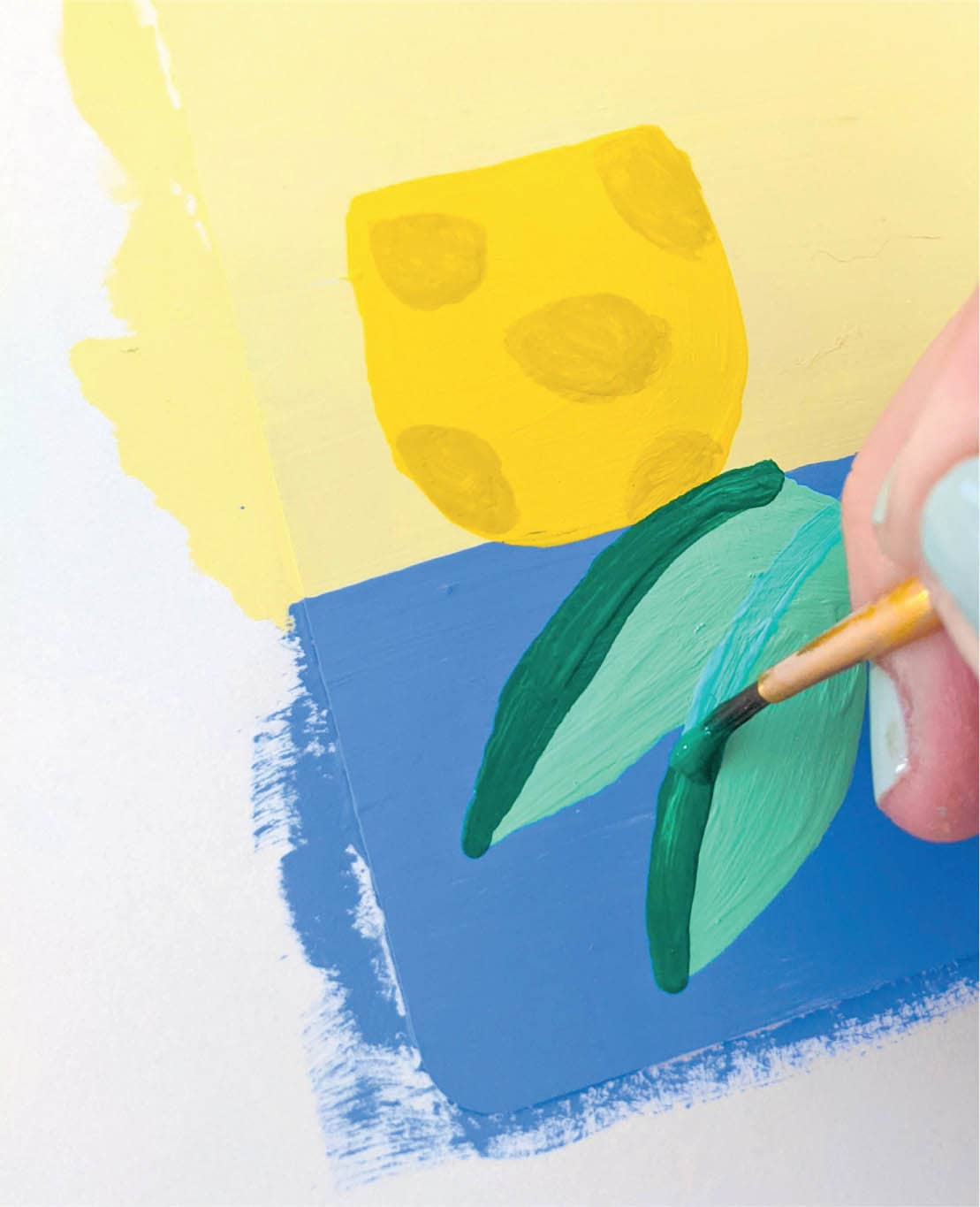
Add a deeper yellow flower pot in an upright position toward the left of the card. Make sure to save room for the uprooted plant! Next, paint leaves on the ground using mint green.
Then add some detail to the leaves with a darker green gouache, as well as monochromatic polka dots to the pot using an ash-yellow shade.
Step 4: Add the Finishing Touches
I’ve decided to paint (rather than draw) the roots of the plant. Use ash-yellow gouache and a thin brush to paint roots sticking up into the air. Then add dots to the sky using a white paint marker.
To make the composition feel more balanced, add a yellow sun in the upper-right corner.
Now the card feels complete, with just the right amount of detail. I am pleased with how it came out!
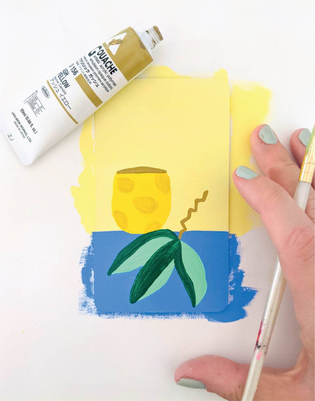
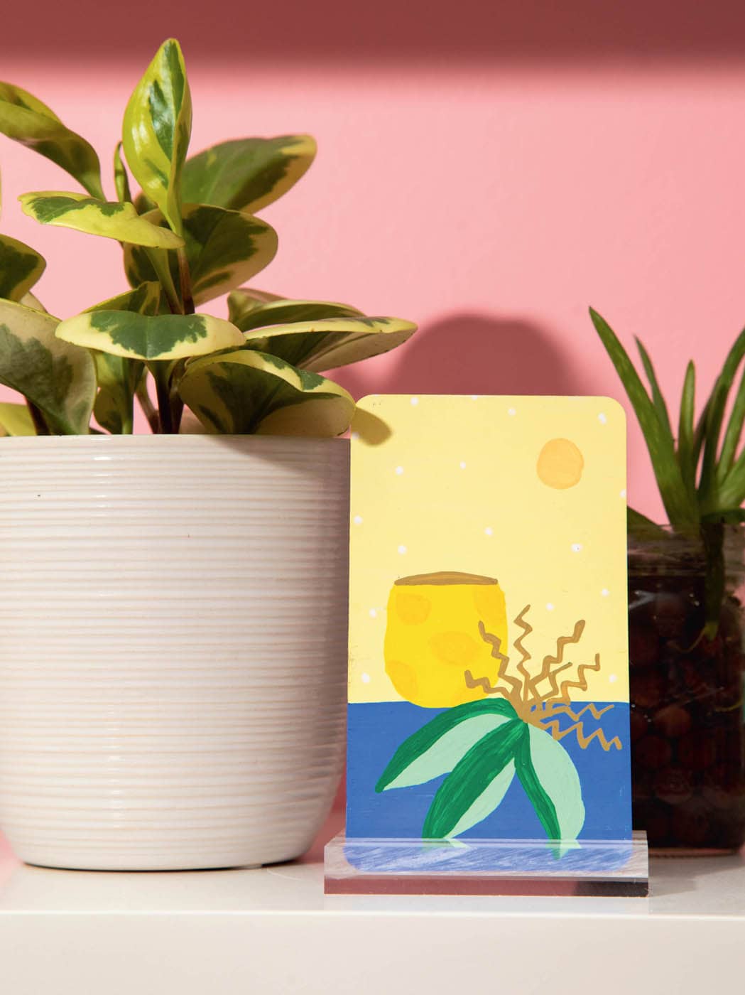
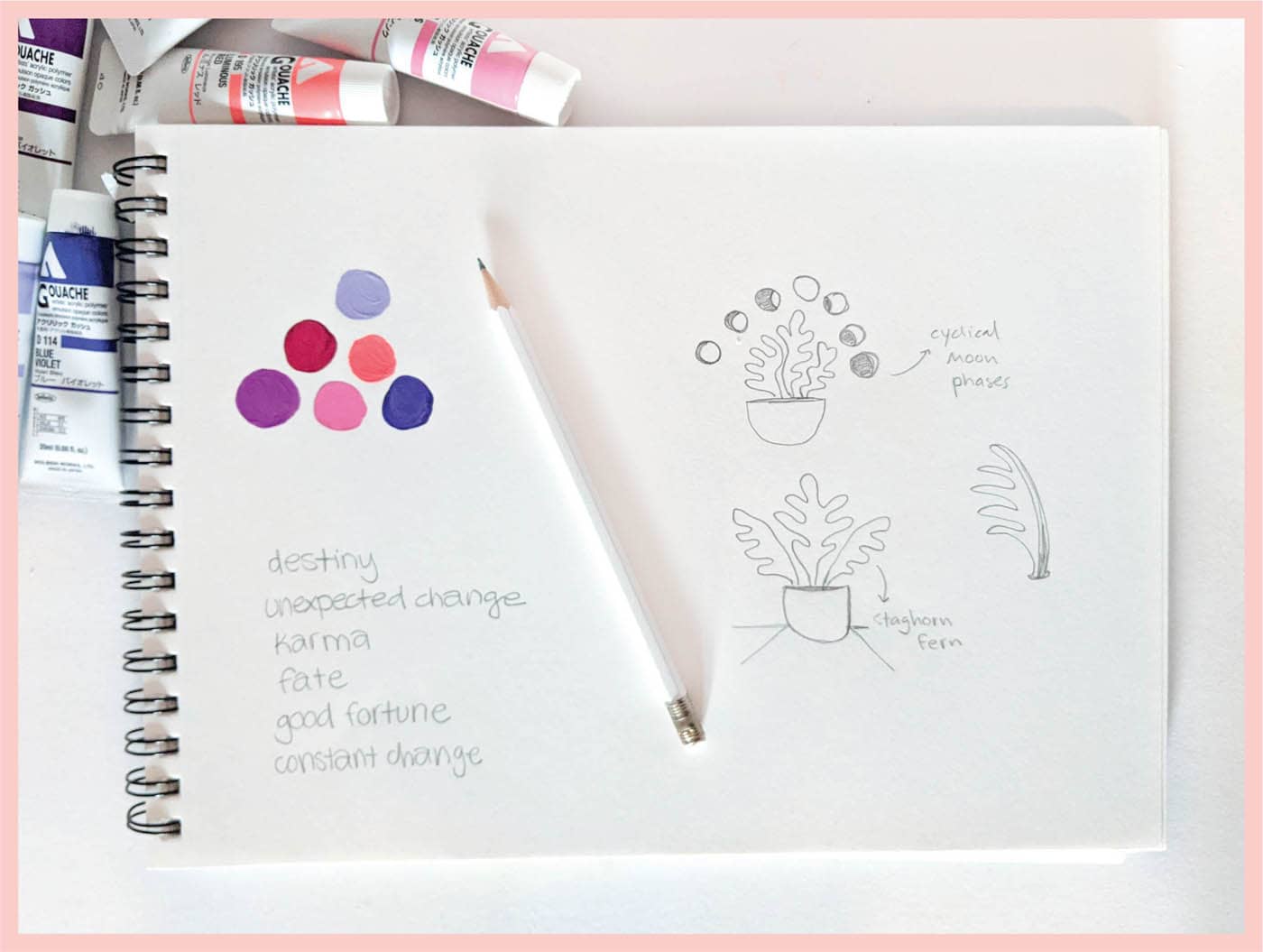
· WHEEL OF FORTUNE ·
COLOR SCHEME
Step 1: Sketch & Prep
To me, the Wheel of Fortune feels like the most mystical card in the entire deck. I want to use unexpected yet alluring colors and have settled on a bright coral with purple accents. I also want the imagery to convey an air of mystique, so I sketch out a fern plant with funky leaves reminiscent of a staghorn fern.
I choose this plant because the leaves stand out and are very funky-looking. Above the fern, I decide to add the phases of the moon, indicating cycles and the ever-rotating Wheel of Fortune.
Step 2: Paint the Background
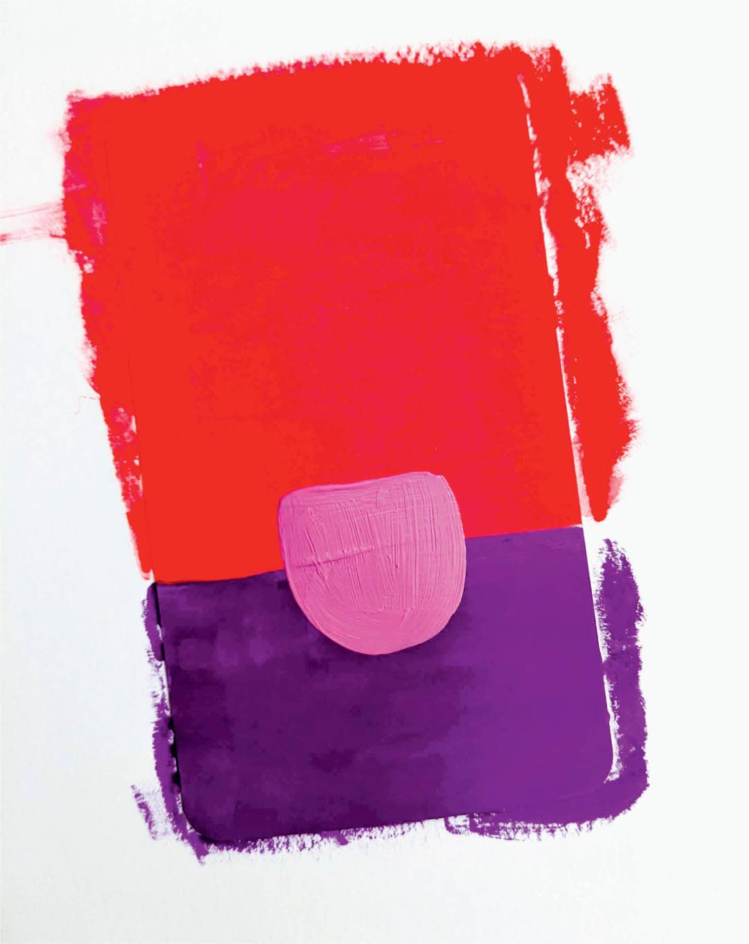
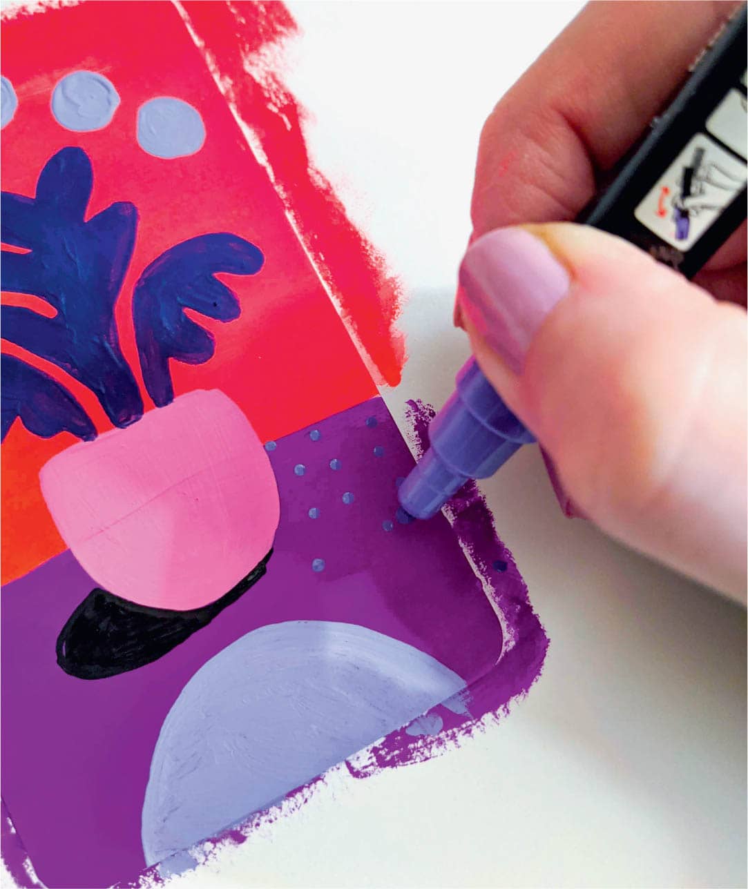
I want coral to be the dominant color, so I’ve used it for the top two-thirds of the card. For the bottom third, use a deep purple and paint a light magenta plant pot over both colors once they have dried.
Step 3: Paint the Foreground
Once the background is dry, use a thin brush to draw the outline of the fern plant. You can use a blue-purple shade of gouache for this. Then select a lilac color and use it to paint the phases of the moon above the fern plant.
Step 4: Add the Finishing Touches
Once the foreground is dry, add a shadow to the plant using a black paint marker. Sometimes little things like shadows add the perfect amount of interest to a card—especially this one, since I’m going for a mystical vibe. Paint a lilac arch on the bottom of the card to anchor the composition. Next, to liven up the large wash of deep purple, use a slightly lighter purple marker to add dots. The final (and most nerve-wracking) step is to use the same black marker to draw in the phases of the moon.
This is one of my favorite cards! I think it’s because I just love the colors and the interesting eeriness that the moons bring.
· THE HANGED MAN ·
COLOR SCHEME
Step 1: Sketch & Prep
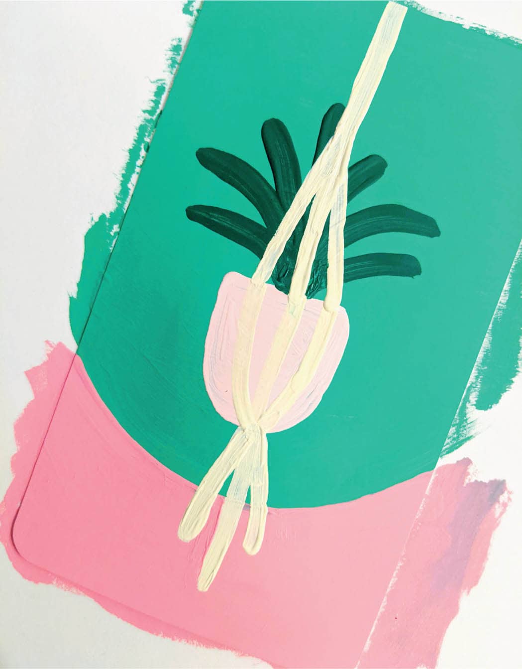
Since The Hanged Man is all about hanging out and waiting, pausing, and reflecting, I know I have to paint a hanging plant for this card. I’ve sketched possible ideas and worked on a color palette. The darker greens suggest prior stability in one’s life. Then use pink to shake things up and symbolize the new perspectives that this card can sometimes bring. Lastly, doing a plant in a macrame hanger feels just right! It’s simple, yet visually interesting.
Step 2: Paint the Background
Start by painting the bottom third of the card pink, and then add a deep emerald to the empty two-thirds. Then rotate the card and add a baby pink plant pot.
Step 3: Paint the Foreground
Next, use a dark green to paint a teeny snake plant. Use ivory for the macrame hanger and a thin brush to paint the line work. Add tassels to the bottom of the hanger, and make it extend all the way past the top barrier of the card.
Step 4: Add the Finishing Touches
Time for details, my favorite part! Use a mid-toned pink to add polka dots to the plant pot and stars to the open green space at the top of the card. Then use the same deep green from the plant leaves to add a tiny arch anchor to the bottom of the card.
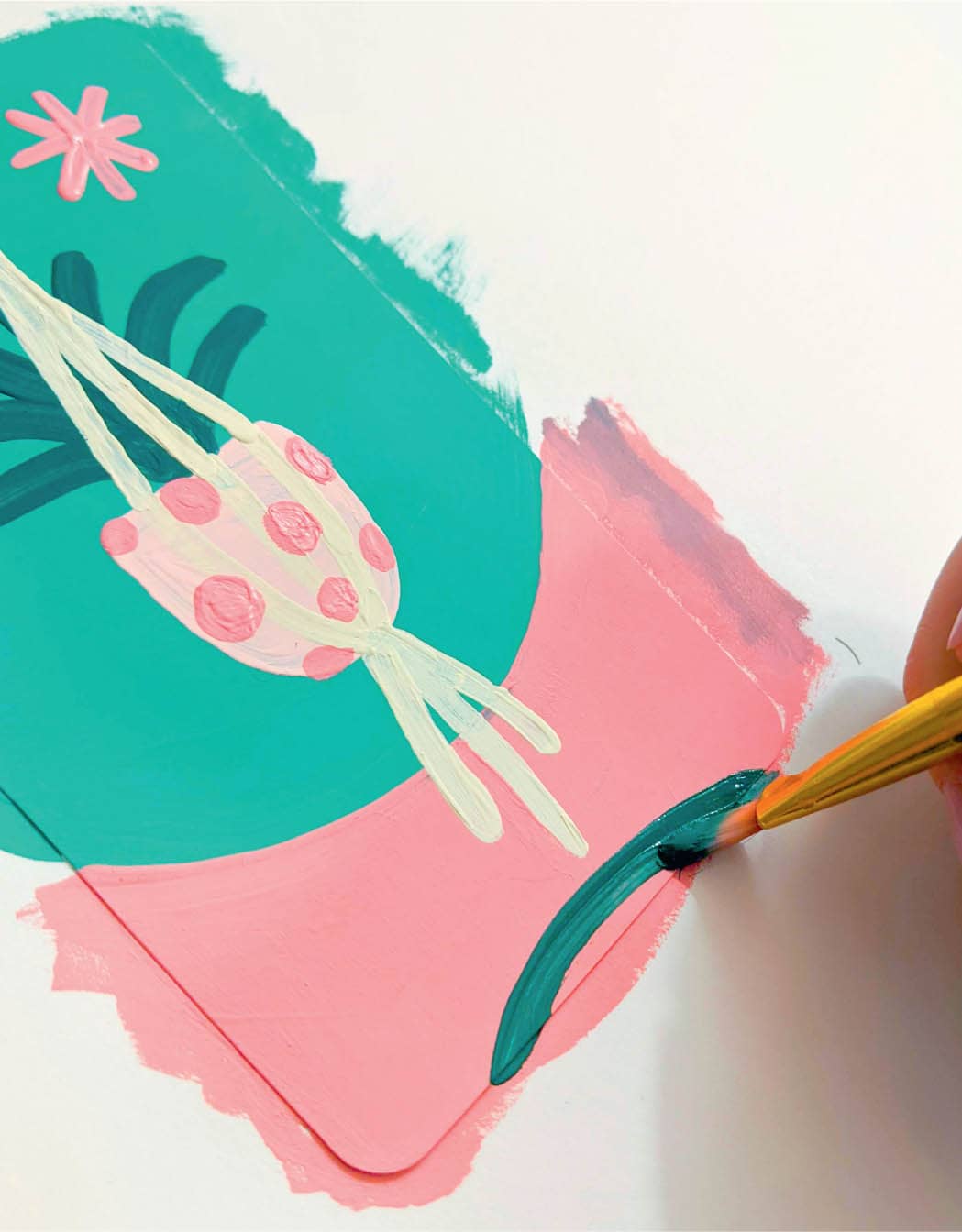

The balance of this card is pretty cool. It’s not often a plant pot can be as dynamic as this! The card is finished.
· JUDGMENT ·
COLOR SCHEME
Step 1: Sketch & Prep
I want to depict the idea of personal freedom, so I’ve sketched out a few plants with suns or radiating beams of light behind them. I want this card to feel light and bright. This is an alternate take on the Judgment card, which sometimes dredges up bad people, feelings, and negativity, but I’ve chosen to focus on the positive part—ultimate forgiveness and letting go. The colors are bright and reflect this optimism.
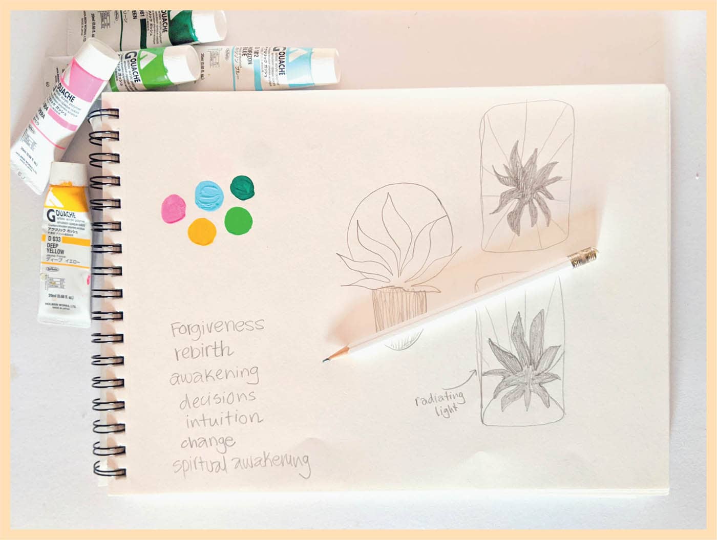
Step 2: Paint the Background
I want the plant to sit on a half-circle, so I paint that first using a sky-blue gouache. Next, add radiating beams of light with neon pink and golden-yellow gouache.
Step 3: Paint the Foreground
Once the background is fully dry, add an emerald-green plant in the center. I’m not really sure what type of plant this is; perhaps I’ve invented it! I want something large with fun leaves that will fill the space. Use a thin brush and lime gouache to add some linework once it’s dry.
Step 4: Add the Finishing Touches
The colors are pretty intense on this one, so keep the composition minimal, including the details. Use a bright pink paint marker to add lines radiating out of the bottom of the plant and a white marker to add dots to the sky.

I’m pleased with how the colors come together and with the simple composition, so this card is done!
· STRENGTH ·
COLOR SCHEME
Step 1: Sketch & Prep
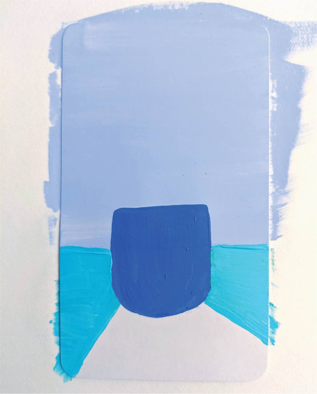
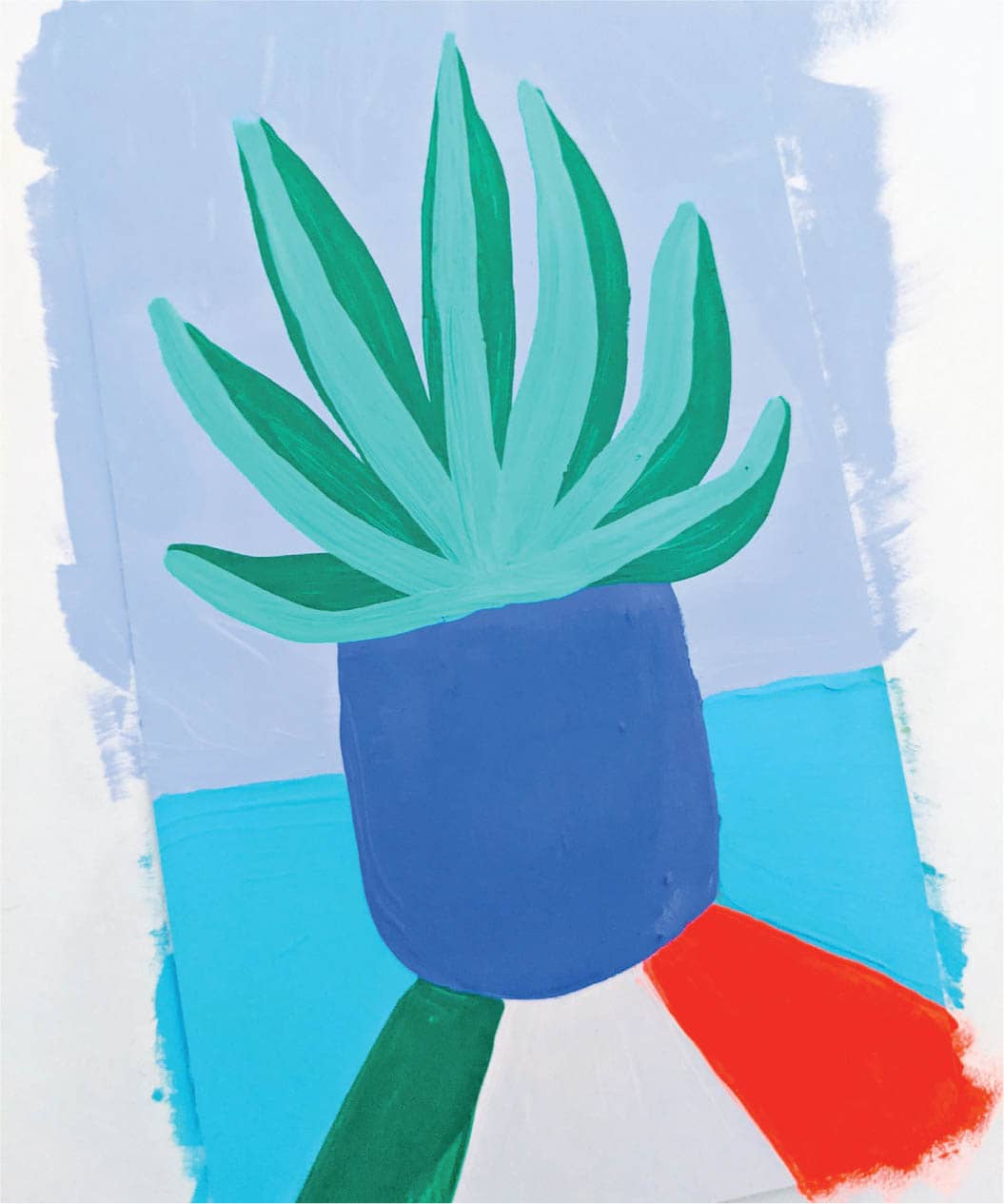
The color blue keeps speaking to me for this one, likely because it’s known to evoke feelings of calm. I’ve based my color palette off several shades of blue and added a few greens and pinks in for good measure. I decide to draw a banana leaf plant. These towering plants symbolize strength for me and are the perfect visual element for this card.
Step 2: Paint the Background
I don’t want the card to appear too dark, so I use a baby pink for the top two-thirds. Add a bright blue plant pot and paint the bottom third around it using turquoise green. Once the pink is dry, add one banana leaf in greenish-blue—getting started on the foreground a bit early!
Step 3: Paint the Foreground
Once that leaf has dried, use a true green gouache to paint another leaf over the top.
Step 4: Add the Finishing Touches
For finishing touches, use a thin brush to add pink stripes to the pot, and add a magenta sun to the upper-left corner to help balance the composition. Finally, use a lime-green paint marker to add stems to the leaves and a white marker to add stars to the sky.
· FOUR OF CUPS ·
COLOR SCHEME
Step 1: Sketch & Prep
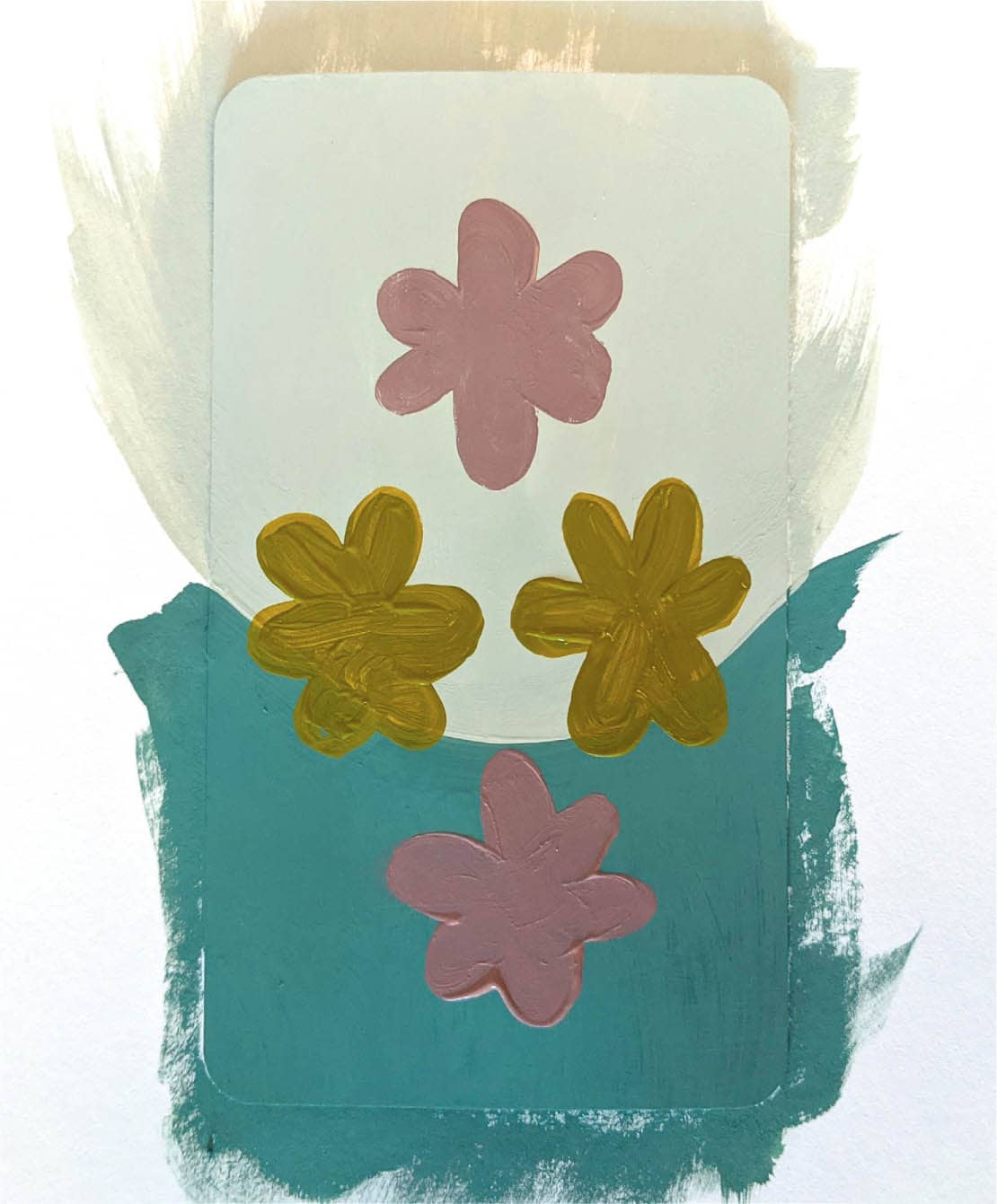
Since this card represents apathy, a muted color palette works well. Earlier in the book, I’ve discussed choosing daisies to represent the Cups suit. Daisies are typically associated with cheerful imagery, so to convey a message of dullness and disinterest, use dull, less saturated colors.
Sketch a few layouts for the four daisies. Sketching helps you plan placement when there are a lot of elements to put on a card.
Then you might choose to tape off the back of your card and adhere it to a piece of scratch paper for painting.
Step 2: Paint the Background
For the background, I’ve decided to go with a dip downward, since it feels more negative than a dip upward or a flat surface. Apply two coats of two shades of green gouache.
Step 3: Paint the Foreground
Next, paint four daisies in a diamond formation. Try to keep the side daisies equidistant from the left and right edges.
Step 4: Add the Finishing Touches
For finishing touches, use a wine-colored paint marker to add stems to the daisies. Then apply a light orange gouache to add circles to the centers of each daisy. Finally, finish the card with some white dots on the upper half of the card.
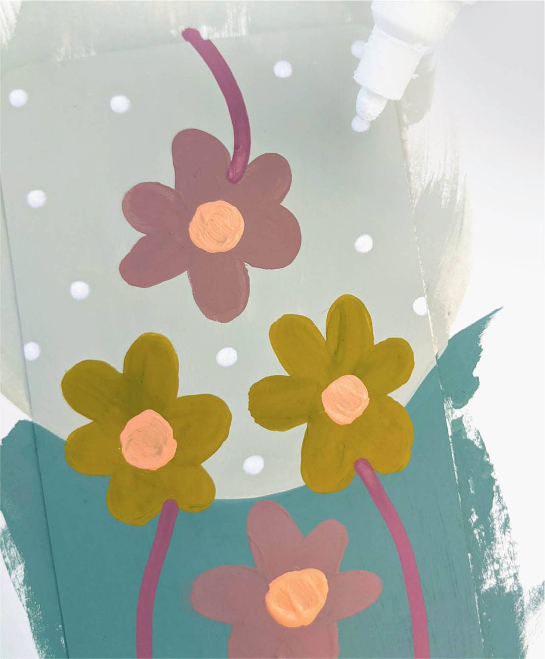
This looks like just the right amount of detail to call this card finished! If you are protecting your card, wait until the paint is fully dry before proceeding.
· TEN OF SWORDS ·
COLOR SCHEME
Step 1: Sketch & Prep
This is a tough card to paint. I have to somehow fit 10 swords into a tiny space, so sketching is a super-important step for cards like these. It’s good to form a plan in advance so you don’t have to start over or paint over your progress.
For this card, I’ve decided to lay the sword plants on top of one another. I need a composition that feels like utter defeat, and visually, this seems to accomplish that goal. In my sketch, I’ve made sure to count all 10 of the swords, to double-check that I got them all!
Step 2: Paint the Background
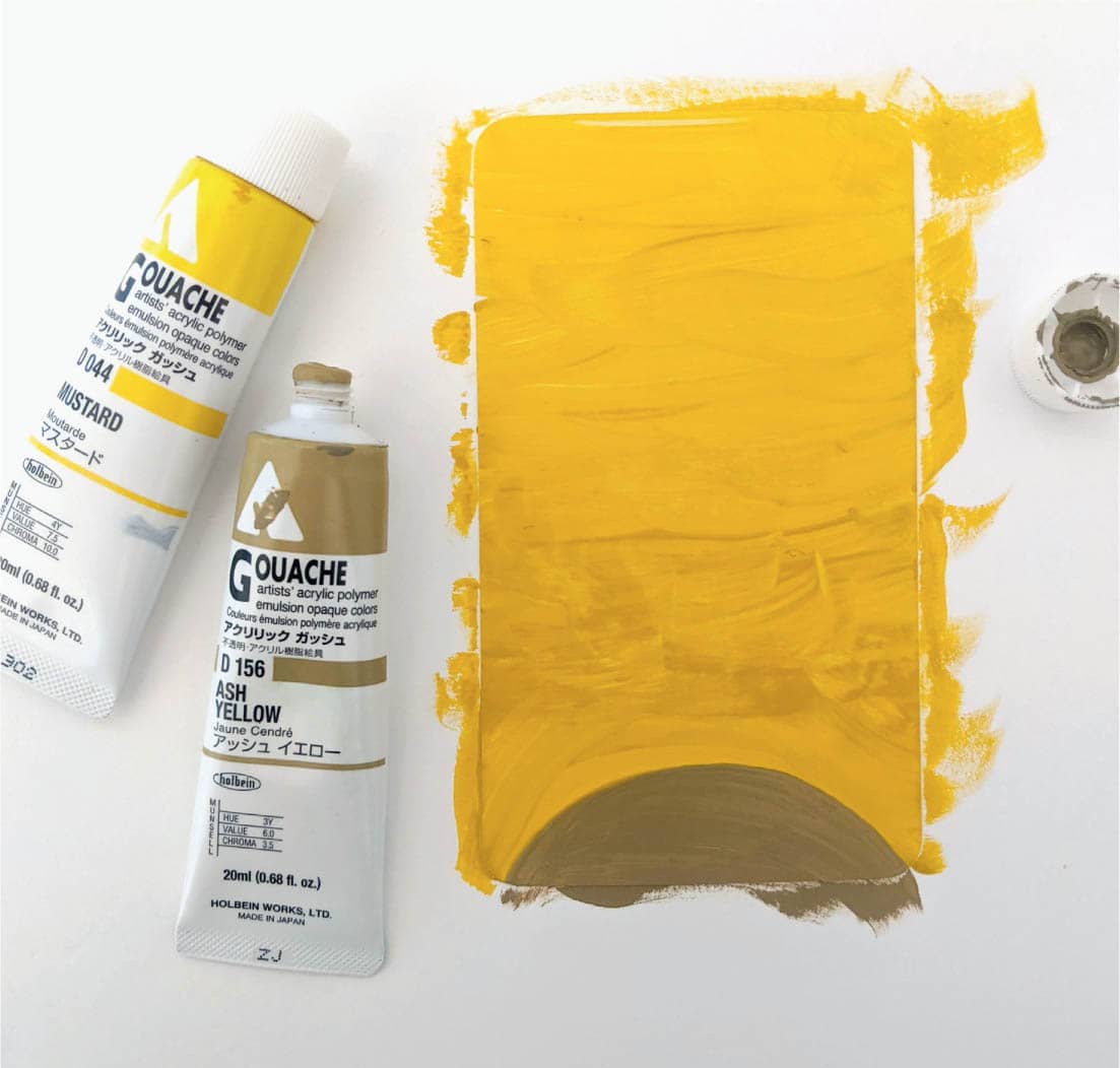
I’m using jewel tones for this card, with a focus on red. Red is about power, and since this card is about defeat, it offers an interesting juxtaposition of concepts. Power versus defeat. Begin by painting the background a mustard yellow and adding an ash-yellow anchor to the bottom.
Step 3: Paint the Foreground
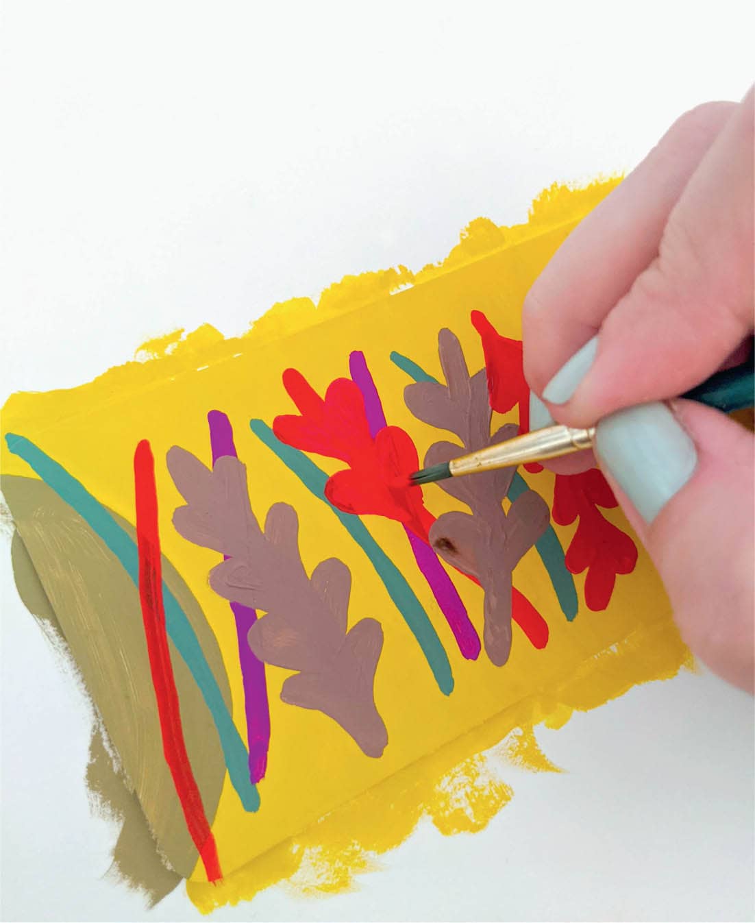
Get ready—this foreground is going to be tough. Since the sword plants have several leaves per stem, you can get the layout right by painting the stems first. Once you feel good about the stacked stems, add leaves to them. This is pretty time-consuming and may not look perfect, but the meaning comes across (which is the most important)!
Step 4: Add the Finishing Touches
Since this card is so visually complex, you can use a paint marker to add detail to each stem. I’ve chosen a fluorescent-red marker for the red stems, a green one for the green stems, a lilac one for the purple stems, and a copper one for the brown stems. This really brings the card to life!
Once the stems are done, add a neon-red sun to the top of the card.
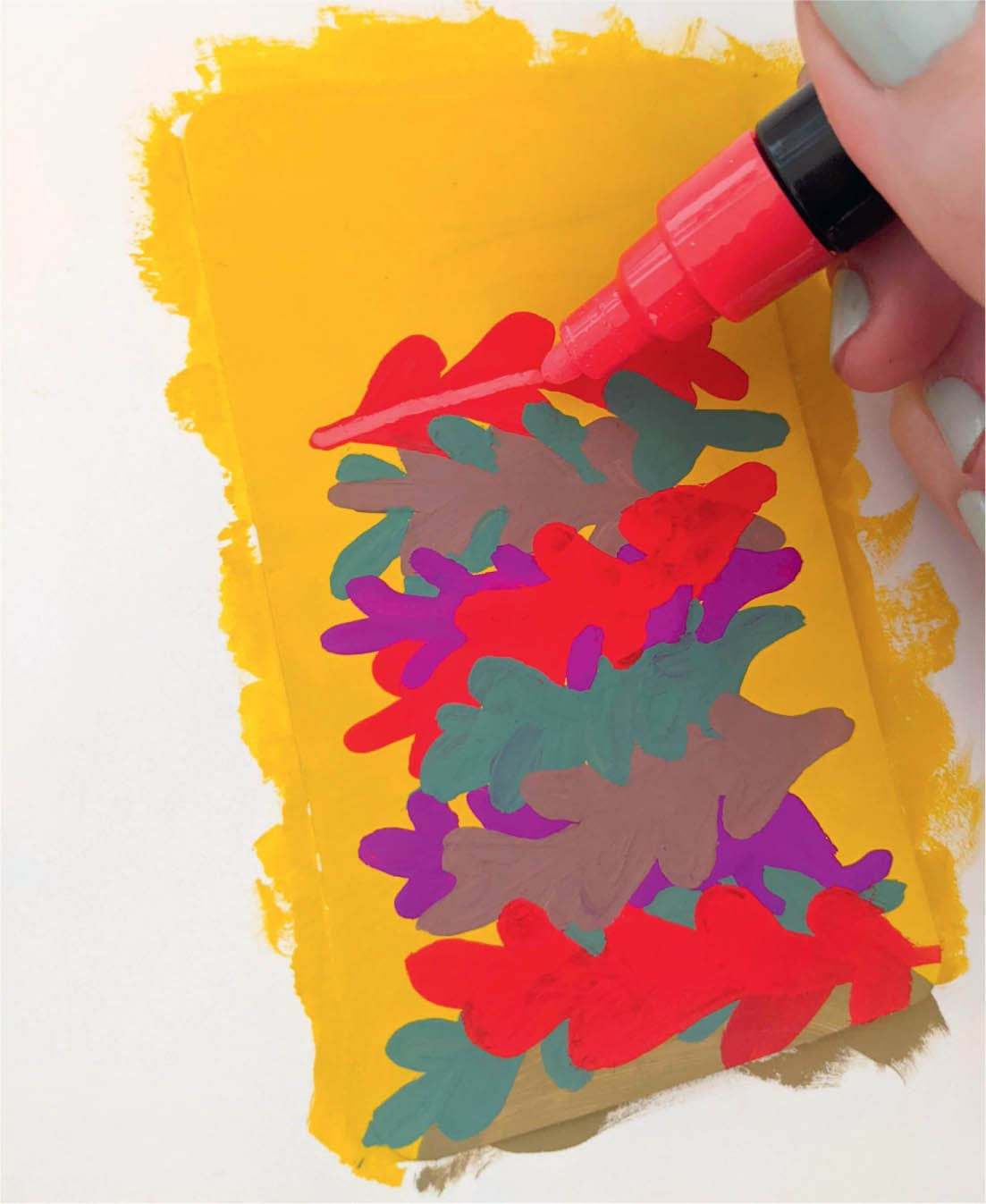
And we’re finished! Aren’t you excited that you made it through a card with 10 objects on it? They are some of the most difficult to paint, so congratulations!
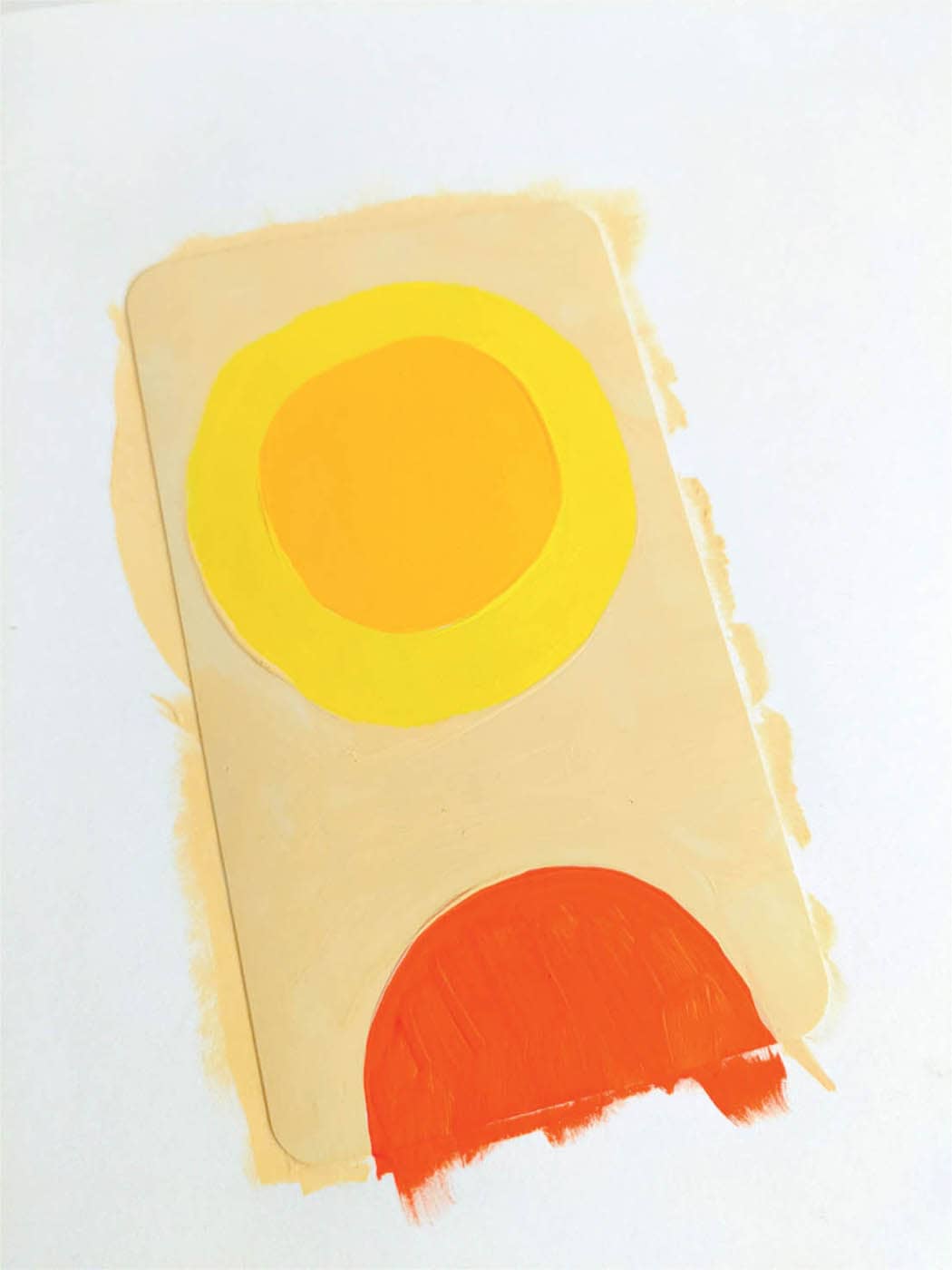
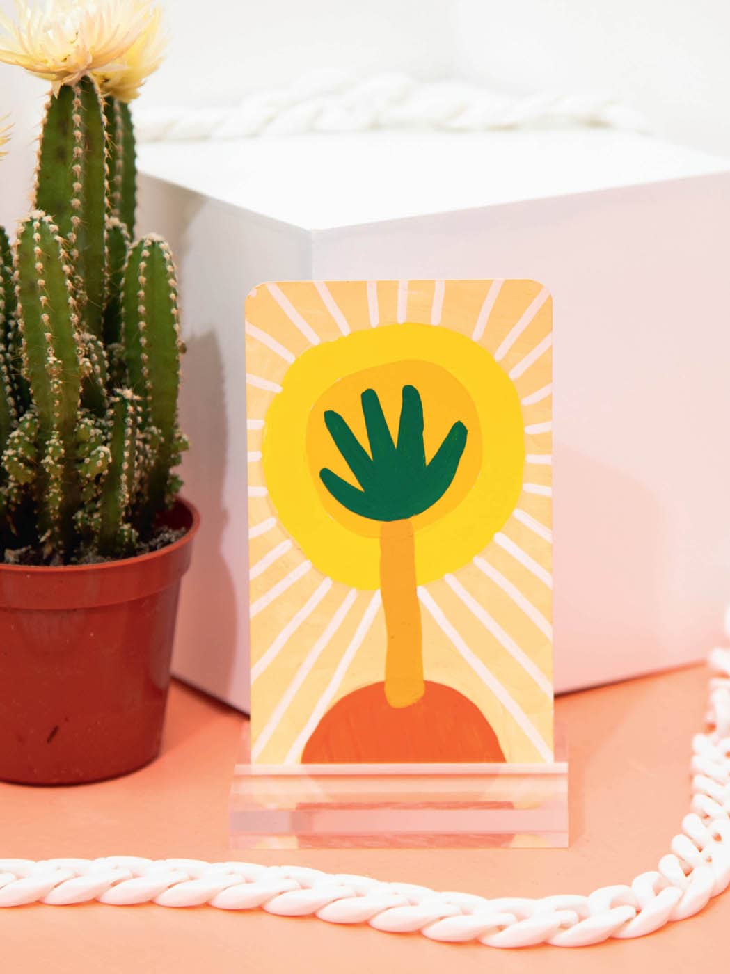
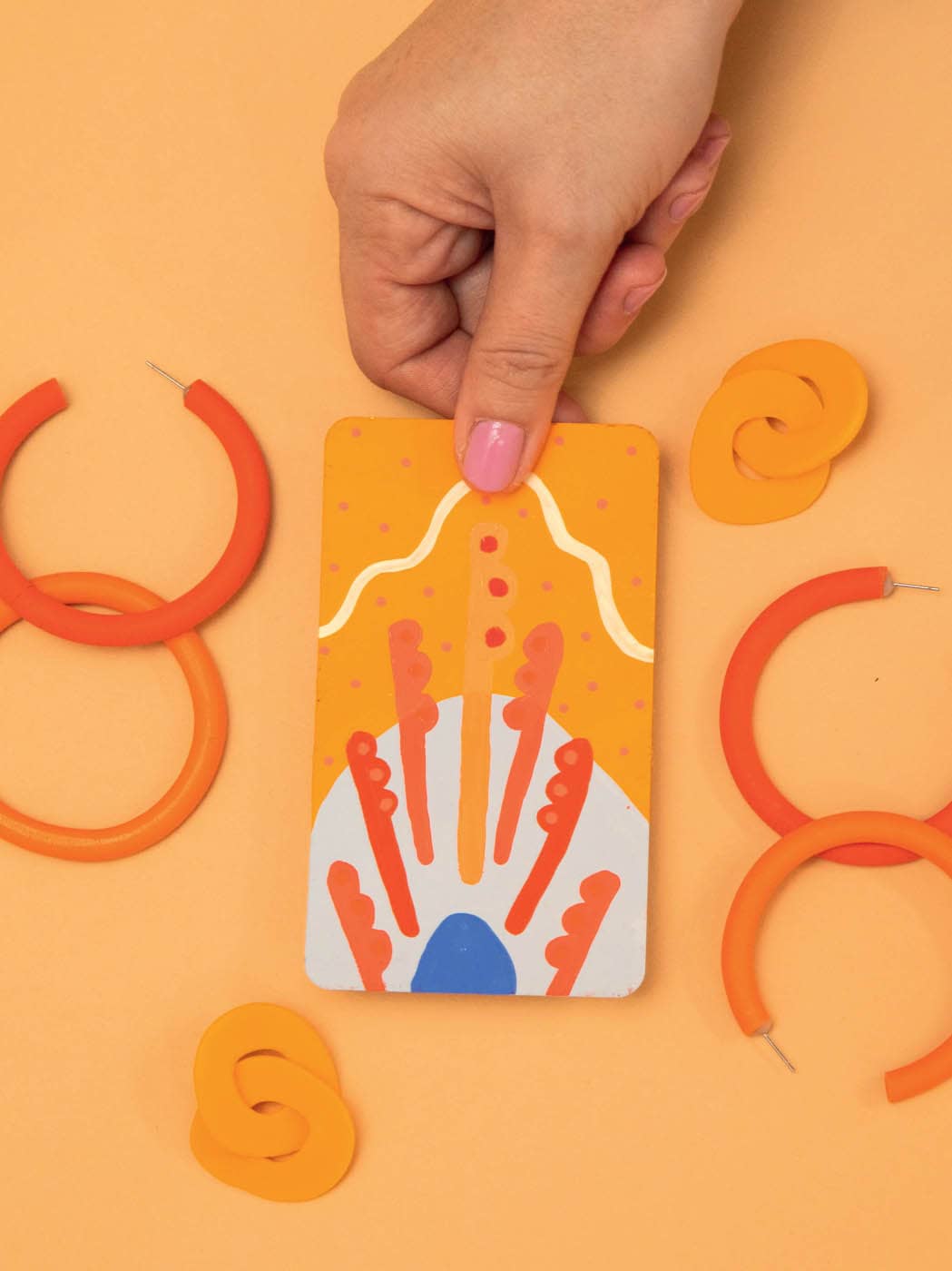
· ACE OF PENTACLES ·
COLOR SCHEME
Step 1: Sketch & Prep
Earlier in the book, I decided to use these little handlike shapes for the Pentacles suit. Since this is the Ace card, you’ll only need one of them. This card symbolizes prosperity, wealth, and new endeavors, so I think it would be nifty to put the hand shape in a yellow circle (a nod to a gold coin). It’s subtle, but I think it works! I’ve decided to use the gold coin as inspiration for the color palette, and I’ve chosen varying shades of yellow with hints of orange, red, and even a pop of green.
Step 2: Paint the Background
I’ve done something unconventional for this card’s background and started with the yellow circle—mostly because I want it to be pure yellow without risk of the background color showing through. From there, add a lighter yellow border to the circle, as well as a red anchor, and fill in the white space with Naples yellow gouache.
Step 3: Paint the Foreground
Once the background is fully dry, add the hand shape to the circle using green gouache. Attach the shape to the red anchor by creating an orange stem with a thick brush.
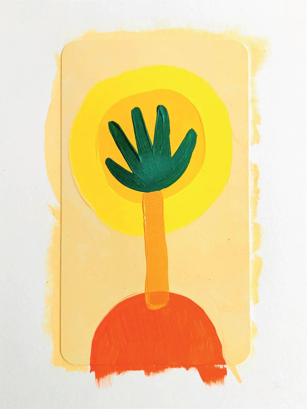
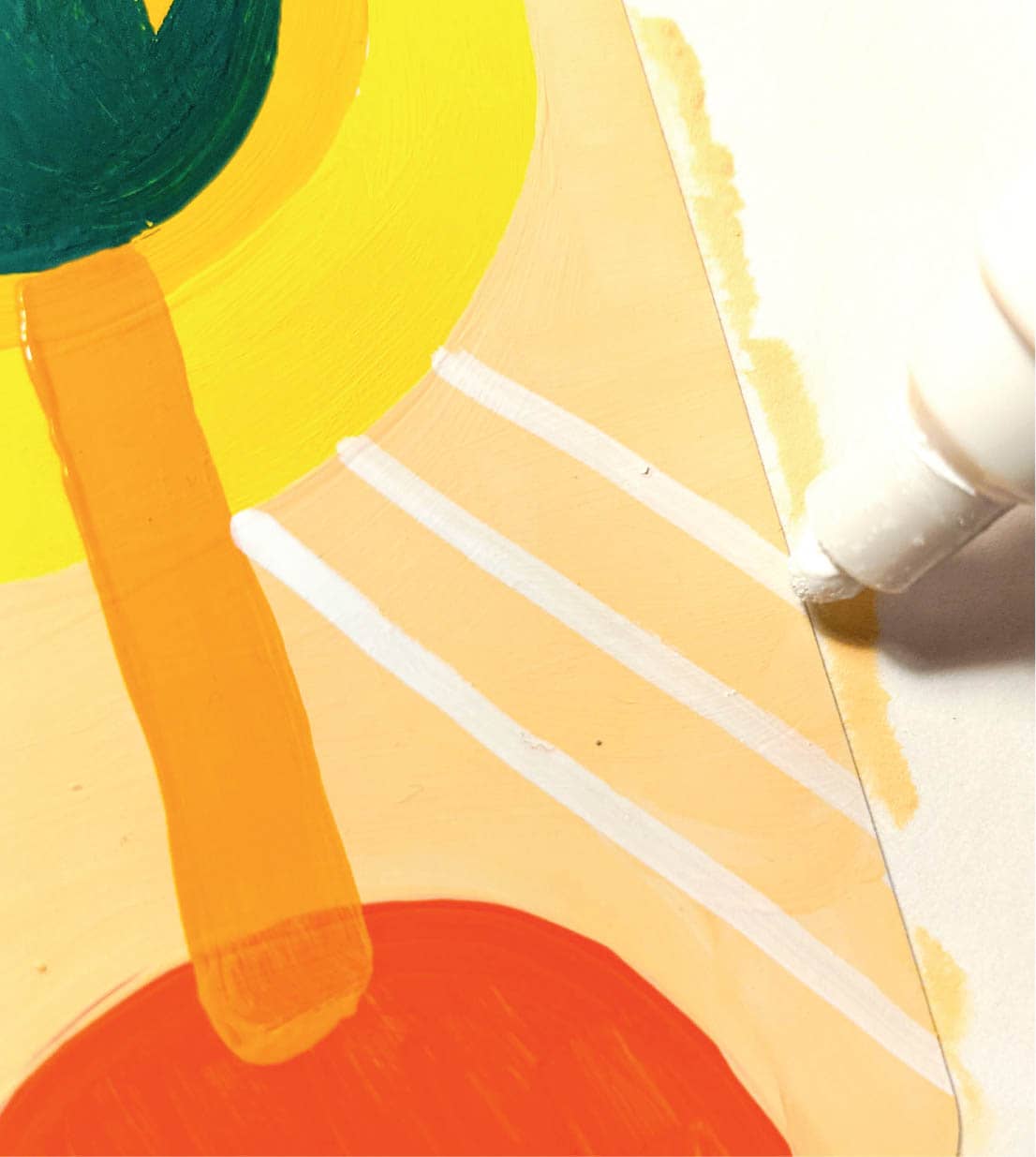
Step 4: Add the Finishing Touches
I want the card to radiate the magical feeling of ambition and success, so I’ve added lines using a white paint marker. The lines start from the lighter yellow circle and radiate off the card.
· SIX OF CUPS ·
COLOR SCHEME
Step 1: Sketch & Prep
The Six of Cups requires six different cups (or in this case, daisies) to be featured. I’ve sketched two layouts and played with a pastel color palette that’s reminiscent of childhood.
Of my two simple ideas, I prefer the one with the mountain in the background. I like the idea of seeing a distant mountain that symbolizes the past.

Step 2: Paint the Background
You can get right to work on the background. This time, I’m using three colors: the sky is a cream-yellow gouache, the mountain is pale lavender, and the ground is misty green. Making the mountains fits with the vibe of my deck. Instead of having sharp corners, the tops are rounded.
Step 3: Paint the Foreground
Time to add the “cups,” or daisies in this case. Let’s use a simple 2x3 layout, and you can get to work painting once the background is dry. The top and bottom rows have pale pink daisies, while the center row has peach daisies. I like alternating colors to add visual interest.
Step 4: Add the Finishing Touches
The details will be simple for this card: circular centers for the daisies and simple white stars in the sky. I’ve used a pale lime for the center of the pink daisies and a yellow gouache for the center of the peach ones. Add the stars with a white paint marker.
I’m pleased with this card! The pastel palette is unique and brings the nostalgia aspect of this card to life.
· SEVEN OF WANDS ·
COLOR SCHEME
Step 1: Sketch & Prep
When you get into the Minor Arcana cards with high numerals, it can be tricky to find a layout that works. As you can see, I’ve tried two layouts on my sketchpad. I think I prefer the layout on the right because it highlights the center wand, which can symbolize the self.
Since this card is about strength and difficulty, I want a muted palette with pops of bright color. I’ve chosen some muted blues and then opted for some orange tones, since orange is the complement of blue. For my bright pop of color, I’ve chosen a fluorescent orange.
Step 2: Paint the Background
First, apply an arch to the bottom of the card using misty-blue gouache. Then fill in the rest of the card with deep yellow. You may need two coats for both colors; let them dry before moving on to the foreground.
Step 3: Paint the Foreground
A card like this is tough because there are so many wands to paint! A helpful way to set up a card’s layout before you get too far along is to use lines or other simple shapes to create your composition. Since wands are linear, I’ve painted seven lines in formation and then added the round lumps to the top half. I’m working in alternating shades of red and orange; I think it looks nice against the muted blue. Use a small, fluffy brush to get the fine details.

Step 4: Add the Finishing Touches
For the details step, I’ve decided to use warm-toned paint markers. Start by adding dots to the center of each lump on the wands. Use royal blue paint to add a half-circle anchor to the bottom of the card.
To add interest to the sky area, use an ivory marker to draw a line across the card. The last step is to add a few orange stars to the sky.
· TWO OF SWORDS ·
COLOR SCHEME
Step 1: Sketch & Prep
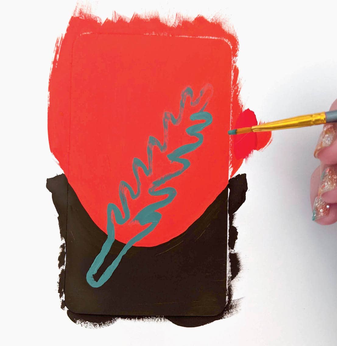
The Two of Swords is about an obstacle, and I want to convey this using the positioning of the swords themselves. These cards are small, so you don’t have a lot of room to get your message across. After trying several layouts, the crossed swords depict conflict the best. A darker, muted color palette further symbolizes the darkness and difficulty of this card.
Step 2: Paint the Background
I’ve used a bright red for the top half of the card and raw umber for the bottom half. I really want the card to look dark with a hint of intensity (the red). After the background dries, quickly paint an outline of a sword in ash green gouache. I’ve used this as a test to see if the green will show up on the background and sure enough, it does! If you’re happy with the placement of the first sword and the color, fill in the shape.
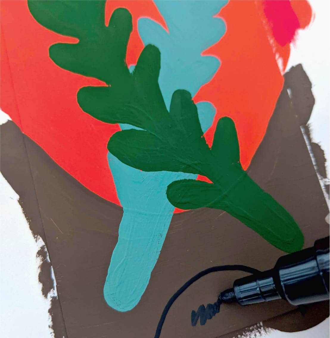
Step 3: Paint the Foreground
Technically, you started the foreground in the last step. After letting the first sword dry completely, paint the same shape over the top, forming an X shape. Once you’re happy with the outline, fill in the shape using a deep olive green. I really like the texture that’s happening on this card!
Step 4: Add the Finishing Touches
This is a pretty simple card, which may be a welcome break after doing the Seven of Wands (here-here)! Add a quick anchor (half-circle shape) to the bottom of the card using a black paint marker. I like anchors—they visually draw your eye down the card and serve as a nice finishing touch. Then add a coral sun for visual interest and to fill the space between the two swords. I really like how the sky area is in a monochromatic color scheme. Sometimes, less is more with color.
Finally, add a few black stars to the red sky.
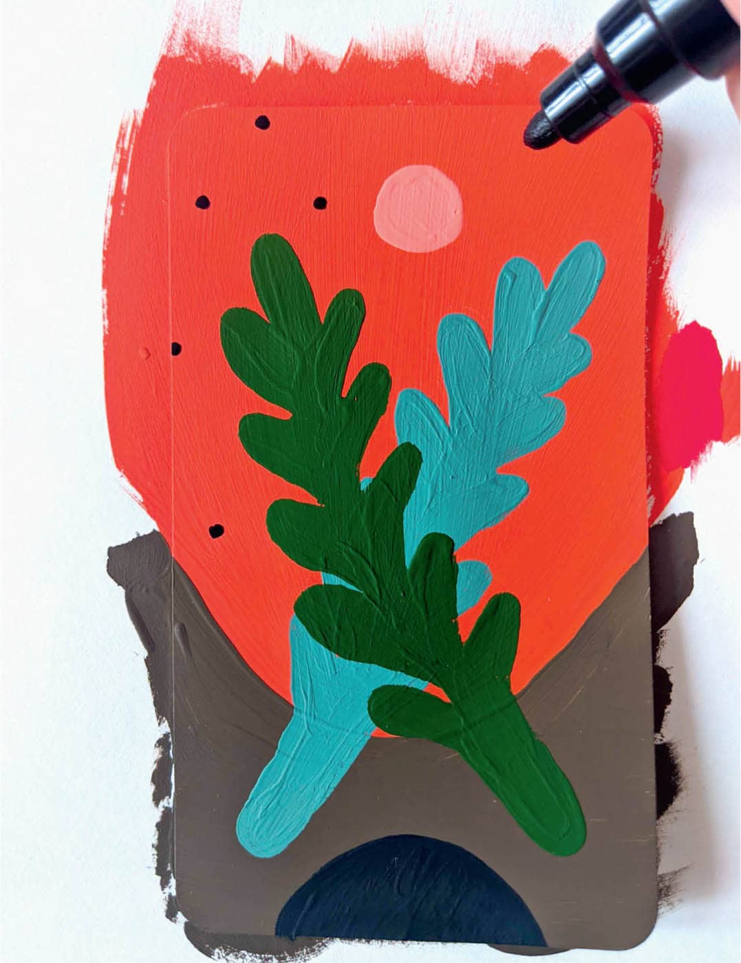
Once the stars are dry, you can consider the card finished. Even though it’s on the simpler side, the colors are bold and the imagery is powerful. Exactly what I love about tarot cards!
· PAGE OF WANDS ·
COLOR SCHEME
Step 1: Sketch & Prep
To prepare, sketch out a few ideas. I’ve decided to paint the snake plant in a pot and to change the pot depending on the rank of the card (i.e., Page, Knight, Queen, or King). Doodle a bit, thinking about the card’s meaning and testing some colors on a sketch pad.
Step 2: Paint the Background
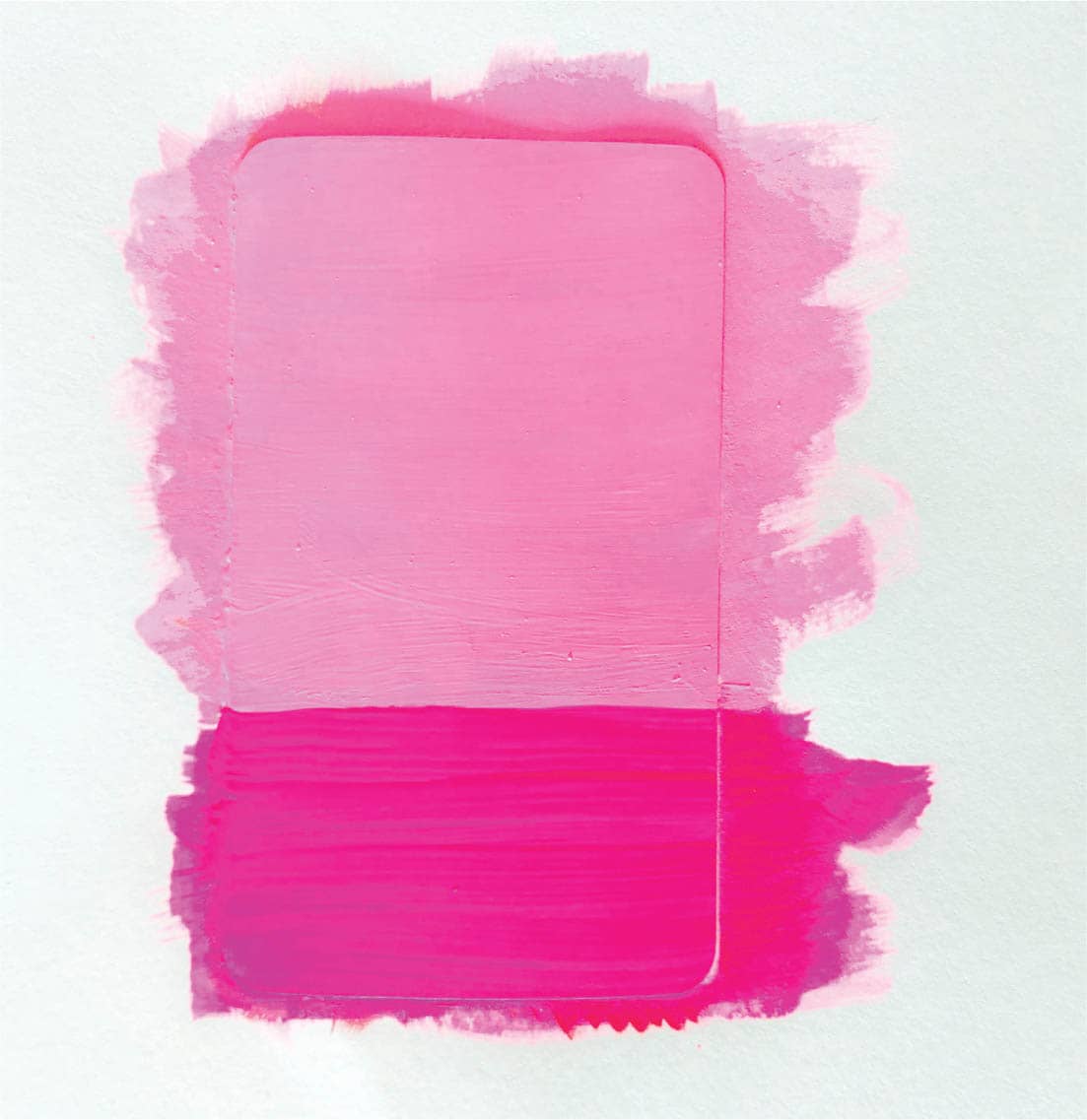
The Page of Wands symbolizes youthful energy and creative passion, so a bold color will work well for the background. I’ve chosen light pink gouache for the top two-thirds of the card and neon pink for the bottom third. Apply two or three coats if needed to even out the color. Lastly, set the card in front of a fan to dry.
Step 3: Paint the Foreground
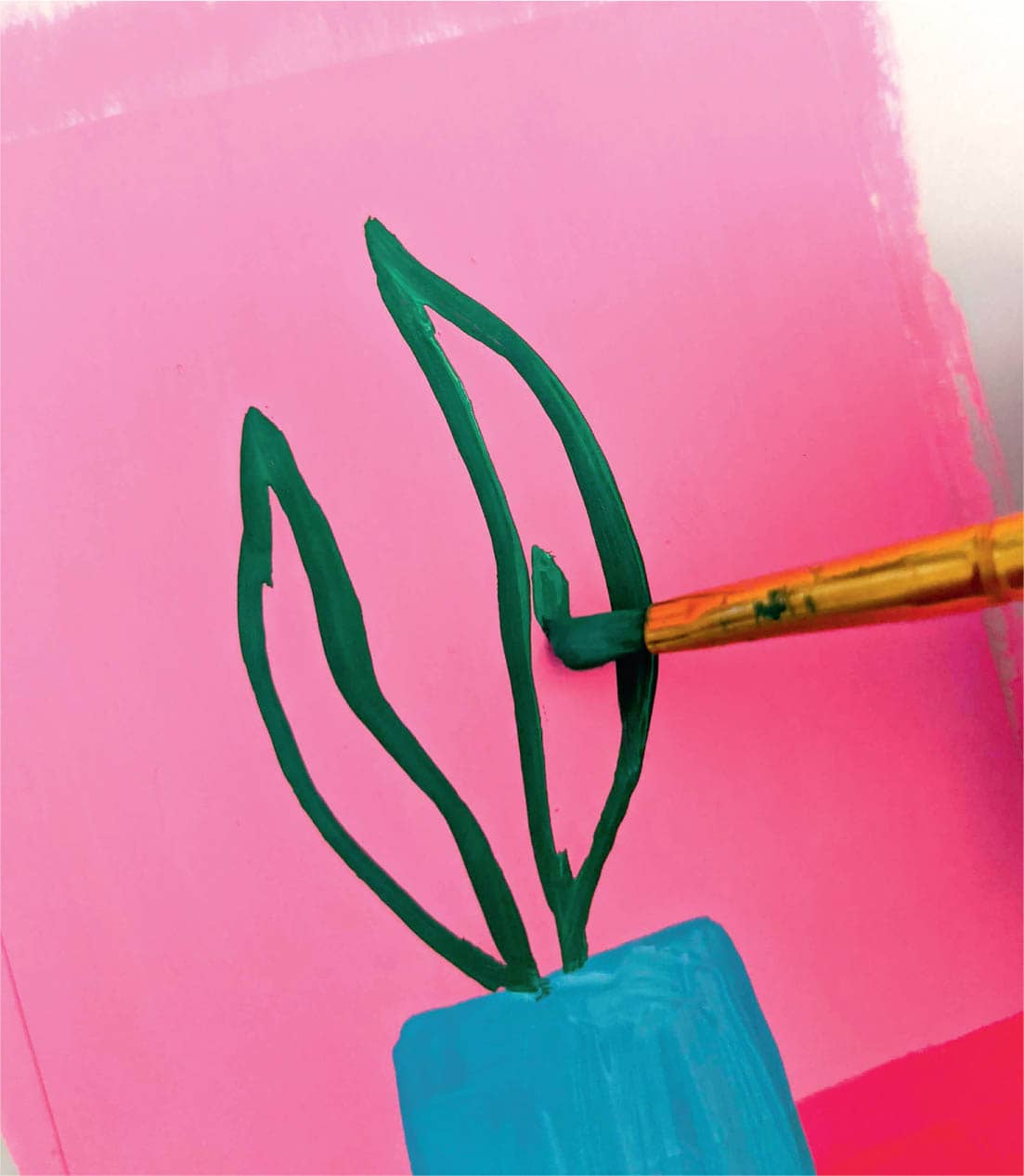
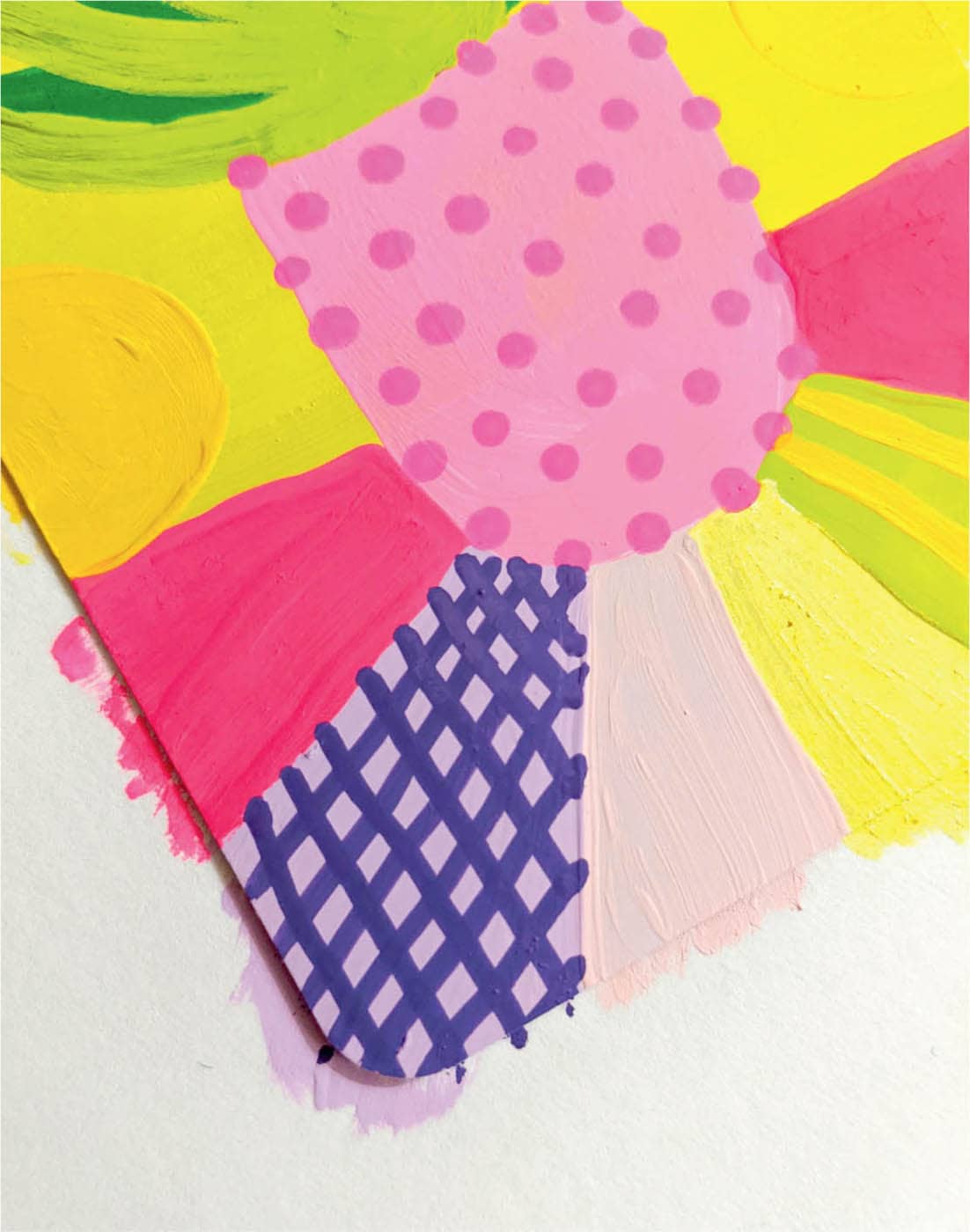
Once the background is dry, it’s time to work on the foreground. First, paint the snake plant’s pot. I’ve used sky blue to stand out on the pink background. Next, paint the leaves. The Page is the youngest in the suit, so use the plant to convey that. I’ve chosen a bright, emerald green for the plant’s leaves. To add interest to the surface the plant is sitting on, you can paint triangular washes of color in neon coral, white, and light magenta. Later, add dots to the white area. The neon coral and light magenta are simply there to add interest to the bottom third of the card.
Step 4: Add the Finishing Touches
Time for my favorite part! Details really bring the artwork to life. To add to this card’s theme of youthfulness, create polka dot details in the pink sky using a bright, golden yellow. To give dimension to the leaves, use pale lime gouache to add vertical lines. For the final step, add stripes to the planter using a lime green paint marker, as well as dots in the white area on the bottom using a black paint marker.
Once you’re satisfied with the details, your card is finished! I’m loving the bright colors on this one!
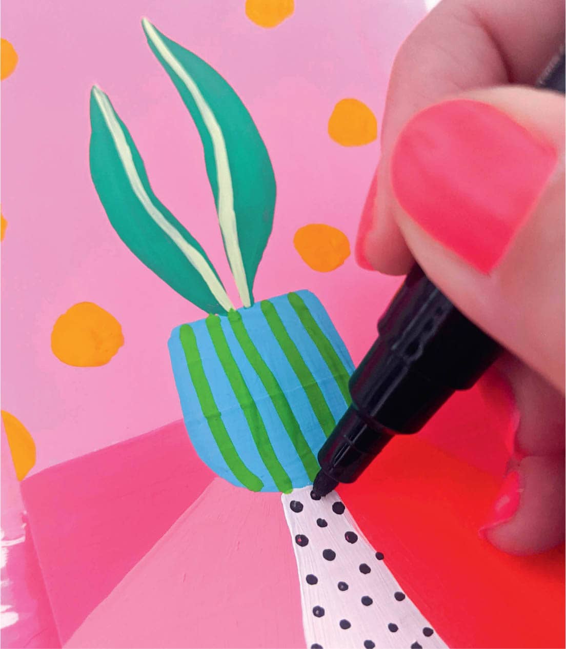
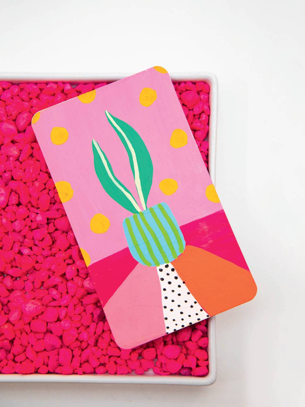
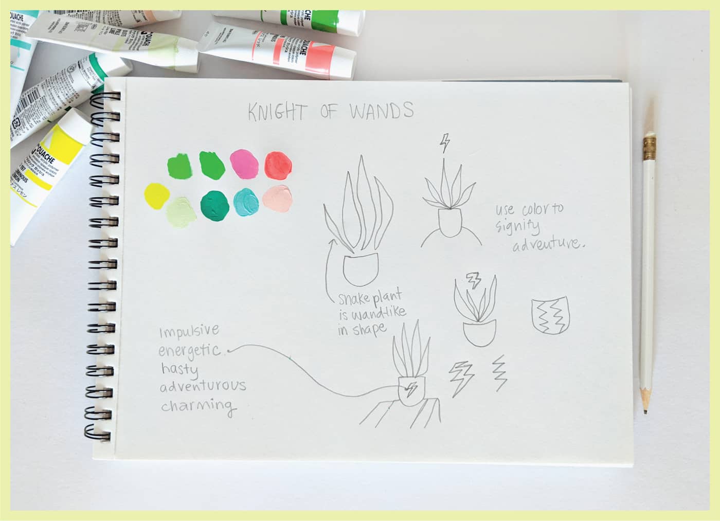
· KNIGHT OF WANDS ·
COLOR SCHEME
Step 1: Sketch & Prep
Grab your sketch pad and try some colors. The Knight is adventurous, energetic, and charming, and another bright color palette works here as well. I’ve used pink for the Page of Wands, so I’ve decided to go with blues and greens now. Since the Knight is part of the Wands suit and the snake plant was used for that suit, you can plan out a more mature snake plant with three leaves instead of the Page’s two.
It’s also fun to put lightning zigzags on the pot to represent the card’s energetic feel.
Now that you have a loose plan, you can prep the card for painting. Taping off the back of the card is optional—but a good idea if you don’t want paint to get on the back edges of your card. Once this optional step is done, you can go ahead and tape your card to a scratch piece of paper for painting.
Step 2: Paint the Background
Look at your sketch pad and choose one color for the top two-thirds, and another color for the bottom third. This background required two coats of gouache.
Step 3: Paint the Foreground
Once the background has dried, you can begin painting your foreground subject. For the Knight, it’s a slightly more mature snake plant. A neon coral makes for a fun pop of color against the teal, and three leaves complete the plant.
Step 4: Add the Finishing Touches
Always my favorite part! Jazz up the table that the plant is sitting on by adding triangular washes of color. You may need two coats for the pink color since it’s so light. Also, add a neon yellow half-circle at the top of the card to anchor it visually and add interest.
Once the second coat of pink paint has dried, add some coral dots to it.
The final step is adding a pattern to the plant’s pot. Take inspiration from the lightning bolts you drew earlier in the process and add zigzags using a sky-blue paint marker.
At this point, if you’re satisfied with the level of detail, you can call this card complete! If you are protecting your cards with varnish, tape, or lamination, feel free to do that once your card is completely dry. Once your card dries, you are finished! On to the next card!
· QUEEN OF WANDS ·
COLOR SCHEME
Step 1: Sketch & Prep
The Queen of Wands is part of the Wands court cards. Since I’ve already planned their pot designs (see here), I draw all four pots in my sketchbook for reference. I also look at the other Wands court cards (here-here and here-here) to orient myself with the composition. The Queen sits between the Knight and King in rank, so I want the snake plant to be larger than the Knight card, yet slightly smaller than the King. I also want the card to exude warmth, so I choose a warm palette of pinks, yellows, and warm greens.
Step 2: Paint the Background
Start painting the top two-thirds of the card a lemon yellow. Next, add a pink plant pot and, as with the Page and Knight cards, add radiating bands of color to the bottom third, starting with a bold pink.
Step 3: Paint the Foreground
Once dry, add the snake plant’s leaves and continue to fill in the bottom with radiating bars of color.
Step 4: Add the Finishing Touches
As planned, use a pink marker to add tiny dots to the plant’s pot. Then use a brush to apply lime-green details to the leaves. The background should be more interesting but not too bold, so you can add slightly darker yellow dots. Then do a cool crosshatch pattern on one of the sections in the bottom third.
This feels like the right amount of detail, and this card fits in with the other Wands court cards we’ve done. Looks like we’re finished!
· KING OF WANDS ·
COLOR SCHEME
Step 1: Sketch & Prep
I’ve done a quick sketch of a really large snake plant in a pot, knowing that the King plant must be the largest of all. I want to give the plant’s pot a unique design that’s different from the Page, Knight, and Queen’s. I’ve settled on large polka dots because I think they will draw attention in a nice way. I’ve also grabbed the Page (here-here), Knight (here-here), and Queen (here-here) cards for reference; I want to make sure the King will fit into the suit by following a similar composition.
Go ahead and tape off your card’s back, if you are doing that, and adhere your card to a piece of scratch paper for painting.
Step 2: Paint the Background
The King of Wands is dominant and creative, but also stable and wise. To me, feelings of calm are best expressed with the color blue. Therefore, I begin with a pale-lavender gouache for the upper half of the card. Once this layer of color has dried, add a blue plant pot and accent the sides with sky blue (similar to the Page, Knight, and Queen cards).
Step 3: Paint the Foreground
Once the background dries completely, begin adding the snake plant’s leaves. Add as many as you can comfortably fit since we are going for a dominant look. Add mint green to the leaves to give them dimension, and also begin to work on the surface on which the pot sits. Like the Page, Knight, and Queen cards, add a triangular wash of bright color. Neon coral is unexpected and adds some flavor to an otherwise calm color palette. Fill in two other triangular washes of color with green and white.
Step 4: Add the Finishing Touches
Now is the time to make this card a bit more fun! Use a blue paint marker to add dots to the sky in slightly different sizes. Then add small dots to the white area in the foreground. Finish up the card by adding pink dots to the plant pot and going over the edges of the plant’s leaves with a green paint marker.