
In this chapter you take a look at XAML, where it is from, and how it relates to .NET code. While you will gain a basic understanding of the markup, remember that one of the goals of Expression Blend is to remove the need for a user to actually have to create large amounts of hand-coded XAML. I obviously recommend learning XAML to a very detailed level. There are scenarios in which WPF and XAML support certain actions, but the Blend UI does not yet implement those scenarios, such as Ancestor Template binding. The good news is that most of these scenarios are advanced, so understanding the base level of XAML and the XAML that Blend produces is certainly a great starting point.
In order to perhaps appreciate XAML, we should take a look at how its great granddaddy XML came along and changed the world of computing.
I bet a lot of you didn’t know (including me until I researched it...) that XML (in its initial format) was actually created back in the late 1960s. It was called GML (General Markup Language) back then, but was used only for documentation systems in IBM.
Apparently when it was brought into use by the ISO standards people in 1986, they named it SGML, and away it went from there. HTML, the cornerstone of the web is a derivative of SGML as it was universally agreed to be one of the best ways of sharing text-based data.
XML is a descendent of the original SGML, taking some three-quarters of its functionality, but also reducing the complexity of the SGML structure by around 80%. XML was designed (as was SGML) to allow the creation of other derived language scripts, but realistically the format stayed very similar regardless of which derivative you use today. XML, HTML, XHTML: They all use a tag system to declare objects and/or elements, or in the case of XAML, to declare objects in design time as well as providing a mechanism to set the properties and event handlers of those respective objects.
So if you hate looking at XML, then you are going to wince when you go to do some hand cranking of your XAML markup because that is what XAML really is. Still, despite all my original views about working with an XML derived script, I must admit that XAML is starting to win me over.
Maybe it’s just that I like all the possible syntax colors of the Visual Studio coding environment—who knows?
When we talk about elements in XAML, we are looking at the complete block of markup as it refers to an object.
For example, the markup listing in Listing 4.1 shows the declaration of a button, with some properties set as well as a reference to the Click event. Figure 4.1 illustrates how the coding appears in the Objects and Timeline panel.
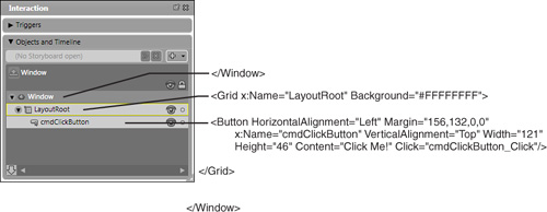
Note, in Figure 4.1, how each element in the Objects and Timeline category is related based on its position within the parent element; for example the entire Button element is inside the <Grid ...> and </Grid> tags.
The very first element is the Window, which is referred to as the Root element of type System.Windows.Window. The Root element is where all the reference declarations for this XAML file are added, which enables the rest of the file to adhere to specific formats as well as to contain references to other objects, including CLR objects (via their namespace) that you may create.
Two important areas within the Root elements XAML markup (which are not shown in Figure 4.1) are the default namespace and the referred namespaces that are specified in the following attributes:
xmlns="http://schemas.microsoft.com/winfx/2006/xaml/presentation"
xmlns:x="http://schemas.microsoft.com/winfx/2006/xaml"
These two declarations, the first being the default (no colon after xmlns) tells the compiler that all the elements within this XAML file are WPF elements. The second is a special namespace that ensures certain XAML utilities are included before compilation is attempted. It also allows other child elements (like the button element in Listing 4.1) to use these special features, for example, object naming.
If you look closely at Listing 4.1, you should be able to see the properties that have been set, as well as the declaration of the Click Handler event. In point of fact, if we wanted to create this same button in code it would look similar to Listing 4.2.
Example 4.2. The .NET Equivalent to the Previously Shown XAML Button Declaration
Button cmdClickButton = new Button();
            cmdClickButton.HorizontalAlignment = HorizontalAlignment.Left;
            cmdClickButton.Margin = new Thickness(156, 132, 0, 0);
            cmdClickButton.VerticalAlignment = VerticalAlignment.Top;
            cmdClickButton.Width = 121;
            cmdClickButton.Height = 46;
            cmdClickButton.Content = "Click Me!";
            cmdClickButton.Click +=new RoutedEventHandler(cmdClickButton_Click);

this.LayoutRoot.AddChild(cmdClickButton);When an element block is added inside another element block (such as the Button element inside the Grid element in Figure 4.1), the outermost element (the Grid, in this case) is referred to as the Parent element.
The term Nested means that a tag is placed between the opening < and terminating /> of an element, so for example:
<Tag1>
    <Tag2/>
</Tag1>
You would say, in this example, that Tag2 is a nested element of Tag1; Tag1 is the parent.
In Listing 4.3 you can see that a Button element is added inside a Border element, which, in turn is inside a Grid element, which also has a parent Grid element.
So does this mean that a control, such as a Grid, can be either a Parent or a Child? Certainly. Control types, such as Grid, allow other controls to be embedded inside them. This is generally referred to as a child collection. Other controls, such as ListBox, have specific child elements. For example, ListBoxItem controls can be used as the child items to display in the ListBox.
For children to be accepted by the .NET compiler, the parent object must implement either the IAddChild or ICollection interface or an error will be raised when you go to build your project.
If you go back to Listing 4.2, notice the last line of code:
this.LayoutRootAddChild(cmdClickButton);
The AddChild method is defined by the IAddChild interface for the Window object, which is implemented within the inherited class System.Windows.Controls.ContentControl, from which the System.Windows.Window class inherits.
Examine the markup in Listing 4.4. From it, you will get the complete picture of the parent/child/children scenario, where the Grid is the parent, the ListBox is the child and the ListBoxItem(s) are the children. The result is illustrated in Figure 4.2.
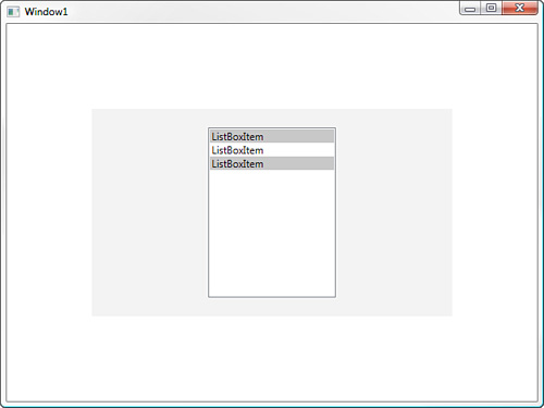
Example 4.4. Creating a Simple Embedded ListBox
<Grid
    Margin="100,100,100,100"
    x:Name="gridParent"
    Background="#3ACCCCCC">
    <ListBox
        HorizontalAlignment="Center"
        x:Name="listBoxChild"
        VerticalAlignment="Center"
        Width="150"
        Height="200"
        IsSynchronizedWithCurrentItem="True">
        <ListBoxItem
            x:Name="listBoxChildren_1"
            Content="ListBoxItem"
            Background="#FFC8C8C8"/>
        <ListBoxItem
            x:Name="listBoxChildren_2"
            Content="ListBoxItem"/>
        <ListBoxItem
            x:Name="listBoxChildren_3"
            Content="ListBoxItem"
            Background="#FFC8C8C8"/>
        </ListBox>
</Grid>
Because we named all the items (the parent, the child, and all the children), we can now refer to them directly in code to set properties during runtime in the following manner:
this.listBoxChildren_1.Content = "The first item";
By default when you add new objects within Expression Blend, those objects are not named; but this does not stop you from referring to the index item from the collection of children held by the ListBox object as is shown in the following:
(this.listBoxChild.Items[0] as ListBoxItem).Content = "The first item";
Attributes within XAML either refer to object properties or events as we have seen in Listing 4.1. Object properties and events are usually shown without any such qualifiers such as x: and are interpreted by the compiler as being relative to the elements that they reside in.
Now, you may be thinking that so far we have set pretty basic property values and wondering what you would do if your property was something other then a string, as it would appear that we are using strings exclusively to set the properties. The truth is that XAML uses the .NET TypeConverter extensively to ensure that the value of a string can be and is converted to the required value type.
Examine the markup in Listing 4.5 and compare it to Listing 4.4. Note the changes made to the Background property of listBoxChildren_1—the Brush type is set to a gradient.
Example 4.5. The Nested Element Syntax Required for More Complex Properties
<ListBox
    HorizontalAlignment="Center"
    x:Name="listBoxChild"
    VerticalAlignment="Center"
    Width="150"
    Height="200"
    IsSynchronizedWithCurrentItem="True">
    <ListBoxItem
        x:Name="listBoxChildren_1"
        Content="ListBoxItem">
        <ListBoxItem.Background>
            <LinearGradientBrush
                EndPoint="1,0.5"
                StartPoint="0,0.5">
                <GradientStop
                    Color="#FF828282"
                    Offset="0"/>
                <GradientStop
                    Color="#FFFFFFFF"
                    Offset="1"/>
            </LinearGradientBrush>
        </ListBoxItem.Background>
    </ListBoxItem>
</ListBox>
The interesting area to look at in this listing is the line:
<ListBoxItem.Background>It shows the dotted (or period) notation, which tells the compiler that this is a property and not a nested child element, for example:
<Object.Property>
Markup extesions play a very important role in XAML as they allow you to specify how the compiler should handle more complex property values.
Typically, the curly braces {} are used to implement an extension, and the type of extension is what is declared directly after the opening brace. Markup extensions allow you to add references to other objects so the value provided to attributes (such as an item’s text value or color) can be dynamic in nature, as opposed to a hard-coded value.
There are a number of extensions available, with the most common being located in the XAML namespace. So, you use the extensions with the x: prefix. Listing 4.6 shows a common extension in action—the Static extension.
Although in this case, we know what the value is, static or dynamic values supplied in the extension enable you to supply value types to your properties in the scenario in which you don’t actually know what the runtime value will be.
DynamicResource is also an extension type and is used here to specify that the property value should change as the value changes. Because the markup specifies a SystemColor, when the user changes the system colors via theme or additional settings, this Grid’s Background property will change to match any new value.
The following markup again uses an extension to specify that the property will be set to Null.
<Grid Background="{x:Null}"/>As another example, you may create a brush (using the Blend interface or directly in XAML) that you want to apply to every visual elements Background property throughout your application (see Listing 4.7). Instead of having to type out all the Brush properties for each element, a method is needed to refer to the Brush object and apply it to the elements as a resource.
You can clearly see that the markup has defined a brush of type SolidColorBrush and set the Color property value. You will also note that we have given the resource a Key value (x:Key="RedBrush"), which we will refer to shortly.
When applying this resource to a grid, use the following markup extension:
<Grid Background="{DynamicResource RedBrush}"/>To apply this resource in code, first find the resource by Key value, and then apply it to the property as shown in Listing 4.8.
Example 4.8. Creating a New Grid During Runtime
//Define a new Grid object
Grid GridTest = new Grid();
GridTest.Height = 100;
GridTest.Width = 100;
GridTest.Margin = new Thickness(20, 20, 20, 20);

//Add the new grid to the LayoutRoot
this.LayoutRoot.Children.Add(GridTest);

//Apply the Brush Resource
Brush ResourceBrush = Window.FindResource("RedBrush") as Brush ;
GridTest.Background = ResourceBrush;
Without going into too much detail at this stage, let’s take a look at the Binding extension, which enables powerful data binding within XAML and WPF. Chapters 12 and 13, “Templates” and “Data Binding,” respectively, go into more detail about how to use data binding in your applications.
Add the markup in Listing 4.9, and then run the application. Your result should resemble Figure 4.3.
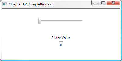
You should replace all the markup in your application from “<Grid x:Name="LayoutRoot"/> on down, with the code in Listing 4.9.
Example 4.9. Binding Example
<Grid
    HorizontalAlignment="Stretch"
    Margin="0,0,0,0"
    Width="Auto">
    <Grid.RowDefinitions>
        <RowDefinition Height="0.5*"/>
        <RowDefinition Height="0.5*"/>
    </Grid.RowDefinitions>
    <Slider
        x:Name="TestSlider"
        HorizontalAlignment="Center"
        Margin="0,0,0,0"
        VerticalAlignment="Center"
        Width="150"/>
    <StackPanel
        HorizontalAlignment="Stretch"
        Margin="0,0,0,0"
        Width="Auto"
        Grid.Row="1"
        Grid.RowSpan="2">
        <Label
            HorizontalAlignment="Center"
            Margin="0,0,0,0"
            Content="Slider Value"/>
        <TextBox
            HorizontalAlignment="Center"
            Margin="0,0,0,0"
            VerticalAlignment="Stretch"
            Width="Auto"
            Height="Auto"
            Grid.Row="1"
            Text="{Binding ElementName=TestSlider , Path=Value}"
            TextWrapping="Wrap"/>
    </StackPanel>
</Grid>
The important piece of markup here is
Text="{Binding ElementName=TestSlider , Path=Value}"The Binding extension allows you to specify a source element—in this instance, a Slider control—named TestSlider and a source value path, which is the Slider’s value property.
You should be able to see the power of this simple technique. By now you may also appreciate just how little coding was actually required to achieve the desired result—98% of the XAML was created by Blend.
The aim of this chapter was to show you the basics or core of XAML and how the various attributes refer to properties and events that make up your objects. If you understand this, then you are well on your way to understanding any XAML you encounter in future. It all revolves around what you see here.
If you are interested in learning more about XAML, then I would strongly recommend that you purchase a copy of Programming Windows Presentation Foundation by Chris Sells and Ian Griffiths. The .NET SDK also provides a great (if not very technical) overview of XAML and can be found at http://msdn2.microsoft.com/en-us/library/ms747122.aspx.