
If you have created user interfaces previously in Microsoft .NET, Adobe Flash, or any other visual tool, you probably have come across situations in which you have spent hours—if not days—trying to get controls to look, feel, and function the way the designers and architects of the application intended.
For developers it was not impossible to embed many controls within controls—and then within more controls—to create a single custom control. But what you almost always ended up with was a hard-to-maintain control, which bubbled events through multiple control managers. And in some cases, you ended up with the inability to deep clone the object (because of the lack of ICloneable interface support from certain controls that were used), no serialization, or poorly constructed interior object references.
The more you work with XAML-based controls, the more you will come to enjoy the freedom and power that you now have when delivering the requirements of the designers and architects of a given interface specification. You can build UIElements that easily inherit parent item properties through the power of Dependency Properties (see Chapter 16, “Using Resources for Skins,” for more information), and you can apply templates or styles to your controls to ensure visual continuity. Best of all, you can embed your controls inside other items or embed other items inside your controls with unprecedented ease.
There are always exceptions to the rule, but I struggle to find any situation that cannot be overcome within a matter of an hour or two, thanks to the flexibility that the control base supports.
Of course in an ideal workflow, a designer will be defining the UI and a developer will be coding up the functionality of the application, which greatly reduces the level of replication. Developers can sleep better at night now.
When you first heard the statement, “UIElements support the embedding of other UIElements,” or if you have just read it for the first time, what did this really mean to you as a developer or designer?
Some of you might have thought, “So what? I can already put a button in a panel, which is in another panel.” Others might have thought, “Great, I can finally play a movie in a textbox!” Still others might have thought, “What does this really mean?”
It means that you can add a ComboBox control to your application window, and inside that ComboBox you can add an image, a radio button, or a standard button as items in just a few lines of markup, which is unbelievably quicker than how long it previously took in WINForms. If you do not believe me, try to do that in any other visual development environment/language.
I will give you a head start; then I will read the paper and maybe take in a movie or two. When you are finished, come back to the book and read on.
To prove just how easy it is to embed UIElements, Listing 5.1 shows the XAML markup needed to achieve the goal previously mentioned.
Example 5.1. UIElement Embedding
<ComboBox x:Name="ComboBox" HorizontalAlignment="Center" VerticalAlignment="Center">
        <ComboBoxItem x:Name="ComboBoxItem">
            <StackPanel x:Name="StackPanel">
                <Image x:Name="Blend_gif" Source="Blend.gif"/>
                <RadioButton x:Name="RadioButton" Content="RadioButton"/>
                <Button x:Name="Button" Content="Button"/>
            </StackPanel>
        </ComboBoxItem>
</ComboBox>This ease means so very much to those of us who are developers and have always pulled our hair out, trying to overcome the limitations of CLR controls that we have had to use in our standard toolbox, but it also means that for those of us who implement the visual design of the UI that we have absolute freedom to think of new ways of displaying items on the screen.
If you are a developer, think about it for a minute. How many times in the past have you wanted to embed a control within another control (and I mean truly embed a control) and just realized in the end that it was not worth all the hassle? Think about that amazing visual on that Flash-based website you visited, when you clicked the button and the vector graphics animated around the page while simultaneously loading the corresponding screen of your choice. Did you ever try to replicate something like this in your desktop environment? Sure, they were achievable; but again we come back to a time/cost ratio for which most commercial projects don’t allow.
Most designers I know stopped trying to design interfaces like this for the desktop as well. They just gave up after the controls could never be implemented.
Now you can create these interfaces for your desktop applications by using Expression Blend and Visual Studio, but it would not be possible if the application base did not support object embedding with such flexibility. When you build several interfaces using the new technology, the one thing that will become quickly apparent is the roles that Margins, Alignment, Size, Layout Spans and Panel type choice plays. (See Chapter 6, “Panel-Based Containers,” for a more in-depth look at panel-based controls.)
One of the most important areas of thought you should give to your application is how the UIElements that are embedded in various panel-based constructs will react when the page(s), window(s), or parent UIElements are resized, maximized, scaled, or localized. We are talking not only about embedding UIElements inside each other but also embedding UIElements into your page construct.
Have you ever navigated to a website only to find that the menu items don’t line up properly or that an embedded image on the page has caused the text to move to a weird position? Most of the time that isn’t much of a problem, and you can live with it. But imagine if you wanted to read that information or had to interact with that site all day. Your rating of the site would be pretty low, regardless of how good the content is. This is why user experience is so important in a XAML-based application. The same sorts of issues can and do occur with WPF applications.
Why does positioning sometimes get messed up?
It comes down to the flexible layout system that WPF uses to place your controls in the correct position, regardless of the screen size, resolution, Z-order, and so on.
Although layout in WPF is extremely flexible in its approach, as with all things powerful, great responsibility is also present. Your responsibility is to ensure that the settings are correct and accurately reflect the environment that the controls(s) are being used in.
When you create a new Standard Project in Expression Blend, you will note that a Grid UIElement is used and named as the LayoutRoot, a child of a Window base element. Visual Studio also uses a Window as its parent container and provides a standard empty Grid as the base panel container.
Adding controls via drag and drop is simple enough in either environment. How these controls are shown in Blend, however, is not always how they will be interpreted in the Visual Studio design environment, and the resulting layout functionality can be impaired.
You will find this occurs sometimes when you switch between the two environments. Most of the time, you can repair the problem simply by looking at the column and row span requirements of the controls in question (see Figure 5.1).
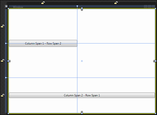
In Figure 5.1, the same Button element is used twice. Everything (including the properties) is identical in both the top and bottom buttons, with one slight change to the layout property on each. The top button has its Row Span set to 2 and Column Span set to 1, whereas the bottom button has its Row Span set to 1 and its Column Span set to 2. Although this is a simple example, it does demonstrate just how different your UIElements will appear if you are not careful about properties such as the margins and the spans.
You may be wondering why it is necessary to bring up such a simple issue, but you would be surprised by the number of times that you will miss this. This is especially true if you are embedding child UIElements in code only, because you will not get any visual verification until runtime.
You may also be using UIElements that have been built by other developers, XAML architects, or designers; and you may not understand the intended span logic used within the various embedded objects.
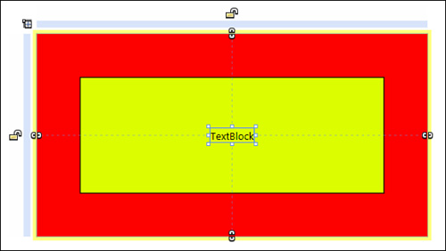
As a demonstration of how margins and size can cause you grief with embedded UIElements, use the following steps to create a small application that will display a red grid in the center, with a yellow rectangle embedded in it for visual effect and a block of text centered in the grid.
Even though this scenario may cause you a headache (which may not appear to be a good incentive to actually doing the following steps—you still should), it is very important that you understand how you may find yourself in the following situation so that, in your future design experiences, you can work around the same potential problems.
Create a new Standard Application in Blend.
Find the Grid element in the ToolBox panel (or locate it in the Asset Library) and double-click the icon to make the Grid element a child of your LayoutRoot element.
Double-click the Grid in the Objects and Timeline viewer to ensure that the Grid element is the active element. When the Grid element is active, it will display with a yellow border.
In the Properties panel, name this element “Grid.”
Open the Layout category of the Properties panel. Make sure that both Width and Height are set to Auto and that the
HorizontalAlignmentandVerticalAlignmentproperties are set to Stretch.Set all four margins to be 100.000 px.
Set the Grid background color to a Red Solid Color Brush in the Brushes category.
Add a Rectangle element as a child of the Grid.
Name this element “Rectangle” in the Properties panel.
Then go to the Layout category in Properties.
Again, make sure that both Width and Height are set to Auto and that the
HorizontalAlignmentandVerticalAlignmentproperties are set to Stretch.Set all four margins to 50.000 px.
Set the Rectangle background color to Yellow.
Select a TextBlock element from the ToolBox panel (or locate it in the Asset Library). Draw the TextBlock in the center of the Rectangle.
You are now in the Text Edit mode of the TextBlock control. Either press ESC or click on the Selection tool in the Toolbox to edit this mode.
Select the Layout category in the Properties panel. Set Width and Height of the TextBlock to Auto and set the
HorizontalAlignmentandVerticalAlignmentto Center. Set all four margins to 0.000 px.You should end up with something similar to what is shown in Figure 5.2. While this design might look bad, it highlights the problem.
Double-click the LayoutRoot element to make it active. Put your mouse over the lower-right corner grab box, and then press and hold your left mouse button so that you can resize your LayoutRoot.
Move your mouse up and notice that the yellow Rectangle element starts to disappear. This is the result of the margin settings. You will also observe that the yellow Rectangle is disappearing altogether but the TextBlock UIElement remains visible, which is unprofessional.
This example highlights how incorrect settings within the margins of the embedded UIElements can cause some ugly results. (Okay, it was always going to be ugly.) The point is, who knows how your application users will resize and move your application window(s)?
It’s important to be aware of this and not just go slapping controls all over the place, hoping that it will all work correctly when the application is launched, because 99.9% of the time, it won’t work how you wanted it to. Understanding how to set up controls properly will make the difference between a great user experience and a poor one.
So, how do you fix it?
You should define, within your application design specification, the minimum size that the application can run at. You will restrict the application Window from becoming so small that elements disappear, which is what currently happens.
You could modify the properties of the Window in the Properties panel to restrict the minimum Width and Height, so that, regardless of how your user changes the size of the parent Window, the elements will always show. However, in this example, you will fix it by modifying the properties of the Window in the code—after all, you can fix anything in code (you should always tell your boss this if you are a developer).
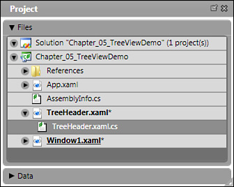
Open your Project panel and find the code page of your Window, which should be Window1.xaml.cs, as shown in Figure 5.3.
Double-click the .cs file. The corresponding code behind page for your XAML Window should appear within Visual Studio when it loads.
With any luck, you will now be looking at the default constructor for your scene. Enter the following code to modify your Window1 behavior:
public partial class Window1 { public Window1() { this.InitializeComponent(); // Insert code required on object creation below this point. this.Loaded += new RoutedEventHandler(Window1_Loaded); } void Window1_Loaded(object sender, RoutedEventArgs e) { this.MinHeight = this.ActualHeight ; this.MinWidth = this.ActualWidth; } }Build the application from the Project menu and then press F5 to test.

You should now be able to stretch your application both horizontally and vertically, and the child elements will continue to resize dynamically. You will note that the Window is now restricted to resizing below the initial startup Width and Height of the Window.
These sorts of issues will occur many times during your application development lifecycle, at least until such a time that all the people involved with the design and development are 100% accustomed to sizing controls and UIElements with layout properties instead of straight measurements and anchors. This is a strong claim to make, but I have witnessed it firsthand working with teams of designers (and developers) who are new to Blend.
When using the Grid (which is the most flexible layout panel and, therefore, quite often the most used), there are really three main Layout properties that you need to make sure are correct:
The
WidthandHeightproperty values determine ifYour element will grow and shrink (Auto) based on
The parent boundaries if Alignment is set to Stretch.
Taking Margin settings into account.
Your element will be a fixed size if
Positioned according to the Alignment settings.
Offset by the Margin settings.
The
Alignmentproperty setting relates to the control’s relational setting given its parent’s boundaries.Stretch directly affects the Actual Width and Actual Height controlled by Min/Max Width and Height property values.
Control bounding box ignores Min/Max and Width/Height settings, but the visible content of the Control is affected directly.
Controls with Width and Height set to Auto, and Alignment other than Stretch, will not show on the screen unless Min/Max Width and Height are also set to a value greater than 0.
The
Marginproperty determines the distance between the outer edges of a control’s bounding box to that of its parent construct.When Alignment (Horizontal or Vertical) is set to Stretch, Left/Right and Top/Bottom margins determine the distance between the outer edge of the control bounding box and the parent construct.
Min/Max Width and Height affect the visual content of the control but not the bounding box of the control to which the margins are applied.
When Alignment is set to Center (either Horizontal or Vertical), the margin properties are an offset value from center of the Parent.
When Alignment is set to Left, the Left margin is the only value that affects the position of the control from the Left edge of the parent.
When Alignment is set to Right, the Right margin is the only value that affects the position of the control from the Right edge of the parent.
When Alignment is set to Top, the Top margin is the only value that affects the position of the control from the Top edge of the parent.
When Alignment is set to Bottom, the Bottom margin is the only value that affects the position of the control from the Bottom edge of the parent.
You may have previously added additional controls at runtime to an application by adding a control to the controls collection of the parent control (generally a form- or panel-based construct in .NET). You add XAML elements in much the same way to a parent UIElementCollection property, generically named as Children, for controls that inherit the Panel base class.
The generic Children property has an Add method that accepts a UIElement type. For example, the following code adds a Button UIElement to a Grid UIElement:
this.Grid1.Children.Add(myNewButton);
The Children property also has an Index accessor that returns a UIElement:
Button myButtonReference = (Button) this.Grid1.Children[0];
Those controls that inherit from ContentControl (Button, CheckBox, Frame, Label, and so on) have a Content property that accepts a single object as a child and is assigned like the following:
myNewButton.Content = myNewGrid;
(See Chapter 9, “Using the Blend Asset Library,” for a detailed look at the ContentControl.)
The same traditional rules apply when you want to add elements to subelements of a UIElement. As long as the UIElements are publicly accessible, you can call the Children.Add method and pop an element in there. Some XAML UIElements use an ItemCollection property called Items, although these are generally used for elements that are designed to take multiple child elements as part of the design functionality.
A TreeView is an example UIElement that has an ItemCollection. It takes an object of type object to display as a node in the tree. This object (of type TreeViewItem) can then contain child elements in both the HeaderedItemsControl collection and the ItemsCollection collection, which could be another TreeViewItem, UIElement, or even another TreeView control element.
You may find that some developers add child elements directly to the XAML. Sometimes this occurs automatically when you develop a control element with a visual helper such as Blend and when the developer or designer uses the drag-and-drop method to create the UIElement tree. The benefit to this is always that the controls can be visualized during design time. You also have access to the element properties and events to respond to, as well as manipulate in Timeline animation options.
Adding additional elements to a parent in design time XAML is simple but you will find that a number of controls have larger initialization requirements then others and working in XAML can be cumbersome for some. I advise against this if you suffer from nose bleeds.
The following code shows a button as a child UIElement of a parent grid:
    <Grid Name="ParentGrid">
        <Button Height="23" Margin="233.8,164.8,301.6,0"
         Name="ChildButton" VerticalAlignment="Top">Child Button</Button>
    </Grid>
You probably wouldn’t type this yourself, because you can just drop the control straight onto the grid in the design time editor, but sometimes you may need to “hand crank” the XAML in order to get your UIElements into the parent. (See Chapter 4, “XAML for Beginners,” for more information on XAML structures.)
The TreeView control element was mentioned previously, so the following example runs through using a TreeView control to display various information and UIElements.
First make a simple TreeView display page.
If you are a developer, you are probably thinking that we are going to create a class that inherits from TreeViewItem as we would do normally. In this case, however, we are concentrating on UIElements, so we are going to create two custom controls:
An element to insert into the TreeViewItemHeader
An element to insert into the TreeViewItem collection
Previously, you may have been limited to the types of information you could show in a node within a TreeView control in .NET. If you had a little time on your hands and you didn’t have a project manager wanting a build every six hours, you could add some other features to your nodes. Unfortunately, I’ve never found an easier way to add other controls, such as a progress bar, another button, or a sub TreeView control, to the node.
You can use a third-party GridView control to show hierarchical data, because it allows you to contain embedded grids within grids. Obviously, however, it will always be primarily determined by the amount and type of information that needs to be shown.
The following steps begin your application by creating a base of functionality within your Window. You will then move on to creating a User Control where the TreeView control functionality will be added.
Create a new project of type WPF Application .exe in Blend.
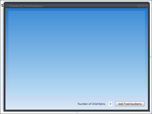
Copy Listing 5.2 into the XAML editor, replacing the existing LayoutRoot element. Your window should look similar to the one shown in Figure 5.4.
Example 5.2. Tree Control Sample in C# and XAML
    <Grid x:Name="LayoutRoot">
        <Grid.Background>
            <LinearGradientBrush EndPoint="0.5,1.203" StartPoint="0.5,-0.203">
                <GradientStop Color="#FFFFFFFF" Offset="1"/>
                <GradientStop Color="#FF005FC4" Offset="0"/>
            </LinearGradientBrush>
        </Grid.Background>
        <TreeView HorizontalAlignment="Center" VerticalAlignment="Top" Width="600"
Height="375" Background="#2DA4EFFF" BorderBrush="{x:Null}" Margin="0,10,0,0"
x:Name="tvMain"/>
        <Grid HorizontalAlignment="Stretch" VerticalAlignment="Bottom" Width="Auto"
Height="52">
            <Grid.ColumnDefinitions>
                <ColumnDefinition Width="0.478*"/>
                <ColumnDefinition Width="0.23*"/>
                <ColumnDefinition Width="0.058*"/>
                <ColumnDefinition Width="0.109*"/>
                <ColumnDefinition Width="0.106*"/>
                <ColumnDefinition Width="0.019*"/>
            </Grid.ColumnDefinitions>
            <Button HorizontalAlignment="Stretch" Margin="3,0,3,0" x:Name="btnAdd-
Child" VerticalAlignment="Center" Content="Add TreeViewItems" Grid.Column="3"
Grid.ColumnSpan="2"/>
            <TextBox HorizontalAlignment="Center" x:Name="txtItemCount" Verti-
calAlignment="Center" Grid.Column="2" Text="0" TextWrapping="Wrap"/>
            <Label HorizontalAlignment="Right" VerticalAlignment="Center" Con-
tent="Number of Child Items" Grid.Column="1"/>
        </Grid>
    </Grid>
Select the File menu and then New Item to view the Add New Item dialog box.
Select UserControl and rename the item TreeHeader.xaml. Click OK when you are done.
Don’t be concerned about the default
HeightandWidthproperties at the moment; you will fix them later. Open the Objects and Timeline panel and select the LayoutRoot element.Open the Properties panel and select the Brushes category.
Verify that the
Backgroundproperty is set to No brush.Select to add a Solid Color Brush object and set the panel color to White by dragging your mouse cursor through the Color palette to the upper-left corner.
Open the Asset Library, search for Border, and select to use it.
You should see the icon appear above the Asset Library button. Double-click the Border icon to add it as a child to your LayoutRoot element.
Open the Properties panel and find the Layout category.
Set both the
HorizontalAlignmentandVerticalAlignmentproperties to Stretch.Set the Width and Height properties to Auto by clicking the button with an X-type icon, to the right of the Width/Height property input boxes.
Find the Border element in the Objects and Timeline panel. Double-click it to set the element as active (the yellow border around the element).
Open the Properties panel again and type pad into the property search box.
Set each of the padding values to 5.
Open the Asset Library and find the Grid control, or locate the Grid control in the Panel Based Control collection on the ToolBox panel.
Double-click the Grid icon to add it as the singular child element of the Border control.
Double-click the Grid element in the Objects and Timelines panel to make it the active element. You should see that the Grid fills the border but has a nice little gap between it and its parent thanks to the padding property you set previously.
Find the Rectangle icon on the Toolbox panel and double-click it to add it as a child element of the Grid control.
Open the Properties panel again. In the property search box, type rad to reveal to radius properties.
Set each of the Radius properties to 15.
Clear the Property search box and type the search word height. Set the
Heightproperty to 30.Now search for the
Widthproperty and set it to Auto also.Clear the property search box.
Open the Brushes category of the properties panel and select the
Fillproperty, which should have a White Solid Color Brush object assigned to it. Set this property to No brush.Select the
Strokeproperty, which should have a Black Solid Color Brush object assigned. Change this color to a deep Blue color. (You could use #FF02378E as the hex value.)Set both of the
HorizontalAlignmentandVerticalAlignmentproperties to Stretch.Open the Asset Library again and locate the ViewBox control, and then select the control to add it to the ToolBox.
Double-click the ViewBox icon to add it as a child control of the Grid. (Remember that the Grid is still the active control.)
Open the properties panel, Layout category and then set both the
HorizontalAlignmentandVerticalAlignmentproperties to Stretch.Set the
Heightproperty of the ViewBox to 20.Set the
Widthproperty to Auto.Locate the
Marginproperty in the Layout category and set the Left and Right Margin properties to 10. The ViewBox should be comfortably within the borders of the Rectangle element now.Double-click the ViewBox control to make it active.
Locate the Label control either in the ToolBox or from the Asset Library.
Double-click the Label icon to add the control as the singular child of the ViewBox.
Click the Escape button to exit the Text edit mode of the Label.
By default the Label control is not named, so you need to name it in order to have access to the control from the .NET code behind file. Name the control labItemInsertedValue.
Select the Label element in the Objects and Timeline panel; then search for the
Contentproperty in the properties panel.Clear the
Contentproperty so that no text shows in the Label.Select the LayoutRoot element in the Objects and Timeline panel.
Open the Brushes category of the Properties panel and set the
Backgroundproperty to No brush.Locate and activate the UserControl element in the Objects and Timeline panel.
Open the Layout category of the Properties panel and set the Width and Height properties to Auto. Your results should look similar to those shown in Figure 5.5.
The XAML in Listing 5.3 allows you to verify your markup created in the previous steps.
Example 5.3. The XAML Representation of the Tree Control
    <Grid x:Name="LayoutRoot" Background="{x:Null}">
        <Border HorizontalAlignment="Stretch" VerticalAlignment="Stretch"
Width="Auto" Height="Auto" Padding="5,5,5,5">
            <Grid>
                <Rectangle HorizontalAlignment="Stretch"
VerticalAlignment="Stretch" Width="Auto" Height="30" Fill="{x:Null}"
Stroke="#FF02378E" RadiusX="15" RadiusY="15"/>
               <Viewbox HorizontalAlignment="Stretch" VerticalAlignment="Stretch"
Width="Auto" Height="20" Margin="10,0,10,0">
                    <Label Content="" x:Name="labItemInsertedValue"/>
                </Viewbox>
            </Grid>
        </Border>
    </Grid>
Now you need to add a public method to the control, allowing you to set the Content property of the Label control with a string value, when the TreeHeader control is used.
Open the Project panel and within the Files category, locate the TreeHeader.xaml file. Expand the node to reveal the code behind page for the control as shown in Figure 5.6.
From the Project menu, select Build to ensure that everything is as it should be with the control and that no errors are raised. Should you receive any errors, please go back through the steps carefully.
Right-click on the TreeHeader.xaml.cs file to reveal a context menu. Click on Edit in Visual Studio to launch Visual Studio, showing the constructor of the TreeHeader control.
Add the code from Listing 5.4 to your C# file, just below the closing curly brace “
}” of the constructor that is already shown:public TreeHeader() { this.InitializeComponent(); // Insert code required on object creation below this point. } }Save the file, exit Visual Studio, and then return to Blend.
Build the application from the Project menu once more.
Close the TreeHeader.xaml file.
In the following steps, you create the next control that will serve as the TreeViewItem Items content.
Press Ctrl+N to launch the Add New Item dialog box.
Again, select UserControl and rename the control to TreeItem.xaml.
Select the LayoutRoot element in the Objects and Timeline panel; then open the Properties panel.
Find the Brushes category and select the
Backgroundproperty. Set this to show a Solid Color Brush object of color White.To make this a little more interesting this time and to demonstrate the embedding capability of WPF control elements, you will add a Label control, a Button control, and a ProgressBar control.
With the LayoutRoot element activated in the Objects and Timeline panel, find the Grid control again, either in the Asset Library or within the Panel Base Controls located on the ToolBox panel.
Add the Grid as the singular child control of the LayoutRoot element.
Set both the Width and Height properties to Auto and then set both the HorizontalAlignment and VerticalAlignment properties to Stretch.
Select and activate the Grid element in the Objects and Timeline panel.
Open the Properties panel. In the search box, type def, which should present you with the Column and Row Definitions for the Grid.
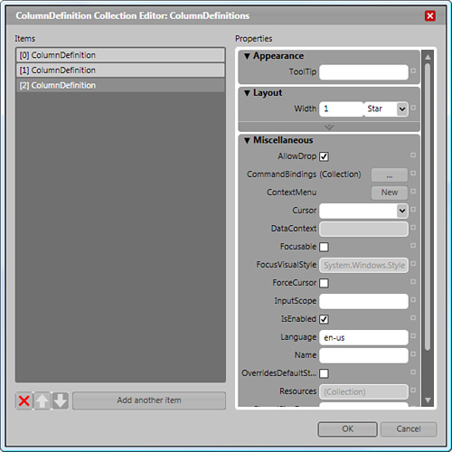
You want to add three columns of equal width, so click on the ColumnDefinitions property button three times, as shown in Figure 5.7.
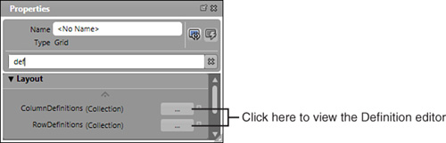
Figure 5.8 shows the ColumnDefinition Collection Editor with three items added to the collection. You will notice that the items have a Width property set to 1 *. If you quickly look at the XAML for the Grid element, you will see that the Grid Column Definitions are declared but are completely empty of property attributes. This will ensure that the distances are equal between all the Collection Items (representing the Columns).
Ensuring the Grid element is activated in the Objects and Timeline panel, find and add a Label control as a child of the Grid.
Press the Escape key to exit Text Edit mode of the Label control.
Name the Label control labChildName.
Clear the Property search box.
Open the Layout category of the Properties panel and set the
HorizontalAlignmentandVerticalAlignmentproperties to Stretch.Search for the
Contentproperty of the Label and remove the text Label.Find and add a ProgressBar control from the Asset Library.
Name the control pbRunner.
Set the Column property to 1, which should move the ProgressBar to the second column of the Grid.
Set the
HorizontalAlignmentproperty to Stretch.Set the
VerticalAlignmentproperty to Center.Set the
Widthproperty to Auto.Set the Left and Right Margin properties to 10.
Name the control btnIndeterminate.
Open the Layout category of the Properties panel and set the Column value to 2.
Set the
HorizontalAlignmentproperty to Stretch.Set the
VerticalAlignmentproperty to Center.Set the Width and Height properties to Auto.
Set the Left and Right Margin properties to 10.
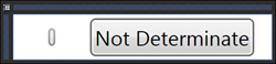
Find the
Contentproperty and set the Text to show Not Determinate.Activate the UserControl element in the Objects and Timeline panel.
Set the Width and Height properties to Auto.
Select the LayoutRoot element and set the
Backgroundproperty, located in Brushes to No brush.Press Ctrl+Shift+S to save all the files in this project and then select Build from the Project menu.
You are about to add a Click Event handler for the Button control you added to the UserControl. This is the reason that you just saved and built the application to ensure that you have access to all the controls from the Visual Studio environment.
Find and select the Button control in the Objects and Timeline panel.
Next to the control name property of the Properties panel is an icon with a little lightning bolt on it. This icon shows you a list of all available events for the currently selected control. Click this icon now to view the list.
The very first event at the top of the list should be Click. Double-click in the input box to auto-generate a Click handler method. If you have Visual Studio Standard or higher installed, Visual Studio should be launched and automatically add the code for your event handler method. If you are copying the methods to the clipboard, open the project now and add it to the code behind file.
Above the event handler method just created, add the code from Listing 5.5. This code creates an enum for the Button state as well as a property to store the current state in.
Example 5.5. Creating an Enum for the Button State
        /// <summary>
        /// Button State choices
        /// </summary>
        public enum ButtonState
        {
            NotDeterminate = 0,
            Determinate = 1
        }

        //Default set
        private ButtonState _currentState = ButtonState.NotDeterminate ;

        /// <summary>
        /// Get or set the current button state
        /// </summary>
        public ButtonState CurrentState
        {
            get { return _currentState; }
            set { _currentState = value; }
        }
Listing 5.6 shows the Click event handler, which controls the ProgressBar control. Add this code now.
Example 5.6. Controlling the ProgressBar Depending on the CurrentState Value
private void btnIndeterminate_Click(object sender, RoutedEventArgs e)
        {
            switch (CurrentState)
            {
                case ButtonState.NotDeterminate:
                    this.CurrentState = ButtonState.Determinate;
                    this.btnIndeterminate.Content = "Determinate";
                    this.pbRunner.IsIndeterminate = true;
                    break;
                case ButtonState.Determinate:
                    this.CurrentState = ButtonState.NotDeterminate ;
                    this.btnIndeterminate.Content = "Not Determinate";
                    this.pbRunner.IsIndeterminate = false;
                    break;
                default:
                    break;
            }
        }
Now you create a method for setting the
Label Contentproperty, which is shown in Listing 5.7.
Select to save the project in Visual Studio and then “Build” the solution choosing the Build Solution menu item as you did previously. You can now return to Blend.
Listing 5.8 shows the XAML for the control should you have any issues with the previous steps.
Example 5.8. The XAML for the Entire Control
    <Grid x:Name="LayoutRoot" Background="{x:Null}">
        <Grid HorizontalAlignment="Stretch" VerticalAlignment="Stretch"
Width="Auto" Height="Auto">
            <Grid.ColumnDefinitions>
                <ColumnDefinition/>
                <ColumnDefinition/>
                <ColumnDefinition/>
            </Grid.ColumnDefinitions>
            <Label HorizontalAlignment="Stretch" x:Name="labChildName" Verti-
calAlignment="Stretch" Content=""/>
            <ProgressBar HorizontalAlignment="Stretch" Margin="10,0,10,0"
x:Name="pbRunner" VerticalAlignment="Center" Width="Auto" Height="10" Grid.Col-
umn="1" IsIndeterminate="False"/>
            <Button HorizontalAlignment="Stretch" Margin="10,0,10,0" x:Name="cmdIn-
determinate" VerticalAlignment="Center" Content="Not Determinate" Grid.Column="2"
Click="cmdIndeterminate_Click"/>
        </Grid>
    </Grid>
You should be ready to continue on with the TreeView sample application that you first started with, using the two controls you just built to display the required information. You added the Button control and ProgressBar controls to the TreeItem control to show that the control can and will maintain its own functionality, independent of its parent.
The majority of the work remaining is carried out in Visual Studio, so as per good working practices, save the project in Blend, and then Build it from the Project menu before continuing.
Close all UserControls in Blend and leave only Window1.xaml showing.
Find and select the btnAddChild button control in the Window by using the Objects and Timeline category.
Open the Properties panel and show the events available for the control.
Again, locate the Click event at the top of the event list and double-click the input box to create the Click handler method.
Listing 5.9 shows that you are looking at the Number of Child Items to add value, which is located in txtItemCount, and basing your additions on it.
Example 5.9. Adding Children of Children
private void btnAddChild_Click(object sender, RoutedEventArgs e)
        {

            int LoopCount = Convert.ToInt32(this.txtItemCount.Text);

            //Make sure we have at least 1 to add
            if(LoopCount == 0)
            {
                this.txtItemCount.Text = "1";
                LoopCount = 1;
            }

            //Create a new TreeItem to add to the control
            TreeViewItem TempItem = new TreeViewItem();

            //Create a single Header that will show the time it was created
            TreeHeader MyHeader = new TreeHeader();
            MyHeader.SetLabelContent("Item added: " + DateTime.Now.ToLongDateString
() + " " + DateTime.Now.ToLongTimeString());
            MyHeader.MinWidth = 300;

            //Add the header to the control before we start to add child items
            TempItem.Header = MyHeader;

            //Add child elements
            for (int LoopValue = 0; LoopValue < LoopCount ; LoopValue++)
            {
                //Create and add an item to our TreeViewItem
                TreeItem TempTreeItem = new TreeItem();
                TempTreeItem.SetLabelValue(Convert.ToString(LoopValue + 1) + " of "
+ LoopCount.ToString() + " children");
                TempTreeItem.MinWidth = 500;
                TempItem.Items.Add(TempTreeItem);

                TempTreeItem = null;
            }

            //Add our item to the TreeView control. If an item or header is selected,
            //add our item as a child of it
            if (this.tvMain.SelectedItem  != null)
            {
                if (this.tvMain.SelectedItem is TreeItem)
                {
                    TreeViewItem SelectedItem = (this.tvMain.SelectedItem as
TreeItem).Parent as TreeViewItem ;
                    this.tvMain.BeginInit();
                    SelectedItem.Items.Add(TempItem);
                    this.tvMain.EndInit();
                }
                else if (this.tvMain.SelectedItem is TreeHeader )
                {
                    TreeViewItem SelectedItem = (this.tvMain.SelectedItem as Tree-
Header).Parent as TreeViewItem;
                    this.tvMain.BeginInit();
                    SelectedItem.Items.Add(TempItem);
                    this.tvMain.EndInit();
                }
                else if (this.tvMain.SelectedItem is TreeViewItem )
                {
                    TreeViewItem SelectedItem = this.tvMain.SelectedItem as Tree-
ViewItem;
                    this.tvMain.BeginInit();
                    SelectedItem.Items.Add(TempItem);
                    this.tvMain.EndInit();
                }

            }
            else
            {
                this.tvMain.BeginInit();
                this.tvMain.Items.Add(TempItem);
                this.tvMain.EndInit();
            }
        }
If you study the previous Add methods, you will see how you must now manage child objects and their header and child items compared with just child items in .NET TreeView controls.
Before you send emails telling me that I should have broken the code in Listing 5.9 into multiple methods, know that I was thinking that some of you reading this book may not have used any code previously. The concept of methods (functions) is covered in Chapter 10, “Visual Studio: C# Primer.” By all means, refactor away if it makes you feel better!
Now add the code to your .NET code behind page, return to Blend, and build and test your application. Your results should be similar to Figure 5.10.
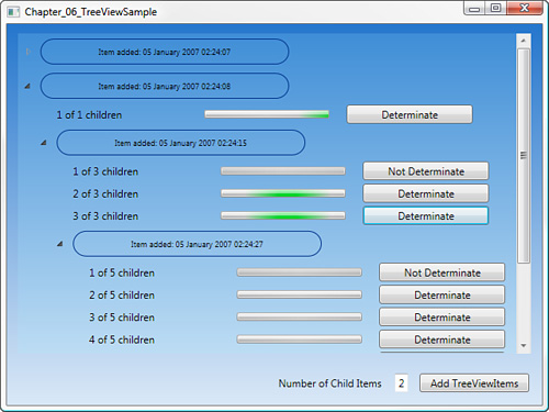
This is a simple sample, but you are probably already thinking about the possibilities this dimensional embedding provides developers. It also lets designers get away with some pretty amazing concepts.
Before you finish with embedding controls, you may be wondering why you had to add a Grid in places where you would normally just add multiple control elements as children. Cast your mind back, and you will remember that you had to do this when building the TreeHeader control when you added a Border control. The only Child element of the Border is a Grid. Everything else under it is a child of the Grid.
The explanation for this pertains to a special control that handles content, aptly called a ContentControl.
The first time I started playing with some of the controls within Blend, I could not understand why my child elements kept disappearing. I thought that this was a huge oversight by the developers and that I was going to have a field day with them all on Microsoft Connect! But I thought before I did that and looked like a proper idiot, I’d better check what the WPF SDK said about content controls.
There it was in black and white (as well as that pale blue border), staring me in the face and telling me that I could only have one child UIElement for any control that inherited from the base ContentControl.
Content is not a collection, it is simply a property that can hold a UIElement or String type, essentially being what is held inside the content property owner and what is rendered when the control is drawn on the screen.
To get around the issue of having just a singular object embedded into controls Content property, you can embed controls that themselves contain a child collection; for example, a Grid control.
In this chapter, you learned how important it is to think about the relationship between the parent and child elements when determining the layout of such elements in an embedded scenario, an issue that is bound to come up in the future.
You also witnessed the flexibility of the TreeView control, which is a shining example of the embedding power now provided in WPF controls via ContentControls and child collections. That should be what you take most from this chapter.
Even though you got a look into some code in the later part of this chapter (which you may not fully understand), hopefully you saw how important it is to give your controls public accessor methods.
The next chapter is really an extension of this one, going into each panel and trying to understand when and where to use each one.