
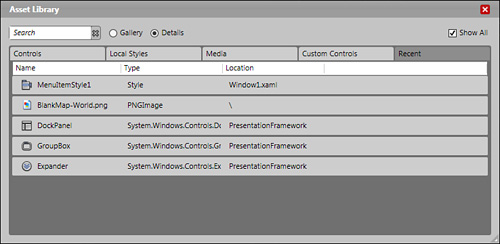
The Expression Blend Asset Library is to be viewed—from the developer’s perspective—as the replacement to the Visual Studio ToolBox palette. As you’ll see in Figure 9.1, many areas are all neatly packaged within this one palette that allows you to transform your applications, from Styles to Controls to your own Custom Controls created in Blend or Visual Studio.
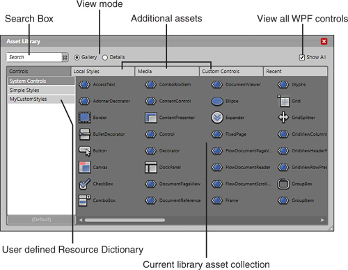
In particular is a search feature that can quickly narrow down the available toolset into library viewing based on full or partial item names. For example, type the word grid, and you will see only those controls with the word grid appearing within their given names.
This chapter contains overviews of the most common controls, because these controls enable you to work with most of the remaining controls as long as they are derived from the main PresentationFramework classes. Most notable are the Control, ContentControl, and FrameworkElement classes that encapsulate the majority of the control features among them.
This chapter also includes code snippets to assist you with common scenarios and some C# code snippets that prepare you for the next chapter, which deals completely with writing code. There is nothing too mind-bending at this stage; you’re just getting your feet wet. So don’t feel compelled to try and add the code in this chapter to a project while you are reading through it, but do read the code and try to understand the relevance of the elements, the markup, and the code working together.
As covered briefly in Chapter 3, “Expression Blend Panels,” there are five primary areas of workflow within the Blend Asset Library, and each has varying degrees of usefulness depending on how you use the tool. For the most part, Controls and Custom Controls are the areas of primary concern, because the other panels provide views that are easily accessible from multiple areas within the Blend IDE.
Figure 9.1 shows the default opening screen of the Asset Library. You will quickly become used to ducking in here to grab a quick control, whether you use it during the normal functionality of your application or whether you need a component to style. The search feature is invaluable for reducing the amount of time you trawl through the control set, whether you are searching for something specific or just looking to discover new control types.
Most functionality in the Controls tab is self-explanatory, but there is one nifty feature that appears to be fairly innocuous until you are in a situation where you need it. (And then, of course, you won’t be able to find it!) At the bottom of the list of user-defined resource dictionaries is a button with the name (Default). By default Blend uses the System Controls style directory, but this feature allows you to select your own Resource Dictionary as the default, just as you would expect. What you may not expect is that this feature also modifies the Toolbox so that you can use any control’s styles you defined in your default style library. So if you have a button in your library, for example, every new button you add to your project contains your style by default.
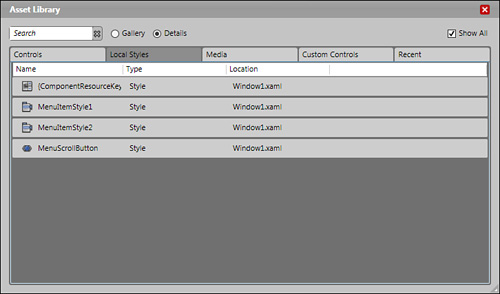
Figure 9.2 shows the Local Styles tab, which contains a complete list of all style templates that you created and saved locally to the currently selected file. Creating a Style locally is often the most efficient method of working with styles within Blend from a performance point of view, but you must remember that the availability of these styles is then contained to the local file.
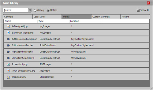
As you can see in Figure 9.3, the Media tab not only shows all different types of media linked and added to your application but also shows some resources (in this case brushes) that are part of the attached resources. This tab is one of those that becomes very important the more media assets you include in your application, allowing you to easily and quickly search and narrow your choices.
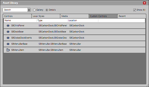
The Custom Controls tab’s contents include all the custom and user controls that you defined within your application scope as well as any external .dlls or third-party controls that you referenced (see Figure 9.4). One interesting note is that only controls that build successfully are shown within this tab. At the time of writing, I could not confirm if this was a defect or done by design. If you are missing a control that you are sure should be there, check that the control is both without error in the design surface and builds correctly.
As the names suggests, the Recent tab shows recently used assets. It not only shows controls but also, as can be seen in Figure 9.5, presents all media types and styles. This is a great shortcut when you have those long, boring, and repetitious jobs to complete.
The Asset Library is a great workflow panel because it allows you to very compactly manage your applications resources and assets easily. I still don’t understand why this panel cannot be permanently pinned or floated on another monitor, because surely its value would only further increase.
For most developers, the controls included in WPF will sound, and in some cases function, similarly to those controls you previously used. If you are a developer, here is an important word of warning: the controls in Framework 3.0 and 3.5 are vastly different in some areas from the previous control types. Method names changed to become more standardized across the control types, and several control methods that previously were common may now return nullable types or have disappeared altogether.
For those of you who are designers, the control names in WPF are, for the most part, fairly descriptive. After you start to feel comfortable with the property and event types of most of the standard controls, you will find that you almost “know” how to use the others, because their familiarity and standardized names make it easier.
Take the time to go through the following control types to get a good basis of understanding with their most prominent features and the events they use.
The ubiquitous Button control is arguably the most common control used to direct user workflow within an application. The control, however, can also go a long way toward providing positive user experiences by having non-ambiguous labels and being positioned and styled to match its surroundings.
Gone are the days in which you had four choices of style, one type of content (text string), and static responses to Click and various mouse events.
One of the most sought-after visual effects with Winforms applications is the capability to create and display Gel button types. As a developer, I never dared to dream past this point because I was always so limited by time, as well as the need to provide theme and accessibility support.
I have tried many different ways of creating Gel buttons with XAML-based applications, and let me tell you, the permutations are endless (which is a very good thing).
Listing 9.1 represents the fewest lines of XAML I could come up with to create a simple Gel button.
Example 9.1. A Simple Gel Button
<UserControl.Resources>
        <Style BasedOn="{x:Null}" TargetType="{x:Type Button}" x:Key="SimpleGel">
            <Style.Triggers>
                <Trigger Property="IsEnabled" Value="False">
                    <Setter Property="Foreground" Value="#FFB9B9B9"/>
                </Trigger>
            </Style.Triggers>
            <Setter Property="Template">
                <Setter.Value>
                    <ControlTemplate TargetType="{x:Type Button}">
                            <Border  Margin="0,0,0,0" VerticalAlignment="Stretch" Height="Auto" BorderBrush="#FF88D641" BorderThickness="1,1,1,1" CornerRadius="18,18,18,18">
                                <Border.Background>
                                    <LinearGradientBrush EndPoint="0.5,2.607"
StartPoint="0.5,-1.607">
                                        <GradientStop Color="#FF34FC00" Offset="0.328"/>
                                        <GradientStop Color="#FFFFFFFF" Offset="0.576"/>
                                    </LinearGradientBrush>
                                </Border.Background>
                                <Border CornerRadius="18,18,18,18" Height="27.573"
Width="176">
                                    <Border.Background>
                                        <LinearGradientBrush EndPoint="0.5,3.488"
StartPoint="0.5,-2.488">
                                            <GradientStop Color="#FF88D641" Offset="0"/>
                                            <GradientStop Color="#4BFFFFFF" Offset="0.645"/>
                                        </LinearGradientBrush>
                                    </Border.Background>
                                    <ContentPresenter SnapsToDevicePixels="{TemplateBinding SnapsToDevicePixels}" RecognizesAccessKey="True" HorizontalAlignment="Center" VerticalAlignment="Center"/>
                                </Border>
                            </Border>
                        <ControlTemplate.Triggers>
                        </ControlTemplate.Triggers>
                    </ControlTemplate>
                </Setter.Value>
            </Setter>
        </Style>
    </UserControl.Resources>

    <Grid x:Name="LayoutRoot">
        <Button Margin="30,15,30,15" Style="{DynamicResource SimpleGel}"
Content="Button"/>
    </Grid>
The code in Listing 9.1 provides for a simple button built using the Make Button tool. Although this code contains no extended functionality for event animations or focus styling, it does show that creating a button like this is both extremely quick and invaluable when needing to create a mock-up application commonly required by interactive designers.
The Button control (as well as any button created with the Make Button tool) contains a ContentControl that can contain strings, images, grids, and more Content controls. (See the “ContentControl” section later in this chapter for a detailed look at how to use this core control.)
As you are well aware of by this point, you can quickly draw on the artboard a standard button that is available from the toolbox. You can also enter markup directly with the Content property assigned a value:
<Button x:Name="btnMyButton" Content="Howdy"/>
As long as you name the button (in the Properties panel or in markup defined by the x:Name attribute), setting the Context value of the button in code to a string value, if that is the requirement; is as simple as the following line of code:
btnMyButton.Content = "Tester Text";
Bear in mind that the button also contains excellent functionality built in with its endless events and methods. You may want to style the button to look more like a label but still allow for the Click functionality.
The ClickMode property on the button allows you to specify exactly when a Click event should take place, be it a Release of the mouse, or the Press or Hover of the mouse that should raise the Click event.
Two other properties commonly used with the Button control include the IsCancel and IsDefault properties. When IsCancel is set to true, the user of the application can press the Escape (ESC) key to perform a button click. IsDefault enables the button to respond when the user presses the Enter key.
“How much different can a CheckBox really be?” you may be asking. There are two answers to that. The first answer is that you are correct; there are no significant changes to the control that warrant a five-page rant. The second answer (and possibly worth the five-page rant) is the capability to use the CheckBox control—and others like it—for the functionality that is already designed and implemented, not for the look or style of the existing control.
When you think about it, the CheckBox has great functionality built in for determining MouseOver, MousePressed, and MouseReleased events. Why not use that functionality when required instead of reinventing the wheel?
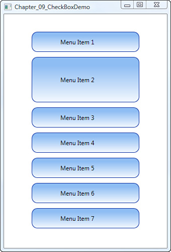
If you think of not only the CheckBox control but also most other controls as merely providing a form of styled container, you may then see that you can take the functionality and use it to your advantage. Listing 9.2 uses the built-in functionality of the CheckBox control to create a presentation menu. You can add the XAML from Listing 9.2 to a project to create the sample.
Example 9.2. A Simple Menu Created from CheckBoxes
<Window
    ... Blend created Window attributes
    Width="340" Height="500">
    <Window.Resources>
        <LinearGradientBrush x:Key="CheckRadioFillNormal">
            <GradientStop Color="#FFD2D4D2"
                Offset="0"/>
            <GradientStop Color="#FFFFFFFF"
                Offset="1"/>
        </LinearGradientBrush>
        <LinearGradientBrush x:Key="CheckRadioStrokeNormal">
            <GradientStop Color="#FF004C94"
                Offset="0"/>
            <GradientStop Color="#FF003C74"
                Offset="1"/>
        </LinearGradientBrush>
        <Style x:Key="EmptyCheckBoxFocusVisual">
            <Setter Property="Control.Template">
                <Setter.Value>
                    <ControlTemplate>
                        <Rectangle Margin="1"
                            StrokeThickness="1"
                            Stroke="Black"
                            StrokeDashArray="1 2"
                            SnapsToDevicePixels="true"/>
                    </ControlTemplate>
                </Setter.Value>
            </Setter>
        </Style>
        <Style x:Key="CheckRadioFocusVisual">
            <Setter Property="Control.Template">
                <Setter.Value>
                    <ControlTemplate>
                        <Rectangle Margin="14,0,0,0"
                            StrokeThickness="1"
                            Stroke="Black"
                            StrokeDashArray="1 2"
                            SnapsToDevicePixels="true"/>
                    </ControlTemplate>
                </Setter.Value>
            </Setter>
        </Style>
        <Style
            TargetType="{x:Type CheckBox}" x:Key="CheckBoxStyle1">
            <Setter Property="Foreground"
                Value="{DynamicResource {x:Static SystemColors.ControlTextBrushKey}}"/>
            <Setter Property="Background"
                Value="{StaticResource CheckRadioFillNormal}"/>
            <Setter Property="BorderBrush"
                Value="{StaticResource CheckRadioStrokeNormal}"/>
            <Setter Property="BorderThickness"
                Value="1"/>
            <Setter Property="FocusVisualStyle"
                Value="{StaticResource EmptyCheckBoxFocusVisual}"/>
            <Setter Property="Template">
                <Setter.Value>
                    <ControlTemplate TargetType="{x:Type CheckBox}">
                        <ControlTemplate.Resources>
                            <Storyboard x:Key="Expand">
                                <DoubleAnimationUsingKeyFrames BeginTime="00:00:00" Storyboard.TargetName="grid" Storyboard.TargetProperty="(FrameworkElement.Height)">
                                    <SplineDoubleKeyFrame KeyTime="00:00:00" Value="50"/>
                                    <SplineDoubleKeyFrame KeyTime="00:00:01" Value="100"/>
                                </DoubleAnimationUsingKeyFrames>
                            </Storyboard>
                            <Storyboard x:Key="Contract">
                                <DoubleAnimationUsingKeyFrames BeginTime="00:00:00" Storyboard.TargetName="grid" Storyboard.TargetProperty="(FrameworkElement.Height)">
                                    <SplineDoubleKeyFrame KeyTime="00:00:00" Value="100"/>
                                    <SplineDoubleKeyFrame KeyTime="00:00:01" Value="50"/>
                                </DoubleAnimationUsingKeyFrames>
                            </Storyboard>
                        </ControlTemplate.Resources>
                        <Grid x:Name="grid" Height="50">
                            <Rectangle Stroke="#FF1438A7" RadiusX="10.7" RadiusY="10.7" HorizontalAlignment="Stretch" Margin="5,5,5,5" Width="Auto">
                                <Rectangle.Fill>
                                    <LinearGradientBrush EndPoint="0.5,3.295" StartPoint="0.5,-2.295">
                                        <GradientStop Color="#FF8EBDF3" Offset="0.444"/>
                                        <GradientStop Color="#FFFFFFFF" Offset="0.605"/>
                                    </LinearGradientBrush>
                                </Rectangle.Fill>
                            </Rectangle>
                            <ContentPresenter HorizontalAlignment="Center" VerticalAlignment="Center" Width="100"/>
                        </Grid>
                        <ControlTemplate.Triggers>
                            <EventTrigger RoutedEvent="ToggleButton.Checked">
                                <BeginStoryboard Storyboard="{StaticResource Expand}"/>
                            </EventTrigger>
                            <EventTrigger RoutedEvent="ToggleButton.Unchecked">
                                <BeginStoryboard x:Name="Contract_BeginStoryboard" Storyboard="{StaticResource Contract}"/>
                            </EventTrigger>
                        </ControlTemplate.Triggers>
                    </ControlTemplate>
                </Setter.Value>
            </Setter>
        </Style>
    </Window.Resources>
    <Grid x:Name="LayoutRoot">
        <ScrollViewer HorizontalAlignment="Stretch" VerticalAlignment="Stretch" Width="Auto" Height="Auto" Margin="15,15,15,15">
            <StackPanel Width="Auto" Height="Auto">
                <CheckBox Style="{DynamicResource CheckBoxStyle1}" HorizontalContentAlignment="Center" VerticalContentAlignment="Center" Content="Menu Item 1" Grid.IsSharedSizeScope="False" ClickMode="Release" Cursor="Hand" ScrollViewer.VerticalScrollBarVisibility="Hidden"/>
                <CheckBox Style="{DynamicResource CheckBoxStyle1}" HorizontalContentAlignment="Center" VerticalContentAlignment="Center" Content="Menu Item 2" Grid.IsSharedSizeScope="False" ClickMode="Release" Cursor="Hand" ScrollViewer.VerticalScrollBarVisibility="Hidden"/>
                <CheckBox Style="{DynamicResource CheckBoxStyle1}" HorizontalContentAlignment="Center" VerticalContentAlignment="Center" Content="Menu Item 3" Grid.IsSharedSizeScope="False" ClickMode="Release" Cursor="Hand" ScrollViewer.VerticalScrollBarVisibility="Hidden"/>
                <CheckBox Style="{DynamicResource CheckBoxStyle1}" HorizontalContentAlignment="Center" VerticalContentAlignment="Center" Content="Menu Item 4" Grid.IsSharedSizeScope="False" ClickMode="Release" Cursor="Hand" ScrollViewer.VerticalScrollBarVisibility="Hidden"/>
                <CheckBox Style="{DynamicResource CheckBoxStyle1}" HorizontalContentAlignment="Center" VerticalContentAlignment="Center" Content="Menu Item 5" Grid.IsSharedSizeScope="False" ClickMode="Release" Cursor="Hand" ScrollViewer.VerticalScrollBarVisibility="Hidden"/>
                <CheckBox Style="{DynamicResource CheckBoxStyle1}" HorizontalContentAlignment="Center" VerticalContentAlignment="Center" Content="Menu Item 6" Grid.IsSharedSizeScope="False" ClickMode="Release" Cursor="Hand" ScrollViewer.VerticalScrollBarVisibility="Hidden"/>
                <CheckBox Style="{DynamicResource CheckBoxStyle1}" HorizontalContentAlignment="Center" VerticalContentAlignment="Center" Content="Menu Item 7" Grid.IsSharedSizeScope="False" ClickMode="Release" Cursor="Hand" ScrollViewer.VerticalScrollBarVisibility="Hidden"/>
            </StackPanel>
        </ScrollViewer>
    </Grid>
</Window>
Figure 9.6 shows how clicking on a Menu item expands the size of the item, which is simply an animation connected to the Checked event. Conversely, another animation is specified for the UnChecked event, which causes the menu item to contract.
The preceding XAML may be a time-consuming process to add to your project, but if you put in the effort, you will see quite a few interesting concepts, including styles and animation, each of which the book covers in future chapters. Don’t let the size of the XAML put you off this way of thinking, however, because this demo application took about four minutes to create using the Blend application interface.
In code, the named CheckBox has the same properties as shown in the Property panel inside Blend. Setting the Checked state of the control, the code would look similar to the following:
myCheckBox.IsChecked = true;
When the user sets the state of the control to showing a Check, the CheckedEvent is raised, allowing you to react to this new state. Conversely, an Unchecked event is available. Listing 9.3 demonstrates these events in code by displaying a MessageBox on the relevant event being raised.
The CheckBox contains many similar features to of that of a button: a Click event as well as the capability to take different types of Content. In addition is a property called IsThreeState, which allows the CheckBox to either display a Check, no Check, or a Block representing the in-between state.
The ComboBox control takes its core functionality from the ancestors of pre-Framework 3.0 and 3.5 classes. This control contains a collection of ComboBoxItems, each with an index, and each programmatically selectable—and importantly—bindable to an XML or CLR Datasource, or even another UIElement property.
Perhaps the greatest exploitation of the ComboBox comes from the ability to nest child elements to an infinite number (well maybe, I didn’t check the limit). The XAML shown in Listing 9.4 gives you proof of this by nesting three ComboBoxes, each with a Button child, and all in just 34 lines of markup!
Example 9.4. Nested Child ComboBoxes
    <Grid x:Name="LayoutRoot">
        <ComboBox Margin="13.8,8.6,15,0" VerticalAlignment="Top" Height="32.8"
Text="ComboBox 1" IsSynchronizedWithCurrentItem="True">
            <ComboBoxItem Height="37.277">
                <Button Width="246.483" Height="36.477" Content="Button"/>
            </ComboBoxItem>
            <ComboBoxItem>
                <ComboBox Width="232.6" Height="34.477" Text="ComboBox 2">
                    <ComboBoxItem>
                        <Button Width="221.683" Height="36.477" Content="Button"/>
                    </ComboBoxItem>
                    <ComboBoxItem>
                        <ComboBox Width="210.2" Height="34.477"
IsDropDownOpen="False" Text="ComboBox  3" SelectedIndex="-1">
                            <ComboBoxItem>
                                <Button Width="199.283" Height="32.477"
Content="Button"/>
                            </ComboBoxItem>
                        </ComboBox>
                    </ComboBoxItem>
                </ComboBox>
            </ComboBoxItem>
        </ComboBox>
    </Grid>
To try it out, add the code in Listing 9.4 XAML to a new project.
To add new ComboBoxItems in code, you need to create an instance of the item first and then assign it to the ComboBox. Listing 9.5 shows exactly this by creating two simple ComboBoxItems and then inserting them into the ComboBox’s item collection.
The properties in Table 9.1 are not exactly common properties but are very handy to know.
Table 9.1. Additional ComboBox Properties Available in Expression Blend
Property Name | Description |
|---|---|
| False by default (Unchecked in the Blend interface), this property sets the control either to display its contents by default or to keep them hidden until the user selects the control to display the child items. |
| False by default (Unchecked in the Blend interface), this property allows the user to edit the text shown in the control’s header. |
| Set to −1 by default (no item selected), you can either set the value in design time or in runtime, which raises the SelectionChanged event. |
| Set to 350 by default, this property allows you to contain the maximum visible drop-down area. |
The ComboBox control contains a collection of items. Each ComboBoxItem or element that you add to the ComboBox is contained within the ComboBox’s “item” collection, which is also accessible in code.
Other controls, such as Listbox, also maintain item collections, so it is handy to know how to retrieve references to the item controls if you have not named them but still need access in code.
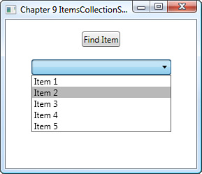
Listings 9.6 and 9.7 work together to demonstrate this principle. First, add the markup to a new project, to create a ComboBox with several unnamed child ComboBoxItem controls and a Button with an associated Click event. The code in Listing 9.7 (which is the Click event) shows how you can iterate the item collection to find an item control and perform functions on it (in this case finding Item 2 and changing its background color).
Example 9.6. Creating Unnamed ComboBox Items
    <Grid x:Name="LayoutRoot">
        <Grid.RowDefinitions>
            <RowDefinition Height="0.266*"/>
            <RowDefinition Height="0.734*"/>
        </Grid.RowDefinitions>

        <ComboBox HorizontalAlignment="Center" x:Name="comboStandard"
VerticalAlignment="Top" Width="200" IsSynchronizedWithCurrentItem="True"
Grid.Row="1">
            <ComboBoxItem Content="Item 1"/>
            <ComboBoxItem Content="Item 2"/>
            <ComboBoxItem Content="Item 3"/>
            <ComboBoxItem Content="Item 4"/>
            <ComboBoxItem Content="Item 5"/>
        </ComboBox>
        <Button HorizontalAlignment="Center" x:Name="btnFindItem"
VerticalAlignment="Center" Content="Find Item" Click="btnFindItem_Click"
Grid.Row="0"/>

    </Grid>
Example 9.7. Finding an Unnamed Child Item in a ComboBox
        private void btnFindItem_Click(object sender, RoutedEventArgs e)
        {
            foreach (ComboBoxItem currentItem in this.comboStandard.Items)
            {
                if (Convert.ToString(currentItem.Content) == "Item 2")
                {
                    currentItem.Background = new SolidColorBrush(Color.FromRgb(185,
185, 185));
                }
            }
}(Chapter 10, “Visual Studio: C# Primer” explains the for each looping C# syntax.)
Another important concept is that a collection contains additional functionality to enable you to sort, group, and filter the content that the item collection presents.
The combination of Listings 9.6 and 9.7 added, and therefore presented, the child items in sequential order (see Figure 9.7). However, as shown by the modifications in Listing 9.8 (which is a complete replacement for Listing 9.7) and with Figure 9.8, you can easily sort the items. If you intend to try this, add the following using directive at the top of the code page:
using System.ComponentModel;
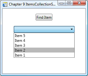
Example 9.8. Reorder Child Items of the ComboBox
        private void btnFindItem_Click(object sender, RoutedEventArgs e)
        {

            foreach (ComboBoxItem currentItem in this.comboStandard.Items)
            {
                if (Convert.ToString(currentItem.Content) == "Item 2")
                {
                    currentItem.Background = new SolidColorBrush(Color.FromRgb(185,
185, 185));
                }
            }

            //Sort the collection
            this.comboStandard.Items.SortDescriptions.Add(new SortDescription
("Content", ListSortDirection.Descending));

}Images take on many different formats, ranging from bitmaps to JPEGs and so on. You are most likely completely comfortable using a tool that you have spent many hundreds if not thousands of hours (and possibly the same amount of money) working with, so when Microsoft unveiled Expression Design, criticism was quick to flow about the so-called “lack of features.”
Given some time and a little patience on learning the tool (Design), the workflow between Expression Design and Blend is really quite good, allowing you to provide visual assets to Blend in either XAML- or an image-based format such as .png, .bmp, or .eps, to name a few.
Be diligent in whether you choose to use XAML vector images over bitmap-based, because there is a point of performance where one has more benefit than the other. Complex XAML images can take up thousands of lines of markup. Unless you need the scaling benefits of vector images over the of photo-realism available with bitmaps, you should consider the following:
Use XAML vector images for
Image assets that need scaling flexibility
Small assets that need to be animated or potentially “morphed” during runtime
Situations in which application skinning affects the appearance of the image
Complex shaded images
Instances that require photo-realism
Assets where the total kilobyte file size is approximately 75% smaller than that of the same amount of XAML required to produce the same or a similar image
You will inevitably need to make compromises of performance over quality in some scenarios, based on the capabilities of the end users’ machines. That said, XAML vector images are fast to load and easily to modify in comparison to bitmap-based images in dynamic WPF applications.
To add an image to your project:
Click on the Add Existing Item menu option under the Project menu in Blend. The File Open dialog displays, allowing you to select an image file, which is then added to the Project hierarchy under the Project panel.
Right-click on the image and select “Insert” to see the image element appear on the artboard. Alternatively, select the image from the Media tab of the Asset Library and then drag the image onto the artboard.
Naturally, you can manipulate and rescale the image as needed. Something you may not expect, however, is the ability to convert bitmap-based images to 3D, which brings in a whole host of new capabilities.
To try changing an image to 3D, create a new project and add an image, as previously described by using the Add Existing Item menu option of the Project menu.
Locate the image in the Projects panel, Files category. Right-click the image and select Insert from the context menu.
The image now displays on the artboard. Manually reposition (center, center) the image using the HorizontalAlignment and VerticalAlignment properties inside the Layout category.
Select the Tools menu and then select Make image 3D.
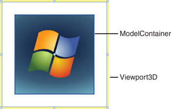
The image is now inside a Viewport3D control, inside the Objects and Timeline category of the Interaction panel. Double-click the Viewport3D control to activate it. Notice that only the top four toolbox items are active.
You can use these controls to reposition the viewport or the object inside the viewport.
Expand the Viewport3D control inside the Objects and Timeline category. You should see some child controls, one being a ModelContainer. Activate the ModelContainer control.
With the Selection tool (V) enabled, a series of red, green, and blue arcs and arrows shows over the image on the artboard. These allow you to control the item in the 3D view. Move your mouse over the center of the image. The cursor changes to an arrow with what looks to be a forward slash running through it that points to the top left of the screen.
Press and hold the left mouse button and move the mouse in either the up or down direction to bring the 3D object closer or send it further away. In this scenario, you want to send the object away, making it appear smaller.
Activate the Viewport3D control again. The ModelContainer now appears to be scaled inside it (see Figure 9.9).
Press the O key or select the Camera Orbit tool from the toolbox. Move the Arrow/Globe-looking mouse cursor over the center of the Viewport3D control. Hold down the left mouse button and drag the mouse around in several different directions to view the 3D position of the ModelContainer.
Another great feature of Blend is the capability to make images dynamically in the forms of visual and drawing brushes. These brushes can then be painted onto a UIElement surface to create effects such as reflection and thumbnails.
The following example shows you the differences between the two.
Create a new Standard application in Blend.
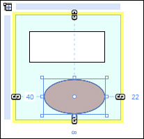
Activate the LayoutRoot element and add a Grid control as a Child.
Set the Background color property of the Grid to a very pale blue, center the Grid both horizontally and vertically, and change the size of the Grid to 150 for both width and height.
Set the bottom margin property to 150 to position the Grid in the center and near the top of the artboard.
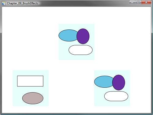
Activate the Grid and, inside the Grid, draw a random selection of ellipses and rectangles as child elements, as shown in Figure 9.10.
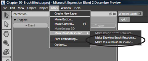
Ensure that the Grid remains active and select it. Open the Tools menu and then select the Make Brush Resource menu item, which shows the additional child menu options of Make Drawing Brush Resource and Make Visual Brush Resource, as shown in Figure 9.11.
Select Make Drawing Brush Resource to open the Create Drawing Brush Resource dialog. Leave the name as DrawingBrush1 for this example.
Repeat step 7, but this time, select Make Visual Brush Resource, the default name of VisualBrush1.
Select and activate the LayoutRoot element. Add two child Grid elements in arbitrary positions at the bottom of the artboard, making their size the same as the first Grid: 150 by 150.
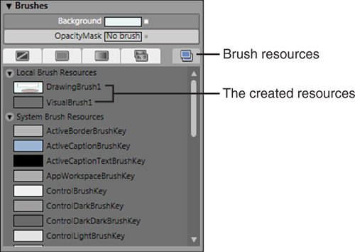
Select the first of the new Grid elements and then open the Brushes category of the Properties panel.
Select the
Backgroundproperty (which is No Brush by default) and then select Brush Resources as the brush type (see Figure 9.12). The DrawingBrush1 and VisualBrush1 resources display in the Local Brush Resources category.Select DrawingBrush1, which is an exact copy of the Grid you created with the Ellipse and the Rectangle objects.
Repeat step 12, for the last of the Grid elements you added, but this time select the visual brush for the
Backgroundproperty resource.Right about now, you might be thinking, “What is the difference?” Go back to the first Grid you created, with the Ellipse and the Rectangle elements. Select and activate it.
With the Selection tool (V), scale and move the Ellipse and Rectangle elements inside the Grid. These live results clearly show the difference.
You are not limited to just showing a Grid. You also can make a DrawingBrush or VisualBrush from any UIElement, even Viewport3D. See Figure 9.13. Table 9.2 provides for some additional properties of the Image element.
Another object type, called a BitmapImage, allows you to create an image from a source file in code and then convert it to an ImageBrush, which can then be painted onto UIElements that require a brush for the background fill property. The BitmapImage type is powerful, but you must remember that only properties set during the object’s initialization period will be used.
In a new application, add the XAML shown in Listing 9.9.
Example 9.9. Creating the ImageBrush Example
    <Grid x:Name="LayoutRoot">
        <Grid.RowDefinitions>
            <RowDefinition Height="0.106*"/>
            <RowDefinition Height="0.894*"/>
        </Grid.RowDefinitions>
        <Grid HorizontalAlignment="Stretch" Margin="20,20,20,20" x:Name="gdImage-
Board" VerticalAlignment="Stretch" Width="Auto" Height="Auto" Grid.Row="1"
Grid.RowSpan="1" Background="#FF8D8D8D"/>
        <Button HorizontalAlignment="Left" Margin="20,10,0,0" x:Name="btnFindImage"
VerticalAlignment="Top" Content="Find Image" Click="btnFindImage_Click"/>
    </Grid>
Listing 9.9 contains a button element that has a click handler declared. Open the Events list in the Properties panel, with the Button selected, then double-click the Click event input box. When you have the event handler code added in Visual Studio, add the code from Listing 9.10. Notice how the BitmapImage is converted to an ImageBrush.
Example 9.10. Making the ImageBrush the Background of a Grid
        void btnFindImage_Click(object sender, RoutedEventArgs e)
        {
            OpenFileDialog OFD = new OpenFileDialog();
            OFD.Filter = "TIF | *.tif";
            OFD.ShowDialog();

            //Build the image to show in the scene
            BitmapImage NewImage = new BitmapImage(new Uri(OFD.FileName,
            UriKind.RelativeOrAbsolute));
        //No properties set on the BitmapImage after the initialization work

            //Create a brush that we use to paint the UIElement with
            ImageBrush ImageToShow = new ImageBrush(NewImage);
            //Assign it to the scene object
            this.gdImageBoard.Background = ImageToShow;
        }
Add the following two using directives:
using Microsoft.Win32;
using System.Windows.Media.Imaging;
You could use a specific Image UIElement, which requires you to set the Source property with an ImageSource value. You could use the same code as previous and instead set the Source of the Image UIElement as follows:
ImageElement.Source = NewImage as ImageSource;
The Label control provides a way to show simple labeling in an application. The control also allows you to specify the Content, which could be a string of text or an additional control, such as an Image or a Grid, with many more controls as children.
Labels also support mnemonics in runtime, so your users can press the Alt key to see an underline under a letter in your label.
<Label HorizontalAlignment="Left" Margin="66,48,0,0" VerticalAlignment="Top"
Width="229" Height="30" Content="La_bel" x:Name="use"/>
By default, the Focusable property is set to false, so when a user executes the mnemonic, focus goes to the next control in the tab order.
Similar to the code syntax required to set the string value of a Button, you can set the display value of the Label by also assigning a value to its Content property:
labMyLabel.Content = "Howdy";
The Listbox is a commonly used control to show the end user, collections of items in a scrollable container. You can activate the control by double-clicking on it in the Objects and Timeline category of the Interaction panel, and then draw any other control directly into it, a Grid for example.
The power of the Listbox comes in when it is data bound to a collection of items, because at heart, the Listbox is an ItemsControl (see the previous discussion in this chapter about ItemsControl). This means it is designed to effectively show a list of items. (See data binding in Chapter 13, “Data Binding,” for more details on using a Listbox in the databound context.)
A ListBoxItem is a child item element of a ListBox control and can contain additional child elements as is required by the user interface specification. Listing 9.11 shows the XAML markup of a simple ListBoxItem.
The quickest way to add a ListBoxItem to a ListBox control is to select the ListBox control in the Objects and Timeline category and right-click to see the menu option to add a ListBoxItem. Listing 9.12 though, shows how to programmatically add ListBoxItem child elements using the items collection “Add()” method.
As you can see from the code in Listing 9.12, a new ListBoxItem is instantiated by the “new” call. The item is then “added” to the Listbox items collection.
Like the CheckBox, the ListBox control has fantastic functionality and can also be used as a Menu control. The items that appear in the List can be styled to any requirement. Additionally, the items collection gives you the flexibility to iterate the child item elements as well as sort, group, and filter, as previously shown with the ComboBox example.
Several events are used commonly with controls such as the Listbox, ComboBox, and ListView controls. The majority of the time you won’t be using one of these controls simply to display items, but more often, you will use these controls to allow a user to actually select an item, which then dictates additional actions for which your interface provides. A master-detailview is a common scenario in many commercial applications, which implements this concept. This concept is discussed in detail when data binding is explained in Chapter 13.
The Selection_Changed event fires when the user makes his or her choice and either clicks or uses the keyboard to highlight a child item element in the control. The event allows you to discover which item the user selected by comparing and sometimes converting the object parsed through the event arguments, therefore giving you the selected item. An example of this functionality is discussed in the next section. You can apply the same methods to the ListBox and other ItemsCollection controls.
The ListView has a long history and a quite impressive pedigree in terms of user functionality. I personally think it took a wrong turn in the early days of .NET, because the ability to add images to multiple columns was a pain, to say the least.
All is not lost with the ListView, however, which makes a triumphant return as one the top controls provided by WPF. ListView allows for extremely flexible data binding, making multicolumn views simple.
You can add ListViewItems to a ListView by using the method described with the ComboBox and ListBox. Select the element in the Objects and Timeline category of the Interaction panel, right-click, and then select Add new ListViewItem from the context menu.
To present multicolumn functionality, you must create a view for the ListView to use. The view represents an object that defines the style and organization of data in the ListView. WPF comes with a predefined view, called the GridView, which you will use in an example shortly. You may also create your own custom views.
Take a few minutes to create the simple XML file shown in Listing 9.13. Add the listing directly to a text file and then save it as Sample.xml in a location you can remember. Then work through the following example that demonstrates the view concept.
Example 9.13. A “People” Object Created in XML with Three “Person” Objects Added
<?xml version="1.0" encoding="utf-8"?>
<People>
    <Person>
        <Name>Bill Turner</Name>
        <Age>25</Age>
        <EyeColor>Blue</EyeColor>
        <Gender>Male</Gender>
    </Person>
    <Person>
        <Name>Steve Turner</Name>
        <Age>32</Age>
        <EyeColor>Brown</EyeColor>
        <Gender>Male</Gender>
    </Person>
    <Person>
        <Name>Jill Turner</Name>
        <Age>29</Age>
        <EyeColor>Green</EyeColor>
        <Gender>Female</Gender>
    </Person>
</People>
The following steps take you through the same simple binding you used in Chapter 2, “Welcome to the New World,” with the Twitter reader, only this time you browse to a file instead of entering a URL for the source XML:
Create the XML file shown in Listing 9.13.
Open a new application in Blend.
Find a ListView control in the Asset Library and add a ListView to the LayoutRoot element.
Open the Project tab panel and click on the +XML button in the Data category.
Browse to the Sample.xml file you created.
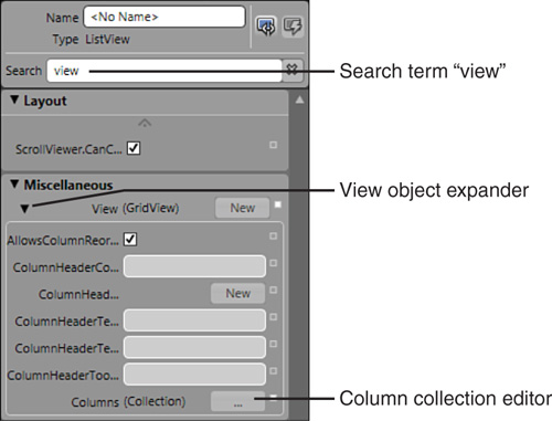
Select the ListView control in Objects and Timeline category and then search for “view” in the property search box of the Properties tab panel. The property View(GridView) displays under the Miscellaneous category, as shown in Figure 9.14.
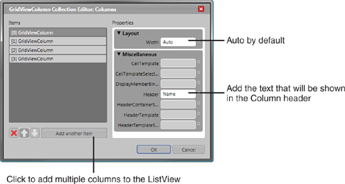
Click on the Columns (Collection) editor button, as shown in Figure 9.14, to launch the GridViewColumn Collection Editor shown in Figure 9.15.
Add three more columns and add the title of the column names in the
Headerproperty of each GridViewColumn (see Figure 9.15).As per the Sample.xml file you created, name the columns Name, Age, EyeColor, and Gender. The ListView element should have four columns in the artboard view.
With the ListView element still selected, search for the
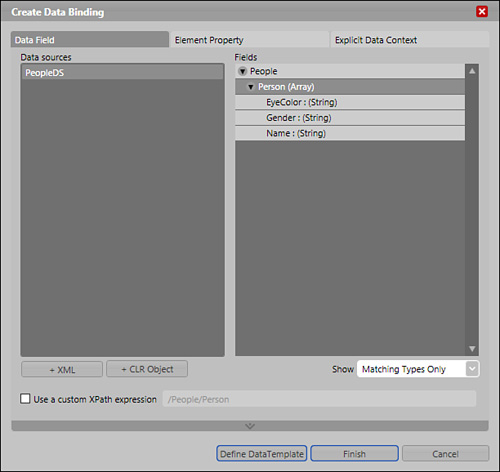
ItemsSourceproperty. Select theAdvancedproperty options (the small square next to the property input box) and select Data Binding... from the context menu.Select the Data Field tab at the top of the dialog box and then select PeopleDS from the Data sources Listbox. “People” should appear in the Fields Listbox with an expander arrow beside it. Expand the Field and select the Person (Array) item in the view (see Figure 9.16).
Click Finish to close the dialog.
On your artboard you now have a ListView control with every field stretched out and showing all the data values for a single person in each field of each column. Why is this?
You defined the view in terms of the columns that you should have, and you specified the data source, but you didn’t strictly define which data each column should contain.
If you switch to XAML view, your markup should look similar to that shown in Listing 9.14, which shows the GridViewColumn collection (inside a GridView element) with only the Header property defined.
Example 9.14. The ListView Showing Four Columns
    <Window.Resources>
        <XmlDataProvider x:Key="PeopleDS" d:IsDataSource="True"
Source="D:Sample.xml" />
    </Window.Resources>

    <Grid x:Name="LayoutRoot" >
        <ListView Margin="50,50,50,50" HorizontalAlignment="Center" VerticalAlignment="Center" Width="350" Height="350" ItemsSource="{Binding Mode=Default, Source={StaticResource PeopleDS}, XPath=/People/Person}">
            <ListView.View>
                <GridView>
                    <GridViewColumn Header="Name"/>
                    <GridViewColumn Header="Age"/>
                    <GridViewColumn Header="EyeColor"/>
                    <GridViewColumn Header="Gender"/>
                </GridView>
            </ListView.View>
        </ListView>
    </Grid>
In order to see the data, you must specify a Data template for each column. You learn more about data binding in Chapter 13, but for now, understand that the GridViewColumn requires a template that sets out how to show the data it gets, which is set to a property named CellTemplate.
Listing 9.15 shows the markup used to define the template for each GridViewColumn in the GridViewColumn collection. An element type of TextBlock is the element used to show the data, but you may choose to use a button or a label element if you wish.
Example 9.15. Data Templates Defined for All Required ListView Columns
              <GridView>
                  <GridViewColumn Header="Name">
                      <GridViewColumn.CellTemplate>
                          <DataTemplate>
                              <TextBlock Text="{Binding XPath=Name}" TextAlignment="Left" />
                          </DataTemplate>
                      </GridViewColumn.CellTemplate>
                  </GridViewColumn>
                  <GridViewColumn Header="Age">
                      <GridViewColumn.CellTemplate>
                          <DataTemplate>
                              <TextBlock Text="{Binding XPath=Age}" TextAlignment="Center" />
                          </DataTemplate>
                      </GridViewColumn.CellTemplate>
                  </GridViewColumn>
                  <GridViewColumn Header="EyeColor">
                      <GridViewColumn.CellTemplate>
                          <DataTemplate>
                              <TextBlock Text="{Binding XPath=EyeColor}" TextAlignment="Right" />
                          </DataTemplate>
                      </GridViewColumn.CellTemplate>
                  </GridViewColumn>
                  <GridViewColumn Header="Gender">
                      <GridViewColumn.CellTemplate>
                          <DataTemplate>
                              <TextBlock Text="{Binding XPath=Gender}" TextAlignment="Left" />
                          </DataTemplate>
                      </GridViewColumn.CellTemplate>
                  </GridViewColumn>
              </GridView>
Listing 9.15 can be inserted between the <ListView.View> and </ListView.View> tags of Listing 9.14.
With any luck, you should now be able to run your application and you will have a multicolumn ListView control, showing the Sample.xml data as required. The DataTemplate element is very powerful in the functionality that is offers, allowing you to specify exactly how you want to present your data, regardless of its source or parental confines.
The inclusion of the PasswordBox control allows you to quickly create password input dialogs or panels that require the user’s entered values to be hidden from the screen.
The control’s use is almost identical to that of a TextBox control, except that the TextBox control has AutoWordSelection and spell-checking properties. You can set the password property programmatically, specifying a string value only. You may also change the symbol that represents the typed characters by supplying the PasswordChar property with a specified char type. See Figure 9.17.
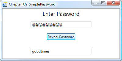
A change within the Password property also raises the PasswordChanged event. To access the value entered into the Password type control, call the Password property to retrieve the value.
Add Listing 9.16 to a new project in Blend. View the Properties for the btnRevealPassword button and double-click on the Click event, adding the code shown in Listing 9.17.
Example 9.16. Setting Up the PasswordBox Example
    <Grid x:Name="LayoutRoot">
        <Grid.RowDefinitions>
            <RowDefinition Height="0.206*"/>
            <RowDefinition Height="0.224*"/>
            <RowDefinition Height="0.273*"/>
            <RowDefinition Height="0.297*"/>
        </Grid.RowDefinitions>
        <Label HorizontalAlignment="Center" VerticalAlignment="Center"
Content="Enter Password" FontSize="18"/>
        <Button HorizontalAlignment="Center" x:Name="btnRevealPassword" VerticalAlignment="Center" Content="Reveal Password" Grid.Row="2" Click="btnRevealPassword_Click"/>
        <TextBox HorizontalAlignment="Center" x:Name="txtPasswordRevealed" VerticalAlignment="Center" Width="200" Grid.Row="3" Text="" TextWrapping="Wrap"/>
        <PasswordBox HorizontalAlignment="Center" x:Name="passEntry" VerticalAlignment="Center" Width="200" Grid.Row="1" PasswordChar="@"/>
</Grid>You could now save and run the application in Visual Studio.
As with previous ProgressBar controls available in the CLR, the ProgressBar control shows a visual position of a Value property in relation to the Maximum and Minimum property values. What is vastly different is the designer’s ability to change the styling of the control to produce nice visual indicators for the user.
The IsIndeterminate property is an interesting property that is accessible from the Properties panel, Common Properties category. If you add the standard ProgressBar control to your artboard and check this property, the progress values begin to marquee across the length of the control’s progress and then reset and begin again. This functionality represents the application equivalent to, “I have no idea how long this will take.”
It’s better to have this functionality, in which the user sees that something is happening with the application rather than sees nothing and closes the application in belief that it has simply stopped working.
The Brushes category of the Property panel enables you to uniquely present the control. To truly customize it, you need to dig into the Control Template. Buried deep in the template is a Rectangle type element that represents the Fill property of the control parent. Here you can create your own styling preferences, including adding animations to the fill (see Figure 9.18) as it changes value using the ValueChanged event. (See Chapter 12, “Templates,” for more detail on Template editing.)
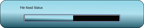
Setting the values of the ProgressBar in code is just as simple as markup, with calls to the Maximum, Minimum, and Value properties being primary. You can also see in the Listing 9.18 how to set the IsIndeterminate property to true, though you would usually set a value or set the ProgressBar to IsIndeterminate but not both.
Example 9.18. Setting the Required Values of a ProgressBar with a Button Click Handler Method
        private void btnBeginProgress_Click(object sender, RoutedEventArgs e)
        {
            this.myProgressBar.Minimum = 0;
            this.myProgressBar.Maximum = 100;
            this.myProgressBar.Value = 69;
         //Set the control to show a scrolling progress
            this.myProgressBar.IsIndeterminate = true;
}The RadioButton control provides your application with a method of allowing mutually exclusive selection. When grouped with other RadioButtons, the control grouping programmatically ascertains which RadioButton should show as checked, and consequently, all others should show as unchecked. Unlike a Checkbox control, the user can’t uncheck the RadioButton by clicking on it several times.
The RadioButton derives from the ToggleButton control, which itself is derived from ButtonBase, so the control does allow you to specify Content, be it text, panels, or even another button.
To create a group of RadioButtons, simply embed them as children to a panel-based control (see Figure 9.19). Listing 9.19 shows three RadioButtons that allow the user to “check” only one button at a time.
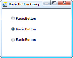
Example 9.19. RadioButton Autonomy in a Group
        <StackPanel HorizontalAlignment="Center" Margin="0,0,0,0"
        VerticalAlignment="Center" Width="168" Height="106">
            <RadioButton Height="35" Content="RadioButton" IsChecked="True"/>
            <RadioButton Height="35" Content="RadioButton"/>
            <RadioButton Height="35" Content="RadioButton"/>
        </StackPanel>
The functionality of the ToggleButton, which is a separate control, is different from that of a standard button because it allows a user to maintain a fixed state, that being either an On or Off, In or Out type state.
The RichTextBox control has a long history with Windows form development. When you need to either display or allow the user to display more complex text formatting, the RichTextBox is a powerful control to use.
The content of the RichTextBox is more complicated than a standard text-based control to either set or retrieve, but the formatting options are endless so don’t let this put you off. Listing 9.20 shows the code used to add a RichTextBox control.
The RichTextBox (RTB) element available in Blend is similar to the RTB controls that developers used previously in .NET Framework 1.0 and 2.0 but with some added features for pagination, layouts, and a few other nice features.
The RTB supports copy and paste of images, text, and all the usual additions. Although the control itself is quite mature and will accept several input formats, as of this writing, it is recommended that only the PNG, JPG, and GIF image types be used in cut-and-paste scenarios. I can find no explanation for this, so perhaps it is just one of those recommendations until such time as the control is deemed released.
One thing to note about the text that you place within the control is that it always wraps. Several workarounds exist for this, but even they don’t always work, so keep this in mind when writing the next mind-blowing text editor.
Take a quick look at the XAML markup in Listing 9.20, and you will note the declaration of Horizontal and Vertical alignment, which does not set the content alignment. For this you must use the HorizontalContentAlignment and VerticalContentAlignment properties, respectively. If left undeclared, the content defaults to Left Aligned.
Note the FlowDocument element, which contains a Paragraph element by default. The FlowDocument element is the only supported child element of the RichTextBox control, but the subelement children of the FlowDocument can contain several useful elements.
The content model of the FlowDocument states that the Top Level child element must be derived from type BLOCK, as Table 9.3 shows.
Table 9.3. Element Types Used in Constructing the RichTextBox Content
Description | |
|---|---|
BlockUIContainer | This lets you embed a single UIElement into the container, which could be a Button (as shown in the sample generated by Listing 9.21) or Grid, which would then allow you to add multiple UIElements. |
List | You must provide ListItem elements, which provide you with numbered or bulleted lists. |
Paragraph | This default element lets you group text and other content. The Paragraph element allows you to declare several other child elements pertaining to the formatting of content such as Bold, Italics, and Underlines. You may also declare content as Hyperlinks and floaters or insert LineBreak elements. |
A special element called an InlineUIContainer works similarly to the BlockUIContainer. You may host a UIElement within the content of the Paragraph, for example, a Button. | |
Section | A Section allows you to group other Block types or additional Section elements. |
Table | The Table allows you to present content in a row- and column-based layout. Several child elements are supported, including TableCell, ListBoxItem, ListViewItem, and FlowDocument. |
To get a better understanding of the Block types and properties discussed in Table 9.3, a simple application is provided in Listing 9.21. The end product is shown in Figure 9.20.
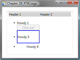
Create a new application project in Expression Blend and enter the markup shown in Listing 9.21. Don’t forget to add a terminating Grid tag.
Example 9.21. Creating a FlowDocument for Use in a RichTextBox Control
<Grid x:Name="LayoutRoot">
    <RichTextBox FontSize="12"
Margin="18.8000000000003,17.2000000000005,20.0000000000001,14.4000000000001"
x:Name="RichTextBox" >
      <FlowDocument>
        <Table>
          <TableRowGroup>
            <TableRow>
              <TableRow.Background >LightGray</TableRow.Background>
              <TableCell>
                <Paragraph>
                  <Run>Header 1</Run>
                </Paragraph>
              </TableCell>
              <TableCell>
                <Paragraph>
                  <Run>Header 2</Run>
                </Paragraph>
              </TableCell>
            </TableRow>
          </TableRowGroup>
          <TableRowGroup>
            <TableRow>
              <TableCell>
                <TableCell.BorderBrush>
                  <SolidColorBrush>Red</SolidColorBrush>
                </TableCell.BorderBrush>
                <List Block.TextAlignment ="Left">
                  <ListItem>
                    <Paragraph>Howdy 1</Paragraph>
                    <BlockUIContainer>
                      <Button>Click me!</Button>
                    </BlockUIContainer>
                  </ListItem>
                  <ListItem>
                    <Section>
                      <Section.BorderBrush>
                        <SolidColorBrush Color ="Blue"></SolidColorBrush>
                      </Section.BorderBrush>
                      <Section.BorderThickness>2</Section.BorderThickness>
                      <Paragraph>Howdy 3</Paragraph>
                    </Section>
                  </ListItem>
                  <ListItem>
                    <Paragraph Margin ="5" TextAlignment ="Right" >Howdy 4</Paragraph>
                  </ListItem>
                </List>
                </TableCell>
            </TableRow>
          </TableRowGroup>
        </Table>
      </FlowDocument>
    </RichTextBox>
    </Grid>
The RTB has protected mouse events, so custom mouse handlers will not work. Instead you need to use tunnelled events (see Chapter 8, “An Example Control Using Just the Tools Palette,” to learn how to add Routed Events) and PreviewMouseUp and PreviewMouseDown events to allow content interaction.
The RichTextBox UIElement is extremely flexible in what it allows as content while at the same time being cumbersome to code from within the .NET environment. The reality is that things don’t always work, like cutting and pasting certain image types, but this is a marked improvement on the control that was previously available within .NET.
Using XAML to declare the various requirements of the RTB is by far an easier route to getting what you want in your RTB, but sleep easy with the knowledge that you can code it in .NET if necessary.
The Slider control is one of those controls that is everywhere but often goes unnoticed in its functionality, because of its simplicity.
You increment or decrement the Sliders value by moving what is known as the thumb. You can also modify the value in code, as shown in Listing 9.22. The Slider can be shown in either a horizontal or vertical position, controlled by an enumerated value to the Orientation property.
A Minimum and Maximum value is set to contain the range of values applicable to the Value property.
The Slider has a few obscure properties that allow finite control of its functionality, as shown in Table 9.4.
Table 9.4. Unique Slider Control Properties
Property Name | Description |
|---|---|
| Set to false (unchecked in the Blend UI interface, which is a checkbox), this self-describing property makes the Slider control value position move downward on increment. This is right to left for Orientation Horizontal and Top to Bottom for Orientation Vertical. |
| Determines how far the thumb value should increment when the user clicks on the slider track. |
| Determines how far the thumb value should increment when the user drags the thumb on the slider track. |
| When TickPlacement has a valid value, the TickFrequency value indicates at what intervals a tick mark should be drawn on the control. |
| Has four enumerated value choices: None, Top Left, Bottom Right, and Both. |
| Default is false, but when enabled it forces the thumb position to snap to the next Tick mark when the user drags the thumb on the track. |
As each release of the .NET Framework supersedes the previous version, it’s usually the control set that has stayed relatively the same. Sure, there were incremental difference to some controls and much requested functionality added to others, but not since the very first version of the .NET Framework have developers seen such a huge change in the way controls fundamentally work and allow you to work with them. The content model of WPF controls is by far the biggest change that migrating developers need to come to terms with, but it is a welcome change and one that opens up a myriad of possibilities instead of a construct of restriction as was previously the case.
A lot of confusion about templates and styles is attributed to the terminology chosen throughout the Blend application’s history from CTP. It was considerably more confusing during the CTPs, where you had different types of templates and styles available on the right-click of an element. You would look at certain controls and see that they had a Content element, which could only accept one child element, and the confusion grew even stronger.
My first thoughts were, “What sort of moron is designing this stuff? One child element is about as handy as an ashtray on a motorcycle!”
Then it occurred to me—and others before me—that you could add a Grid or any panel-based construct element as the child and, therefore, add as many children to that. Now I was feeling like the moron, because someone had obviously thought about it... a lot. (See Chapters 5, “UIElement: Control Embedding,” and 6, “Panel-Based Containers,” for more detail about Panel types and embedding child controls.)
The ContentControl is a strange control (at first) and one that takes a bit of getting used to, because this level of sophistication was never before available in CLR controls. It could have been explained a whole lot better by Microsoft, which included it in the Fabrikam examples that came with the Blend CTPs, because the use was spread out over two tutorials, and they kept going in and out of explanations, so it got a little confusing. The Microsoft help file writers described the ContentControl as a picture frame, which is a little limiting in its true capabilities but simple enough to at least intrigue you.
The ContentControl allows you to store content (amazing, I know). But more than just content as far as control elements are concerned, ContentControl allows you to style the element and then transfer that style to other areas of your application without having a specific type requirement.
Picture this if, you will. You have a Grid element on your work surface, and you divide that Grid into five rows and five columns. Within each cell of the columns and rows, you want to display a control that could be another Grid, a ListBox, or even a MediaElement control playing a motion video. The only thing is that you want to provide a certain style of border and a specific Datacontext to each one of those cells without limiting what can be added to the cells as far as a control element is concerned.
This is the purpose of the ContentControl, because it allows you to create your style and then transfer that style to other ContentControls, which allow you to add your Grid, Listbox, MediaElement, and so on as a child of the ContentControl, therefore presenting different types with the same visual styling.
The following steps create a simple example application that will give you a better understanding of the ContentControl by using style templating as it was intended. When you are ready, open a new project in Blend.
With the LayoutRoot active, find and double-click the Grid element located within the panel-based tools in the ToolBox palette. (See Chapter 7, “Using the Blend Toolbox: Tools and Common Controls,” for a detailed look at the Toolbox.)
Resize the Grid so that it takes up about three-quarters of the work surface and then double-click the Grid element in the Object and Timelines panel to activate the Grid.
Move the mouse over the top of the Grid frame to split the Grid into two columns. You could also use the Properties panel to do this, if you prefer, by typing defi into the property search box, revealing the Row and Column definition collection properties. (Chapter 5 shows this in detail.)
Open the Asset Library and then locate and select the ContentControl.
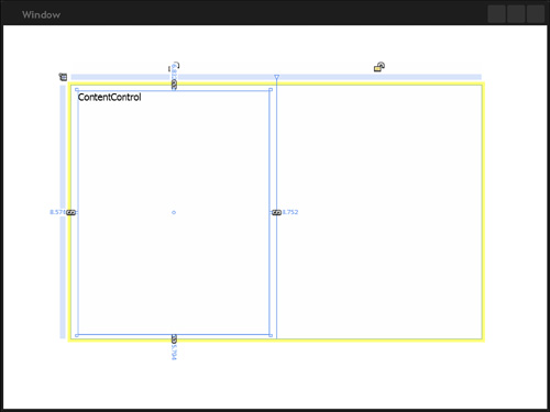
With the ContentControl selected, manually add the control to fit the majority of the left column of the Grid, as shown in Figure 9.21.
The ContentControl already has some content, that being the string ContentControl. As soon as you add the next control item, this content will be replaced. Remember that the ContentControl only allows you to have one child element.
Select and activate the ContentControl.
From the common controls ToolBox palette, select the ListBox control. Double-click it to add it to the ContentControl, where it should automatically fill the entire area.
Open the properties panel and select the Brushes category, changing the Background Brush to any color you choose, maybe a red or even a gradient if you’re feeling adventurous.
With the ContentControl activated in the Objects and Timeline panel, right-click on the element and select Edit Control Parts (Template). Select Edit a Copy to open the Create Style Resource dialog.
Within the Resource name (Key) field, enter DemoTemplate1 as the name and click OK.
You are now in template editor mode. As shown in Figure 9.22, the Objects and Timeline panel shows only a ContentPresenter as the child of the template.
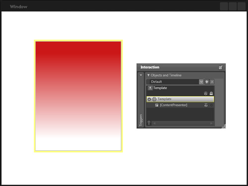
But where is the ListBox? Why is it displayed on the screen but not present in the Objects and Timeline panel?
The question is, where does this ContentPresenter come from if you didn’t add it as an element?
The ContentPresenter is the real magician of the ContentControl, because it is what Microsoft was referring to when it called ContentControl a picture frame. The ContentPresenter shows the current child element(s) of the ContentControl, allowing you to Style your template or add additional control items to fit with the overall requirement for the control.
Continuing on with the example, go ahead and select the ContentPresenter in the Objects and Timeline panel. Then right-click on the element and select Delete from the menu.
So the ContentPresenter is gone, but it is gone only from the template presentation layer. Open the Assets Library panel and find the ContentPresenter control. Double-click it on the ToolBox palette, and you’re the ListBox returns.
Clearly, the ContentPresenter control is not a copy of the child control element(s) but rather a visual representation of the Control Template.
Select and delete the ContentPresenter control once more from the Objects and Timeline panel.
Find and double-click a Grid element within the ToolBox to add it as a Child of the Template.
By default, the Grid element should fill the entirety of the template. Later, you can do whatever you please with this Grid by way of Row and Column definitions, but for now you will just settle with the default.
Double-click the Grid element in the Objects and Timelines panel to activate it. This is very important, because you can use only one child element.
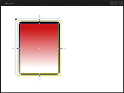
Find and select the Rectangle control from the Shapes control family in the ToolBox palette.
Manually draw the element on the screen so that it fills almost all of its parent Grid, leaving a small but noticeable margin around the Rectangle.
Open the Properties panel. In the property search box, type margin. Set each of the margin values to 5.
Enter the word radius into the property search box. The RadiusX and RadiusY properties display. You could always just use the mouse to set these properties on the Rectangle by moving your mouse to the top-left corner of the rectangle, but to be accurate, you enter the values manually. This examples uses the value 15, but you can adjust it to suit your taste and style.
Enter the text brush into the property search box. Select the fill brush and add a Gradient Brush type (Linear Gradient Mode). Use the Brush Transform tool to rotate the Gradient, showing a dark color on top of a lighter bottom color (see Figure 9.23).
Not to get caught up in styling, you now get back to the ContentControl.
Select and activate the Grid element in the Objects and Timeline panel. Remember that if you activate the Template element, the next control you add replaces the Grid as the only allowable child element, and along with it goes your hard work and master Rectangle styling.
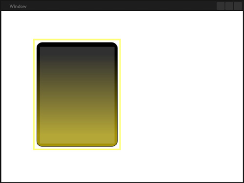
You should now be able to find the ContentPresenter control in the last-used controls section at the bottom of the ToolBox palette. Double-click it to again show the ListBox control representation.
Resize the ListBox so that it fits nicely within the Rectangle element that you previously added (see Figure 9.24).
That is it for the styling of the template for now (see Figure 9.25). Click on the Scope Up button to return to your artboard with the ContentControl and its child ListBox control showing in the Objects and Timeline panel.

The following steps demonstrate clearly the implications of applying your styled template to another ContentControl:
Select the ListBox, and then open the Brushes category of the Properties panel.
Set the Background Brush to a Solid Color Brush, 100% white and then reduce the opacity to 20% by setting the Alpha value.
Select the
Borderbrush property and set it to No Brush.Double-click the Grid element in the Objects and Timeline panel to activate it.
Select the ContentControl from the common controls ToolBox items and manually draw the control within the second column of the Grid.
Open the Properties panel and type margin into the Property Search box.
Set each value to a value higher than normal to create a noticeably smaller ContentControl than what is shown in the first column of the Grid. This example uses 50 for the values.
Double-click and activate this new ContentControl within the Objects and Timelines panel. (If you were diligent enough to name the controls, it will be easy for you to find the right one.)
Choose the Object menu from the top of the screen, select Edit Style, and then select Apply Resource. Your template—DemoTemplate1—appears in the list. Select the template now.
Is this what you were expecting, or did you expect to see the ListBox in there as well?
Remember that all you did was style the template of the ContentControl. By applying this template to the new ContentControl, just the Rectangle element displays (see Figure 9.26).
But what if you want to have the ListBox element transfer with the template? Then you need to go back and add it as a child of the Grid element that you added to the template.
The following steps take you through adding the ListBox to the template and, in the process, you see an interesting side effect of editing the Template at this stage of the project development:
Select and cut the ListBox element that shows as the Child of the first ContentControl.
Double-click to activate the first ContentControl and then right-click to access the context menu. Again select Edit Control Parts (Template), but this time, select Edit Template.
Double-click the Grid element to activate it, and then right-click and paste the ListBox into the tree as child element of the Grid.
What you should notice as soon as you do this is that the template updates immediately on the second ContentControl. If you were to manipulate or change the properties with this template now, you would see them reflected at the same time.
So why didn’t you do this first? Remember that you cannot refer to the Template child elements in code (at least, not very easily), so adding a ListBox (unless prefilled with items) becomes an unusable solution. If you want to Style the ListBox and show that same styling within two ContentControls (or any other control), you need to edit the Style of the ListBox, store it, and apply that styling to the additional ListBox control(s).
There are many instances in which the power to create your own generic styling of a very generic Container control is a fantastic advantage. One of the big areas of benefit is within application skinning, which requires different styles be applied to typed objects. (See Chapter 16, “Using Resources for Skins,” for an example in application skinning.)
Now that you understand the ContentControl and the difference between Template and Control styling, you will better understand the requirements for customizing a standard control that features a ContentControl as the containing element.
Building from your newly acquired knowledge on ContentControls, the concept of HeaderedContentControls is not dissimilar. A HeaderedContentControl contains two Content properties, namely a Header and a Content (referred to as the Primary Content) property.
Both properties can contain only a single child, but as per “Content” rules, you can use a Grid as the single child to enable further embedding of controls. Generally, the header is a way to label the primary content, for example, a TabControl where the TabItem (Tab page, or the primary content) displays the content (usually a panel-based control such as a Grid element) and the Tab (or the Header) displays the name of the page. The Expander control also contains this formula: a Header and Content.
The TabControl is an ItemsControl that allows you to deliver “page” items (the collection) to the user interface in a clean and efficient manner. The control (or at least variations and imitations) were widely used in previous Windows Forms applications and, depending on the circumstances, it helped to either provide fantastic user experience or absolutely rubbish screen management by the developer(s) responsible.
Listing 9.23 represents the default markup added to the XAML file when a TabControl is added to the artboard from the Asset Library.
Example 9.23. The Base TabControl and TabItems as Created by Expression Blend
        <TabControl HorizontalAlignment="Left" VerticalAlignment="Top" Width="100"
Height="100" IsSynchronizedWithCurrentItem="True">
            <TabItem Header="TabItem 1">
                <Grid/>
            </TabItem>
            <TabItem Header="TabItem 2">
                <Grid/>
            </TabItem>
        </TabControl>
You can clearly see in Listing 9.23 that two TabItems are added to the content of the TabControl. Inside each TabItem is a Header property with the value “TabItem” assigned, and a Grid element exists as the content container for the TabItem’s primary content.
Table 9.5 lists some of the properties that help define the visual layout of the TabControl.
Table 9.5. TabControl Common Properties
Property Name | Description |
|---|---|
| The collection of TabItems that the items collection contains. You can add new items to the collection directly from the property in Blend. |
| The default value is −1, which represents that no item should be selected. When a user selects a tab, either via keyboard or mouse, the SelectionChanged event is raised as well as this property value equating to the index of the selected item. |
| Accepts an enumerated value, one of the following four: Top, Bottom, Left, or Right. |
You can use these properties and many others in code to modify an instance of a TabControl, as is shown in Listing 9.24.
The code in Listing 9.24 creates and adds a new TabControl to the LayoutRoot elements child collection, but what about TabItems? This discussion is about HeaderedContentControls after all.
You can create an instance of a TabItem just as easily in code and then add it to the TabControls items collection. This method is shown in the modified Listing of 9.25.
Example 9.25. Adding a New TabItem to a New TabControl, Then Adding the TabControl to the Parent Items Collections
        private void CreateNewTabControl()
        {
            TabControl myTabControl = new TabControl();
            myTabControl.TabStripPlacement = Dock.Top;
            myTabControl.FlowDirection = FlowDirection.RightToLeft;

            //Define a TabItem for the items collection of the TabControl
            TabItem newTabItem = new TabItem();
            newTabItem.Header = "Tab Name 1";

            //Make a Grid element for the TabItems content
            Grid TabItemGrid = new Grid();
            TabItemGrid.Background = new SolidColorBrush(Color.FromRgb(255, 0, 0));

            newTabItem.Content = TabItemGrid;

            //Add the TabItem to the TabControl
            myTabControl.Items.Add(newTabItem);

            this.LayoutRoot.Children.Add(myTabControl);
        }
I don’t know about you, but using Blend to create TabControls and TabItems is my method of choice.
“What is the difference between HeaderedContentControls and HeaderedItemsControls?” Is that the first thing you thought of when you saw the subtitle?
It’s not a silly question, but you need to remember what was previously stated about the HeaderedContentControl put in context beside the HeaderedItemsControl to understand this concept. The differences are shown in Table 9.6.
An example of elements that are HeaderedItemsControls are MenuItems and TreeViewItems, because they both contain a Header property and an Items collection.
The TreeView control (which is an Items Control—no header) demonstrates this concept clearly. This next example goes through the process of creating a TreeView and then adding the TreeViewItems.
TreeView controls have been around in Windows for a long time (Windows 95 was the first, I think). The control plays an important part in showing hierarchical data, the most common example being that of the Windows Explorer application.
Expression Blend allows you to use this element and effectively manage the information that is shown in it, directly in the user interface.
Add the markup from Listing 9.26 to create the TreeView control and its child elements, as shown in Figure 9.27.
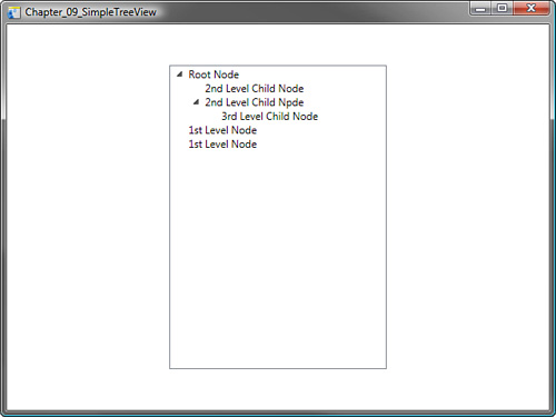
Example 9.26. A Simple TreeView Control
        <TreeView HorizontalAlignment="Center" x:Name="myTreeView" VerticalAlign-
ment="Center" Width="250" Height="350">
            <TreeViewItem Header="Root Node" IsExpanded="True">
                <TreeViewItem Header="2nd Level Child Node"/>
                <TreeViewItem Header="2nd Level Child Node" IsExpanded="True">
                    <TreeViewItem Header="3rd Level Child Node"/>
                </TreeViewItem>
            </TreeViewItem>
            <TreeViewItem Header="1st Level Node"/>
            <TreeViewItem Header="1st Level Node"/>
</TreeView>While you can edit a TreeViewItem control by right-clicking on the TreeView control in the Object and Timeline panel, you will add them in code, which demonstrates the child collection more clearly.
With a new project in Blend, add a Button (name it btnAddItems) and an empty TreeView control (name it tvSampleTree) to the artboard.
Select btnAddItems, set the properties you wish, and then select the Event viewer or the Properties panel. Double-click on the Click event to automatically create the Click handler code in Visual Studio.
The code in Listing 9.27 shows not only how a TreeViewItem element is instantiated in code but also how additional TreeViewItem elements are added to the first element’s Items Collection.
Example 9.27. Creating and Adding Child TreeViewItem Controls
        private void btnAddItems_Click(object sender, RoutedEventArgs e)
        {
            //Make the first TreeViewItem which will contain all the others as
            children
            TreeViewItem RootLevel = new TreeViewItem();
            RootLevel.Header = "Root Level";

            //Create the first Child
            TreeViewItem FirstChild = new TreeViewItem();
            FirstChild.Header = "First Child";

            //Create the second Child
            TreeViewItem SecondChild = new TreeViewItem();
            SecondChild.Header = "Second Child";

            //Create the third Child
            TreeViewItem ThirdChild = new TreeViewItem();
            ThirdChild.Header = "Third Child";

            //Create the fourth Child
            TreeViewItem FourthChild = new TreeViewItem();
            FourthChild.Header = "Fourth Child";


            //Add all the children to the parent items collection
            RootLevel.Items.Add(FirstChild);
            RootLevel.Items.Add(SecondChild);
            RootLevel.Items.Add(ThirdChild);
            RootLevel.Items.Add(FourthChild);


            //Add the root level to the treeview
            this.tvSampleTree.Items.Add(RootLevel);
        }
Just because the parent control is a TreeView doesn’t mean that the child elements need to be TreeViewItems. You may create an instance of any child element to add to the parents Items Collection, such as a user control.
Two of the properties that are available for the TreeViewItem in the Blend Properties panel are IsSelected and IsExpanded, both self-describing in their functionality. See Table 9.7 for a description of these properties.
The Expander control provides an effective way of controlling screen real estate by allowing you to store other controls grouped by a “common” scenario, so it has a Header and Content area. The visual difference between the Expander control and a combo box, for example, is that the Expander’s panel also takes up screen space when expanded. This expansion forces the parent to apply layout logic to any children occupying the same controlled space—for example, in a Row or Column of a parent Grid control—or as shown in Figure 9.28, the other child items in a StackPanel are moved.
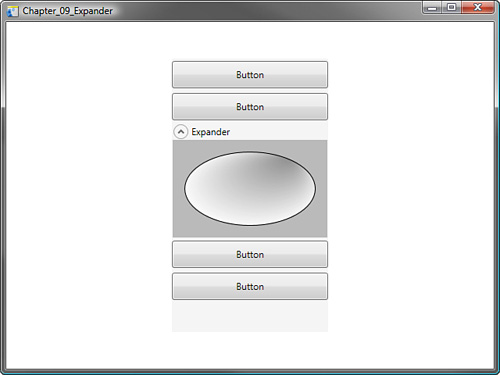
The Expanders content Window (which is the expanded area) can contain another single control. As you would expect, that could be a Grid (a Grid element is placed by default) or another panel-based control to enable further parent-child control embedding. Listing 9.28 provides some markup for creating an expander that contains multiple child items. See Figure 9.29.
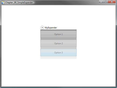
Example 9.28. An Expander Control with Multiple Child Item Elements
        <Expander HorizontalAlignment="Center" VerticalAlignment="Top" Width="200" Grid.Row="1" IsExpanded="False" Header="MyExpander">
            <Grid Height="161">
                <Grid.Background>
                    <LinearGradientBrush EndPoint="0.5,1.115" StartPoint="0.5,-0.115">
                        <GradientStop Color="#FF898989" Offset="0"/>
                        <GradientStop Color="#FFFFFFFF" Offset="1"/>
                    </LinearGradientBrush>
                </Grid.Background>
                <StackPanel HorizontalAlignment="Stretch" Margin="0,0,0,0" VerticalAlignment="Stretch">
                    <Button Opacity="0.45" Margin="0,5,0,5" Height="40" Content="Option 1"/>
                    <Button Opacity="0.45" Margin="0,5,0,5" Height="40" Content="Option 2"/>
                    <Button Opacity="0.45" Margin="0,5,0,5" Height="40" Content="Option 3"/>
                </StackPanel>
            </Grid>
        </Expander>
Listing 9.29 shows how you can effect the expand and collapse methods in code by calling the appropriate methods of the Expander control. The descriptions of these properties are shown in Table 9.8.
Table 9.8. Specific Expander Properties
Property Name | Description |
|---|---|
| You may control the direction in which the Expander’s Content appears by setting the enumerated value of the ExpandDirection property. |
| Set to false by default, this property determines the current state of the elements view. |
Example 9.29. Controlling the Expander in Code
private void btnExpand_Click(object sender, RoutedEventArgs e)
        {
            this.expMyExpander.ExpandDirection = ExpandDirection.Down;
            this.expMyExpander.IsExpanded = true;
        }

        private void btnCollapse_Click(object sender, RoutedEventArgs e)
        {
            this.expMyExpander.IsExpanded = false;
}The GridSplitter control allows you to “resize,” or change, the amount of space between Rows or Columns inside of a Grid. The control should always be given its own space, however, in terms of a Row or a Column so that it remains visible on the Grid. You can provide this area by declaring additional RowDefinitions or ColumnDefinitions as needed. The functionality of the control is simple enough, but in some scenarios it is invaluable for allowing your user to control the screen layout of a Grid and its children.
Listing 9.30 creates a simple grid with Columns and a GridSplitter to control the width of each adjacent column. Figure 9.30 shows the Grid with two controls side by side (purposely exaggerated). The GridSplitter gives the illusion of modifying the control widths when, in fact, the HorizontalAlignment properties of these two controls are set to Stretch and the GridSplitter modifies the ColumnDefinition positions.
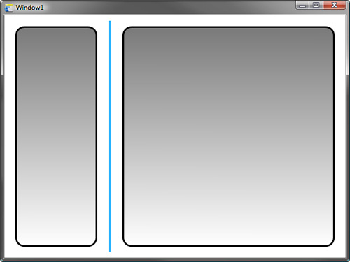
Example 9.30. Demonstrating GridSplitter Functionality
<Grid.ColumnDefinitions>
            <ColumnDefinition Width="0.28*"/>
            <ColumnDefinition Width="0.01*"/>
            <ColumnDefinition Width="0.71*"/>
        </Grid.ColumnDefinitions>
        <Rectangle Stroke="#FF000000" StrokeThickness="3" RadiusX="15" RadiusY="15" HorizontalAlignment="Stretch" Margin="20,20,20,20" VerticalAlignment="Stretch" Height="Auto">
            <Rectangle.Fill>
                <LinearGradientBrush EndPoint="0.486,1.002" StartPoint="0.487,0">
                    <GradientStop Color="#FF797979" Offset="0"/>
                    <GradientStop Color="#FFFFFFFF" Offset="1"/>
                </LinearGradientBrush>
            </Rectangle.Fill>
        </Rectangle>
        <Rectangle Stroke="#FF000000" StrokeThickness="3" RadiusX="15" RadiusY="15" Height="Auto" Margin="20,20,20,20" Grid.Column="2">
            <Rectangle.Fill>
                <LinearGradientBrush EndPoint="0.486,1.002" StartPoint="0.487,0">
                    <GradientStop Color="#FF797979" Offset="0"/>
                    <GradientStop Color="#FFFFFFFF" Offset="1"/>
                </LinearGradientBrush>
            </Rectangle.Fill>
        </Rectangle>
        <GridSplitter HorizontalAlignment="Stretch" Margin="2,10,2,10" VerticalAlignment="Stretch" Width="Auto" Height="Auto" Background="#FF06A7FF" Grid.Column="1" DragIncrement="1" ShowsPreview="False"/>
Table 9.9 discuses some obscure properties, which can change the experience that your user receives from your GridSplitter implementations.
Table 9.9. GridSplitter Specific Properties
Property Name | Description |
|---|---|
| Enables you to control whether the GridSplitter can resize only Rows or Columns, or both. Default is Auto (Both). |
| When enabled, the user will see the GridSplitter’s position when modified by dragging the mouse. When the selection button is released, the Layout logic is applied to the Rows or Columns of the Grid affected. When set to false, the user sees a real-time view of the affect the GridSplitter has to the Rows and Columns. |
| By default the value of this property is set to 1. Modification of the property value changes the spacing that the GridSplitter position takes when moved by the user. |
The Popup control appears simple in its functionality, in that as its name would describe, it pops up!
The Control has myriad properties to allow you to be specific with its positioning, animation, and mouse-controlled functionality, such as staying open or disappearing automatically when the mouse moves off the control.
You have no doubt witnessed a Popup in action before. Whenever you right-click on a control in a Windows form, and a context menu appears. That is the Popup control at work.
You can specify absolute coordinates for the Popup position when rendered, or you can attach it to a parent control, specifying the PlacementTarget property value. You may also set the Placement property and specify its visible position when activated with the giant list of associated enumerated values.
The Popup control is slightly different from others you may use in Blend in that it does not contain its own children. You need to name and access the contained controls directly if you wish to modify or use them in some way. You also need to set the AllowsTransparency property to true if you wish to modify the opacity setting of the control itself or change the shape of the popup appearance. In fact, the AllowsTransparency property was added specifically so you could do this. But again, because the Popup control has parent ownership of the contained controls, this has no effect on them in terms of their opacity or transparency.
Listing 9.31 provides for simple markup of a button control and an associated Popup control. Although the functionality can be made to imitate a tooltip or context menu, you are advised to use a tooltip or a context menu for that specific purpose.
What you will notice in the listing is that the ContentPresenter (Text) of the button is now added to a StackPanel, because the Button has a Content property, meaning that only the button text or the Popup control could be the Content property value. So by using a StackPanel, you are able to have both.
Example 9.31. Defining a Popup Control
       <Grid x:Name="LayoutRoot">
              <Button Margin="228,142,229,0" x:Name="btnPopupButton" VerticalAlignment="Top" Height="36" Click="btnPopupButton_Click">
                     <StackPanel Width="Auto" Height="Auto">
                           <Label Content="This is the Button" Width="101.693" Height="25.96"/>
                           <Popup Placement="Right" x:Name="popButton">
                                  <Grid Width="100" Height="100" Background="#FFD2D2D2">
                                         <TextBlock TextWrapping="Wrap" Language="en-gb">
                                                This is the Popup Grid element set
to display on the Right side of the attached element.
                                         </TextBlock>
                                  </Grid>
                           </Popup>
                     </StackPanel>
              </Button>
       </Grid>
The code in Listing 9.32 demonstrates the button click handler setting the Popup control’s property IsOpen to true, which displays the popup (see Figure 9.31).
The code also sets the StaysOpen property to False, which forces the control to close when it loses mouse capture, by the user clicking elsewhere on the applications form or another control receives focus.
Table 9.10 shows the properties you will most likely be using most of the time to control how your Popup control(s) function in your application.
Table 9.10. Popup Control Properties That Modify the End User Experience and Functionality
Property Name | Description |
|---|---|
| Controls the way in which the Popup control is presented through animation:
|
| Sets the offset amount that the Popup control presents from the left of the original position of the control. |
| Sets the offset amount that the Popup control presents from the top of the original position of the control. |
| Enumerated property value that sets the position of the Popup control, relative to the parent:
|
| Determines whether the popup is visible. |
| Determines whether the control should stay open when the |
It is not unusual for your interface to have resizing capability according to the user’s screen resolution, which sometimes inhibits the ability to use screen space effectively. The ScrollViewer control allows you to overcome this by embedding a child control (usually a panel based-control) and providing for a scrollable region that effectively provides more screen space on the panel.
An example of this is visible in most applications, such as word-processing programs where, in normal usage context, one could expect the text or image objects to take up more than one page; yet you as the interface developer still need to provide an effective means of allowing the user to scroll in both horizontal and vertical directions in order to view the content.
That may be a bad example because in WPF you would use a DocumentViewer control, which has built-in pagination functionality. The usage example, however, is the important piece to get across.
The markup in Listing 9.33 demonstrates the ScrollViewer by placing a Grid panel (whose size is greater than the parent ScrollViewer dimensions) inside a ScrollViewer. A further control (an Ellipse) is added as the Gird child and also set to be larger in dimensional size to that of the Grid’s parent. The results are shown in Figure 9.32.
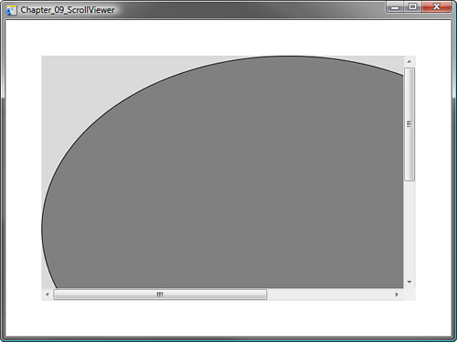
Example 9.33. Creating the Sample ScrollViewer
        <ScrollViewer HorizontalAlignment="Stretch" Margin="50,50,50,50" VerticalAlignment="Stretch" Width="Auto" Height="Auto" HorizontalScrollBarVisibility="Auto">
            <Grid Width="800" Height="600" Background="#FFDADADA">
                <Ellipse Fill="#FF808080" Stroke="#FF000000" Margin="0,0,107,113"/>
            </Grid>
        </ScrollViewer>
The two most common properties of the ScrollViewer control are detailed in Table 9.11.
Table 9.11. ScrollViewer Scroll Bar Control
Property Name | Description |
|---|---|
| Set to Disable by default, you must set the property to Auto or Visible for it to become active. |
| Set to Visible by default, you can set the property to Auto to hide the scrollbars when its content no longer exceeds the bounds of the control. |
This has been a long chapter, but it was all about getting used to the WPF controls and their types accessible with Expression Blend. You may want to revisit a few of the controls and elements of this chapter after you have completed Chapter 10, which is all about writing code in Visual Studio. Any of the concepts shown in this chapter’s code that may have confused you will be re-enforced and much better understood.
These WPF controls are highly flexible compared with control sets provided for in previous .NET Frameworks. You should now have a good understanding of what you can achieve when using these controls and understanding that always using the functionality of an existing control is better than trying to write your own and implement functionality that already exists.