
Templates are a fantastic way of providing standardization for your applications. They also provide you with visual continuity in terms of how your application is going to look with style/data templates for different controls by allowing you to modify all your standard controls to someway adapt to the way your user experienced is intended to be delivered. Data can also be controlled with much more predictable results because of templates. Previously in WinForms, it was often the case that you needed to use a control that could accept or display data. Now you can build controls with templates that look and work a certain way because of the data.
Templates allow you to not only do this within your application, but also you can use the same templates later or send them to another team working on the same application to ensure that styling and design continuity are facilitated. In this chapter you will learn how to modify and create new templates for styles and controls. The next chapter focuses on data binding and will include details of data templates. Your ability to change these templates will directly effect your ability to use the WPF (Windows Presentation Foundation) as an application platform, so you should probably expect to run through some of these concepts a few times to make sure that they are cemented within your mind before moving on. This chapter should really give you a sense of being a god at the end of it because as compared to CLR (Common Language Runtime) controls, XAML (Extensible Application Markup Language) controls are a cinch to work with and to therefore deliver exactly what is required within a design specification and, ultimately, a solution.
At first, the template scenarios in WPF can be quite confusing because they are layered—one template is nested inside another—and indeed, when you start working with more complex templates, additional template references are littered throughout the original template.
We need to begin this topic by defining what a control is, what an element is, and what a UIElement is. In Blend terms, the differences between a control and a UIElement is described in Table 12.1.
For the most part, the terms controls and elements are used interchangeably, and you should consider that a control is represented in XAML as a singular, regardless of the internal parts of the control. For example, a Buttons is written in markup as <Button/>. The Expander is a good example of a control that is made up of separate parts (many other elements) to create the singular functioning control. The Expander contains Grids, Borders, ToggleButtons, and ContentControls/ContentPresenters. Therefore some of the individual parts of the Expander can have styles applied to modify the appearance and or functionality of it.
For this chapter, you are going to create a new template for a button, modify the existing template of an Expander control, and use your new button template to enhance the Expander so that you can use it in future.
Creating a new (control) template is simple and you have already done this several times throughout the book with various exercises. Each time you created a new button, you were creating a new template for the Button element.
A control template is represented in XAML by declaring a ControlTemplate type and a TargetType as shown in the markup following:
<ControlTemplate x:Key="ExpanderControlTemplate1" TargetType="{x:Type Expander}"/>The importance of the TargetType is so you don’t try to apply a ListBox’s control template to an Expander control, for example. The benefit of this is that Blend recognizes the template types and so allows you to assign them interchangeable within single (or groups of) controls that match the target type, without concern that you will apply the wrong template to an incompatible type.
To create a blank template, right click on any element, select Edit Control Parts (Template), and then select Create Empty. From here you can build your own template with various controls to suit. You might lose the functionality of the base control when doing this, though, because the control might have explicit methods, properties, and events that it uses to receive and send input through the control. For example, if you remove the ToggleButton element from the Expander control, you can’t expect to automatically have the functionality of the original control based on the events, properties, and methods used by the original ToggleButton. So, be careful!
Where should you start? You could go off and start hand-coding the markup for the given control and fight your way through (which is how we did it in the earliest of days). Or you could use the methods prescribed in the previous paragraph. But my recommendation for people new to XAML and the concepts of the Blend/WPF Templating system is to use what is already there as a base and build on it.
When you right-click on a control and select Edit Control Parts (Template), you also see another option: Edit a Copy. By using this option, you are effectively cloning the existing template and giving yourself free rein to modify and enhance (or destroy) the existing template without any real concerns as your original will always be available.
To demonstrate this a little further, you will now modify the ToggleButton control template in a ComboBox control and then apply that to the ToggleButton in an Expander control.
Start with a new application in Blend, adding two ColumnDefinitions to the LayoutRoot element to split it down the middle.
Open the Asset Library and select a ComboBox element from the Simple Styles collection, placing it on the left side of the artboard, about halfway up.
Find the ComboBox element in the Objects and Timeline category of the Interaction panel, right-click to raise the context menu, and select Edit Control Parts (Template), followed by Edit Template.
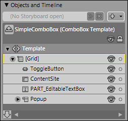
You are now “in” the template editing view and your artboard should have changed to show you a really big ComboBox only. The Objects and Timeline category has also changed, showing you the inner makeup of the ComboBox element as shown in Figure 12.1.
Double-click the ToggleButton element to activate it. You are now going to edit the ToggleButton element control template, so again go through the process of right-clicking the element, but this time opt to edit a copy instead of the template.
The Create ControlTemplate Resource dialog should now be showing. Enter
MyGreenToggleButtoninto the Resource Name (Key) edit box, and ensure that the Define radio button for Application is selected.You will now see the Objects and Timeline category shows the individual elements that make up the combo box. Hide some of the elements and you should see that the part that acts as the drop-down button is a Rectangle element that fills the entire space.
Select the Rectangle element and change the
Fillproperty to show a nice light green SolidColorBrush.If you look in the Triggers category, you should see three Triggers defined that change both the functionality and the style of the element depending on which triggers are raised. (This is the implicit style-editing ability of Blend and will be covered in the next section.) You are looking for the Trigger that is raised when
IsChecked=True. Select it in the list and you should take note of the Properties When Active area of the Triggers category.Figure 12.2 also shows the style template change that is made when this Trigger is activated and it is this property that we want to change. You will see the style change is also visible in the Rectangle element that you have selected, as you will now see that it has reverted to the silver type PressedBrush resource. Making sure that Trigger Recording is on by verifying the red border around the artboard, you can change the
Fillproperty once more to aSolidColorBrush, this time choosing a darker green.You have now finished with the ToggleButton template, so you can click on the ScopeUp button to return to the ComboBox template, click on the ScopeUp button again to return to your application scene, or you can use the Template Breadcrumb capability of Blend as described in Figure 12.3. This breadcrumb workflow allows you to move quickly between the layers of templates and the subsequent child controls of parent control templates. After you have specifically opted to edit a ControlTemplate or style template, you no longer need to go through the right-click menu scenarios because you can select the template to edit at anytime on the breadcrumb bar.
Press F5 to run the application and click on the drop-down arrow to note the changes that occur with the Trigger activating: The
IsCheckedproperty is set to true and your Trigger fires to modify the part color to green.What you should have noticed is that the
MouseOverTrigger is also activated, which again sets the style of the Rectangle. You can go back in and change the style if you really want to!


Applying your template is a very simple process as you will now see continuing with the example. It makes no difference what sort of template you have edited, the application of the template is the same as the following procedure.
Add a SimpleStyles Expander to your application, setting it to show on the right side of the LayoutRoot grid.
When you have finished with your placement of the Expander, double-click on the Expander to activate it, and then continue through to Edit Control Parts (Template) either by right-clicking in the Objects and Timeline category or by using the Template Breadcrumb toolbar. You probably don’t see any Style or Template buttons next to the [Expander] button, but you should see a little arrow indicating drop-down features. Click on this button and you will see a shortcut menu appear, giving you same the features as the right-click context functionality. You should be editing the template here, not a copy of the template.
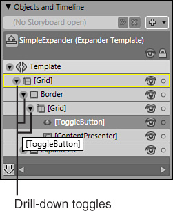
As Figure 12.4 shows, the Object and Timeline element tree can be drilled down to show the ToggleButton control—this is the target control you wanted to find.
Double-click the ToggleButton element to activate it. Right-click to produce the context menu, again selecting the Edit Control Parts (Template) menu item, and this time moving down to Apply Resource. You should see a new context menu appear, and it should contain the item MyGreenToggleButton. Select the item to apply it. You can also do this from the Template Breadcrumb toolbar.
ScopeUp back to your application scene and press F5 to run your application.
When you run your application, you should see the same functionality and style applied to the element as is applied to the ComboBox element. You will notice some other changes that you need to make to complete the correct functionality, which include editing the Expander template (I would advise a copy) and setting the Arrow Path element to point upward when the IsChecked property is true.
As you can see, the biggest part of the job is creating the custom template, which is easy thanks to the Blend UI. You can apply the template to your heart’s content throughout your application now, ensuring that all ToggleButton elements look the same way.
The Style Template is the top level template of every control and is created at the time of authoring the control.
When looking at controls in existing pre–.NET 3.0 applications, it’s hard to think of them as containing much of any sort of style. The controls are plain in aesthetic terms, conveying very little in the way of user experience or adding much to a good overall user experience.
A style template allows you as a designer to specify how a control should look and function in terms of appearance and animation through property evaluation. As with all templates, you can also store these templates in a resource dictionary if required or just add them to the application’s resource collection.
Style animation also has the added benefit of allowing you to define property events. This means that when a given property evaluates to true, an event is raised and you can then execute actions such as starting another animation, setting another property to a desired value, or changing the style to suit the given situation.
An example of this is when you set a Button control’s IsEnabled property to false in the Properties panel, Common Properties category. The style template has been designed with a property trigger so that when the IsEnabled property is false, the style changes color to give the user a clear understanding that the control is in a different state. The markup shown in Listing 12.1 is the default style template added by Blend when you edit the template of a button.
Example 12.1. The Breakdown of a Style Template
Style Templates are placed by Blend in the Resources collection of the parent
control type (which is a UserControl in this case).

<UserControl.Resources>

Style definition with a Key, a TargetType, and BasedOn property/attribute setting.

    <Style x:Key="ButtonStyle1" BasedOn="{x:Null}" TargetType="{x:Type Button}">
        <Setter Property="Template">
            <Setter.Value>

This is the ControlTemplate which is editable using the methods described previously in this chapter. The ControlTemplate makes up the parts.

                <ControlTemplate TargetType="{x:Type Button}">
                    <Grid x:Name="grid" Background="#FFCEFF00">
                        <ContentPresenter SnapsToDevicePixels="{TemplateBinding
SnapsToDevicePixels}" HorizontalAlignment="{TemplateBinding
HorizontalContentAlignment}" VerticalAlignment="{TemplateBinding
VerticalContentAlignment}" RecognizesAccessKey="True"/>
                    </Grid>

The Trigger declarations allow you to specify what should occur and when.

                    <ControlTemplate.Triggers>
                        <Trigger Property="IsFocused" Value="True"/>
                        <Trigger Property="IsDefaulted" Value="True"/>
                        <Trigger Property="IsMouseOver" Value="True">

In this Trigger, when the IsMouseOver property for the button is true, changes are
made to the following element.
                            <Setter Property="Background" TargetName="grid"
Value="#FFFF0000"/>

This "Setter" requires a property name from a named element (in this case the
"grid") and a new value to apply.

                        </Trigger>
                        <Trigger Property="IsPressed" Value="True"/>
                        <Trigger Property="IsEnabled" Value="False"/>
                    </ControlTemplate.Triggers>
                </ControlTemplate>
            </Setter.Value>
        </Setter>
    </Style>
</UserControl.Resources>
Looking through the markup in Listing 12.1, you can see a very simple style template which is a nice and simple example to look at for the distinguishing parts of a style template. Obviously Style templates (and templates in general) can get very complex with multiple trigger scenarios, firing off animations and setting property states. If you can modify an element in your scene and then understand what the XAML is doing to achieve your settings, you will have a better understanding of how and why XAML is so fantastic, and why Blend is the obvious tool of choice (rather than Visual Studio) to make such modifications.
WPF controls are created with a generic style. This generic style is not dissimilar to the style template shown in Listing 12.1 and is what makes up the markup added to the XAML editor when you do indeed opt to edit or copy a template. The phrase “edit the style template implicitly” means that when you opt to edit the ControlTemplate, you also get the entire style template because as you can also see from Listing 12.1, the ControlTemplate resides within the style template.
When intending to modify styles of existing WPF controls, Blend gives you a baseline series of styles defined for specific controls that are available in the Simple Styles collection available in the Assets panel. Operating system themes are also brought into the mix, and depending on whether you are using Windows XP or Windows Vista, some styles determine how controls should look when in the runtime environment.
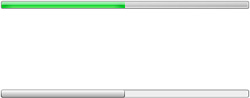
An example of the generic base styling and theme-based component styling can be seen with the ProgressBar control. Try adding a standard ProgressBar and a SimpleStyles ProgressBar, one above the other, and then set an arbitrary value to both controls. The difference is dramatic and can be seen in Figure 12.5.
If you added the SimpleStyle ProgressBar control to an empty Window or UserControl, you will not see anything in the markup to indicate that a theme is being used to control the visual aspects of the control. If you now edit the template of the control, you should see a new XML namespace added to the top of your Window (or UserControl) declaration. Markup similar to the following:
xmlns:Microsoft_Windows_Themes="clr-
namespace:Microsoft.Windows.Themes;assembly=PresentationFramework.Aero"
This indicates that the style is using a Windows theme somewhere. And in the ProgressBar’s case, deep in the style template, you will see where a Rectangle element has a highlight binding converter, which is what gives the ProgressBar its styled appearance. If you edit a copy of the style template locally with a Simple Style ProgressBar on a new Window or UserControl, you will note that no such theme is used. In addition to the visual differences, when you try to modify the template of the controls you will also see how simple (no pun intended) it is to modify one control against the other.
Let’s now modify the Simple Styles ProgressBar and, in the process, create a new style template that you can then apply to other ProgressBars that you might want to use later in the same application or a completely different one.
The following steps take you through creating a new Style; the same process can be used for all controls:
Either add the XAML from Listing 12.2 or start a new empty project and then open the Asset Viewer and type
Progressinto the search box, which should return a single control SimpleProgressBar.Add this control to the center of the LayoutRoot panel and set its height to 15, set the HorizontalAlignment to Stretch, and set the Left and Right Margin to 150.
Open the Objects and Timelines panel and navigate through the visual tree to find and select the ProgressBar control.
On the top menu, Object, find the option for Edit Style and select Edit Style from the child menu.
Open the Interaction panel if it is not already visible and you should note a default trigger exists called Default. This represents the default property values of the control. By default the Simple ProgressBar contains a property recorded value, setting the
Backgroundproperty of the control.Try changing a visual property such as the Brush applied to the
Backgroundproperty. You will see nothing has changed on the control. Why is this? It’s because the SimpleProgressBar is made up of two parts and a Container object, as shown in Table 12.2. TheBackgroundproperty you see in the style template refers to the background of the control as a group and not the individual part shown in the control. The part called Part_Track is a control of type Border and represents what you see as the background panel on the control.You will also note at this point that you are modifying the
SimpleStyles.xamlresource dictionary directly (you should see this file at the top of the artboard in the list of open files).
To change the ProgressBar, you need to access the control template and then modify the styles of the individual part components.
I hesitated about adding this section in this book because the FocusVisualStyle can create a wide range of user experience issues if not used correctly. When you add a Button element to an application and that Button element is focused in runtime, you will note a style is given to the Button to indicate that it does indeed have the keyboard focus. If you add a Simple Styles Button element and run the application, you will note that the appearance of a Focus style is much less prominent.
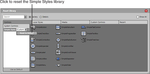
While in the style template, click on the XAML viewer tab and you will see the entire Simple Style file. Open the Asset Library panel and you will see that the Simple Styles button in the Controls category has changed and now shows a combo box control with the word Custom in it. When you click on the combo box, you now have the option to remove your custom styles and reset the Simple Styles dictionary back to its default as shown in Figure 12.6.
The FocusVisualStyle is a little deceptive in how you are meant to work with it in a solution design sense. You are not meant to change the FocusVisualStyle of individual controls; doing so could lead to a confusing user experience because one control would show a certain focus style and a different control would show a different focus style. You are meant only to work with the FocusVisualStyle when creating a theme to be used across all controls in your solution.
A FocusVisualStyle is a ControlTemplate element that targets the Control.Template property of the intended target; in this case, a Button element. The following is the easiest way I have found to create a FocusVisualStyle ControlTemplate, so you will now go through creating a new border for the button when it receives focus.
Start a new application in Blend.
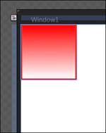
Add a Border element to the artboard, leaving it at its default position and size in the top left of the artboard.
Style the Border element anyway you choose, using the Properties panel to set the
BackgroundandStrokeproperties. In the example, I have created a redLinearGradientBrushwith a bright redSolidColorBrushfor theStroke.Set the
BorderThicknessproperty to 2.Switch to the XAML view and add the listing shown in Listing 12.3 above the LayoutRoot Grid element, which creates the Style and ControlTemplate element you are going to assign to your control.
You should also be able to see your Border element in the XAML. Select the entire markup for the element and put it between the <ControlTemplate> markup tags in the style you just created in
Window.Resources.Your entire markup should look similar to that of Listing 12.4.
Example 12.4. Building Out the ControlTemplate
<Window.Resources>
    <Style x:Key="NewFocusVisualStyle">
      <Setter Property="Control.Template">
        <Setter.Value>
          <ControlTemplate>
                <Border HorizontalAlignment="Left" VerticalAlignment="Top"
Width="100" Height="100" BorderBrush="#FFFF0000" BorderThickness="2,2,2,2">
                        <Border.Background>
                                <LinearGradientBrush EndPoint="0.502,1"
StartPoint="0.498,0">
                                        <GradientStop Color="#FFFF0000"
Offset="0"/>
                                        <GradientStop Color="#FFFFFFFF"
Offset="1"/>
                                </LinearGradientBrush>
                        </Border.Background>
                </Border>
          </ControlTemplate>
        </Setter.Value>
      </Setter>
    </Style>
</Window.Resources>
        <Grid x:Name="LayoutRoot">
         </Grid>
You need to make some final modifications to your Border element that pertain to the size, layout, and positioning of the Border. The Border will take its position from its target element, so you can remove the following markup from your Border element:
HorizontalAlignment="Left" VerticalAlignment="Top" Width="100" Height="100"
Finally, add a new Margin property to the element because you want the Border to appear just outside the bounds of the target control when the focus is on it, just so the user will instantly notice the change in focus. Add the following markup to the Border element:
Margin="-3"
Return to the Design artboard and you should have a clean space to work with. Open the Asset panel and select a Button element from the Simple Styles collection.
Place the Button on the artboard at any position and size you choose.
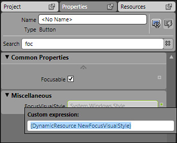
With the Button element selected, type the word
focinto the property search box and you should find the propertyFocusVisualStylein the Miscellaneous category.You will note that you can’t edit the property directly in the property edit box. But don’t worry, all is not lost. To the right of the property edit box, you will see a small box that allows you to open the advanced properties options.
Click on the small box, and select the Custom Expression menu option, which opens a small pop-up as shown in Figure 12.8.
Enter the following into the box:
{DynamicResource NewFocusVisualStyle}and press Enter to close.
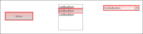
Now run your application and press the Tab button to send the focus to your button. It should turn red. Perhaps a little too red?
Okay, I was just making a point, albeit a very ugly one. Change the
GradientStopcolor values to something similar to the following and try again:<GradientStop Color="#3FFF0000" Offset="0"/> <GradientStop Color="#3FFFFFFF" Offset="1"/>
The markup in Listing 12.5 shows that the FocusVisualStyle has been applied to three items in the scene as shown in Figure 12.9. But using the method of applying the style to each individual element could be quite time-consuming to say the least, especially in a large application that contains many screens and/or UserControls.
Example 12.5. Applying the FocusVisualStyle
<Grid x:Name="LayoutRoot">

        <Grid.ColumnDefinitions>
                <ColumnDefinition/>
                <ColumnDefinition/>
                <ColumnDefinition/>
        </Grid.ColumnDefinitions>
        <Grid.RowDefinitions>
                <RowDefinition/>
                <RowDefinition/>
                <RowDefinition/>
        </Grid.RowDefinitions>

        <Button FocusVisualStyle="{DynamicResource NewFocusVisualStyle}"
HorizontalAlignment="Stretch" Style="{DynamicResource SimpleButton}"
VerticalAlignment="Stretch" Width="Auto" Height="Auto" Content="Button"
Margin="35,55,35,55" Grid.Row="1"/>

        <ListBox FocusVisualStyle="{DynamicResource NewFocusVisualStyle}"
HorizontalAlignment="Center" Margin="0,20,0,20" Style="{DynamicResource
SimpleListBox}" VerticalAlignment="Stretch" Width="100" Grid.Column="1"
Grid.Row="1" IsSynchronizedWithCurrentItem="True">
                <ListBoxItem FocusVisualStyle="{DynamicResource
NewFocusVisualStyle}" Style="{DynamicResource SimpleListBoxItem}"
Content="ListBoxItem"/>
                <ListBoxItem FocusVisualStyle="{DynamicResource
NewFocusVisualStyle}" Style="{DynamicResource SimpleListBoxItem}"
Content="ListBoxItem"/>
                <ListBoxItem FocusVisualStyle="{DynamicResource
NewFocusVisualStyle}" Style="{DynamicResource SimpleListBoxItem}"
Content="ListBoxItem"/>
        </ListBox>
        <ComboBox FocusVisualStyle="{DynamicResource NewFocusVisualStyle}"
HorizontalAlignment="Stretch" Margin="15,25,15,0" Style="{DynamicResource
SimpleComboBox}" VerticalAlignment="Top" Grid.Column="2" Grid.Row="1"
IsSynchronizedWithCurrentItem="True" SelectedIndex="0">
                <ComboBoxItem FocusVisualStyle="{DynamicResource
NewFocusVisualStyle}" Style="{DynamicResource SimpleComboBoxItem}"
Content="ComboBoxItem"/>
                <ComboBoxItem FocusVisualStyle="{DynamicResource
NewFocusVisualStyle}" Style="{DynamicResource SimpleComboBoxItem}"
Content="ComboBoxItem"/>
                <ComboBoxItem FocusVisualStyle="{DynamicResource
NewFocusVisualStyle}" Style="{DynamicResource SimpleComboBoxItem}"
Content="ComboBoxItem"/>
        </ComboBox>

</Grid>
There has to be an easier way to apply the FocusVisualStyle across the application, right? Well, if you have heeded my advice and have chosen to use only SimpleStyle elements in your application, you will be able to open your version of the SimpleStyles.xaml file and add your FocusVisualStyle directly to the elements that you use.
Open the file and search for each component’s element markup or do the following:
Right click on a SimpleStyle element in your artboard.
Select Edit Control Parts (Template) and then Edit Template.
In the Objects and Timeline category of the Interaction panel, select the Template item, right click, and select View XAML.
You should see above the element’s markup there will be either a style defined or a reference to a FocusVisualStyle that the element uses. You can modify this style directly or replace it entirely at your discretion.
It’s interesting to look through the file and see how the certain existing styles have been created. You could even use those as a template and simply modify the colors and or stroke values as required.
Data templates are a powerful tool in your arsenal, enabling you to control and deliver data exactly as is required by your end user(s). Because you are working with a template, you can store that template in a Resource Dictionary or simply keep it in the application markup source.
You have the ability, with data templates, to change the number, definition, and property values of any control you add to the template, which means that you are free to mold data visualization assets with unprecedented ease.
You should create a new project and add the markup from Listing 12.6. The listing creates a simple ListBox, an XMLDataProvider, as well as a basic DataTemplate for displaying an Internet RSS (Really Simple Syndication) feed from CNN.com. The process to create Listing 12.6 is identical to the steps you took in Chapter 2, “Welcome to the New World,” to connect the twitter RSS feed.
Example 12.6. A ListBox with DataProvider Attached
<Window.Resources>
    <XmlDataProvider x:Key="rssDS"
Source="http://rss.cnn.com/rss/si_topstories.rss">
        <XmlDataProvider.XmlNamespaceManager>
            <XmlNamespaceMappingCollection>
                <XmlNamespaceMapping Prefix="feedburner"
Uri="http://rssnamespace.org/feedburner/ext/1.0"/>
                <XmlNamespaceMapping Prefix="atom10"
Uri="http://www.w3.org/2005/Atom"/>
            </XmlNamespaceMappingCollection>
        </XmlDataProvider.XmlNamespaceManager>
    </XmlDataProvider>
    <DataTemplate x:Key="rssTemplate">
        <StackPanel>
            <TextBlock Text="{Binding Mode=OneWay, XPath=@version}"/>
            <StackPanel>
                <TextBlock Text="{Binding Mode=OneWay, XPath=channel/title}"/>
                <TextBlock Text="{Binding Mode=OneWay, XPath=channel/link}"/>
                <TextBlock Text="{Binding Mode=OneWay, XPath=channel/description}"/>
                <TextBlock Text="{Binding Mode=OneWay, XPath=channel/copyright}"/>
                <StackPanel>
                    <Image Source="{Binding Mode=OneWay,
XPath=channel/image/url}"/>
                </StackPanel>
                <ItemsControl ItemsSource="{Binding Mode=OneWay,
XPath=channel/item}">
                    <ItemsControl.ItemTemplate>
                        <DataTemplate>
                            <StackPanel>
                                <TextBlock Text="{Binding Mode=OneWay,
XPath=title}"/>
                            </StackPanel>
                        </DataTemplate>
                    </ItemsControl.ItemTemplate>
                </ItemsControl>
            </StackPanel>
        </StackPanel>
    </DataTemplate>
</Window.Resources>

    <Grid x:Name="LayoutRoot">
        <ListBox HorizontalAlignment="Center" VerticalAlignment="Center"
Width="457" Height="334" ItemTemplate="{DynamicResource rssTemplate}"
ItemsSource="{Binding Mode=Default, Source={StaticResource rssDS}, XPath=/rss}"
IsSynchronizedWithCurrentItem="True"/>

    </Grid>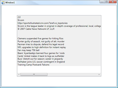
The main point you should understand here is that it doesn’t matter what type of data source you have, be it RSS, XML files, or CLR objects; the DataTemplate doesn’t care. Its job is to take data and display it using the controls that you think are best suited for that purpose for each piece of data. If you think about that a little more, you will then realize that because you are specifying control elements to display the data, you can style those elements using templates as well!
The markup in Listing 12.6 already contains a basic data template; well, it contains two, actually. You are now going to edit one of those templates to move things around and add some style to the output.
You will note that the Objects and Timeline category looks pretty bare and this is because the data template is referenced by the ListBox and not part of its items collection. Right-click on the ListBox and look for the menu item Edit Other Templates, or use the Template Breadcrumb toolbar at the top of the artboard. You can choose Edit Generated Items (Item Template) and then select Edit Template.
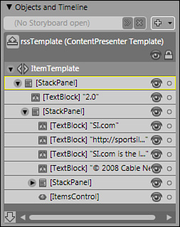
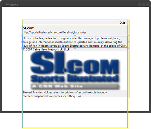
The DataTemplate is now visible in the Objects and Timeline category of the Interaction panel, as shown in Figure 12.11. Technically it is actually the ContentPresenter template, but it represents the DataTemplate and the controls that defined within it. Walk through the visual tree, double clicking to activate the individual control elements, and you will see on the artboard where those controls are located.
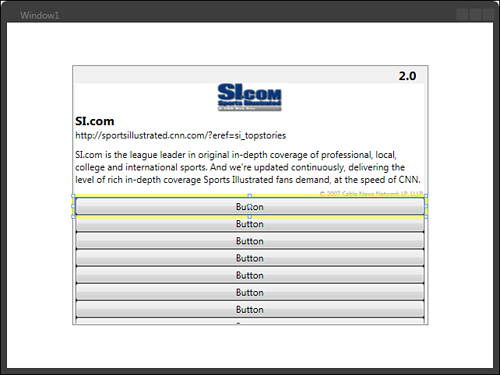
Activate the top most StackPanel element and you will see that this control stretches way to the right of the bounds of the ListBox. Pan the artboard to the direction of the outer bounds of the control. Resize the control so that it fits neatly inside the ListBox and you should see an image come into view as shown in Figure 12.12.
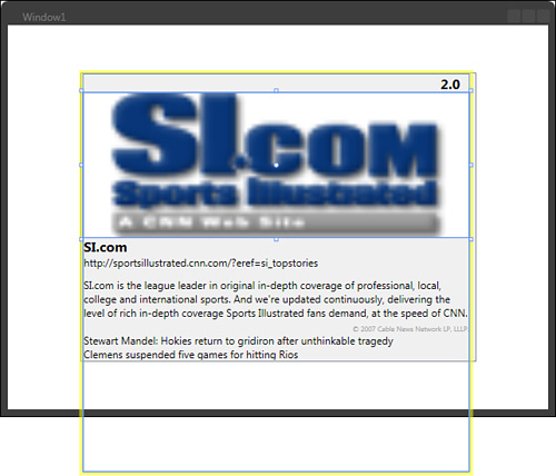
Working down the Objects and Timeline tree, you can resize the elements and change fonts and colors to start to give your data some distinctive styling. You should realize by now that all these control elements are inside the parent StackPanel control, so you could change the Panel type if the stacking of the elements does not suit your layout ambitions.
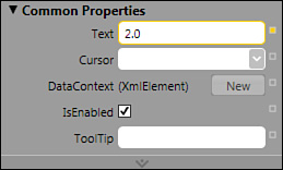
With the second element activated (the TextBlock with “2.0”), open the Common Properties category of the Properties panel and you should see the Text property has an orange border around its value input box (see Figure 12.13) and the advanced property options square is also orange. This indicates that the value present is the result of a data binding.
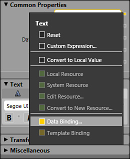
Click on the advanced property options button (little orange square) and you will be presented with a context menu that has an option at the bottom for data binding, as shown in Figure 12.14.
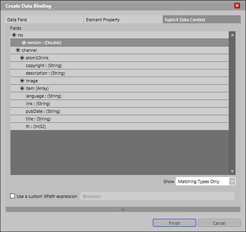
The Create Data Binding dialog is presented, which should automatically show you the Explicit Data Context tab with the field list that the control is currently bound to, as shown in Figure 12.15.
You could change the field here that the element is bound to using either the Fields selector or you could add a custom XPath expression.
Click Cancel to close the dialog or Finish if you selected a new Field.
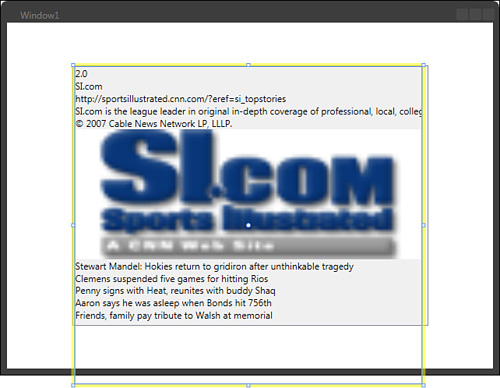
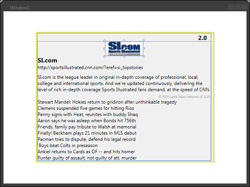
Begin moving, resizing, and changing the properties of the control elements as you see fit. When you get to the TextBlock element that contains the starting text “SI.com is the league leader in...”, you will notice that the text extended out past the bounds of the ListBox. In the property search box, enter the word
Wrapand you should then change the property to Wrap, which will resize the control for you.Set the
Top Marginproperty value to 10 to give a little space between this element and the previous element (see Figure 12.16).You should now be looking at the distorted image, which is clearly incorrectly sized. The Image element also sits inside a StackPanel for no obvious reason. Drag the element in the Object and Timeline visual tree so that it becomes a child of the StackPanel parent element and not inside its own StackPanel. This should move the image to the very bottom of the screen.
Remove the empty StackPanel element now—it is no longer needed. Right-click on the Image element and select Order and then Send to Back from the subsequent context menus. Hopefully you should now have something similar to Figure 12.17 and your Objects and Timeline category should look like Figure 12.18.
Now the image placement is where you want it (or where I want it), you now need to do something about the size of the image. Because this image is from an RSS feed, there is no guarantee that the image will be the same every time or indeed the same dimensions, so you should really bind the
WidthandHeightproperties of the Image element to the field properties (if present) inside the data source.With the Image element selected, find the
WidthandHeightproperties in the Layout category of the Properties panel. Starting with theWidthproperty, select the advanced property option button and then select Data Binding.Select the Explicit Data Context tab, drill down through the list of fields until you find the image, and then select the width: (Int32) field. Click Finish to apply this binding.
Do the same for the
Heightproperty. If all is well, you should end up with the correctly formatted image in your template, as shown in Figure 12.19.You will notice that the last element at the bottom of the visual tree is called ItemsControl. When you activate it, it appears that the ItemsControl element contains the rest of the fields being shown. The ItemsControl is showing a collection of items from the data source (the feed, in this case), so it could dynamically change both the number and the content of each item and the data template would handle it without error.
Double-click the ItemsControl element to activate it if you have not already done so and right-click the element in the Object and Timeline visual tree. Again you need to select Edit Other Templates, Edit Generated Items (Item Template), and then Edit Template.
You can now see the template in the Objects and Timeline category, which contains a single StackPanel and child TextBlock element. This confirms that the ItemsControl is a template for each item shown, so any change you make to this template is propagated to each item in the collection.
You should select and delete the TextBlock element. All the items will disappear but you are going to put it all back in a short while.
Double-click to activate the StackPanel element.
Find the Button control in the toolbox and add a single button as the child element of the StackPanel. You will now see quite a few buttons back on the artboard as shown in Figure 12.20.
Looking at Figure 12.20, you can see that there are many more buttons than space. Obviously a scrollbar needs to be implemented somewhere so that the user can see all the items, but you can’t do it in this template because the template represents just one item. You will change this shortly.
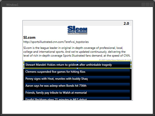
With the Button element activated, find the Content property, again selecting the advanced property options button and selecting Data Binding.
Inside the Explicit Data Context tab, you need to remember that you are looking for the Item Array (because this is the Item collection you are working with). Find the appropriate field, which in this case is title: (String). Select it and click Finish.
You should now have some more meaningful content inside each of the Button element items. You can go ahead now and style the button to your requirements. My efforts are shown in Figure 12.21.
You changed the DataTemplate to have buttons instead of TextBlock elements, and there was a reason for that. You want users to be able to click on a headline shown in the button and launch a browser taking them to the selected story. So, how do you achieve this? You can add a click handler for each button because the data template only defines one button. In addition, the content is dynamic, so you need to somehow parse the correct information though the button so that the application can act on it.
With the Button element activated, enter the word
Taginto the property search box. You should see only one property, which is (funnily enough) calledTag.Using the advanced property options, Data Binding menu, navigate inside the Explicit Data Context, to the Item Array, and find the field Link: (String), and then click the Finish button.
You will note that the
Tagproperty now shows the orange border, confirming that the value is databound, but you need to take note of the value type that is contained in the property. Even though you bound directly to the string type field Link, you are actually binding to an XmlElement object. You will deal with this in the code when the object is used.Each Button item now has the link for its corresponding headline embedded so that now all you have to do is extract that link and call the appropriate code using that information, as you will now do.
With the Button element still activated, open the Event Viewer list in the Properties panel, looking for the
Clickevent. Add the click handler by double-clicking the Handler field box to open Visual Studio.private void Button_Click(object sender, RoutedEventArgs e) { }The parameters available through this event handler are very handy. You can see the first one (object sender) is of type Object and it represents the object that made the call to this event. In this case, it is the Button element that represents the item. Using this information, you can first of all test that the
Tagproperty does contain something and then you can begin to use the information as you please.Complete the method by adding the code shown in Listing 12.7. You will notice that there is a call from an object called Process. You will need to add a
usingstatement at the top of the code page to enable this:using System.Diagnostics;
You will also need to add the following
usingstatement for the XmlElement type used:using System.Xml;
Ridiculously simple? You can see in the code in Listing 12.7 that you are casting the object parameter
senderto its original type, a Button element, which then allows you to retrieve theTagproperty. First you check to make sure that the property object does not equal null, and then you convert theTagproperty (which was of type Object, remember) to an XmlElement type.Process.Start()does all the rest, firing up the user’s default browser and loading the page given the URL link contained in theInnerTextproperty of the XmlElement object.Save the solution in Visual Studio and select OK to save the
.slnfile where Visual Studio suggests.Back to Blend and the editing of the ItemsControl template is complete, so scope up to return to the first DataTemplate.
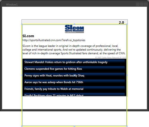
With the ItemsControl activated, you should see that the border of the control extends well beyond the visible area of the ListBox, as shown in Figure 12.22, and as you will remember, previously you noted the amount of Button elements generated by the ItemsControl.
Right-click on the ItemsControl in the Object and Timeline category and select to cut the element.
Find the parent StackPanel (which contains most of the fields) and double-click it to activate it.
In the Panel Based Control collection in the toolbox, or the Asset Library, find the ScrollViewer element and add it as a child of the StackPanel.
It should be placed at the bottom of the StackPanel automatically as new items are stacked from the bottom. Stretch the ScrollViewer element so that it now reaches the bottom of the ListBox control.
Double-click the ScrollViewer element to activate it, and then right-click and select Paste to put the ItemsControl element inside it.
Ensure that the Width of the ItemsControl is set to Auto and the HorizontalAlignment is set to Stretch. (Make sure the Property search box is cleared to find the properties.) The ItemsControl should now extend the ScrollViewer to show a scrollbar vertically, as shown in Figure 12.23.

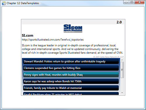
You are now ready to test the application by pressing F5. Click on any of the HeadLine buttons to launch your browser to that page.
In this chapter, you learned to change the makeup of a control by modifying and replacing the elements in it, while at the same time using this specification to create a reusable template. You also learned about styles and how changes to the style template can dramatically change the way the control looks to the end user.
There are a few gotchas, such as not being able to use Color Resources in style templates (which is a Framework defect and not Blend, apparently). Designers could find it particularly difficult to modify templates stored in external Resource Dictionaries as apposed to in-control editing because they will have no visual context to work with—only the template is visible on the artboard and not the surrounding controls of a Window or UserControl, for example. Aside from these issues, templating in Blend is very good and you can expect it only to become even easier to use in future versions.
Data templates are very specific to the controls they will be applied to, but as you have seen, you can create and modify these templates just as easy as you can a standard ControlTemplate.
Remember that the naming of your templates is very important as well as the location that you choose to create your template and the scope that you give it for others to use within the application framework.