
Expression Blend has a great system for including and using resources within your applications. These resources can be almost anything you want to include with your application, such as images (of varying formats), text files, and even different data templates.
Resource Dictionaries (shown in detail in Chapter 12, “Templates,”) are, of course, considered resources. And in this chapter, you will see how to use these in terms of creating a skin for your application and the code logic that enables you to switch the skins during runtime. I should point out that theming in the WPF (Windows Presentation Foundation) is considered by Microsoft to be the operating system theme applied to the control types you use in your application, whereas skinning refers to changes made to a specific application.
The concept of styling applications (or skinning) has been around for a long time, and an application such as Windows Media Player is probably one of the most well known that has this feature included. It’s when you start to consider the implications on a large enterprise application that things quickly get out of hand.
In some enterprise applications, it is not unusual to have many tens, hundreds, and sometimes more than a thousand controls that may be loaded up as part of a user interface. Although it might appear to be a daunting task to have to skin all these controls, the good news is that you usually (aside from custom controls) have a set of 10–50 control types (such as text box and button) of which you create a style for. Applying the style across all the user controls, windows, and so on, is a single attribute value, and even quicker to use Blend to point to.
The best practice, I believe, is to implement a very strictly enforced Resource Dictionary naming convention, which means that every control, and PART_ of a control must be connected to a style that you have in your Resource Dictionaries. If you create a style template locally and set your control styles to use it, it becomes very difficult to manage the changing of the skin during runtime.
For the most part, users tend to change the Skin of the application during runtime, so while being able to create skin resources in design time is high on the priority list, enabling Resources interchange is the key to a successful skinning system.
Starting off with a simple example, the following steps take you through applying a new style in code at runtime, using two styles that reside in the same Resource Dictionary.
Create a new application in Blend.
Add a SimpleStyles ProgressBar control and a Button.
Name the ProgressBar pbSimple.
Name the Button btnChangeStyle.
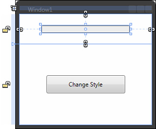
You might want to make your window smaller and layout similar to that shown in Figure 16.1.
Set your ProgressBar element’s
Valueproperty to 50.Click on the Resources tab and select the New Dictionary button.
The default name of
ResourceDictionary1.xamlshould be shown in the New Item dialog. For this example, please leave this name intact.You should now see your
ResourceDictionary1.xamlfile in the list underSimple Styles.xaml.Locate the pbSimple control in the Objects and Timeline category of the Interaction panel.
Right-click and select Edit Control Parts (Template) and then select to edit a copy.
Give the Key of PBSimpleStyle1 and make sure to select your
ResourceDictionary1.xamlfile from the drop-down list next to the Resource Dictionary radio button. Click OK to continue.Begin to modify the style of the template by selecting the PART_Track element in the Objects and Timeline category.
For this example, I simply changed the
Backgroundproperty in the Brushes category to a SolidColor red brush.Use the breadcrumb control to return back to the application or use the Scope Up button.
Go back through the Edit Control Parts (Template) process again, again opting to create a copy. This time call the style PBSimpleStyle2. Remember to add this to your Resource Dictionary.
Modify the PART_Track to show a green SolidColor brush.
You should be able to see your two styles as children of your
ResourceDictionary1.xamlfile as shown in the Resource tab.Scope back up to your application.
So, you now have two styles for the same control in the same Resource Dictionary. Now you are going to go through in code, changing out the Style, which is a very simple process.
Save your application in Blend.
Select your Button element and then find the Click event in the Properties panel.
Double-click the Click event name input box to launch Visual Studio with an event handler added for you.
Because you named your ProgressBar control pbSimple, you can now easily refer to the control to assign a new style to its Style property value. Add the code shown in Listing 16.1.
Run the application from Visual Studio by pressing F5. Click the button and your style should change from green to red.
This is a simple example of applying a new style to an existing style of an existing control, but what happens when you have many controls and styles and you can’t add 10 different ProgressBar styles to one file? This is the job of the Merged Resource Dictionary feature of WPF.
MergedDictionaries is a scenario where two or more ResourceDictionaries are merged together in a Resource Dictionary collection. You have already done this without probably knowing and you can see the results of it in your App.xaml file (see Listing 16.2) from the last simple example.
Example 16.2. The MergedDictionaries Property from the Simple Sample App.xaml File
<Application
    xmlns="http://schemas.microsoft.com/winfx/2006/xaml/presentation"
    xmlns:x="http://schemas.microsoft.com/winfx/2006/xaml"
    x:Class="Chapter_16_SimpleStyleChange.App"
    StartupUri="Window1.xaml">
    <Application.Resources>
        <!— Resources scoped at the Application level should be defined here. —>
        <ResourceDictionary>
            <ResourceDictionary.MergedDictionaries>
                <ResourceDictionary Source="Simple Styles.xaml"/>
                <ResourceDictionary Source="ResourceDictionary1.xaml"/>
            </ResourceDictionary.MergedDictionaries>
        </ResourceDictionary>
    </Application.Resources>
</Application>
Usually when you add items to a ResourceDictionary, each item must contain a unique x:Key attribute to identify it, but you will notice in the markup of Listing 16.2 that each Resource Dictionary is specified with a Source value and no Key value. This is a special scenario and the only time it is allowed.
Having to specify unique Key values inside a ResourceDictionary does not mean that, internal to both Resource Dictionaries, items cannot contain the same Key value. It just means that a scope order exists as to which resource will actually be returned to you if two or more items share the same key in different dictionaries.
The resource returned is from the last ResourceDictionary found to contain the required Key value, listed in the Collection. The example being that if both Simple Styles.xaml and ResourceDictionary1.xaml contained the same style with the same Key, the style from ResourceDictionary1.xaml would be the style returned. If a style of the specified Key is not found in ResourceDictionary1.xaml, the application will continue its search back up the list of Resource Dictionaries until it finds a Key (in which case it stops looking) or it doesn’t find a Key with the required value (which might result in a null object exception if the designer or developer is not careful).
It is not unusual for an application to contain many Resource Dictionaries, perhaps each one used for a specific purpose such as colors, brushes, common controls, custom controls, or more. Be aware that Blend does not really understand what Resource Dictionaries it is adding to the list and in what order, so you might want to check from time to time to remove duplicate entries from the collection.
Your application at runtime contains a property that allows you to access the Resources collection as shown in Listing 16.2, including the MergedDictionaries collection; you can either replace the entire set of resources being used or add a new ResourceDictionary to the MergedDictionary collection as is required.
This makes it easy to manage large sets of resource dictionaries or MergedDictionary collections at runtime and the following example leads you through swapping out the current resources for a new Dictionary, which is an extension of the method previously shown:
Create a new application in Blend.
Set your Window
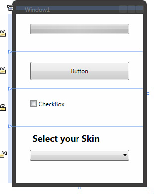
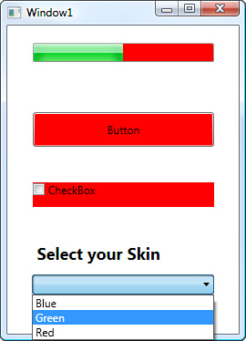
Widthto 270 andHeightto 375.Replace your LayoutRoot XAML with the markup shown in Listing 16.3.
Example 16.3. Setting Up the Sample Application
<Grid x:Name="LayoutRoot">
    <Grid.RowDefinitions>
        <RowDefinition Height="75"/>
        <RowDefinition Height="75"/>
        <RowDefinition Height="75"/>
        <RowDefinition Height="*"/>
    </Grid.RowDefinitions>
    <ProgressBar Margin="27.5,19,27.5,35.036"/>
    <Button Margin="27.5,20,27.5,17" Content="Button" Grid.Row="1"/>
    <CheckBox Margin="27.5,22,27.5,26" Content="CheckBox" Grid.Row="2"/>
    <Label Margin="27.5,8,27.5,0" VerticalAlignment="Top" Height="36"
Content="Select your Skin" Grid.Row="3" FontSize="18" FontWeight="Bold"/>
    <ComboBox IsSynchronizedWithCurrentItem="True" HorizontalAlignment="Center"
Margin="0,48,0,0" VerticalAlignment="Top" Width="200" Grid.Row="3"/>
</Grid>
You will note that not one of the controls is named in the markup. The result is shown in Figure 16.2.
Open the Resources panel and create three new Resource Dictionaries called
Blue.xaml,Red.xaml, andGreen.xaml.You should notice that the
App.xamlelement in the Resources tab starts to link to your new Resource Dictionaries automatically. Remember where these are because you will need to unlink them shortly.Edit a copy of the Control Parts (Template) for the ProgressBar, naming the style PBStyle and add it to the
Blue.xamlResourceDictionary.You will notice that this is not a SimpleStyles control template, but you should be able to find the same PART_Track as used previously.
Set the PART_Track to a SolidColor brush of a blue color.
Scope up back to the application level.
Edit a copy of the Control Parts (Template) for the Button, naming the style BTNStyle and add it to the
Blue.xamlResourceDictionary.Select the element called Chrome. You will note that the Background brush has an orange square next to it, which indicates its value is currently template-bound. Click on the little square and select Reset from the advanced property options shown.
You should now be able to select the SolidColor brush and set the color to the previous blue you used for the ProgressBar.
Scope up back to the application level.
Edit a copy of the Control Parts (Template) for the CheckBox, naming the style CHKStyle and add it to the
Blue.xamlResourceDictionary.Select the element called [BulletDecorator].
You should be able to select the
Backgroundproperty in the Brushes category of the Properties panel and set it to a SolidColor brush using the previous blue you used for the ProgressBar and Button.Open the Resources panel and find the child elements of the
App.xamlfile, selecting the Linked To: Blue.xaml item. Right-click and select Delete from the context menu. This will remove only the item from the MergedDictionaries collection, not the Resource Dictionary. You may also receive notices in the Results panel that the specific styles “cannot be resolved” but you should ignore these.

Do steps 6–18 for the additional colors for each of the three controls used in this example (ProgressBar, Button, and CheckBox), only this time keep the same name for each of the styles for each particular control regardless of which Resource Dictionary it is going into, as shown in Table 16.1.
Obviously you need to change the color of each of the elements in the resources you create to match the Resource Dictionary to which you are adding the style template.
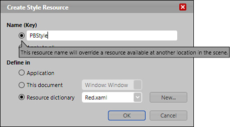
When you go to create the new style using a name that is already declared in an existing Resource Dictionary, you receive a warning as shown in Figure 16.4. At the time of writing, a defect meant that sometimes the OK button is disabled incorrectly; hence the need for you to unlink the Resource Dictionaries in the App.xaml file.
Now you have completed creating your three Resource Dictionaries, you need to remove the existing Style attribute from each of the three controls.
Select the ProgressBar control in the Objects and Timeline category.
Type
Styleinto the Property search box and you should see theStyleproperty in the Miscellaneous category.You may note that the property value has a green square next to it and the value also has a green border. This indicates that the element is using a resource (static or dynamic) to supply its value.
Click on the green square next to it and select Reset from the advanced property options menu.
Do this for the other two controls and you should notice them returning to their standard styled state. It should be noted that if all the Resources Dictionaries were unlinked previously, your controls should already be in their standard style state.
Activate the ComboBox element in the Objects and Timeline category by double-clicking on it.
Add three child ComboBoxItem controls by right-clicking on the ComboBox in the Objects and Timeline category and selecting Add ComboBoxItem from the menu.
Change the
Contentproperty of each of the ComboBoxItems, setting the first to Blue, the second to Green, and I will let you guess the third one! (Make sure each value contains exactly the same spelling as the title of each Resource Dictionary you created.)Check that you have, at the minimum, one Resource Dictionary linked to the
App.xamlfile and the styles from that Resource Dictionary applied to each of the three controls.If you have removed all styles and have no Resource Dictionaries linked:
In the Resources panel, right-click on the
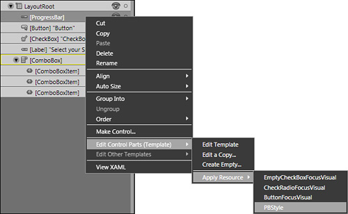
App.xamlelement and then select Link to Resource Dictionary, selecting one of your Resource Dictionaries.For each of the three elements in the application, right-click on the element in the Objects and Timeline category, select Edit Control Parts (Template), select Apply Resource, and then select the PB style you created, as shown in Figure 16.5.
Save the application.
Selecting the parent ComboBox again, open the Event Viewer mode of the Properties panel and find an event named SelectionChanged. Double-click the input box to open Visual Studio with the correct event handler code added.
Add the code shown in Listing 16.4.
Example 16.4. Handling the Selection Changed Event for the ComboBox
private void ComboBox_SelectionChanged(object sender, SelectionChangedEventArgs e)
{

    if (sender != null)
    {
        string ResourceSelected = ((e.OriginalSource as ComboBox).SelectedItem as
ComboBoxItem).Content.ToString();

        ResourceDictionary rd = Application.LoadComponent(new Uri(ResourceSelected
+".xaml", UriKind.Relative)) as ResourceDictionary;

        Application.Current.Resources = rd;

    }
}
The following line of code takes the string value from the Content property of the selected ComboBoxItem:
string ResourceSelected = ((e.OriginalSource as ComboBox).SelectedItem as ComboBoxItem).Content.ToString();
The next line:
ResourceDictionary rd = Application.LoadComponent(new Uri(ResourceSelected
+".xaml", UriKind.Relative)) as ResourceDictionary;
This shows a method of the application called LoadComponent(), which allows you to specify the location of a XAML file to load. At the end of that line, you are specifying that a ResourceDictionary is being loaded. This then lets you apply the loaded Resource Dictionary to the current Resources property of your application:
Application.Current.Resources = rd;
Run your application now, and if everything has been completed in order, you should be able to select a skin from the ComboBox and apply it to your controls as shown in Figure 16.6.
You will also note that this change takes immediate effect and, as long as the naming convention is adhered to, the styles update without incident.
Inevitably, you will come across a scenario in which you need to provide the ability for other users to create their own skins and your application has to be able to deal with that.
The Application.LoadComponent() method is great when you have a referenced file or file linked to your application, but in this scenario you are dealing with an “unknown” file. You would need to ensure that your skin provider has matched your naming convention for the styles to be applied correctly. So, given that, the following should correctly load the file and apply the style. This is an extension of the previously built application.
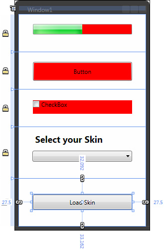
Add another Button element to your application and call it btnLoadSkin.
Find the ComboBox element in the Objects and Timeline category and give the element the name of cmboSkinSelector.
Create a new Resource Dictionary called
Orange.xaml.Move through the controls, creating a copy of the template(s) into the new
Orange.xamlResource Dictionary.Remember to name the styles exactly as you have done previously.
When you have completed all the styles, open the Resources panel and look at the
App.xamlchildren. You should note thatOrange.xamlis linked. Right-click and select Delete to unlink the Resource Dictionary.Your controls should go back to the previous style, which is the MergedDictionaries doing their job by applying the last item in the collection!
Open the Project tab and find your
Orange.xamlfile in the project list.Select the file, right-click, and select Remove from Project. You will be asked if you are sure; select Yes. Do not delete the file!
Save your application.
Select your new Button element and add a
Clickevent handler to open Visual Studio.
From here on out, you must make the previous code a little bit more robust in order to make the skin system user friendly. You are asking the user to find the skin file by opening a dialog, but you want the user to have to do this only once, with the relevant style being added to the MergedDictionary collection. You will also want to add a ComboBoxItem so that the users can reselect this style as they please. Add the code shown in Listing 16.5 to the newly created event handler method.
Example 16.5. Loading the Resource from File
private void btnLoadSkin_Click(object sender, RoutedEventArgs e)
{
    //Create a dialog box so we can search for the Skin file
    Microsoft.Win32.OpenFileDialog newDialog = new Microsoft.Win32.OpenFileDialog();
    newDialog.DefaultExt = ".xaml";
    newDialog.Filter = "XAML Files|*.xaml";
    newDialog.InitialDirectory = Environment.CurrentDirectory;

    //Show the dialog
    if (newDialog.ShowDialog() == true)
    {
        //Get a stream for the XAMLReader
        Stream newSkin = newDialog.OpenFile();

        //Try and load the loose xaml file
        ResourceDictionary ExternalRD =
System.Windows.Markup.XamlReader.Load(newSkin) as ResourceDictionary;
        if (ExternalRD != null)
        {
            //Set the Source property
            ExternalRD.Source = new Uri(newDialog.FileName,
UriKind.RelativeOrAbsolute) ;

            //Add this RD as the last one in the list
            Application.Current.Resources.MergedDictionaries.Add(ExternalRD );

            //Add a new ComboBoxItem so the user can reselect the imported skin
            ComboBoxItem newItem = new ComboBoxItem();
            newItem.Content = Path.GetFileNameWithoutExtension(newDialog.FileName);
            this.cmboSkinSelector.Items.Add(newItem);
        }
    }

    //Close the file stream
    newDialog = null;

}
The most important lines in Listing 16.5 are
ResourceDictionary ExternalRD = System.Windows.Markup.XamlReader.Load(newSkin) as
ResourceDictionary;
These lines take a stream (from the file being opened) and use the XamlReader.Load() method to deserialize the file into the correct object type.
The difference in this example is that you are not clearing out the MergedDictionary collection when the new skin is selected; you are using the rules of the MergedDictionary and adding this new object to the bottom of the list as shown with this line:
Application.Current.Resources.MergedDictionaries.Add(ExternalRD );
Because the code in Listing 16.5 also creates a new ComboBoxItem control for your user to select from, you also need to change the code in the ComboBox_SelectionChanged event to deal with the new Resource Dictionary. Listing 16.6 shows the changes made to the event handler method with two additional methods added to make the code easier to follow, debug, and ultimately to upgrade.
Example 16.6. Modifying the ComboBox selection event
private void ComboBox_SelectionChanged(object sender, SelectionChangedEventArgs e)
        {

            if (sender != null)
            {
                //Get the string of the Selected Item
                string ResourceSelected = ((e.OriginalSource as ComboBox).
SelectedItem as ComboBoxItem).Content.ToString();

                //Check to see if the ResourceDictionary already exist in the
merged dictionaries
                int CurrentPosition = this.FindResourceDictionaryByName
(ResourceSelected);

                //Do we need to load up the Resource?
                if (CurrentPosition == -1)
                {
                    //Load up the Resource as specified by the name in the item
selected
                    ResourceDictionary InternalRD = Application.LoadComponent(new
Uri(ResourceSelected + ".xaml", UriKind.Relative)) as ResourceDictionary;
                    InternalRD.Source = new Uri(ResourceSelected + ".xaml",
UriKind.RelativeOrAbsolute);

                    //Add the Resource to the collection
                   Application.Current.Resources.MergedDictionaries.Add(InternalRD);
                }
                else
                {
                    //Using the MergedDictionaries rules, set the dictionary to the
last position
                    this.RepositionRD(CurrentPosition);
                }

            }
        }


        private int FindResourceDictionaryByName(string RDName)
        {
            int LoopCount = 0;
            string FileNameTest = string.Empty;

            //Search the existing collection of Resources for the Dictionary by
name using the Source value
            foreach (ResourceDictionary item in
Application.Current.Resources.MergedDictionaries)
            {
                //Get just the Filename and the extension
                FileNameTest = Path.GetFileName(item.Source.OriginalString);

                if (FileNameTest == RDName + ".xaml")
                    break;

                LoopCount++;
            }

            if (LoopCount <=
Application.Current.Resources.MergedDictionaries.Count - 1)
            {
                //Send back the current position in the Collection
                return LoopCount;
            }
            else
            {
                //-1 indicates that the Name was not found
                return -1;
            }
        }

        private void RepositionRD(int OldPosition)
        {
            //Check that it isnt already the last ResourceDictionary in the list
            if (OldPosition ==
Application.Current.Resources.MergedDictionaries.Count )
                return;

            //Get an instance of the Resource Dictionary
            ResourceDictionary RemovedRD = Application.Current.Resources.MergedDictionaries[OldPosition ] as ResourceDictionary;

            //Remove it from its previous position
            Application.Current.Resources.MergedDictionaries.RemoveAt(OldPosition);

            //Send it to the last item by adding it back to the collection
            Application.Current.Resources.MergedDictionaries.Add(RemovedRD);
        }
The first of the two new methods added is responsible for finding the selected skin file by name from the collection. The second enables you to reposition the Resource Dictionaries to the bottom of the list so that the styles contained within are applied to the elements on the screen.
I hope this chapter has been as much fun for you as it has been for me writing it.
One thing for sure is, when it comes to skinning, a lot of testing and validation needs to be taken care of on loading of skin files. You need to create a skin map if using purely loose XAML files because it is crucial to ensure that your style naming convention is adhered to. Of course, Resource Dictionaries can contain lots of types of resources, so maybe you can adapt and change these methods to allow your users to load different data templates or even animations.