
What You’ll Learn in This Hour:
The syntax used for binding data
The different types and modes of data binding
Dependency properties
Data Context
In this hour we discuss how to bind data in your WPF application. Data binding is one of the most powerful and exciting features of WPF. Data binding enables you to declare, in a very simple manner, how data will interact with the controls and elements in your UI.
Data binding is a means of connecting the elements of a user interface with the underlying data that the application is interested in. Data binding is declarative rather than imperative. Declarative means that instead of writing a series of commands to be executed, you describe the relation that the data has to the elements in the UI.
For example, in the Font Viewer, we are interested in the collection of currently installed fonts. We would like to display that collection in a ListBox. If we took an imperative approach to the problem, we would write code that would retrieve the set of fonts and then populate the ListBox with items based on the collection. With data binding, we can simply describe the relationship between the set of fonts and the ListBox declaratively in the markup.
The syntax that WPF uses for data binding can be confusing when you first encounter it. In fact, more than one way exists to declare a data binding in XAML. The most common method of declaring a binding uses a feature of XAML called markup extensions. We introduced markup extensions in Hour 2, “Understanding XAML,” and you may remember that they enable you to concisely describe something that would be awkward or too verbose in plain XAML.
Markup extensions are identified by curly brackets ({}), and a data binding extension always begins with the word Binding.
Let’s begin by examining the data bindings on one of the TextBlock elements in the Font Viewer. Consider the following markup:
<TextBlock Text="{Binding ElementName=SampleText, Path=Text}"
           FontFamily="{Binding ElementName=FontList,
                                Path=SelectedItem}"
           FontSize="10"
           TextWrapping="Wrap"
           Margin="0 0 0 4" />
We have two separate data bindings in this markup. The first binds the Text property of the TextBlock to the Text property of a TextBox named SampleText. Note that the Text attribute’s value is a data binding markup extension. Again, it’s important to emphasize that quotation marks are not allowed inside the markup extension. Markup extensions are not XML like the rest of XAML; rather, they are merely string values that are parsed when an application is compiled.
Our binding references two properties: ElementName and Path. The ElementName property tells the binding to look for an element named SampleText in the XAML and to use that as the source of the data. The Path property tells the binding where to find the specific data that interests us in relation to the data source. In this case, we are interested in the Text property on the source.
Examining the second binding on the TextBlock, we interpret the markup extension, {Binding ElementName=FontList, Path=SelectedItem}, to mean that we will use the SelectedItem property of an element named FontList as the data source.
Wiring the properties of two controls together is one of the simplest forms of data binding. In the following steps, we bind the font size of a TextBox to a Slider.
Open
Window1.xamlin the designer.Replace the
Gridwith aStackPanelusing the following markup:<StackPanel> </StackPanel>
Inside the
StackPanel, create a slider with the following markup:<Slider x:Name="mySlider" Minimum="8" Maximum="64" />
The
MaximumandMinimumattributes define the upper and lower bounds of theSlider. We want to restrict the font size to something meaningful. We also use thex:Nameattribute to provide a unique name,mySlider, for the control.Immediately before the
Slider, create aTextBlockusing the following markup:<TextBlock Text="This is fun!" FontSize="{Binding ElementName=mySlider, Path=Value}" HorizontalAlignment="Center" />
We added an attribute to horizontally align the
TextBlockin the center of theStackPanel. This causes the text to remain centered when the font size changes.We bind the
FontSizeproperty of theTextBlockto theValueproperty ofmySlider.The complete markup is shown in Listing 6.1.
Run the application.
Move the thumb on the slider and observe how the size of the font changes automatically. You’ll also notice that the slider is automatically repositioned as the font grows larger.
In the preceding example, the data moves in only one direction, from the Slider to the FontSize property. What do we do when we want a user to input some data using either a TextBox or a Slider, and we’d like one to update the other? If the user moves the thumb on the Slider, we want the TextBox to display the Slider’s new value, and if the user enters a value directly in the TextBox, we want the thumb to be repositioned on the Slider.
WPF makes this scenario very easy to implement. Let’s walk through the steps for setting this up:
Create a new WPF Application project in Visual Studio.
Open
Window1.xamlin the designer.Again, replace the
Gridwith aStackPanelusing the following markup:<StackPanel> </StackPanel>
Inside the
StackPanel, create aTextBlockand aSliderwith the following markup:<TextBox Text="{Binding ElementName=mySlider,Path=Value,Mode=TwoWay}" /> <Slider x:Name="mySlider" Minimum="0" Maximum="100"/>
This time we’ve made the range from 0 to 100.
Run the application.
Move the thumb back and forth and notice that the text changes immediately when the thumb is moved. You’ll also notice that the number displayed has a lot of decimal places included. This is because
Slider.Valueis adouble.Now enter a number in
TextBoxbetween 0 and 100, and then press the Tab key.Note that the slider did not update its position until the
TextBoxlost focus.Enter some non-numeric text, like your name, into the text field and then press the Tab key.
Nothing happens; the thumb does not move and the text does not change. The data cannot be converted to the appropriate type and it’s ignored.
The thumb snaps all the way to the right, and the text is changed back to 100. The
Slidercannot accept a value larger than itsMaximum. When you enter a value that is larger, theSlidersetsValueto the maximum. BecauseSlider.Valueis changed to the maximum value,TextBox.Textis set to the new value.
The behavior in the last step can be confusing. Here is a breakdown of what is happening:
The value of
TextBox.Textis changed by the user.The data binding updates the value of
Slider.Value.The new value is both valid and greater than
Slider.Maximumand so theSliderchangesValueto the largest possible value allowed.The data binding updates the value of
TextBox.Text.
Take another look at the binding on TextBox.Text:
{Binding ElementName=mySlider, Path=Value, Mode=TwoWay}We have introduced a new property, Mode. The value of Mode determines how the data will flow between the data source and the target. The possible values for Mode are listed in Table 6.1.
Table 6.1. Modes for Data Binding
Name | Description |
|---|---|
| Changes to the source will update the target. |
| Changes to the source will update the target, and changes on the target will update the source. |
| The target is set only when the application starts or when the data context is changed. |
| Changes to the target will update the source. |
You are not required to set the Mode for a data binding. However it is a good practice to explicitly state the Mode. The default value for Mode is set by the target of the data binding, and different elements have different defaults. The default data binding mode for a TextBox is TwoWay, whereas the default for TextBlock is OneWay. The default values usually make sense, but it’s always a good idea to make your intention clear.
Watch Out!
Occasionally, you may run into a situation where a data binding does not appear to work. If a data binding cannot convert data to an appropriate type, it will fail silently. We demonstrated an example of this when we bound the TextBox.Text and the Slider.Value. The value of the first is a string, and the later is a double. When the data binding received a string value that it could not convert into a double, it did not complain—it just didn’t work.
I have often encountered bugs in my WPF applications where a data source was unexpectedly null, and the application did not throw an exception. Be sure to keep an eye open for this.
In the Font Viewer, we bound a ListBox to the collection of currently installed fonts. The .NET Framework BCL provides this collection as a static property called SystemFontFamilies on the class System.Windows.Media.Fonts. This property returns an instance of type ICollection<FontFamily>. Anything that is enumerable can be bound to the ItemsSource property on the ListBox.
You may have noticed that we did not use the same syntax for binding the font collection to the ListBox as we did for binding the controls to one another. We used the following markup extension:
{x:Static Fonts.SystemFontFamilies}This markup extension is used for referencing static value members on a class. Value members are fields, properties, constants, and enumeration values.
Technically, using x:Static is not a data binding, and WPF treats it a little bit different from standard data binding, but for a simple scenario such as this you can treat it the same.
By the Way
If you would like to have additional information about a markup extension, you’ll need to look for the extension by its class name. The class names are the identifier plus the word “Extension” (don’t include the namespace alias).
For example, to find out more about x:Static you will need to search “StaticExtension”.
As we’ve mentioned before, all the controls in WPF inherit from FrameworkElement. FrameworkElement has a property called DataContext, and it is incredibly useful when it comes to binding data.
DataContext is the “context” or the “starting point” from which the data binding is taking place. In our earlier examples, we explicitly provide a context for the binding with the ElementName property. The Path property points to the location of source data within the given context.
Additionally, if you set the DataContext for a given FrameworkElement, all the children of that element will have the same DataContext. In other words, a control’s DataContext is inherited from its parent.
Let’s consider a new feature for the Font Viewer that will help us demonstrate how DataContext works. Perhaps we would like to display the number of fonts that are currently installed. We know that Fonts.SystemFontFamilies has a Count that returns the number of items in the collection. We can add a ToolTip to the ListBox that will display the count.
Let’s modify the Font Viewer to add this new feature:
Open the Font Viewer project.
Locate the
ListBoxinMainWindow.xaml.Replace the existing ListBox with the following markup:
<ListBox x:Name="FontList"
         DataContext="{x:Static Fonts.SystemFontFamilies}"
         DockPanel.Dock="Left"
         ItemsSource="{Binding}"
         ToolTip="{Binding Path=Count, Mode=OneTime}"
         Width="160" />
This places the collection of fonts in the
DataContextfor theListBox.TheItemsSourceis then bound to theDataContextitself. If you don’t specify aPath, the binding points to the context itself. That’s what we want in this case.We also added a binding targeting the
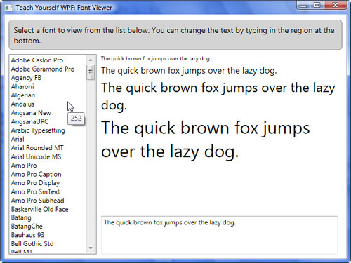
ToolTipproperty using theCountproperty of the font collection as the source. We told the binder to update just once because we don’t expect the number of fonts to change while our application is running.Run the application, and hover your mouse over the
ListBox. Notice that it displays a number as shown in Figure 6.1. A number by itself could be confusing, so let’s add a little explanatory text to the ToolTip to help out the user.We’ll change the markup to the following:
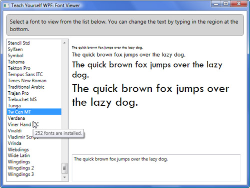
<ListBox x:Name="FontList"
         DataContext="{x:Static Fonts.SystemFontFamilies}"
         DockPanel.Dock="Left"
         ItemsSource="{Binding}"
         Width="160">
    <ListBox.ToolTip>
        <ToolTip>
            <StackPanel Orientation="Horizontal">
                <TextBlock Text="{Binding Path=Count,
                                          Mode=OneTime}"/>
                <TextBlock Text=" fonts are installed."/>
            </StackPanel>
        </ToolTip>
    </ListBox.ToolTip>
</ListBox>
We added a
StackPanelbecause aToolTipcan have only one child and we need the two bits of text. We use anOrientationofHorizontalbecause we want theTextBlockelements to display next to each other (rather than being on top of one another). The new ToolTip is shown in Figure 6.2.The interesting part to note here is that the
DataContextset on theListBoxpropogates all the way down through theStackPanelto theTextBlock.Run the application. Listing 6.2 contains the complete markup for this example.
Example 6.2. Adding a ToolTip to the Font Viewer
<Window x:Class="TeachYourselfWPF.FontViewer.MainWindow"
        xmlns="http://schemas.microsoft.com/winfx/2006/xaml/presentation"
        xmlns:x="http://schemas.microsoft.com/winfx/2006/xaml"
        Title="Teach Yourself WPF: Font Viewer"
        Height="480"
        Width="640">
    <DockPanel Margin="8">
        <Border DockPanel.Dock="Top"
                CornerRadius="6"
                BorderThickness="1"
                BorderBrush="Gray"
                Background="LightGray"
                Padding="8"
                Margin="0 0 0 8">
            <TextBlock FontSize="14"
                       TextWrapping="Wrap">
            Select a font to view from the list below.
            You can change the text by typing in the region at the bottom.
            </TextBlock>
        </Border>
        <ListBox x:Name="FontList"
                 DataContext="{x:Static Fonts.SystemFontFamilies}"
                 DockPanel.Dock="Left"
                 ItemsSource="{Binding}"
                 Width="160">
        <TextBox x:Name="SampleText"
                 DockPanel.Dock="Bottom"
                 MinLines="4"
                 Margin="8 0"
                 TextWrapping="Wrap"
                 ToolTip="Type here to change the preview text.">
                    The quick brown fox jumps over the lazy dog.
        </TextBox>
        <StackPanel Margin="8 0 8 8">
            <TextBlock Text="{Binding Path=Count}" />
            <TextBlock Text="{Binding ElementName=SampleText,
                                      Path=Text}"
                       FontFamily="{Binding ElementName=FontList,
                                            Path=SelectedItem}"
                       FontSize="10"
                       TextWrapping="Wrap"
                       Margin="0 0 0 4" />
            <TextBlock Text="{Binding ElementName=SampleText,
                                      Path=Text}"
                       FontFamily="{Binding ElementName=FontList,
                                            Path=SelectedItem}"
                       FontSize="16"
                       TextWrapping="Wrap"
                       Margin="0 0 0 4" />
            <TextBlock Text="{Binding ElementName=SampleText,
                                      Path=Text}"
                       FontFamily="{Binding ElementName=FontList,
                                            Path=SelectedItem}"
                       FontSize="24"
                       TextWrapping="Wrap"
                       Margin="0 0 0 4" />
            <TextBlock Text="{Binding ElementName=SampleText,
                                      Path=Text}"
                       FontFamily="{Binding ElementName=FontList,
                                            Path=SelectedItem}"
                       FontSize="32"
                       TextWrapping="Wrap" />
        </StackPanel>
    </DockPanel>
</Window>
Part of the magic of data binding comes from the WPF property system. The WPF property system allows properties to participate in data binding, styling, animation, and several other exciting features. A property that is registered with the WPF property system is called a dependency property.
A property must be a dependency property to be the target of a data binding. If you are not certain as to whether a property on a control is a dependency property, just check the official documentation. Microsoft makes a note in the description indicating whether the property is a dependency property.
Dependency properties include metadata about the property, such as the default value for the property, the default binding mode, and other miscellaneous items.
Dependency properties also provide automatic change notification. In the example earlier this hour, when we bound TextBox.Text to Slider.Value, the Slider.Value was the data source and a dependency property. Slider.Value automatically notified the data binding target because it was a dependency property.
By the Way
Dependency properties are the foundation for much of WPF. You can get a lot out of WPF without becoming an expert in them. However, if you want to take full advantage of the API, then you will want to dig deeper.
There are many good resources on the Web. Be sure to search for both “DependencyObject” as well as “DependencyProperty” when doing your research.
Unlike the target of a data binding, data sources are not required to be dependency properties. However, if you want to use a binding mode other than OneWay, your properties need to implement some mechanism for change notification.
Other than dependency properties, WPF uses two methods for monitoring change notifications. The first is to raise an event in your property setter that is named after the property plus “Changed.” For example, if your property is FirstName, the setter should raise FirstNameChanged. WPF automatically checks for this event and updates data bindings accordingly. We’ll create a custom dependency property in Hour 11, “Output.”
The second method is to implement INotifyPropertyChanged on the class that owns the property. We’ll discuss that in detail in a later hour.
We are going to create a small application to demonstrate how WPF automatically wires events based on the name of the event. We will build an application that allows a user to enter a name in a text field and then store that name in a custom class. Whenever the user changes the name, we want to immediately display the name above the text field in a larger font. We will also see how to set the DataContext in the code-behind.
Create a new WPF Application in Visual Studio named
AutomaticChangeNotification.Right-click the project and add a class named
Person.Visual Studio will open the
Personclass in the editor. Add the following code to the class:private string _firstName; public string FirstName { get { return _firstName; } set { _firstName = value; } }
In
Window1.xaml, add some rows to theGridelement so that it looks like this:<Grid> <Grid.RowDefinitions> <RowDefinition Height="auto" /> <RowDefinition Height="auto" /> </Grid.RowDefinitions> </Grid>
Beneath the
RowDefinitions, but inside theGrid, add the elements:<TextBox Text="{Binding Path=FirstName,Mode=TwoWay}" Margin="4"/> <Button Grid.Row="1" Height="40" Margin="4"/>
We are adding the
Buttonright now because theTextBoxdoes not change its data until it loses focus, so we need another control in the window that we can focus on. The data binding on theTextBoxis implicitly referencing the data context of its container. After we set the data context to an instance ofPerson, the binding will point to theFirstNameproperty.To set the
DataContextfor theWindowto a new instance ofPerson, open the code-behind forWindow1.xamland edit the constructor so that it reads as follows:public Window1() { InitializeComponent(); DataContext = new Person(); }
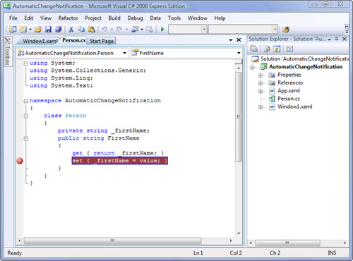
Right-click the setter for the
FirstNameproperty, and select Breakpoint, Insert Breakpoint. Figure 6.3 shows the location of the breakpoint.Run the application and enter some text in the
TextBox, and then click theButton. When the TextBox changes, we hit our breakpoint.Stop debugging, and open
Window1.xaml. We’re going to bind the content of theButtontoFirstNameas well. We’re also going to add a handler for theClickevent.Replace the existing
Buttonmarkup with this:<Button Grid.Row="1" Height="40" Margin="4" Click="Button_Click" Content="{Binding Path=FirstName,Mode=TwoWay}" />
In the code-behind for
Window1.xaml, add the event handler that changes theFirstNameof ourPersoninstance:private void Button_Click(object sender, RoutedEventArgs e) { ((Person)DataContext).FirstName = "My New Name"; }
Run the application again and click the button. You’ll notice that we still hit our breakpoint, but nothing is bound to the
Button. This is because ourPersonclass does not provide any notification whenFirstNameis changed.Watch Out!
If you enter some text in the
TextBox, theButtonupdates when theTextBoxloses focus. This happens even when we haven’t implemented change notification for this class. WPF can do this because the change originates with the data binding system. BecauseTextBoxis using two-way binding, it is initiating the change, and that’s how WPF knows to update theButton. When we change thePersoninstance in the event handler, WPF doesn’t know anything about it, and that’s why we need to provide the change notification.Stop debugging, and open
Person.csin the editor. We’re going to raise an event whenFirstNameis changed; add the following code to thePersonclass:public event EventHandler FirstNameChanged; private void OnFirstNameChanged() { if (FirstNameChanged != null) FirstNameChanged(this, EventArgs.Empty); }
Remember, WPF automatically looks for an event based on the property’s name.
Modify the setter for
FirstNameto raise the event:set { _firstName = value; OnFirstNameChanged(); }
Run the application again, and click the button. This time you will notice that the content of both the
Buttonand theTextBoxchanges.
Watch Out!
WPF will not look for these events on classes deriving from DependencyObject or on classes implementing INotifyPropertyChanged.
I once created a property on a user control that I wanted to participate in data binding, and I was confused when WPF did not pick up the custom event I was raising when the property was changed. Then I realized that UserControl inherits from DependencyObject, and I implemented my property as a dependency property instead.
So far we have only used the markup extensions to declare data bindings; however, you can declare data binds without using markup extensions at all. Let’s consider our example from the beginning of the hour:
<TextBlock Text="This is fun!"
           FontSize="{Binding ElementName=mySlider,Path=Value}"
           HorizontalAlignment="Center" />
To declare the same binding without using a markup extension, we would write the following:
<TextBlock Text="This is fun!"
           HorizontalAlignment="Center">
    <TextBlock.FontSize>
        <Binding Path="Value"
                 ElementName="mySlider" />
    </TextBlock.FontSize>
</TextBlock>
Notice that the FontSize attribute in the first example becomes the TextBlock.FontSize element in the second example. The markup extension becomes the Binding element, and the properties become attributes.
Even though it’s easier to understand, this syntax is not used very often. It is much more verbose and adds a lot of noise to the markup. However, you may find it useful in situations where a data binding becomes very complicated.
In this hour we discussed the basics of using data binding in your WPF application. We demonstrated how you can easily wire controls together using only XAML. We examined how markup extensions are used to declare data bindings, as well as considering the alternative syntax using plain XAML.
We looked at how data context works, and implemented a custom class that was able to participate in data binding.