
What You’ll Learn in This Hour:
Using static versus dynamic resources
Stylizing the Contact Manager
In Hours 12 and 13 we worked hard to build a solid application architecture. We decided to use an MVP pattern and we organized the solution structure appropriately. Using MVP or MVC is a good approach to building almost any UI, but there are other important issues that must be dealt with as well. As applications grow, they depend more and more on resources such as graphics and colors. Over the development of a solution, a common “look and feel” may be designed, or it may emerge on its own. In previous Windows technologies, these styles would likely be strewn across various classes, creating a maintenance nightmare. The designers of WPF were well aware of these problems and created a rich and dynamic solution, as discussed in this hour.
WPF uses a special type called a ResourceDictionary to store reusable “pieces” of an application. Some of the most common reusable pieces are colors and brushes used to create an application’s color theme. The Application type has a Resources property of type ResourceDictionary that a developer can use to store application-scoped resources. Resources are often marked with a Key for easy access by other parts of the UI. It turns out that this is a great way to define a color theme for your application. Let’s go ahead and do this for the Contact Manager:
Open the Contact Manager solution in Visual Studio.
Open the
App.xamlfile for editing.Use the XAML in Listing 14.1 as the markup for this file.
Example 14.1. App.xaml
<Application x:Class="ContactManager.App"
             xmlns="http://schemas.microsoft.com/winfx/2006/xaml/presentation"
             xmlns:x="http://schemas.microsoft.com/winfx/2006/xaml"
             StartupUri="Shell.xaml">
    <Application.Resources>
        <Color x:Key="lightBlueColor">#FF145E9D</Color>
        <Color x:Key="darkBlueColor">#FF022D51</Color>
        <Color x:Key="redColor">#FFAA2C27</Color>
        <Color x:Key="greenColor">#FF656A03</Color>
        <Color x:Key="brownColor">#FF513100</Color>
    </Application.Resources>
</Application>
Everything that inherits from FrameworkElement has a Resources property. This creates a hierarchical set of resources for the application. Items declared in App.Resources are visible to the entire application. Resources defined for a particular UserControl would be visible only to that control. If that UserControl had a Grid that defined resources, those items would be visible only to the children of the Grid, and so on. Additionally, resources in a more fine-grained scope can override items in a larger scope. For example, some styles defined in a particular UserControl could override styles declared at the application level. As you can see, WPF provides for some very complex resource scoping needs.
Declaring resources is simple. All you have to do is add the XAML definition of the object you want to store to a ResourceDictionary (usually through the Resources property at the desired scope). Typically, you add a Key to the resource so that it can be referenced elsewhere. Looking back at Listing 14.1, you can see how simple this is to do.
WPF colors can be declared in a variety of ways. It is most common to use hexadecimal notation as we have. This notation always begins with a # and uses two digits each for the alpha, red, green, and blue values. We’ll discuss colors in greater detail in Hour 19, “Colors and Brushes.”
One powerful aspect of resources is that they can be combined to create new resources. This composability enables developers to factor their XAML so that they can reduce duplication and enable easier maintenance. Let’s use our colors to create a set of brushes for the Contact Manager now:
Open
App.xamlfor editing.Just below the previously defined
Colorresources, add the following XAML:<SolidColorBrush x:Key="lightBlueBrush" Color="{StaticResource lightBlueColor}" /> <SolidColorBrush x:Key="darkBlueBrush" Color="{StaticResource darkBlueColor}" /> <SolidColorBrush x:Key="redBrush" Color="{StaticResource redColor}" /> <SolidColorBrush x:Key="greenBrush" Color="{StaticResource greenColor}" /> <SolidColorBrush x:Key="brownBrush" Color="{StaticResource brownColor}" />
Colors cannot be applied to most WPF element properties like Background or Foreground. These properties require the use of a Brush. In the preceding XAML we have used our previously defined colors to create several instances of SolidColorBrush. We have done this using the StaticResource markup extension. You will recall from earlier hours that Binding is a markup extension. Binding, along with StaticResource, make up the two most common extensions that you will use in WPF. Using the StaticResource extension allows you to reference a previously defined resource by its Key value. When you reference a resource in this fashion, WPF will start at the local scope and search broader and broader scopes until it finds a resource with the specified key.
Interestingly, we have been using brushes for quite some time now. Every time we declared something like Background="Blue" we have been using some built-in default brushes. WPF has all sorts of brushes that you can paint with. The simple SolidColorBrush is only one example of how you can declare your own brushes. We’ll discuss this and other options in more detail in Hour 19.
Now that we have some brushes, we should apply them to our currently plain user interface. Let’s start by filling in one of the missing pieces introduced in Hour 12:
Open
SearchBar.xamllocated under theUserControlsfolder in the solution.Use the markup in Listing 14.2 for the contents of this file.
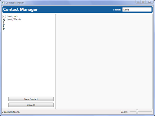
Open the
SearchBar.xaml.csfile and use the code in Listing 14.3 to finish off the user control’s implementation.Run the application. You should see something similar to Figure 14.1.
Example 14.2. SearchBar.xaml
<UserControl x:Class="ContactManager.UserControls.SearchBar"
             xmlns="http://schemas.microsoft.com/winfx/2006/xaml/presentation"
             xmlns:x="http://schemas.microsoft.com/winfx/2006/xaml">
    <Border Background="{StaticResource lightBlueBrush}"
            CornerRadius="6"
            Margin="4"
            Padding="4">
        <DockPanel LastChildFill="False">
            <TextBlock DockPanel.Dock="Left"
                       Text="Contact Manager"
                       FontWeight="Bold"
                       Foreground="White"
                       VerticalAlignment="Center"
                       FontSize="22"
                       FontFamily="Trebuchet" />
                <TextBox x:Name="searchText"
                         DockPanel.Dock="Right"
                         Width="150"
                         Background="White"
                         TextChanged="SearchText_Changed" />
                <Label DockPanel.Dock="Right"
                       Content="Search:"
                       FontWeight="Bold"
                       Foreground="White" />
            </DockPanel>
    </Border>
</UserControl>
Example 14.3. SearchBar.xaml.cs
using System.Windows.Controls;
using ContactManager.Presenters;

namespace ContactManager.UserControls
{
    public partial class SearchBar : UserControl
    {
        public SearchBar()
        {
            InitializeComponent();
        }

        public ApplicationPresenter Presenter
        {
            get { return DataContext as ApplicationPresenter; }
        }
        private void SearchText_Changed(object sender, TextChangedEventArgs e)
        {
            Presenter.Search(searchText.Text);
        }
    }
}
Looking back over the previous two listings, you’ll see that nothing is terribly new. The SearchBar.xaml creates the interface, and the SearchBar.xaml.cs wires up the presenter in the fashion discussed in Hour 13. The one interesting point is in the Border’s use of the StaticResource lightBlueBrush. Because this Brush is defined at the application’s resources, it is available for use here.
In complex applications, you may have a large amount of application scoped resources. Piling all these resources into the App.xaml file can turn into a maintenance issue very quickly. WPF provides a way to split resources into separate files. Let’s go ahead and do this with our application:
On the
Resourcesfolder, right-click and select Add, New Item.In the dialog that appears, select Resource Dictionary (WPF) and name the new file
ColorsAndBrushes.xaml.Remove the defined colors and brushes from
App.xamland add them to the newColorsAndBrushes.xaml ResourceDictionary.Add the following markup to the
Application.ResourcesinApp.xaml:<ResourceDictionary> <ResourceDictionary.MergedDictionaries> <ResourceDictionary Source="ResourcesColorsAndBrushes.xaml" /> </ResourceDictionary.MergedDictionaries> </ResourceDictionary>
Run the application and observe that the appearance is the same as previously seen in Figure 14.1.
One very useful feature of resource dictionaries is the capability to merge them to create new dictionaries. In this example, we create a resource for storing only our colors, and we merged this resource into the main application dictionary.
So far, we have referenced all our resources using the StaticResource markup extension. You can also use resources with the DynamicResource extension. But what is the difference? Simply put, DynamicResource allows the resource to change after the point of reference, whereas StaticResource does not. This most often applies when you’re using system resources. For example, if you wanted to use a color from SystemColors, you would use a DynamicResource. This allows for the scenario where the user changed the system color theme while your application was running. If a DynamicResource was used, your application would update its colors on-the-fly whereas they would remain the same with a StaticResource. Because of the dynamic nature of the so-named resource, it is more resource intensive and less performant than StaticResource. You should prefer to use StaticResource and fall back to DynamicResource only when you need the special capabilities it offers.
Almost anything can be added to a resource dictionary, but perhaps the most common items to define there are styles. Styles allow a way to declare common property values on any FrameworkElement. If you have a web background, then you will find WPF styles are similar to CSS. The best way to understand their purpose is to see them in action. Let’s add some basic styles to our application:
Add a new
ResourceDictionaryto theResourcesfolder calledDefaultStyles.xaml.Use the markup in Listing 14.4 to implement the resource dictionary.
Open
App.xamland add the following toResourceDictionary.MergedDictionaries:<ResourceDictionary Source="ResourcesDefaultStyles.xaml" />
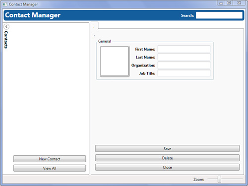
Run the application and click New Contact. There are some subtle changes in the appearance of various elements as pictured in Figure 14.2.
Example 14.4. DefaultStyles.xaml
<ResourceDictionary
    xmlns="http://schemas.microsoft.com/winfx/2006/xaml/presentation"
    xmlns:x="http://schemas.microsoft.com/winfx/2006/xaml">
    <Style TargetType="{x:Type Button}">
        <Setter Property="Margin"
                Value="4" />
    </Style>
    <Style TargetType="{x:Type GroupBox}">
        <Setter Property="Margin"
                Value="5" />
        <Setter Property="Padding"
                Value="5" />
        <Setter Property="BorderThickness"
                Value="2" />
    </Style>
    <Style TargetType="{x:Type Label}">
        <Setter Property="FontWeight"
                Value="Bold" />
        <Setter Property="FontSize"
                Value="12" />
        <Setter Property="HorizontalAlignment"
                Value="Right" />
    </Style>
    <Style TargetType="{x:Type TextBox}">
        <Setter Property="FontWeight"
                Value="Normal" />
        <Setter Property="FontSize"
                Value="12" />
        <Setter Property="Margin"
                Value="2" />
    </Style>
    <Style TargetType="{x:Type ComboBox}">
        <Setter Property="FontWeight"
                Value="Normal" />
        <Setter Property="FontSize"
                Value="12" />
        <Setter Property="Margin"
                Value="2" />
    </Style>
</ResourceDictionary>
Every Style must have a TargetType to declare to what it should be applied. Styles are straightforward resources because they are mostly composed of setters. By using a Setter a developer can declare a reusable property/value pair that can be applied to the TargetType. This is done by setting the Property attribute to the name of a property on the TargetType and the Value attribute to the desired value. Setter values can be simple or complex objects. In light of what we have already discussed, at least one thing about styles should jump out at you. They have no Key defined. A Style resource is a special case because its key can be implicitly based on its TargetType value. This allows WPF to automatically apply styles to elements whose type matches the TargetType property within the given scope. For example, because these styles are defined at the application level, every Button in the entire application will have its Margin property set to 4.
Although Styles can be implicitly keyed from their TargetType, they can also be explicitly keyed like a standard resource. Let’s add some explicit styles to our application:
Open
DefaultStyles.xaml.Add the following markup to the resource dictionary below the previously defined styles:
<Style x:Key="openButton"
       TargetType="{x:Type Button}">
    <Setter Property="Content"
            Value="+" />
    <Setter Property="Background"
            Value="Transparent" />
    <Setter Property="BorderBrush"
            Value="Transparent" />
    <Setter Property="VerticalAlignment"
            Value="Top" />
    <Setter Property="HorizontalAlignment"
            Value="Right" />
    <Setter Property="Margin"
            Value="0 5 10 0" />
    <Setter Property="Padding"
            Value="0" />
    <Setter Property="FontWeight"
            Value="Bold" />
</Style>
<Style x:Key="buttonPanel"
       TargetType="{x:Type StackPanel}">
    <Setter Property="Orientation"
            Value="Horizontal" />
    <Setter Property="HorizontalAlignment"
            Value="Right" />
    <Setter Property="VerticalAlignment"
            Value="Bottom" />
</Style>
<Style x:Key="header"
       TargetType="{x:Type Border}">
    <Setter Property="Background"
            Value="{StaticResource darkBlueBrush}" />
    <Setter Property="CornerRadius"
            Value="6" />
    <Setter Property="Padding"
            Value="10 5 10 5" />
    <Setter Property="TextBlock.Foreground"
            Value="White" />
    <Setter Property="TextBlock.FontSize"
            Value="20" />
    <Setter Property="TextBlock.FontWeight"
            Value="Bold" />
</Style>
<Style x:Key="groupBoxHeader"
       TargetType="{x:Type Border}">
    <Setter Property="CornerRadius"
            Value="4" />
    <Setter Property="Padding"
            Value="5 1 5 1" />
    <Setter Property="TextBlock.Foreground"
            Value="White" />
    <Setter Property="TextBlock.FontSize"
            Value="14" />
    <Setter Property="TextBlock.FontWeight"
            Value="Bold" />
</Style>
If you run the application, you will notice that nothing changes. Styles defined with a Key, even though they have a TargetType, must be assigned on an element before they take effect. In this case, TargetType must still be declared so that the XAML parser can ensure that the wrong style is not applied to an incompatible type.
Keyed styles are used like any other resource. Every FrameworkElement has a Style property that you can set using the StaticResource extension. Let’s make a dramatic change to our user interface by extending it and applying our new styles throughout:
Open
EditContactView.xaml.Replace the markup with the extended and stylized XAML found in Listing 14.5.
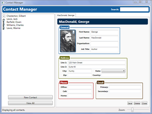
Run the application and click New Contact.
Click the Change Picture button to add a photo of the contact. You should see the dramatically altered interface depicted in Figure 14.3.
Example 14.5. EditContactView.xaml
<UserControl x:Class="ContactManager.Views.EditContactView" xmlns="http://schemas.microsoft.com/winfx/2006/xaml/presentation" xmlns:x="http://schemas.microsoft.com/winfx/2006/xaml"> <DockPanel Margin="5"> <Border DockPanel.Dock="Top" Style="{StaticResource header}"> <DockPanel LastChildFill="False"> <TextBlock DockPanel.Dock="Left" Text="{Binding Contact.LastName}" /> <TextBlock DockPanel.Dock="Left" Text=", " /> <TextBlock DockPanel.Dock="Left" Text="{Binding Contact.FirstName}" /> <TextBlock DockPanel.Dock="Right" Text="{Binding Contact.Organization}" /> </DockPanel> </Border> <StackPanel DockPanel.Dock="Bottom" Style="{StaticResource buttonPanel}"> <Button Content="Save" Click="Save_Click" /> <Button Content="Delete" Click="Delete_Click" /> <Button Content="Close" Click="Close_Click" /> </StackPanel> <WrapPanel> <GroupBox BorderBrush="{StaticResource lightBlueBrush}"> <GroupBox.Header> <Border Background="{StaticResource lightBlueBrush}" Style="{StaticResource groupBoxHeader}"> <TextBlock Text="General" /> </Border> </GroupBox.Header> <Grid> <Grid.ColumnDefinitions> <ColumnDefinition Width="100" /> <ColumnDefinition Width="Auto" /> <ColumnDefinition Width="175" /> </Grid.ColumnDefinitions> <Grid.RowDefinitions> <RowDefinition Height="Auto" /> <RowDefinition Height="Auto" /> <RowDefinition Height="Auto" /> <RowDefinition Height="Auto" /> </Grid.RowDefinitions> <Grid Grid.RowSpan="4"> <Border Background="Gray" CornerRadius="6" Margin="2 2 0 0" Opacity=".5" /> <Border Margin="2 2 4 4" Background="White" /> <Viewbox Margin="2 2 4 4"> <Image Source="{Binding Contact.ImagePath}" /> </Viewbox> <Border BorderBrush="{StaticResource lightBlueBrush}" BorderThickness="2" Background="Transparent" CornerRadius="6" Margin="0 0 2 2" /> <Button Style="{StaticResource openButton}" Background="White" Foreground="{StaticResource lightBlueBrush}" BorderBrush="{StaticResource lightBlueBrush}" ToolTip="Change Picture" Click="SelectImage_Click" /> </Grid> <Label Grid.Column="1" Content="_First Name:" Target="{Binding ElementName=firstName}" /> <TextBox x:Name="firstName" Grid.Column="2" Text="{Binding Contact.FirstName}" /> <Label Grid.Row="1" Grid.Column="1" Content="_Last Name:" Target="{Binding ElementName=lastName}" /> <TextBox x:Name="lastName" Grid.Row="1" Grid.Column="2" Text="{Binding Contact.LastName}" /> <Label Grid.Row="2" Grid.Column="1" Content="Or_ganization:" Target="{Binding ElementName=organization}" /> <TextBox x:Name="organization" Grid.Row="2" Grid.Column="2" Text="{Binding Contact.Organization}" /> <Label Grid.Row="3" Grid.Column="1" Content="_Job Title:" Target="{Binding ElementName=jobTitle}" /> <TextBox x:Name="jobTitle" Grid.Row="3" Grid.Column="2" Text="{Binding Contact.JobTitle}" /> </Grid> </GroupBox> <GroupBox BorderBrush="{StaticResource greenBrush}"> <GroupBox.Header> <Border Background="{StaticResource greenBrush}" Style="{StaticResource groupBoxHeader}"> <TextBlock Text="Address" /> </Border> </GroupBox.Header> <Grid> <Grid.ColumnDefinitions> <ColumnDefinition Width="Auto" /> <ColumnDefinition Width="150" /> <ColumnDefinition Width="Auto" /> <ColumnDefinition Width="150" /> </Grid.ColumnDefinitions> <Grid.RowDefinitions> <RowDefinition Height="Auto" /> <RowDefinition Height="Auto" /> <RowDefinition Height="Auto" /> <RowDefinition Height="Auto" /> </Grid.RowDefinitions> <Label Content="Line _1:" Target="{Binding ElementName=line1}" /> <TextBox x:Name="line1" Grid.Column="1" Grid.ColumnSpan="3" Text="{Binding Contact.Address.Line1}" /> <Label Grid.Row="1" Content="Line _2:" Target="{Binding ElementName=line2}" /> <TextBox x:Name="line2" Grid.Row="1" Grid.Column="1" Grid.ColumnSpan="3" Text="{Binding Contact.Address.Line2}" /> <Label Grid.Row="2" Content="Ci_ty:" Target="{Binding ElementName=city}" /> <TextBox x:Name="city" Grid.Row="2" Grid.Column="1" Text="{Binding Contact.Address.City}" /> <Label Grid.Row="2" Grid.Column="2" Content="_State:" Target="{Binding ElementName=state}" /> <ComboBox x:Name="state" Grid.Row="2" Grid.Column="3" SelectedItem="{Binding Contact.Address.State}" /> <Label Grid.Row="3" Content="_Zip:" Target="{Binding ElementName=zip}" /> <TextBox x:Name="zip" Grid.Row="3" Grid.Column="1" Text="{Binding Contact.Address.Zip}" /> <Label Grid.Row="3" Grid.Column="2" Content="Countr_y:" Target="{Binding ElementName=country}" /> <TextBox x:Name="country" Grid.Row="3" Grid.Column="3" Text="{Binding Contact.Address.Country}" /> </Grid> </GroupBox> <GroupBox BorderBrush="{StaticResource redBrush}"> <GroupBox.Header> <Border Background="{StaticResource redBrush}" Style="{StaticResource groupBoxHeader}"> <TextBlock Text="Phone" /> </Border> </GroupBox.Header> <Grid> <Grid.ColumnDefinitions> <ColumnDefinition Width="Auto" /> <ColumnDefinition Width="150" /> </Grid.ColumnDefinitions> <Grid.RowDefinitions> <RowDefinition Height="Auto" /> <RowDefinition Height="Auto" /> <RowDefinition Height="Auto" /> </Grid.RowDefinitions> <Label Content="_Office:" Target="{Binding ElementName=office}" /> <TextBox x:Name="office" Grid.Column="1" Text="{Binding Contact.OfficePhone}" /> <Label Grid.Row="1" Content="_Cell:" Target="{Binding ElementName=cell}" /> <TextBox x:Name="cell" Grid.Row="1" Grid.Column="1" Text="{Binding Contact.CellPhone}" /> <Label Grid.Row="2" Content="_Home:" Target="{Binding ElementName=home}" /> <TextBox x:Name="home" Grid.Row="2" Grid.Column="1" Text="{Binding Contact.HomePhone}" /> </Grid> </GroupBox> <GroupBox BorderBrush="{StaticResource brownBrush}"> <GroupBox.Header> <Border Background="{StaticResource brownBrush}" Style="{StaticResource groupBoxHeader}"> <TextBlock Text="Email" /> </Border> </GroupBox.Header> <Grid> <Grid.ColumnDefinitions> <ColumnDefinition Width="Auto" /> <ColumnDefinition Width="200" /> </Grid.ColumnDefinitions> <Grid.RowDefinitions> <RowDefinition Height="Auto" /> <RowDefinition Height="Auto" /> </Grid.RowDefinitions> <Label Content="_Primary:" Target="{Binding ElementName=primaryEmail}" /> <TextBox x:Name="primaryEmail" Grid.Column="1" Text="{Binding Contact.PrimaryEmail}" /> <Label Grid.Row="1" Content="S_econdary:" Target="{Binding ElementName=secondaryEmail}" /> <TextBox x:Name="secondaryEmail" Grid.Row="1" Grid.Column="1" Text="{Binding Contact.SecondaryEmail}" /> </Grid> </GroupBox> </WrapPanel> </DockPanel> </UserControl>
In the previous markup, we have added several additional GroupBox controls to display the rest of the information that our Contact class is tracking. The layouts, controls, and data bindings are all very similar to what we have seen in previous hours. If you take a close look at the markup, you will find many instances where we have set the Style property of an element using a StaticResource. We have referenced our application-wide styles by name, and we could have referenced any number of locally scoped styles just as easily. Applying styles to a UI is that simple.
Did you Know?
In real applications, user interface markup can get very large due to its complexity. Therefore, it is important to begin recognizing commonalities in appearance as early as possible so that they can be extracted into a Style and located elsewhere. If you notice that you are declaring the same colors, fonts, margins, etc. on elements repeatedly, it’s time to implement some styles.
Sometimes different styles can have a lot in common. For example, you might want to use the same font appearance on all your buttons and labels, but you don’t want to declare this over and over. WPF has a simple facility for letting you inherit styles one from another. Take a look at the following markup:
      <Style x:Key="baseControlStyle"
             TargetType="{x:Type Control}">
          <Setter Property="FontFamily"
                  Value="Arial" />
          <Setter Property="FontSize"
                  Value="12" />
      </Style>
      <Style TargetType="{x:Type Button}"
             BasedOn="{StaticResource baseControlStyle}">
          <Setter Property="Margin"
                  Value="4" />
      </Style>
      <Style TargetType="{x:Type Label}"
             BasedOn="{StaticResource baseControlStyle}">
          <Setter Property="HorizontalAlignment"
                  Value="Right" />
          <Setter Property="FontWeight"
                  Value="Bold" />
      </Style>
By using the BasedOn property you can reference other styles and effectively enable style inheritance. The basic constraint is that you must determine a compatible base class for all the styles involved. In this case, both Button and Label inherit from Control.
This hour introduced one of the most powerful WPF features: Styles. With styles there is a new set of possibilities available and a greater ease of development and maintenance of application UIs. Resources are the typical home of styles but they are not limited to storing them alone. Any CLR object with a parameterless constructor can be stored inside a resource dictionary and easily accessed later by key. As you work more with WPF, you will find that combining these features deeply enables rich, dynamic application development.
Research “Resources” on MSDN. Investigate some of the deeper implications of using dynamic versus static resources.
Review the styles presented in this hour. Determine if there is a way to extract some base styles and make the appropriate changes.
Experiment with the application’s color theme. Create a new color theme for the application by changing only resource values.