
What You’ll Learn in This Hour:
The basics of making control templates
Why you would want to use control templates
Examples of making control templates
Solutions for problems that you’ll encounter when authoring your own templates
Control templates are used to define the actual look of a control. With control templates we can make a list box filled with the names of countries look like a map of the world, without affecting the behavior of the list box programmatically. After we cover the basic concepts, you’ll find that control templates are easy to understand. The difficulty in working with them is in the details of the individual controls. We go through a few examples in this hour so that you’ll be well equipped to write your own control templates.
You’ve probably heard people using the phrase “look and feel” when discussing software. People sometimes hear it for years and never stop to consider what it actually means. In the case of control templates, the “look” is what is rendered on the screen, and the “feel” is the actual behavior of a control. For example, a list box of any sort will always present users with a set of items, allowing them to make a selection. That describes the feel, or behavior, of a list box. Visually, it might be a 10×10 grid of little colored squares, one square for each item in the set, or it might be a traditional box with a scrollbar and vertically stacked items. Either option is a different look.
Control templates are a way for you to define the look of a control without affecting its feel. An example is worth a thousand words here. Suppose that we would like to create a button that looks like a smiley face.
Create a new project called
ControlTemplates.In
Window1.xaml, create a button with the following:<Button HorizontalAlignment="Center" VerticalAlignment="Center"> <Canvas Width="48" Height="48"> <Ellipse Width="48" Height="48" Fill="Yellow" /> <Ellipse Width="8" Height="8" Canvas.Top="12" Canvas.Left="12" Fill="Black"/> <Ellipse Width="8" Height="8" Canvas.Top="12" Canvas.Right="12" Fill="Black" /> <Path Data="M10,30 C18,38 30,38 38,30" Stroke="Black" /> </Canvas> </Button>
Run the application, and the result will look like Figure 21.1.
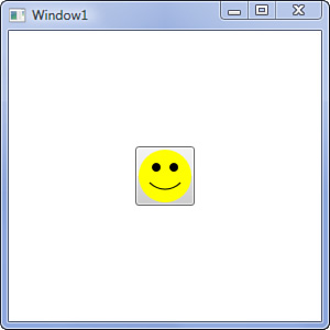
We’ve created a button and placed a canvas inside with a drawing of a smiley face. The problem with this is that our canvas is inside the button. The chrome of the button is still present. We want to completely replace the visual representation of our button.
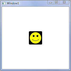
We are going to add a control template. But first, to save us some typing, copy and paste our smiley face into the window’s resource dictionary:
<Window.Resources>
    <Canvas x:Key="Smiley" Width="48" Height="48">
        <Ellipse Width="48" Height="48"
                         Fill="Yellow" />
        <Ellipse Width="8" Height="8"
                         Canvas.Top="12" Canvas.Left="12"
                         Fill="Black"/>
        <Ellipse Width="8" Height="8"
                         Canvas.Top="12" Canvas.Right="12"
                         Fill="Black" />
        <Path Data="M10,30 C18,38 30,38 38,30"
                      Stroke="Black" />
    </Canvas>
</Window.Resources>
We’ll modify our button to this:
<Button HorizontalAlignment="Center"
        VerticalAlignment="Center">
    <Button.Template>
        <ControlTemplate>
            <Border Background="Black"
                    Padding="4"
                    CornerRadius="4"
                    Child="{StaticResource Smiley}" />
        </ControlTemplate>
    </Button.Template>
</Button>
The WPF designer isn’t able to render a preview. However, run the application and you’ll see that our button is now just the black border and smiley face. Be sure to mouse over and click the button. The result is shown in Figure 21.2.
Watch Out!
Why isn’t the WPF designer able to render the button after we placed the canvas in the resources? The exact reason is somewhat technical; however, the problem illustrates an important point. Items in a resource dictionary are single instances. Essentially, we are creating an instance of a Canvas, and all references in our XAML are pointing to that one instance. A given element can have only one parent. If we attempt to reuse our stored canvas in another location, we’ll run into the same error at runtime. You can easily demonstrate the problem by simply duplicating the button we just created.
In practice, it is not very useful to store instances of UIElement in a resource dictionary.
Did you notice that our button no longer has any visual cues for mouseover and click? Those effects are actually part of the built-in control templates. Anytime you implement a control template, you’ll have to handle these effects yourself. We’ll show you how to handle this when we cover the topic of triggers.
Our smiley face started off in the Content property of the button, and after moving it to the template we no longer have any content for the button. It’s just the template. In the majority of cases, however, your template isn’t meant to provide the actual content; rather, it’s a template that your content will be injected into.
Add the
Contentattribute back to theButtonwith the valueSmile!.<Button HorizontalAlignment="Center" VerticalAlignment="Center" Content="Smile!">
Run the application and take a look at the button. Where’s the content? We haven’t told the template what to do with the content, so WPF just ignores it.
We need to take two steps for WPF to render the content. First, we need to tell the template what type of control it is a template for. Modify the opening tag of the template to match this:
<ControlTemplate TargetType="{x:Type Button}">
Then the template needs to know where to place the content. There are few special elements called presenters that communicate to a template where to place the content. We can modify the template to look like this:
<ControlTemplate TargetType="{x:Type Button}">
    <Grid>
        <Border Background="Green"
                Padding="4"
                CornerRadius="4"
                Child="{StaticResource Smiley}" />
        <ContentPresenter HorizontalAlignment="Center" />
    </Grid>
</ControlTemplate>
I changed the background of the border to contrast better with the content. Run the application to see the button with its content.
Now you should have a basic feel for control templates. Here are few points to summarize things so far:
Templates are composed out of UI elements.
Templates need to be explicitly told what type of control they are targeting. Use the
TargetTypeattribute to do this.Templates need to know what to do with the control content. We used the
ContentPresenterelement to handle this for a button.
We just mentioned the ContentPresenter, but two other presenter controls exist as well: ScrollContentPresenter and ItemsPresenter.
Use ContentPresenter when templating any control that has a Content property. Examples of these controls are Label, ToolTip, and Button; that is, anything that derives from ContentControl.
Use ItemsPresenter for any control that has an Items property. Some controls using this presenter in their templates are TreeView, Menu, and ListBox. Use this with any control that derives from ItemsControl.
ScrollContentPresenter is a special case that is used only with the ScrollViewer control. It derives from ContentPresenter, but implements the IScrollInfo interface.
A few things about ItemsControl warrant more explanation. You may recall from Hour 16, “Visualizing Lists,” that ItemsControl has a property ItemsPanel that allows you to choose a panel for the layout of the actual items. An example might be:
<ListBox>
    <ListBox.ItemsPanel>
        <ItemsPanelTemplate>
            <WrapPanel />
        </ItemsPanelTemplate>
    </ListBox.ItemsPanel>
    <ListBox.Items>
        <ListBoxItem Content="Red" />
        <ListBoxItem Content="Green" />
        <ListBoxItem Content="Blue" />
    </ListBox.Items>
</ListBox>
We’ve told this ListBox to use a WrapPanel instead of its default StackPanel. The three items that we’ve explicitly added to the ListBox will be injected into the WrapPanel. Now we’ll add a control template:
<ListBox>
    <ListBox.ItemsPanel>
        <ItemsPanelTemplate>
            <WrapPanel />
        </ItemsPanelTemplate>
    </ListBox.ItemsPanel>
    <ListBox.Items>
        <ListBoxItem Content="Red" />
        <ListBoxItem Content="Green" />
        <ListBoxItem Content="Blue" />
    </ListBox.Items>
    <ListBox.Template>
        <ControlTemplate TargetType="{x:Type ListBox}">
            <Border Background="Pink"
                    Padding="8">
                <ItemsPresenter />
            </Border>
        </ControlTemplate>
    </ListBox.Template>
</ListBox>
When the template is rendered, the WrapPanel and its children are injected at the location of ItemsPresenter.
As you can see, the XAML is growing quickly. There is a shortcut, however.
<ListBox>
    <ListBox.Items>
        <ListBoxItem Content="Red" />
        <ListBoxItem Content="Green" />
        <ListBoxItem Content="Blue" />
    </ListBox.Items>
    <ListBox.Template>
        <ControlTemplate TargetType="{x:Type ListBox}">
            <Border Background="Pink"
                    Padding="8">
                <WrapPanel IsItemsHost="True" />
            </Border>
        </ControlTemplate>
    </ListBox.Template>
</ListBox>
In this snippet, we no longer set the ItemsPanel on the ListBox. In addition, no ItemsPresenter is in the template. Instead, we specify the panel inline and set the IsItemsHost to True.
Although this is convenient shorthand, a drawback exists. You are no longer able to set the ItemsPanel. The property is ignored when you use IsItemsHost. This means that another developer using this control template cannot swap out the panel without modifying the template.
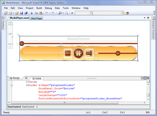
Let’s apply some of our knowledge of templates to the Media Viewer. We’ll begin with the Home button in the upper-left corner of the application.
Open the Media Viewer project.
In
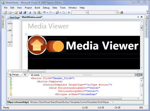
MainWindow.xaml, locate theButtonwired toHeader_Click. First, we’ll remove theBackgroundattribute, and then we’ll add the template. Modify the button to look like this:<Button Background="{StaticResource redBrush}" Click="Header_Click"> <Button.Template> <ControlTemplate TargetType="{x:Type Button}"> <Grid HorizontalAlignment="Center" VerticalAlignment="Center"> <Ellipse x:Name="chromeEdge" Margin="-2" Width="36" Height="36" Fill="{StaticResource chromeBrush}" Stroke="{StaticResource chromeOutline}" StrokeThickness="0.5"> </Ellipse> <Ellipse x:Name="bg" Width="32" Height="32" Stroke="{StaticResource redBrush}" Fill="{StaticResource redRadial}"/> <ContentPresenter HorizontalAlignment="Center" VerticalAlignment="Center" /> <Rectangle x:Name="gloss" Margin="3.5" Width="25" Height="16" RadiusX="20" RadiusY="10" Fill="{StaticResource glossBrush}" VerticalAlignment="Top"/> </Grid> </ControlTemplate> </Button.Template> <Polygon Fill="{StaticResource yellowGradient}" Points="0,10 11,0 22,10 18,10 18,20 4,20 4,10" /> </Button>
Let’s take a moment to examine what we just did. We have two ellipses, a content presenter, and a rectangle. Because we don’t have any columns or rows in the containing grid, these four elements are stacked on top of one another. We set the horizontal and vertical alignment to center to make the Grid collapse to the size of its content.
At the bottom of the stack is the Ellipse element we named chromeEdge. It’s not imperative that we name these elements, but it makes it easier to talk about them. chromeEdge extends outside the containing grid because of its negative margin. Because it’s on the bottom, it’s also almost entirely covered by the other elements. The combination of the chromeBrush fill and the chromeOutline stroke provide the illusion of a metallic ring around the button.
The next element, bg, is the primary background of the button. I added the redBrush stroke to further enhance the metallic ring.
Next we have the actual content. Note that we’ve centered the ContentPresenter in the Grid.
Finally, we use a highly rounded rectangle to give the impression of depth and glossiness. The brush is translucent and actually on top of the content.
When viewed in the designer, MainWindow.xaml will look like Figure 21.3.
This same control template would look great when used with the Play button in the MediaPlayer user control. We’ll need to move the template into a resource dictionary to accomplish this.
By the Way
It’s a good idea to place your control templates in a resource dictionary. Templates are usually lengthy, and they can easily obscure the intent of your markup. You can even apply templates through styles, which reduces the inline markup even more. Finally, it’s necessary if you plan to reuse a template.
Open
DefaultStyles.xaml. We’re going create a style that we’ll apply to both the Home button and the Play button. Add the following:<Style x:Key="fancyButtonStyle" TargetType="{x:Type Button}"> <Setter Property="Margin" Value="4" /> <Setter Property="Template"> <Setter.Value> <!-- We'll cut and paste the template here! --> </Setter.Value> </Setter> </Style>
I also added some margin to the style as well.
Now cut the
ControlTemplatefromMainWindow.xamland paste in the spot we left inDefaultStyles.xaml.Modify the Home button in
MainWindow.xamlso that it references the style and no longer has aButton.Templatechild. It should look like this when you are done:<Button Style="{StaticResource fancyButtonStyle}" Click="Header_Click"> <Polygon Fill="{StaticResource yellowGradient}" Points="0,10 11,0 22,10 18,10 18,20 4,20 4,10" /> </Button>
Open
MediaPlayer.xamlin theUserControlsdirectory and locate theButtonwired toPlay_Click. Add the following attribute:Style="{StaticResource fancyButtonStyle}"
I also modified the contents of the Play button slightly to match the new template. The markup for the entire button is:
<Button Grid.Column="1"
        Click="Play_Click"
        Style="{StaticResource fancyButtonStyle}">
    <Grid Margin="4 0 0 0">
        <Polygon Fill="{StaticResource yellowGradient}"
                 Stroke="{StaticResource chromeOutline}"
                 Points="0,0 18,10 0,18">
        </Polygon>
        <Canvas Visibility="Hidden">
            <Rectangle Height="18"
                       Fill="{StaticResource yellowGradient}"
                       Stroke="{StaticResource chromeOutline}"
                       Width="6"/>
            <Rectangle Height="18"
                       Fill="{StaticResource yellowGradient}"
                       Stroke="{StaticResource chromeOutline}"
                       Width="6" Canvas.Left="8"/>
        </Canvas>
    </Grid>
</Button>
Run the application and switch to the music view. The Home button and the Play button now use the same template.
Creating a template for the Stop and Mute buttons uses the same principles. Here is the style for them:
<Style x:Key="mediaButtonStyle" TargetType="{x:Type ButtonBase}">
    <Setter Property="Template">
        <Setter.Value>
            <ControlTemplate TargetType="{x:Type ButtonBase}">
                <Grid Width="32" Height="32"
                      Background="Transparent" >
                    <ContentPresenter VerticalAlignment="Center"
                                      HorizontalAlignment="Center"/>
                    <Border x:Name="highlight"
                            CornerRadius="3"
                            Background="{StaticResource mediaButtonHover}"
                            BorderBrush="{StaticResource glossOutline}"
                            BorderThickness="1">
                    </Border>
                </Grid>
            </ControlTemplate>
        </Setter.Value>
    </Setter>
</Style>
Note that both the style and the template target
ButtonBaseinstead ofButton. The style is going to be applied to aToggleButtonas well, so we target the base class for bothButtonandToggleButton.In a later hour, we’ll modify this template so that
highlightis visible only when a mouse is over the button.Our template depends upon the brush
mediaButtonHover. Let’s go ahead and add that toColorsAndBrushes.xaml:<LinearGradientBrush x:Key="mediaButtonHover" StartPoint="0.5,0" EndPoint="0.5,1" > <GradientStop Color="#C0FFFFFF" Offset="0"/> <GradientStop Color="#00FFFFFF" Offset="0.33"/> <GradientStop Color="#00FFFFFF" Offset="0.66"/> <GradientStop Color="#C0FFFFFF" Offset="1"/> </LinearGradientBrush>
The Stop button now looks like this:
<Button Style="{StaticResource mediaButtonStyle}"
        Click="Stop_Click">
    <Border Width="18" Height="20"
            Background="{StaticResource redRadial}"
            CornerRadius="1"
            BorderBrush="{StaticResource controlOutline}"
            BorderThickness="1"
            SnapsToDevicePixels="False">
        <Rectangle HorizontalAlignment="Center"
                   VerticalAlignment="Top"
                   Margin="0,1,0,0"
                   Width="15" Height="10"
                   Fill="{StaticResource glossBrush}"
                   RadiusX="1" RadiusY="1"/>
    </Border>
</Button>
The Mute button now looks like this:
<ToggleButton Grid.Column="2"
              Style="{StaticResource mediaButtonStyle}"
              IsChecked="{Binding Path=IsMuted, ElementName=mediaElement}" >
    <Grid>
        <Canvas Width="20" Height="20">
            <!-- the speaker -->
            <Path Fill="{StaticResource redRadial}"
              Stroke="{StaticResource controlOutline}"
              StrokeLineJoin="Round">
                <Path.Data>
                    <PathGeometry>
                        <PathFigure StartPoint="12,5"
                                    IsClosed="True">
                            <LineSegment Point="0,6" />
                            <PolyLineSegment Points="0,14 12,15 17,20" />
                            <ArcSegment Point="17,0"
                                        Size="30,30"/>
                        </PathFigure>
                    </PathGeometry>
                </Path.Data>
            </Path>
            <!-- highlight -->
            <Path Fill="{StaticResource glossBrush}">
                <Path.Data>
                    <PathGeometry>
                        <PathFigure StartPoint="13,6"
                                    IsClosed="True">
                            <PolyLineSegment Points="1,7 1,11 17.5,11" />
                            <ArcSegment Point="16.5,2"
                                        Size="30,30"/>
                        </PathFigure>
                    </PathGeometry>
                </Path.Data>
            </Path>
            <!-- sound waves -->
            <Polygon Points="20,5 25,0 27,3"
                     Fill="{StaticResource textBrush}" />
            <Polygon Points="20,10 28,9 27,6"
                     Fill="{StaticResource textBrush}" />
            <Polygon Points="20,13 26,17 27,13"
                     Fill="{StaticResource textBrush}" />
            <Polygon Points="20,17 24,21 26,18"
                     Fill="{StaticResource textBrush}" />
        </Canvas>
    </Grid>
</ToggleButton>
At this point, the music view of the application is really beginning to take shape.
ContentPresenter and ItemsPresenter provide support only for a limited number of controls. For example, if you wanted to create a template for a TextBox, how would you communicate to the template which element displays the input? Or if you are creating a ScrollBar, which has many moving parts, how does the template know which elements are which?
Many controls have special named parts that must be included in the template for the control to be completely functional. The named parts are simply elements with well-known names that the control expects to be there. The convention established for these well-known names is that they begin with “PART_”. The control also expects these elements to be specific types. Table 21.1 lists all controls included with WPF that use named parts, as well as the expected type for each part. (Note that although most of the types are in System.Windows.Controls, some are in System.Windows.Controls.Primitives.)
Table 21.1. Named Parts in the Standard WPF Controls
Name | Named Parts |
|---|---|
| PART_EditableTextBox ( PART_Popup ( |
| PART_ContentHost ( PART_FindToolBarHost ( |
| PART_FindToolBarHost ( |
| PART_ContentHost ( PART_FindToolBarHost ( |
PART_ContentHost ( PART_FindToolBarHost ( PART_ToolBarHost ( | |
| PART_FrameCP ( |
| PART_FloatingHeaderCanvas ( PART_HeaderGripper ( |
| PART_Popup ( |
| PART_NavWinCP ( |
| PART_ContentHost ( |
| PART_Indicator ( PART_Track ( |
| PART_Track ( |
| PART_HorizontalScrollBar ( PART_ScrollContentPresenter ( PART_VerticalScrollBar ( |
| PART_SelectionRange ( PART_Track ( |
| PART_CloseButton ( PART_ContentControl ( PART_CopyMenuItem ( PART_EraseMenuItem ( PART_IconButton ( PART_InkMenuItem ( PART_PasteMenuItem ( PART_ResizeBottomRightThumb ( PART_SelectMenuItem ( PART_TitleThumb ( |
| PART_SelectedContentHost ( |
| PART_ContentHost ( |
| PART_ToolBarOverflowPanel ( PART_ToolBarPanel ( |
| PART_Header ( |
Watch Out!
Controls won’t complain if you forget to include a named part—a portion (or all) of the control just won’t work.
This is part of Microsoft’s “Guidelines for Designing Stylable Controls.” The guidelines explicitly state that a control should not throw an exception if the template fails to fulfill the contract.
Microsoft’s convention is that any control using parts in its template should be decorated with the TemplatePartAttribute for each of the parts. The purpose is to provide design-time support for templating, but it is also helpful for identifying the named parts in the official documentation.
We’re going to create a control template for all the slider controls in the Media Viewer. Slider has two named parts, although we will be concerned with only one of them at the moment.
It will be helpful to think about the various parts of the control before we get started. Figure 21.4 shows the anatomy of the Slider.
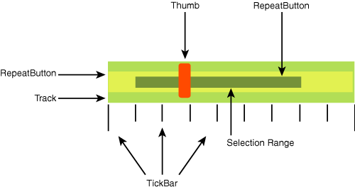
There are 6 functional parts to a Slider:
Thumb—. This is the element you click and drag to adjust the value of theSlider.Track—. This element is responsible for the layout of theRepeatButtonelements and theThumb. This is a named part.RepeatButton—. There are two of these elements, one on the left of theThumband another on the right. They allow a user to adjust the value when clicking either side of theThumb.TickBar—. This element displays a set of ticks. TheThumbcan optionally snap to the ticks marks.Selection Range—. This is another named part. Its purpose is to visually indicate a specific range on the slider, although it does not actually restrict the value.
For the Media Viewer, we are going only to the Track and Thumb. These two are the bare minimum we need to have a functioning Slider.
Open
DefaultStyles.xaml.Create a new style using the following:
<Style TargetType="{x:Type Slider}">
    <Setter Property="Template">
        <Setter.Value>
            <ControlTemplate TargetType="{x:Type Slider}">
                <Grid x:Name="root">
                    <Border Height="4"
                            CornerRadius="2"
                            Background="{StaticResource sliderBg}">
                    </Border>
                    <Track x:Name="PART_Track">
                        <Track.Thumb>
                            <Thumb />
                        </Track.Thumb>
                    </Track>
                </Grid>
            </ControlTemplate>
        </Setter.Value>
    </Setter>
</Style>
Notice that we didn’t provide an
x:Keyattribute. This means that the styles will be applied to all the sliders in the application.We need to add the
sliderBgbrush toColorsAndBrushes.xaml. Open this file and add the following:<LinearGradientBrush x:Key="sliderBg" StartPoint="0.5,0" EndPoint="0.5,1"> <GradientStop Color="{StaticResource redColor}" Offset="0"/> <GradientStop Color="{StaticResource orangeColor}" Offset="0.5"/> <GradientStop Color="{StaticResource redColor}" Offset="1"/> </LinearGradientBrush>
If you run the application now and switch to the music view, you will notice that the sliders look very odd. The
Thumbis unstyled, and it stretches vertically to the container of the slider. Add the following toDefaultStyles.xaml:<Style TargetType="{x:Type Thumb}" > <Setter Property="Template"> <Setter.Value> <ControlTemplate TargetType="{x:Type Thumb}"> <Grid Width="16" Height="16"> <Ellipse Fill="{StaticResource redRadial}" Stroke="{StaticResource controlOutline}"/> <Ellipse Fill="{StaticResource glossBrush}" Margin="2,2,2,4"/> </Grid> </ControlTemplate> </Setter.Value> </Setter> </Style>
Again, this style applies to all thumbs in the application. A few other controls also use thumbs, so there is potential for conflict. If you discover that your style is showing up in unwanted spots, provide a key and then explicitly reference the style in your slider template. Figure 21.5 shows the results of these new templates.
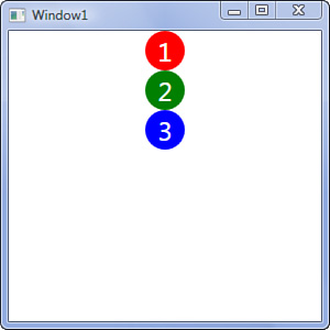
Suppose that you would like to provide a single control template for all the buttons in an application. Perhaps all the buttons need to be circles, but you want to be able to set a different background brush for the circle on each button. You can accomplish this using data binding. We can bind elements in a template to the actual control.
Suppose that we have a template, named CircleButton, that looks like this:
    <ControlTemplate x:Key="CircleButton" TargetType="{x:Type Button}">
        <Grid HorizontalAlignment="Center"
              VerticalAlignment="Center"
              MinHeight="36" MinWidth="36">
            <Ellipse Fill="{TemplateBinding Background}" />
            <ContentPresenter />
        </Grid>
    </ControlTemplate>
In this example, the Fill property on the Ellipse will be set to the Background property of the button that the template is applied to.
Let’s see how template binding works by returning to the ControlTemplates project that we created at the beginning of this hour:
Open the project
ControlTemplates.Modify Windows1.xaml to match Listing 21.1. This creates three buttons in a
StackPanelthat all use the same template. However, the brush for the Fill is different for each button. Figure 21.6 shows how WPF renders this XAML.Example 21.1. Window1.xaml
<Window x:Class="ControlTemplates.Window1"
        xmlns="http://schemas.microsoft.com/winfx/2006/xaml/presentation"
        xmlns:x="http://schemas.microsoft.com/winfx/2006/xaml"
        Title="Window1" Height="300" Width="300">
    <StackPanel>
        <StackPanel.Resources>
            <ControlTemplate x:Key="CircleButton"
                             TargetType="{x:Type Button}">
                <Grid HorizontalAlignment="Center"
                      VerticalAlignment="Center"
                      MinHeight="36" MinWidth="36">
                    <Ellipse Fill="{TemplateBinding Background}" />
                    <ContentPresenter TextBlock.FontSize="24"
                                      TextBlock.Foreground="White"
                                      HorizontalAlignment="Center"
                                      VerticalAlignment="Center" />
                </Grid>
            </ControlTemplate>
        </StackPanel.Resources>
        <Button Background="Red"
                Content="1"
                Template="{StaticResource CircleButton}" />
        <Button Background="Green"
                Content="2"
                Template="{StaticResource CircleButton}" />
        <Button Background="Blue"
                Content="3"
                Template="{StaticResource CircleButton}" />
    </StackPanel>
</Window>
By the Way
Note that we are using attached properties on the ContentPresenter in Listing 21.1. The properties tell WPF to set the FontSize and Foreground for any TextBlock elements that end up in the ContentPresenter. Even though we aren’t explicitly using a TextBlock in each of the buttons, we can take advantage of the fact that WPF needs to use a TextBlock to render the string we put in Content.
Template binding is very powerful. Any property on the target type of the template can be bound, including the DataContext and Tag properties.
It is a common practice to keep a control template flexible through the use of template binding. The idea is that you create a default style for your controls that sets the control template. However, you use template binding and set as many of the properties as possible in the style. That way, you can inherit from the default style, overriding specifics as needed, while retaining your control template. When you use this approach, you can think of the control template as the structural portion of your control. I’ve applied this pattern to the XAML we just looked at, and the result is Listing 21.2.
Example 21.2. Window1.xaml Refactored
<Window x:Class="ControlTemplates.Window1"
        xmlns="http://schemas.microsoft.com/winfx/2006/xaml/presentation"
        xmlns:x="http://schemas.microsoft.com/winfx/2006/xaml"
        Title="Window1" Height="300" Width="300">
    <StackPanel>
        <StackPanel.Resources>
            <ControlTemplate x:Key="CircleButtonTemplate"
                             TargetType="{x:Type Button}">
                <Grid HorizontalAlignment="Center"
                      VerticalAlignment="Center"
                      MinHeight="{TemplateBinding MinHeight}"
                      MinWidth="{TemplateBinding MinWidth}">
                    <Ellipse Fill="{TemplateBinding Background}" />
                    <ContentPresenter TextBlock.FontSize="{TemplateBinding FontSize}"
                                      TextBlock.Foreground="{TemplateBinding Foreground}"
                                      HorizontalAlignment="Center"
                                      VerticalAlignment="Center" />
                </Grid>
            </ControlTemplate>
            <!--the basic style-->
            <Style x:Key="DefaultCircleButtonStyle"
                   TargetType="{x:Type Button}">
                <Setter Property="Template"
                        Value="{StaticResource CircleButtonTemplate}" />
                <Setter Property="Background"
                        Value="Red" />
                <Setter Property="Foreground"
                        Value="White" />
                <Setter Property="FontSize"
                        Value="24" />
                <Setter Property="MinHeight"
                        Value="36" />
                <Setter Property="MinWidth"
                        Value="36" />
            </Style>
            <!--a derived style-->
            <Style x:Key="NewCircleButtonStyle"
                   TargetType="{x:Type Button}"
                   BasedOn="{StaticResource DefaultCircleButtonStyle}">
                <Setter Property="Background"
                        Value="Green"/>
            </Style>

        </StackPanel.Resources>
        <Button Content="1"
                Style="{StaticResource DefaultCircleButtonStyle}" />
        <Button Content="2"
                Style="{StaticResource NewCircleButtonStyle}" />
        <Button Background="Blue"
                Content="3"
                Style="{StaticResource DefaultCircleButtonStyle}" />
    </StackPanel>
</Window>
Listing 21.2 will render the same as the previous listing. Notice that with each button we set the background brush using a different method.
By the Way
The result of a template binding could also be accomplished using a regular data binding. For example, this data binding:
{Binding RelativeSource={RelativeSource TemplatedParent}, Path=Background}
is the equivalent of this template binding:
{TemplateBinding Background}
Template bindings are preferred because they are both easier to read and more performant. However, they do have some limitations; for example, they can pass data in only one direction: from the control to the template. If you find yourself running into such a limitation, you may need to resort to a data binding.
Additional control templates for the Media Viewer are provided in the downloadable resources.
As we alluded to at the beginning of this hour, control templates are useful because they allow you to change the visualization and structure of a control without having to modify the behavior of the control. They provide a way to cleanly separate the look from the feel. (We discuss the principle of separating concerns further in Hour 24, “Best Practices.”)
This means that you can always treat a ListBox as a ListBox in code, even though it might have a radically different appearance to the user. Because a ListBox can take so many different visual forms, we are able to “develop” new controls simply by creating new templates. Furthermore, control templates make it easier for developers to collaborate with designers to determine what a control should look like.
The core principles underlying control templates are easy to master. We can readily apply our knowledge of composing a UI to the process of constructing templates. Control templates provide us with the real power to completely theme an application.
The difficulty is with the details, however, as every control has unique needs when defining templates. There are lots of “gotchas,” and you will find a frequent need to consult the documentation or examine reference templates.
Additional control templates and resources for the Media Viewer are available on the web site for this book (see Appendix C, “Project Source (downloadable)” for more information). Download these resources and add them.
Extend the control template for the
Sliderto use aTickBarand selection range.