
What You’ll Learn in This Hour:
Some underlying concepts for animation in general
The mechanics of animation in WPF
Creating animations in XAML
How to apply animations to styles and control templates
Animation is one of the more complicated topics to discuss in WPF—not because it is technically more difficult, but because it has many prerequisites. To fully discuss animation, you need to have knowledge of routed events, dependency properties, triggers, and many other aspects of WPF. Hopefully, you have a sense of satisfaction that you are now ready to tackle the subject.
Before we dig into the tools that WPF provides for creating animations, we should take a moment to understand the fundamentals of animation in general. At its root, an animation is a series of images shown in rapid succession to give the illusion of motion. “Motion” has a broad meaning here, and you could substitute the phrase “continuous change.” The practical difficulty of producing animation is that it takes a large number of images to create even a few seconds of motion.
The individual images in an animation are referred to as frames. The number of frames per second (fps) is called the frame rate. Most television and film is somewhere between 20 and 30fps. The higher the frame rate, the smoother the animation will seem. Computer graphics generally target a frame rate around 60fps.
In traditional hand-drawn animation, each frame is drawn by hand. As you can imagine, this is a somewhat tedious process. Teams of animators are employed to create all the necessary frames. However, a lead animator draws the key frames. Key frames are the frames that represent significant points in the motion, such as the start and end points. All the remaining frames, those in between the key frames, are called tweens. (That’s a contraction of “in between frames.”)
The animation system of WPF, as well as that of Adobe Flash, allows you to define the key frames, and then it will handle the tweens for you. For example, say that you have a circle that you want to move along a linear path from the right side of the screen to the left. You can specify the starting position and the ending position of the circle, and then allow WPF to interpolate all the necessary positions in between.
One of the central concepts behind animation in WPF is timelines. (In fact, timelines are central to most computer animation frameworks.) A timeline is a segment of time; it has a beginning point and duration. In other words, it is “when does the animation start” and “how long does it last.” In some cases, you will designate key frames at certain points along the timelines, but in many cases the key frames will be implied from the beginning and end of the timeline.
In WPF, timelines are represented by classes inheriting from System.Windows.Media.Animation.Timeline. There are lots of classes that derive from Timeline. Many of them contain Animation in their names. For example, ColorAnimation, StringAnimationUsingKeyFrames, and PointAnimationUsingPath are all derived from Timeline. These classes are responsible for defining how a value changes over their duration. Take a look at this snippet of XAML:
<ColorAnimation From="Yellow" To="Red" Duration="0:0:5"
                Storyboard.TargetProperty="Fill.Color" />
This is a timeline responsible for changing a Color from yellow to red over the course of 5 seconds. We can provide a string in the format of “hours:minutes:seconds” for the Duration property. This timeline has two implicit keyframes. The first is right at the beginning, that is at “0:0:0”. The second is at “0:0:5”. ColorAnimation knows how to interpolate between two Color values.
The attached property, Storyboard.TargetProperty, is a reference to the property we are animating.
An important concept to grasp here is that these timeline classes are tied to specifc types. ColorAnimation knows only how to interpolate between two Color values. If you need to animate a property of type double, you must use a class like DoubleAnimation.
The Storyboard class is a special timeline. You will use it for all the animations that you build in XAML. It’s a container timeline that allows you to group other timelines. It can also tell its children which object and property to target for the animation. We’ll come back to Storyboard and other timelines in a moment.
To animate something, we need to answer a few questions for WPF:
What object are we targeting for the animation?
Which property on the target object are we going to animate?
When does the animation start? Or what triggers the animation?
How long does the animation last?
How does the property change over the course of the animation?
Let’s create a simple project with a simple animation and examine how we can answer these questions in XAML. We’ll animate a small red ball moving across the window over the course of 7.5 seconds:
Create a new project called
LearningAnimation.Replace the markup in
Window1.xamlwith the XAML supplied in Listing 23.1.Example 23.1. Window1.xaml
<Window x:Class="LearningAnimation.Window1"
        xmlns="http://schemas.microsoft.com/winfx/2006/xaml/presentation"
        xmlns:x="http://schemas.microsoft.com/winfx/2006/xaml"
        Title="Window1"
        Height="300" Width="300">
    <Window.Triggers>
        <EventTrigger RoutedEvent="Window.Loaded">
            <BeginStoryboard>
                <Storyboard Storyboard.TargetName="Ball"
                            Storyboard.TargetProperty="(Canvas.Left)">
                    <DoubleAnimation By="300"
                                     Duration="0:0:07.5"/>
                </Storyboard>
            </BeginStoryboard>
        </EventTrigger>
    </Window.Triggers>
    <Canvas>
        <Ellipse x:Name="Ball"
                 Width="20" Height="20"
                 Fill="Red"
                 Canvas.Top="50" Canvas.Left="0">
        </Ellipse>
    </Canvas>
</Window>
The animation will not play in the preview pane, so you need to run the application to see it.
We have a simple, red Ellipse that we have given the name Ball. We place Ball at 50px from the top. We want to animate it so that it moves all the way across the window.
The Storyboard element answers two of our questions. It says that we are targeting Ball and that we want to animate the attached property, Canvas.Left. We want the animation to start when the Loaded event for the Window executes. The EventTrigger takes a BeginStoryboard, which derives from TriggerAction. We’ll discuss BeginStoryboard in more detail later; for now you can read the XAML as “when the window is loaded begin the storyboard.”
The Storyboard has a single child. It’s a DoubleAnimation because Canvas.Left is of type double. It also answers our remaining questions. The animation will last for 7.5 seconds, and at the end of the duration the targeted property should be increased by 300. DoubleAnimation increases the value linearly, which results in a very mechanical animation.
The Clock class (also located in the System.Windows.Media.Animation namespace) performs the actual work of the animation. You don’t handle clocks directly in XAML (though you might do so in code). Every timeline instance has a related clock instance. I like to think of a timeline as a set of instructions for a clock. The timeline merely describes what should happen. The clock handles updating the property that we are animating, and it keeps track of the current state of the animation.
A clock behaves like a timer, updating its target at intervals. The intervals are very small, but the actual size and regularity is dependent on the system resources.
By the Way
We are focusing on how to create animations in XAML and so we’re not going to go through any examples that show you how to use clocks in code. There are lots of resources and tutorials available on MSDN. Search for the Clock class, as well as “Animation and Timing System Overview.”
You might benefit from using a clock in code if you have demanding animations and need to optimize for performance.
Timelines as Easing Equations
If you have a background with Adobe Flash, you may be familiar with the term easing. Easing refers to how an animated value changes with time. To talk about this mathematically, we are changing some value v with respect to time t. If we are changing Canvas.Left for an element, and we are moving from 50 to 250 over the course of 5 seconds, we could express it as the following equation:
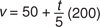
More generically, if we call the starting value A, the ending value B, and the duration d, we could express it as
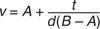
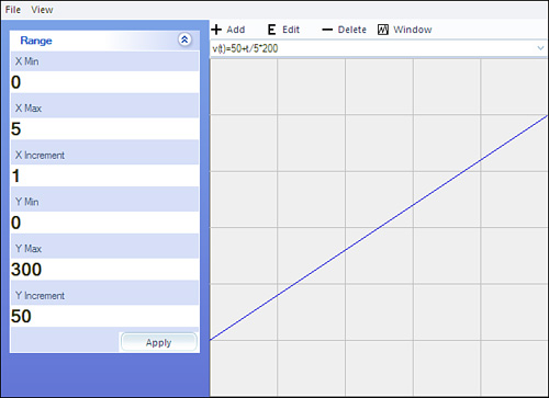
You might recognize that this can be simplified to a linear equation of the form
y=mx + b |
The graph of a linear equation is a straight line, as shown in Figure 23.1.
The timeline classes in WPF named with pattern XAnimation use linear equations. They will plug in the values that you provide into a linear equation. The clock supplies t, and then sets targeted property to resulting v. If we use the property names as variables, the equation would look like
(Using the property By is just short for (To–From).)
Visually, a linear equation produces change at a constant speed. If you are animating position, the element will not speed up nor slow down as it moves. There is no acceleration.
Linear equations result in animations that look stiff and mechanical, especially when we are animating motion. For motion to look natural, we expect it to speed up and slow down. This speeding up and slowing down is where the term easing comes from—in the sense of lessening or abating.
If you want to achieve nonlinear easing in WPF you have two options. The first is to use any of the classes named with pattern XAnimationUsingPath. They allow you to define the curve used to interpolate values over time using the PathGeometry class that we covered in Hour 18, “Drawing with Shapes.” The second option is to create your own custom timeline classes using whatever equations you like.
For more information on these concepts, check out http://thewpfblog.com. Specifically, look for the posts regarding Robert Penner and porting his easing equations from ActionScript to C#.
In the previous hours, we added animations for fancyButtonStyle in DefaultStyles.xaml. Specifically, we added two animations to the control template embedded in that style. Let’s take a moment to examine them. The following snippet has the two EventTrigger from the template.
<EventTrigger RoutedEvent="UIElement.MouseEnter">
    <BeginStoryboard>
        <Storyboard Storyboard.TargetName="chromeEdge"
              Storyboard.TargetProperty="RenderTransform.Angle">
            <DoubleAnimation To="90" Duration="0:0:0.10" />
        </Storyboard>
    </BeginStoryboard>
</EventTrigger>
<EventTrigger RoutedEvent="UIElement.MouseLeave">
    <BeginStoryboard>
        <Storyboard Storyboard.TargetName="chromeEdge"
              Storyboard.TargetProperty="RenderTransform.Angle">
            <DoubleAnimation To="0" Duration="0:0:0.10" />
        </Storyboard>
    </BeginStoryboard>
</EventTrigger>
Both of these animations should make more sense to you now. We can read the first animation as “when the mouse enters the UIElement, animate the angle on the RenderTransform for the element named chromeEdge, beginning from its current value to the value of 90, over the course of 0.10 seconds.” The second animation is merely the inverse of this.
There are a few things to note about these animations. By default, an Ellipse will have a null value for RenderTransform. In the markup for our control template, we explicitly set RenderTransform to an instance of RotateTransform. The default value of Angle on a new instance of RotateTransform is 0. If we had not provided a RotateTransform, the animation would have thrown an exception when it was triggered. Additionally, RenderTransform isn’t guaranteed to be an instance of RotateTransform; it might have been any derivative of Transform. If so, the animation could not have resolved the Angle property, and again it would have thrown an exception.
We purposefully did not set the From values on either animation. If we set From, the target property will snap to that value when the animation is triggered. If we moved the mouse over and off of the element repeatedly, this would result in very jumpy motion. If you change the Duration to a longer value, such as 3 seconds, you can easily see how the animation transitions smoothly.
Let’s add a new animation to the Media Viewer. We want to make images on the picture view grow when we mouse over them, and revert to their default size when we mouse out.
Open the MediaViewer project.
Open
PictureView.xaml, and locate theImageelement. It’s located in theDataTemplate.We need to add a couple of
EventTriggerelements, one for theImage.MouseEnterevent and another forImage.MouseLeave. Add the following markup inside theImageelement:<Image.Triggers> <EventTrigger RoutedEvent="Image.MouseEnter"> <BeginStoryboard> <Storyboard> <DoubleAnimation By="25" Duration="0:0:0.25" Storyboard.TargetProperty="Width" /> </Storyboard> </BeginStoryboard> </EventTrigger> <EventTrigger RoutedEvent="Image.MouseLeave"> <BeginStoryboard> <Storyboard> <DoubleAnimation To="{TemplateBinding Width}" Duration="0:0:0.25" Storyboard.TargetProperty="Width" /> </Storyboard> </BeginStoryboard> </EventTrigger> </Image.Triggers>
The only new thing we’ve introduced here is the use of the template binding. Because we are in a data template, we can use this kind of binding to see the
Tovalue from the animation. Run the application and examine the new animations.
The animation for MouseEnter uses the By property, and the MouseLeave animation is bound to the Width. This means that both animations are independent of the actual size of the image. The designer could change the image size and not need to worry about breaking the animations.
Also, notice that we are animating only the Width, but the Height of the images also changes. This is because the default value of Image.Stretch is Uniform, which keeps the Width and Height synchronized.
The target property for an animation can be any dependency property. This also includes properties that have no visual significance. As we have already seen, we can specify a path to the target property. This is similar to what we have seen with data binding.
There are a few cases in which the path to the property requires disambiguation. Consider this snippet from earlier in the hour:
<Storyboard Storyboard.TargetName="Ball"
            Storyboard.TargetProperty="(Canvas.Left)">
    <DoubleAnimation By="300" Duration="0:0:07.5"/>
</Storyboard>
Notice the parentheses around the target property. We use the parentheses to tell WPF that Canvas.Left is a single property. If we omit the parentheses, WPF would look for a property named Canvas on the Ellipse. This means that when animating an attached property, you will need to enclose it in parentheses.
If you are using a tool such as Blend, you might also encounter a target property that looks like this:
Storyboard.TargetProperty="(UIElement.RenderTransform).(RotateTransform.Angle)"
These are not attached properties. Instead, these are properties that are qualified by their types. This property path is equivalent to the one we used in fancyButtonStyle:
Storyboard.TargetProperty="RenderTransform.Angle"
You might also need a property path that references a specific index in a collection. Imagine that the RenderTransform from chromeEdge has this value:
<Ellipse.RenderTransform>
    <TransformGroup>
        <ScaleTransform/>
        <RotateTransform />
        <TranslateTransform/>
    </TransformGroup>
</Ellipse.RenderTransform>
We could still reference the RotateTransform using
Storyboard.TargetProperty="RenderTransform.Children[1].Angle"
Notice that we have to include the Children property, even though it is not present in the XAML.
There is a great deal of flexibility in where you can place an animation. Storyboard elements themselves are reusable, and they are frequently placed in a resource dictionary. This is also helpful for maintainability.
Storyboards can be triggered directly from an instance of an element. Our very first example this hour, the LearningAnimation project, triggered the animation directly from the instance of the window.
Any element can trigger an animation. Again, the animation in LearningAnimation could have been triggered from the Canvas element, or even the Ellipse that was the target of the animation.
In the official documentation, the practice of triggering an animation directly from an instance of an element is referred to as beginning an animation per-instance.
In addition to this technique, animations can be triggered from styles, control templates, and data templates. Animations can even be started by triggers other than event triggers, although the syntax is somewhat different.
You should be aware of some limitations when you place animations in a style or template.
Inside of a Style, you cannot use Storyboard.TargetName. When you create an animation in a style, it will always target the element that the style is applied to. Likewise, you cannot specify the SourceName on a trigger. On the whole, a storyboard inside a style cannot reference dynamic resources or data bind.
For animations within a control template and data templates, you may only reference elements that are children of the template. Just as with styles, you cannot reference dynamic resources or perform data binding.
A set of properties common to most timelines help you achieve certain effects with your animation that might otherwise be tedious. These are properties set directly on the animation elements in XAML.
Table 23.1 lists some of the more frequently used properties.
Table 23.1. Useful Properties on Timeline
Name | Description |
|---|---|
| Percentage of |
| If true, the animation will play in reverse after its first forward playback. |
| This allows you to set an offset for when the animation will begin—for example, if you want the playback to start 2 seconds after the animation is triggered. |
| Like |
| Determines what the animation will do after it’s done. |
| Allows you to control if and how an animation will repeat. For example, it might repeat just once or forever. |
| Changes the rate of playback relative to the parent timeline (which is most commonly the Storyboard). For example, even if the Duration is the same for both the parent and child, a |
These two properties, AccelerationRatio and DecelerationRatio, allow you to change the easing of the animation. Both properties are percentages, ranging in value from 0.0 to 1.0. AccelerationRatio affects the beginning of the animation, and DecelerationRatio affects the end.
Suppose you have a simple animation, similar to the one we created in LearningAnimation, and that it has a Duration of 10 seconds.
<DoubleAnimation By="300" Duration="0:0:10"/>
In this case, the ball would move at a constant rate of 30 pixels per second. Now we’ll add AccelerationRatio and DecelerationRatio, both with a value of 40%.
<DoubleAnimation By="300"
                 AccelerationRatio="0.4"
                 DecelerationRatio="0.4"
                 Duration="0:0:10"/>
With this markup, the ball will start at a speed of 0 and accelerate for 4 seconds. Then, beginning at the sixth second, it will slow down for 4 seconds.
This is an easy and useful way to achieve a more natural motion.
The fill is what the animation does after it has run its course. In our ball example, the ball just stops and maintains its last position at the end of the animation. The two possible values are Stop and HoldEnd. A FillBehavior of Stop will cause the property being animated to revert to the initial value.
Fill is affected by the duration of the containing timeline. The behavior is only applied if the child timeline is allowed to complete. This is really only noticeable with Stop. In the following snippet, the ball will return to its original position at the end of 10 seconds.
<Storyboard Storyboard.TargetName="Ball"
            Storyboard.TargetProperty="(Canvas.Left)">
    <DoubleAnimation By="300" Duration="0:0:10" FillBehavior="Stop"/>
</Storyboard>
However, if we explictly set the Duration of the Storyboard to 5 seconds, the DoubleAnimation will never complete, and the FillBehavior has no effect.
<Storyboard Duration="0:0:5"
            Storyboard.TargetName="Ball"
            Storyboard.TargetProperty="(Canvas.Left)">
    <DoubleAnimation By="300" Duration="0:0:10" FillBehavior="Stop"/>
</Storyboard>
RepeatBehavior also controls the behavior of the animation after it reaches the end. Like FillBehavior, this is governed by its parent timeline. There are three ways to set the behavior. The value Forever causes the animation to repeat forever. You can specify a specific number of iterations with a number followed by x. For example, 2x will repeat twice. Finally, you can specify a duration in the same format we’ve seen before, “hh:mm:ss.” The animation will loop until this duration runs out. If the repeat duration is not a multiple of the animation’s overall duration, the final loop will stop partway through the animation.
When people talk about animating with key frames in WPF, they usually mean using key frames explicitly to control the animation. Up to this point, I’ve used the term more loosely to mean significant values at specific points on the timeline. These values are what WPF uses to interpolate the intermediate values. These key frames are implied by the From, To, and By properties.
You can, however, use key frames explicitly. The classes that allow you to use key frames are named with pattern XAnimationUsingKeyFrames. Let’s use one these classes to make our ball move in a square.
Open the project
LearningAnimation.Open Window1.xaml, and replace the Storyboard with this:
<Storyboard Storyboard.TargetName="Ball">
    <DoubleAnimationUsingKeyFrames Storyboard.TargetProperty="(Canvas.Left)">
        <LinearDoubleKeyFrame Value="50" KeyTime="0:0:2" />
        <LinearDoubleKeyFrame Value="50" KeyTime="0:0:4" />
        <LinearDoubleKeyFrame Value="0" KeyTime="0:0:6" />
    </DoubleAnimationUsingKeyFrames>
    <DoubleAnimationUsingKeyFrames Storyboard.TargetProperty="(Canvas.Top)"
                                   BeginTime="0:0:2">
        <LinearDoubleKeyFrame Value="100" KeyTime="0:0:2"  />
        <LinearDoubleKeyFrame Value="100" KeyTime="0:0:4"  />
        <LinearDoubleKeyFrame Value="50" KeyTime="0:0:6" />
    </DoubleAnimationUsingKeyFrames>
</Storyboard>
Go ahead and run the application.
A few things to note: First we target Ball on the Storyboard, but we target the properties on the DoubleAnimationUsingKeyFrame instances. We are actually animating two properties at the same time. The Storyboard passes its targeting information to its children, but you can override it at the child.
Each of the LinearDoubleKeyFrame elements represents what the value for the property will be at a specific time.
The animation for Canvas.Left begins at a value of 0 and moves to 50 over the first two seconds. We want it to stay at 50 for another two seconds while we animate Canvas.Top. Finally, we want it to move back to 0 between the fourth and sixth seconds.
The animation for Canvas.Top begins with a value of 50. That is the value we set for the property on Ball. We used BeginTime to start the animation two seconds after the Storyboard is triggered. This means that all the KeyTime values are offset by two seconds. The KeyTime, 0:0:2 for Canvas.Top, is at the same moment as 0:0:4 for Canvas.Left. It was not necessary to use BeginTime here, but it demonstrates nicely how the property works.
LinearDoubleKeyFrame is one of several classes for representing key frames. The classes are all named using the pattern [InterpolationMethod][Type]KeyFrame. Thus, LinearDoubleKeyFrame represents a key frame for a double value that uses linear interpolation. There are three possible interpolation methods for the key frames classes. Table 23.2 describes them.
Table 23.2. Interpolation Methods for Key Frames
Name | Description |
|---|---|
Discrete | The property snaps to the value at the |
Linear | The value changes at a constant rate. This is the same behavior as using an |
Splined | This allows you to specify a set of points that represents a curve. It is not unlike using |
One final thing to note about key frame classes is the options you have for setting the KeyTime. In our example, we have set KeyTime using hh:mm:ss. There are three alternatives to this.
You can express KeyTime as a percentage, such as 20%. This is interpreted as a percentage of the duration of the animation. (This means that Duration needs to be set to value.) If the duration of the timeline is 0:0:20, and the KeyTime of a particular frame is 20%, the frame will be active at 0:0:04.
If you set all KeyTime properties to Uniform, the duration of the animation is divided evenly between the key frames. For example, if we had an animation with a duration of 10 seconds, and it contained four key frames, equivalent KeyTime values would be 2.5, 5.0, 7.5, and 10.
When using a KeyTime value of Paced, WPF attempts to time the key frames in such a way as to create a constant velocity.
We can use path geometry to provide the values for our target property. It can sometimes be difficult to visualize how the values from a path will be used. Because we are dealing with geometry, we have both an X and a Y value for any given point on the path.
Let’s imagine a very simple path such as the one in Figure 23.2. It consists of three equal segments; two horizontal and one vertical.
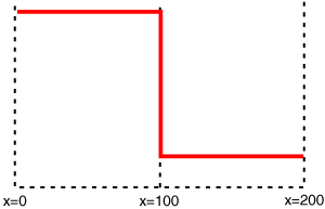
Now imagine a point moving along the path at a constant rate. If we wanted it to take 3 seconds total to traverse the path, it would take 1 second per segment. By default, our animated value corresponds to the position of the imaginary point on the X axis. This means that the value won’t change at all between seconds 1 and 2.
Classes such as DoubleAnimationUsingPath have a property, Source, which allows us to say whether we want the X or the Y value. If we want to make an element trace a path, we can provide two animations, one using X and the other using Y.
Let’s see how this works out in real XAML.
Open
LearningAnimation.We’ll start using the path represented in Figure 23.2. Replace the markup in
Window1.xamlwith Listing 23.2.Example 23.2. Window1.xaml Demonstrating Animation with a Path
<Window x:Class="LearningAnimation.Window1"
        xmlns="http://schemas.microsoft.com/winfx/2006/xaml/presentation"
        xmlns:x="http://schemas.microsoft.com/winfx/2006/xaml"
        Title="Window1"
        Height="300" Width="300">
    <Window.Resources>
        <PathGeometry x:Key="path" Figures="M0,0 L100,0 100,100 200,100" />
    </Window.Resources>
    <Window.Triggers>
        <EventTrigger RoutedEvent="Window.Loaded">
            <BeginStoryboard>
                <Storyboard Storyboard.TargetName="Ball">
                    <DoubleAnimationUsingPath Duration="0:0:10"
                                              Storyboard.TargetProperty="(Canvas.Left)"
                                              Source="X"
                                              PathGeometry="{StaticResource path}" />
                    <DoubleAnimationUsingPath Duration="0:0:10"
                                              Storyboard.TargetProperty="(Canvas.Top)"
                                              Source="Y"
                                              PathGeometry="{StaticResource path}" />
                </Storyboard>
            </BeginStoryboard>
        </EventTrigger>
    </Window.Triggers>
    <Canvas>
        <Ellipse x:Name="Ball"
                 Width="20" Height="20"
                 Fill="Red"
                 Canvas.Top="50" Canvas.Left="0">
        </Ellipse>
        <Path Stroke="Red" StrokeThickness="2" Data="{StaticResource path}">

        </Path>
    </Canvas>
</Window>
Stop the program, and replace
FiguresonPathGeometrywithM50,10 C100,10 0,90 50,100 C100,90 0,10 50,10 zRun the application once more and observe the animation.
By the Way
If you would like to make the center of the ball follow the path, instead of the upper left corner, you can use a transform. You would shift the ball’s x and y position by half of its width and height. Thus the resulting Ellipse would look like this:
<Ellipse x:Name="Ball"
         Width="20" Height="20"
         Fill="Red"
         Canvas.Top="50" Canvas.Left="0">
    <Ellipse.RenderTransform>
        <TranslateTransform X="-10" Y="-10" />
    </Ellipse.RenderTransform>
</Ellipse>
We placed the PathGeometry in the resources so that we could use it both in the Path and the DoubleAnimationUsingPath. Ball doesn’t quite stay on the path as it moves, because Ball is positioned using the upper-left corner of its bounding box. The corner is what is tracing the path exactly. Change the Ellipse to a Rectangle and you will be able to see this more clearly.
In all our examples so far, we’ve used BeginStoryboard. This element was confusing to me when I first encountered it. The name “BeginStoryBoard” is meant to communicate that it is a trigger action for initiating a storyboard animation. However, the element also serves as a handle for manipulating the animation after it has begun.
First, you must provide a name for the BeginStoryboard element. After you do so, you can use a series of trigger actions to manipulate the animation. Table 23.3 lists the available actions.
Table 23.3. Trigger Actions for Controlling Animations
Name | Description |
|---|---|
| Pauses the animation. |
| Removes the storyboard. (See the documentation regarding this.) |
| Resumes play for a paused storyboard. |
| Allows you to change the speed of playback. |
| Jumps to the fill portion of the storyboard. |
| Stops playback. |
In this context, the name BeginStoryboard makes a little more sense. However, note that all these derive from ControllableStoryboardAction, whereas BeginStoryboard is a direct descendant of TriggerAction.
Let’s add some of these to our project:
Open the project
LearningAnimation.Modify the markup of
Window1.xamlto match Listing 23.3.Example 23.3. Window1.xaml Demonstrating a Controlled Animation
<Window x:Class="LearningAnimation.Window1"
        xmlns="http://schemas.microsoft.com/winfx/2006/xaml/presentation"
        xmlns:x="http://schemas.microsoft.com/winfx/2006/xaml"
        Title="Window1"
        Height="300" Width="300">
    <Window.Triggers>
        <EventTrigger RoutedEvent="Window.Loaded">
            <BeginStoryboard x:Name="BallStoryboard">
                <Storyboard Storyboard.TargetName="Ball"
                            Storyboard.TargetProperty="(Canvas.Left)">
                    <DoubleAnimation By="300"
                                     Duration="0:0:07.5"/>
                </Storyboard>
            </BeginStoryboard>
        </EventTrigger>
        <EventTrigger RoutedEvent="Button.Click"
                      SourceName="Pause">
            <PauseStoryboard BeginStoryboardName="BallStoryboard" />
        </EventTrigger>
        <EventTrigger RoutedEvent="Button.Click"
                      SourceName="Resume">
            <ResumeStoryboard BeginStoryboardName="BallStoryboard" />
        </EventTrigger>
    </Window.Triggers>
    <StackPanel>
        <StackPanel Orientation="Horizontal">
            <Button x:Name="Pause">Pause</Button>
            <Button x:Name="Resume">Resume</Button>
        </StackPanel>
        <Canvas>
            <Ellipse x:Name="Ball"
                 Width="20" Height="20"
                 Fill="Red"
                 Canvas.Top="50" Canvas.Left="0">
            </Ellipse>
        </Canvas>
    </StackPanel>
</Window>
Notice that we named the Button elements, but we didn’t need to wire the Click event. Instead, we capture it using the
SourceNameonEventTrigger. Run the application and click Pause and Resume.
An interesting item to note is that Storyboard, because it is a timeline, is really a set of instructions. Those instructions could be used in more than one location. The BeginStoryboard class is responsible for managing the objects that actually perform the animation. This is why we reference it, instead of referencing the Storyboard directly.
The technique we’ve been using this hour is called storyboard animation; however, there are a few other approaches to animation in WPF. Even though we are not going to cover them in this book, it’s useful to know that they exist and when they are applicable. The alternative techniques are available only in code.
This approach can be used with any class that descends from AnimationTimeline. Most of the timeline classes we’ve discussed so far qualify. You can create an instance of the class in code, set its properties, and then call BeginAnimation on the target object passing in the target property and AnimationTimeline instance. The following snippet shows an example using C# 3.0:
var animation = new ColorAnimation
               {
                   From = Colors.Blue,
                   To = Colors.Yellow,
                   Duration = new Duration(TimeSpan.FromSeconds(2))
               };
var button = new Button();
button.BeginAnimation(Button.BackgroundProperty,animation);
This is a very simple and quick way to create an animation. The downside is that you are not able to control the animation interactively after it’s triggered. Likewise, there is no way to use a local animation in styles and templates.
Clock animations are very similar to local animations. You would use this approach if you need something more complex than a local animation, but you want more control than a storyboard provides (perhaps for tweaking performance).
With this approach you use CreateClock on AnimationTimeline to produce an instance of an AnimationClock. The object to animate then calls its ApplyAnimationClock method passing in the dependency property and the clock. In C# 3.0, it would look like this:
var animation = new ColorAnimation
{
    From = Colors.Blue,
    To = Colors.Yellow,
    Duration = new Duration(TimeSpan.FromSeconds(2))
};
var clock = animation.CreateClock();
var button = new Button();
button.ApplyAnimationClock(Button.BackgroundProperty, clock);
The final approach is to completely bypass the animation system. You should take this approach only in rare and special cases. WPF has a static class called CompositionTarget that represents the display surface of the application. It raises an event Rendering for every frame that it paints to the screen. In the handler for this event, you would need to manually update the properties you are interested in animating. You would also need to manually keep track of the time elapsed for your animation.
Using animations in your application may feel superfluous. However, there are a couple of ways of applying animations that can have a real and positive impact even on prosaic business applications.
In the Media Viewer, we have already demonstrated using animation to communicate the state of a control. For example, when we move the mouse over a button using the fancyButtonStyle, we use a subtle animation to draw attention to the button. Such visual cues might seem trivial, but they can have a profound effect on an application’s usability.
Another exciting way to use animations is to provide tutorials or context-sensitive help within an application. A tutorial storyboard can actually interact with and change the state of the UI. Additionally, a user could pause, resume, or otherwise interrupt such a tutorial.
By the Way
We posted a special XAML-only version of the Font Viewer from Part I at bluespire.com/wpf/FontViewer.xaml. In this online version, clicking on the help icon in the upper-right corner triggers an animated explanation of how to use the application.
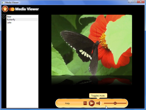
Let’s add a Help button that triggers some animated tool tips that explain the purpose of the controls in MediaPlayer.xaml. We’ll use a story board that positions the tool tip over the various elements, and change the text to explain each element. We’ll also use the same storyboard to temporarily turn off the progress bar so that it won’t obscure the tips:
In the Media Viewer project, open
MediaPlayer.xaml.Locate the
GridwithDockPanel.Dock="Bottom". This should be the firstGridinside theDockPanel.Inside this
Grid, immediately after theGrid.ColumnDefinitionselement, add the following markup:<Canvas VerticalAlignment="Top" Margin="0 6 0 0"> <StackPanel x:Name="tipBox" Canvas.Bottom="0"> <Border CornerRadius="4" SnapsToDevicePixels="True" Width="100" Padding="4" Background="{StaticResource paleBrush}" BorderBrush="{StaticResource orangeBrush}" BorderThickness="1"> <TextBlock TextWrapping="Wrap" TextAlignment="Center" Text="{Binding ElementName=tipBox, Path=Tag}" /> </Border> <Path Margin="0 -1 0 0" SnapsToDevicePixels="True" Stroke="{StaticResource orangeBrush}" Fill="{StaticResource paleBrush}" Data="M40,0 L50,10 60,0" /> </StackPanel> </Canvas>
Let’s examine this markup a bit before we go on. We’re making use of a couple of layout tricks in order to achieve a specific effect. I wanted a tool tip box with a little arrow at the bottom, pointing to the element it is explaining. However, I wanted the tool tip box to resize vertically to fit its content. The
Borderwith a set width containing aTextBlockwith wrapping is very close to that. I placed theBorderinStackPanelalong with aPathto represent the arrow pointing down. ThePathhas a negative margin so that it will overlap with theBorderand thus give the effect that they are a single element. TheStackPaneltakes care of making sure theBorderand thePathare always stacked properly. We setSnapsToDevicePixelsonBorderandPathto ensure that there is not a seam between them.The
Gridthat all this is located in is the same one that contains the media controls (play, stop, mute, and volume). We’re using aCanvasas the container for theStackPanel(which is in turn the whole tool tip). Because theCanvasdefaults to zero height, the bottom of theCanvasis located at the top of theGrid. This allows us to keep our tool tip snapped to the top of theGrideven when lengthy text causes it to resize. This is important because the tool tip won’t be pushed down and hence obscure the controls it’s describing. We also set a 6px margin on the top of theCanvasso that the arrow just slightly overlaps with theGrid.We need to add a storyboard to control the tool tip. At the top of
MediaPlayer.xaml, just under the opening tag, add this:<UserControl.Resources> <Storyboard x:Key="tipStoryboard" Storyboard.TargetName="tipBox" > <DoubleAnimationUsingKeyFrames Storyboard.TargetProperty="(Canvas.Left)"> <DiscreteDoubleKeyFrame KeyTime="00:00:00" Value="115"/> <DiscreteDoubleKeyFrame KeyTime="00:00:02" Value="150"/> <DiscreteDoubleKeyFrame KeyTime="00:00:04" Value="185"/> <DiscreteDoubleKeyFrame KeyTime="00:00:06" Value="280"/> </DoubleAnimationUsingKeyFrames> <StringAnimationUsingKeyFrames Storyboard.TargetProperty="Tag"> <DiscreteStringKeyFrame KeyTime="00:00:00" Value="Stops media when playing."/> <DiscreteStringKeyFrame KeyTime="00:00:02" Value="Plays media, or pauses currently playing media." /> <DiscreteStringKeyFrame KeyTime="00:00:04" Value="Toggles mute." /> <DiscreteStringKeyFrame KeyTime="00:00:06" Value="Controls the volume." /> </StringAnimationUsingKeyFrames> <ParallelTimeline Storyboard.TargetProperty="Opacity"> <DoubleAnimation BeginTime="00:00:00" To="1"/> <DoubleAnimation BeginTime="00:00:08" To="0"/> </ParallelTimeline> <ParallelTimeline Storyboard.TargetName="progressSlider" Storyboard.TargetProperty="Opacity"> <DoubleAnimation BeginTime="00:00:00" To="0"/> <DoubleAnimation BeginTime="00:00:08" To="1"/> </ParallelTimeline> </Storyboard> </UserControl.Resources>
The storyboard targets the
StackPanel, which we namedtipBox. We named the storyboardtipStoryboardso that we can reference it in a button. The storyboard contains a series of timelines that execute in tandem. TheDoubleAnimationUsingKeyFramestimeline is responsible for positioning thetipBoxover each of the controls, whereasStringAnimationUsingKeyFramessimultaneously changes the text. (We are actually changingTagontipBox, but theTextBlockinsidetipBoxis bound to that property. This was to simplify the markup on the storyboard.)By the Way
You can manually set the
Canvas.Leftproperty ontipBoxand see the result in the design pane. This is how I determined the values to use in the storyboard. Also, two seconds is probably too brief for displaying this sort of help, but it’s almost too long when you are just interested in learning WPF.We have two
ParallelTimelineelements, which are just used to group some related timelines. The first one targets theOpacityoftipBox, causes it to fade in and fade out. The second is similar, except that it fades out theprogressSlidercontrol so that it won’t be in the way of our tool tip.Now we need a way to trigger the storyboard. We’ll just add a quick help button inside the same
Gridas thetipBox. Immediately beneath the Canvas element, add the following:<Button Style="{StaticResource mediaButtonStyle}" Content="Help"> <Button.Triggers> <EventTrigger RoutedEvent="Button.Click"> <BeginStoryboard Storyboard="{StaticResource tipStoryboard}"/> </EventTrigger> </Button.Triggers> </Button>
Finally, we want to set the
Opacityto0ontipBox. This prevents the tool tip from being visible until we trigger the storyboard.Run the application, switch to a view that displays the media player, and click our new Help button. The animation should resemble Figure 23.3.
Again we have only introduced the foundation for animating with WPF. However, you are now equipped to handle all kinds of animation scenarios, including animating by paths and key frames. If you encounter situations that we have covered, you now have enough understanding to research deeper into the possibilities that WPF has.