
Chapter 15. Making Your Site Mobile
In This Chapter
Being mobile means you have access to the Internet away from your home or office, with a computer, cell phone, or PDA, and without the use of wires to connect. If you’ve ever used your cell phone to look up directions, you have used the Mobile Web. Wireless technology has increased in prevalence because the hardware required to operate wireless technology has become smaller and faster. More and more people are using their phones and other devices to access the Mobile Web than ever before. As a web designer, you need to be aware of how the Mobile Web works and how your website might need to be changed to be used with the Mobile Web.
This chapter covers some of the most common mobile web devices and software. Then it covers what can and can’t be done on the Mobile Web, and finally, how to make your website mobile compatible.
Would someone walking down the street or driving in a car be interested in the information offered on your website? You might not think so, but consider these situations:
 Someone standing in a knitting store, trying to decide which needle to buy, can access a knitting website to see what it recommends.
Someone trying to find a particular item in a local store can find an image of the item online, through a site that sells the item, and use the phone or PDA to show it to the store clerk.
Someone with a taste for cannoli can use their cell phone or PDA to search for local Italian restaurants that have posted their menus to the web and that offer cannoli.
As these examples illustrate, websites that cater to the mobile market will see traffic increase.
If you want to use the Mobile Web, you first need a device that provides a connection to the Internet. A cell phone, PDA, or wireless laptop would all work. Then you use a browser built in to your device to go to an address, similar to the browser you use on your computer to access the internet.
Mobile web devices can access almost any web page, but some pages are specifically designed for mobile web users. These pages display better and load faster on mobile devices.
To be an effective developer of websites that are accessed by mobile web devices, you should be a mobile web user yourself.
Check to see whether your cell phone or PDA accesses the Mobile Web. If you don’t have one, try to get access to one so you can see what websites look like on these devices. If you are building sites specifically designed to be accessed by the Mobile Web, it is important to have a mobile web device on which to test your website.
For more information, see the following websites:
Mobile Web Wikipedia entry—http://en.wikipedia.org/wiki/Mobile_Web
W3C mobile Web Initiative—http://www.w3.org/Mobile/
Mobile Web Best Practices 1.0—http://www.w3.org/TR/mobile-bp/
At one time computers used to fill whole rooms. They used vacuum tubes and punch cards to run complex calculations that helped book air travel and build the atomic bomb. Things have changed. Today, devices such as cell phones and PDAs are many times faster and much, much smaller. To understand how to use the Mobile Web to your website’s advantage, it is important to know the tools available. Let’s explore some of these devices and how they work.
We definitely can see the age of the telephone connected to the telephone network through wires from your house to a central switching office are changing. Go to a college campus these days and stand in one place, and just count the number of cell phones you can see. We are no longer tied down to the phones on our desks.
We do more with our phones than ever before, and they are becoming indispensible. We can listen to music, take pictures, and even connect to the Mobile Web. These devices are sometimes called smart phones.
Along with a rise in cell phones, the early 1990s saw the introduction of handheld data devices. The air around you is being filled with data being sent to and from PDAs. Do you know someone with a portable email device such as a Blackberry? This is also connecting to the Mobile Web.
It now seems that the devices people carry around in their pockets can do just about anything. I have an iPhone, and I can make calls, send text messages, take pictures, and access websites. All from a touch screen I carry around in my pocket.
Mobile devices are not limited to what you can carry around in your pocket. There are small mobile devices that users carry around or use in their cars. More and more we are going to see web access on things we would never expect. The other day I saw a refrigerator that had a screen on it. If it can have a screen, you might be able to access the Mobile Web with it.
Just as your desktop or laptop computer has an operating system—Windows, OSX, Linux, and so on—most mobile web devices have their own operating system. You should be familiar with a few major ones:
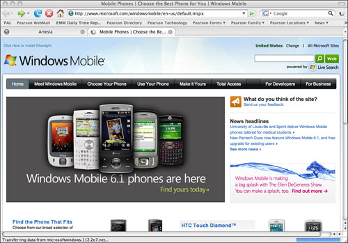
Microsoft Windows Mobile (http://www.microsoft.com/windowsmobile/)—This is a version of Microsoft Windows designed specifically to run on mobile devices (see Figure 15.1). It allows you to access familiar programs such as Microsoft Word and Microsoft Excel. It also comes standard with a version of Microsoft Internet Explorer.
Symbian (http://www.symbian.com/)—This is an open-source mobile operating system used on phones from Fujitsu, LG, Mitsubishi, Motorola, Nokia, Samsung, Sharp, and Sony Ericsson. Symbian uses the Opera open-source mobile browser to access the Mobile Web.
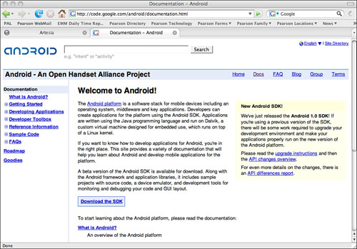
Android (http://code.google.com/android/)—Android is the brand new operating system for mobile devices from Google (see Figure 15.2). Like other Google projects, Android is an open-source operating system and development platform for handsets. Android uses its own embedded browser but encourages existing browser developers to develop versions of their web browser for Android-enabled devices.
Just as your desktop or laptop computer uses a web browser—Internet Explorer, FireFox, Safari, and so on—to access the Internet, mobile devices use similar browsers to access the Mobile Web. These browsers are different, though, and may not look like any browser you have ever seen.
Windows Internet Explorer Mobile (http://www.microsoft.com/windowsmobile/en-us/downloads/microsoft/internet-explorer-mobile.mspx)—This is a web browser that comes installed with Windows mobile devices. It has several different viewing options, and you can sync your Favorites list with your PC.
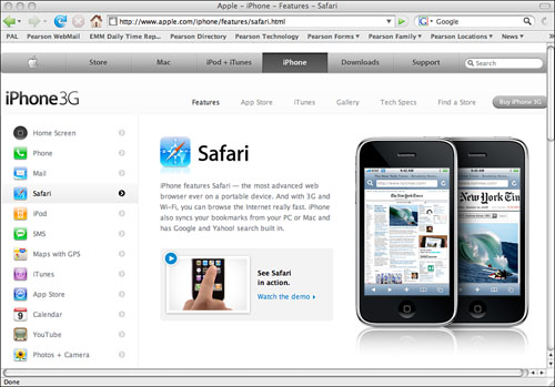
Safari (http://www.apple.com/iphone/features/safari.html)—This is a version of the Safari browser that comes installed on Apple’s iPhone (see Figure 15.3). It allows eight windows to be open at once and is fully integrated into the rest of the iPhone operating system. If you get a text message on your iPhone and it has a web address, you can touch the screen and the Safari browser displays that page.
Opera (http://www.opera.com/products/mobile/)—The mobile Opera browser is an open-source browser for smart phones and PDAs. Since it was created, it has been installed and runs on millions of phones. It’s the default browser with the Symbian mobile operating system.
For more up-to-date information, look at the Wikipedia entry on mobile browsers: http://en.wikipedia.org/wiki/Mobile_browser.
The Mobile Web gives access to the Internet from anywhere, with devices that are small and lightweight. There’s no doubt about it: It’s probably the best thing since sliced bread. But the Mobile Web has some limitations that you must know about before you create or modify your website for it.
Speed—The speed of the Mobile Web is not the same as what you get with conventional methods of connection. Even with the fastest Wi-Fi connections, some mobile devices have processors and graphics engines that are still slower than a typical desktop or laptop computer.
Screen size and resolution—Mobile devices have small screens with low resolutions and limited aspect ratios.
Lack of web applications—Not everything that can run on the Web can run on the Mobile Web. Most mobile web browsers can’t run JavaScript or Flash applications, making some content inaccessible.
Page Sizes—If your website is designed with a fixed width or length, it might not be displayed correctly on the Mobile Web. If you are thinking about a Mobile Web site, pay close attention to your page sizes.
I’m going to show you how to create web pages that work best on the Mobile Web and how to test these websites. As with any website, you should follow the steps of planning, designing, building, and then testing. This section covers topics in those areas specific to the Mobile Web.
When people come to your website using a Mobile Web device, you might want to direct them to a particular part of your website. Detecting a mobile web user might not be as easy as it seems. There are scripts in languages such as PHP that can detect a Mobile Web browser and direct the visitor to a more Mobile Web friendly part of your website. If you are serious about detecting and redirecting mobile users, look at the following locations:
How to redirect mobile (WAP) visitors to your mobile content—http://www.stepforth.com/faq/mobile-redirects.html
Detecting mobile browsers—http://www.brainhandles.com/2007/10/15/detecting-mobile-browsers/
Detecting and automatically redirecting website visitors—http://studiohyperset.wordpress.com/2006/10/06/detecting-and-automatically-redirecting-website-visitors-who-visit-a-standard-webpage-website-on-mobile-handheld-wireless-pda-or-cel-cell-phone-devices-browsers-to-a-mobile-version-of-the-webpage-or-w/
You might not want your whole site accessible to the Mobile Web, or you might want to create a website specifically for the Mobile Web. If you are creating a website specifically for the mobile web user, you might want to create a specific domain or subdomain. Here are some examples of Mobile Web–specific domains:
m. Prefix—Sometimes if you go to a Mobile Web site, it might have a subdomain suffix of m.. For example, the mobile version of Google is m.google.com and the mobile version of cnn.com is m.cnn.com. Because most host providers don’t charge for new subdomains, this is usually a free option.
.mobi—There is now a high-level domain for mobile phones, .mobi. This domain was set up specifically to be used with Mobile Web content. This domain was sponsored by major telecommunications and software companies to separate their sites from other domains.
You can use HTML to create Mobile Web sites, but you might want to use other languages specifically designed to make Mobile Web pages as easy to use as possible. Here are a couple of options:
Wireless Markup Language—An early version of a language specifically for mobile devices.
XHTML—A markup language (like HTML) that allows for web pages that work better on some Mobile Web browsers.
Mobile Web browsers have small screens and you want to provide as much information as possible on that screen. Don’t have a huge image or header text on the top of your page or you are asking people to scroll down immediately.
When designing web pages for Mobile Web browsers, keep in mind that the interface design might be completely different than that of a regular web page.
Shortcuts—Make sure to use lots of shortcuts. On a mobile device, it is easier to select a shortcut than to scroll.
Vertical scrolling—This is not the easiest thing to do with some mobile web devices. Keep this to a minimum.
Horizontal scrolling—Scrolling across the screen should be avoided at all costs. Some browsers don’t even allow this function.
Images—Images are big files that introduce display problems, so keep images to a minimum. If you have to add images, try to keep them under 100×100 pixels.
Text—Keep your text and text size as small as you can. Remember that some mobile web users might be paying to download your page.
Some things that you might use on a standard web page should be avoided at all costs for a Mobile Web page. These things can cause the page to display incorrectly or not at all. If at all possible avoid these web features:
Tables
Frames
Pop-ups
There is a growing community of online mobile web developers. If you are going to be developing Mobile Web sites, I recommend you visit these sites and take part in the communities.
A Beginner’s Guide to Mobile Web Development (http://mobiforge.com/starting/story/a-beginners-guide-mobile-web-development)—An excellent spot to begin learning about mobile web development.
Mobile Web Best Practices 1.0 (http://www.w3.org/TR/2005/WD-mobile-bp-20051220/)—The W3C not only creates standards for regular websites but also issues Mobile Web best practices. Familiarize yourself with these if you are going to do more Mobile Web development.
Mobile Web Site Builders (http://www.site.mobi & http://www.mobisitegalore.com/)—These sites enable you to create very simple Mobile Web sites that meet mobile standards.
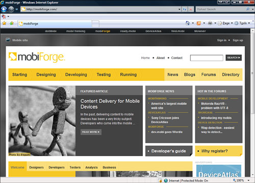
mobiForge (http://mobiforge.com/)—A Mobile Web developer’s website with designing, development, and testing resources (see Figure 15.4).
W3C Mobile Web Initiative (http://www.w3.org/Mobile/)—W3C’s home for Mobile Web page development.
One of the unique features of developing for the Mobile Web is testing your web page on different devices. The good news is that you don’t have to go out and buy all the mobile devices you can find and check your page on them. There are websites that can evaluate your Mobile Web site and emulate what it will look like on different mobile devices. Here are some to consider:
ready.mobi (http://ready.mobi/)—This is an evaluation tool for Mobile Web sites that checks a particular page or an entire website for how well it will work on mobile devices. This site is a must to test your Mobile Web page.
Mobile Emulator (http://mtld.mobi/emulator.php)—This site tests how your web page would function on different mobile devices.
Barkley Mobile emulator (http://www.barkleyus.com/wap/)—Another Mobile Web emulator.